Late Friday Night Chart… Risk and Responsibility

I seen a lot of disappointment today at the forum on the volatility with NVO.V and the rest of the NOVO related stocks. If you bought into these stocks then you need to be responsible for your trades. Sir Plunger stated many times that these were speculative stocks and the volatility would be great. That is the nature of these types of trades, big risk equals big reward if it works.

One of my first big life changing trades took place back in 1991 just before the start of the first Gulf war. I was in the middle of raising a family so extra cash for investing was hard to come by back then. I set a goal the year before to save $100 a week to invest in the stock market and when I built it up to $5000 I would begin to invest it.

Back then charts were hard to come by unless you made your own charts on graph paper which I had been doing for years. Stock quotes were delayed by 15 minutes and fractions were still being used. You talk about the Stone Age.

In the fall of 1990 the saber rattling began and it looked like the US was going to go to war with Iraq. I still remember how negative the environment was when it came to the stock market. Analysis were saying if we went to war the stock markets would collapse as we were going up against the 5th largest army in the world and no one knew how the war would go. The economy was going to go into a bear market because oil was going to go through the roof. Nothing positive was ever mentioned just that the world as we knew was going to dramatically  change.

By the end of 1990 it was inevitable that we were going to war, but it was just a matter of when. By that time I had saved nearly $5000 to invest in the stock market. The INDU was basically in a bear market for most of 1990, but there was a glimmer of hope when I began to recognize a possible small H&S bottom with the head forming in October. The INDU rallied about 300 points which was a lot back in those days into Christmas. Then came the beat of war drums stating in early January of 1991. Over a period of two weeks the INDU lost 200 points when it was certain the US was going to war. It’s very important to understand how negative every one was at that time. What is going on with North Korea today is nothing compared to January of 1991.

I had dabbled in options back then but never had much luck. I learned it was a tough game to be successful at, but I knew the basics. What I was seeing on the daily chart was a possible much bigger H&S bottom with the 200 point decline in January being the bottom of a possible right shoulder low, using the neckline symmetry line. It was a tough decision to make but I decided to use the $5000 I had saved to buy some out of the money call options on the OEX 100. Over a period of 5 days I had bought a ton of cheap options for 1/4 and 3/8’s that were going to expire in less than four weeks on the third Friday in February spending the entire $5000.

When I look back in hindsight it was probably the dumbest thing I could have done. I worked my butt off for a year to save $100 a week and I was going to blow it all in less than four weeks.

Below is a static chart I built years ago when I first subscribed to stocks charts to see what that trade looked like if I had had stock charts at my disposal. In January of 1991 you can see how the price action was testing the neckline symmetry line, red circle, while all the saber rattling was taking place. I had all my options bought and now I had to wait for the start of the war which no one really knew when the actual day would be. I can still remember vividly when the war started. We were eating supper when a special report flashed on the TV saying we were bombing Iraq. In those first few hours no one knew what as going to happen, but it was the first time I seen a thing called a Smart Bomb. By morning it was clear the war was not going to be a bad as everyone feared.

The INDU gapped up over 100 points on the open as everyone was so relieved, but my out of the money options still had a long ways to go before they got in the money. As the price action reached the neckline area of the larger H&S bottom the INDU built out that beautiful red bullish rising wedge which was a sight for sore eyes.

My plan was to hold all the options until the Friday of expiration because back then it seemed like the INDU would rally into options expiration. I also used a simple sell/stop method of moving my sell/stop up to just below the previous days low. Once the options got into the money they exploded in value. Options I had bought three weeks earlier for a 1/4 were selling over $4.00.

I managed to hang on until the Thursday before expiration. It’s hard to see, red circle at the top of the chart, but that day the INDU had a pretty good selloff so I just called my broker and said lets sell. In just over three weeks I turned that $5,000 into $120,000. Had I stayed just one more day and sold my options at market on close they would have been worth $143,000 as the INDU rallied strongly in to options expiration.

I remember my broker calling several times a day when the options started running wanting me to sell and take my profits, but I held my ground and was going to be responsible for my actions win lose or draw. It was a great learning experience for me in more ways than one. Unless you go through something like that in real time, you won’t know the mental fortitude it takes to follow your own plan when everyone is telling you to do something different.

This one trade set off a string of events in my life that would have never happened if I hadn’t taken on the risk. I ended up buying a restaurant that ended up being very successful and by participating in the bull market in the 1990’s I and was able to basically retire at the end of the tech bubble in 2000 at the age of 50. For me retirement isn’t sitting in a rocking chair on the front porch. Retirement for me is the freedom to do what you want to do when you want to do it.

The bottom line is that you have to be responsible for each and every trade you make and don’t put the blame on someone else or the PPT, manipulation or whatever excuse many traders like to use. Sir Plunger laid out a well thought out report last weekend stating the good with the bad and it was going to be a speculative trade. Maybe it will workout and maybe it won’t, but I took my positions with the understanding that I’m responsible for my own actions and no one else. Trading in hindsight is the easiest thing in the world to do, but in the real world trading in hindsight doesn’t work. Enjoy the rest of your Thanksgiving Weekend. All the best…Rambus


Commodities : The Big Three

Tonight I would like to show you some long term charts for the big three, Copper, Oil and Gold. There are a lot of similarities between them which is strongly suggesting all three should be in new bull markets. The laggard is gold which has still not confirmed its new bull market but is getting closer as you will see. The key will be what the US dollar has up its sleeves so lets start with a daily chart for the US dollar.

The US dollar still hasn’t totally broken down yet, but it did have a failed inverse H&S bottom. It was a very beautiful and symmetrical H&S bottom that looked like it was going to reverse the downtrend that is right at a year old now. It had a nice clean breakout above the neckline with a clean backtest from above. All looked good. After a brief rally the US dollar declined once more to the neckline, but this time the neckline failed to hold support, strongly suggesting the H&S bottom was failing.

As we’ve discussed in the past when you see a failed H&S pattern you often times see a strong move in the opposite direction. The rule of thumb is that when the price action breaks below the right shoulder low the failure is complete. The US dollar is still trading slightly above the right shoulder low, but is now getting close to breaking that important low. Note how the neckline reversed its role to what had been resistance during the formation of the H&S bottom, to support once broken to the upside, and then reversed its role one more time to resistance on the last backtest from below.

Below is a 20 year monthly chart for the INDU which shows you what can happen when you see a failed H&S pattern. In 2007 that H&S top worked out beautifully, but it was a different story altogether in 2015. The two H&S patterns were about as symmetrical as they could be, but when the price action broke out above the right shoulder high in early 2016, the failure was complete and we have gotten a very strong impulse move in the opposite direction.

Commodities should enjoy a weaker US dollar as they generally run inverse to each other. About 5 months ago Copper broke out from a very symmetrical H&S bottom on this 20 year monthly chart with no backtest to the neckline so far. There are no rules that says we have to have a backtest, but many time we do.

This 45 year quarterly chart for Copper shows you a lot of history. From 1979 to 2004 Copper traded in a massive flat top triangle or ascending triangle. The end of the giant 25 year pattern started with the double bottom at the 4th reversal point. That double bottom gave Copper the energy it needed to reach the top rail of the flat top triangle. From that point a consolidation pattern was needed to build up the energy to finally breakout above 25 years of resistance, which took form of a bullish rising wedge.

Note how the 2008 crash found support on the top rail of the 25 year flat top triangle. It was slightly penetrated but held. You can see the H&S top which ended the 2008 bull market with our new H&S bottom reversing that bear market, to our new bull market which is still very young yet.

Now lets take a look at WTIC, Crude Oil, as it has a similar setup to Copper. Copper is a little further along in its breakout move as oil is just now in its second month. For nearly two years oil has built out a double H&S bottom which is reversing the bear market from the 2011 high. This 20 year chart shows you why it’s important to look for H&S patterns at the end of big moves. There was a H&S top in 2008 followed by another one in 2011 and now our current H&S bottom. There was also another important H&S pattern which was a consolidation pattern in 2007 which launched oil on its parabolic ride to 147. When you see a H&S pattern show up on a long term chart you know the move is going to be very large, such as a bull or bear market.

This 35 year quarterly chart for oil shows you how it built out a massive 20 year double bottom. I know it is hard to believe but in 1998 oil was trading down to 10.50 where it put in the second bottom which launched oil to its all time high at 147. Before oil could breakout of the massive resistance zone between 35 and 40, it built out a bullish rising wedge.

On this log scale chart you can see the double bottom was 276% between the top and bottom. When you add 276% on the breakout it projected a price objective up to 146.

Durning the 2015 crash oil initially fell through the old resistance zone which looked at the time that it could possibly move all the way down to the 10.50 area. Looking back in hindsight now it was just a strong backtest, which left a very long tail on that quarterly bar. Like Copper, this move in oil is just getting started.

Now lets take a look at some gold charts we’ve been following. This first chart is a monthly look which shows the beautiful bull market uptrend with one consolidation pattern forming on top of the next. That all ended in 2011 when gold topped out and the bear market began. There are two different long term patterns I’ve been showing for gold. One is the bullish expanding falling wedge which is on this chart, and the other is a parallel downtrend channel. The last time we looked at this particular chart I was showing a possible ping pong move taking place between the top rail of the blue expanding falling wedge, and the top rail of the much bigger black expanding falling wedge. Note the bullish expanding falling wedge which formed during the 2008 crash low.

Below is another view of gold’s bull market uptrend channel we’ve been following with the blue arrows showing touches of the bottom rail. This chart shows a 7 point blue falling wedge reversal pattern as the last completed pattern if the bear market is completed. You can see two backtests to the top rail, one shortly after the breakout with the second one coming when the price action touched the bottom rail of the major uptrend channel, which was a perfect area to find support.

Four months ago the price action broke out above the top rail of the black expanding falling wedge and has been in backtest mode, last bar on this chart. It’s been a slow painful ride up the bottom rail of the major uptrend channel, but so far it hasn’t been broken.

I’m going to use this weekly chart to show you gold’s 2011 parallel bear market downtrend channel as it’s a little more detailed. This past summer gold finally broke out above the top rail of its bear market downtrend channel. That top rail is the same one as the top rails we looked at on the monthly charts above. It’s only the bottom rail that is angled differently. As you can see gold has been doing a ping pong move between the top rail of the downtrend channel and the old neckline from the H&S top. So far the breakout and backtest is working.

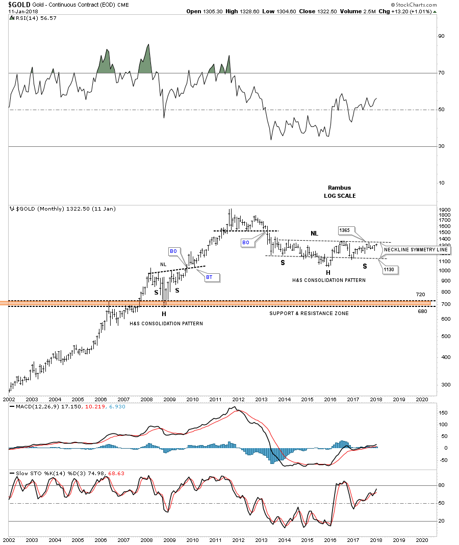
Previously we looked at a big H&S bottom that formed on Copper and Oil which have already broken out. Gold is currently still working on its own H&S bottom if it can breakout above the neckline which would come into play around the 1365 area. It’s pretty symmetrical but I can’t rule out one more move down to the neckline symmetry line at the 1130 area to match the symmetry to the left shoulder a little more closely. The bottom line is that if gold can trade above the neckline it will have a massive base to launch its bull market just like Copper and Oil.

This last chart for tonight is a 40 year look at gold that shows its massive 25 year H&S bottom which launched its bull market. Every time I show this chart I always say it’s a good study in how support and resistance works. The red and blue arrows shows how each cup and handle were broken to the upside with one last backtest before the next move higher that doubled the previous cup and handle formation.

Also notice how that massive 25 year neckline was initially tested with the red triangle. After the red triangle was complete the breakout finally took place. If you were trading the PM complex back then you know how bad the 2008 crash was which seemed like the end of the world. As you can see the 25 year neckline reversed its role to support during the 2008 crash at the 700 area. That massive H&S bottom had a price objective up to the 2035 area which ended up being about 115 points too high, but for such a massive pattern it was pretty close.

What these big three commodities sectors are strongly suggesting is that the US dollar may be entering into a bear market as commodities are entering into a new bull market. Time will always tell the truth, but that is how it’s looking on this day before Thanksgiving 2017. Enjoy your dinner tomorrow and all the best…Rambus