This content is for Yearly and Monthly members only.
Subscribe
Subscribe
Already a member? Log in here

In this Weekend Report I would like to show you a chart pattern that seems to be showing up in a lot of different area’s of the markets, in particular the commodities complex. We looked at some of them in the last Weekend Report which were maturing, but in some cases hadn’t broken down yet. The chart pattern I’m referring to is the bearish rising wedge.
Some of the bearish rising wedges have a common theme which is the late 2015 low, when commodities and the PM complex finally bottomed out after that massive impulse move down. At a minimum the price objective for a rising or falling wedge is the first reversal point in which the wedge began to build out. Prices can go much lower, but the first reversal point is a good first price objective.
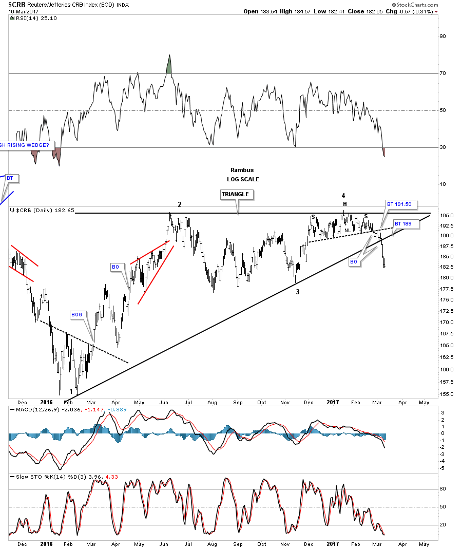
Lets start with some commodities indexes to see what last weeks price action did to this one plus year consolidation pattern. The CRB index has been around longer than most and gives us a good general feel on how commodities are doing in general. Last Tuesday the price action broke below the bottom rail of its bearish rising wedge and continued to fall for the rest of the week. The big clue that the CRB index was in trouble was when the small H&S top at reversal point #4 gave way. You can see there was a quick bactest to the underside of the neckline at 191.50 which led to the test of the bottom rail of the big bearish rising wedge. The price action bounced off of the bottom rail for three days before breaking below that very important rail on Tuesday of last week. It’s still possible we could see a backtest to the bottom rail at the 189 area before prices break lower.
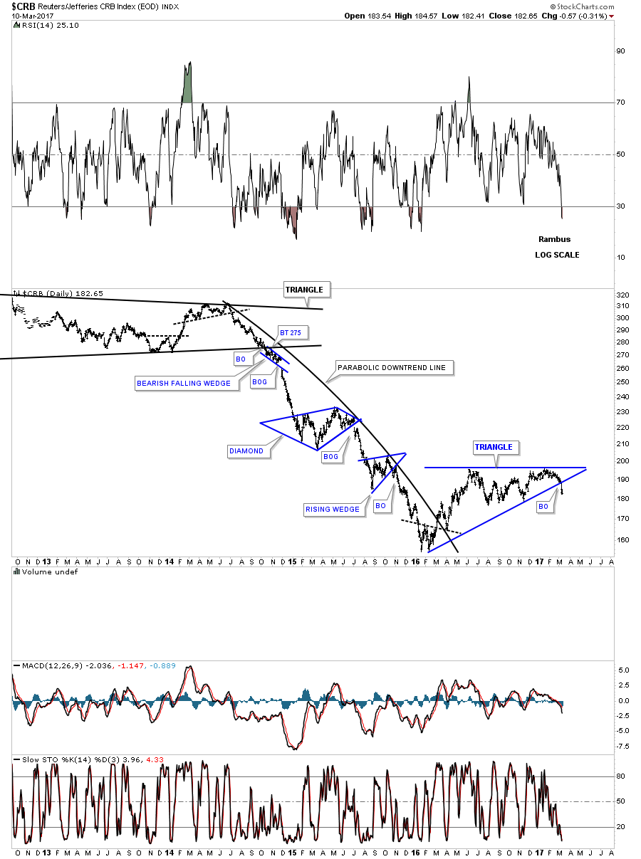
Below is a long term daily chart for the CRB index which shows how the bearish rising wedge fits into the big picture. That massive impulse leg down that began in 2014 took almost 2 years to complete and produced a parabolic downtrend. Since the minimum price objective is down to the first reversal point at the 2016 low it’s possible we could see a double bottom build out at the 150 area as one scenario.
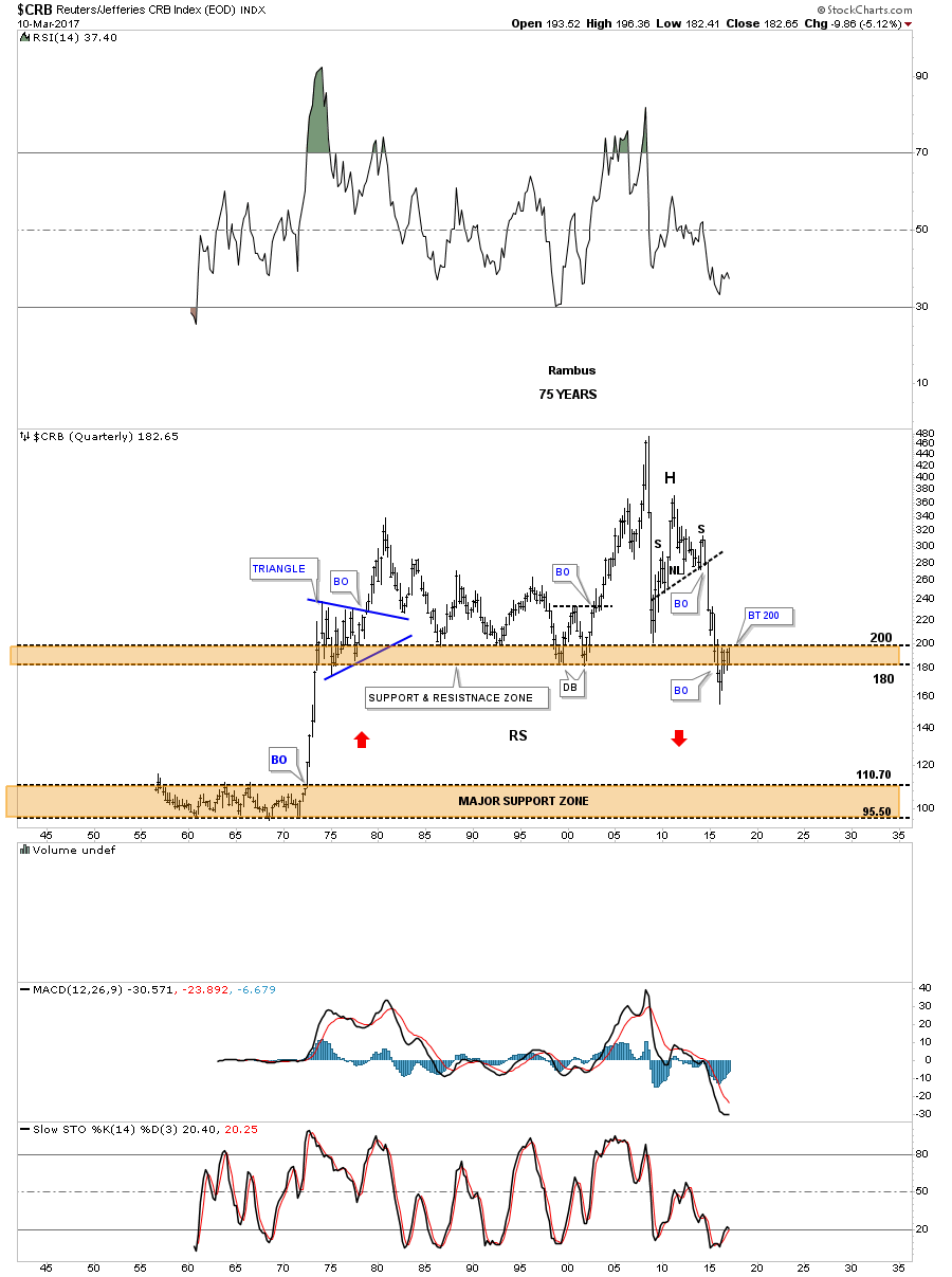
This last chart for the CRB index is the 75 year quarterly chart that I built in 2015 which is still relevant. After breaking below the upper brown shaded S&R zone the price action has rallied back up to the top of the brown shaded S&R zone, but has failed to go any higher and is on the verge of breaking back below again. Note the double bottom that formed in 2000 which led to a massive leg higher. This is one chart I’ll be watching very closely.
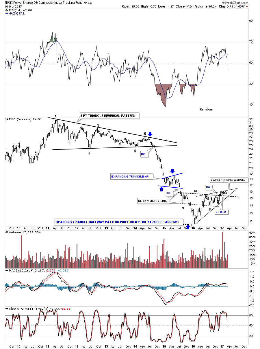
Next is the DBC commodities index which is probably the most actively traded of all the different commodities indexes. As you can see it is setup just like the CRB index. Note the blue triangle that formed in the middle which at the time looked like it could be a consolidation pattern to the upside, which even had a breakout gap. After the price action failed to move much higher that was a clue that the blue triangle might not be what it looked like. Again, the big clue that it might be failing was at the 4th reversal point in the bearish rising wedge. As you can see last week the DBC broke below the bottom rail of the rising wedge and the top rail of the blue triangle, which should have acted as support.

This weekly chart for the DBC shows the original H&S bottom which looked like it would work as a reversal pattern reversing the massive impulse leg down. The symmetry was very good originally as shown by the neckline symmetry line, which showed the low for the left and right shoulders. Again, after breaking out above the neckline prices failed to move much higher, but nothing was actually broken yet. As you can see last weeks bar broke below the neckline and the bottom rail of the bearish rising wedge. I can now say we have a bearish rising wedge because the price action has broken below the bottom rail and not above the top rail.
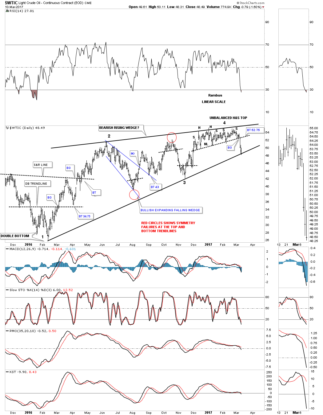
Next lets look at the energy sector which is showing a similar setup to the commodities indexes above. Last weekend we looked at the $WTIC oil index, which was testing the neckline of its small H&S top at reversal point number 4 in its bearish rising wedge. Unlike the commodities indexes we looked at above, WTIC landed on the bottom rail of its rising wedge on Friday and has not clearly broken below it yet. There is still the possibility that we could see a backtest to the neckline before prices break lower at the 52.75 area, but no guarantee.
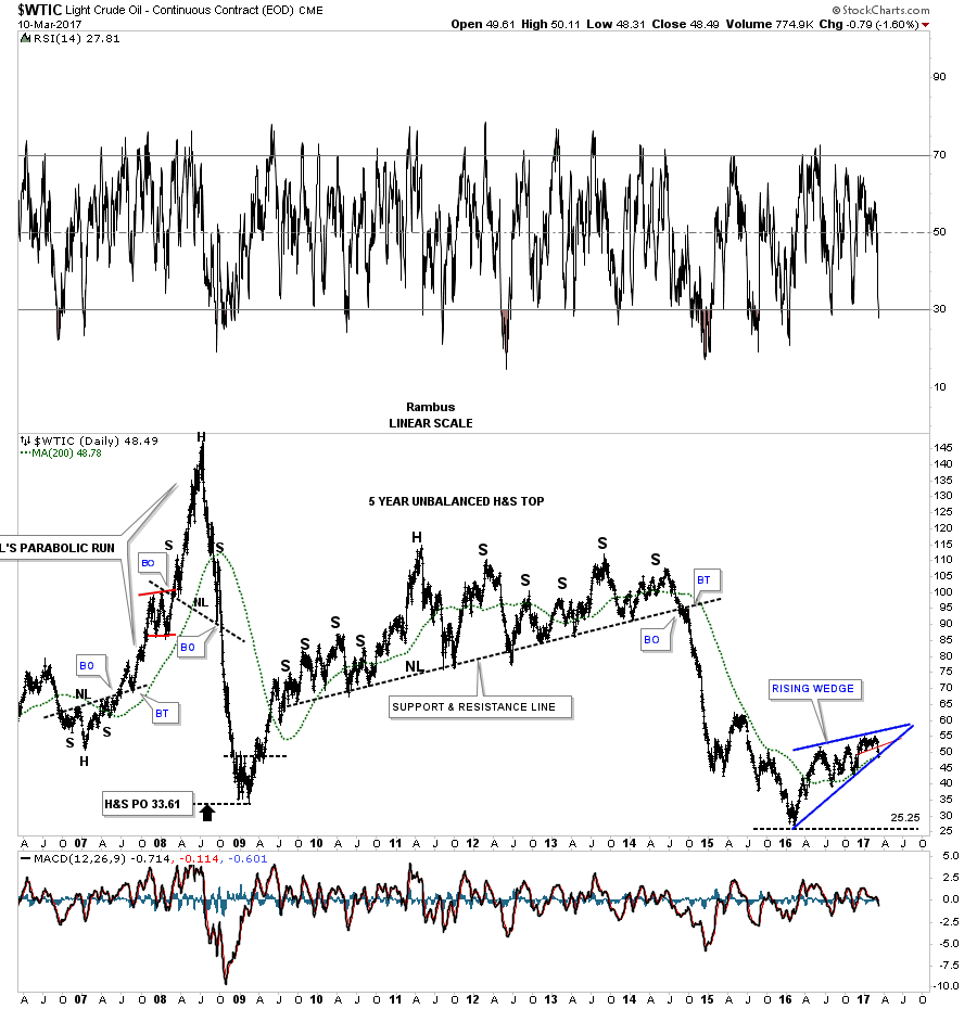
This next chart shows the massive H&S top which we followed for several years before it finally broke down. As I’ve mentioned in the past, recognizing big patterns like this can be a double edged sword. You can see the big pattern building out, but you don’t know when the actual breakout is going to occur. Patience is required to wait for the actual breakout. The thin red line in the blue rising wedge at the bottom of the chart shows how the massive H&S top on the long term look could very well be a fractal on the short term daily chart, at the 4th reversal point in the rising wedge. Both H&S tops produced unbalanced patterns with more right shoulders forming than left shoulders.
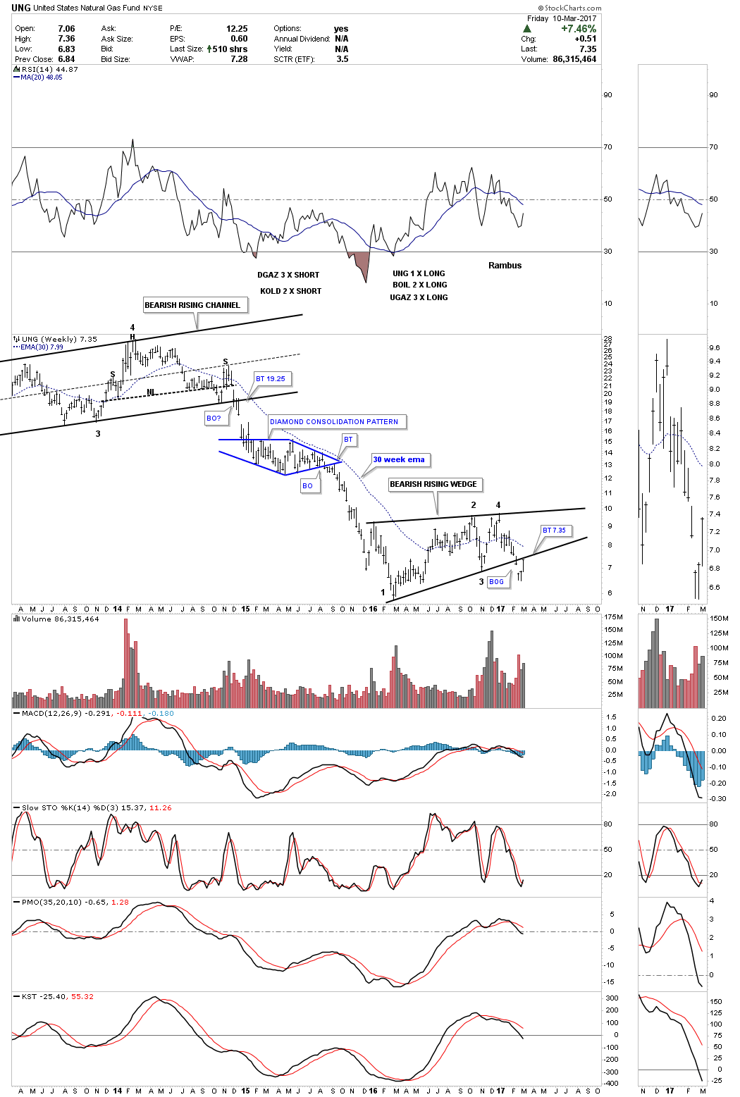
Lets take a look at natural gas as it actually broke below the bottom rail of its bearish rising wedge two weeks ago, ahead of the commodities indexes and oil. The breakout was accompanied by a very large breakout gap on heavy volume, which is what one likes to see when an important trendline gives way. Last Friday the price action backtested the neckline at the 7.35 area which is normal. Now we need to see the bottom rail hold resistance going forward.
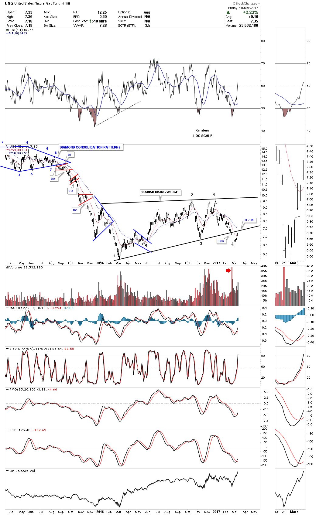
This weekly chart shows the big breakout gap and the backtest last Friday. Note how the 30 week ema does a good job of defining the trend, but lets you know when you’re in a consolidation phase when the price action trades above it or below it. You can see how well the breakout and backtesting process worked on the two patterns above the black bearish rising wedge.
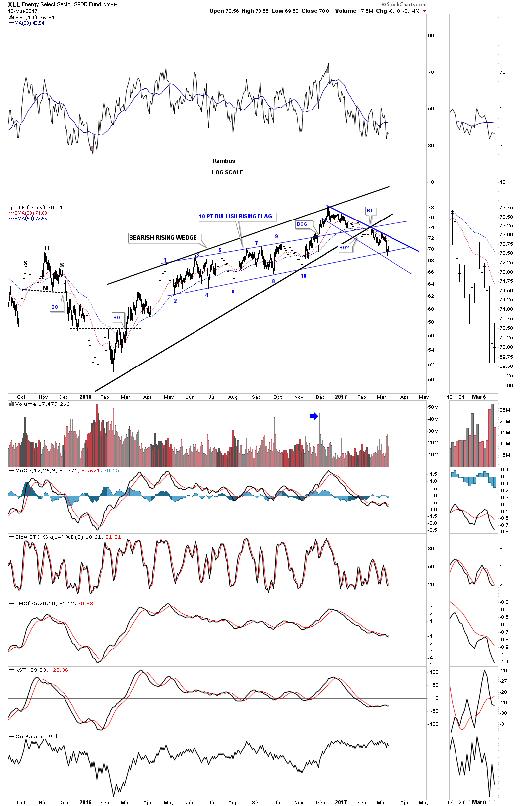
Lets look at one last stock for the energy sector which is the XLE. Like all the bearish rising wedges we looked at above this one to began to build out in early 2016. I had high hopes for this index and even went long at one point, when the price action broke out above the top rail of the 10 point bullish rising flag late last year. Ten reversal points in a pattern doesn’t happen all that often, but when they do it usually leads to a good move. Again, like all the patterns we looked at above the XLE produced a breakout which failed to take prices much higher before turning down. The last time we looked at this chart the XLE was in backtest mode to the bottom rail of the black bearish rising wedge, the top rail of the 10 point flag, and the top rail of the downtrend channel. We can also add the 20 and 50 day ema’s for good measure.
Next I would like to show you a couple of bond charts which also shows a bearish rising wedge in play, but on a longer term time frame. Below is a 15 year monthly chart for the TLT which broke below the bottom rail of its bearish rising wedge 4 1/2 months ago. As this rising wedge formed in the uptrend it needed 5 reversal points to become a reversal pattern, unlike a consolidation pattern which needs an even number of reversal points as shown by the two blue lower patterns.

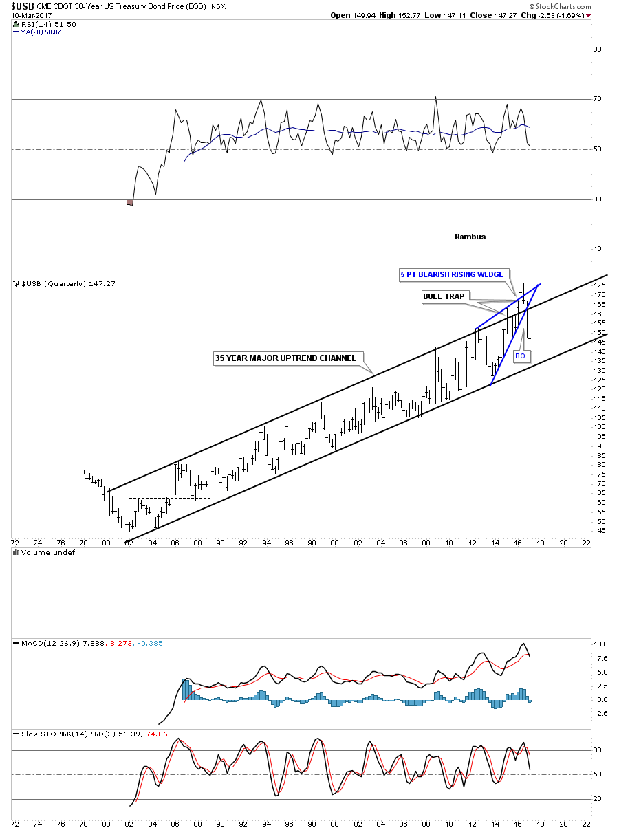
This next chart is a 45 year quarterly chart for the $USB, 30 year bond chart, which shows a multi year blue bearish rising wedge which is the reversal pattern that is reversing the 35 year bull market uptrend channel. I believe the price action above the top rail of the 35 year uptrend channel was a bull trap sucking in the very last of the bond investors before moving lower.
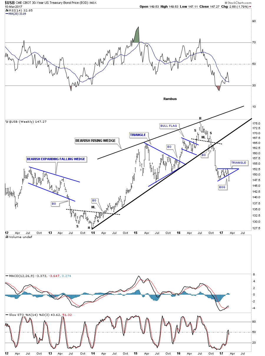
The bearish rising wedge on the weekly chart.
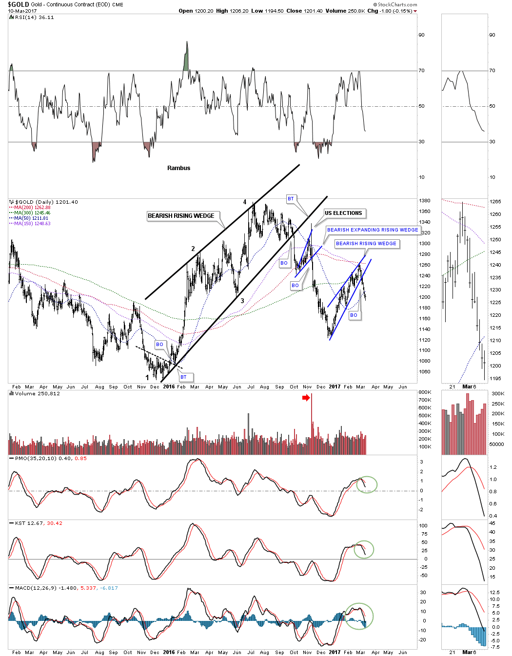
Now I would like to show you some bearish rising wedges in the precious metals sector starting with gold. I know most of you don’t want to believe that gold could still be in a bear market and that’s OK. For me personally this daily chart for gold shows the black bearish rising wedge that started to build out in late 2015, which corresponds to many of the rising wedges we looked at above, and shows its leading the way lower. This bearish rising wedge broke below the bottom rail back in October of last year much earlier than the rest of the rising wedges we looked at. Also note the smaller blue bearish rising wedge which broke below the bottom rail a week or so ago and is now trading back below all the important daily moving averages.
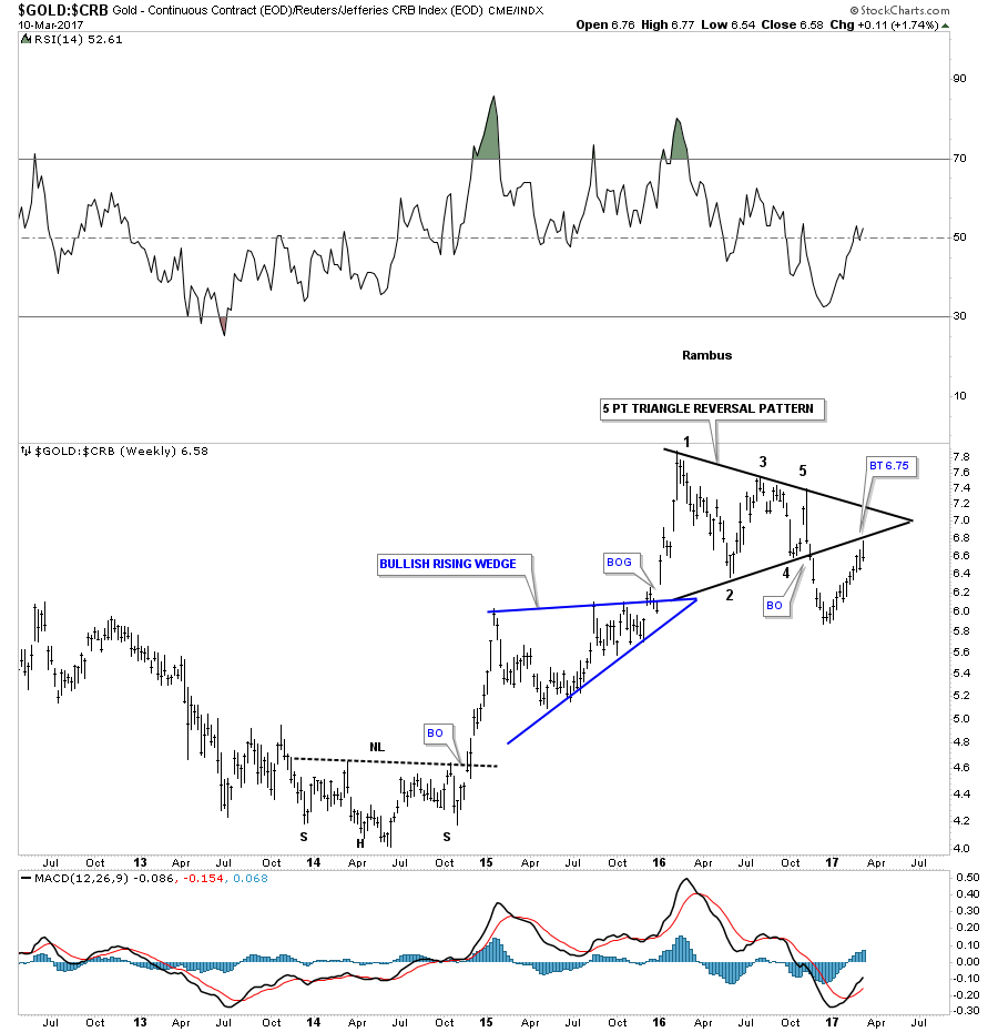
Below is a ratio chart which compares gold to the CRB index that shows how much weaker gold is to the CRB index. This ratio built out a 5 point triangle reversal pattern that reversed the rally out of the 2014 low. Last week it looks like the backtest to the underside of the bottom rail of the black triangle reversal pattern may have completed. When this ratio is falling, gold is under performing the CRB index.
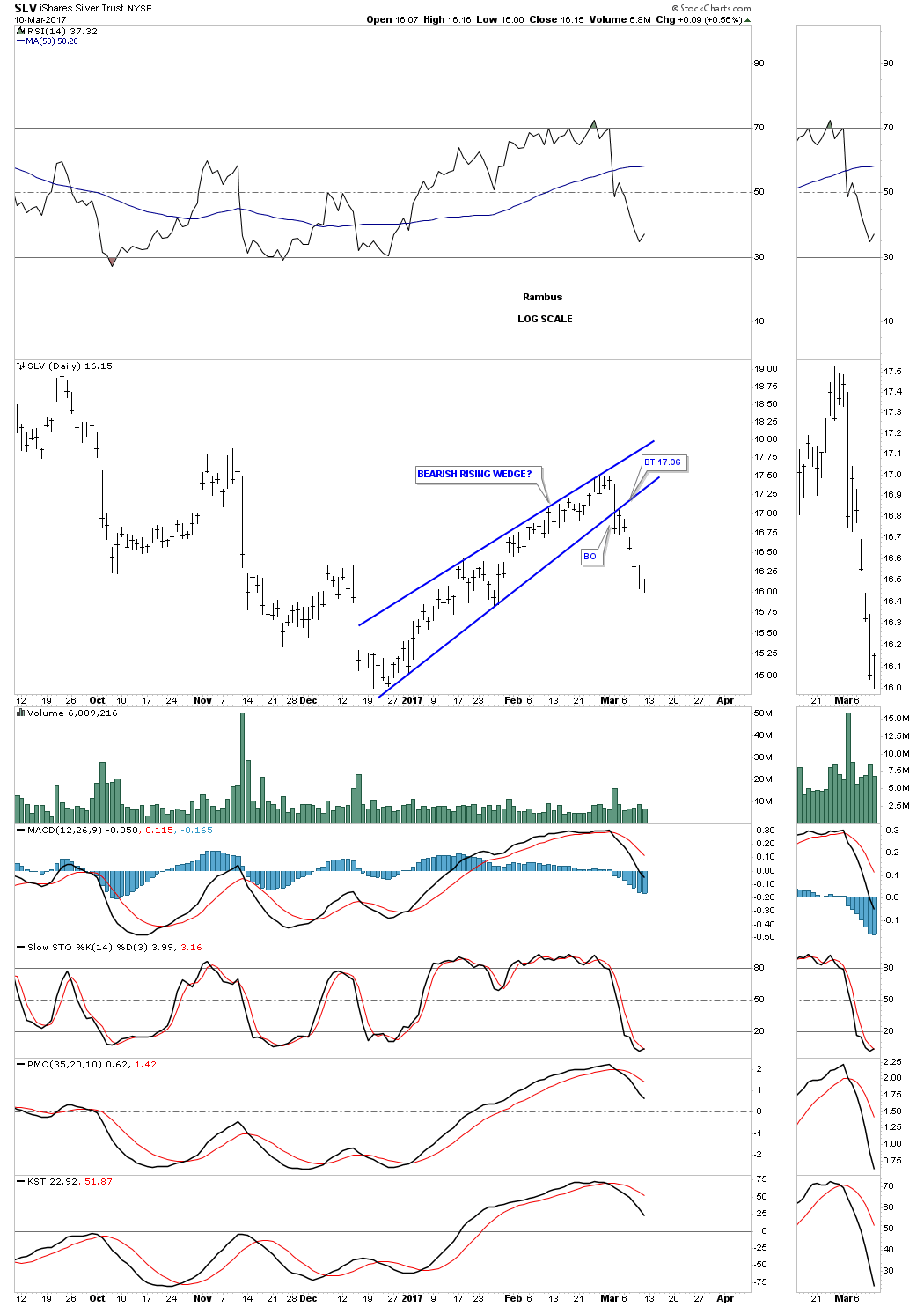
Below is a daily chart for SLV which shows a bearish rising wedge that broke below the bottom rail 8 days ago and began moving lower after a quick backtest to the bottom rail.
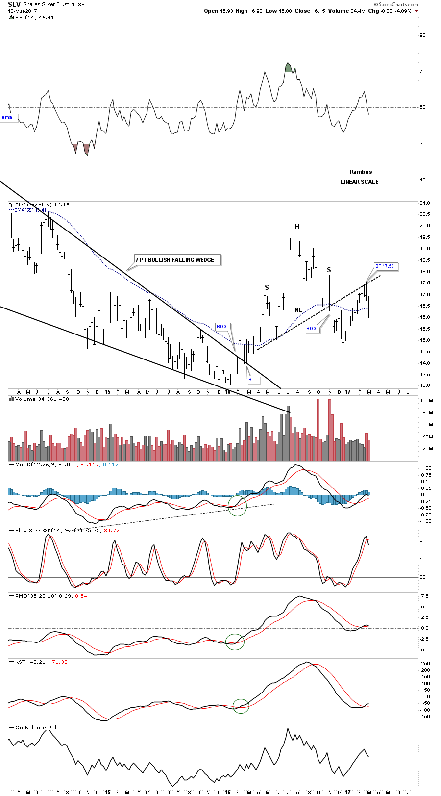
Below is a weekly chart for SLV which doesn’t show a bearish rising wedge, but it does show the backtest to the neckline which occurred 2 weeks ago about the same time as the bearish rising wedge was breaking down. Two bearish patterns back to back.
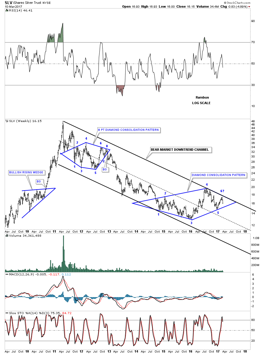
This next long term weekly chart for SLV doesn’t show a bearish rising wedge, but the bear market downtrend channel and the 6 point diamond consolidation pattern that is building out. The diamond won’t be complete until the bottom rail is broken to the downside.
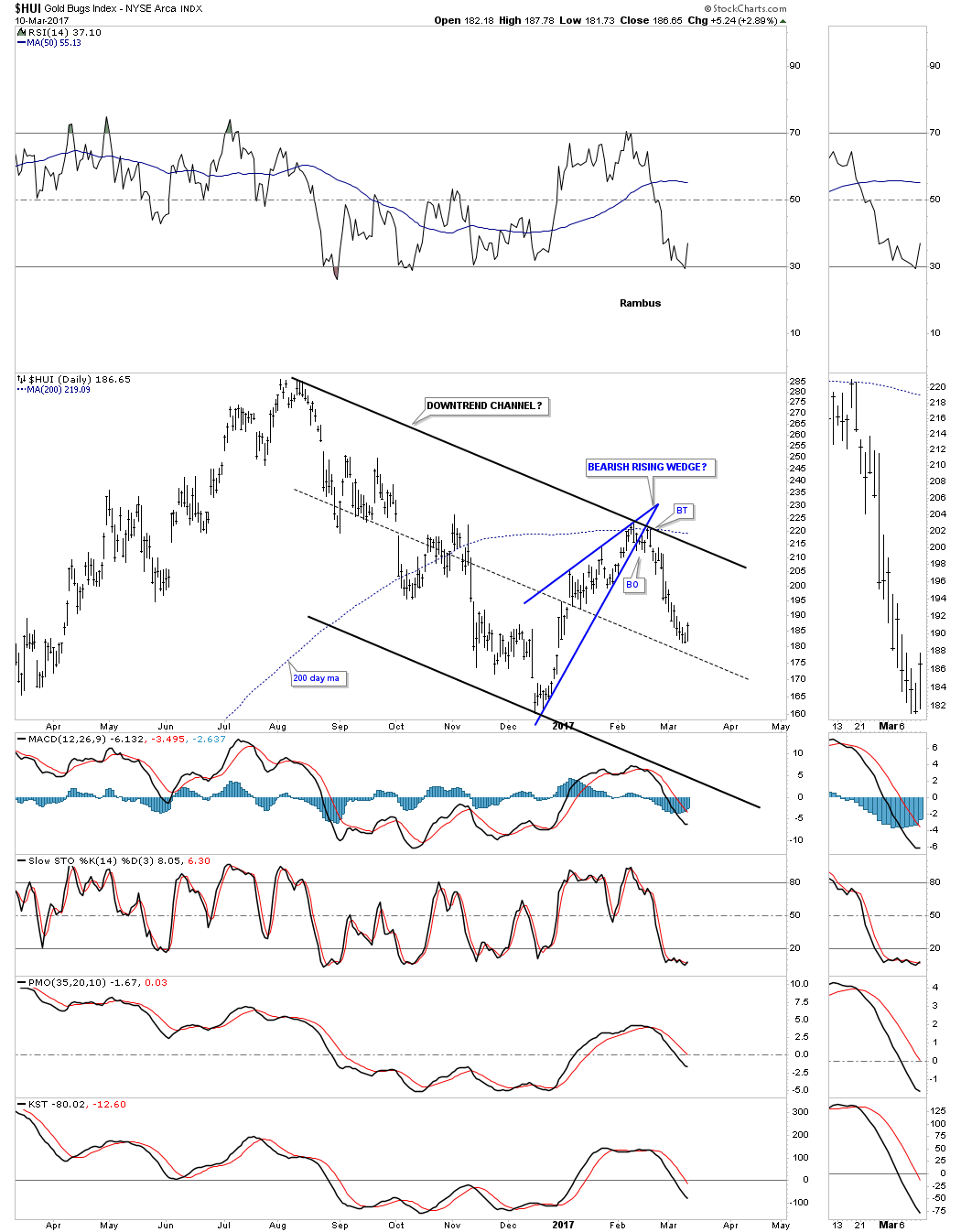
The HUI has broken out of a much smaller bearish rising wedge back in early February.
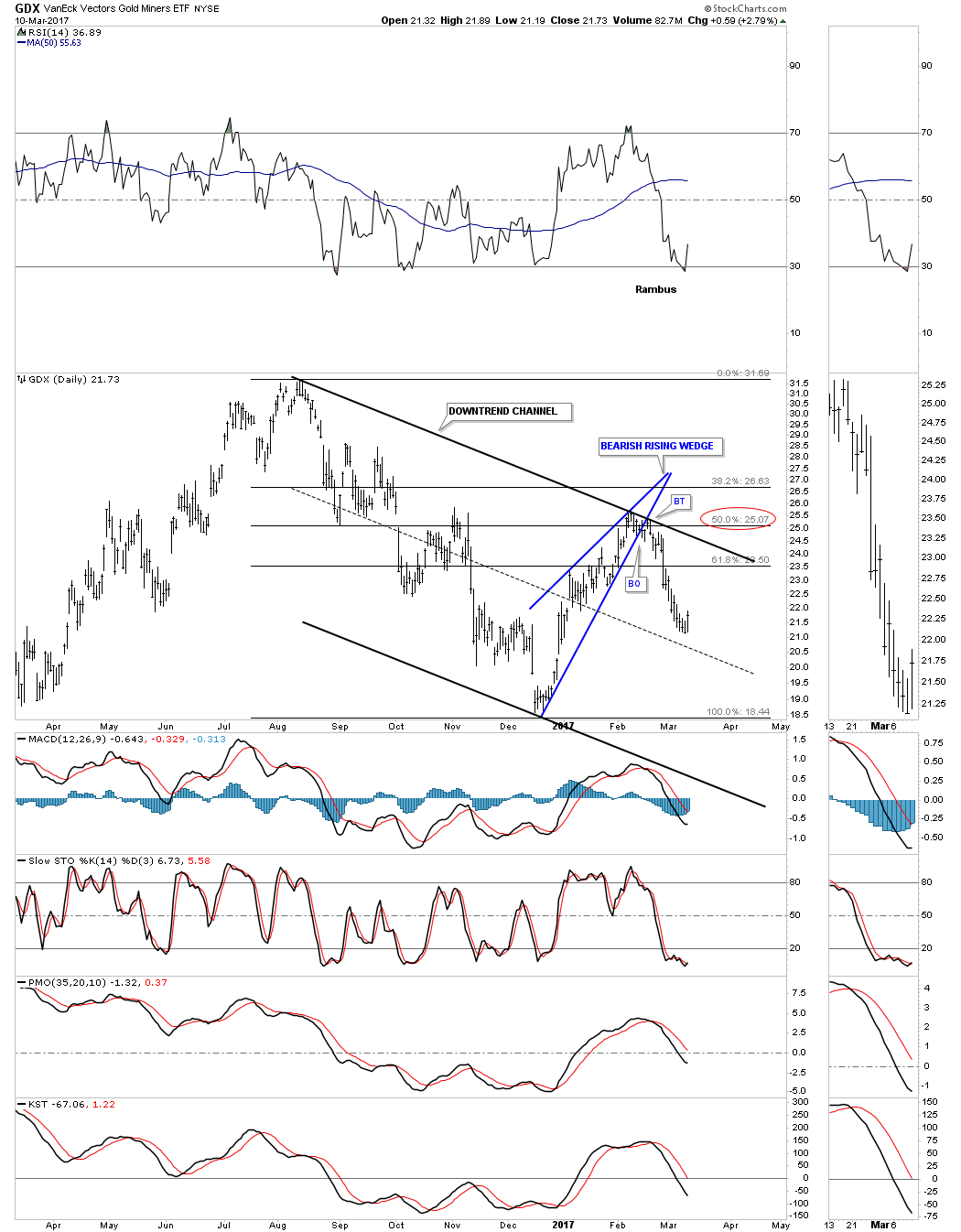
GDX bearish rising wedge.
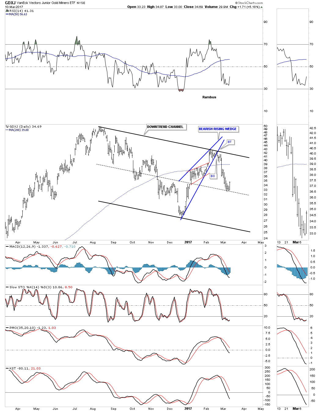
GDXJ is finding some initial support on the center dashed mid line.
The precious metals stocks have taken it on the chin since the high on February 8th and need to start building out some type of consolidation pattern to relieve the oversold condition. If the bulls are in charge they need to build out a reversal pattern reversing the decline out of the February high. If the bears are in charge we should see a consolidation pattern of some kind form. As it stands right now the bulls are on the ropes and need to step up to the plate and do what they do in a bull market, make higher highs and higher lows. All the best…Rambus