This content is for Yearly and Monthly members only.
Subscribe
Subscribe
Already a member? Log in here

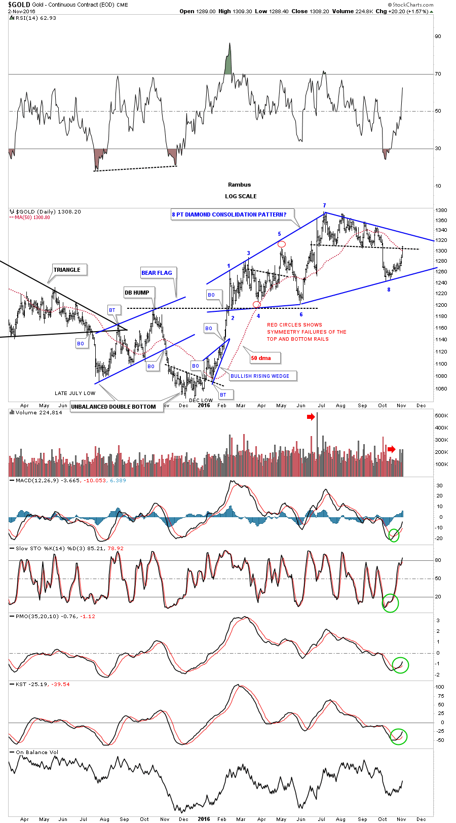
Tonight I would like to look at some gold charts as it has been showing some relative strength since October. We can even go back to February of this year which shows a possible big diamond consolidation pattern building out. Regardless of whatever trading discipline one uses the last nine months of price action has been difficult at best to read.
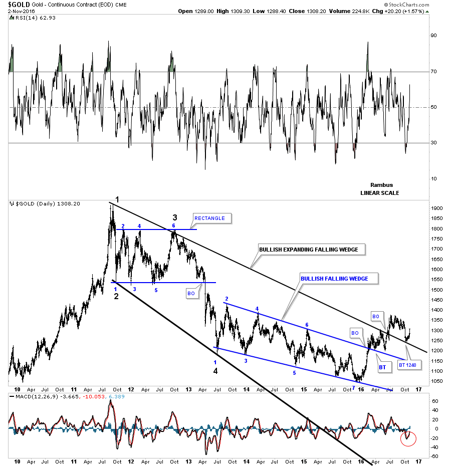
This next chart is a linear scale chart for gold which I think may be the most important chart to help give us a sense of the bear market that began in September of 2011. What makes this chart so interesting is the breakout and backtest to the top rail of the bear market expanding falling wedge.
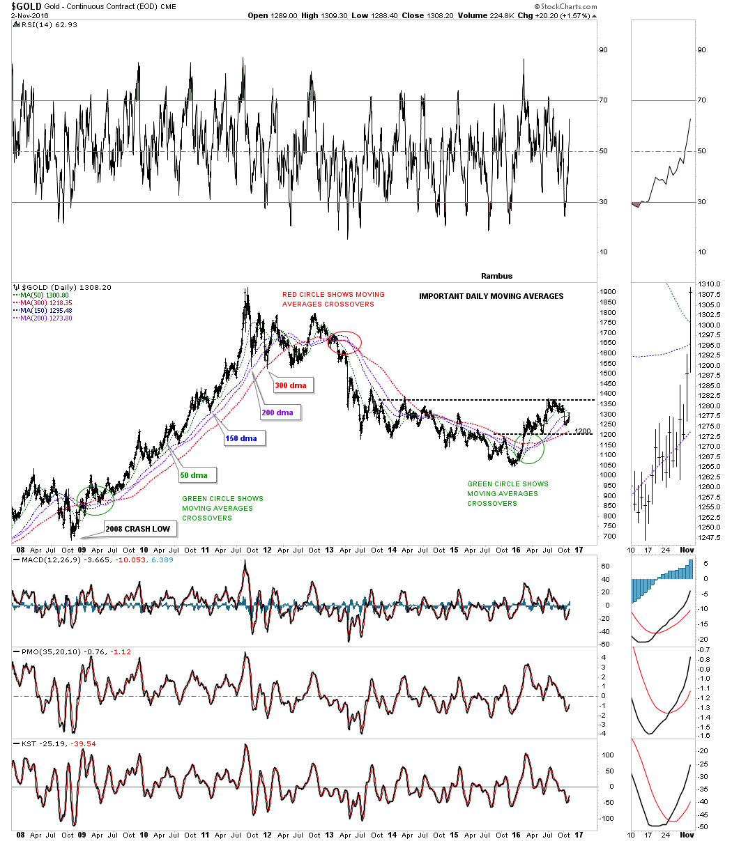
This next chart for gold is the important moving average crossover chart which shows the four most important daily moving averages for gold. The green circle back in 2009 shows when they all became positively aligned and led to the parabolic run to 1920. Then in 2013 they all became negatively aligned to the downside which led to the bear market as shown by the red circle. It took three more years of bear market price action to finally get the four important moving averages bullish aligned again which occurred in April of this year.
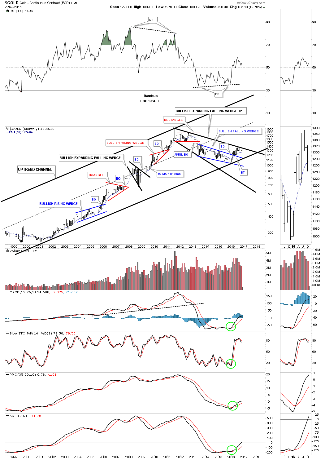
This next chart for gold is an eighteen year log scale chart which shows the bull market uptrend channel that began to form back in 2000 or so. This log scale chart gives us a slightly different view of the bear market expanding falling wedge which shows the price action still trading below that important trendline. The 10 month ema has done a good job of holding both support and resistance during this now almost 17 year bull market.
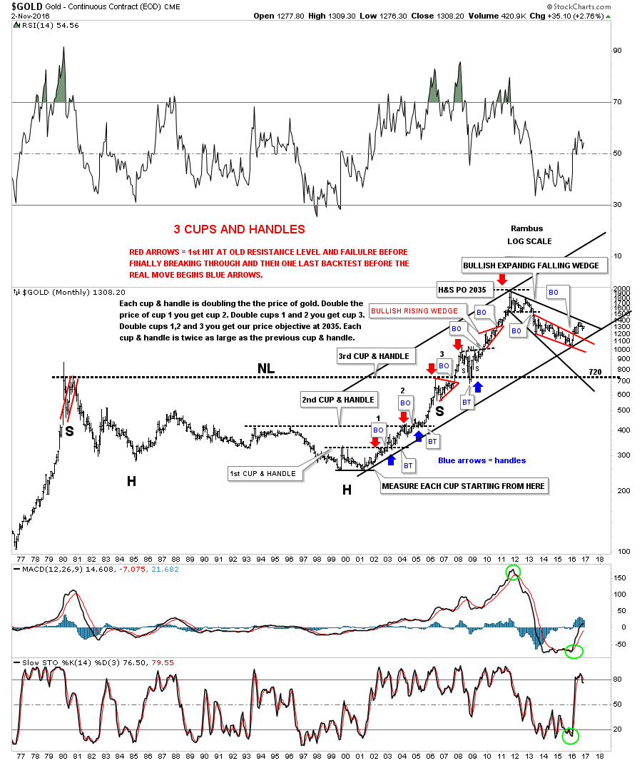
This last chart for gold is a 40 year look which shows a massive 27 year H&S consolidation pattern and the bull market uptrend channel that began in 2000. The bottom line is that as long as the bottom rail of the 2000 uptrend channel remains intact I will remain a bull. All the best…Rambus