This content is for Yearly and Monthly members only.
Subscribe
Subscribe
Already a member? Log in here

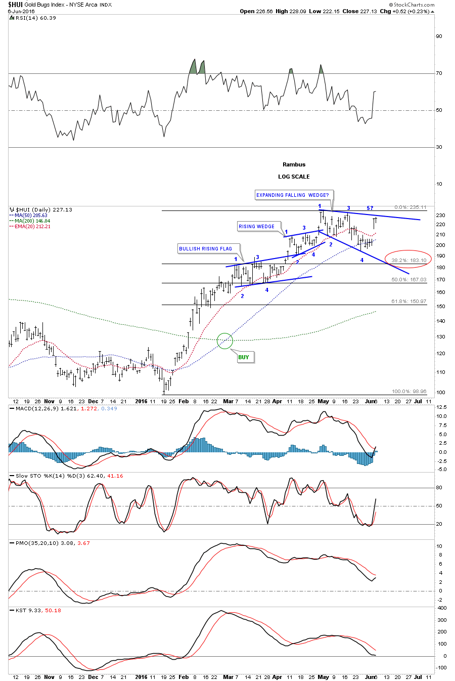
There are two patterns I’m watching very closely in here on the HUI which will be a proxy for the rest of the PM stock indexes. This first chart is daily chart which shows the three small consolidation patterns that have formed since the January low. The top pattern basically completed its fourth reversal point today which is an expanding falling wedge. One of two things will most likely happen tomorrow. If this is the correct consolidation pattern then we will most likely see a breakout gap above the top rail which should lead to the next impulse move up. The second scenario would be to see the top rail hold resistance and a move down to the bottom rail of the expanding falling wedge where the 38% retrace would come into play around the 183 area. This pattern is complete except for the breakout.
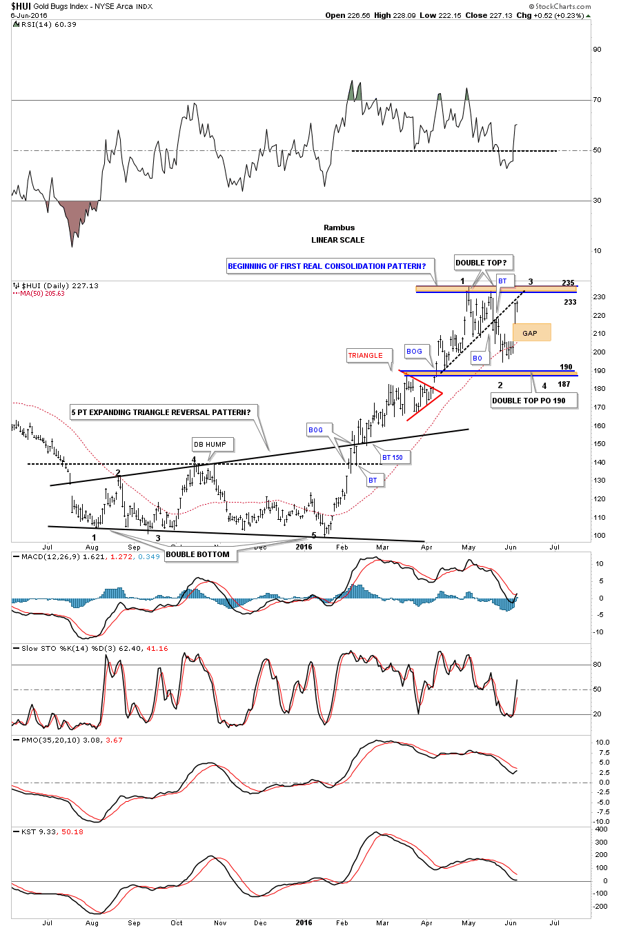
Below is another daily chart we’ve been following which shows a possible bigger consolidation area forming with the second reversal point coming into play at the top of the trading range. If and that is a big if, if the top of the trading range does hold resistance then we’ll need to see one more decline toward the bottom of the trading range to complete the 3rd reversal point, which would then setup the all important area to begin the fourth reversal point back up to the top of the trading range to complete whatever consolidation pattern develops. We won’t know what pattern we have until we have the four reversal points in place. As bullish as this sector seems right now it’s hard to imagine that big gap getting filled but it’s a possibility. There are no laws though that says the gap has to get filled, it’s just that most of the time they do get filled at some point.
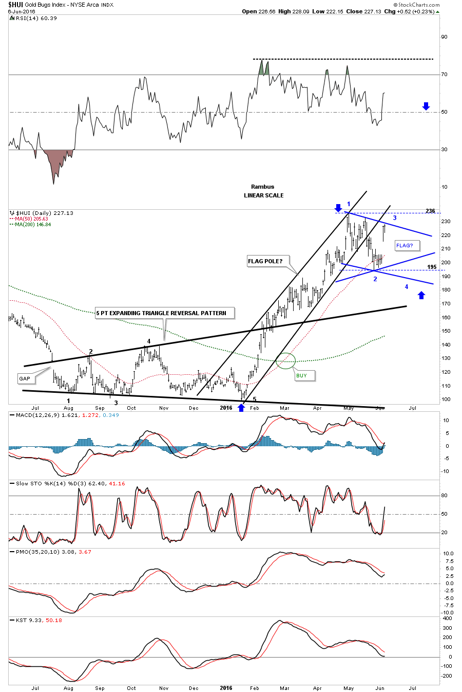
This next daily chart for the HUI would be the most bullish pattern we could ask for. The initial rally that began at the January low to the April high could be called a flag pole. Whatever consolidation pattern we get starting from the April high would be called the flag. The blue trendlines shows the two most likely patterns that may form the flag. I’ve also added a horizontal dashed line at the top and bottom of the trading range that would show a rectangle. So there is a possible triangle, falling flag or rectangle that could form the flag. The most important thing to watch right now is what happens up here at the top of the trading range.The blue arrows would measure the halfway point from where ever the last reversal point takes place in the bull flag. The higher the last reversal point the higher the price objective.
If the HUI gaps up big tomorrow morning then the first chart we looked at, the expanding falling wedge, will most likely be the next consolidation pattern that leads the next impulse move up. The bottom line is to be prepared for either scenarios.
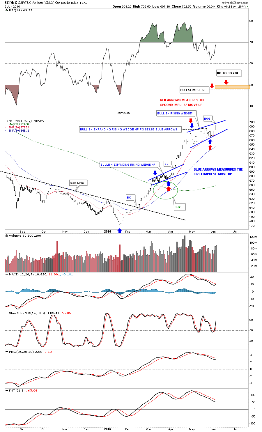
I’ve been watching the $CDNX for clues also, which may have given us a big one today. I wanted to wait for the end of the day to see if the price action held above the top rail of its small blue rising wedge. It did and closed at the high for the day. The blue bullish rising wedge would equate to the first pattern we looked at on the HUI which was the falling expand wedge.The blue arrows measures the first impulse move up that was separated by the bullish expanding rising wedge as the halfway pattern. The red arrows measures the second impulse move up if the blue bullish rising wedge works out as a halfway pattern. The rally would probably last four to five weeks before the price objectives are reached. Again have your favorite PM stocks ready to go in case this scenario plays out.