This content is for Yearly and Monthly members only.
Subscribe
Subscribe
Already a member? Log in here

About a month or so ago I started posting regularly on the possible inflection point I was seeing in regards to the deflationary trend that has been on going since 2011. As you know stocks move from a reversal or consolidation pattern in an impulse move which is much different than a sideways chopping action of a reversal or consolidation pattern. Impulse moves are the stored up energy that is released once a reversal or consolidation pattern is finished doing its job. About four weeks ago it looked like the most recent consolidation phase was coming to an end which would then leave the door opened to an impulse move.
At the first writing of the possible inflection point the US dollar was still trading within the confines of its possible bullish falling wedge which I viewed as a consolidation pattern to the upside. Shortly after that first post on the possible inflection point the US dollar broke out of its bullish falling wedge and is now approaching its previous high just above 100 or so. The US dollar is the key driver for this deflationary spiral that has been in place for over four years now with no light at the end of the tunnel for the commodities complex yet.
You’re probably getting tired of all the post on the US dollar but this is where the truth lies in regards to the falling commodities complex. Without a rising US dollar the deflationary scenario would not have a chance of playing out. Some of the more important commodities have now started their next impulse move lower which could very well be the capitulation phase where the baby is thrown out with the bathwater. If this is the beginning of the capitulation phase it should be relentless in nature whereby investors just throw up their hands in disgust and exit their positions at any price.
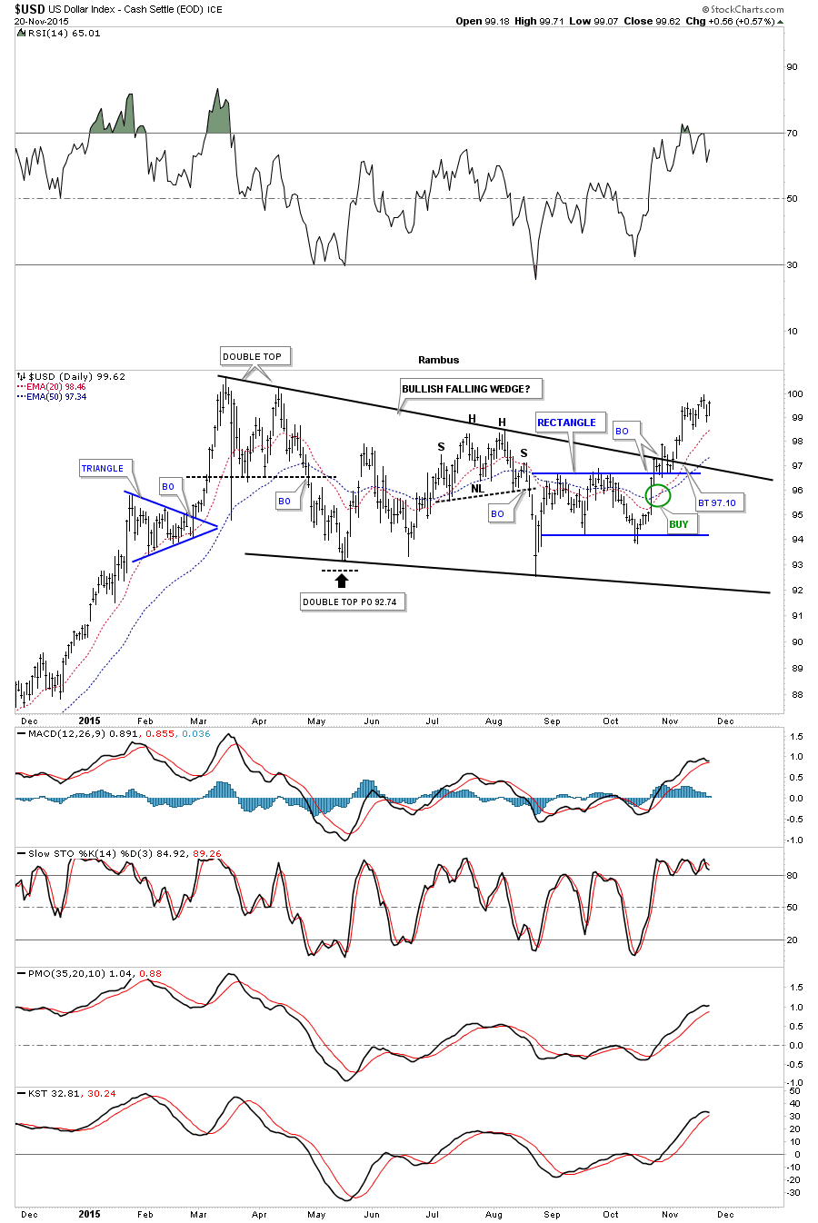
The first chart of many tonight is a short term one year daily chart for the US dollar that shows the bullish falling wedge in detail. The breakout was just a tad on the sloppy side but the top rail of the blue rectangle, that formed out toward the apex, held support which has led to the current move higher. As you can see the price action is approaching the high made back in March of this year which the US dollar will need to take out to confirm then next impulse move higher is truly underway. So far so good.
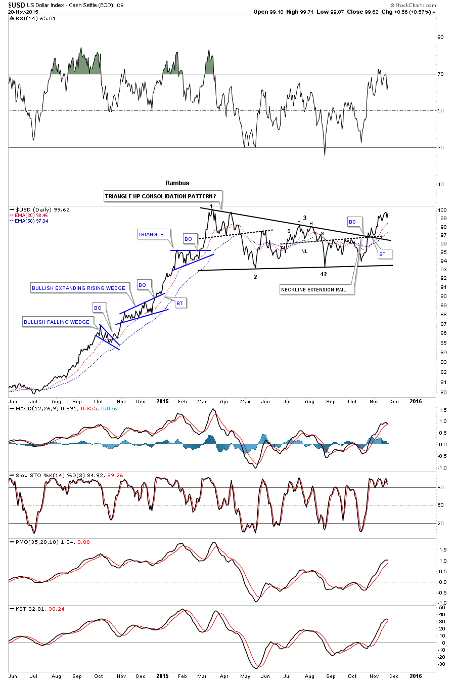
The longer term two year daily chart for the US dollar shows the previous impulse move up out of the five point blue rectangle reversal pattern in 2014. That impulse move created three smaller red consolidation patterns which is what one likes to see during a strong impulse move.

Below is a daily line chart which shows the previous impulse move up with a nice clean breakout and backtest of the bullish falling wedge. Again you can see the three smaller blue consolidation patterns that formed in that strong impulse move up.
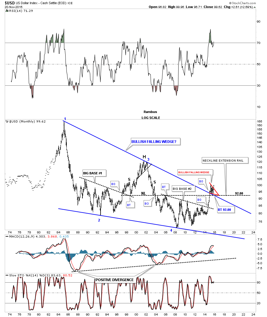
This next chart is a 30 year monthly bar chart I showed you many times once the top rail of the blue bullish falling wedge was broken to the upside. This chart is a very important to understanding the longer time view. Note the breakout and backtest to the top rail of the 30 year bullish falling wedge which shows the small red bullish falling wedge which is the same falling wedge we just looked at on the daily charts above. Pieces of the puzzle.
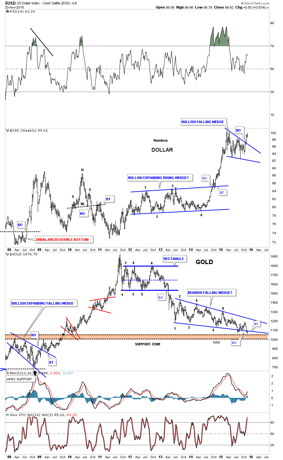
This next chart is a weekly combo chart which has the US dollar on top and gold on the bottom. Note how close the US dollar is to testing its recent high while gold is testing its recent low. If the US dollar is getting ready to breakout to a new high then it stands to reason that gold will break to new lows as the inverse correlation comes into play.
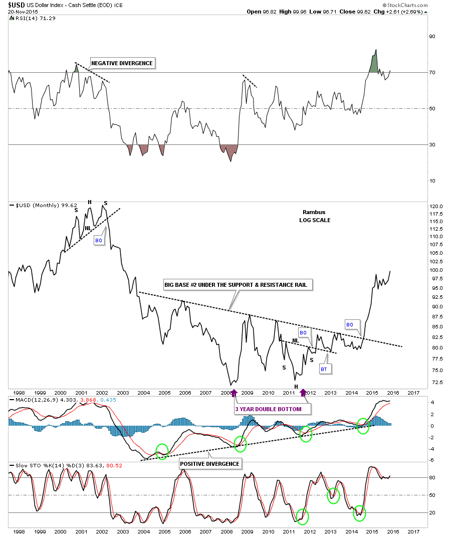
If the US dollar can close out the month of November right where it’s now it will be at a 13 year high on the long term monthly line chart and a new high for its bull market.
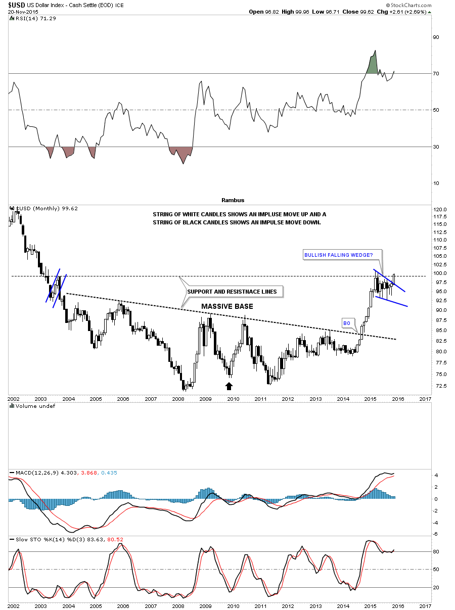
Lets look at one last chart of the US dollar which is the monthly candlestick chart. This chart clearly shows that when the US dollar is in a strong impulse move up it will produce a string of white candlesticks and when it’s in a strong impulse move down it will form a string of black candlesticks. The previous impulse move up created nine white monthly candlesticks in a row.
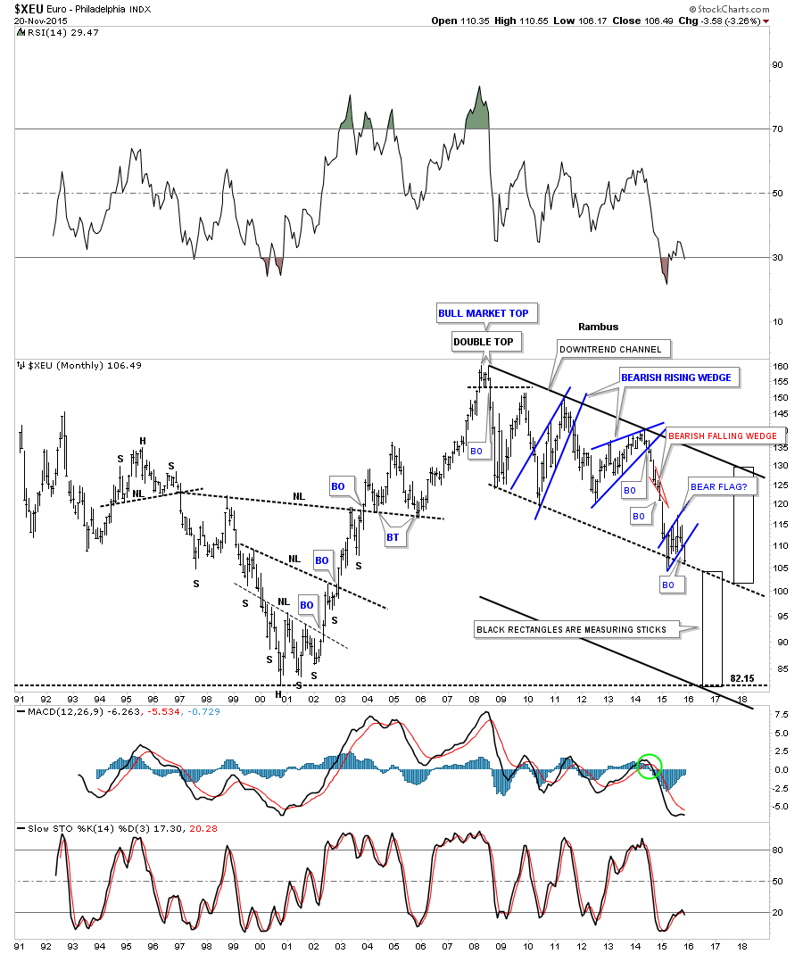
If the US dollar is breaking out of a bullish falling wedge then there is a good chance that the $XEU is breaking out of a similar pattern only in the opposite direction. The long term monthly chart for the $XEU shows this to be true.
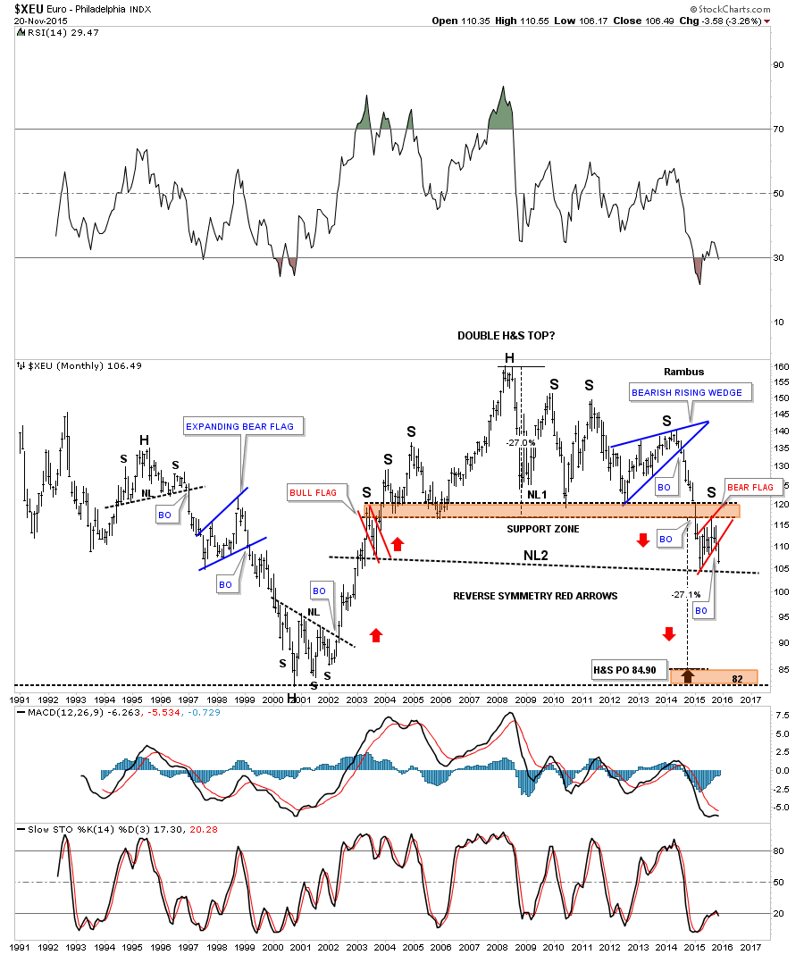
The long term monthly chart for the $XEU shows a different pattern that has the same implications as the chart above if it breaks below the black dashed down slopping trendline which would be showing us this latest impulse move down is just halfway finished.
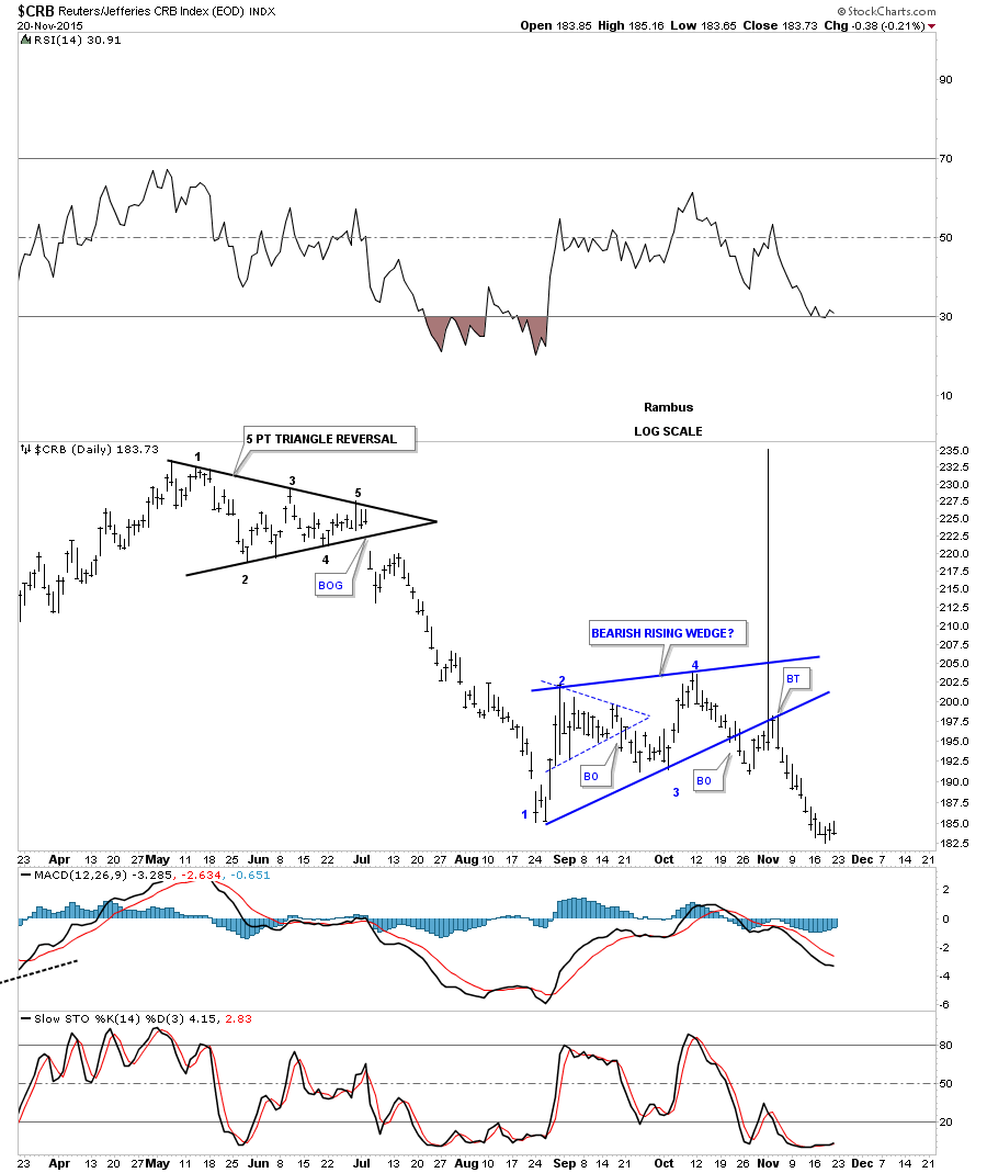
If the US dollar is showing strength in here then we should see some weakness in some of the commodities indexes. The daily chart for the $CRB index shows it has broken down out of the blue bearish rising wedge complete with a backtest.
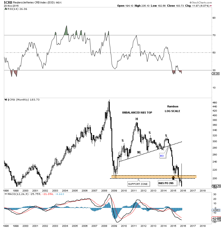
The monthly chart for the $CRB index shows it has broken down below the brown shaded S&R zone with a backtest to the underside currently testing its bear market lows.
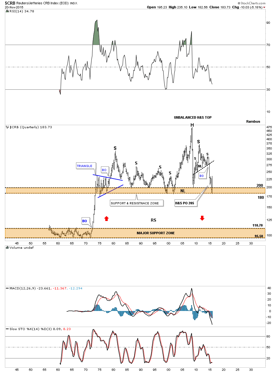
The very long term 60 year quarterly chart for the $CRB index now shows how close it’s to breaking below the brown shaded support and resistance zone going all the way back to the early 1970’s. That’s pretty incredible when put it into perspective.
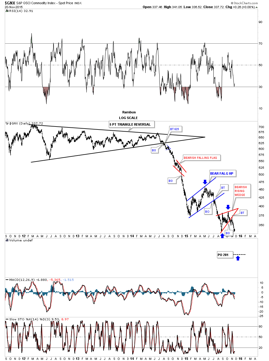
After breaking out from a five point black triangle reversal pattern as its bear market top the $GNX has created one consolidation pattern below the next showing us its bear market is still intact.
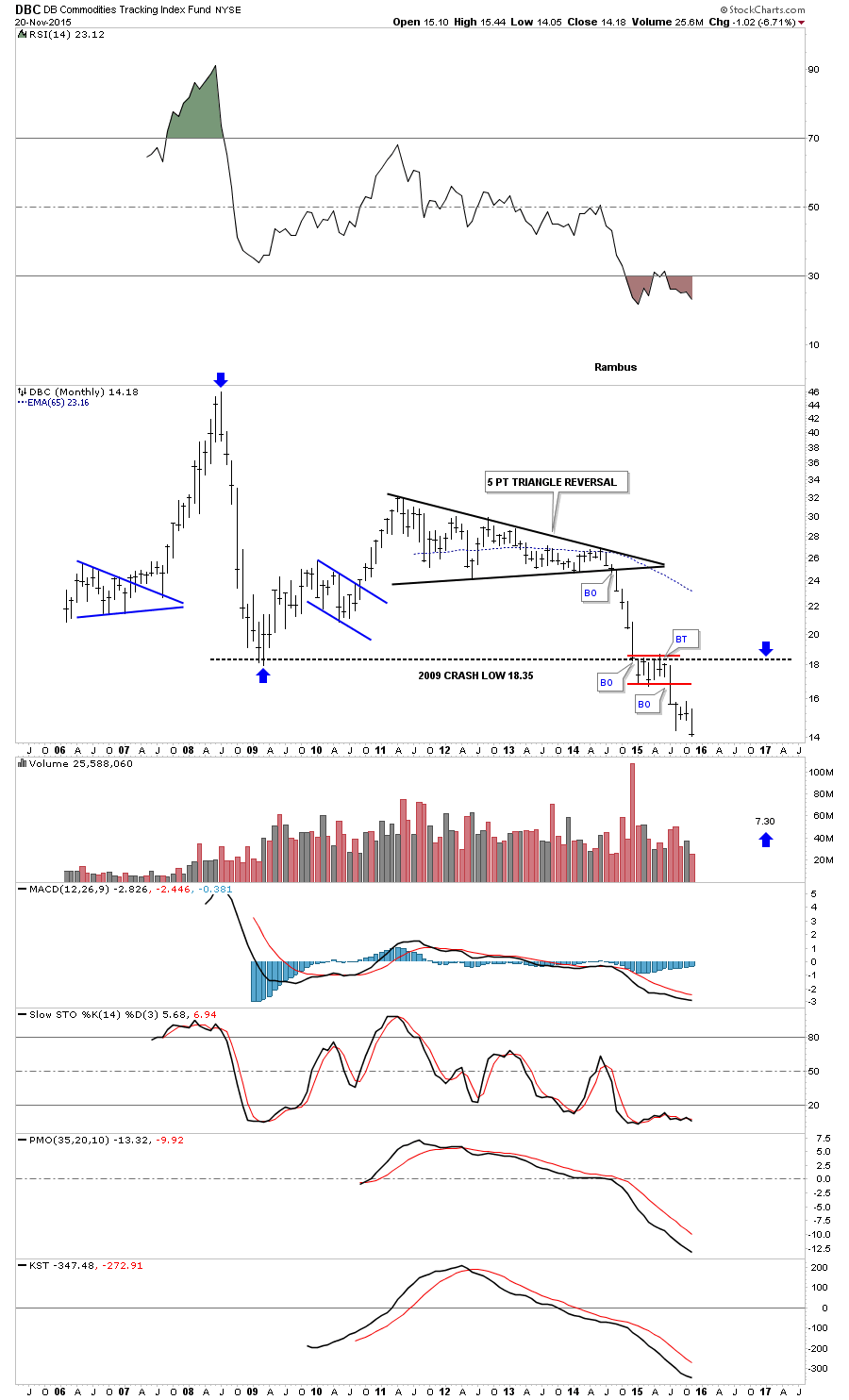
The DBC is probably the most actively traded commodities index to track. It too buillt out a black 5 point triangle reversal pattern as its bear market top. After breaking below the 2008 crash low the DBC then built out the red rectangle just below that very important support zone which has recently broken out to the downside making new all time lows.
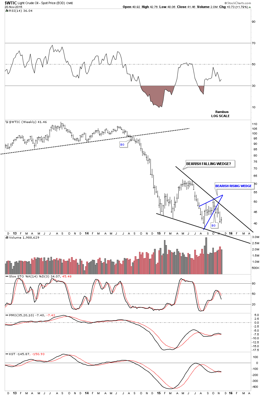
Lets now look at the most important commodity on the planet the $WTIC, oil index. The daily chart below shows a possible blue bearish falling wedge / H&S consolidation pattern forming. Last week oil was backtesting the neckline of a small H&S top that is forming the possible right shoulder.

Below is a daily chart for oil which shows the possible stand along H&S consolidation pattern.
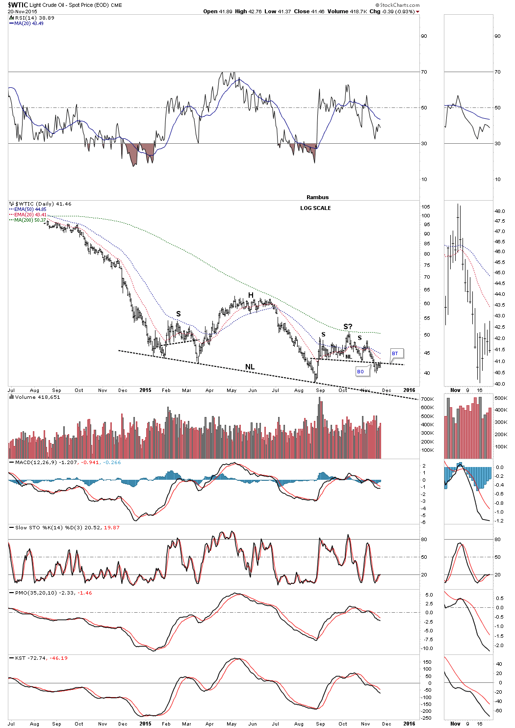
If you recall I used this daily chart for oil to take our first short position when the price action rallied up into the top rail of the falling wedge and the bottom blue rail of the bearish rising wedge.
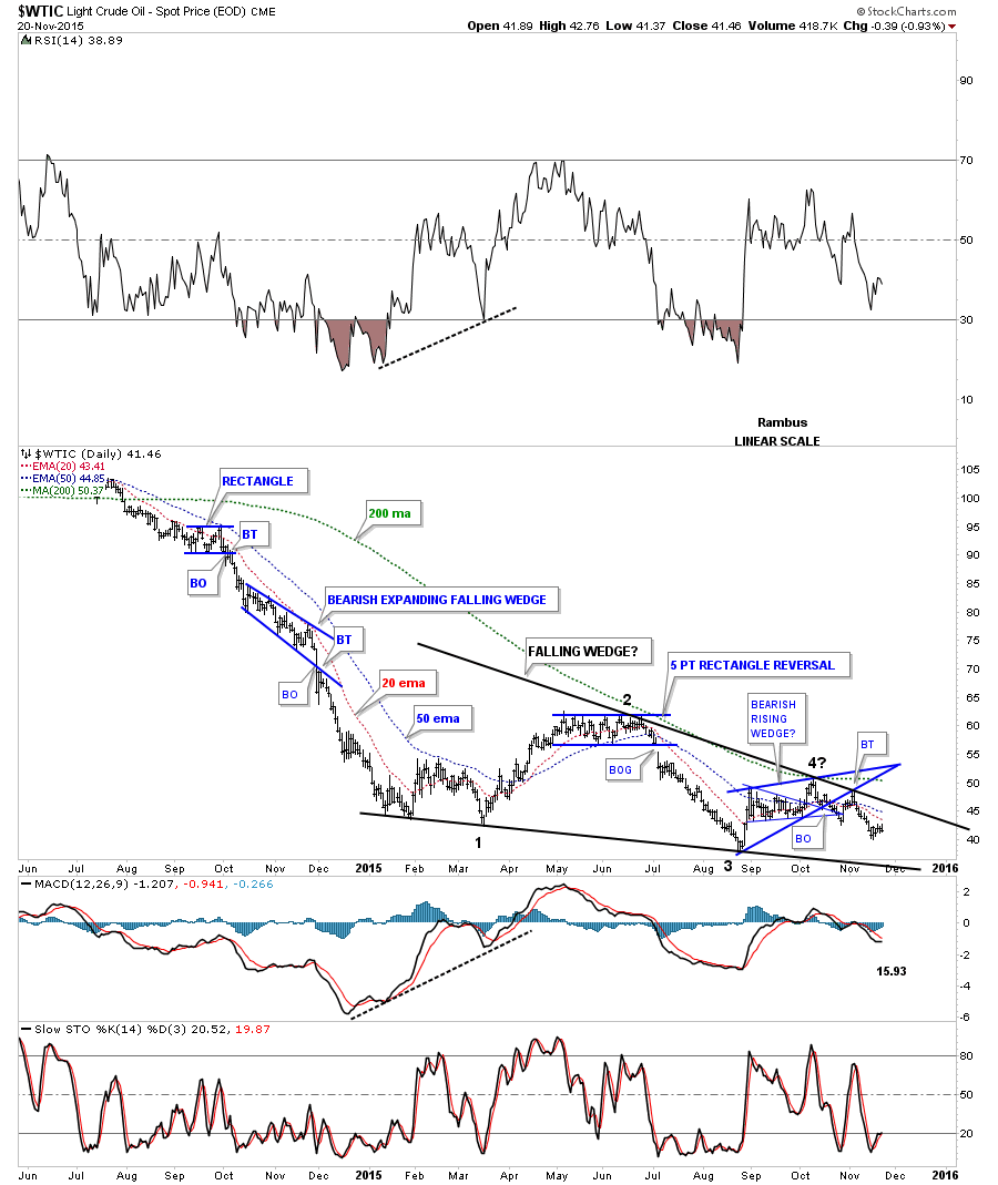
Below is a weekly chart which is showing us two wedges. There is the smaller blue bearish rising wedge forming inside of the possible very large black bearish falling wedge.
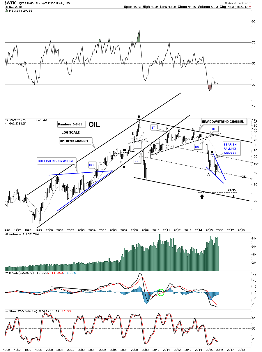
The 20 year monthly chart for oil shows how the larger falling wedge fits into the bigger picture as a possible halfway pattern to the downside within a possible downtrend channel.
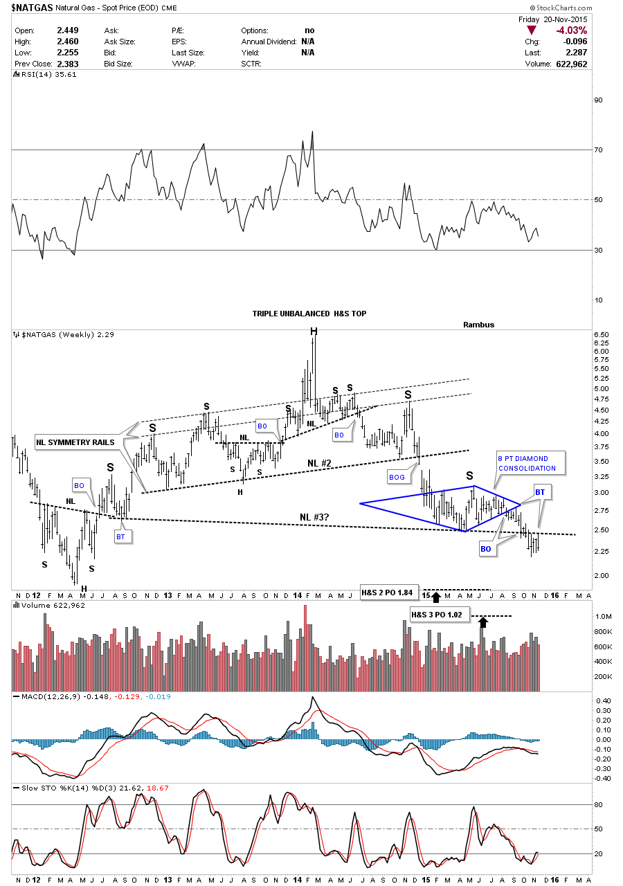
Natural Gas is another commodity that has taken it on the chin recently. The weekly chart shows a multi H&S topping pattern with a recent breakdown of the third neckline and a backtest to the underside last week.
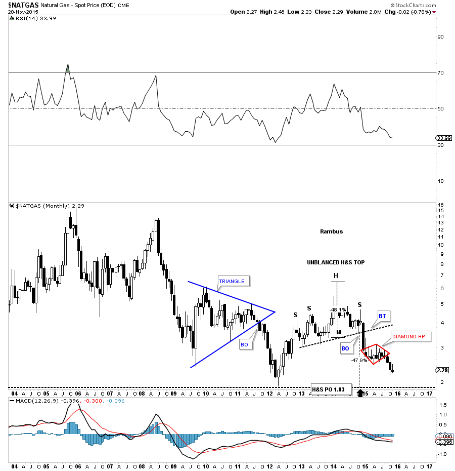
The 10 year chart for natural gas shows a H&S top with a huge breakout black candlestick signaling the H&S top was completed. You can see how the red Diamond pattern is forming as a possible halfway pattern.
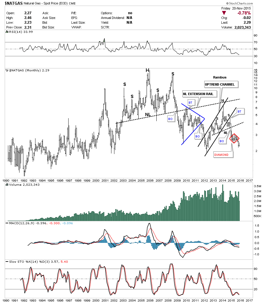
The very long term 25 year monthly chart for $NATGAS shows how the smaller H&S top, on the weekly chart above, fits into the big picture. As you can see it’s just part of a massive topping pattern that actually topped out in 2005 or so.
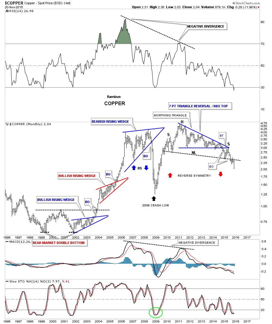
Next lets look at several more important commodity charts that gives us a feel for how long this deflationary episode may play out at a minimum. The long term weekly chart for copper shows a massive seven point blue triangle reversal pattern that is the head portion of an even bigger H&S top. The backtest to the neckline formed the small red triangle consolidation pattern which just broke down two weeks ago. It looks like the next impulse move down has begun.

The 20 year monthly chart for copper shows how the breakout from the six year H&S top is really just getting underway to the downside after completing the backtest.
The 40 year quarterly chart for copper shows us a possible low on top of the massive black flat top triangle around the 1.47 area. As this is a quarterly chart you can see there is still some considerable time left for the 1.47 price objective to be reached.

The monthly chart for KOL, coal etf, shows it has really declined sharply since topping out in 2011 with a huge H&S top. It’s now trading below its 2008 crash low.

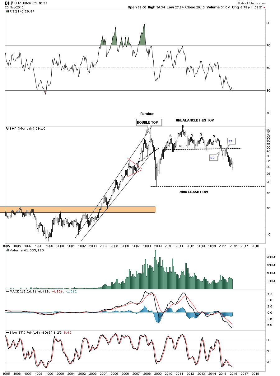
There are a couple of long term charts I would like to show you that relate to the commodities being in a weakened state. The monthly chart for BHP shows it’s in a well entrenched impulse move down.
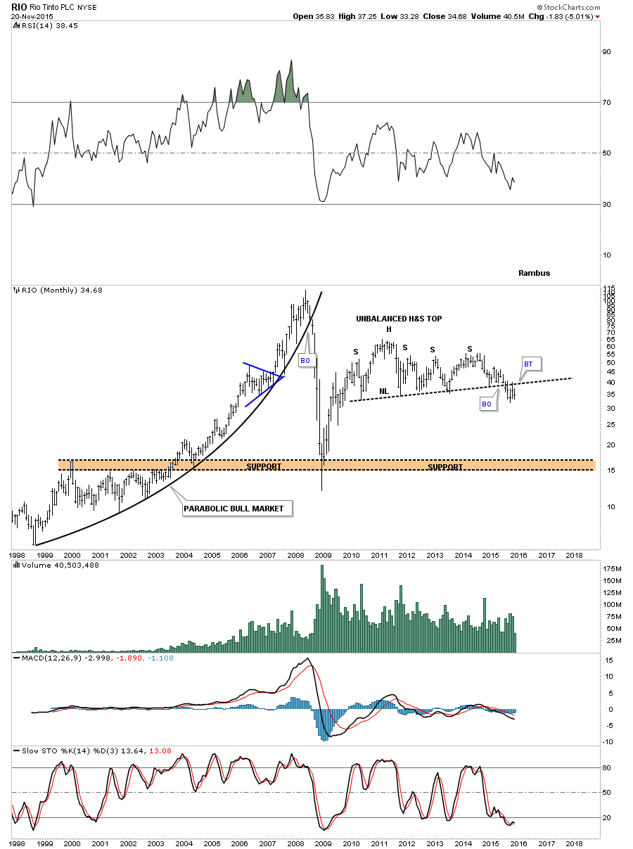
RIO looks like it’s finishing up with the breakout and backtesting process of a massive H&S top formation. During the bull market years it formed a parabolic uptrend which came to an abrupt halt leading into the 2008 crash lows.
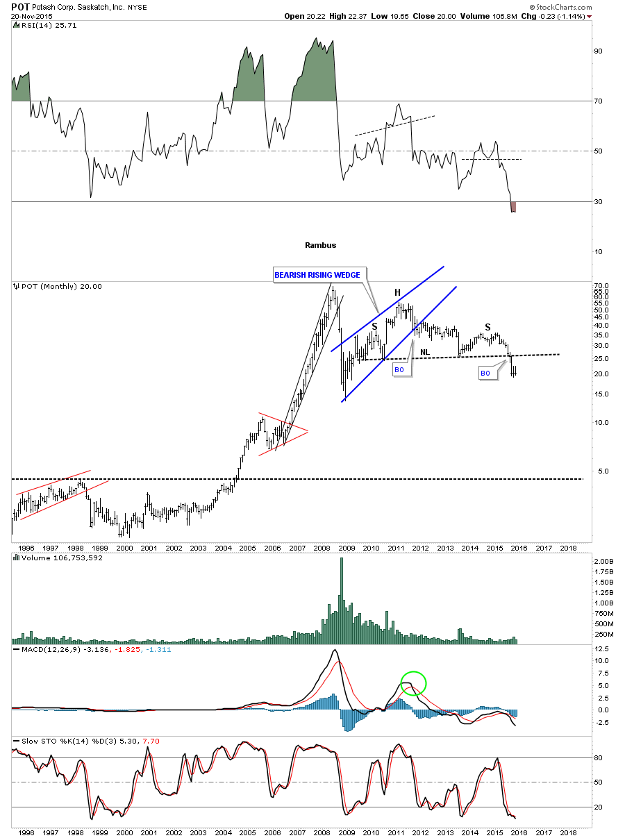
POT is another stock that looks like it’s completing a massive H&S top that has broken below its neckline.
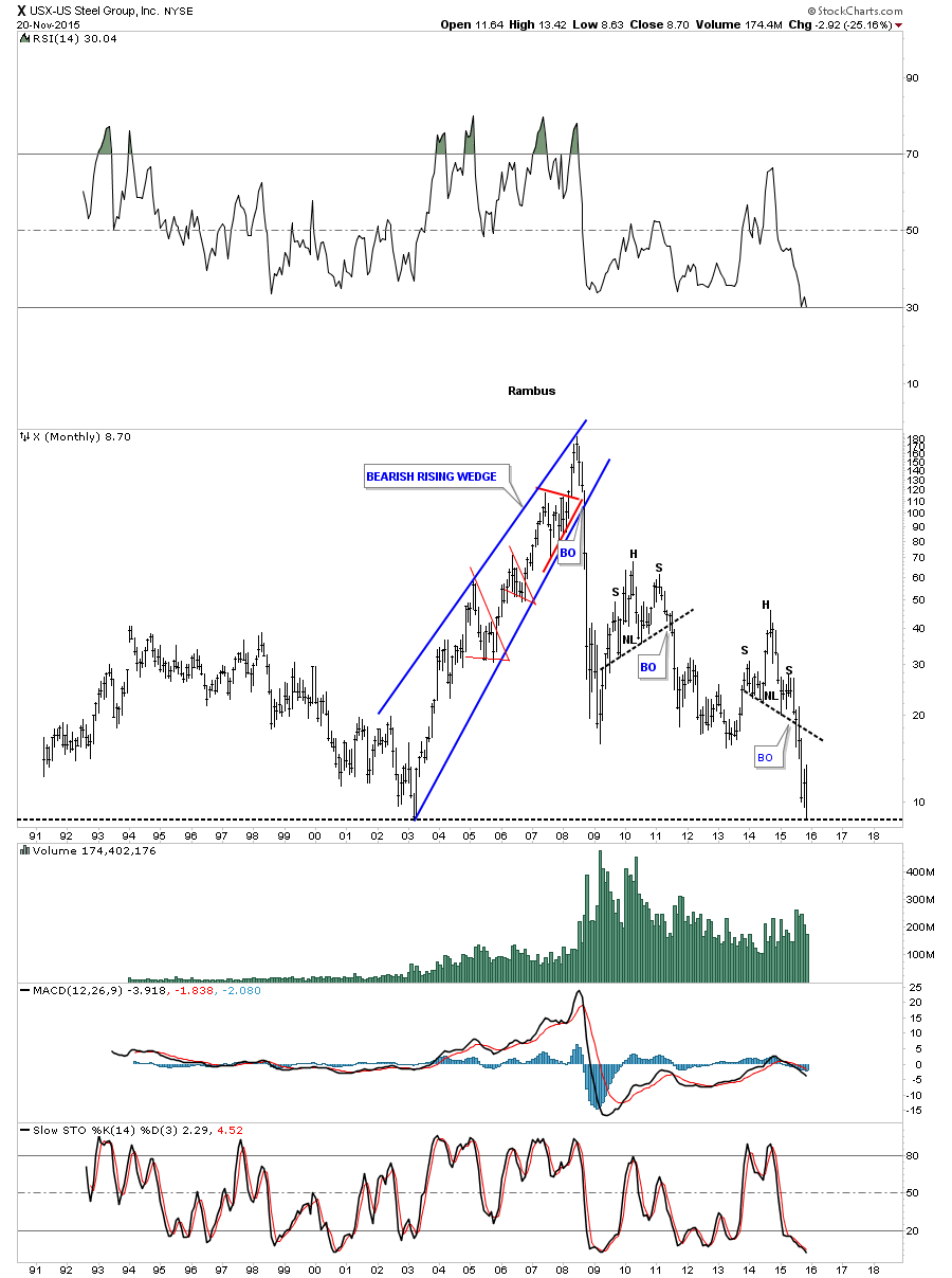
X in the steel area shows it’s closing in on its 2003 low.
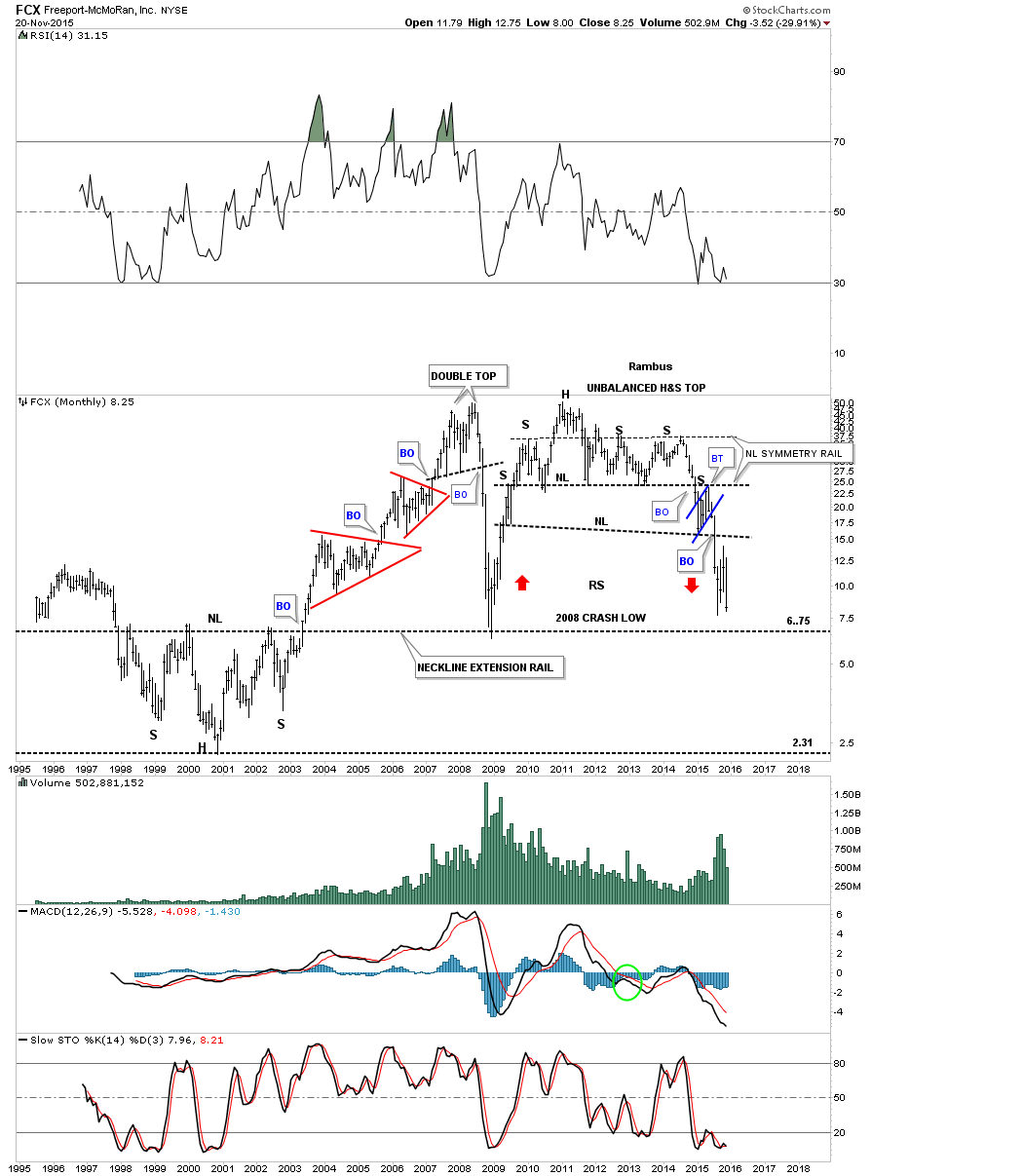
I’ve been positing this long term chart for FCX since the second right shoulder was building out on the unbalanced H&S top.
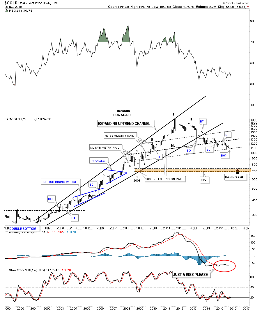
The last chart for tonight will be a long term monthly chart for gold which formed a bearish expanding rising wedge formation as its bull market. We still have another week of trading yet but you can see the last bar on this chart is currently making an ever so slightly new low for this bear market.
What these charts suggest to me is that there is still plenty of room to move lower in the commodities complex before we see a significant turn around. Nothing goes straight up or down but as many of the charts above show most have massive topping patterns followed by downside breakouts that are in some cases just getting started. Going forward is going to be interesting to say the least. All the best…Rambus