This content is for Yearly and Monthly members only.
Subscribe
Subscribe
Already a member? Log in here

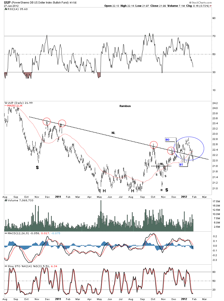
Just a quick update on the UUP dollar etf. We have now firmly closed below the big one year neckline. This is the reason I moved the stop up last week to persevere any profits some might have had. Its just as important to know when something is not working vs when something is working. The rally should have moved up and away from the neckline after the backtest and the longer it lingered there the more doubt it showed. Anyway this should now be good for the precious metals complex and the stock markets going forward.
UUP false breakout.
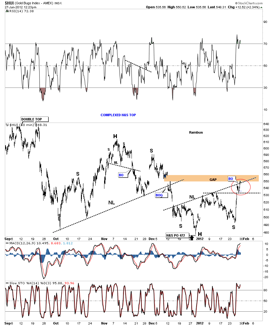
Today were going to look at the HUI from top to bottom. Its been a long two year drought for most of the precious metals stocks. When silver had it’s near parabolic move higher last year the stocks barely budged and even declined in many case. Same thing when gold had it’s big move later in the year. The frustration felt by the precious metals stock investors was beyond frustration. How could gold and silver have such big moves and the underlying stocks actually go negative. All I can say its the nature of the markets to make life as difficult as possible, to wear one out with frustration, and then when the investor finally can’t take it anymore he quits in disgust blaming everybody and everything for his failure. Remember we are competing against the best and brightest investors around the world who want your money. This is a game where only the strongest and smartest survive. So keep those thoughts in mind the next time you put your hard earned capital in markets. If it was easy everybody would be millionaires and we know that can’t happen no matter how smart we think we might be.
The first chart we are going to look at is the 60 minute look that is showing a rather strong unbalanced inverse H&S bottom. You may think that is not a H&S bottom but I can assure you I’ve seen these types of patterns play out before. Alot of times investors don’t see a pattern that is not text book in nature and won’t give it the time of day. Follow the neckline from the bottom left on up to the right side of the breakout, red circle on chart below. Notice how many times that neckline has been touched. We touched the neckline yesterday inter day, and that is why we had the mild sell off. The reaction yesterday took the price down to the previous high, horizontal black dashed rail where it found support. It also closed a small gap that was made on the open yesterday. Today’s action is exactly what we want to see. A strong move off the the horizontal support rail and the break of the neckline. Notice the big gap that is just above the inverse H&S neckline. That gap should get filled.
HUI 60 minute unbalanced inverse H&S with breakout and big gap overhead.
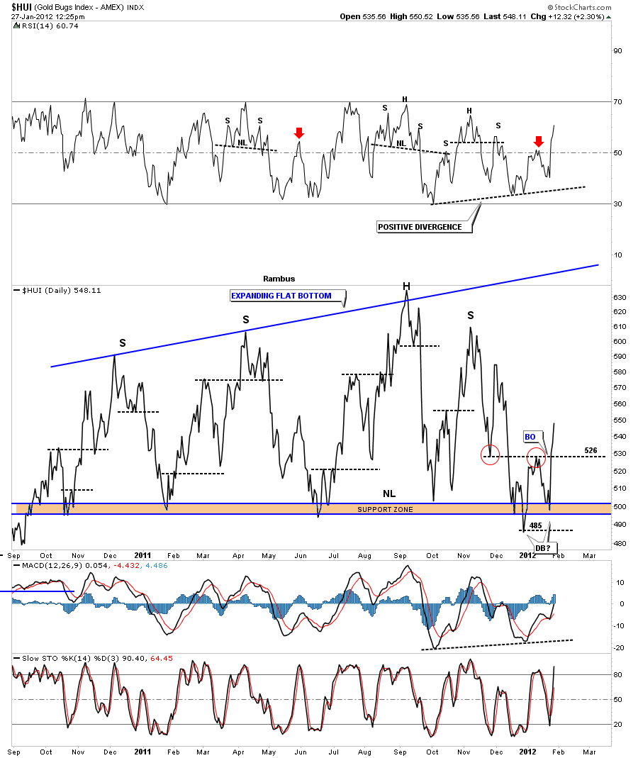
Next I want to look at the daily line chart that I’ve shown before showing the black dashed horizontal support and resistance rails. The last time I showed this chart we were looking at the 526 area, that was the previous low made on the way down, red circles on chart below. You can see how it stopped the initial rally dead in its tracks and the reaction that followed that took prices all the way back to the bottom of the big trading range. What this reaction did was create the second bottom of a double bottom reversal pattern. If for any reason we get a short term sell off the 526 area will now act as support.
HUI daily line chart showing support and resistance rails and our new double bottom.
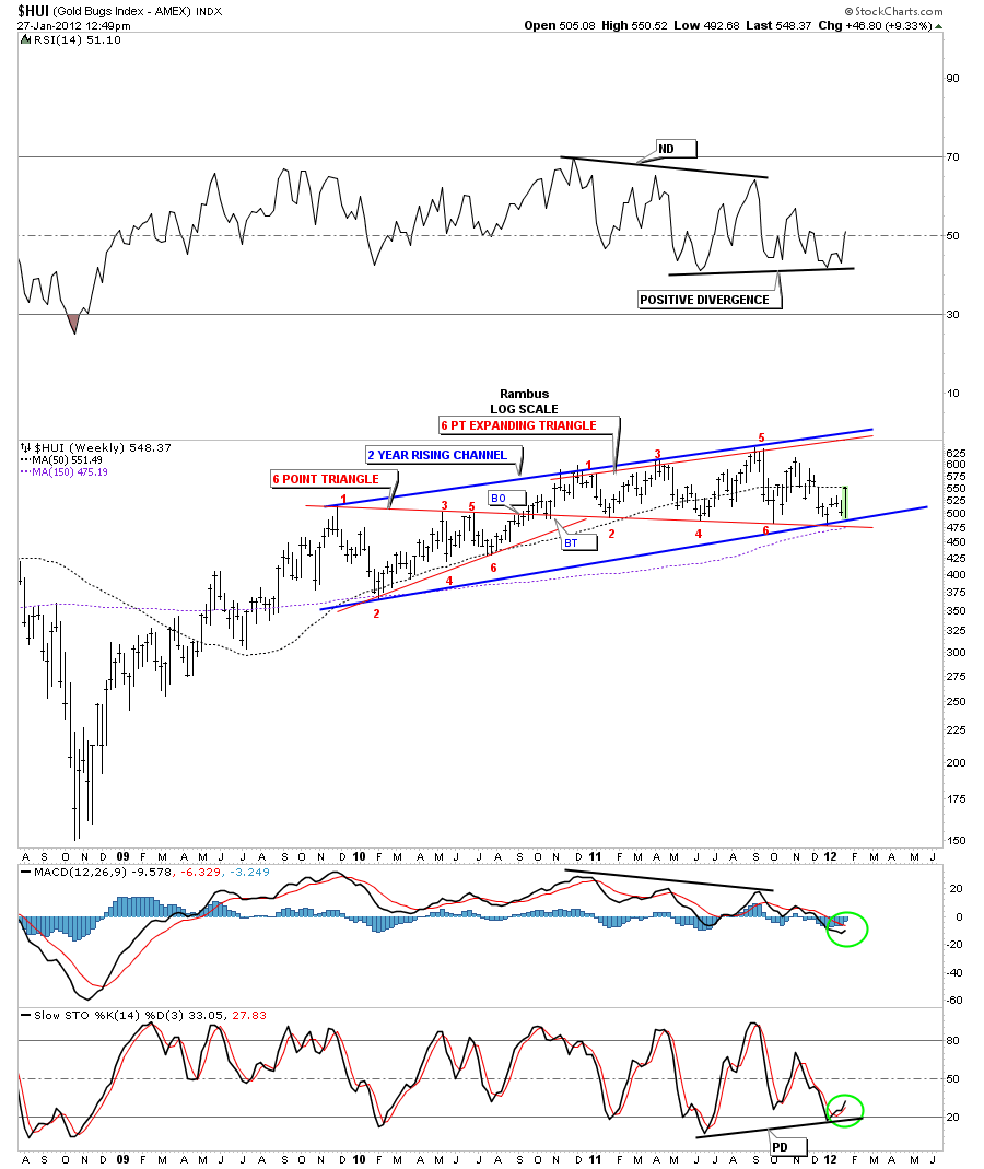
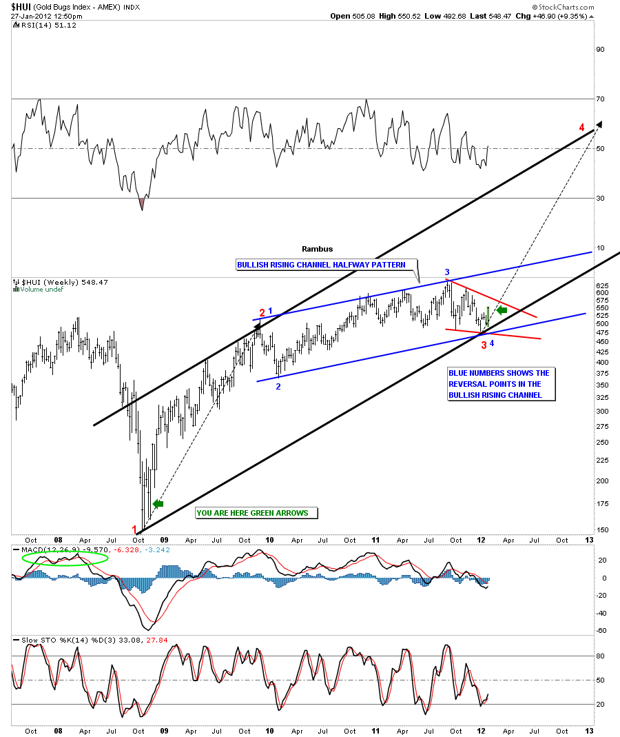
Next lets take a look at the weekly chart that goes back to the 2008 crash low for the precious metals stocks. After a strong one year rally, off the 2008 low, the HUI has been in a sideways trading range consisting of two patterns. The first pattern was a triangle and the second pattern is our current expanding triangle, both in red with numbered reversal points. I know it doesn’t feel like it but that 2 year bullish rising channel is what some would call a running correction. Folks this is a very bullish situation the precious metals stocks are now in. After two years of grinding torture it looks like this pattern is now maturing and we could very well be setting up the big move we have been anxiously waiting for. Note the slight positive divergence on the RSI at the top of the chart and on the slow stoch at the bottom of the chart. Also note the MACD is beginning to hook up and a crossover will set the stage for the next impulse leg higher.
HUI weekly 2 year bullish rising channel.
This next chart is what this post is all about. Here is what I think is about to happen with the precious metals stocks. We have been in a big drawn out correction for two years now. That is a big correction by any standard. What that 2 year bullish rising channel represents to me is, its a halfway pattern. If this plays out like I think it will this bullish rising channel will show itself as the middle point of a big rally that began off the 2008 crash low to the ultimate high that is higher than anybody is even thinking right now. All the pain and suffering over the last two years will be totally forgotten when this move tops out north of 1500 over the next year. Thats right, 1500 over the next year. The rally off the 2008 low took about one year to reach the first reaction high on the bullish rising channel. If this is the last low we are experiencing right now, at the bottom of the rising channel, it will take roughly the same amount of time to reach the top of the big black uptrend channel a year from now. This is how symmetry works in the markets. If you look at some of the charts in the model portfolio you can see similar action on a smaller scale, where the preceding rally, then consolidation, and then the rally out of the consolidation pattens, is very similar to the rally leading into the consolidation. Man that’s a mouthful. You may also notice, on some of the stocks in the model portfolio, have very large sideways consolidation patterns that will follow the HUI higher. They will be the leaders in the next impulse leg higher.
HUI weekly bullish rising channel halfway pattern.
We now have a road map to follow as this next upleg begins. There will be some hard shakeouts along the way, just look at the first impulse leg up off the 2008 bottom. The hardest thing for most investors is going to be, sitting tight for the next year as this next impulse leg unfolds. My job will be to find the best stocks to participate in this move to new highs by culling the ones that aren’t showing relative strength and adding the ones that are outperforming. Bottom line is our long anticipated move in the precious metals stocks may finally be at hand……All the best…..Rambus
I Believe Rambus is working on Seperate Charts to update his 10 PM Stock Pics which are presently listed under the Model Portfolio on the Right Side Bar…stand by for an update…lots of Work for the Professor
🙂
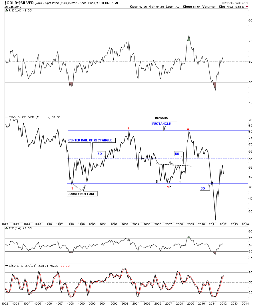
This week I’m going to look at the gold to silver ratio as requested by Sir riscott63. The first chart we are going to look at is a long term 20 year line chart that shows shows a huge 13 year rectangle. When this ratio if falling that means silver is outperforming gold. The ratio hit a high during the big crash in 2008 where gold had been outperforming silver for the last 2 years or so. From that high in the fall of 2008, point #4, silver went on an unprecedented run that took the ratio all the way back down to the bottom of the rectangle where it didn’t stop at the previous lows. When it broke the bottom rail of the rectangle it confirmed the rectangle was indeed a valid pattern. That low coincided with silver hitting it’s high for this bull market at 50.
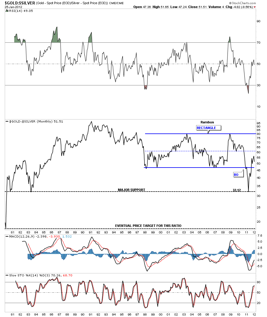
Below is a 30 year chart of the gold to silver ratio showing where silver finally bottomed out at against gold that went all the way back to the old bull market in 1980 and again in 1983. This chart really shows its been a very long time since this ratio has been as low as it was last year. Whenever I have a rectangle pattern I always draw in a thin dashed rail at the middle point of the rectangle, Sometimes the center point of a rectangle will act as resistance or support depending on which direction the move is taking place. Even after a clear breakout, a counter trend rally can make it all the way back into the center of the rectangle where it may reverse itself again in the direction of the previous move. I believe this gold to silver ratio maybe setting up this scenario. If you put this line chart to a bar chart you will see this ratio did make it up to the center dashed blue rail where it has reversed and maybe starting to head back down again. It could very well be that this ratio may work its way lower down below 20 where I believe a ratio of 15 ounces of silver could buy one ounce of gold when its all said and down. This would be pretty close to the normal ratio that had been in place for many hundreds of years. If this is the case then the ratio is showing that silver will be the place to be invested over the coming years.
Below is the gold to silver ratio chart, that I built several years ago, comparing the ratio to the SPX. This chart shows the clear implications of how the stock markets behave when silver is outperforming gold. As silver is used both as a commodity and a precious metal it plays a double role. When the stock market is in rally mode that puts pressure on silver as a commodity because it is used in alot of different technologies. So when we see the stock market going up we generally see the gold to silver ratio falling. As you can see from the 2008 stock market crash low silver has been outperforming gold, for the most part, as the stock market started a new bull market. You can also see when the ratio bottomed during our latest correction last year, and had a little counter trend rally, the SPX formed it’s correction low. What we want to see going forward is for the ratio to keep falling and the stock markets to go higher. If the stock markets are indeed embarking on a bull market run the gold to silver ratio should fall pretty low. Maybe all the way to the historic average around 15 oz silver to 1 oz of gold. This ratio chart will give us something to watch as the bull market unfolds for the stock markets and for silver. Note how the gold to silver ratio broke the bottom support rail during silver’s near parabolic move up to 50. Now that this long term support rail has been broken it should now be easier for the ratio to break below the bottom support rail and continue lower.

I hope this answers your question on who will be leading this next leg up in the precious metals. If the gold to silver ratio keeps falling the stock markets will continue to rise and silver will outperform gold, for the most part, going forward… All the best Sir riscott63…Rambus