This content is for Yearly and Monthly members only.
Subscribe
Subscribe
Already a member? Log in here

Tonight I would like to focus in on silver which remains one of the best bargains in the PM complex right now. When I first became acquainted with the PM complex back in early 2002 I learned quickly that just because gold may have had a good rally sometimes the PM stocks move very little which was confusing to me as I thought they should move in tandem. Then there were other times when the PM stocks would rally and gold didn’t move that much. It didn’t make a lot of sense at the time, but markets can be fickle like that.
Another thing I noticed back then was that silver was very weak and wouldn’t respond at all if the PM stock and gold were in rally mode. That has stuck with me all these years. Currently with the PM complex bottoming on March 23 we are seeing a similar scenario playing out where gold and the PM stocks are having a decent rally but silver is still lagging very badly. The thing about silver is that once it’s ready to move the rallies and declines for that matter, can be breathtaking. When the PM complex ended their bull market in 2011 silver was the first one to complete its bull market in April of 2011 while gold and the PM stock indexes didn’t complete their bull market until September a full 5 months later.
As you know I’ve been accumulating silver using the USLV under $15 since the first of April 2020. Using the weekly combo chart which has the USLV on top with our 3 current positions with SLV on the bottom. We’ve discussed many times in the past that if there is a false breakout and the price action can trade back into the pattern most of the time you can get a big move in the opposite direction and in this case up.
The main reason I began accumulating USLV was when the price action formed a massive breakout gap below the bottom rail of its 2016 falling wedge. The following week the price action fell even further to the downside and things were not looking good for silver. And then out of the clear blue silver put on a rally like we had not seen in a very long time. As it turned out SLV only spent one full week under the bottom rail before closing back into the 2016 falling wedge which negated the breakout.
Looking a little closer at the breakout below the bottom rail you can see that massive breakout gap which looked like a breakout gap but instead turned out to be an exhaustion gap with very different implications moving forward. Instead of continuing the bear market that exhaustion gap on massive volume ended the bear market with one final capitulation move that gave investors in silver a chance to get out and ask questions later. IMHO I think we’ve just seen the low in silver that won’t be seen again in at least my lifetime if ever.

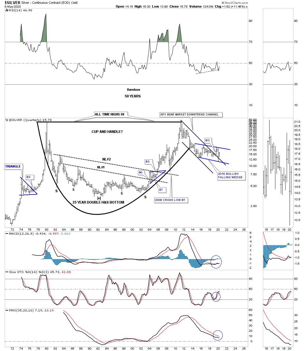
It’s been awhile since we last looked at this long term 50 year quarterly chart for silver which has some beautiful symmetry. Over a 30 year period from the 1980 high to the April 2011 high silver has built out a potential massive cup and handle formation. The bear market that began at the high in 2011 may be completing the handle. You would have to go all the way back to October of 2008 low to match the low put in last month In April. To say silver is undervalued compared to the rest of the PM complex is an understatement.
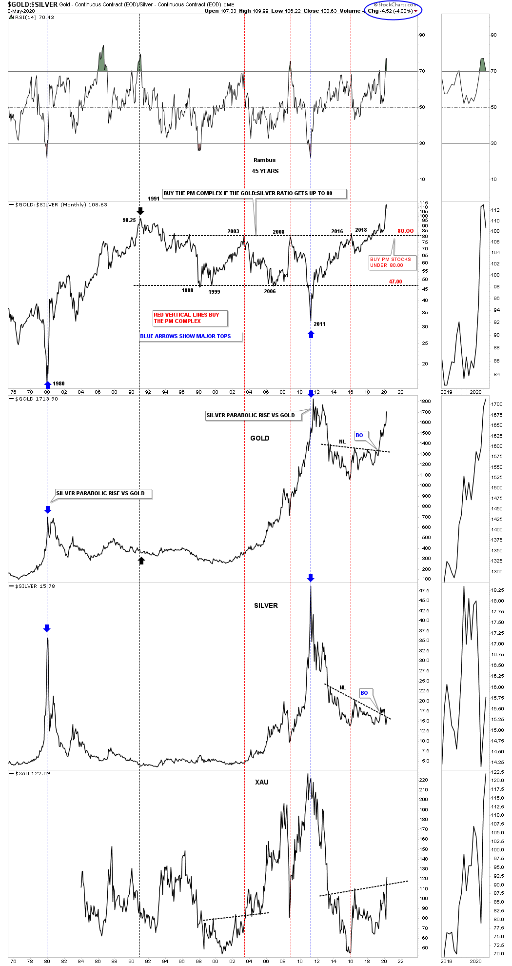
If you have looked at the gold:silver ratio recently you know that gold has been massively outperforming silver. The ratio is currently at new all time highs which makes silver undervalued vs gold. Below is a combo chart with the gold; silver ratio on top with gold, silver and the XAU below. Normally when the gold:silver ratio drops below 80 that is generally a good time to buy PM stocks. As you know, currently the PM stock indexes have broken out of a 4 1/2 year triangle reversal pattern with the gold:silver ratio at all time highs. If silver ever gets its mojo back and starts to outperform gold the ratio will start to drop which should put a headwind behind the PM stocks. The only question is when will silver start to outperform gold.
Next is a ratio combo chart with the Gold:Silver ratio on top with gold, silver and the XAU below. This combo chart is another reason I began accumulating silver. It’s not everyday that ratios can get so far apart but the Gold:Silver ratio is at historic extremes right now. Can it get more extreme? Yes, but the odds are favoring a revert back to the norm.
What the ratio chart on top is showing is that if it can drop below the 80 area that usually bodes well for the PM stocks. Note the XAU which doesn’t seem to be waiting for silver to start outperforming gold. Maybe it’s an earlier sign that the XAU is going to led the ratio lower instead of the other way around.
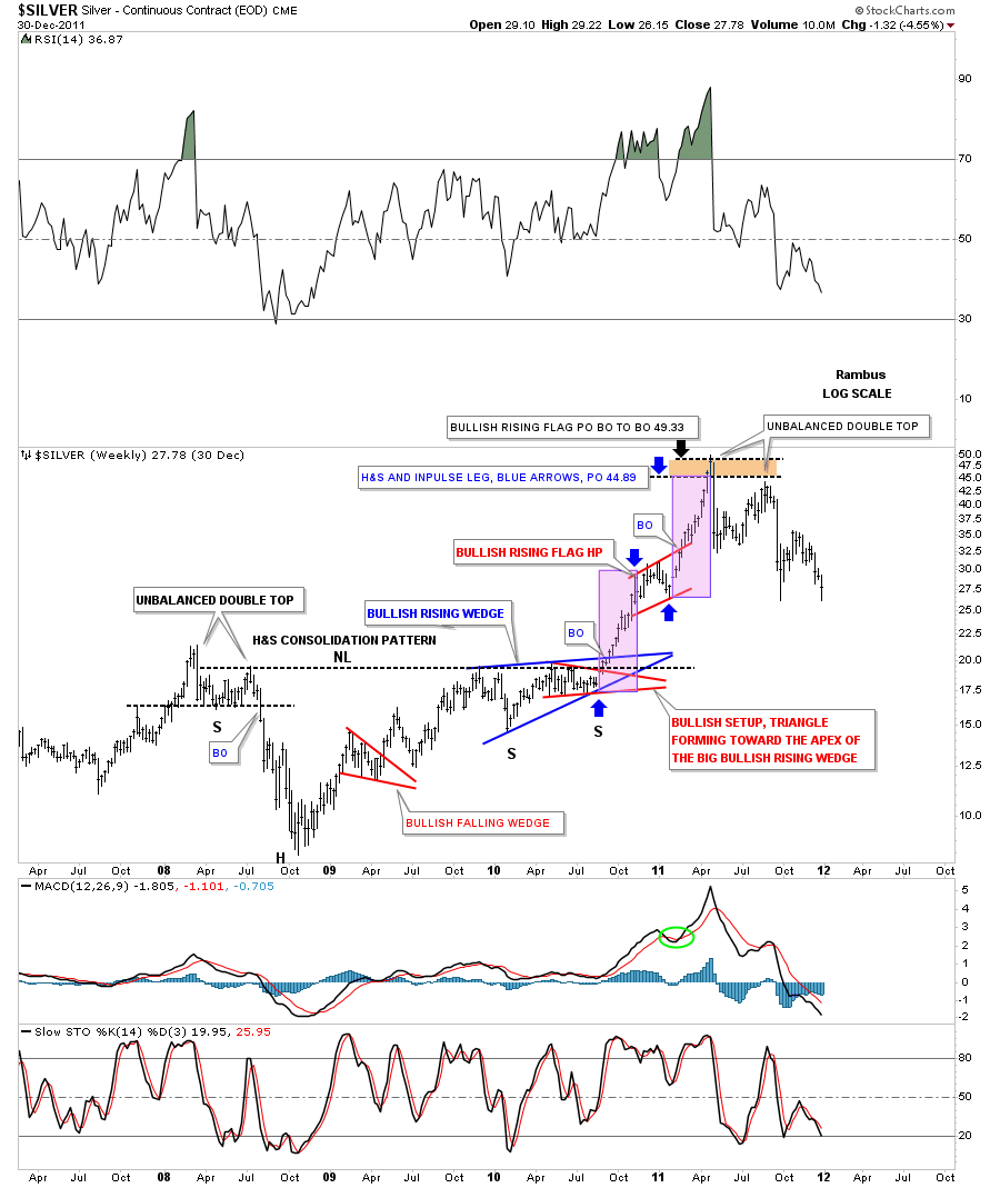
This last chart is an old weekly chart for silver which shows the 2008 crash low and the rally phase that went near parabolic into the April 2011 high. First note the combo 2008 bottoming patterns. Of course the H&S consolidation pattern is the dominate pattern but it’s made up of several other chart patterns which is common in big trading ranges. The left shoulder consisted of a small double top with a small rectangle. The right shoulder formed 2 patterns the bigger blue bullish rising wedge with the smaller red triangle forming at the apex which was strongly telling us the breakout to the upside was going to take place.
What came next was a classic breakout sequence with 2 individual price objectives based on 2 different patterns. The 2008 H&S consolidation pattern had a price objective up to the 49.33 area. The other measured move is called the breakout to breakout method where you begin from the recent low to the first reversal point in the next consolidation pattern which in this case was the red bullish rising flag. To get your price objective you take that first measurement and add it to the last reversal point in the red bullish rising flag HP that gave us a price objective up to 44.89 as shown by the blue arrows. The beauty of the final rally into the bull market high was the symmetry of the last two impulse moves as shown by the pink rectangles. Those two rectangles are exactly the same size that measure time and price.
There are times to be conservative when trading the markets when things aren’t quite as clear as they should be and then there are times to be bold and take on more risk than normal. I believe the PM complex is giving us a chance to be more aggressive and take on more risk than normal which hasn’t been the case since the 2011 highs. Stay safe and all the best…Rambus