This content is for Yearly and Monthly members only.
Subscribe
Subscribe
Already a member? Log in here

In order to get the whole family together we are celebrating Christmas this afternoon. If you have a big family you know what I mean. I have two grandson’s overseas with one making it home for the holidays so today is our day to celebrate Christmas.
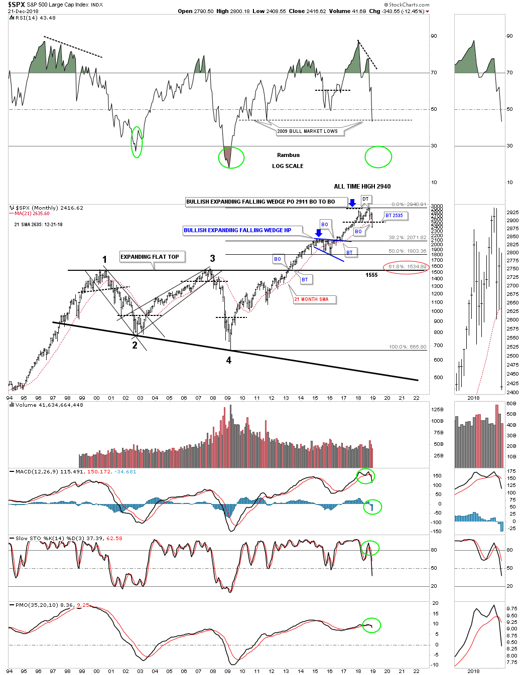
This Weekends Report is going to be short and sweet as there are not enough hours in the day right now to get everything done. There will be some slow time after Christmas to get more in-depth on what I see happening in the markets. Today’s chart for the SPX which gives you a glimpse of what could be possible.
After the 2000 bull market ended the SPX began to build out a massive 13 year flat top triangle consolidation pattern. The breakout occurred in March of 2013 at the 1555 area which began the second leg of the 2009 bull market. After the initial breakout above the top rail of the flat top expanding triangle at 1555 there was a quick backtest which launched the SPX on its next impulse move up to the first reversal point in the blue bullish expanding falling wedge halfway pattern at 2135.
After that impulse move up to 2135 it was time to consolidate that impulse move with the SPX forming the blue expanding falling wedge halfway pattern. Without even measuring for the price objective for the expanding falling wedge halfway pattern you can visually see how it formed in the middle of the two big impulse moves from the top of the 13 year expanding flat top triangle at 1555 to our most recent high at 2940.
To measure the blue expanding falling wedge halfway pattern I used the breakout to breakout method to get the price objective up to 2911. To get the breakout to breakout measured move you start with the breaking of the 13 year flat top expanding triangle at 1555 and measure up to the first reversal point in the blue expanding falling wedge which is 2135. You then take that measurement and add it to the breakout point on the blue expanding falling wedge halfway pattern to get your price objective us to the 2911 area as shown by the blue arrows.
After the price objective was met at 2911 there was a strong possibility that it was time to begin consolidating that second leg. If you recall, after the February low this year was confirmed, I began to label the price action as a new trading range knowing there were two possible outcomes. Either the SPX was going to buildout another consolidation pattern in its 2009 bull market or the price action would buildout a top. Those are the only two options. As you know I’ve been in the bull camp for a long time so I was leaning towards our current one year trading range being a consolidation pattern that would eventually breakout topside.
We’ve discussed many times in the past that a stock does only one of three things from a Chartology perspective. A stock can buildout a consolidation pattern, a reversal pattern or is in an impulse move. This past week the price action is showing us that the trading range that began to buildout in January of this year is not going to be a consolidation pattern to the upside but instead is going to be double top reversal pattern which is ushering in a brand new bear market.
The reason I’m showing you this 25 year chart for the SPX, is how the top rail of that 13 year flat top triangle at 1555 could come in play as possible support if the new bear market gets going to the downside. What had been resistance for 13 years should now be support on a backtest.

This second chart for the SPX is exactly the same one as the chart above but I’ve added the Fib retrace. The fib retraces the beginning of the bull market that started in 2009 to our most recent high at 2940. What’s very interesting is that the 61.8% retrace of the 2009 bull market comes in at the top rail of the 13 year flat top expanding triangle at 1535 just 20 points lower than rail the top of the expanding flat top triangle which is 1555.
During the bull market years the RSI would declined down the the horizontal line where it found support which would lead to the next rally phase. This past Friday the RSI closed right on the bull market RSI line. A breakout below the horizontal bull market support line would be a major change of character for the RSI. The green circles show where the RSI bottomed in 2002 and 2009. Will we see that same general are hit again during our new bear market?
I would like to wish everyone a happy holiday season with your family and friends. All the best…Rambus
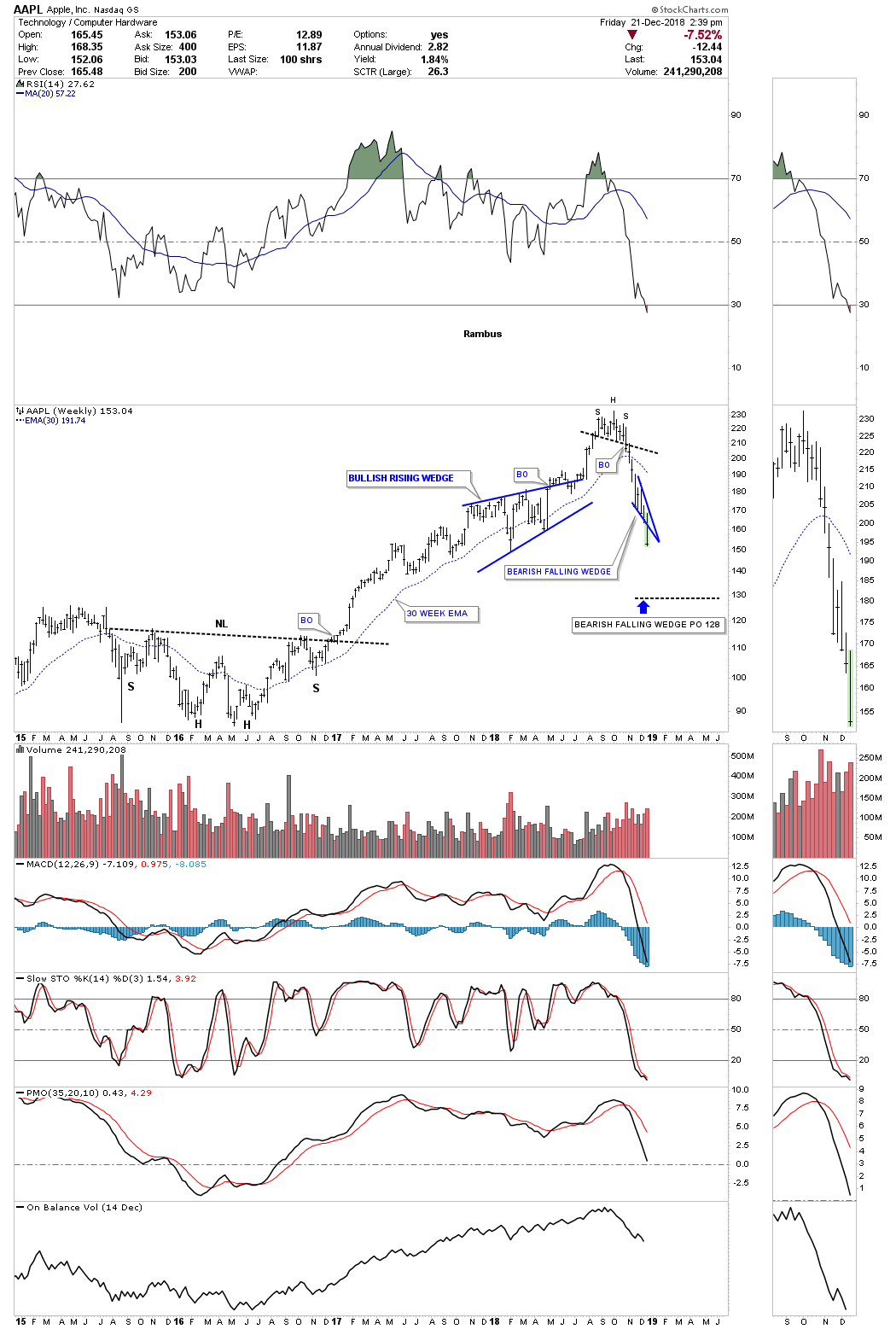
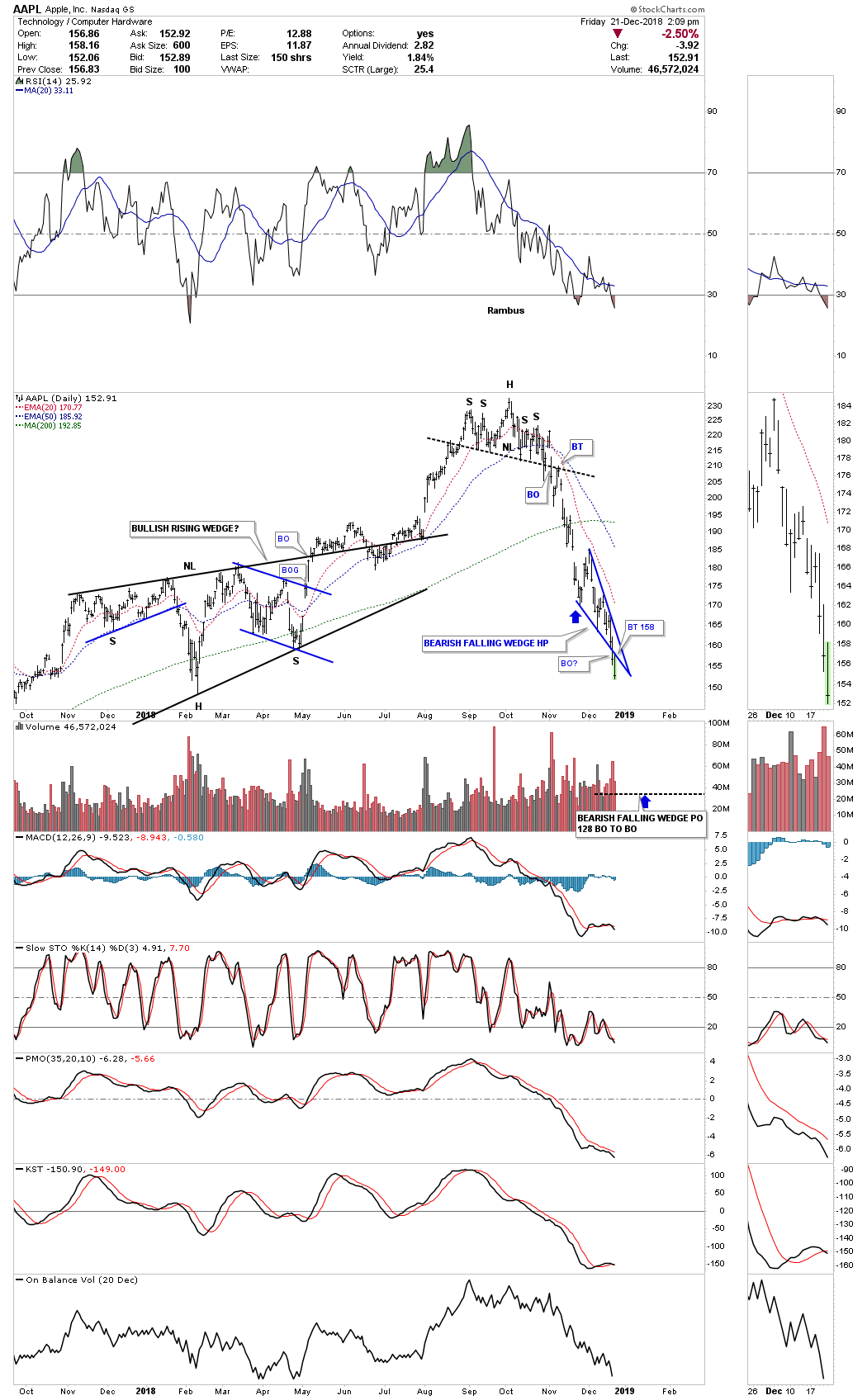
Just a quick update on the daily chart for AAPL one of the largest of the big cap stocks on the planet. After building out a H&S top in September of this year AAPL declined very quickly to the downside where it began to consolidate the recent impulse leg down. The consolidation pattern that AAPL built out is a pattern all of you have seen many times in the past which lets us know that a stock or market is in a hurry to move, in this case down, the pattern is the bearish falling wedge which slopes in the direction of the downtrend.
Today AAPL is breaking out from the bottom rail of the bearish falling wedge. Keep in mind this pattern is like any other consolidation pattern as it shows roughly the halfway point in a bigger impulse move. Note the bigger combo H&S – black bullish rising wedge that built out earlier this year on the left side of the chart. For those that have the ability to short this stock or buy put options you can use the top rail of the bearish falling wedge as your sell/stop.
I used the breakout to breakout method to get a price objective for the bearish falling wedge halfway pattern which would be down to the 128 area shown by the blue arrows. Again, these patterns show up in fast moving markets.
This weekly chart puts everything into perspective. The price action leaving the falling wedge should look similar to the price action leading into the falling wedge so we could see this move lasting another two to three weeks before the falling wedge price objective is reached.