This content is for Yearly and Monthly members only.
Subscribe
Subscribe
Already a member? Log in here

I would like to put out a short update on the oil market and my view of the QQQs being a proxy for the Hi-Tech end of the market. With the hard sell off in the oil market of this week this would seem a logical place to give it a rest and for a short seller to step over to the sidelines for a while. Anytime the market has gotten itself to this level of being oversold we have seen a rip to the upside.
One of the keys to being a successful short seller is to know when its time to press ones bet. Extended moves to the downside come from oversold levels and I am going to show you why I believe we may have further to go to the downside before this current move is over.
You should recall we executed our first short position in oil in the beginning of March just prior to oil falling out of the descending triangle . Keep in mind the dynamics of a descending triangle is where the ceiling of supply gets lower as time progresses. Each time price rises it meets selling at a lower level. Note below once the triangle got established the higher volume bars were red indicating sales volume. This was an in-your-face bearish announcement to anyone who cared to listen. But typically not many care to listen to the language of the market… so they were “surprised”.
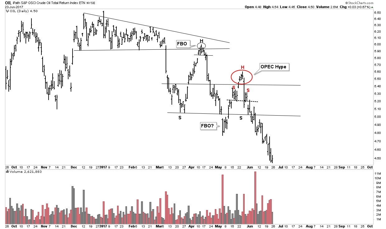
Looking a the chart above I have described it as a super-ball bouncing down the stairs. When a ball is rolled down the stairs the amplitude of the bounces increase with each progressive bounce. The reason for this of course is potential energy is being converted into kinetic energy. We see this dynamic in the chart above. This is not just a coincident metaphor, but a market principle in energy dynamics. Recall how the oil price stayed in a bounded channel for 24 years between $10-$40 from 1980-2004. During that time it was coiling energy so when it finally broke out it had the propulsive power to run to $147 over the next 3 years. These physical dynamic images are useful in understanding markets. So what that means for us now is this market still has downward energy in it. The second bounce we saw occurring in the month of May was strictly based on OPEC-hype narrative. It immediately fell apart after the OPEC meeting.
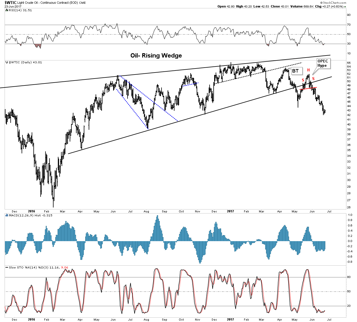
Here is what this move looks like within the the bigger picture of the entire bounce off the lows of Jan 2016. We see how we built out a H&S right on the lower boundary of the rising wedge—Classic. Also note how RSI, although low does not limit a move further to the downside. Stochastics are flatlined on the bottom NOT showing any case for an immediate upward move. MACD Histograms also do not have a pulse. Bottom-line there is not yet any sign of a bounce taking hold in this chart.
The OPEC Narrative
I understand this site focuses on the charts and not the narrative, however I believe its useful to have knowledge of what’s going on behind the scenes. Besides, that’s how Plunger rolls when it comes to how I construct trades. You must know that Saudi Aramco is positioning itself for a major IPO of its assets. Recall that an IPO is how insiders cash out of a market and “unload” their assets onto the public. This deal is in the works. It is estimated that this will be the biggest IPO in history. Valuations are in the $2 Trillion neighborhood. Obviously, the higher the oil price the bigger the IPO, so we can see how imperative it is for the Saudi’s to keep the oil price up.
But here is the problem, the Saudi narrative has now developed into “the boy who cried wolf”. Their public efforts of managing supply to elevate price have been entirely discredited by the market. Cutting supply simply cedes market share in the world of financialized oil hedging contracts. Stated differently, all OPEC jawboning narratives are now shot.
ECON 101- Ingredients to a bull market
Now I have a question for you: Where is the chapter in your Econ 101 textbook which describes that a bull market can be based on decreasing supply? I must have been asleep in class on that day because I don’t remember that one. (Actually Econ 101 is nothing more than Keynesian indoctrination of course, where the only worthwhile thing taught is supply/demand curves… but I digress). But my point is that a bull market must be driven by increased demand. Supply typically rises along with the trend of higher prices. So what has occurred over the past 16 months is the market has been artificially moved higher without any rebalancing of supply and demand. Therefore this market is now currently out of balance.
This is simply a way to highlight that the entire structure of the oil market is an engineered facade. The free market eventually tears down facades, which is what I believe we are witnessing before our eyes right now. The CBs of the world offer virtually free money which funds the frackers. Saudi cuts back market share and ramps prices to $55 where the frackers hedge future production. The frackers can now pump increasing amounts without regard to the oil price for 12-18 months. Its a recipe for an oil crash.
Volume Dynamics
Now this is where us Chatologists have an advantage. The charts reveal something is up. Rambus has often taught the principle of Symmetry. Stated differently, the way the market goes up is the way it goes down and vice versa. Volume analysis is a similar concept. It’s what those volume-by-price bars are for on the left side of the chart. If there is little to no volume in a price range then there is little support or resistance. As a result price tends to move rapidly through these zones. Well that’s what we have with the oil chart. Below I put the volume-by-price bars onto our bearish rising wedge chart and we can see a zone between $34-$41 having very thin volume. So breaching $41 unlocks overhead supply from any supporting structure which can hold it up. There is a possibility that we could witness a flash crash in the oil market from these levels down to as low as $34.
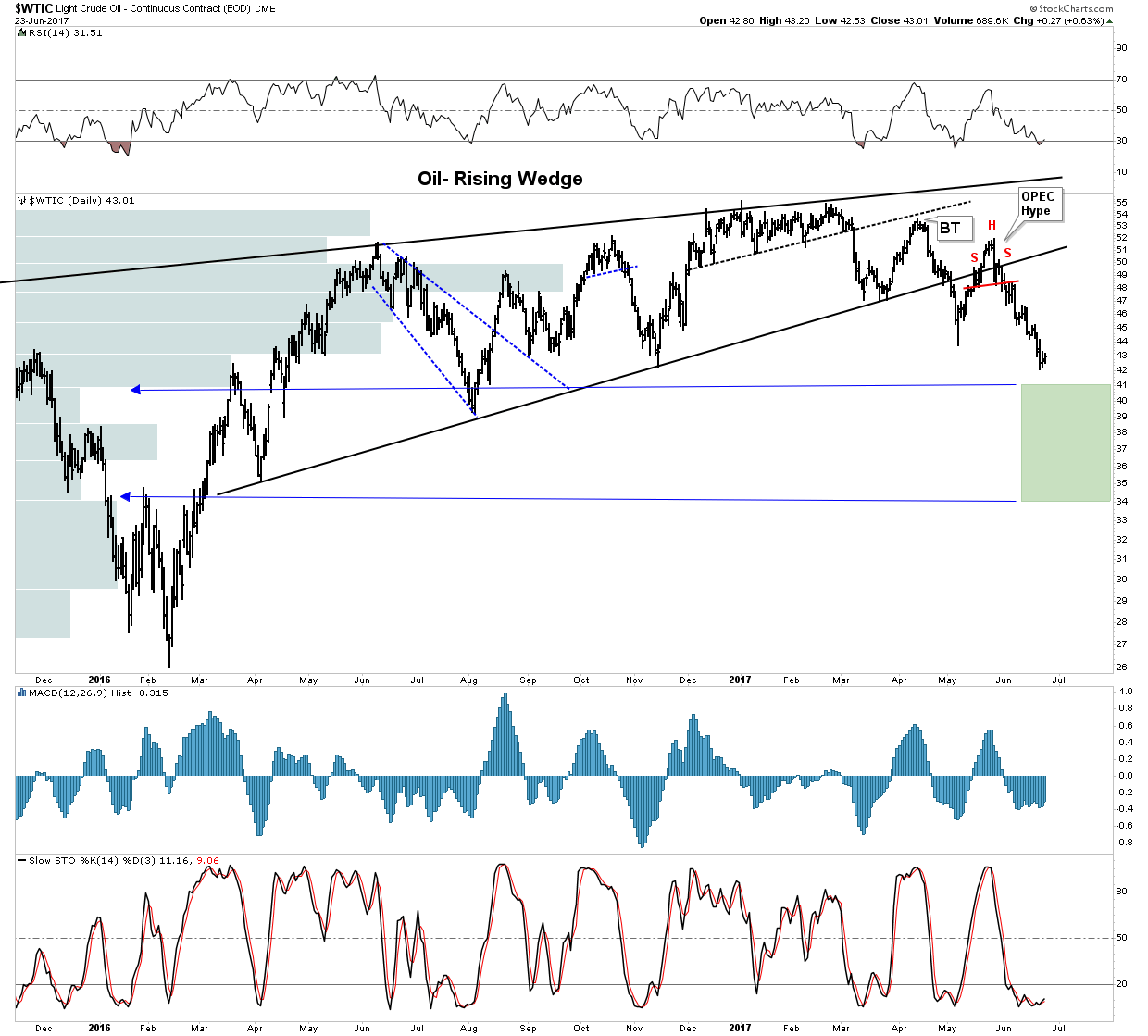
Another very important clue to future price dynamics can been seen by looking at the internal structure of this bearish rising wedge. Take a step back and notice how ALL of the bottoms in the chart above are sharp V-bottoms. I don’t have to tell you that V-bottoms are not the ingredients to a sustained move. V-bottoms cry out to be tested and are not foundational. Folks what we see above is a picture of a developing crash.
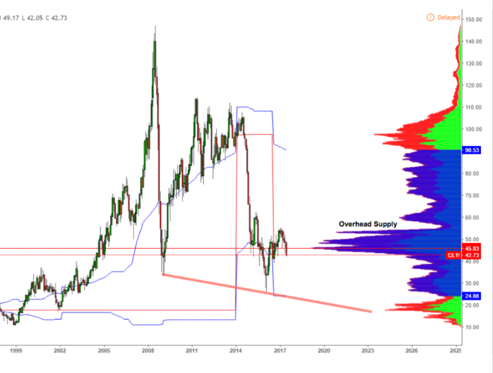
Here is another view from Alastair Williams’ twitter feed showing the long term volume nodes which on his chart show overhead supply becoming un-locked at $42.
Pivot Point Support
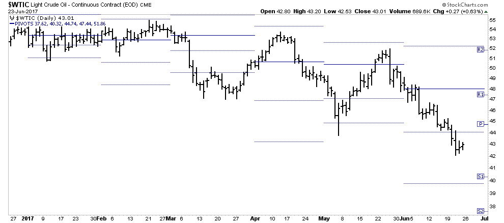
Pivot points can be helpful to indicate where possible support can come into play. Here we show an S-1 at 40.32 and S-2 at 37.62. I regard pivot point analysis as marginal assistance however it is one additional data point to be aware of.
What could go wrong
So what could de-rail this path toward Sub-$40 prices? Plenty of course. OPEC is in the false narrative business, so any engineered event could derail this move temporarily. A supply disruption scare would be the principle method of boosting the price and there are plenty of ways to engineer that over the short term. OPEC jawboning is obviously futile at this point which explains why OPEC was so silent this week.
So I am staying the course, I see the opportunity for a downward acceleration, however there is always the risk of a short covering rally for traders.
QQQ Update.
I have made my short term bearish case for the QQQ’s in the past 2 weekly reports. I think the US market is set-up for a crack. The bull market may not be over as conditions allow for another run to higher highs after a shake-out, but for now we’re walking on eggshells.
First off, Rambus has made it clear that there is still no resolution in the QQQ. We have bounced off the NL of a potential H&S pattern therefore no sell signal from a price perspective has been triggered. As mentioned however, sometimes I get out a bit further on my skis and this is a case of this. So with a note of caution, I would like to show you what I am seeing.
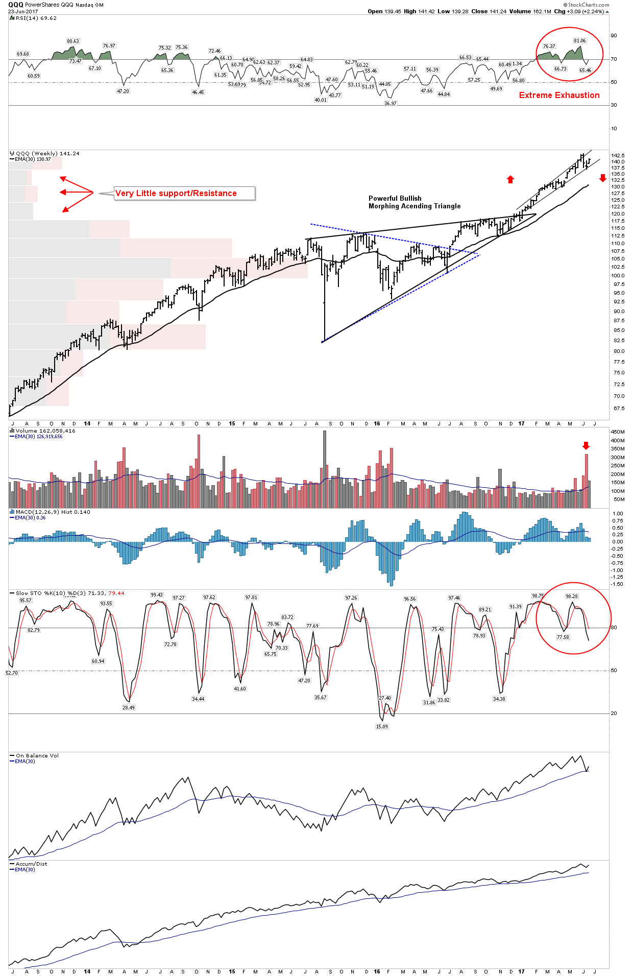
Below we see a 4-year weekly view of the QQQ. It shows a powerful move upward where it underwent a mid-course triangle consolidation. The move was so powerful that we see how it morphed from a horizontal triangle into an ascending triangle. That was a big clue of what was to come. After the breakout we see a mania-power-run leaving tiny volume-by-price bars in its trail. It went on to top (for now) at a weekly RSI of 81.06. This is simply extraordinary. We then put in a volume spike-outside reversal to the downside associated with an upside exhaustion. I mentioned earlier that this has not occurred since March 2000 at the peak of THAT mania. So I see the potential for a downside crack in the market right here. Call it the shakeout before the breakout.
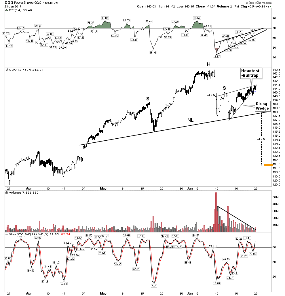
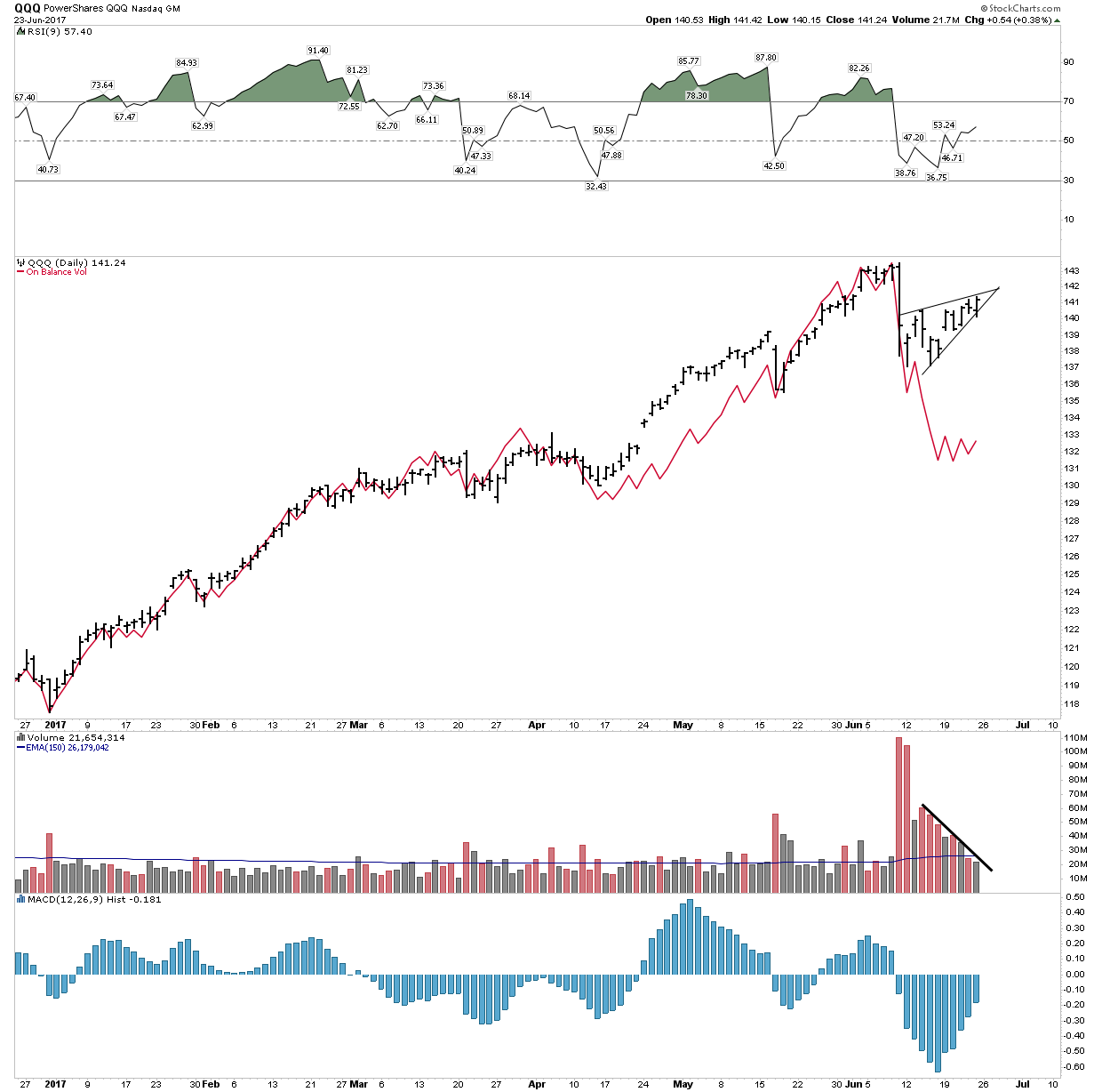
Let’s dive in a little deeper and examine the internals which shows what I am seeing. Below is how I interpret the price action. It’s all pretty classic and consistent with bounce dynamics. We see bearish rising wedges all over. In the RSI and price action it looks like a dead cat bounce (DCB). Volume decay supports this view as there is no longer enough interest to support a higher move to a new high for now. If the NL is broken we see a MM down to 131.5. All pretty vanilla standard interpretation.
On Balance Volume
So now let’s give a bit more deeper insight: Volume analysis. Joe Granville, the great one, gave us his on balance volume (OBV). He had an epiphany and saw it one day as a valuable way to view volume accumulated. In a similar fashion Dick Arms one day walked into the stock exchange, looked at the board and it struck him…the “Arm’s Index” was created. (look it up). It just hit him. So OBV is a running summation of up minus down volume. A simple concept actually, easy to see how its a great measure of bull vs bear internal action. If the market is moving up it would make sense that there is more up vs down volume. If not, something is obviously wrong. Which by the way was another Granville truism: “What is obvious, is obviously wrong”
So here we see OBV with the red line over price. Talk about obvious… there is something wrong here, price has risen on declining OBV. This is called a divergence. I would say its announcing this bounce is built on borrowed time:
Momentum
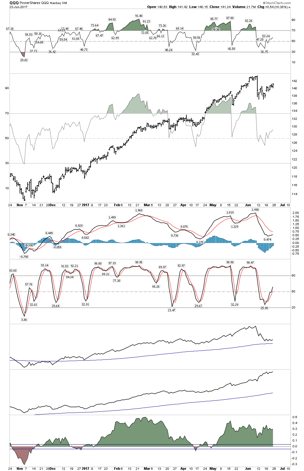
Let’s now get the “feel” of momentum. Step back a bit and look at this chart from a distance. RSI is a level of overbought and oversold. It also expresses momentum. I have superimposed RSI on top of price to drive home my point. Put yourself in a car riding up the price bars while observing the RSI peaks. Get the feel of how the movement upward is starting to feel exhausted. Note how the last peak just couldn’t get that RSI level up there anymore. Furthermore, this recent dead cat bounce virtually just sat there. Now look down at the MACD histograms, they can’t even get above zero…Stochastics are substandard as well. This paints a confirming picture of exhaustion.
Mr. Fibonacci sez Prego….almost
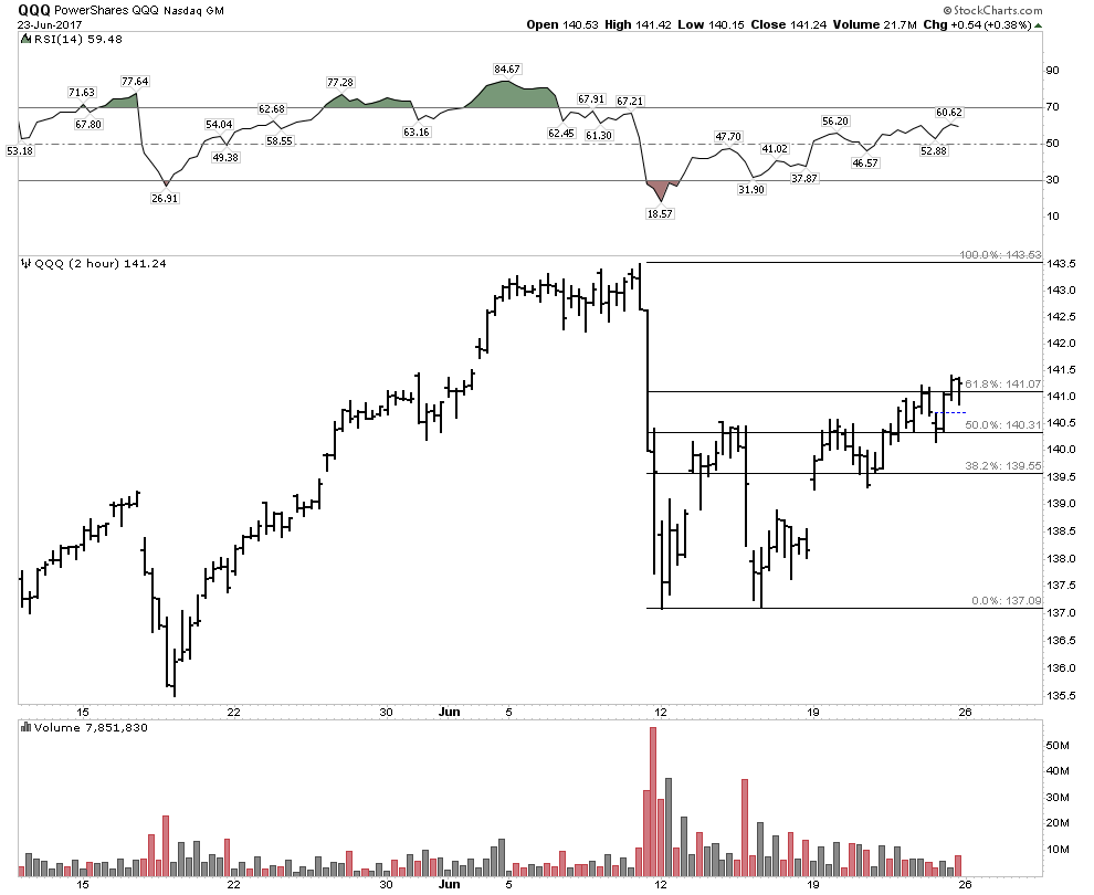
We have virtually a perfect 61% retracement of the move down:
The Hindenburg Omen
The Hindenburg Omen (HO) does not mandate any specific outcome to happen, but its a statistical data point that gives us insight to a forward path. We just registered a confirming second HO this week. There has never been a crash without a HO.
Here are the statistics over the past 29 years after a confirmed HO:
24%- Major Crash
39% chance 10-15% decline
54% chance 8-10% decline
77% chance 5-8% decline
92% chance 2-5% decline
7% chance of a total miss
So I just wanted to present to you some analysis of these two markets. I certainly don’t “know” what happens next, but you should be familiar with these potential outcomes.
Tonight I would like to update a few ratio combo charts as several are at a crossroad, which may shed some light on where the PM complex may be headed next. A couple of the ratio combo charts worked out extremely well in calling a bottom in January of 2016.
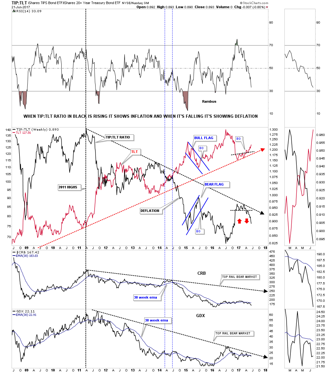
Lets start with the TLT:TIP ratio combo chart we looked at recently which shows if we’re experiencing inflation or deflation. When the ratio in black is falling it’s showing deflation and when it’s rising it’s showing inflation. From the 2011 high the general trend has been for deflation. About a year ago you can see the black ratio was rising in a pretty strong move up, but late last year and the first part of this year the ratio topped out and has begun to fall. The red arrows shows how the ratio is reversing symmetry down over the same area on the way up. For the time being there isn’t much in the way of support.
At the bottom of the chart I added the CRB index and the GDX which also topped out in 2011 and have been trending down with the black ratio. If the TLT:TIP ratio keeps falling, will the CRB and GDX keep performing in a similar manner as they have since their 2011 bear market highs? The 30 week ema is the first line of resistance they will need to overcome followed by the top rail of the 2011 bear market downtrend channel.
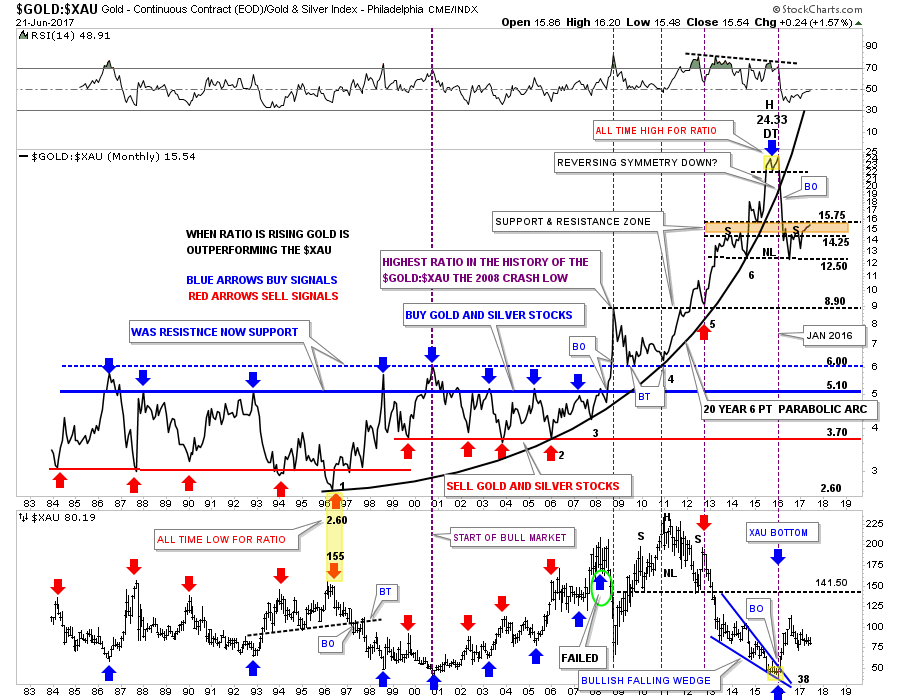
This next ratio combo chart compares gold to the XAU on top with the XAU on the bottom. Long term members are familiar with this chart, but for the new members I’ll give you a quick rundown. For many years when the ratio chart on top would get down to the 3.70 area it was a good time to sell your pm stocks, red arrows, and when the ratio got up to the 5.10 area it was a good time to buy your favorite PM stocks.
All that changed dramatically during the 2008 crash in the PM complex when the ratio made a new all time high above 6.00 for the first time in history. That new high for the ratio above 6.00 told us just how weak the PM stocks were to the price of gold. Little did I know back in 2008 that the under performance of the PM stocks to gold would continue until January of 2016. That little double top in 2016, yellow shaded area, was the first clue that the ratio may be topping out. When the price action broke below the double top hump that was the beginning of the January to August 2016 rally in the XAU. I suggested at the time that the rally could be very strong because the 20 year, 6 point parabolic arc, was finally giving way. Normally when a parabolic move ends you can have a big move equal to or greater than the parabolic move in the opposite direction.
I was initially looking for support at the brown shaded S&R zone, but the ratio declined all the way down to 12.50 before it finally found support. After the ratio bounced at 12.50 I drew in the possible H&S top looking for a right shoulder to form in the brown shaded area. That has happened, but now the ratio is testing the upper limits of the brown shaded S&R zone. The bulls want to see this ratio declining as it suggests that the PM stocks are out performing gold which is what you want to see in a bull market. The XAU chart on the bottom shows how it began its 2016 rally at the exact same time the ratio broke down from the double top.
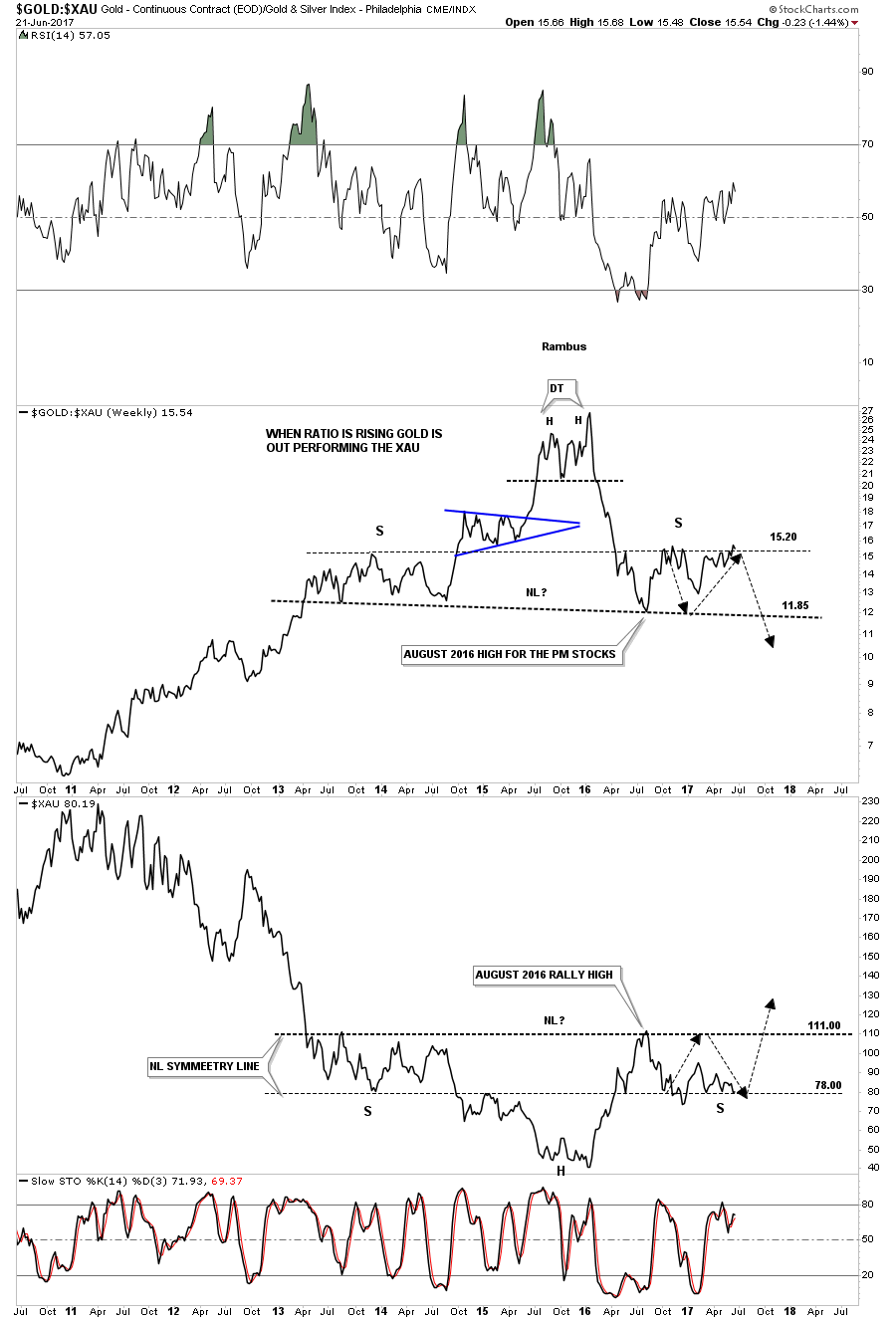
This next ratio combo chart is a weekly line chart which compares gold to the XAU on top with the XAU on the bottom, which gives us a close up view of the possible H&S top on the ratio chart. When I first built these charts the possible right shoulders were still pretty small in relation to the left shoulders so I added the black arrows looking for some symmetry. As you can see, if the H&S patterns are going to play out we need to see the ratio chart on top start to break down as it’s testing the upper limits of the right shoulder, while at the same time we should see the XAU putting in its low for the right shoulder. These potential H&S patterns are 4 1/2 years in the making so if the XAU can take out the neckline there will be a very large base in which to launch a new bull market. On the other hand if we see the ratio rally much higher than where it is now the odds favor a continuation of the bear market.
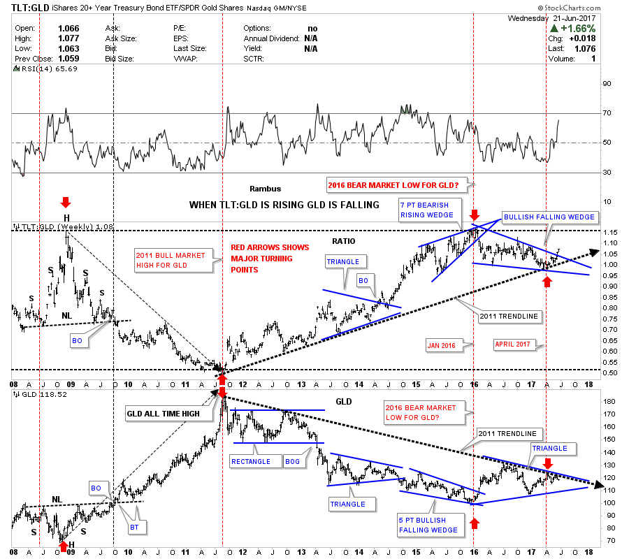
Below is another ratio combo chart which compares TLT to gld on top with gld on the bottom. When the ratio is rising gld is generally falling and vice versa. The ratio has a pretty strong inverse correlation with gold. On the left hand side of the chart you can see the ratio built out a H&S top while gld built out an inverse H&S bottom at the 2008 crash low. Then in 2011 you can see where gold topped out and the ratio bottomed out which was the start of the bear market for gold as shown by the red arrows.
The ratio chart gave us a very clear and early buy signal back in January of 2016. The ratio was building out a rising wedge formation which ended up having 7 reversal points making it a bearish rising wedge. When the price action broke below the bottom rail of the rising wedge a buy signal was given which coincided with the small double top on the Gold to XAU ratio chart we looked at earlier.
Some of you may have already noticed that the ratio chart on top has formed a 15 month falling wedge which has broken out topside while gld on the bottom chart is finding resistance at the top rail of a possible triangle. The heavy black dashed trendlines shows the 2011 bull market in the ratio chart and the bear market in gld. The ratio chart on top is strongly suggesting that the bear market might not be over for gold if the breakout continues to hold. Again it’s time for the PM bulls to step up to the plate and show us they mean business. I would love for nothing better than to see the PM sector in a bull market again. All the best…Rambus