This content is for Yearly and Monthly members only.
Subscribe
Subscribe
Already a member? Log in here

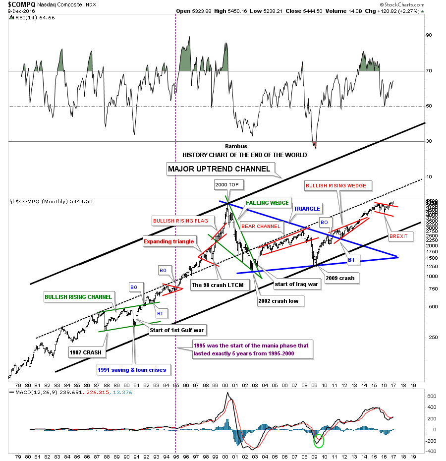
I try to show this long term monthly chart for the $COMPQ which I call the “End of the World History Chart” at least once a year or if something interesting takes place. When you look at the 1987 crash it felt like the end of the world at the time but that ended up being the second reversal point in the green bullish rising channel. How many remember the months leading up to the first Gulf war in 1991? No one knew at the time how that conflict would play out as the US was going up against the 5th largest army in the world. On the first night of bombing it was very clear that the conflict would be over quickly and the stock markets took off the very next day which made the fourth reversal point in the green bullish rising channel.
Which also helped put that fourth reversal point in the green bullish rising channel was the Savings and Loan crises which was dominating the headlines at that time. As you can see the COMPQ launched into one of the greatest bull markets of all time that ended nine years later when the tech bubble finally burned out.
How many remember the crash in 1998 that doesn’t look like anything on this chart but it was the LTCM, Long Term Capital Management debacle that felt like the end of the world at the time. It’s easy to look at a chart like this and see how important events in the world look in hindsight but when you are living and trading during one of these events it’s a totally different story.
After the $COMPQ topped out in 2000 it declined in a very strong move down building out the green bullish falling wedge which broke to the upside during the start of the Iraq war. The markets were crashing and the US was going to war. It doesn’t get much more negative than that but that was the low. I know most of you are familiar with the 2009 crash low which felt like the end of the world at the time but as you can see it launched a seven year bull market that is still making new all time highs.
The last chart pattern on the right hand side of the chart is the little red bull flag that just completed a backtest to the top rail last month and is now making new all time highs. The fourth reversal point on that little red bull flag was the BREXIT vote that tanked the markets which quickly reversed back up after just a couple of days.
The last point I would like to make with this chart is shown by the ten year blue triangle consolidation pattern. Note how clean the breakout and backtest was to the top rail which began the formation of the red bullish rising wedge. There are many individual stocks that made a similar consolidation pattern that have broken out and are well into new all time high territory. When looking at this big picture you can see how the blue ten year triangle consolidation pattern is forming as a possible halfway pattern which should show a similar move leading out of the triangle to the one leading into the triangle.
I’m viewing our current breakout and impulse move up, could take the price action up to the black dashed mid line before we see a decent correction. The move up could resemble the move up out of the red bullish rising wedge which would then show the red bull flag as a halfway pattern. The good news is this next impulse leg up is just getting started. As long as the game plan keeps play out this is how I see things unfolding over the coming years which will be punctuated with some strong corrections and maybe even a black swan event such as the 1987 crash which ended up being a great buying opportunity. I will have a ton of charts to post tomorrow that will shed some more light on the big picture which is the most important time frame to get right. If you know and understand the big trend it is so much easier to stay in the game. There are times when one can trade against the dominate trend but it’s much more difficult to do, the trend is your friend.

This first precious metals combo chart is one I try to show you at least twice a week so you can follow the price action as it’s unfolding in real time. Except for SLV the other indexes have now traded below their respective neckline for five weeks now. If you look at the sidebar you can see which sectors are doing the best and which ones are weakest. As you can see GLD has been by far the weakest of the four while SLV has been the strongest. To negate these H&S tops we would need to see the price action close back above the necklines. The necklines are your lines in the sand, above is bullish and below is negative.

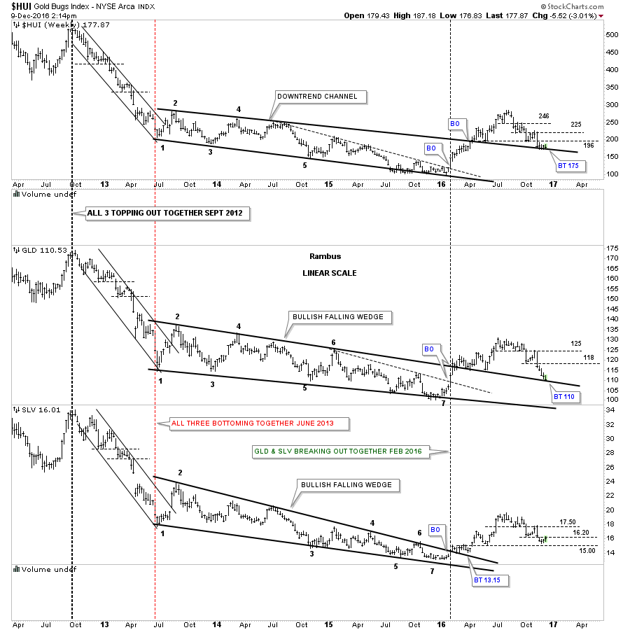
This next combo chart is also one we’ve been following very closely which shows the multi year trading ranges which were broken to the upside earlier this year. Those big top rails should reverse their role from what had been resistance to now support which they’ve done so far.
Now lets look at the thin black dashed horizontal lines which represents support and resistance. During the strong bear market move back in 2013 you can see how they reversed their role to what had been initial support to resistance once the price action broke below those S&R lines. Looking at the right hand side of the chart you can see the same thing taking place since the August highs.
Following the price action is just that, following what the charts are showing us and not trying to second guess what we may think we want to see,, which is a lot harder than it seems. Note how the HUI and GLD are now testing their top rails from above. As long as those top rails hold support then all is good for the PM complex. On the other hand if we see those top rails broken to the downside then the PM complex will be talking to us from a bearish perspective regardless of all the reasons why the PM complex can’t go down.