This content is for Yearly and Monthly members only.
Subscribe
Subscribe
Already a member? Log in here

About a month or so ago I wrote the Weekend Report on the US Dollar showing many dollar charts that were suggesting the dollar was close to topping out. Its important to pay close attention to the dollar as it affects so many markets especially Gold and Silver. I would like to update a few of the charts to see how the price action has been.
rambus1.com/?s=The+Buck+Stops+here
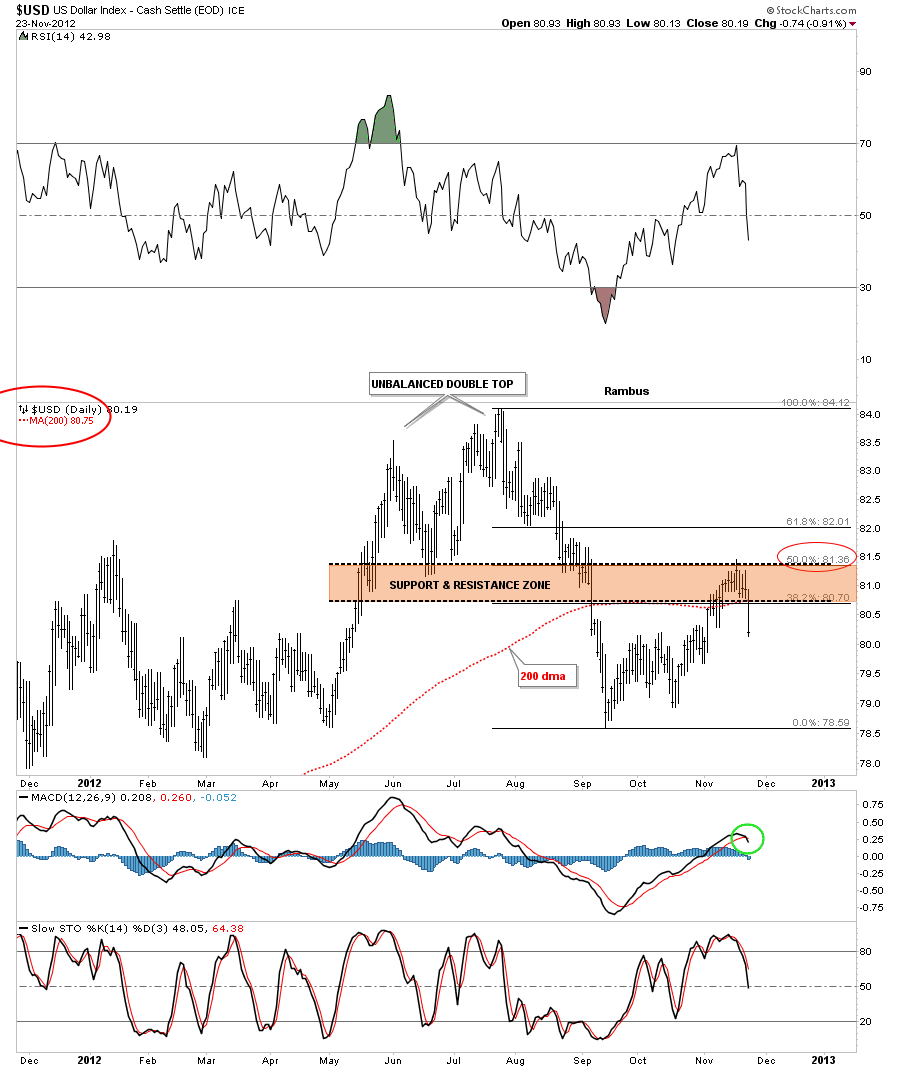
First lets look at the Fibonacci retracements and see which one finally held resistance. The chart below shows the 50% retrace held which also corresponded to the top of the brown shaded support and resistance zone. Fridays price action also closed below the 200 dma and MACD at the bottom of the chart has now crossed giving a sell signal.
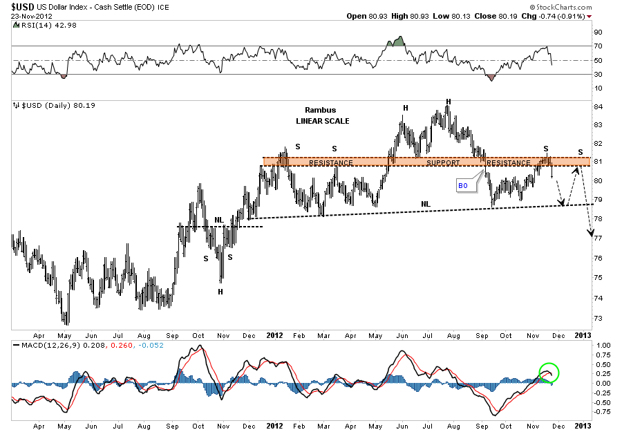
Next lets look at the H&S that was forming that has two left shoulders. It looks like the dollar has just completed the first right shoulder and is headed back down to the neckline. As you know symmetry plays a big role in how I look at the charts. As you can see on the chart below the left side of the H&S top has two shoulders. Its very possible that the dollar may build a second right shoulder before the H&S top is complete. Its possible that this H&S top could be of an unbalanced variety meaning two left shoulders and one right shoulder. We will just have to see what happens when the dollar reaches the neckline and take it from there. Note the MACD has crossed and is now giving a sell signal as well.
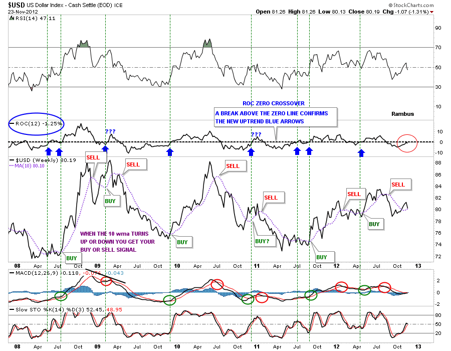
Lets take a look at the ROC indicator that was approaching the zero line, red circle on chart below. Its currently at a minus 1.25 which is still in negative territory. The 10 wma has turned up ever so slightly but with last weeks price action in the dollar there is a good chance it will start to roll over again. From this ROC indicator I still rate the dollar as on a sell signal.
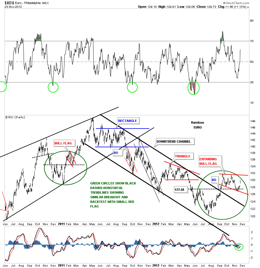
Lets now take a peek at the Euro as it should have an inverse look to the US Dollar. The daily chart below shows a nice inverse H&S bottom forming that has a price objective up to 145 or so as a minimum move. Note the MACD indicator at the bottom of the chart has now crossed and is giving a buy signal.
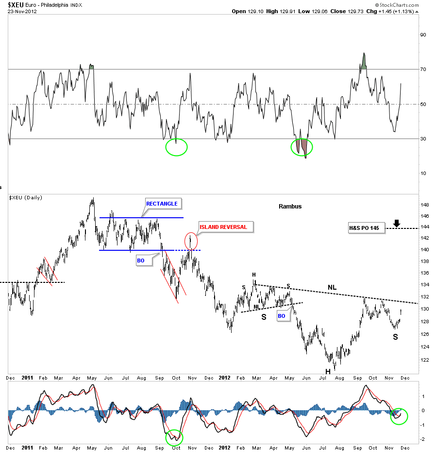
I used a slightly different approach looking for the bottom for the XEU (The Euro ETF). Notice the big green circle on the left side of the chart and how the little red bull flag formed right on top of the black dashed horizontal rail that acted as support. Now focus your attention to the right side of the chart and the big green circle that is showing the same setup. After testing the black dashed horizontal rail as support the euro began to liftoff last Friday. That bottom is also the bottom for the right shoulder I showed you on the chart above.
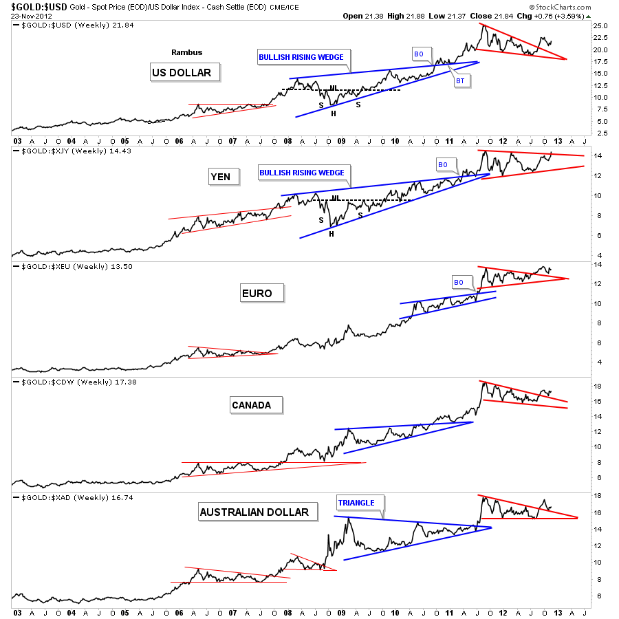
Lets see how gold looks from several different currencies. The chart below is a combo chart that shows how gold is trading against the US dollar and several of the major currencies of the world. As you can see gold has broken out of the red triangles and is in the process of doing some backtesting in some cases. The Yen to gold looks particularly strong in here as it will probably be the first currency to reach new all time highs with the euro right behind.
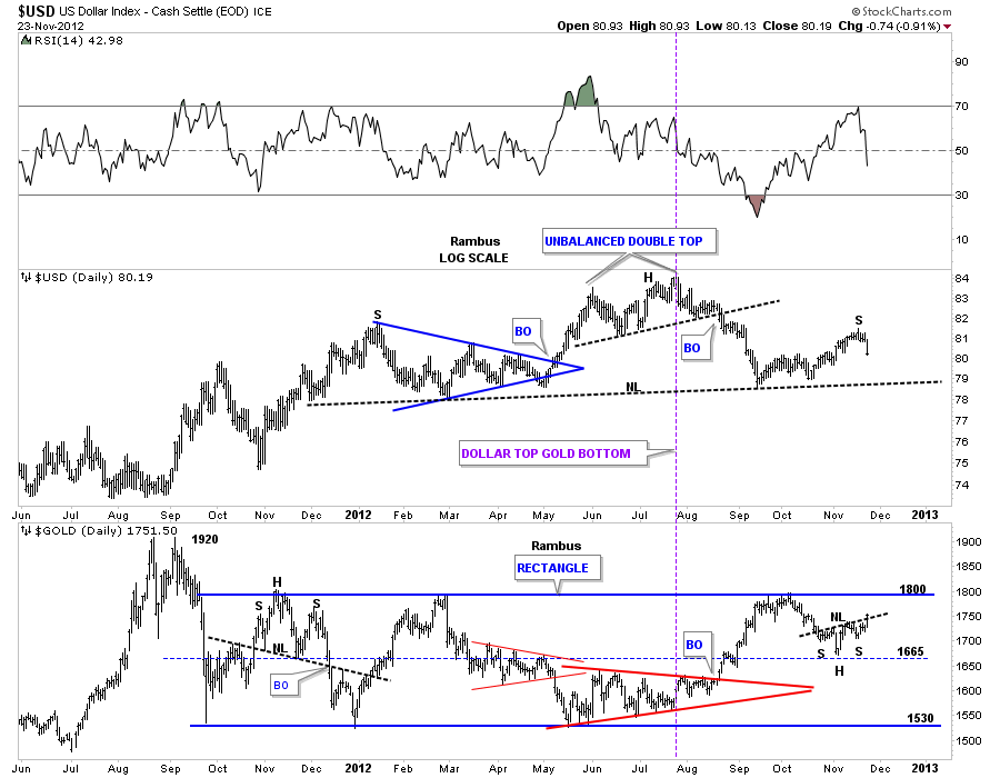
Lets look at one more combo chart that shows the US dollar on top and Gold on the bottom. This chart shows the inverse relationship between the two, purple vertical line. The most important thing to take away from this chart below is the neckline on the dollar and the top blue rail of the rectangle for gold. Those are both strong and hot rails. By the looks of it they will both hit their respective rails at the same time, the dollar the neckline and gold the top blue rail of it’s rectangle. That is what you can call an inflection point. I suspect they will both work through the breaking out and backtesting process together for their critical trendlines. Once the breakout and backtests are complete each trendline will reverse its role. The neckline once broken to the downside will act as resistance and the top blue rail of the rectangle will act as support when it finally gives way.
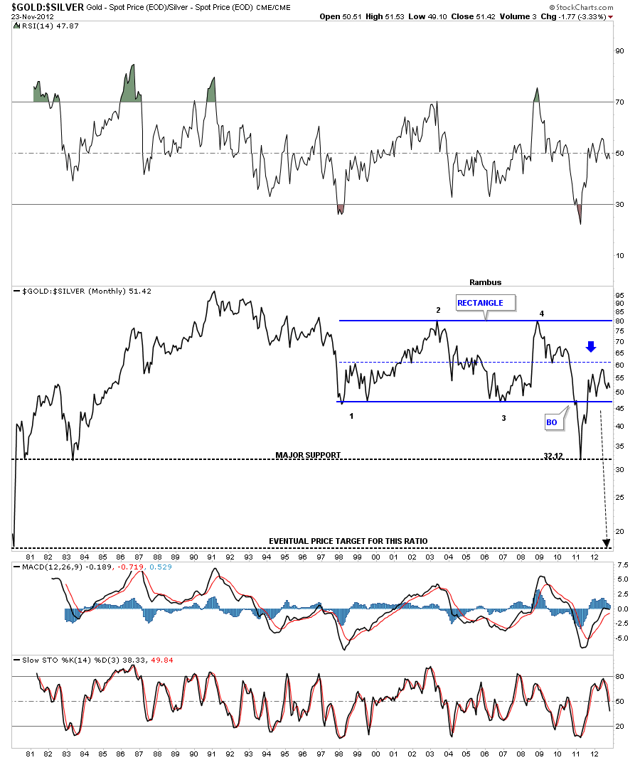
Lets look at one last chart that is the gold to silver ratio chart. When the price action is falling silver is outperforming gold. In a strong move in the precious metals I like to see silver outperforming gold. A break below the bottom rail of the blue rectangle will signal silver is the place to be for investments purpose. This would also be bullish for the stock markets.
OK, one last chart of the gold to silver ratio that shows when silver is outperforming gold it’s good for the stock markets. Thats because its still looked at as a commodity. A strong stock market equals more demand for silver so the two go hand in hand. The SPX is above and the gold to silver ratio is on the bottom. As long as the black arrows point up for the SPX and down for the gold to silver ratio that should be a bullish setup especially for silver.

I’ve been working on a long term gold chart that will show you how beautiful this bull market has been. I still have a little more work to do but It should be finished for the Wednesday Report. So stay tuned as it will be one of a kind chart that you won’t find anywhere else on the net….All the best…Rambus
More at
www.rambus1.com
Tonight lets look at some of the positive signs that are beginning to show up that are showing a bottom might be close at hand or already in for the precious metals stocks. The first PM stock index to look at has been one of the most symmetrical in several ways. The XAU has bounced perfectly off the neckline symmetry rail and shows a nice rally maybe starting. We still can’t rule out one more test of the neckline symmetry rail as alot of times there are two test of an important trendline before the real move begins. If you look at some of the other tops and bottoms on the chart below you will see what I mean.
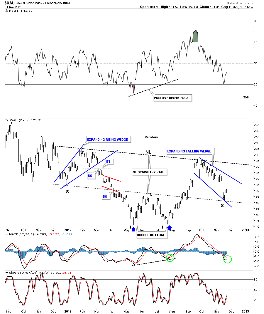
There is another form of symmetry, on the chart above that most won’t see, is both the left and right shoulders of the inverse H&S bottom are both expanding wedges. The left shoulder is a bearish expanding rising wedge and the right shoulder is a bullish expanding falling wedge. With the double headed double bottom for the absolute bottom and the two expanding wedges for the left and right shoulders gives us an awesome looking H&S bottom. If the neckline symmetry rail is showing us the low for the right shoulder we can expect at least a 100 point rally in the XAU when the neckline is broken to the upside.
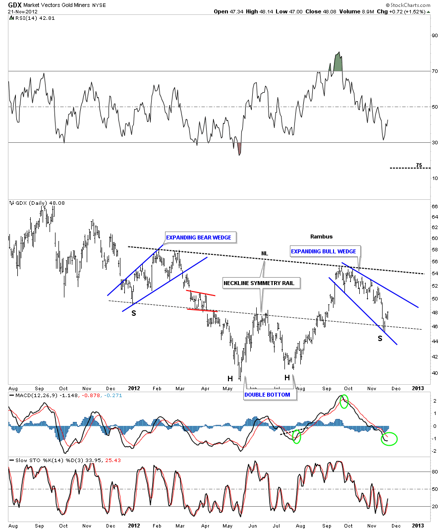
The GDX is also showing a very similar setup in regards to the neckline symmetry rail. It also has two expanding wedges as it’s left and right shoulders. I would like to see the MACD crossover to confirm the bottom is in.
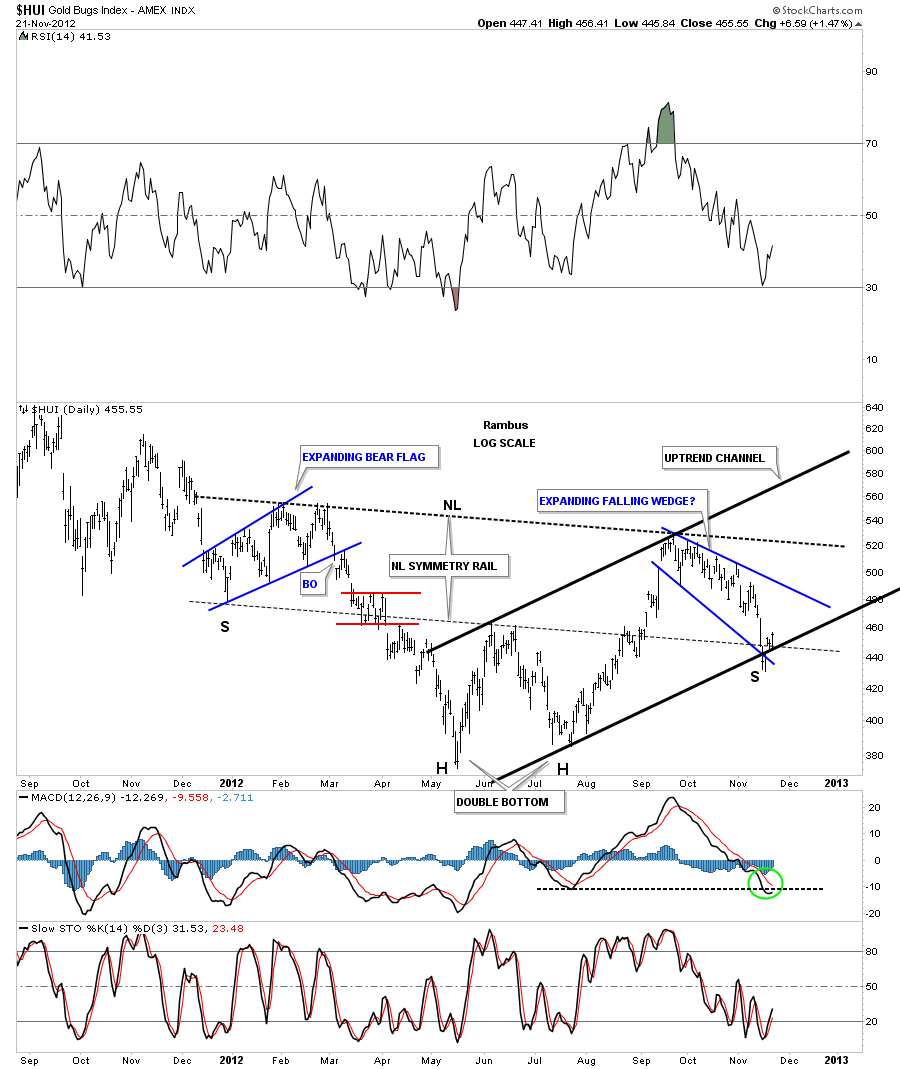
The HUI has a similar setup to the other PM stock indexes. I’ve added an uptrend channel that may or may not come into play down the road.
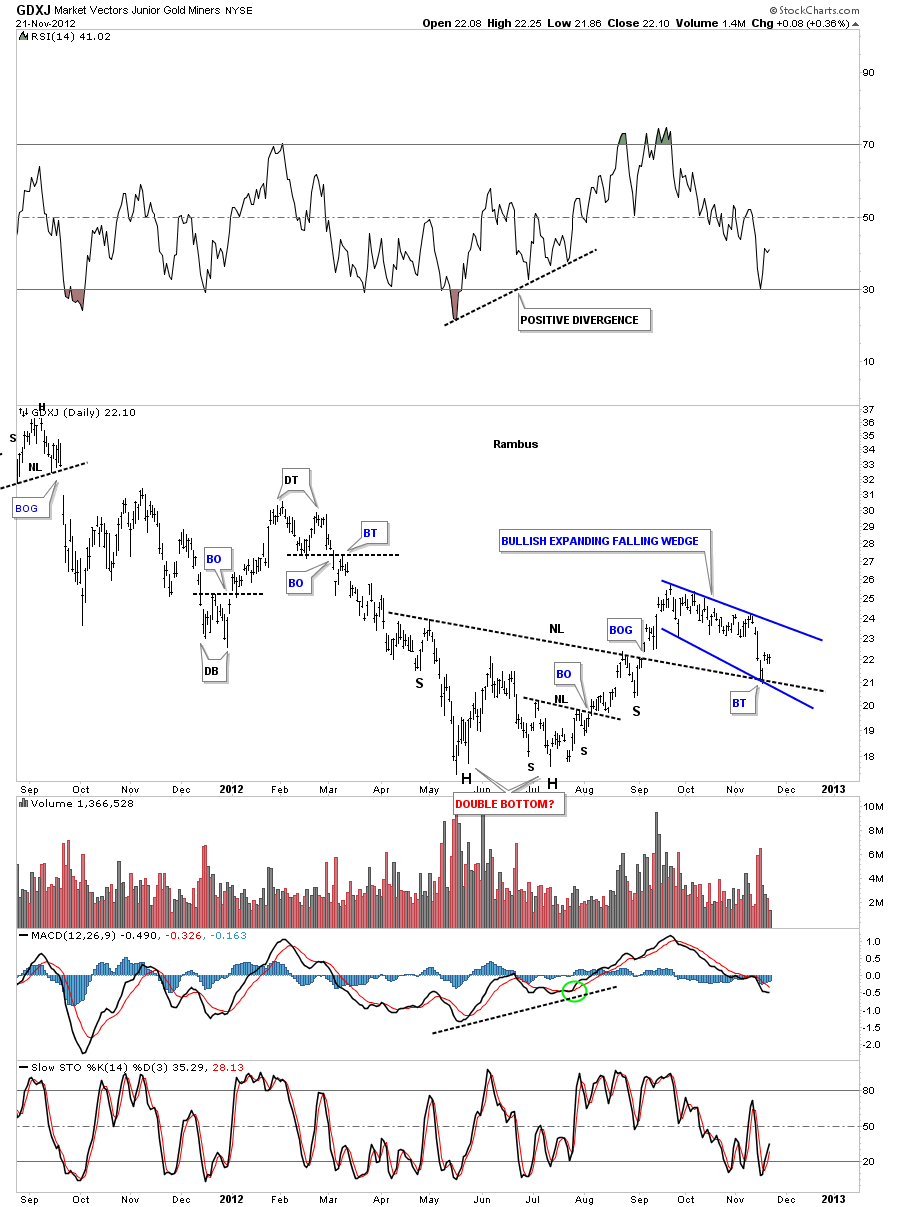
The GDXJ small cap PM stock index show a little different look to the bigger cap stocks. It still has a double bottom with a smaller inverse H&S base. It also has an expanding falling wedge that backtested the neckline last week.
The next chart I would like to show you is a daily line chart for the HUI that shows the double bottom hump still working as support. Line charts are good for showing where real hidden support or resistance is by taking out the spikes that a bar chart can show. As you can see on the chart below the HUI is getting a nice bounce from the lower area of the brown support zone.
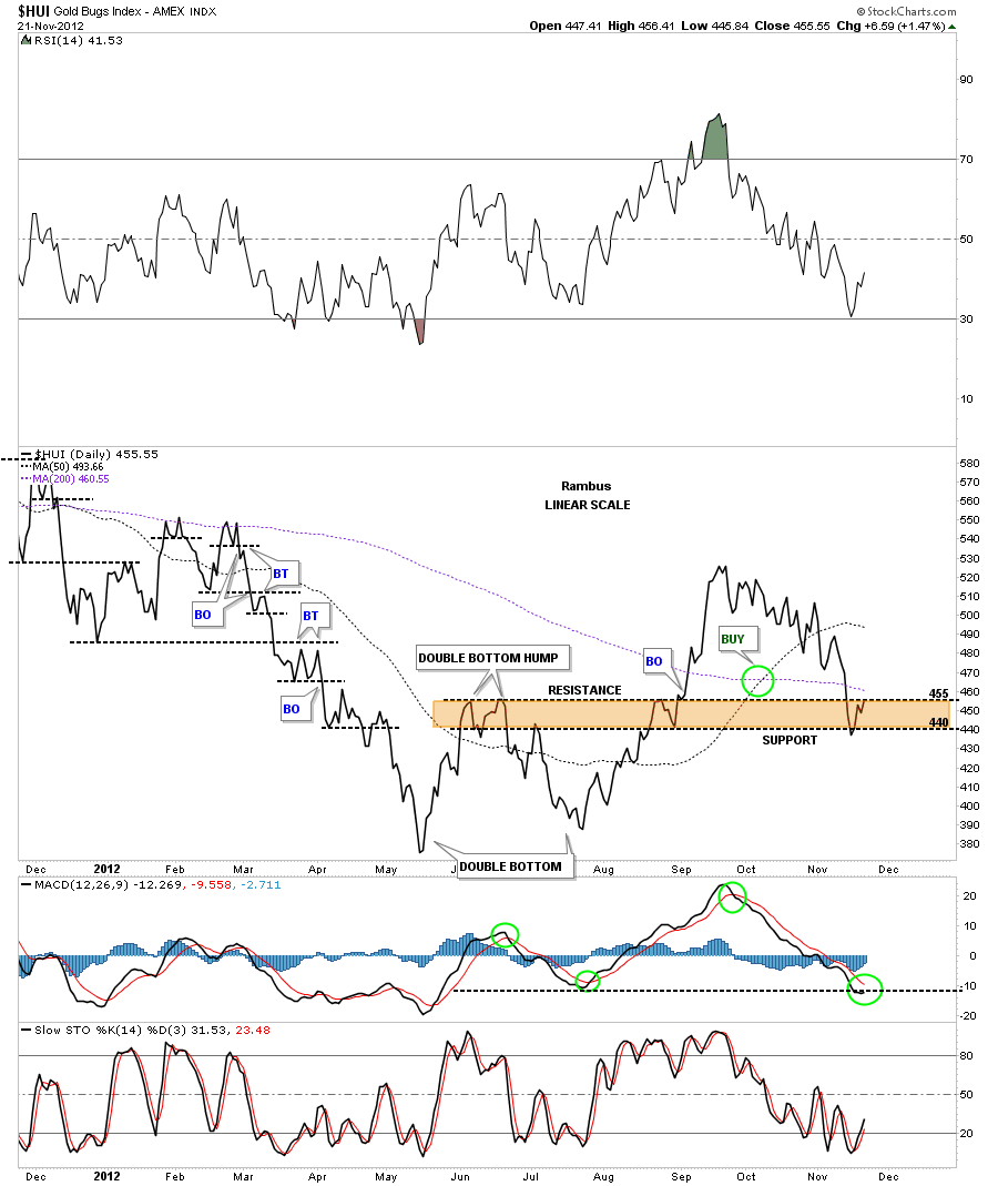
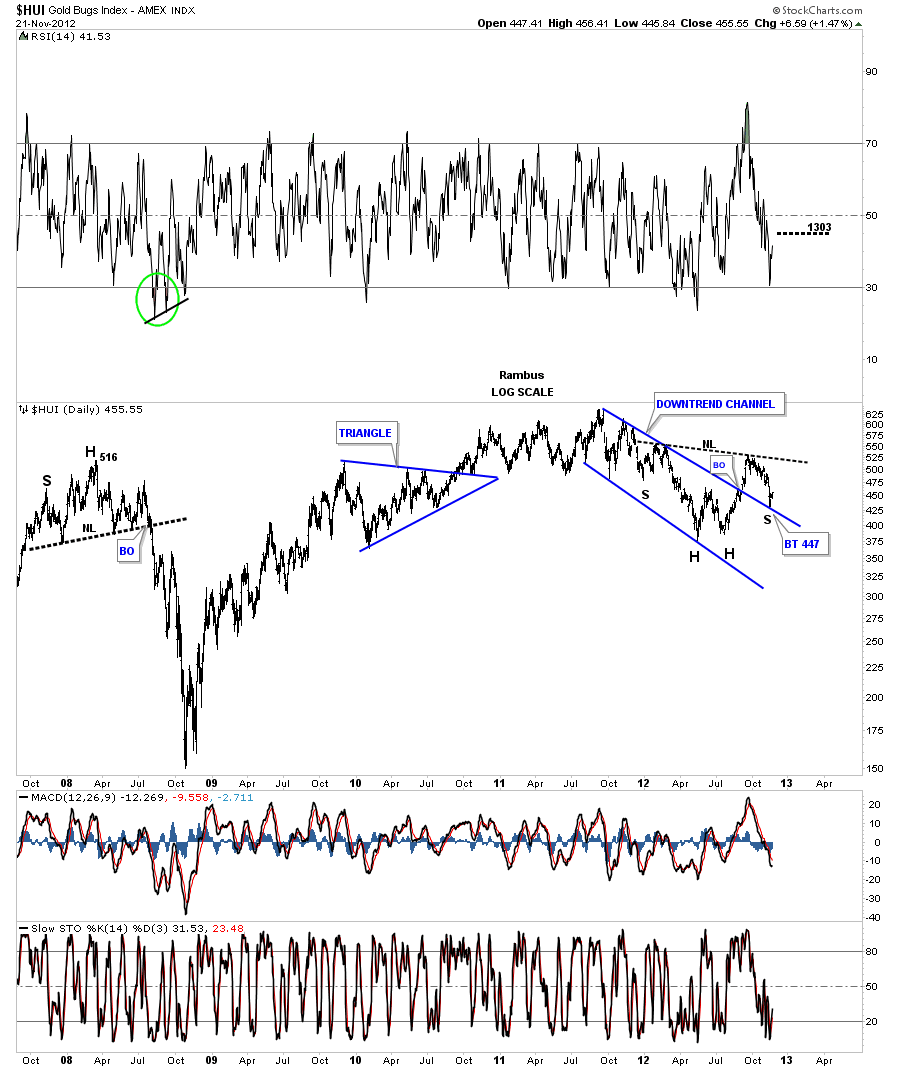
This next chart of the HUI shows the backtest taking place to the top blue rail of the downtrend channel. So putting some of the pieces of the puzzle together you can begin to see why I think the bottom is in for the precious metals stocks. The right shoulder, of the inverse H&S bottom is finding support on the top blue rail of the downtrend channel, is more common than most realize.
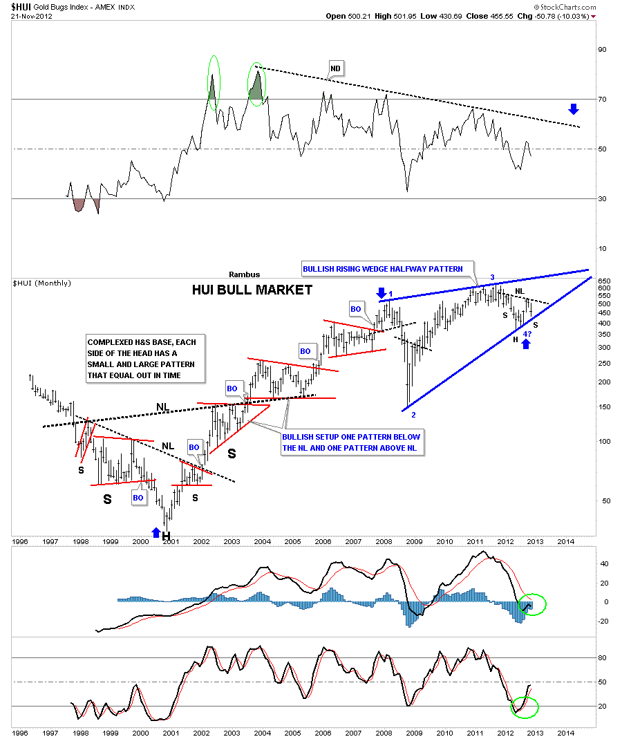
This last chart for the HUI is a long term monthly look that shows the whole bull market from the big complex H&S base to our most recent consolidation pattern, a potential bullish rising wedge halfway pattern. I have taken alot of flack in the past for showing a rising wedge as a bullish consolidation pattern but they are no different than any other consolidation pattern. If they breakout to the upside its a consolidation pattern regardless of what the rules say. Also the expanding rising and falling wedges are another pattern that most chartists miss because they are not in the book of Technical Analysis. Notice where our current inverse H&S bottom is forming, right at the 4th reversal point of the bullish rising wedge. The H&S is a reversal pattern that was needed to reverse the latest downtrend and to put in a 4th reversal point for the big blue bullish halfway pattern. Notice how much bigger the bullish rising wedge is compared to all the other consolidation patterns in red. This is a huge consolidation pattern and has been in consolidation mode since the 2008 H&S top. Big consolidation pattern equals big moves.
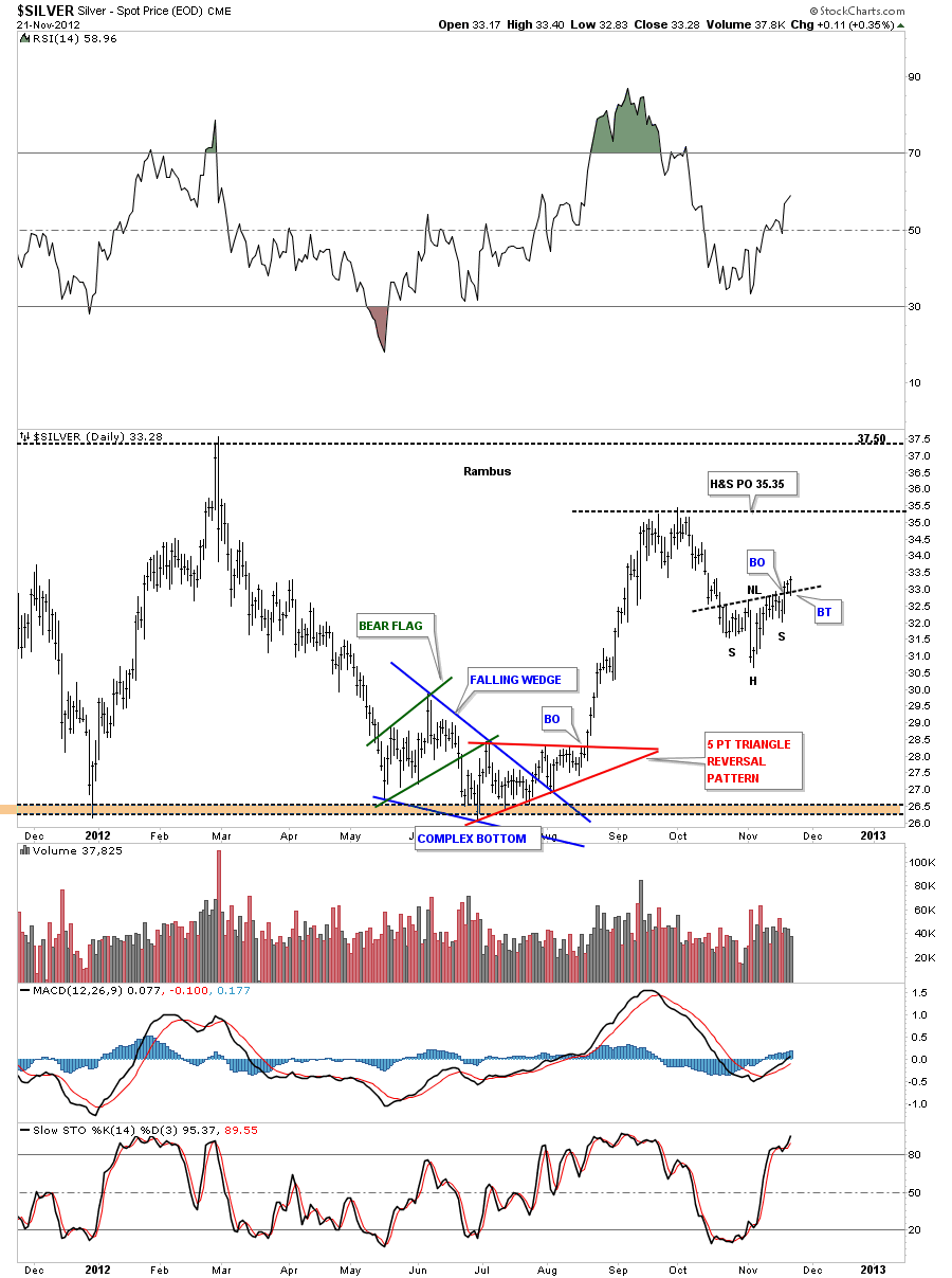
As the precious metals stocks are showing some bottoming action lets take a look at Silver and see if it is confirming a bottom also. This daily chart shows a nice inverse H&S bottom that has already broken out to the upside three days ago with some backtesting already taking place. The price objective is to the previous high at the 35 area.
The last chart I would like to show you is a long term look at gold that is showing a parabolic curve taking shape. If the PM stock indexes are bottoming and silver is bottoming then gold should also show a bottom. If you look at the last bar on the top right hand side of this monthly chart you can see that bar is finding support at the last uptrend rail of the parabolic rise.
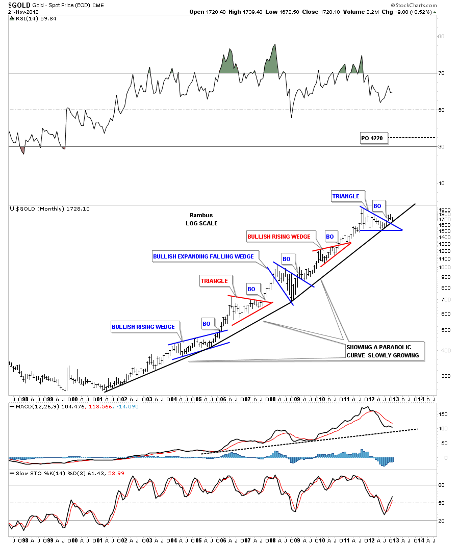
From a chartology perspective there is alot of evidence that is suggesting the precious metals complex has bottomed. I know thats is a strong statement to make but that is what the charts are suggesting to me right now. The last monthly chart above is showing gold on the launch pad with the breakout and backtest of the blue triangle finishing up on the bottom black rail of the parabolic uptrend arc. This is the 5th large consolidation pattern for the 12 year bull market that is suggesting a multiple year rally lies just ahead of us. The chartology shows 3 different methodologies used for analyzing the charts above that don’t show up in most text books. The neckline symmetry rail, the expanding rising and falling wedges and the bullish rising wedge. Its a little unconventional but whatever it takes to see the picture the charts are trying to show us is what its all about. All the best….Rambus.
………………
EDITOR’S NOTE :
Rambus Chartology is Primarily a Goldbug TA Site where you can watch Rambus follow the markets on a daily basis and learn a great deal of Hands on Chartology from Rambus Tutorials and Question and Answeres .
Most Members are Staunch Goldbugs who have seen Rambus in action from the 2007 to 2008 period at www.goldtent.org and now Here at Rambus Chartology since early 2012 .
To review his Work and incredible calls from the 2007-2008 period click on the top right sidebar in the “Wizard of Rambus” ….”What If !!” Post
To Follow Rambus Unique Unbiased Chart Work and participate in a Chartology Form with questions and answeres and learn the Art and Science and Mindset of a Pro Trader please Join us by subscribing monthly for $29.99 at
www.rambus1.com
We have many subscribers from all over the world who are glad they did as they enjoy the many daily updates and commentaries provided at this exciting new site
As you will see Rambus (Dave) has prepared us for this difficult period by being one of the only ones to see and warn about the incredibly debilitating PM smackdown as early as Jan 2 2012 …click on the” HUI Diamond in the Rough” Post in the “Wizard of Rambus” top right
More Recently Rambus called a Bottom in HUI in this post…and has had subscribers on board for a Powerful Run to the Upside
rambus1.com/?p=5651
BUT
What is he seeing Now ?
You will find Rambus to be a calm humble down home country tutor with an incredible repitoir of all the TA based protocols tempered with his own one of a kind style…simply put…He wants to keep his subscribers on the right side of these crazy volitile and downright dangerous markets
See you at the Rambus Chartology
www.rambus1.com