This content is for Yearly and Monthly members only.
Subscribe
Subscribe
Already a member? Log in here

In this Weekend Report I want to take a good hard look at silver which has been the laggard in the precious metals complex to see if there is something technically wrong. If you been following the precious metals complex for any length of time you’ll know that silver can be contrarian at times. It likes to start out slow and then once gold begins to pickup the pace then silver will play catchup. Once silver gets ready to move it can rally hard and fast catching up to gold and surpassing in on a percentage basis. So far since the December low silver is playing its game of Opossum by looking weak and not confirming the move in gold or the precious metals stocks. I think this is a deceptive look on silver right now. Lets see what the charts are telling us about silver and look for some clues that might help shed some light on what is really taking place right now.
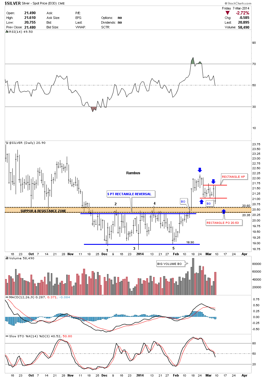
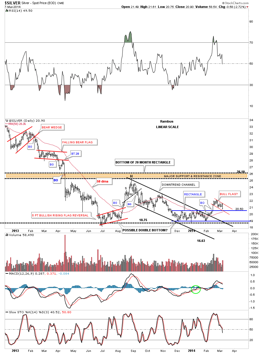
The first chart is a six month daily look that shows our five point rectangle reversal pattern that has reversed the downtrend. The breakout was accompanied buy some really heavy volume which is what you like to see. I’ve added a brown shaded support and resistance zone that gives us a place to look for support now that silver has broken above that area of resistance. That zone is roughly 20.35 to 20.60 which should offer good support. One last important note on the chart below. Since silver made its breakout high it has been in backtest mode which is to be expected. In doing so it has created a small red rectangle halfway pattern to the downside. Using the impulse measuring technique I’ve been showing you the little red rectangle halfway pattern has a price objective down to the 25.53 area which is in the brown shaded support and resistance zone.
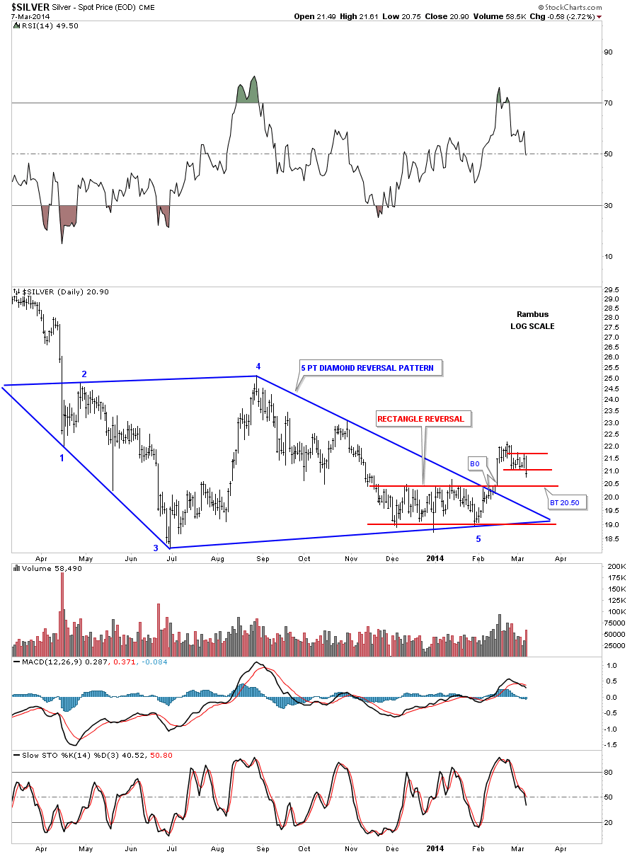
Lets now look back about one year that shows the two reversal patterns that are now in play. The first reversal pattern is the big blue five point Diamond reversal pattern. This Diamond has shown up on a lot of the PM stocks which has done a little morphing since we first started to recognize it last year. The other reversal pattern is the blue five point rectangle reversal pattern that we looked at on the chart above. We have two – five point reversal patterns in play right now that suggests a decent bottom should be in place right now.
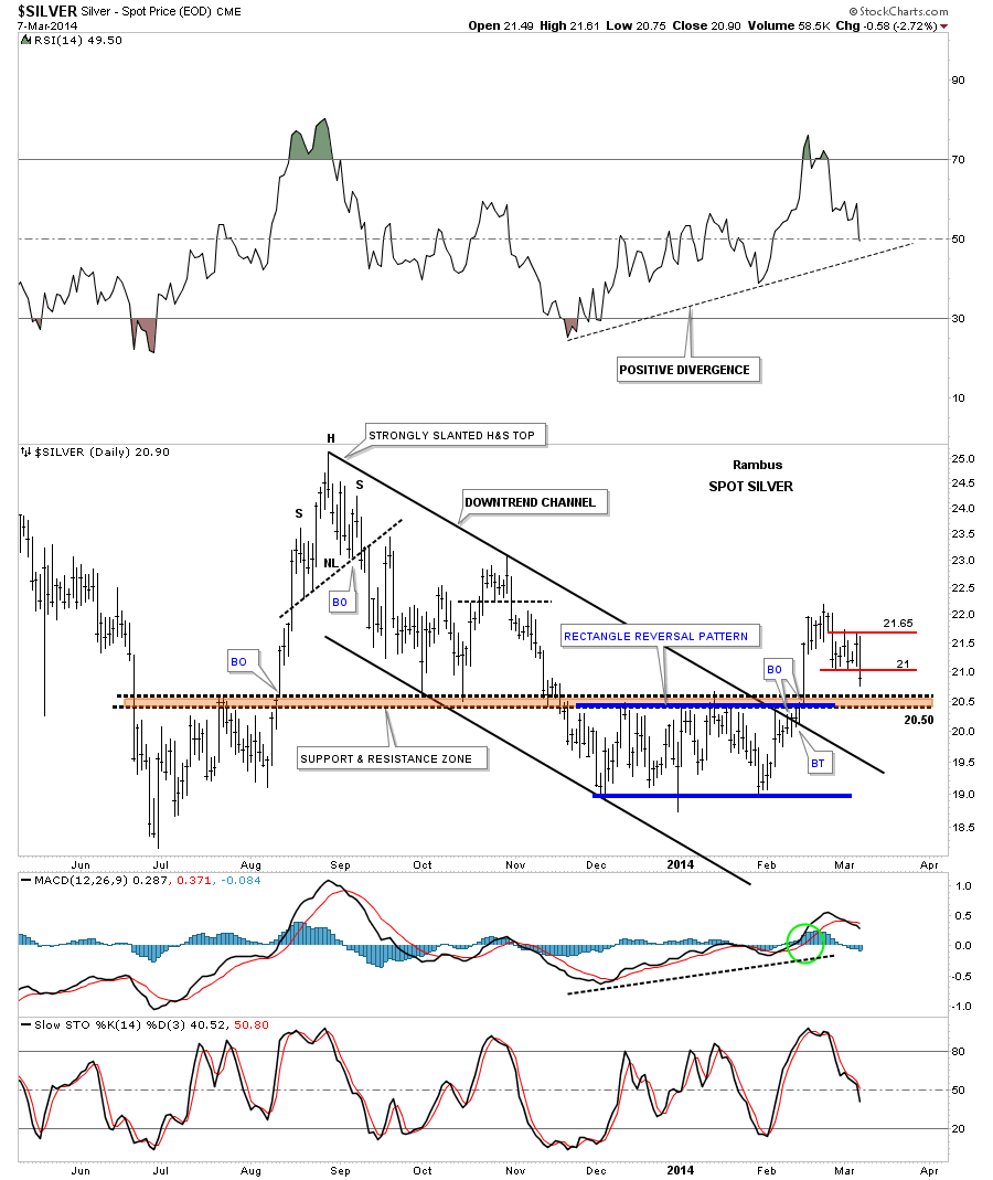
Lets look at another daily chart for silver that is about a year long that shows us another positive development. When silver broke above the brown shaded support and resistance zone it also took out the top rail of a six month downtrend channel along with the top rail of the 5 point blue rectangle. If you look real close you will see that silver backtested the top rail of the downtrend channel, around the 20.50 area, for just two days before it shot higher. It now looks like silver is going to backtest the brown shaded support and resistance zone, from the topside, just as it did back in October of last year. Note how fast silver moved up last August when it was ready to go. If you’re not positioned before a move like that it’s hard to get on because there is no pullback. You either plug your nose and jump in or you miss the move.
Lets look at one more longer term daily chart for silver that puts the downtrend channel and the blue five point rectangle reversal pattern in perspective. I would like to focus your attention to the bottom right hand side of the chart that shows our current price action. There are three possible areas of support that intersect right at the 20.50 area. The first one is the top of the blue rectangle. The second is the bottom rail of the red bull flag that is made up of the little red rectangle halfway pattern that I showed you on the first chart above. The third possible area of support is the 50 dma that comes in at 20.36.
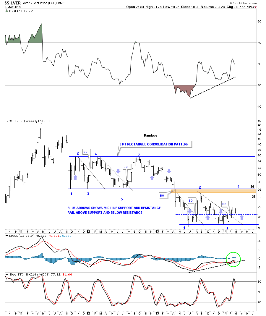
Now lets take a look at a weekly chart that starts putting the big picture into focus. This weekly chart shows the rally up to the 50 area and the bear market that has ensued. After breaking down from the unbalanced double top silver went right into a six point rectangle consolidation pattern that lasted almost two years. Whenever you have a horizontal trading range or rectangle I always look for a mid rail that forms in the center of the rectangle. Sometimes these mid rails will be exactly in the middle and sometimes they can be offset just a bit either up or down from the mid point. As you can see on the upper six point rectangle the center blue dashed rail is pretty close to the center as shown by the light colored blue arrows. What the blue arrows are showing is the tops and bottoms which you connect your center line to. Above is support and below is resistance. As you can see in our current horizontal trading range the mid line is a tad lower as shown by the thin blue arrows. It comes in at, you guessed it, 20.50. The black dashed down sloping trendlines shows what happens when they get broken to the upside. As you can see there is generally a very strong rally backup to the top of the trading range. So far silver is four weeks into its breakout move above its black dashed downtrend rail. Hopefully when the backtest gets finished it will waste little time rallying back up to the top of the trading range between 25 and 26.
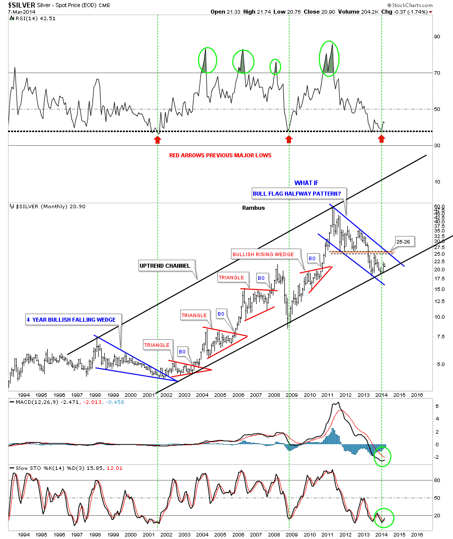
Lets look at the monthly chart that shows the very large uptrend channel that silver has built out over the last 12 years or so. The two big blue patterns make up the width of the uptrend channel with the smaller red secondary patterns making up the rest of the bull market in the move going into the April 2011 top. Whenever I see a chart like this, that has several smaller consolidation patterns that form in an uptrend, and then the stock makes a much bigger consolidation pattern, I always think of the bigger consolidation pattern as a halfway pattern. This can be on any time frame. This is one of those “WHAT IF” moments. What if this three year blue bull flag is a halfway pattern to the upside. What would the price objective for silver be if this is the case? If this three year bull flag is actually a halfway pattern in the secular bull market, that the precious metal complex has been in since the beginning 2000, then the price objective would be around the 200 area give or take 20 dollars. That’s a long time from now but it’s a possibility. Right now we have to worry about the 20.50 area holding support and take it one step at a time.
The last chart I would like to show you for silver is the quarterly chart that shows all the history going back to 1970. You can see why the possibility for 200 isn’t out of the question. Silver has been reversing symmetry back up to how it went down after the 1980 all time high. Its been making a series of H&S bottoms with the third and largest H&S bottom working as support as silver is in backtest mode right now. Also silver could be forming a very large cup and handle with our blue bull flag being the handle. The first thing we need to see happen is for silver to breakout of its bull flag then takeout the all time high at 50. So there is a lot of work to do but the possibility is there in the long term picture. Note how big our current blue flag looks compared to any other consolidation pattern on this very long term chart.
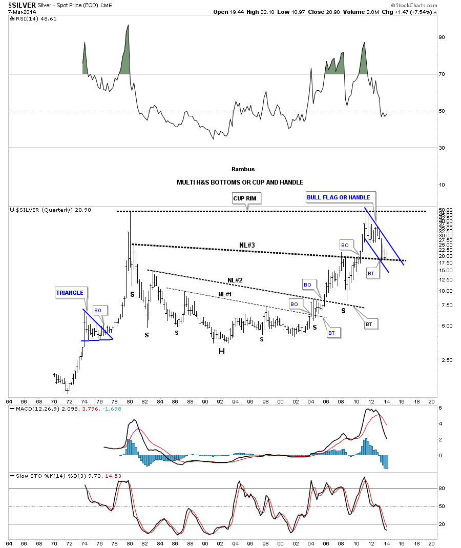
In the very short term silver needs to hold support around the 20.50 area and then rally strongly up from there. If it can do that then our first price objective will be the 25 to 26 area which is the top of our recent high in this consolidation pattern and the bottom of the six point rectangle that formed after silver put in its major top in April of 2011. So we wait for silver to shows us her hand. All the best…Rambus
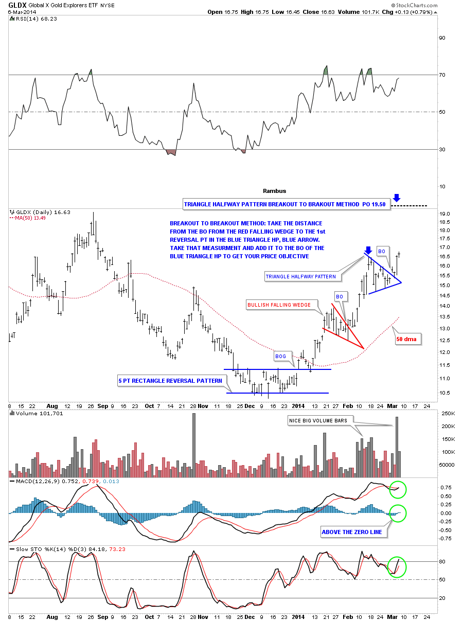
As I promised you last night lets look at the GLDX, Junior Gold Stock Explorers etf that maybe one of the hottest areas in the markets right now. Tonight I’ll show you the two different measuring techniques I use to get an idea of where the price may move once a breakout is in progress.
The first method I call the breakout to breakout method which the name implies. You can use this method when you have a top, bottom or consolidation pattern below your current consolidation pattern. Using the GLDX we see this is the case. We have the red bullish falling wedge that formed below our current blue triangle. If this plays out according to plan the blue triangle will be in the middle between the red bullish falling wedge and the price objective up to the 19.50 area.
To measure the blue triangle as a halfway pattern I just take my fib tool and measure the distance from the breakout from the red bullish falling wedge to the first reversal point in the blue triangle, blue arrow. You do this with any consolidation pattern, whether it’s a rectangle, wedge, Diamond or whatever the consolidation pattern is. You then take that measurement and add it to the breakout of the blue triangle halfway pattern to get your price objective up to the 19.50 area. Sometimes these measurements can be dead on the money and other times fairly close. It gives you a place to look for other signs of where the impulse move may run into resistance. In this case you can see a top that was formed last August in the 19.50 area so that is another good clue that the breakout move should go up into that area.
Note the MACD just crossed with the Histogram moving above the zero line along with the slow stoch also crossing. This breakout is being accompanied by some nice big black volume bars also. As you can see today’s price action is testing the high of the blue triangle which is encouraging. So there are a lot of positive things going on with this little junior stock index.
The other method I use to measure a price objective I call the impulse method as it’s measuring the equal distance above and below a halfway pattern. Using the same GLDX chart we are going to measure the blue triangle as a halfway pattern using the impulse method. Again, take your fib tool and measure from the last reversal point in the previous consolidation pattern, red falling wedge, which actually starts the impulse leg up. You then take that measurement and add it to the last reversal point in the blue triangle to get your price objective up to the 18.85 area as shown by the blue arrows. It doesn’t make any difference how many reversal points a consolidation pattern has, 4,6,8 or more, you always use the last reversal point in any consolidation pattern to measure for your price objective.
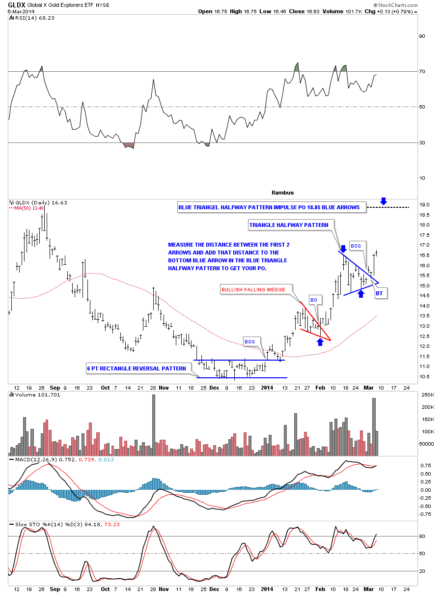
So between the two different measuring techniques we get a range between 18.85 and 19.50 with the previous high made last August also in that area gives us a place to shoot for. I know there are other measuring techniques that people use but for me this is how I like to calculate a measured move.
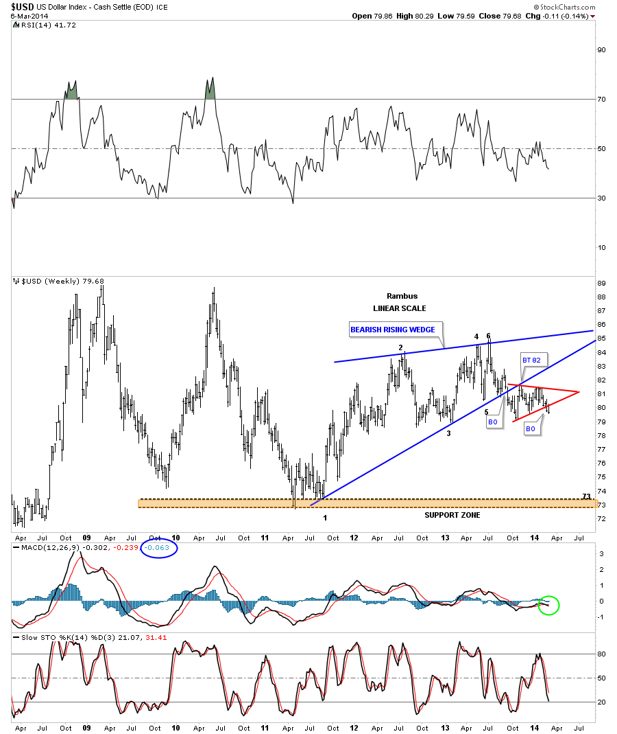
It’s been awhile since we looked at the US dollar that has been showing some weakness lately. The first chart is pretty cut and dried as it shows a big blue bearish rising wedge that had a clean breakout and backtest. It then went on to form the red triangle just below the bottom blue rail which as you know I view as a bearish setup. The price objective for a rising or falling wedge, many times is the beginning of the wedge. In this case the blue bearish rising wedge started to form back in the late summer of 2011 at the 73 area. You never know 100% for sure how the inter market analysis is going to play out but a decline, in the US dollar to the 73 area, could be a big catalyst for a large move up in the precious metals complex. We’ll know in hindsight.
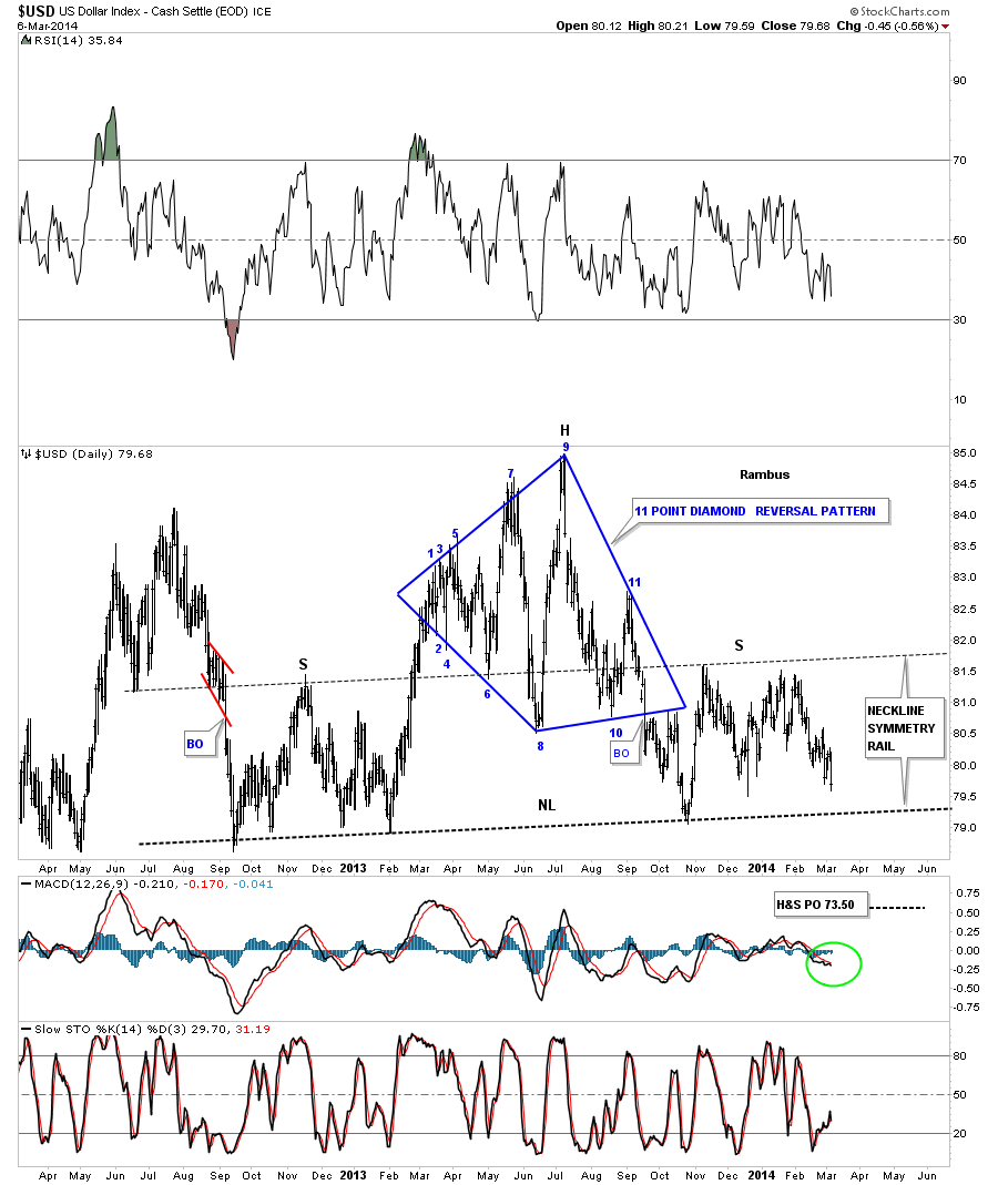
Some of our longer term subscribers may remember this big 11 point Diamond reversal pattern that formed last year. This is a very similar setup to the big Diamond that gave me a clue that the HUI was in a very large topping pattern well before the price action broke down. I view the blue Diamond as the head portion of a big H&S top formation. I’ve added a neckline symmetry rail that is just a parallel line taken off of the neckline that often times gives us a place to look for a high on the right shoulder. As you can see it nailed the height for the right shoulder. The price objective is quite interesting for this H&S top. If the neckline gets broken to the downside the price objective would be down to the 73.50. This puts the price down into the 73 area as shown by the bearish rising wedge on the chart above. Again, we’ll know in hindsight if this all plays out but for the moment this is what the Chartology is telling us.
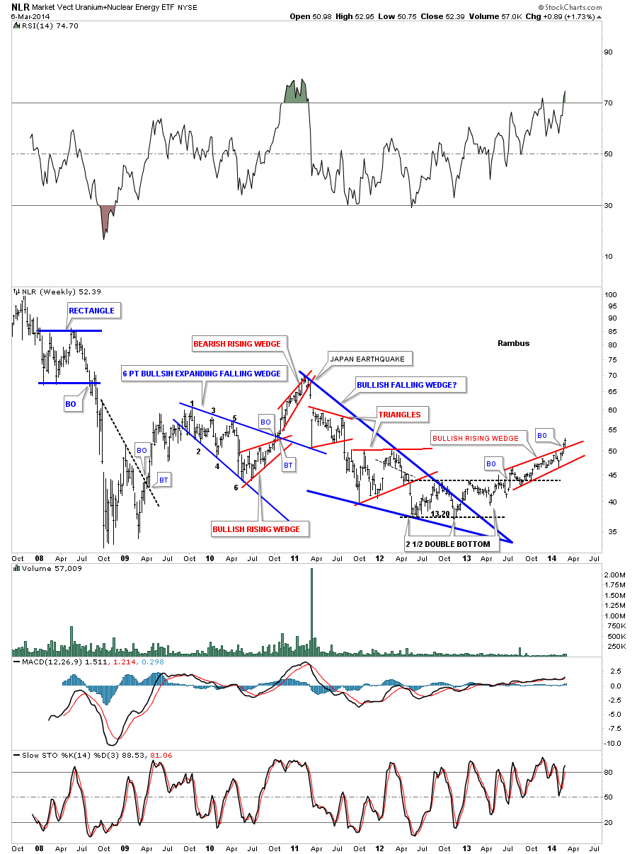
There is another area we haven’t looked at in awhile and that is the Uranium Sector. This area has also caught on fire. Lets look at the NLR, the Uranium etf, that shows the price action breaking out though the top rail of a bullish rising wedge. This is a pretty impressive move taking place right now in this sector.
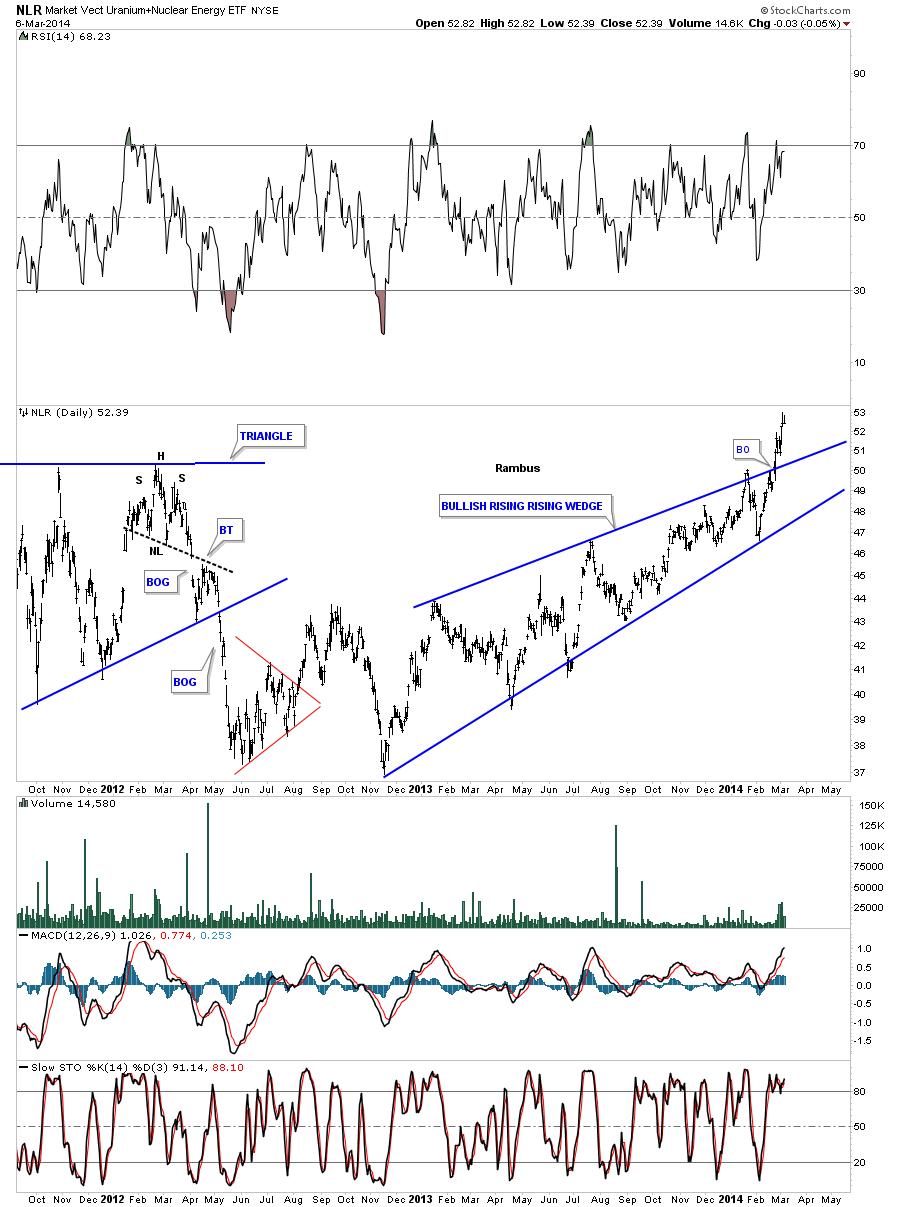
Below is a weekly chart for the NLR that shows all the chart patterns that have developed over the last 6 years. Note the big blue bullish falling wedge that broke out well over a year ago but it was a slow grind higher until just recently as prices have started to accelerate to the upside. Sometimes I’m still amazed at what the Chartology can show you sometimes before an event happens. Notice the red bearish rising wedge that had formed back in late 2010 around the 65 area. That vertical breakdown form that red bearish rising wedge was the Japan earthquake. That was the top like so many other commodities that have been in a 3 year correction that started in 2011. Three years is a nice long time for a correction to take place in a secular bull market. Maybe we’ll see inflation first and then deflation. It really doesn’t make and difference as we will be following the price action to where ever it takes us. All the best…Rambus