I was going to write this article several weeks ago but the move in gold took the spotlight and I had to put this on the back burner. Now that gold has settled down a bit I would like to show you some charts that pertain to the Risk On trade that are showing commodities entering a weak period. By the looks of some of the commodity charts it looks like some deflation is on the way. Even with all the money printing it doesn’t seem like enough to stem another round of weakening commodity prices. So lets see what the charts are telling us.
The US dollar is key if we are about to enter the Risk On trade. If you recall the dollar sky rocketed during that bout of deflation as precious metals, commodities and the basic materials stocks fell on hard times in 2008. I know there is a lot of talk about inflation taking off but as the charts below will show, now doesn’t look like the time we have to worry about the inflation scenario.
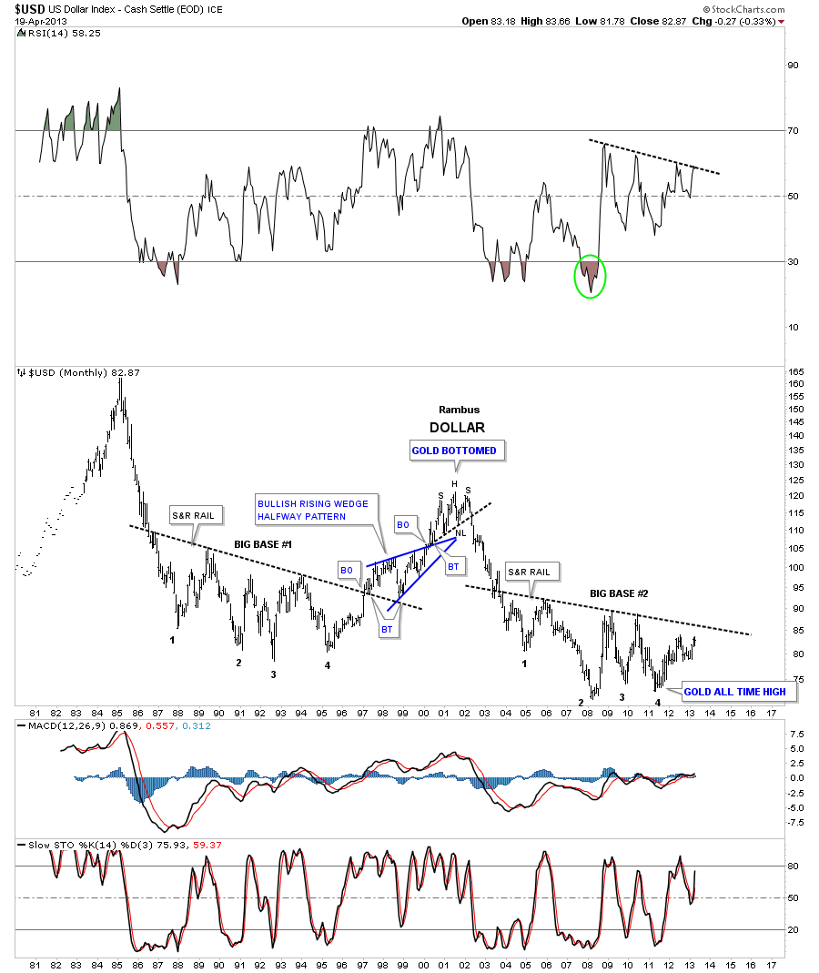
The US dollar has been making a series of higher lows since the bottom in the summer of 2011. Late last year and early this year the US dollar made a double bottom which is now the head portion of a H&S consolidation pattern. The dollar is still working on the right shoulder but when the neckline gets broken to the upside that will start putting pressure on commodities and basic materials. A break above 84 should get the ball rolling.

This next chart is a weekly long term combo chart with gold on top and the dollar on the bottom. Note the purple dashed vertical lines with the purple arrows. What that shows us is how the dollar refused to make a new lower low while gold went on its parabolic run to 1920. This was a major positive divergence for the US dollar to gold. Note the big rounding base the dollar has been carving out while gold has been trending down. It’s not perfect but you can see the inverse correlation between the two. A break above that long term black dashed support and resistance rail at 86 will really put pressure on gold and the rest of the Risk On trades.

Lets take a look at one more chart for the dollar that is a long term monthly look that shows the huge base that is getting close to completing. You can see, on the chart below, there was a big base built back in the late 80’s and early 90’s, labeled big base #1 that led to a multi year rally in the dollar. Notice how similar the two big bases are. Once the dollar breaks out above the support and resistance rail, the big base #2 will be complete. Keep in mind this is a monthly chart so the move is not going to be a flash in the pan type of event but a multi year rally.
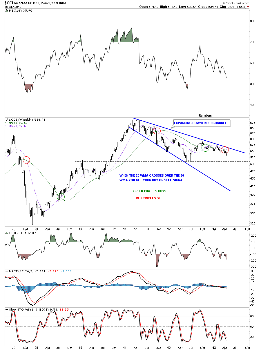
Lets look at the CCI commodities index that is showing the price action has been trading within an expanding downtrend channel since toping in the spring of 2011. The 20 and 50 week moving averages are just about ready to cross that will give a sell signal.
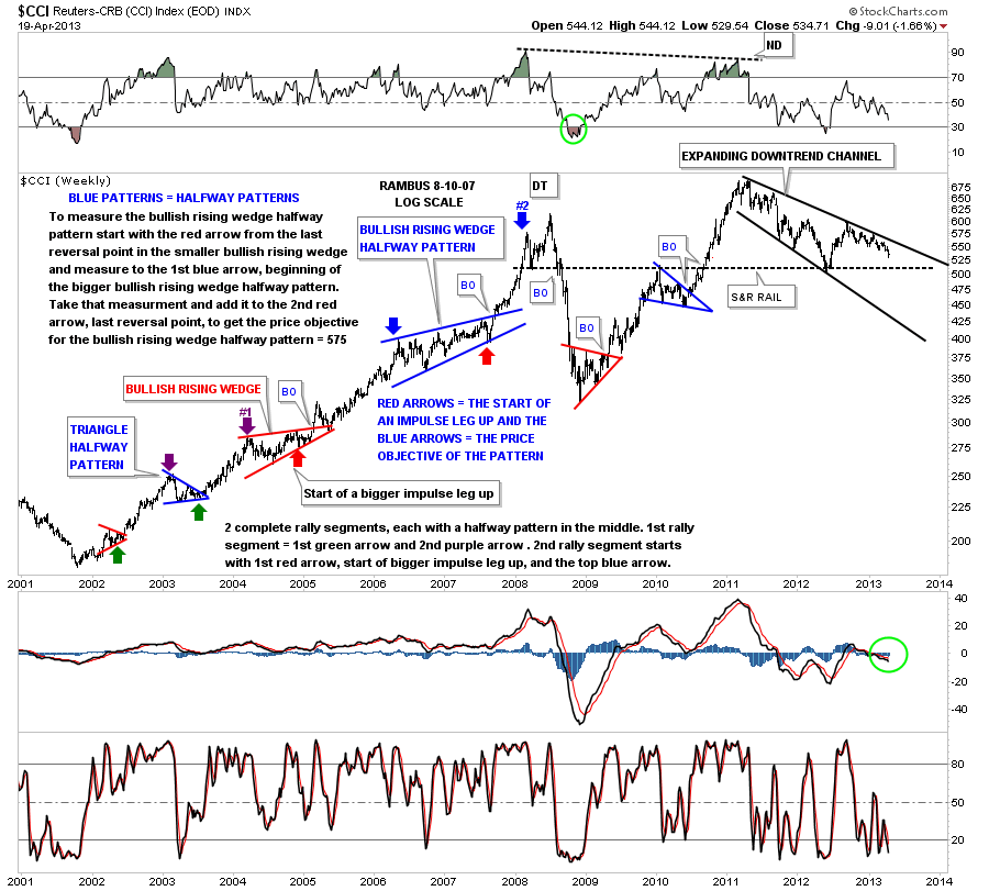
The very long term weekly look at the CCI shows some very nice chartology that I used during the initial bull market off the 2002 bottom. I’m still amazed by the random walk of the stock markets that can create such beautiful symmetry and patterns that can be used to help take out a lot of the noise that keeps many investors confused.
The old CRB index is breaking down from a small H&S consolidation pattern within its expanding downtrend channel.

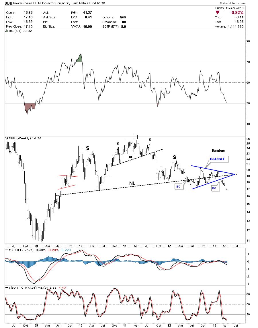
The DBB Multi- Sector Commodities Trust Metals Fund has broken out of a very nice H&S top and is in the process of making new multi year lows.
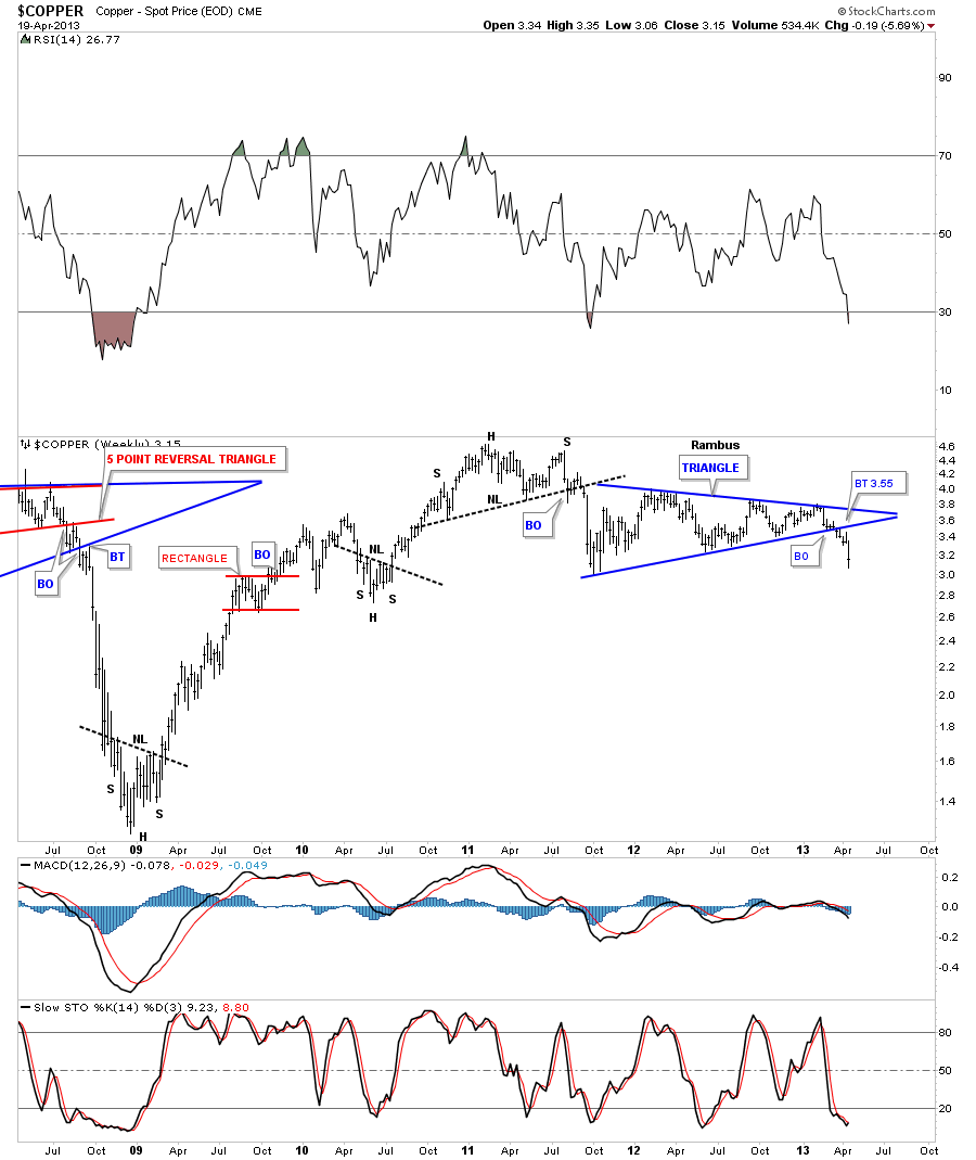
Copper plays a big role in the Risk On trade. The weekly chart below shows the small H&S at the top of the chart that reversed the uptrend that began off the 2008 bottom. The big blue triangle is just the first consolidation pattern that has formed since the downtrend began. If your looking for inflation you don’t want to see this commodity fall in price.
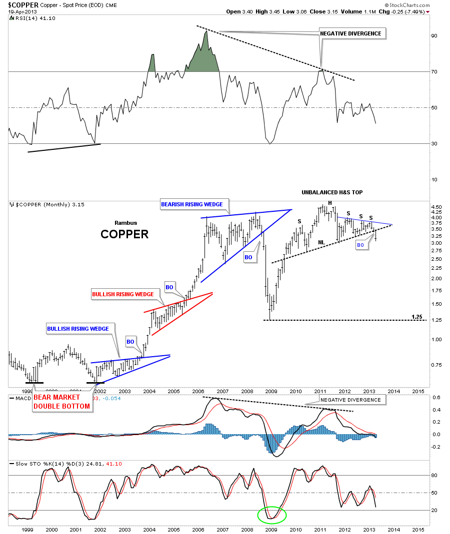
The long term monthly chart for copper is very interesting as it shows a big unbalanced H&S top that has just recently broken out. That’s a big top by any standard. It should have enough energy to move the price of copper down to the 2008 lows. Note the big negative divergences on the RSI on the top of the chart and the MACD on the bottom. Just think of the neckline as a line in the sand, above positive and below negative. Keep it simple.
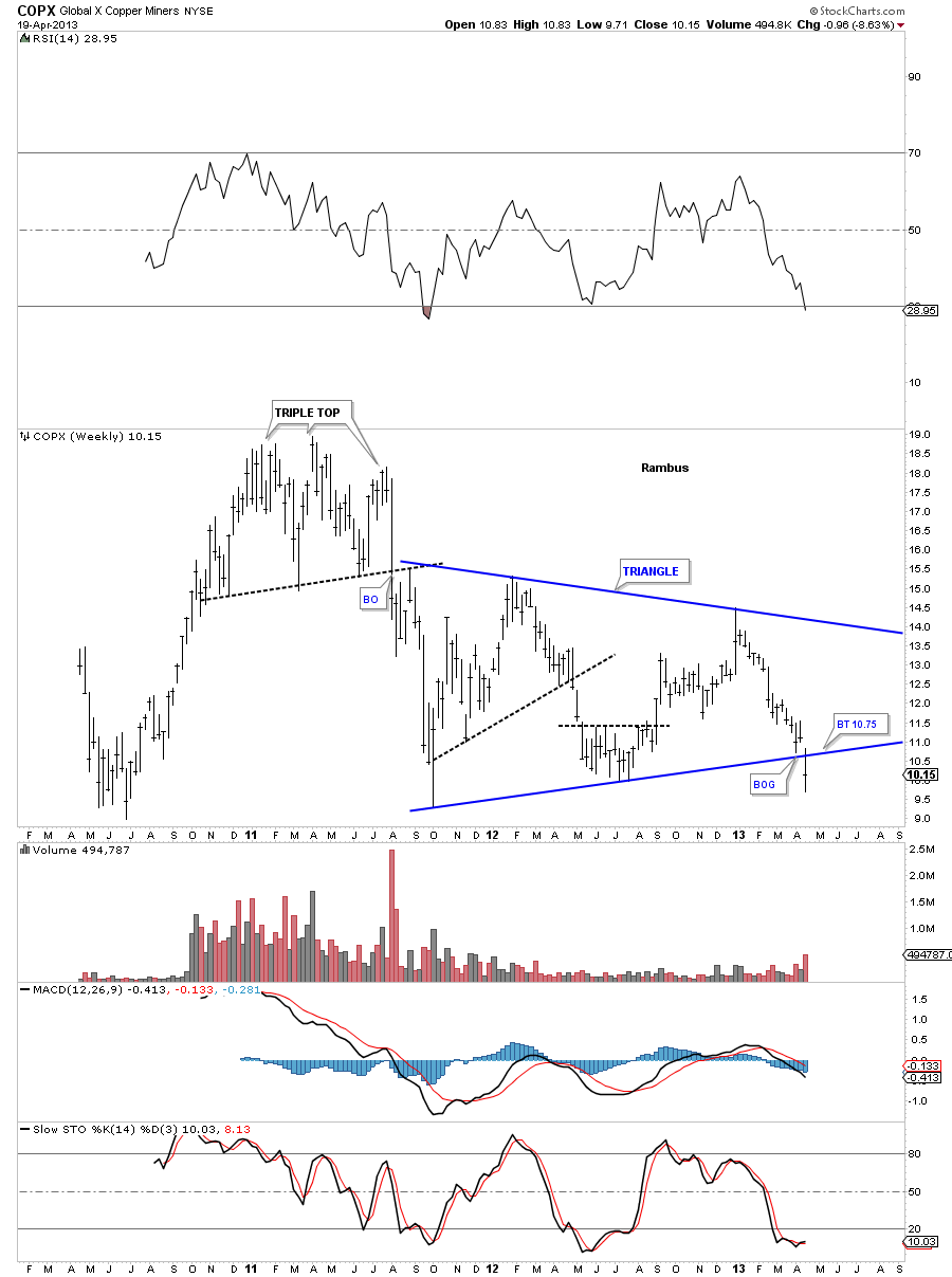
The COPX broke out, with a gap, of a very symmetrical triangle consolidation pattern this week. There could be a backtest to the bottom blue rail at 10.75 before the move down begins in earnest.
The IYM is your Basic Materials etf that looks like it’s completing an unbalanced double top. It had a breakout gap on Monday along with many other stocks and is now in the process of backtesting the double top trendline at 67.30 or so. This one really needs to breakdown for the Risk On trade to gather momentum to the downside. We’ll see if the backtest now holds as resistance.

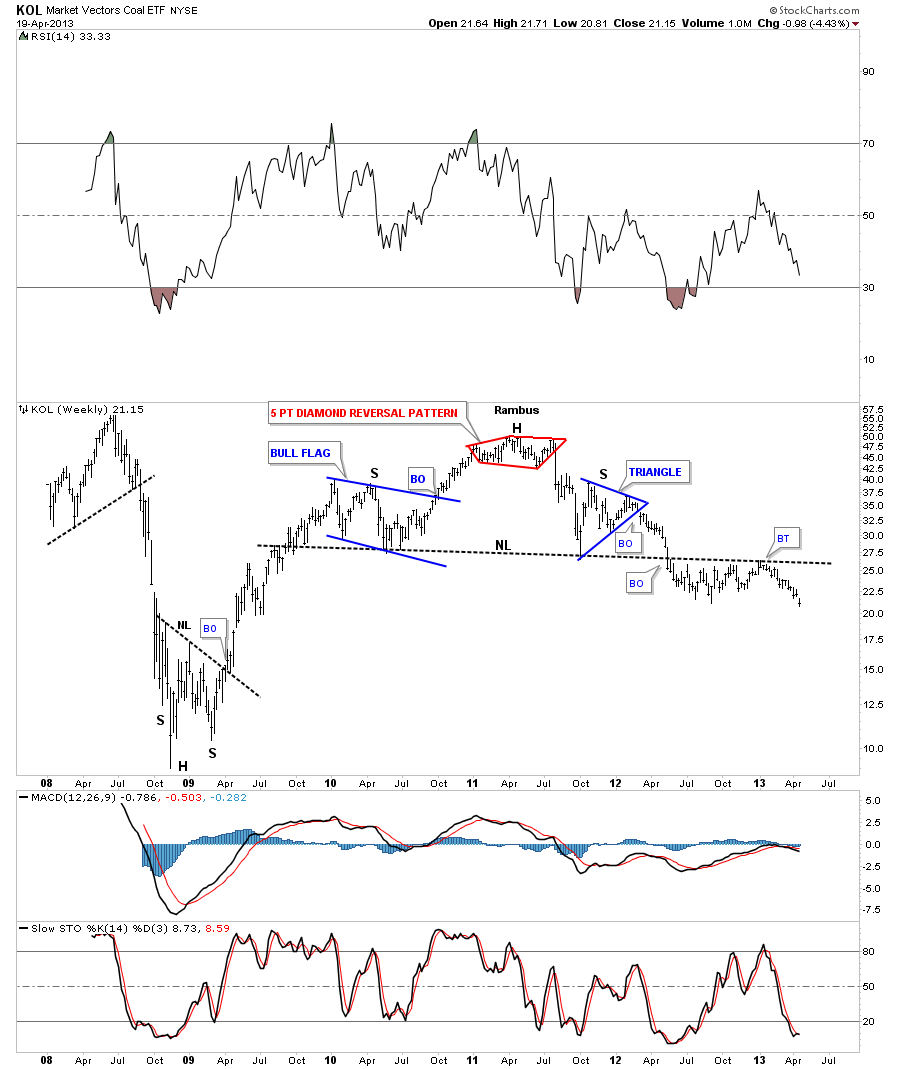
I’ve been following this H&S top for KOL, coal etf, for what seems like an eternity. As you can see after breaking down through the neckline the price action has been testing the neckline from below for a year or better. It now looks like it’s finally starting to break a little harder to the downside. That’s another very larger H&S top that resembles alot of the precious metals stocks.
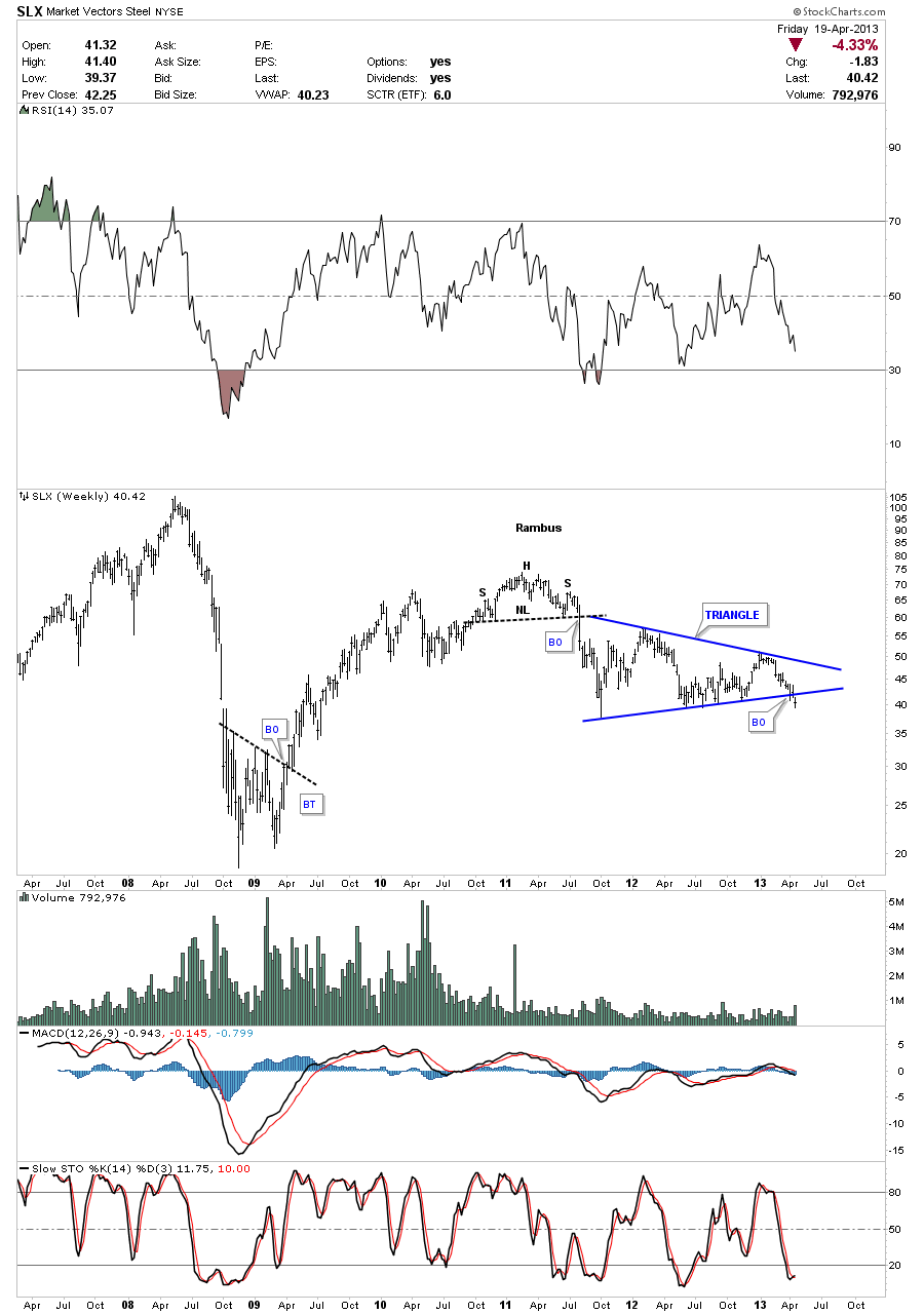
Lets look at the SLX which is a steel etf that just broke out of a pretty symmetrical triangle this past week. Note the small H&S at the top of the chart that reversed the uptrend off the 2008 bottom. This is Chartology at its best.
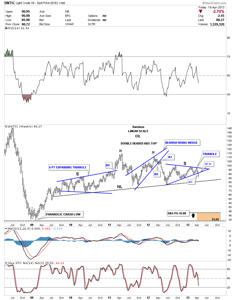
If we are truly entering another period of Risk On trades, Oil needs to participate along with the rest of the commodities complex. Oil broke out of a symmetrical triangle a week or so ago. Note the little H&S top that formed at the apex of the blue triangle that tipped us off that the triangle was going to break to the downside. Here a clue there a clue and pretty soon a picture starts to emerge.

The second to the last chart I would like to show is a weekly chart for Oil that is showing a very large H&S topping pattern that will have a big impact on the Risk On trades. As I showed you the small H&S top, on the daily chart above, that gave us a clue that the triangle was going to break to the downside, we now have a similar setup with this weekly Oil chart. Here you can see the breakout of the blue triangle is giving us an early warning that the big neckline is going to get broken to the downside.
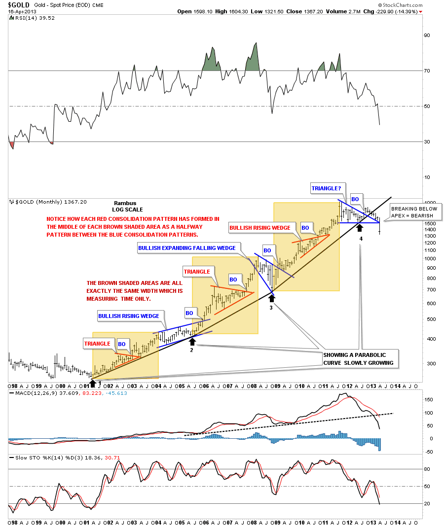
I want to leave you with a very long term chart for gold that I have now labeled as having put in a very large unbalanced double top. It pains me to do this, as I know most Chartology Members are first and foremost Goldbugs, but I can’t argue with what the price action is showing. Until last week we still didn’t know for sure if the trading action below the 1920 area was a consolidation pattern to the upside or a topping pattern. There is now no doubt that gold has put in a major top that is going to take alot of time to turn things around. As you can see on the long term monthly chart gold has now put in a series of lower highs and lower lows which is a downtrend, Chartology 101. This chart shows exactly how a market that has gone parabolic, which some will disagree with me, breaks down. Last weeks major sell off has trapped many gold investors who bought into the unbalanced double top area, which will now be looking for a place to sell on any strength. Normally in these type of situations the market won’t be very obliging and will inflict much pain for those that don’t recognize or understand what is taking place.

What these charts above are telling me is that inflation isn’t on the horizon right now. We need to be concerned about another bout of deflation and gear our portfolios to take advantage of that scenario. All the big H&S topping patterns that have shown up in the precious metals stocks, oil and many other commodities are telling us this isn’t going to end anytime soon. The US dollar is on the verge of breaking out of a huge base that is telling us this could be a multi year event and not just a flash in the pan. I hope the charts, I presented in this article, paint a clear picture of what lies ahead for us, regardless of how some interpret the fundamentals to be inflationary. The charts don’t lie but the misinterpretation of the charts can lead many astray. Knowing how the battles between the bulls and the bears show up as a consolidation pattern or a top or bottom, can give one an edge if one can read between the lines and keep an open mind. All the best…Rambus
Editors Note
Rambus Chartology is Primarily a Goldbug TA Site where you can watch Rambus follow the markets on a daily basis and learn a great deal of Hands on Chartology from Rambus Tutorials and Question and Answers .
Most Members are Staunch Goldbugs who have seen Rambus in action from the 2007 to 2008 period … and now Here at Rambus Chartology since early 2012 .
What is he seeing now ?