HUI Update…WHAT IF THIS IS DEJA VU ?

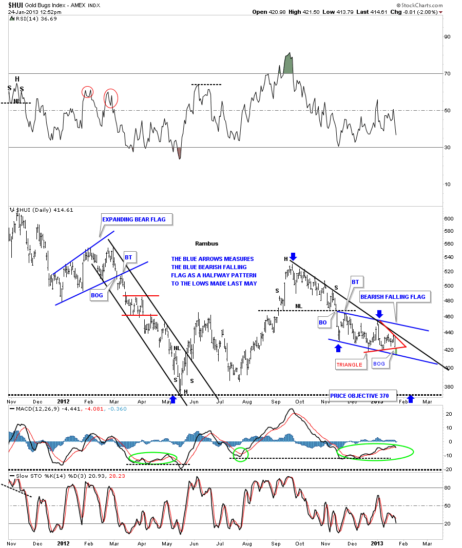
I just want to show you what I think is happening right now with the HUI. You can see the blue bearish falling flag that actually started out as a bearish falling wedge but morphed into the falling flag. Same bearish setup but the original pattern just morphed alittle bit. This morning the price action gapped below the bottom rail of the red triangle that has formed within the blue bearish falling flag. The price action is now sitting on the bottom blue rail. Its totally possible that we get a backtest to the bottom rail of the red triangle before we move lower. If we do then I’ll take another 1/3 position in the Kamikaze Portfolio with the capital we raised yesterday when we got stopped out of our DSLV trade. The blue arrows shows how I measured the blue bearish falling flag as a halfway pattern that shows the price objective to the previous low made last May. Important note here. That May low is also where the neckline form the big H&S top comes into play. Things are starting to get interesting again after the long chopping action over the last several months or so.
HUI 55555

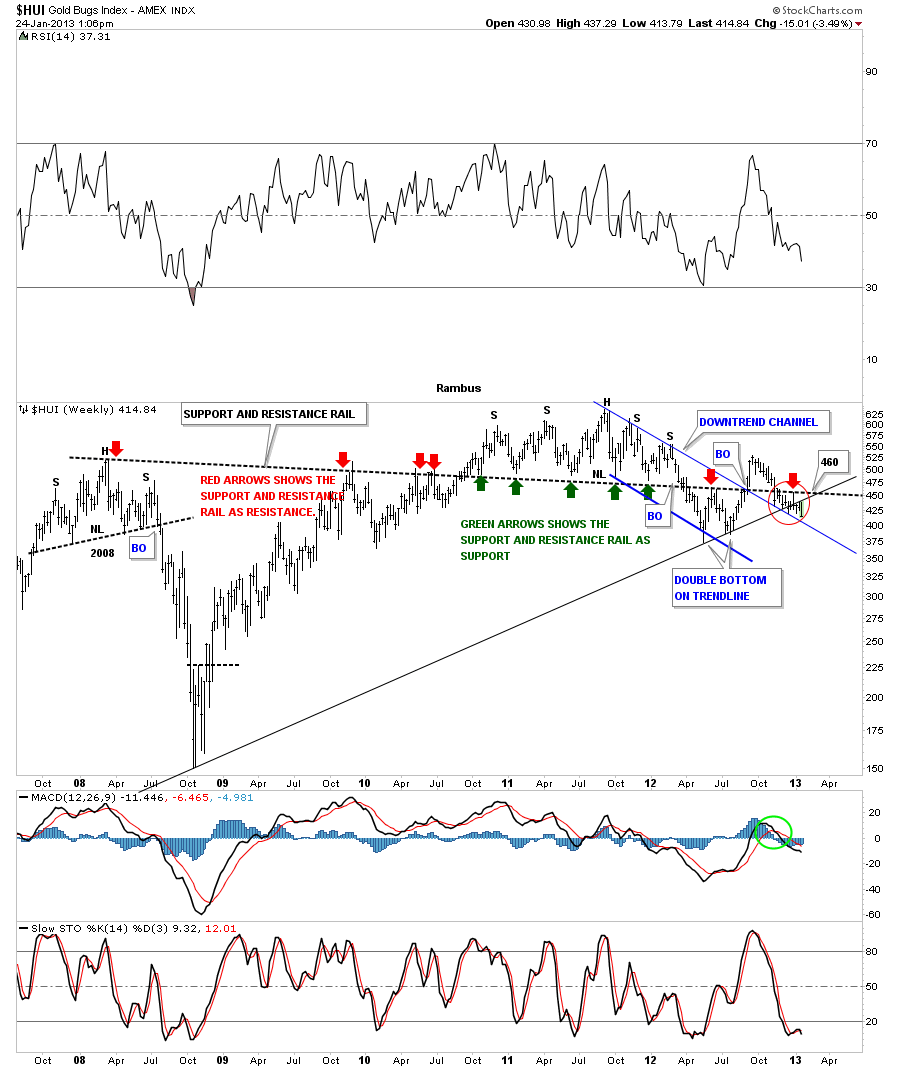
Below is a weekly chart that shows the price action in the red circle that has been backtesting the long black dashed support and resistance rail that goes all the way back to the H&S top in 2008. There is also the uptrend rail made off the 2008 low that is being backtested. The only support rail left is the top blue rail of the small downtrend channel.
hui weekly 2008

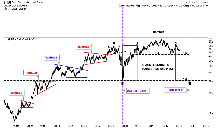
Below is a chart I built sometime ago that shows the beautiful symmetry taking place in the big picture for the HUI. This chart shows the possibility of what to expect if the neckline is ever taken out. First things first tho. A move down to the neckline is the next thing we have to see happen before we get to excited about the prospects of the massive H&S top. I actually started thinking about the prospects for the big H&S topping pattern back in December of 2011. When you live through the development of a massively large pattern like this it seems like it takes forever to come to fruition. But as long as it keeps on developing the way that you envision you have to think you might be on the right track until something derails your idea.
 

mmmmmm

EDITOR’S NOTE :
Rambus Chartology is Primarily a Goldbug TA Site where you can watch Rambus follow the markets on a daily basis and learn a great deal of Hands on Chartology from Rambus Tutorials and Question and Answers .

Most Members are Staunch Goldbugs who have seen Rambus in action from the 2007 to 2008 period at www.goldtent.org and now Here at Rambus Chartology since early 2012 .
www.rambus1.com

To review his Work and incredible calls from the 2007-2008 period click on the top right sidebar in the “Wizard of Rambus” ….”What If ?! ”

To Follow Rambus Unique Unbiased Chart Work and participate in a Chartology Form with questions and answers, and learn the Art and Science and Mindset of a Pro Trader you may Join us by subscribing at
www.rambus1.com

We have many subscribers from all over the world who are glad they did as they enjoy the many daily updates and commentaries provided at this exciting new site.

As you will see Rambus (Dave from The Ozark Mtns in Arkansas) has prepared us for this difficult period by being one of the only ones to see and warn about the incredibly debilitating PM smackdown as early as Jan 2 2012 …click on the” HUI Diamond in the Rough” Post in the “Wizard of Rambus” top right

More Recently Rambus called a Bottom in HUI in this post…and has had subscribers on board for a Powerful Run to the Upside
rambus1.com/?p=5651

Followed again by his timely bearish call in this SLV Update which has had us on the sidelines and or short
rambus1.com/?p=8876

BUT
What is he seeing Now ?

You will find Rambus to be a calm humble down home country tutor with an incredible repitoir of all the TA based protocols tempered with his own one of a kind style…simply put…He wants to keep his subscribers on the right side of these crazy volitile and downright dangerous markets
See you at the Rambus Chartology
Wednesday Report..A Little Clarity Goes a Long Way in PM Markets

The first thing I would like to discuss tonight is getting stopped out of our DSLV trade today. I believe it was by about .13 cents. There comes a point when one has to draw a line in the sand no matter how right we may think we are. Its all about preserving capital for the next trade that is most important.

Today was like a double edged sword where we got stopped out of our DSLV trade and on the other hand we got alittle more clarity on the precious metals stocks. How one deals with a trade like DSLV, being so close to working but failing at the last moment, can emotionally get in the way of sound reasoning going forward.

A big mistake alot of investors make is they know they are  right and the market is wrong so they hold on to their losing positions waiting for the market to come around to their point of view. Many times the market never comes around to what one was originally thinking. Think tech bubble in 2000 or the gold price in 1980. Things change all the time and if you don’t change when the markets change you get left holding the bag with nothing in it. Believe me, the markets don’t care one bit about your point of view. The markets are always right no matter what you may think.

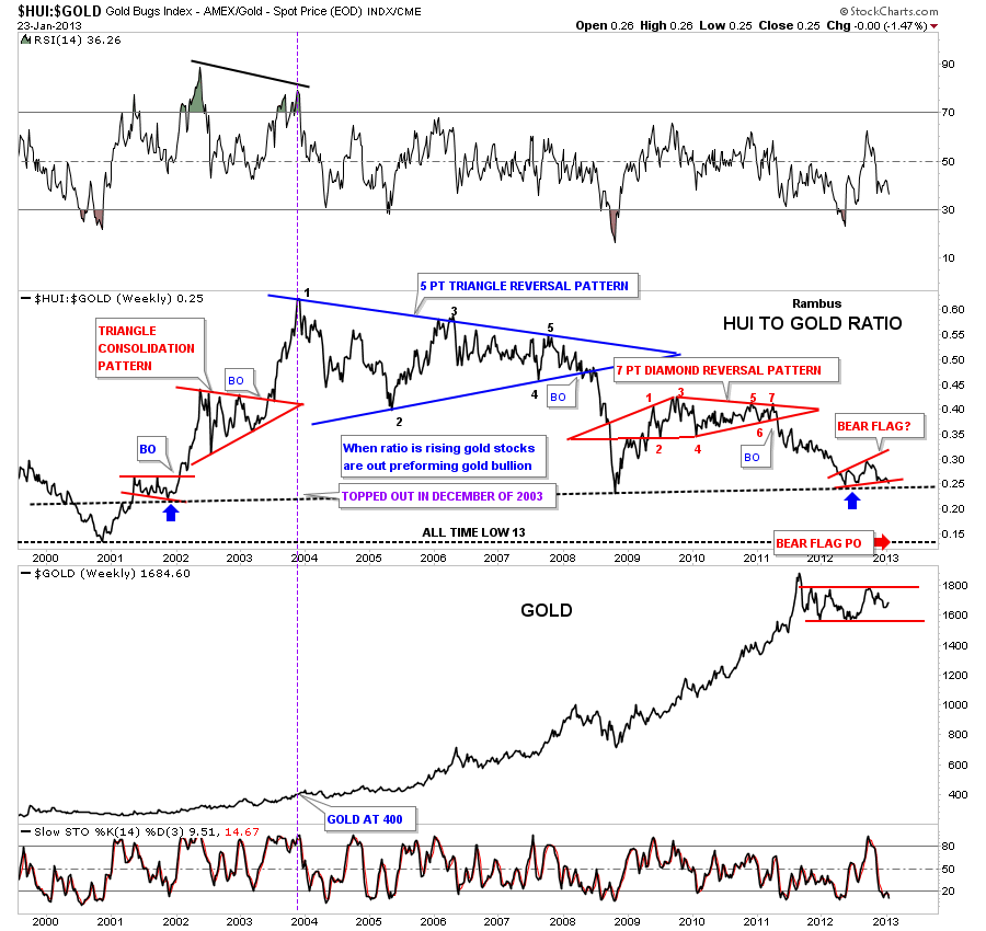
When you look at the ratio charts below keep in mind they are relative. For instance when the bull market started in the precious metals complex back in 2001 the HUI was trading at 35 and gold was at 255 that gave a reading of .13 or so. There can be a higher price for the HUI and gold where you can still get a ratio of .13 which is where I think we are headed in the future. The ratio chart does do a good job of telling you which item is outperforming the other one.

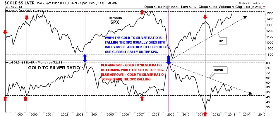
Now I would like to show you why I think silver has been acting so strong lately. Silver is viewed by most investors as a commodity and when the stock markets are in rally mode, like right now, silver tends to go up as an improving economy puts more demand on silver. Also you will see the gold to silver ratio fall as silver outperforms gold. Below is a chart I built several years ago that shows you exactly what I mean. Its a combo chart with the SPX on top and the gold to silver ratio on the bottom. It clearly shows that when the stock markets are in rally mode that is good for silver as the gold to silver ratio falls as silver is outperforming gold. Its not a perfect correlation but it does give you a heads up and as long as the SPX stays in rally mode the gold to silver ratio should keep falling enforcing the bullish stance in the stock markets. Bottom line is that if you own silver you should be hoping for the stock markets to rally and not crash.

combo chart

Next, the precious metals stocks march to their own drummer and seem to do whatever the hell they like. The first ratio chart below shows you that the HUI to gold ratio is beginning to breakdown again after consolidating for eight months or so. If this expanding red bear flag plays out it will put this ratio all the way down to the very beginnings of the bull market that started all the way back in 2001. It will have made a complete round trip to 13 which is the price objective of the red expanding red bear flag. Please note the purple vertical dashed line that shows you where the precious metals stocks stopped outperforming gold in the overall big picture. As you can see it was at the very end of 2003. Yes the PM stocks did outperform gold right after the 2008 crash but as you can see they soon topped out with the formation of the 7 point red diamond reversal pattern. Note the price of gold when the ratio topped out in 2003. Its hard to believe but gold was trading around the 400 mark. This combo chart shows you why the precious metals stocks investors are so wore out. Always hoping but never getting what they want. I do think if this ratio chart does hit 13 sometime in the future that would represent a very good investment if one has the cash to buy the bargains.

gold to hui

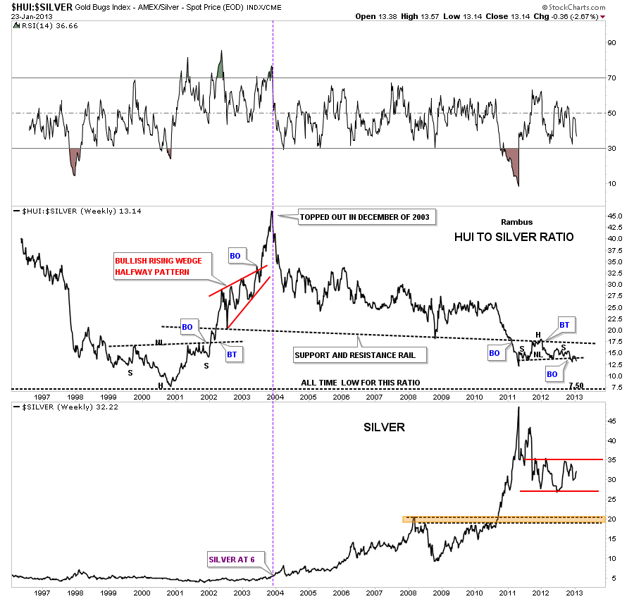
When we compare the HUI to silver we see a similar setup. This ratio also topped out at the end of 2003 with silver trading at $6.00, purple dashed vertical line. How obscene is that? Now I want to focus your attention to the right side of the chart to the HUI to Silver ratio where you can see a H&S consolidation pattern that has formed. The black dashed support and resistance rail, once it was broken to the downside, reversed its role and held resistance that created the head portion of the H&S pattern. If you look close you can see it has been backtesting the neckline and is now ready to start the move lower IMHO.

hui to silver

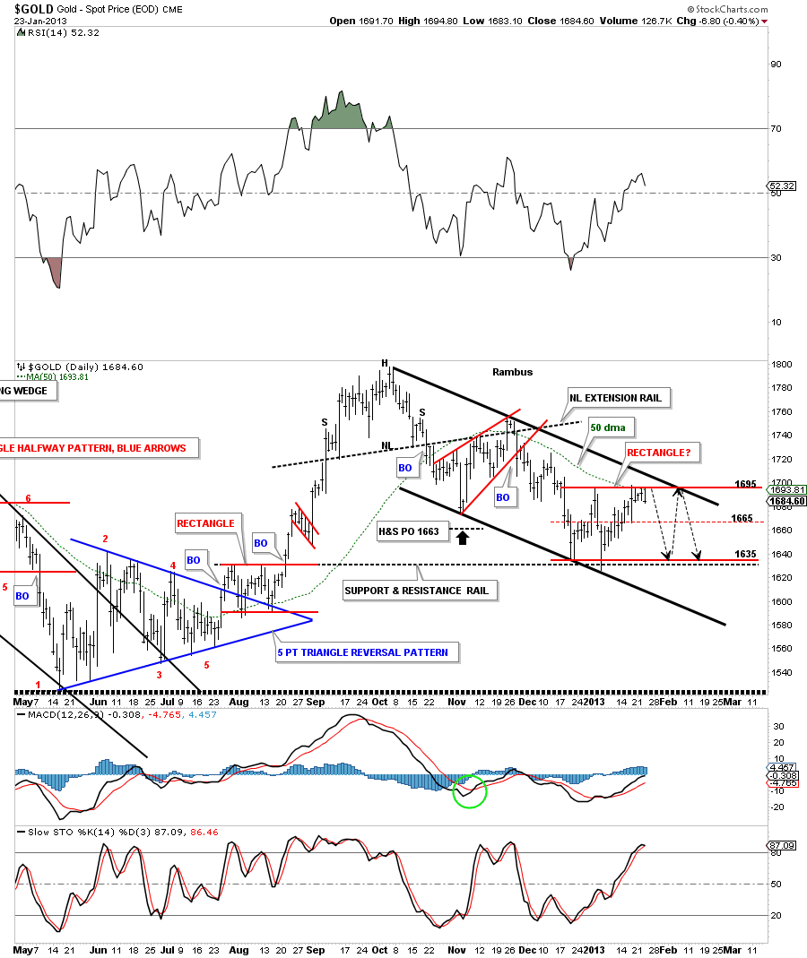
In the Weekend Report I showed you how this potential rectangle, in gold, may form in here. Gold that has been beating it’s head up against the top red rail of the possible red rectangle consolidation pattern for 5 days now. I think there is a good chance that we may see several more reversal points as shown by the black arrows within the downtrend channel. From a symmetry perspective it seems to fit. Keep in mind as these horizontal trading ranges mature it usually takes longer for the price action to go from the top rail to bottom rail and vise versa. The rectangle won’t be complete until the price action touches the bottom red rail. At that point gold will have it’s fourth reversal point completed.

gold rectangle

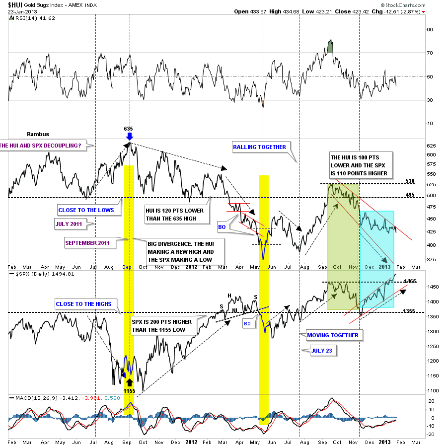
One last chart that I use to compare the HUI to the SPX. Its a combo chart with the HUI on top and the SPX on the bottom. It shows that sometimes they trade together and sometimes they are inverse to each other. Lets focus on the right side of the chart starting with the green shaded area that shows both the HUI and the SPX falling together. Then in November of last year they decoupled and the SPX has been in rally mode while the HUI has been declining, blue shaded area. How long this inverse relationship will last is anyone’s guess but until it changes this is the reality of the situation.

hui invers to the spx

I hope this Wednesday Report helps put into perspective for you what is really happening right now. I know how over sold everything is related to the precious metals stock. All the indicators, you name it there all oversold, but they are just indicators, its the price action that you have to follow above and beyond everything else. Keep an open mind. All the best…Rambus


EDITOR’S NOTE :
Rambus Chartology is Primarily a Goldbug TA Site where you can watch Rambus follow the markets on a daily basis and learn a great deal of Hands on Chartology from Rambus Tutorials and Question and Answers .

Most Members are Staunch Goldbugs who have seen Rambus in action from the 2007 to 2008 period at www.goldtent.org and now Here at Rambus Chartology since early 2012 .
www.rambus1.com

To review his Work and incredible calls from the 2007-2008 period click on the top right sidebar in the “Wizard of Rambus” ….”What If ?! ”

To Follow Rambus Unique Unbiased Chart Work and participate in a Chartology Form with questions and answers, and learn the Art and Science and Mindset of a Pro Trader you may Join us by subscribing at
www.rambus1.com

We have many subscribers from all over the world who are glad they did as they enjoy the many daily updates and commentaries provided at this exciting new site.

As you will see Rambus (Dave from The Ozark Mtns in Arkansas) has prepared us for this difficult period by being one of the only ones to see and warn about the incredibly debilitating PM smackdown as early as Jan 2 2012 …click on the” HUI Diamond in the Rough” Post in the “Wizard of Rambus” top right

More Recently Rambus called a Bottom in HUI in this post…and has had subscribers on board for a Powerful Run to the Upside
rambus1.com/?p=5651

Followed again by his timely bearish call in this SLV Update which has had us on the sidelines and or short
rambus1.com/?p=8876

BUT
What is he seeing Now ?

You will find Rambus to be a calm humble down home country tutor with an incredible repitoir of all the TA based protocols tempered with his own one of a kind style…simply put…He wants to keep his subscribers on the right side of these crazy volitile and downright dangerous markets
See you at the Rambus Chartology
FNV Update…

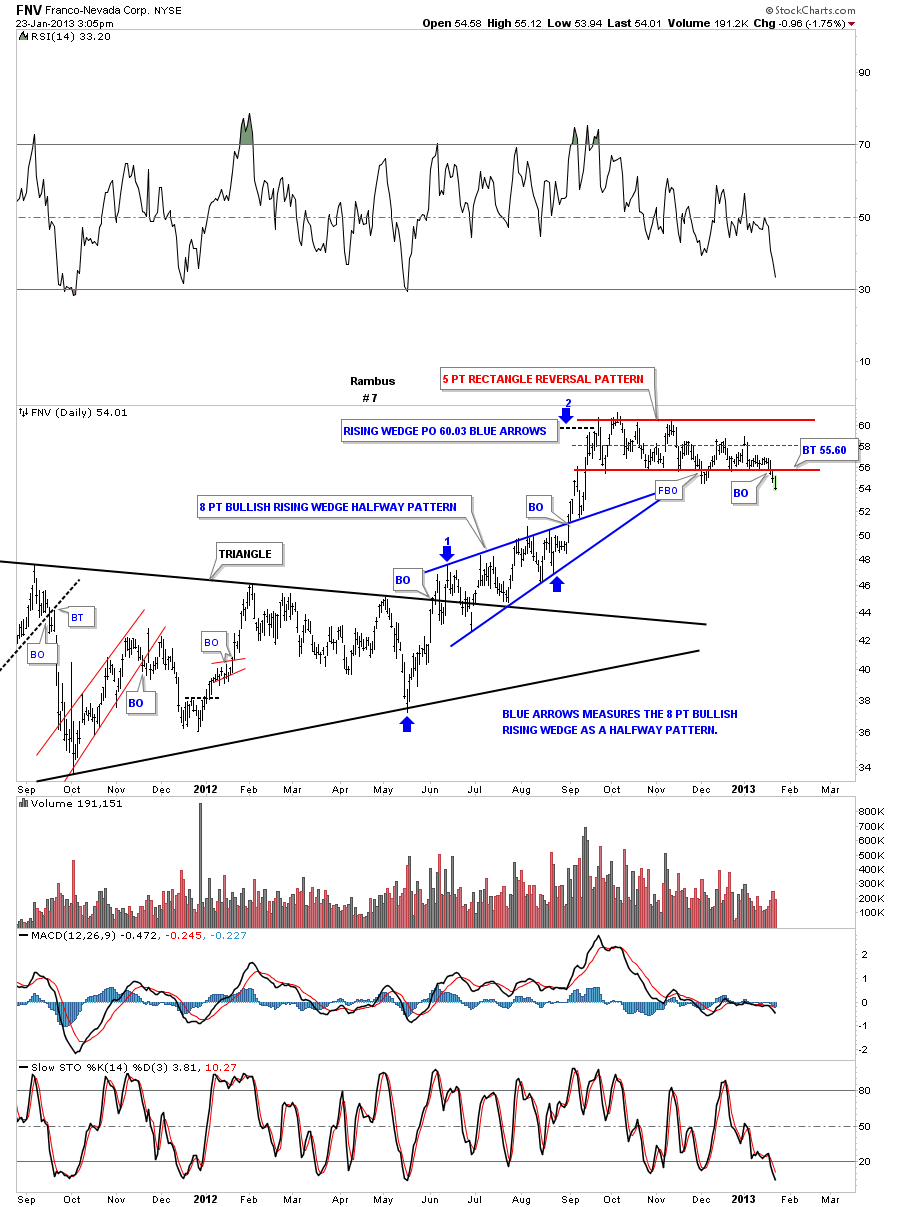
I showed you this stock on Monday that was trading down at the bottom rail of a big 5 point rectangle reversal pattern. To launch a big rally there needs to be a base built. What we are seeing in most of the precious metals stocks is just the complete opposite. We are seeing topping patterns not bottoming patterns.

FNV

EDITORS NOTE:

If you are not yet a subscriber why not join us for Daily Chartology Classes

Details on the right sidebar

Subscribers have been out of the PM Majors and Juniors for many months

Some adventurers have been in the Kamikazi Trades like DUST (3X Short PM Stocks)

Which gained nearly 10% Today

Some are in the World Market ETFs like IRE (Ireland)

Rambus believes there will be a time for the PMs

But that time is not just yet.

NGD Update…

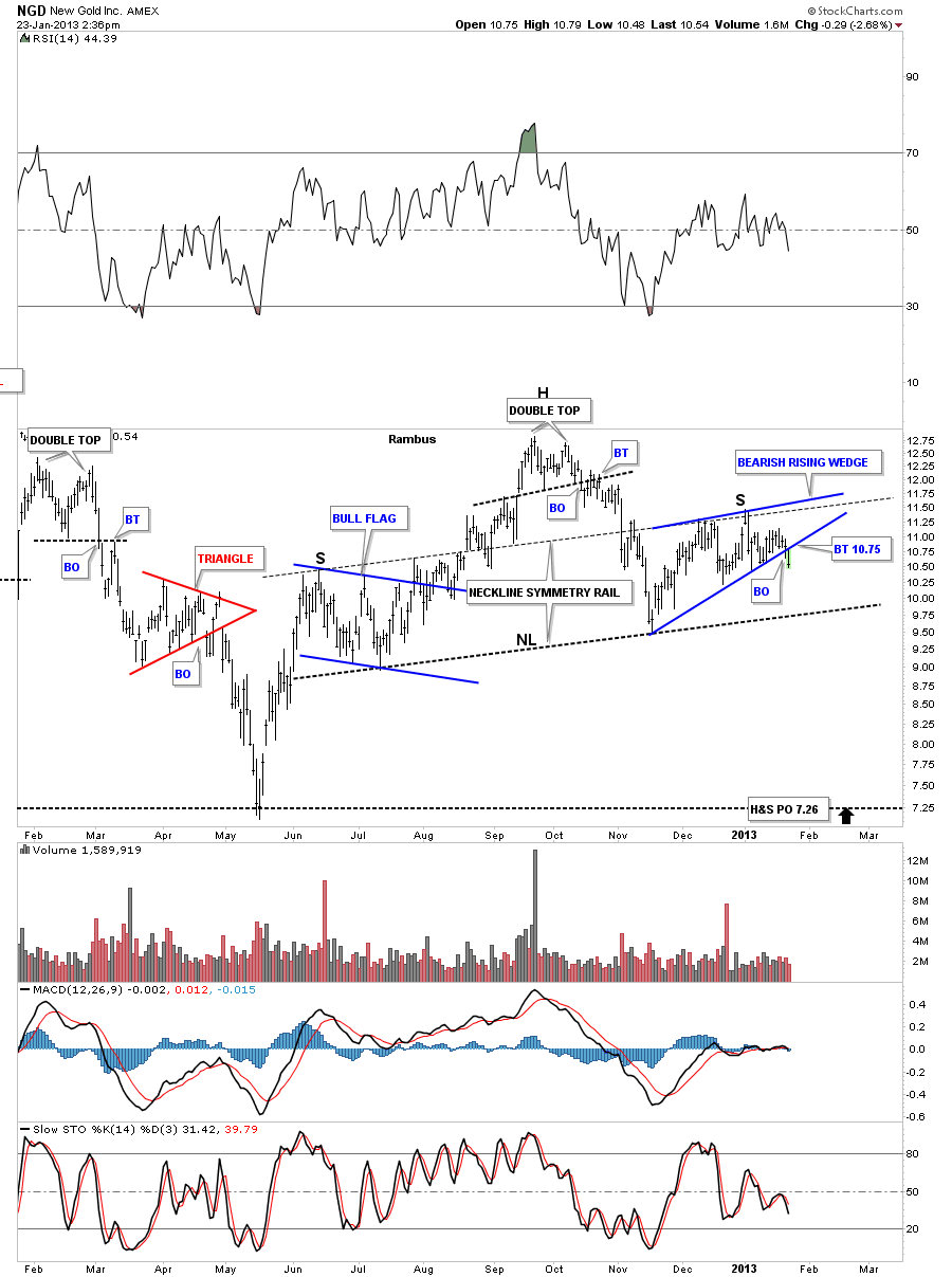
I know this a popular precious metals stock alot of investors follow. Today its broken the bottom blue rail of a bearish rising wedge that has formed the right shoulder of a H&S topping pattern. You can see the neckline symmetry rail did a good job of showing us where to look for a possible high for the right shoulder.There could be backtest to the bottom blue rail around the 10.75 area. No one can see into the future but these charts I’ve been showing you on some of the precious metals stocks are talking to us right now. What will be the fundamental driver be for their weakness?  We will all know AFTER the facts are in.

NGD 1


Tune in Tonite for a Rambus Wednesday Report if you want to know wtf is going on !

Fully (Confused)

IAG Update…

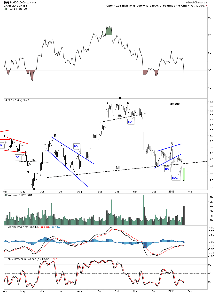
For those that think the precious metals stocks are getting ready to launch to the heavens there are precious metals stocks that are going to take their investors to HELL. This stock is a prime example of what is happening in alot of the precious metals stocks.

iag


Editor’s Note

Rambus I puked when I saw that one !

I think we need to offer free gravol with a monthly subscription to this site

www.rambus1.com