This content is for Yearly and Monthly members only.
Subscribe
Subscribe
Already a member? Log in here

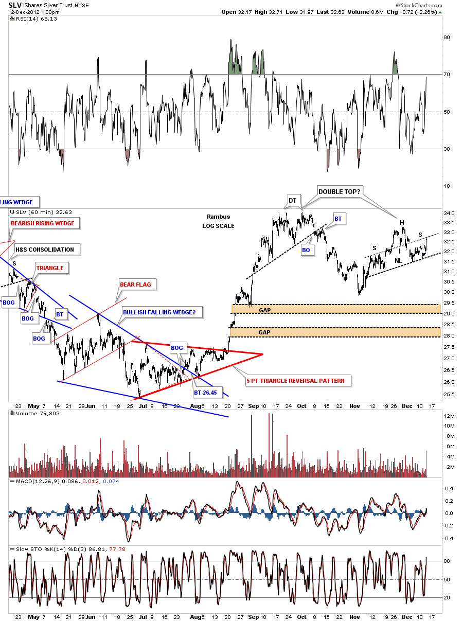
I’ve been watching the 60 minute chart for SLV that is at a critical area right here. SLV just hit the neckline symmetry rail for a possible right shoulder of H&S top pattern that could be part of a bigger unbalanced double top.
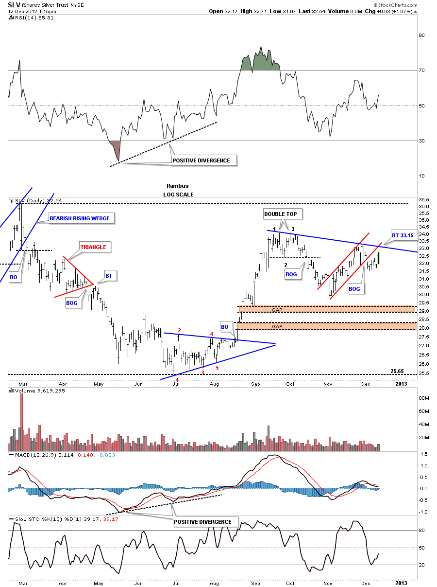
This next chart shows the small double top that was made back in September and the red uptrend channel that broke out to the downside 8 days ago. I’ve connected both tops with a blue downtrend rail that intersects around the 33.15 area. If SLV can trade above that area that would be a bullish sign as it would be making a higher high. There are still two unfilled gaps down at the 28 and 29 area that still may get filled at some point in time.
This next chart shows what everybody is watching right now. Its the uptrend channel with the possible red triangle forming. The top of the red triangle comes in at 33.15. The question is will it be a 4 point consolidation pattern to the upside or will the price reverse at 33.15 for a 5th reversal point making the red triangle a reversal pattern?
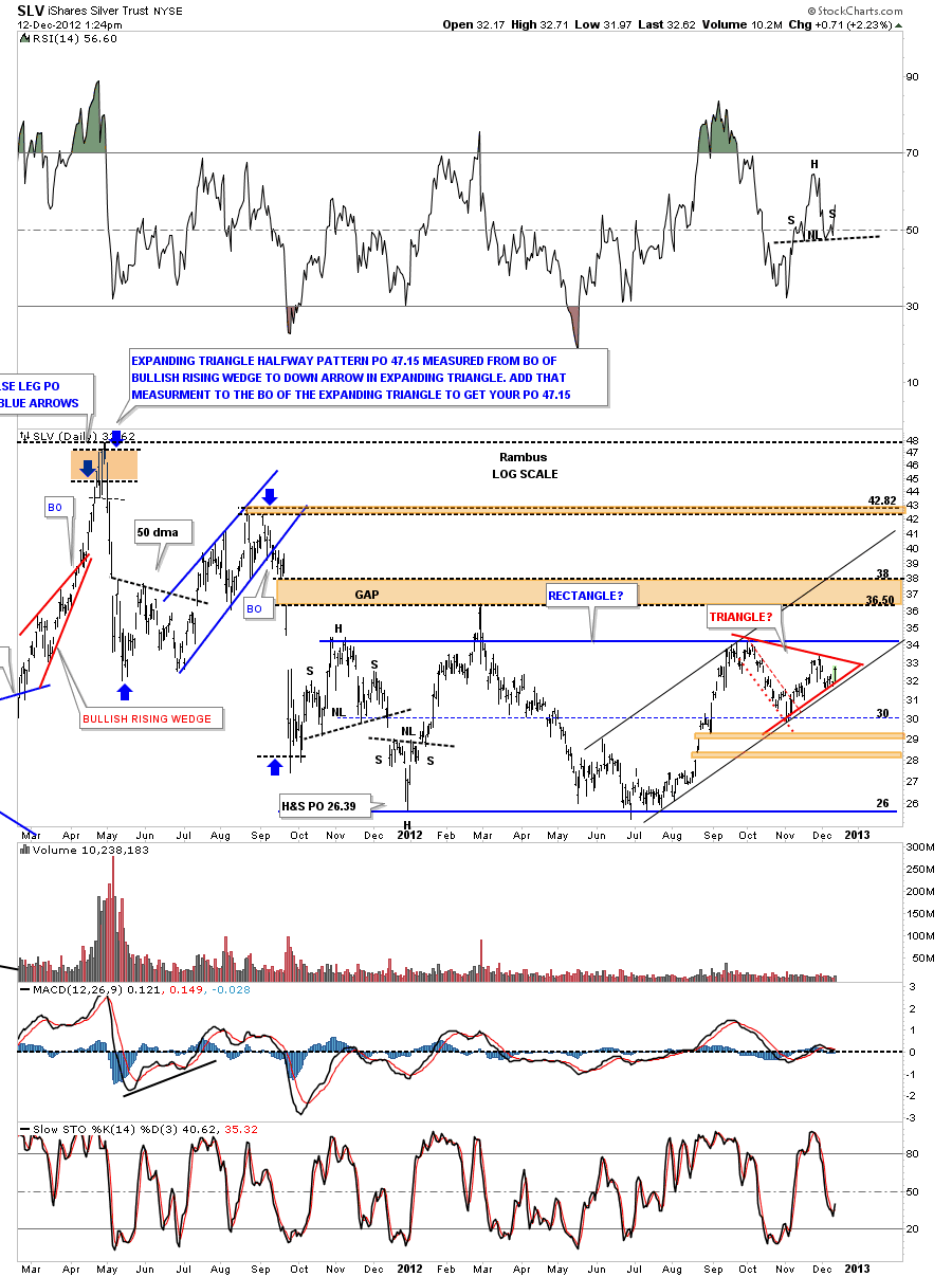
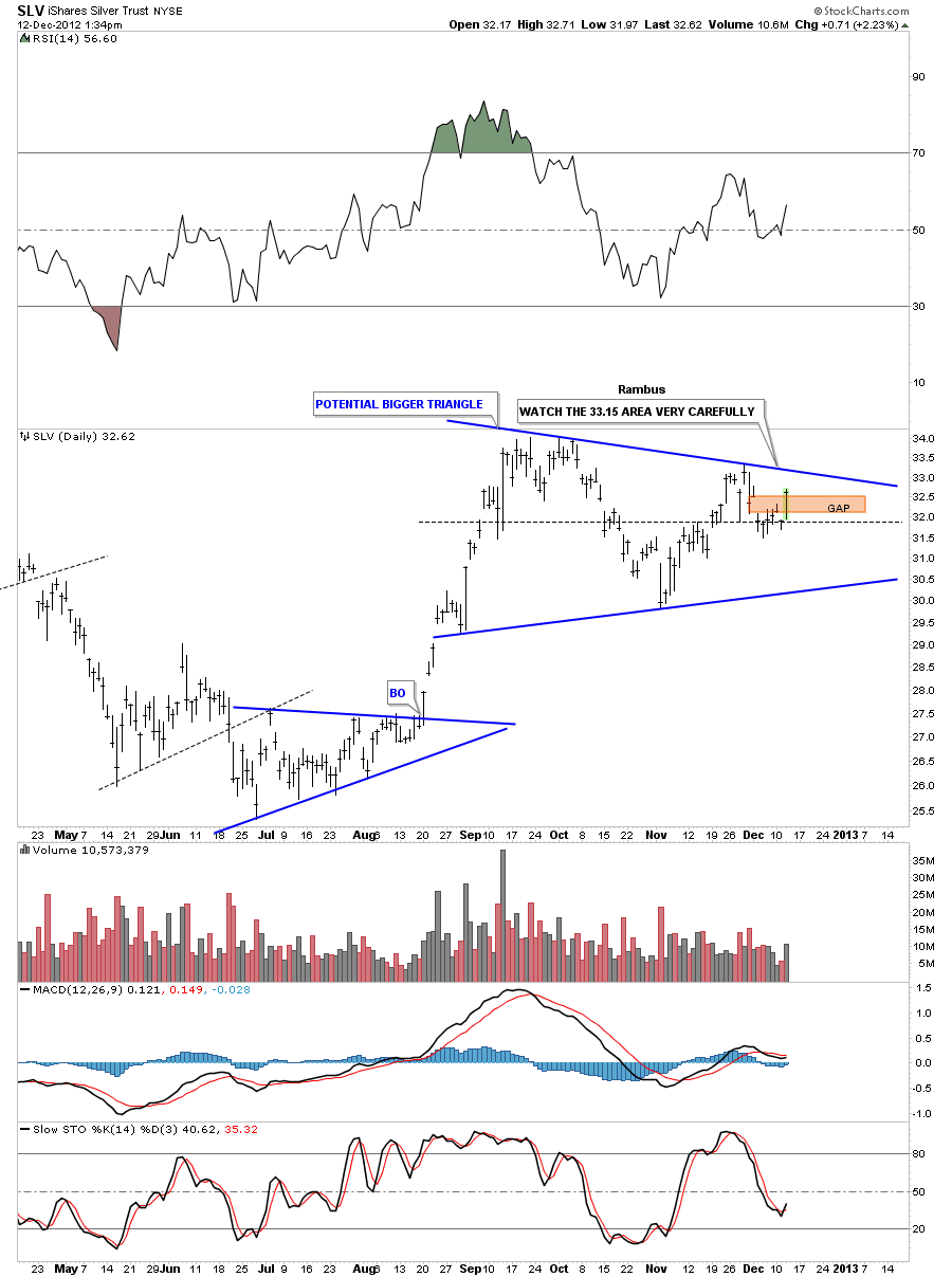
Below is another possible triangle that could be forming that is much bigger than the one above. Its alittle more symmetrical in appearance. Again, the 33.15 area is a critical place to watch on the top blue rail.
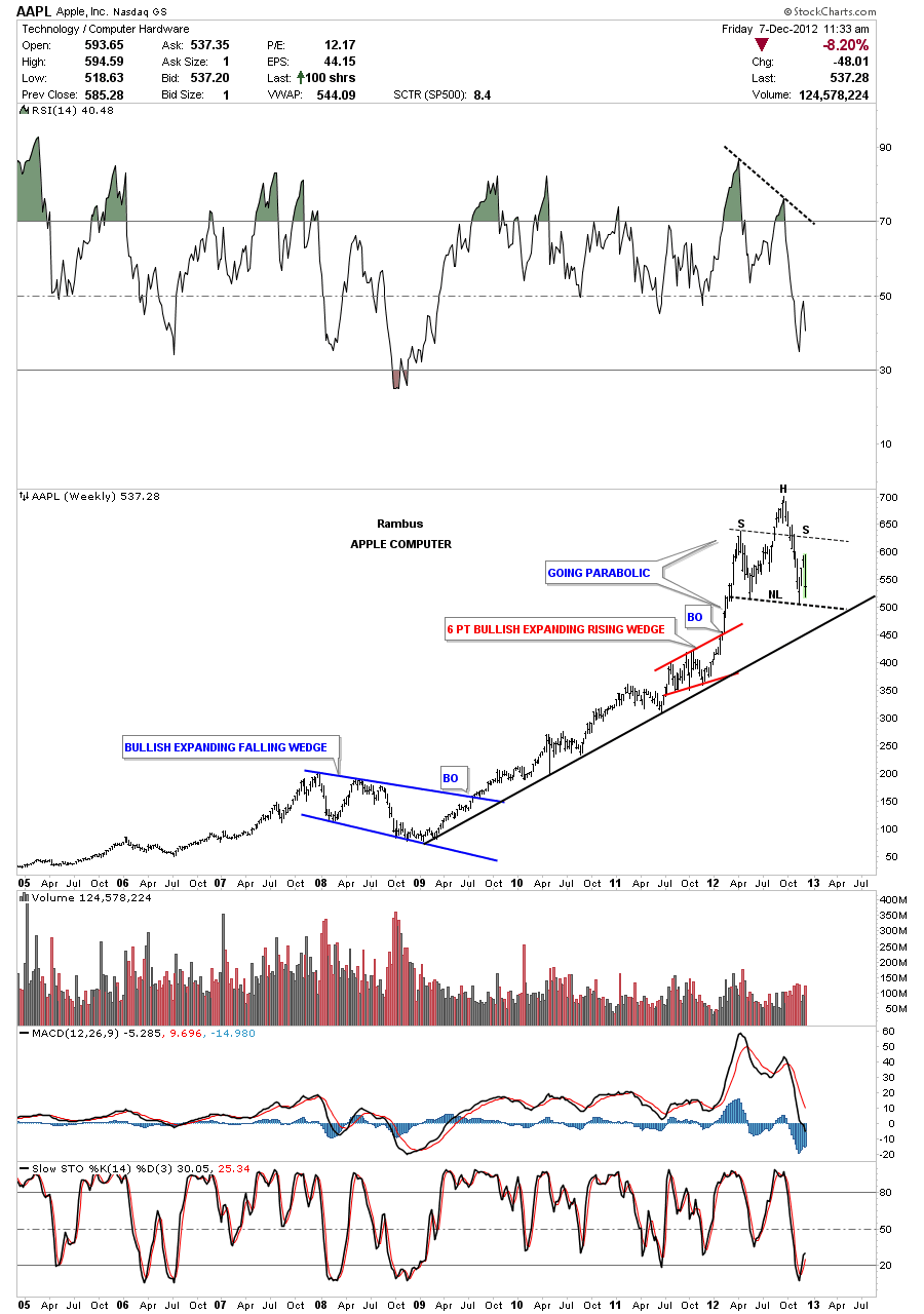
The reason I’m showing you this stock is because it has the highest market cap of any stock in the world I believe. Not to long ago I read something to the affect that it could be the first stock to have a trillion dollar market cap. It remained me of the late 90’s when I read that. Tech stocks were going ballistic to the upside even stocks that had no earnings to speak of.
Below is a daily chart of Apple Computer that I haven’t shown in awhile. This stock shows up in alot of the stock market indexes and plays a big roll in how they move both up and down. Notice the head portion of the bigger H&S top formation. That is a small H&S top that reversed the parabolic run. It doesn’t look like much but it was significant in turning Apple around from up to down. Many times you will see a small H&S top that is just part of a bigger H&S pattern further down the road.
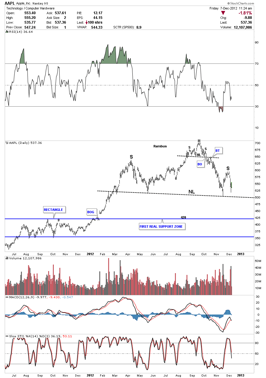
The weekly look really puts the H&S top into perspective. Note the black uptrend rail off the 2009 bottom and how the price went parabolic starting at the end of 2011. The price basically doubled in 6 to 8 months which is an unsustainable run. What makes this H&S top pattern a little more ominous looking is that the right shoulder couldn’t make it up to the neckline symmetry rail and fell way short. If one of the best companies in the world is topping out what does that say about the rest of the stocks going forward? It maybe suggesting that this cyclical bull market, that has been in progress since the 2009 crash bottom, maybe coming to an end and the secular bear market might be getting underway again. One stock does not make a market but one of the best companies in the world, showing a topping pattern, could be a strong signal to protect your 401 K if its possible.