Silver long term 30 year look

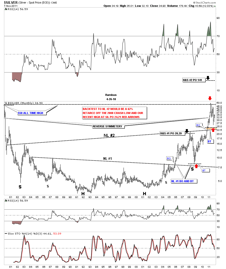
In the weekend report I showed a 30 year long term look at gold so you could see the big base that launched it’s bull market. Silver’s huge base is just as impressive as golds. On the chart below the first thing you will notice is the two H&S patterns that formed the almost 30 year base. I’ve labeled the two H&S patterns as Neckline #1 and neckline #2. The lower or smaller H&S base reached it’s price objective of 20.39 just before everything crashed in 2008. During the crash silver found support just above it’s neckline which qualified as the backtest. That crash low in 2008 also created the right shoulder of the much bigger H&S base, NL #2. The rally sliced right thru the NL #2 like butter until it hit 50. Again, like the smaller H&S #1, the price corrected all the way down to just above NL #2, close to the 62% retrace, red arrows on chart below. That  also qualified as the backtest IMHO. The brown area on the chart shows where I was looking for the backtest to stop and just like the lower H&S neckline #1 the backtest stopped just short of a full test all the way down to the neckline. Close enough for government work. The big #2 H&S base has a price objective all the way up to 141.

Silver 30 year base with two H&S patterns
GLD update

Yesterday was an important day for GLD. A week or so ago I said we needed to get above the top rail of the bullish rising wedge to really turn GLD bullish again. As you can see on the chart below we gaped over the top blue rail of the rising wedge yesterday. This was a very positive indication the top rail is still hot and in play. Take a moment and follow the price action against the top rail of the rising wedge. What you will notice is that everytime we break above or below the top blue rail there is a gap or we just trade up to the blue rail and back off. These are important little clues as to the validity of the top rail of the bullish rising wedge. I’ve marked where we may see one last backtest to the top rail that we broke out of yesterday. If we backtest the top rail, 172 should come into play. That’s about 20 points lower than where we are trading presently. We don’t have to have one last backtest but from my perspective I would love to see us test the top rail one last time, close the gap, and then rocket higher. Either way as long as we stay above the top rail of the bullish rising wedge the bulls will be in charge.

GLD daily bullish rising wedge, gaps and backtest.

HUI Beautifull Weekly Look

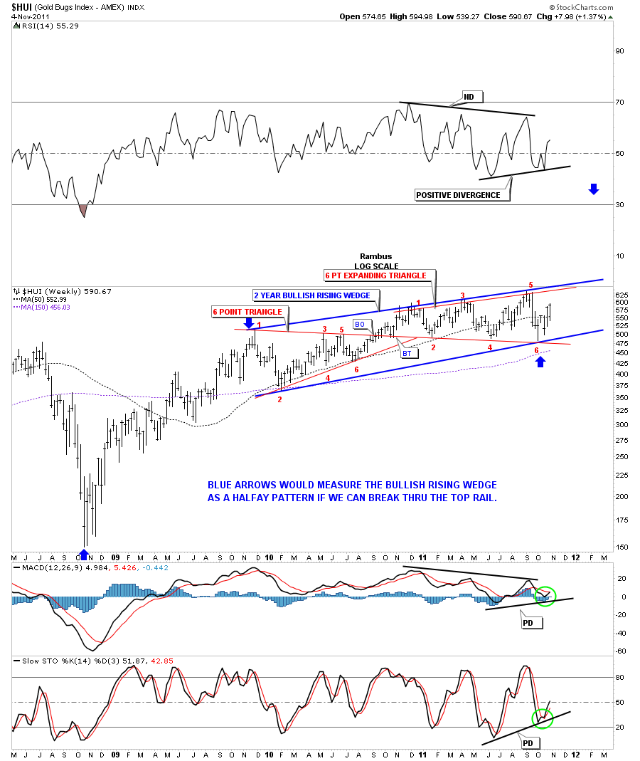
This was a volatile week for the precious metals stocks along with the stock markets. Tuesday was a pivotal day when everything was hard down, doing their backtest, to their breakout points. The market quickly recovered and left a long tail on the bar chart signaling there was a good chance the bottom was in.. The weekly chart will show you why the H&S bottom, that has been forming for the last five weeks, is critical to the long term look.

On the chart below you will notice a big blue pattern that is a 2 year rising wedge.. The rising wedge pattern has 2 separate smaller patterns in red. The first one is a triangle that failed to reach it’s price objective and our current one is an expanding triangle.They were both 6 point consolidation patterns. Whenever a pattern fails, like the triangle above, it usually becomes part of a bigger pattern, like the bullish rising wedge is showing now. Also notice the positive divergences on the indicators.The reason I believe this 2 year bullish rising wedge is a big deal is because it could very well be a halfway pattern.  The blue arrows on the chart shows how I would measure it. Think of that big 2 year bullish rising wedge as a running correction. I know it doesn’t feel like a running correction but that, in fact, is what is happening right now. How we inter act with the top rail of the rising wedge will give us some more clues as to it’s validity. All in all it was a very positive week for the HUI. From Tuesday’s low at 539, the HUI gained about 50 points. Not bad for 3 1/2 days work.  Enjoy your weekend….Rambus

HUI weekly look.


Combo Chart

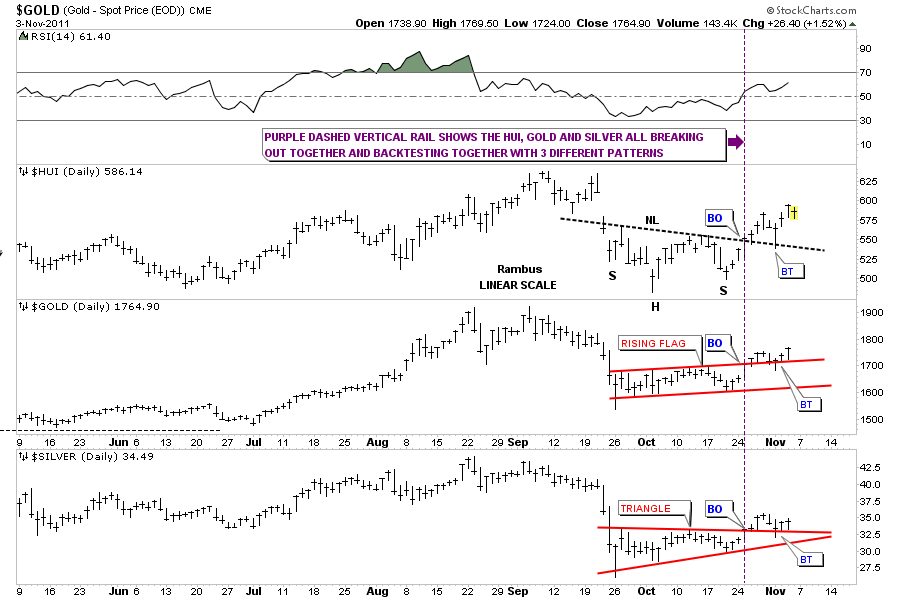
Below is a combo chart showing the HUI, Gold and Silver. This chart helps one to see how all three are preforming against each other. What I want to focus on is our most recent bottom and the 3 completely different reversal patterns that formed. The top of the chart is the HUI and it’s H&S bottom. Next is gold and it’s 5 point bullish rising flag and third is silver with it’s 5 point triangle reversal pattern. Even tho each has a different bottoming pattern they have all broken out and backtested together. The purple dashed vertical rail shows the breakout of the 3 reversal patterns. On Tuesday they all backtested their resistance rails, HUI the neckline, Gold’s top rail of it’s 5 point bullish rising flag and Silver the top rail of the 5 point triangle. What I’ll be looking for, from this comb chart, is who will be the first to breakout into new all time highs. Hopefully the HUI will lead the charge higher but its really to early to tell yet.

Combo 6 month daily chart with the HUI, Gold & Silver

HUI daily update

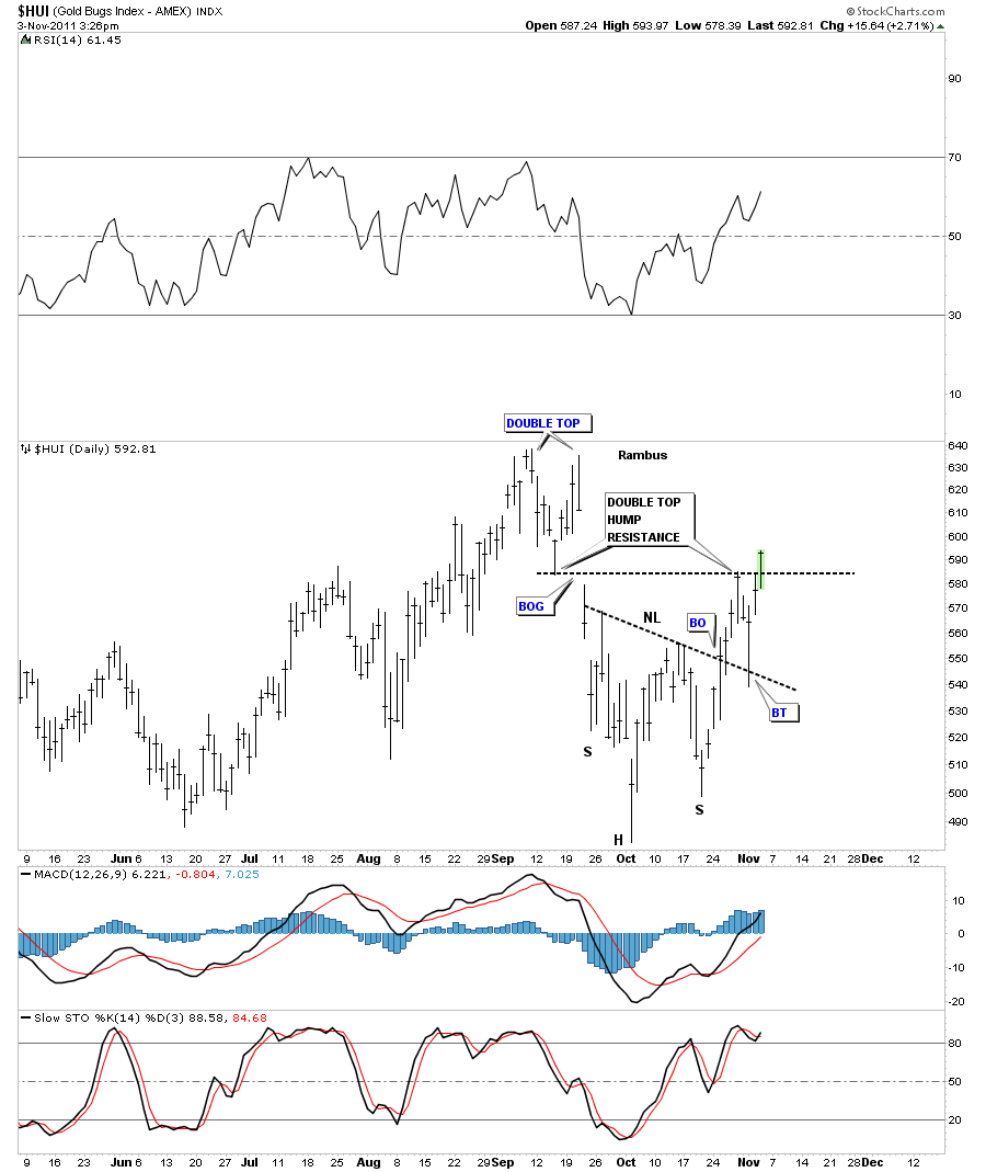
Below is a 6 month daily chart for the HUI showing our H&S bottom and how it has interacted with it’s own support and resistance points since the double top made in September of this year. Please note where the initial thrust was stopped on the breakout from the H&S neckline. The double top hump provided just enough resistance to stop the move and reverse the trend down. Now look where the move down stopped. Right on the old neckline that held resistance while the H&S bottom pattern was forming. Once the HUI was able to break the neckline to the upside the neckline has reversed its roll and now act as support. These types of support and resistance areas are nothing more than investor psychology. Meaning all the folks that bought below the neckline are still ahead of the game when the neckline is backtested from the topside. So there is not much selling just above the neckline. The buyers step in and away you go again until the next resistance zone is hit. As long as the bulls are in charge the corrections will be modest.

HUI 6 month daily H&S bottom with support and resistance points.

DOW update

Tuesday of this week, when everything was down hard, stock markets and precious metals stocks, I showed the daily chart for the Dow Jones and  where I thought the backtest  would most likely take place. You can see on the chart below the Dow did come all the way back down to it’s breakout point at around the 11,600 area. So we can now give more credence to the double bottom being valid. That black dashed rail that marks the double bottom hump and the breakout point is now your line in the sand. Above the rail positive below negative. Note where our latest backtest started from, the most obvious place on the chart, the old neckline from the H&S top. You can see why support and resistance shows up at certain spots on a chart. So now we bounce between the big neckline and the top of the double bottom hump until one side wins out. An old stock market adage: The markets like to “climb a wall of worry”. If there isn’t enough to worry about with all the bad news you hear and read and see on TV, I think we have a substantial wall to climb and so far its doing a good job. The Dow has gained almost 2000 points in about a month and everyone is still debating when the end of the world is going to be.

Dow Jones daily breakout and backtest.

Bullish expanding falling wedge

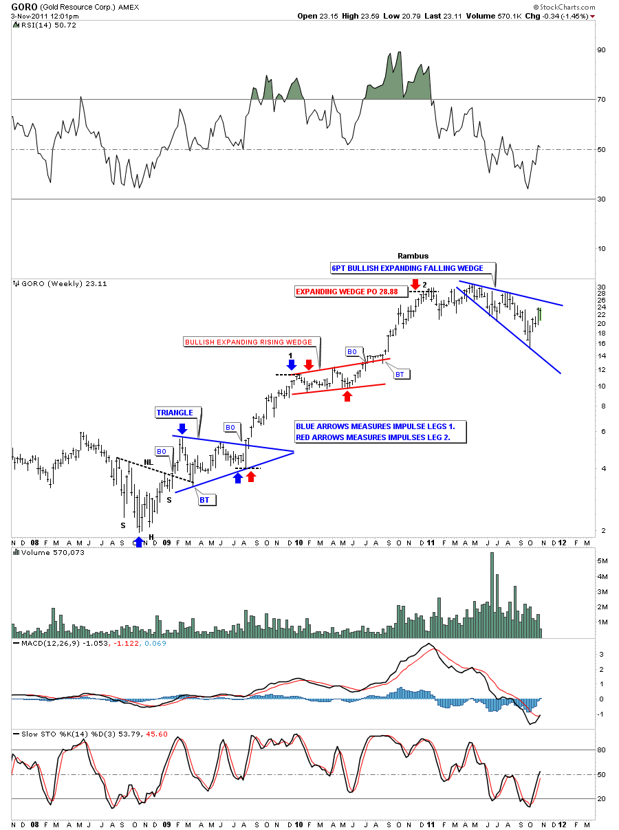
I want to do a little followup on a pattern that I posted yesterday on the weekly stock pick, GORO. I showed a bullish expanding falling wedge as it’s most recent consolidation pattern. I know many of you are thinking, “I want some of what Rambus is smoking”. Where does he come up with some of these off the wall chart patterns? This bullish expanding falling wedge pattern seems to start off as some kind of H&S pattern where the head and the top of the right shoulder form the top rail. The bottom rail is formed from the right shoulder crotch, at the neckline, and the last reversal point is made from the low that is achieved from the breakout of the neckline. The common thread for this pattern is that the price objective of the H&S falls short making the last low higher than if the H&S reached it’s full price potential. These patterns are showing up on the weekly look that is less cluttered than the daily. A consolidation pattern shows the fight taking place between the bulls and the bears and the fight can take on many different patterns.The main thing to keep in mind is there has to be at least 4 reversal points within the top and bottom boundaries to qualify as a consolidation pattern. Sometimes the boundaries of the consolidation pattern slope up, sometimes horizontal, some slope down and in this case they expand. So lets look at some of these patterns in real time and see if this is just an isolated incident on GORO. First we’ll look at the GORO weekly chart from last night as a template.

GORO weekly bullish expanding falling wedge.

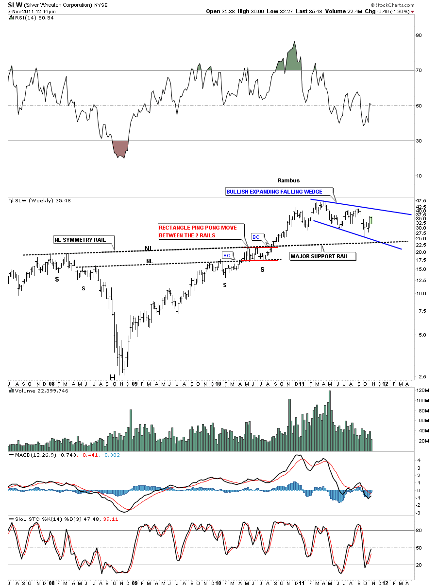
SLW weekly very similar setup to GORO.

SIL weekly look.

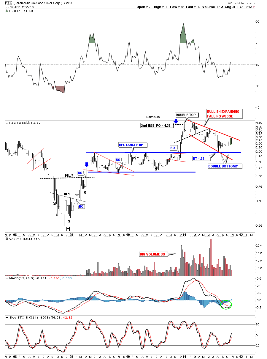
PZG weekly look.

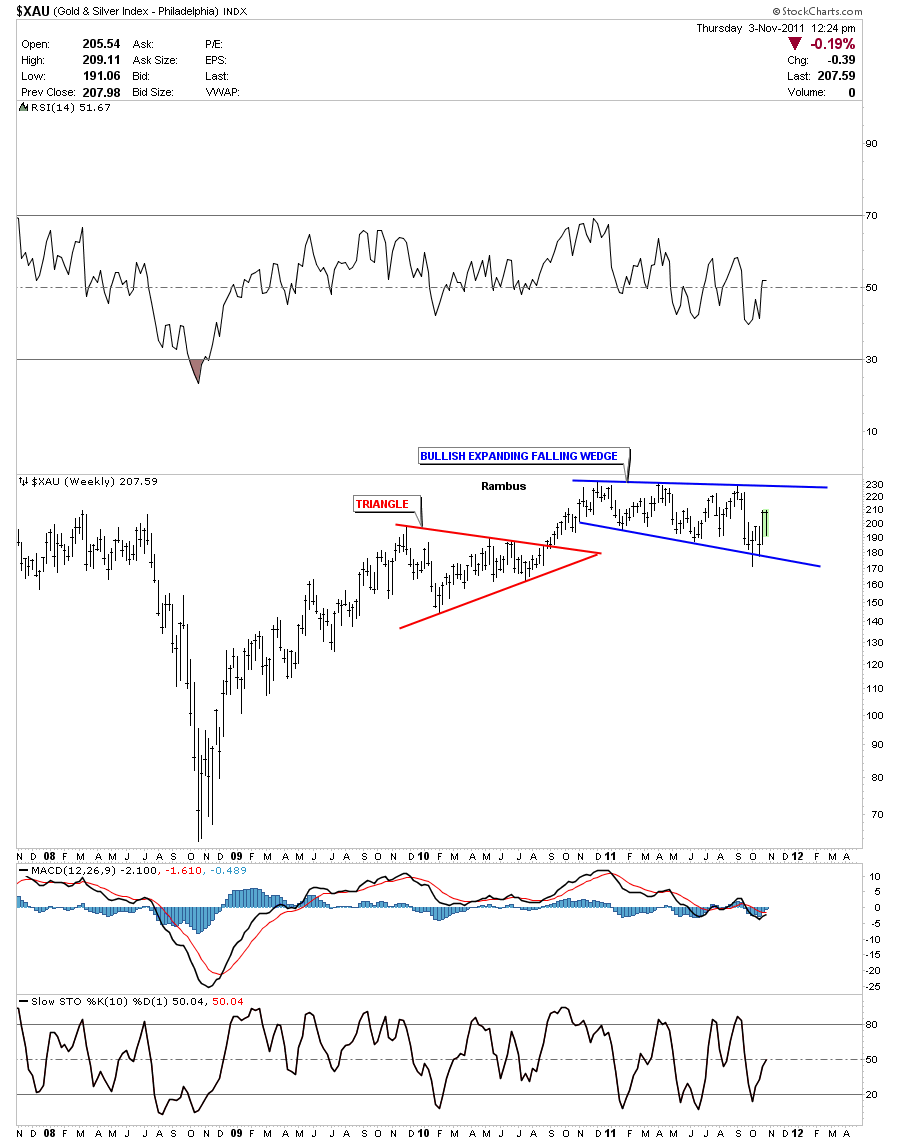
I could show many more bullish expanding falling wedges but I think you can see they are a fairly common consolidation pattern during our latest one year correction. During the next big correction the prevalent consolidation pattern might be a triangle or rectangle or whatever pattern the bulls and the bears create during their fight for superiority. The reason there are so many bullish expanding falling wedges has to do with one of the precious metals stock indexes, the XAU.

XAU weekly 6 point bullish expanding falling wedge.