This content is for Yearly and Monthly members only.
Subscribe
Subscribe
Already a member? Log in here

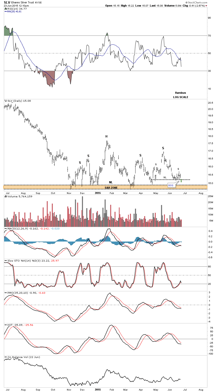
Since the all important low that the precious metals complex made last November SLV has built out a H&S consolidation pattern. It’s not the prettiest one I’ve ever seen but all the pieces are there. SLV looks like it’s completing the second right shoulder by breaking down from a small H&S top today. As you can see there are two left shoulders and two right shoulders with a big fat neckline, brown shaded area, as the lows were not even. Nevertheless that brown shaded S&R zone shows all the lows that were made since the November low and if SLV breaks below the brown shaded S&R zone/neckline it will reverse its role to what had been support for 7 months to resistance.
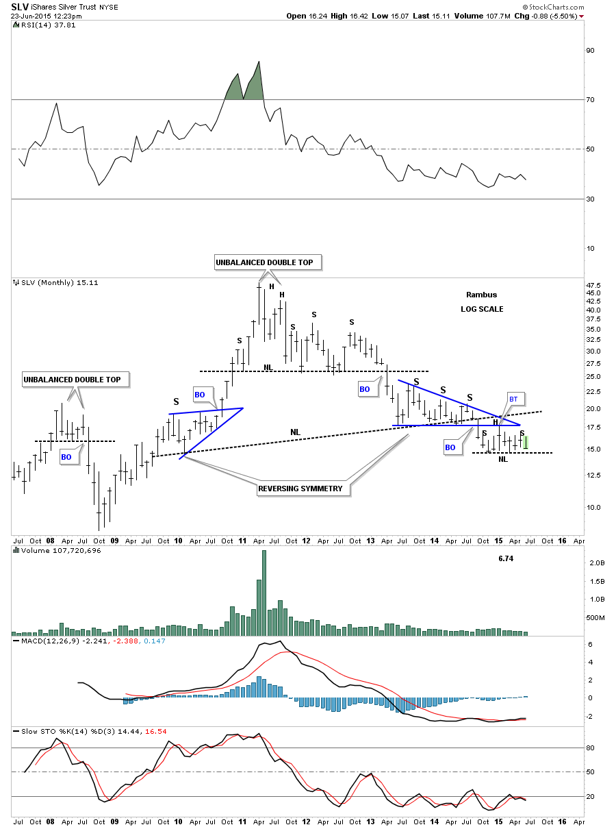
Below is the long term monthly chart we’ve been following for several years now. This daily H&S consolidation pattern has formed as the backtest to the bottom rail of the blue triangle and the neckline of a much bigger H&S top. It has taken almost a year now since SLV broke below the bottom rail of the blue triangle to compete the backtesting process. Big patterns take lots of time to completed all the work during the breaking out and backtesting sequence. Step by step the job is getting completed.
There are no words to describe the Carnage that Precious Metals Stocks have suffered for the last 12 years. There is no consoling those who have invested in this sector , many who have literally lost their life’s savings as they watch this horror unfold in utter disbelief .
The best way to gauge this complete evisceration of Precious Metals Investors is to follow the HUI:GOLD Ratio .
This ratio compares the most widely followed PM Mining Index . the HUI …Numerator
with the Price of Gold …Denominator
This Ratio is widely followed by PM Analysts, many who have been calling for it to bottom since it entered its bear market in…get this…2003 !
Yes 2003 !
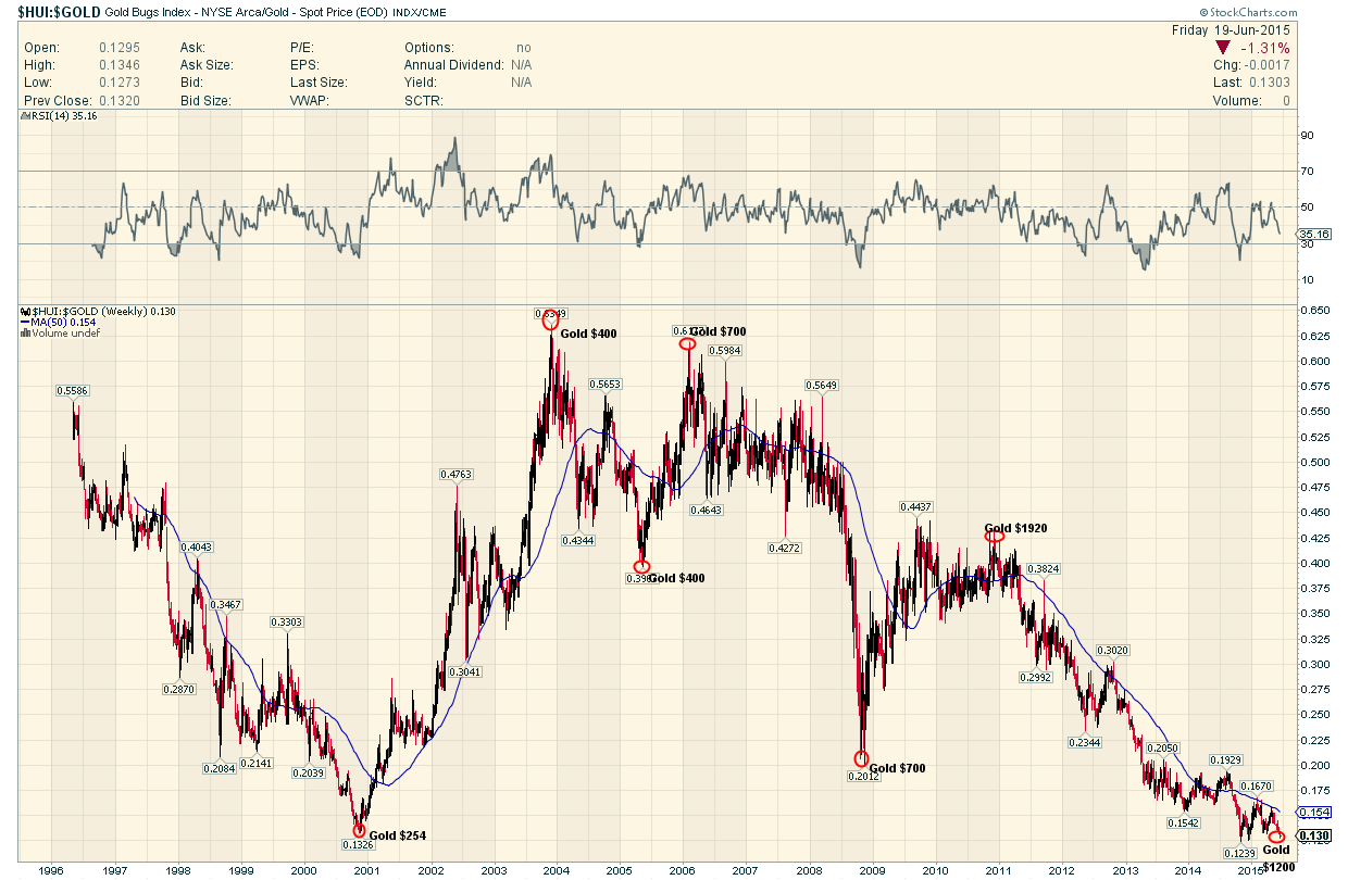
Rambus has documented the fall of this ratio ever since he began this website and has just tonight posted an update showing it has actually broken out of a small consolidation pattern this past week and is now BELOW where it was at the beginning of the Late Great Gold Bull Market in 2001 .
………………………………..
Excerpt from Rambus Chartology Weekend Report June 21 2015.
“Next I would like to update you on the long term HUI:GOLD ratio chart we’ve been following that shows this ratio has finally broken below major long term support, going all the way back to the 2000 low. I have literally waited several years for this ratio chart to break .13 and it finally has. The little H&S consolidation pattern that formed right on the S&R rail has been the key in looking for this ratio to break to new all time lows”
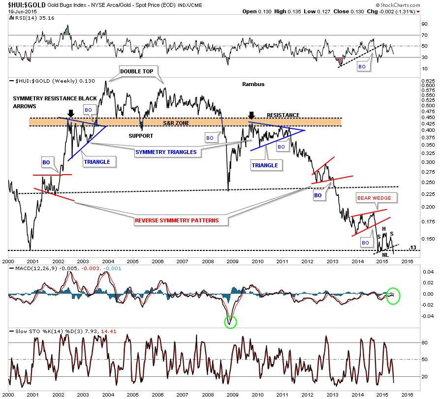
Please take a moment to let this stunning chart sink in .
Especially if you have been holding PM Stocks with the view that this ratio cannot possibly go any lower or if you have been bottom fishing in this god forsaken sector .
The price of the Major PM Mining Stocks, as represented by the HUI:GOLD Ratio , is BELOW where it was when gold was trading at $250 , 15 years ago.
And in spite of all the analysts saying this was absolutely impossible , this Incredible Ratio is breaking down yet again to new all time lows .
The Mind Boggles .
Fullgoldcrown (For Rambus Chartology)