This content is for Yearly and Monthly members only.
Subscribe
Subscribe
Already a member? Log in here

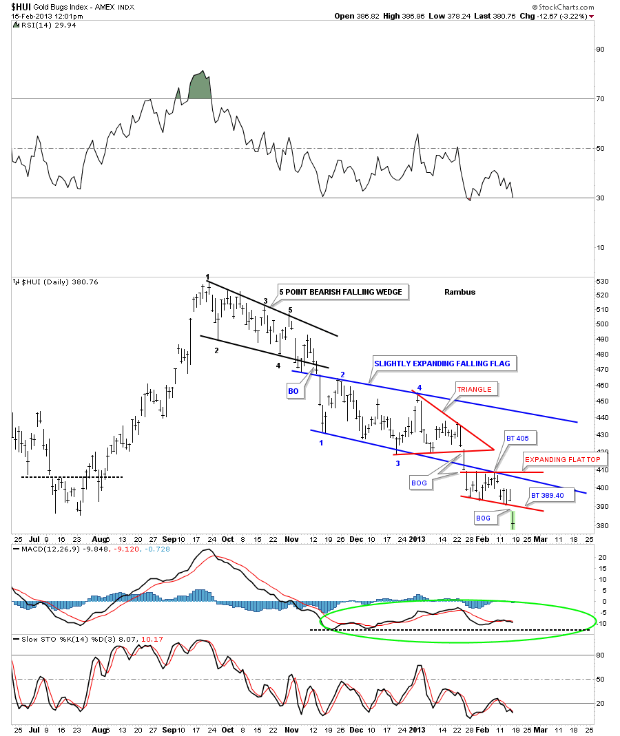
Below is a chart for the HUI that shows all the patterns since this downtrend began at the September 2012 high. Today it broke below the latest small consolidation pattern the little red flat top triangle. Today marks the start of the 3rd impulse leg down since the 2012 top. The first one was the breakout of the black 5 point bearish falling wedge. The second impulse leg down was the breakout of the blue slightly expanding bear flag. And today is the start of the 3rd impulse leg down on the breakout of the red flat top. The reason your seeing a big move is because its a breakout. Notice the breakout gap this morning. This is what one likes to see when you have a completed pattern. It tells you the consolidation period is over. I can guarantee you won’t see this type of analysis or these chart patterns anywhere else on the planet except here at Rambus Chartology.
Editors Note :
I am a HUGE Goldbug…but I decided I can bitch Moan and complain..or…I can follow all the Action
with Chartology by Rambus and be on the right side for a change !
Presently Rambus’s Chartology is showing this may not be even close to Over !
why not join us for some Incredible Tutorials in PM Market Investing
Rambus is giving it to you for free for 10 days but IMHO you may as well subscribe srtaight up
either way you have everything to gain….top right sidebar
I was planning on doing the Wednesday Report on Platinum and Palladium tonight but there is some deterioration taking place on some of the precious metals stocks that needs to be addressed. I’ve been waiting patiently for a couple of the really big caps to start showing some weakness. I believe the biggest cap precious metals stocks have been hiding the retreat that has been going on in some of the lesser precious metals stocks, giving hope that a bottom is close at hand, if one just looks at the big cap pm stocks. I’ve gotten several e mails from angry gold bugs that tell me I have it completely backwards and that the precious metals stock indexes are putting in a triple bottom. I got another one that told me these H&S top patterns, that I’ve been showing you, are too big to be valid. The amount of denial is still pretty strong among the staunch gold bugs. But that’s not what’s important. What’s important is what are the charts showing us regardless of what some folks may think.
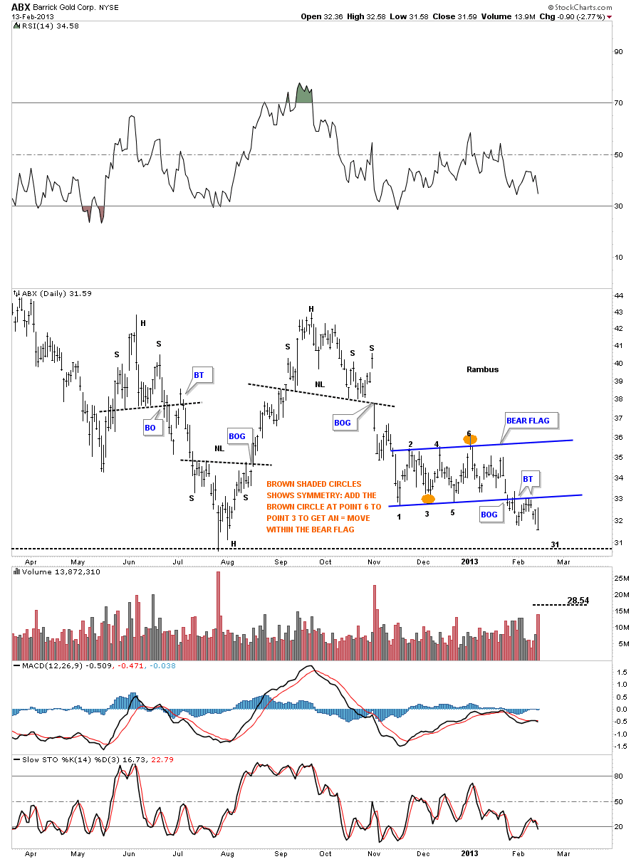
First lets look at ABX as it’s the biggest of the big cap precious metals stocks. How it goes so goes the rest of the PM complex. Below is a daily chart that shows ABX has broken out of a bear flag and has completed the backtest move. You would have to go all the way back to August of last year to see a lower closing price vs today’s closing price.
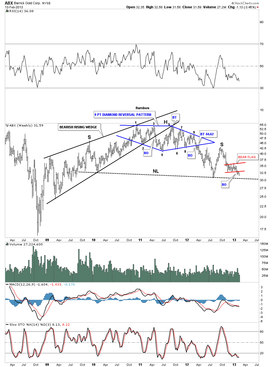
We have to look at the weekly chart to put the daily look into perspective. The placement of the bear flag on the daily chart above is very important as its forming just above the big neckline. That little bear flag may have enough energy to move the price of ABX below the big neckline.
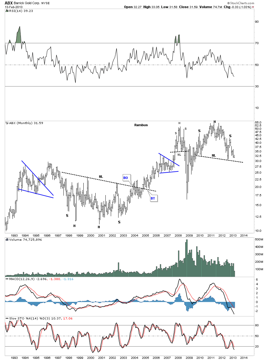
The long term monthly look at the H&S top. Note the multi year base that lead to the bull market in ABX.
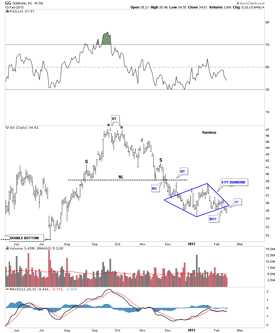
GG is another big cap precious metals stocks that is showing some deterioration on the daily chart. After completing a H&S top last fall GG has been building out a 6 point blue diamond consolidation pattern just below the neckline. Today’s move backtested the bottom blue rail before selling off for the rest of the day.
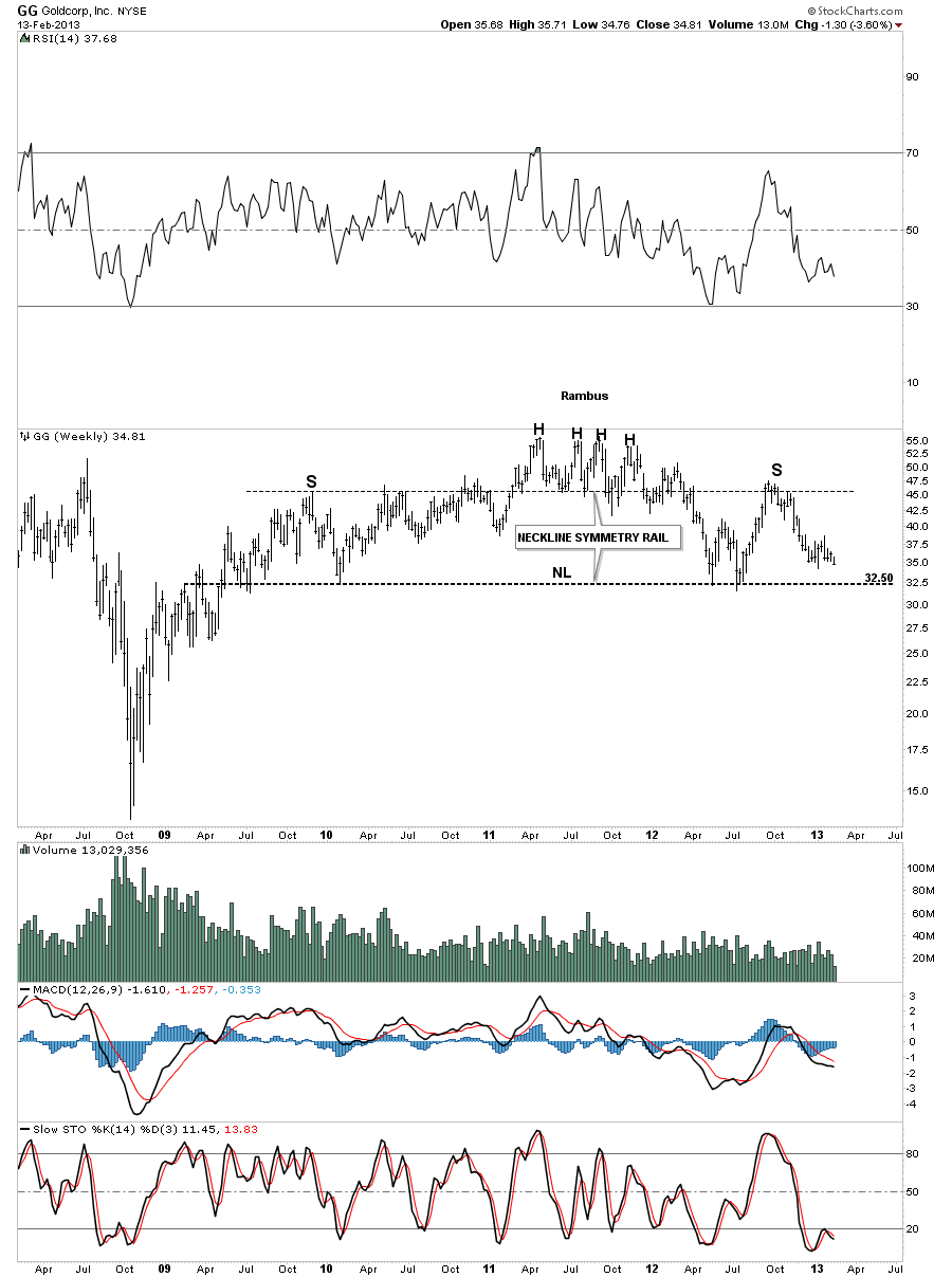
The weekly chart shows the all important neckline, that comes in at the 32.50 area, as the bulls last line of defense that needs to hold.
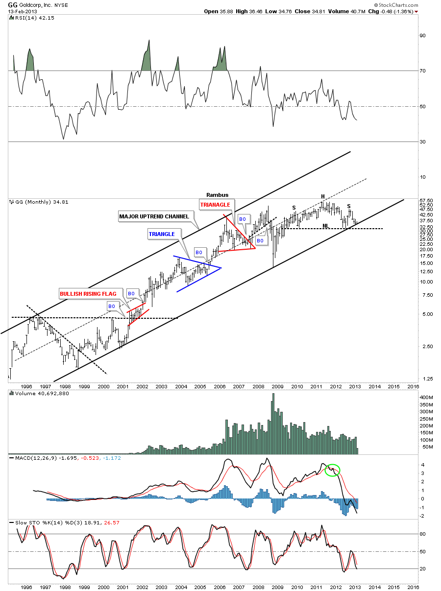
The monthly look at GG is interesting because of where the H&S top is forming. As you can see on the chart below there is an uptrend channel that has been in place since 1998 or so. If the H&S top plays out that means the big multi year uptrend channel will be broken to the downside. Also seeing a massive H&S reversal pattern sitting on top of the long term uptrend channel should give even the most bullish bulls a reason to reflect on what maybe possible if the H&S plays out. Keep in mind I’m only the messenger.
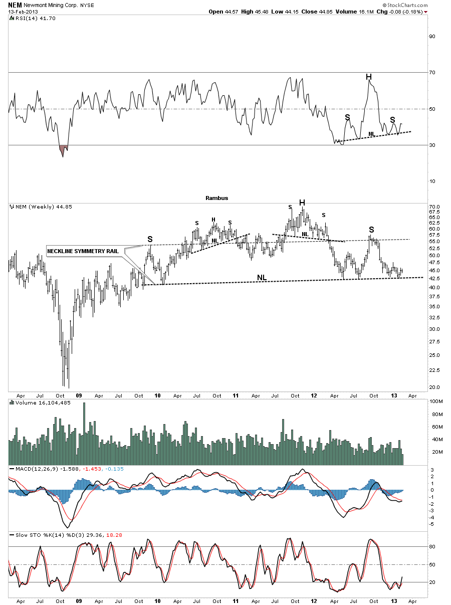
Lets now take a look at a weekly bar chart for NEM that is showing a massive H&S top pattern. This chart shows the neckline symmetry rail, parallel neckline rail, that showed us where to look for a possible top to the right shoulder. You can also see the 4 touches, of the big neckline, in the area of the right shoulder so we know that neckline is hot and to be respected. If it gives way it will reverse it’s role and act as resistance on any backtest.
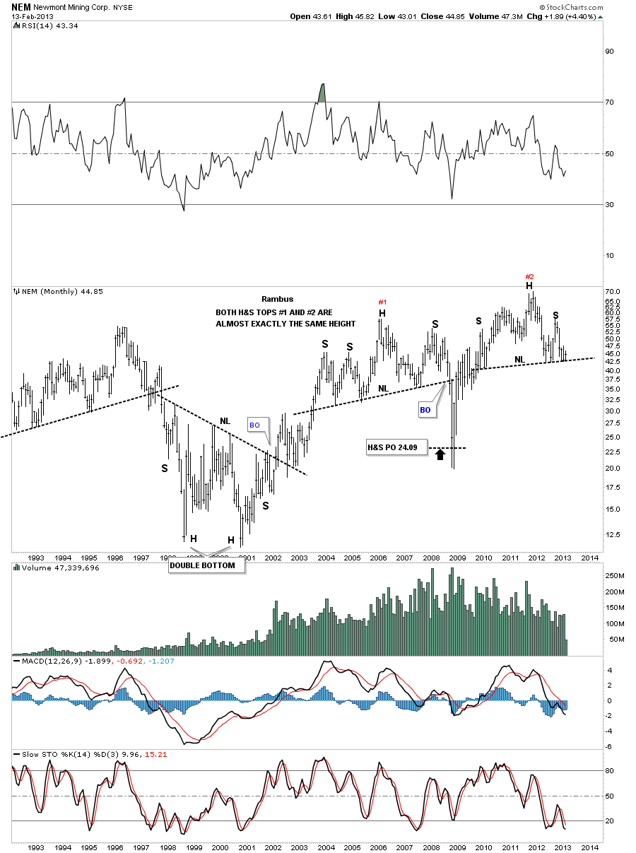
The monthly look shows our H&S top that is almost exactly the same height as the H&S top that formed just to the left.
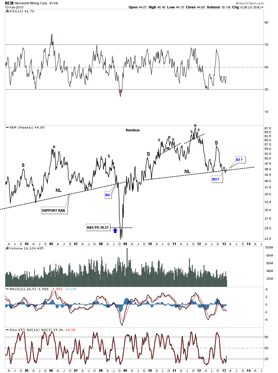
Lets look at one more chart for NEM that is a weekly line chart. As you can see on the chart below it has been testing the breakout point of it’s big H&S top pattern. So far nothing definitive but it looks like the neckline is being backtested from below.
As I have shown you on the charts above the biggest of the big cap precious metals stocks have yet to really break below their respective necklines. Now I would like to show you some other precious metals stocks that have already broken below important topping patterns while the big caps are running interference, taking the investors eye off the ball.
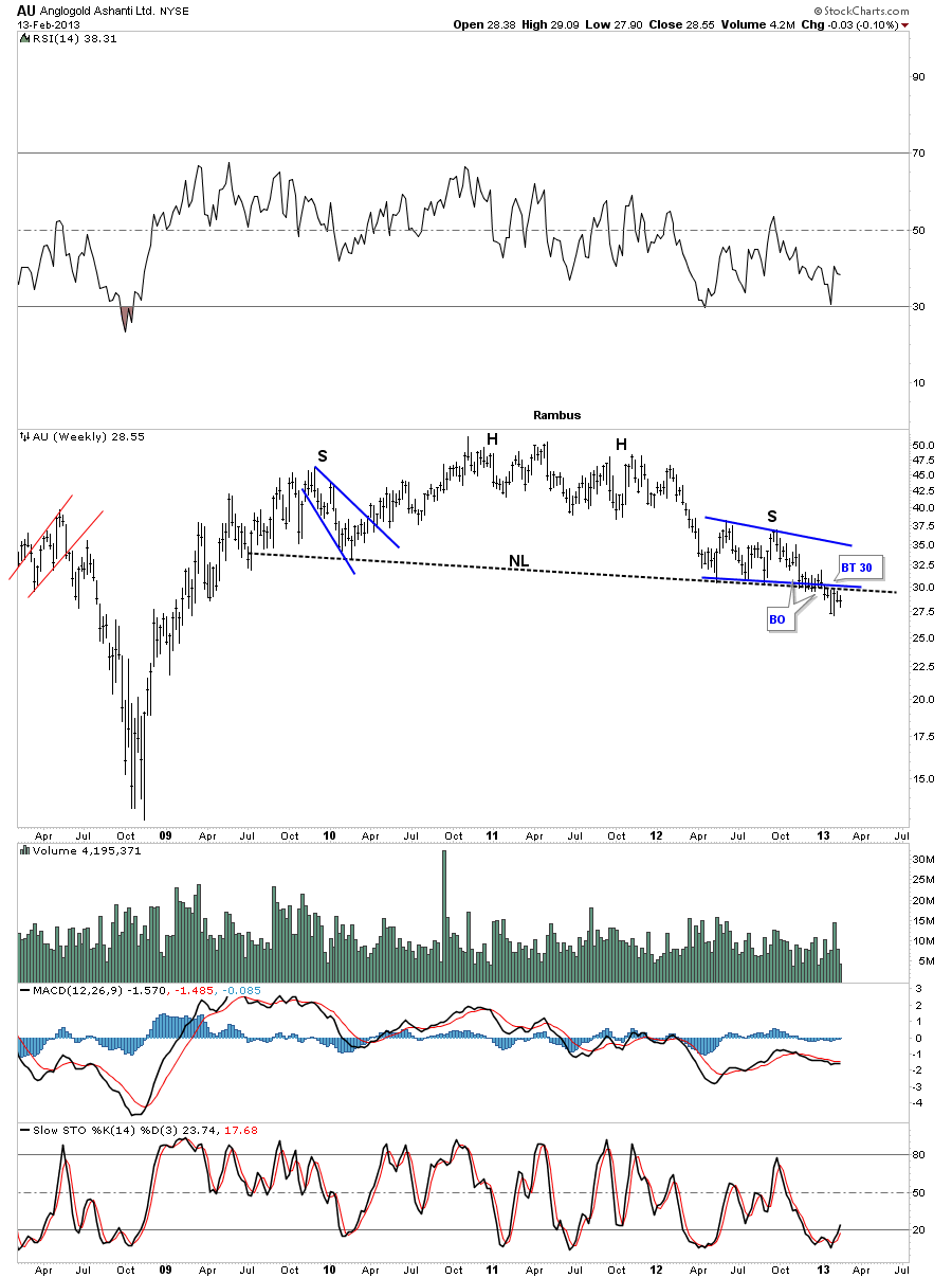
AU has been trading below it’s big neckline for 6 weeks or so and has completed a backtest to the 30 area.
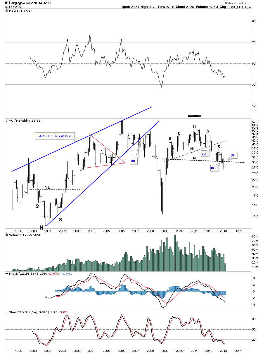
The AU monthly look shows the double H&S top.
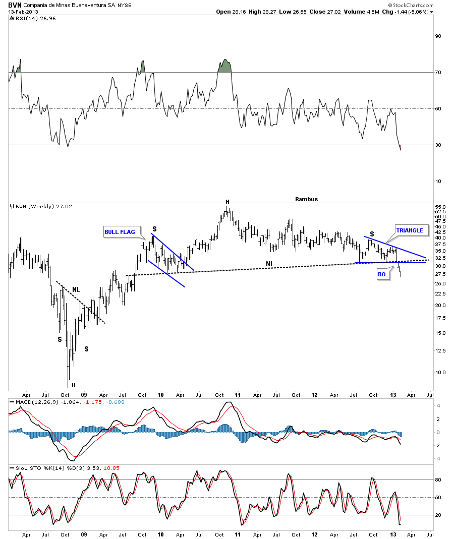
BVN has been trading below its massive H&S top for 3 weeks now.
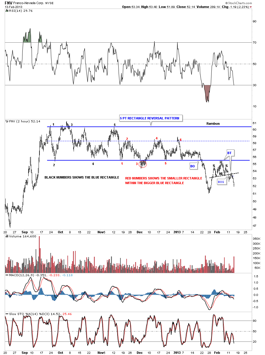
All the reversal patterns have not been of the H&S variety. Below is a 60 minute chart of FNV that shows a 5 point rectangle as it’s reversal pattern. Notice the smaller H&S pattern that formed on the backtest to the bottom blue rail of the 5 point rectangle. That’s an impressive backtest leaving no doubt that the bottom blue rail is HOT.
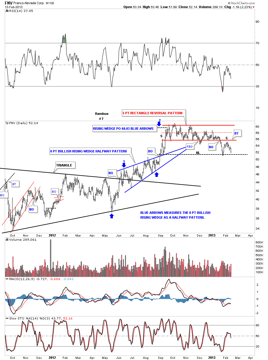
The daily chart shows how its reversing symmetry down as shown by the black dashed horizontal trendline that started off the September 2012 low. I could make a case for a H&S top using last September’s high and our current backtest high as a left and right shoulder.
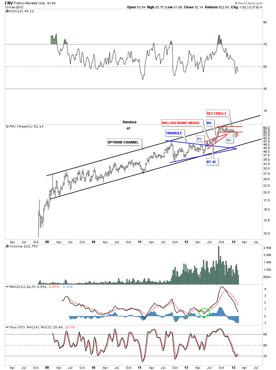
Again we have to look at the long term chart to put everything into perspective. As you can see FNV has been in a nice tight uptrend channel since 2009. It looks like at a minimum that the bottom rail of the uptrend channel will be tested at some point in the future.
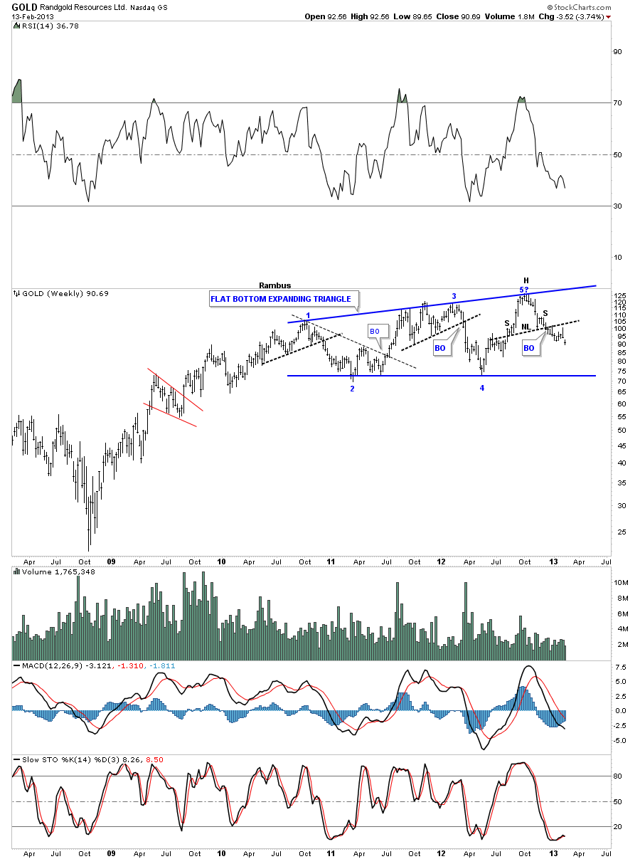
The Randgold weekly chart is showing a 5 point flat bottom expanding triangle as it’s potential topping pattern. It still has a ways to go yet but the small H&S top pattern that has formed at point #5 should get the price back down to the blue horizontal trendline.
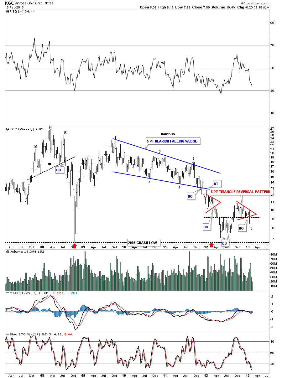
KGC is probably one of the weakest big cap pm stocks as it’s fast approaching the 2008 low. You can see it’s reversal pattern was a 5 point bearish falling wedge. Note the failure of the double bottom hump, on the far right hand side of the chart, to hold support. The reason it failed is because of the 5 point red triangle that reversed the small uptrend.
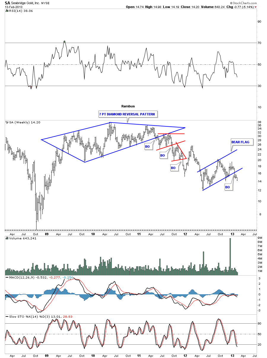
SA shows us a 7 point diamond reversal pattern that broke down in April of 2011. It now looks like it has just created a blue bear flag that broke down about 3 weeks ago.
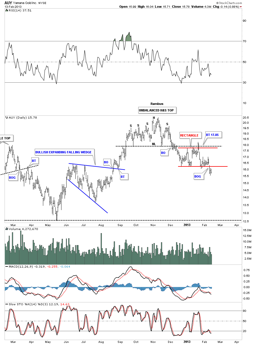
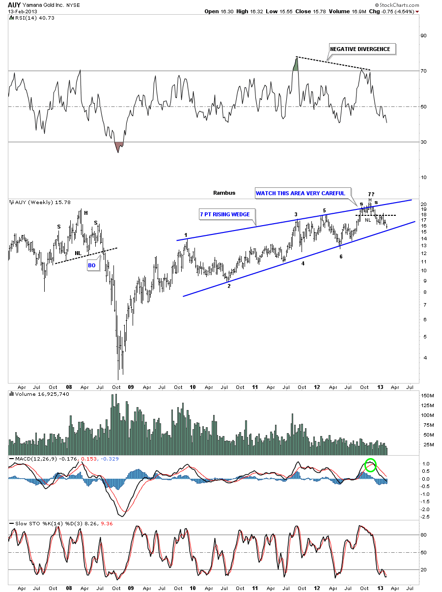
The AUY daily chart shows a H&S top that broke down in December of last year followed by the red rectangle that has formed just below the neckline. Its now 3 days into the breakout phase of the red rectangle.
The weekly chart shows why the H&S top, on the daily chart above, is so critical to the overall bearish picture. The H&S top has formed at the top of a 7 point rising wedge. A break of the bottom blue rail of the rising wedge will complete a very bearish picture for AUY. If you own this stock keep a close eye on the bottom rail and act accordingly it it breaks down.
I could go on and show you more bearish charts for the big cap precious metals stocks but its getting late and I think you get the picture. Folks this article doesn’t take into account the small cap precious metals stocks that have been vastly under performing the big caps. The real carnage is in the small caps right now. If you are holding any then you will know what I mean.
As I stated earlier I’m just the messenger and have no axe to grind with the precious metals crowd as I have been following this sector since the spring of 2002. I wish I could be showing you some big reversal patterns to the upside but that’s not what the charts are showing. There is no bell that rings when a top or bottom is in place. There is only hard work in understating what the charts are telling us if we can keep an open mind. All the best…Rambus
More at
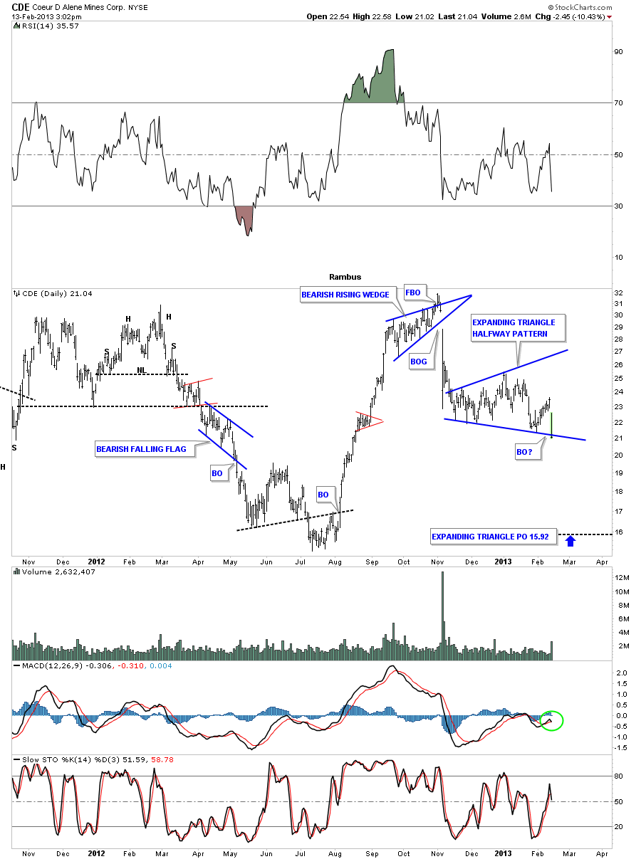
This trade is just for those subscribers that know what they’re doing and have the experience to buy puts or have the ability to sell short. You can use the chart below as your guide. What you do is up to you.
After breaking down out of the bearish rising wedge CDE has been forming an expanding triangle consolidation pattern. The price action is sitting right on the bottom blue rail as we speak. The minimum price objective is to the 15.92 area which is close to the previous lows made back in July and August of last year.
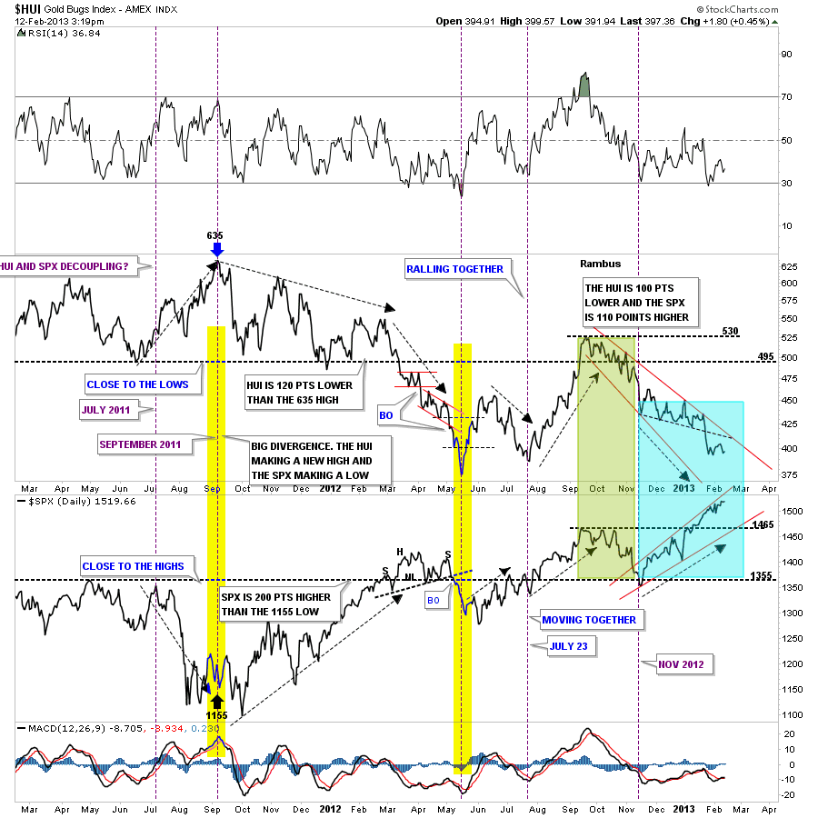
I like to use this chart when I want to know how the HUI is doing compared the the stock markets. It clearly shows that sometimes the HUI is outperforming the SPX in a big way and sometimes the SPX is outperforming the HUI, yellow shaded areas, and sometimes they move together. I would like to focus your attention to the right side of the chart that shows the blue shaded area. The blue shaded area shows how the HUI and the SPX has decoupled starting in November of 2012. How long this divergence goes on is anybodies guess. But it is what it is until it changes.
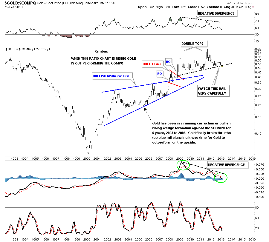
Lets look at a couple of ratio chart that shows something may be brewing when we compare gold to the COMPQ or the SPX. First lets look at the Gold to COMPQ ratio that is showing that the COMPQ has been outperforming gold for over a year now. There is a potential unbalanced double top in place where the double top trendline is being tested right here and now. You can see gold strongly outperformed the COMPQ during the first 9 years or so before the ratio put in it’s first peak in 2009. It formed a second peak that was slightly higher than the first peak but there was a very large negative divergence on the RSI and MACD indicators. Is this chart now suggesting that it might be time for the stock markets to start outperforming gold in a big way if the double top comes to fruition?
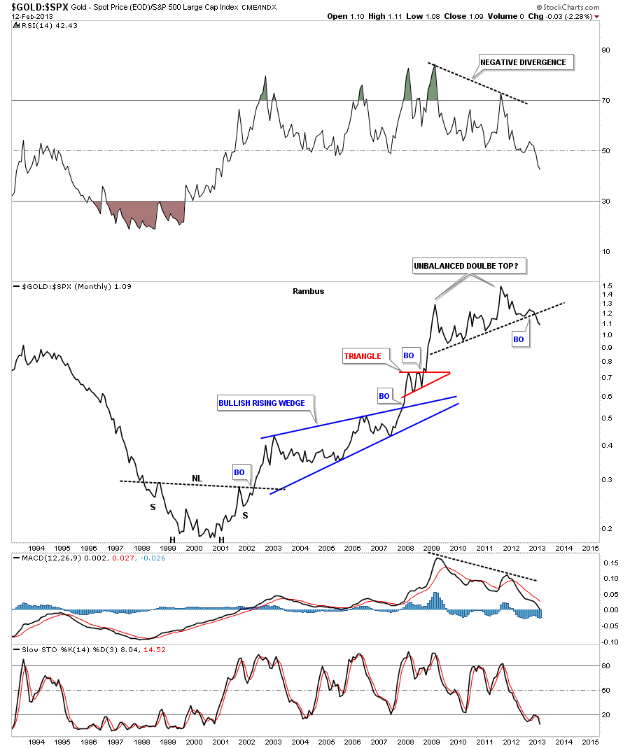
Lets look at the gold to SPX ratio chart that is showing a very similar pattern to the ratio chart above. Here I’m using a line chart that shows the ratio is breaking down from the unbalanced double top. You can see the beautiful inverse H&S bottom that was made back in late 1990’s and early 2000’s that launched the outperformance of gold to the stock markets. Keep in mind a big base leads to a big bull market and a big top leads to a big bear market which this ratio chart clearly shows. Also note the big negative divergences on the RSI and the MACD indicators. The question that has to be asked is the bull market that gold has enjoyed since 2000 compared to the stock markets coming to an end? Stay tuned as things are starting to get interesting.
More at
LIMITED TIME FREE TRIAL