This content is for Yearly and Monthly members only.
Subscribe
Subscribe
Already a member? Log in here

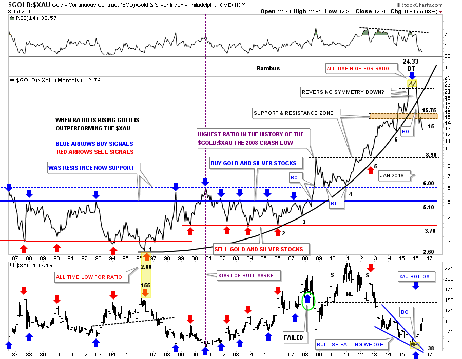
This first chart for tonight is the GOLD:XAU ratio combo chart we’ve been following very closely. I just want to make it perfectly clear what this ratio chart is telling us. The ratio chart on top is telling us that gold is in a parabolic collapse vs the XAU after 20 years of out performance. Even though they can both go up together the XAU stocks are going up parabolic to gold as shown by the vertical move down in the ratio and the vertical move up in the XAU.
When the ratio broke down from its double top all time highs at 24.33 there has only been one month, May, that the ratio had a small rally and backtested to the bottom of the S&R zone at 15. You can see the same thing happened on the XAU chart at the bottom, where it just went sideways in May. We are witnessing an unprecedented rebalancing of the precious metals stocks to gold. This started in January of this year and shows no signs of abating.
If you’ve been a precious metals complex investor, or as some like to call them gold bugs, this is the absolute best buying opportunity in 20 years to buy your favorite precious metals stocks. The unwinding of the parabolic 20 year arc is something you don’t see everyday and to be on the ground floor of the rebalancing move should be very rewarding if one can stay in the saddle.
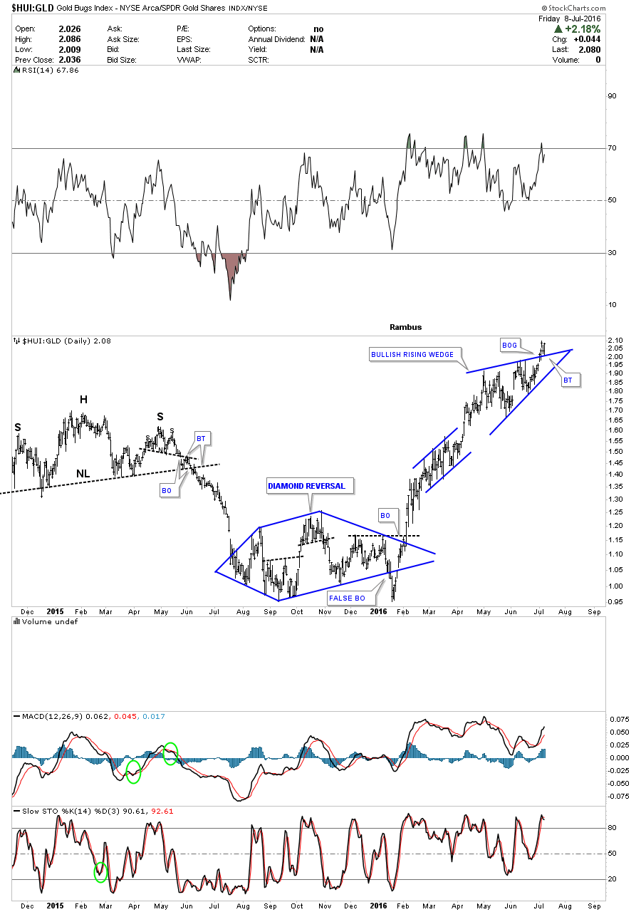
Below is another ratio chart in which I compare the HUI to gold. When the ratio is rising the HUI is outperforming gold. If the ratio chart above has any validity then we should see the HUI rising in a near vertical move vs gold. After building out a Diamond reversal pattern at the bear market low, this ratio has been in a strong impulse move higher. Note the breakout and backtest to the top rail of the current bullish rising wedge. As long as the apex holds support we need to let this ratio fulfill its destiny.
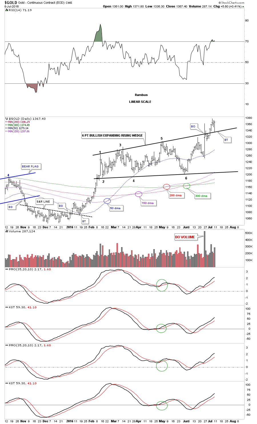
This next chart is a 10 month daily chart for gold which shows the breakout and backtest to the top rail of its six point bullish expanding rising wedge. If gold is just now breaking out in a brand new impulse move up, what does that say about the GOLD:XAU ratio chart we just looked on the first chart above? In order for the ratio to keep falling in a near vertical manner, as it has been doing since January of this year, the PM stocks are going to have to go up faster than gold itself which they’ve been doing since January.
Note the huge volume bar on the breakout from the six point bullish expanding rising wedge. Also note the backtest to the top rail that took place this morning. These are major clues that this consolidation pattern is mature and ready to make its next move.
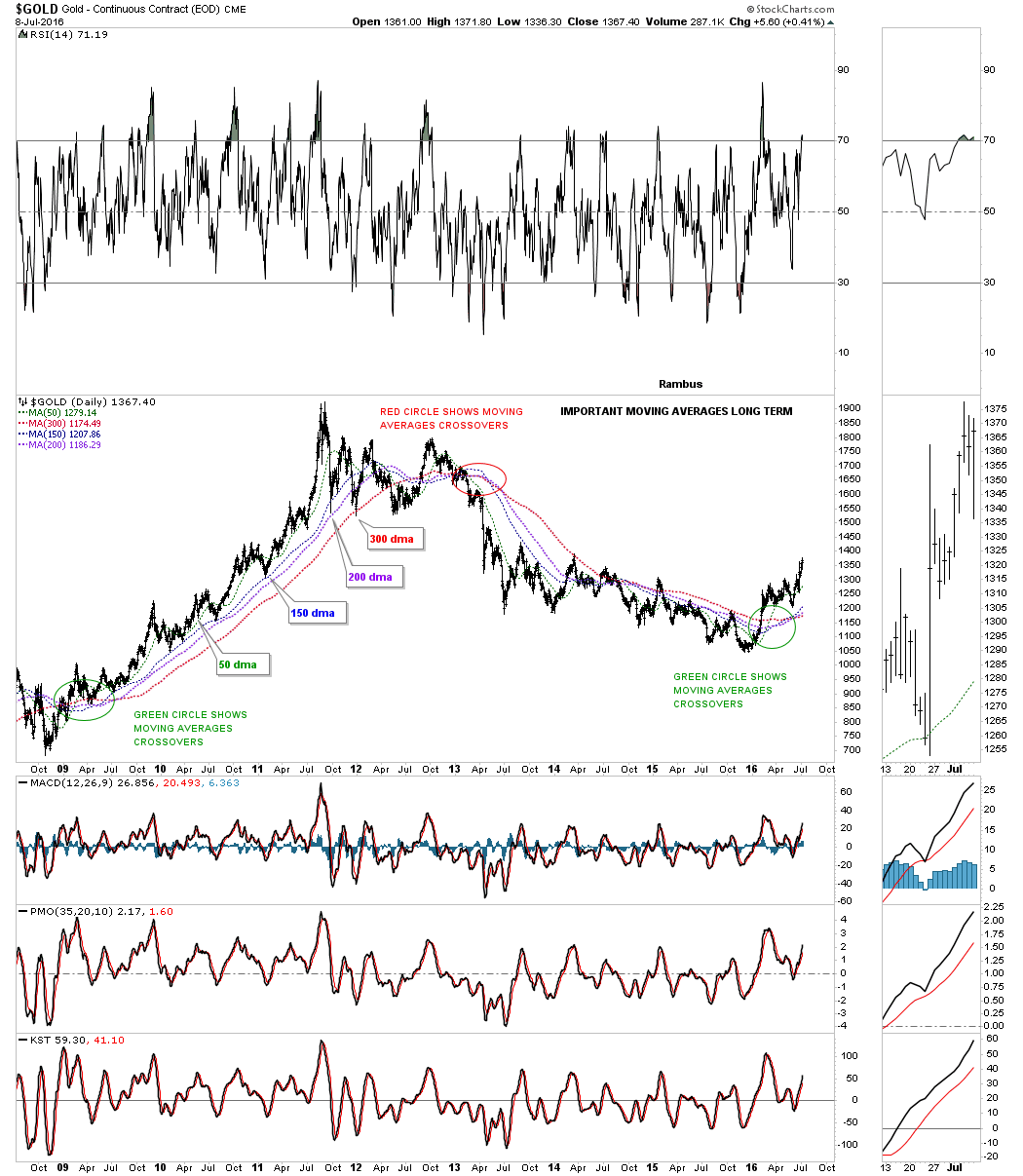
This chart also has what I consider to be the most important moving averages for gold. The 50 day simple ma has held support except for the move below it at the sixth reversal point in the bullish expanding rising wedge. It even held on the big volatility day when gold broke out from the bullish expanding rising wedge. As you can see all the moving averages were slopping down coming into the December 2015 bottom. It took until last month June, for all the moving averages to have a positive crossover when the 200 finally moved above the 300 day moving average which was the last piece of the puzzle for the moving average alignments. They are now all proper aligned for the new bull market and pointing up.
The longer term daily chart for gold shows the rally off the 2008 crash low and how all the important moving averages aligned to show the bull move that took place. During that big bull run up to gold’s all time highs the 150 day moving average was the one moving average that held support the best. It was never violated until the first move down from the 2011 top which also tested the 200 day moving average for the first time during that epic run.
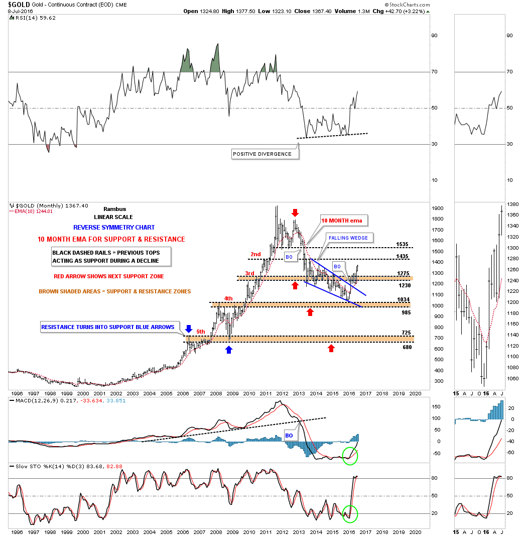
The 20 year monthly chart for gold shows how well the 10 month ema held support during the bull market years and resistance during the bear market. Note how the 10 month ema has reversed its role back to support on the rally out of the bear market low at 1035.
I think the charts are showing us, now is the time to be strongly invested in the precious metals stocks. To try and trade in and out of a strong bull move like we’ve been seeing since the first of the year can take one out of the market just when the time is right to take advantage of a possible life changing event. Opportunities like this don’t come around very often in ones investing career and to be on the ground floor, well that’s just the frosting on the cake. The general pubic isn’t even aware of what is taking place in the PM complex right now. If you have been following the PM complex for 10 to 15 years then yes, you should be aware of what is taking place right now and taking advantage of what you have learned through the years. I believe most gold bugs see the rally that is taking place but aren’t fully aware of the magnitude of what is really taking place right now in the PM complex. As always we’ll know in the fullness of time if these charts are telling us the truth. Have a great weekend. All the best…Rambus
Several weeks ago we were looking at a couple of consolidation patterns that were forming on some of the PM stock indexes. One was the bullish rising wedge and the other was a H&S consolidation pattern. Below is a daily chart for the HUI which shows the black five point expanding triangle as the bear market reversal pattern. From that reversal pattern the HUI built out its first real consolidation pattern which is the bullish rising wedge. I commented just before the breakout gap of how the battle was shaping up between the bull and the bears at the top rail which had been holding resistance. I mentioned that we would see how strong the bears were by how well they could defend the top rail. We got our answer a day or two later when the price action gapped above the top rail of the bullish rising wedge. Keep in mind these patterns show up in strong trending markets, so it’s something I always look for when I know the move is strong.

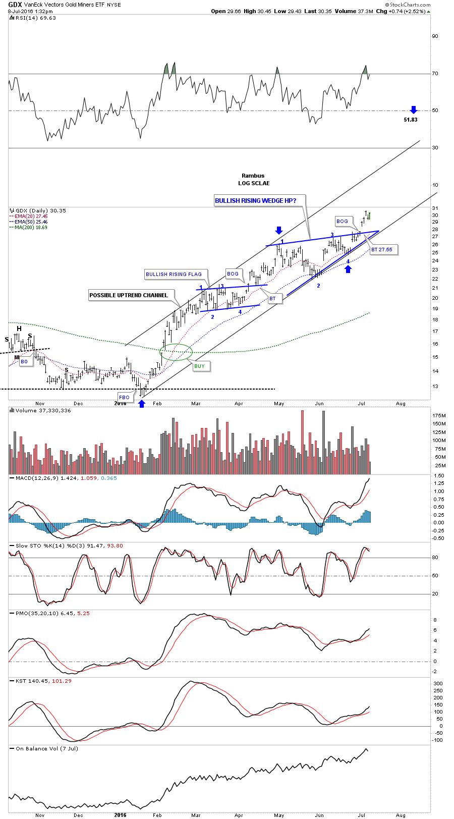
The GDX bullish rising wedge.
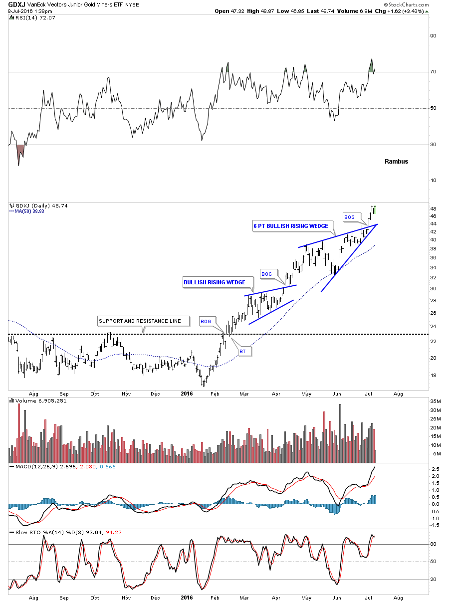
Below is a daily chart for the GDXJ we looked at earlier this week when it gapped above the top rail of its own bullish rising wedge. It has six reversal points instead of four for the other PM stock indexes.
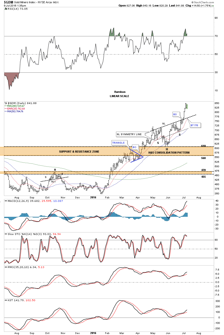
The other consolidation pattern we were looking at was a strongly slanted H&S consolidation pattern as shown on the daily chart for the $GDM. I said it was very symmetrical as the neckline symmetry line was showing the low for both the left and right shoulders. The H&S consolidation pattern also formed on top of the big brown shaded S&R zone which was a very good place to look for support.
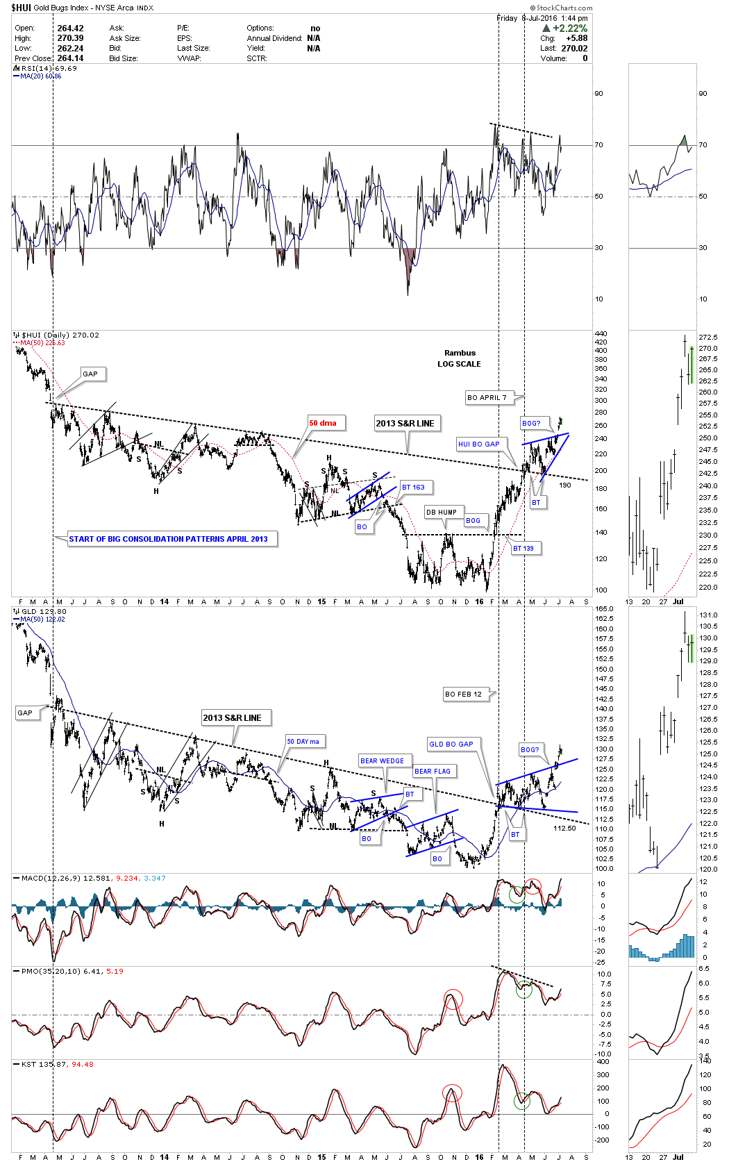
Below is a long term daily combo chart which has the HUI on top and GLD on the bottom. The most important point on this chart is the 2013 S&R line on each chart. You can call the price action below the 2013 S&R line anything you want. What is most important is the breakout gap above that three year S&R line. As you can see the HUI has formed its first consolidation pattern of its new bull market which was the bullish rising wedge. GLD also formed the first consolidation pattern of its new bull market which is a bullish expanding triangle. Note each consolidation pattern shows a breakout gap above the top rail. Maybe we’ll get a backtest to the top blue rails before these two go higher but I wouldn’t count on it as these guys are mean reverting back to some kind of normalcy.
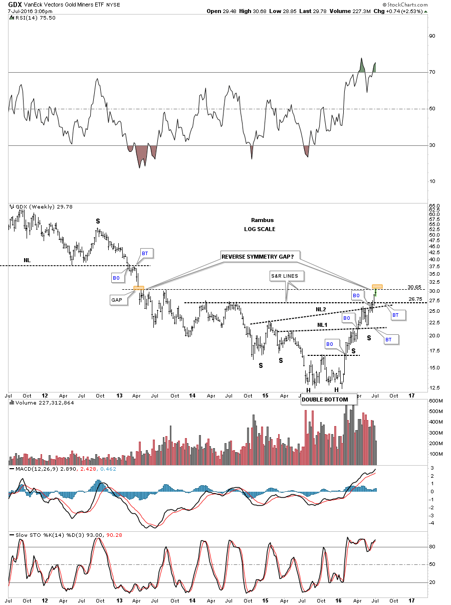
Last week we looked at a weekly chart for the GDX which showed a gap made during the 2013 impulse move down. This week the GDX has finally arrived at the gap area as shown by the two brown shaded rectangles. This is the point where we’ll want to watch how the price action interacts with the gap area. First, the bottom of the gap my hold resistance for awhile and we may see a ping pong move between the bottom of the gap at 30.65 and the horizontal S&R line at the 26.75 area. The other possibility is we may see a reverse symmetry gap over the 2013 gap. Interesting times to say the least.