This content is for Yearly and Monthly members only.
Subscribe
Subscribe
Already a member? Log in here

In deference to Mark Twain, I will review the USD, general stock market, precious metals, the electric metals and various other topics. In the past two weeks Rambus has been so prolific with such high impact charts that I find it a challenge to offer value added material so I offer charts with some different perspectives.
USD-No I Am NOT Dead Yet!
Currencies tend to be a very emotional subject. I try to be objective when analyzing them, sticking to the language of the market and it’s message. It is always important to guard against the gold bug narrative, it can even influence our views of currencies. Demanding posts insisting the USD is toast and immediately headed towards history’s ash heap seem closely related to this gold bug narrative. The USD has spent the first 8 months of 2017 in a well defined downtrend, however it does not appear to be in a death spiral. Actually the shouting and insistence that it must continue down has been a fairly predictable sign that its move downward was reaching its limit. The dollar may have now completed a base and is set to continue its move higher. This is not dogma as it could reverse downward, but for now it’s making all the right moves if the trend is higher.
Please review Rambus’ October 25 post on the USD as there is no other finer analysis anywhere:
I have often made the point that we are in a post bubble contraction. It began with the financial crisis in 2007, however the central banks of the world and their interventions have truncated the natural corrective process and re-inflated the bubble due to financial engineering. Ultimately, if robust growth is to ever return to the world’s economies the PBC must be allowed to do its work in de-levering balance sheets. Historically in the previous 5 episodes over the past 340 years, PBCs have taken 15-20 years to accomplish this. So this is a slow process and the 8 month downtrend of the USD in 2017 could just be a little wiggle that turns out to be just a correction in an ongoing up-trend. Time will tell of course. In a PBC, the senior currency becomes chronically strong and acts as a magnet attracting capital flows from around the world. Over the past year this economic principle has been very hard to accept, however it may be getting ready to reassert itself. I personally don’t trade currencies, however I watch them since they drive asset classes and knowing their trend gives us a clue of where these assets will themselves trend.
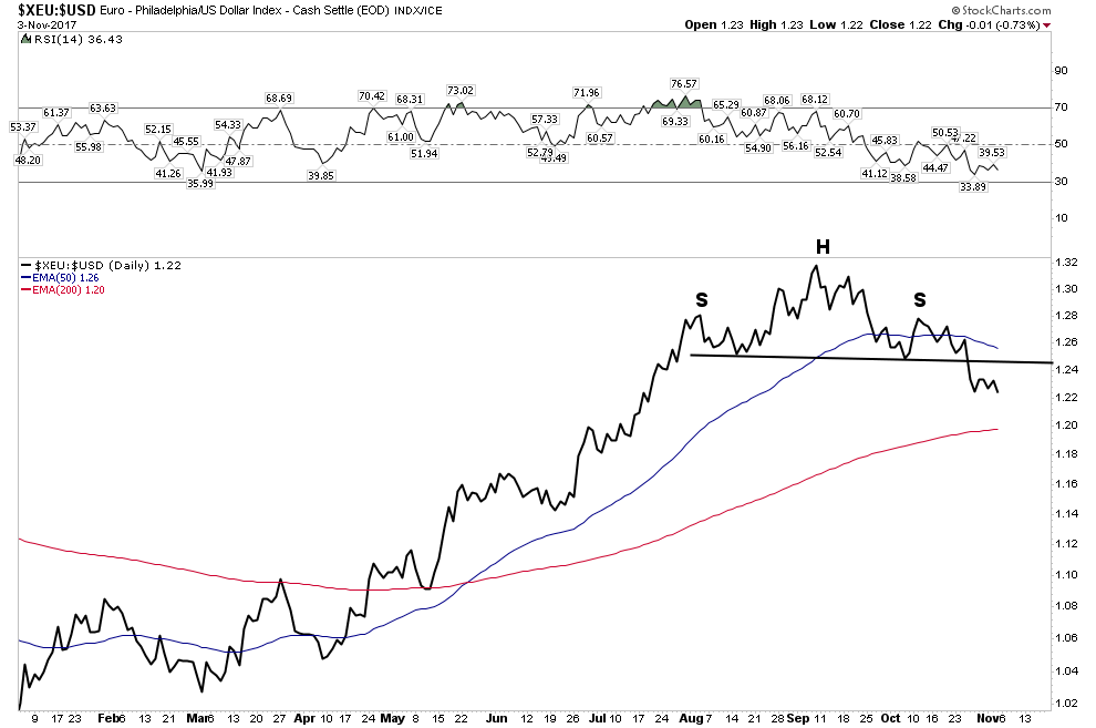
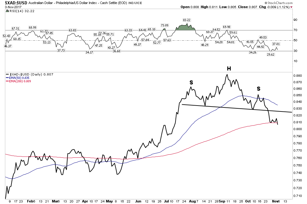
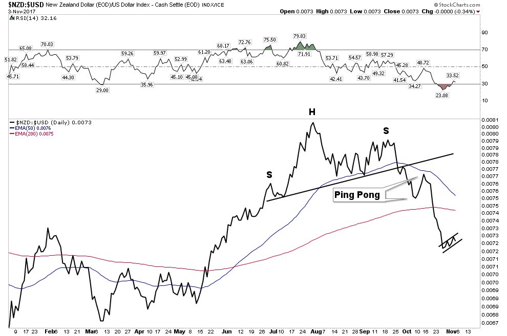
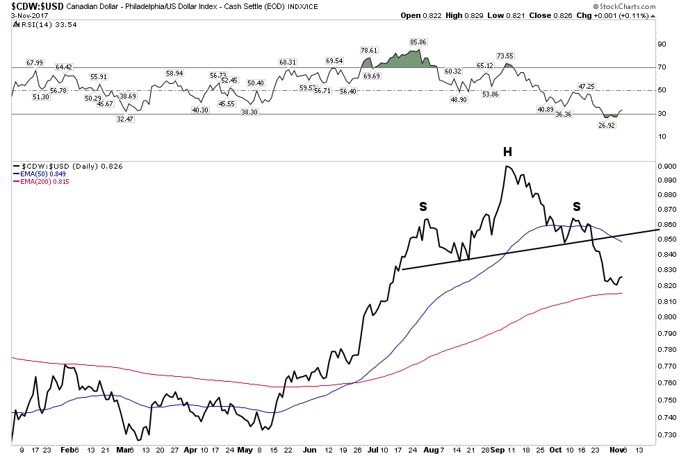
It appears we are at a crucial point in currency markets as the USD is beginning to reassert itself. Lets look at the various currency charts vs the USD:
Euro- H&S neckline now broken:
Aussie Dollar– H&S break with price now violating the 200 EMA
NZD– The first to show its hand
Canadian Dollar– The ultimate resource currency
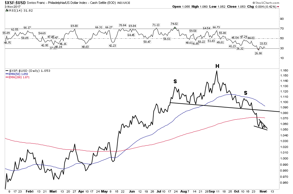
The Swissie: Et tu? Even the ultimate haven currency… 200 EMA violation.
South Africa Rand:
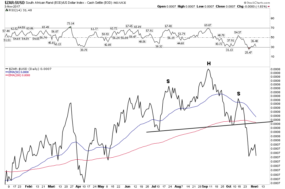
So one can see all of these currencies are now in a broad based breakdown vs the USD. The USD took some time to gain traction and it’s NOT out of the woods yet, but these charts show that it would take some work to reverse this initial trend reversal.
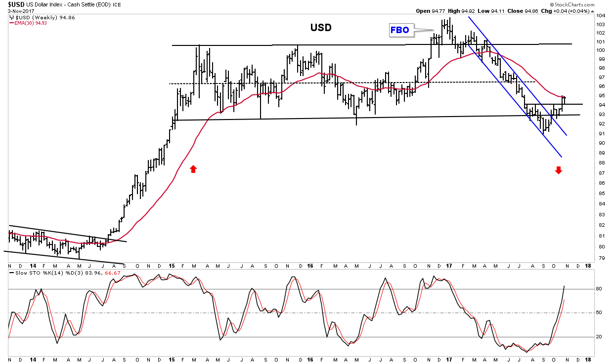
In the chart below we see how the USD has broken above its lower horizontal channel line and is now attempting to overcome the resistance of the 30 W EMA. Stochastics are indicating that it has the momentum to continue its move higher.
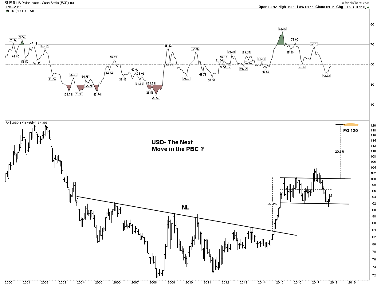
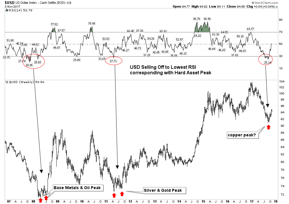
Below is the chart that has been subject to ridicule and derision, however it depicts what could occur when the PBC reasserts itself. It is certainly not a guarantee, however it shows what may lie in store.
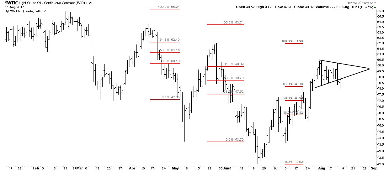
This next chart shows the relationship between the USD and the three metals: gold, silver and copper. It is hinting that if the USD continues to rally it could make it difficult for these three metals to advance much further:
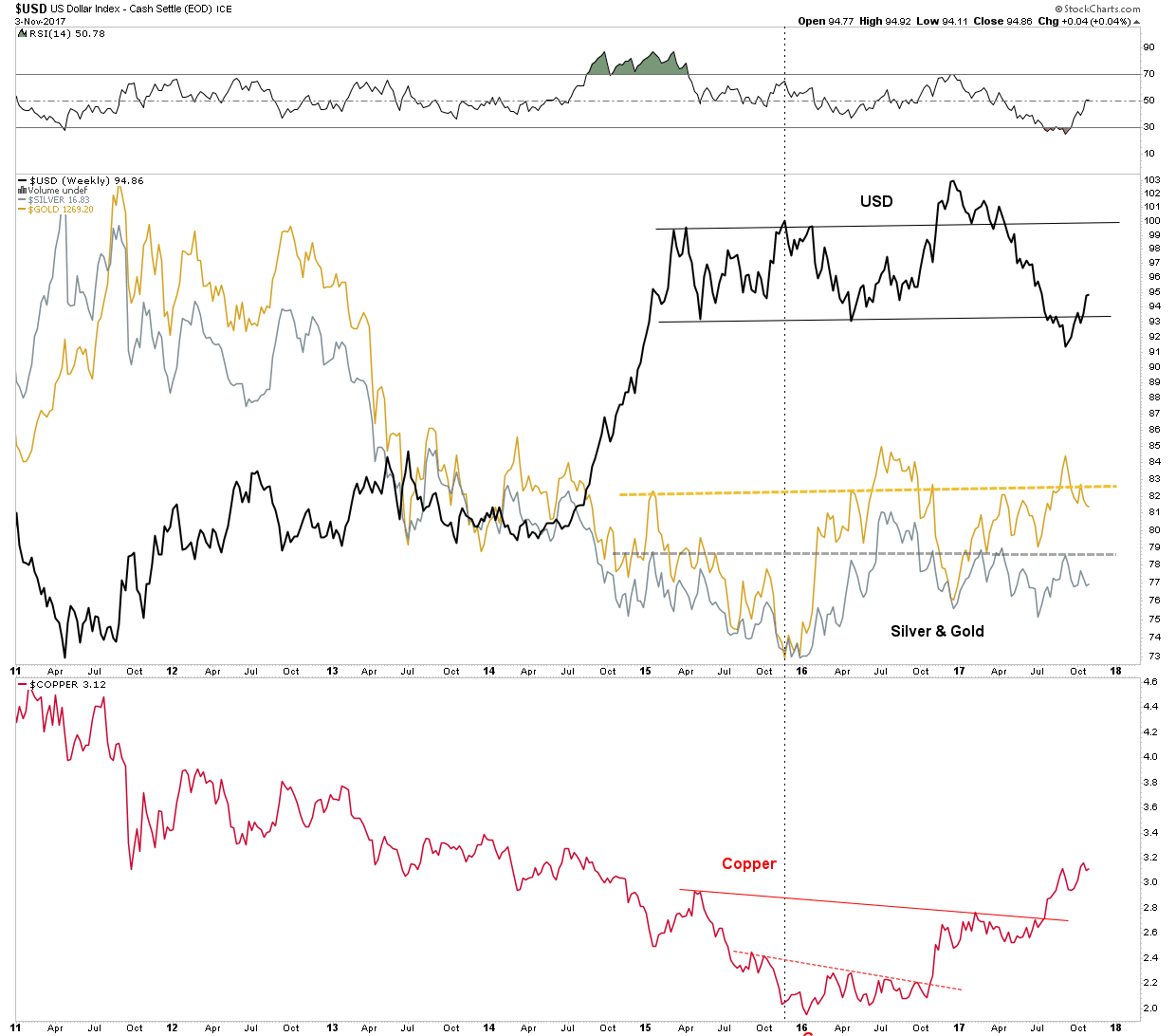
Finally, this USD chart poses the question: are the industrial metals getting ready to end their run for now? It seems that in the past when the USD reversed from being oversold on the weekly that was the message:
The Stock Market- From Here to Infinity?
Rambus has shown that the move upward in the stock market continues to be unimpeded. I would concur with the caveat that early next year it may peak and end the 9 year bull market, so far the second longest in history. Momentum is still powering higher, however internal deterioration has begun to be evident. Here is one possible scenario for the ultimate top:
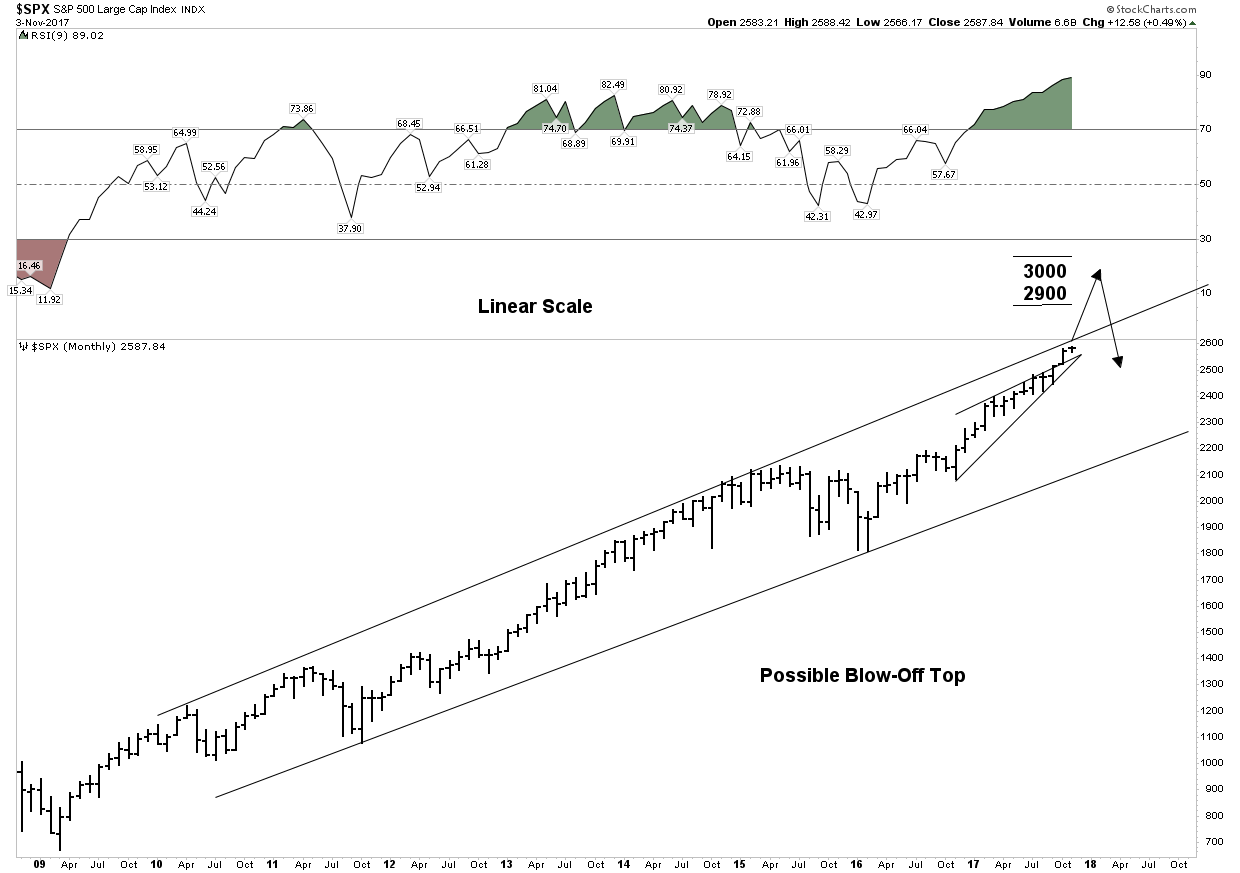
Above is a linear scale view of the 9 year bull market. It depicts a blow off top penetrating the upper trend channel with a target of 2900-3000. We see 3 phases to this bull market and the blow off would end the final phase III “mania”. Note the extreme reading in the RSI lending credence to this outcome.
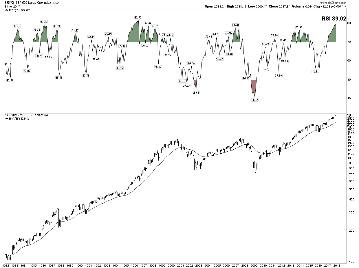
Below is a chart which highlights just how overbought and extended this market has become. It is a monthly view of the entire 36 year secular bull market. Note the RSI is now the second highest in the entire bull market. It is saying this relentless rise has reached a point where the RSI will limit its move.
I would like to show just how narrow the advance has become. We all know how the FANG stocks have led the market. The XLK includes a heavy weighting made up of the FANGS and FANG-like stocks. The rise been relentless:
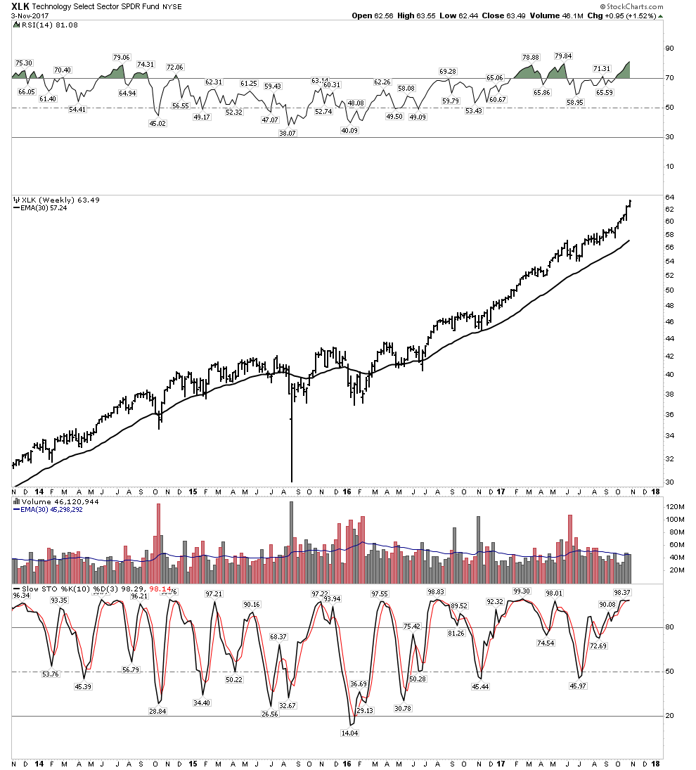
Note how extended stochastics and RSI have become. Also note how volume is trailing off despite this recent blow off move.
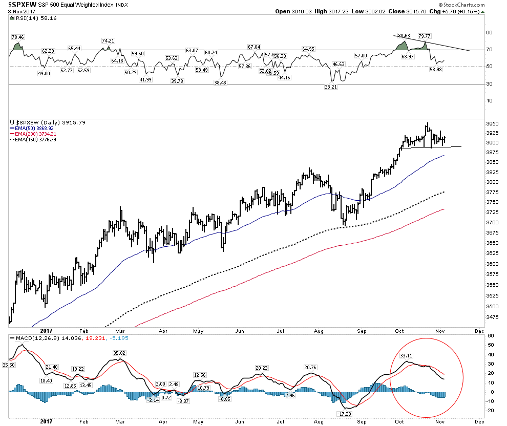
SPX-Equal Weighted Index
Below is the SPX represented as an equal weighted index. It values all 500 stocks equally vs the normal cap weighted measure. Here we see the trend solidly upward, however note that RSI is waning and it may be putting in a H&S top. MACD momentum is also indicating weakness.
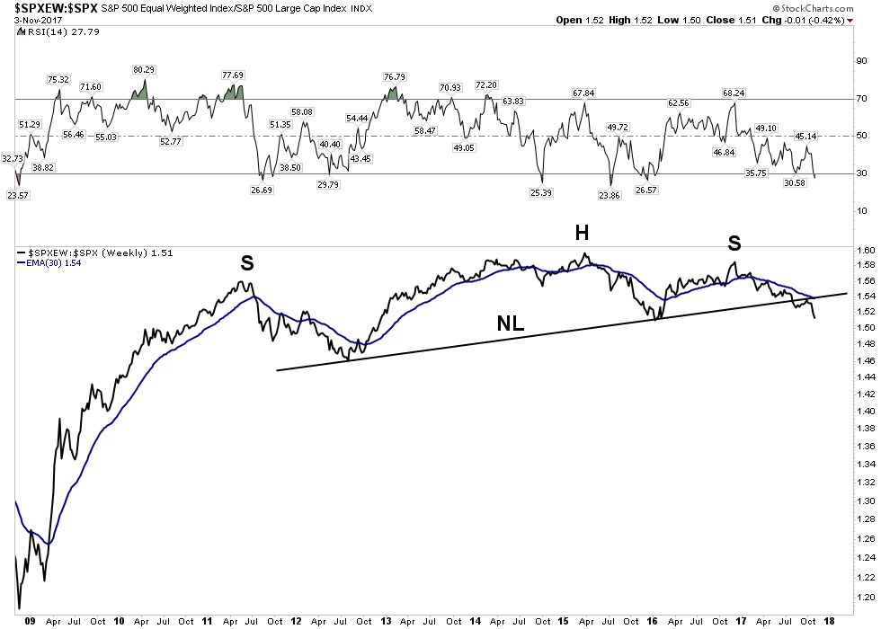
Now let’s go back and view the entire 9 year bull market and subtract out the cap weighted influence of the index as opposed to just neutralizing it. You will see it reveals the core of the market has not really gone anywhere for 7 years and it has recently broken its NL, followed up with a BT and is now resuming its downtrend.
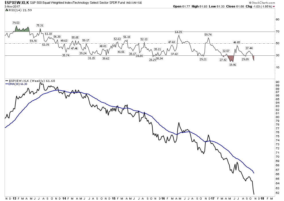
Finally, let’s remove the effect of the super momentum driven XLK for the past 5 years and what is revealed is something really shocking. That of course is a total implosion of the core of the market relative to the momentum driven XLK. The message here for us to understand is that this market is being driven by money flows into an increasingly narrow sector of the market. This is a classic final phase characteristic of a blow off market. It is not announcing an end tomorrow, but it tells one what season we are in.
Let’s look at a few charts that you should be aware of. Again, the message is not that the end is here, but the internals are deteriorating:
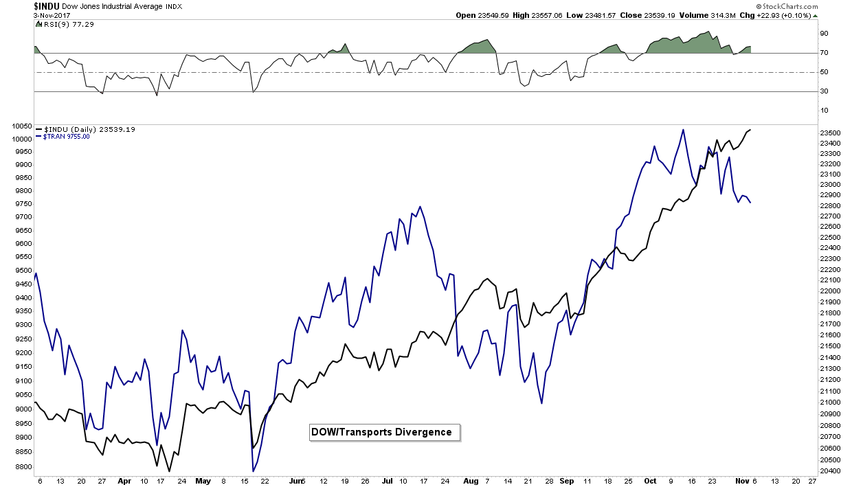
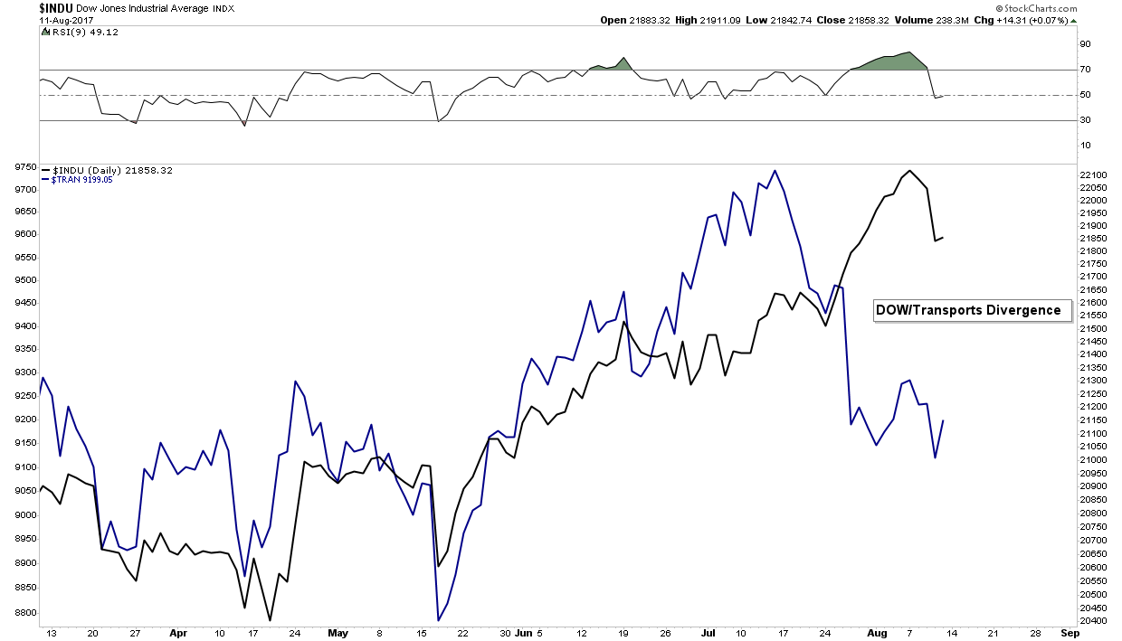
Dow Theory- Non Conformation
It’s only been in effect for three weeks, however this divergence needs to be corrected by the transports resuming its uptrend. Without a reversal upside, it signals trouble ahead:
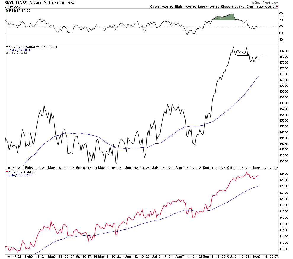
Advanced Decline Volume:
It’s too soon to call a top, however here we see the first step down in Adv/Decline volume indicating internal weakness.
GSR- Update
We don’t expect a breakout until after a market peak is in place, however it continues to progress doing it’s technical work:
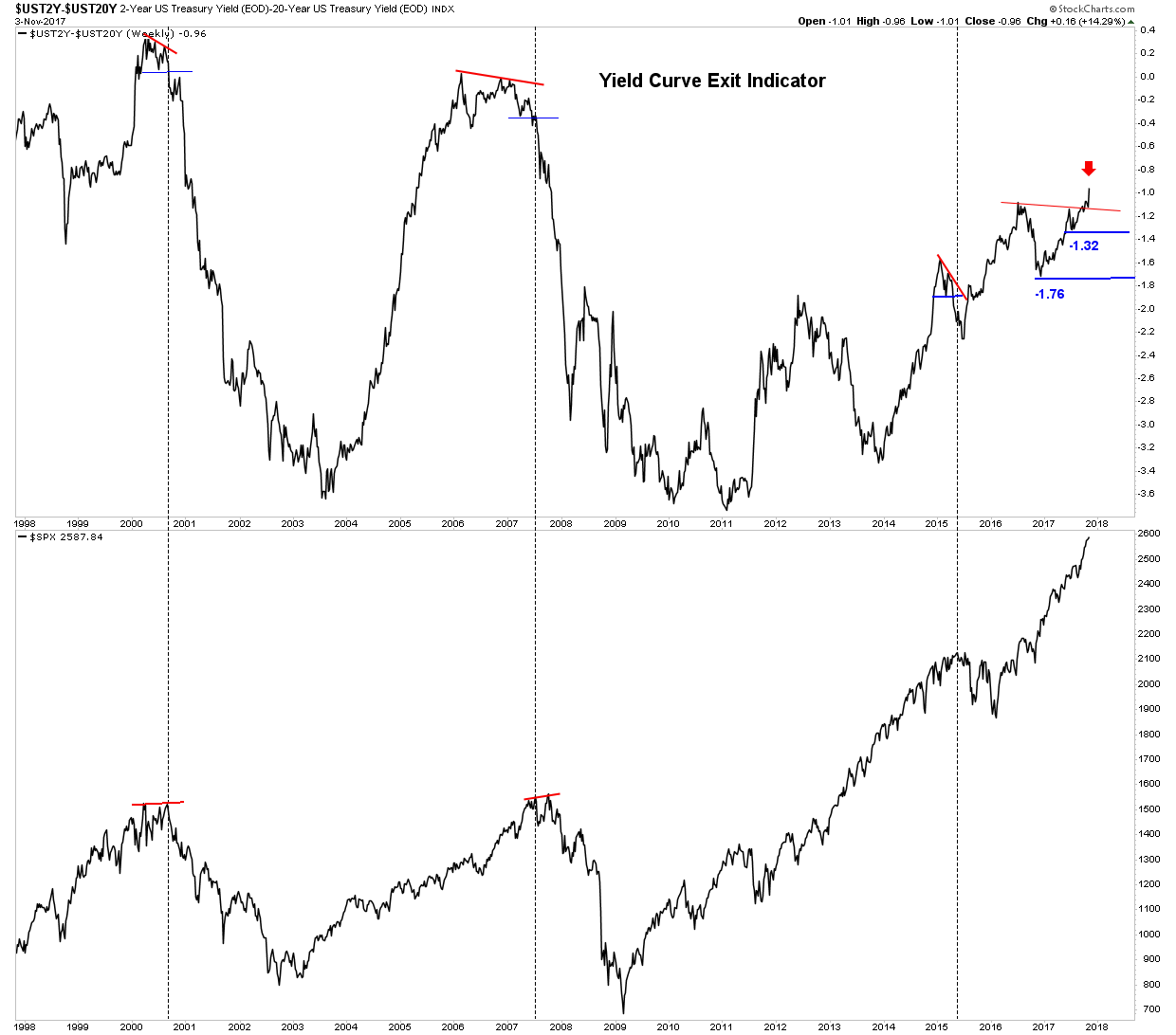
Yield Curve Exit Indicator:
It is saying don’t exit yet despite these initial internal indicators deteriorating.
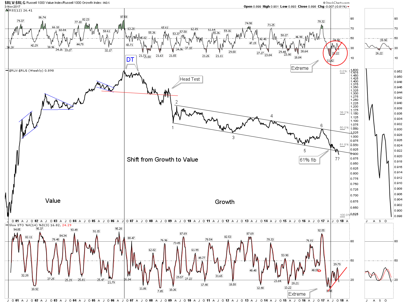
Value vs Growth indicator:
This chart indicates the market preference for growth over value continues even though it is extremely stretched
Bottom Line stock market– Stay the course if you are long, however the market is screaming it is in final blow off mode. Be careful and know that eventually you will need to exit to protect your capital.
The New FED Chair– Say Hello to the New Boss- Same as the Old Boss.
Peter Townsend would be proud of Trump’s pick this week of Jerome Powell as the new FED head. There had been hope of a libertarian disruptor to the established order, but the reality turned that hope into a pipe dream… of course. What this appointment assures is the money printing will continue and Wall Street will be assured of a bailout when the next crisis arrives. The Greenspan/Bernanke/Yellen legacy will be maintained and the Everything Bubble will continue to be pumped if it ever shows signs of deflating.
It is important to know where this man came from. He was a partner at the Carlisle Group, private equity firm. Their business model of course is using cheap capital to perform acquisitions. Their model is a classic case of mal-investment since these “deals” are not driven by consumer demand but are enabled by leveraging-up a balance sheet and “playing” the difference between their cost of capital and the markets cost. So the acquisitions they do are not due to business innovation, but instead from financial engineering. A recent example of this process completing the full circle is Toys “R” Us.
To understand Powell’s perspective and his understanding of economics this is all you really need to know. It will ultimately be all about saving his Wall Street friends whenever the next financial crisis arrives. The libertarian dream of disrupting the crony system of bailouts is not going to happen- meet the new boss!
Precious Metals and the PM Stocks
I discussed the new FED chief in the previous section because ultimately it will have a major impact on the precious metals. When the expanding bubble eventually pops, the gold price and the course of the gold miners will be in relation to the size of the credit bubble created by the FED. Remember a credit bubble is caused by the monetization of debt.
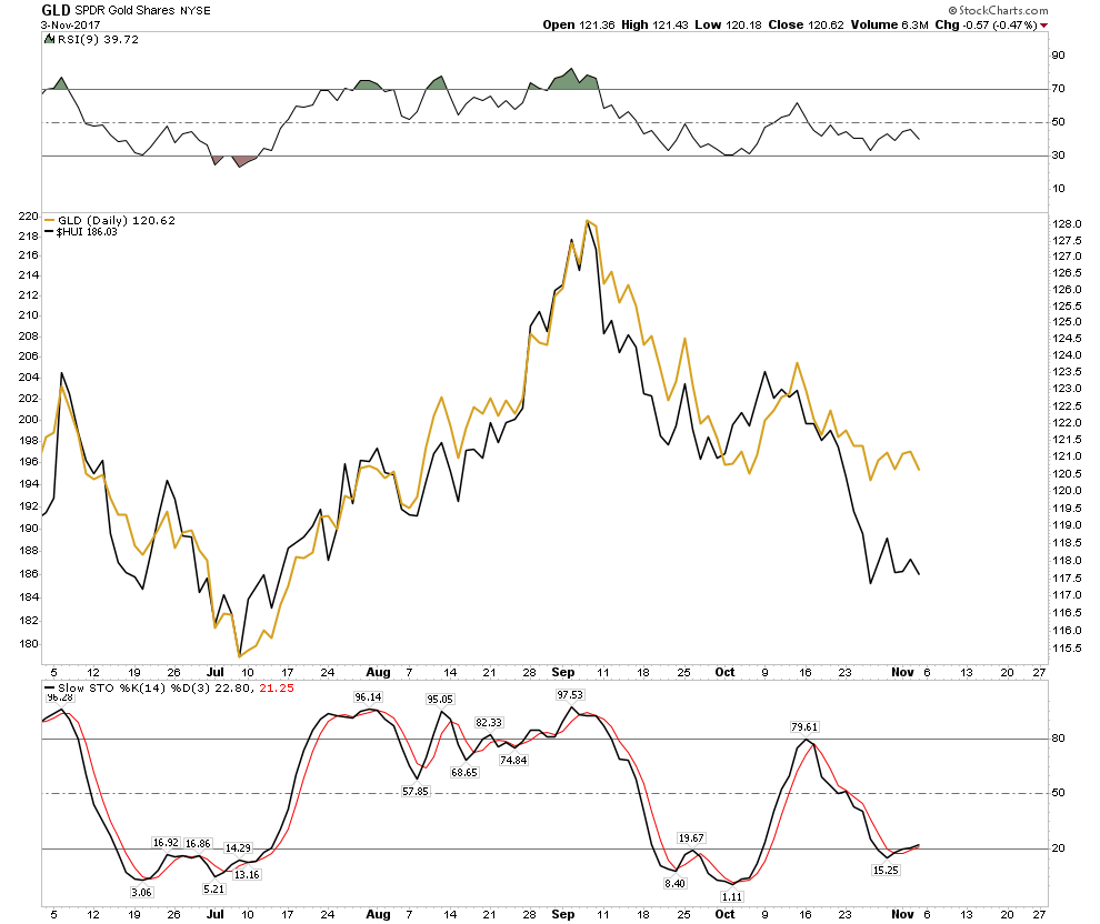
The strengthening US Dollar has been suppressing the price of Gold. This is why I have emphasized one should view gold and the metal stocks through both clear analytical CAD glasses and USD rose colored glasses. With the USD rising the rose colored glasses have now been shattered and reality has asserted itself and its getting ugly.
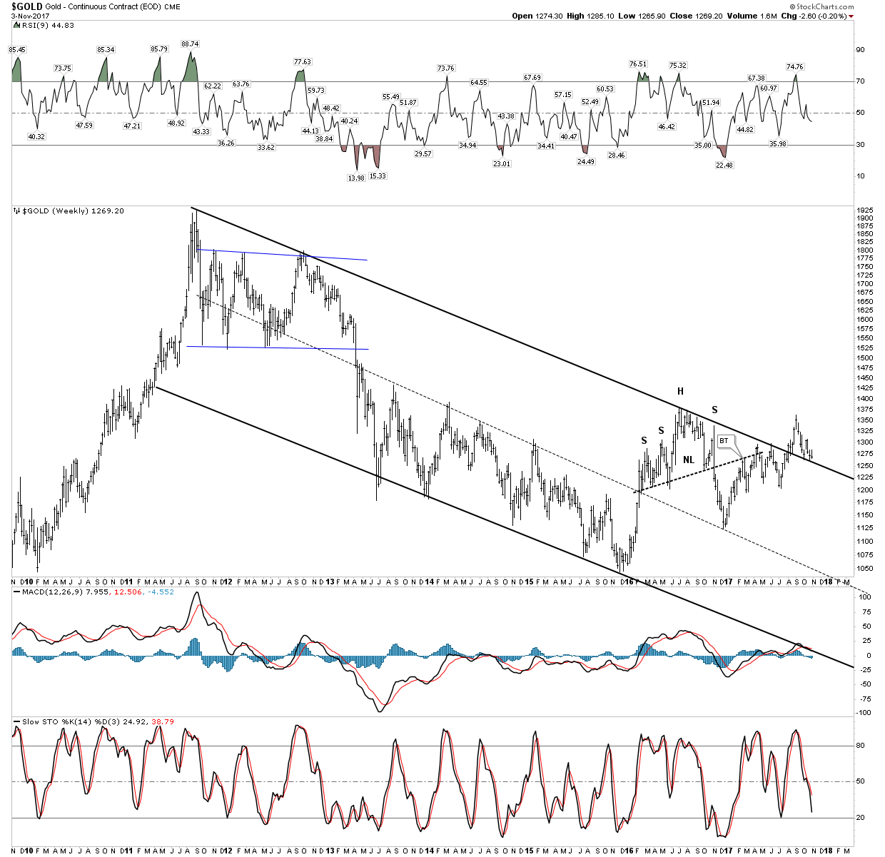
Gold Big Picture:
Gold is still hanging in there above the down channel even in USD terms but it is clearly at a critical juncture. If it can resume its uptrend from here that would be very bullish, however stochastics point lower indicating it is set-up to violate the downtrend channel to the downside. Watch this chart closely
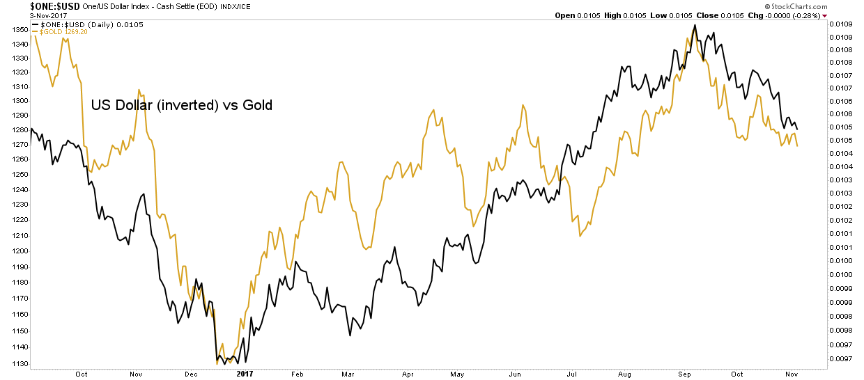
This view is backed up by the below chart which shows gold in lock step with the inverse of the USD. Again this points to the likelihood of lower gold prices, given a rising USD.
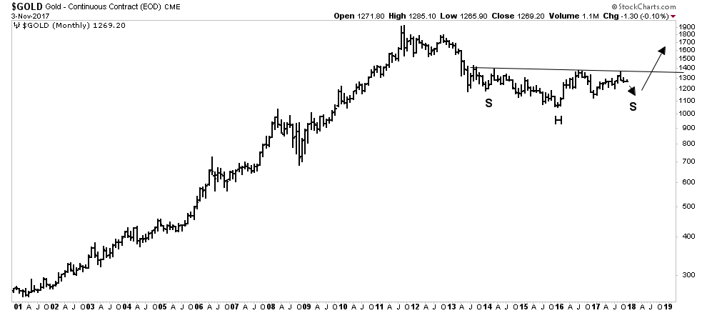
The chart below shows that even if we break down from these levels it is not the end of the world, just a temporary set-back since gold all the way down to 1150 would still be considered basing action of the big saucer consolidation. Gold could be ready for prime time as soon as early 2018.
Gold stocks weaker than the metal:
This is not what we want to see. An uptrend should show the gold stocks rising ahead of the metal.
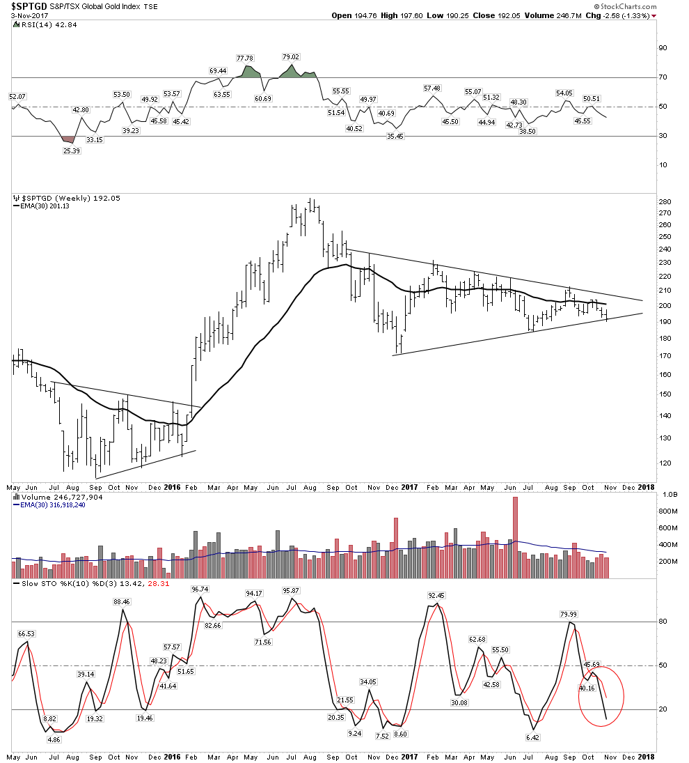
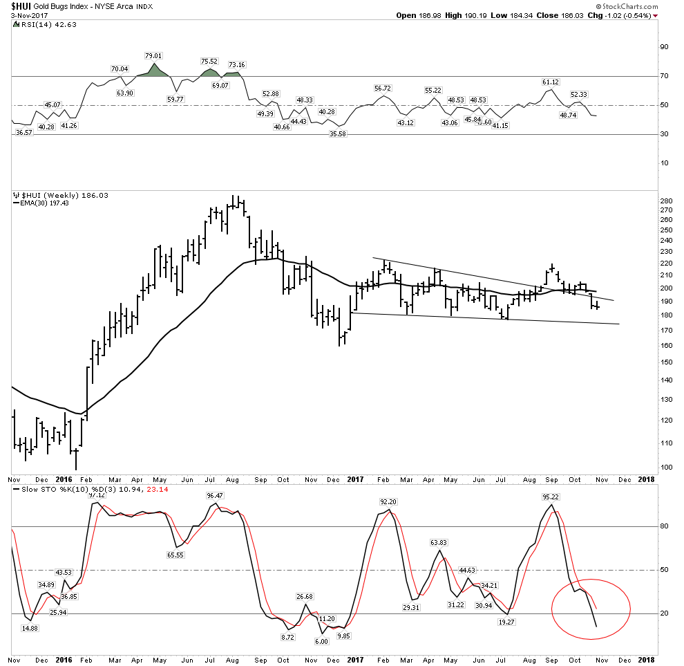
Gold Stocks in $CAD terms:
The weekly chart again shows the PM stocks at a critical juncture. It needs to immediately reverse upward or is in danger of breaking down. Note it is below a declining 30 EMA with stochastics pointed straight down on waning volume…not a pretty picture.
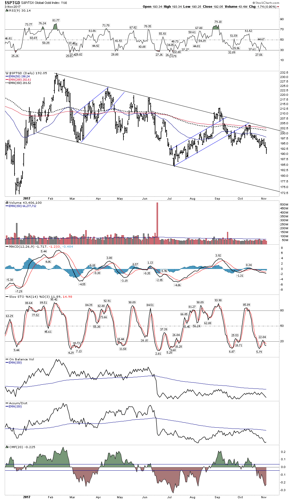
The daily chart looks grim as well. Locked in its downtrend probing new lows, volume collapsing with all indicators headed down. What is going to turn it around?
Gold Stocks in USD terms
With the USD rallying, gold stocks no longer have a tail wind and the charts reveal this. The weekly HUI shows the saucer bottom continuing to develop, but it is very heavy.
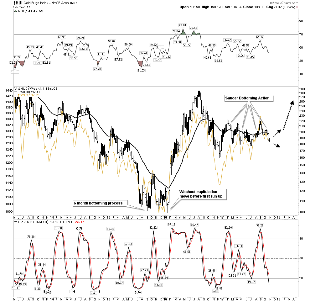
A close up of the weekly HUI below shows how it has dropped down into its consolidation triangle. Below a declining 30 EMA with stochastics pointing sharply lower with no hint of reversing. This chart is indicating price is likely to drop at least to the low 170’s.
Weekly GDX
The GDX still shows some hope of salvaging its breakout, but not much room for error with price now below a declining 30 EMA and stochastics rolling over:
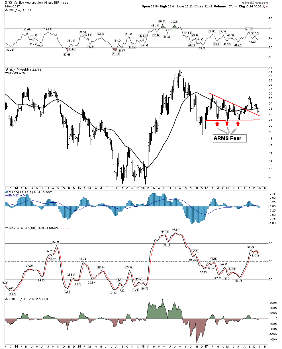
The Daily shows a last gasp attempt of holding on with volume collapsing:

Bottom Line on the Gold Stocks: Looks like we go lower into tax loss selling. This particularly could be accentuated if the general market continues higher with investors selling those gold stocks and redeploying it into the stock market. I call this the shiny object factor, drawing attention away from the PM stocks.
Here is what I see as a definite possibility as painful as it may be,
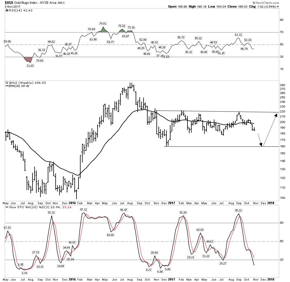
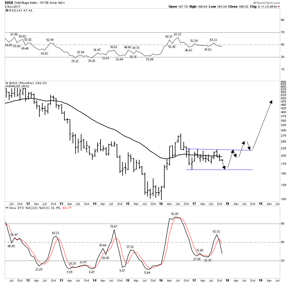
The good news however is that this could be the final phase of consolidating the first leg up in the new bull market in the gold stocks which started in January 2016. The next leg up could begin as soon as late December and 2018 could develop into a rip roaring year for the gold stocks with the HUI reaching a target range of 450-520.
Rays of Hope
So the PM indexes appear short term bearish, however I do have some rays of hope, to include some stocks which I hold despite the indexes being rather dreary. Principally I own a healthy position in Pretium. If next quarter’s production results validate last quarters strong numbers this stock could likely get taken out. Agnico Eagle may be waiting in the wings. This week we saw what happened to Alterra power. It spiked up 63% in its take out, with little warning- a classic “got to be in it to win it” story.
Monthly:

Weekly:
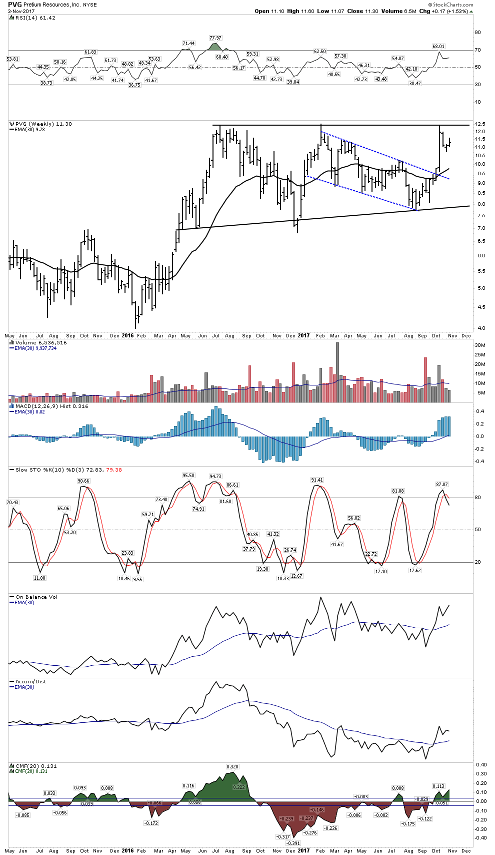
Daily:
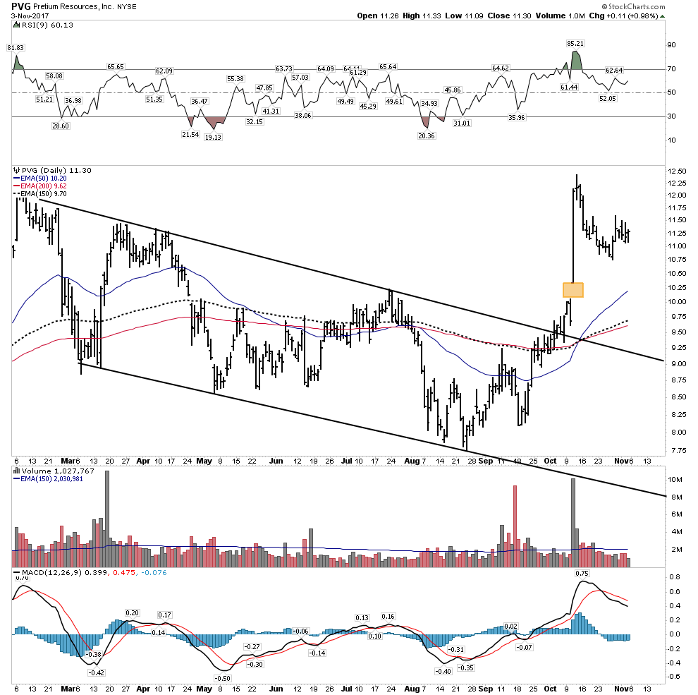
That’s a breakaway gap, it doesn’t have to necessarily get filled.
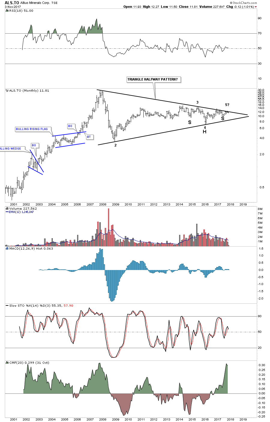
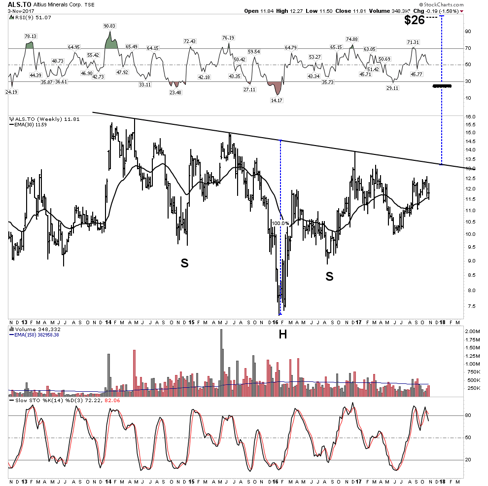
Altius Minerals– Not a gold stock, but it is building cause for a powerful break out.
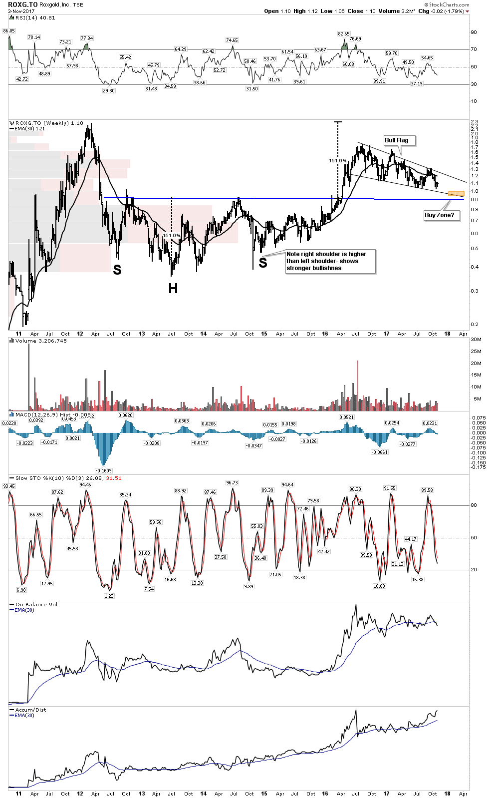
Roxgold– updating the set-up:
I don’t own this, however this is typical of stocks that one should keep an eye on as its nearing an end to its consolidation of a massive move:
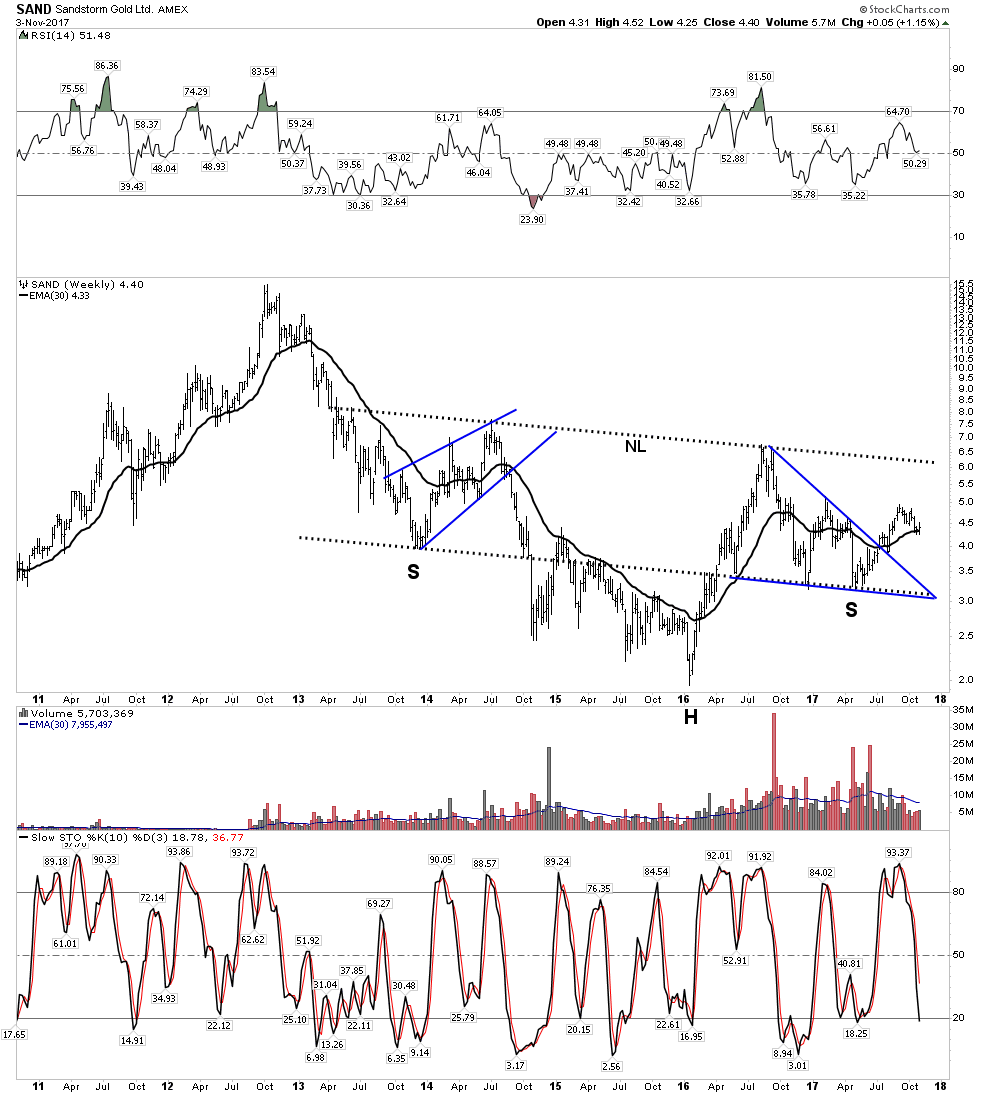
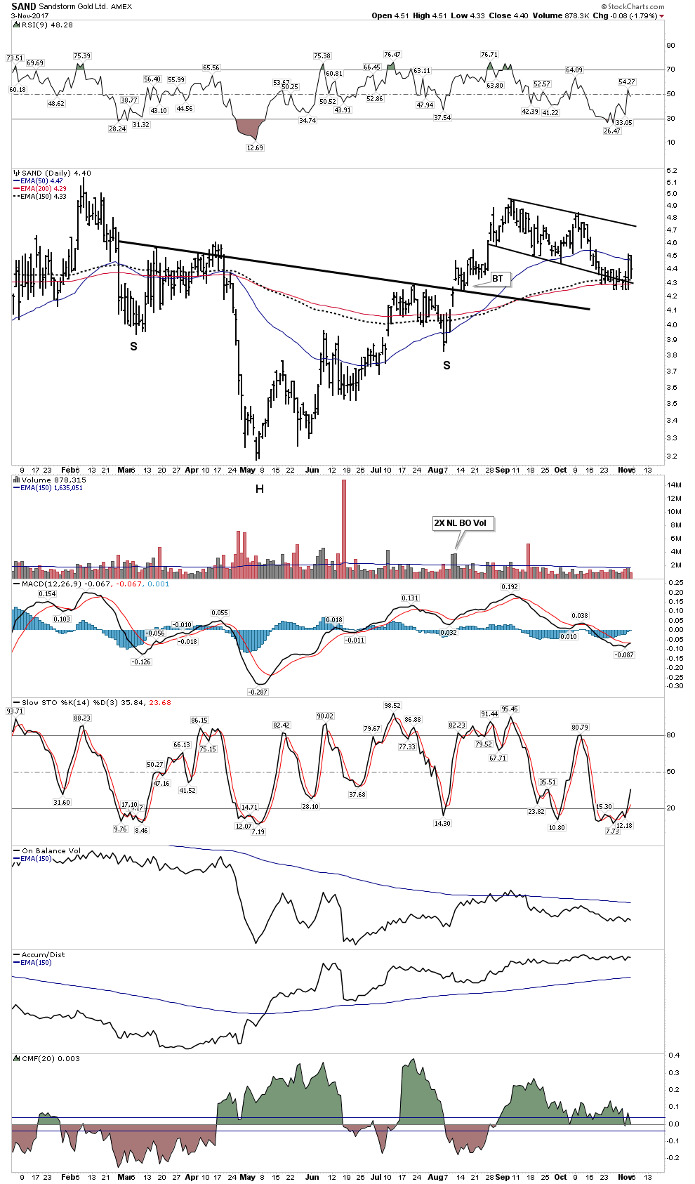
Sandstorm:
Jury is still out on whether this stock needs to consolidate lower. I own 80% of my allocated holding of this stock which is my 3rd largest position.
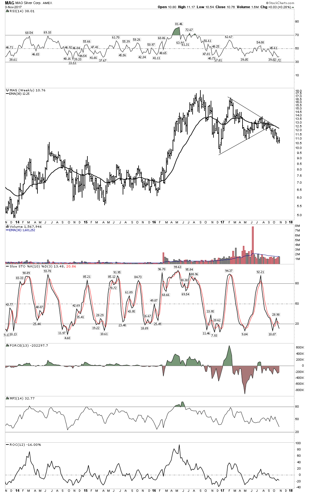
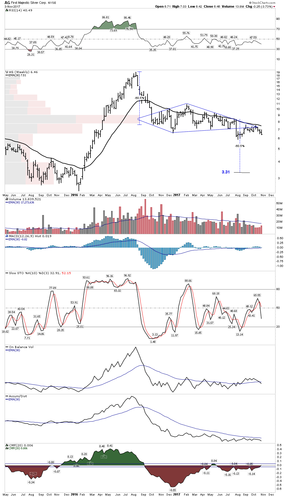
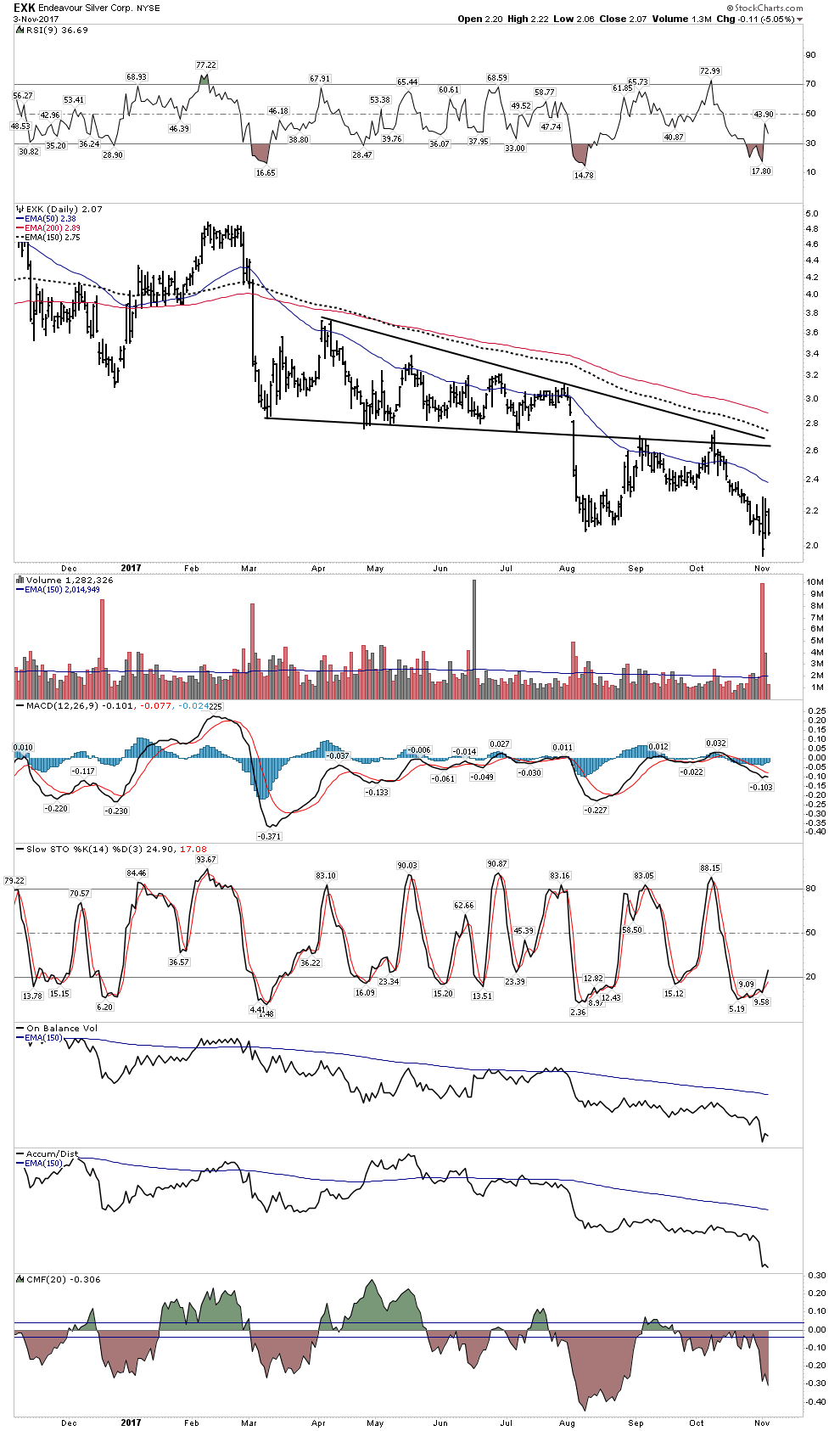
Silver Stocks
Here are a few representative silver stocks. We see the story looks somewhat bleak. They don’t look as promising as the gold stocks. The message here is they could drop significantly lower over the next 2 months
MAG
First Majestic
Endeavour
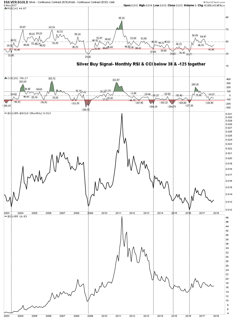
Silver Stock Buy Indicator
Recall our silver stock buy indicator. It works for gold stocks also. It continues to say patience, your time will come.
NOVO- The Great Gold Hope
Despite the gold group looking heavy Novo is doing just fine. It appears to be undergoing its second high level consolidation. This week it had a significant development in that they confirmed a fine gold component in trenching at Purdy’s Reward. This management team seems to be well skilled in managing the news flow.
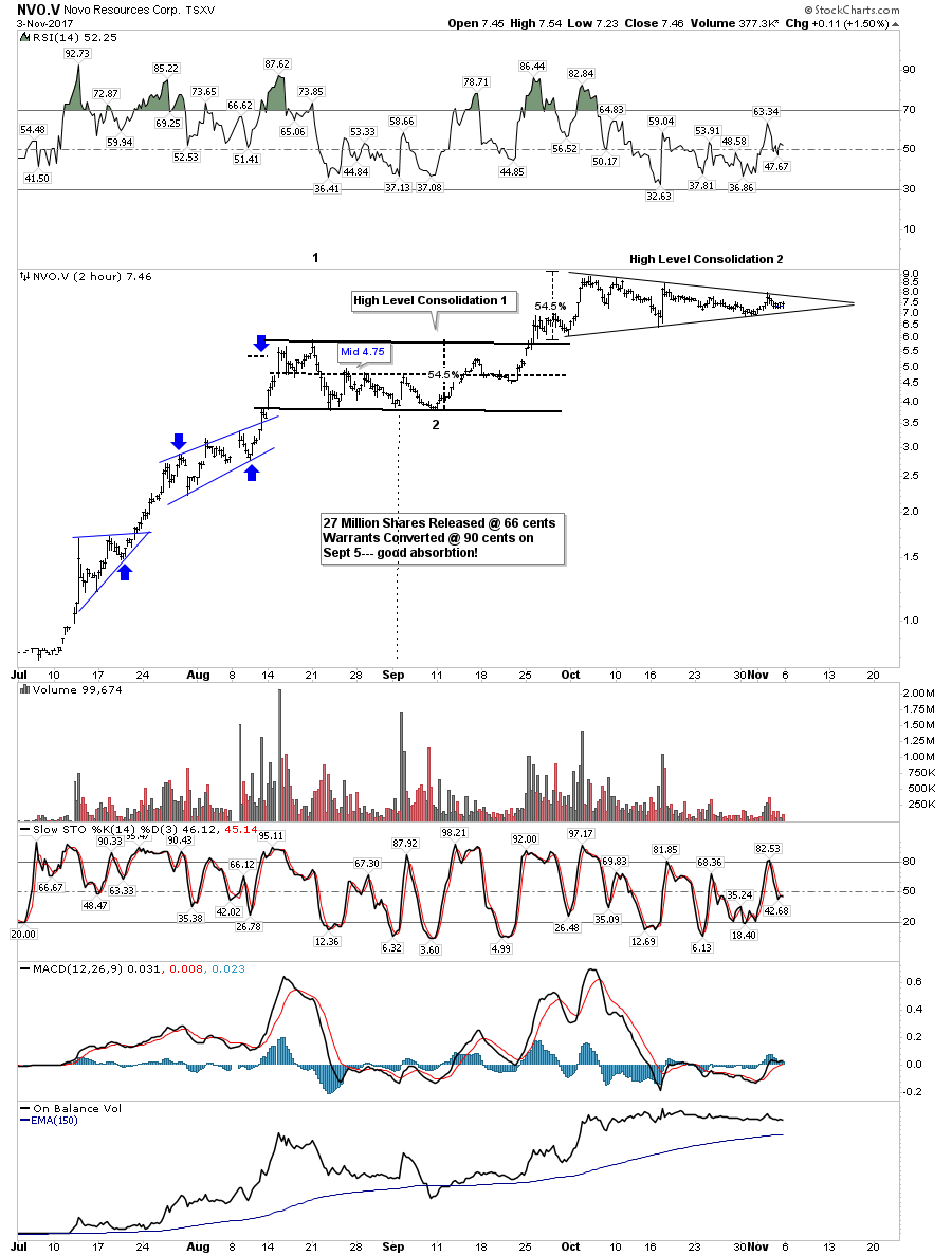
Blue Sky:
Electric Metals Hot- Gold Cold
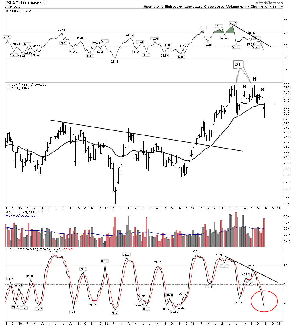
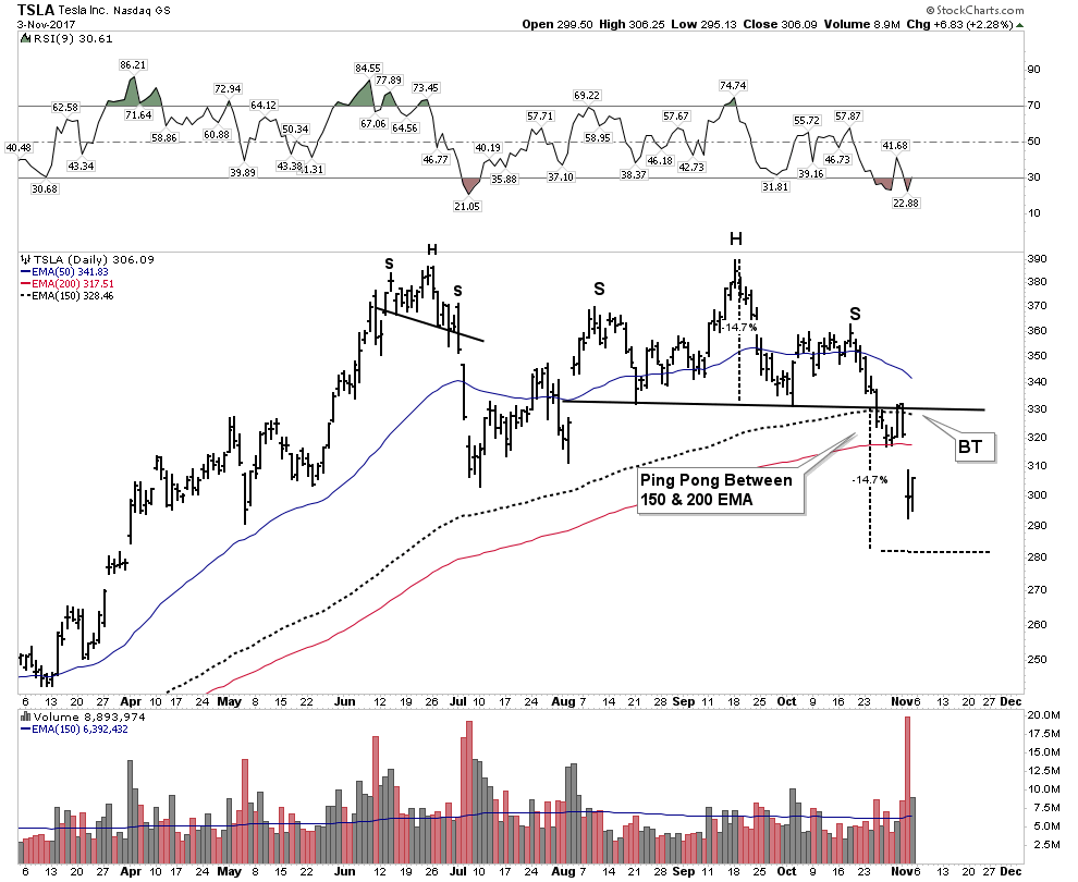
While gold has has been down and out the electric metals have been all the rage, especially the cobalt plays. Seems every month a new battery factory is announced and a new EV manufacturer announces its plans to enter the market. With additional automotive capacity entering the market the collateral damage this week was the darling of the sector- Tesla.
Tesla– is it finally time for the shorts to be taken off the intensive care list?
Things changed this week for Tesla, as reality came calling when the tax debate in Washington put Tesla’s tax credits in the cross hairs. With the $7,500 tax credit/ vehicle under threat the economics of the EV are not quite as good. If shorting is best done as a shoot em in the back strategy maybe it’s time to start taking aim…just sayin.
Weekly:
30 W EMA now rolling over with broken momentum indicators
Daily- This may be the ugliest chart of the day, as it sports not one but two violated H&S patterns. The gap jumping the 200 EMA delivers the message -it’s done.
Electric Metals still hot.
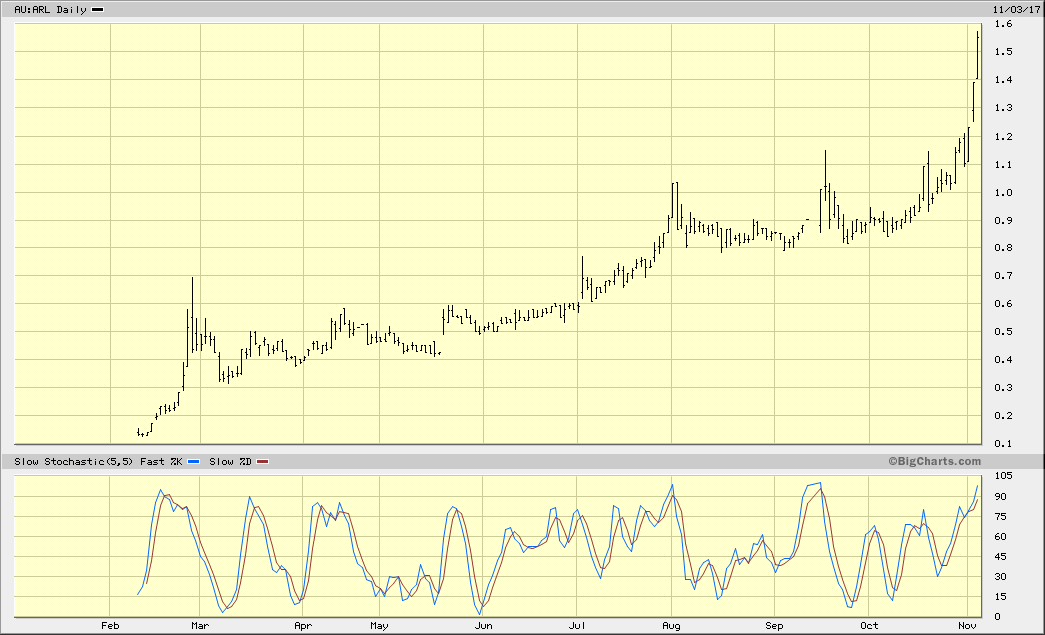
But Tesla is just one of many EV producers, and the demand for the metals will be insatiable. The lithium stocks have been on fire for some time and recently the cobalts have been catching up. My personal cobalt play is Ardea Resources in Australia:
The next would be Robert Freidlands Clean TEQ:
John Kaiser thinks ultimately Clean TEQ will find Scandium Intl. a perfect fit and will acquire them somewhere down the road. What we saw this week with Alterra could be a precursor to SCY:
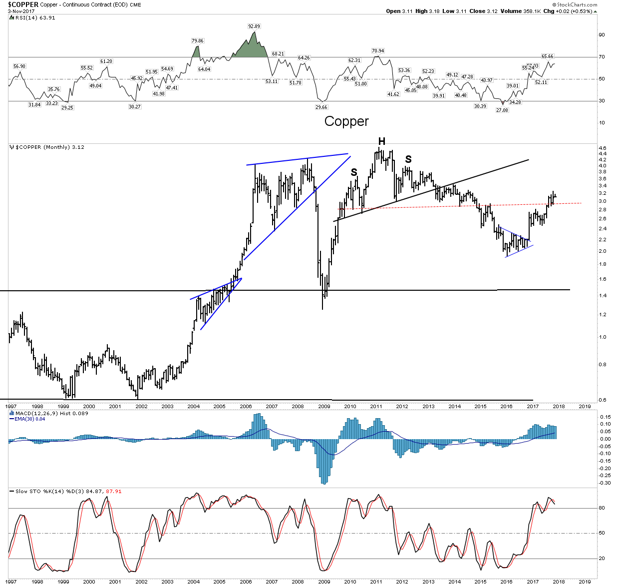
Copper
With the rising USD threatening copper’s continued ascent, copper still seems relatively impervious to the threat.
Nevsun– My favorite copper play mainly because I am a sleuth for value. This recently underwent a brutal shakeout but is now in stronger hands and back on track.
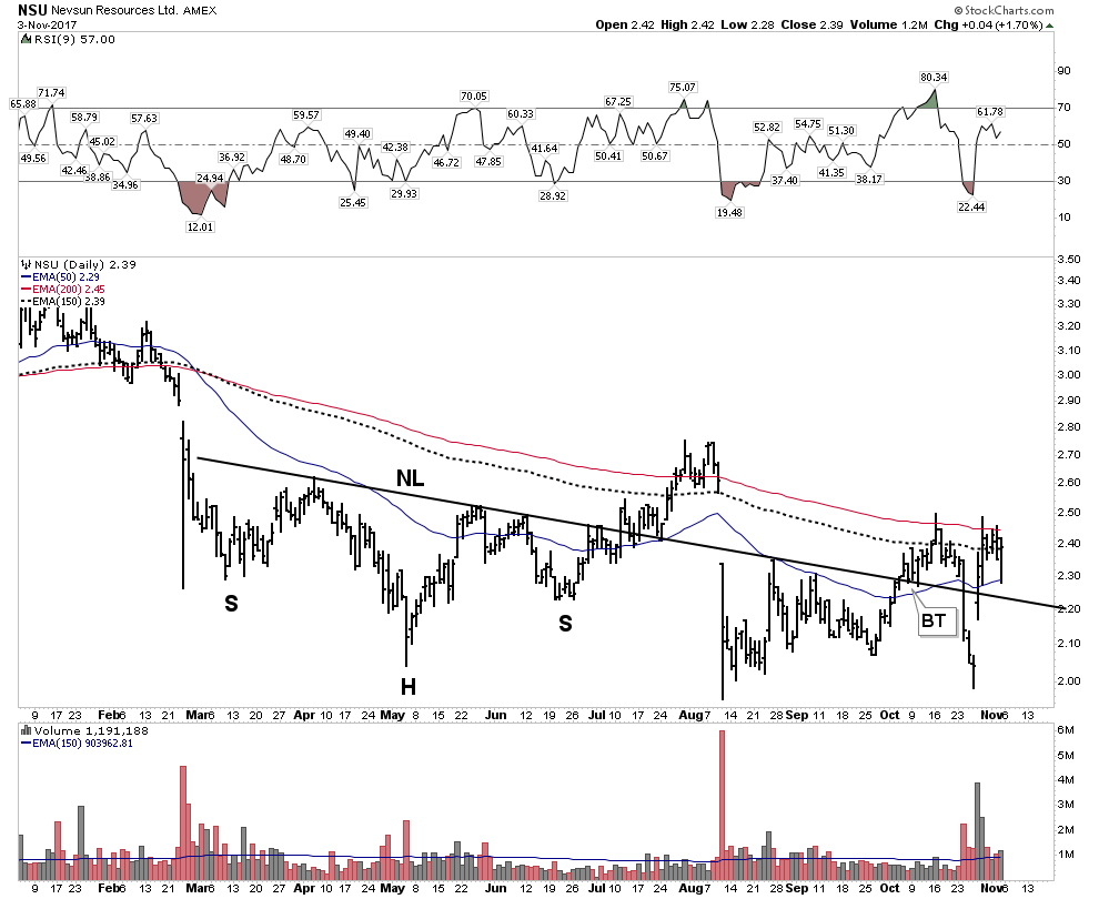
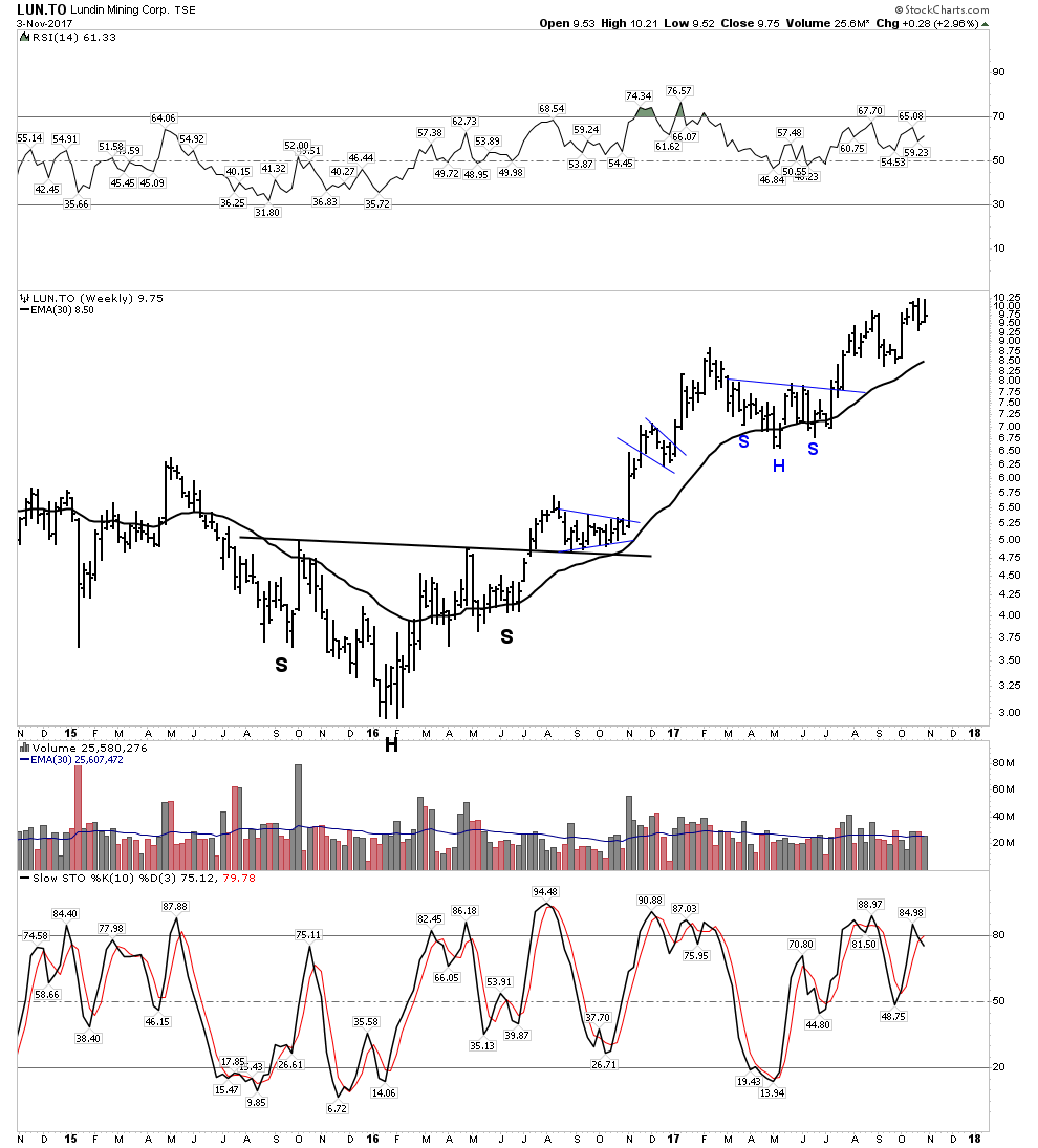
Before Nevsun can make it to production in Serbia it may likely be taken out by Lundin:
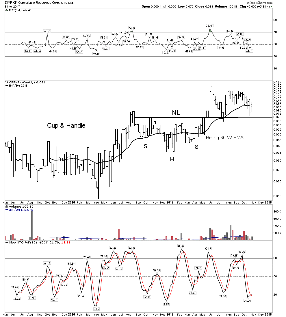
Copperbank– A good proxy for copper optionality plays:
Uranium– Everyones Whipping Boy:
We have been down this road before, but eventually it might just turn around. This week the “other” yellow metal bounced or at least its proxy ETF did.
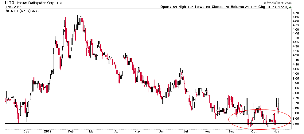
Is this significant? Maybe, but I don’t like the fact that the stocks didn’t seem to care too much as evidenced by URA. Irregardless, I took a starter position in CCJ, just in case.

CCJ- What do they say about a second go at marriage…”The triumph of hope over experience”?

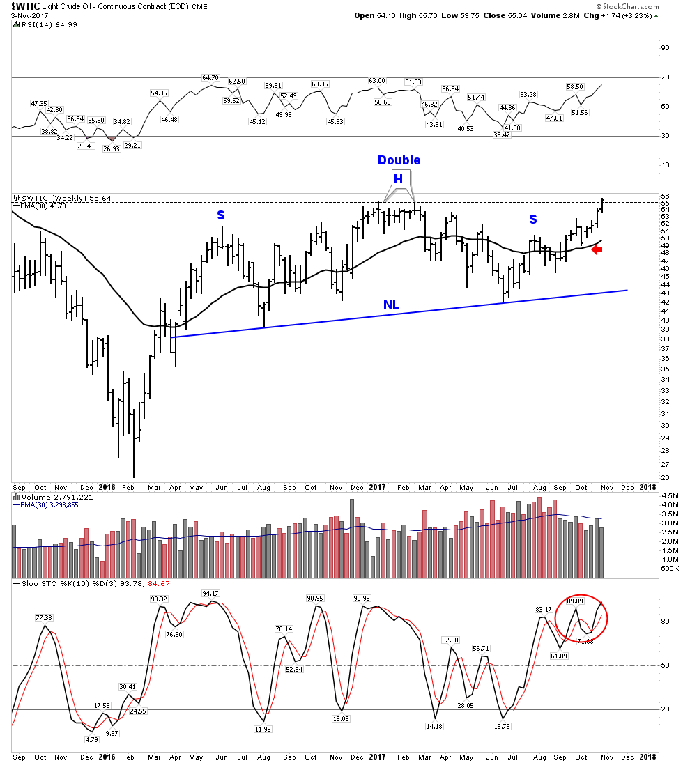
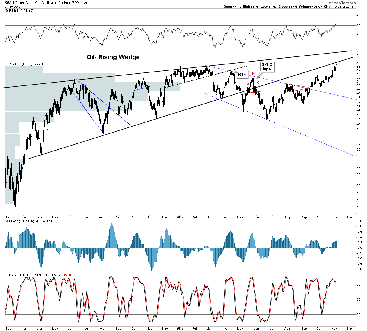
OIL- Solid Strength
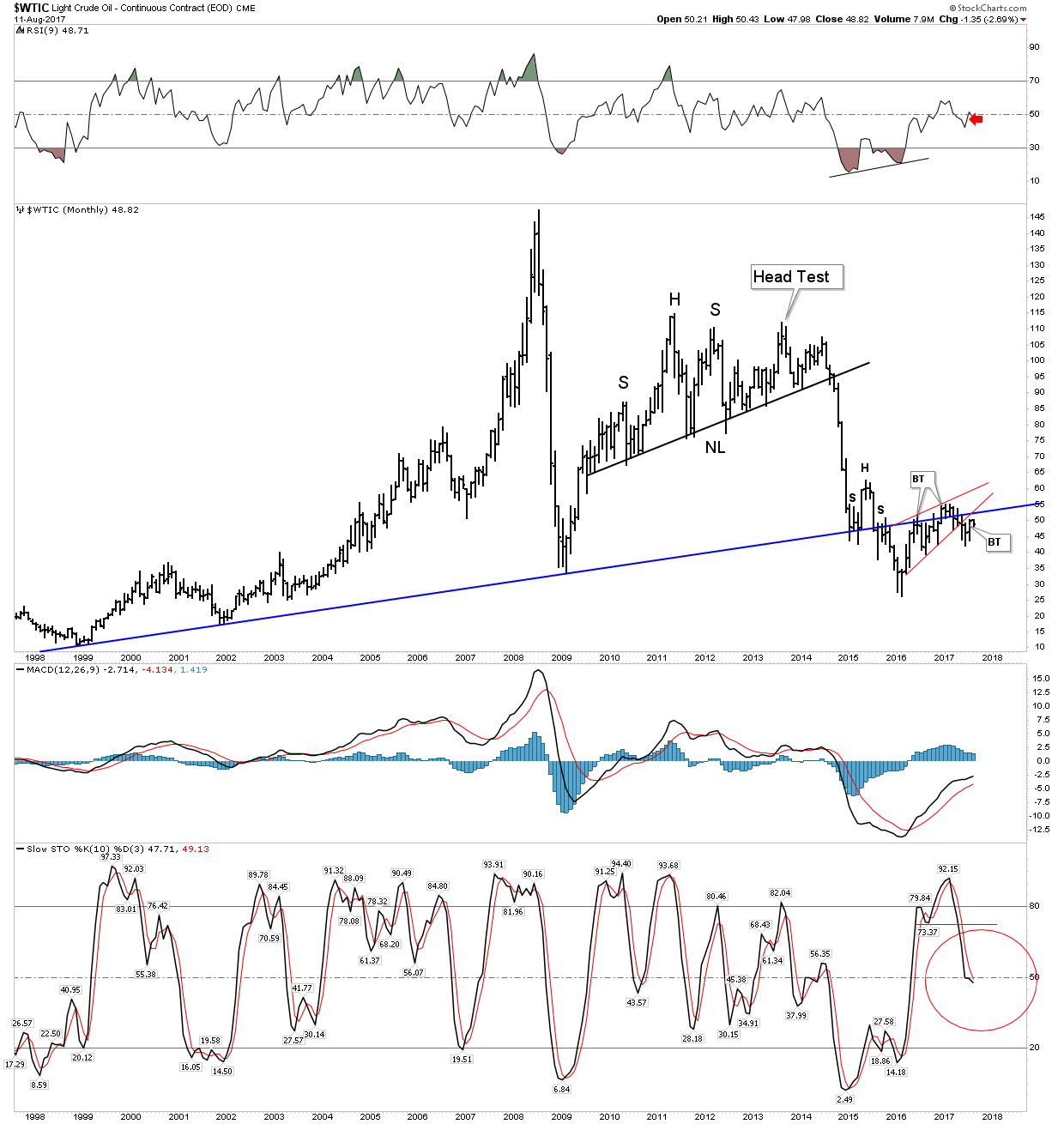
Oil continues to power higher. Art Bermen has been the clearest voice as to why it continues higher and he thinks the move is not over. It has now reached the levels where I originally shorted it last February. It was a great trade, however it only made the initial move lower which I had anticipated. The charts and fundamentals still indicate to me that oil is in a secular bear market. The previous secular bear lasted 18 years, we are presently approaching 10 years in the current one. Clearly, the trend for now is higher, however once the next recession arrives the target in the low $30 range may be achieved, but for now I watch from the sidelines. When that time comes, it will be a heck of a trade.

Commodities
Commodities as a whole have now established an uptrend, despite the rising USD. Still some sectors such as the ags continue to wallow, but the liquid fuel component and lumber have powered the CRB above its NL.
Viewed from the long term perspective however, commodities need to continue significantly higher, maybe another 10% to indicate a new price regime has been established:
Conclusion
The general markets continue to power higher with momentum firmly intact. If you are playing this sector you are making money, but be careful as numerous signs point to a top within 2-4 months. Meanwhile the PM sector is getting beaten up, but therein may lie the opportunity of a lifetime, especially now that we know the new FED chair is just another Brainless Keynesian who thinks there will never be any repercussions to endless money printing. Perhaps it’s time to take our eye off of the shiny object and buy what is real value, the precious and the electric metals.
Today I am going to lay out the case of a major market top and how it fits into the geopolitical backdrop of today. We then profile the trade set-up to look for and finally I will forcefully remove your Rose Colored Glasses you have been wearing since January 2017.
In Barbara Tuchman’s “The Guns of August” she argues that August 1914 was when the Gilded Age died and the modern era actually began. The book opens with the famous depiction of Edward VII’s funeral in 1910 attended peacefully by all the kings of Europe. Never again would the body of world leaders be unified and cut from a similar cloth. The war ushered in a new world, not recognizable from the past. Not since that time have we witnessed such diplomatic folly as in the month of August 1914. Today we wonder are we witnessing a similar conflict between a super power and the client state of China which is an emerging super power? Could it unfold in a similar fashion?
Since May I have chronicled the topping process associated with a post bubble contraction. We have witnessed the following sequence:
1 The Gold-Silver ratio initially warning of an upcoming credit contraction in the future.
2. European stocks putting in a top in the traditional time window of May-June
3. USA stocks embarking on a final run for the roses, one last hurrah over the summer.
4. The Gold-Silver ratio signaling a confirmation of its original signal.
5. Yield curve flattening and credit spreads widening
6. Investor psychology embracing market top behaviors.
7. An initial crack in the US indexes in the time window of August or September.
The Topping Process
Over the summer we have watched the indexes relentlessly rise despite narrower breath. The FAANGs drove the NASDAQ and Boeing drove the Dow over the past 6 weeks. The DOW being a price weighted index, was inordinately influenced by Boeing, now a $240 stock. Boeing’s rise accounted for 75% of the DOW’s gain since the beginning of July. Strip Boeing out of the DOW and the index barely even rose… Same with the FAANG’s effect on the NASDAQ.
This of course is classic topping action. It masks the underlying exhaustion which has been occurring in individual issues. The exhaustion expressed itself in a lack of volatility. On August 8th the S&P 500 had gone 13 days in a row with less than a 0.3% fluctuation. This has never occurred since records have been kept since 1927. This compression then expressed itself with the VIX exploding over 80% in a raucous 3 day move.
Bearish market signals have been evident to the few who cared to interpret the charts. Let’s take a look at some of the flashing red flags available to all who care to see:
S&P 500 Orthodox Broadening Top
Pull out your copy of the bible of technical analysis: Edwards and Magee. Look under the index for “The Orthodox Broadening Top”. The example they use is Air Reduction Co. from 1929. I will scan and post below:
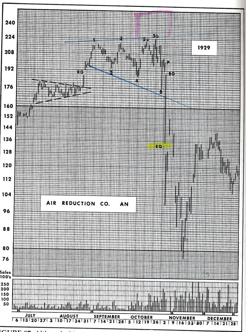
E&M remind us this type of top comes from low volume markets (check) and it is precisely defined on the chart (check). It’s definition is:
“It has three peaks at successfully higher levels and, between them, two bottoms with the second bottom lower than the first. The assumption has been that it has been completed and an in effect as an important reversal indication just as soon as the reaction from its third peak carries below the level of its second bottom”
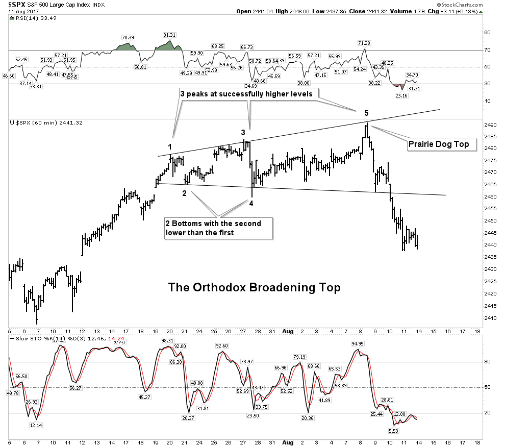
Knights, I believe in making charts as simple and uncluttered as possible. Clean charts deliver the most powerful messages. This chart above should make you sit up and take notice. It is classic, right out of the pages of the Edwards and Magee reference book.
My analysis of this chart actually shows weak exhausted action. E&M state that 4 out of 5 examples of this pattern have a re-test of high #3 (point #5). This re-test often exceeds the high by up to 3%. We see this re-test in the above example in Air Reduction Co labeled as 5b. In our present day case we see the S&P spike high in a prairie dog top with no ability to rally for a re-test. This is a case of exhaustion and in my analysis is quite foreboding.
I emphasize that E&M characterize this pattern as “extremely bearish” and it depicts the last stages of a Primary Uptrend. That’s right,- PRIMARY. This was the principle pattern that exhibited itself in numerous individual issues in the 2 months leading into the crash of 1929.
Within this current broadening top formation we can also see two loosely formed H&S tops as well. Bottom line: This is a treacherous reversal pattern.
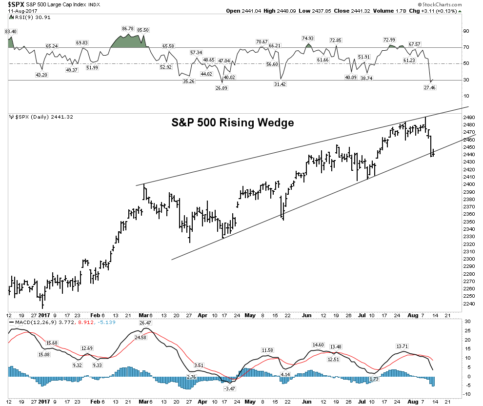
S&P 500 Bearish Rising Wedge
If we step further away and look at a daily chart over the past 8 months we see the S&P 500 forming a presumedly bearish rising wedge. I will cover the investment set-up later on at the end of this section.
Red Flags Everywhere
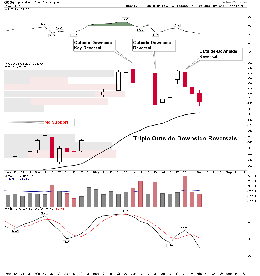
The FAANG stocks have risen relentlessly all year long, however recently have been broadcasting major trouble ahead. Let’s take a look at some of the red flags:
Google of course is widely owned and at $900 can no longer generate much upside volume as it’s hard for the little guy to move the needle with his low order size. Therefore, it is very significant when we see 3 Outside-Downside reversals with one being a KEY reversal (reversing new highs) all within an 8 week span! If Google breaks $900 on a weekly closing basis it has the potential to trigger a trap door as one can see there is no support until it reaches $855.
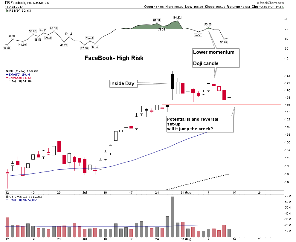
Here we have a very high risk stock. If you own this do you feel lucky? It opened July 27 with great fan fare and put in a black candle inside day. This is a sign of exhaustion. Note the following attempt to rally failed with a red doji, change of trend, candle. Since the black candle top, down days have exhibited more volume than up days. This stock is at high risk of triggering a very bearish Island Reversal if it jumps the creek below the red line.
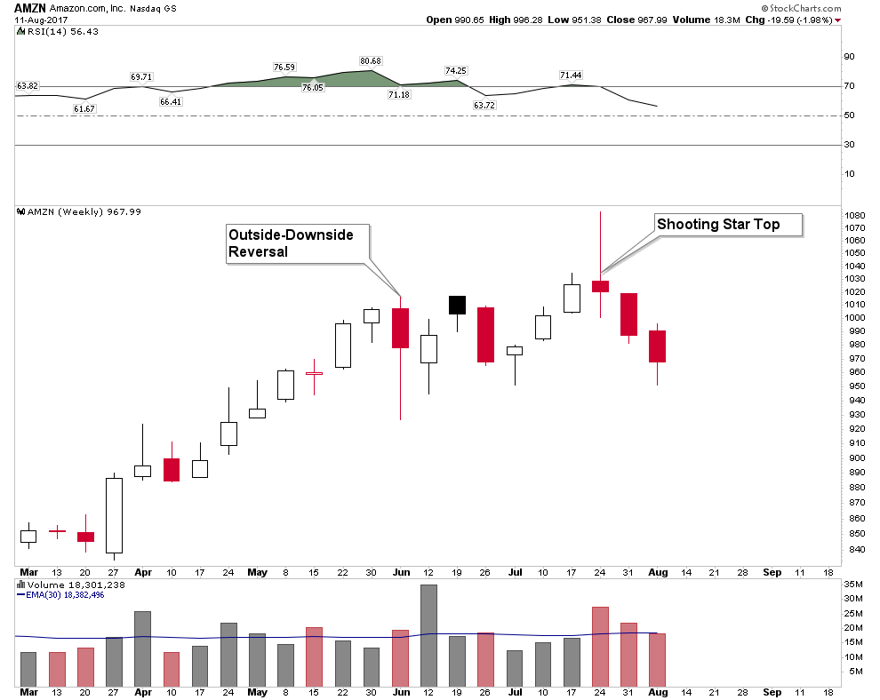
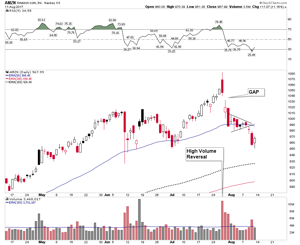
Amazon
Weekly: Outside Reversal with a high volume weekly shooting star top. What else do you want folks.
Daily: High Volume Key reversal off the top with a gap down the next day. Checkmate!
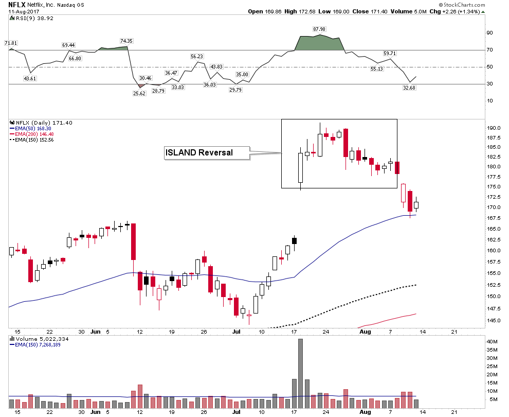
Netflix
Standard Island Reversal off the top. This is high risk.
There are many other examples of technical failures right off their tops, but these are the highest profile. The point is there are many charts showing profound technical signs of failed tops. The DOW Transports have also been displaying a divergence with the Dow for the past month which occurs typically at market tops:
Bull Markets Don’t Die of Old Age
Really? Well that’s the Wall Street narrative at least, however all rules have limits. This bull market began in March of 2009 making it one of the longest in history. In a recent study of the 32 longest bull markets throughout the world over the past 100 years to include Europe and Asia the current NASDAQ bull market is the second longest bull market over the past 100 years of all markets!
The Dow has now eclipsed all previous bull market durations in the DJIA in all of its history. The second longest was the bull of the 1920’s which lasted 419 weeks. Today our bull is at 440 weeks. One of the indisputable facts in the study of bull markets is that the longer a bull market lasts the higher the probability the ensuing bear market develops into a deeper bear market.
Years which end in 7 have historically had a tough go of it during the 3rd and 4th quarters. 1907, 1937, 1987 had major crashes in the 4th quarter. Other years had strong sell offs as well, such as 1917,1957 and 1977. 2007 was the precursor to the financial crisis of 2008. There clearly is a 10 year cycle in the markets and it often bottoms in the later part of the 7th year.
We have all seen numerous measures of extreme valuation of today’s market, but we also know that markets can’t be timed using valuation. Excessive valuation however, will always be corrected. Many would say this cycle wont end until the little guy comes back into the market. Guess what, he already has! Here is a quote from Charles Schwab Brokerage:
“In Q2 after years of avoiding equities, Schwab clients opened the highest number of brokerage accounts in the first half of 2017 since 2000. This was the biggest first half increase in 17 years. Total client assets rose 16% to $3.04 Trillion.”
In summary: The little guy is in.
Again, there are so many anecdotal signs of an imminent top I cannot begin to chronicle them all here. Recently Warren Buffet passed the $100 million mark in cash. You of course know he does not sit on cash at market bottoms.
Thursday afternoon I was watching Bloomberg financial TV with the Dow trading down almost 250 points when a market strategist from a Wall Street brokerage house was confidently stating this was a buy the dip opportunity. He seemed so sure of himself and smug, having been conditioned to do so over the past 8 years. So if you think the market can’t drop because so many people are looking for it to drop, you are just not thinking…it can, and conditions are ripe.
The Trade Set-up
Of course anything can happen. If North Korea announces this weekend they are going to suspend future missile tests I am sure the S&P would rip upward through the entire Broadening Top formation to new highs. There are no guarantees about anything and a myriad of different outcomes are possible, but this is what I would look for in rough fashion: I expect an aggressive backtest up to at least the bottom S&R line of the broadening top formation around the S&P 2460 level. Why? Because the ingrained buy the dip mentality has programed Wall Street to buy it. They simply can’t help themselves. Any hint of good news should spark a rally. I think the only reason it didn’t occur on Friday was because of weekend uncertainty.
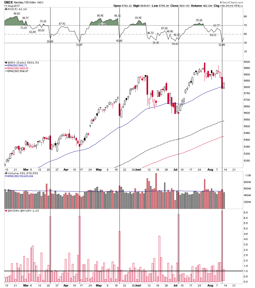
Also from a technical perspective we are set up to rally right now. Look at the NDX Down vs Up Volume. It has been a great indicator of past bottoms. It shows when the market is washed out at the lows. Thursday’s big down day shows the market is now washed out and ready to rally. Any positive news should cause a bounce. But I am not playing it. My trade is to find an entry point for the short side.
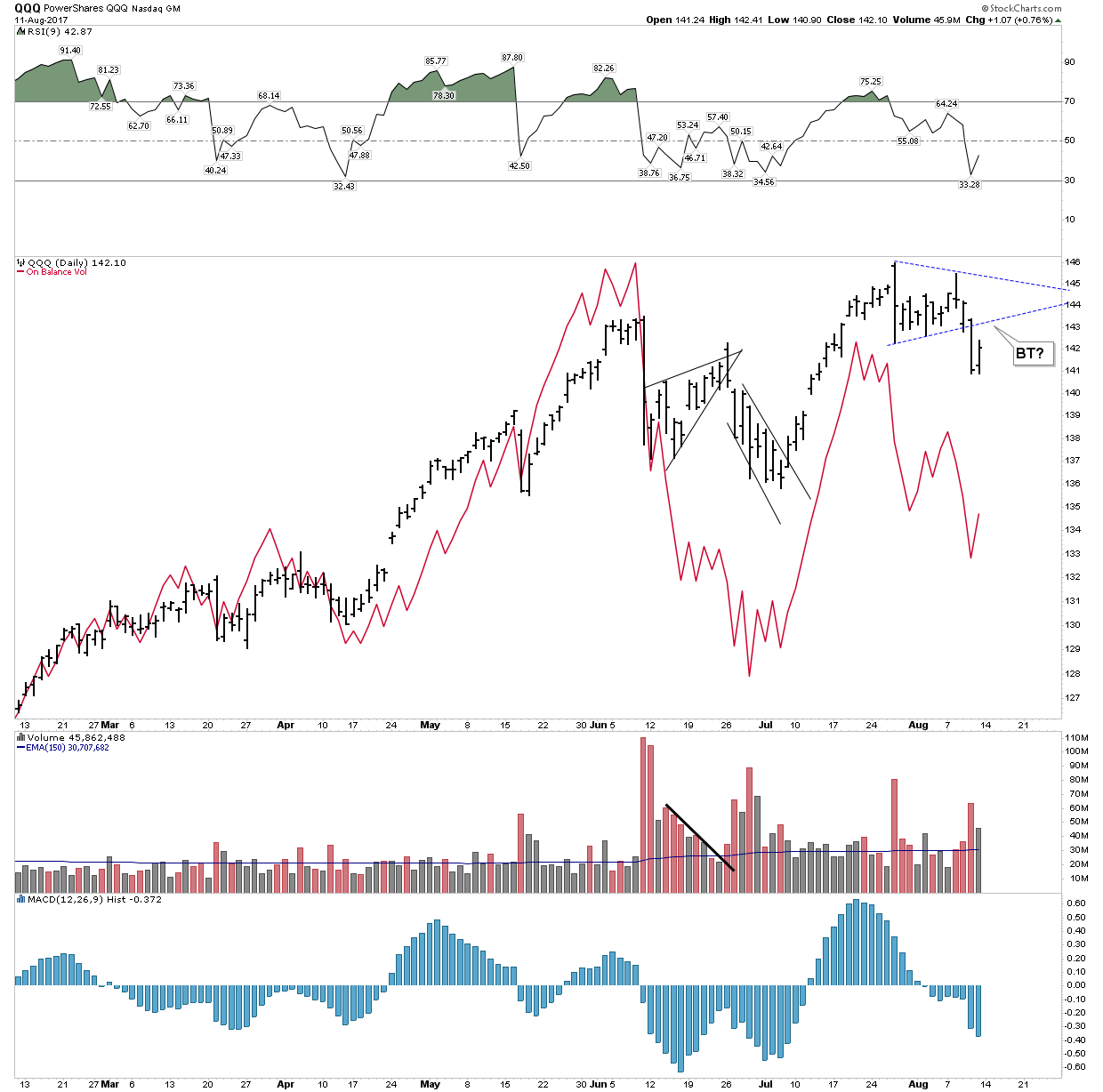
I prefer to sit and watch and stalk the market. I want to see how the SPX chart at the beginning of this report and the QQQ chart below resolve themselves and to look for a short entry.
S&P Big Picture
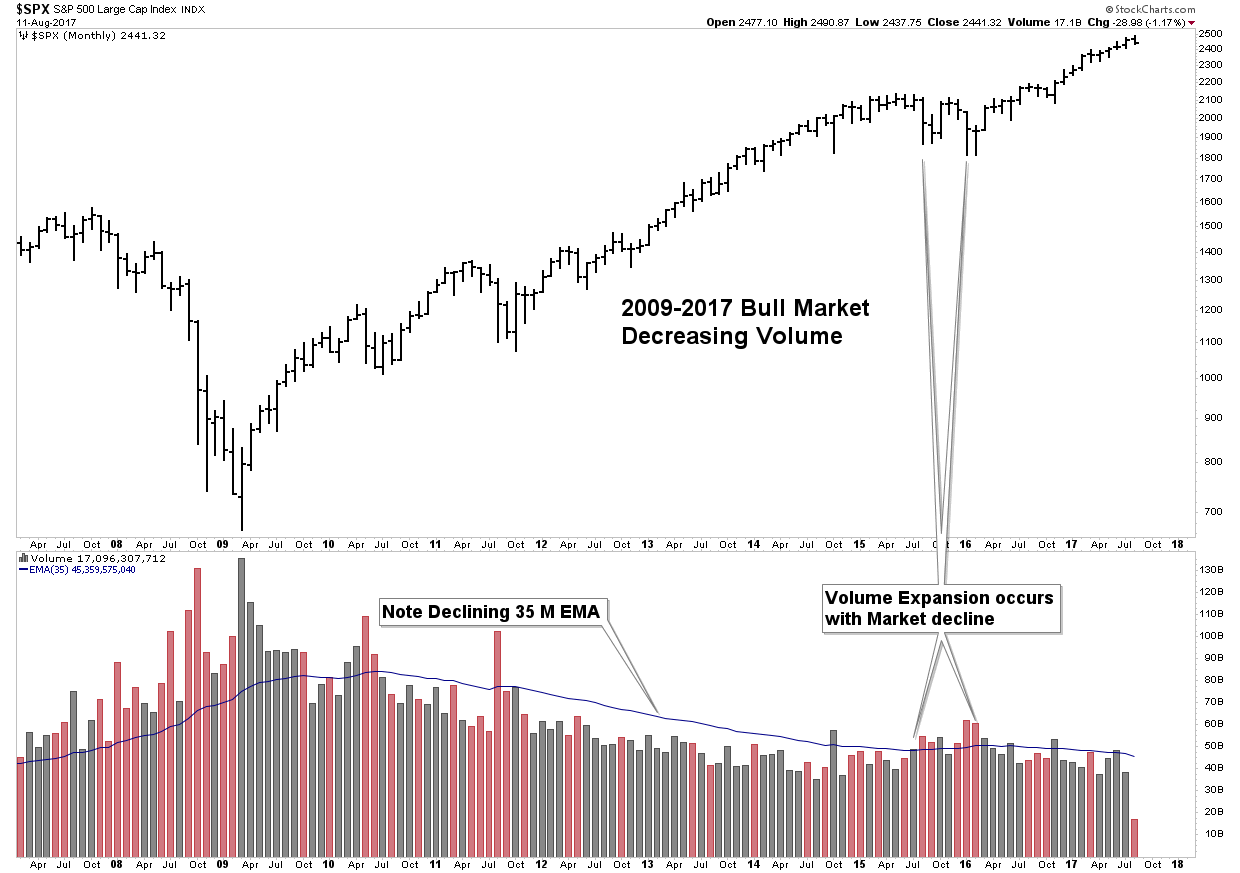
The message of the below chart to me is this entire bull market, since 2009 has been engineered and is phony. I understand that goes against the grain for many. But I ask where is the volume? Real bull markets ride along a tide of increasing volume. This “bull market” has had progressively decreasing volume. If I had to guess…and we are allowed to, I would think that when the inevitable bear market comes along it will be fast and furious as illiquidity will lock up the market.
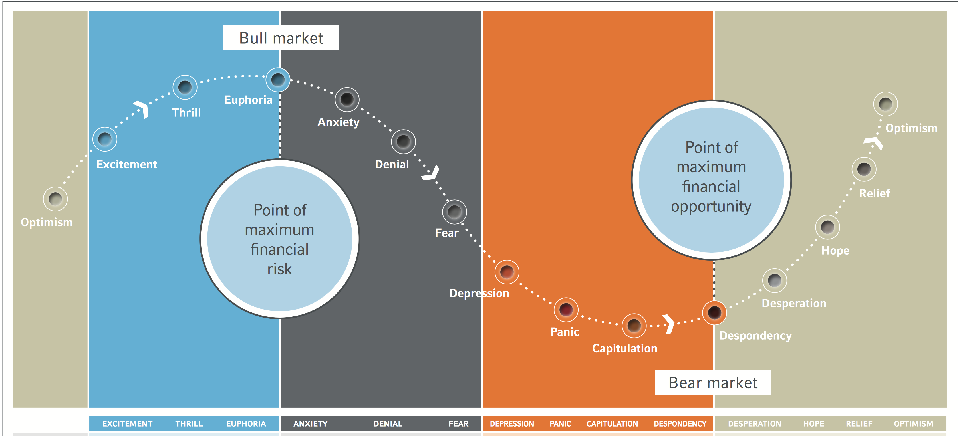
The Market’s Cycle of Emotions
The below chart shows where we are in the emotional market cycle. We are just now leaving the euphoria stage and approaching the anxiety stage. It was only a week ago where mass Trump rallies celebrated how great everyones 401Ks were and the Dow’s string of advances seemed to never cease. How fast things change. By late October we may already be to the fear stage.
It’s Time to Remove Your Rose Colored Glasses- The Currency Deflator.
Since Jan 3, 2017 the USD has been in a decline with plenty of debate as to its future path. The overriding question: Is the USD now in a Primary Bear market? I do not believe it is, instead I interpret its move as a secondary reaction in an ongoing Primary Bull market. That said, since Jan of this year the USD has been in a downtrend. Therefore if you are a Dollar centric person everything we buy or sell has been affected by the decline of the USD.
The weaker USD has assisted commodity and gold prices. Simply stated a weak USD has elevated the price of financial and real assets. If the USD is your currency you have been viewing the markets through Rose Colored glasses. Well I am now going to remove those glasses so you can see how the world really looks. I warn you it’s not pretty.
I received this inspiration while sipping on a scotch in Edinburgh Scotland two weeks ago. It was one of those Ah-Ha moments. As USD people we see everything through the USD lens, and I wondered what would it look like if we were to see it from a different, yet equally valid perspective.
Below is a chart of the Yen, Euro, Canadian & Aussie Dollar. Since January they have squiggled around a lot, but have ended up pretty close relative to each other. So I am going to use the Euro as a proxy for all currencies to correct asset prices for the weakness in the USD we have seen this year. This is called a currency deflater. We correct the effects of a declining currency by dividing assets by the Euro.
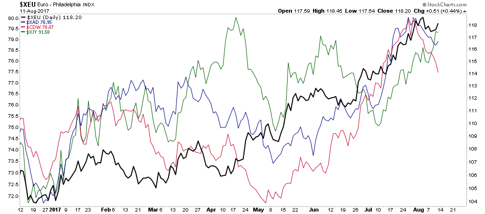
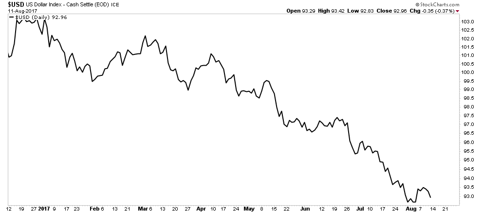
Here is a view of the USD since January. Above we have currencies going from bottom left to top right and below we have the USD going from top left to bottom right. Significant indeed!
But before I show you the currency deflator I will post the most recent PM composite by Rambus so you can see what these indexes look like in their home currency:
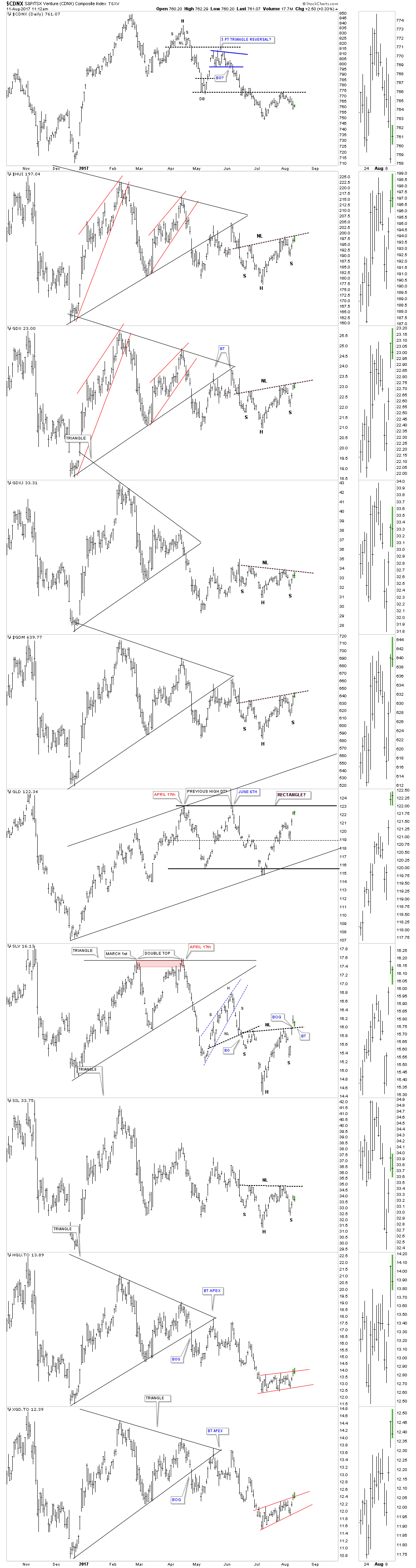
GDX
It is important to compare this chart with the GDX chart Rambus depicted above in his Composite PM chart. In his depiction the GDX seems to have a fighting chance to establish a bottom by putting in an inverted H&S and seems poised for a possible break upward over its NL. However if we strip out the currency tailwinds it reveals a pathetic collapse in the making.
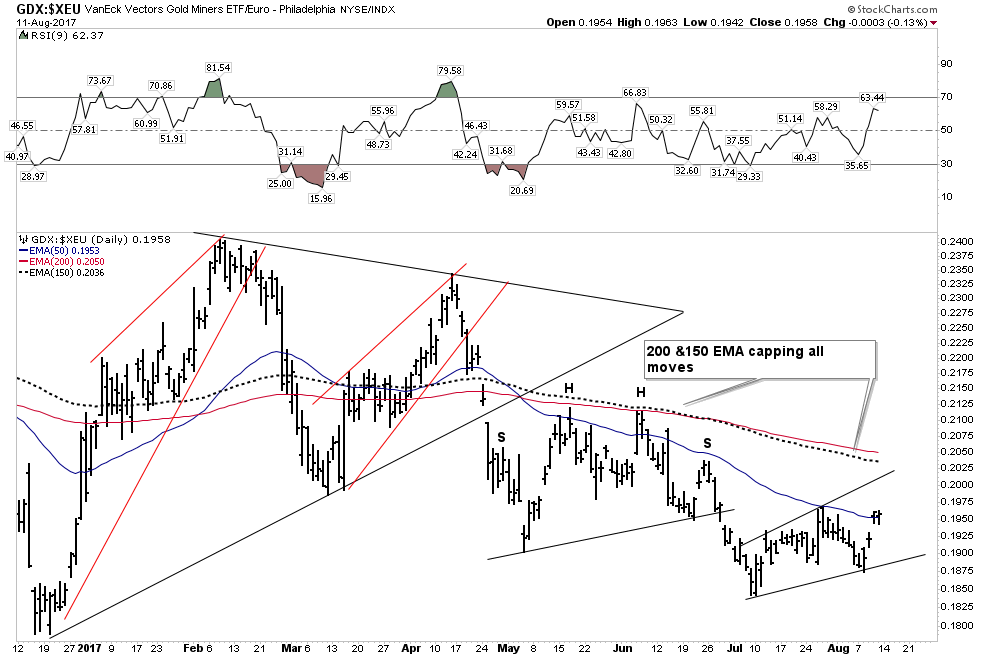
Note how the rallies are progressively weaker each time there is an attempt to make a bounce. After the the urgent decline in late April which fell out of the triangle, it has been capped by the 200 & 150 EMA. Overall it appears to have a one-way ticket to an eventual capitulation washout.
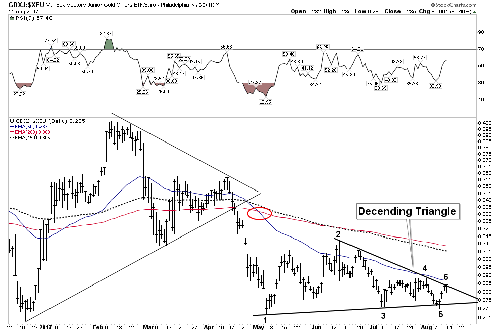
GDXJ- It get’s worse
Below we deflate the currency effects out of the GDXJ and we see a chart of grim liquidation. Up until mid April the GDXJ had enough energy to at least coil within the bounds of a horizontal triangle, however after the urgent gapping decline from the triangle its next consolidation became a descending triangle. Keep in mind this formation depicts supply coming in at progressively lower levels each time price rises. Ultimately it most likely is bearish with a probable resolution to the down side. Again we see all movements capped by the 200 and 150 EMA. It is becoming so week that the 50 EMA is now acting as resistance, whereas it didn’t before.
Silver Miners (SIL)
This depicts a slowly accelerating downward parabola bounded by an 8 point (?) descending wedge. Again, it is increasingly unable to generate enough upward power to penetrate any moving averages.
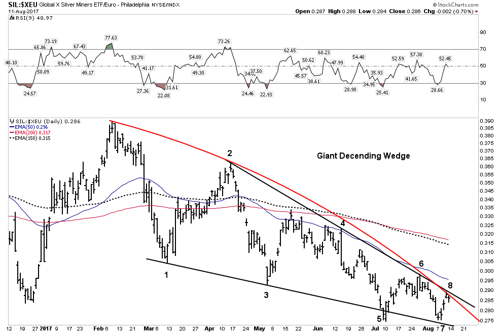
This type of pattern has the potential to drop out of such a long authoritative structure in catastrophic fashion. Kind of like this:
Keep in mind Silver Majestic is regarded as one of the leaders of the group. In Rambus’ PM composite you may have wondered why the two bottom charts, the XGD and HGU have been perennial weak sisters? The reason is because these two indexes are in Canadian Dollars. That’s right they don’t have the declining USD propping them up hence their bearish patterns building out. Currently they each are bounded within a bear flag.
The Currency Deflater and the S&P
Now let’s turn our little currency deflator towards the S&P 500. The results are shocking! You may have thought you have been in a bull market all year. Well if you were not from the US you most certainly were not. This chart is devastatingly classic.
A well formed broad duration H&S with an urgent break below its NL. The break is followed up with a prolonged back test repelled at the NL. A violent gap down from its BT followed by a classic ping pong move between the 200 & 150 EMA followed by a final “give it up” drop and fall away. This is an incredibly bearish chart!
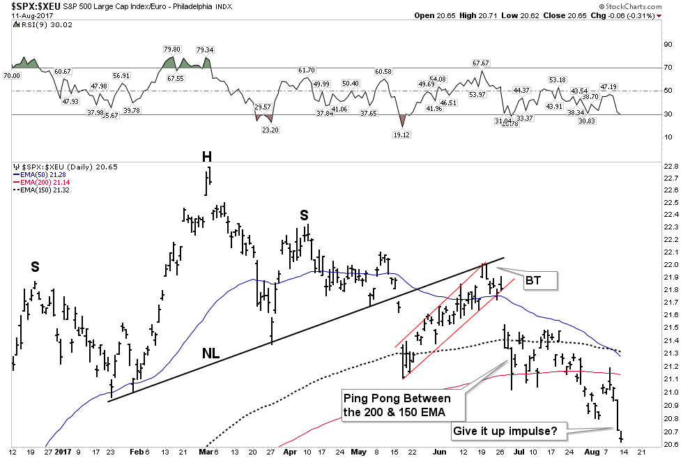
You can continue this exercise with other indexes to see how it has been the weak USD that has given us the perception that the markets have been healthy. Take off your Rose Colored glasses and you quickly see the deterioration that lies within going on all year. In fact, deflation has been eating away the markets like termites in an abandoned house. Eventually the winds blow and the collapse ensues.
Coming back to the point of the currency deflator, we can see that it’s the weak USD dollar that has maintained the appearance of healthy markets. So what happens if the USD resumes its primary upward trend? It’s pretty simple really, a rebounding USD would crush commodities and anything related to the precious metals. It most likely would have the same effect on the general stock indexes.
Eventually however, in a post bubble contraction (PBC) both gold and the reserve currency should catch a safe haven bid and can climb together. When this occurs it should be the start of the initial phase of the bull market in precious metals which lies ahead.
Gold- How it fits in
How gold fits into all this is very tricky. If we take out the USD tailwind gold has a decidedly bearish look. But the geopolitical aspect could very well give gold a pop going forward. It’s really hard to analyze, however just the fact that it is right now peaking above its 6 year downtrend line should be enough to get enough gold bugs lathered up to give it a bump higher.
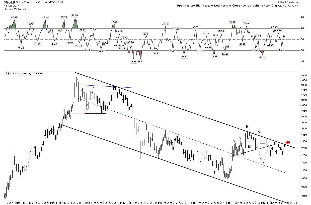
It’s always hard to forecast a false breakout in anything, but that’s what I will be looking for if gold pops above its down trend line. Most assuredly a major conflict in Korea will rally the metal, but I don’t see it as sustainable.
Gold and Silver Stocks- The Question on Everyones Mind
The universal question is what happens to the PM stocks if the market tanks in the fall? The PBC model allows for the PM stocks to fall in sympathy with the market, after all they are stocks also. But here is the thing, historically the PM stocks are the first to recover after the initial wave of selling. We saw this play out in the 2008 crisis.
Traders Review
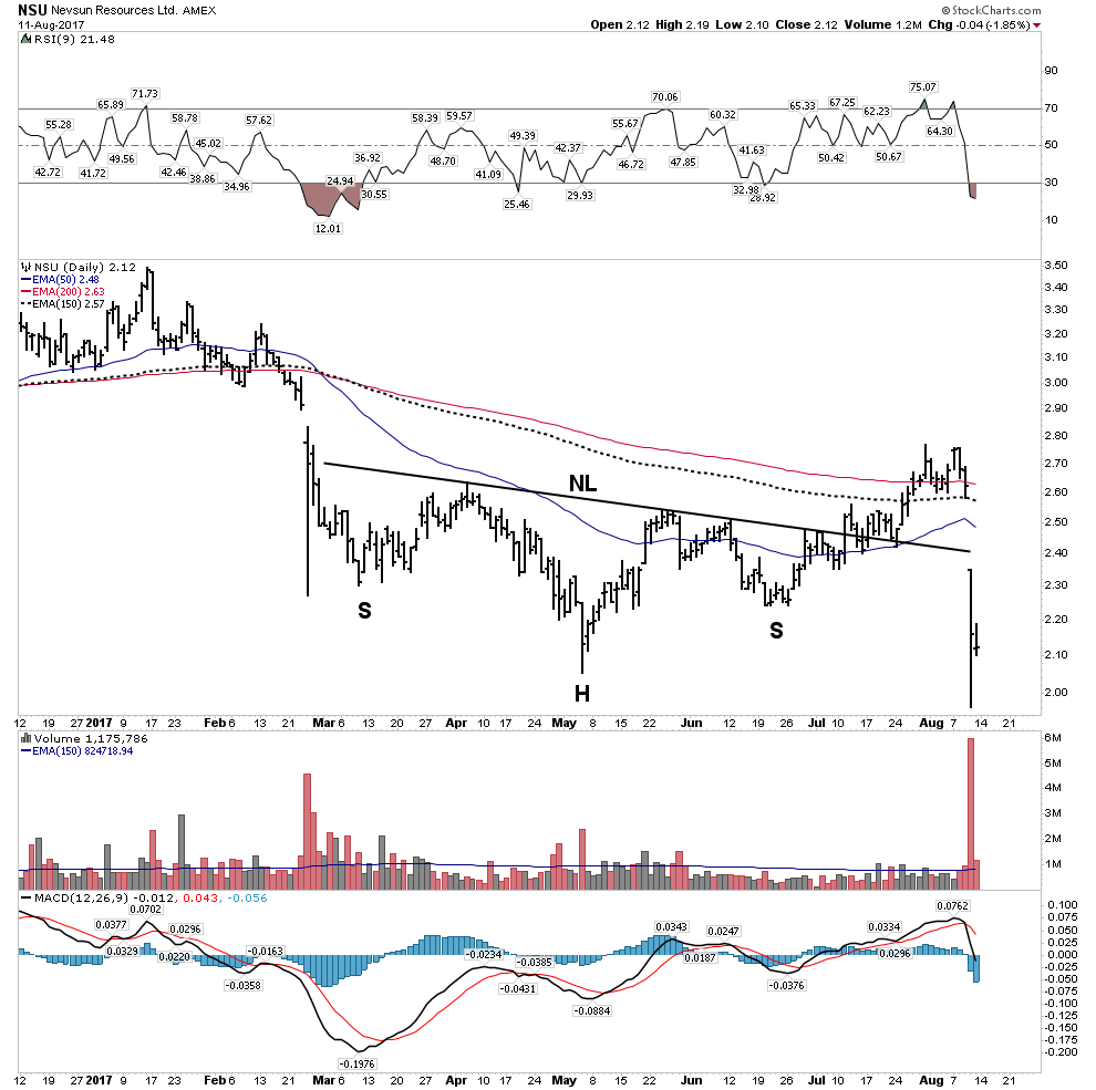
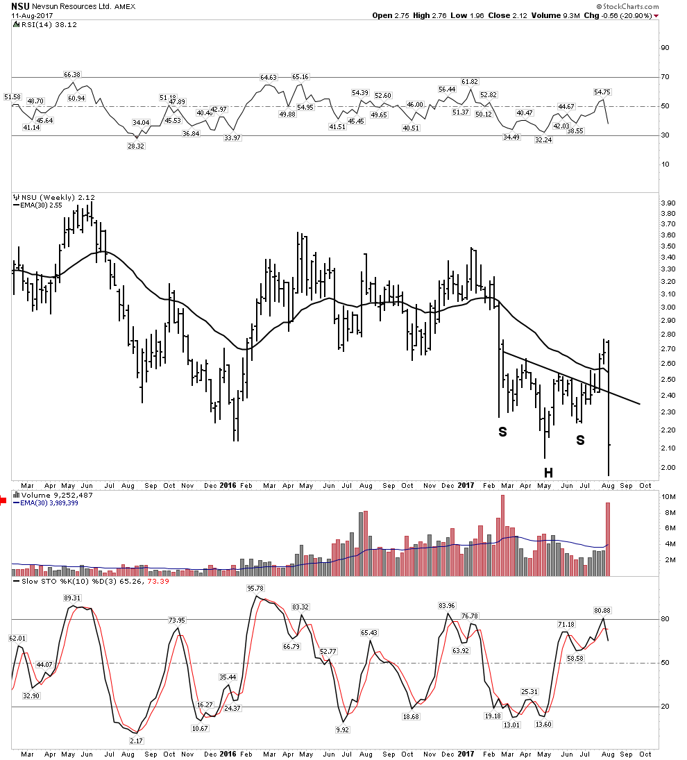
Im my last report I outlined the bullish opportunity in the electric metals. This is a long term investment thesis which will play out over time, however in the short term a bear market in the general stock market is likely to cause the price of metals and the mining companies to decline. As a value investor one must be willing to buy opportunity whenever it appears. This is exactly what occurred this week with Nevsun.
Recall in the last report I stated:
“There is a risk of a significant drop when next quarters earnings are released due to continuing metallurgical issues with the Bisha mine in Eritrea related with their zinc extraction.”
This is exactly what happened this week when the stock got knocked down due to the company announcing an earnings miss. It was expected. The drawdown was particularly steep (-20%) due to announcing a reduction in the life of the Bisha mine in Africa plus pushing back the PFS into next year. After discussions with my broker it is our view that the company wanted to clear the decks and get out all the bad news in one announcement and start out with a clean slate.
As a result, I doubled down on my investment near the lows and now have a large position in NSU. Keep in mind that the Investment thesis for this company is NOT based on the Bisha mine, but instead the copper assets in Serbia. Therefore I see this as a great opportunity to buy a world class copper asset for absolute firesafe prices. Also keep in mind that this is a potential likely takeover by Lundin Mining.
Knights if you are going to be in this business of resource investing and speculation, one must be able to act on the fly and recognize a deal when it presents itself. These prices may not last long.
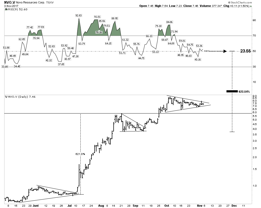
Novo Resources
Another comment from my last report:
“I am clearing the decks and finding cash to buy more of Novo, be brave knights… Oh, and I am not waiting for a pull back.”
“But once you buy, one has to hold on with all your might. Don’t trade it, don’t “register” your profits, Be brave and just hold on.”
At the time of this report Novo’s price had closed over the weekend at 2.67. Upon opening Monday morning after my recommendation anyone wanting in received a gift as it immediately dropped to 2.22. This past Friday Novo reached a high of 3.85, in all an increase of 73% over the optimal buy point immediately after the report.
Here is the point: I have listened to a lot of commentary on Novo and virtually everyone has stressed the stock is way ahead of itself and one should stalk the stock and buy it on a pullback. I argued otherwise. That technique leaves you standing at the station wishing you were on board. The best course has been as I stated, gird your loins and pay up then hold on for all you are worth. I have seen enough of these to know this is the best way to conquer this one….Rambus Chartology- Value added indeed!
I continue to add to my Novo position, buying another 25,000 shares at the opening this past Thursday. I am not done buying as I believe the potential for this stock could prove to be life changing
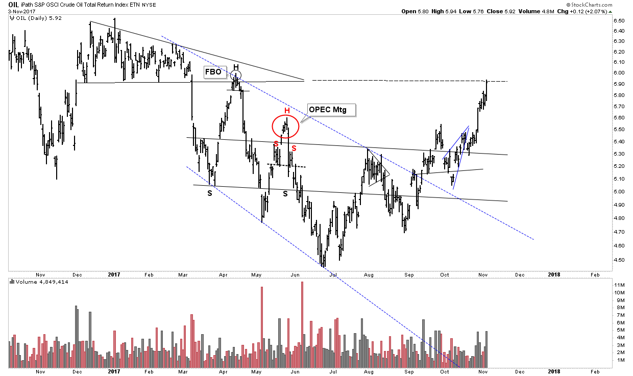
Plunger’s Big Trade- The Oil Short
This has been on the back burner since early July allowing the recent BMR to run its course. It appears time to start moving it back up front as it may be approaching prime time once again.

Recall my big picture analogy of the kinetic energy super ball bouncing down the staircase adding energy and amplitude with each successive bounce. With that picture in mind it appears this bounce is about to run out of gas. Plus stochastics are now turning down. As a result I started shorting oil again this week, however only an entry position since it still has the potential to surprise and rally into the 50’s. No one ever said this game was easy and the current red triangle buildout at the down sloping blue dashed resistance line could go either way. I am starting to build a position based on it going down.

The outcome is still in question however, if the bulls are still in control there remains the chance the current horizontal triangle could be a half-way pattern with the ultimate PO around the extended dashed apex line in the first chart. If this were to occur, obviously one should cover ones short position.
Here is an interesting Fib guide to the extent of previous retracements. It’s at previous max retracements now!
The long term linear chart shows the two bearish formations forming on both sides of the S&R line. Resolution soon to come.
And the proprietary big picture chart shows we are still locked in a secular bear market for oil. The last one lasted 18 years (1980-1998) and we are currently 9 years into this one.
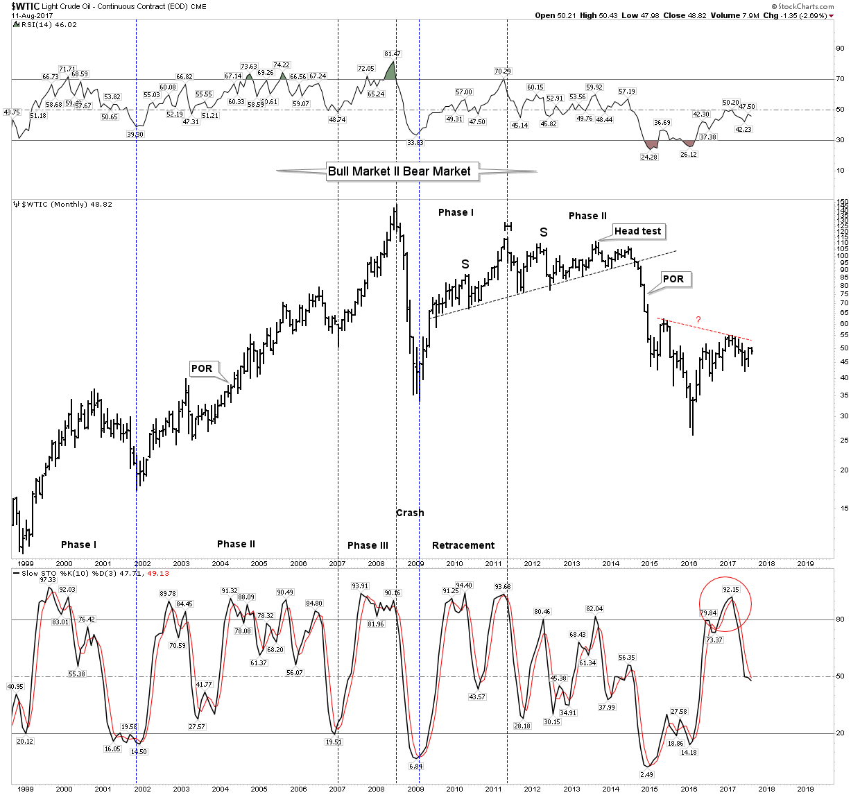
Ultimately with the onset of the next bear market and recession the forecast is for much lower oil prices.
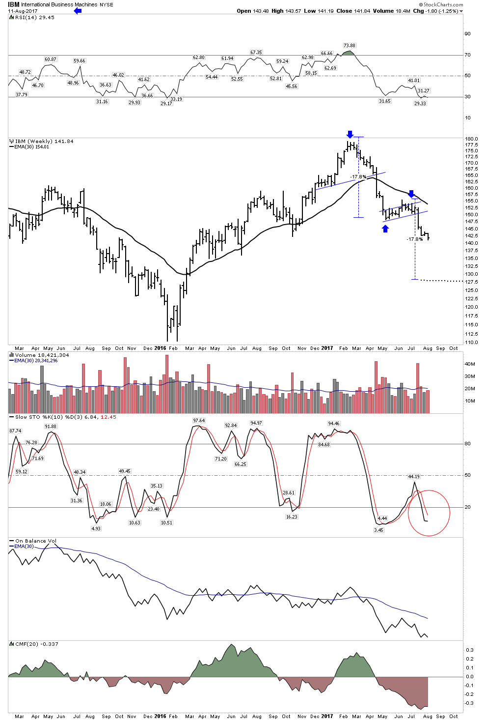
Market Shorts- IBM and CLI
IBM has been a barn burner short, it has been my second largest winner this year. The chartology has been so clean and classic and still has further to fall. IBM is a victim of the Amazon juggernaut. Two-thirds of IBM’s revenue is exposed to competition from the most brutal competitor in the history of commerce- Amazon. Recall what Bezo’s likes to say “Your margins are my opportunity”. IBM is a has-been company, soon to be sent to the slaughter house by the new price structure reality.
IBM still has broad institutional ownership who haven’t yet figured this out. Institutions act like lemmings, when they have their ah-ha moment its going to be a deluge. They will all exit together in one cathartic capitulation. That’s the message of the IBM chart… you can see it coming and why I have such a large position.
One warning however, as we all know Mr. Market would like to make this drop lower without any shorts profiting from it. So at some point prior to this event expect a short squeeze to drive out the shorts. I have noticed an early stage positive divergence in momentum on the daily chart and I stand ready to cover my short at a moments notice…you should be ready too…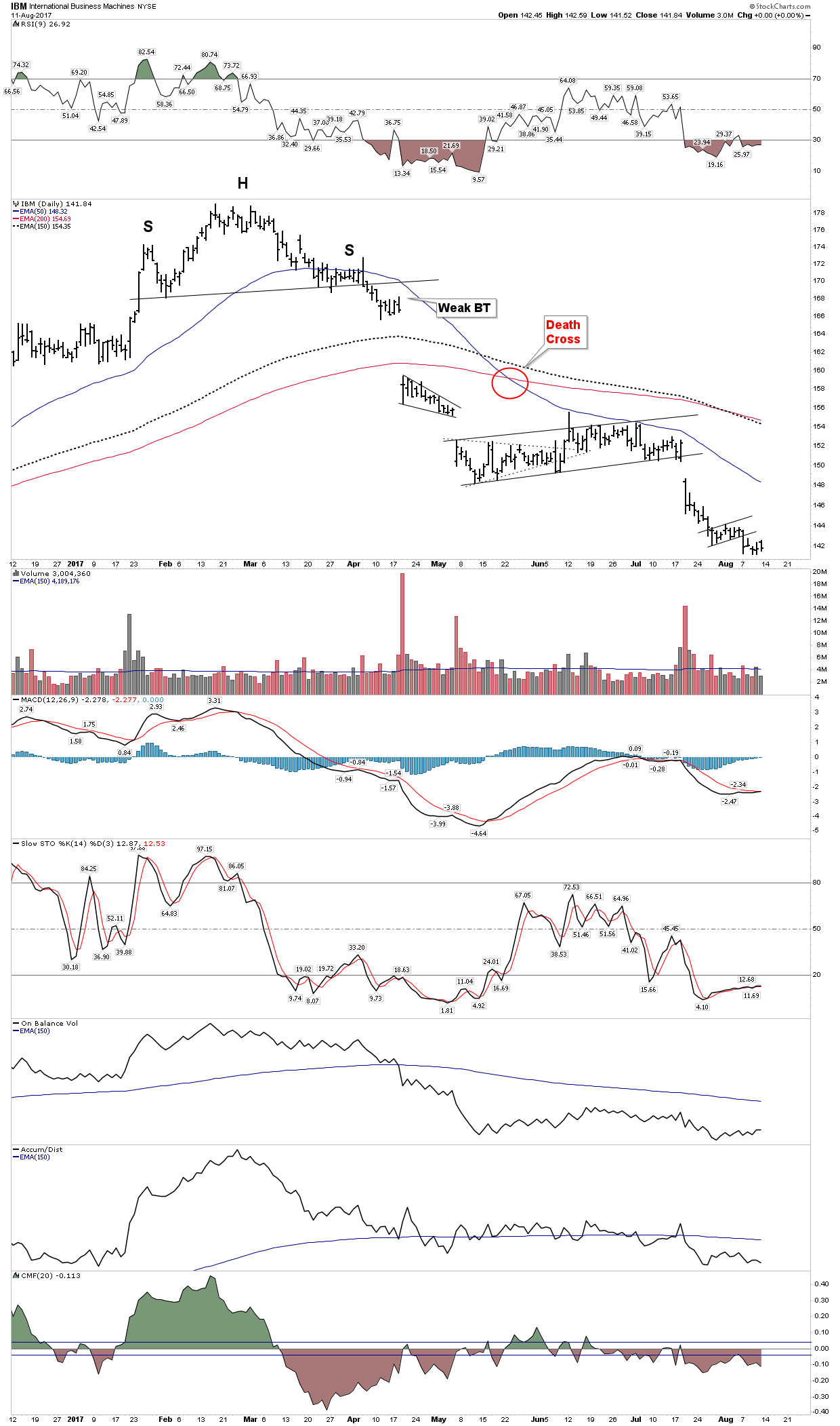
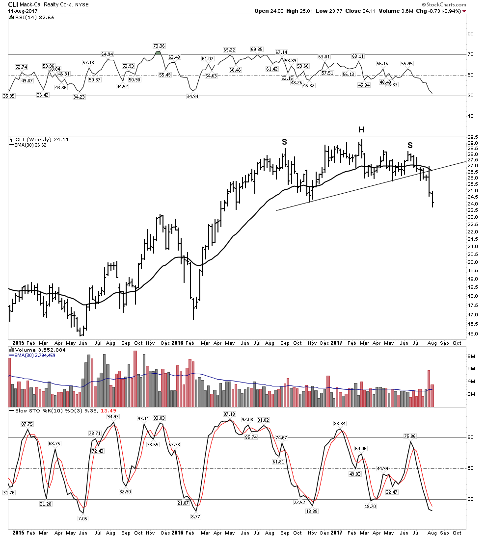
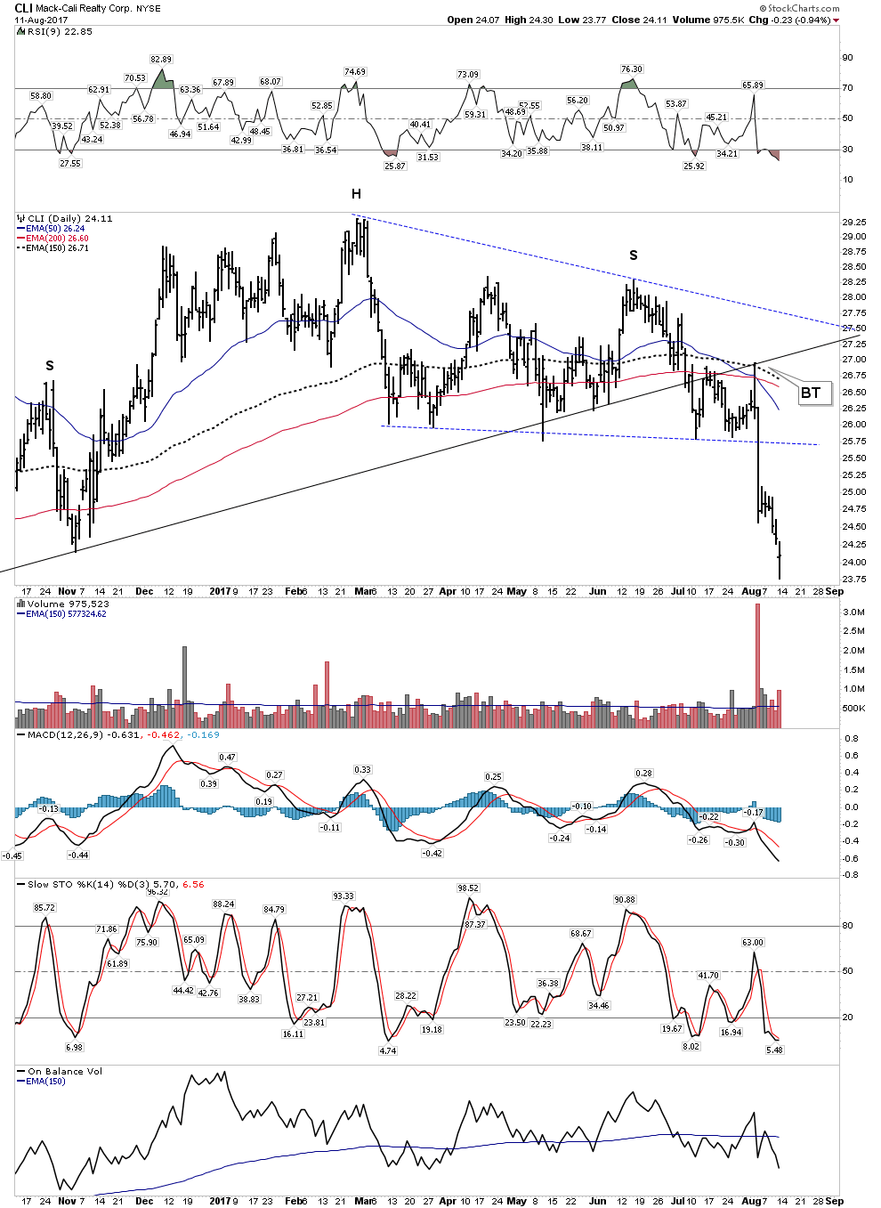
Mack-Cali Realty Corporation (CLI)
This is a classic Weinstein short set-up and this week turned out to be a nice little surprise. Lately it has been trying my patience as I have been short for a few months, but the chartology finally came through. Note the beauty of this set-up. Rounding arching top with the 30 EMA finally bending over and providing overhead resistance. Very broad H&S with lot’s of unoccupied airspace to fill on the downside. They don’t get much prettier than this one.
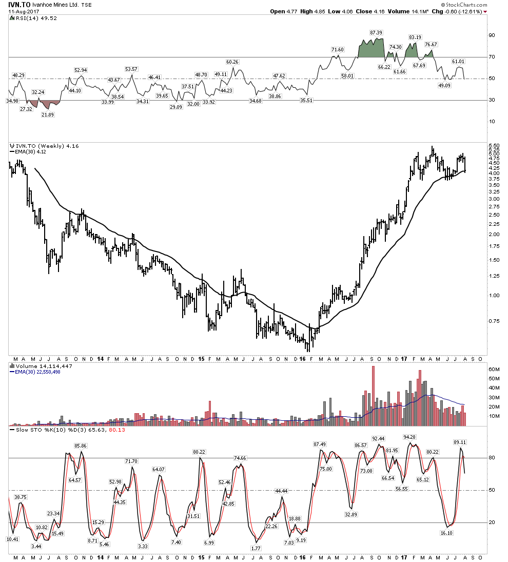
Ivanhoe
Last report I mentioned:
“Well, I think there may be a chance that it may be somewhat exhausted. Maybe, maybe not. Therefore the chart below gives me pause. Maybe we will get a pullback corrective move.”
This was mentioned with the stock above the NL. The caution was warranted, and yes indeed it was a bull trap. One wants to own this stock, however I plan on waiting to get a much better entry position…patience.

European Stocks
Recall the PBC thesis called for European stocks peaking in May-June followed by a USA peak in Aug-Sept. This appears to be occurring according to script. We now have the Euro stocks following through IAW the model. It’s actually an amazing progression which began with a H&S reversal top spanning over 3 months thus establishing its broad authority. This was followed up by a break of its NL with ensuing back test over a 3-week period. Next we see a break of the 150 EMA (30 W EMA proxy) with a classic ping pong indecisive move for two weeks. Finally we see an urgent “give it up” move with a running gap to the downside. The STOXX50 index represents the largest super-sector leaders in the Eurozone in terms of free-float market capitalization. The index captures about 60% of the free-float market capitalization of the EURO STOXX Total Market Index. It is the most comprehensive measure of Euro stock markets.
Think back to late May when this model was proposed. The markets seemed so strong, but the model provided guidance going forward….trust the model.
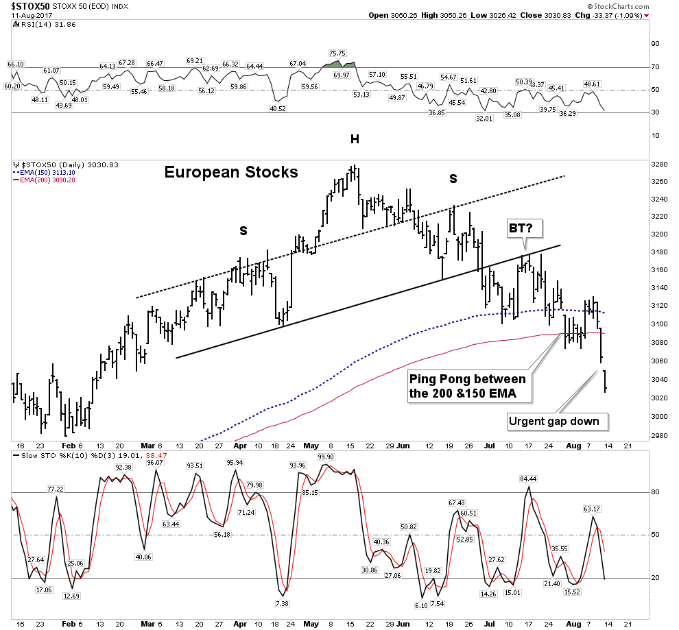

Clearly, the above chart is a bearish looking set-up which is a bit of a conundrum because European economic and trade numbers have actually been improving significantly. Again, we defer to the charts as discounting future conditions.
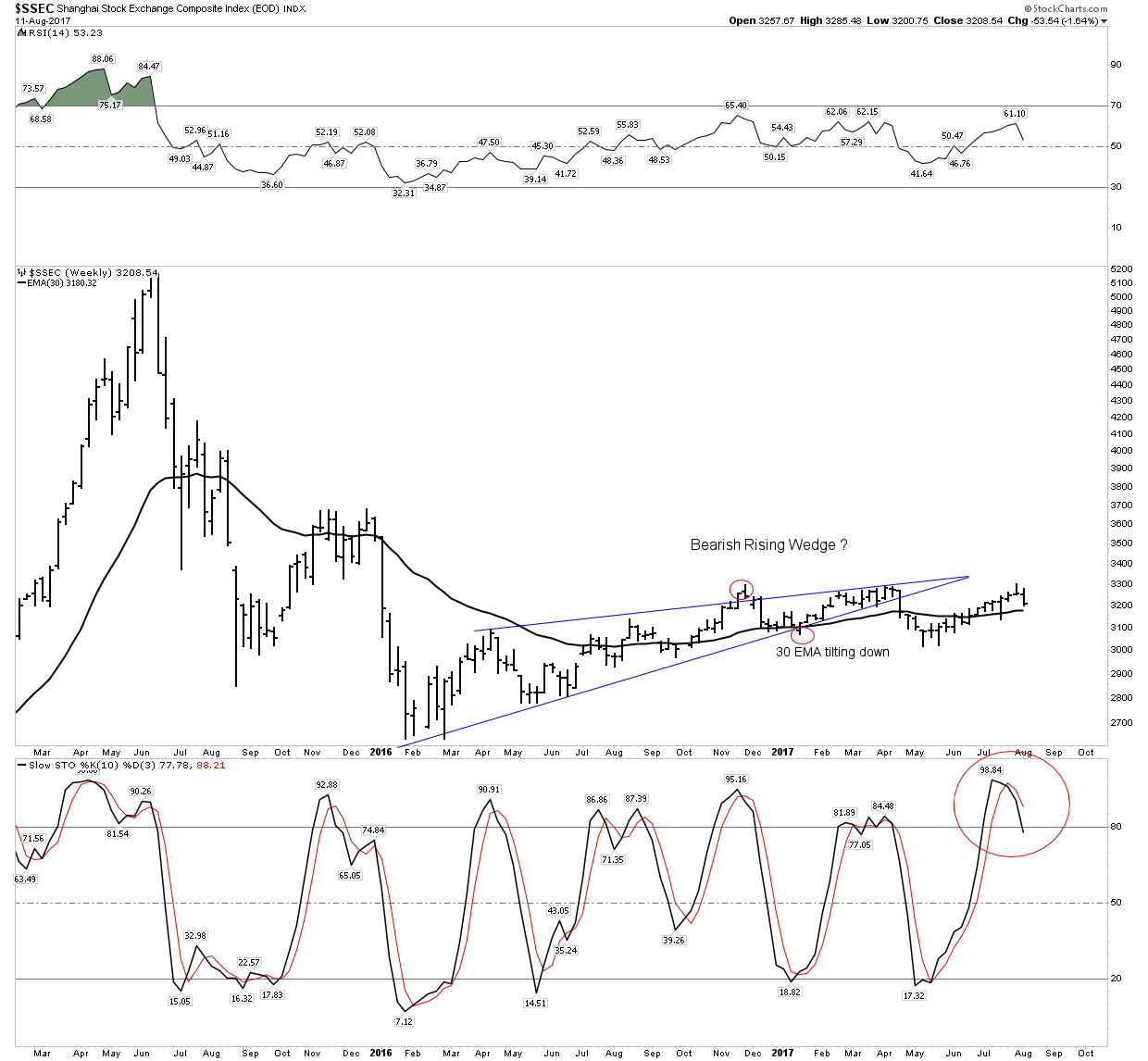
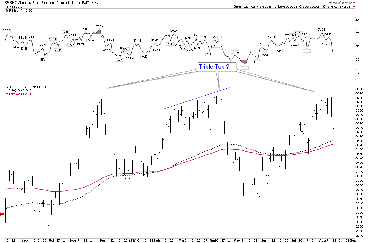
China- At a Critical Juncture
I am bullish on the Chinese stock market over the long term. It actually has not gotten over priced as our market has since it has spent the past 10 years digesting its previous gains. However it appears to be ready to trend downward after being in a flat bearish rising wedge for the past 2 years. I am avoiding virtually all stocks at this time
India is in a strong rally, but again I prefer to sit on my war chest at least until the fall season.
Inflation- Not out of the woods yet
In an Orwellian world inflation equals growth. That’s pretty much what the FED has told you. The narrative is the FED is succeeding in their inflation campaign, but the charts are not yet confirming this story. Let’s take a look.
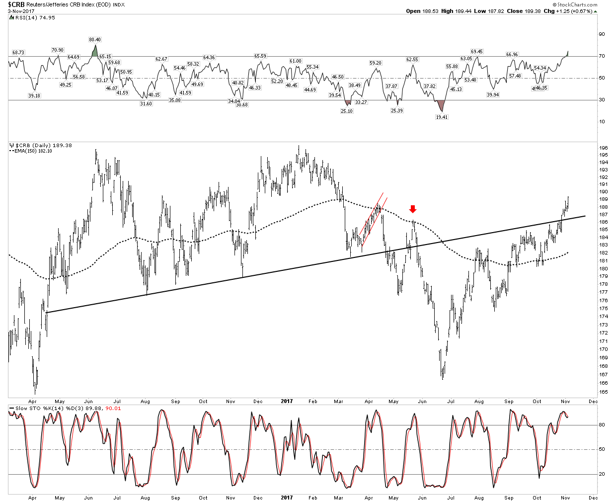
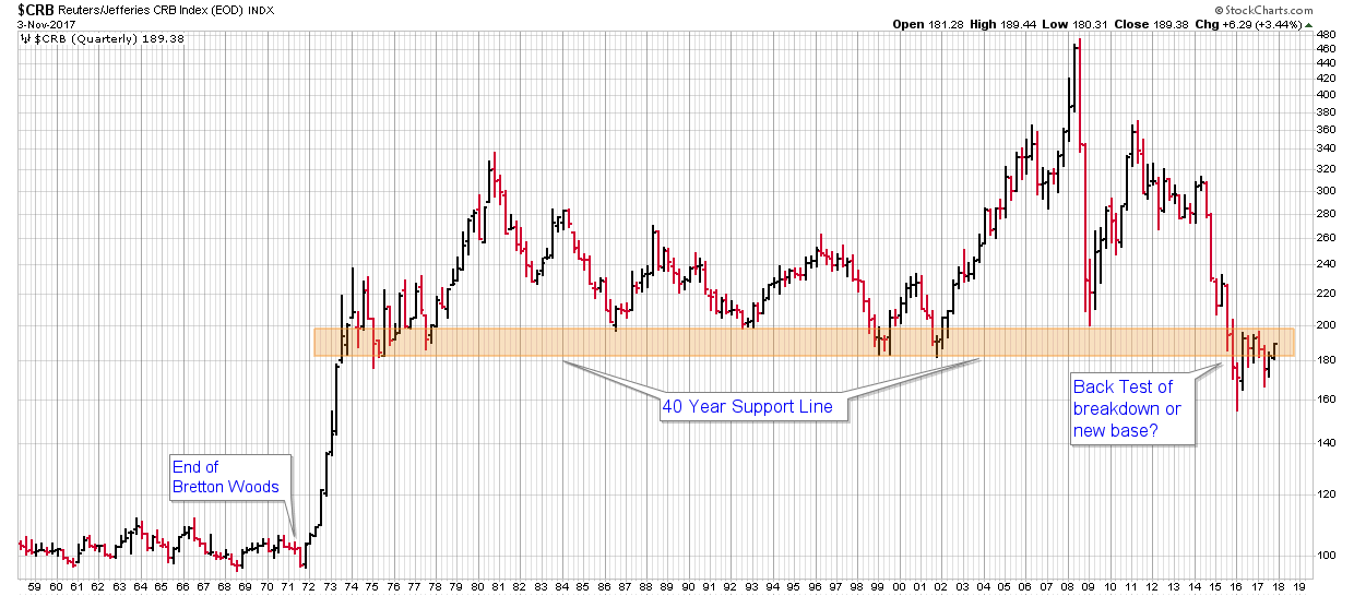
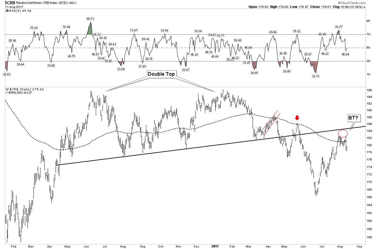
Our long term CRB index is what I like to call the scariest chart on the planet. Since breaking its 40 year support line it has been unable to rise up above it after 2 years of trying. It still appears in back test mode and I shouldn’t have to tell you there is NO SUPPORT below these levels. Simply stated if price falls to early 1970’s levels it’s monetary Armageddon. We have been assured by the money printers that they have “got this”. It’s all under control… but is it?

Let’s zoom in and look at the action over the past two years. It’s pretty obvious what’s been going on here knights. This has been a back-test retracement rally just like we saw in the oil market from 2009 to 2014. Follow the action here: In April a bearish rising wedge failed at the 150 EMA then fell through its NL. It then followed up with a bounce back to be repelled by the same 150 EMA. Note its life above the NL was then short lived. It now dropped in a deep dive below the NL with another BT failing below the NL. This is all eerily similar to the way oil broke down in late summer of 2014 to crash from $100 down to $27. Sit up and pay attention knights.
Currency Deflater again revealing the true story
Again, this failing pattern has occurred despite the USD providing a wind at the back of commodities all-year-long! So let’s take out the currency advantage and see how it looks.
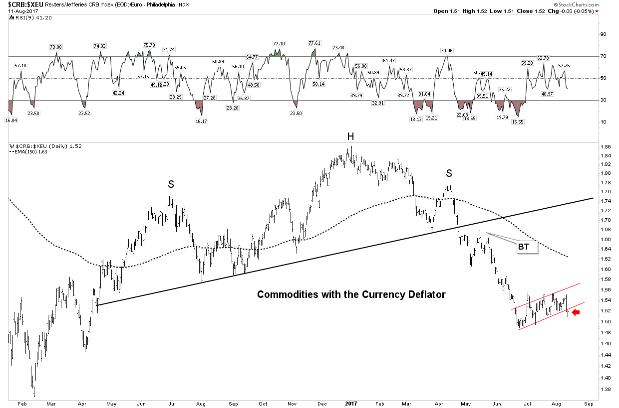
All I can say is OMG look out below. What a violent breakdown! And what happens when or if the USD resumes a primary up trend? The current red bear flag has just been violated and could be a half way pattern to the down side. This chart is telling us its time to head to the chopper.
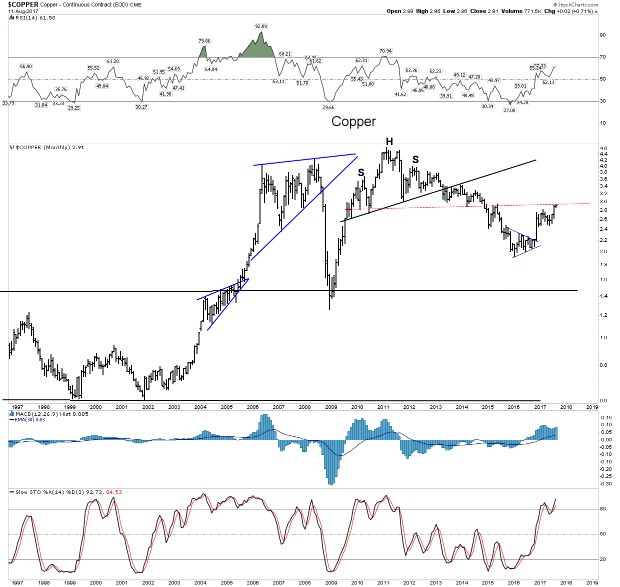
Copper- Also not out of the woods yet.
Despite the great long term prospects for this metal its chart indicates it too, may not be ready for prime time. It has had a great move and this may be indicative of future leadership, however it needs more follow through to get itself out of the woods.
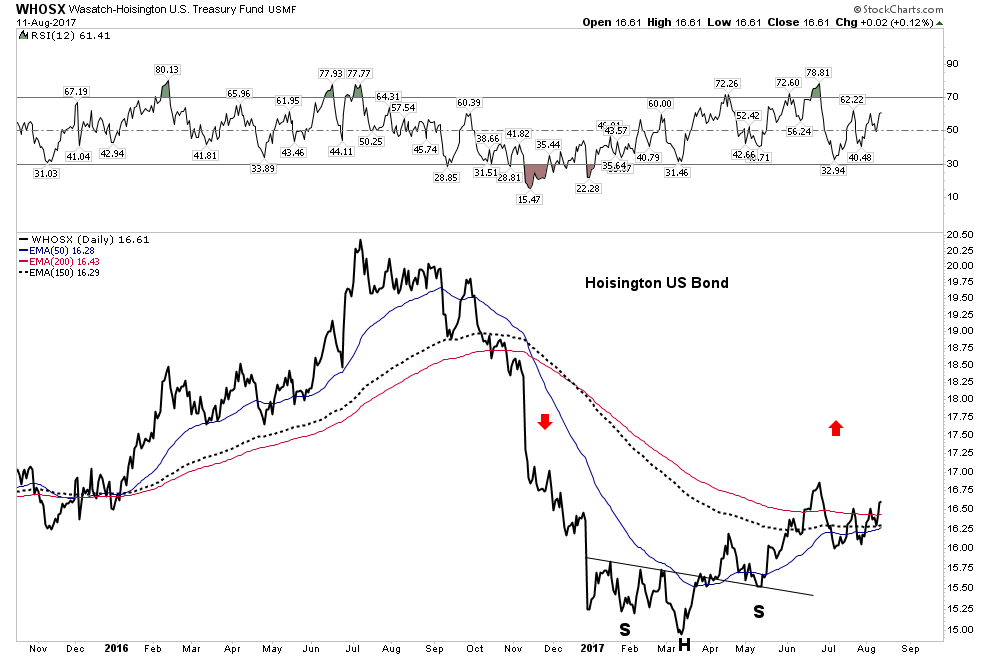
Bonds
Bonds seem to be delivering the same message. I have noted in the past that part of my war chest sits in the Hoisington LT Treasury Fund. These are reserve funds standing at the ready for the opportunities I see coming this fall. The bonds look prepared to embark on an advance if deflationary conditions break out.
Conclusion
I take no pleasure on raining on anyones parade. I am just here to call it like I see it. We have covered a lot of ground here and shown perspectives backed up with hard hitting chart analysis that you will not see anywhere else in the world. I have approached this entire year as a campaign towards an objective. Reading the tea leaves we have watched the individual bricks of a market top fall into place from market charts to investor psychology. Few people cared to observe or listen, but our payday is fast approaching. Girt your loins knights and prepare your war chest because as Churchill once said:
For this is our finest hour.