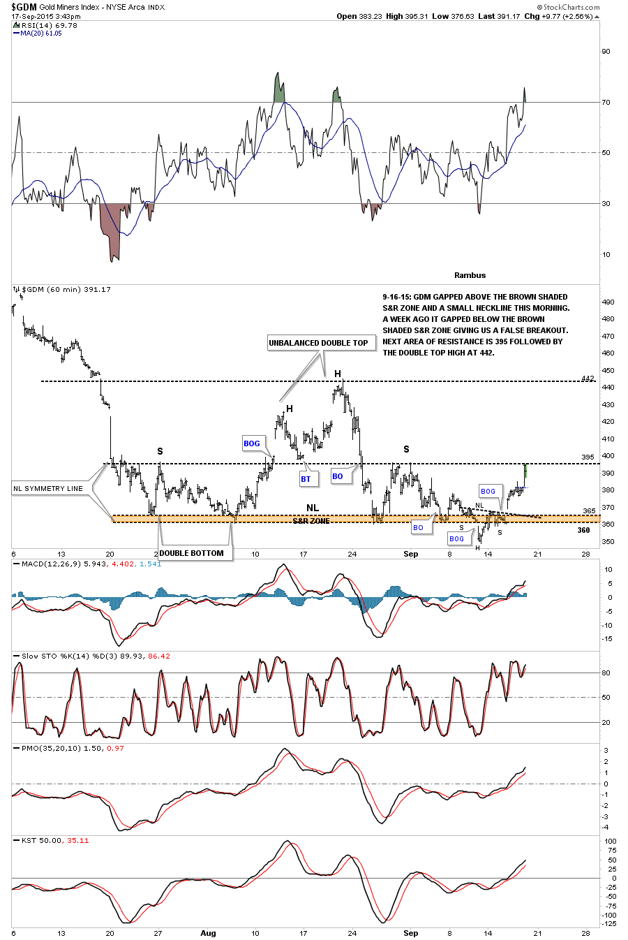
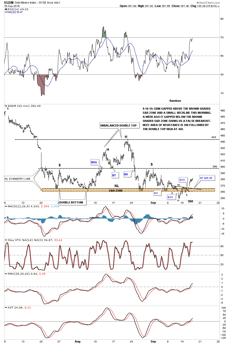
The 60 minute chart below shows the GDM running into its first resistance point at the previous left and right shoulder highs at 395. This would be a good place for it to take a little rest. A break above the 395 area would be positive for a run to the top of the potential trading range at 442. First it has to get past the 395 area.
Category Archives: public
GDXJ Update…
LABU Trade Setup…
Transportation Average Update…
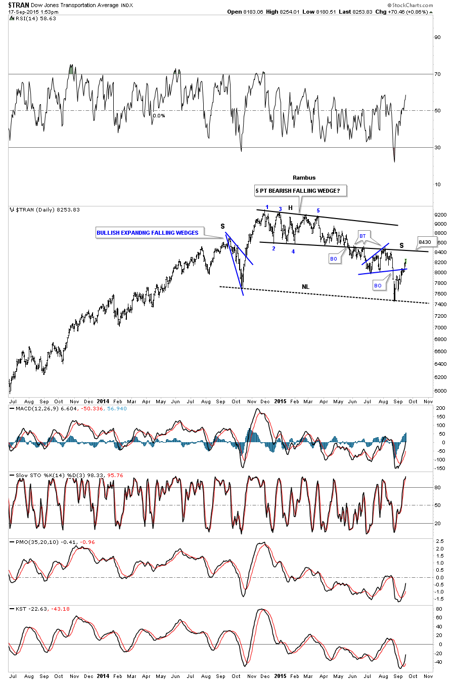
I’ve adjusted the neckline to the most recent low as the old neckline became obsolete. The next important area of resistance is the bottom black rail of the 5 point bearish falling wedge reversal pattern at 8430. If the transports can trade above the 8430 area the bulls will be talking to us. You can see how it has held resistance 3 times so far on the backtests.
$RUT Update…
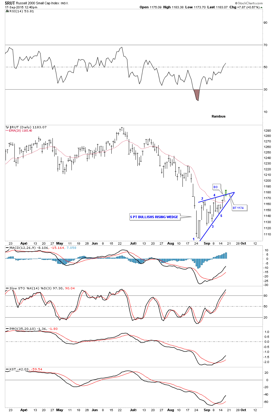
Today the RUT is breaking above the top rail of a potential 5 point bullish rising wedge reversal pattern. All the indicators are looking good as well along with the 20 ema.
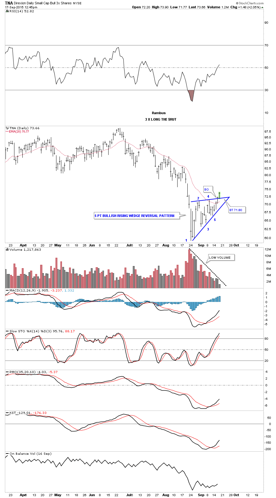
The TNA is a 3 X long etf for the $RUT which is showing the same pattern but the volume is very very light. We’ll see what happens after the fed announcement.
Wednesday Report…Hackers Schmackers : You Can’t Kill the Charts
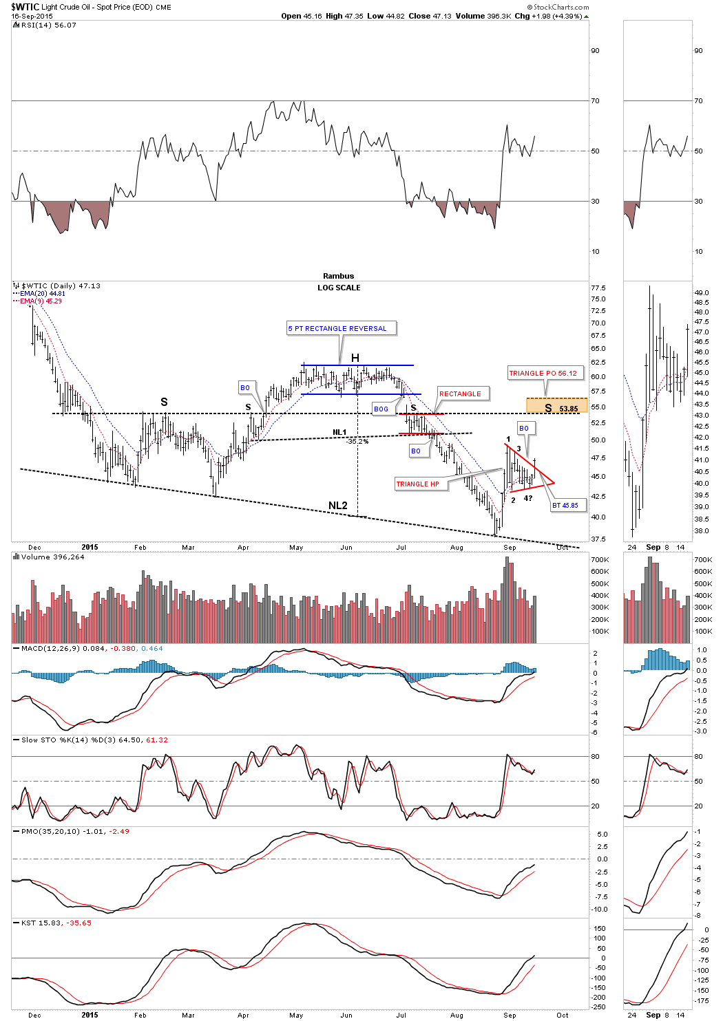
Lets get right to the charts tonight as there is so much happening right now in the markets. The first chart we’ll look at is $WTIC, oil. Today oil finally completed the triangle consolidation pattern I’ve been waiting for. Below is a daily chart for the game plan I laid out several weeks ago in which I was looking for a halfway pattern to form in this general area. This red triangle should give oil enough gas to move up to the brown shaded price objectives between 54 and 56. That’s where the bigger picture comes in. Many times the right shoulder will be of an equal height as the left shoulder as shown by the horizontal black dashed trendline at 53.85. That is what I’m shooting for. The 54 area will also be the place where I will reverse positions, selling UWTI and buying DWTI which is a 3 X short oil etf. As you can see if oil does put in a right shoulder around the 54 area we’ll have a very large H&S consolidation pattern. So far so good.
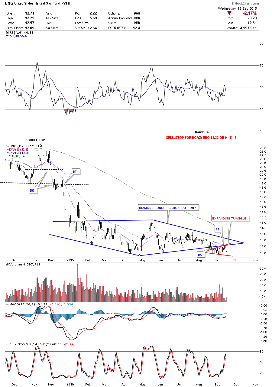
Natural Gas is another 3 X etf we have that backtested the bottom rail of the blue Diamond yesterday where we took our third position in DGAZ. I’m using UNG as the proxy for Natural Gas. UNG does have a bearish setup with the red expanding triangle forming just below the bottom rail of the blue Diamond. I plan to take a fourth and final position when the bottom rail of the red expanding triangle is broken to the downside. I’m using UNG to set my sell/stop for DGAZ at 13.33.
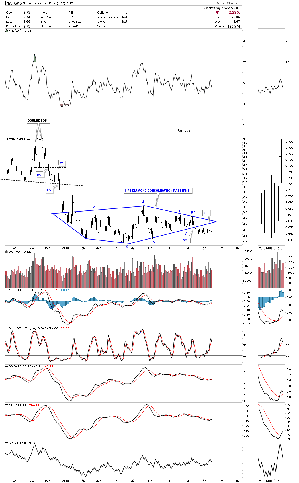
The $NATGAS spot price chart also shows a blue Diamond consolidation pattern with a backtest yesterday to the bottom rail.
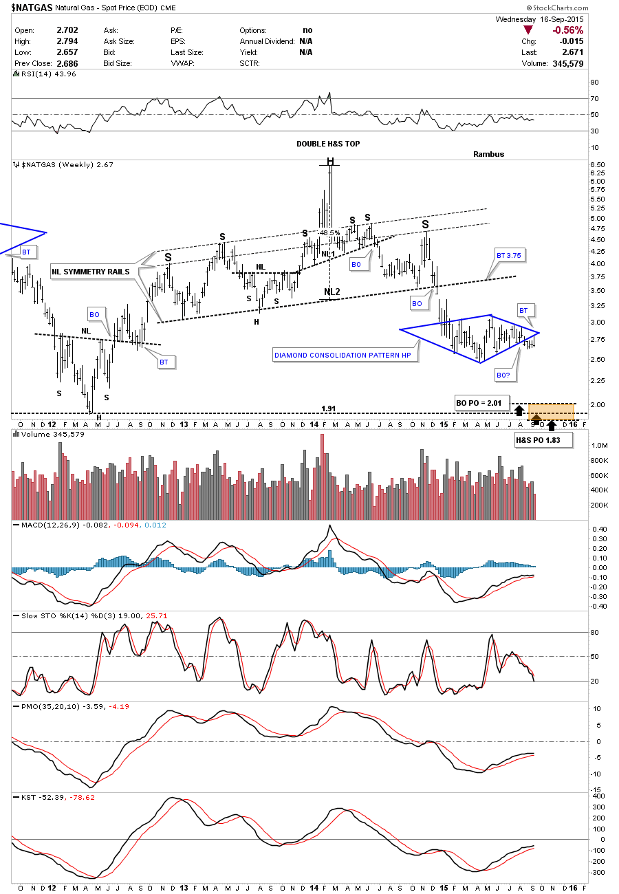
The weekly chart for $NATGAS shows its massive H&S top which is the main reason I’ve been hanging on to our DGAZ trades. You can see how the blue Diamond consolidation pattern is forming right in the middle of the lower price objectives. You never know 100% for sure if the backtesting process is finished but it does look like it on this weekly chart. We need to see a new weekly closing price for more confirmation the pattern is complete.
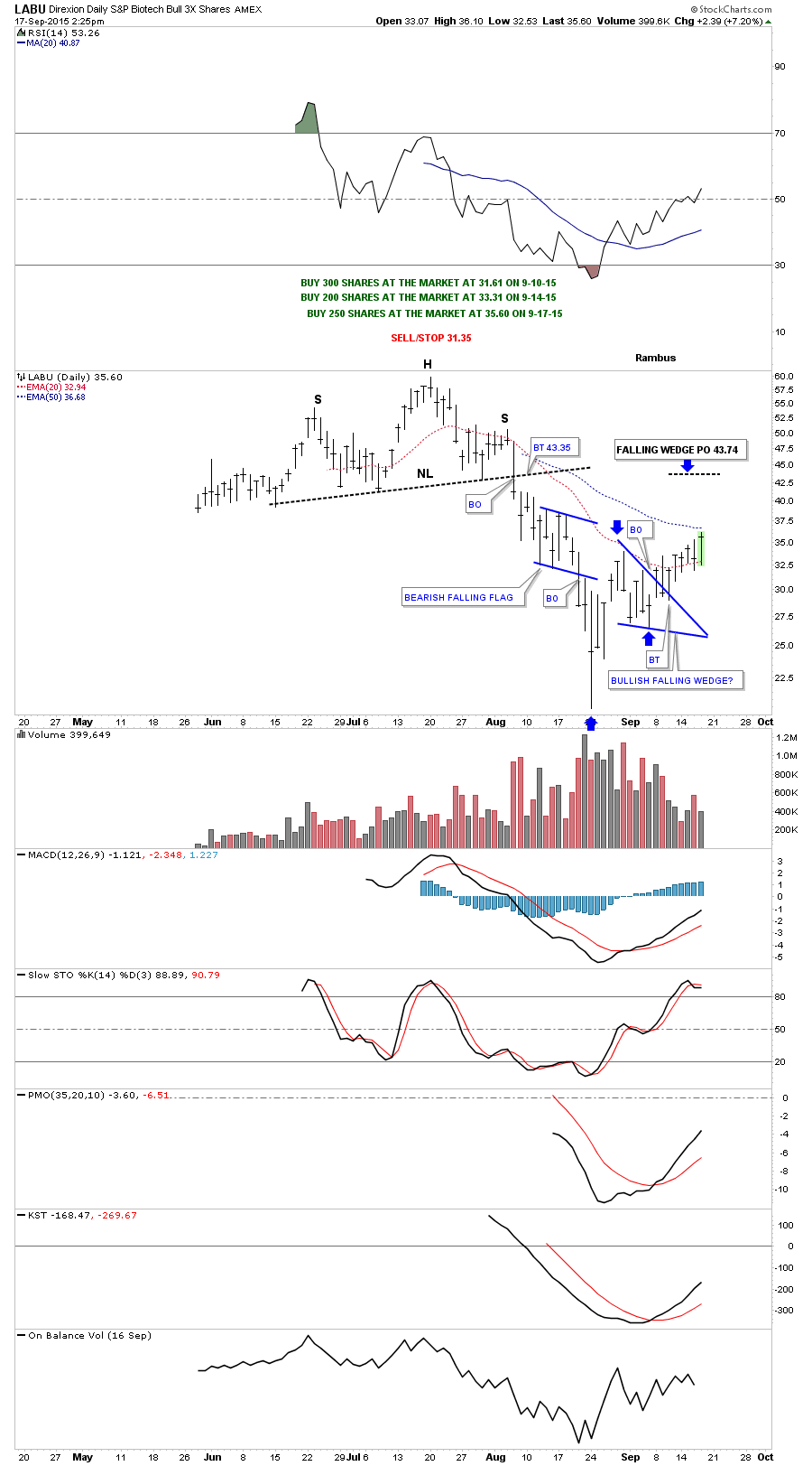
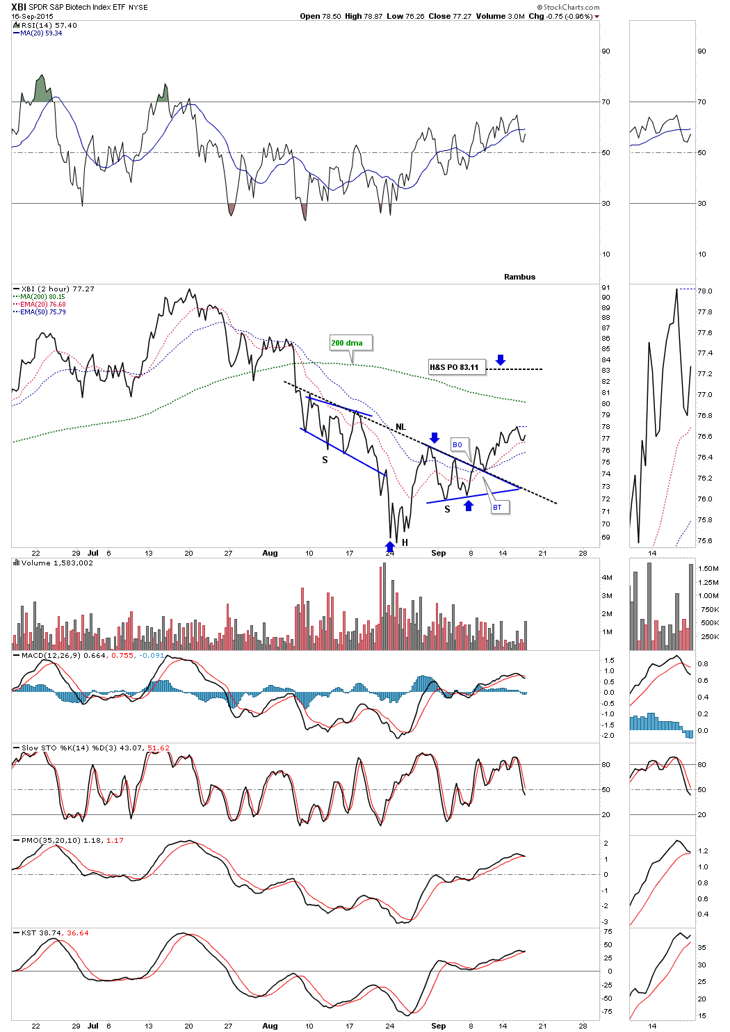
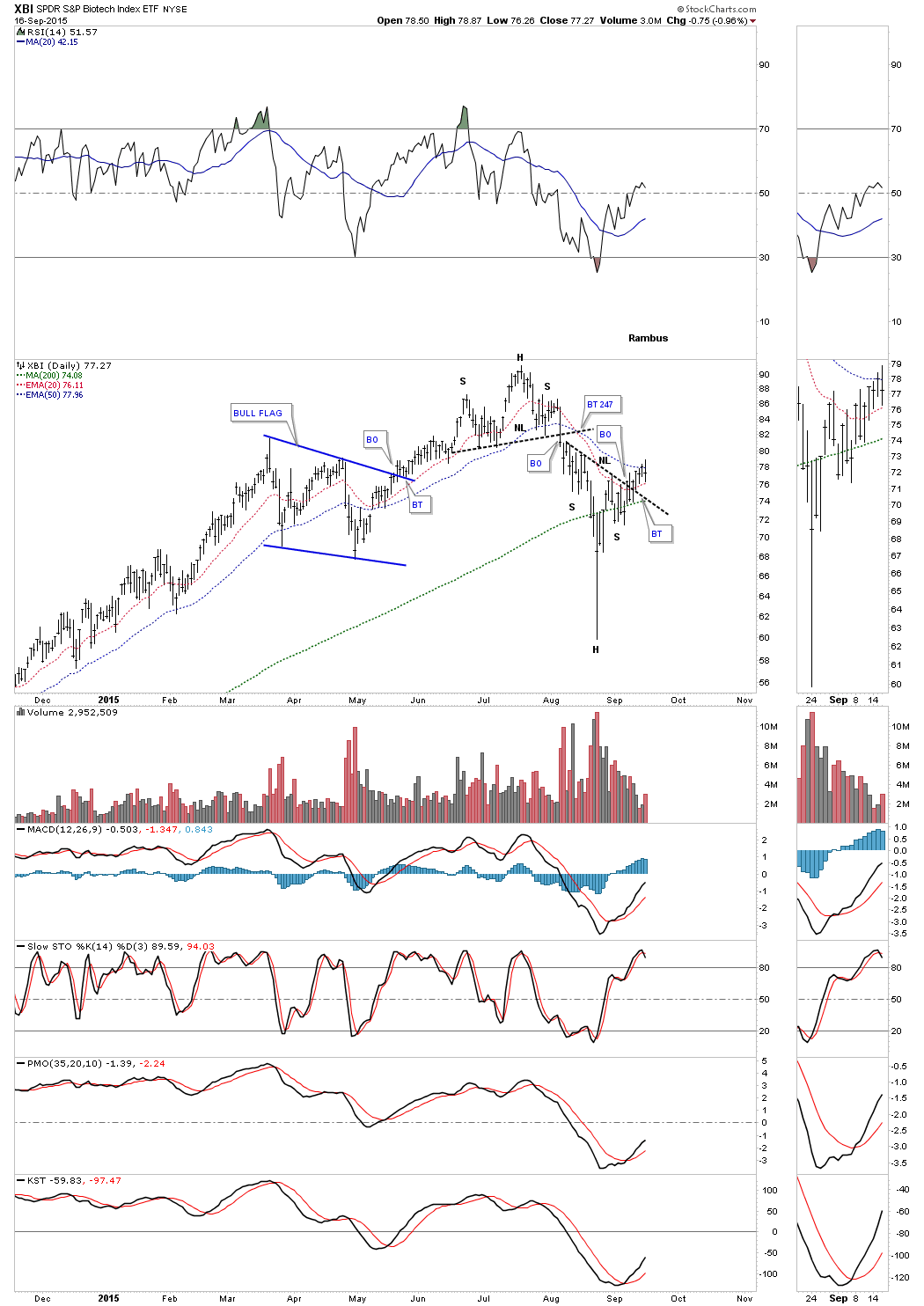
We have several positions, long the biotech sector, using LABU, which is a 3 X long etf. The 2 hour line chart below shows an inverse H&S bottom that has broken out above the neckline.
The daily chart for the XBI shows a strongly slanted inverse H&S bottom in place. We could still see a backtest to the neckline and the 200 dma at around the 74.08 area.
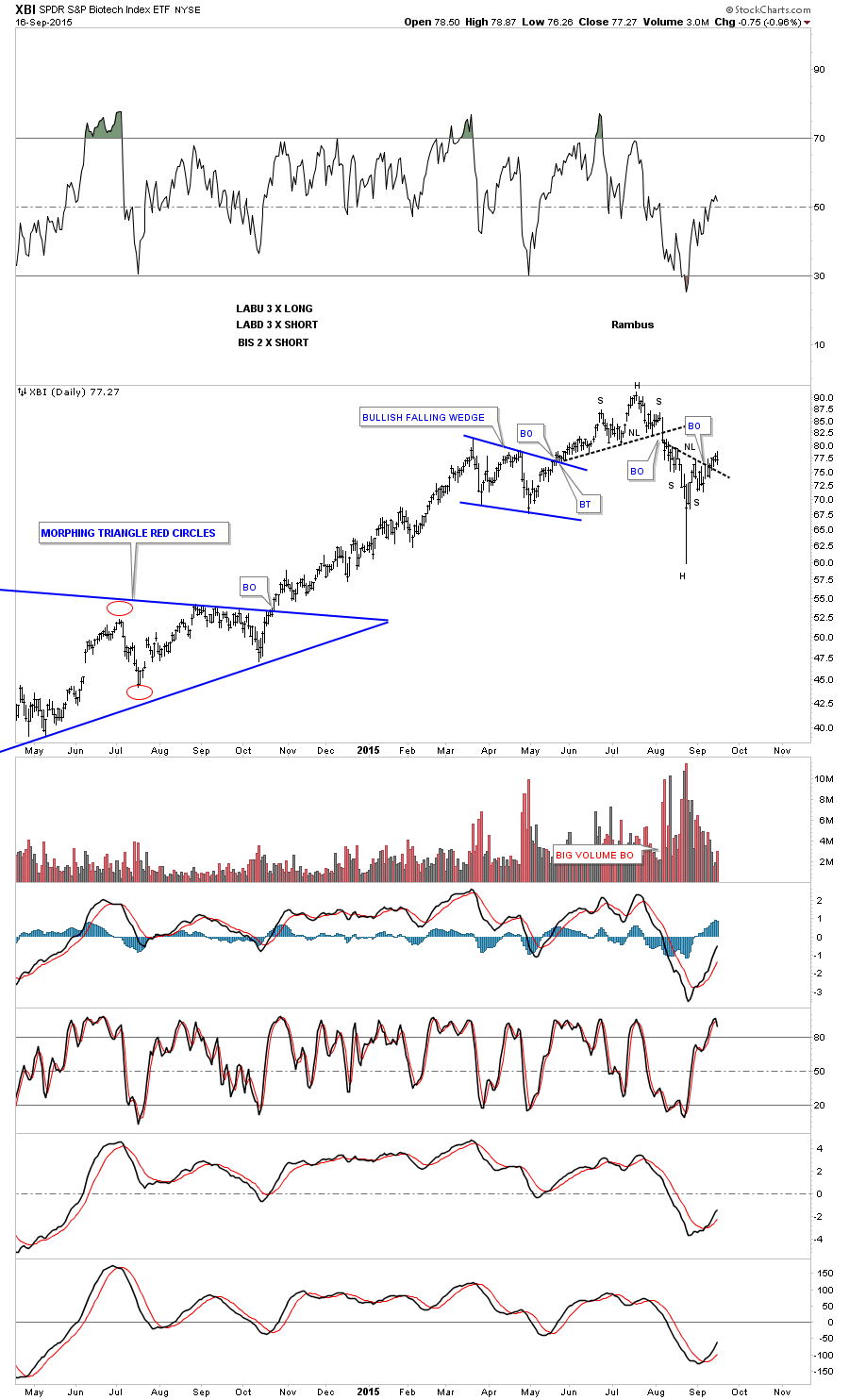
Next is a long term daily chart which shows the H&S top which led to the recent decline. Now we have an inverse H&S bottom which should reverse the short downtrend. The neckline is our line in the sand, above positive and below negative.
Lets now look at the 60 minute bar chart we’ve been following for the GDM which shows the gap up this morning above the brown shaded S&R zone and now we can see a small H&S bottom neckline was also gapped at the same time. This is the reason I exited our Kamikaze positions this morning. The top of the brown shaded S&R zone was our line in the sand, below positive because we were short and above negative.
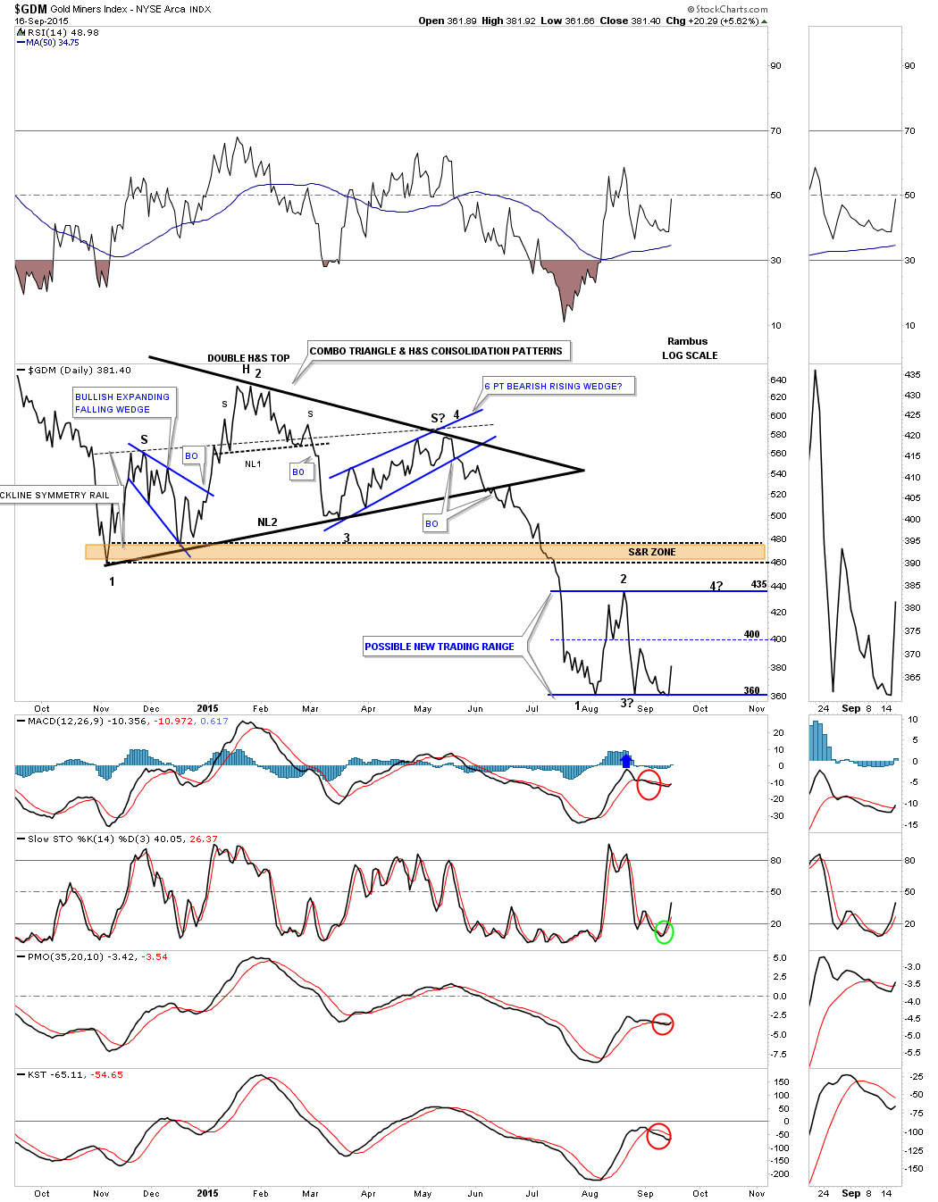
With the bounce off of the bottom rail this morning I now have to respect the fact that we maybe forming a sideways trading range with the bottom at 360 and the top at 435. If that is the case then the GDM is starting its 3rd reversal point to the upside which won’t be complete until we find where the possible fourth reversal point begins.
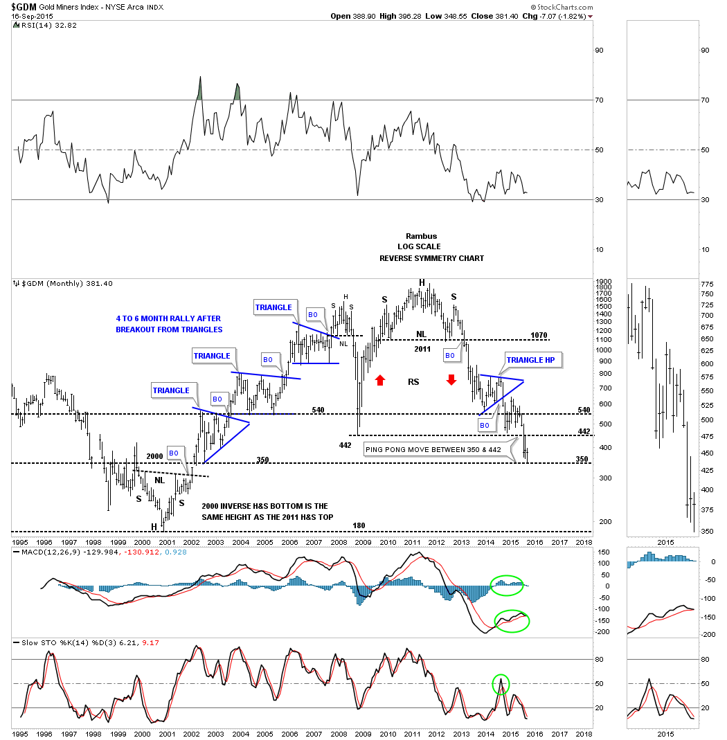
Below is a long term monthly chart which is showing us a possible ping pong move between support at 350 and resistance at the previous low around the 442 area. That would tie into the possible horizontal trading range we looked at earlier.
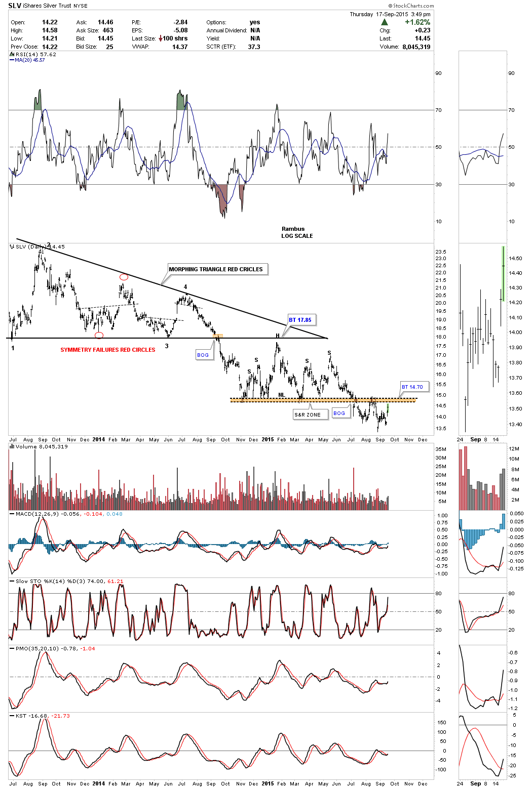
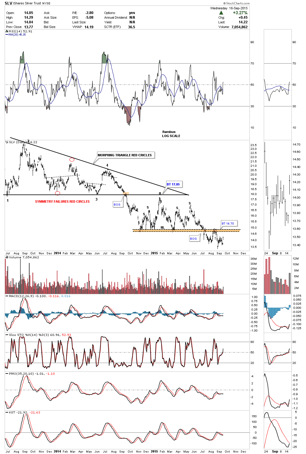
The long term daily chart for SLV shows the brown shaded S&R zone / neckline coming in at 14.70 which has held resistance several times so far.
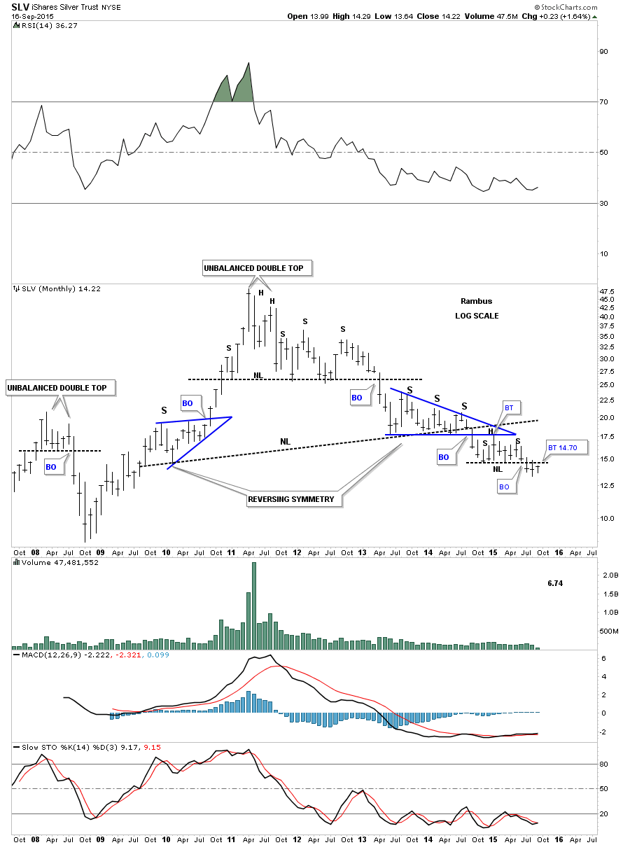
The long term monthly chart for SLV shows you how important the neckline at 14.70 is. We are now in our third month of breaking out and backtesting the neckline at 14.70.
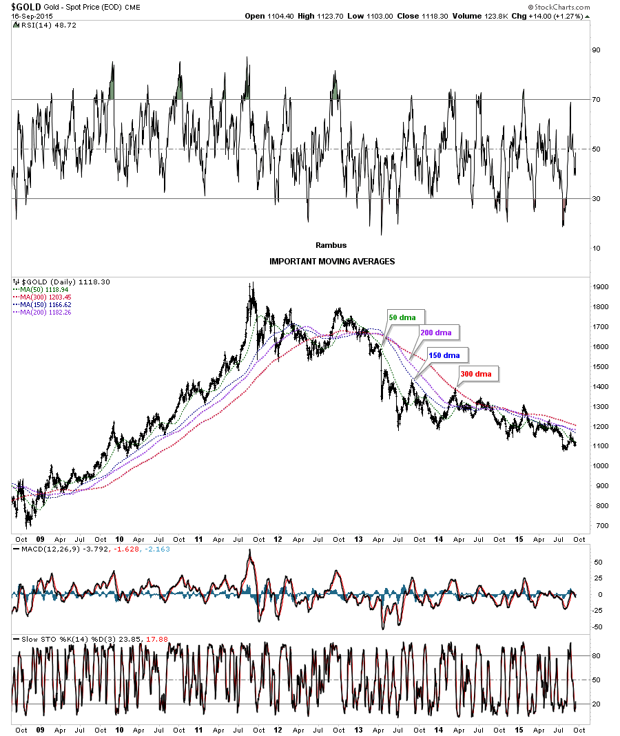
Next we’ll look at daily chart for Gold which shows all the important moving averages. Today Gold tested the 50 dma with the other 3 just overhead.
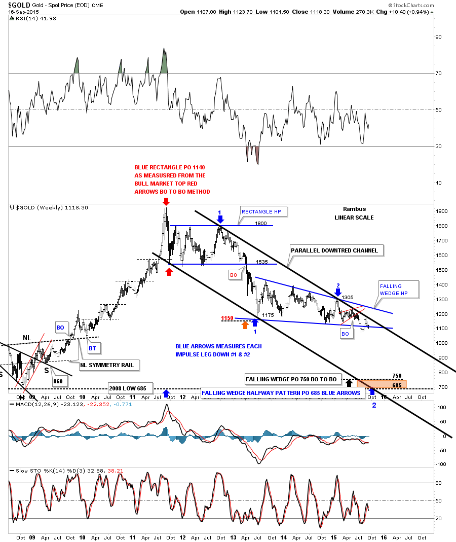
The next chart for Gold is a weekly look that shows the downtrend channel that has been in force since the bull market top. The top rail of the parallel downtrend channel was just recently touched about three weeks ago. The 65 week moving average now comes in at 12.07.
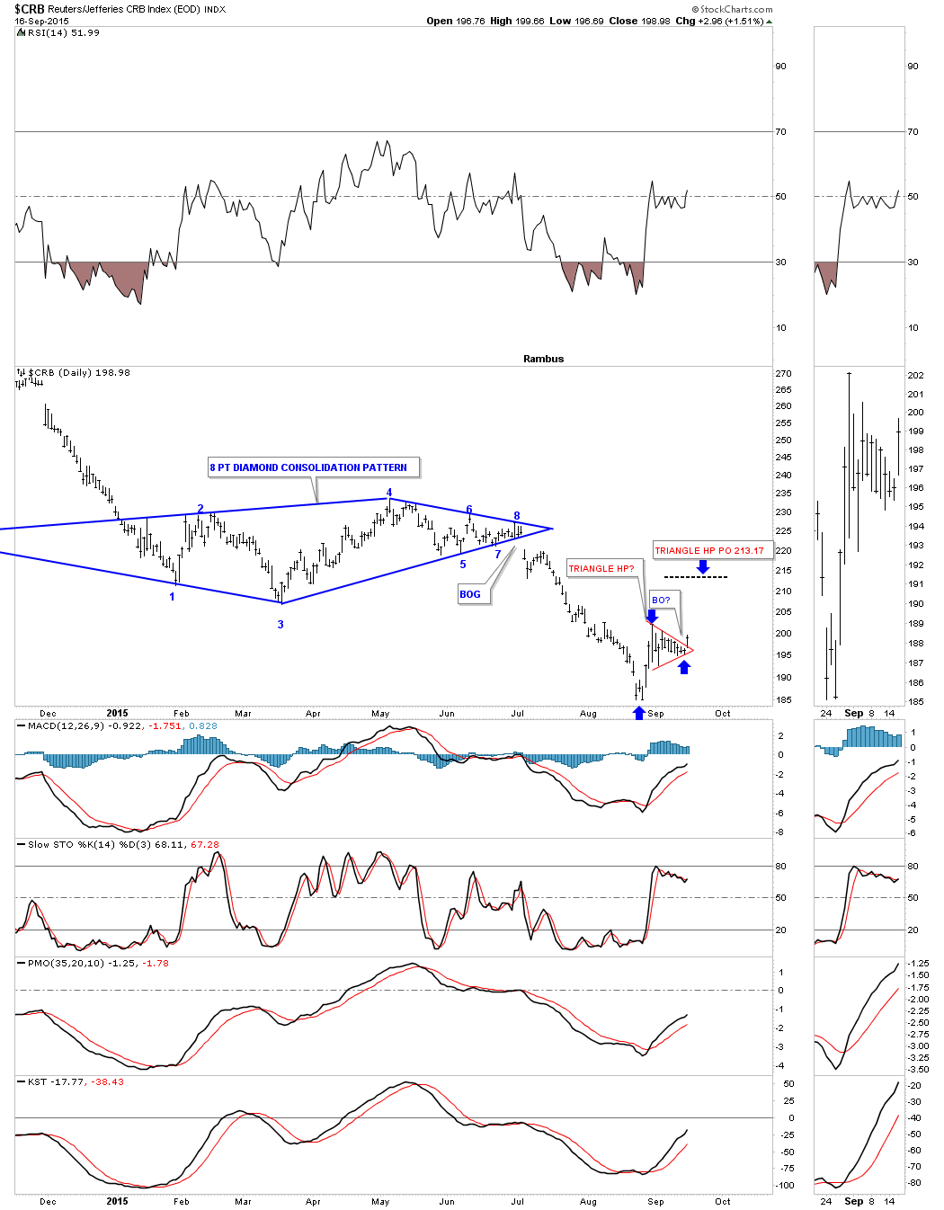
If the CRB index is showing us anything the little red triangle that broke out today maybe showing us a halfway pattern to 213 or so as shown by the blue arrows.
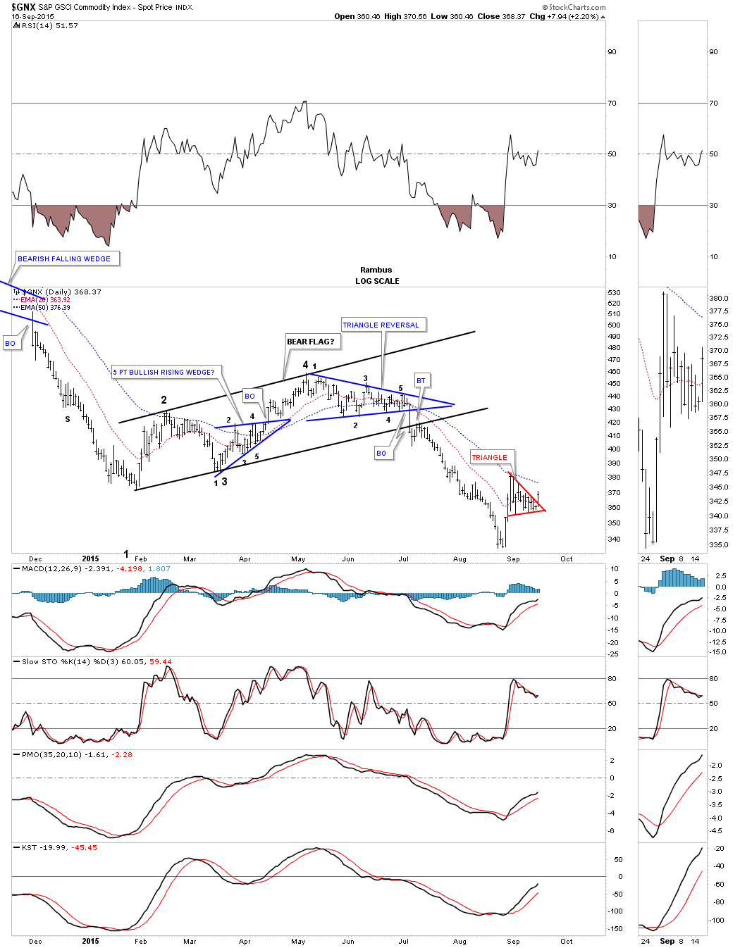
The daily chart for the $GNX, which is another commodities etf, shows the same small red triangle as the CRB.
Lets look at one last commodities index the DBC which trades with alot of volume. It to is showing us a small red triangle that I’m viewing as a halfway pattern to the upside right now.
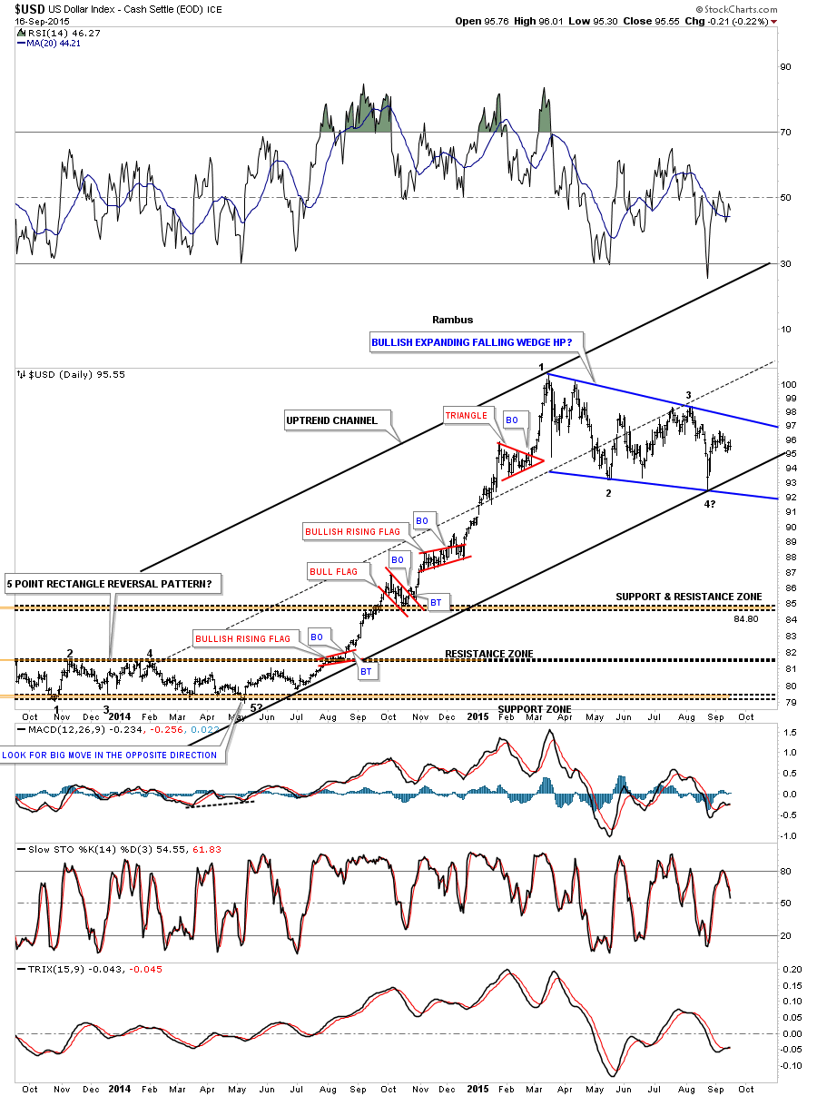
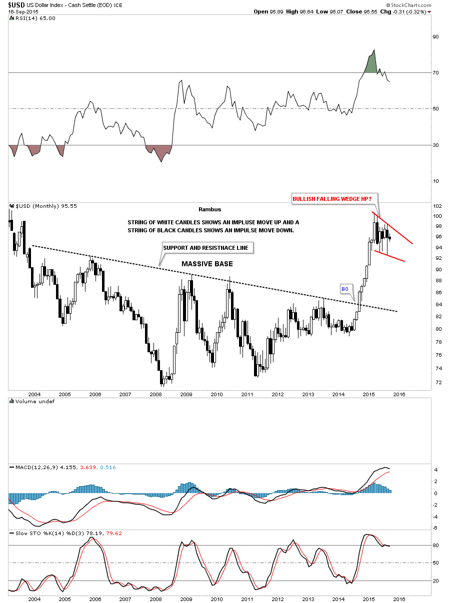
Lets finish up by looking at the US dollar for some clues on what might be happening. This daily chart shows the big impulse move up accompanied by all the small red consolidation patterns. After finally running out of gas earlier this year the US dollar has been chopping out a sideways trading range which looks like a bullish falling wedge at this point in time. As you can see the US dollar has completed 3 reversal points so far with the fourth one in progress.
The long term monthly chart for the US dollar shows you some classic Chartology. Note the massive base that formed over 10 years. Note the string of white candles that formed the impulse move up. With such a big base it stands to reason that the US dollar would be forming a halfway pattern in this general area. It’s just consolidating that massive rise out of that big base.
Depending on how tomorrow goes I have many more charts to show you on the stock markets. I’m going to wait until after the fed announcement tomorrow before I take a position in the stock markets. Tomorrow should be interesting as usual on the fed announcement days. I hope this posts. All the best…Rambus
Late Friday Night Charts…Psychological Warfare in the PMs vs the Big Picture
Tonight we’ll look at the precious metals complex and see how this game of psychological warfare looks from a Chartology perspective. I know many are disappointed by the short covering rally at the end of today’s trading but this is how markets work. They do everything they can to throw you off the trade and just when you think you have it figured out it will change again. The big question is did this short covering rally change the bigger picture? If one just looks at the very short minute charts they will see the end of the day rally as being pretty significant but the further you go out in time the less it affects the appearance of the chart.
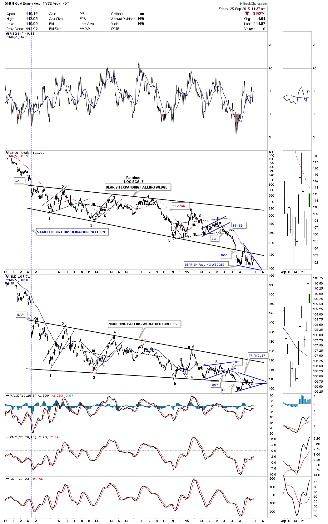
Lets start by looking at the combo chart for the HUI and GLD that we’ve been follow for a long time now. Both the HUI and GLD started their 27 months consolidation patterns on the same day back in April of 2013. They both broke below their respective bottom trendlines on the same day on July 16th of this year. That big breakout occurred on very heavy volume with a big breakout gap. The breakout is now almost two months in the making. Remember how you felt when the HUI gapped back above the bottom rail of its big bearish expanding falling wedge? How could this be with such a perfect breakout? Now when you look at the HUI chart on top that move back above the bottom rail doesn’t look so terrible now as the HUI made a new multi year low at one point today.
The GLD chart at the bottom stayed inside of its bearish falling wedge a little longer than the HUI did but this week it broke back below its bottom trendline. You can see it made a small H&S pattern right on the bottom rail. It’s now in the process of backtesting both trendlines which would come in around the 108 area. This combo chart shows nothing is broken yet with these two stocks only short sellers spirits.
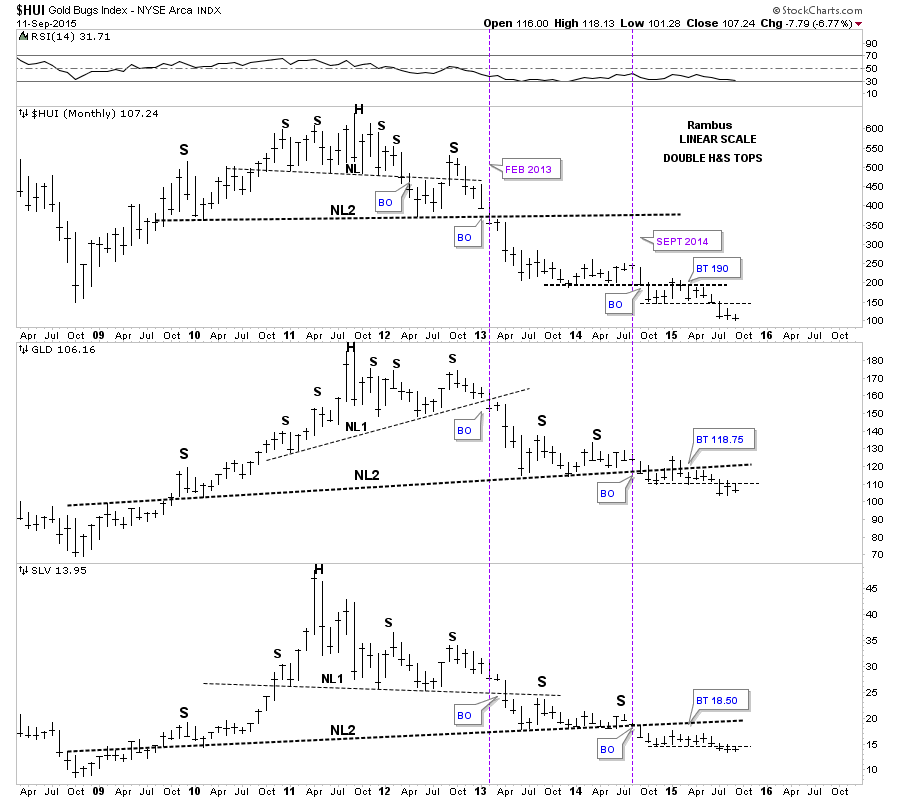
Below is a triple combo chart which has the HUI on top, GLD in the middle and SLV on the bottom. This is a comparison chart which shows you how they tend to move together. It’s not a perfect correlation but pretty close. This chart makes it very clear that the HUI has been leading the metals lower as it was the first one to breakout of its smaller H&S #1 neckline. As you can see all three formed a double H&S top. Almost exactly one year ago both GLD and SLV broke below their neckline #2 and have been backtesting it ever since. That’s almost a whole year of chopping sideways going basically nowhere. The main takeaway from this chart is that the big neckline #2 has held resistance for GLD and SLV. As you can see the HUI and SLV are trading at multi year lows for the month of September with GLD not far behind.
What is striking about this triple combo chart is how much weaker the HUI has been vs the metals. I think this chart is giving us a pretty clear picture of which one of these three is going to bottom first. Note how much lower the price action is for the HUI vs GLD & SLV. GLD and SLV are still pretty close to their respective neckline #2 while the HUI is trading way below its neckline #2 in both time and price. So from a long term monthly perspective there is nothing remotely bullish about these three stocks as they’re basically trading at four year lows.
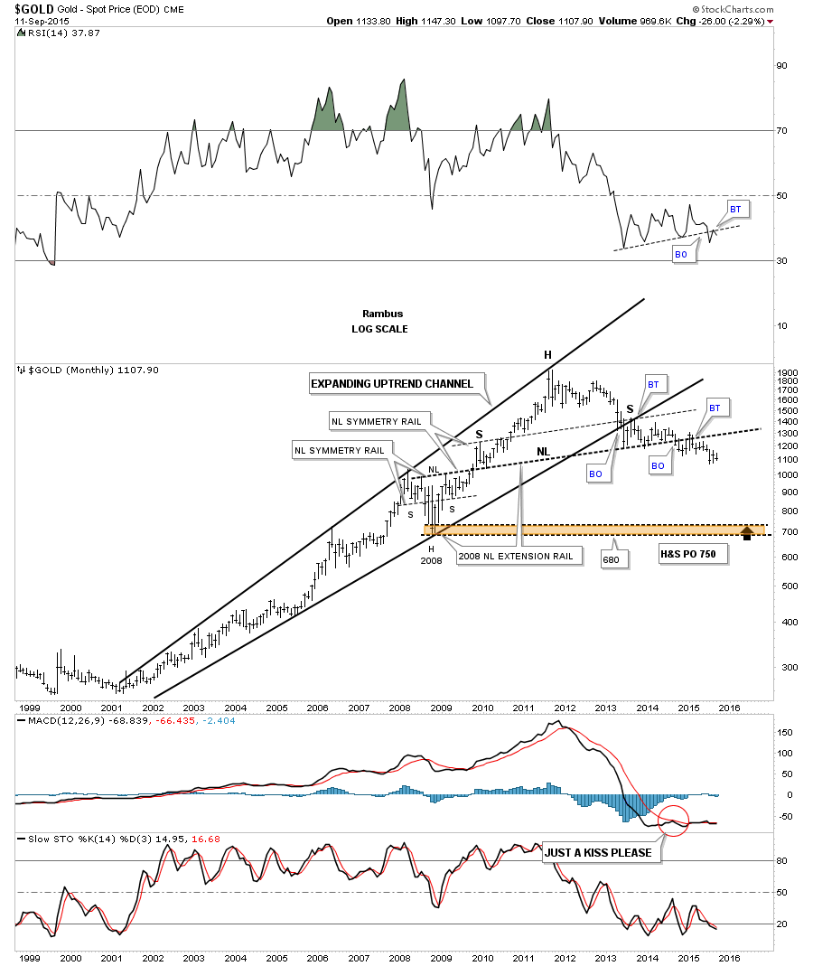
The next chart is a monthly look at gold which shows its bull market created and expanding rising wedge. It has a classic symmetrical H&S top as shown by the neckline symmetry line which shows the height for the left and right shoulders. Another interesting thing about that massive H&S top is how the left shoulder and head formed inside of the expanding rising wedge while the right shoulder formed as the backtest to the underside of the bottom rail of the bearish expanding rising wedge. The brown shaded area shows the possible two price objectives. The massive H&S top measures down to the 750 area while the 2008 crash low comes in at the 680 area. Its been close to two years now since I first posted the possibility for the massive H&S top which I know feels like an eternity for some of you but this is a very big pattern which takes time to setup the impulse move down. It’s impossible to chart every little wiggle a stock makes but the big picture for gold, I laid out a long time ago, is still working and nothing is broken. Just think for a moment of all the gold bugs that still don’t see the big picture that will eventually capitulate their shares at a lower price than today’s.
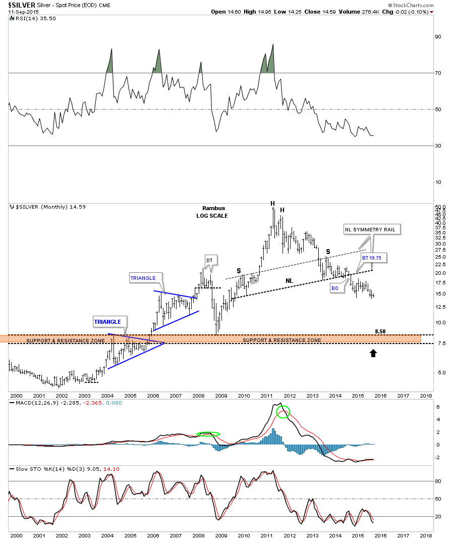
The long term monthly chart for silver also shows a very symmetrical H&S top in place. The brown shaded S&R zone shows the price objective for the massive H&S top.
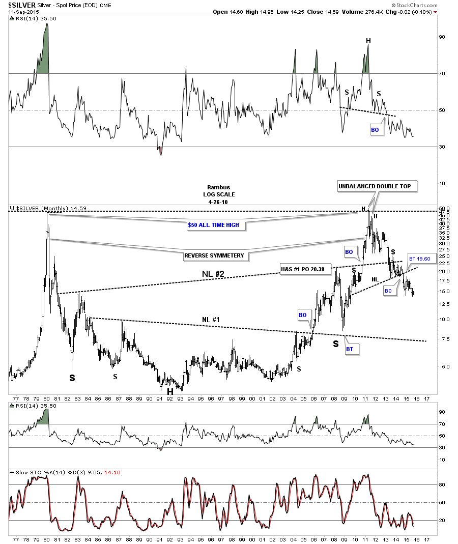
Lets look at one last chart for tonight which is a 40 year monthly chart for silver. This chart shows some nice reverse symmetry going all the way back to the 1980 bull market peak at 50. You can also see the H&S top that I showed you on the shorter term monthly chart above on the far right hand side of the chart. I could be wrong but it looks like the price action is just suspended in thin air waiting for gravity to take it down. As always we’ll know in the fullness of time. All the best…Rambus
Really Late Friday Night Charts…THE MOST IMPORTANT CHART on the PLANET
Sorry goldbugs ,it is not the gold chart .
There are a lot of opinions out there on the US Dollar . Many of them are bearish in the short medium and long term time frames.
So lets see what the Charts are whispering .
With all the volatility this week in markets around the world the US dollar made an interesting move. The long term daily chart below shows the five point rectangle, at the bottom left hand side of the chart, that launched the big breakout and impulse move higher in May of 2014. If you look at reversal point #5 with a question mark on it you’ll see the comment I made at the time which I noted, this could be a false breakout to the downside and we might see a big move in the opposite direction, which was up. Keep in mind the chart was much bigger back then and the false breakout also looked much bigger. As you can see that indeed was a false breakout to the downside which led to the impulse move up we found ourselves in until the US dollar topped out earlier this year and has been building out the next consolidation pattern.
It’s still not completed yet but the consolidation pattern is taking on the formation of a triangle consolidation pattern. Right now I’m looking at the last dip below the bottom rail of the black triangle consolidation pattern as a possible false breakout which if that turns out to be the case then this triangle consolidation should be finishing up and we should expect a big move in the opposite direction of the false breakout, which would be up. Until the top rail is touched tho this possible fourth reversal point is still under construction with no confirmation yet that the triangle has completed its job of giving the US dollar time to consolidate that big impulse move up.
Below is a daily line chart which shows the three smaller consolidation patterns that made up the last impulse move higher to our most recent high. Many times you will see at least three smaller consolation patterns form that make up a strong impulse leg. After you see the third small consolidation pattern form you generally know the end is getting near. The daily line chart shows the US dollar has some overhead resistance to contend with in the near term. If the bull’s are really in charge the US dollar will need to take out all the above overhead resistance, moving averages, small neckline and the top rail of the black triangle.
The monthly candlestick chart for the US dollar shows it massive base it broke out of. Note the string of white candlesticks all in a row which shows us how strong that first impulse leg up was. Now look at the candlesticks since the US dollar topped out earlier this year. You can see there are some white and back candles with the price action going nowhere which tells us the US dollar is still consolidating. Remember a big base leads to a big move which the US dollar has.
I have been watching the 40 year monthly chart for the US dollar , since we opened the doors here at Rambus Chartology ,
This all important chart shows a massive falling wedge with the two big fractal bases, base #1 and base #2. The breakout from big base #1 shows a backtest to the the big base trendline well over a year later but it didn’t alter the inevitable outcome to its bull market top in 2000. Now note the current breakout from big base #2 which was more vertical than big base #1. Instead of getting a backtest to the big base #2 trendline we are getting the backtest to the top rail of the bullish falling wedge which we’ve been following ever since the US dollar broke out above it. The backtest to the top rail of the blue bullish falling wedge has been picture perfect which includes this months bar with a long tail. So far the breakout and backtest is exactly what we wanted to see. Sorry or the late Friday Night Charts. All the best…Rambus
GDM Update…
Last night in the Wednesday Report I posted this daily chart for the GDM explaining why the current low was so critical. The current low could be the third reversal point in a bigger consolidation pattern in which we would need one more counter trend rally to get the 4th reversal point. Hopefully we’ll be able to buy back our Kamikaze stocks at a lower price which means a higher price for the GDM. If this bottom doesn’t hold on the GDM we’ll have to buy the Kamikaze stocks at a higher price. Either way we’ll get positioned again when the time is right.
The GDX possible new trading range.
The HUI’s possible trading range with the 50 dma coming at at 128.02 right now.
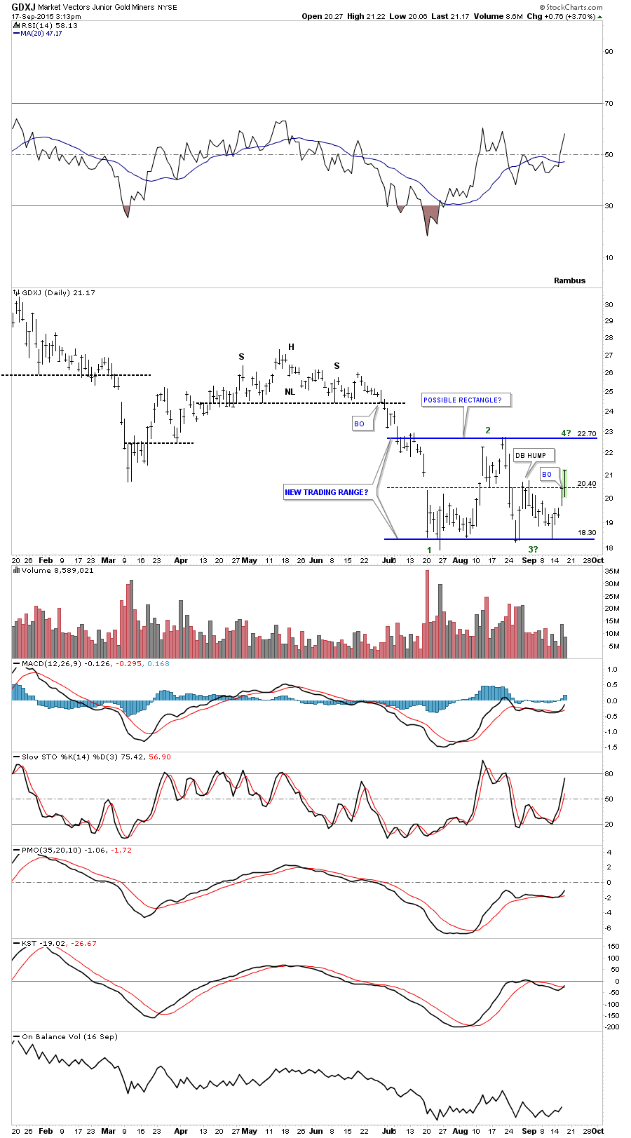
The daily line chart for the GDXJ shows the bounce and the areas of possible resistance labeled on the right side of the chart. The 19.50 area would be the highs made back in late July. Next would be the double top hump at 20.75 and then the brown shaded support and resistance zone.
This weekly chart for the GDXJ is our main focus. We’ll have to see how the GDXJ lets us get repositioned again for the downside.