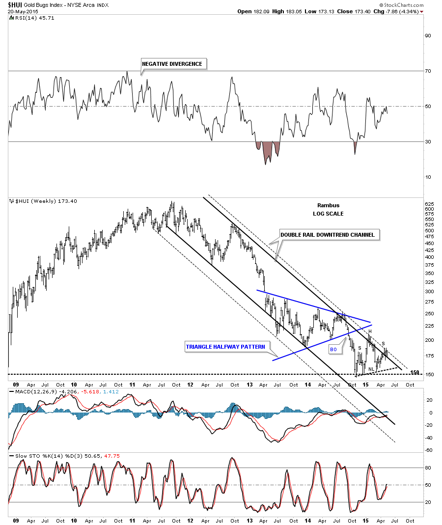
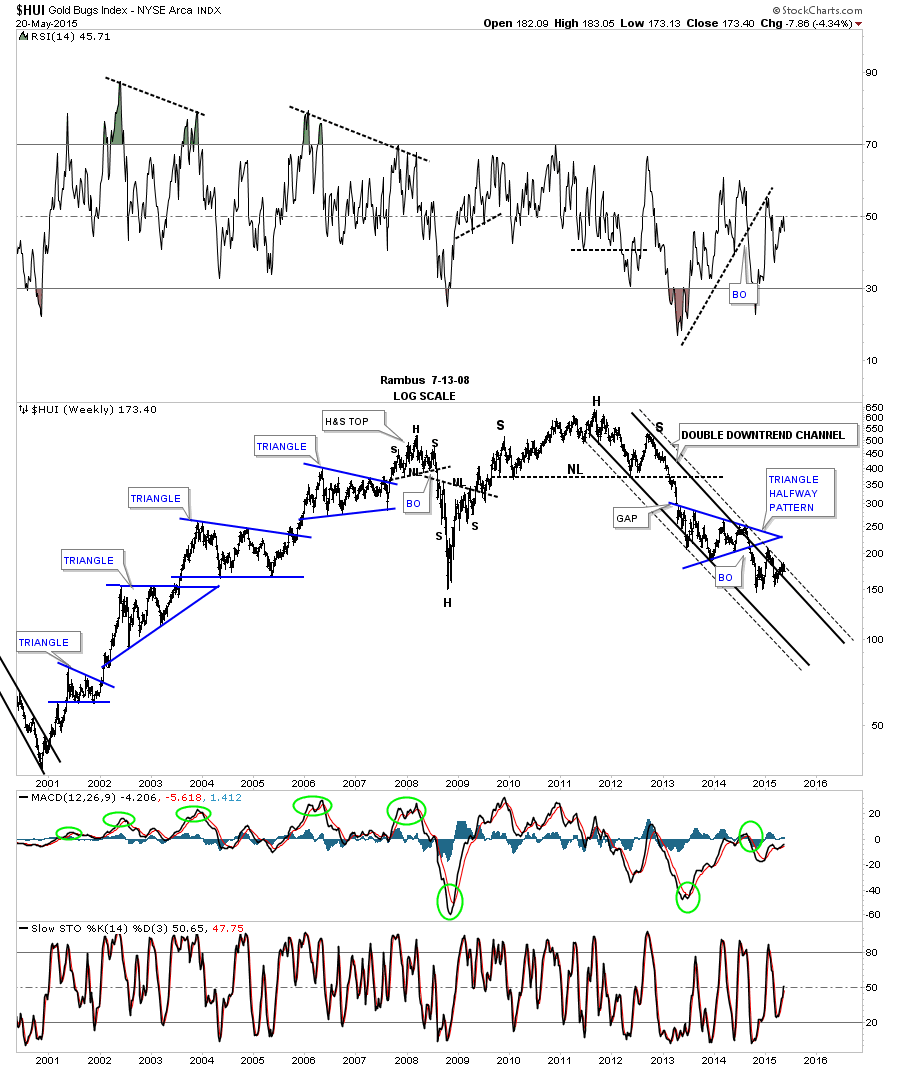
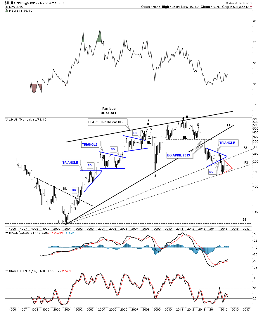
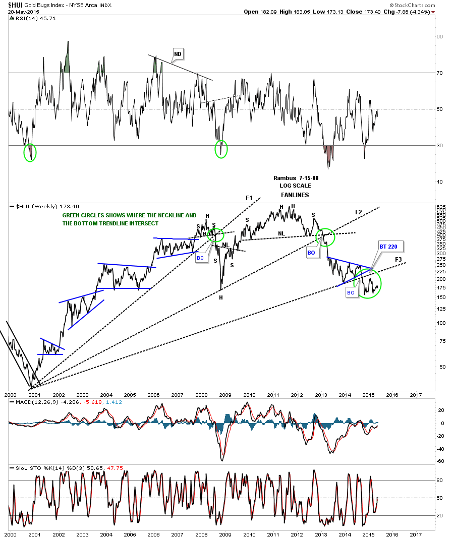
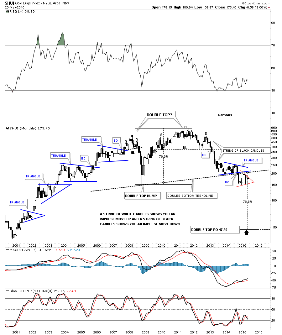
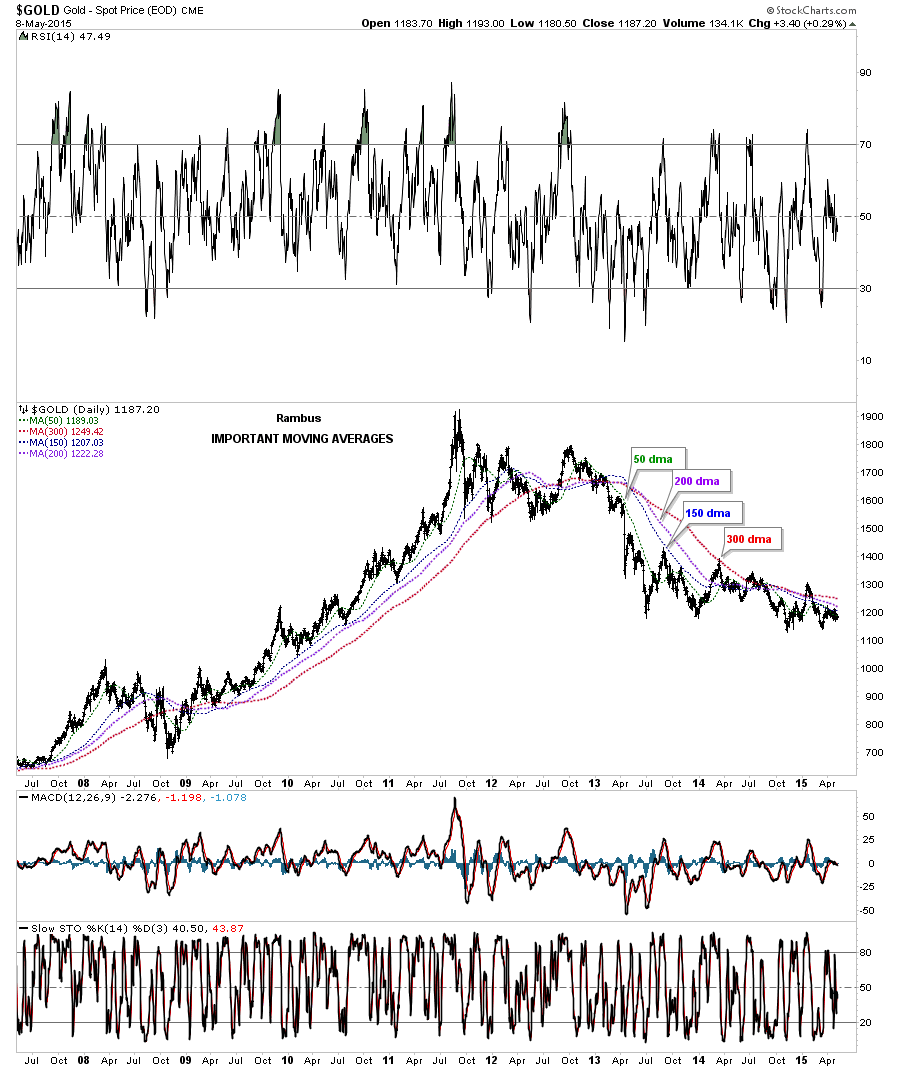
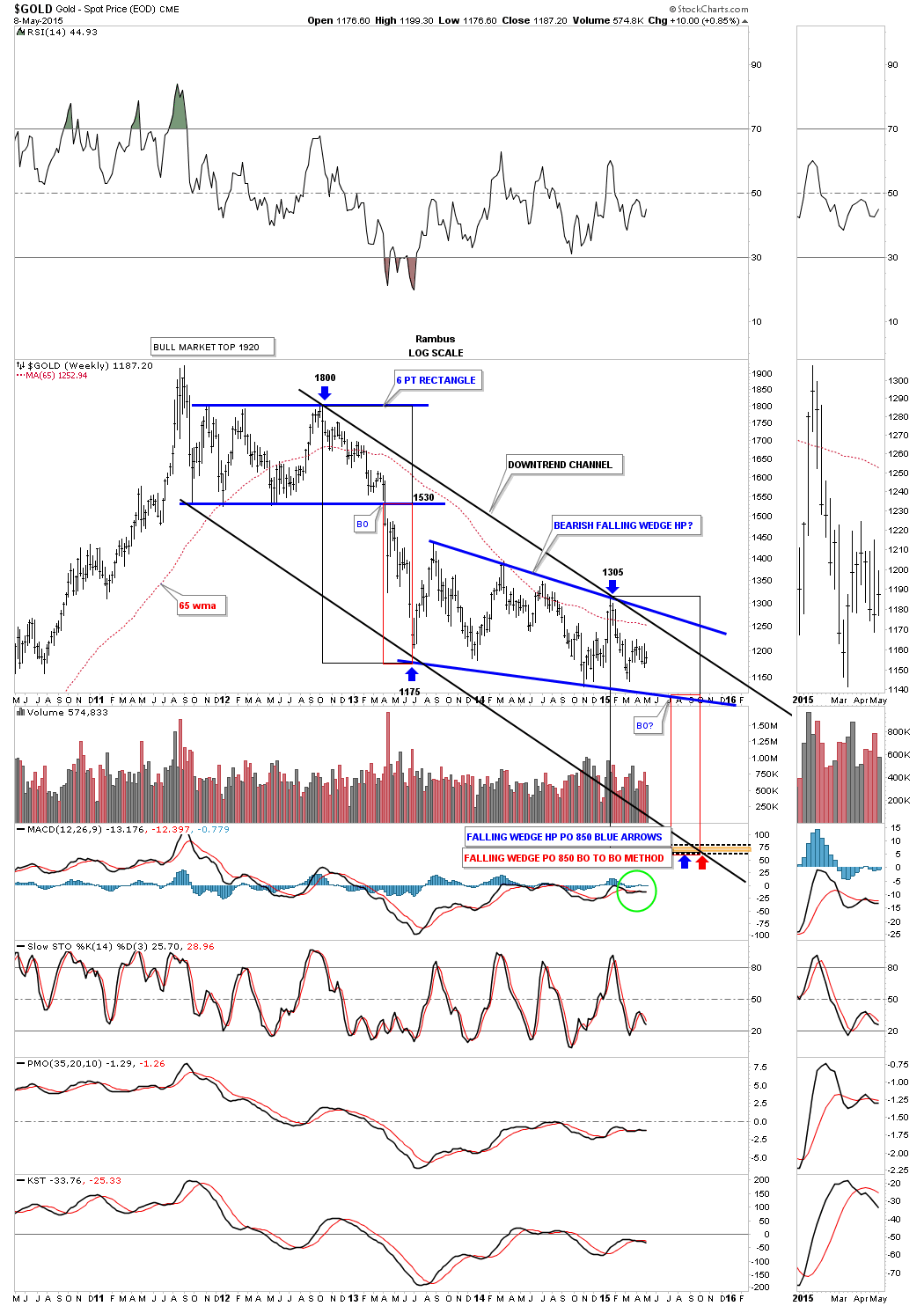
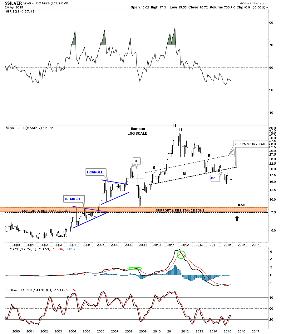
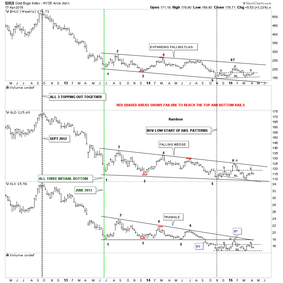
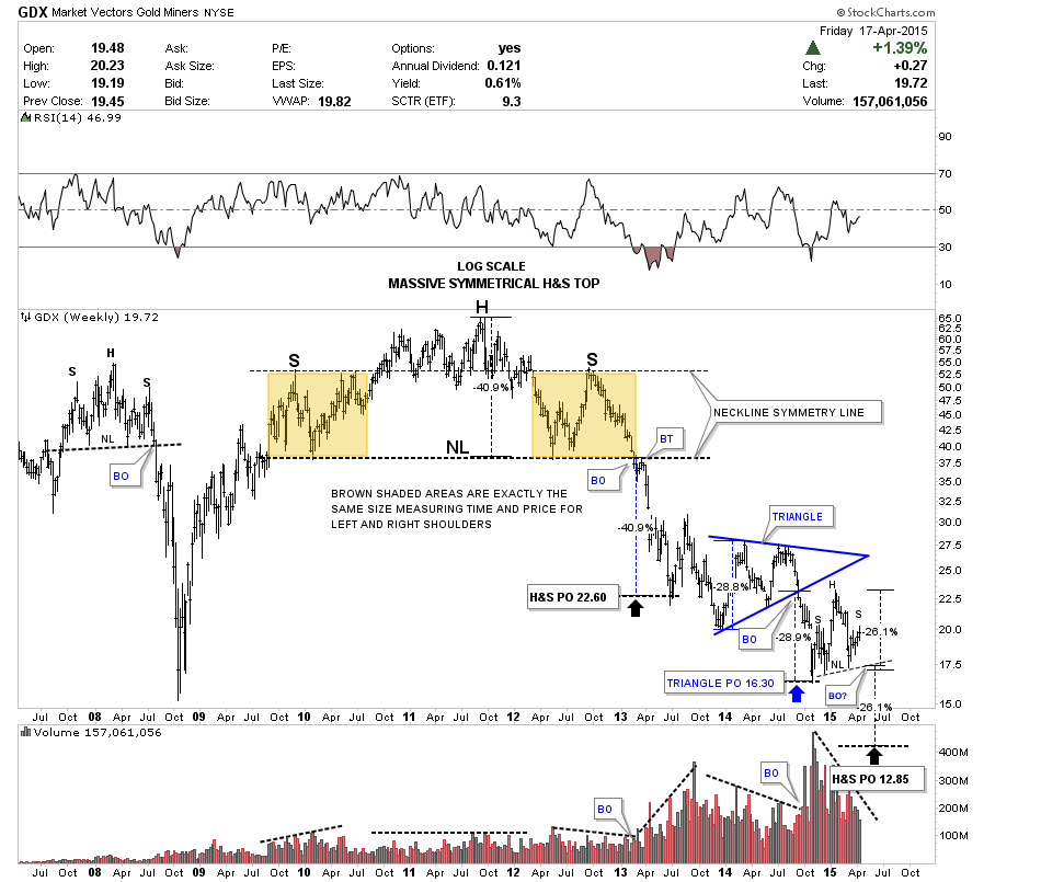
In this Weekend Report I would like to look at the longer term weekly and monthly charts for some of the precious metals stocks. Every time we get a small rally the gold bugs come out of the woodwork trying to explain why this time is different. At some point in time things will be different but I don’t believe that time is now. By focusing in on the longer term charts we can get a better feel for where some of these PM stocks are relative to where they’ve been especially the 2008 crash low which is a milestone since the 2000 bull market began for the PM complex. Even the bear market bottom in 2000 comes into play for some of the weaker precious metals stock, think South African miners.
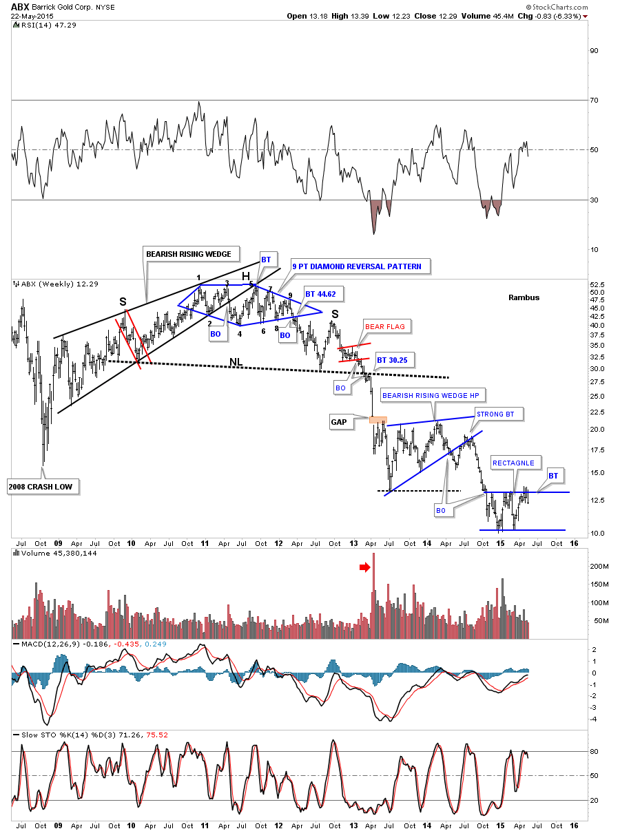
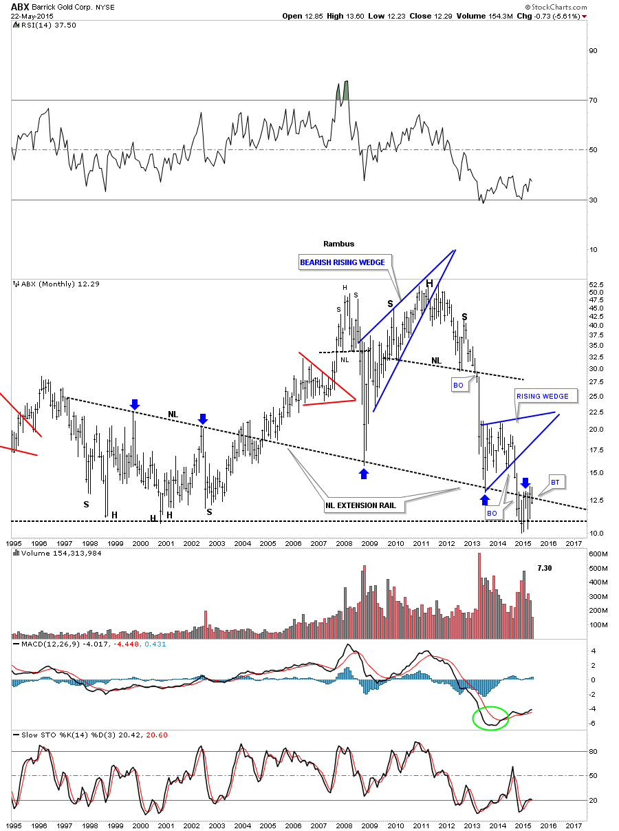
For most of the PM stocks their correction began late last year in November. Many have been just chopping sideways in a trading range going basically nowhere. A good example of this sideways trading range is a weekly look at ABX. For the last three weeks this big cap PM stock has been hitting the top rail of a potential rectangle consolidation pattern. You can see the top rail is forming just below the bottom of the bearish rising wedge. Also note how much lower ABX is trading vs the 2008 low.
This long term monthly chart shows how ABX is doing a ping pong move between the 2000 low and bottom of the rising wedge. This chart also shows you some nice reverse symmetry when ABX broke off of that massive H&S top.
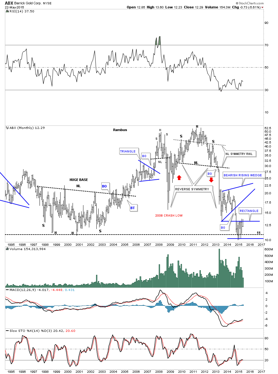
It’s has been a long time since I showed you this long term monthly chart for ABX where I extended the neckline to the right side of the chart from that massive H&S base that launched the bull market for ABX. That neckline is called a neckline extension rail as shown by the blue arrows.
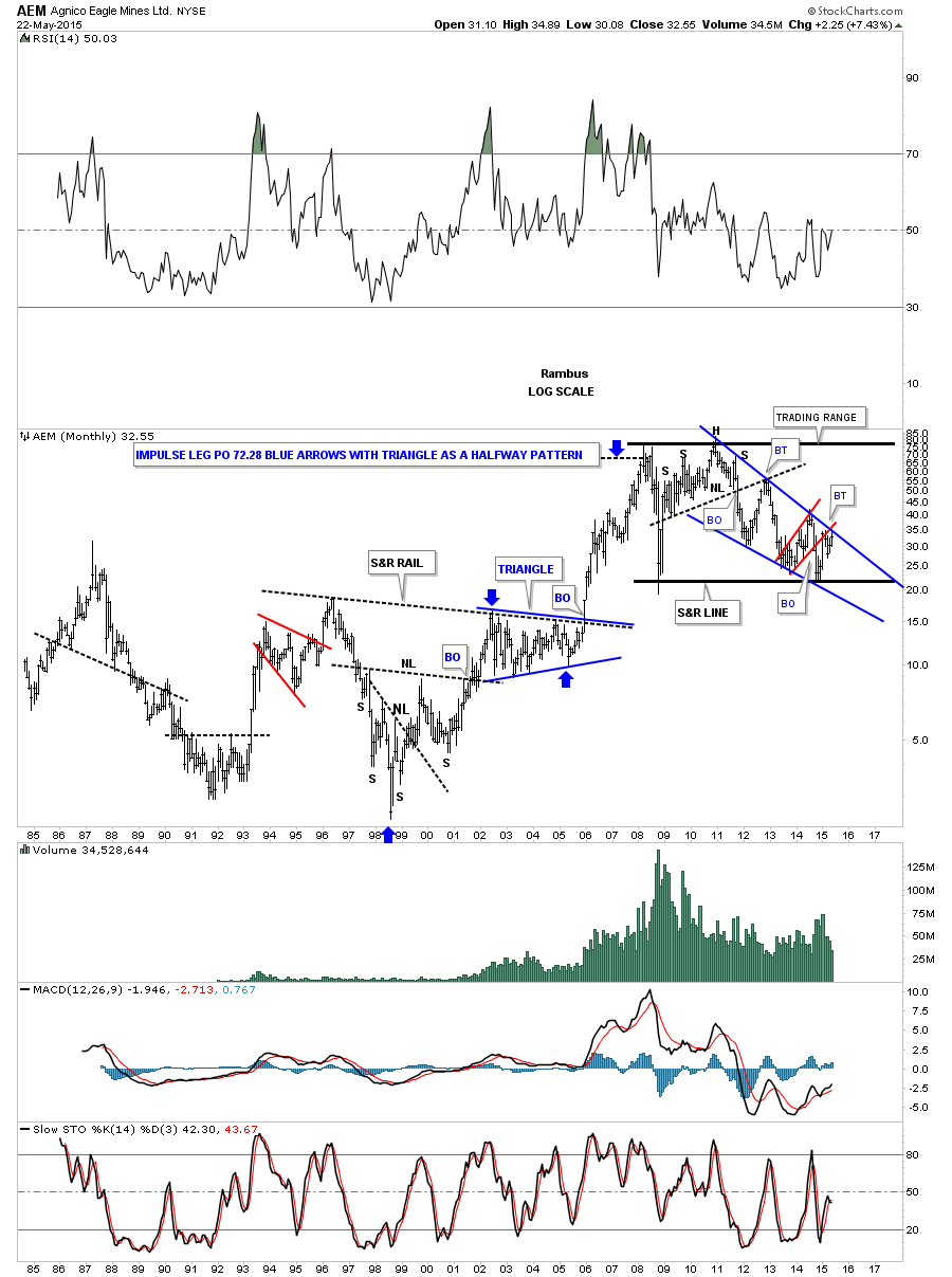
After completing its H&S top in 2011 AEM has been in a pretty tight falling wedge creating 6 reversal points so far with a possible 7th underway. Again note how the neckline extension rail caught the backtest from the H&S top.
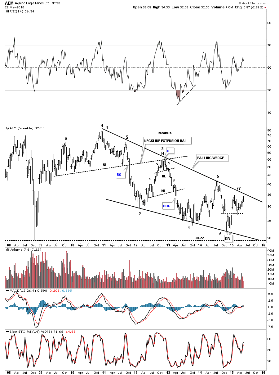
The long term monthly chart for AEM shows the blue falling wedge with the red bear flag being backtested right now. You can see AEM’s huge base that launched its bull market. The blue arrows measures each half of the impulse move up with the right shoulder triangle being the halfway pattern.
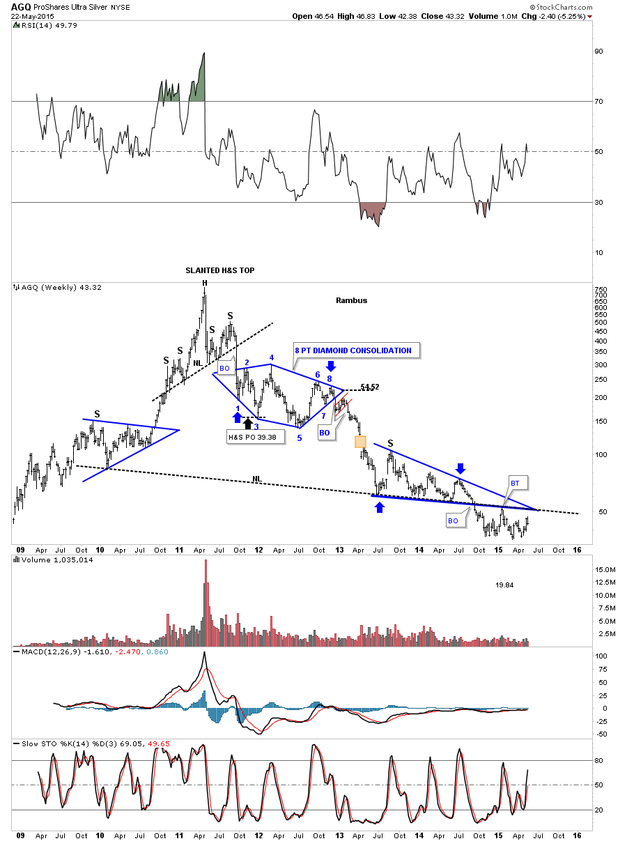
Below is a weekly chart for AGQ which is a long etf for silver. It’s been a long time since I posted this chart but from a Chartology perspective it has some really nice chart patterns with the biggest one being the possible H&S top. It’s bull market top was a strongly slanted H&S top.
The weekly chart for ASA shows it built out a 15 month blue rectangle consolidation pattern after breaking down from its big H&S topping pattern. Since the November low from last year it has been chopping out a sideways trading range in red. You can see there was a strong backtest to the bottom rail of the blue rectangle which in cases like this I will wait and see if the center dashed line can hold resistance. So far ASA has been unable to penetrate the blue dashed center line and is now trading back inside the smaller red trading range.
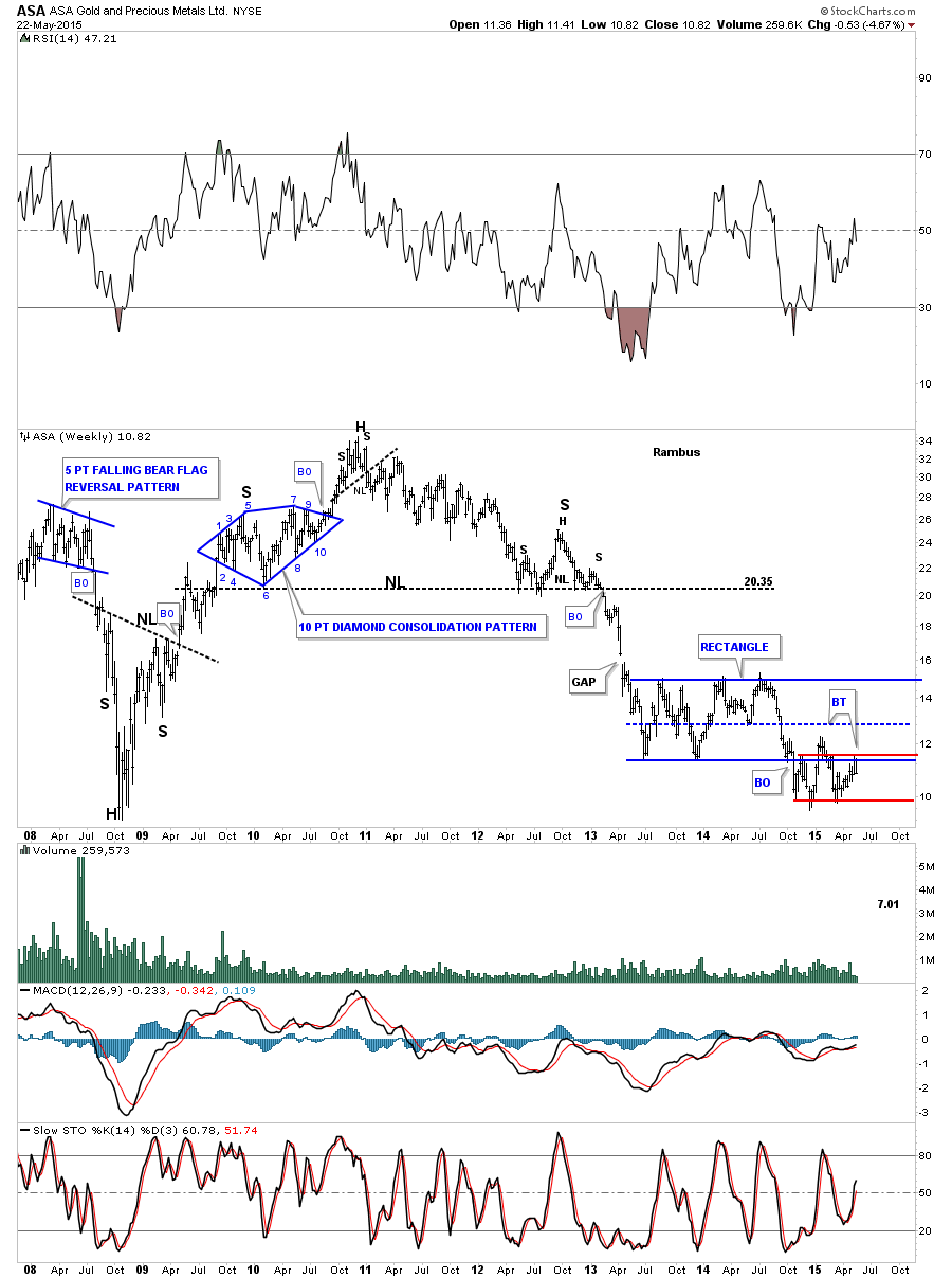
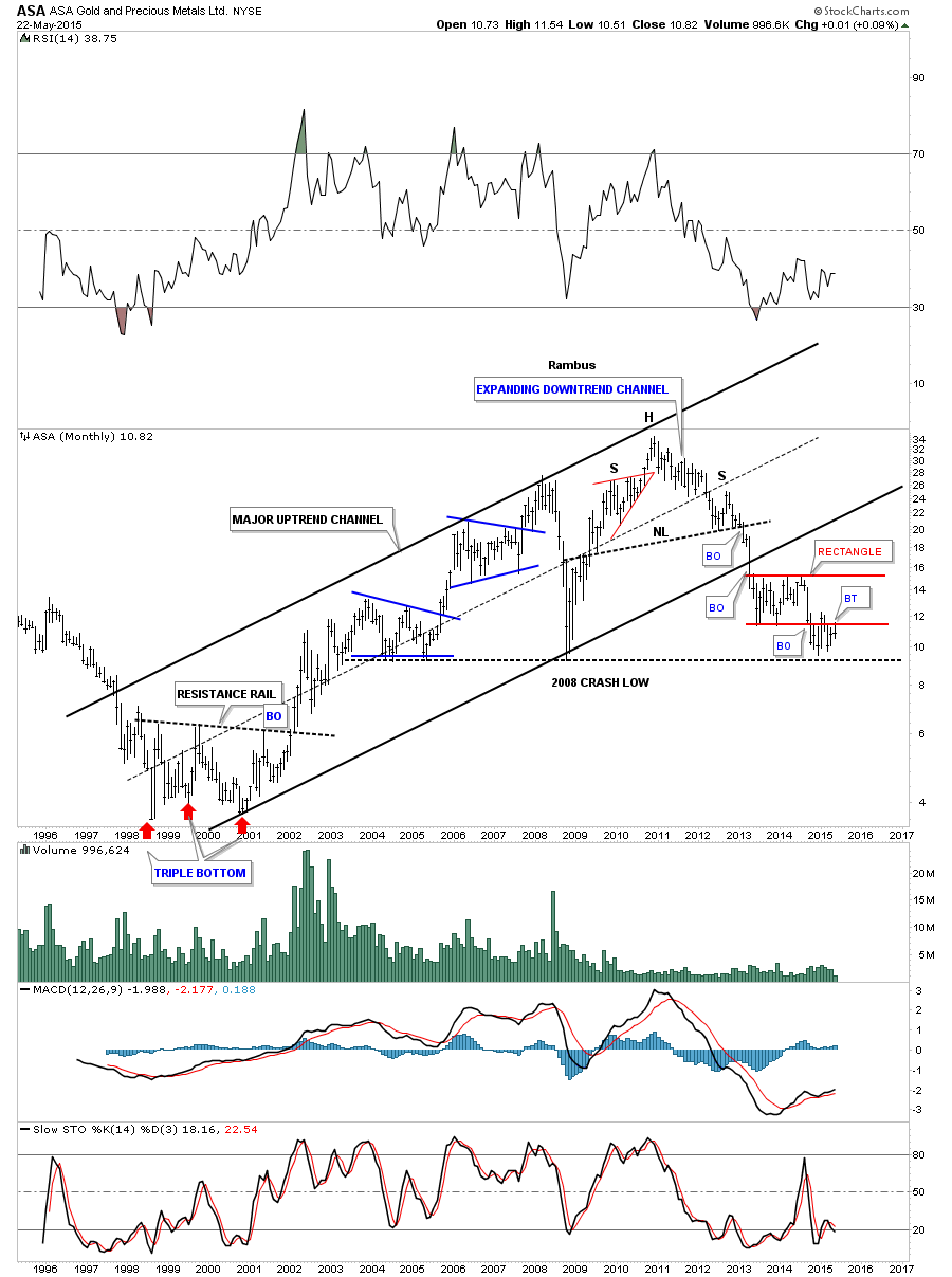
The long term monthly chart for ASA shows it built out a triple bottom to launch its bull market. ASA created a beautiful 10 year uptrend channel that broke down once the H&S top was completed. ASA is also doing a ping pong move between the 2008 low and the bottom rail of the red rectangle.
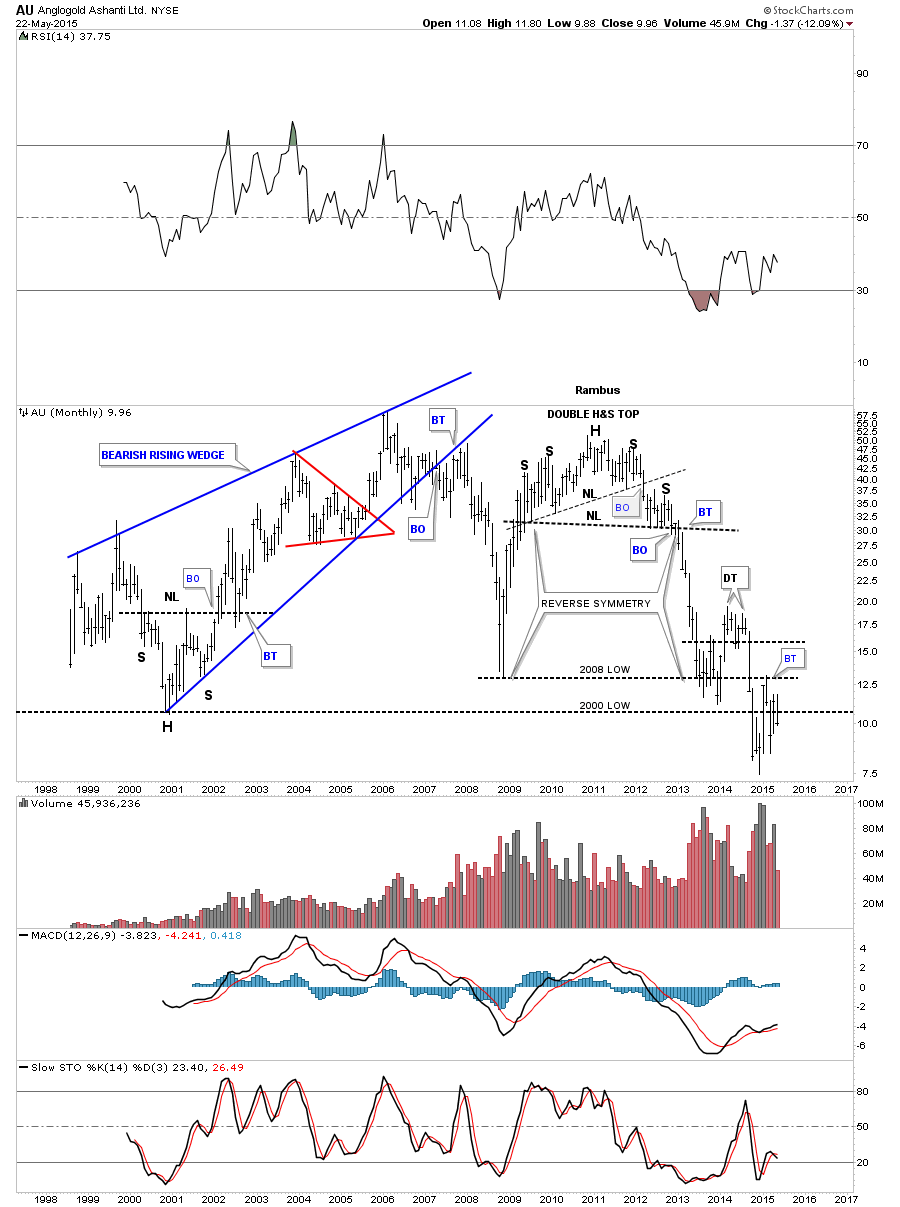
The monthly chart for AU shows it built out a double H&S top to end its bull market after building out an inverse H&S bottom to start its bull market. AU has been chopping wildly after testing its 2008 and 2000 lows. If it closes the month of May right where its at now it will again be below the 2000 low which tells us that anyone who bought this stock in the last 15 years is pretty much underwater unless they bought on the initial penetration of the 2000 low and even there some are holding loosing positions. This chart shows you just how hard it is to play a counter trend rally in a bear market.
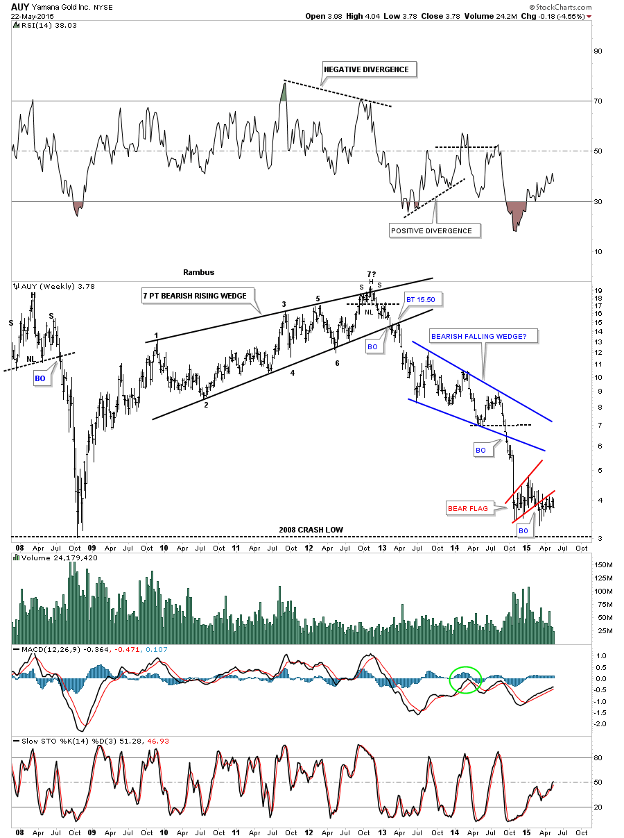
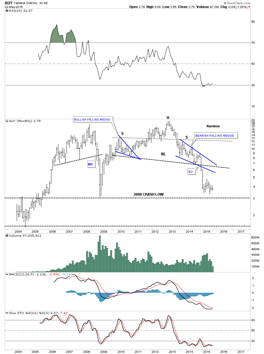
AUY built out several topping patterns to end its bull market. The weekly chart shows the 7 point bearish rising wedge complete with a breakout and backtest. From there it went on to form the blue bearish falling wedge and is now backtesting the red bear flag from below just above the 2008 crash low.
The monthly chart shows a pretty H&S top that reversed its bull market.
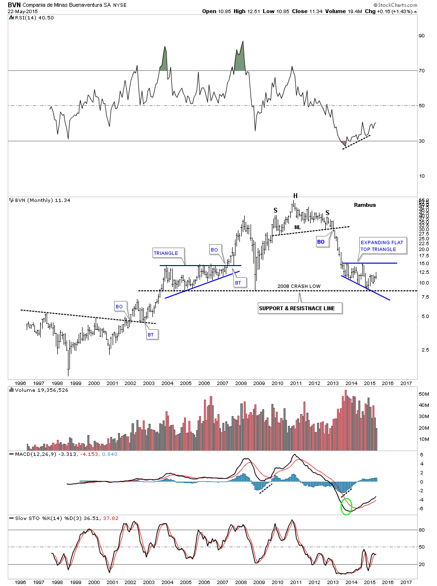
The monthly chart for BVN shows it built out a H&S top with a nice reverse symmetry move down toward the 2008 crash low which has been holding support so far going all the way back to 2003.
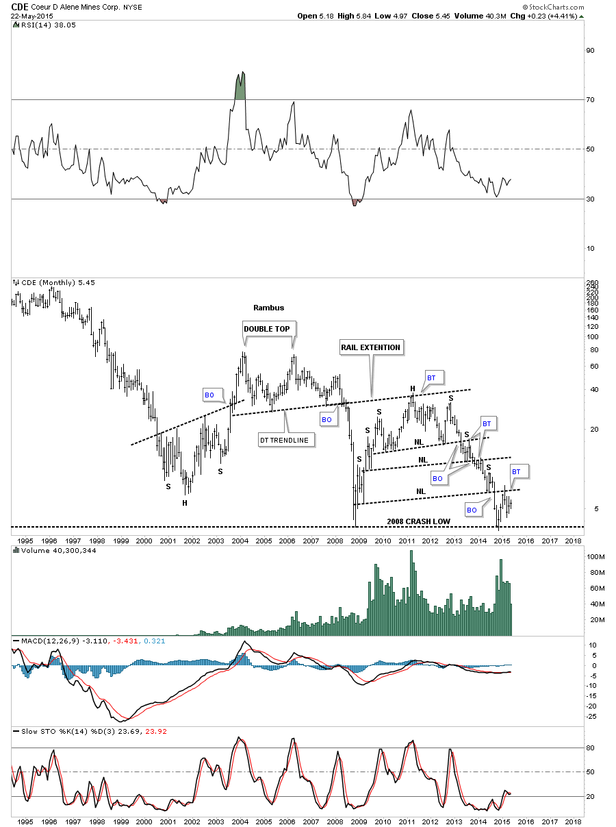
The monthly chart for CDE shows it built out a double top to reverse its bull market run. The double bottom trendline caught the backtest which ended up being the head of a multiple H&S top. Notice how each neckline was backtested from below once the breakout occurred. This stock is also testing its 2008 crash low.
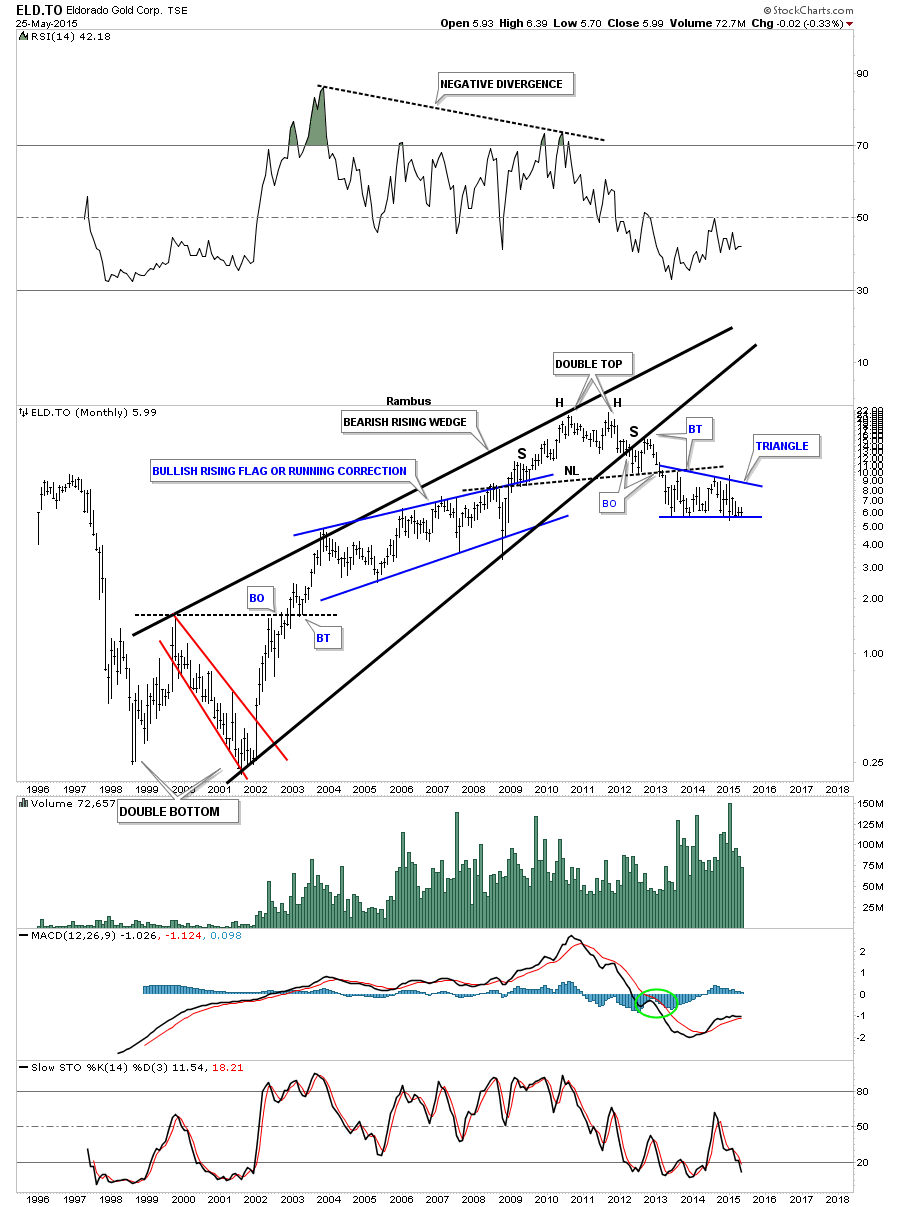
The weekly chart for ELD.To shows its beautiful H&S top with a nice clean breakout and backtest. Since the breakout from the massive H&S top it has been forming a blue triangle that now has completed six reversal points and is sitting on the bottom rail. A break of the bottom blue rail would most likely lead to a move down to the 2008 low.
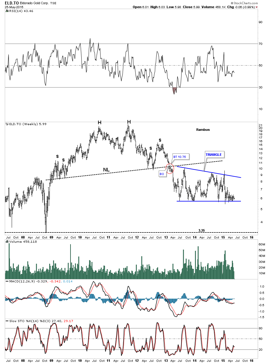
The monthly chart for ELD.To shows some nice Chartology as its bull market formed a massive bearish rising wedge. I’ve shown you many times in the past how a wedge of flag can form a H&S pattern. Here you can see the left shoulder and head were formed inside the rising wedge with the right shoulder being formed on the backtest from below.
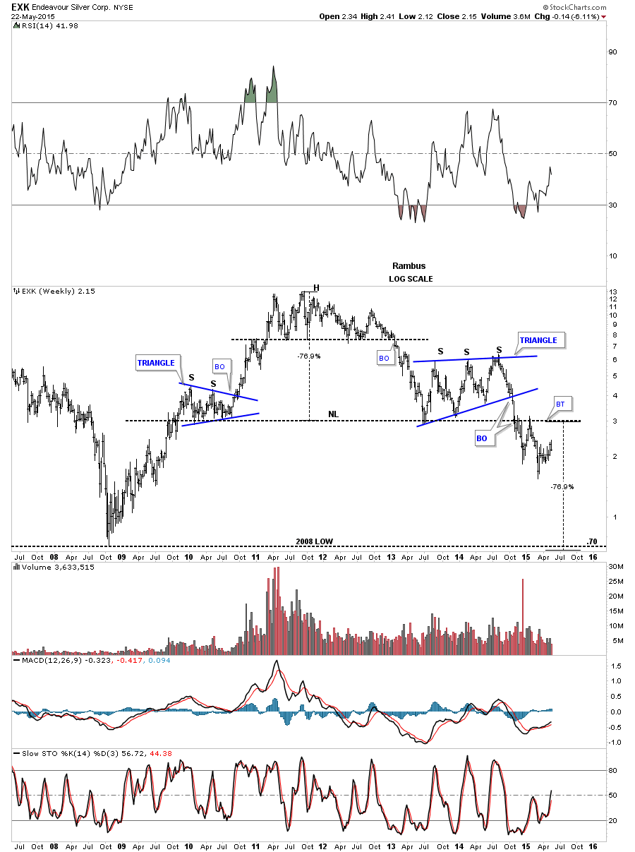
The weekly chart for EXK shows its massive H&S top but has held up better than most PM stocks. Even thou it has held up better it still has a long ways to go to reach its price objective which would be the 2008 crash low around .70 or so.
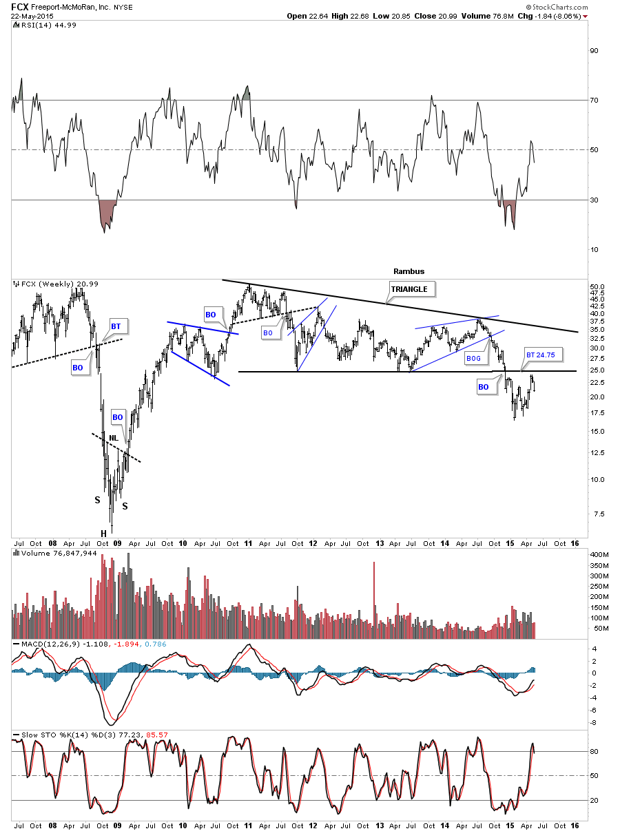
The weekly chart for FCX shows it has broken down from a massive triangle pattern and has just completed a backtest to the underside.
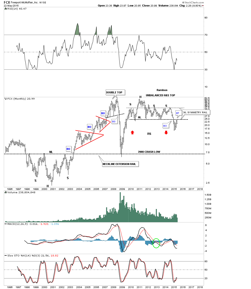
I can make a case for an unbalanced H&S top on the monthly look at FCX. Here you can see it has backtested the neckline. The neckline symmetry rail also shows us the height for the right shoulders. There really isn’t much in the way of support until the 2008 crash low is hit so its very possible that we’ll see some reverse symmetry down once the impulse move gets underway, red arrows.
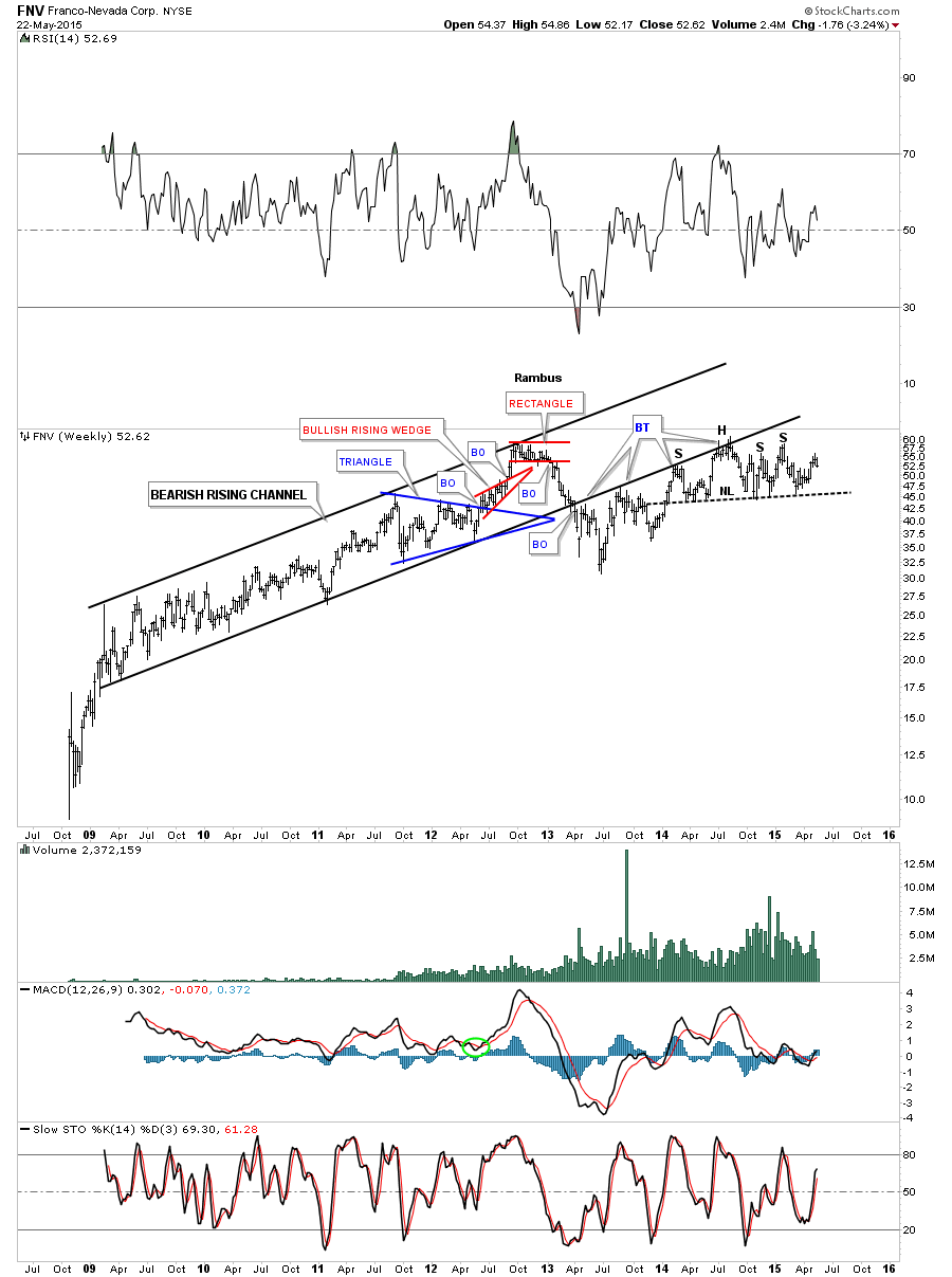
We’ve been looking at this weekly chart for FNV for several years now and that bottom rail of the rising wedge is still holding resistance. This stock may also be building out an unbalanced H&S top. We won’t know the answer to that question until the neckline is broken to the downside.
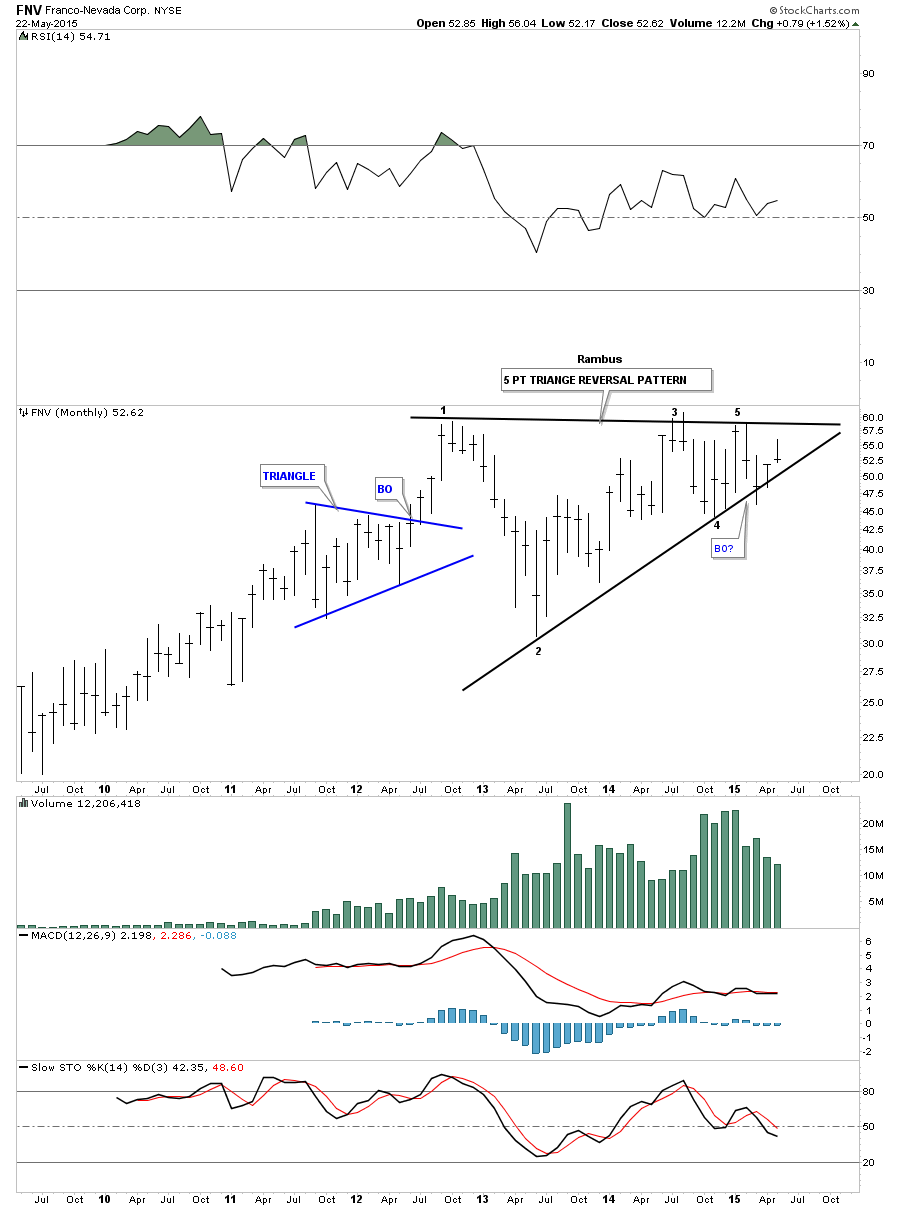
This first monthly chart for FNV shows a possible 5 point triangle reversal pattern in play if the bottom rail is broken to the downside. You can see it cracked the bottom rail back in March of this year but managed to claw its way back above the bottom rail negating the breakout for now.
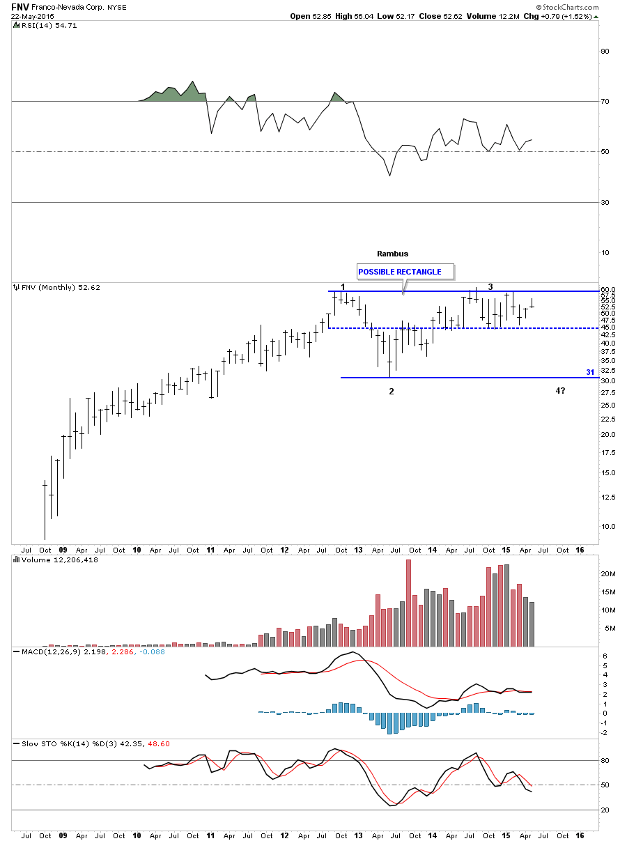
Below is another monthly chart for FNV which shows you how I think it may play out. As it has been one of the stronger PM stocks I can see it creating a very larger trading range or rectangle. FNV has been trading between the top rail and the center dashed line for over a year now. A break of the center dashed line would most likely lead to a move down to the bottom trendline around the 31 area where I would most likely back up the truck.
I’m going to end the Weekend Report right here for the time being as you get the general feeling of why I haven’t been a buyer of PM stocks yet. That point is coming but I think we still have one more leg down to complete this bear market. I hope everyone had a great three day weekend. All the best…Rambus