In this Weekend Report I would like to show you some charts on the US stock markets along with some overseas markets as things are starting to heat up. It’s beginning to look like a world wide event taking place. Some of the European stock markets are breaking out of huge bases along with some Asian countries. Even in the US several of our stock market sectors are just a stones throw away from breaking out to new highs. I think it’s a good thing to see a lot of the worlds stock markets in bullish mode.
First lets take a look at several US stock markets and then we’ll move on and look at some overseas markets to get a feel for this bull move that is getting underway. As you will see some stock markets are stronger than others and that is where we’ll focus some of our attention.
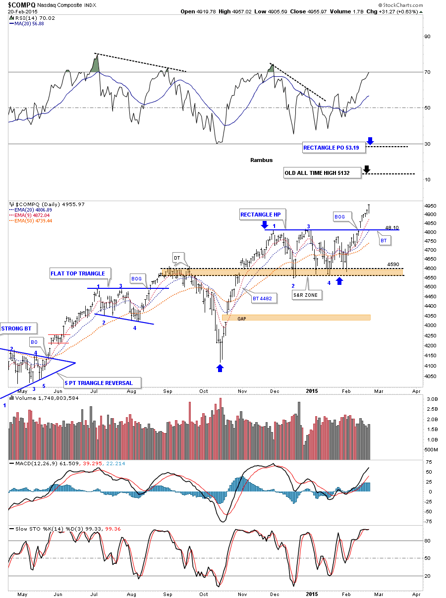
The 2 hour chart for the Dow Jones Industrials (INDU) starts at the all important October low from last year. As you can see the INDU had a nice impulse move up off of that bottom and began a sideways trading range starting in the first part of December. So far this sideways trading range has lasted roughly four and half months and is carving out an expanding flat bottom triangle. This pattern has completed the minimum number of reversal points, four, if this is going to be a consolidation pattern. The bearish case shows the last high in the expanding flat bottom triangle, marked with a 5?, as the 5th reversal point won’t be complete until the bottom rail is hit. So if you’re a bear the first thing you need to see happen is for the bottom rail of the small blue falling wedge to give way. Even then the bottom rail of the 4 1/2 month flat bottom triangle would have to give way to really see a bearish situation in the INDU. If you’re bullish on the INDU then the first thing we need to see happen is for the top rail of the blue falling wedge to give way and then a rally up to the top rail of the bigger expanding flat bottom triangle. A breakout through the top black rail of the flat bottom triangle would then complete this 4 1/2 month consolidation pattern and usher in the next impulse move higher.
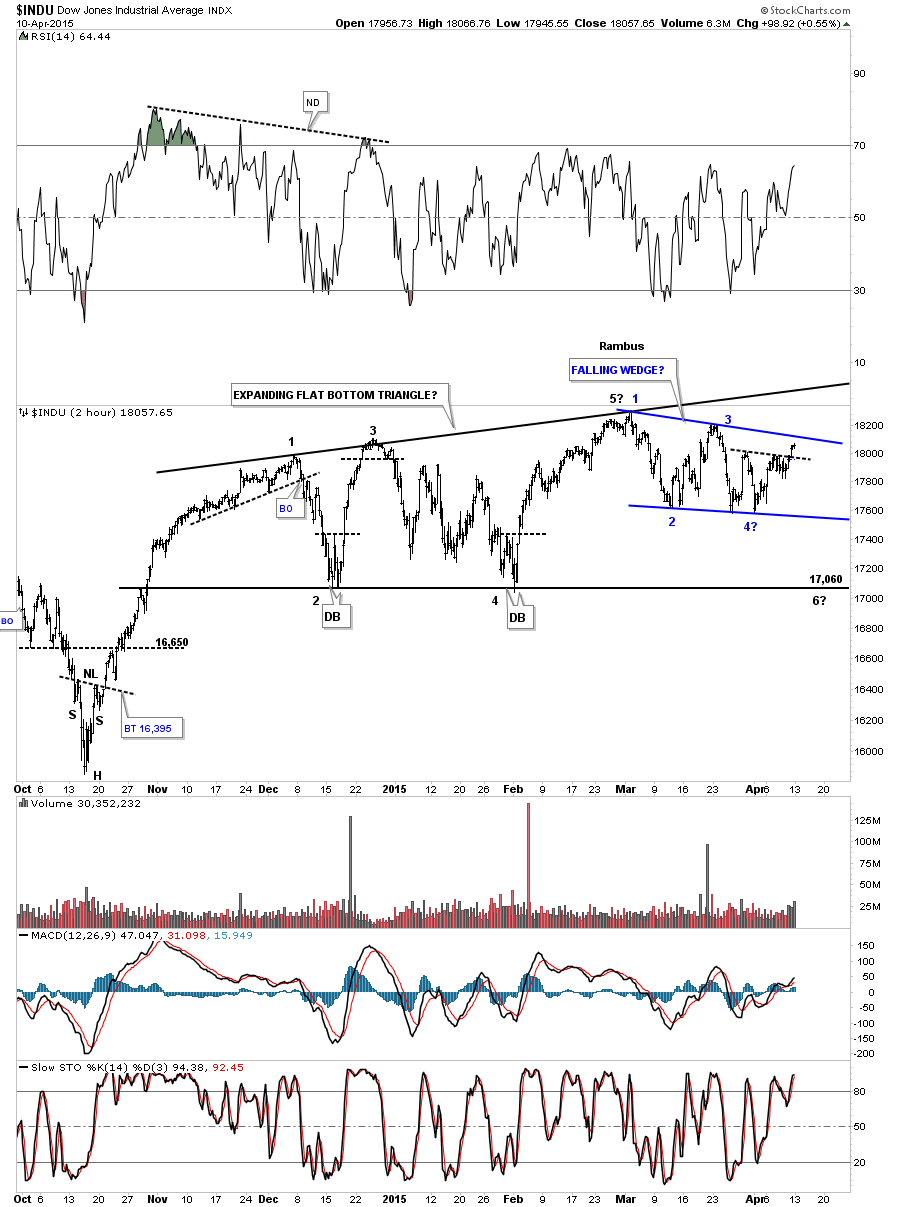
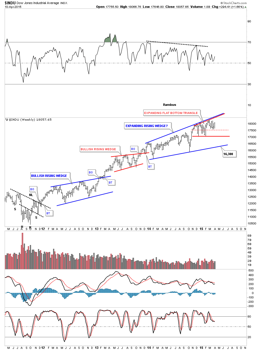
The 2 hour expanding flat bottom triangle I just showed you on the chart above is part of an even bigger consolidation pattern that goes back to the beginning of 2014 which makes this consolidation phase 15 1/2 months long. If the INDU breaks out above the top rail of the much bigger expanding rising wedge we would have an intermediate term move on our hands to follow.
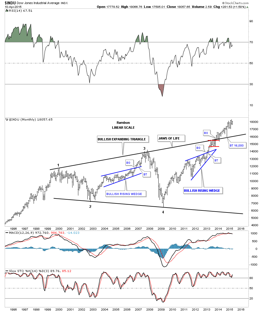
This last chart for the INDU is a monthly look that puts everything in perspective. The breakout of the massive 13 year black expanding triangle actually occurred in September of 2013. Because the expanding black triangle is so massive it has taken this long to complete the breaking out and backtest phases. Note the October low of last year that found support exactly where it should have on the top rail of the black expanding triangle. It’s hard to see anything bearish on this chart for the longer term.
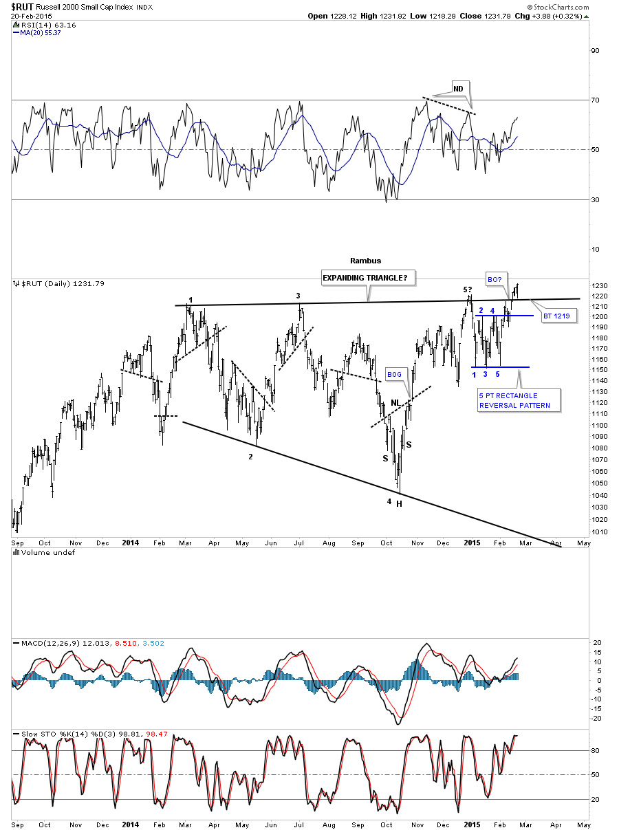
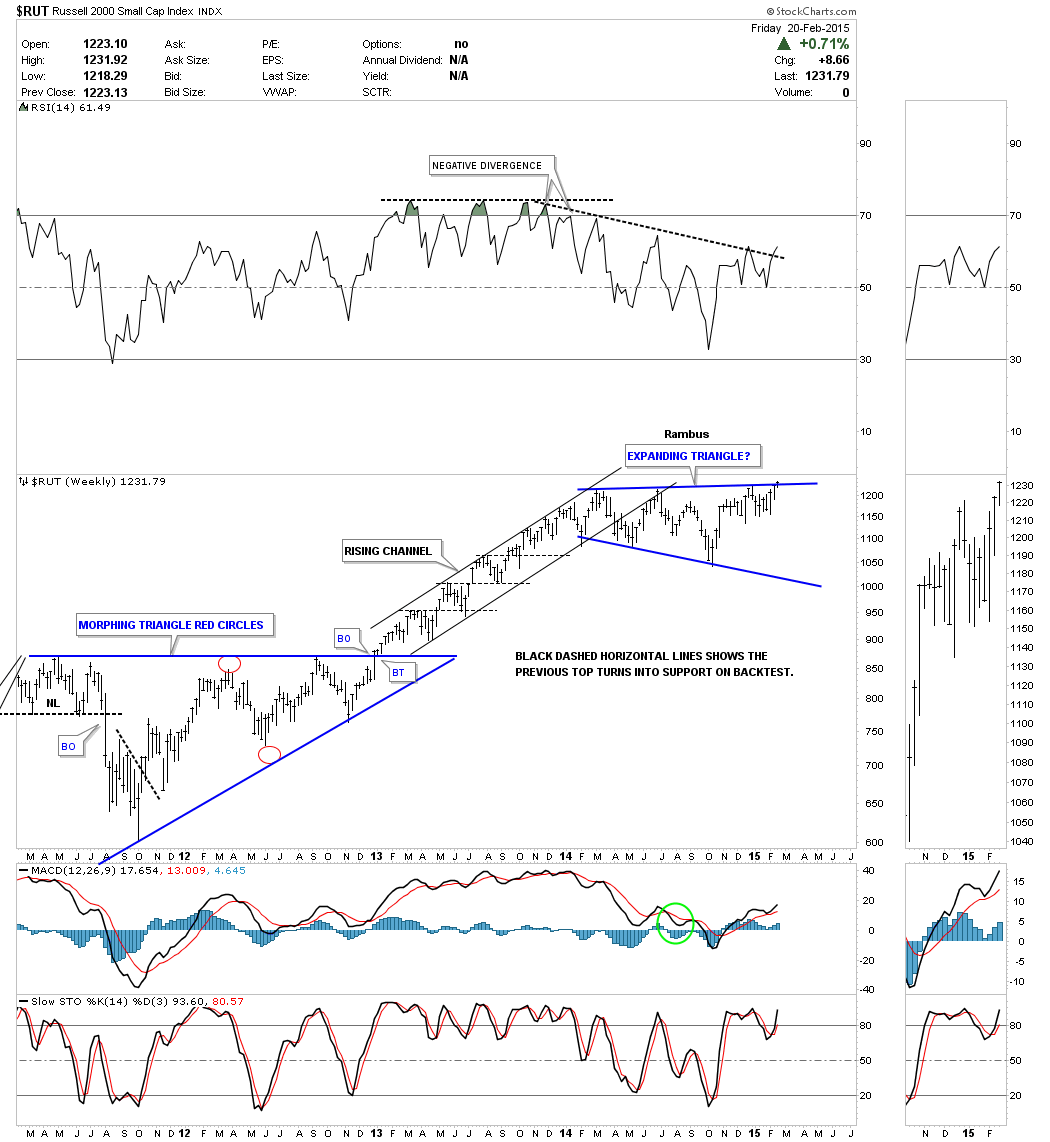
The RUSSEL 2000 (small caps) is leading the charge higher for the US stock markets. After breaking out of its one year black expanding triangle it had a strong backtest that formed a small bear trap just below the top rail, red circle. It’s still uncertain if we’ll see the breakout to new all times highs now, which is just above the previous high made in March of this year, or will we get one more backtest to the top black rail which would then give us a small consolidation pattern sitting on top of the expanding triangle which would be very bullish setup.
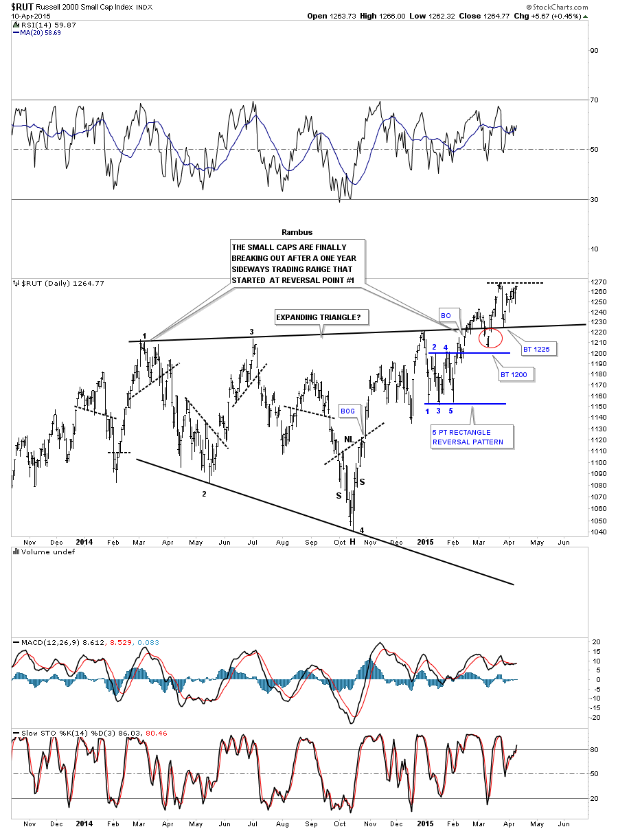
The weekly chart for the RUT shows a nice clean blue expanding triangle consolidation pattern which broke out less than four months ago. Note the last intermediate term uptrend that began when the RUT broke out of the big blue triangle consolidation pattern at the end of 2012. It was a choppy intermediate term move but support was always found at the previous high once it was broken to the upside as shown by the black dashed horizontal lines.
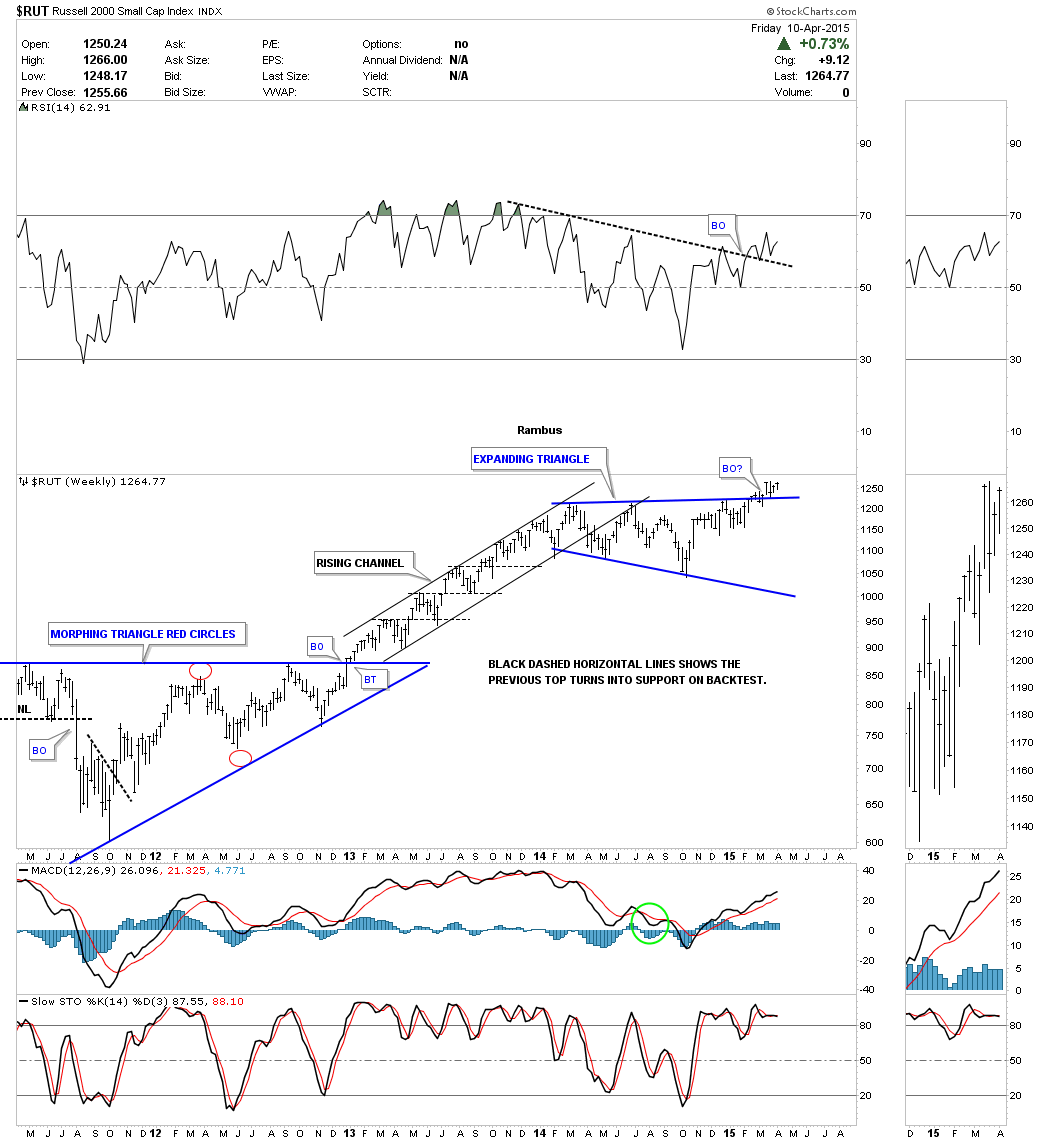
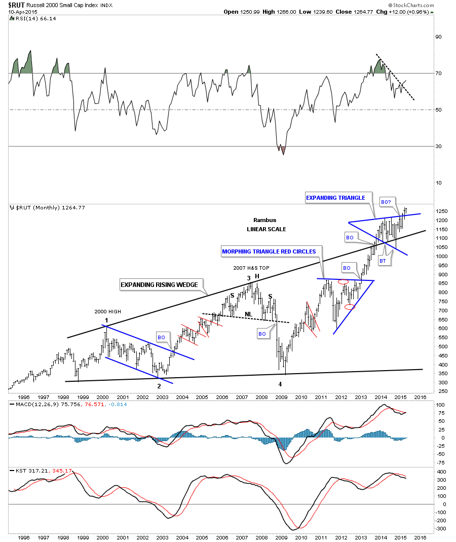
Again lets put everything in perspective by looking at the long term monthly chart for the RUT 2000. Here you can see the massive 13 year bullish expanding rising wedge consolidation pattern with the blue expanding triangle forming on the top rail. Note the two other blue consolidation patterns and the impulse moves that followed after the breakout occurred. We are at the equivalent area of the 2nd bar on those other two impulse moves after the breakout. If there was ever a time to buy and hold this would be it for probably at least the next year. I know it’s going to be hard to ride this next impulse move but one could take 3/4’s of their capital and use it for the long term and trade the remaining 1/4 just so you have some action. The intermediate term move is where the big money is made vs the consolidation phases as you can clearly see on the chart below.
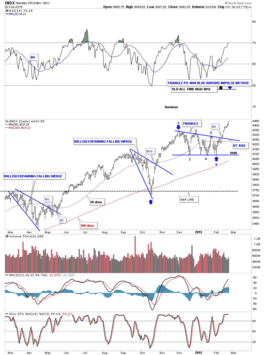
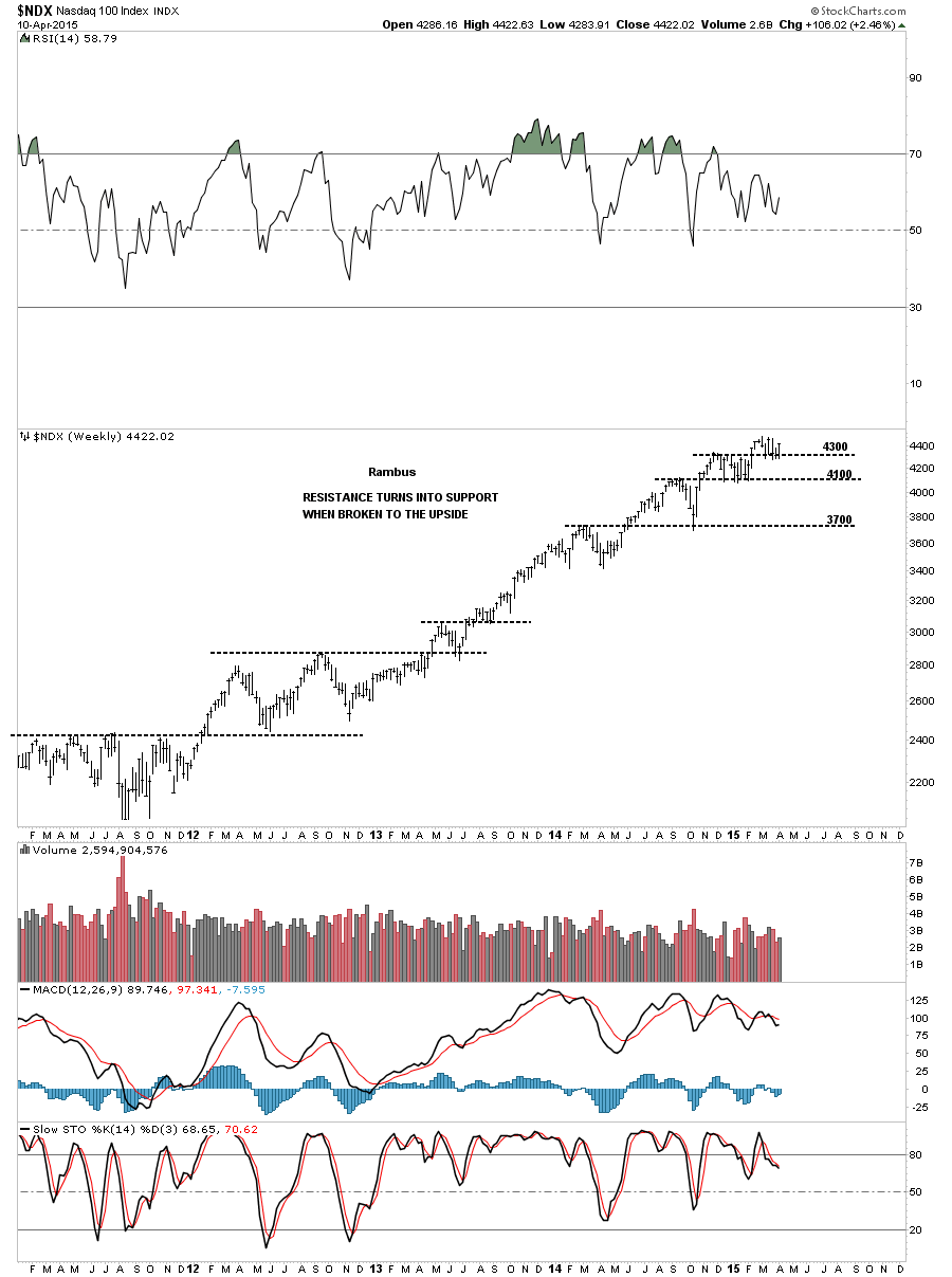
Below is a weekly chart for the Nasdaq 100 ( NDX) that I showed you several weeks ago that has the black dashed horizontal lines that shows resistance turning into support once the price action broke to new highs. I said to watch the 4300 area as a good place to see support come in which is the previous top.
Before we leave the US stock markets lets take a quick look at the Transportation Index which is showing a pretty tight triangle consolidation pattern. On Monday of last week there was a small break of the bottom rail which was quickly reversed to the upside and completed the 5th reversal point. In order to keep this chart bullish we need to see the price action rally back up to the top rail to complete the 6th reversal point putting this triangle back into consolidation mode.
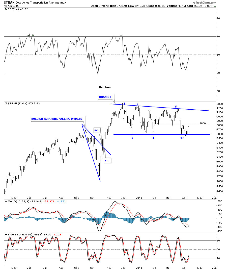
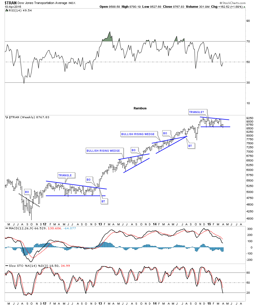
The weekly chart shows the blue triangle as a possible consolidation pattern forming as another brick in the wall within its bull market.
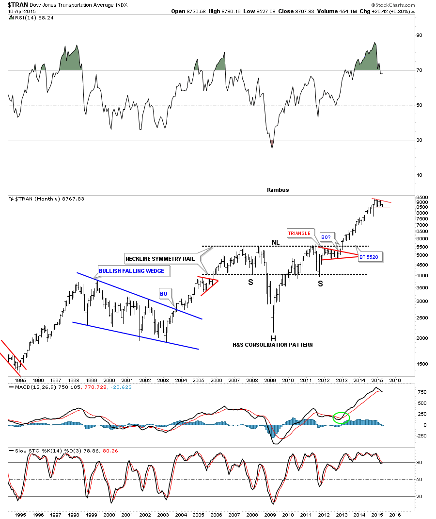
The monthly chart for the TRAN shows the little red triangle forming at the top of its most recent impulse move. After a big move like that it’s healthy for a stock to build out some type of consolidation pattern.
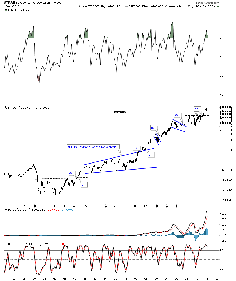
This last chart for the TRAN is a 100 year quarterly chart that puts that beautiful H&S consolidation pattern in perspective on the chart above. It still amazes me when I look at a chart like this after 100 years of history investors are still building out consolidation patterns just like the did 100 years ago. Even with all the new technologies investors are still creating the same chart patterns. Chartology will remain the same 100 years from now IMHO.
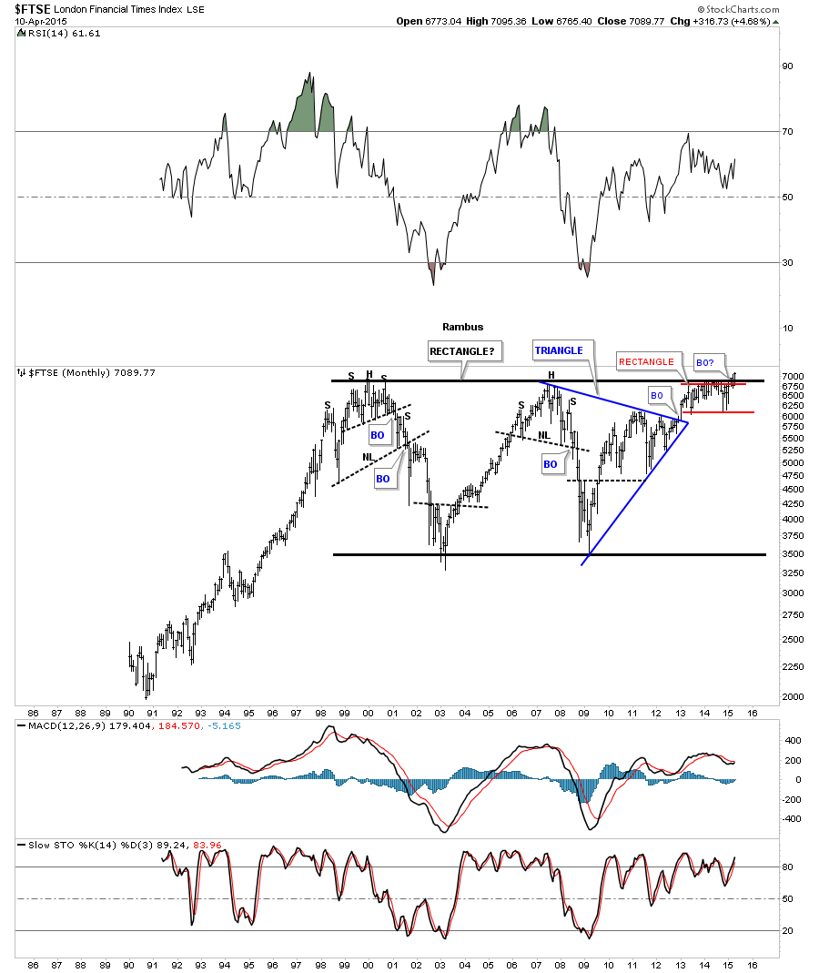
Lets look at a couple of European stock markets and see how they are doing. The weekly chart for the FTSE shows it breaking out from a two year red rectangle consolidation pattern which had a strong backtest similar to the RUT chart I showed you earlier. It closed the week at a brand new all time high on Friday.
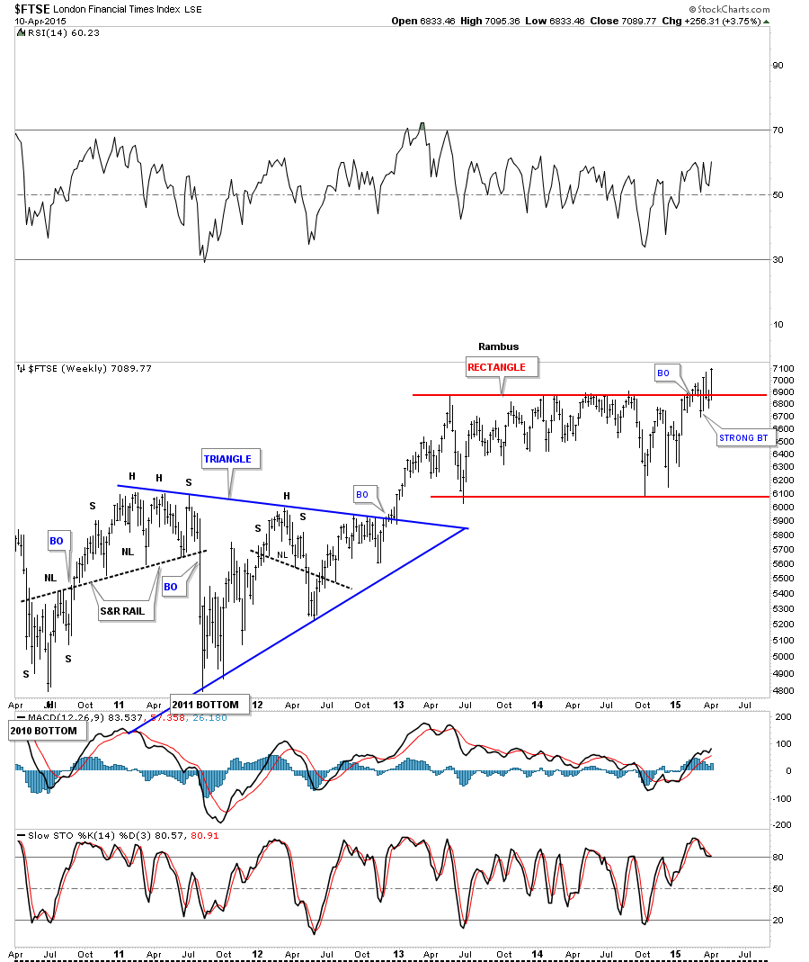
The red rectangle on the weekly chart above looks big by most standards but when you see it on the long term monthly chart it’s just a very small part of a massive 15 year black rectangle. The breakout and backtesting phase is now underway. There is nothing bearish about this chart at all from a Chartology perspective.
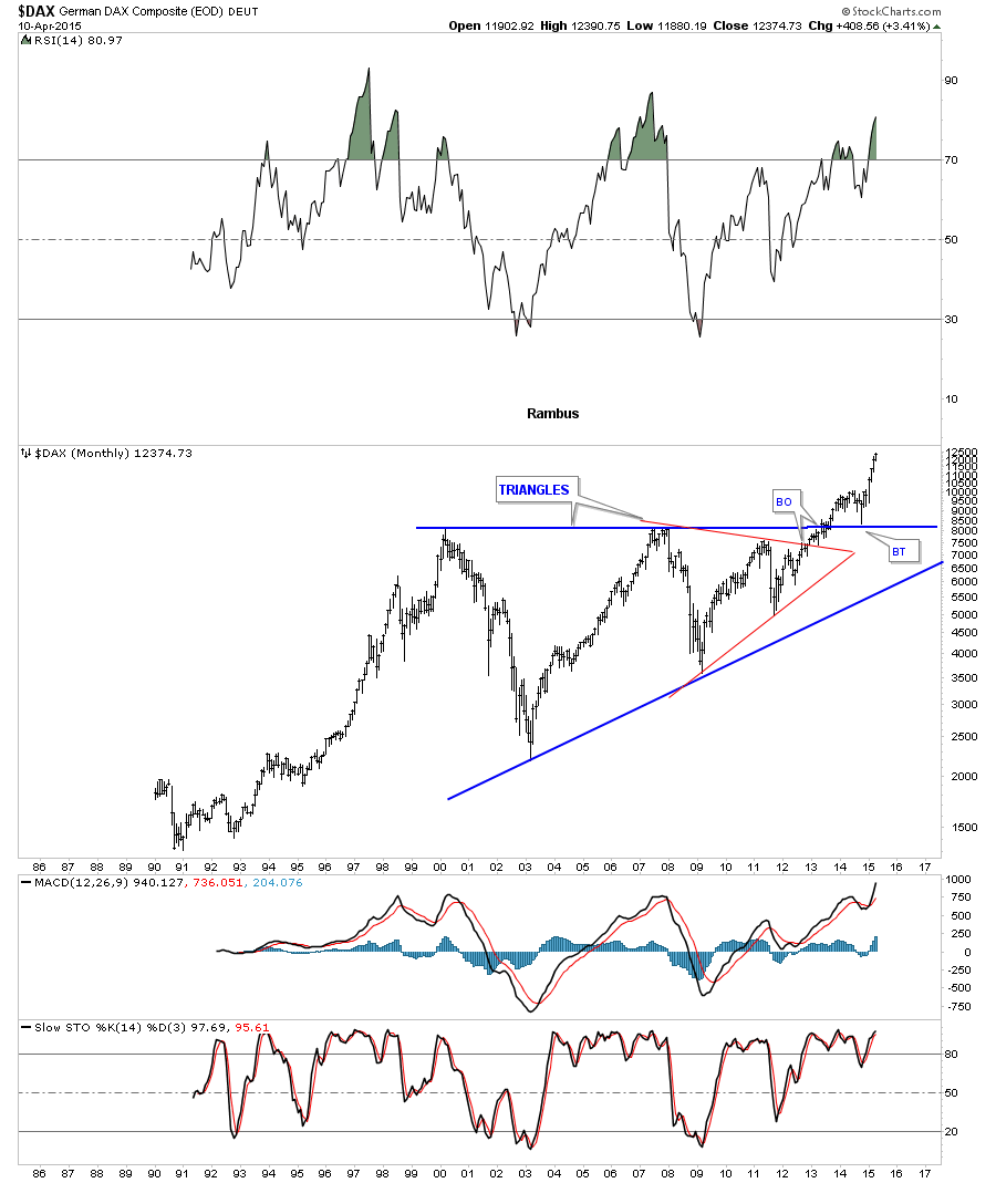
Lets now look at the DAX which is further along in its next impulse move higher than the FTSE. Again notice the massive blue 13 year triangle consolidation pattern. Confirmation of this huge triangle was when the top rail was backtested during the October low of last year. I know these charts are showing a different view from the bearish perspective that the stock markets are getting ready to crash and burn. These chart are showing the polar opposite taking place. Keep in mind these chart patterns are built by millions of investors from around the world. Regardless of what you may read their views are expressed in these charts which is the bottom line.
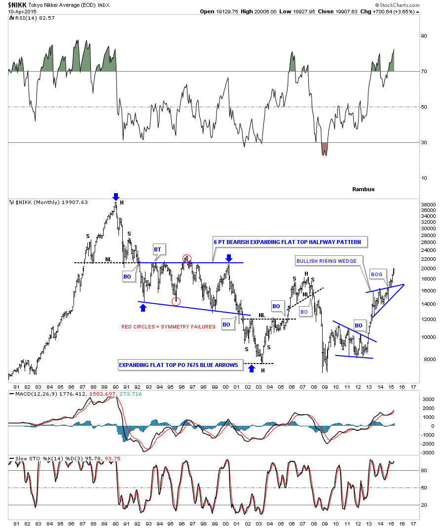
When you compare the Asian stock markets to the US or European stock markets they have been lagging pretty bad. When you look at the charts above they are very close to breaking out to new all time highs. When you look at the Asian stock markets they’re trading well below their all time highs. I think there is a good chance that Asian markets may play catch up to the US and European stock markets. Below is a long term monthly chart for the NIKK which is well into its next impulse move higher. As you can see it’s breaking above the previous high made back in 2007. This is an extremely bullish looking chart.
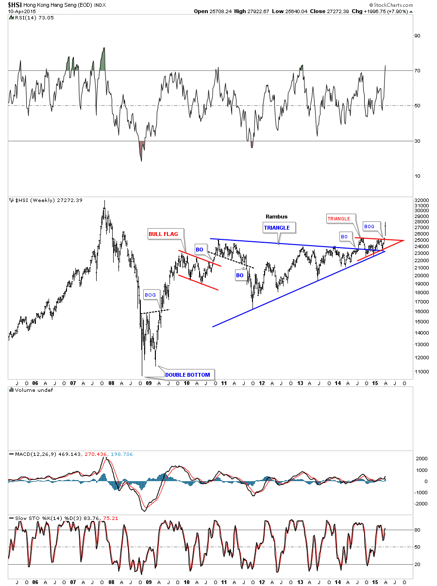
This next Asian Stock market we’ll look at is the Hong Kong (HSI) which had a rather ugly breakout and backtest but this last weeks price action confirms the next impulse move is underway. It’s pretty rare to see a breakout gap on a weekly or monthly chart but the HSI produce one this past week breaking out of the red triangle consolidation pattern that sits on the apex of the much bigger blue triangle consolidation pattern. Again not very pretty but it is what it is.
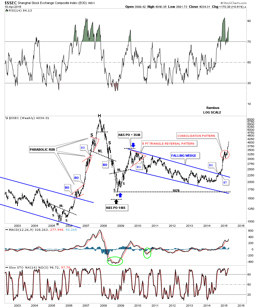
Lets look at one more Asian stock market the Shanghai Stock Exchange ( SSEC ) which is where the fireworks are taking place right now. The old all time high was made back in 2007 around the 6000 area followed by a lengthy correction. The SSEC is still about 2000 points lower than the all time high so it may have some catching up to do. Again this is a very bullish looking chart.
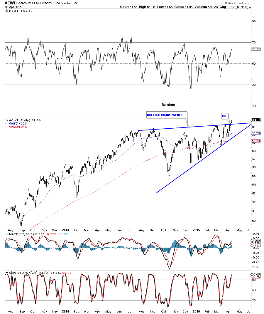
The ACWI, World Stock Markets Index, broke out of a bullish rising wedge last week.
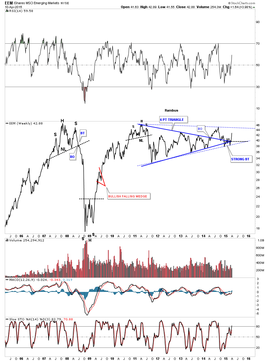
The last index we’ll look at is the EEM, Emerging Markets, that has been plugging along going nowhere fast. Its built out a four year blue triangle that did a little morphing with a false breakout of the top and bottom rails, solid trendlines. The blue dashed trendlines shows the newer version of the morphing triangle.
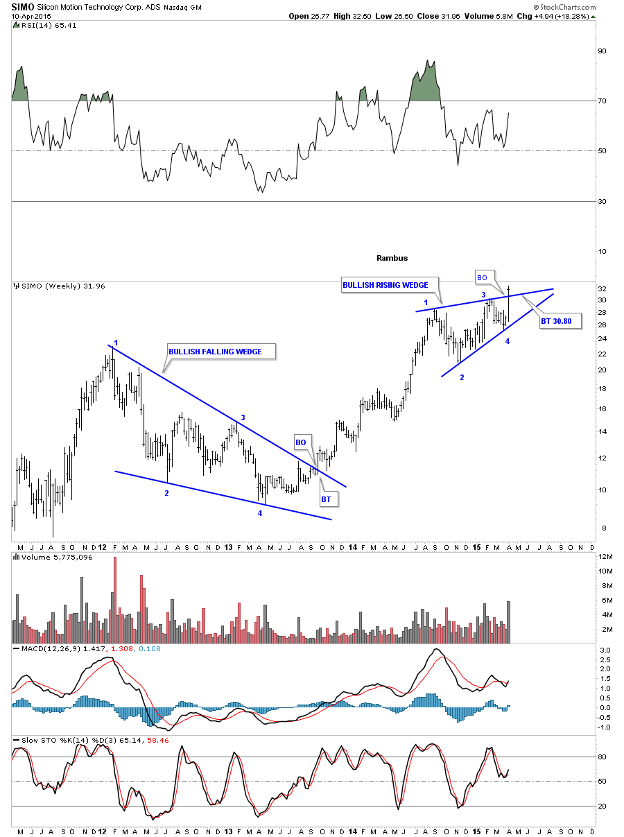
Some of the Chinese stocks are breaking out of some nice chart patterns. SIMO broke out of a bullish rising wedge last week.
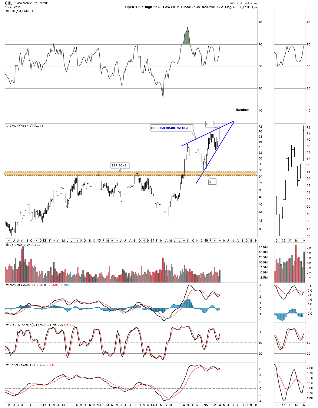
Below is a weekly chart for CHL that is showing a potential bullish rising wedge with the top rail being tested last week.
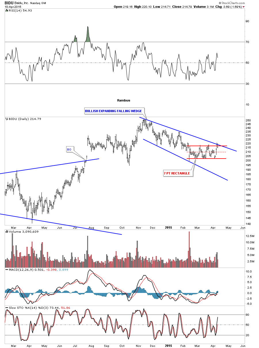
BIDU is starting to look interesting again after a 4 1/2 month correction. It tested the top rail of the 7 point red triangle and the top blue rail of the expanding falling wedge. As you can see it’s at a real interesting junction right here. If it can clear both of those trendlines it will be back in the bullish camp.
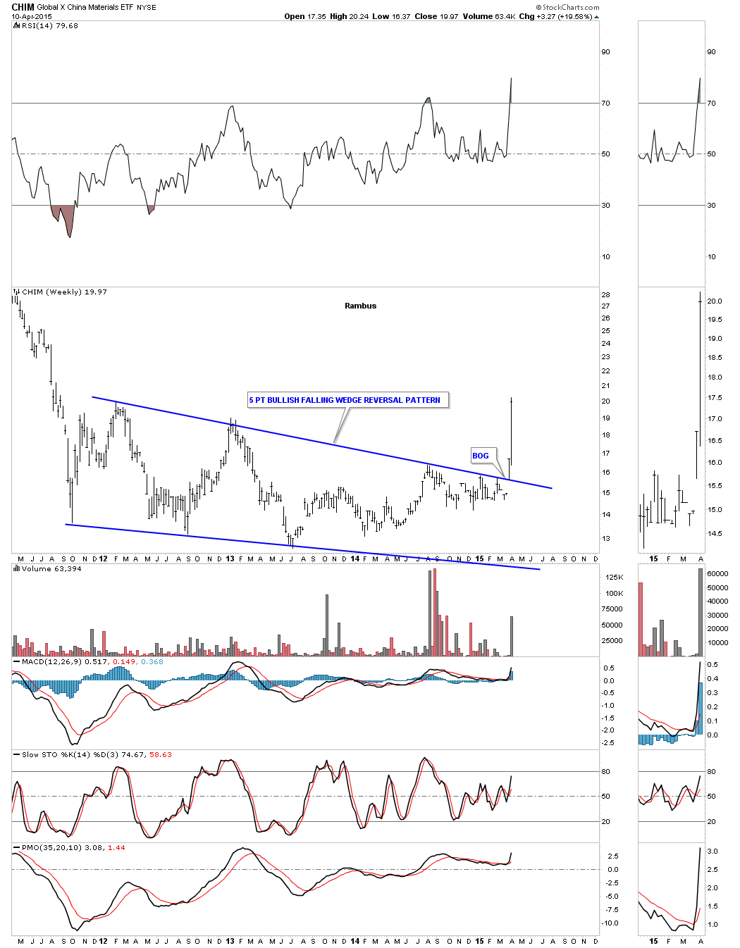
The weekly chart for CHIM shows it breaking out of a 5 point bullish falling wedge reversal pattern with a big breakout gap two weeks ago. Last week it had some nice follow through.
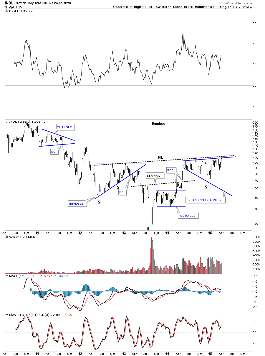
The weekly chart for the 3X India Long etf ( INDL) shows it testing the neckline of a one year inverse H&S base.
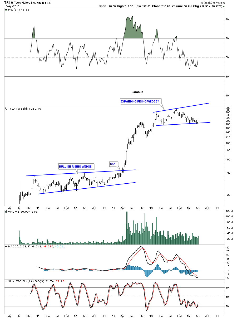
Back in the USA , Telsa Motors (TSLA) has been working on a one year plus consolidation pattern and is trading at the bottom of its trading range. This looks like a pretty good low risk setup using the bottom rail as your line in the sand.
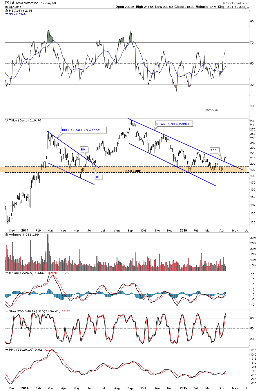
The daily chart shows TSLA breaking out of an eight month downtrend channel after bouncing off the brown shaded support and resistance zone many times.
I have many more stocks that are coming to life that I’ll be posting this week.
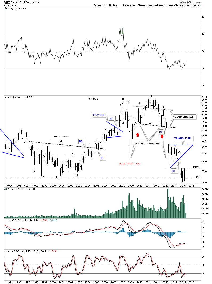
I would like to finish tonites report taking a look at two importsnt precious metals stocks : ABX and HL as requested by Sir Classact. The monthly chart for ABX shows it bouncing around at its all time lows. If it can break above the 13.20 area that would be the first bullish sign for this stock in quite awhile.
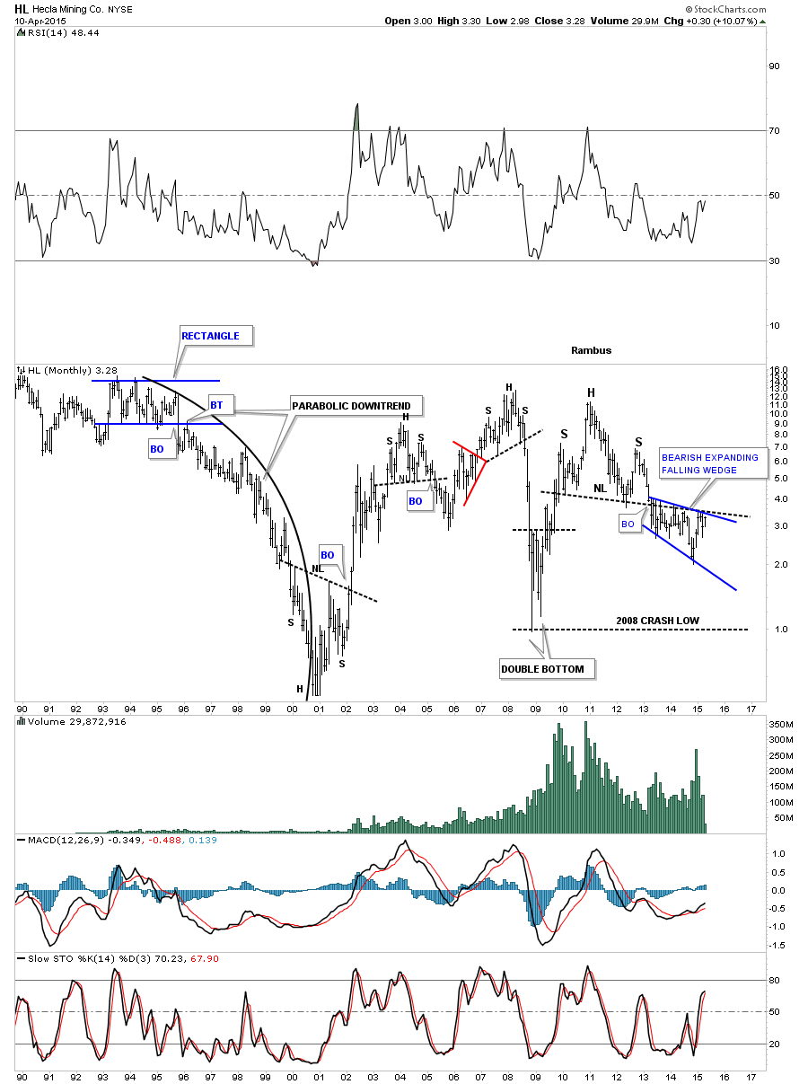
The monthly chart for HL shows it’s trading in the blue expanding falling wedge which is located just below the neckline of a fairly large H&S top. I expect this pattern to break down but if HL breaks up and out of the blue expanding falling wedge and above the neckline I would have to respect the power of that move.
It sure looks to me like the world stock markets are breaking out together for the most part. It will be interesting to see if we get any weakness after last week big run up in the Asian markets. This is where you want to buy the dips and ride the intermediate term trend. Trying to trade in and out of these intermediate term trends can be costly as the markets usually make it hard to get back in at a lower price than what you sold at. There are a lot of stocks setting up with some good chart patterns that will be great intermediate term buys. Get right and sit tight. All the best…Rambus