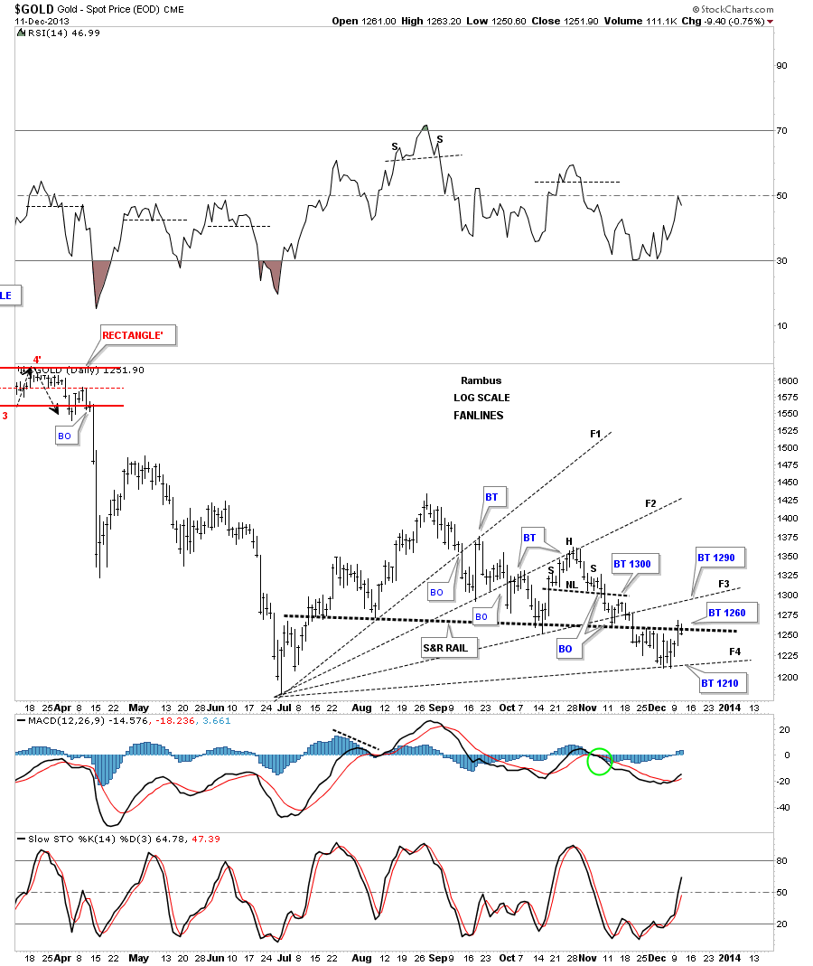
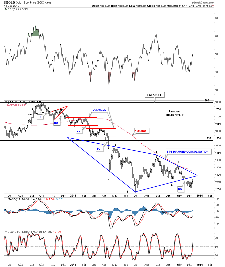
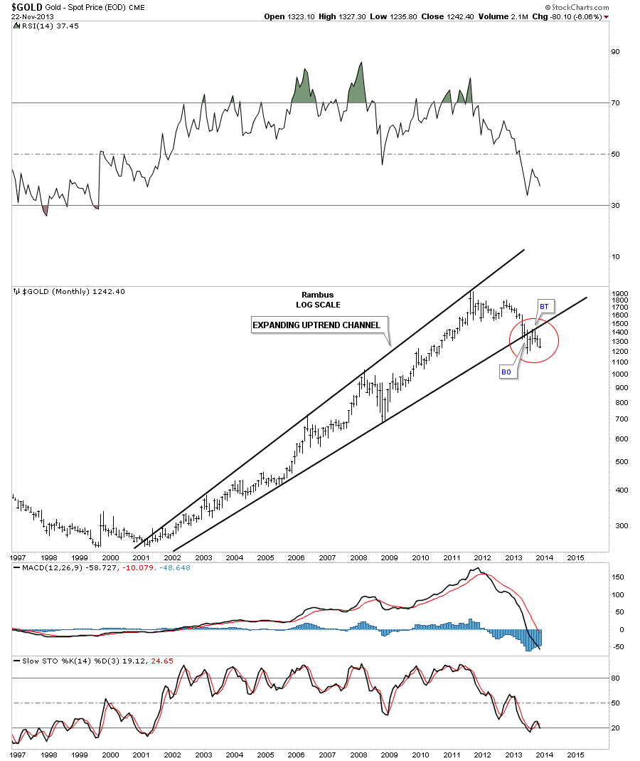
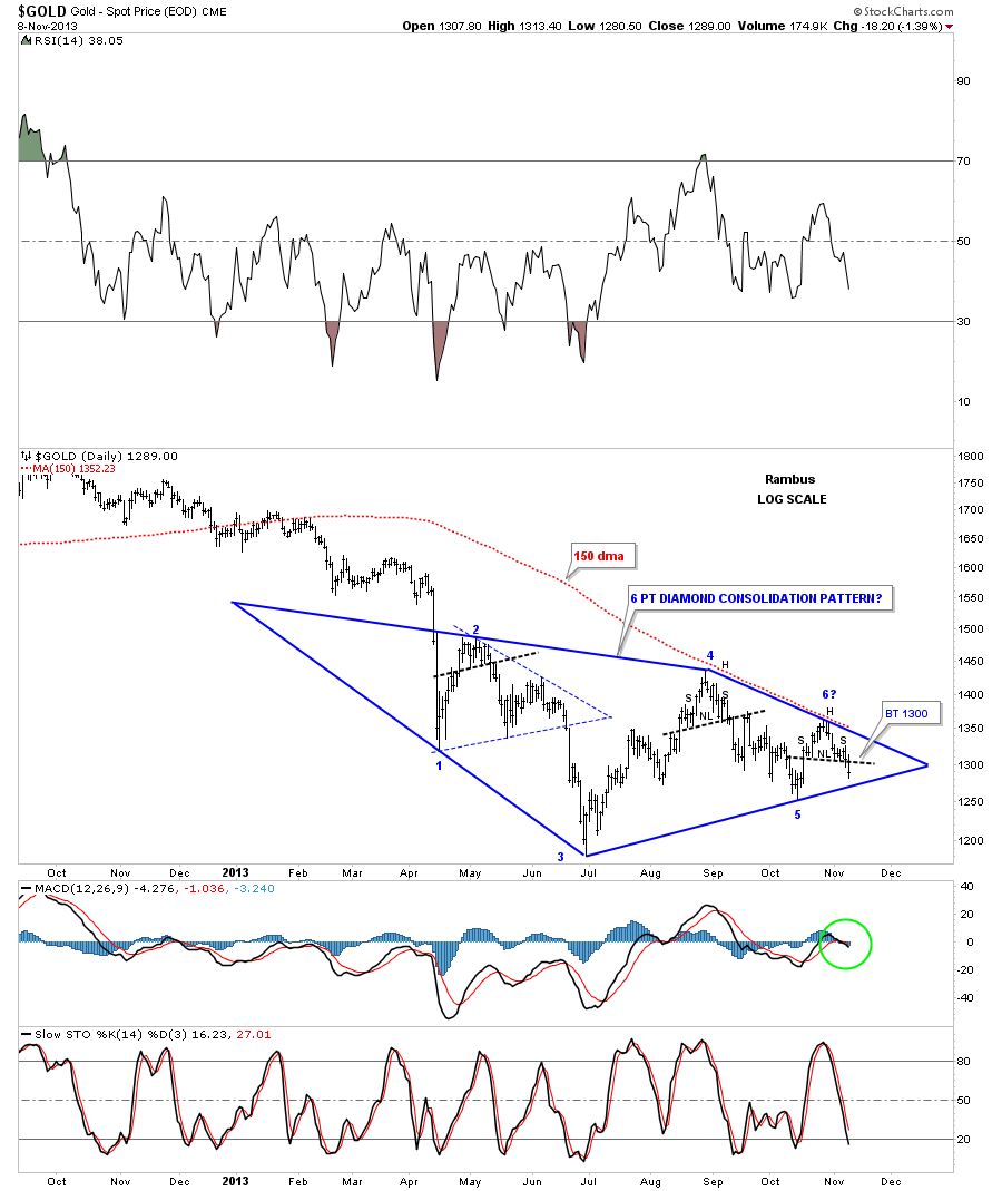
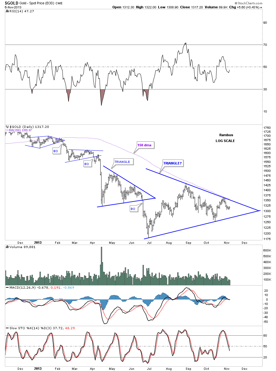
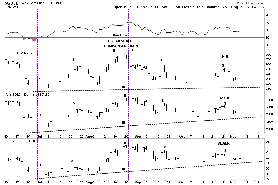
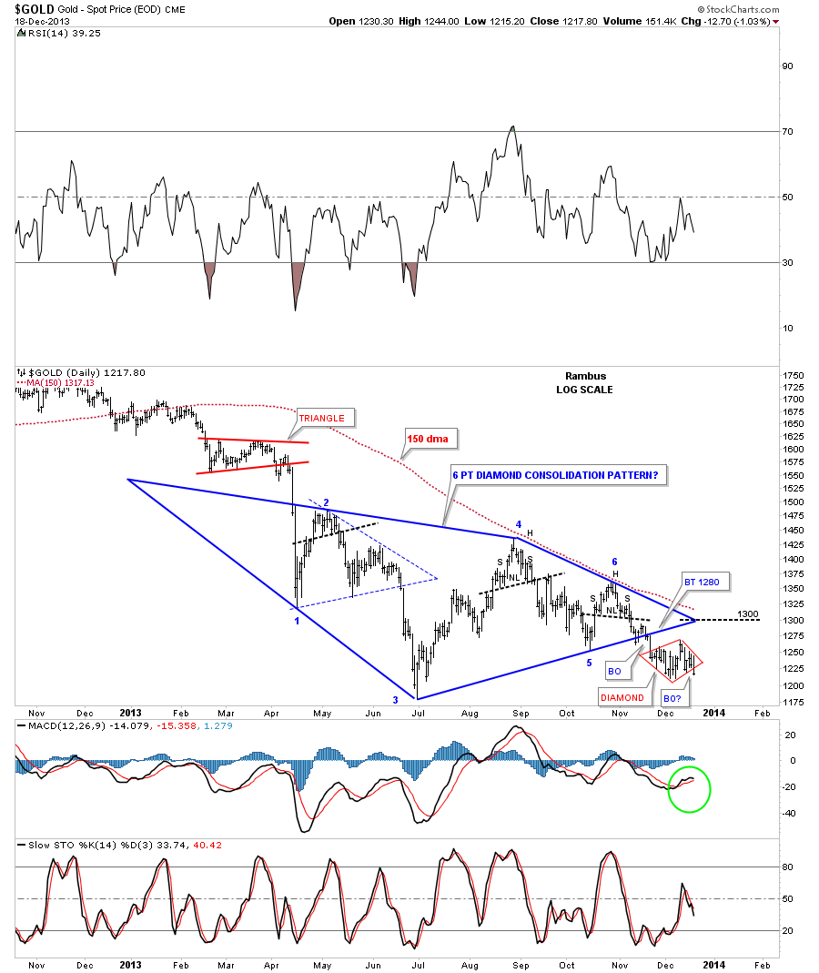
Lets get right to the charts tonight as everything seems to be going according to plan so far. Today’s move in gold seemed volatile but when you look at the daily chart, the price action fit right into another little Diamond consolidation pattern, that has formed just below the bigger blue Diamond consolidation pattern. When you look at the very last bar on the chart below you can see the high today came right up to the top rail on the right side of the Diamond and then fell away. Then just towards the end of the day it broke through the bottom rail. So it looks like our small consolidation phase maybe coming to an end. If we get a backtest tomorrow, to the bottom red rail, it would be a good low risk entry point to add another small bite to your existing position.
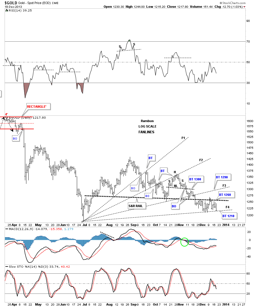
Lets look at a daily chart that shows the fanlines I’ve been using that shows how gold has been backing and filling coming down from its most recent high. The June low is the starting point for your fanlines as that area was the most important low in this decline. Note, when each fanline is broken to the downside you generally get a backtest to the underside at some point. Normally after the 3rd fanline is broken is when the pattern is complete. In this case I’ve added a fourth fanline which gold closed right on today. Note the heavy black dashed horizontal support and resistance rail that runs through the chart. Above is positive and below is negative. Notice how its reversed its role from support to resistance at the end of November.
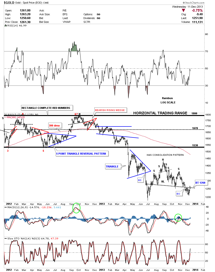
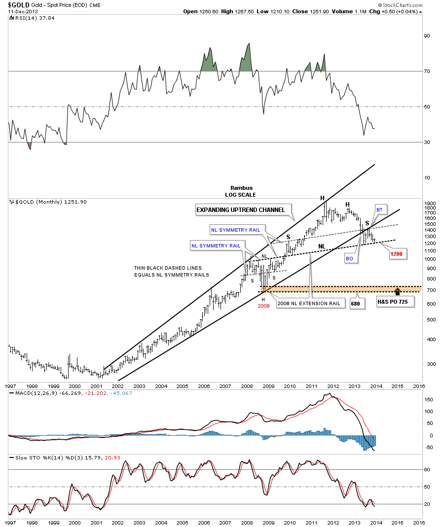
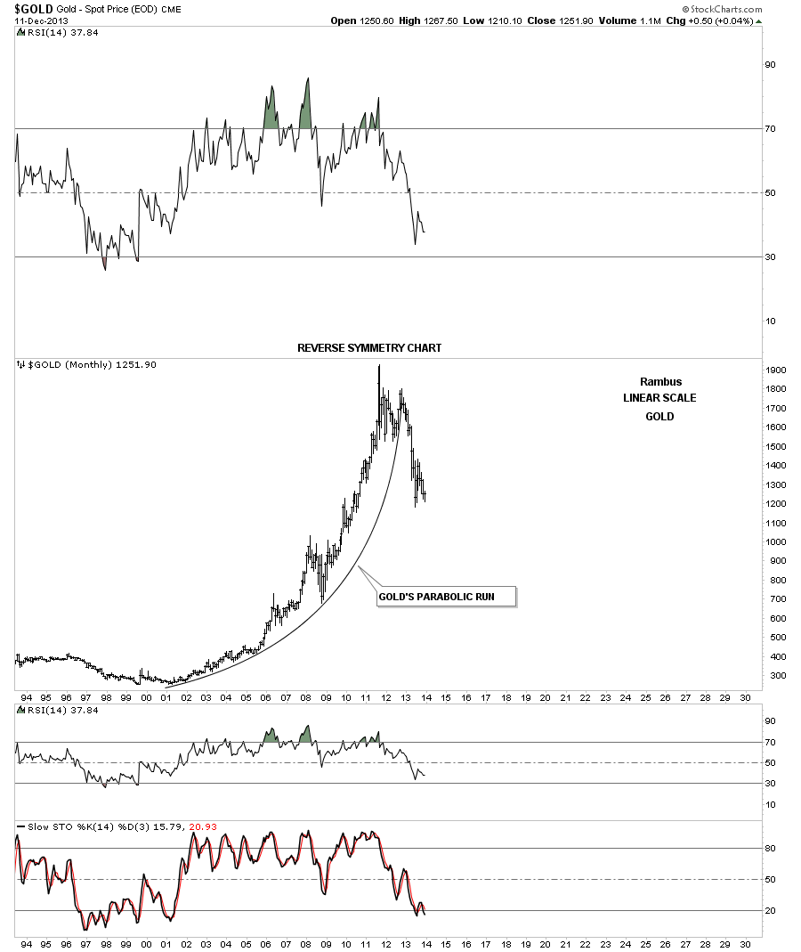
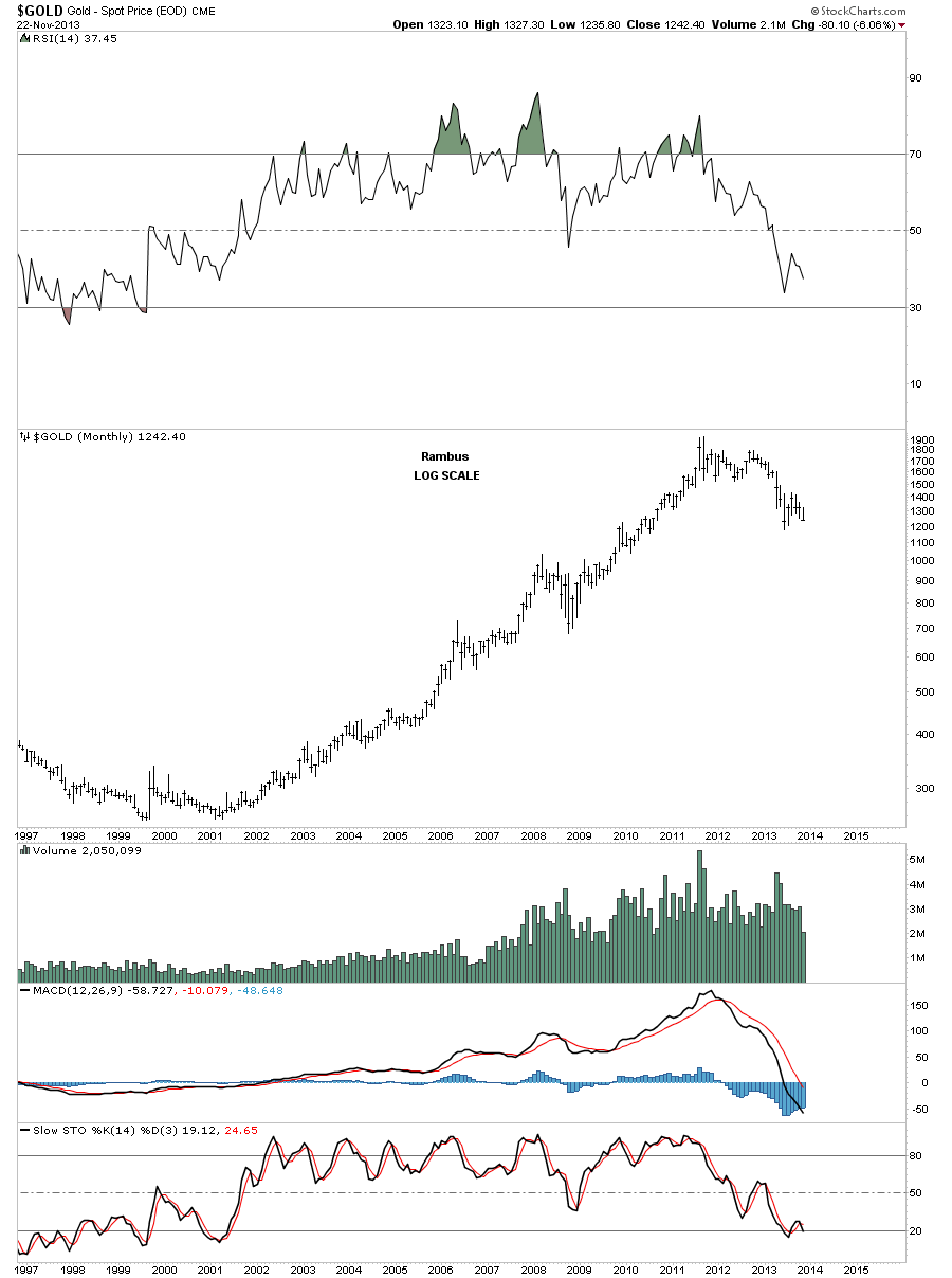
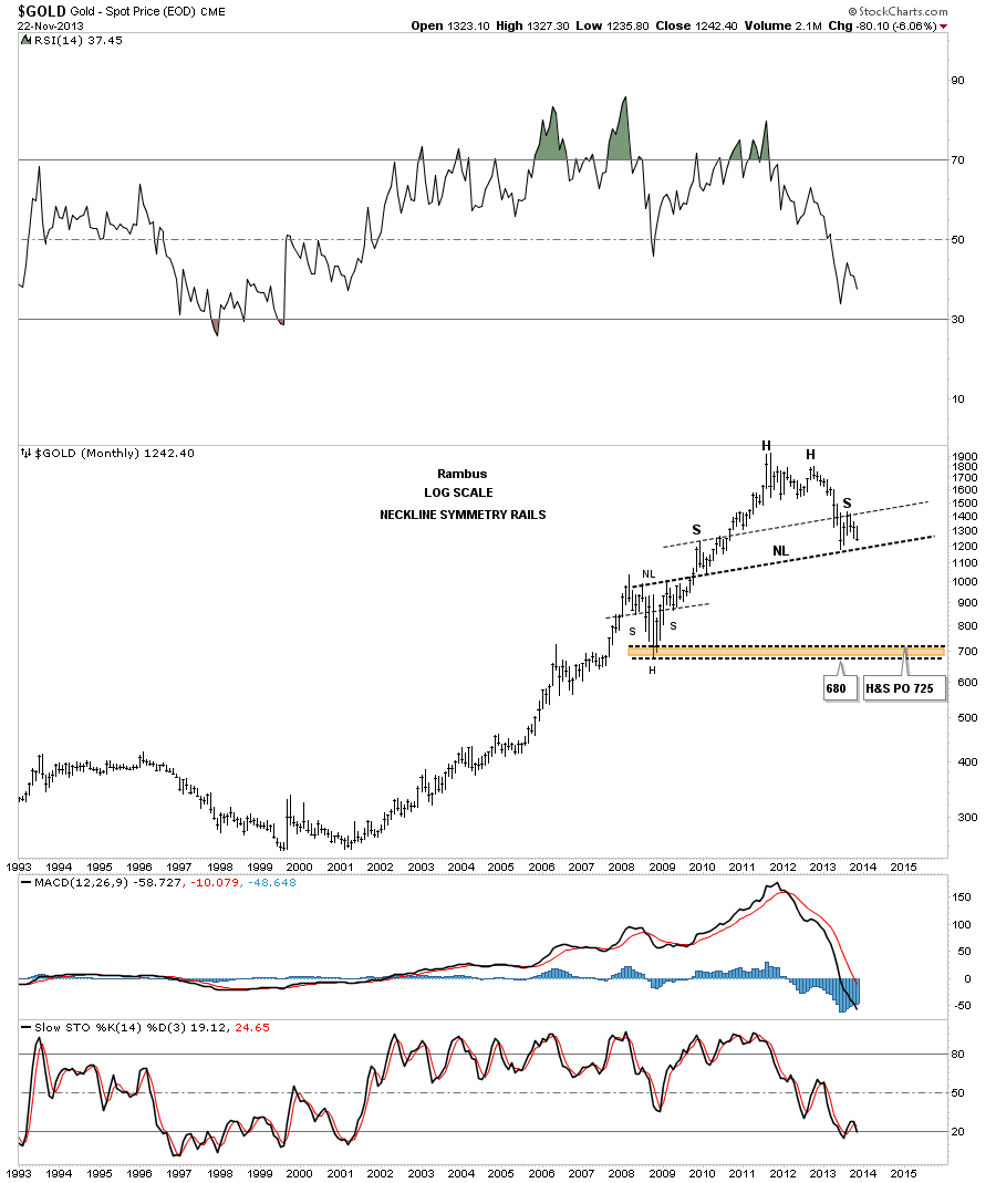
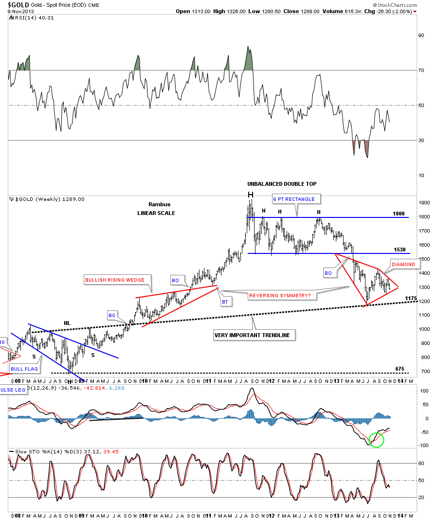
If you look really close, at this monthly chart for gold, you can see it’s now trading below the month of November. With just a little more downside action it will be trading below the all important June low which will setup a lower low for this bear market. So far this reverse symmetry chart is working out beautifully.
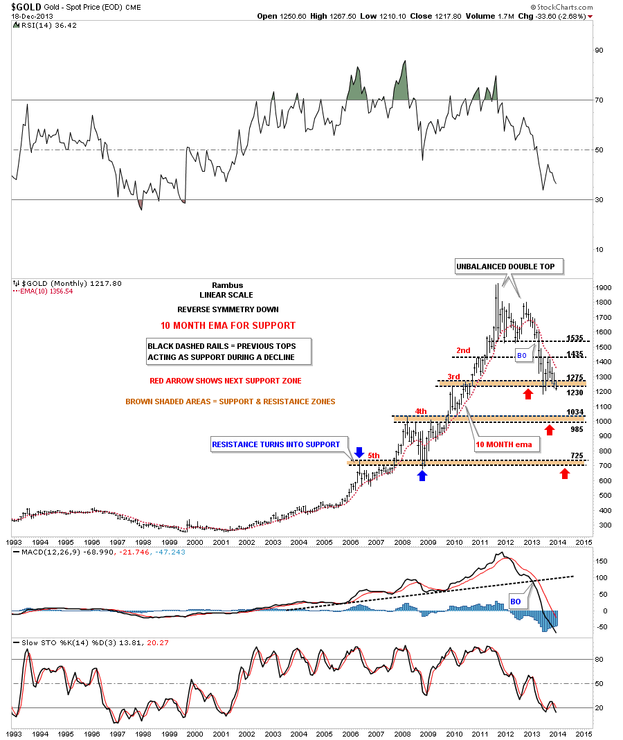
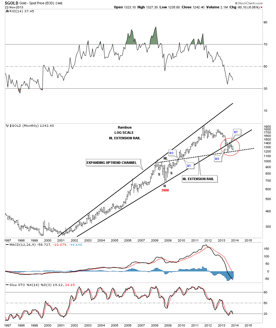
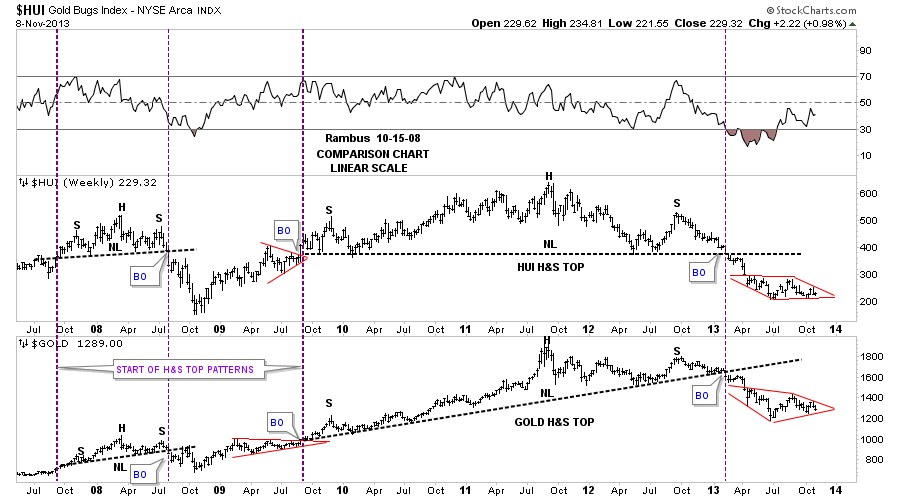
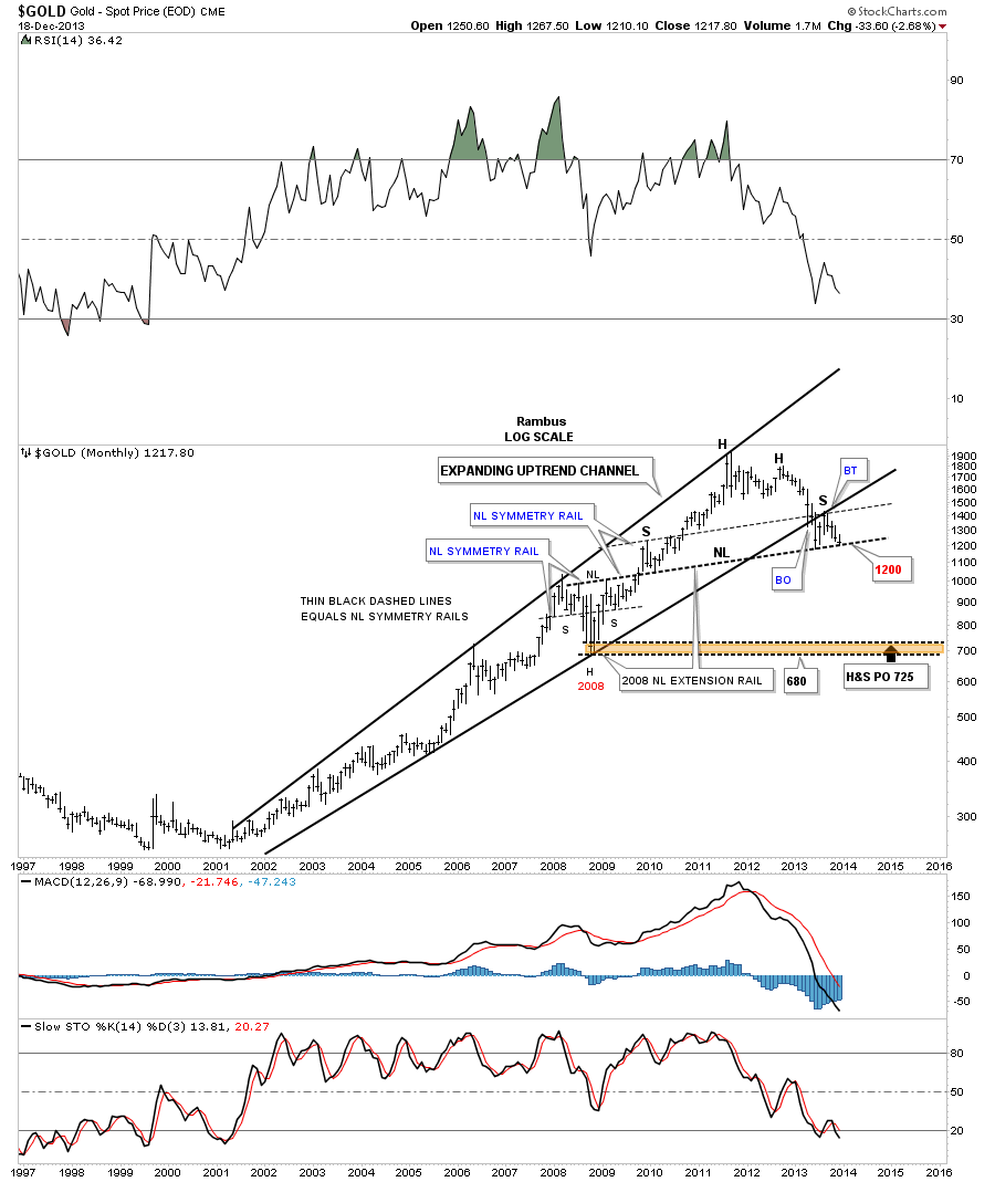
As you can see on this last chart for gold the possible neckline, of a huge H&S top, is within striking distance. Charts like this is what makes this game so interesting because you can see what the potential is before it happens. And then to watch it unfold in real time is just the frosting on the cake. So far so good.
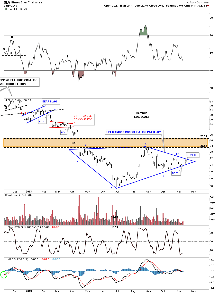
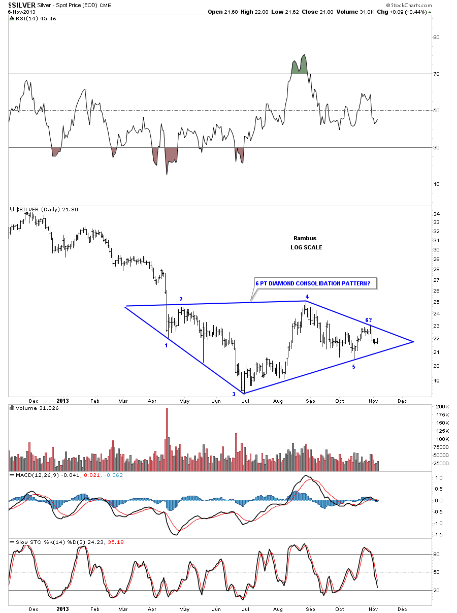
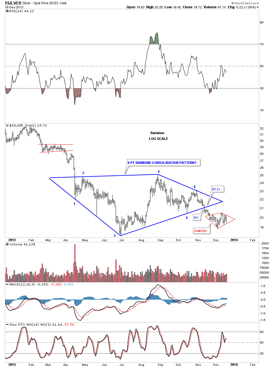
Silver is also forming a small red Diamond consolidation pattern just below its big blue Diamond. Unlike gold silver didn’t breakout of its little red Diamond pattern today so we have to wait for confirmation before we add a few more shares of DSLV.
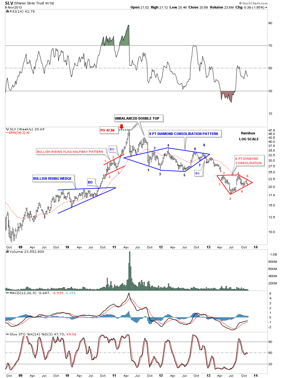
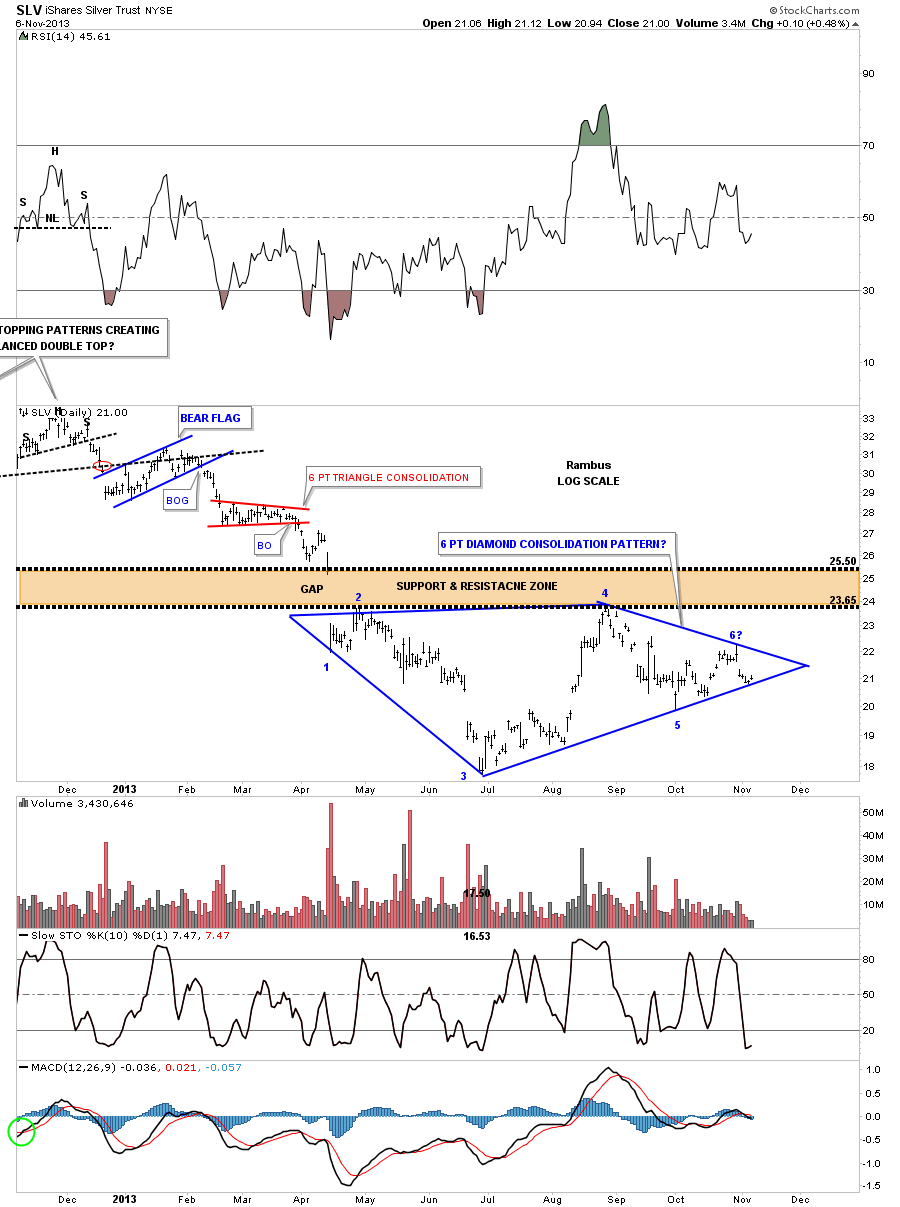
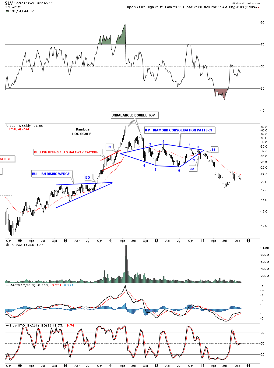
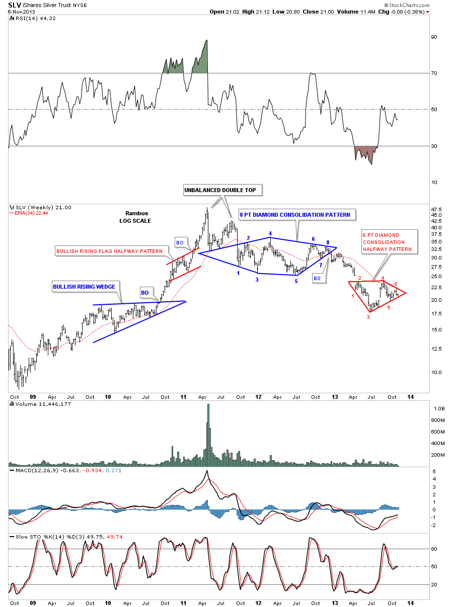
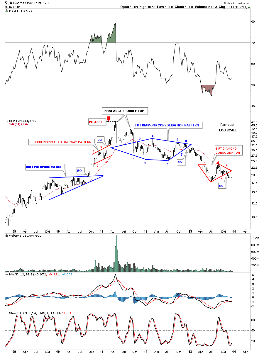
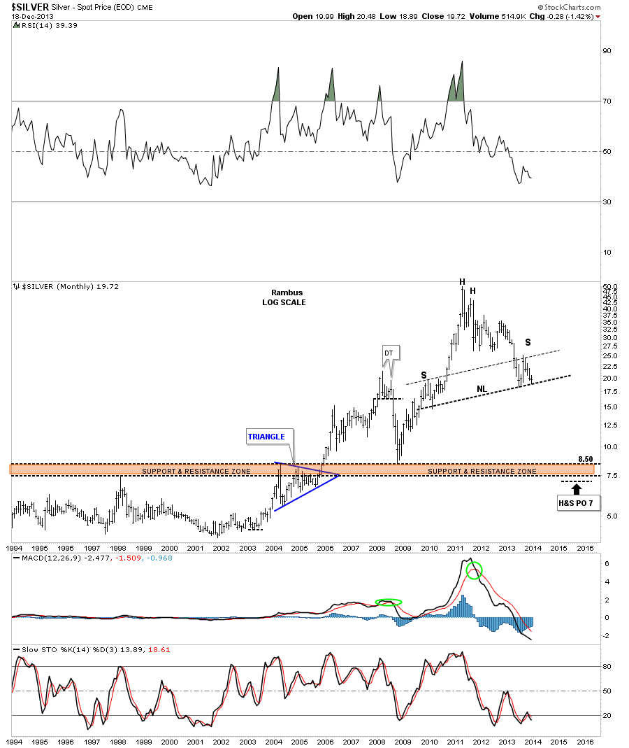
Lets now look at a weekly chart for SLV that shows us the two pretty Diamonds that have formed. I know it feels like this backtest has taken a long time but if you look at the bigger blue Diamond the backtest there took about 12 weeks vs about seven weeks with our smaller red triangle. The apex of the Diamond is critical resistance. We don’t want to see that area violated under any circumstance.
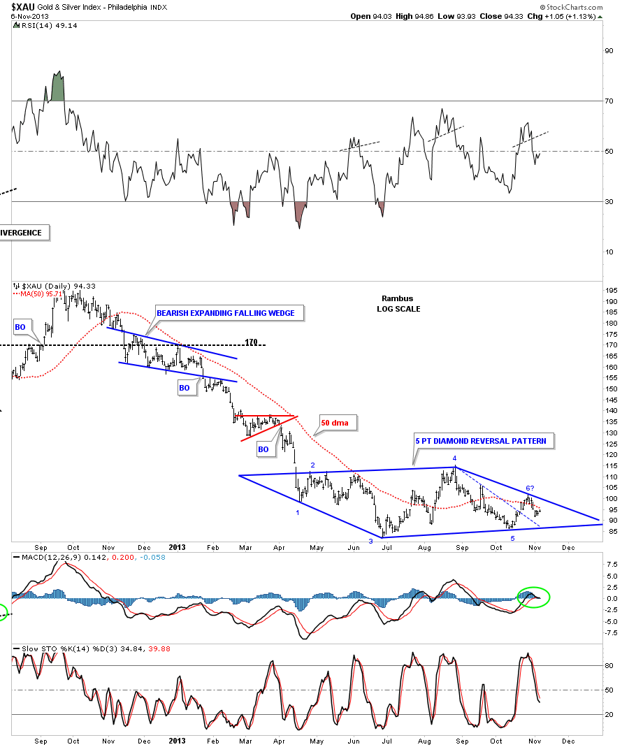
Below is a long term monthly chart for silver that shows neckline being tested on this huge potential H&S top. As I have said several times, I really want to see how silver interacts with this all import trendline as it will give us some good clues to go by. So far it has bounced off of the neckline once so it’s telling us it is getting warmer.
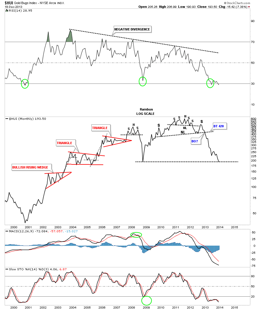
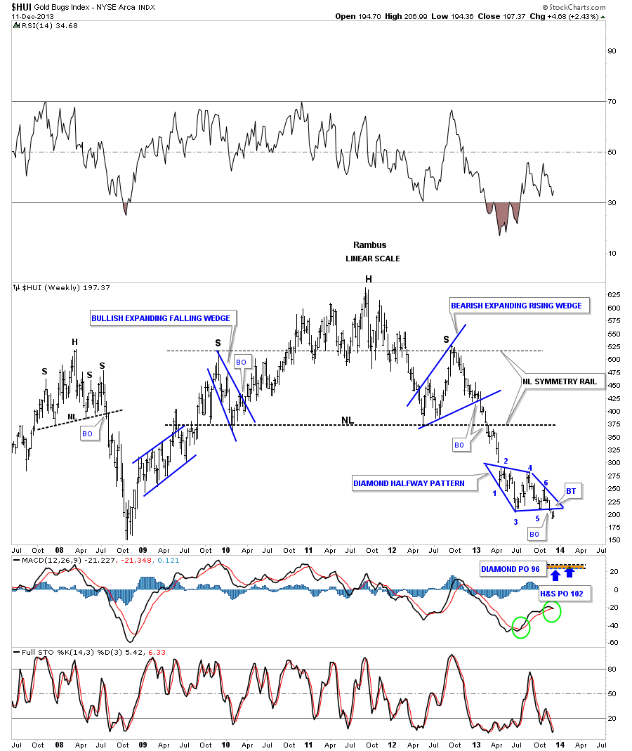
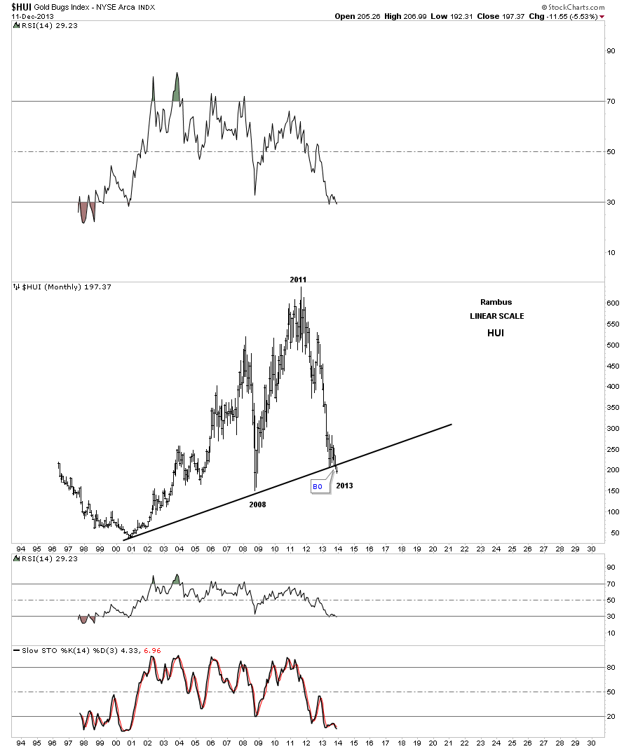
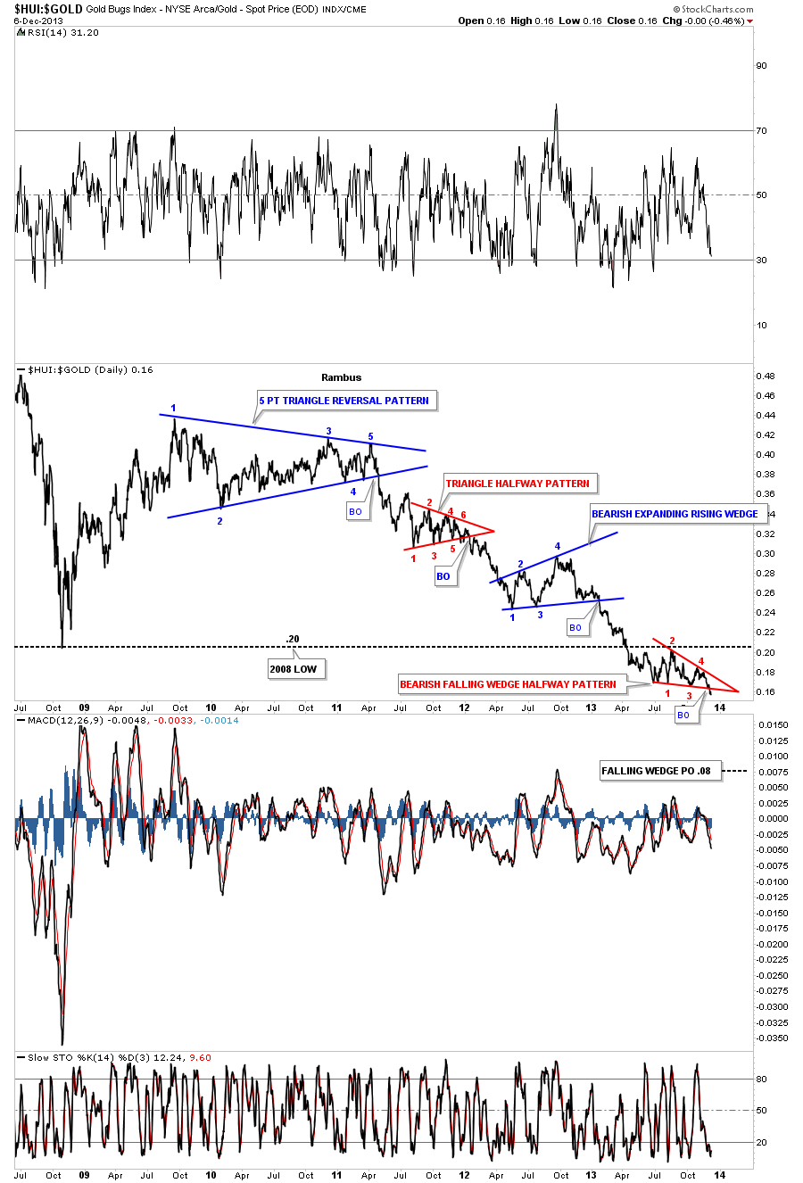
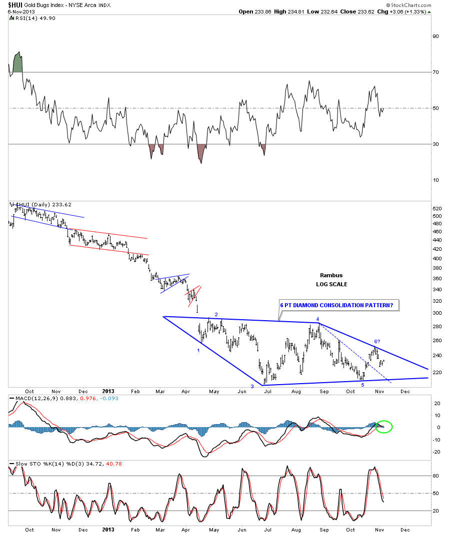
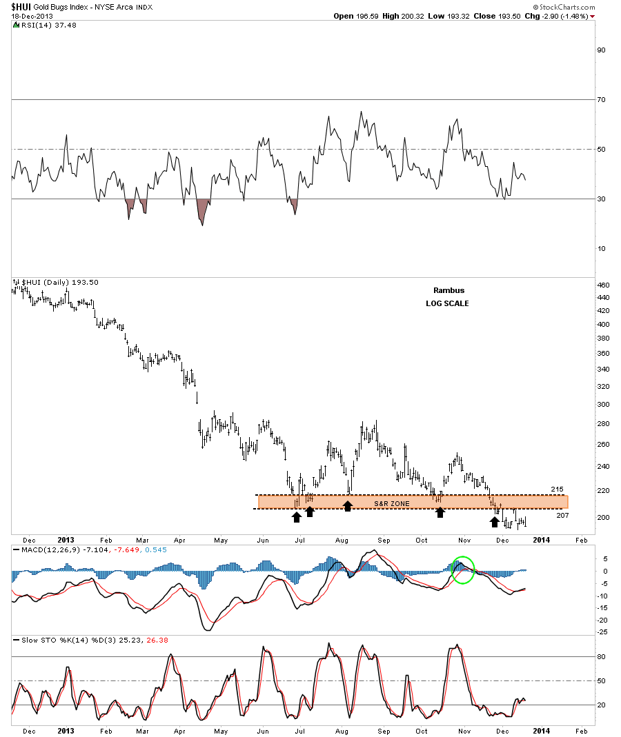
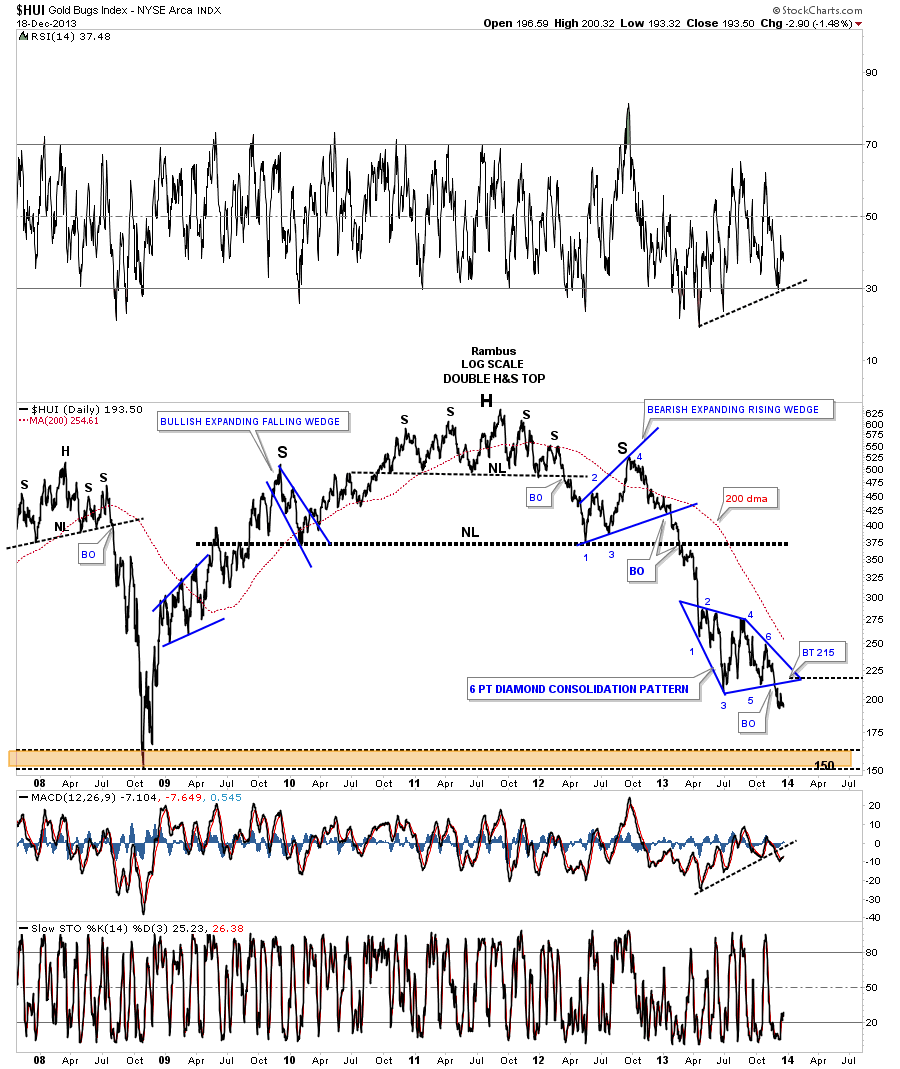
Lets now take a look at the HUI with a simple brown shaded support and resistance zone that has worked out beautifully so far. The black arrows shows previous support points that should now turn into resistance since the HUI has broken below the support and resistance zone. Keep in mind everyone that bought above that brown shaded support and resistance zone is underwater and looking for a place to get out even if they can. This should put a ceiling on the price for the HUI.
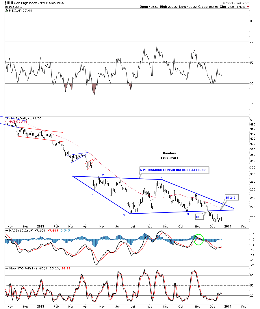
Below is the HUI Diamond consolidation pattern that we’ve been following for quite awhile now. The breakout is still under the gravitational pull from the blue Diamond but with a little more downside effort the HUI will finally break free and move down to the next area of support.
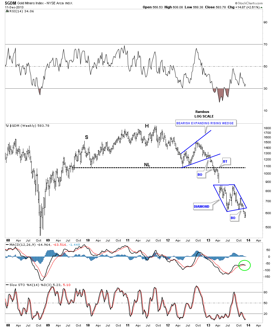
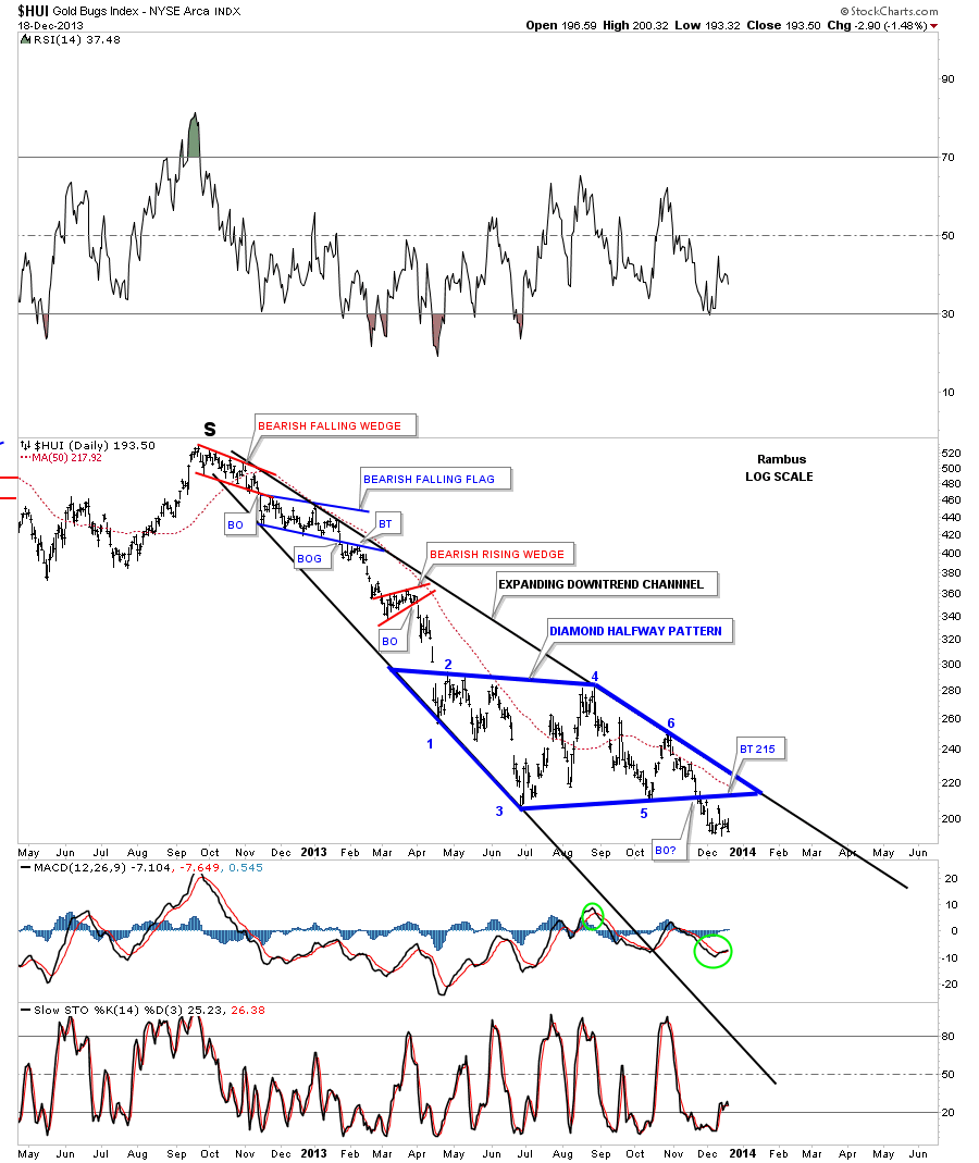
I haven’t shown you this chart for the HUI yet that has an expanding downtrend channel. I did show you an expanding uptrend channel on the gold monthly chart above that has that big potential H&S top pattern forming. This expanding downtrend on the HUI is just the opposite, it’s getting bigger at the bottom. I’ve been following this chart very closely since the 6th reversal point was hit on the blue Diamond that coincided with the top rail of the expanding downtrend channel. This chart starts at the top right shoulder of the massive H&S top pattern, labeled with the bold S. This is what that decline has looked like since the top at 520. Note the smaller blue bearish falling flag that began the expansion of this downtrend channel. This chart looks very ominous to me. If I was a bull and seen this chart I would be very scared of the consequences if it plays out like I think it will. You can see the breakout from the blue Diamond is well underway with nothing but air below.
Below is a weekly line chart for our blue Diamond that shows the top of the right shoulder that we just looked at on the chart above.
The weekly line chart shows us a bearish falling wedge that I consider to be a halfway pattern. Same consolidation area just a different look.
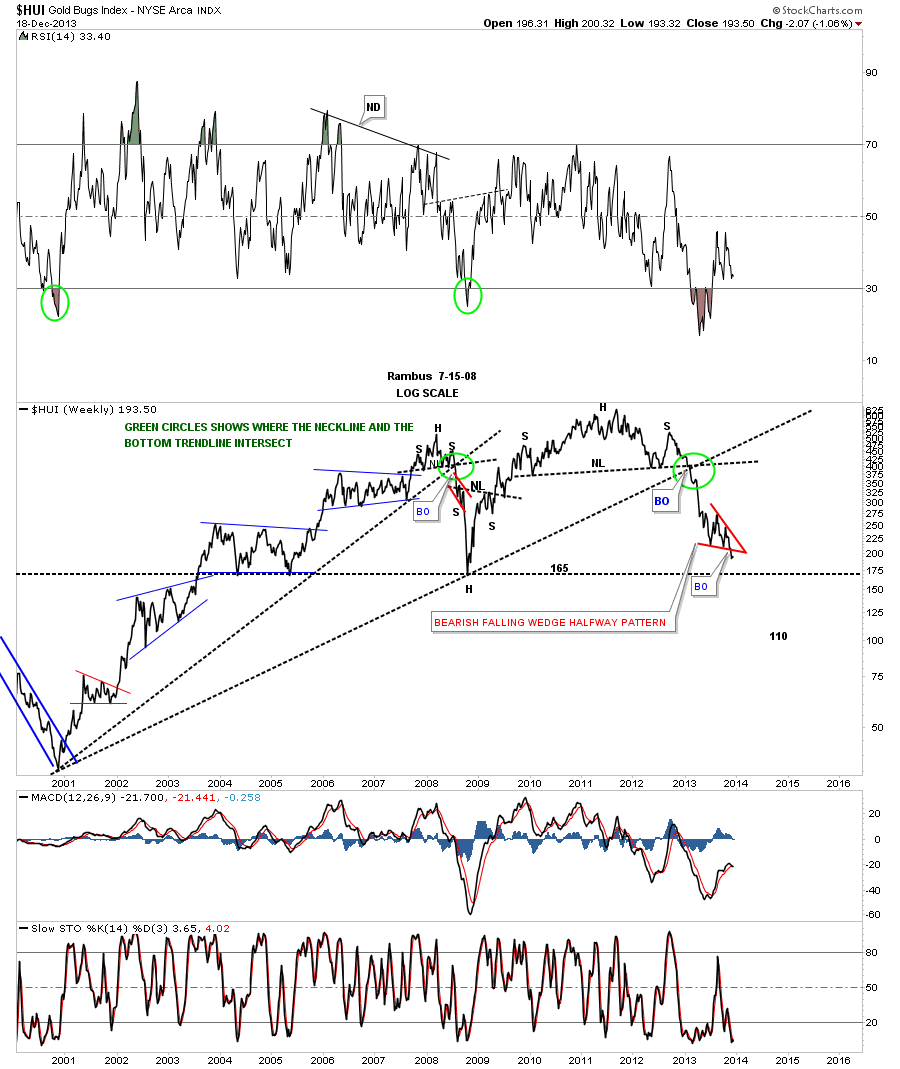
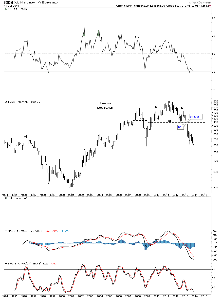
This last chart I would like to show you tonight is a monthly line chart for the HUI. Keep in mind a line chart just shows the closing price, whether it’s a daily, weekly or monthly look. For me this chart really puts things into perspective. As you can see, on a monthly closing basis, we are now trading down at the 2008 crash low. Pretty incredible when you think about it. I don’t have time to show you tonight but alot of the big cap precious metals stocks still have a long ways to go down yet before their price targets are hit. So can the HUI go lower than the 2008 crash low? Stick around and find out. All the best…Rambus