SLV critical backtest

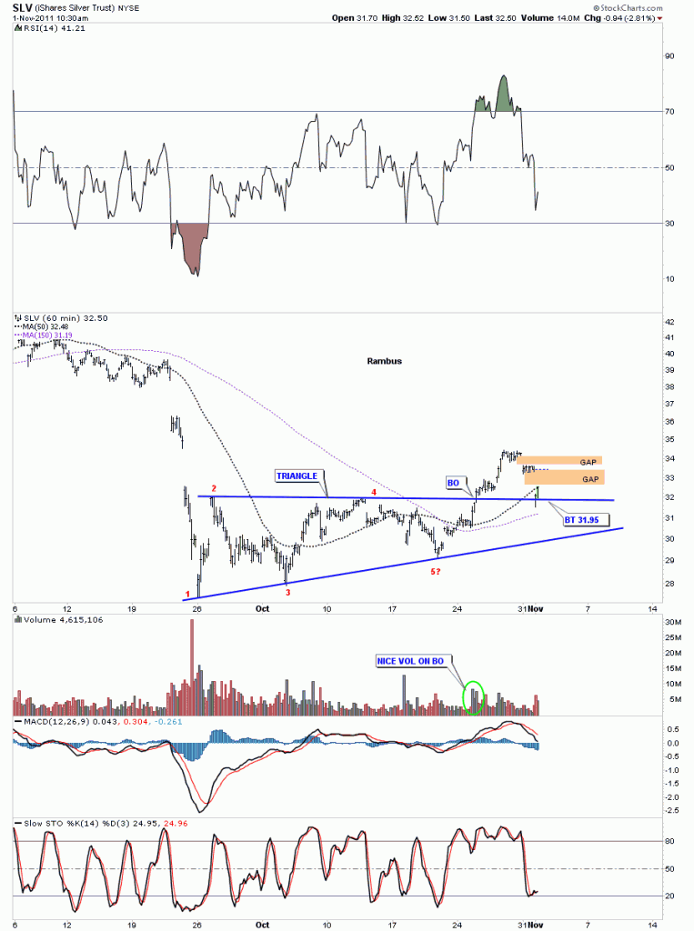
This mornings decline in SLV took us right to the top rail of the 5 point triangle reversal pattern. This is an important test of the triangle. The backtest is the last step in confirming whether a chart pattern is valid or not. Below is a 60 minute chart I have been showing since the triangle started forming at the end of September. This backtest was to be expected but now is the moment of truth. The top rail needs to hold or the triangle may fail. So far we have bounced off the top rail but the backtest is still in progress. So far so good

SLV 60 minute triangle backtest.

GLD update

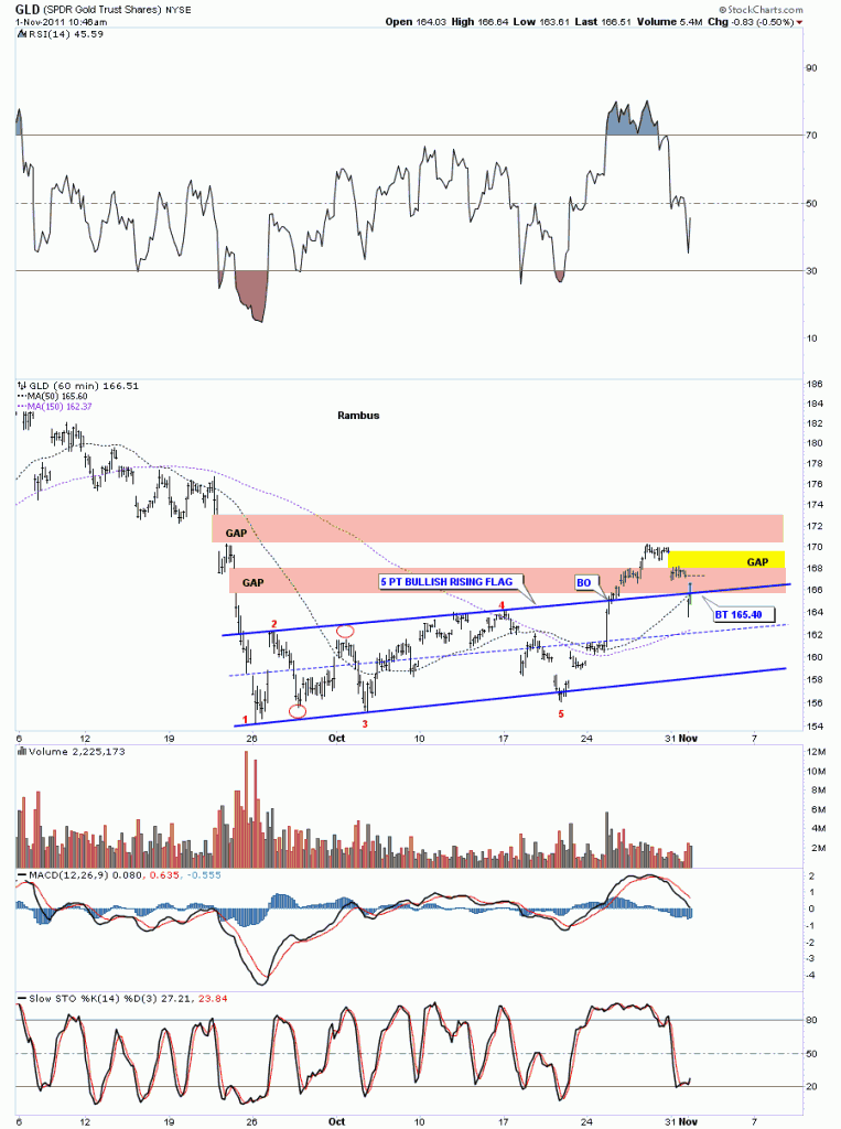
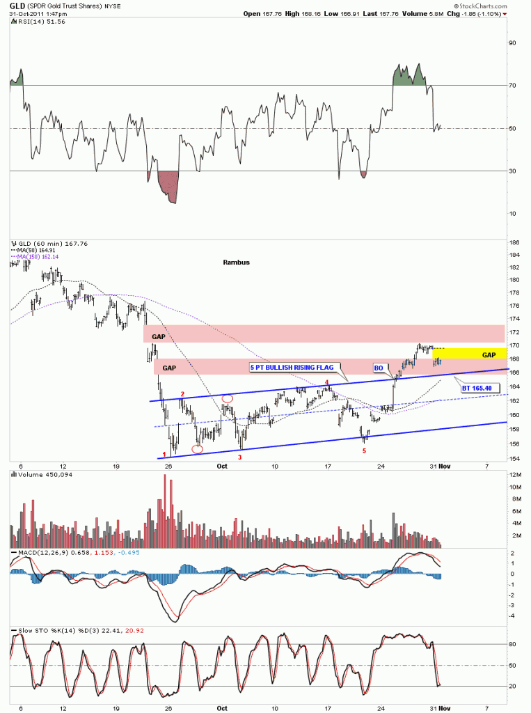
Today we are getting a little correction from last weeks breakout move from the 5 point bullish rising flag formation. As you can see on the chart below we were able to close one of the 2 overhead gaps GLD made on the way down. Fridays action took us up just to the underside of the top gap where we are getting today’s correction. I’ve marked in yellow today’s gap down which should get filled in the not to distance future. If we backtest all the way down to the top rail of the rising flag we could see 165.40.

GLD 60 minute look.

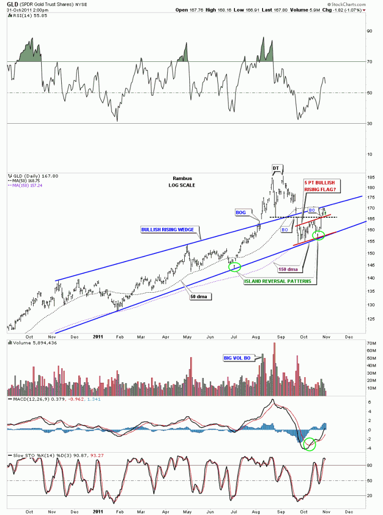
The daily look shows how we hit the top rail last Thursday on the bullish rising wedge pattern. The action GLD has been giving the technical trader has been textbook in that the support and resistance points are playing out just as you would expect. Now GLD has overhead resistance at the top rail of the bullish rising wedge and support should now come in at the top of the red 5 point bullish rising flag. Watch those two areas for further developments. The really big thing to watch is the top blue rail of the bullish rising wedge. Once we get above that top rail we should move on up to test the double top area around 1925 or so. One step at a time.

GLD daily look.

HUI update

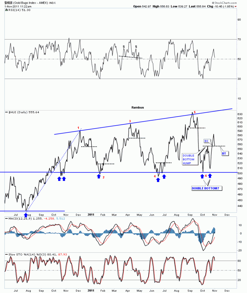
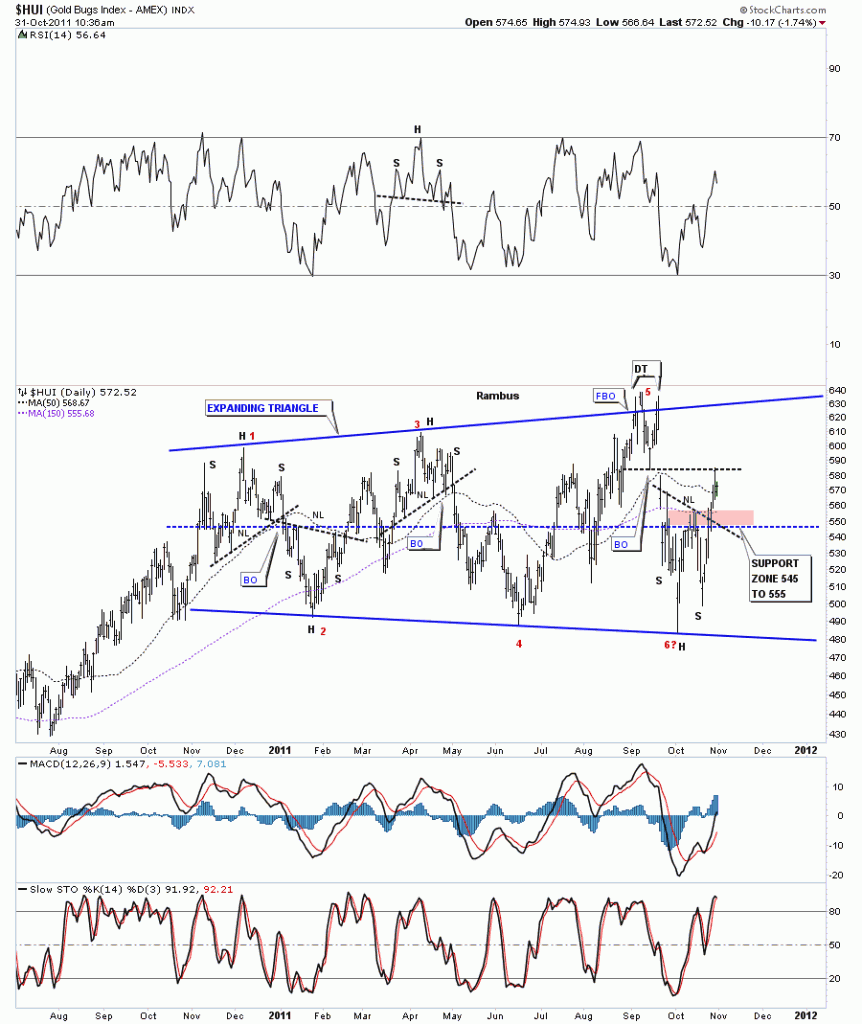
After last week huge run it stands to reason that its time for alittle profit taking by some traders. This is all normal price action. No matter how bad you may want it to be, the markets never go up or down in a straight line for very long before profit takers come in. Today’s daily chart of the HUI shows why we are getting some weakness. The last high made in September was a double top. There was a false breakout of the top rail and then another total reversal point was made all the way down to the bottom of the trading range. Getting back to the double top. Whenever you have a double top or double bottom the hump or the V is always a good place to look for support or resistance. In this case, the double top hump, is acting as resistance. As you can see last weeks rally stopped right at the bottom of the V of the double top. Today’s action is what you would expect on the first hit of that area. Now what we have going is resistance at the double top hump and support at the neckline of the H&S bottom. So we are probably going to do a little ping pong move between the overhead resistance and the neckline support area. I’ve labeled the support zone with a brown rectangle. This is important support to watch.

HUI daily support zone brown rectangle.

Risk on….Risk off Trade

Knowing when to go into a Risk On trade or a Risk Off trade is critical to understand. The risk on trade happens when the dollar is falling. A falling dollar makes everything more expensive as it takes more dollars to buy the same amount of goods that were bought when the dollar was higher and could buy more. Commodities are really affected by a falling dollar in a big way. The risk off trade generally happens when the dollar is rising causing deflation. Deflation is a big no no when you have a debt burden as big as the United States or the rest of the world for that matter. So the only way to try and fight the debt is to print more dollars which is actually a tax on you. We can’t deflate our way out of this economic situation but we can try to inflate our way by making the debt seem smaller as there are more dollars to pay down the debt. This is just a simple explanation of the Risk On and Risk Off trade.

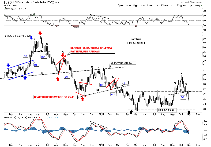
Since the US dollar plays such an important role in the risk on and risk off trades we need to look and see how the dollar is doing. The daily chart below shows the small rally the dollar enjoyed for the month of October. After hitting 80 the dollar stalled out and now has created a H&S reversal top pattern. This is why the stock markets, commodities and precious stocks have done so well the last couple of weeks, a falling dollar. This little H&S top projects down to the May low around 73 as a minimum.

Dollar daily look.
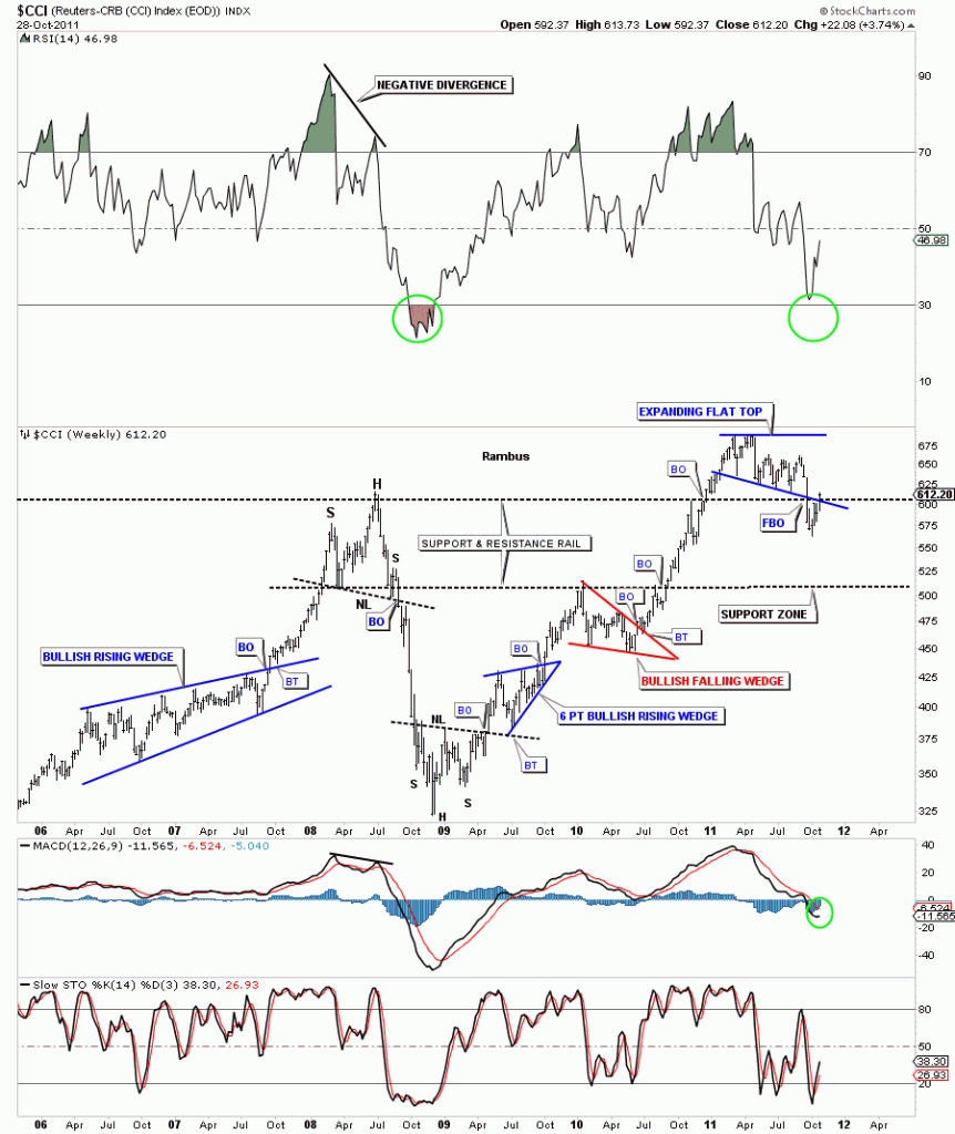
Next we need to look at the CCI commodities index to see how commodities have been doing in general. This index will give us a big clue as to risk on or risk off trade. After breaking the bottom rail of the expanding flat top, the CCI has managed to climb back into the pattern as the dollar has been breaking down from the H&S top. The false breakout on the CCI looks like a bear trap. Alot of times when you get a sharp break of a support rail and then manage to get back into the pattern, the bottom is in and a big move will probably take place.

CCI daily look.
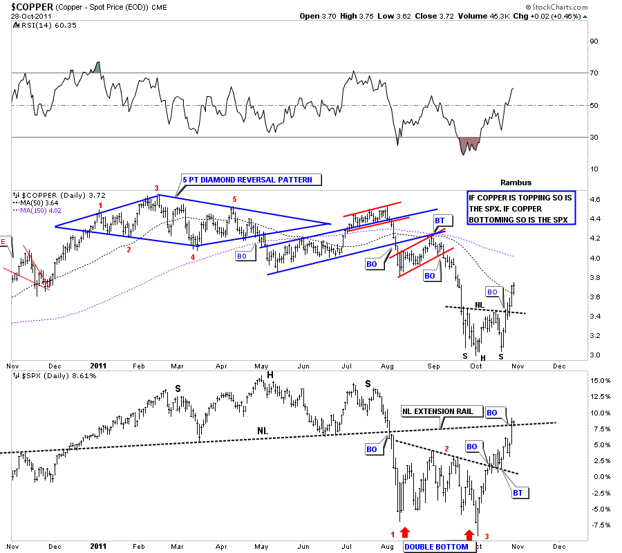
Lets look at some commodities and see if any of them have been bottoming as the dollar has been topping over the last couple of weeks. Copper is a key commodity that reflects commodities and stock market strength or weakness. The chart below shows a good example of how a strong or weak copper price affects the stock market. As you can see when copper is falling so is the stock market and when copper is rising the stock market is also rising reflecting the strength and demand from a growing economy. Copper has completed a very nice H&S bottom while the SPX bottomed with a Double Bottom. This chart shows a good example of a Risk on trade.

Copper top SPX bottom daily look.

Oil is another important commodity that is affected by a rising or falling dollar. The chart below is one of my favorite oil charts going all the way back to the beginning of it’s bull market in 2002. It shows the parabolic move to 147 and then the even faster move down into the commodities crash low at the end of 2008. The crash low ended with a double bottom similar to the double bottom we have just broken out of recently. Note the price objective from the H&S top that occurred during the parabolic rise and the steep decline. The linear scale oil chart nailed the bottom of the crash almost to the penny. Pretty amazing. The H&S price objective is also the top of the very long term trading range that goes way back in time.

OIL long term daily look. Current double bottom.
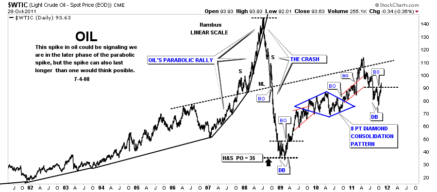
The 20 year oil chart is a good study in support and resistance. Note where the 2008 crash ended. Right on the old resistance highs that held oil in check throughout it’s history. Now that resistance reversed it’s role and is now long term support.

OIL long term chart.
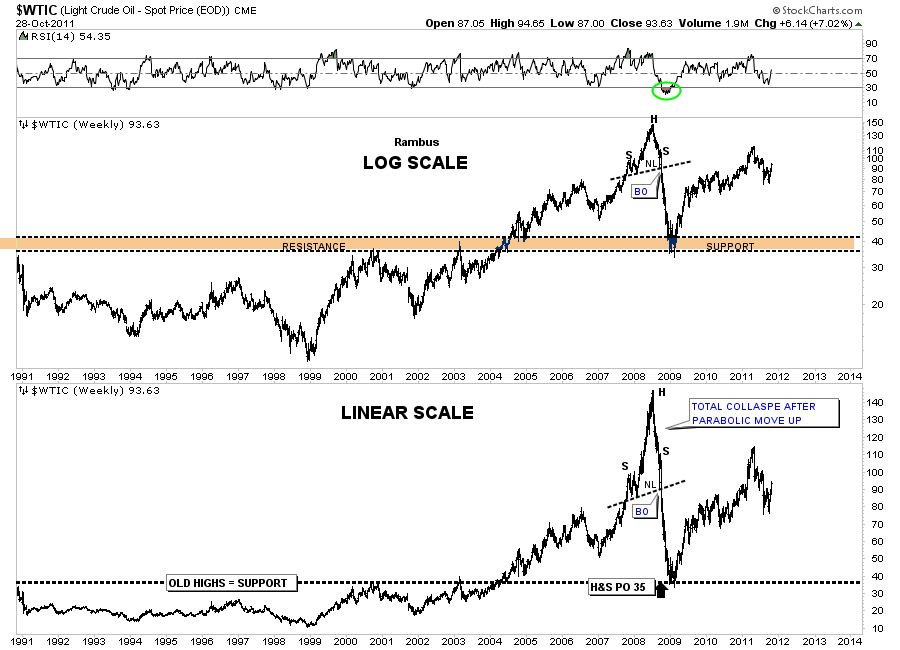
The IYM, Basic Materials ETF, is another good place to look for inflation visa vie a falling dollar. The IYM, like copper, has also put in a H&S bottom and has rallied all the way up to to the big H&S top and just hit the neckline from below. The H&S top formation is what led to our 3 months or so of a deflation scare that looks like it is not going to materialize this go around. Alittle pause here to refresh should be expected over the very short term.

IYM basic materials daily look.
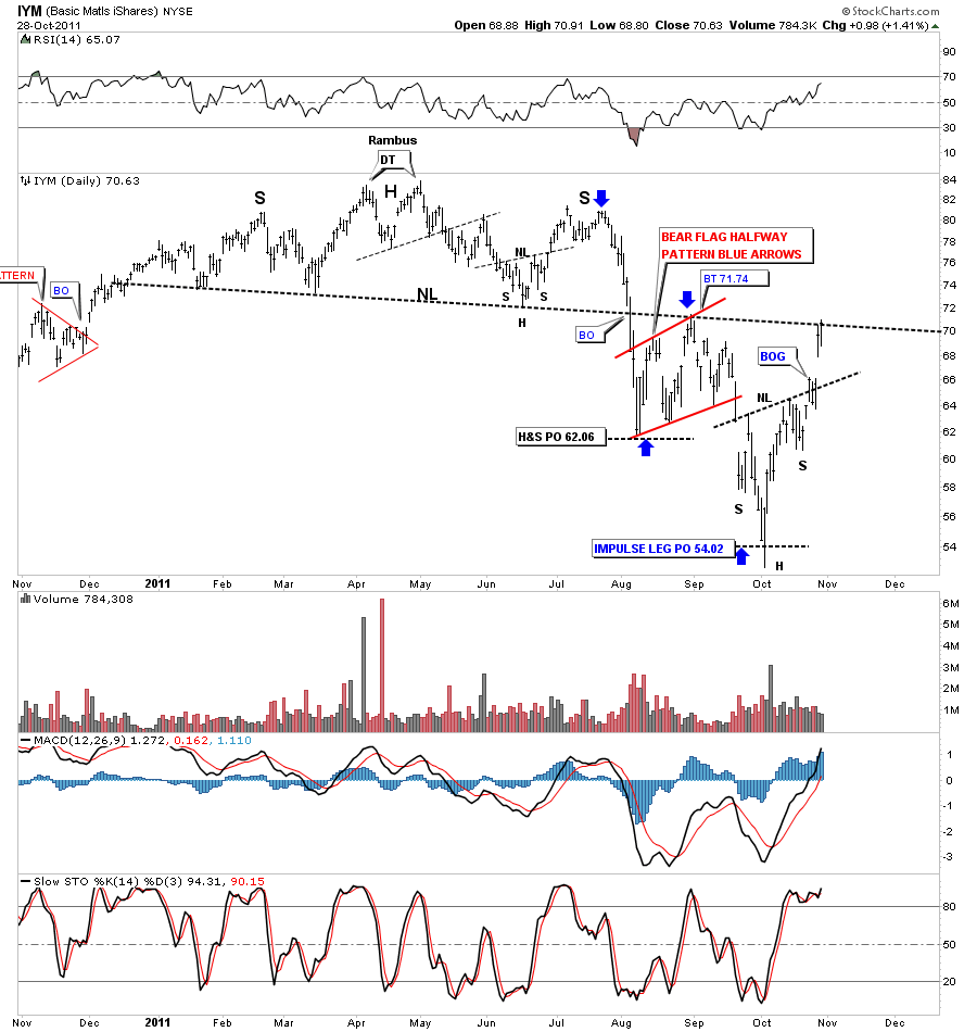
Lets take a quick look at a couple more commodities just to get a feel for the strength they have been displaying over the last month while the dollar was topping. The SLX looks at steel. If we are going to have a rebound in the economy steel will play an important role in the recovery.

SLX steel daily H&S bottom.
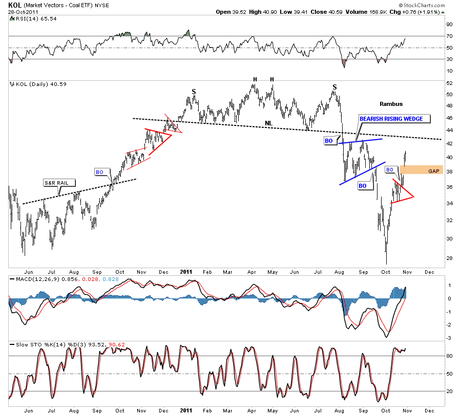
One last chart to show the strength in commodities. KOL is a coal etf. If you are going to have a pickup in the economies of the world coal will play a vital roll.

KOL-Coal daily look.
By looking at the above charts it sure looks like inflation is about to come to the for front and lead the commodities higher. I could have added precious metals to this inflationary scenario but I think you can see a falling dollar is going to put upward pressure on inflation, the stock markets and commodities, just as Gold and silver are suggesting after they have completed their most recent bottom patterns. So, the risk on trade is where its at right now and one should be trading accordingly.

All the best…Rambus

IMPULSE MOVES

What is an impulse move and where does one begin? An impulse move is a very strong move that takes place after a period of consolidation or at the end of a very large decline. Depending on what time frame you are looking at they can be small if you are looking at minute charts or they can be very large if our are looking at a daily or weekly chart. An impulse move starts from the last reversal point within a consolidation pattern just before the breakout. The HUI bull market is a text book example of what an impulse leg looks like. From the very beginning of it’s bull market in early 2001 there have been 6 impulse legs higher, red numbers on the chart below. Two have started at the bottoms and the rest during consolidation patterns. The two bottoms where an impulse leg got started was the bear market low in 2001 and then after the 2008 crash. When you look at the chart of the HUI below it becomes very obvious what an impulse leg looks like. They are the straight line advances out of the consolidation patterns.

HUI weekly bull market chart patterns and impulse legs.

Gold has also been creating nice consolidation patterns and impulse legs since the beginning of it’s bull market. Alot of times an impulse leg up will be divided into two equal parts with a smaller halfway pattern that shows up in the middle of the move. I’ve labeled two little red triangles as halfway patterns on the chart below. You can see they came right in the middle of the impulse leg up. One at the end of 2005 and the other in 2007.

Gold weekly chart patterns with impulse legs in between.

Lets take a look at Silver’s last impulse leg up to the 50 area. It was a text book move divided by an expanding triangle halfway pattern. On the silver chart below there are two impulse legs measured by the green and blue arrows. Just remember an impulse leg starts from the last reversal point within the consolidation pattern. Impulse legs are the power moves during a bull market.

Lets take one more look at what an impulse looks and feels like. Below is a chart from our model portfolio that shows each impulse leg higher off the 2008 crash low. The big blue consolidation patterns are where the energy is derived from to create the next impulse leg up. The smaller consolidation patterns are roughly the halfway point during the impulse leg higher.  If you look at our latest blue consolidation pattern you may begin to understand what might be coming down the road in the not to distance future. Understanding how markets works, from a chartists point of view, can give you an edge in knowing what and where to look for certain things to develop.

FVI.TO weekly look.

I posted this chart a couple of weeks ago showing where I think we are in context of the big picture. Note the purple arrows, your are here, on the chart below. If this is truly the start of the next big impulse leg higher you can see what lies ahead of us. Impulse moves are NOT to be traded. They are to be rode like a wild bronco for 8 seconds and then you jump off after the impulse leg is finished and wait for the next consolidation phase to begin.

EXK weekly look, you are here.

AXU H&S bottom

If the precious metal stock indexes are making H&S bottoms then it stands to reason that many individual stocks will also be making the same pattern. AXU is a good example of a completed H&S bottom. AXU broke the neckline 3 days ago. If you remember the sharp shakeout yesterday morning, after a very good open, alot of precious metals stocks did their backtest to the neckline to complete the breakout. H&S patterns are the most useful chart pattern to show reversals, either up or down. If you see one don’t ignore its implications for the stock or index as these are very powerful reversal patterns. H&S patterns also are good for measuring the future price objective of the underlying asset.

AXU daily H&S breakout.

HL quick update

Last night I did the weekly stock analysis for HL that was requested by Goldfool. I pointed out the H&S bottom was nearing completion as we were trading right at the neckline. The 60 minute chart shows the clear breakout this morning with nice volume accompanied by a breakout gap.

HL 60 minute breakout.

The daily look shows how this mornings gap up, on the breakout, took out two resistance rails at one time, the neckline and the mid rail of the downtrend channel. Its possible HL may do a backtest to the breakout point but there is no guarantee that will happen. If it does happen that would be a great low risk entry point  if one is not already in the stock.

HL daily H&S breakout.