Weekend Report…The Chartology of the S&P 500

In order to get the whole family together we are celebrating Christmas this afternoon. If you have a big family you know what I mean. I have two grandson’s overseas with one making it home for the holidays so today is our day to celebrate Christmas.

This Weekends Report is going to be short and sweet as there are not enough hours in the day right now to get everything done. There will be some slow time after Christmas to get more in-depth on what I see happening in the markets. Today’s chart for the SPX which gives you a glimpse of what could be possible.

After the 2000 bull market ended the SPX began to build out a massive 13 year flat top triangle consolidation pattern. The breakout occurred in March of 2013 at the 1555 area which began the second leg of the 2009 bull market. After the initial breakout above the top rail of the flat top expanding triangle at 1555 there was a quick backtest which launched the SPX on its next impulse move up to the first reversal point in the blue bullish  expanding falling wedge halfway pattern at 2135.

After that impulse move up to 2135 it was time to consolidate that impulse move with the SPX forming the blue expanding falling wedge halfway pattern. Without even measuring for the price objective for the expanding falling wedge halfway pattern you can visually see how it formed in the middle of the two big impulse moves from the top of the 13 year expanding flat top triangle at 1555 to our most recent high at 2940.

To measure the blue expanding falling wedge halfway pattern I used the breakout to breakout method to get the price objective up to 2911. To get the breakout to breakout measured move you start with the breaking of the 13 year flat top expanding triangle at 1555 and measure up to the first reversal point in the blue expanding falling wedge which is 2135. You then take that measurement and add it to the breakout point on the blue expanding falling wedge halfway pattern to get your price objective us to the 2911 area as shown by the blue arrows.

After the price objective was met at 2911 there was a strong possibility that it was time to begin consolidating that second leg. If you recall, after the February low this year was confirmed, I began to label the price action as a new trading range knowing there were two possible outcomes. Either the SPX was going to buildout another consolidation pattern in its 2009 bull market or the price action would buildout a top. Those are the only two options. As you know I’ve been in the bull camp for a long time so I was leaning towards our current one year trading range being a consolidation pattern that would eventually breakout topside.

We’ve discussed many times in the past that a stock does only one of three things from a Chartology perspective. A stock can buildout a consolidation pattern, a reversal pattern or is in an impulse move. This past week the price action is showing us that the trading range that began to buildout in January of this year is not going to be a consolidation pattern to the upside but instead is going to be double top reversal pattern which is ushering in a brand new bear market.

The reason I’m showing you this 25 year chart for the SPX, is how the top rail of that 13 year flat top triangle at 1555 could come in play as possible support if the new bear market gets going to the downside. What had been resistance for 13 years should now be support on a backtest.

This second chart for the SPX is exactly the same one as the chart above but I’ve added the Fib retrace. The fib retraces the beginning of the bull market that started in 2009 to our most recent high at 2940. What’s very interesting is that the 61.8% retrace of the 2009 bull market comes in at the top rail of the 13 year flat top expanding triangle at 1535 just 20 points lower than rail the top of the expanding flat top triangle which is 1555.

During the bull market years the RSI would declined down the the horizontal line where it found support which would lead to the next rally phase. This past Friday the RSI closed right on the bull market RSI line. A breakout below the horizontal bull market support line would be a major change of character for the RSI. The green circles show where the RSI bottomed in 2002 and 2009. Will we see that same general are hit again during our new bear market?

I would like to wish everyone a happy holiday season with your family and friends. All the best…Rambus


AAPL Update…

Just a quick update on the daily chart for AAPL one of the largest of the big cap stocks on the planet. After building out a H&S top in September of this year AAPL declined very quickly to the downside where it began to consolidate the recent impulse leg down. The consolidation pattern that AAPL built out is a pattern all of you have seen many times in the past which lets us know that a stock or market is in a hurry to move, in this case down, the pattern is the bearish falling wedge which slopes in the direction of the downtrend.

Today AAPL is breaking out from the bottom rail of the bearish falling wedge. Keep in mind this pattern is like any other consolidation pattern as it shows roughly the halfway point in a bigger impulse move. Note the bigger combo H&S – black bullish rising wedge that built out earlier this year on the left side of the chart. For those that have the ability to short this stock or buy put options you can use the top rail of the bearish falling wedge as your sell/stop.

I used the breakout to breakout method to get a price objective for the bearish falling wedge halfway pattern which would be down to the 128 area shown by the blue arrows. Again, these patterns show up in fast moving markets.

This weekly chart puts everything into perspective. The price action leaving the falling wedge should look similar to the price action leading into the falling wedge so we could see this move lasting another two to three weeks before the falling wedge price objective is reached.


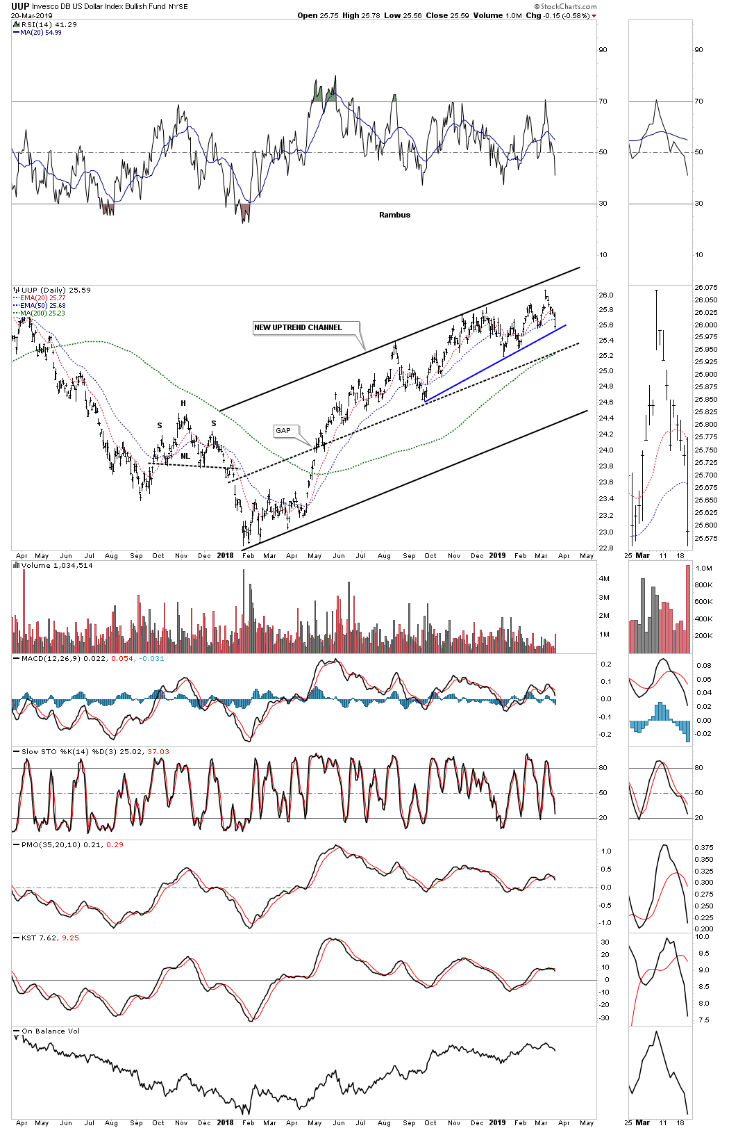
UUP Update…The Dollar Channel

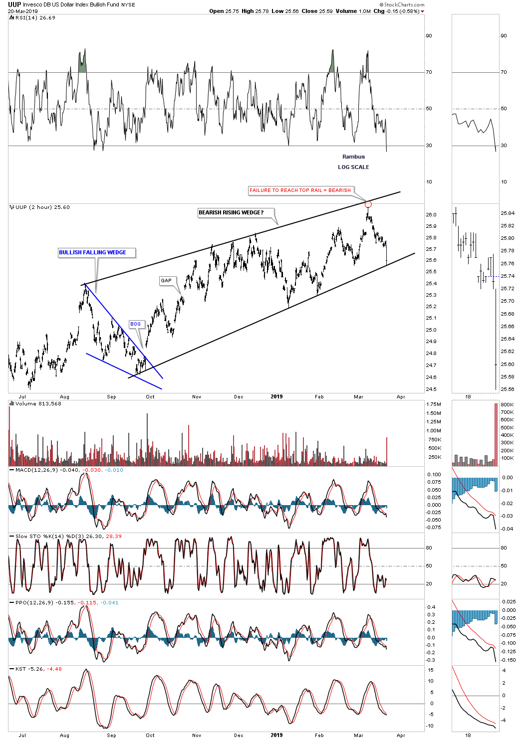
Yesterday I posted this daily chart for the UUP suggesting that it could very well be building out a new uptrend channel with the current price action trading at the top rail where it has been chopping out the small blue rising wedge. Today we are getting some follow through to the downside.

Below is the weekly chart which shows how the new uptrend channel could still be bullish over the longer term as long as the price action can stay above the bottom rail. Today the PM complex is definitely trading inversely to the US dollar’s decline.


Weekend Report…The Amazing Story of Gold to Gold Stocks Ratios.

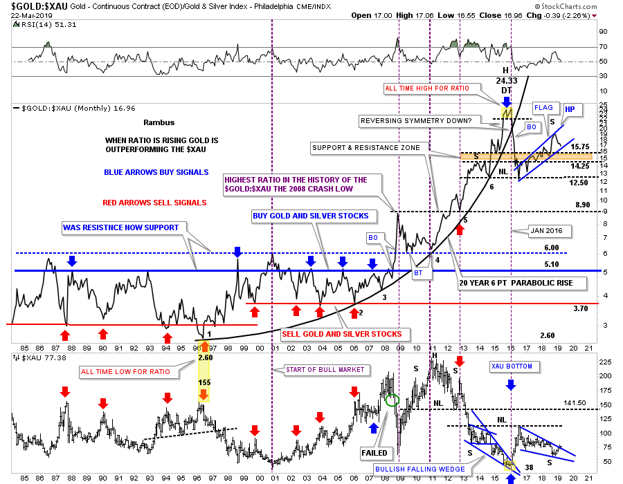
Tonight I would like to show you some charts from the PM complex we haven’t looked at in a long time. Some of these charts will look familiar to some of our long term members as they were very helpful in the past to help us figure out what the PM complex was up to. This first chart is a ratio combo chart which has the GOLD:XAU on top and the XAU on the bottom. When the ratio is rising gold is outperforming the XAU. During the bull market years starting around 1999 or so the ratio would trade between roughly 5.10 on top, blue horizontal line, and 3.70 on the bottom, red hormonal line. When the ratio rallied up to the blue line around the 5.10 area it was a good time to back up the truck and buy your favorite PM stocks and when the ratio got down to the red line around the 3.70 it was a good time to sell your PM stocks.

That worked out very well until the crash in 2008 which changed everything in regards to the ratio chart. As you can see the ratio broke out above the blue horizontal trendline and rallied all the way up to 8.90 which was the highest this ratio had been in history. There was no way to know back then that this was the start of the massive underperformance of the XAU to gold or PM stock in general to gold. The ratio sold off down to the 6.00 area that reversed its role to what had been resistance at the all time high for the ratio, to now support from above in September of 2009. The ratio chart on top finally topped out in its 20 year six point parabolic arc in January of 2016 which began the baby bull market, yellow shaded area at the top of the chart. When that small double top broke down is when we took our first PM stock positions which at the time was a good buy signal. The price action sliced right through the parabolic arc like a hot knife through butter and things were once again good for the bull market in the precious metals stocks.

The brown shaded S&R zone was the first place we began to look for initial support, but the ratio broke down a little further and finally found support at the previous low at 12.50. Looking at that massive decline off of the double top high at 24.33 you can see why the 2016 rally was so strong, as shown on the bottom chart for the XAU. We got a nice bounce off the 12.50 area which looked like we could see the ratio start building out a H&S top but that wasn’t going to happen. As the ratio kept drifting higher and higher the XAU drifted lower and lower which brings us up to our current situation. Currently the price action on the ratio chart on top is testing the top rail of a rising blue flag, while the XAU on the bottom chart is testing the bottom rail of its possible bullish falling wedge. To really get this rally going in the precious metal stocks we need to see the ratio chart on top break to the downside in no uncertain terms. If the ratio chart ever trades back into its old trading range between 3.70 at the bottom and 5.10 at the top the PM stocks should be massively higher than where they are trading today. The very first thing we need to see happen is for the blue falling wedge on the XAU to breakout and move higher in an impulse type of move. The setup is there now we just need to see some follow through to the upside on the XAU.

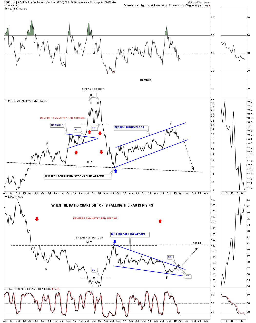
This next chart is a weekly ratio combo chart for the GOLD:XAU ratio on top and the XAU on the bottom. This chart shows the last seven years of the ratio combo chart above. Here you can see how the possible H&S top is building out on the ratio chart which in turn will show a possible H&S bottom on the XAU. After we got the initial bounce in the ratio chart in July of 2016, and the high on the XAU, I was looking for a possible right shoulder to build out that would show some symmetry to the left shoulder in both the ratio and the XAU charts. That began to fall apart at the beginning of this year as both have been trading inside of their 2016 trading ranges. Again, for the bullish case, it’s possible that we could be seeing the price action testing the top rail of the potential bearish rising wedge on the ratio chart with the potential test of the bottom rail of the bullish falling wedge on the XAU chart.

Below is another long term ratio combo chart we haven’t looked at in ages which has the HUI:GOLD ratio on top and the HUI on the bottom. This chart really sums up how badly the HUI has done vs GOLD. When the bull market began for the HUI back in November of 2000, the HUI kicked gold’s butt on the initial thrust and for the next three years until December of 2003. Believe it or not that was the last time the HUI has outperformed gold in a meaningful way right up to the present. Note the price of gold when the ratio topped out in December of 2003 which was just $400. Note where the ratio was trading back in September of 2011 when gold topped out at 1920.

When the ratio broke down from that 7 point diamond reversal pattern, it had to be a reversal pattern because it formed above the previous low, another impulse move to the downside began once again. How could this be happening? The ratio finally found support in 2012 and built out the small red rising flag. At the time I labeled the red rising flag as a reverse symmetry pattern which is related to the small Red Bull flag which was the very first consolidation pattern in the new bull market back in 2000. I remember just like yesterday we kept waiting for the price objective of the small red bear flag to be hit at .13 which was the all time low up until that point. As you can see we got a couple of small bounces off .13 but the ratio had to shakeout the last holders of the HUI stocks and traded below the .13 S&R line. We now have a potential bullish falling wedge on the ratio chart which is the best setup in many years. Hopefully if this is the true bottom we’ll see something like what happened at the beginning of the 2000 bull market where the HUI kicked gold’s butt for three full years.

The bottom line is that the ratio is now lower today with the price of gold at $1250 than it was at the beginning of the HUI’s bull market in Year 2000 when the price was almost exactly $1000 lower . Pretty amazing when you think about it.

All the best…Rambus

Wednesday Report…Gold Oil and Commodities …Back to the Future ?

Before we look at tonights charts I would like to take a minute to discuss trading the three X leveraged etf’s. Leveraged etf’s aren’t for everyone as they can be very volatile. These instruments are for those that can take a bigger risk and still come out OK when they go against you. For the average investor a 1 X leveraged etf is all they can handle and that should be fine. When you start playing with the 2 X and 3 X leveraged etf’s your risk factor goes up very fast.

Placing a sell/stop in the correct place works great for the 1 X leveraged etf, but when you are in a 3 X leveraged etf setting the sell/stop is a totally different game. Very rarely do I let the original sell/stop be hit before I will exit the trade as you have to give the stock some wiggle room when you first take a position. As more information becomes available you can start to make adjustments to your sell/stop mentally. A 3 X etf can get away from you in a heartbeat so one has to pay very close attention at all times.

With the 3 X Kamikaze stocks the leverage can be very high and can knock you out of a decent trade before it has time to start working in your favor. There is no worse feeling than waking up in the morning and seeing one of your Kamikaze stocks trading down15% or more before you can do anything about it. This is why we call them Kamikaze stocks.

Always keep in mind that leverage can cut both ways. During that two year bull run in the stock markets from 2016 to January of this year we had as many as 35 stocks at one time with many being 3 X leveraged positions. Once you can get ahead on your positions you can then move your sell/stop accordingly. As I’m more of an intermediate term trader I like to use the 30 week ema as my sell/stop as it usually gives the stock enough room to breathe. Again, leveraged stocks are not for everyone so please keep that in mind the next time you are deciding where or not to take on the leverage.

Tonight I would like to start out by looking at the HUI and show you why I decided to exit all my Kamikaze stocks today. The Kamikaze stocks are similar to options that decrease in value over time, but not to the extreme an option can lose value. It’s more of a slow decay in price, but after a fair amount of time you can begin to see the decay working against you which is why you try to time your purchases during an impulse move. Even then when a consolidation pattern starts to build out time is eroding your Kamikaze stock.

Below is one of the weekly charts we’ve been following which shows the parallel 2016 downtrend channel. In the center of the downtrend channel you can see the blue 7 point falling wedge reversal pattern. It’s a reversal pattern because it formed above the December 2016 low. The blue arrows measure the price objective which was down to the 119 area. The actual low came in at 131which was about 12 points higher than the price objective which could be close enough to call it done. Also you can see the black dashed horizontal line that is taken from the double bottom hump made back in 2015 which led to that impulse move up to the August 2016 high. Note how the HUI has been trading around the double bottom hump trendline around the 139 area making little progress.

This next chart is a longer term weekly look at the HUI which shows the same percentage bear market rallies in the blue shaded vertical areas. Note the brown shaded support and resistance zone the HUI has been trading in that runs from the 2015 double bottom hump at 139 to the 2008 low at 150 with a quick tick up to the bottom of the first reversal point point in the blue triangle at 162. So far the HUI has been trading within the brown shaded S&R zone for close to three months now frustrating both the bulls and bears alike.

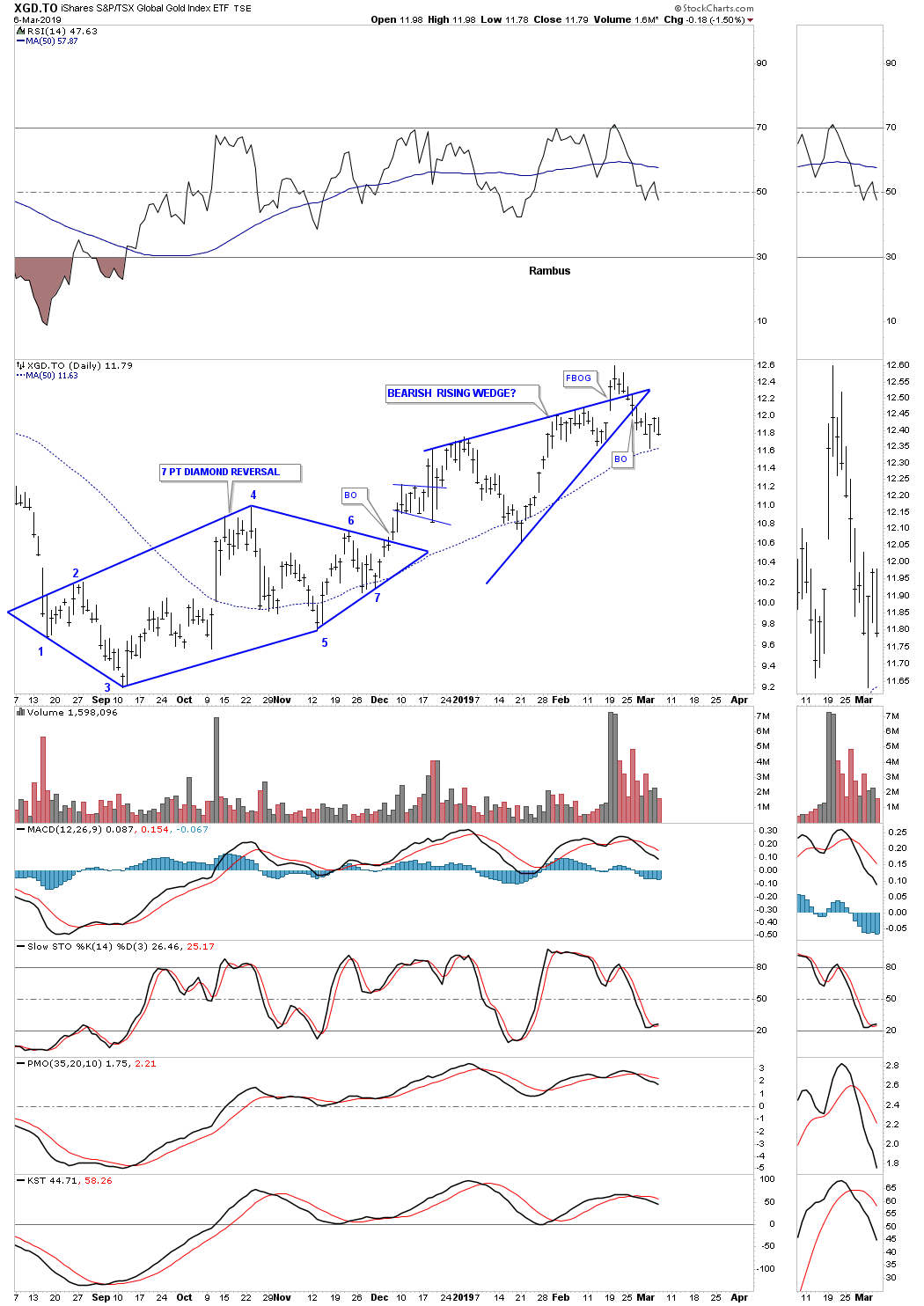
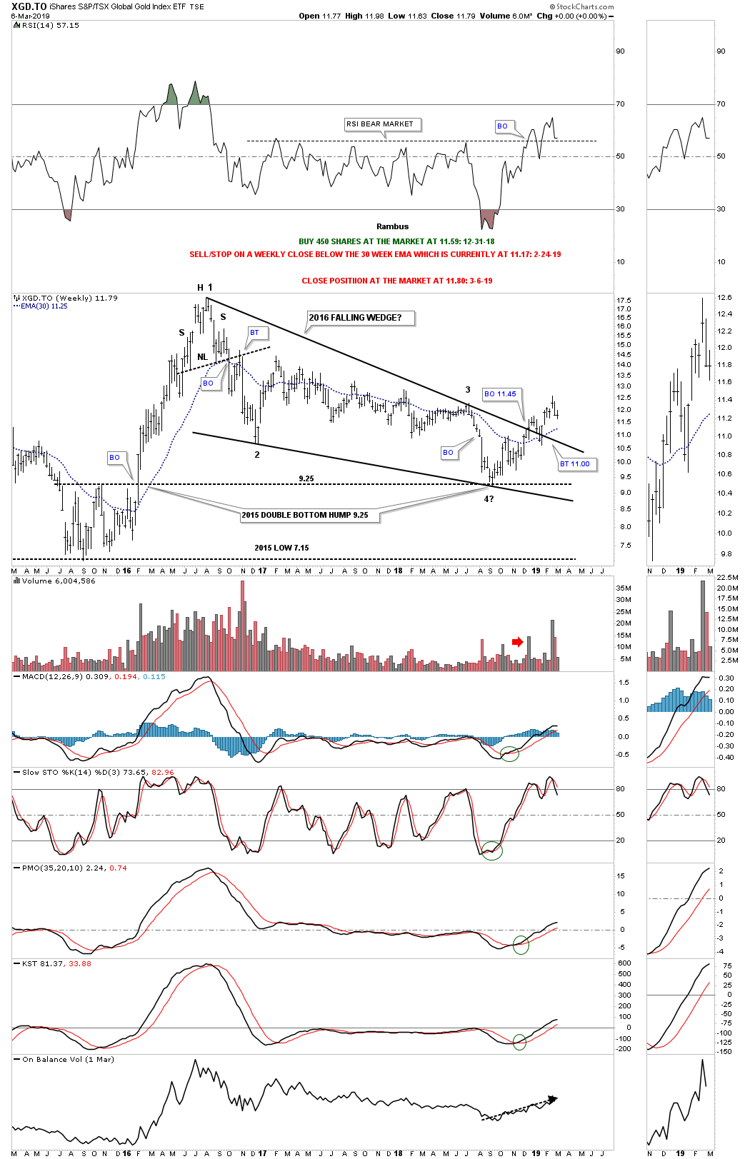
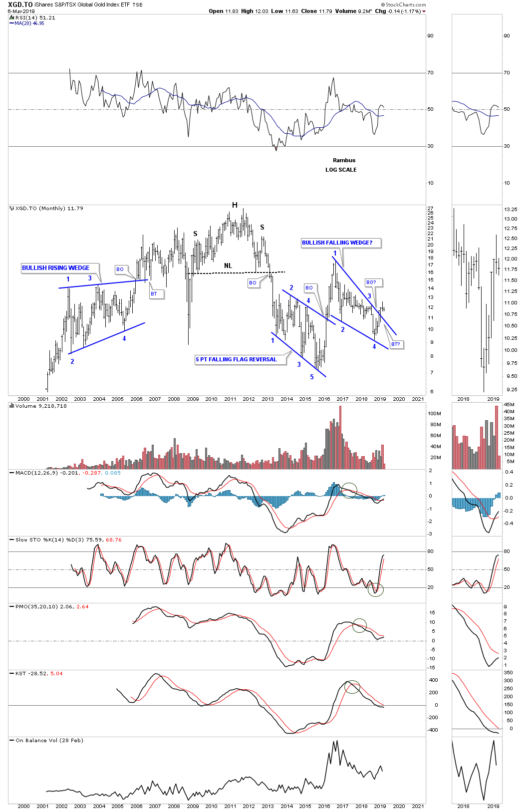
This next combo chart I’ve only shared with you one time several months ago which shows the pink shaded S&R zones. It’s too early to know yet, but there is a possibility that the PM stock indexes may be building out a double bottom on the double bottom hump from the 2015 double bottom. That was a mouthful. The green vertical shaded area on the left hand side of the chart shows the 2015 double bottoms where applicable. The green vertical shaded area on the right side of the chart shows the possible 2018 double bottoms forming on many of the stocks indexes. Some of the possible double bottoms are forming right on or just above the 2015 double bottom hump like the HUI, SGDM, XAU, XGD.TO and SIL.

I’ve been showing you the 2016 decline as a possible parallel downtrend channel as shown on the weekly chart just above the one above. With the possible double bottom building out I changed the angle of the lower trendline to intersect the possible double bottom which gives us a 25 month falling wedge formation in most cases. Please keep in mind this is only a possibility right now as there is a lot of overhead work that needs to be done before we can entertain the thought that we have a potentially bullish rising wedge building out. If in fact these PM stocks are putting in a small double bottom, which is creating the fourth reversal point in the falling wedge, then in most cases we could possibly be trading right at a very important low. Let me stress one more time, this is only a possibility right now, but it shouldn’t take too long to get our answer.

Next we need to look at oil as it may be sending us an alarm about the US stock markets. There is kind of a misconception that the economy does better when oil is cheap and plentiful, but that’s not totally accurate. Normally the stock markets and the Transportation Average like a rising oil price as long as it doesn’t get out of control to the upside. With oil crashing since the first of October it’s not what I wanted to see for the continuation of the bull market in stocks. Oil should be trading sideways while the US stock markets continue their sideways trading range that began in January of this year.

I have a ton of oil charts so lets start with a daily line chart, in linear scale, which shows the bottom rail of the 2016 uptrend channel giving way this week.

The daly log scale of the same price action shows us a bearish rising wedge.

This next chart for oil is a long term weekly chart in linear scale, which shows the 2016 uptrend channel hitting the underside of the 5 point rectangle reversal pattern that formed the last major high. Note how short and sweet the breakout and backtest were when the bottom rail finally gave way after nearly four years of trading. That big rectangle is just part of an even bigger topping pattern. Note the parabolic rise on the left side of the chart which finally ended at 147 and then the parabolic decline down to 34.82 as measured by that H&S top. For whatever reasons oil measures out best using the linear scale.

This next chart shows the massive H&S top that we had to wait forever before the price action finally broke down below the neckline. As you can see when oil decides it’s time to decline it doesn’t waste anytime in doing so. Note the decline during the 2008 crash and the one that broke down in August of 2014 when the US dollar was in its breakout move out of its eleven year base. A backtest to the neckline extension line would come into play around the 48 area.

This next chart I built out after the 2015 decline ended and drew in the top and bottom rails of a potential downtrend channel that is actually converging. Earlier before the breakdown began I thought the price action would at least hit the top rail before we would    see any serious decline, but that doesn’t look like the case now.

This last chart for the $WTIC shows the entire history going all the way back to the early 1980’s. When oil was crashing in 2015 it broke below the long term brown shaded S&R zone and it looked like it may go all the way down to the bottom of that generational trading range. Oil finally turned on a dime and left a long tail on the quarterly bar which ended up being the bottom. There are a couple interesting points of Chartology on this chart starting with the blue bullish rising wedge which formed just below the brown shaded S&R zone which gave oil the strength to breakout above that 20 year S&R zone. Note the width of that large double bottom that finally ended in July of 2004. The price objective of that generational double bottom measured out to 146.15, each being 277%. If we see oil trading back below the neckline the next area of support would be the top of the brown shaded S&R zone at 40, and below that the 35 area, and below that, well one step at a time.

I would like to finish off this Wednesday Report by looking at the CRB index. Like so many different stock markets, commodities, and the PM complex, 2016 was an important turn in many markets.

This 20 year monthly chart shows the H&S top which launched the impulse leg down during the 2014 – 2015 crash. After bottoming in 2016 the CRB index has been working on its rising wedge formation.

Looking at these long term quarterly charts feels like deja vu all over again. We were also following this chart during the 2014 – 2015 crash in commodities that broke important support at the brown shaded S&R zone. Again, when markets are crashing like that we were looking for a possible test of the major support zone at the bottom of the chart. Like the quarterly chart for oil the CRB finally found support in 2016. As you can see how the rising wedge fits into the big picture. If that 2016 rising wedge breaks to the downside, I know it seems impossible, but could we see the support zone at the bottom of the chart tested if the rising wedge is a halfway pattern to the downside? Commodities back to 1960s prices is hard to fathom . Just following the Chartology

All the best…Rambus


Wednesday Report…SPX : The Incredibull Market Plays On

Tonight I would like to update some of the charts we’ve been following for some of the SPX that had a wild October to say the least. For whatever reasons October has a lot of volatility which can lead to some important lows and in a few cases a crash which is rare. This past October shaped up similar to many of the previous Octobers we’ve seen since the bull market began in 2009.
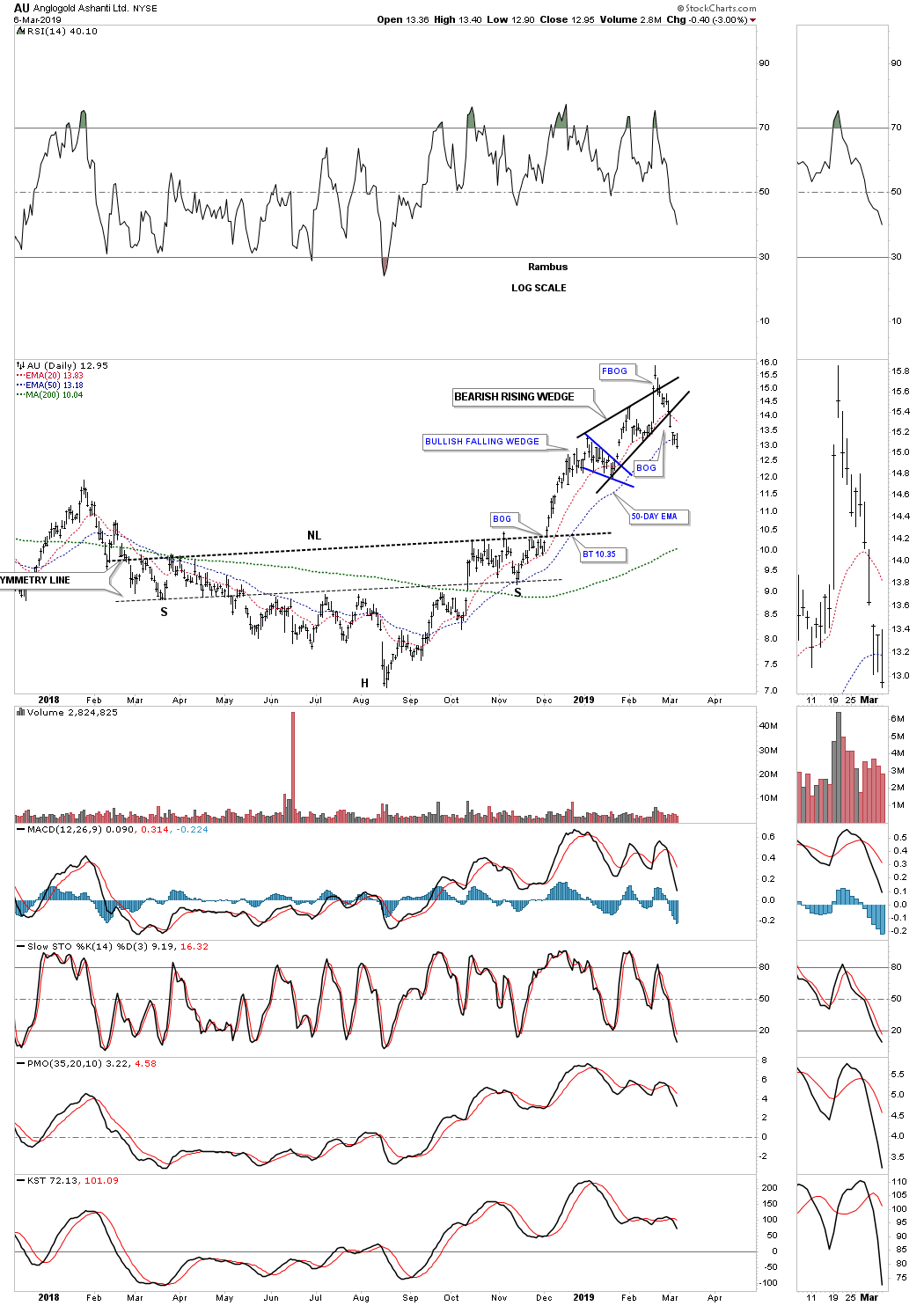
This weekly chart for the SPX shows all the Octobers since the bull market began in 2009. For the most part if you took a position in October you were generally ahead of the game the following October with a few exceptions. This past October again marked a good spot to take a position in the SPX for a possible intermediate term move.

This next chart is a two hour chart of the SPX that we looked at back in the middle of October when we were looking for an ABC price decline with the A leg down matching the C leg down in price which hit pretty close. During the October decline the SPX built out a bullish falling wedge which was concluded  with a big breakout gap. Whenever I see a well formed wedge, in this case the falling wedge, I like to look for reverse symmetry on the way up. We have looked at many cases where the left shoulder low and head form inside the falling wedge, with the right shoulder low forming during the backtesting process.

As you can see so far this two hour chart is showing the bullish falling wedge with a H&S bottom as part of the falling wedge. The H&S bottom was confirmed with the big breakout gap this morning. Today’s price action reached the top of the B leg where we could see a pause that refreshes with a possible move down to the original H&S neckline around the 2760 area. If that were to occur and the neckline held support we could end up with a double H&S bottom which is only a possibility right now.

Below is a daily look at the SPX which shows the 2018 trading range which is shaping up to be a parallel rising flag formation if the price action can takeout the top rail. Note how today’s move took out the three moving averages by gapping above the 200 day sma and the 20 day ema and closed above the 50 day ema.  Again it’s possible we could start to see a potential right shoulder build out which would close today’s breakout gap.

Earlier this spring when it became apparent that the first reversal point was in place and the price action began to rally off the bottom, to start the second reversal point to the upside, I strongly suggested back then that I would be looking for a possible four point consolidation pattern to build out because that’s what stocks do during a bull market. Since we only had reversal point #1 in place with the possible 2nd reversal point starting I drew in the top and bottom trendlines as horizontal. There was no way to know what type of trading range would build out so I always start out with a horizontal top and bottom trendline. As more information becomes available you then start to tweak your top and bottom trendlines. It wan’t until the October high, which made a slightly higher high vs the January high could we begin looking for the 3rd reversal point to the downside, which you can see on the chart below.

This next weekly chart shows the now rising flag formation is 3/4’s the way finished if we end up with four reversal points. What is also encouraging about this pattern is that it’s slopping up in the uptrend trend channel which shows a strong bull market is still in play. One last positive on this chart is the SPX is now trading back above its 30 week ema.

If our potential bullish rising flag plays out this simple weekly chart shows how the bull market that began in 2009 is starting to go parabolic. From the 2009 low to the 2016 low the uptrend was steady as she goes. Then from the 2016 low to our most recent low in the rising flag formation, the trend is getting steeper. It’s subtle, but it is possible that our next rally phase could be steeper than the two year 2016 rally phase.

This monthly chart shows the 2009 bull market which is classic in its development. A breakout above the top rail of our current rising flag formation will lead to a similar rally out of the previous consolidation pattern, the bullish expanding falling wedge, to the first reversal points in our current trading range. The chances are that it could also be steeper than the 2016 rally phase if we get a blowoff phase similar to the end of the 2000 bull market.

This next chart is the 21 month trend follower chart which we looked at last month when the price action was testing the all important 21 month sma on the SPX. During the deepest part of the correction last month the 21 month sma held support just as I had hoped it would. It was nip and tuck at the bottom, but so far so good.

To put everything into perspective below is a 75 year quarterly chart for the SPX which shows the 1970’s trading range and the 2000’s trading range which has led to a secular bull market after the big consolidation patterns were finished building out. I know how radical this chart seems to most people but we’ve been following this secular bull market since the SPX broke out from the flat top expanding triangle in 2013.

Below is a 75 year quarterly chart for the INDU which I call the Jaws of Life, because so many analyst were calling it the, Jaws of Death, where I saw a consolidation pattern they saw a top. The backtest to the top rail of the Jaws of Life was one to test your patience as it went on forever before the impulse move finally began. If you look at the thumbnail on the right side of the chart you can see that the INDU is within striking distance of new all time highs. You can also see on the thumbnail that the last four quarterly bars are forming a rising wedge formation.

Since our current bull market that started in 2009 there have been countless opportunities for the bears to be correct, but in the end, at least so far, this bull market has proven them all wrong. One of the most important rules of all time is, “The Trend is Your Friend.” All the best…Rambus