Wednesday Report…(Some) Commodity Charts are Breaking Out.

Tonight I would like to update some charts for the commodities complex as we are starting to see some action in this sector. Back in the summer months when we first started to get long some of the different commodities sectors, we got many breakouts from some very nice H&S bases. After the initial move up came the first consolidation phase that has been going on for nearly four months or so. We are now starting to see some of these consolidation patterns breaking out which should lead to the next impulse move higher in most cases.

Lets start with BHP, one of the biggest miners on the planet, that shows a good example of where we are at in the bull market. Today the price action broke out with a gap above the top rail of an almost 5 month triangle consolidation pattern. A backtest to the top rail would come in around the 43.50 area.

Now lets look at a long term weekly chart which shows some classic Chartology. We have discussed many times in the past when you see a small consolidation pattern form just below an important trendline, in this case the neckline, and one above, that is usually a very bullish setup which BHP is now showing.

Also keep in mind the size of that double H&S bottom that took three years to buildout. Big patterns lead to big moves. The minimum price objective of that double H&S bottom is measured from the head straight up to the neckline # two. Add that distance to the breakout point to get your minimum price objective.

This monthly chart put the double H&S bottom in perspective.

Copper is an important commodity as it can show the strength or weakness of the economy which is why it’s called Dr. Copper. This weekly chart shows copper’s big H&S bottom with the breakout in the summer. The head formed a 7 point triangle reversal pattern which actually reversed the bear market. Here is a case where we didn’t see a backtest to the neckline when the breakout took place. The 30 week ema has done a good job of holding support so far during Coppers new bull market.

This 20 year monthly chart shows how the H&S fits into the very big picture.

Below is the quarterly chart which shows some nice Chartology especially that 24 year flat top triangle’s price objective.

I originally took two positions, one in July and one in August of this year for the COPX, Copper Miners etf, in anticipation of the eventual breakout above the neckline which so far hasn’t happened just yet. It’s close but no cigar.

This monthly chart shows a double H&S bottom which many of the different commodities are showing. The 12 month simple moving average has done a good job of showing support during the new bull market.

SCCO, Southern Copper, is the strongest stock in this sector. The daily chart below shows it has just broken out from a rectangle consolidation pattern with a breakout gap.

If big patterns lead to big moves then this weekly chart for SCCO says we should expect a  very large impulse move higher as it’s trading at a new all time high after breaking out from a six year triangle consolidation pattern.

This 25 YEAR monthly chart below shows the breakout taking place above the six year triangle consolidation pattern which is now making new all time highs. Note the blue bullish rising wedge that formed as a halfway pattern back in the early 2000’s.

Some of the steel stocks are starting to show their pent-up bullishness as they are breaking out from major consolidation patterns. This monthly chart for NUE shows it broke out from its 9 year triangle consolidation pattern in 2016 and has been consolidating that breakout move by forming a second consolidation pattern just above the top rail which is the Red Bull flag.

This week SCHN is breaking out from a six year double H&S bottom. You would have to go all the way back to 2011 to equal today’s high.

This weekly chart for STLD shows it broke out from a one year bull flag three weeks ago.

This 20 year monthly chart shows the entire history for STLD. This chart also has some nice Chartology on it. Note the 2000 H&S bottom which launched STLD on its first bull market which produced several consolidation patterns along the way. When that bull market ended in 2008 it took 9 years to build out the massive triangle consolidation pattern which is now launching STLD on its next bull market leg higher. If you stand back and look at this chart from a distance you can almost see the beginnings of a parabolic move taking place.

Before I run out of time I would like to show you one of the weakest areas in the commodities complex which is $NATGAS. Last week it finally broke down from a year and a half H&S top. We now have a clean line in the sand, above the neckline is bullish and below is bearish.

Several weeks ago I tried to go long UNG as it was testing the bottom rail of an expanding triangle. After five touches of the bottom rail I thought it would hold one last time, but that wasn’t the case. After getting a decent pop off the last touch the price action reversed straight down and then gapped the bottom trendline where I exited the trade. Again UNG is bullish above the bottom rail and bearish below.

There are two patterns I’m keeping a close eye on for $WTIC. This first pattern is a rising flag formation which has just completed its fourth reversal point at the top rail. I would view the rising flag as a halfway pattern if the price action can take out the top rail.

As we’ve seen with some of the other commodity related stocks tonight many have formed a double H&S bottom reversal pattern. This 10 year daily chart for $WTIC shows it too has a double H&S pattern in play with a breakout above the neckline. The last time we looked at this chart I suggested it looked similarly inverse to that massive unbalanced H&S top, only on a smaller time frame.

This 20 year monthly chart shows how the double H&S bottom fits into the big picture.

This last chart for tonight is a 35 year quarterly chart which puts everything in perspective. Keep in mind the measured move for a H&S pattern when you look at this chart. Time to get this posted. All the best…Rambus


The Dow Gold Ratio

Excerpt from Rambus Weekend Report. “Gold Ratio Charts Update”

Editor’s Note : This is an important point that deserves its own separate post.

………………………………………

This next set of ratio charts I consider to be the most important ratio charts if you are deciding whether to be an investor in the INDU or in Gold.

When the price is rising The INDU ( Dow Jones Industrial Average ) (a proxy for General Stock Markets) is rising against Gold , and when it is falling Gold is rising against the Dow.

This first ratio chart for the INDU:Gold is a daily look which shows the ratio breaking out above the top rail of a bullish rising flag with a completed backtest. It doesn’t look that impressive on a daily chart, but when we look at the longer term ratio chart it becomes very important.


Below is a long term 10 year weekly chart which shows a massive H&S bottom on the ratio chart on top and a possible massive H&S top on gold on the bottom chart. Note  how the blue bullish rising flag formed just below the neckline on the ratio chart which has given the ratio chart the energy it needed to finally breakout. I’ve been showing this ratio combo chart for a long time now so the breakout above the neckline is falling into place.

Below is a 38 year daily line chart for the INDU:gold ratio chart which puts the very big picture in perspective. This ratio chart tells you when you need to be trading in the INDU and out of Gold and visa versa. As you can see you wanted to be trading in the INDU going into the 2000 bubble top and out of gold. In 2000 that all changed. From that point forward you wanted to be trading in the PM sector staying away from the INDU.

There are many gold investors that swear that the ratio has to go as low a 1 to 1 before the gold bull market is over. As you can see the ratio got as low as 5.5 in 2011 which is close enough IMHO especially since the price action that followed that double bottom low. There is a massive H&S bottom with the breakout underway. We have a very clear line in the sand for the staunch gold bulls which is the neckline. As long as the price action trades above that neckline the INDU is going to outperform gold.

As the breakout is just now taking place this ratio could rise for many years to come regardless of all the reasons it can’t. I will have no problem reversing my stance if I see the neckline is broken to the downside, but until it is I have to give the ratio chart the benefit of a doubt. All the best…Rambus

GDX & GDXJ Targets

I’m going to use the GDX and GDXJ as a proxy for the rest of the PM stock indexes which are very similar to these two. Last Wednesday we looked at the short term daily charts to the longer term weekly charts to see how things were setting in the PM complex.

We first looked at the short term daily chart which was showing the H&S top and the smaller blue consolidation pattern that was building out below the neckline. The smaller blue patterns were kind of morphing, but were giving us a hint of what they would eventually look like when they competed.

Below is the short term daily chart for the GDX which shows the H&S top with the completed bearish rising flag. The breakout was a little sloppy, but today we are getting some follow through to the downside.

This short term daily chart for the GDXJ shows it broke out below the bottom rail of its bearish falling wedge this morning with a breakout gap.

Now lets look at the longer term daily chart for the GDX which shows the one year triangle consolidation pattern with the breakout now visible. The chances are high that the triangle consolidation pattern will be a halfway pattern to the downside with a price objective to the 14.88 area as shown by the blue arrows.

Below is the long term daily chart for the GDXJ which shows the H&S top on the short term daily chart as the 4th reversal point in its one year triangle consolidation pattern. The impulse measured move would be down to the 20.75 area as shown by the blue arrows.

This four year weekly chart for the GDX puts the triangle in perspective as a possible halfway pattern to the downside. It’s still possible we could see a backtest to the underside of the bottom rail of the triangle which would come into play around the 22.75 area.


Until the bulls can take out the top rail of the downtrend channel the bears are still in charge.

This short term weekly chart for the GDXJ puts its one year triangle in perspective as a possible halfway pattern to the downside.

This long term weekly chart shows how the triangle fits into the very big picture. Again all the bulls need to do is take out the top rail of the bear market downtrend channel and all will be right with the world again. As you can see they have tried three times in the last year and a half, but so far haven’t been able to do it.

Late Friday Night Chart… Risk and Responsibility

I seen a lot of disappointment today at the forum on the volatility with NVO.V and the rest of the NOVO related stocks. If you bought into these stocks then you need to be responsible for your trades. Sir Plunger stated many times that these were speculative stocks and the volatility would be great. That is the nature of these types of trades, big risk equals big reward if it works.

One of my first big life changing trades took place back in 1991 just before the start of the first Gulf war. I was in the middle of raising a family so extra cash for investing was hard to come by back then. I set a goal the year before to save $100 a week to invest in the stock market and when I built it up to $5000 I would begin to invest it.

Back then charts were hard to come by unless you made your own charts on graph paper which I had been doing for years. Stock quotes were delayed by 15 minutes and fractions were still being used. You talk about the Stone Age.
In the fall of 1990 the saber rattling began and it looked like the US was going to go to war with Iraq. I still remember how negative the environment was when it came to the stock market. Analysis were saying if we went to war the stock markets would collapse as we were going up against the 5th largest army in the world and no one knew how the war would go. The economy was going to go into a bear market because oil was going to go through the roof. Nothing positive was ever mentioned just that the world as we knew was going to dramatically  change.

By the end of 1990 it was inevitable that we were going to war, but it was just a matter of when. By that time I had saved nearly $5000 to invest in the stock market. The INDU was basically in a bear market for most of 1990, but there was a glimmer of hope when I began to recognize a possible small H&S bottom with the head forming in October. The INDU rallied about 300 points which was a lot back in those days into Christmas. Then came the beat of war drums stating in early January of 1991. Over a period of two weeks the INDU lost 200 points when it was certain the US was going to war. It’s very important to understand how negative every one was at that time. What is going on with North Korea today is nothing compared to January of 1991.
I had dabbled in options back then but never had much luck. I learned it was a tough game to be successful at, but I knew the basics. What I was seeing on the daily chart was a possible much bigger H&S bottom with the 200 point decline in January being the bottom of a possible right shoulder low, using the neckline symmetry line. It was a tough decision to make but I decided to use the $5000 I had saved to buy some out of the money call options on the OEX 100. Over a period of 5 days I had bought a ton of cheap options for 1/4 and 3/8’s that were going to expire in less than four weeks on the third Friday in February spending the entire $5000.

When I look back in hindsight it was probably the dumbest thing I could have done. I worked my butt off for a year to save $100 a week and I was going to blow it all in less than four weeks.

Below is a static chart I built years ago when I first subscribed to stocks charts to see what that trade looked like if I had had stock charts at my disposal. In January of 1991 you can see how the price action was testing the neckline symmetry line, red circle, while all the saber rattling was taking place. I had all my options bought and now I had to wait for the start of the war which no one really knew when the actual day would be. I can still remember vividly when the war started. We were eating supper when a special report flashed on the TV saying we were bombing Iraq. In those first few hours no one knew what as going to happen, but it was the first time I seen a thing called a Smart Bomb. By morning it was clear the war was not going to be a bad as everyone feared.

The INDU gapped up over 100 points on the open as everyone was so relieved, but my out of the money options still had a long ways to go before they got in the money. As the price action reached the neckline area of the larger H&S bottom the INDU built out that beautiful red bullish rising wedge which was a sight for sore eyes.

My plan was to hold all the options until the Friday of expiration because back then it seemed like the INDU would rally into options expiration. I also used a simple sell/stop method of moving my sell/stop up to just below the previous days low. Once the options got into the money they exploded in value. Options I had bought three weeks earlier for a 1/4 were selling over $4.00.

I managed to hang on until the Thursday before expiration. It’s hard to see, red circle at the top of the chart, but that day the INDU had a pretty good selloff so I just called my broker and said lets sell. In just over three weeks I turned that $5,000 into $120,000. Had I stayed just one more day and sold my options at market on close they would have been worth $143,000 as the INDU rallied strongly in to options expiration.

I remember my broker calling several times a day when the options started running wanting me to sell and take my profits, but I held my ground and was going to be responsible for my actions win lose or draw. It was a great learning experience for me in more ways than one. Unless you go through something like that in real time, you won’t know the mental fortitude it takes to follow your own plan when everyone is telling you to do something different.

This one trade set off a string of events in my life that would have never happened if I hadn’t taken on the risk. I ended up buying a restaurant that ended up being very successful and by participating in the bull market in the 1990’s I and was able to basically retire at the end of the tech bubble in 2000 at the age of 50. For me retirement isn’t sitting in a rocking chair on the front porch. Retirement for me is the freedom to do what you want to do when you want to do it.

The bottom line is that you have to be responsible for each and every trade you make and don’t put the blame on someone else or the PPT, manipulation or whatever excuse many traders like to use. Sir Plunger laid out a well thought out report last weekend stating the good with the bad and it was going to be a speculative trade. Maybe it will workout and maybe it won’t, but I took my positions with the understanding that I’m responsible for my own actions and no one else. Trading in hindsight is the easiest thing in the world to do, but in the real world trading in hindsight doesn’t work. Enjoy the rest of your Thanksgiving Weekend. All the best…Rambus


Commodities : The Big Three

Tonight I would like to show you some long term charts for the big three, Copper, Oil and Gold. There are a lot of similarities between them which is strongly suggesting all three should be in new bull markets. The laggard is gold which has still not confirmed its new bull market but is getting closer as you will see. The key will be what the US dollar has up its sleeves so lets start with a daily chart for the US dollar.

The US dollar still hasn’t totally broken down yet, but it did have a failed inverse H&S bottom. It was a very beautiful and symmetrical H&S bottom that looked like it was going to reverse the downtrend that is right at a year old now. It had a nice clean breakout above the neckline with a clean backtest from above. All looked good. After a brief rally the US dollar declined once more to the neckline, but this time the neckline failed to hold support, strongly suggesting the H&S bottom was failing.

As we’ve discussed in the past when you see a failed H&S pattern you often times see a strong move in the opposite direction. The rule of thumb is that when the price action breaks below the right shoulder low the failure is complete. The US dollar is still trading slightly above the right shoulder low, but is now getting close to breaking that important low. Note how the neckline reversed its role to what had been resistance during the formation of the H&S bottom, to support once broken to the upside, and then reversed its role one more time to resistance on the last backtest from below.

Below is a 20 year monthly chart for the INDU which shows you what can happen when you see a failed H&S pattern. In 2007 that H&S top worked out beautifully, but it was a different story altogether in 2015. The two H&S patterns were about as symmetrical as they could be, but when the price action broke out above the right shoulder high in early 2016, the failure was complete and we have gotten a very strong impulse move in the opposite direction.

Commodities should enjoy a weaker US dollar as they generally run inverse to each other. About 5 months ago Copper broke out from a very symmetrical H&S bottom on this 20 year monthly chart with no backtest to the neckline so far. There are no rules that says we have to have a backtest, but many time we do.

This 45 year quarterly chart for Copper shows you a lot of history. From 1979 to 2004 Copper traded in a massive flat top triangle or ascending triangle. The end of the giant 25 year pattern started with the double bottom at the 4th reversal point. That double bottom gave Copper the energy it needed to reach the top rail of the flat top triangle. From that point a consolidation pattern was needed to build up the energy to finally breakout above 25 years of resistance, which took form of a bullish rising wedge.

Note how the 2008 crash found support on the top rail of the 25 year flat top triangle. It was slightly penetrated but held. You can see the H&S top which ended the 2008 bull market with our new H&S bottom reversing that bear market, to our new bull market which is still very young yet.

Now lets take a look at WTIC, Crude Oil, as it has a similar setup to Copper. Copper is a little further along in its breakout move as oil is just now in its second month. For nearly two years oil has built out a double H&S bottom which is reversing the bear market from the 2011 high. This 20 year chart shows you why it’s important to look for H&S patterns at the end of big moves. There was a H&S top in 2008 followed by another one in 2011 and now our current H&S bottom. There was also another important H&S pattern which was a consolidation pattern in 2007 which launched oil on its parabolic ride to 147. When you see a H&S pattern show up on a long term chart you know the move is going to be very large, such as a bull or bear market.

This 35 year quarterly chart for oil shows you how it built out a massive 20 year double bottom. I know it is hard to believe but in 1998 oil was trading down to 10.50 where it put in the second bottom which launched oil to its all time high at 147. Before oil could breakout of the massive resistance zone between 35 and 40, it built out a bullish rising wedge.

On this log scale chart you can see the double bottom was 276% between the top and bottom. When you add 276% on the breakout it projected a price objective up to 146.

Durning the 2015 crash oil initially fell through the old resistance zone which looked at the time that it could possibly move all the way down to the 10.50 area. Looking back in hindsight now it was just a strong backtest, which left a very long tail on that quarterly bar. Like Copper, this move in oil is just getting started.

Now lets take a look at some gold charts we’ve been following. This first chart is a monthly look which shows the beautiful bull market uptrend with one consolidation pattern forming on top of the next. That all ended in 2011 when gold topped out and the bear market began. There are two different long term patterns I’ve been showing for gold. One is the bullish expanding falling wedge which is on this chart, and the other is a parallel downtrend channel. The last time we looked at this particular chart I was showing a possible ping pong move taking place between the top rail of the blue expanding falling wedge, and the top rail of the much bigger black expanding falling wedge. Note the bullish expanding falling wedge which formed during the 2008 crash low.

Below is another view of gold’s bull market uptrend channel we’ve been following with the blue arrows showing touches of the bottom rail. This chart shows a 7 point blue falling wedge reversal pattern as the last completed pattern if the bear market is completed. You can see two backtests to the top rail, one shortly after the breakout with the second one coming when the price action touched the bottom rail of the major uptrend channel, which was a perfect area to find support.

Four months ago the price action broke out above the top rail of the black expanding falling wedge and has been in backtest mode, last bar on this chart. It’s been a slow painful ride up the bottom rail of the major uptrend channel, but so far it hasn’t been broken.

I’m going to use this weekly chart to show you gold’s 2011 parallel bear market downtrend channel as it’s a little more detailed. This past summer gold finally broke out above the top rail of its bear market downtrend channel. That top rail is the same one as the top rails we looked at on the monthly charts above. It’s only the bottom rail that is angled differently. As you can see gold has been doing a ping pong move between the top rail of the downtrend channel and the old neckline from the H&S top. So far the breakout and backtest is working.

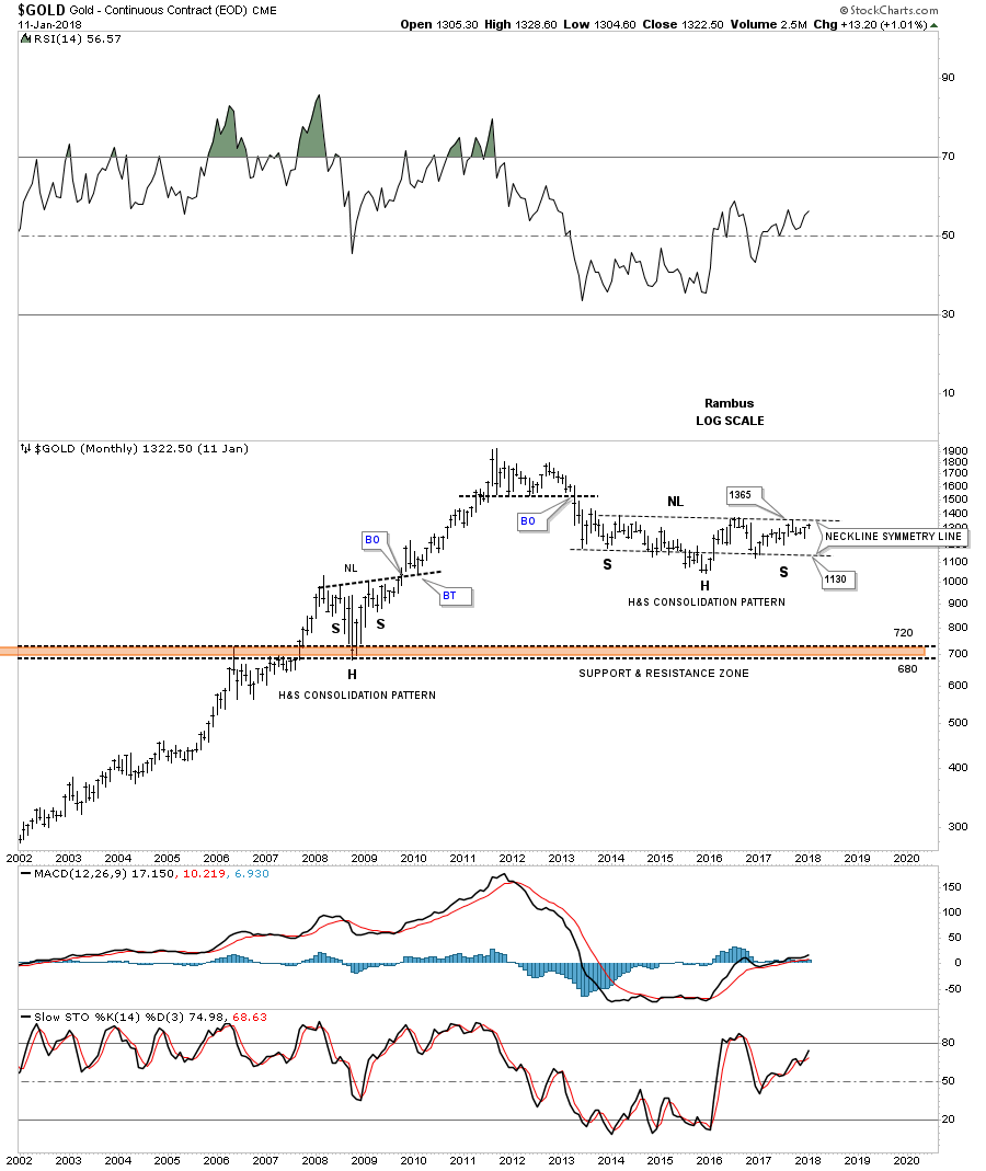
Previously we looked at a big H&S bottom that formed on Copper and Oil which have already broken out. Gold is currently still working on its own H&S bottom if it can breakout above the neckline which would come into play around the 1365 area. It’s pretty symmetrical but I can’t rule out one more move down to the neckline symmetry line at the 1130 area to match the symmetry to the left shoulder a little more closely. The bottom line is that if gold can trade above the neckline it will have a massive base to launch its bull market just like Copper and Oil.

This last chart for tonight is a 40 year look at gold that shows its massive 25 year H&S bottom which launched its bull market. Every time I show this chart I always say it’s a good study in how support and resistance works. The red and blue arrows shows how each cup and handle were broken to the upside with one last backtest before the next move higher that doubled the previous cup and handle formation.

Also notice how that massive 25 year neckline was initially tested with the red triangle. After the red triangle was complete the breakout finally took place. If you were trading the PM complex back then you know how bad the 2008 crash was which seemed like the end of the world. As you can see the 25 year neckline reversed its role to support during the 2008 crash at the 700 area. That massive H&S bottom had a price objective up to the 2035 area which ended up being about 115 points too high, but for such a massive pattern it was pretty close.

What these big three commodities sectors are strongly suggesting is that the US dollar may be entering into a bear market as commodities are entering into a new bull market. Time will always tell the truth, but that is how it’s looking on this day before Thanksgiving 2017. Enjoy your dinner tomorrow and all the best…Rambus

Wednesday Report…Psychological Warfare in the Precious Metals Markets

For almost a year now the PM stock indexes have been building out a triangle trading range that has yet to be determined if it is going to be a consolidation pattern or a reversal pattern. With big patterns one can lose sight of what is really there, as the longer a trading range develops the more trendlines one puts on a chart, and the more confusing things become.

Tonight I would like to show you, from a Chartology perspective, what the basic patterns are, from the short term to the longer term. The bigger a trading range the more chart patterns can develop before we see the final product. Sometimes it’s totally different from the early stages of the trading range. It’s important to clear ones mind of all the preconceived notions of what they think is happening to just what the charts are suggesting. It’s a hard thing for most investors to do because of all the things we read each and everyday which works on our subconscious. More than anything else we are playing a game of psychological warfare.

Lets start by looking at a short term daily chart for the HUI which is showing the H&S top we’ve been following since early October. The H&S top is pretty symmetrical and the breakout below the neckline was accompanied by a breakout gap. This is what we know to be true at this point in time. If the price action can trade back above the neckline then this scenario will be thrown out the window, but until that time the H&S top is valid. Also when the neckline gave way so did the 200 day moving average.

Next lets look back a little further back in time to see how the H&S top on the daily chart above fits into the bigger picture. Since the December low from last year this daily chart for the HUI shows the internal structure of the almost one year triangle trading range. As you can see the initial pattern was the big blue bearish falling wedge which shows the height of the triangle. Normally when you see a wedge pattern buildout the price objective will be where the wedge began to buildout. In this case the blue rising wedge should have had a price objective down to the December 2016 low at reversal point # one. The failure of the price objective to be reached was our first clue that a trading range of some kind may develop.

As you can see, two more blue rising wedges built out as part of the bigger trading range and reached their minimum price objective, which was where the rising wedge started to form. The 4th chart pattern on this one year chart is the H&S top at the 4th reversal point. That H&S top at the 4th reversal point is strongly suggesting the bottom of the one year triangle is going to be broken to the downside, which still hasn’t happened yet.

In big trading ranges like this sometimes it’s hard to connect all the reversal points on one trendline so in this case I’ve added a second trendline which is showing two possible scenarios. Believe it or not the internal structure of this triangle is pretty typical of most big trading ranges. The only thing we have to see now is confirmation. There is also no law that says the triangle trading range has to breakdown from here. If one of the bottom trrendlines holds support it’s possible that a 5th reversal point can form and the trading range could be a reversal pattern to the upside. As I stated earlier though, the H&S top is strongly suggesting the bottom rail is going to give way, so we wait for confirmation.

Now lets look at a 2 year daily chart for the HUI which puts the trading range on the chart above in perspective.  Another clue that the triangle trading range may breakout to the downside is because it has formed below the August 2016 high as the main trend has been down. Here you can see reversal points #1 and #2 formed during the formation of the the bearish rising wedge. Reversal point #3 was created by the small H&S bottom, while the 4th reversal point was formed by the H&S top. If, and that is a big if, because the triangle hasn’t broken down yet, but if it does then the triangle would be a halfway pattern to the downside as shown by the blue arrows. The red arrows just under the RSI shows where the RSI was when the the last big move down began at the August 2016 high vs where the current RSI is at. The RSI built out a positive divergence until the price action finally bottomed a year ago in December.

After the August 2016 top was put in place I got a lot of flack for showing a H&S top. I was told that everyone and their brother could see that H&S top so therefore it was invalid. Below is a 3 1/2 year weekly chart for the HUI which shows that August 2016 H&S top. As you can see the neckline has held resistance on two separate occasions when backtested from below. That H&S top will be invalidated when the neckline is broken to the upside.

This next chart is a long term weekly look at the HUI that shows its massive 2011 H&S top with its bear market downtrend channel. Our current triangle has formed just below the top rail of the 2011 bear market downtrend channel, which is another clue that the triangle may break to the downside. This is the area where the bulls need to step up to the plate and produce a strong move higher to negate what all the charts above are suggesting.

The last time we looked at this next chart for the HUI the price action was closing in on the 223 area which was showing the same percentage bear market rallies. As you can see every bear market rally since the right shoulder high on that massive H&S top all were exactly the same height as shown by the blue shaded areas. The only exception was the 2016 rally. The HUI has made two attempts to takeout the bear market rally high at the 223 area, but so far has failed to do so. That would be a bullish development if the bulls could show their strength and make a higher high above 223.

I won’t go into a lot of detail with these next charts as we’ve already covered that information on the HUI charts above. Below is a short term daily chart for the GDX which shows its small H&S top. Today the GDX tested its 200 day ma from below.

GDX daily:

GDX weekly short term:

GDX weekly long term:

GDXJ daily short term:

GDXJ long term daily:

GDXJ short term weekly:

GDXJ long term weekly:

GDM weekly:

XAU weekly:

SGDM weekly:

SGDJ weekly:

SIL weekly:

ZIG.TO weekly:

The last chart for tonight is a long term weekly look at gold which shows the bulls still have a fighting chance if they can hold the backtest. All the best…Rambus


Weekend Report- The USD-Reports of its death have been greatly exaggerated

In deference to Mark Twain, I will review the USD, general stock market, precious metals, the electric metals and various other topics.  In the past two weeks Rambus has been so prolific with such high impact charts that I find it a challenge to offer value added material so I offer charts with some different perspectives.

USD-No I Am NOT Dead Yet!

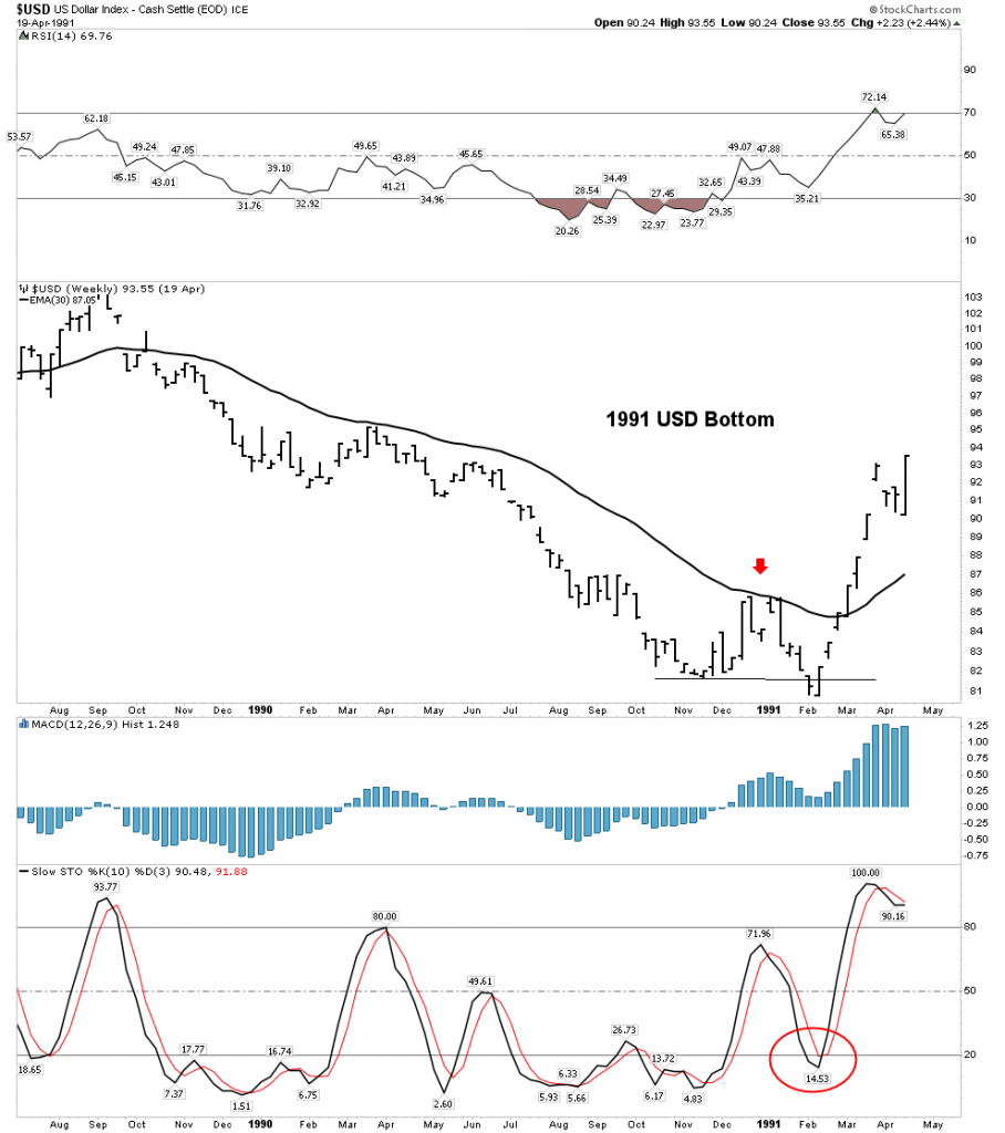
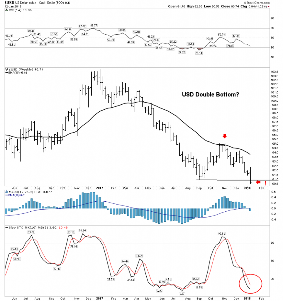
Currencies tend to be a very emotional subject. I try to be objective when analyzing them, sticking to the language of the market and it’s message.  It is always important to guard against the gold bug narrative, it can even influence our views of currencies.  Demanding posts insisting the USD is toast and immediately headed towards history’s ash heap seem closely related to this gold bug narrative.  The USD has spent the first 8 months of 2017 in a well defined downtrend, however it does not appear to be in a death spiral.  Actually the shouting and insistence that it must continue down has been a fairly predictable sign that its move downward was reaching its limit.  The dollar may have now completed a base and is set to continue its move higher.  This is not dogma as it could reverse downward, but for now it’s making all the right moves if the trend is higher.

Please review Rambus’ October 25 post on the USD as there is no other finer analysis anywhere:

Early Weekend Report…The Dollar Post

I have often made the point that we are in a post bubble contraction.  It began with the financial crisis in 2007, however the central banks of the world and their interventions have truncated the natural corrective process and re-inflated the bubble due to financial engineering.  Ultimately,  if robust growth is to ever return to the world’s economies the PBC must be allowed to do its work in de-levering balance sheets.  Historically in the previous 5 episodes over the past 340 years, PBCs have taken 15-20 years to accomplish this.  So this is a slow process and the 8 month downtrend of the USD in 2017 could just be a little wiggle that turns out to be just a correction in an ongoing up-trend.  Time will tell of course.  In a PBC, the senior currency becomes chronically strong and acts as a magnet  attracting capital flows from around the world.  Over the past year this economic principle has been very hard to accept, however it may be getting ready to reassert itself.  I personally don’t trade currencies, however I watch them since they drive asset classes and knowing their trend gives us a clue of where these assets will themselves trend.

It appears we are at a crucial point in currency markets as the USD is beginning to reassert itself.  Lets look at the various currency charts vs the USD:

Euro- H&S neckline now broken:

Aussie Dollar– H&S break with price now violating the 200 EMA

NZD– The first to show its hand

Canadian Dollar– The ultimate resource currency

The Swissie: Et tu? Even the ultimate haven currency… 200 EMA violation.

South Africa Rand:

So one can see all of these currencies are now in a broad based breakdown vs the USD.  The USD took some time to gain traction and it’s NOT out of the woods yet, but these charts show that it would take some work to reverse this initial trend reversal.

In the chart below we see how the USD has broken above its lower horizontal channel line and is now attempting to overcome the resistance of the 30 W EMA.  Stochastics are indicating that it has the momentum to continue its move higher.

Below is the chart that has been subject to ridicule and derision, however it depicts what could occur when the PBC reasserts itself.  It is certainly not a guarantee, however it shows what may lie in store.

This next chart shows the relationship between the USD and the three metals: gold, silver and copper.  It is hinting that if the USD continues to rally it could make it difficult for these three metals to advance much further:

Finally, this USD chart poses the question: are the industrial metals getting ready to end their run for now?  It seems that in the past when the USD reversed from being oversold on the weekly that was the message:

The Stock Market- From Here to Infinity?

Rambus has shown that the move upward in the stock market continues to be unimpeded. I would concur with the caveat that early next year it may peak and end the 9 year bull market, so far the second longest in history.  Momentum is still powering higher, however internal deterioration has begun to be evident.  Here is one possible scenario for the ultimate top:

Above is a linear scale view of the 9 year bull market.  It depicts a blow off top penetrating the upper trend channel with a target of 2900-3000.  We see 3 phases to this bull market and the blow off would end the final phase III “mania”. Note the extreme reading in the RSI lending credence to this outcome.

Below is a chart which highlights just how overbought and extended this market has become.  It is a monthly view of the entire 36 year secular bull market.  Note the RSI is now the second highest in the entire bull market.  It is saying this relentless rise has reached a point where the RSI will limit its move.

I would like to show just how narrow the advance has become.  We all know how the FANG stocks have led the market.  The XLK includes a heavy weighting made up of the FANGS and FANG-like stocks.  The rise been relentless:

Note how extended stochastics and RSI have become.  Also note how volume is trailing off despite this recent blow off move.

SPX-Equal Weighted Index

Below is the SPX represented as an equal weighted index.  It values all 500 stocks equally vs the normal cap weighted measure.  Here we see the trend solidly upward, however note that RSI is waning and it may be putting in a H&S top. MACD momentum is also indicating weakness.

Now let’s go back and view the entire 9 year bull market and subtract out the cap weighted influence of the index as opposed to just neutralizing it.  You will see it reveals the core of the market has not really gone anywhere for 7 years and it has recently broken its NL, followed up with a BT and is now resuming its downtrend.

Finally, let’s remove the effect of the super momentum driven XLK for the past 5 years and what is revealed is something really shocking.  That of course is a total implosion of the core of the market relative to the momentum driven XLK.  The message here for us to understand is that this market is being driven by money flows into an increasingly narrow sector of the market.  This is a classic final phase characteristic of a blow off market.  It is not announcing an end tomorrow, but it tells one what season we are in.

Let’s look at a few charts that you should be aware of.  Again, the message is not that the end is here, but the internals are deteriorating:

Dow Theory- Non Conformation

It’s only been in effect for three weeks, however this divergence needs to be corrected by the transports resuming its uptrend.   Without a reversal upside, it signals trouble ahead:

Advanced Decline Volume:

It’s too soon to call a top, however here we see the first step down in Adv/Decline volume indicating internal weakness.

GSR- Update

We don’t expect a breakout until after a market peak is in place, however it continues to progress doing it’s technical work:

Yield Curve Exit Indicator:

It is saying don’t exit yet despite these initial internal indicators deteriorating.

Value vs Growth indicator:

This chart indicates the market preference for growth over value continues even though it is extremely stretched

Bottom Line stock market– Stay the course if you are long, however the market is screaming it is in final blow off mode. Be careful and know that eventually you will need to exit to protect your capital.

The New FED Chair– Say Hello to the New Boss- Same as the Old Boss.

Peter Townsend would be proud of Trump’s pick this week of Jerome Powell as the new FED head.  There had been hope of a libertarian disruptor to the established order, but the reality turned that hope into a pipe dream… of course.  What this appointment assures is the money printing will continue and Wall Street will be assured of a bailout when the next crisis arrives.  The Greenspan/Bernanke/Yellen legacy will be maintained and the Everything Bubble will continue to be pumped if it ever shows signs of deflating.

It is important to know where this man came from.  He was a partner at the Carlisle Group, private equity firm.  Their business model of course is using cheap capital to perform acquisitions.  Their model is a classic case of mal-investment since these “deals” are not driven by consumer demand but are enabled by leveraging-up a balance sheet and “playing” the difference between their cost of capital and the markets cost.  So the acquisitions they do are not due to business innovation, but instead from financial engineering.  A recent example of this process completing the full circle is Toys “R” Us.

To understand Powell’s perspective and his understanding of economics this is all you really need to know.  It will ultimately be all about saving his Wall Street friends whenever the next financial crisis arrives.  The libertarian dream of disrupting the crony system of bailouts is not going to happen- meet the new boss!

Precious Metals and the PM Stocks

I discussed the new FED chief in the previous section because ultimately it will have a major impact on the precious metals.  When the expanding bubble eventually pops, the gold price and the course of the gold miners will be in relation to the size of the credit bubble created by the FED.  Remember a credit bubble is caused by the monetization of debt.

The strengthening US Dollar has been suppressing the price of Gold.  This is why I have emphasized one should view gold and the metal stocks through both clear analytical CAD glasses and USD rose colored glasses.  With the USD rising the rose colored glasses have now been shattered and reality has asserted itself and its getting ugly.

Gold Big Picture:

Gold is still hanging in there above the down channel even in USD terms but it is clearly at a critical juncture.  If it can resume its uptrend from here that would be very bullish, however stochastics point lower indicating it is set-up to violate the downtrend channel to the downside.  Watch this chart closely

This view is backed up by the below chart which shows gold in lock step with the inverse of the USD.   Again this points to the likelihood of lower gold prices, given a rising USD.

The chart below shows that even if we break down from these levels it is not the end of the world, just a temporary set-back since gold all the way down to 1150 would still be considered basing action of the big saucer consolidation.  Gold could be ready for prime time as soon as early 2018.

Gold stocks weaker than the metal:

This is not what we want to see.  An uptrend should show the gold stocks rising ahead of the metal.

Gold Stocks in $CAD terms:

The weekly chart again shows the PM stocks at a critical juncture.  It needs to immediately reverse upward or is in danger of breaking down.  Note it is below a declining 30 EMA with stochastics pointed straight down on waning volume…not a pretty picture.

The daily chart looks grim as well. Locked in its downtrend probing new lows, volume collapsing with all indicators headed down.  What is going to turn it around?

Gold Stocks in USD terms

With the USD rallying, gold stocks no longer have a tail wind and the charts reveal this.  The weekly HUI shows the saucer bottom continuing to develop, but it is very heavy.

A close up of the weekly HUI below  shows how it has dropped down into its consolidation triangle.  Below a declining 30 EMA with stochastics pointing sharply lower with no hint of reversing. This chart is indicating price is likely to drop at least to the low 170’s.

Weekly GDX

The GDX still shows some hope of salvaging its breakout, but not much room for error with price now below a declining 30 EMA and stochastics rolling over:

The Daily shows a last gasp attempt of holding on with volume collapsing:

Bottom Line on the Gold Stocks:  Looks like we go lower into tax loss selling.  This particularly could be accentuated if the general market continues higher with investors selling those gold stocks and redeploying it into the stock market.  I call this the shiny object factor, drawing attention away from the PM stocks.

Here is what I see as a definite possibility as painful as it may be,

The good news however is that this could be the final phase of consolidating the first leg up in the new bull market in the gold stocks which started in January 2016.  The next leg up could begin as soon as late December and 2018 could develop into a rip roaring year for the gold stocks with the HUI reaching a target range of 450-520.

Rays of Hope

So the PM indexes appear short term bearish, however I do have some rays of hope,  to include some stocks which I hold despite the indexes being rather dreary.  Principally I own a healthy position in Pretium.  If next quarter’s production results validate last quarters strong numbers this stock could likely get taken out. Agnico Eagle may be waiting in the wings.  This week we saw what happened to Alterra power.  It spiked up 63% in its take out, with little warning- a classic “got to be in it to win it” story.

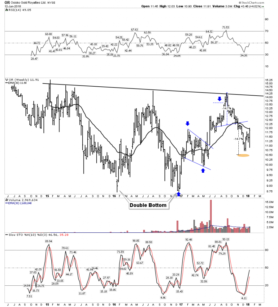
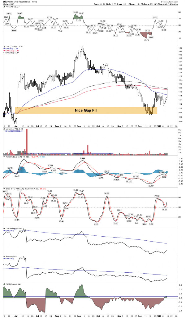
Monthly:

Weekly:

Daily:

That’s a breakaway gap, it doesn’t have to necessarily get filled.

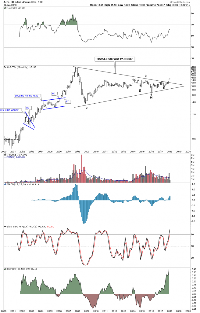
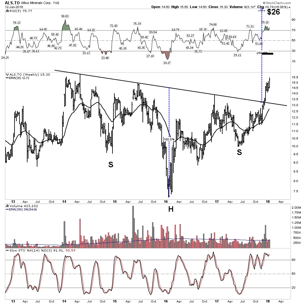
Altius Minerals– Not a gold stock, but it is building cause for a powerful break out.

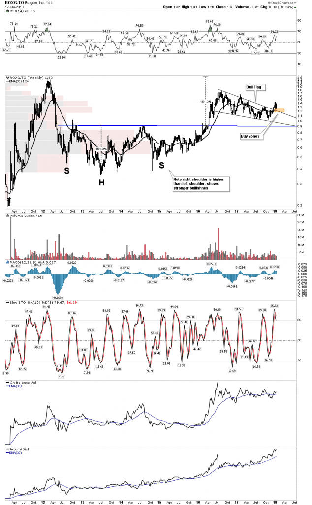
Roxgold– updating the set-up:

I don’t own this, however this is typical of stocks that one should keep an eye on as its nearing an end to its consolidation of a massive move:

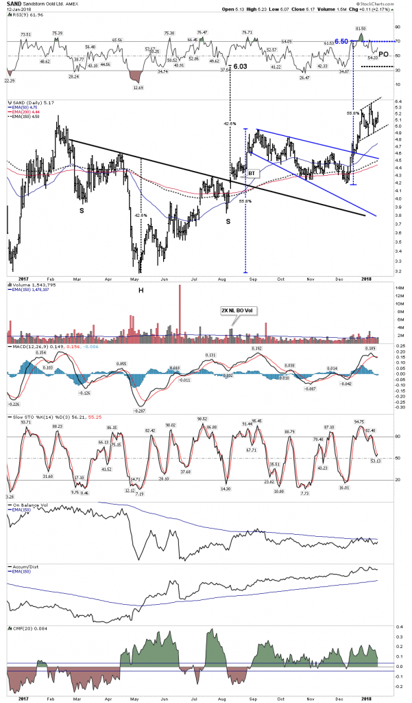
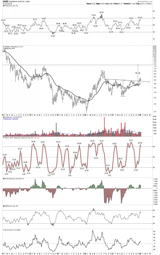
Sandstorm:

Jury is still out on whether this stock needs to consolidate lower.  I own 80% of my allocated holding of this stock which is my 3rd largest position.

Silver Stocks

Here are a few representative silver stocks.  We see the story looks somewhat bleak.  They don’t look as promising as the gold stocks.  The message here is they could drop significantly lower over the next 2 months

MAG

First Majestic

Endeavour 

Silver Stock Buy Indicator

Recall our silver stock buy indicator.  It works for gold stocks also.  It continues to say patience, your time will come.

NOVO- The Great Gold Hope

Despite the gold group looking heavy Novo is doing just fine.  It appears to be undergoing its second high level consolidation.  This week it had a significant development in that they confirmed a fine gold component in trenching at Purdy’s Reward.  This management team seems to be well skilled in managing the news flow.

Blue Sky:

Electric Metals Hot- Gold Cold

While gold has has been down and out the electric metals have been all the rage, especially the cobalt plays.  Seems every month a new battery factory is announced and a new EV manufacturer announces its plans to enter the market.  With additional automotive capacity entering the market the collateral damage this week was the darling of the sector- Tesla.

Tesla– is it finally time for the shorts to be taken off the intensive care list?

Things changed this week for Tesla, as reality came calling when the tax debate in Washington put Tesla’s tax credits in the cross hairs.  With the $7,500 tax credit/ vehicle under threat the economics of the EV are not quite as good.  If shorting is best done as a shoot em in the back strategy maybe it’s time to start taking aim…just sayin.

Weekly:

30 W EMA now rolling over with broken momentum indicators

Daily- This may be the ugliest chart of the day, as it sports not one but two violated H&S patterns. The gap jumping the 200 EMA delivers the message -it’s done.

Electric Metals still hot.  

But Tesla is just one of many EV producers, and the demand for the metals will be insatiable.  The lithium stocks have been on fire for some time and recently the cobalts have been catching up.  My personal cobalt play is Ardea Resources in Australia:

The next would be Robert Freidlands Clean TEQ:

John Kaiser thinks ultimately Clean TEQ will find Scandium Intl. a perfect fit and will acquire them somewhere down the road.  What we saw this week with Alterra could be a precursor to SCY:

Copper

With the rising USD threatening copper’s continued ascent, copper still seems relatively impervious to the threat.

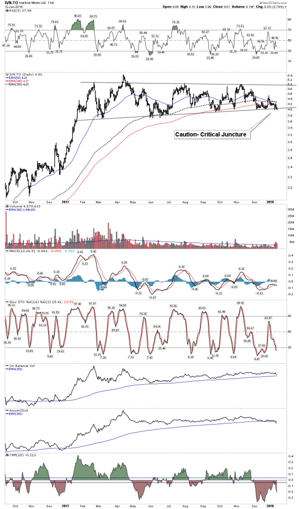
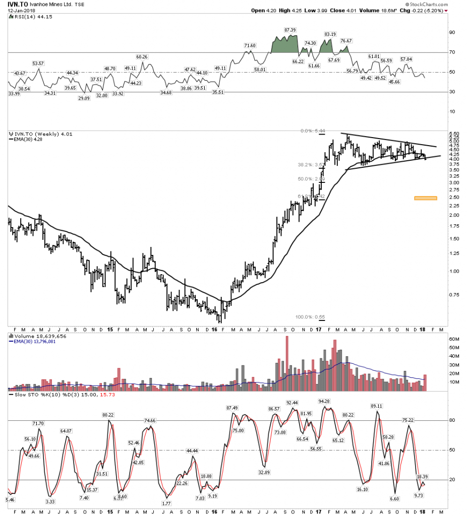
Nevsun– My favorite copper play mainly because I am a sleuth for value.  This recently underwent a brutal shakeout but is now in stronger hands and back on track.

Before Nevsun can make it to production in Serbia it may likely be taken out by Lundin:

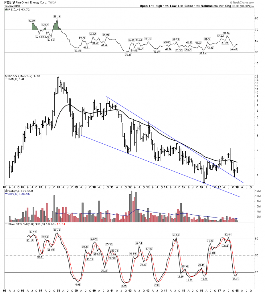
Copperbank– A good proxy for copper optionality plays:

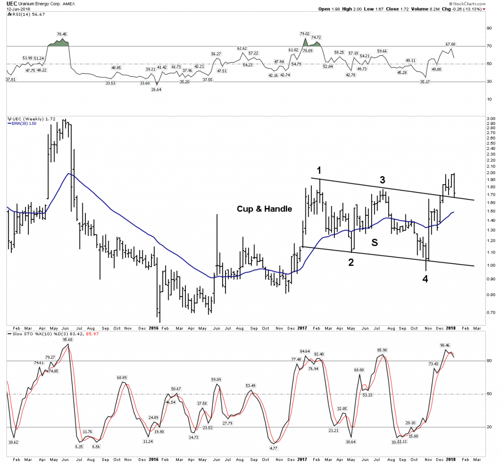
Uranium– Everyones Whipping Boy:

We have been down this road before, but eventually it might just turn around.   This week the “other” yellow metal bounced or at least its proxy ETF did.

Is this significant?  Maybe, but I don’t like the fact that the stocks didn’t seem to care too much as evidenced by URA.  Irregardless, I took a starter position in CCJ, just in case.

CCJ- What do they say about a second go at marriage…”The triumph of hope over experience”?

OIL- Solid Strength 

Oil continues to power higher.  Art Bermen has been the clearest voice as to why it continues higher and he thinks the move is not over.  It has now reached the levels where I originally shorted it last February.  It was a great trade, however it only made the initial move lower which I had anticipated.  The charts and fundamentals still indicate to me that oil is in a secular bear market.  The previous secular bear lasted 18 years, we are presently approaching 10 years in the current one.  Clearly, the trend for now is higher, however once the next recession arrives the target in the low $30 range may be achieved, but for now I watch from the sidelines. When that time comes, it will be a heck of a trade.

Commodities

Commodities as a whole have now established an uptrend,  despite the rising USD.  Still some sectors such as the ags continue to wallow, but the liquid fuel component and lumber have powered the CRB above its NL.

Viewed from the long term perspective however, commodities need to continue significantly higher,  maybe another 10% to indicate a new price regime has been established:

Conclusion

The general markets continue to power higher with momentum firmly intact.  If you are playing this sector you are making money, but be careful as numerous signs point to a top within 2-4 months.  Meanwhile the PM sector is getting beaten up, but therein may lie the opportunity of a lifetime, especially now that we know the new FED chair is just another Brainless Keynesian who thinks there will never be any repercussions to endless money printing.  Perhaps it’s time to take our eye off of the shiny object and buy what is real value, the precious and the electric metals.

Early Weekend Report…The Dollar Post


…………………………………………………………..

I haven’t posted much on the US dollar lately as I’ve been waiting for the dust to settle, as the price action completed another reversal point in its nearly 2 1/2 year trading range.

Tonight I would like to update some of the charts we’ve been following to see if we can gain any insight into what the US dollar is currently telling us about which way it wants to go. We’ll also look at some other currencies that may shed some light on the direction for the US dollar.

This first daily chart for the US dollar starts at the 2017 top and down to the bottom of the 2  1/2 year trading range.

I’ve been showing you this technique with some of the stock market indexes that are doubling the size of their 2009 uptrend channel. With the US dollar it’s just the opposite, where I used the black rectangles that are exactly the same height, to look for a place to add the bottom rail of the downtrend channel. As you can see there were no touches on the bottom rail until the very bottom of the downtrend channel was hit.

All it really tells us at this point is that we have a parallel downtrend channel in place. What we need now is to see some type of reversal pattern building out to reverse the downtrend that has been in place for almost a year. We have a potential inverse H&S bottom building out, but we need to see the neckline broken to the upside before we have confirmation that the downtrend may be over. It’s close, but not quite there yet.

Now I would like to add the downtrend channel from the daily chart above to the big 2 1/2 year trading range so you can see how it fits into the big picture. You can see why  for a dollar bull case we need to see a reversal pattern build out right here and now. What this chart is also telling us is that we had a false breakout above the top rail of the 2 1/2 year trading range and one below. I have shown you many charts in the past on how these false breakouts are what I call false symmetry breakouts. What this generally means is that the original 2 1/2 year trading range is still valid and to be respected. It’s important at this point in time to see the price action continue to trade above the bottom rail of the 2 1/2 trading range, above the 93.00 area.

Below is a long term weekly chart which shows the massive 10 year base that launched the previous impulse move up and how our current 2 1/2 year trading range fits into the big picture. Again, you can see how important a reversal pattern is for the life of this 2 1/2 year blue trading range. That big massive 10 year base is strongly suggesting to me that our 2 1/2 year trading range should be a halfway pattern to the upside, vs a top that many are willing to see . Time will tell.

This next long term chart for the US dollar is a long term 35 year monthly look which shows the two massive fractals labeled, big base #1 and big base #2. Long term members should remember this chart as it seemed like it took forever for the big base #2 S&R line to be broken to the upside. It was a case of discovering this big pattern well before the breakout, so a lot of time went by before we got confirmation that big base #2 was indeed valid. Once the breakout occurred the US dollar wasted little time and rallied in an almost vertical move before our current trading range began to buildout.

There is also another piece of fractal information on this chart which is shown by the two thin black dashed horizontal lines at 92 and 104. What those two lines represent is the size of the 1998 – 1999 bullish rising wedge halfway pattern. If big base #1 was big enough to launch that bull market up to the 120 area you would think our big base fractal #2 should also be big enough to launch a similar rally. If that is the case then our 2 1/2 year trading range should be a halfway pattern to the upside.

We’ve been following this next very long term chart for the US dollar that shows its 30 year falling wedge with reversal points #2 and #4 being our two big fractal bases. Reversal point #3 was the H&S top at the 2000 high. It took a lot of energy for the US dollar to breakout above the top rail of that 30 year falling wedge, which was needed to consolidate that move by forming our current 2 1/2 year trading range right on the top rail of that 30 year falling wedge. There is another line of support that comes into play at the 92.00 area, which is the neckline extension rail taken from the bigger H&S top, which formed at the 2000 high. So far it has held support on three separate occasions.

Before we move on there is one more long term chart for the US dollar that I’ve only posted several times in the past. I’ve been keeping a close eye on the neckline symmetry line to see if it would hold support as a possible low for the right shoulder. Keep in mind this possible massive H&S bottom is going to take time before it’s confirmed one way or the other. This is one of those cases that if I’m right, we aren’t going to know for many months if it’s valid or not, but we will be able to follow the price action in real time and monitor it going forward. As they say, stay tuned .

Also for this bullish scenario ,we need to see some type of reversal pattern buildout right here to reverse the price action off the neckline symmetry line. The H&S bottom we looked at on the daily chart is our best option at this time. That potential small H&S bottom is so critical to so many different areas we looked at on these US dollar charts above.


Lets look at some other currencies to see if they can give us any clues on what the US dollar might do. Below is a 20 year monthly chart for the Canadian Dollar that is showing a  very large double top with a strong backtest to the double bottom hump which is forming a  possible bearish rising wedge.

This long term monthly chart for the Swiss Franc is showing us a 6 year falling wedge which may have had a false breakout above the top rail. If the price action trades back into the falling wedge it will negate the breakout for now.

This weekly chart for the $XSF is showing a possible rectangle consolidation pattern building out within the downtrend.

Next up is the Australian Dollar which may be in the process of building out a bearish rising wedge halfway pattern to the downside if the bottom rail is broken.

With the US dollar testing critical support then there is a good chance that the $XEU should also be testing resistance somewhere. When the $XEU broke below the neckline I was initially looking for a quick backtest to the underside of the neckline, but little did I know it would take almost three years before we would see a complete backtest at the 120 area. At any rate we now have a complete backtest in place. Now we’ll see if the neckline has reversed its role to what had been support to now resistance.

Below is a weekly look at the $XJY which is showing it breaking down from a morphing rising wedge formation as shown by the red circles. If we get a backtest it would come in around the 89.15 area.

Below is another longer term weekly chart for the $XJY that we’ve been following for many years which is getting quite busy now. First, notice how the price action interacts with big Neckline #2. There was an initial gap made on the left hand side of the chart when the $XJY gapped up to start forming the left shoulder of that massive 6 year H&S top #2. There was a breakout gap when the price acton broke below the neckline 6 years later confirming the double H&S top labeled reverse symmetry gap.

After the initial decline the $XJY built out the 7 point inverted roof reversal pattern which led to a countertrend rally back up to the neckline. When we got back up to the neckline I thought the backtest was complete when the price action declined for about 3 weeks or so, but then it decided to rally once again, this time breaking above the neckline which looked like the neckline had failed to hold resistance. After trading above the neckline for several months and backtesting it from above, the XJY built out the red 5 point triangle reversal pattern, which led to the move back below the neckline I then called that trading range above the neckline a bull trap. Note the green circle on the far right hand side of the chart which shows the XYJ gapping below the neckline once again, telling us the neckline was properly placed.

About 6 weeks ago the price action backtested the neckline from below once again,  forming the red bearish rising wedge which is the same rising wedge we looked at on at the weekly chart above.

This next chart is a long term chart which compares the $USD to the $XJY. For the last several years the neckline symmetry line has been holding support for the right shoulder low. It’s possible that this ratio may be building out 13 a year triple H&S bottom. We won’t have a definite answer until neckline #3 is broken to the upside, but we can follow the price action for more clues as time marches forward.

Below is a combo chart which has the $USD:$XJY ratio on top and gold on the bottom. The neckline symmetry line on both charts have done a beautiful job of showing us where the low for the right shoulder on the ratio chart is, and the high for the right shoulder on the gold chart is located. Again, we won’t have confirmation that the possible H&S patterns are complete until we see the necklines broken. At any rate this combo chart may have some profound  implications if these two H&S patterns play out. Have a great weekend and all the best…Rambus


PM Combo Chart Update…

Today we are getting some more follow through to the downside as most of the necklines have now been broken. Note the breakout gap yesterday on the HUI which tells us our neckline was properly placed. The next important line of support is the bottom rail of the nearly one year triangle trading range. Keep in mind a backtest to the underside of the neckline can occur at anytime which should be expected, but not necessary. We could even see a ping pong move between the bottom rail of the triangle and the neckline before all is said and done.

With this H&S top forming at the 4th reversal point it’s telling us that the bottom rail of the triangle trading range is going to be broken to the downside by its measured move. Using the HUI as a proxy for the rest of the PM stock indexes the H&S top at the 4th reversal point measures down to the 174 area which is well below the bottom rail of the triangle trading range.

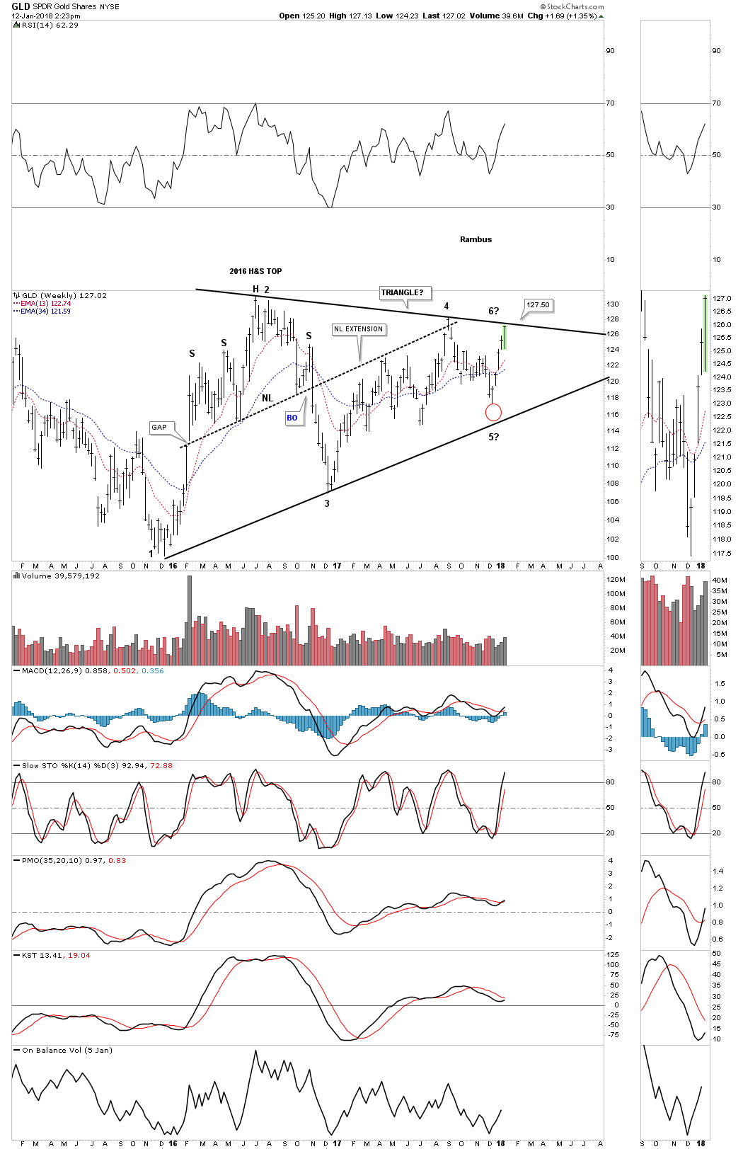
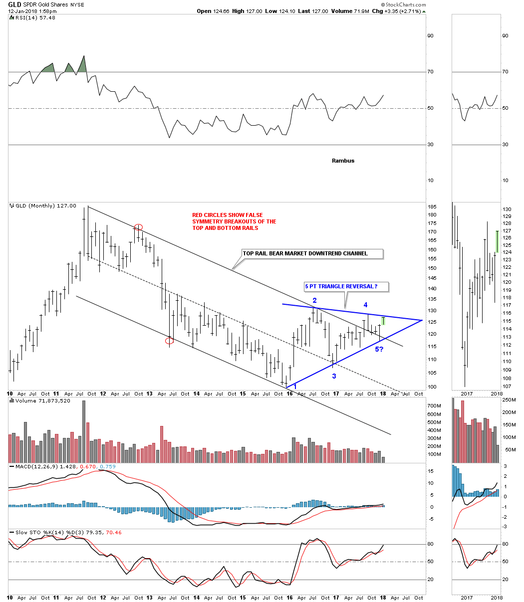
The last bit of information this combo chart is showing us is that GLD and SLV are showing relative strength to the PM stock indexes as they are still trading well above their respective necklines. Normally you would like to see the PM stocks leading GLD and SLV in a strong rally which isn’t the case right now.