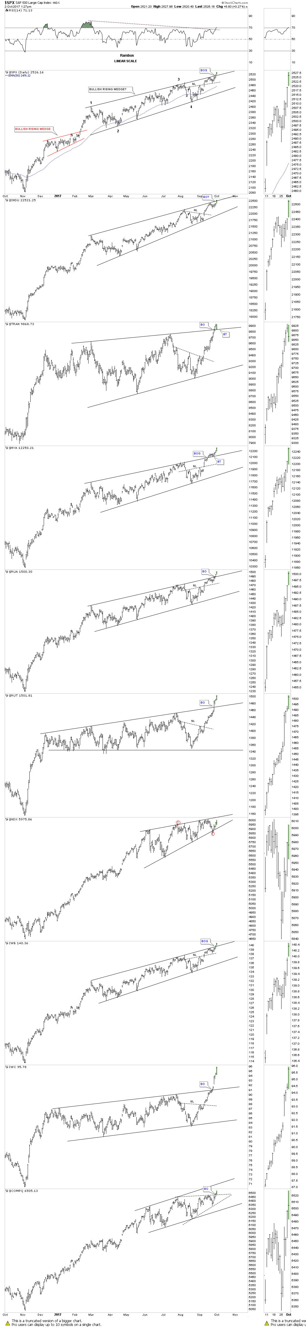
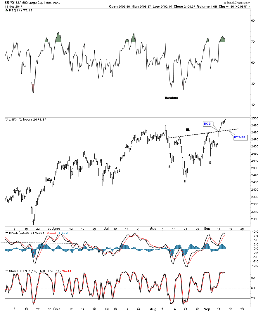
On the 2 hour charts I’ve spotted several small H&S bottoms building out on some of the stock market indexes. It wasn’t until Monday of this week that they began to show themselves when several broke out above their necklines. Some of these small H&S bottoms are part of a bigger pattern that has been building out for most of this year. At a minimum their price objectives should get some of the stock market indexes back up to the top of their 2016 uptrend channels.
Lets start with a 2 hour chart for the SPX which shows it gapped above its neckline on Monday of this week and closed at a new all time high today. A backtest to the neckline would come in around the 2482 area.

At the close of trading last Friday there wasn’t a H&S bottom to be seen until the SPX opened higher on Monday with the breakout gap.
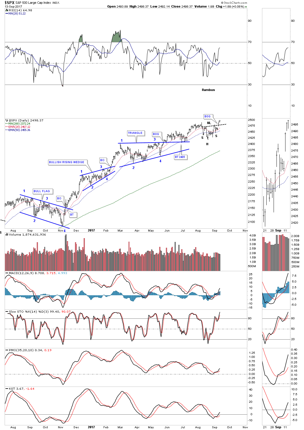
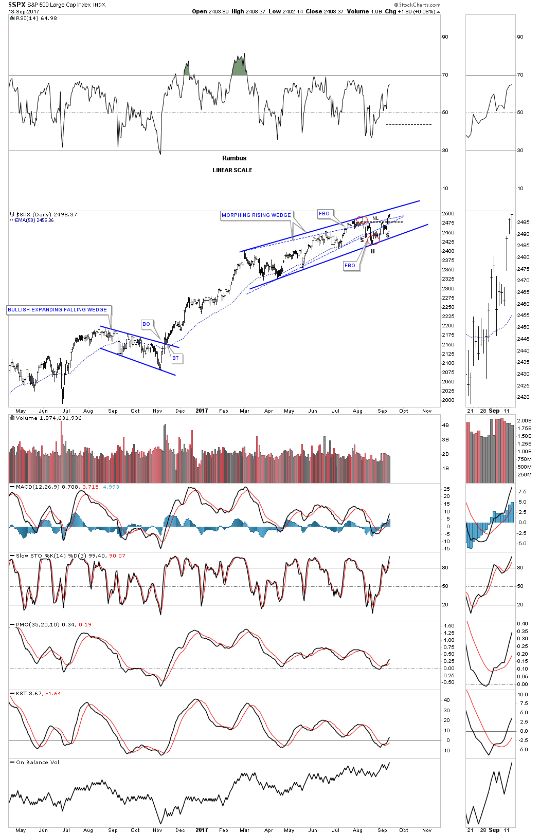
Several weeks ago I posted this chart which was showing how the original rising wedge, blue dashed trendiness, was morphing into a bigger pattern as shown by the red circles with a symmetry false breakout of the top and bottom blue dashed rails. It’s getting pretty busy in the apex, but you can see how the small H&S bottom fits into the bigger pattern that began building out back in February of this year. If that little H&S bottom plays out it strongly suggests the SPX is going to breakout topside from that 7 month morphing rising wedge in a new impulse leg up.

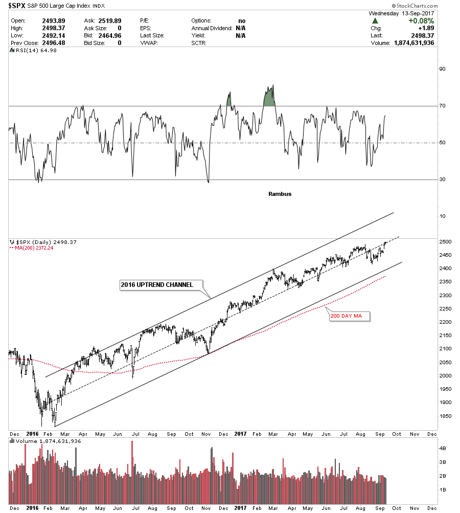
Below is a 2 year daily chart for the SPX which just shows its 2016 uptrend channel. On many of the stock market indexes the 200 day moving average does a good job of showing you the angle of the uptrend channel.

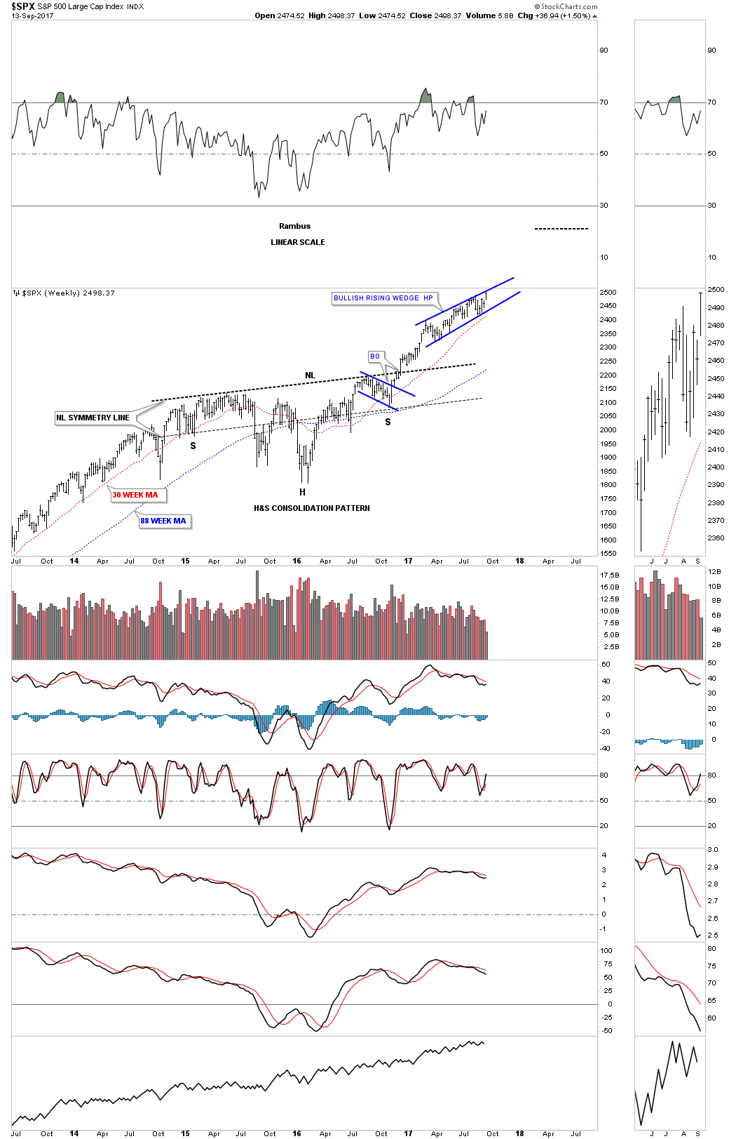
Perspective is everything when you discover what may be an important chart pattern. The weekly chart below shows the 2 year H&S consolidation pattern that corrected the last impulse move up. Now you can see how the blue morphing rising wedge fits into the very big picture. Keep in mind the rising wedge hasn’t broken out yet so the pattern isn’t complete. The reason I think the rising wedge is going to breakout topside is because we are in a bull market and patterns like this tend to form in strong bull markets. If we do get the upside breakout from the rising wedge I would view it as a halfway pattern that would have formed between the neckline and the ultimate price objective.
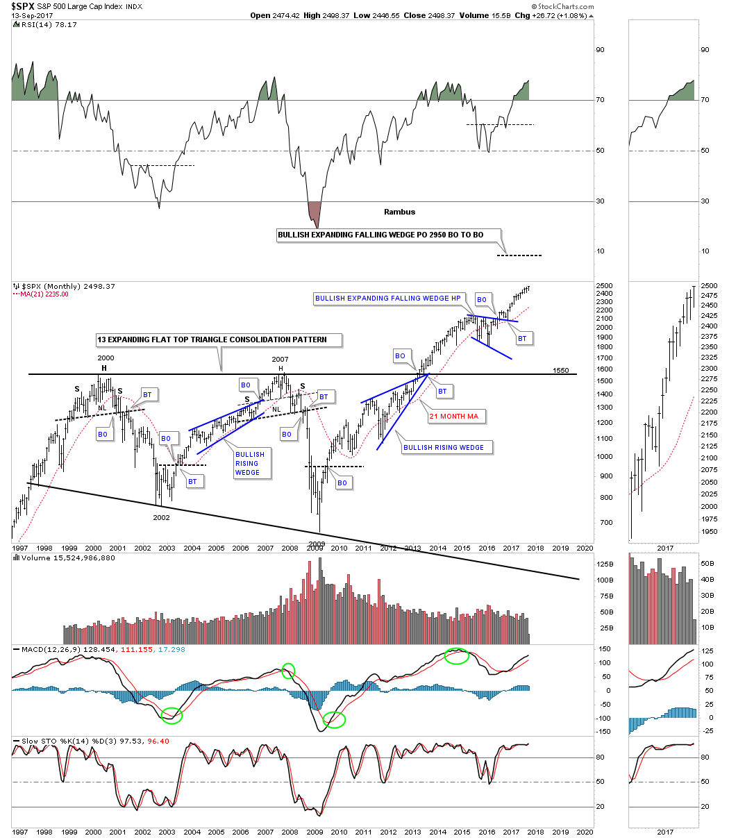
As I mentioned earlier perspective is everything. Below is a 20 year monthly chart for the SPX which we’ve been following before the top rail of the 13 year expanding flat top triangle consolidation pattern was broken. On this chart I’m showing the 2014 and 2015 consolidation period as a bullish expanding falling wedge halfway pattern. I have to tell you that it has been pretty lonely being a long term bull, but it has even been harder over the last several months as the rising wedge has been developing on the daily charts above. It’s these long term charts that take out all the noise that give me the confidence to hang in there when most say the bull market can’t keep going up. This chart shows you the wall of worry since the breakout from the blue bullish expanding falling wedge.

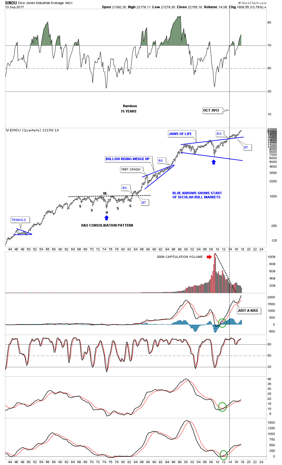
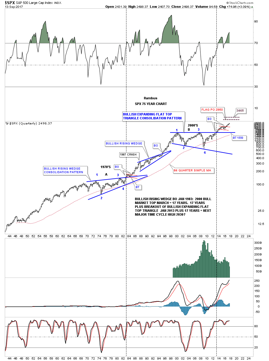
Again perspective is everything when you look at this 75 year quarterly chart for the SPX. The blue expanding falling wedge on the chart above is the small red consolidation pattern at the top of this chart. This chart along with the Jaws of Life on the INDU has given us a look into the future that few want to believe. For whatever reason investors love to hear bad news or that the markets are going to crash. Fear sells where bullish scenarios go by the wayside. For all the reasons this bull market that began in March of 2009 can’t keep going up, it keeps going up regardless of all the reasons it can’t, and there are a millions reasons why it can’t keep going up. The price action above all else has the final say when everything else is boiled away.
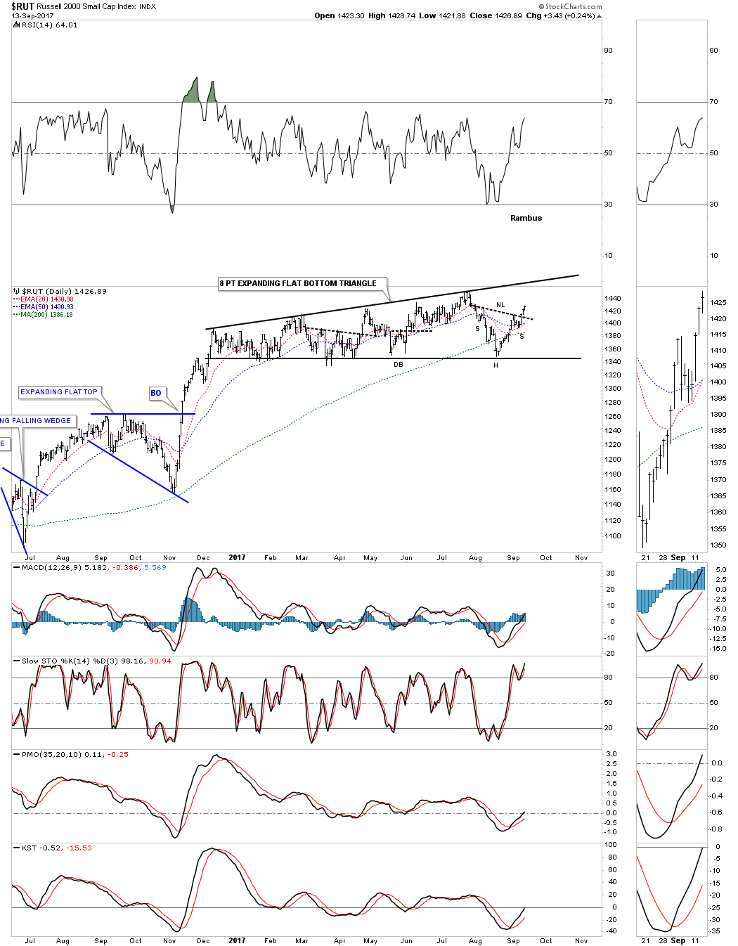
Next I would like to show you some charts for the RUT which has been consolidating longer than the other stock market indexes. Yesterday it broke out above the neckline of its small H&S bottom on the 2 hour look.

The daily chart below shows how the RUT has been consolidating a 10 month flat bottom expanding triangle. The H&S bottom on the 2 hour chart above is forming at the 8th reversal point which suggests the top rail should be reached at a minimum with the possibility of a total breakout.
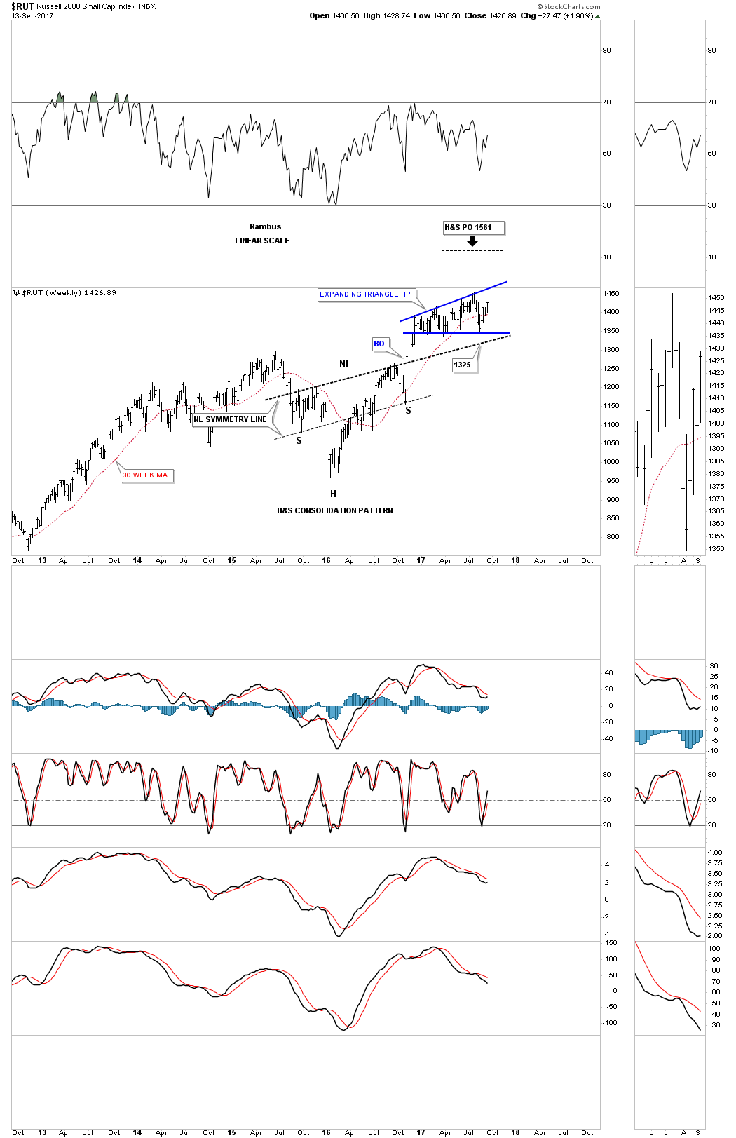
Below is a long term weekly chart which shows the RUT built out a beautiful and symmetrical H&S consolidation pattern which launched the next leg up. Again, because we are in a bull market the odds favor that the 8 point expanding flat bottom triangle is going to breakout topside. The price objective of the big H&S consolidation pattern is strongly suggesting the expanding flat bottom triangle is going to breakout topside also.
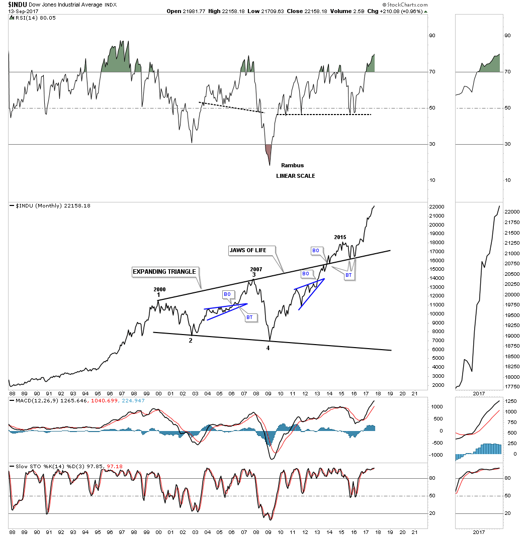
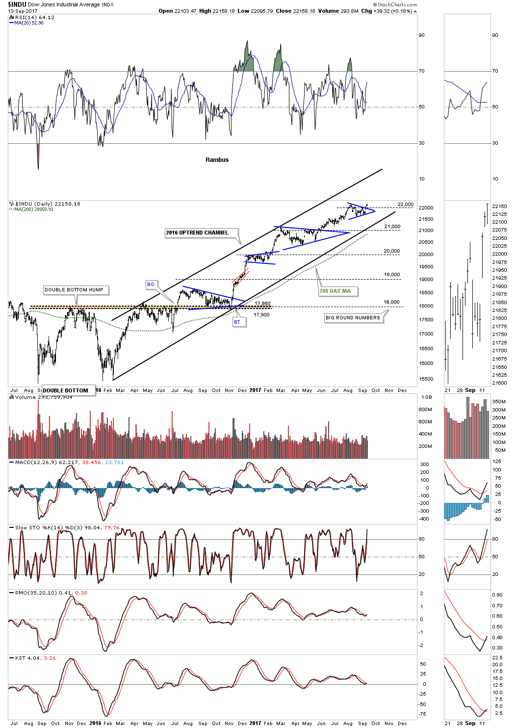
I’m going to go over the charts for the INDU quickly as there is so much to look at tonight. Below is a daily chart which shows the 2016 uptrend channel which looks like a new all time high was made today.
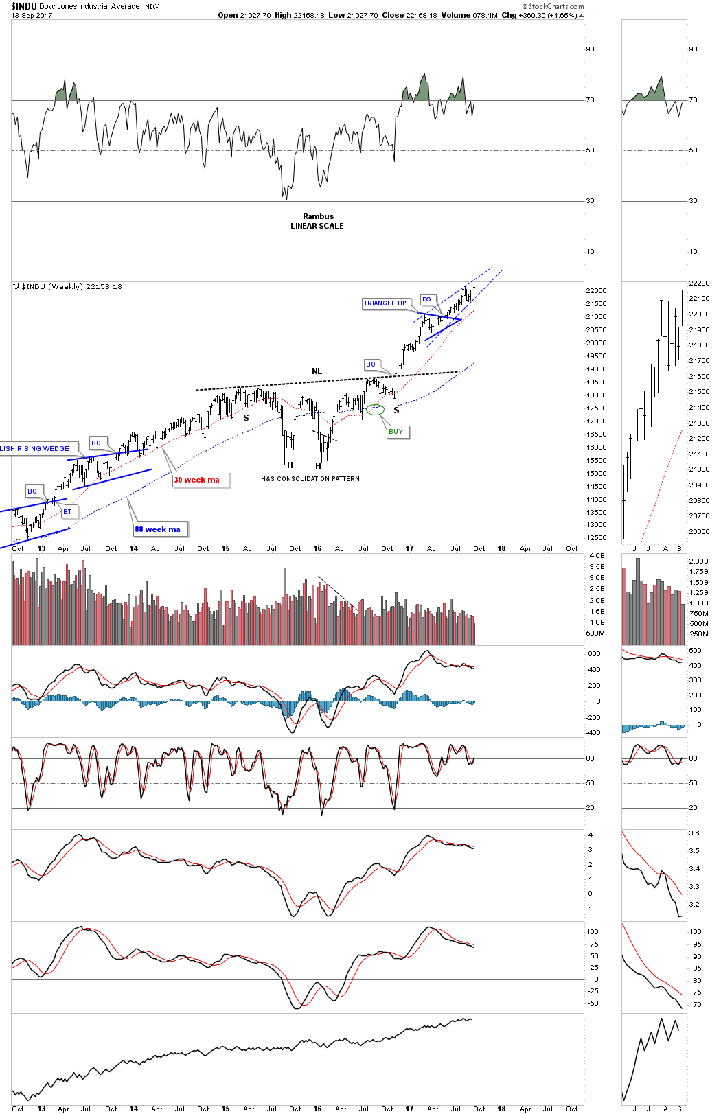
This weekly chart shows the INDU’s H&S consolidation pattern with the breakout and impulse move higher.
The monthly line chart for the Jaws of Life.

Below is the 75 year chart for the INDU which shows the Jaws of Life and a glimpse into the future.

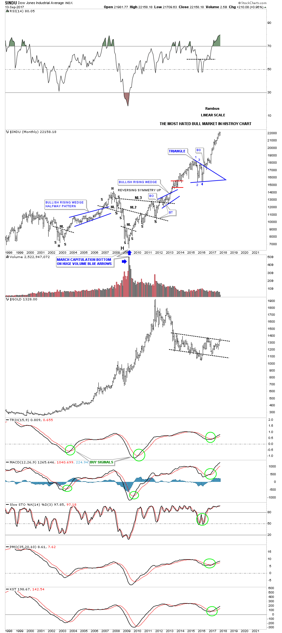
The most hated bull market in history chart for the INDU.

Below is a long term daily chart for the NDX which I call, Just Another Brick in the Wall. The NDX built out a bullish rising wedge as its 2015 and 2016 consolidation pattern. Note all the small blue consolidation patterns that formed during the previous impulse leg up from 2013 to 2015. The 200 day simple moving average did a good job of showing the angle of the uptrend.
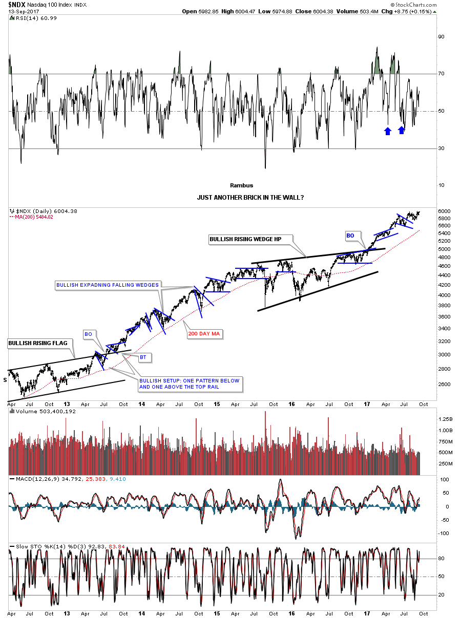
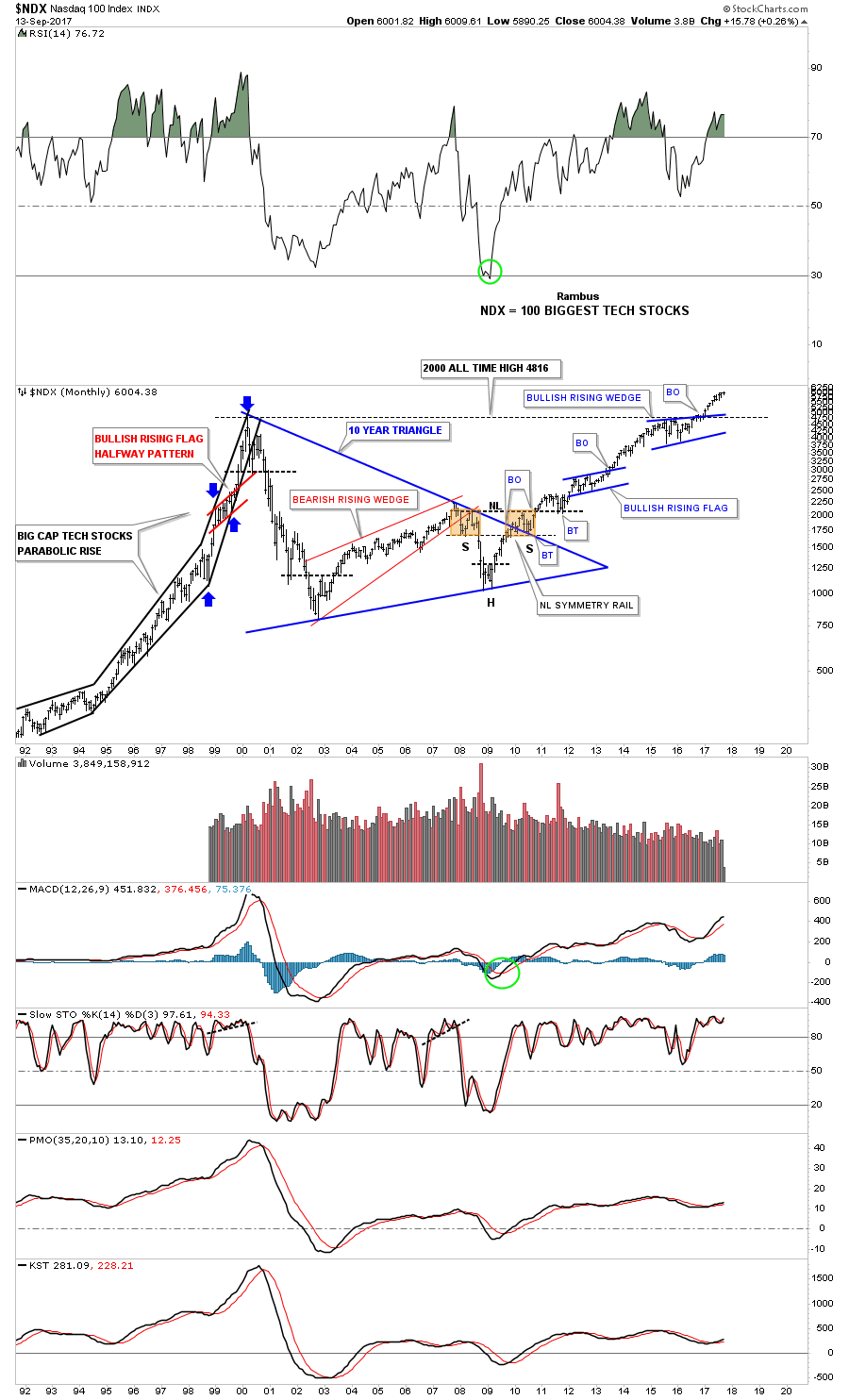
Below is a 25 year look at the NDX which shows some beautiful Chartology. Note the bullish rising wedge which formed just below the all time highs that gave the NDX the energy it needed to finally move on to all time highs. Classic Chartology.
Below is a weekly chart for the Transportation Average which has a lot of investors concerned about the bull market in equites. As you can see transports built out a beautiful H&S bottom with the head forming at the 2016 low. The Transportation Average has been building out a nearly one year expanding triangle which is not to far from new all time highs. The bull market strongly suggests the expanding triangle should breakout through the top.
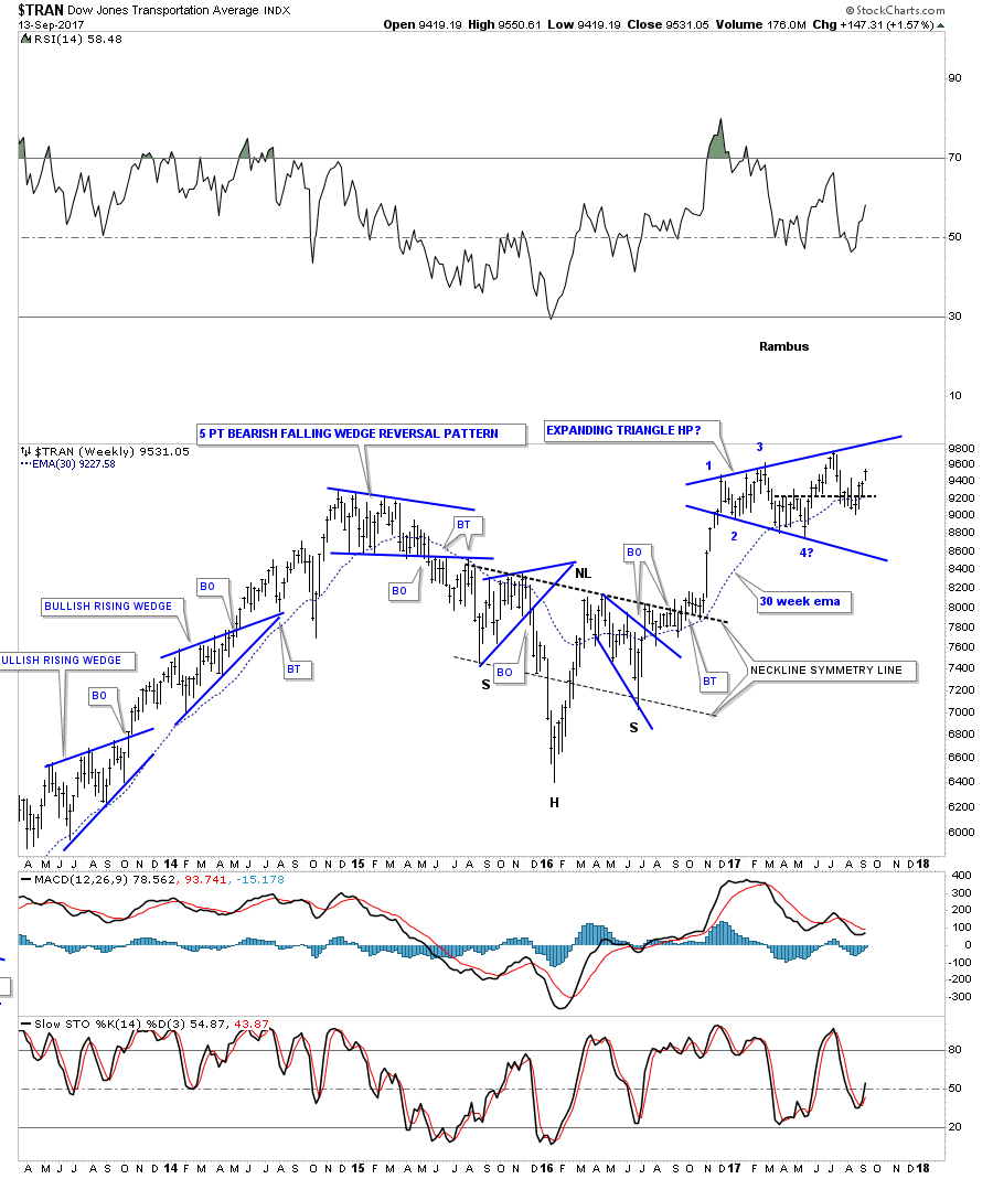
The 20 year monthly chart shows the expanding triangle as a high level consolidation pattern.

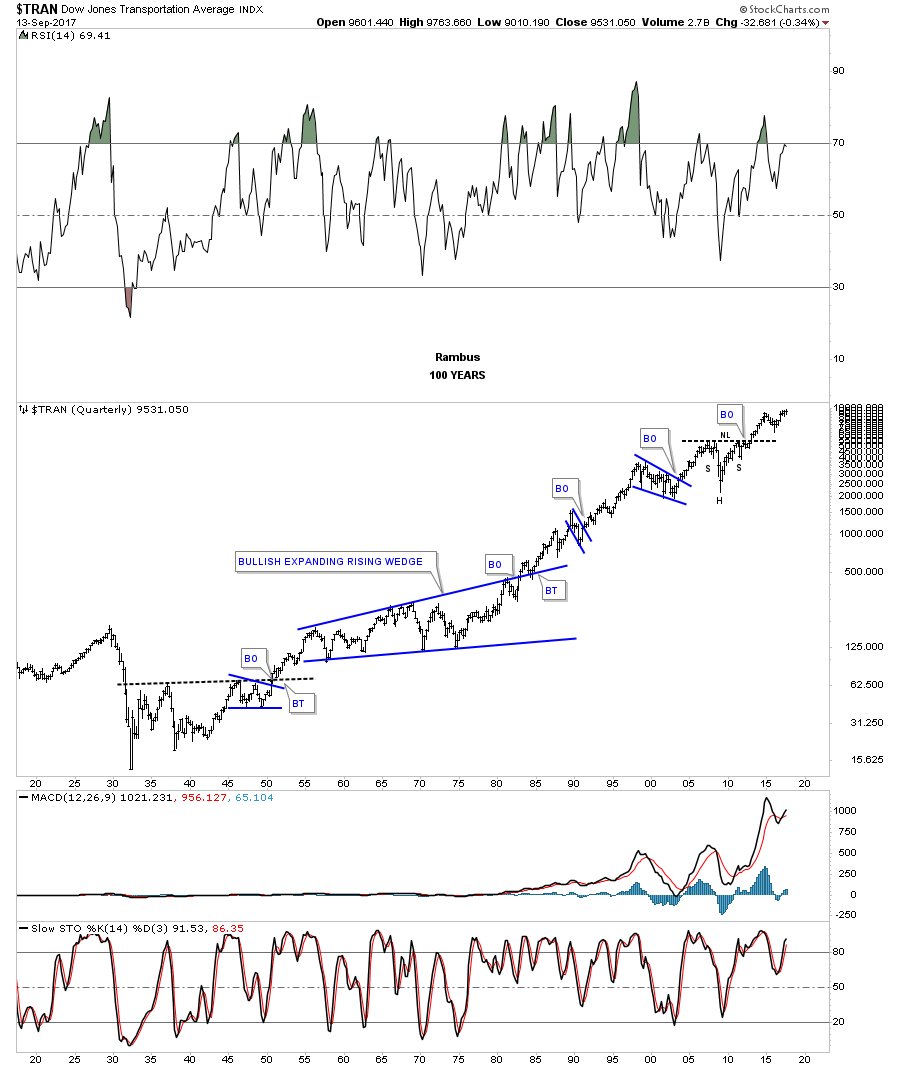
Below is the 100 year quarterly chart for the Transports. I wonder what this chart will look like in another 100 years?
This next chart is for our many long term holders that don’t like to trade every little wiggle a stock makes and are looking for something to hold on to. This was one of the big leaders during the first leg up and then built out the blue triangle consolidation pattern to consolidate that impulse move up.
The long term monthly line chart. Think of the blue triangle as a halfway pattern.

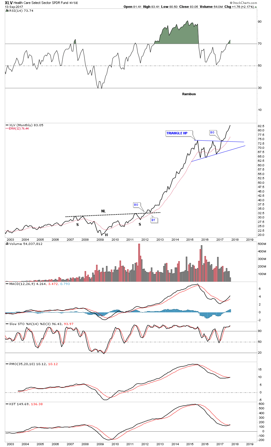
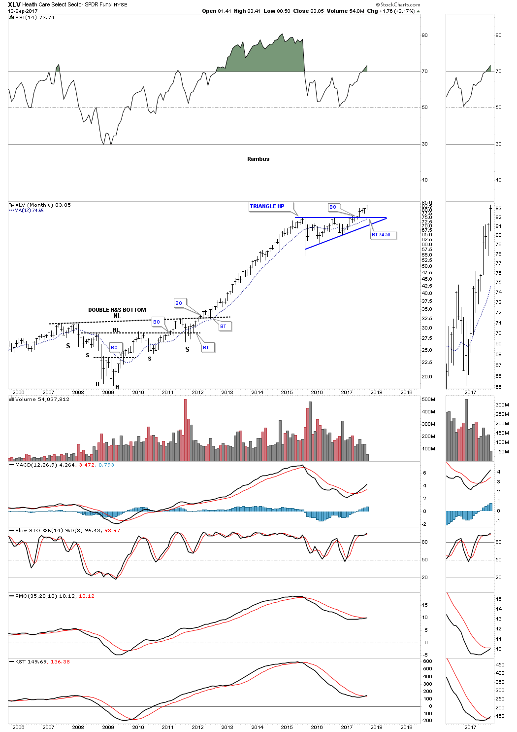
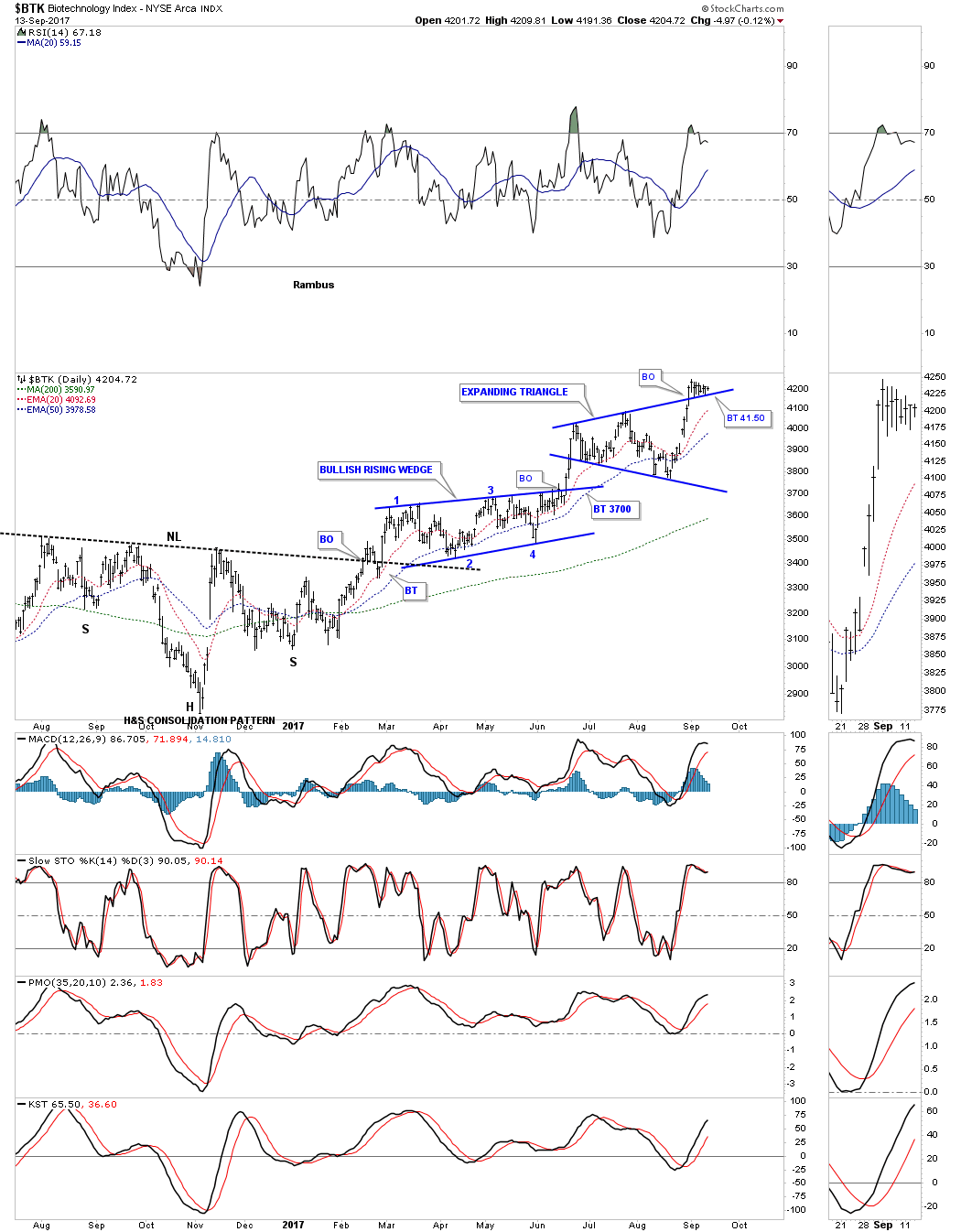
Undoubtedly my favorite sector is the $BTK, biotechnology. The daily chart.
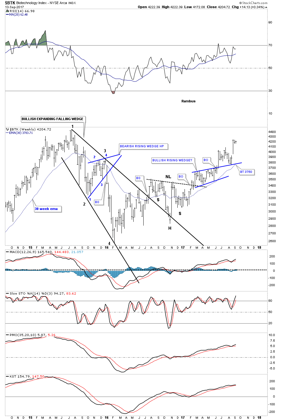
BTK weekly:
Below is the $BTK monthly.
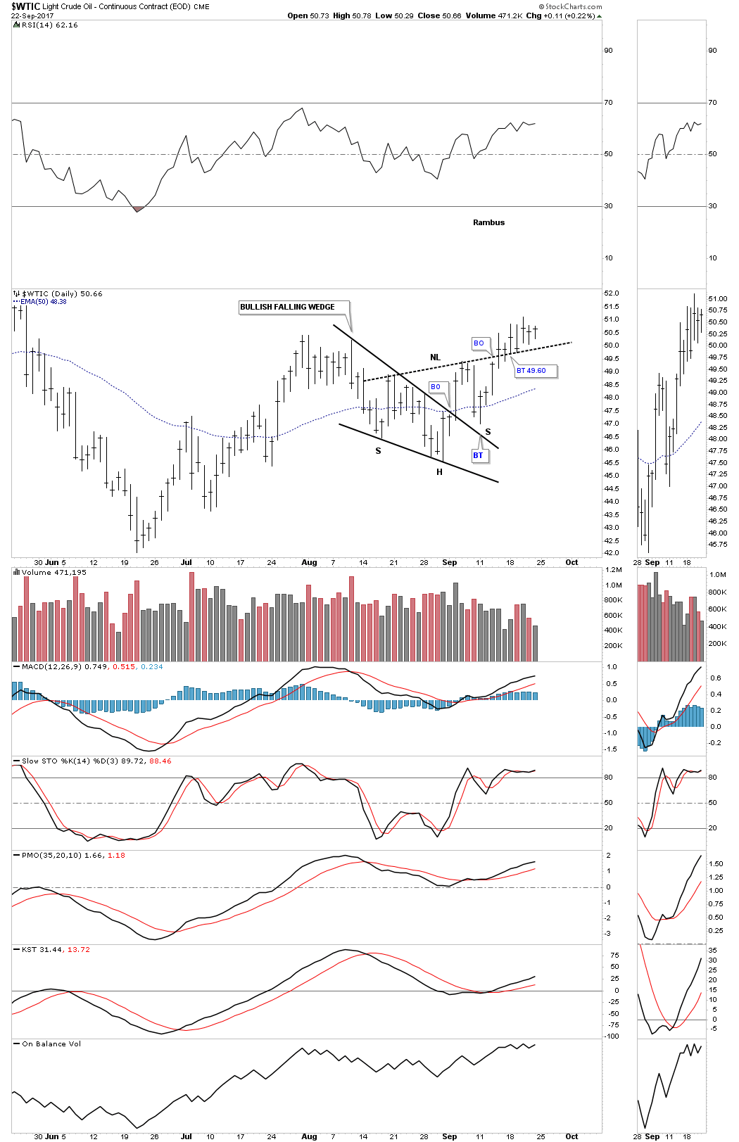
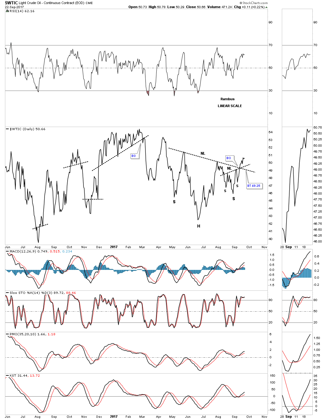
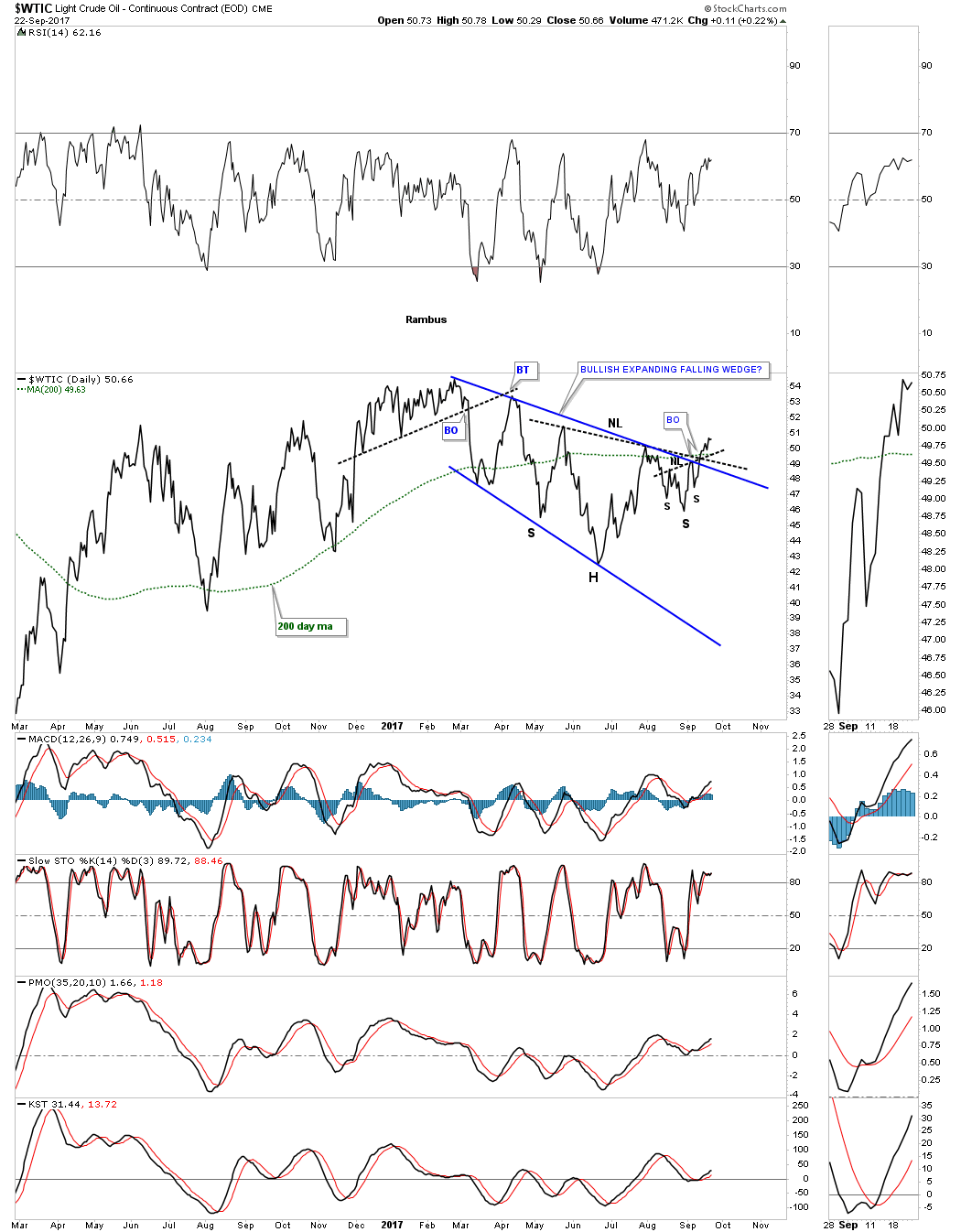
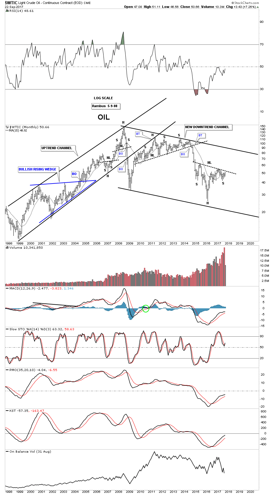
I had planed on showing you some charts on oil, but I’ve run out of time. The bottom line is that until something changes the bull market, it is what it is and all the negativity about the economy or fundamentals or whatever one uses to gauge the health of the stock markets is not going to make you a dime. Trying to short a bull market is one of the hardest things to do as many have found out. It’s much easier to go with the price action and what it’s telling you to do than to fight it. Maybe we crash into October like so many are predicting, but on the other hand what if we don’t? All the best…Rambus