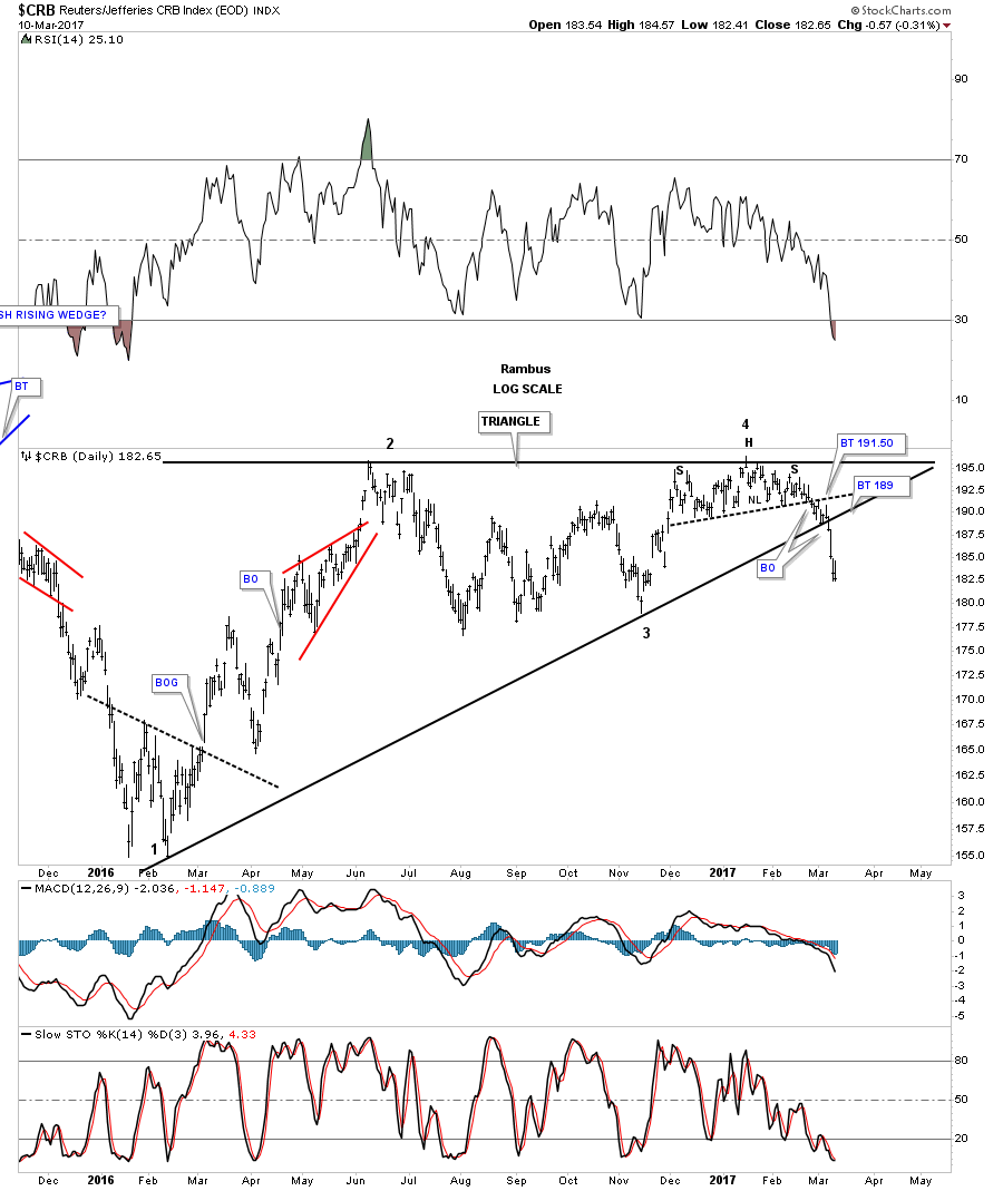
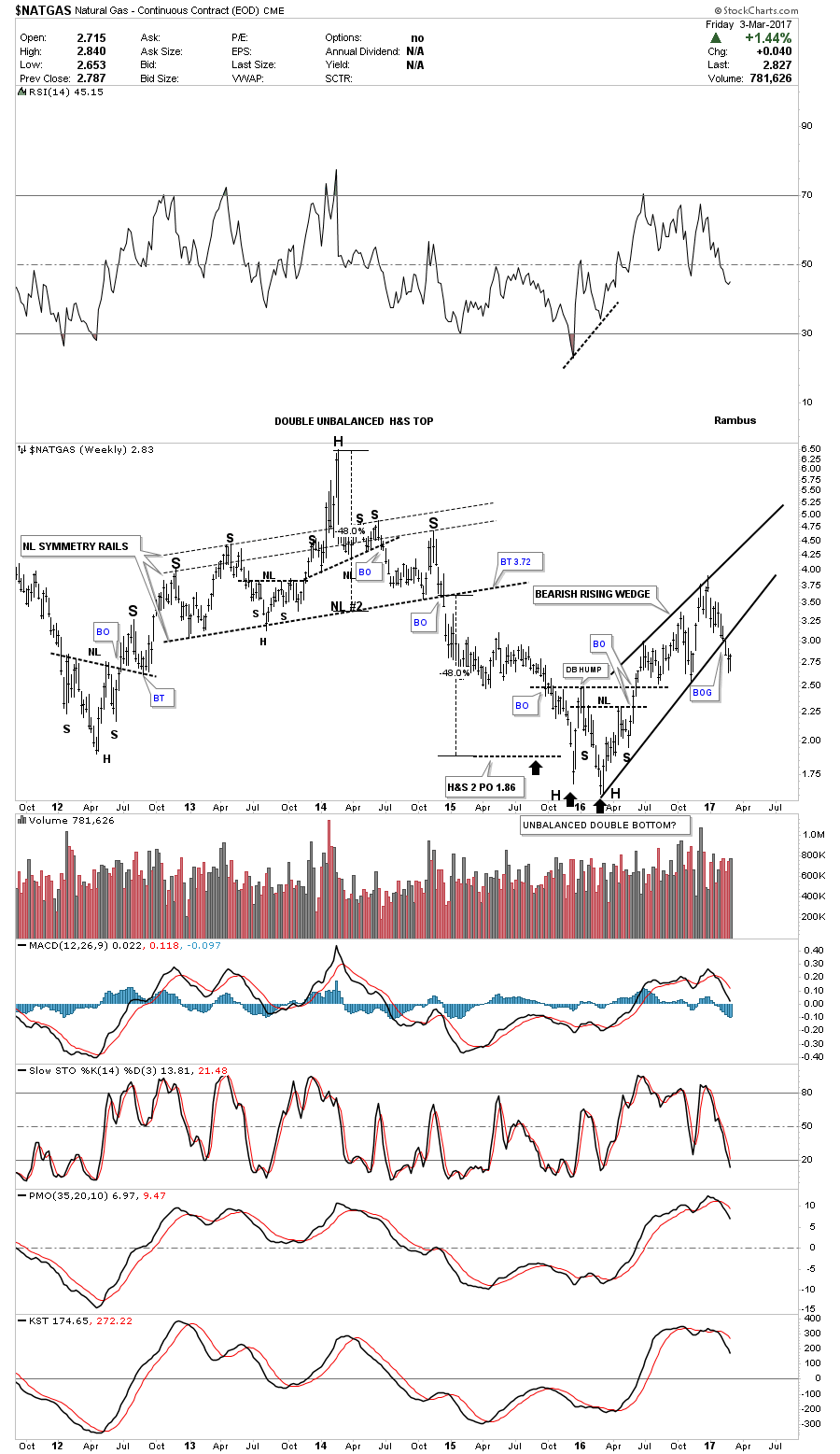
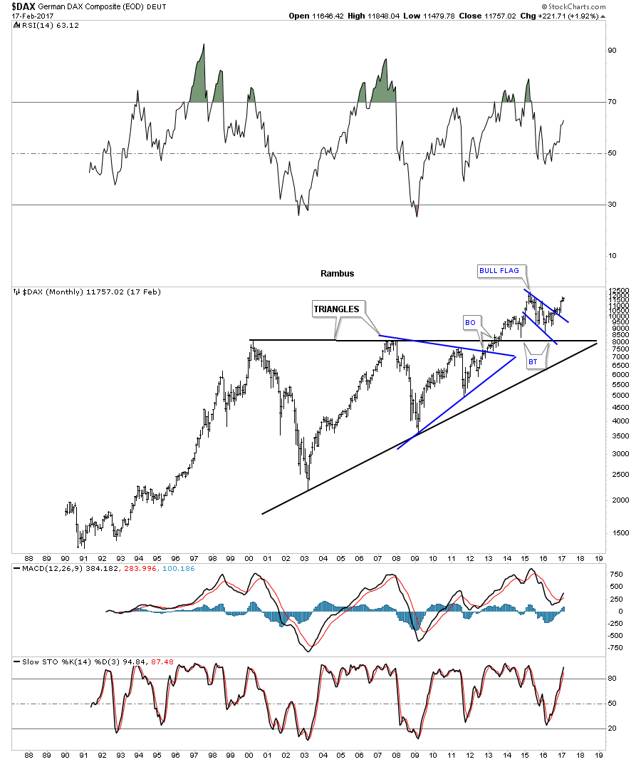
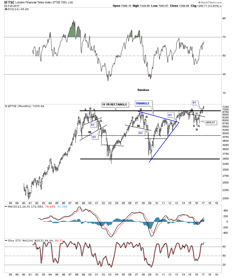
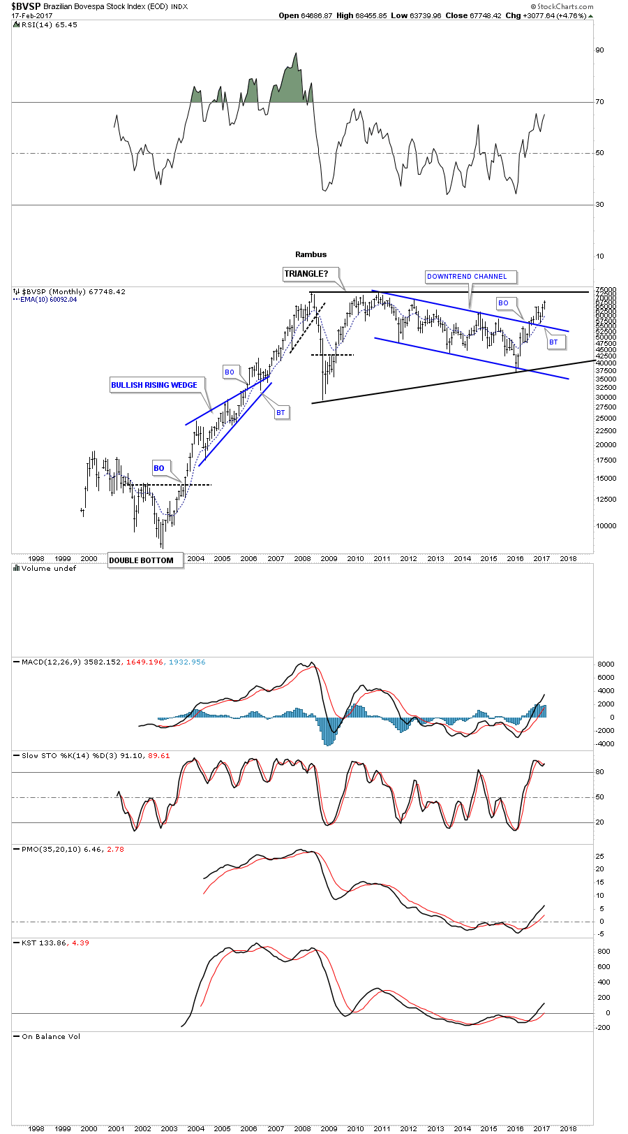
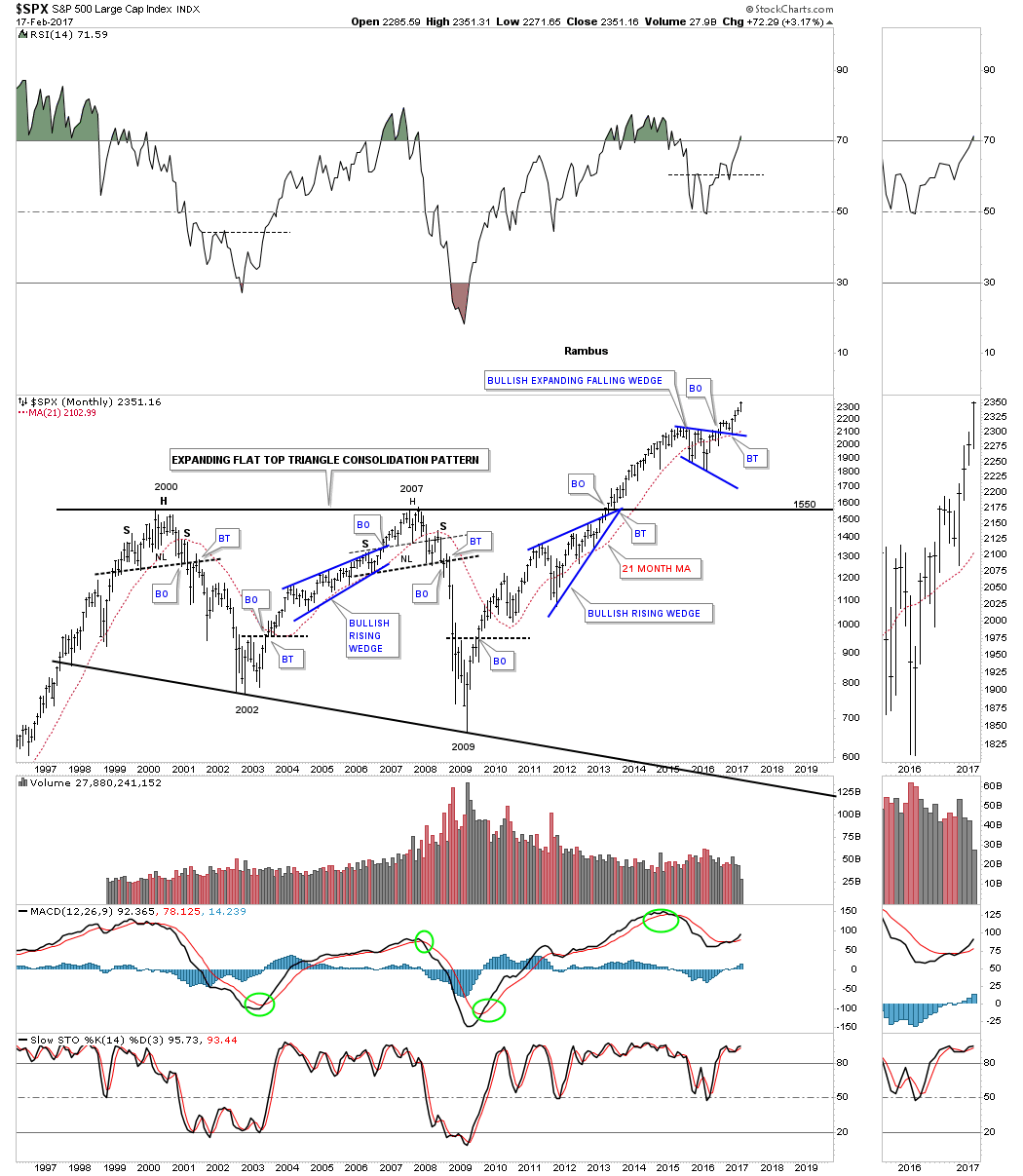
In the Wednesday Report the title read, What Type of Investor are You? My main focus was to show some intermediate to long term buy and sell signals based on the 21 month simple moving average and the MACD-Histogram. Tonight I would to take it one step further and look at the Chartology for some of the big stock market indexes which shows the intermediate to longer term perspective. There is one dominate chart pattern that has built out a consolidation pattern for the 2015 to 2016 correction.
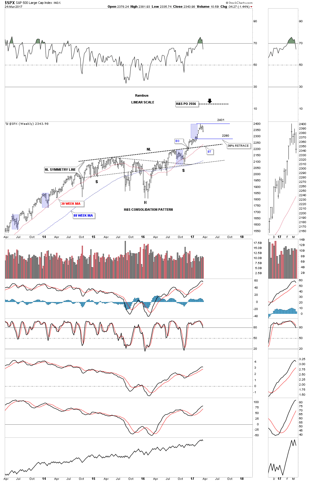
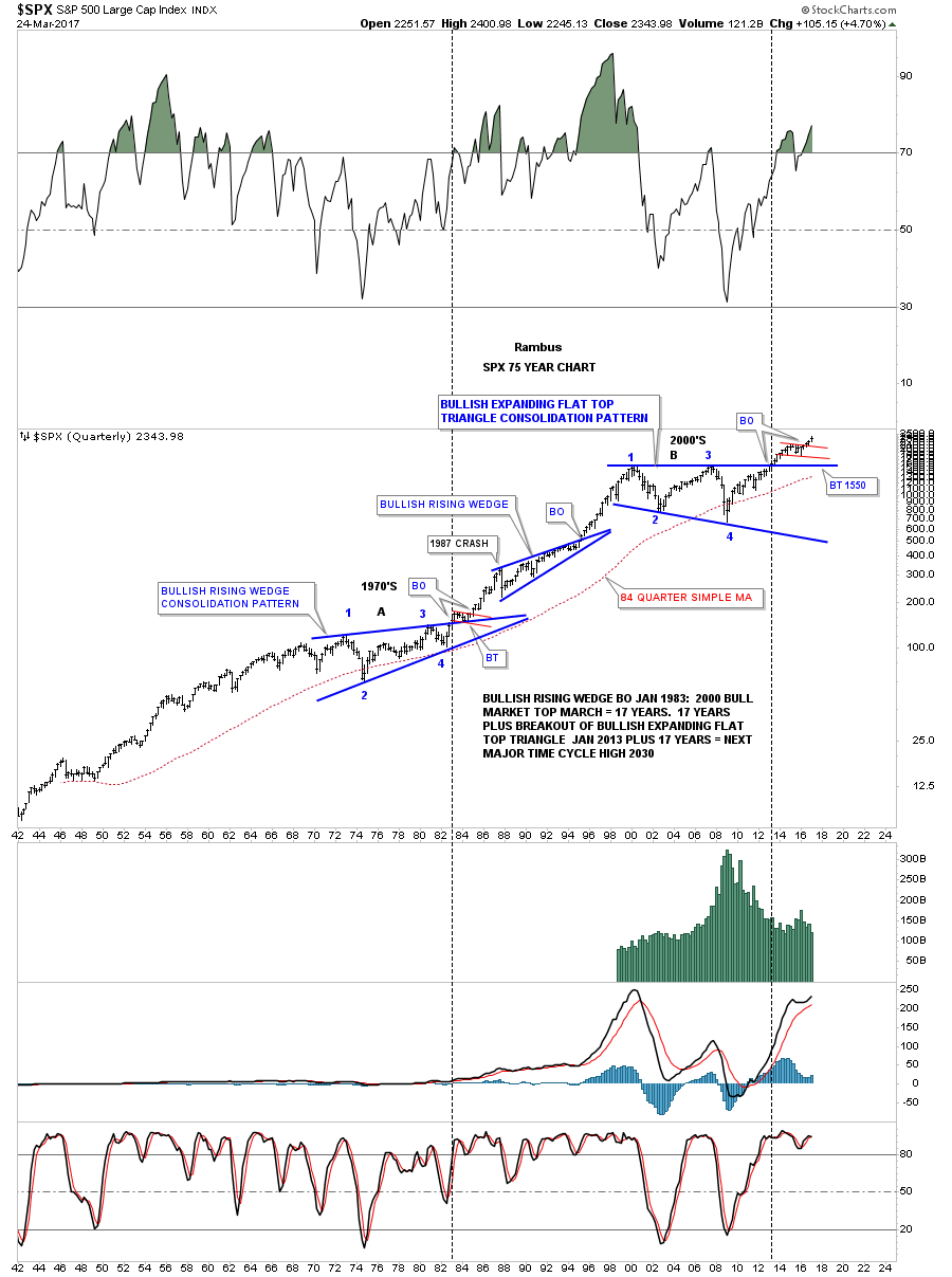
Lets start by looking at a 4 year weekly chart for the $SPX which shows the dominate H&S consolidation pattern that was needed to consolidate the last rally phase. It could have been any number of different consolidation patterns, but this time it was the H&S consolidation pattern. Back in December of last year the SPX broke out above its neckline and has rallied strongly without much of a correction. Four weeks ago the SPX hit a high of 2401 and has been going nowhere which is suggesting the first real correction may be at hand since the rally out of the November elections low.
The blue shaded areas shows the size of some of the previous corrections on a linear scale. If our current consolidation phase is similar to some of the previous corrections then we could see the SPX dip down to the 2280 area, which would also be a 38% retrace from the right shoulder low. If a deeper correction is in the cards then a complete backtest to the neckline would come into play. The red 30 week ma is rising strongly and is now just above the neckline. The H&S consolidation pattern has a price objective up to the 2556 area, at a minimum.
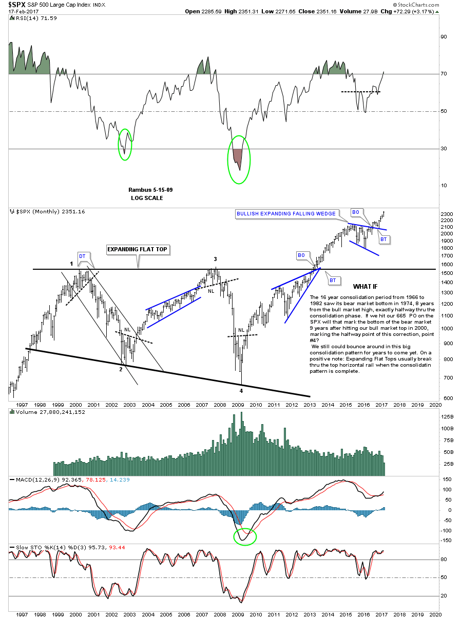
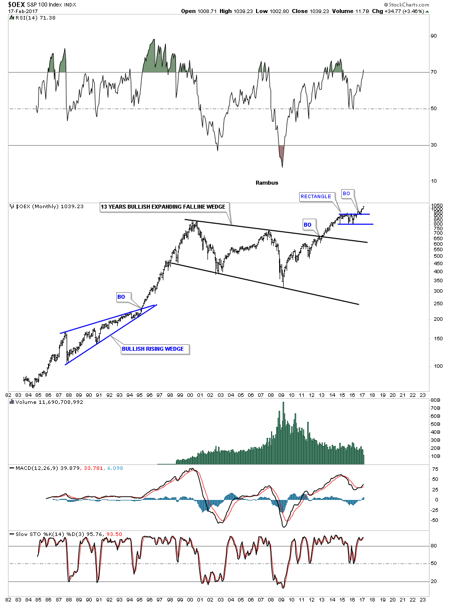
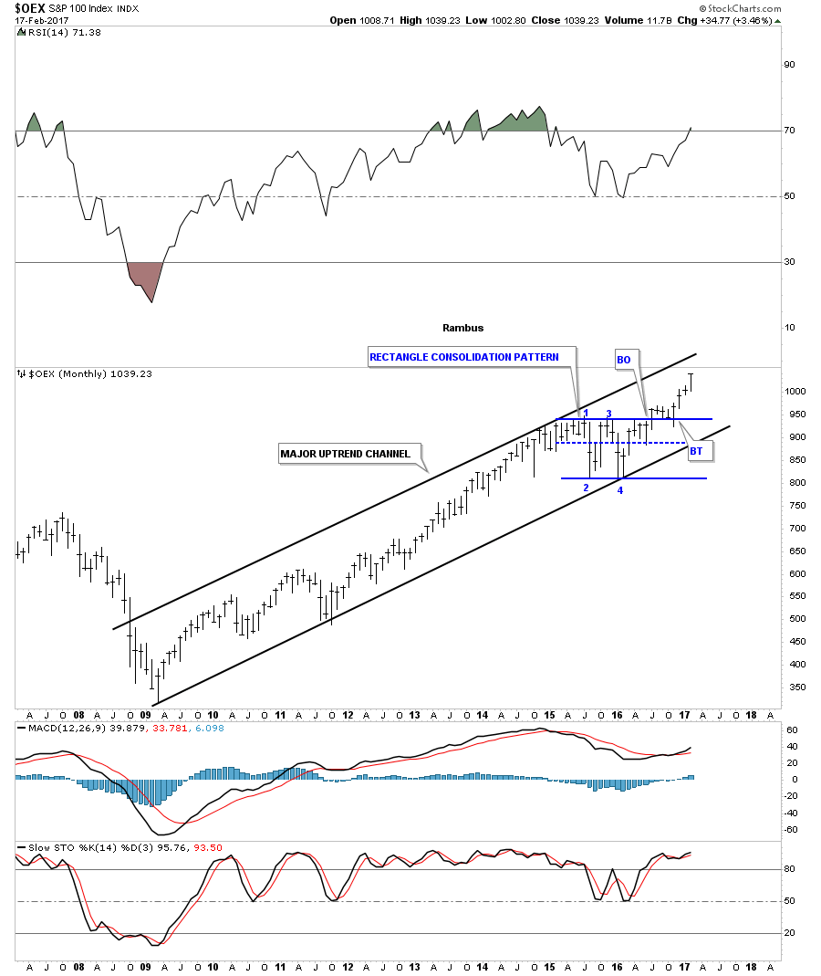
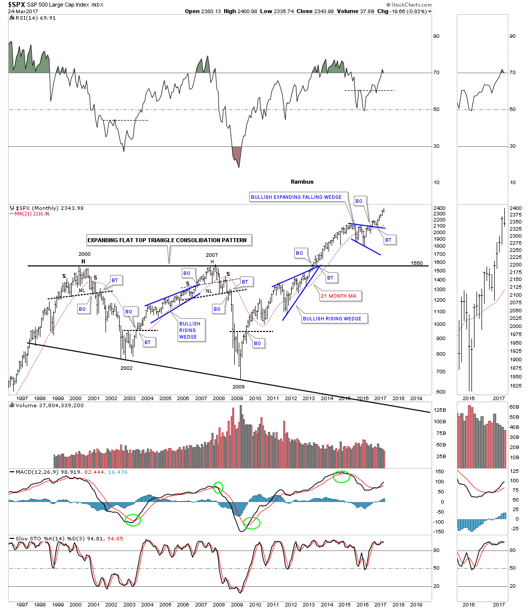
The 25 year monthly chart for the SPX shows a blue bullish expanding falling wedge which has the H&S consolidation pattern as part of it. Keep in mind the 13 year black flat top triangle that consolidated the bull market that ran from 1976 to 2000, which I view as a halfway pattern to the upside.
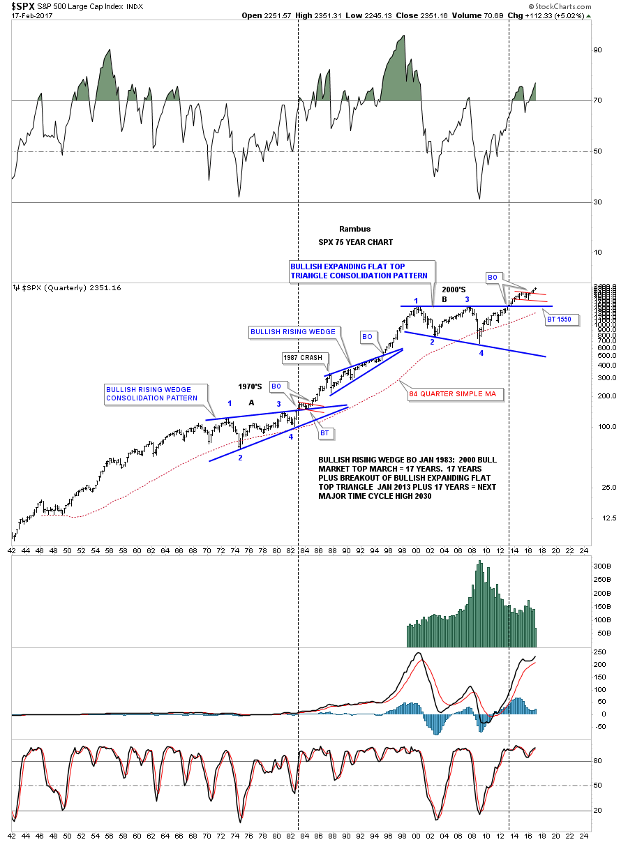
The 75 year quarterly chart for the SPX shows you why I believe the 13 year flat top triangle is a halfway pattern to the upside. Note the near 20 year bullish rising wedge which formed in the 1970’s, and the huge bull market that took place after the breakout and backtest were finished. If you think things are bad right now and there is no way the stock market can go up, you should have been trading the stock markets in the 1970’s when inflation was out of control and interest rates were up over 20%. The 2009 crash low is equal to the low in 1982 which launched one of the biggest bull markets of all time. Big consolidation patterns equals big moves.
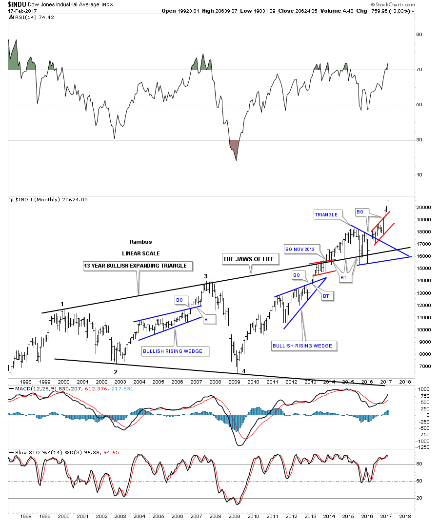
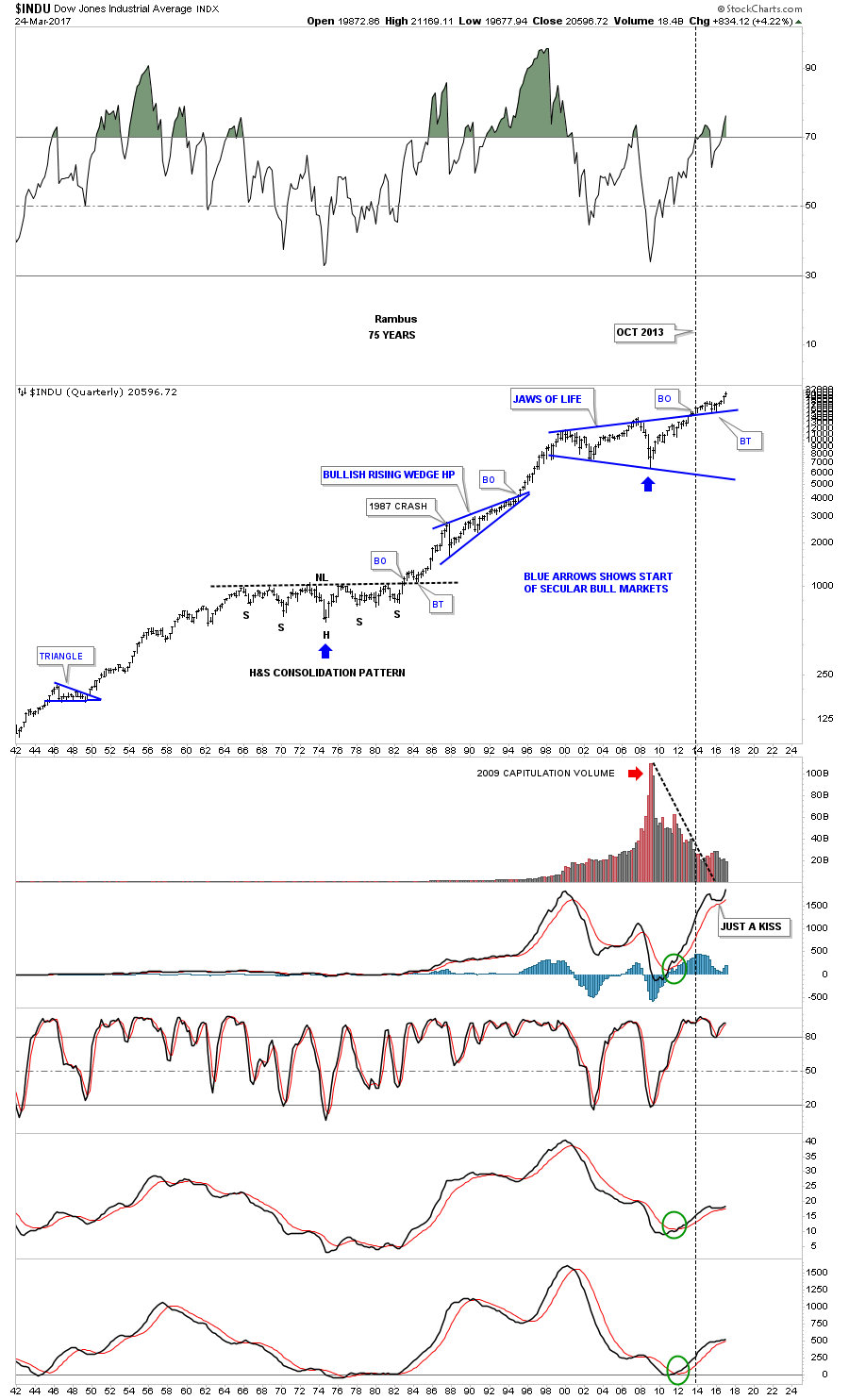
Next lets look at the H&S consolidation pattern that the INDU has built out on the weekly chart. As you can see that was one heck of an impulse leg up when the price action finally broke out above the neckline. A 38% retrace from the right shoulder low to the recent high comes in at the 19,899 area. The two blue horizontal trendlines represents the possible new consolidation area that may build out. There is no way to know at this time what type of consolidation pattern may form, but this looks like a good place to start.

The 75 year quarterly chart for the INDU shows a similar long term setup to the SPX chart we looked at earlier. From the mid 1960’s to the breakout above the neckline in 1982 the INDU built out a massive H&S consolidation pattern, which led to its greatest bull market of all time. Note the beautiful breakout and backtest to the neckline which led to the first impulse leg up that lasted almost 5 years until the infamous 1987 crash, which is still one of the worst declines for one day, on a percentage basis, in history.That definitely felt like the end of the world back then, but it did very little to slow down the secular bull market as the bullish rising wedge began to build out. Note how similar the breakout and backtest looks on the Jaws of Life expanding triangle to the 1982 breakout and backtest. The blue bullish rising wedge formed as a halfway pattern during that secular bull market. The only real bullish analysis back in 1982 was Robert Prechter, who made the outlandish prediction that the INDU would trade up to 5000 or so if I remember correctly. As it turned out he got out way to early and missed the best part of the bull market during the 1990’s.
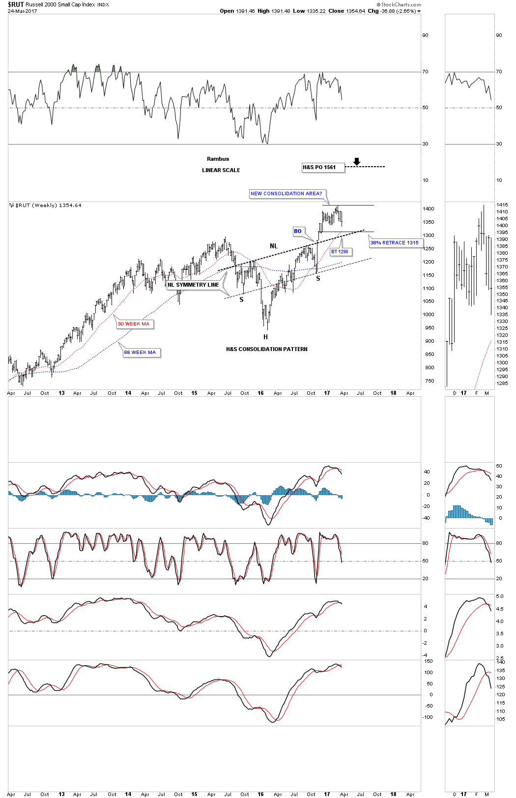
Now lets look at the $RUT, Russel 2000 small cap index, which is showing a H&S consolidation pattern on its weekly chart. The small caps were actually the strongest sector during the rally out of the right shoulder low. It was also the first index to stall out. There are 3 possible areas of support. The first is the 38% retrace off the right shoulder low to the recent high, which comes in at 1315 which is also the area where the 30 week ma average comes into play. The 3rd area of support is at the neckline at 1290 or so. Note how the neckline symmetry line shows the low for the left and right shoulders.
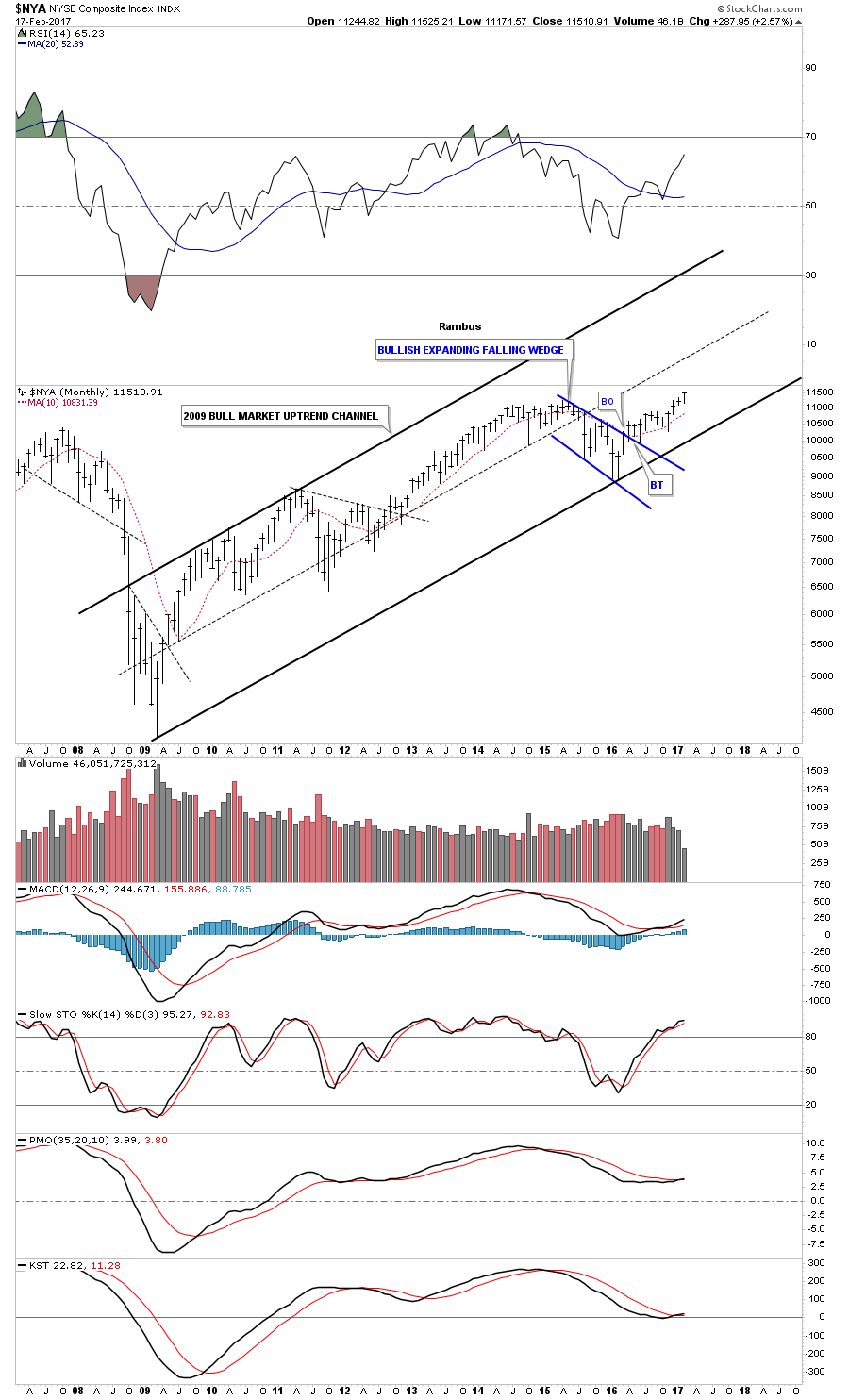
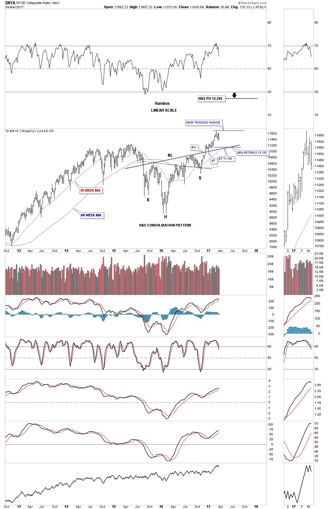
The $NYA is a good proxy for the overall health of the stock markets as it has over 1900 stocks that make up this index. A backtest to the neckline comes in at the 11,100 area with the 38% retrace 35 points higher at 11,135. The 30 week ma is also coming into focus at the neckline.
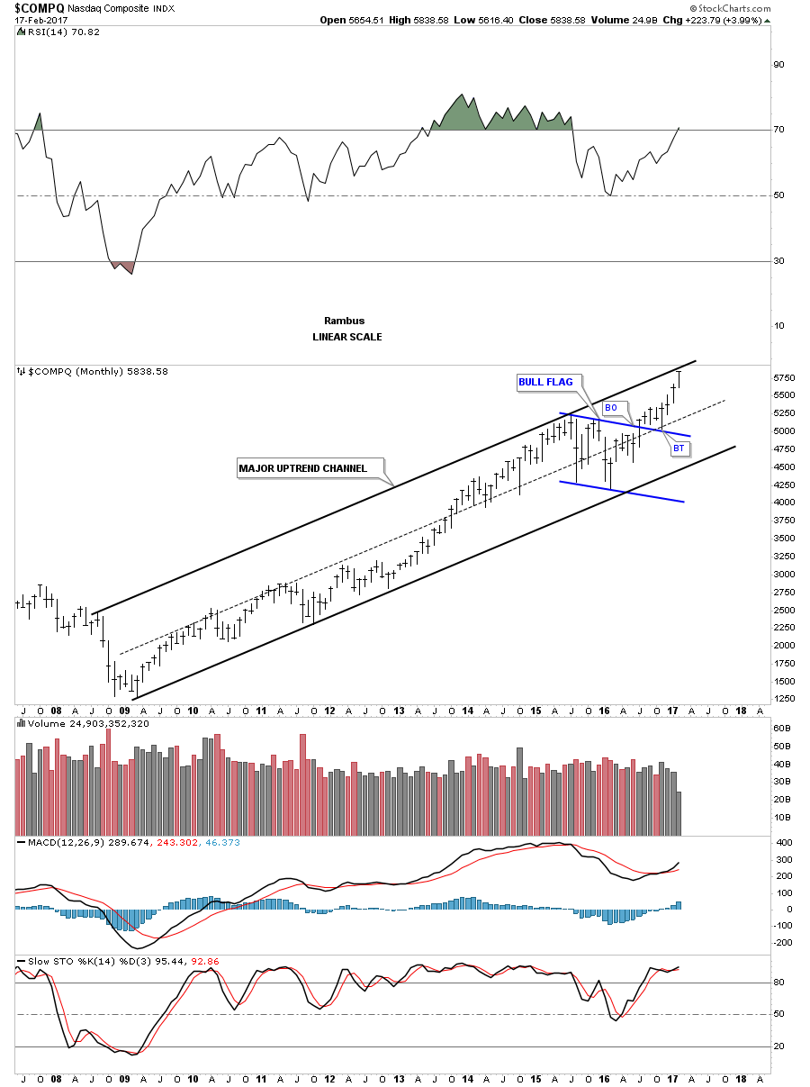
This last index we’ll look at tonight has been the strongest sector which is the $COMPQ, tech stock index. Instead of a H&S consolidation pattern the $COMPQ built out the black bull flag. I’m using the 13 and 34 week ema’s which have done a good job of showing support, especially the 34 week ema.
After a strong rally out of the November elections low, it looks like the first consolidation phase is beginning. As Always there will be hysteria and calls for an impending Market Crash, but examination of these charts should show the higher probability is that this is a well needed and healthy time of digestion of the recent strong gains. This is simply how bull markets work.
The weekly charts above show where we should expect strong support to materialize. Keep in mind if this is the beginning of a consolidation phase we should see a low fairly soon with a counter trend rally, and then one more reaction low to form the fourth reversal point to complete whatever type of consolidation pattern may build out. For those that feel the correction might be too strong for them , take some chips off the table and try buying back your shares toward some of the support zones laid out above. It’s always easier said than done. All the best…Rambus