$RUT Update…Small Caps Leading

Last week the neckline held support and the $RUT got a good pop and hit a new all time high today. When the small cap stocks are doing well that means investor are willing to take on more risk and is usually good for the stock markets. It could use a little breather right now after such a vertical move.

rut-week

This next chart is a ratio chart which compares the $RUT to the $SPX. When the ratio is rising that means the RUT small caps are outperforming the SPX big caps. Since February of this year the small caps have really outperformed the big caps.

rut-spx


SPX Update…Bullish Target

Below is a weekly chart for the SPX which goes all the way back to the beginning of our current bull market that began in the spring of 2009. It took an inverse H&S bottom to reverse one of the worst declines going back to the great depression which scared many investors for life.

Some of you may remember the correction in 2011 which felt pretty negative at the time. As it turned out the SPX just created a H&S consolidation pattern instead of the many other possible patterns that could have formed.

If we are truly in a long term bull market it looks like the SPX has just finished its next consolidation pattern which is close to a two year H&S consolidation pattern. The way the price action is backtesting the neckline and bouncing looks very encouraging. This is exactly what you want to see from a Chartology perspective. The neckline gives one a low risk entry point as your line in the sand, above is bullish and below is bearish. It can be as simple as that.

I’ve studied most trading disciplines through the years and what the red numbers on this weekly chart shows is a basic Elliot Wave count. Maybe it’s possible that the SPX is just starting its fifth wave up which at a minimum should equal the first wave up in the secular bull market. At any rate this is a pretty bullish looking chart IMHO in more ways than one.

spx-elliot-wave

Wednesday Report…The Most Hated Bull Market in History

I know some of you are wondering why I didn’t post many charts today. The reason being, when there is extreme volatility one can get whipsawed to death getting caught on the wrong side of the whipsaw. My experience has been to let things settle down for a day or two and see what happens. I always look for how the price action is interacting with a potential strong support or resistance line. Normally, whatever the direction the big trend is in, when you get a day like today, after the volatility subsides, the big trend will reassert itself again. It may take a few days or a few weeks but the big trend is your friend.

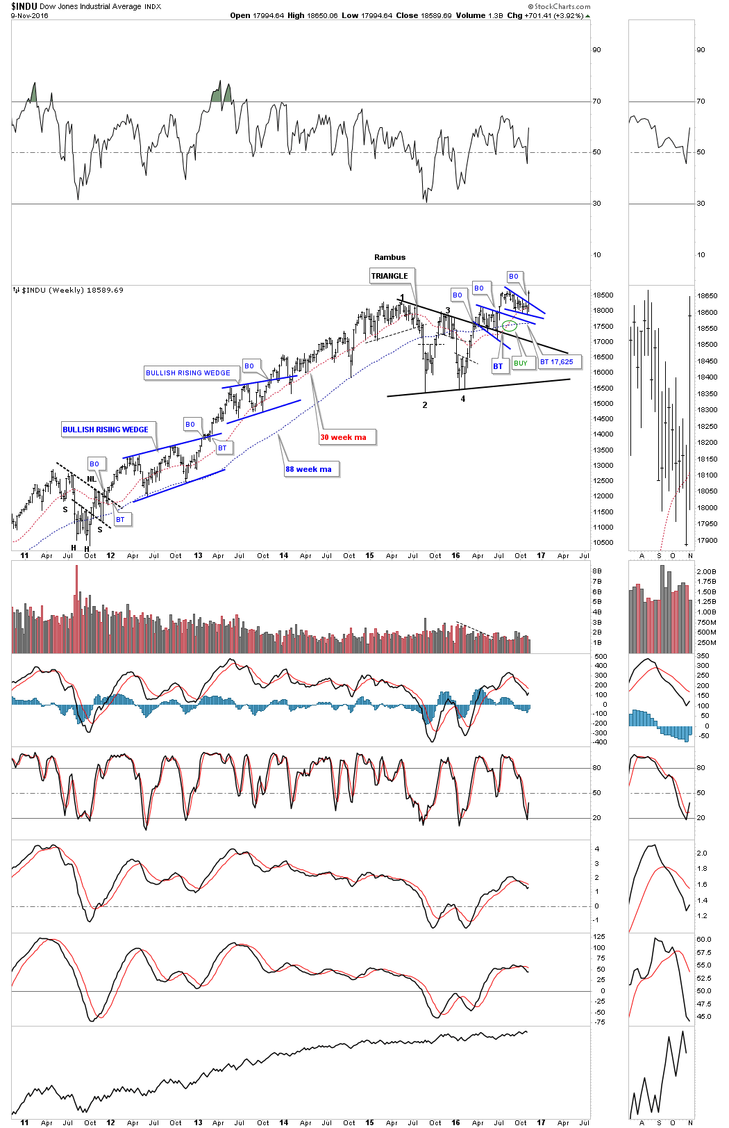
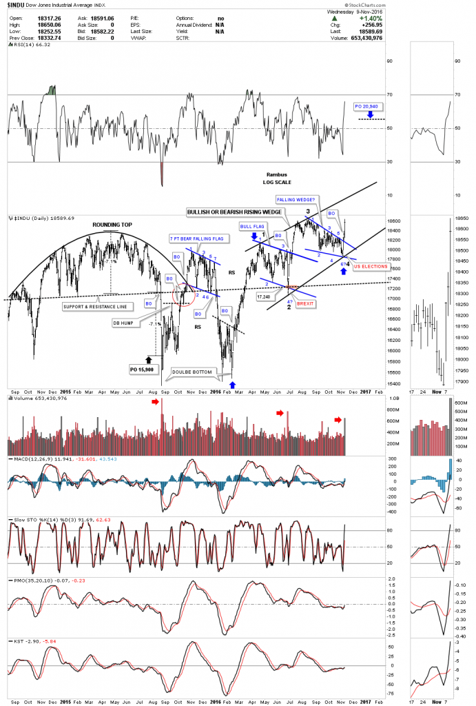
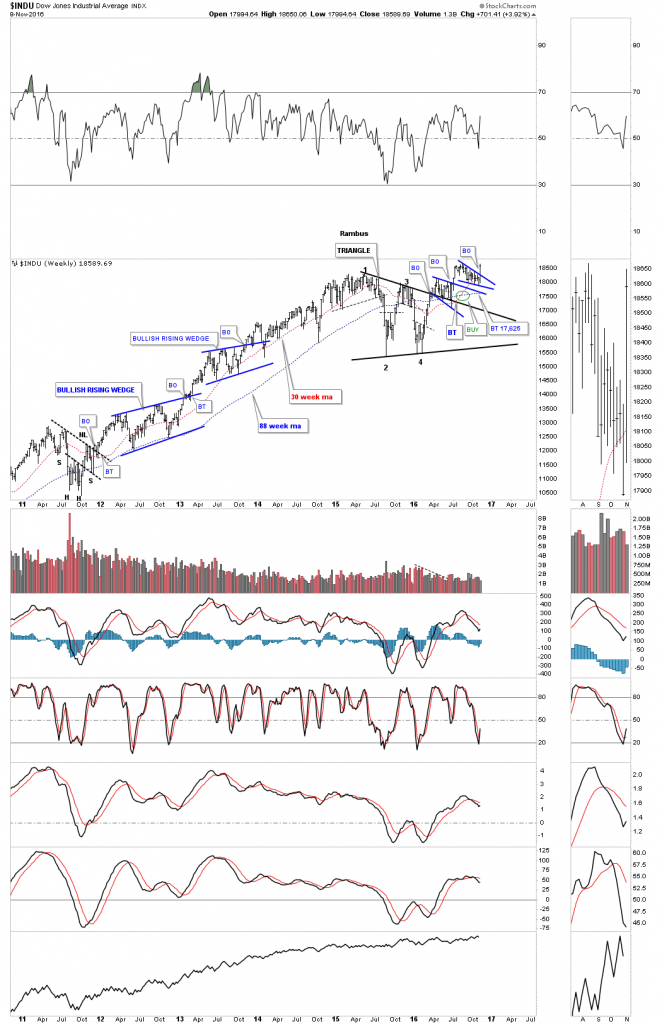
Earlier today I showed you a daily chart for the INDU which showed several small blue consolidation patterns forming on top of a one year black triangle consolidation pattern. There is another daily chart I haven’t shown you yet that shows the two small blue consolidations forming in a rising wedge formation. Until today I had the lower black rail of the rising wedge parallel to the top rail. With the big reversal taking place I adjusted the bottom rail up to catch this weeks low, which is now giving us a rising wedge formation. I’ve shown you many times in the past how bigger patterns can be made up from smaller patterns. This is now the case with the rising wedge formation.

This is where it gets interesting. Probably 95% of folks that follow chart patterns think that a rising wedge is always a bearish rising wedge and prices will breakdown. That is true in many cases, but not always. In strong moving markets a stock can create a rising wedge that will breakout to the upside in the case of an uptrend.

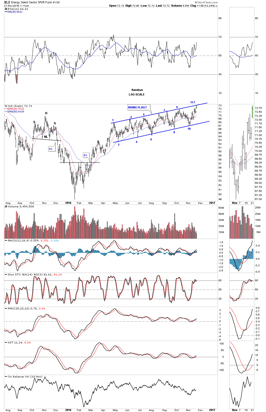
Below is a two year daily chart for the INDU which shows you why I have been sitting tight with some of the leveraged trades. If you recall the beginning of this year 2016, the stock markets took it on the chin and had one of their worst starts to a new year. Things looked pretty bad then. What happened was that the INDU built out a small double bottom reversal pattern, which is actually part of a much bigger double bottom going back to September of 2015. Starting with our small double bottom that built out at the beginning of this year, you can see how the price action wasted little time putting on a strong impulse move up to the first reversal point in the blue flag. That blue flag took about three months to complete. Note the spike down into the fourth reversal point which was the BREXIT bottom, which began the next leg up to new all time highs on the DOW.

When the price action failed to really takeout the previous all time high and reversed back down, that was a warning sign that a potential bigger consolidation pattern may be developing. If the blue bear flag was a stand alone consolidation pattern the price action should have run much higher before correcting lower.

Now fast forward to this weeks price action. Again, another big whipsaw took place  which was very similar to the BREXIT vote low, the US elections low. How many could have imagined that the INDU would be up this strong today after it was down over 800 points last night. The moral of the story is the big trend is your friend regardless of all the noise that occurs within the big uptrend. From the January 2016 low you can see a series of higher highs and higher lows which constitutes an uptrend. Note the massive volume today on the breakout above the falling wedge.

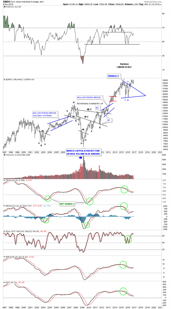
It’s still too early to know yet, but if the bull market lives on and the top rail of the big black rising wedge gives way, that will create a bullish rising wedge halfway pattern as shown by the blue arrows. The price objective would be up around the 20,940 area. From a Chartology perspective, since the beginning of the year, you can see a classic uptrend forming, regardless of all the reasons it shouldn’t be happening.

indu-day-2

Below is a six year weekly chart which shows the black triangle as a halfway pattern with the two small blue consolidation patterns forming just above the top rail. A new buy signal was given when the 30 week ma crossed back above the 88 week ma.

indu-weekly

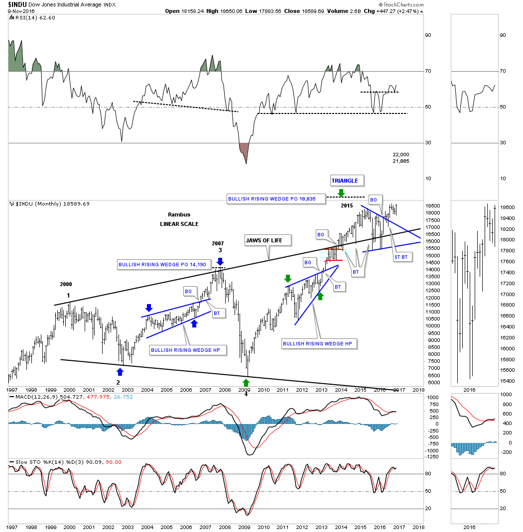
This next chart is a long term twenty year monthly chart for the INDU which shows the infamous JAWS OF LIFE consolidation pattern I’ve been showing you for longer than I care to admit. You can see how the triangle consolidation pattern we looked at on the chart above, fits into the big picture which is showing us the breakout and backtesting that has been going on since 2013. Keep in mind everything is big when you see a big pattern building out. Having the patience to ride out those price swings is a lot tougher to do in real time vs looking back in hindsight.

jaws-of-live

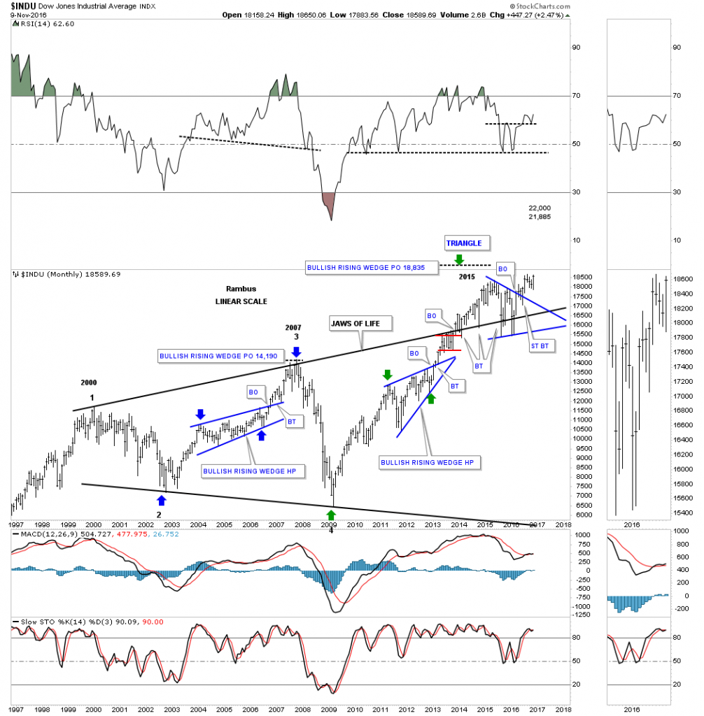
If you don’t like the JAWS OF LIFE consolidation pattern, below is another 20 year monthly chart, which shows the beautiful bull market that began at the 2009 crash low. After seven years of bull market action the INDU is on the verge of making a brand new all time high. Just think about that for a second before you dismiss it. This has been one of the most hated bull markets in history and has taken a lot of folks to the cleaners who have tried to short this market. This chart also shows you a good example of how trading in the direction of the major trend is so much easier to do than to try and trade against it. Virtually everyone who has shorted the INDU and is still holding on to those shorts are underwater. On the other hand, anyone who has bought this index has a profit if they are still holding on.

indu-monthly-no

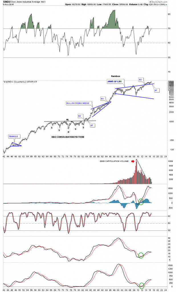
I keep on coming back to the 75 year quarterly chart for the INDU which helps keep me grounded in regards to the very big picture. I know many of you weren’t around during the 1970’s correction, but that too was a time of negativity which led to the greatest bull market in history at the time. I was hand building charts back then but didn’t know what would happen when the neckline finally gave way. If I remember right, it was 1051 or so. Pessimism was so thick back then you couldn’t cut it with a knife. The only person that I recall that had a bullish outlook for the stock markets was Robert Prechter, who thought the INDU might rally up to the 5000 area, if I remember correctly which everyone laughed at at the time. I know some of you are thinking I’m probably just as crazy as Robert Precther was at the 1982 backtest to the neckline, but are we in a current setup right now with the backtest to the top rail of the JAWS OF LIFE consolidation pattern? I haven’t said this in a long time. The only rule in the stock market is, there are no rules.

indy-75-etar

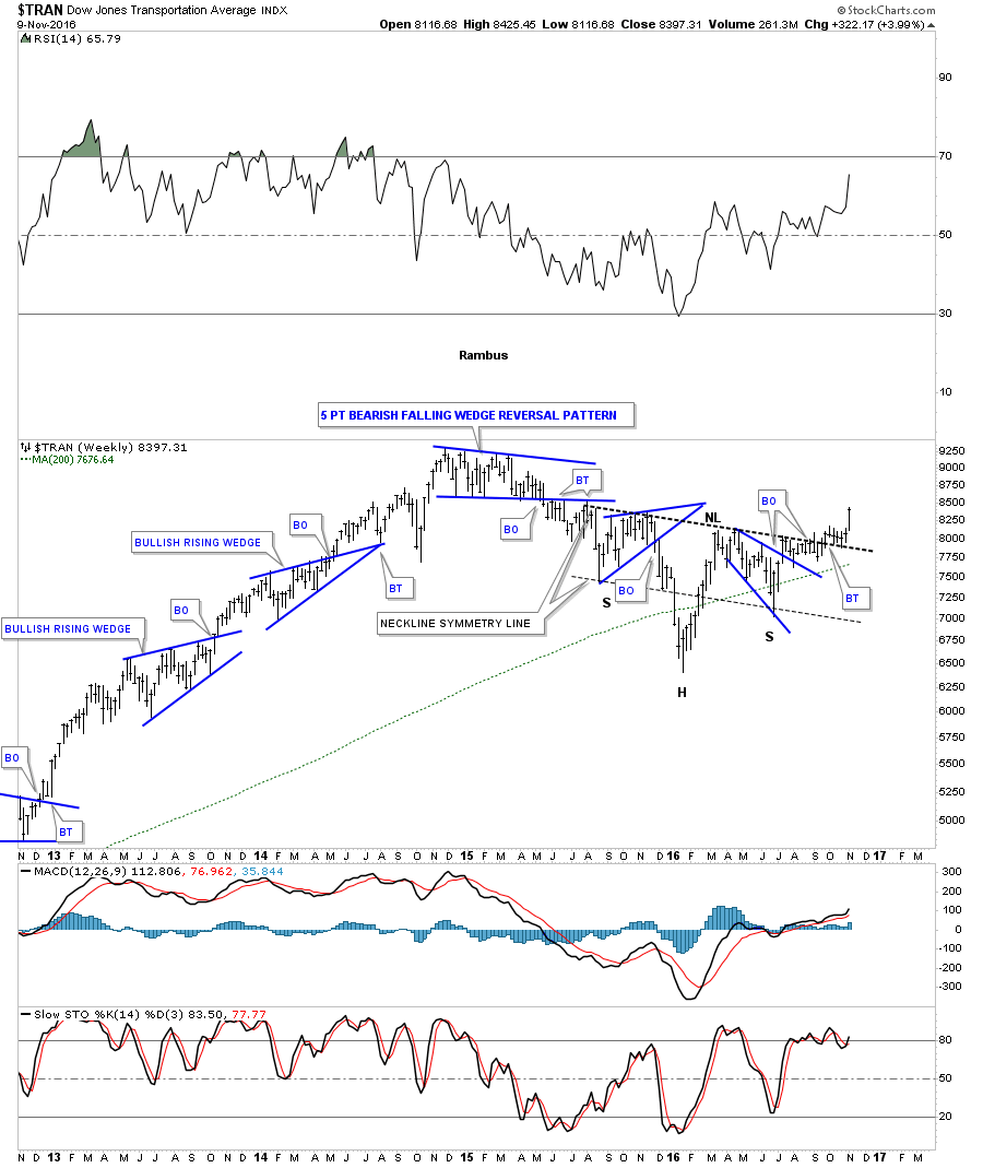
If the INDU is going to start a new impulse leg up, then the Transportation Average will need to come along for the ride, no pun intended, to confirm the bull market is alive and well. Below is the daily chart for the TA which shows the big H&S consolidation pattern which closed at a new high for the year today.

trans-ports-day-1

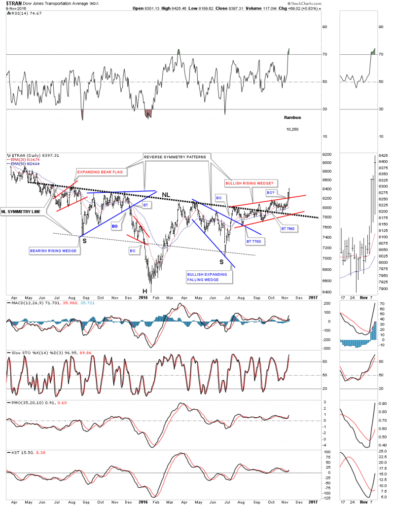
I know how exciting the short term charts can be at times, but it’s the longer term charts that really gives you perspective on the trend. Notice how pretty that one plus year H&S consolidation pattern looks on the weekly chart. As you can see the price action is only in its second week of the next impulse move higher after backtesting the neckline over the last seven weeks or so.

transport-weekly

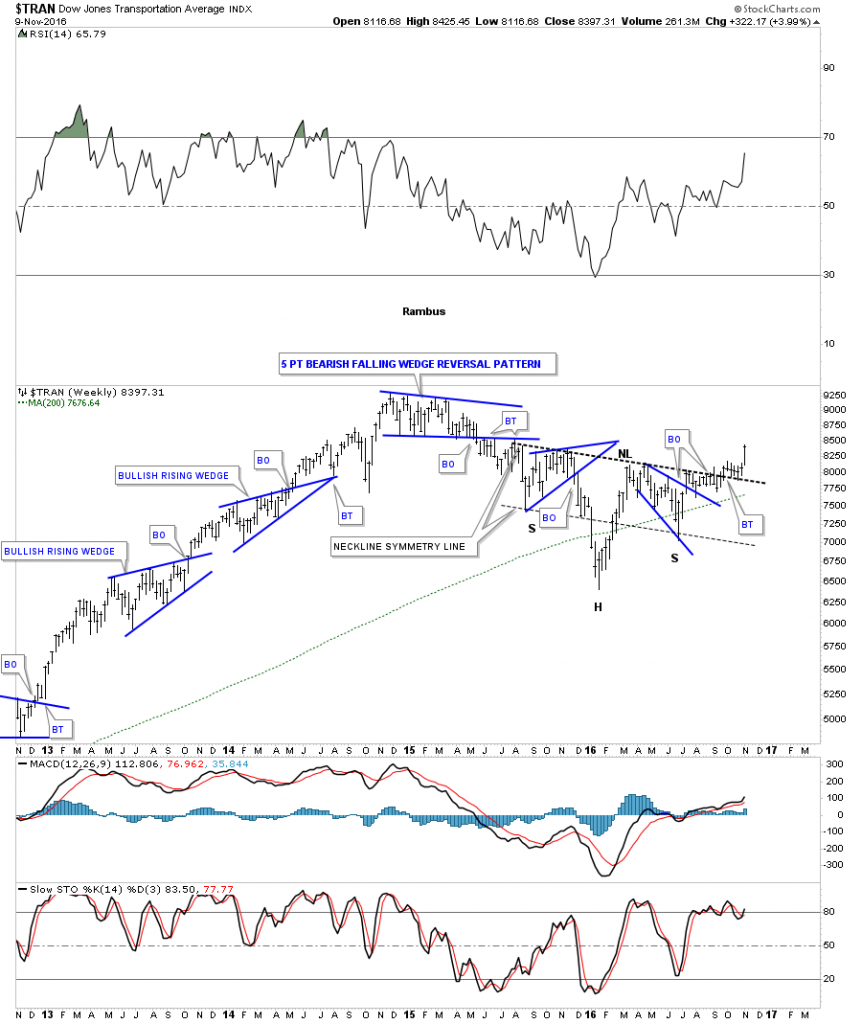
The 20 year monthly chart for the INDU shows you the massive H&S consolidation pattern that formed between 2007 and 2012. It was as pretty as it gets, as shown by the neckline symmetry line which shows the low for the left and right shoulders. The Transportation Average is now in the third month of breakout action above the neckline of our current H&S consolidation pattern.

translpots-monthly

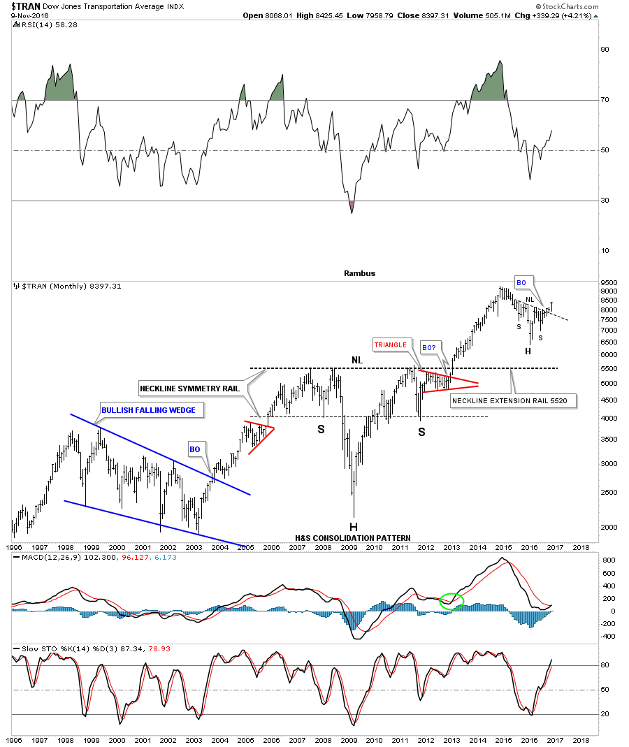
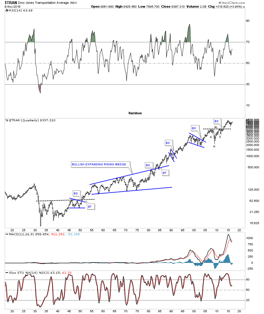
This last chart for the Transportation Average is a 100 year quarterly chart which shows you the big H&S consolidation pattern on the monthly chart above. This 100 year chart also shows you how investors still paint the same chart patterns based on investor psychology. We’ll see the same chart patterns building out 100 years in the future.

trans-quaterlly-100

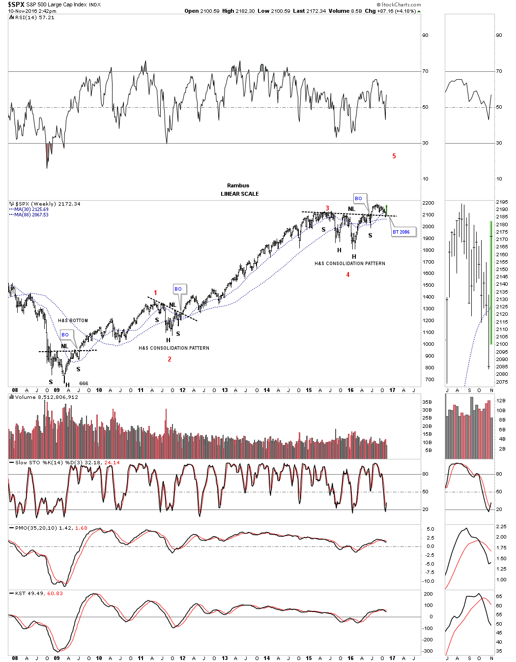
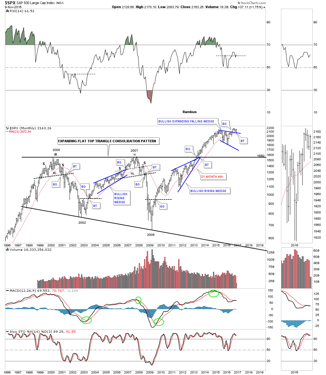
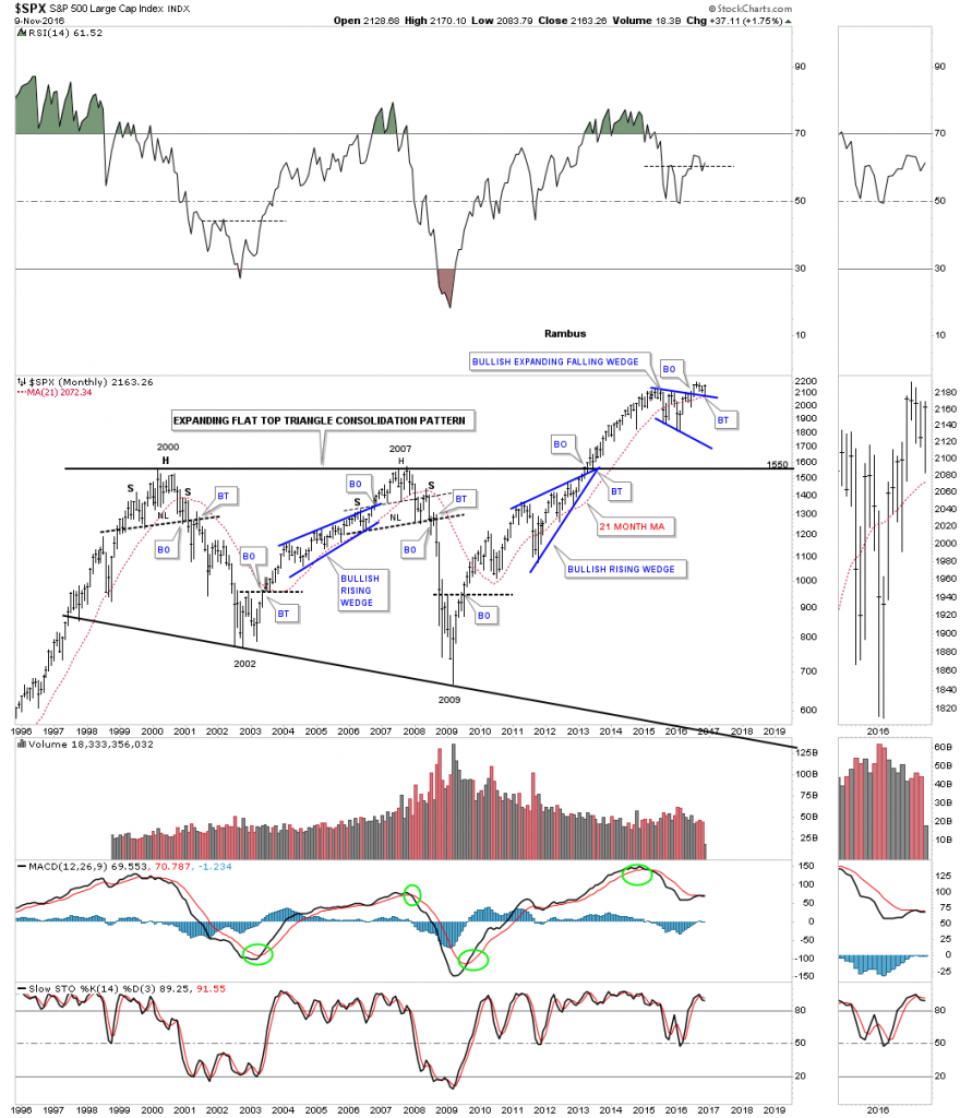
I’m going to go thru these next charts rather quickly so you can see how everything is lining up for a decent move to the upside in the stock markets. Below is a twenty year monthly chart for the SPX which shows it massive 12 year consolidation pattern with the breakout taking place back in late 2012 or so. Note our current blue bullish expanding falling wedge consolidation pattern that had a breakout and a backtest to the top rail,  and the 21 month moving average this month. The top rail of the blue expanding falling wedge is a perfect line in the sand, above is bullish, and below is bearish.

spx-moohtly-1

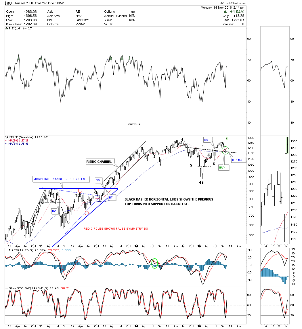
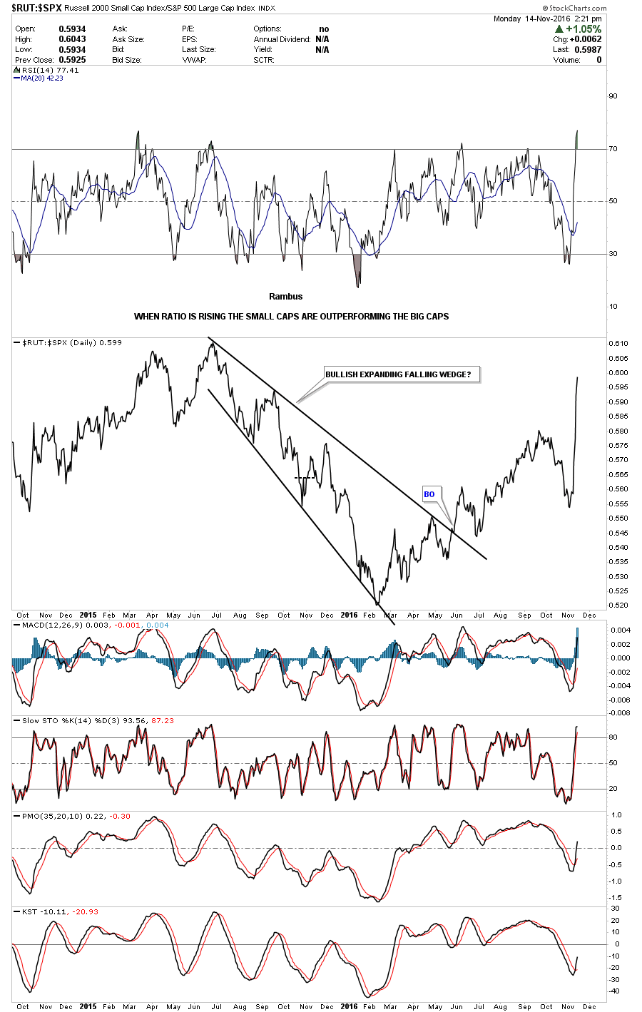
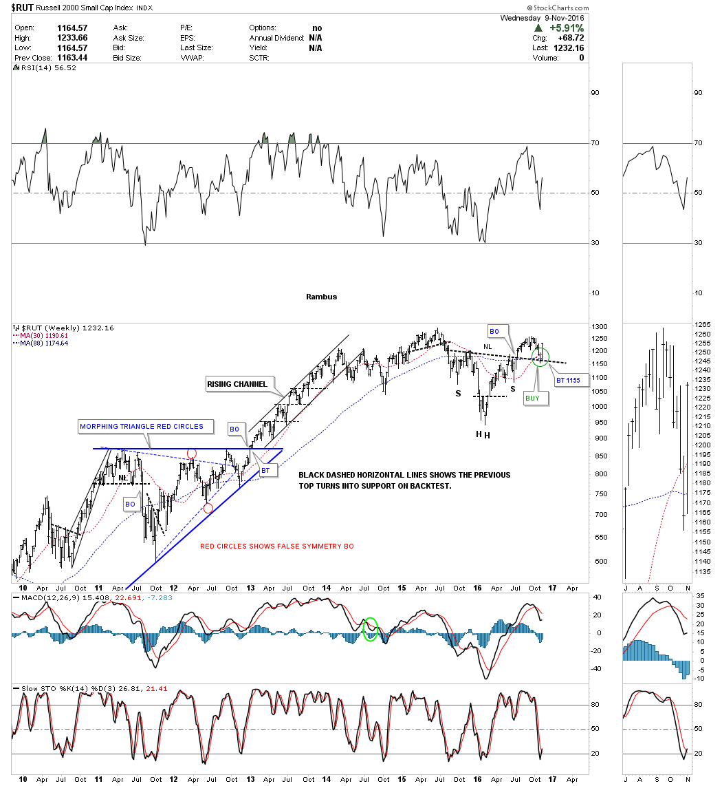
The weekly chart for the $RUT shows it has broken out from a H&S consolidation pattern and has backtested the neckline this week. Also note the 30 week ma has crossed above the 88 week ma for a buy signal.

rut-weekly-1

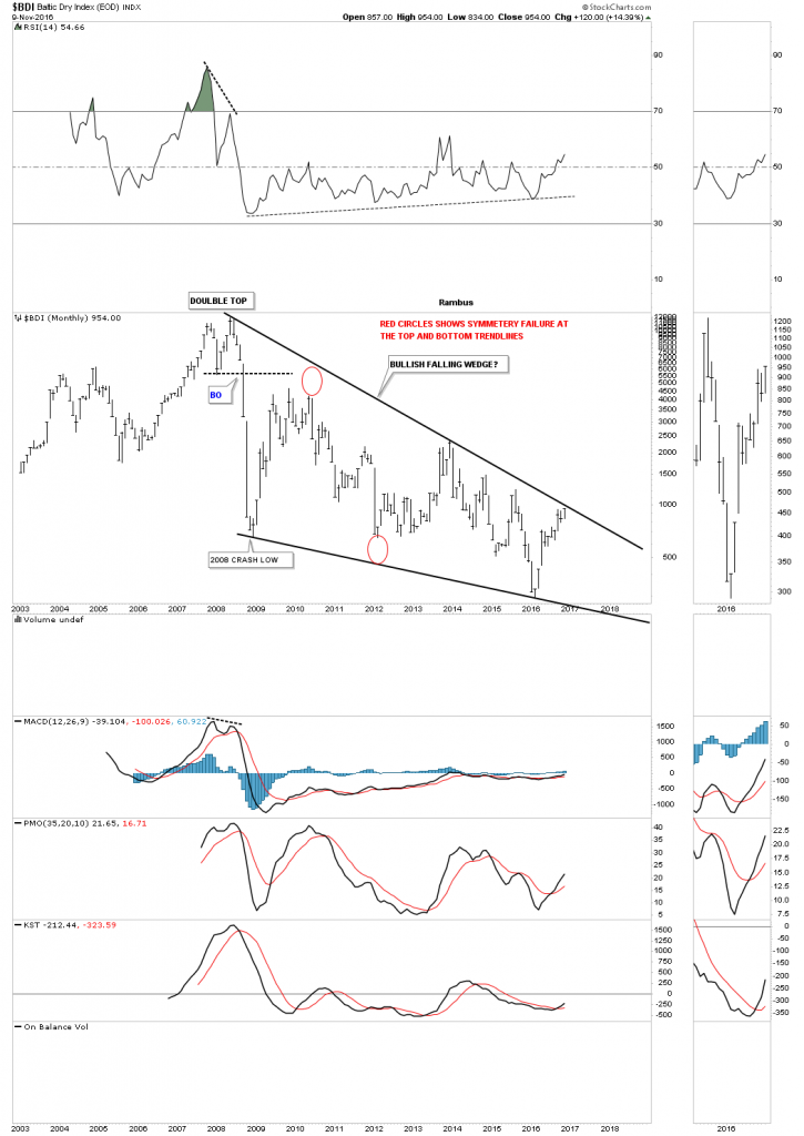
Next up is the BDI, Baltic Dry index which we haven’t looked at in some time but it looks like it may be starting to come to life. Just like the stock markets and commodities for the most part, the BDI built out a small red bullish rising wedge just below an important S&R line or neckline extension line. As you can see, there was a clean backtest last week to the S&R line.

bdi-weekly

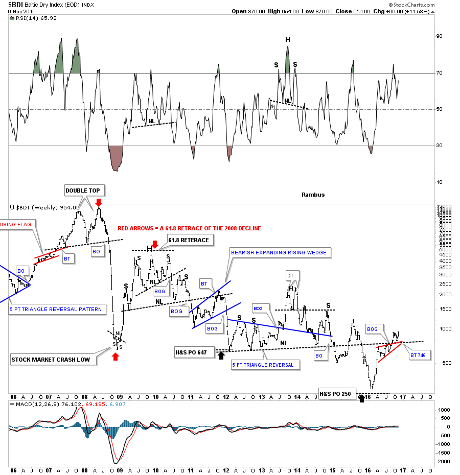
The 15 year monthly chart for the BDI shows a potential massive bullish falling wedge building out with the price action getting close to testing the top rail. This would be a good index to see showing some strength, if the economy and commodities are going to have a decent run.

a-bdi-monthly

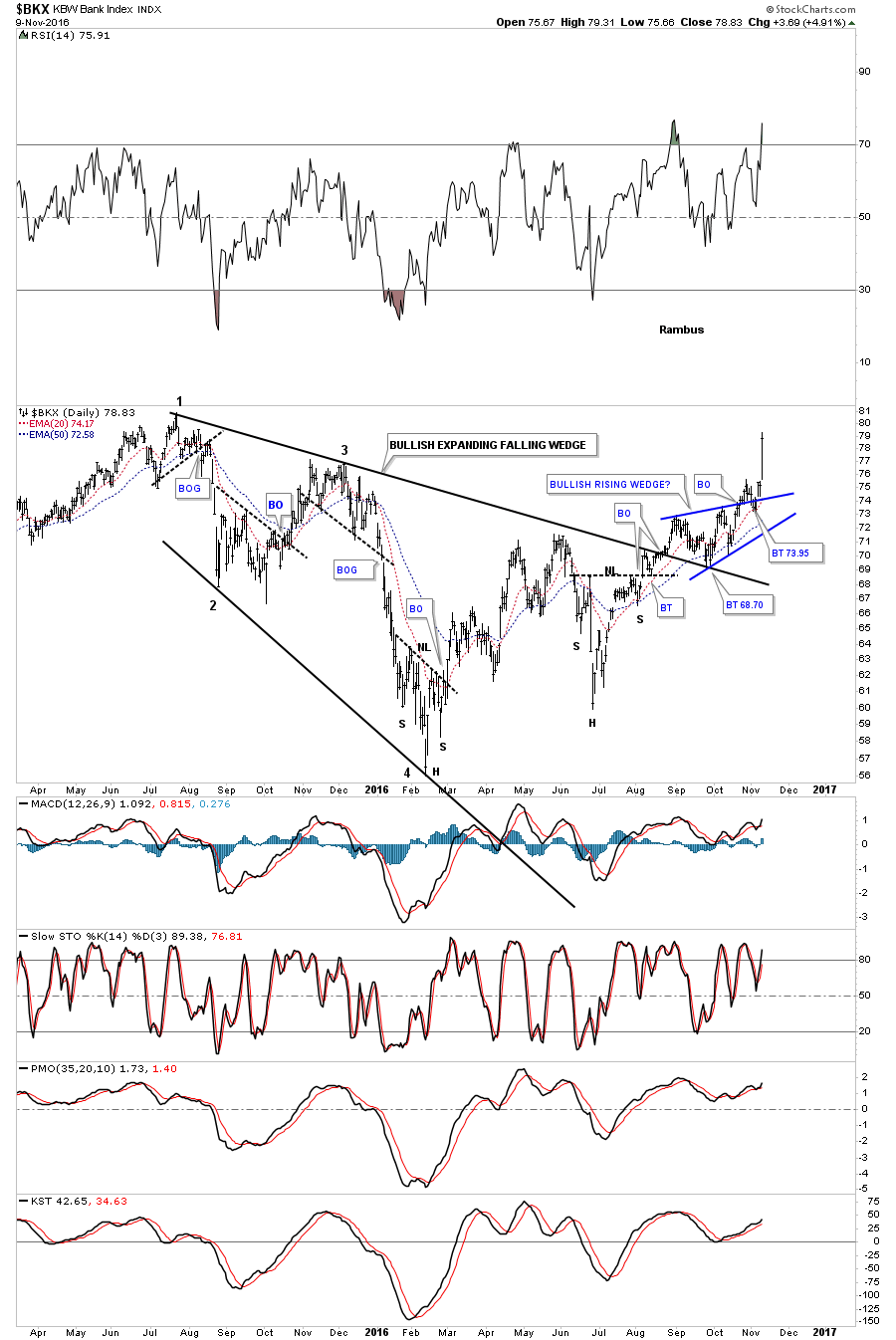
The daily chart for the $BKX, Bank Index, shows a very large expanding falling wedge with the current blue bullish rising wedge breaking out this week.

bkx-day

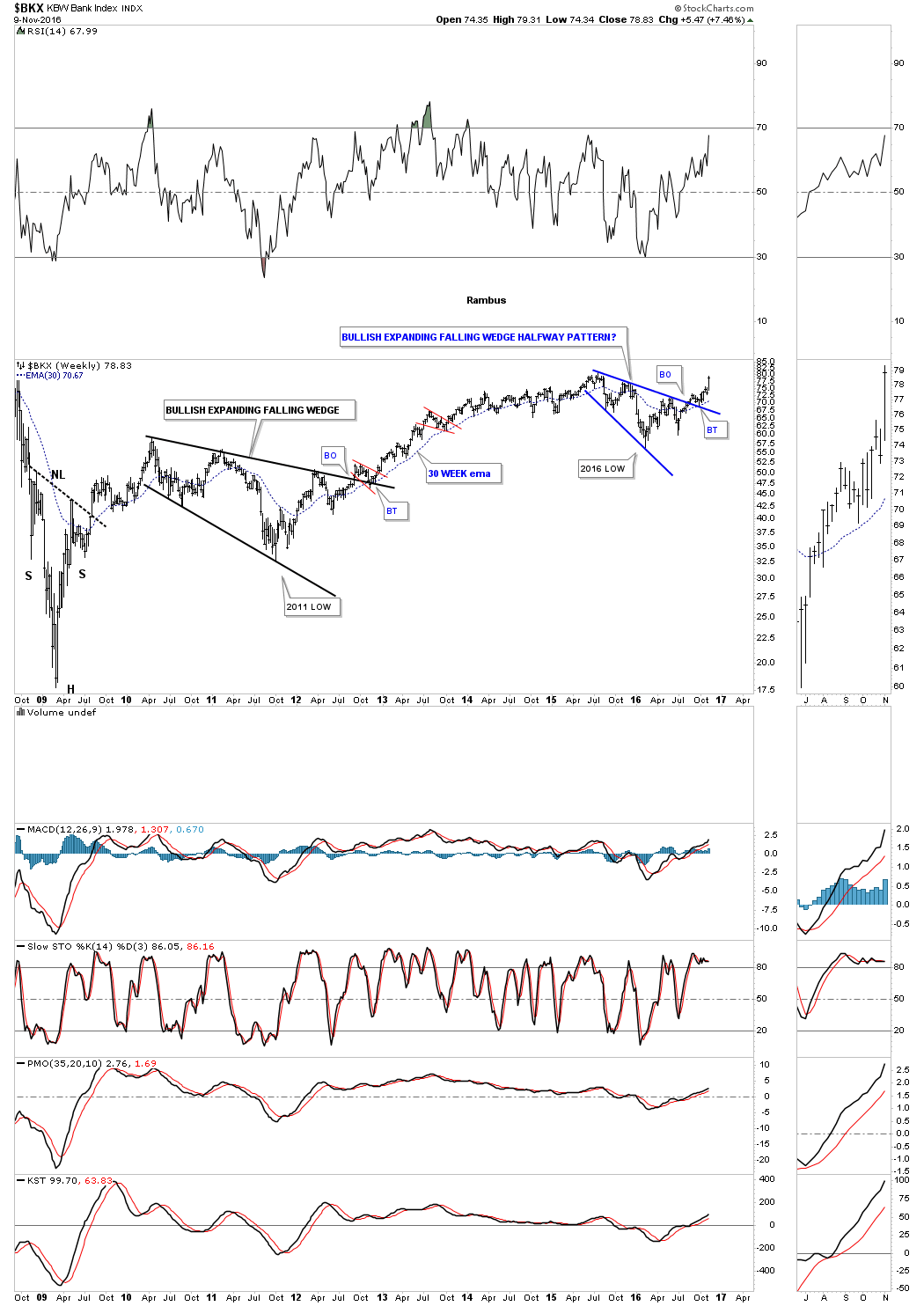
The weekly chart for the $BKX shows you two bullish expanding falling wedges that built out as consolidation patterns. The one that built out in 2010 – 2012 was quite a bit larger than our current one. Note how each one had a nice clean breakout and backtest to their respective top rails.

bkx-weekly

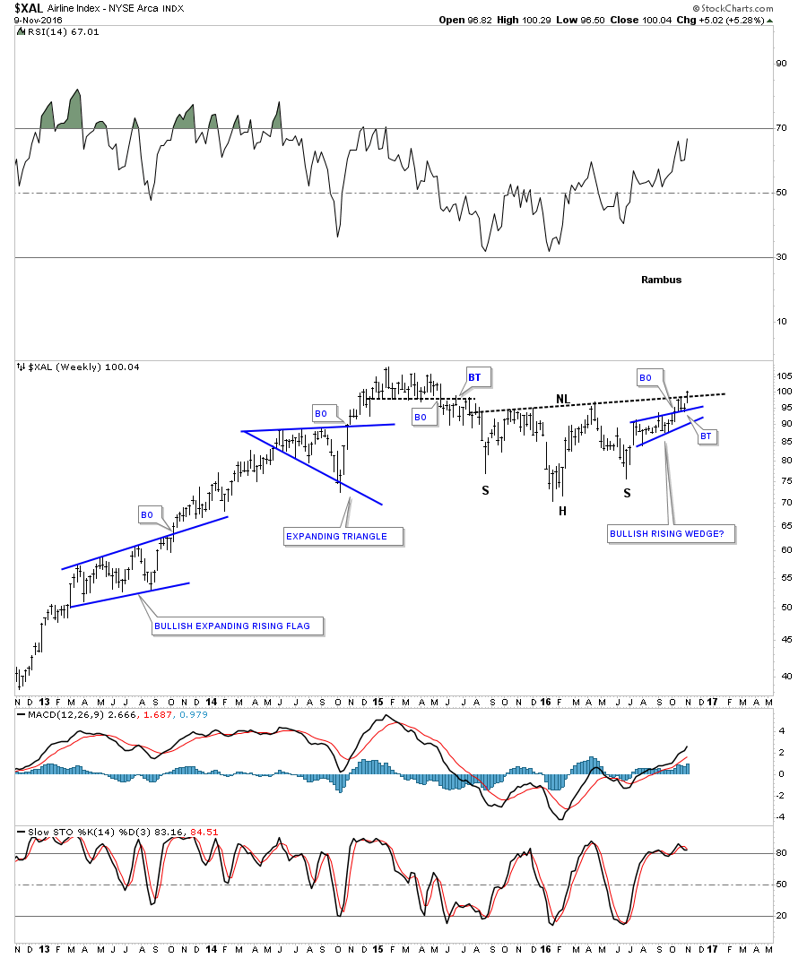
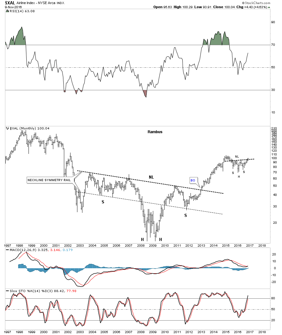
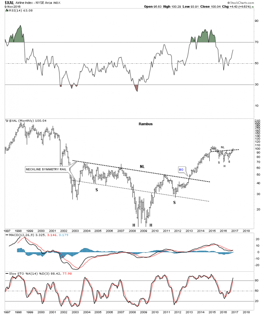
If the Transportation Average is embarking on a new impulse leg up the chances are pretty good the the $XAL, Airline Index, would also be looking bullish. The weekly chart below shows the $XAL breaking out above the neckline this week of a two year H&S consolidation pattern.

xal-weekly

The monthly chart for the $XAL shows a very symmetrical ten year H&S consolidation pattern. Just like the Transportation Average we looked at earlier, you can see a similar H&S consolidation pattern building out, with the breakout taking place this week.

xal-monthl

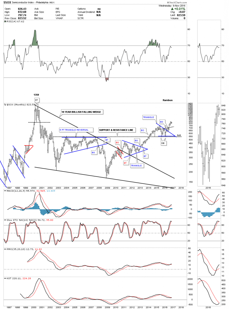
The $SOX, semiconductor index, is another area which has been very strong and is just a whisker away from making a new high, not seen since the 2000 mania bubble.

sox-monnt

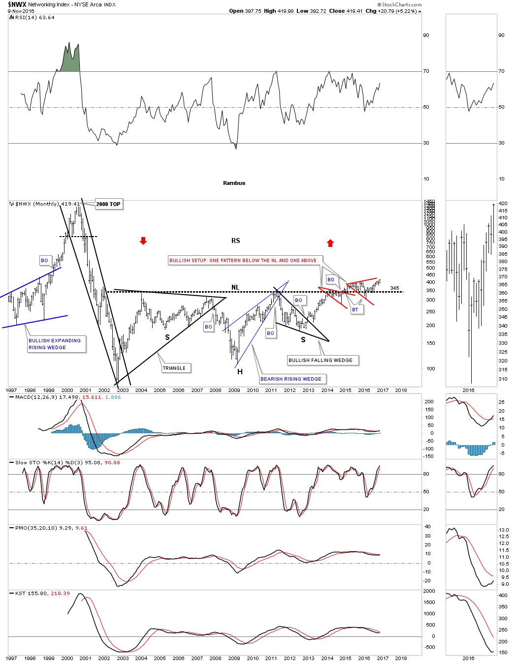
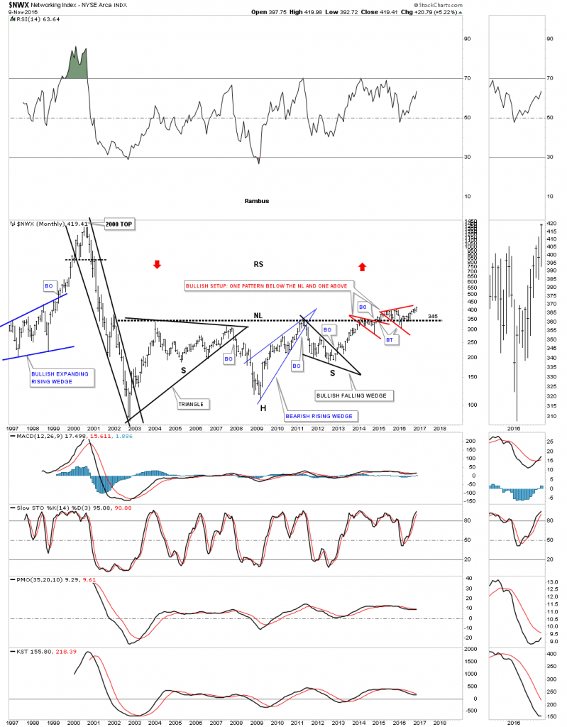
The $NWX, Networking index, we’ve been following for a very long time has taken its sweet ole time breaking out and backtesting that massive 12 year neckline. This has been a lagging sector which may finally come to life and play catch up.

nwx-month

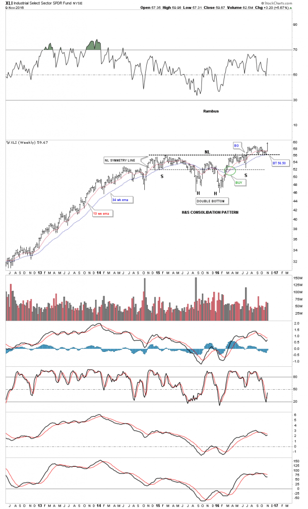
The XLI, Industrial Sector, has been in breakout and backtesting mode since earlier this spring. An all time new high was achieved today.

xmi

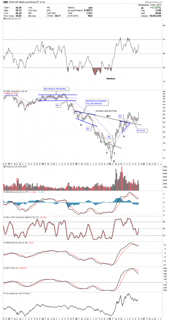
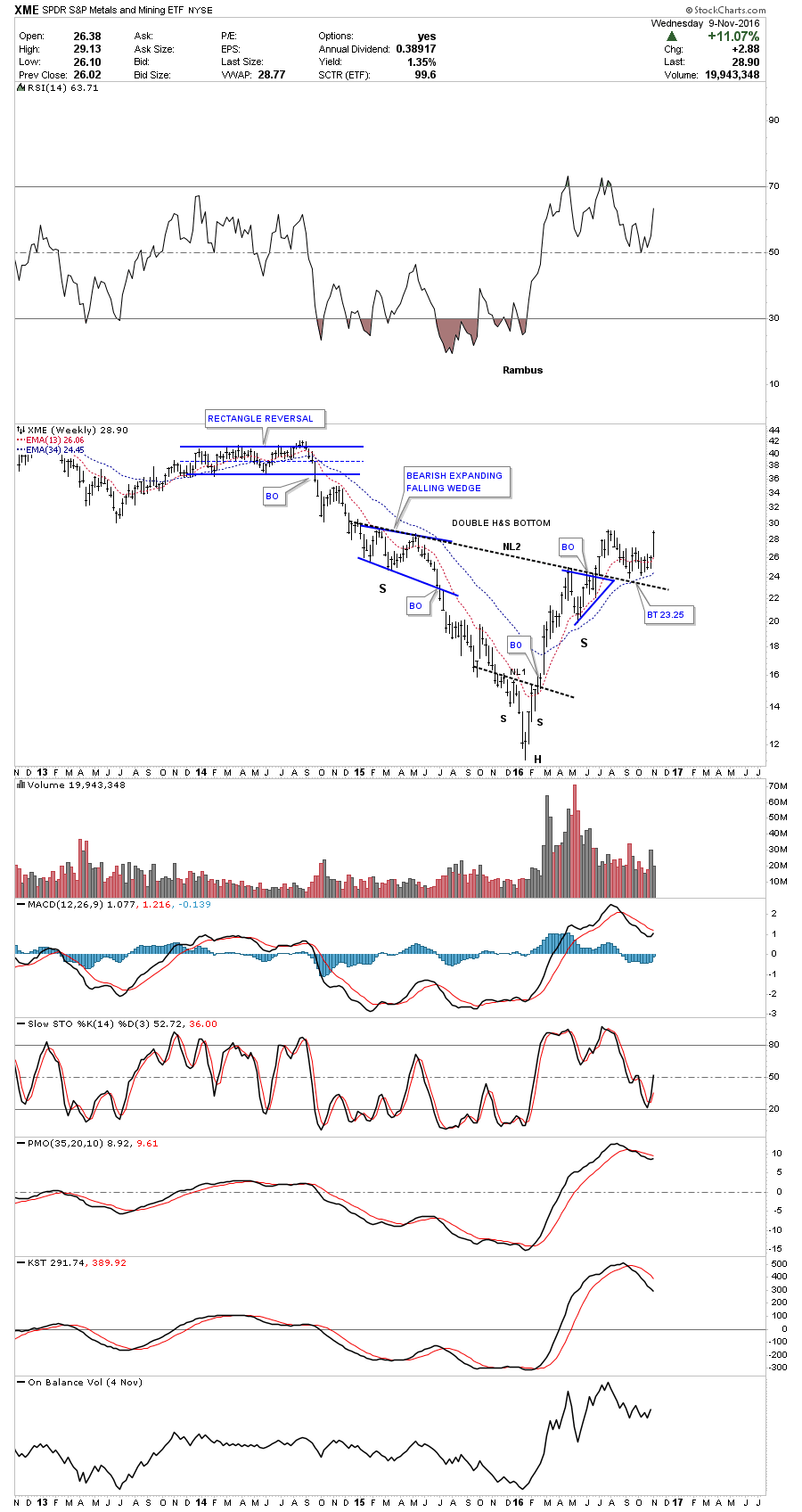
There are many more charts I could show you but I’m running out of time so we’ll look at one more chart which is the XME, metals and mining etf. This is another stock we’ve been following for a long time which shows a nice inverse H&S bottom in place. Like with most commodities and the PM complex, it to bottomed out in January of this year. As you can see it has been in breakout and backtesting mode since the middle of the summer. Today’s price action is finally moving the XME up to almost a new high for the move. This index should bode well for the PM complex and commodities in general.

These charts should give you a feel for how the Chartology looks in many different areas in the markets. There is a lot of confirmation taking place between the many different areas which helps confirm the bull market is still alive and well. All the best…Rambus

xme-weekly


Friday Night Charts…A Most Important Ratio Chart…

Tonight is a good night to post one of the ratio combo charts we’ve been following for a very long time , which compares the TLT:GLD ratio to the GLD. Below the ratio chart is a ten year weekly bar chart for GLD.  There are many ways to analyze a ratio combo chart like this which can help one look for the intermediate to longer term trends.

When the ratio chart on top, the TLT:GLD is rising, that means the 20 year Treasury bond is out performing GLD and when the ratio is declining GLD is stronger than the TLT. On the left side of the chart you can see how the ratio chart on top built out a H&S top at the same time GLD built out a H&S consolidation pattern during the 2008 crash. Once both H&S patterns were complete GLD rallied for almost three years while the ratio chart declined. Note how the ratio chart on top and GLD on the bottom, both gave each other a nice kiss when gold topped out at 1920 in September of 2011 and the ratio bottomed, red arrows.

That point marked the exact starting point for GLD’s nearly four and a half year bear market. That bear market decline lasted until December of 2015 and ended when the ratio chart topped out at the previous 2008 high. Some of you may remember that when the ratio chart was trading at the 2015 high it was building out the blue rising wedge. If you recall I was looking for a possible breakout above the top rail which would have driven GLD down to the 700 area. What I knew was that whatever the direction of the breakout move, out of the rising wedge, a good move would occur.

You have to look real close but the ratio left a nice big breakout gap the week the rising wedge broke to the downside telling us the bear market was over for the PM complex at the same time GLD was breaking out above the top rail of its inverse looking bullish falling wedge. As you can see these two have been in consolidation mode since the spring of this year. This week the price action on the ratio chart touched the possible neckline and bottom rail of a potential bear flag. Just like we had to wait for the ratio chart on top to tells us which way the rising wedge was going to breakout we are in the exact same situation right now. The odds favor the ratio chart breaking down but confirmation the next impulse move is underway will be when the ratio chart closes below the neckline and the uptrend line.

Keep in mind that is a two year H&S top on the ratio chart so a big move should occur if and when the neckline gives way. From a Chartology perspective the TLG:GLD ratio chart is still in an uptrend while GLD is still technically in a downtrend. You can see how the next impulse leg down in the ratio and up in GLD will complete the massive reversal patterns. Things are setting up. Now all we have to do is wait for their respective breakouts to happen.

One last note on this ratio combo chart which is showing GLD has formed a positive divergence to the ratio chart by forming a higher low vs the 2008 crash low while the ratio topped out at the 2008 top. It’s pure speculation at this point but if the ratio chart declined down to its 2011 low, GLD’s high with the positive divergence GLD has right now, how much higher would GLD be? Anyway, knowing the big trend is most important. Trading against the major trend can be done but just look at how much easier it would have been to trade in the direction of the big trend vs against it. The setup is there now all we have to do is wait for confirmation.

This ratio chart analysis can confuse even the most experienced members . I recommend you study these two charts and then re read the narrative above.

tlt-gold-comb-rait

Below is a daily chart for the TLT:GLD ratio which shows the H&S top up close and personal. Today the price action touched the neckline for the seventh time which is telling us the two year neckline it’s hot. This chart will give us the first clue when the next impulse move up is really underway for GLD. Have a great weekend. All the best…Rambus

a-gld-tlt

PS

Sir Plunger at the Chartology Forum wanted to add the following to this discussion

Just had to comment on his TLT:Gold relationship post. Here is Rambus chart

a-gld-tlt

Well there is a slight similarity of this pattern to something else near and dear to our heart. The great big H&S in oil before the big crash. Here it is:

sc-2244

and the resolution:

sc-2245

Wednesday Report…The Chartology of Gold

Tonight I would like to look at some gold charts as it has been showing some relative strength since October.  We can even go back to February of this year which shows a possible big diamond consolidation pattern building out. Regardless of whatever trading discipline one uses the last nine months of price action has been difficult at best to read.

gold-1

This next chart is a linear scale chart for gold which I think may be the most important chart to help give us a sense of the bear market that began in September of 2011. What makes this chart so interesting is the breakout and backtest to the top rail of the bear market expanding falling wedge.

gold-xeapnding

This next chart for gold is the important moving average crossover chart which shows the four most important daily moving averages for gold. The green circle back in 2009 shows when they all became positively aligned and led to the parabolic run to 1920. Then in 2013 they all became negatively aligned to the downside which led to the bear market as shown by the red circle. It took three more years of bear market price action to finally get the four important moving averages bullish aligned again which occurred in April of this year.

gold-ma-corssobers

This next chart for gold is an eighteen year log scale chart which shows the bull market uptrend channel that began to form back in 2000 or so. This log scale chart gives us a slightly different view of the bear market expanding falling wedge which shows the price action still trading below that important trendline. The 10 month ema has done a good job of holding both support and resistance during this now almost 17 year bull market.

gold-uptrend-chanlle

This last chart for gold is a 40 year look which shows a massive 27 year H&S consolidation pattern and the bull market uptrend channel that began in 2000. The bottom line is that as long as the bottom rail of the 2000 uptrend channel remains intact I will remain a bull. All the best…Rambus

goold-40

Diamonds in the Precious Metals Miners…

Back in September we looked at a possible morphing Diamond on the GDXJ in which the dashed trendlines were showing the original Diamond. When it started to morph into the bigger Diamond I added the two red circles that showed the false breakouts from the original dashed Diamond. As you can see the last two weeks produced a rally that so far has failed below the apex of the morphing Diamond. From a Chartology perspective the Diamond is a reversal pattern as it has five reversal points.

gdxj-day-1

Below is a longer term daily line chart for the GDXJ which shows how it is situated at the top of the big impulse move up out of the January low. The brown shaded support and resistance zone comes in between 29.75 and 32.50. It may be possible that the Diamond could be the reversal pattern at the first reversal point in a much bigger consolidation pattern.

gdxj-day-line

In the very big picture the neckline symmetry line comes in around the 33.75 area on the long term monthly chart, which would be in the ball park of the brown shaded support and resistance zone. Symmetry suggests the right shoulder still needs a lot more work compared to the left shoulder.

gdxj-monthly

Below is a daily chart for the GOEX, which is the old GLDX gold explores etf, which shows a Diamond reversal pattern in place with a small expanding rising wedge forming as a possible halfway pattern. The price objective for the expanding rising wedge comes in around the 29.56 area. The 50% retrace of the first impulse leg is at 30.15.

As you can see the indicators below the chart all have a positive cross. If the expanding falling wedge plays out to the downside it would be nice to see a positive divergence on the RSI at the top of the chart.

The breakout below the bottom rail of the Diamond consolidation pattern only took about four days or so to reach the low. If we see a similar move down to the price objective, that will shake many PM investors to the core. This looks like a good time to raise a little cash if one is a shorter term trader. For the intermediate to longer term investors sitting tight still looks like the best approach. Once we get the first reversal point in place, at the bottom of the new trading range, that will suggest the low for the rest of the bull market is in place. Surviving this first reaction low will test your mental fortitude if it plays out.

goe-x-day

HUI Update…

First I would like to thank everyone for their patience over these last four days.

Just a quick update on the HUI which is showing the price action hitting the top rail of the downtrend channel this morning. We still don’t have a confirmed first reversal point low yet. A breakout above the top rail of the downtrend channel would be the first indication reversal point #1 maybe in place. We should see some type of small reversal pattern form at the first low such as a double bottom or H&S bottom.

hui-day

Weekend Report….Precious Metals Indices at an Emotionally Challenging Juncture

This past week there was some panic selling in the PM complex which is what we need to see happen to put in an important low. The HUI hit the 50% retrace at 195 for this first leg up in its new bull market, just under 200, which is an important physiological round number. Many times investor will place their sell/stops just under a round number like 40, 50 or 200 for instance, thinking if a stock drops below that important round number it’s time to exit that position. Many times a drop below these round numbers can be the reversal point for the next rally in the case of an uptrend.

This first chart is a daily chart we’ve been following which shows the first impulse leg up and our first correction taking place. The 50% fib retrace plus the price objective for the small blue triangle comes in at the190 area, which is the tip of the strong buy point. As I mentioned last Friday the 190 area on the HUI is a place to start nibbling on your favorite precious metals stocks. If the HUI moves down into the brown shaded area, which I have labeled as a strong buy zone, this would represent your lowest risk entry point back into the precious metals stocks.

If the HUI were to break below the 62% retrace on a closing basis that would be the first red flag that the bull market in the PM stocks was in trouble. At this point in time this is a normal correction taking place in one of the strongest first legs up in history for the HUI. Emotionally it can be challenging to buy, when everyone is selling, as things are the bleakest at an important low.

Price wise the 170 to 190 area represents the lowest risk entry point back into the PM stocks. Time wise it can be a little different as we could see a V bottom but most likely there will be some type of small reversal pattern form, such as a double bottom or H&S bottom, which would be the two patterns I’ll be looking for. Identifying this first low will be important to the big picture, as this initial low normally marks the low for the rest of the bull market, just like the January low has.

hui-day-1

We looked at this next chart for the HUI in the Wednesday Report, which has the closest fit to what we’re seeing for our current correction. After bouncing for a day or two at the price objective in 2003, the HUI then capitulated down to the bottom at 92.82, which marked the end of reversal point #1 and the beginning of reversal point #2 back up. That low at 92.82 was never approached again during the rest of the bull market. Also note the price action doesn’t have to rally straight back up to the top of the trading range. We have no idea how long this correction may last but the odds favor some type of consolidation period should take place after such a big initial thrust out of the January bottom.

hui-2

I would like to show you a long term monthly chart for the GDXJ which embodies the Chartology for the rest of the precious metals stocks indexes. If we are truly at the beginning of what may become one of the greatest bull markets of our lifetime then we should see a massive base in which to launch this bull market from. This monthly chart below shows the entire history for the GDXJ which was born during the later phase of the 2000 bull market when it formed its massive H&S top along with all the other PM stock indexes.

For over three years now the GDXJ has been building out a massive inverse H&S bottom with the possible right shoulder under construction presently. The neckline symmetry line shows the 33.75 area could mark the low for the right shoulder. This is exactly what happened during the formation of all the big H&S tops, in all the different PM stock indexes in 2011. The neckline symmetry line nailed the right shoulder highs, which actually started the bear market.This chart also shows you how from a time perspective, it could take six month or so to complete some symmetry to the left shoulder, possibly building out a triangle or falling wedge to complete the right shoulder.

When I look at the potential for this massive H&S bottom I get the same feeling I had when I saw all the massive H&S tops forming in 2011 for the PM stock indexes. It was so obvious but most investors never saw that massive H&S top until well after the bear market began. There was one short post I did  as a, Late Friday Night Chart in which I labeled it, The Elephant in the Room, as the H&S top was so obvious but few seen it in real time.

https://rambus1.com/2013/03/01/friday-night-chart-2/

Keep in mind things were very bullish in the PM complex back in 2011 when the head was formed. It was just the opposite when the head was formed in January of this year after one of the greatest bear markets of all time ended just under 17.00. The 33.75 area, at the neckline symmetry line, could equate to the same area as the top of the right shoulder in February of 2012, when the GDXJ was trading at the neckline symmetry line around the 115 area. That area marked the absolute best shorting opportunity available. The 33.75 area at the bottom of our current neckline symmetry line could mark the absolute best buying point for this next phase of the bull market, when this potential massive base is completed. After nearly three years of base building the GDXJ looks like it’s in the finishing stages of completing a massive H&S base, which is what we need to see, if we’re going to see a once in a lifetime bull market. Big patterns equals big moves.

gdxj-monthly

After the BREXIT vote and using the INDU as a proxy for the other stock market indexes the INDU rallied up strongly to a new all time high at 18,668, where it put in a small double top during the dogs days of summer. The price action broke below the double top trendline in September and has been backtesting that DT trendline ever since, creating another small S&R line. If the INDU breaks below the S&R line it could decline down to the top rail of the blue expanding falling wedge and the 200 day moving average, around the 17,625 area which should offer strong support.

indu-day-1

The weekly chart for the INDU shows you the big picture and why the 17,625 area should offer initial support at the top rail of the blue expanding falling wedge and the 30 week ema. Except for the BREXIT vote, which is the spike below the top rail of the expanding falling wedge, the INDU has been acting in a positive manner for all of 2016.

I’m going to be doing an indepth quarterly report this week for Catherine Austin Fitts so I’ll be covering all the different areas of the markets from the PM complex, commodities, currencies and stock market indexes from around the world. It takes a lot of work to put these big quarterly reports together but it forces you to look at all the different areas to see if there are any major changes from the previous quarterly reports. It’s always important to look at the big picture first and then work your way back to the smaller time frames for perspective. It looks like another busy week ahead in more ways than one. Have a great weekend and all the best…Rambus

indu-weekly


Wednesday Report…Projecting The Consolidation in the PM Mining Stock Indices

Tonight I would like to start off the Wednesday Report by looking at our current bull market in the HUI. I’m going to try and show you how our current setup is what one would expect in a bull market.

A stock or stock market does one of three things. First, it’s building out a reversal pattern that will reverse the current trend. Second, it’s building out a consolidation pattern that is consolidating the current trend. Third, the price action is impulsing after breaking out of either a reversal pattern or consolidation pattern. This is how markets works.

Below is a long term monthly chart for the HUI which shows the price action described on the paragraph above. As you can see the price action is either building out a reversal pattern, consolidation pattern or is impulsing in one direction or the other. This chart shows classic Chartology. On the right hand side of the chart the HUI had a big impulse move up out of its bear market low in January of 2016. At some point, during an impulse move, it will finally run out of gas and will begin to consolidate its gains. This is what I believe is happening presently. Note the bull market that began in 2000 with all the blue triangle consolidation patterns with an impulse leg between them. We’ll look at those in more detail later.

hui-monthly

This next chart is a weekly chart for gold which I call, JUST ANOTHER BRICK IN THE WALL, which shows all the consolidation patterns that formed during gold’s bull market years from 2000 to 2011. I’ve always said this was one of the most beautiful bull markets of all time. Put yourself in anyone of those bigger consolidation patterns to get a feel of what it would take to hang on during the consolidation process. What’s important to notice is that gold never made a lower low except during the 2008 crash low as shown by the black bullish expanding falling wedge. If you look real close you can see little green triangles that formed halfway in many of the impulse moves up.

Looking to the right hand side of the chart you can see the very large black expanding falling wedge which is very similar to the 2008 black expanding falling wedge. Since the bear market low in December of 2015 gold has made a series of higher highs and higher lows. At this point the one thing that will get me concerned about our new bull market would be if I see gold close below the recent low, which was the backtest to the top rail of the blue bullish falling wedge.

One last note on the chart below. Notice how gold made all lower lows and lower highs from its bull market top in 2011 until the breakout above the bullish falling wedge.

gold-weekly

This next chart is an old weekly chart for the INDU which shows the same thing as the gold chart above. This eleven year chart starts with the H&S top in 2007 which lead to the infamous bank and housing crash. That H&S top, which reversed the bull market up to that point, was the reversal pattern. The second reversal pattern formed at the 2008 – 2009 crash low which was the same height as the 2007 H&S top.

From that bear market low in 2009 began one of the most hated and greatest bull markets of all time. Note the small H&S top that formed back in 2011 which temporarily reversed the uptrend. As you can see that small H&S top found support on the old neckline extension rail that was actually taken from the 2007 H&S neckline labeled neckline extension rail. It’s pretty hard to see but there was a small double bottom that formed on the neckline extension line which reversed the price objective from that small H&S top.

indu-weekly

Now I would like to turn your attention back to the present daily chart for the HUI keeping in mind the charts we just looked at above. This first chart for the HUI shows the impulse move up in its new bull market that began in January of 2016 and topped out in August of this year. As you can see this correction is bigger than any of the previous small correction that formed during this first impulse move up. As I mentioned previously I would expect the 62% retrace of the new bull market to be the worst case scenario if the HUI dips that low. The little blue triangle has a price objective down to the 50% retrace which comes in around the 192 area.

At this point in time there is no way to know what type of consolidation pattern may build out so for now the top and bottom trendlines are horizontal. As you can see we are now closer to the bottom of this new trading range than the top. So far this is normal Chartology behavior taking place.

hui-day-1

Before you read this next section please go back and review the first chart in this post which is the 20 year monthly chart for the HUI which shows all the blue triangle consolidation patterns that formed when the bull market began in 2000.

This first chart shows the bear market low in November of  2000 and the first impulse move up that topped out six months later in May of 2001. That first impulse move up gained 79.63 points before the HUI began to correct and build out its first consolidation pattern which was the black triangle.

After a nearly six month correction the HUI began its second impulse leg up gaining 155 points in six months. Note how each impulse leg formed three smaller consolidation patterns. At this point there are two impulse moves up with the triangle consolidation pattern sitting in the middle.

hui-2-impulse-moves

This next chart for the HUI starts where the last one leaves off at the June 2002 top, impulse leg #2. The beginning of this second triangle consolidation pattern looks eerily similar to our current one. The red arrows measures the price objective for the small blue triangle down to the 104.70 area. As you can see the price action spiked to the bottom at 92.82 which created the second reversal point in the black triangle that built out over the next year. Impulse leg #3 began in March of 2003 and ended in December of 2003 gaining 146 points.

You may have notice the small black dashed lines which shows small reversal patterns at the reversal points. In big consolidation patterns like this these are the patterns I look for to try and trade within the consolidation patterns. Sometimes they’re very obvious but other times they can be hard to spot in real time. The main thing to keep in mine when trading these consolidation patterns is the big picture. It’s easy to get chopped up trading these consolidation pattern but knowing where the top and bottom of the trading range are located can help immensely.

impulse-leg-33333

This last chart for the HUI tonight starts where the last one left off at impulse leg #3. Again notice the black dashed lines which helps us find the reversal points inside the nearly two year triangle consolidation pattern. Impulse move #4 ran from May 2005 to May of 2006 which took one year to complete. This impulse move gained 235 points before it was finished. Big patterns equals big moves.

Note the hard shakeout after this last impulse move finished at 401.69. That two month shakeout down to 270 was actually the low for the next triangle consolidation pattern that would form.

There is no way to know how this bull market is going to play out. The odds favor that when we see a large impulse leg up that it will be followed by some type of consolidation pattern that will consolidate that move. It looks easy in hindsight when everything is 20/20 but it’s another story in real time. Knowing that after a large impulse move is finished that some type of consolidation pattern will form, will help us try to trade the swings within the consolidation pattern, always keeping the big picture in mind. All the best…Rambus

hui-impulse-4