Weekend Report…..The Magic of Gold Ratio Charts

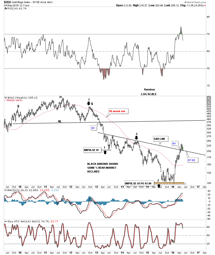
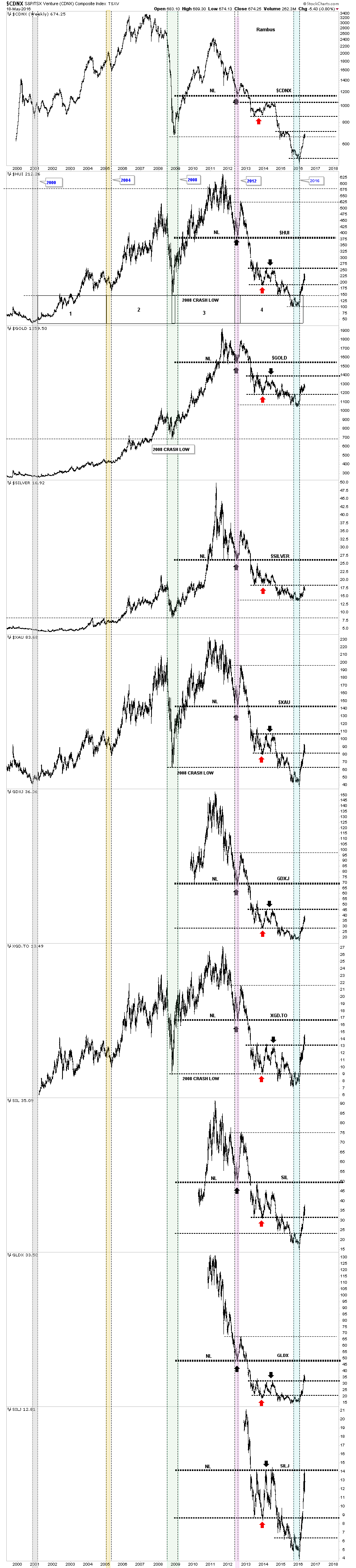
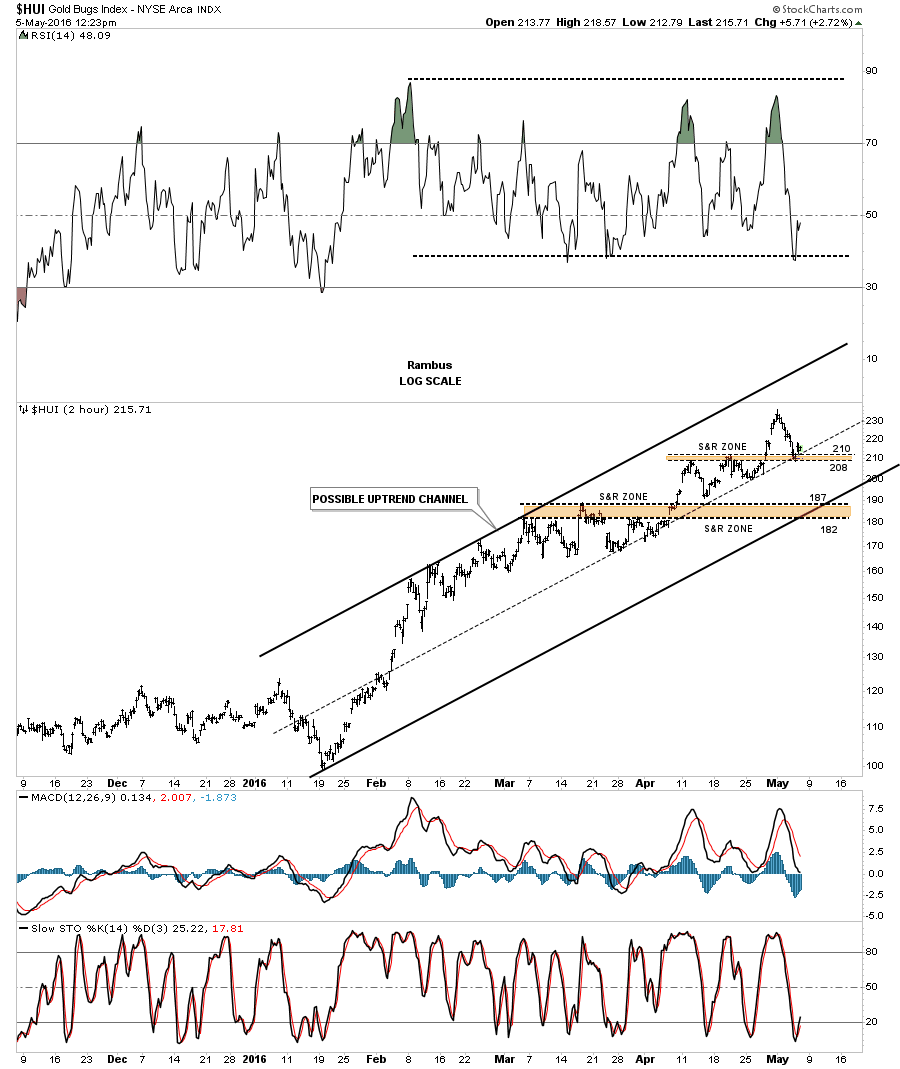
The first point I would like to make is that many of you are probably wondering how I could reverse my long term bearish view on the precious metals complex to a bullish view in such a short period of time. The other point I’ve been trying to make is to get you positioned and sit tight, as this new bull market is just getting started. Understanding the Chartology of this sector from the many different precious metals stock indexes, to individual PM stocks and especially the combo ratio charts, paints a picture that if one keeps an open mind and truly understands what is taking place right now, getting positioned and sitting tight makes alot of sense. This is easier said than done of course.

Many are surprised by the magnitude of this bull market rally in the precious metals complex and are trying to come up with all kinds of reasons why it should or shouldn’t be taking place right now, based on whatever trading discipline they’re using. Most are looking for at least a correction to relieve the overbought conditions before the bull market can make any progress higher. That may very well happen, but I’ve been showing you three very important combo ratio charts which are telling me a different story based on the Chartology and inter market ratios for the PM complex.

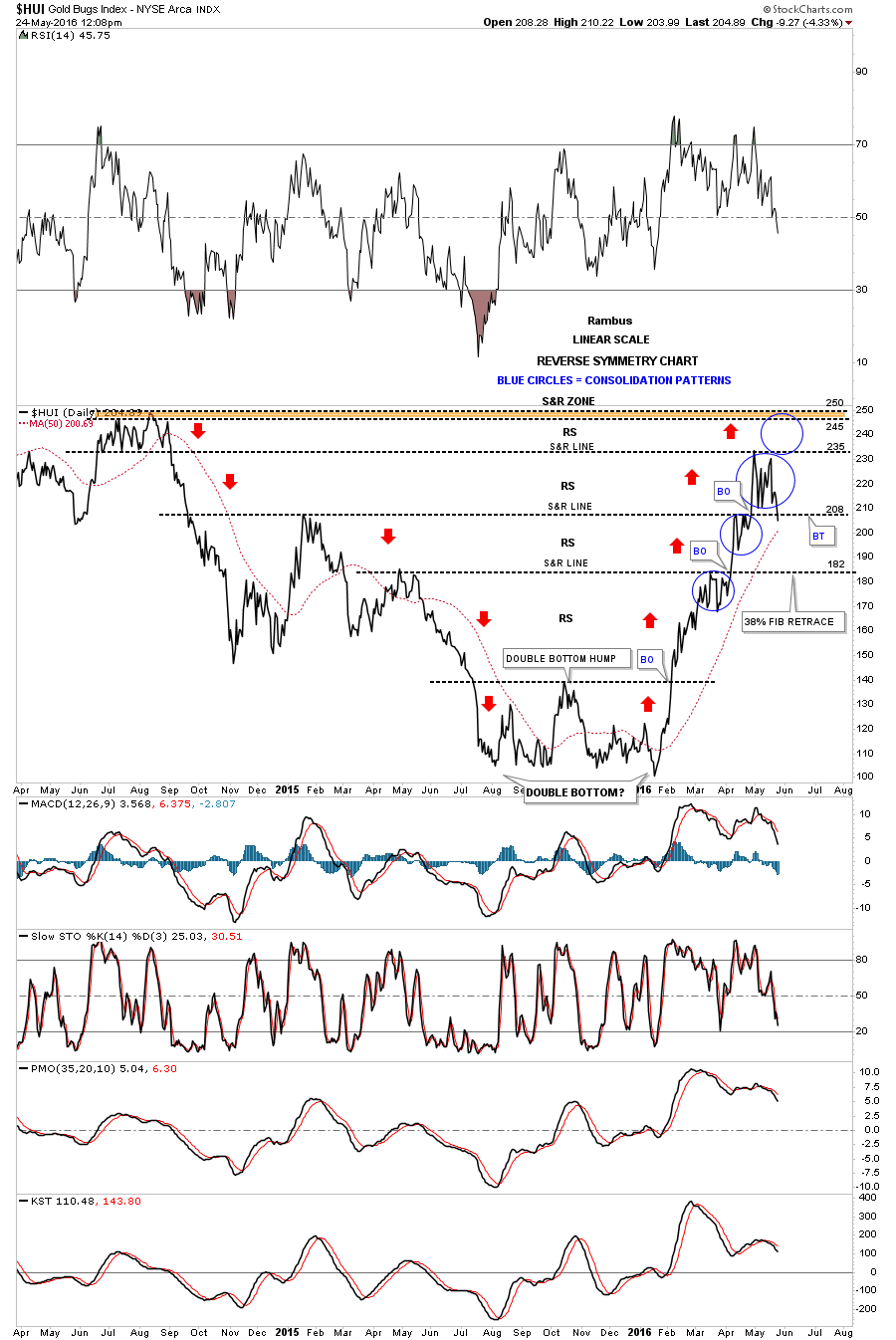
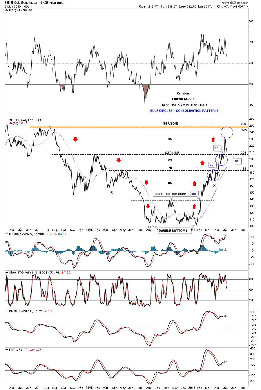
I coined the phrase  “Reverse Symmetry” years ago when I first picked up on it after looking at literally thousands of charts and studying their price behavior. Once you become aware of this particular piece of Chartology you begin to look for it and will see it all over the place from short term minute charts to long term monthly charts. It’s no big mystery why it works but it can tell you what to look for during certain market conditions. The precious metal complex is giving us a perfect example of reverse symmetry right now.

I’ve been showing you at least three different combo ratio charts for the PM complex which showed the end of the bear market and the beginning of the new bull market. Keep in mind this is unique to Chartology and my interpretation of the Chartology.  There are many good trading disciplines out there in which some investors can master and be successful while most will give up the minute it doesn’t work perfect. Sticking with whatever trading discipline you choose, whether it’s cycles, Elliott Wave, Gann, or even watching the COT’s numbers, give yourself the time to fully understand and grasp its principals before you give up on it. For me personally, Chartology is the road I chose to travel and after experimenting with several different trading disciplines I always came back to Chartology.

So why I’m I so bullish on the precious metals sector right now?

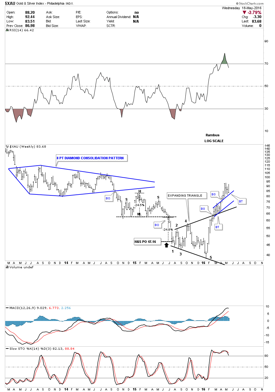
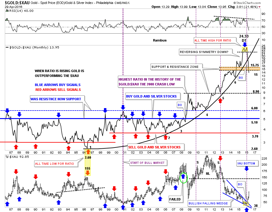
1…GOLD:XAU Ratio ( When this is rising  ,Gold is stronger than the Gold Stocks and when it is falling Gold Stocks are Stronger than Gold , which is Bullish for Gold)

This first combo ratio chart I’ve been trying to show you about once a week so you can follow the price action. I’ve been showing this combo ratio chart for years, but when I seen the double top put in place at the top of the chart, yellow shaded area, I know what a double top looks like and this double top formed at the end of a 20 year parabolic move where gold had been outperforming the XAU. The break below the double top hump came in January of this year, which was the first real clue that the nearly five year bear market maybe coming to and end, which would usher in a brand new bull market.

I won’t go into detail again as I’ve been covering this chart in depth since the double top reversal pattern completed. When the ratio chart first broke down from the double top I said to look for reverse symmetry to the downside, as the rally leading into the double top was a near vertical move. In just three short months look at how the price action has been declining in a vertical move down, breaking below the parabolic arc and now the brown shaded S&R zone between 15 and 15.75. This is one reason to have gotten positioned and to sit tight. A break below a parabolic arc strongly suggests that the move to follow will be just as strong or stronger to the downside vs the upside. It’s just the nature of a broken parabolic arc.

You can see what is happening to the XAU in the bottom chart as it bottomed at the exact same time as the ratio chart doubled topped. The ratio chart is unwinding its parabolic rise while the XAU is doing the very opposite by rallying in a near vertical move. Folks we don’t get this kind of setup everyday. This is a rare phenomenon that is only being presented by Chartology. I doubt anybody on the planet is looking at the precious metals complex from this particular angle. This combo ratio chart shows you one reason the bear market has ended, and a new bull market has begun. This combo ratio chart also shows you why the vertical move up in the precious metals stocks is taking place and sitting tight is the prudent thing to do right now IMHO. We are dealing with a breakout of a 20 year parabolic uptrend that is reversing direction in favor of the PM stocks, which is a big deal. Getting positioned at a bottom like this in the PM sector or any stock market for that matter doesn’t happen for most investors, it’s only a dream.

aaa gold ratio xau

……………………………………………………………….
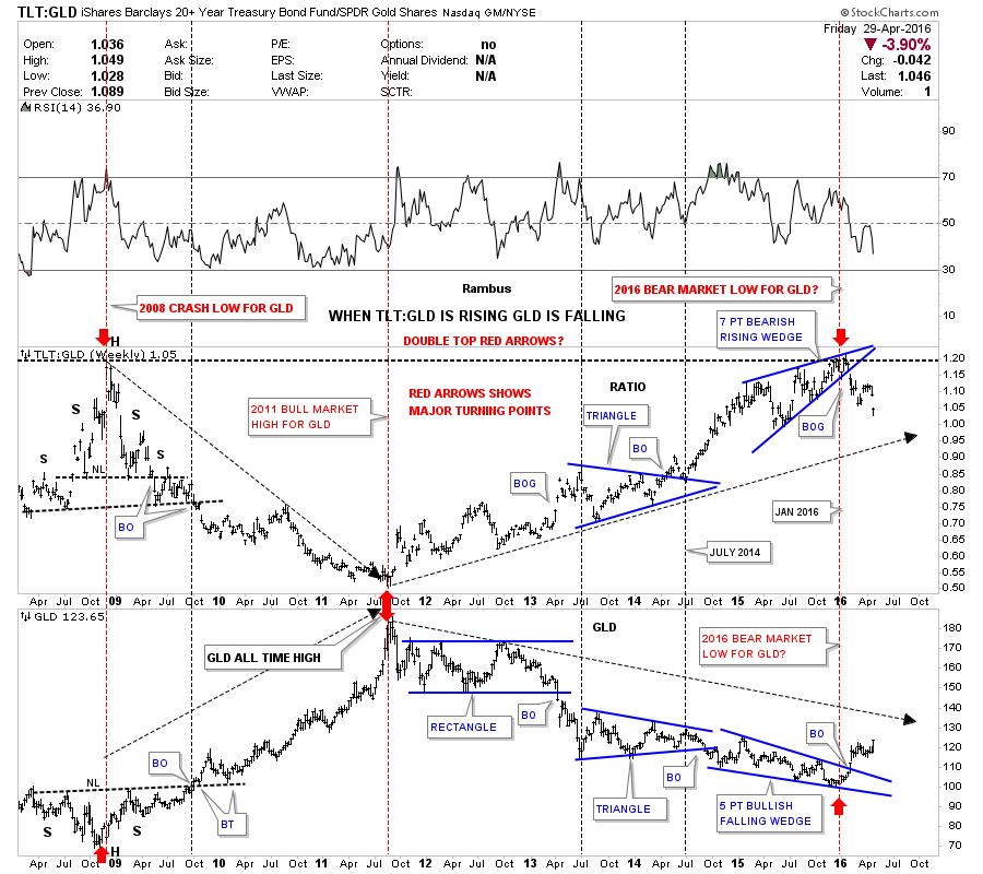
2…TLT:GLD Ratio :

TLT is the ETF for US Treasury Bonds and GLD is the ETF that tracks Gold .  When  this ratio is rising Bonds are outperforming Gold , and when falling Gold is outperforming Bonds , which is bullish for Gold .

Now lets look at another combo ratio chart which compares the TLT:GLD on top and GLD on the bottom, which shows the inverse relationship these two have most of the time. Again I won’t go into a lot of detail as we’ve been following this combo ratio chart pretty closely. Just a quick summary shows how the ratio chart on top formed a H&S top during the 2008 crash, while GLD formed a H&S bottom inversely to the TLT:GLD ratio chart. Then when GLD topped out in September of 2011 the TLT:GLD ratio chart shows it bottomed at the same time as shown by the red arrows in 2011.

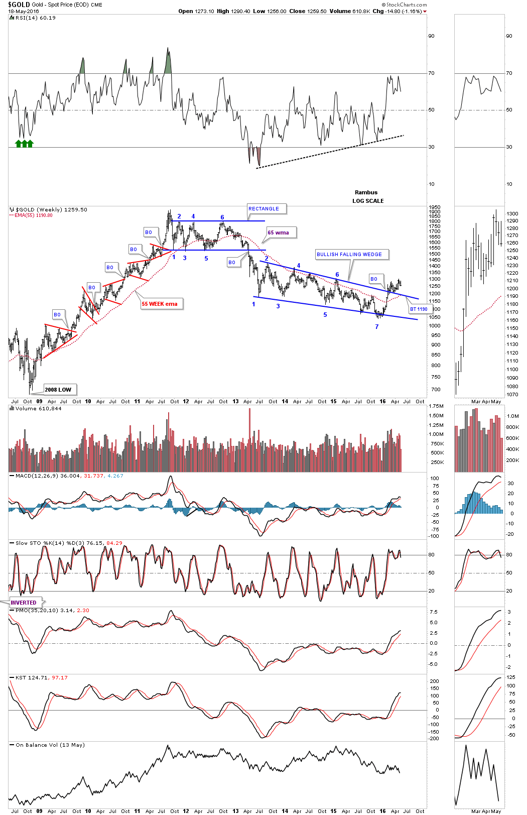
Looking at the ratio chart on top we can see the one year blue rising wedge that ended up having seven reversal points, which is a reversal pattern that was confirmed with the breakout gap to the downside. Up until the blue rising wedge broke to the downside there was a potential that it could have just been a consolidation pattern if the price action had broken to the upside instead. But we got the breakout gap to the downside which sealed the fate for the bear market in GLD, which then gave rise to the new bull market in GLD.

Note the near perfect inverse correlation between the ratio chart on top and GLD on the bottom during the January 2016 reversal points on both charts. As the ratio chart gapped down out of its blue bearish rising wedge GLD broke out of its bullish five point falling wedge reversal pattern at the same time.

One last bit of interesting price action on the ratio chart which shows the recent top in January of this year matches the same high made back in 2008. That top on the ratio chart in 2008 shows the head of the H&S reversal pattern, which matches the head for GLD on the bottom. That important high on the ratio chart and low on GLD led to GLD embarking on its final move up to its September of 2011 all time highs at 1920 in just three years. Again January of 2016 comes into play as an important low for the precious metals complex based on the ratio chart.

bbb

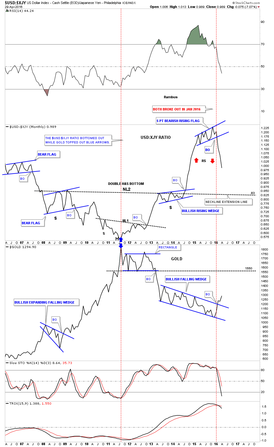
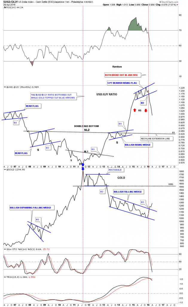
This next combo ratio chart shows another good example of why I think the bear market is over and a new bull market has begun in the precious metals complex since mid January of 2016. What fascinates me the most about Chartology is how it can show the future price action before the fundamentals come into play. As most of you know the Japanese Yen has been on a rocket ride for the last week or so , faking out just about everyone. We’ll hear stories of manipulation or Bank of Japan or the Fed or other fundamental reasons why it’s doing what it’s doing, which I do not  get into because the Chartology already showed us what was coming. It constantly amazes me the Chartology knows before anybody  what is coming down the pike.

……………………………………………..

3…US Dollar: Japanese Yen Ratio:

This ratio rises when the Dollar is rising against the Yen which is bearish for Gold and when it is falling the Yen is rising against the Dollar which is bullish for Gold.

Below is another combo ratio chart which has the $USD:$XJY ratio on top and gold on the bottom. I’ve been showing you this chart for many years but most importantly since the ratio broke down from that blue five point bearish rising flag reversal pattern in January of this year while Gold on the bottom chart was breaking out of its bullish falling wedge reversal pattern at the same time. If you recall back in late January of this year I said there was a good chance we could see some reverse symmetry to the downside in the ratio chart which would be bullish for Gold. I had absolutely no idea why the US dollar would collapse against the Yen but collapse it has.

Again note the parabolic rise the ratio chart made in 2014 to the top in late 2015. The rise was so steep no consolidation patterns formed on the way up so there is nothing to offer any support on the way down until neckline #2 comes into play around the .83 area. As the ratio keeps falling we should see gold rising which has been the case. If we see the ratio chart on top hit neckline #2 at .83 and gold hits the bottom rail of its blue rectangle consolidation pattern that formed on the way down at 1550 or so, it will most likely mark a period of consolidation for both the ratio and gold.

ccccc xjy

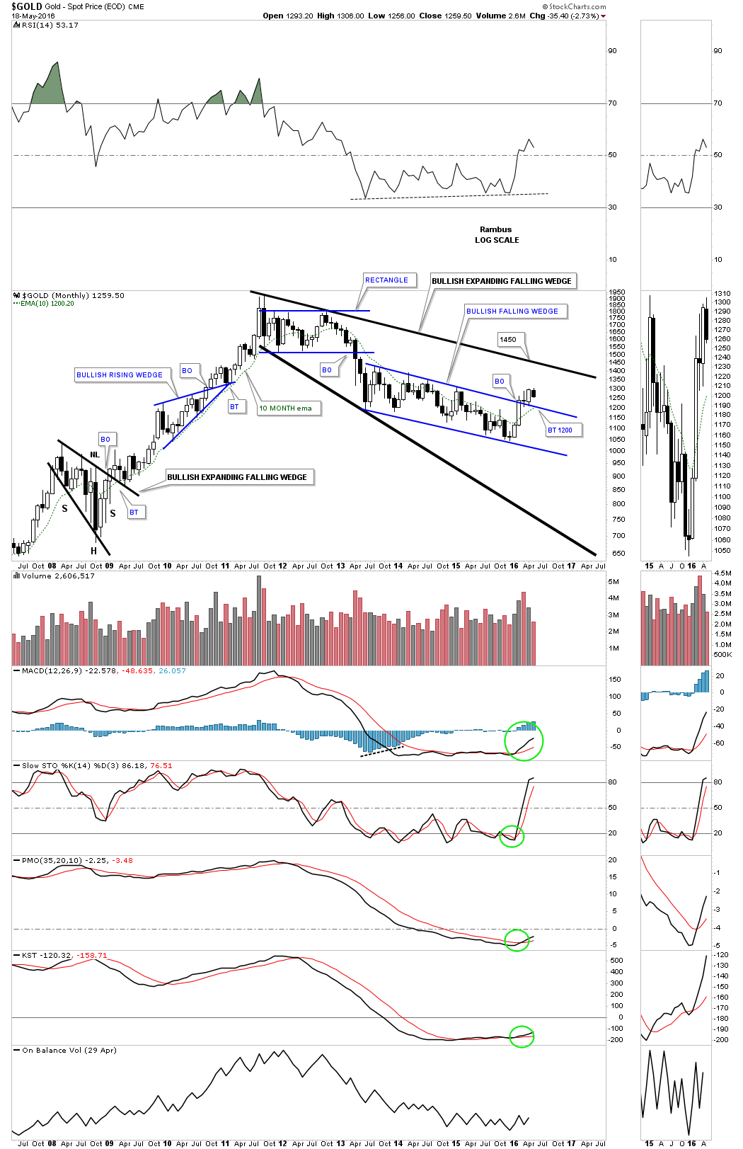
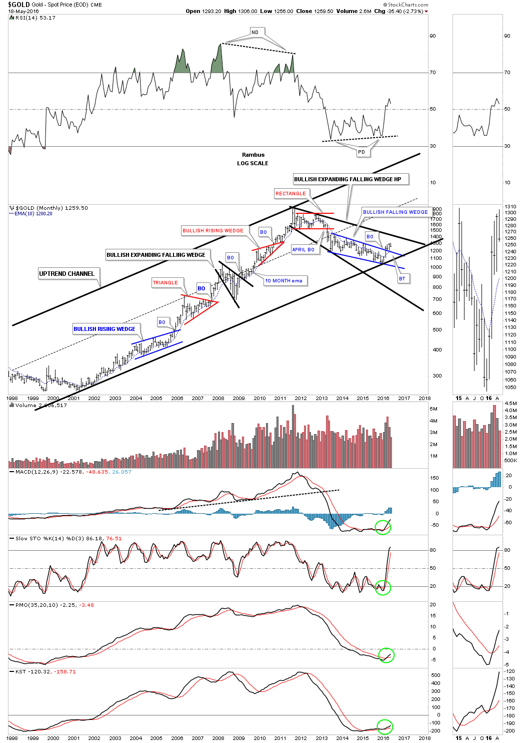
These three combo ratio charts above shows me how the bear market ended and how the new bull market began in the precious metals complex. There are never any guarantees when it comes to the markets, but by following the price action one can take out alot of the noise, which can can make things confusing at times.

What I believe is happening since the tops were put into place on these ratio charts above, is that the parabolic move leading into those tops is now reversing symmetry back down over the same area. This is the reason I’ve been so adamant about getting your favorite precious metals stocks bought, and to sit tight until some decent support is hit on these ratio charts. This could be one of the easiest or hardest trades you’ll ever  make. It could be easy because all you have to do is buy your favorite PM stocks and do nothing. The hard part would be if you try to outsmart the new bull market by over trading and finding yourself on the outside looking in.

A correction is coming , but what is going to surprise most folks is the strength of this first impulse leg up. Some are waiting for the right signal to call the new bull market in the PM complex, while many are trying to trade in and out of this strong impulse move which is just almost impossible to do. The move like we’ve seen since mid January of this year is frustrating the bulls and the bears alike. This is a perfect start to the second leg up of the secular bull market that began at the turn of the century. All the best…Rambus


HUI Update…Beautiful Chartology

Below is a two year daily chart for the HUI which I first showed you when the HUI broke above the double bottom hump to start its bull market. I call this chart the reverse symmetry chart as shown by the red arrows. How a stock comes down, especially in a strong move, will reverse symmetry back up over the same area. It’s more of an art than a science. You can see the rally off of the mid January low found a little resistance at 182 before it broke through. Now it’s testing the next overhead resistance line at the 208 area and has been finding some resistance which we should initial expect. Today is the fourth time that the HUI has tested the 208 area from below. A breakout above the 208 area will put the next area of resistance on the map at 250 or so which would happen fairly quickly as the decline back in 2014 was pretty steep. If the HUI fails to breakout right here at 208 then support will show up at the previous high at 182 or so.

hui

Weekend Report…Precious Metals Complex Reverse Symmetry

In mid January of this year it looked as if another leg down was in store for the precious metals complex. Most of the precious metals stock indexes broke down to a new bear market low which I was expecting, as I was looking for that one last capitulation move to shake out the last of the bulls. There was a pretty symmetrical H&S consolidation pattern that had developed at the lows going back to August of last year. The setup looked perfect for one last move down to end the bear market but that didn’t happen. Instead we got a two day shakeout below the previous low which ended exactly three months ago today.

I have been one of the biggest bears since the HUI put in its right shoulder high in 2012 which was the beginning of the bear market.The actual high was made in 2011 but the first real strong impulse move down started from the right shoulder high. Three and a half years or so was a long time to be bearish on this once thriving sector but when I seen the failed breakout to the downside in January of this year that caught my attention. There is an old expression in the markets that says if you see a false breakout from a well defined pattern, the chances are very good that it was a failed breakout and the price action will move rapidly in the opposite direction, leaving everyone who was on the wrong side of the trade in the DUST.

This is exactly what happened in the precious metals sector. After just two days below the neckline on the HUI for instance, the move back up has been breathtaking to say the least. Both the bulls and the bears were confused as to what just happened. How could sentiment change so quickly from the bottom falling out, to a rip roaring bull market just like that. That’s how many moves end. The bear market was so long and brutal that everyone who wanted to sell finally had their chance. With no sellers left the bulls took charge and a brand new impulse move up began.

We’re now at a critical point where both the bulls and the bears don’t know what to do. The bears keep hoping that they were right and the bear market isn’t really over yet and new lows will be on the horizon. The bulls on the other hand are waiting for a good correction in which to buy their favorite PM stocks in this new bull market but the precious metals stocks just keep going higher without any significant declines. Damned if you do and damned if you don’t.

Lets look at some charts so I can show you what I was looking at in regards to such a major shift in sentiment. These first charts will be what I call a ratio combo chart. The top chart will have a ratio which compares one item to the other, which shows how it’s doing compared to the item on the bottom chart. It’s a little bit like inner market analysis, but is easy to see and understand. How a ratio chart develops can have huge consequences for the underling stock or market.

This first ratio combo chart compares gold to the XAU on top with the XAU on the bottom. The ratio chart on top tells the story of how undervalued the XAU index is to the price of gold. It’s mind blowing when you understand how beaten up the precious metals stocks have been vs gold. For many years the blue horizontal line at 5.10 or so was a good place to buy your favorite precious metals stocks, and when the ratio dipped down to the red horizontal line around the 3.70 area it was time to exit those favorite PM stocks.

Looking back to the 1996 time frame you can see the ratio chart on top put in its all time low at 2.60 while the XAU was putting in another important high up to that point in history. From that important low in 1996 the ratio chart on top embarked on a twenty year parabolic rise in which gold would outperform the XAU, even with the bull market the XAU had in the 2000’s.

The first real sign that the XAU or the precious metals stocks were in trouble with gold was during the famous 2008 crash which spiked the ratio up to new all time highs. At the time it looked like it might just be an aberration and the ratio would fall back into its normal trading range between 3.70 and 5.10. If you look at point #4 on the parabolic arc the old ceiling now became support for the ratio meaning gold was outperforming the XAU. There is no way anyone could have predicted how far out of wack this ratio would become. The parabolic arc just kept getting steeper and steeper until it finally put in a double top reversal pattern in January of this year. That was my cue to reverse from a staunch bear to now a staunch bull on the precious metals stocks.

Many times when a parabolic trend ends either up or down the move in the opposite direction can be quicker than the actual parabolic move itself. So far the move down from that double top on the ratio chart has been vertical in nature. Now take a look at the XAU monthly chart on the bottom. As the ratio has been moving down the XAU has been in a strong rally since the middle of January of this year. The XAU broke out from the five point blue bullish falling wedge reversal pattern while the ratio chart on top has broken below the parabolic arc. What this combo chart strongly suggests to me is that it’s now time for the precious metals stocks to outperform gold and in a big way, a revision back to the means.

a xau month rato

Below is another ratio combo chart which did an excellent job of calling the low for the bear market in the PM complex. This chart has the TLT:GLD ratio chart on top and GLD on the bottom. On the left hand side of the charts you can see how the ratio chart topped out during the crash in 2008 while GLD bottomed out with each forming a H&S pattern. Then when GLD topped out in 2011 the ratio chart bottomed out calling for a bear market in GLD.  Now fast forward to January of this year 2016. Up until January of this year, the blue rising wedge could have broken out in either direction which I was leaning toward an upside breakout as that would have signaled the capitulation move for the PM sector. After the seventh reversal point in the blue rising wedge the ratio broke to the downside signaling the bear market was over. Instead of being a consolidation pattern the blue seven point rising wedge ended up being a reversal pattern. Mid January of 2016 comes into play again as an important low for the PM complex.

a tlt gold rtio

This next ratio combo chart compares the US dollar to the Japaneses Yen on top and Gold on the bottom. Normally when the US dollar is outperforming the Yen gold declines in general. Note where the two blue arrows meet in 2011. They meet at gold’s 2011 bull market peak and the ratios bottom. The ratio chart built out a double inverse H&S bottom while gold built out a rectangle consolidation pattern. From the 2011 high for gold, and the bottom for the ratio they both moved in the opposite direction. The ratio chart on top and gold on the bottom actually made their reversal high in November of last year but they both broke out of their reversal patterns in January of this year. Again January 2016 comes into play  You can see the ratio built out a blue five point bearish rising flag reversal pattern while gold built out a very large seven point falling wedge.

There is one more important point to make on the ratio chart which will most likely affect gold as well. Note the near vertical move up the ratio made when it broke out of above neckline #2. It was a vertical move which didn’t have time to form any consolidation patterns along the way. Many times when you see a near vertical move like this the decline will be just as strong because there were no consolidation patterns built on the way up to offer any support on the way down. I call this Reverse Symmetry as shown by the red arrows. As you can see the decline out of the blue 5 point bearish rising flag has been just as steep as the rally leading up into the bearish rising flag, reverse symmetry. The first area of real support for the ratio chart will be .83 which is the neckline extension rail taken from neckline #2 which many times will hold initial support.

What is interesting about these three ratio combo charts is that they are all suggesting a strong move up for the precious metals complex that maybe larger and quicker than move folks can believe. We won’t know 100% until we can look back in hindsight and see what actually took place, but so far the beginning of the rally, especially the precious metals stocks, has been very strong since the mid January low. If you’re a bull where do you get on and if you’re a bear where do you get off? Questions I’m sure are being asked right now from many of the precious metals complex investors.

xjy usd

Lets look at one last ratio combo chart which has the TIP:TLT ratio chart on top with the CRB and the GDX indexes on the bottom. When the ratio chart in black is rising there is some general inflation and when it’s falling we generally see deflation. It’s not a perfect tool but it shows us a general picture of what is actually taking place. As you can see the ratio chart in black topped out in 2011 along with most commodities and the precious metals complex. We’ve been in a general state of deflation since the 2011 ratio high and still are to this day. What would get my attention that maybe some inflation may be coming into the markets would be if I seen the ratio in black starting to rise above the downtrend arrow with the TLT itself declining below its uptrend arrow. At this point there is nothing to get excited about on the inflation front unless the ratio chart builds out a possible double bottom in this area, and the TLT builds out a possible double top.

Now lets look at the CRB index and the GDX precious metals stock index at the bottom of the chart. The CRB index has barely budged off of its bottom but it has formed a higher high and has broken above its two year downtrend arrow with the 30 week ema just above the current price.

The GDX is showing a much stronger bottom in place as it has broken above its double bottom trendline at 16.90, the top rail of its five year downtrend line, and is trading well above its 30 week ema. This tells us the precious metals stocks are leading the rest of the commodities complex higher at least to this point in time. There is one more bit of interesting chart action on the GDX at the very bottom. If you look to the left hand side of the chart you can see that massive H&S top that formed back in 2011 on this linear scale chart. You only get one guess on the price objective for that massive H&S top. The measured move for that H&S top is down to 12.26 which is almost dead on the money of the actual low. Just take your fib tool and measure down from the top of the head to the neckline and then move your fib tool down to the neckline and see what you get.

a gdx cp,bpgp

This next combo chart shows how gold is performing in some of the more important currencies of the world. The two resource based currencies the Canadian Dollar and the Australian Dollar show a big triangle consolidation pattern that has broken out and and is being backtested presently. Note how the Australian Dollar is the closest to making new all time highs vs the other currencies vs gold while the US dollar is the furthest away from making a new all time high.

gold many curreences

This last chart for tonight I call the Precious Metals Combo 10 chart. This combo chart has all of the most important precious metals stock indexes along with gold and silver. I use this chart to see what PM indexes are performing the best so far in this new bull market. The red arrows shows the 2014 consolidation patterns lows and the black arrows shows the 2014 consolidation patterns highs.The blue shaded vertical area shows the January 2016 lows. When you scroll down through all these charts you can see which ones are leading the pack using the red arrows for a reference point. Up until today the XGD.TO, big cap PM miners, was the first PM index to reach the top of the 2014 consolidation pattern as shown by the black arrow. Today though shows the GLDX, junior gold explores, making up ground fast as it too closed at the top of the 2014 consolidation pattern. Note the move of the small cap junior silver miners which is the last chart on the bottom. The SILJ still has a ways to go yet to reach the black arrow, but they’re putting on a show for all those folks that care to take a look. Silver is still the weakest but it’s trying to make a move up. Even the old $CDNX small cap Canadian index has finally joined the party and is getting a decent move to the upside.

The other different shaded vertical areas shows what I consider to be important lows. It just so happens that the lows are roughly four years apart, as shown by the black rectangles on the HUI chart. They’re not exact by any measure, but they do show up at interesting junctures on these indexes.

Back in 2008 when the PM sector finally bottomed it was an important low as that’s where the buyers stepped up to the plate. In 2015 most of the PM stock indexes broke below that very important bottom which made one stand up and take notice. And then in January of 2016 a rally started, which would take those PM indexes back above that important 2008 crash low. That was a very big deal for me, which suggests we seen a bear trap which few got out alive. Now just three months later many of the PM stock indexes are trading back up to their 2014 consolidation pattern highs, which is a multi year high in some cases. There are no guarantees when it comes to trading the market, only probabilities which we need to get on our side in order to be successful. All the best…Rambus

top 10


SILJ Update…

This silver juniors etf is also having a good day. What you see on this chart is a classic impulse move with one pattern forming on top of the next. In a strong impulse move you can see up to three and sometimes four small consolidation patterns form before a bigger correction takes place which can be pretty lengthy at times.

SILJ D

The monthly candlestick chart shows the entire history for this etf. There are still two weeks left to trade this month and it would be nice to see a nice big white candlestick form.

SILJ MONNLY

HUI Goldbugs Index : Some Perfect Chartology

Below is a daily chart for the HUI which shows one of the original patterns that formed the, what turned out to be a Diamond reversal pattern to the upside. There are at least several more reversal patterns that formed at this most important low. As you can see the Diamond had seven reversal point making it a reversal pattern to the upside. The breakout was accompanied by a gap and then a backtest to the top rail. Everything looked good to go at that point then after just four days of rallying the HUI quickly reversed direction and traded below the apex of the blue triangle which is not what I wanted to see as that usually is a bearish setup in this case. After trading just four days below the apex the price action reversed hard again to the upside negating the end around the apex move. That was a shakeout before the breakout or bear trap. Again as we’ve discussed in the past when you get a false breakout in one direction you’ll generally see a big move in the opposite direction. That false breakout of the blue Diamond was the bears last hope to push the HUI lower but they quickly ran out of gas and the bulls then took control which initiating the short covering rally.

Since the initial high during the first week of March the HUI has been consolidating that first impulse move up forming a bullish expanding rising wedge which broke out this morning with a breakout gap.

hui day 1

This second daily chart for the HUI shows a clean five point expanding triangle reversal pattern. The breakout was a little sloppy but the backtest held nicely on the last touch. It’s always nice to see some type of consolidation pattern form on top of an important trendline which is generally a bullish setup in this case. The moving averages had a nice cross back in February with the 20 and 50 day ema’s crossing above the 200 day simple moving average.

HUI DAY 2

This next chart is a weekly combo chart which has the HUI on top, gld in the middle and slv on the bottom. We’ve been following this chart for a very long time which shows the massive 3 1/2 year consolidation patterns that each one has formed. Both GLD and SLV broke above their top rails several months ago already while the HUI is just now breaking out above its massive seven point bullish downtrend channel. It’s charts like this one that helps us confirm the bull market is still alive and well. If we see the price action become very weak and start trading below the top rails of their respective 3 1/2 year trading ranges then we’ll know there is trouble but as long as the price action keeps confirming the bull market it is what it is.

HUI WEEKLY 555

Below is a weekly chart which shows the massive H&S top and the bear market that ensued once the neckline was broken to the downside back in 2013. At the bottom of the chart you can see the blue 5 point expanding triangle that formed which was the  reversal pattern to end the bear market for the HUI. I put a red circle around the breakout and backtesting  process of both the expanding triangle and the top rail of the downtrend channel. It’s very subtle but you can see the price action broke above the top rail of the downtrend channel first and then backtested it. The HUI then rallied above the top rail of the expanding triangle and then backtested it before moving higher. They’re inconsequential to most folks but for me these little clues all add up to paint a picture that one can make a game plan to follow and as long as the game plan is working stick with it and don’t try to out smart yourself by looking at every trendline thinking it’s the most important line on the chart. In a bull market the surprise will be to the upside as today’s price action is showing.

hui weekly

This next weekly chart for the HUI shows a good example of how this bull is unfolding from a Chartology perspective by doing all the right things. This is the ping pong chart we’ve been following which shows the expanding triangle forming on the bottom rail of the 3 1/2 downtrend channel. The breakout above the blue expanding triangle also coincided with a breakout above the 2008 crash low which was a very important low which had been violated to the downside last summer. Trading back above that crash low was a big deal. It’s interesting that this morning the HUI had a gap opening which is right at the top rail of the 3 1/2 year downtrend channel. It won’t surprise me in the least if we see a backtest ot the top rail of the downtrend channel before it’s all said and done which would add more confirmation especially if it holds support. There are no rules tho that say we have to see a backtest either.

hui weekl many many

This last chart for the HUI is a weekly line chart that shows there have only been two weeks since the January 2016 low was put in place, where the HUI fell. This kind of price action makes it hard for the bulls to take a position if they missed the bottom and it makes it hard for the bears who are looking for some weakness to reduce their short positions. Confounding both the bulls and bears alike is what makes this move so special. Everyone can’t get in at the bottom and everyone can’t get out at the top.

hui weekly lie


HUI Update…

Below is the weekly chart we’ve been following very closely which shows the ping pong move taking place between the top rail of the three year expanding downtrend channel and the top rail of the blue expanding triangle. Today the HUI is breaking above the top rail of the expanding downtrend channel offering another clue that the bull market is alive and well. Simple charts like this can add a mountain of evidence to the big picture analysis which is what we want to see for more confirmation. As long as we keep getting confirmation from different areas of Chartology and inter market studies we looked at in the Wednesday Report you only have to fear is fear itself.

I know there are a lot of folks that are frozen in the headlights right now not knowing what to do. It’s never easy to switch ones opinion that may have been in place for literally years. The Chartology is strongly suggesting that a change is taking place right here and now not because of what some analysis is saying but it’s what the charts are saying that matters the most. Everything is locked up in the price action from fundamentals, Elliot Waves, cycles you name it and it’s on the chart. It’s the discipline of what technique you use to unlock what the charts are saying. I just so happen to like Chartology but the other disciplines work well for those folks that understand how they work. Keep an open mind to any eventuality and use whatever discipline suits you as an investor.

hui ping pong


$CDNX Update…

In the old days before all the new etf’s came out we use to watch this index as a proxy for the small cap precious stocks. This Canadian small cap index also has other small cap companies in  but it was all we had to gauge the strength of the juniors. Since the January low of this year it has been under the radar screen quietly rising in price. Today it looks like it maybe breaking out of a small bullish rising flag.

CDNX DAY

The long term monthly chart for the CDNX shows you just how undervalued this small cap index is as it hasn’t even climbed its way back above the 2008 crash low. When this index decides it’s time to move it usually does so in a strong impulse move either up or down. Another possible piece of the puzzle.

cdnx montly

Wednesday Report…Gold Ratio Charts Revisited.

As the consolidation phase continues to build out from this first impulse move up in the precious metals sector lets review some of the charts we’ve looked at previously that suggested the bear market might be over.  Most of these charts will be ratio charts which compare different sectors to one another These rather complex charts can give us some hidden clues that an important reversal may have taken place.

The consolidation process takes its toll on both the bulls and the bears alike. As you know there are never any guarantees of anything when it comes to the markets so it’s always important to try and get the big picture right to get the odds in your favor.

Lets start with one of the more important combo ratio charts we’ve been following which has the TLT:GLD ratio on top and GLD on the bottom. When the ratio chart on top is falling ( Gold is Outperforming Bonds ), GLD is generally rising and vice versa. On the left side of the chart you can see the ratio chart topped out in 2008 while GLD bottomed with both forming H&S patterns. Next in 2011 the ratio chart bottomed out while GLD topped out and started its bear market. Now looking to the right hand side of the chart you can see where the ratio chart on top , topped out on January 16th of this year while GLD on the bottom also put in its bear market low. The ratio chart on top has been rising over the last three weeks while gld has been consolidating, which is to be expected as no market goes straight up or down. So far there is nothing concerning with this combo ratio chart except for a mild correction. As long as the ratio chart trades below the top black dashed horizontal rail the new bull market lives on.

a ratio chart for tlt

Below is another very important combo ratio chart we’ve been following which shows the GOLD:XAU ratio chart on top and the XAU ( large cap Gold Stocks) on the bottom. This combo chart does a very good job of showing just how undervalued the XAU is to the price of gold. Back in 1996 the ratio chart on top bottomed out at 2.60 while the XAU on the bottom topped at 155, which wasn’t to far out of wack. The parabolic arc shows from that low in 1996, even with the bull market years from 2000 to 2011 gold continued to beat up on the XAU until just recently when the ratio chart on top put in that small double top at 24.33 yellow shaded area. To say the XAU is under valued to the price of gold is an understatement. Think about this for a moment. It has to be one of the most amazing   bear markets in history . The price of large cap Gold Miners has been falling relative to Gold for 20 years , even during the most incredible bull market the yellow metal has ever seen ! Ask any Gold Enthusiast and they will tell you , Gold stocks have been a brutal investment choice .

The ratio chart on top is a monthly line chart so we won’t know until the end of April if the crack below the parabolic arc is truly broken to the downside. Note how the XAU on the bottom chart bottomed out at the same time the ratio chart was putting that double top. The XAU is now in its third month of a breakout move out of the seven point bullish falling wedge reversal pattern. There is nothing broken on this chart and still looks positive for the XAU outperforming gold.

a gold to xay

This next chart is a weekly bar chart for the GLD:XAU ratio on top and the XAU chart on the bottom which gives us a close up view of the price action. Note the GLD:XAU ratio chart on top shows a failed breakout above the top rail of the blue triangle which shows up as a double top on the monthly line chart. The bearish setup here is when the price action gaped below the apex of the blue triangle which is never a good sign if one is bullish. Also we’ve discussed many times in the past that when you see a false breakout in one direction you tend to see a big move in the opposite direction, which we have. The XAU chart on the bottom shows it has broken out of a seven point falling wedge reversal pattern. So far nothing is broken on this combo chart.

GLD XAU FALLING WEDGE

This next ratio combo chart shows the very important USD:XJY on top and gold on the bottom that we’ve been following very closely. You can see how they are generally inversely correlated, not always but in a general sense. You can see in 2011 when gold put in its bull market peak the ratio chart on top built out an inverse H&S bottom, blue arrows. From that 2011 low the ratio chart on top went on a tear to the upside while gold built out its bear market downtrend. For most of 2015 while gold was generally falling lower the ratio chart was building out a five point bearish rising flag. Before that five point blue bearish rising flag broke to the downside I thought it might breakout through the top side which would signal the capitulation move for the PM complex. Once it broke to the downside I wasn’t going to argue with what the chart had just said, that the five point rising flag was a reversal pattern  to be respected. The other important aspect of the ratio chart on top is the possible setup for some reverse symmetry to the downside, as shown by the red arrows. We’ve been following the breakout from that five point bearish rising flag reversal pattern since day one, looking for a near vertical drop which so far has been taking place. The reason being is that there are no consolidation patterns to stem the decline which could offer some support. How the ratio chart went up is most likely how it will come back down.

gold xjy

This next chart is a combo chart which compares gold to many of the important currencies of the world. As you would expect the gold vs the US dollar would show the weakest chart as the US dollar had been so strong. Gold vs the Australian dollar has been the strongest of these currencies charts with the Canadian dollar being pretty strong as these are commodity based currencies. They all have formed blue consolidation patterns with Gold in  Euro, Canadian Dollar, and the Australian Dollar all breaking out above the respective top rails.

gold to currecies

This next combo chart shows the GDX on top and the  $BPGDM on the bottom. I like to use the $BPGDM chart on the bottom to look for a divergence with the GDX chart on top. After the initial move up in January of this year there was a divergence where the $BPGDM had a much higher low vs the GDX. The $BPGDM just recently went on another buy signal when the price went above the above the 5 day moving average and the 5 day moving average traded above the 8 day moving average which are now properly aligned to the upside.

bpgdm

Lets look at one last chart which shows the most important moving averages for gold on the long term daily chart. It wasn’t very long ago and the price of gold was trading below all four moving averages. I said at that time that gold would have to show its hand if it started to trade above any of the moving averages. There is no getting around that fact. As you can see gold is now trading above all four of the moving averages which have all started to turn up. At some point I expect to see them all properly aligned in a similar fashion to the left side of the chart. When they all get aligned properly, in a bull market or bear market, they show you the major trend and which direction one should be trading.

gold ma

Without actually analyzing the PM complex in isolation, the inter market relationship with the different sectors we looked at on the charts above paint a picture of a reversal of the bear market that has been in place for 4 1/2 years. As long as the relationships keep playing out as they have since the beginning of this year I have to remain a bull until proven otherwise. It won’t be easy but with a game plan in place to follow it makes taking a position and holding on to it during the inevitable pull backs less challenging. All the best…Rambus