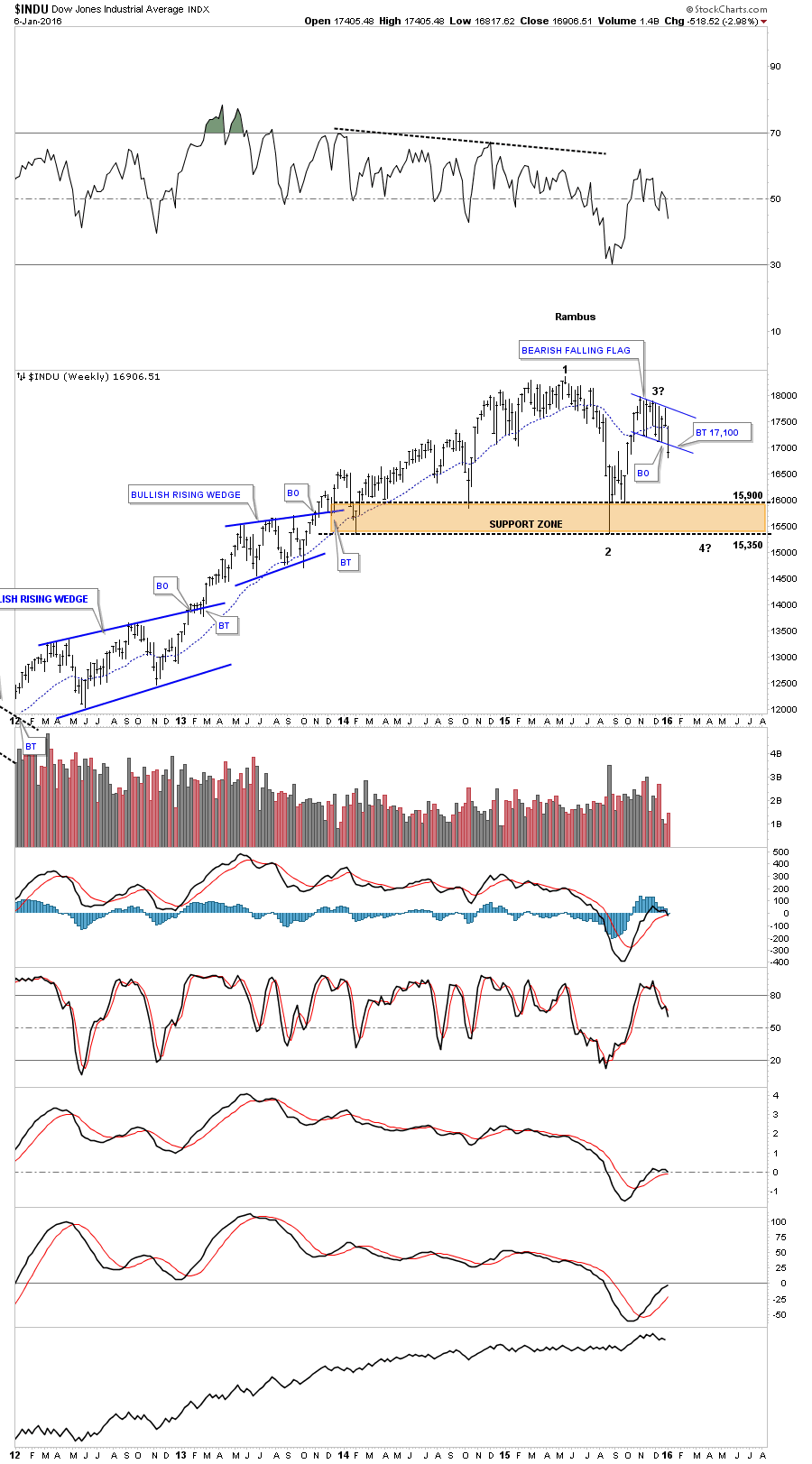
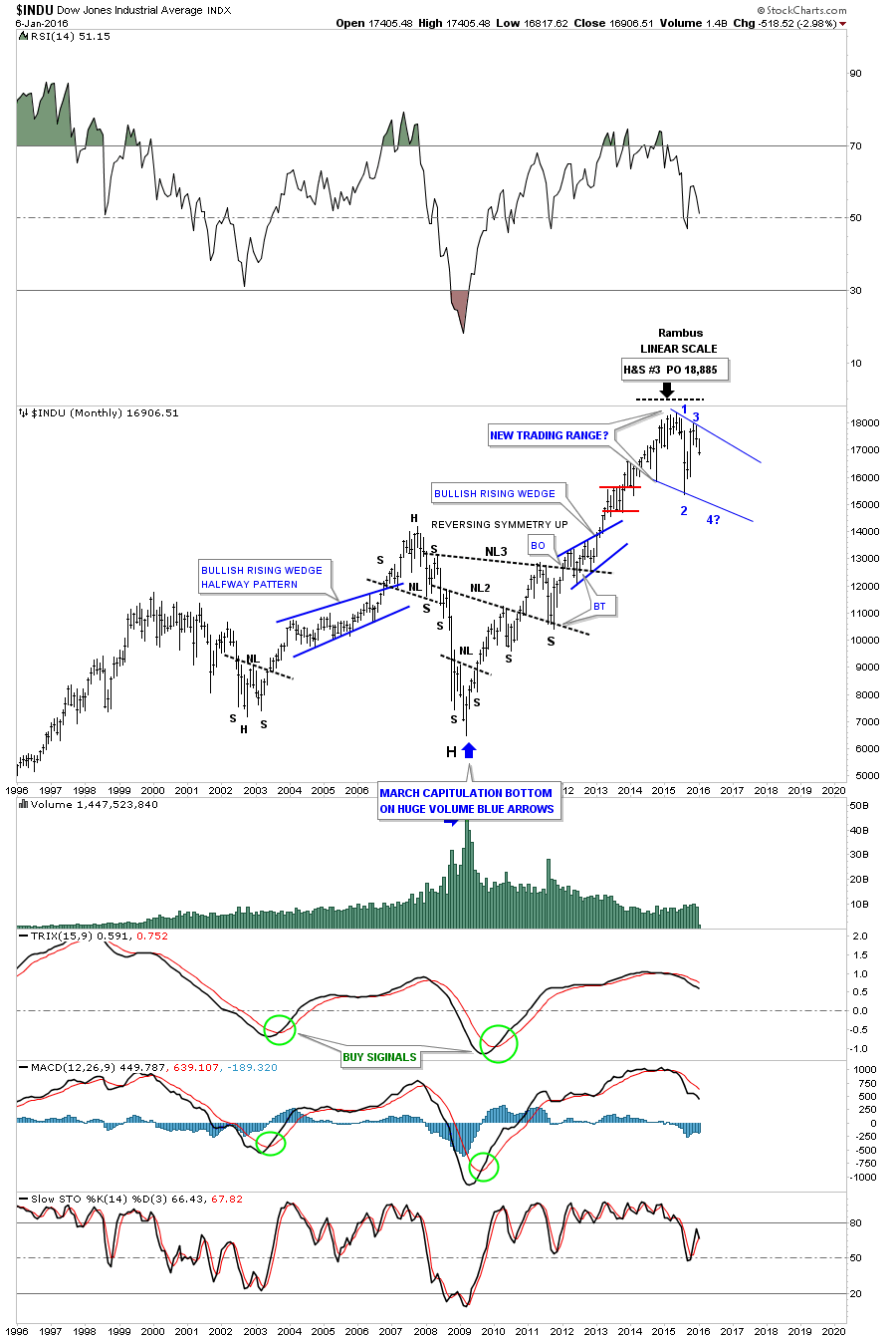
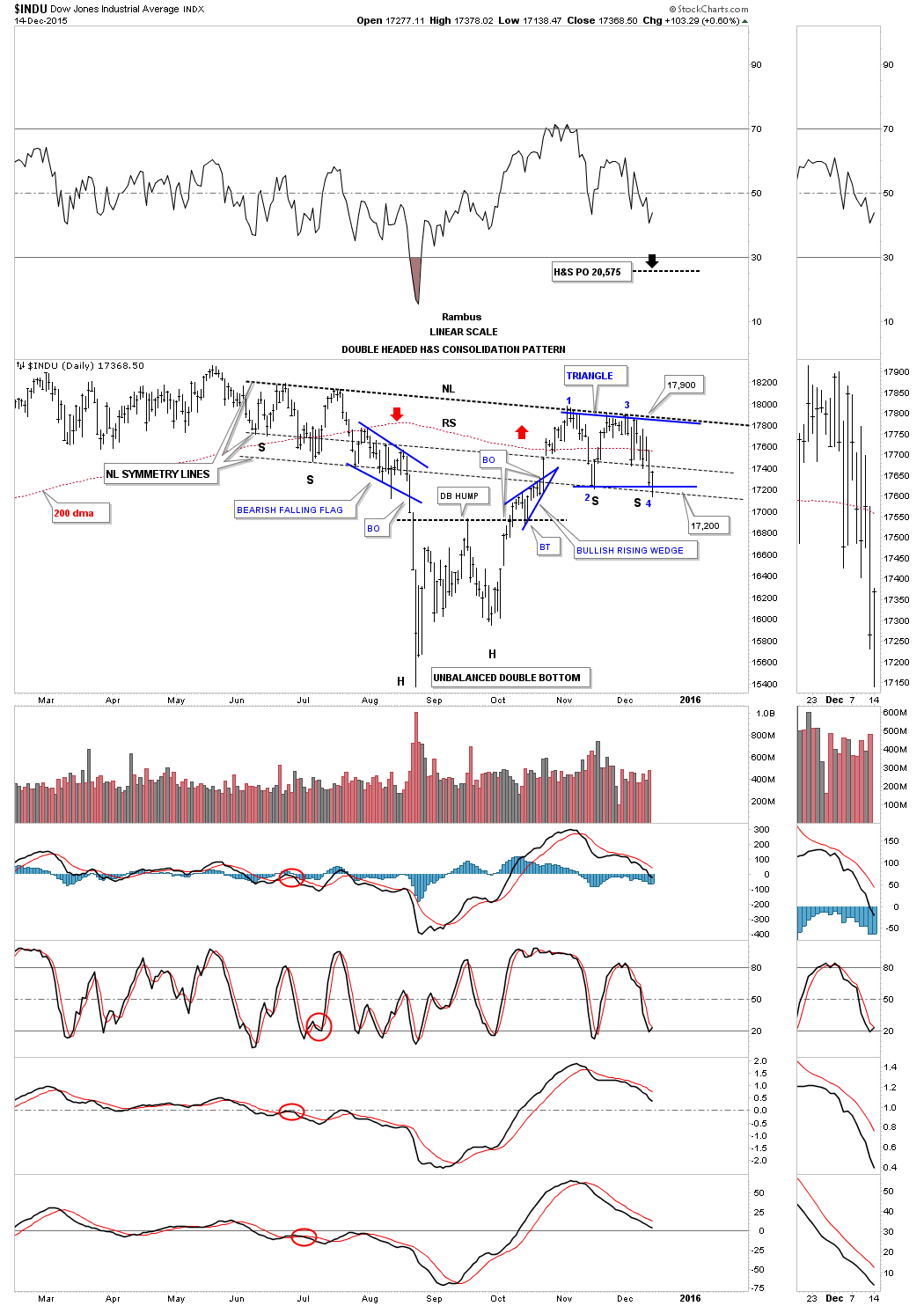
Today felt like an inflection point in gold and the INDU with both breaking important trendlines. As there is alot of ground to cover tonight lets get right to the charts starting with the daily look at the INDU. Today the INDU finally closed below the bottom rail of the now seven point bearish falling flag and the double bottom trendline at 16,920. This was a big deal IMHO. We may see a little backing and filling in this general area but today’s move clearly setup a pattern of lower highs and lower lows. Note the six point bearish falling wedge that formed back in July of last year. As it formed below the previous high it needed an even number of reversal points to complete the pattern to the downside. Because our current seven point bearish falling flag formed at the top it needed to have an odd number of reversal points to make a reversal pattern. One last point on the chart below which shows two red arrows one point up and the other pointing down. As you can see the rally out of the low made in October was vertical only taking three days. The red arrow pointing down shows how it’s possible we may see the INDU reverse symmetry back down over the same area as shown by the red arrow pointing up.
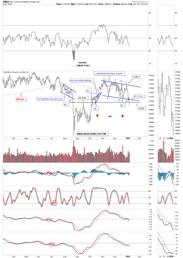
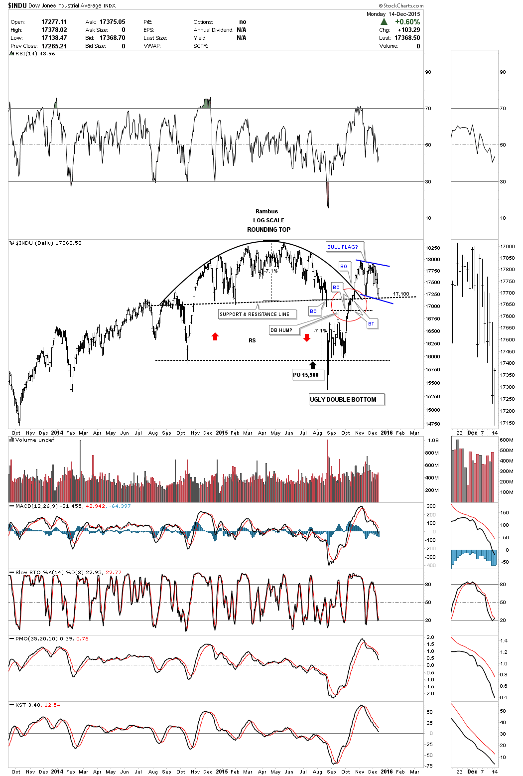
Below is a daily line chart for the INDU which shows it closing below the brown shaded support and resistance zone today. Also the 20 ema crossed below the 50 ema giving a sell signal.
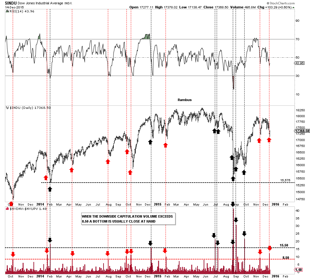
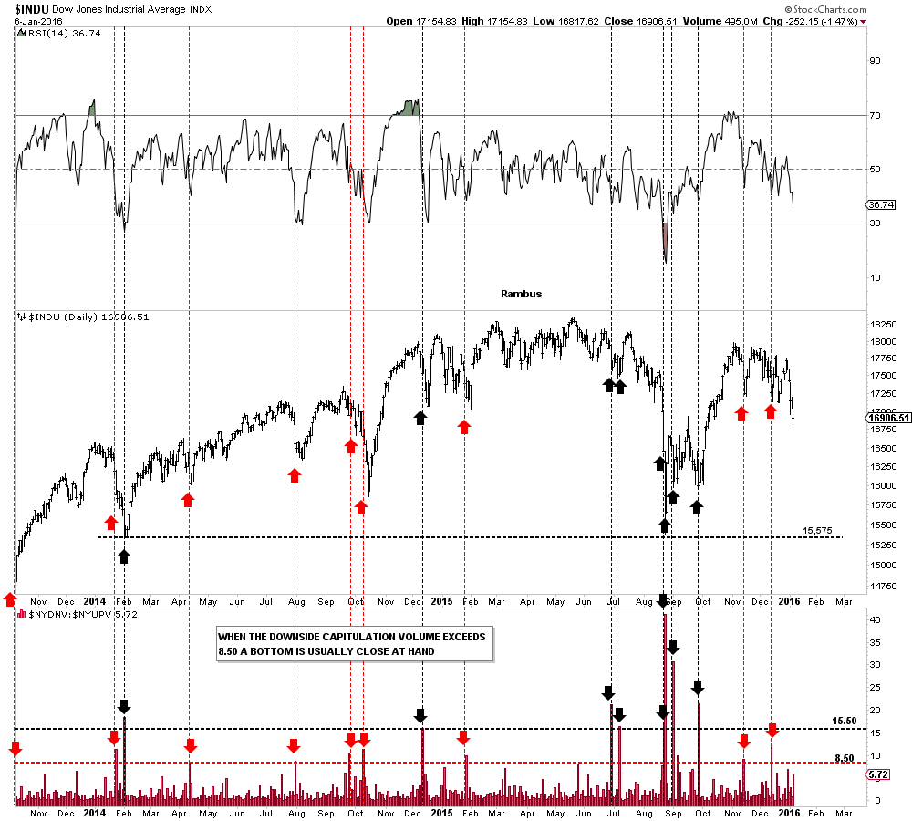
This next chart for the INDU is the down to up volume chart which shows when the down volume out paces the up volume in a big way we usually see some capitulation take place and get a bounce. We had a red arrow in November and December which showed some mild capitulation and a small rally. What’s interesting about this chart right now is that the INDU is making a lower low but the down to up volume isn’t showing any capitulation. As long as the INDU can keep declining without any capitulation spikes the further it can fall before we get some type of relief rally.
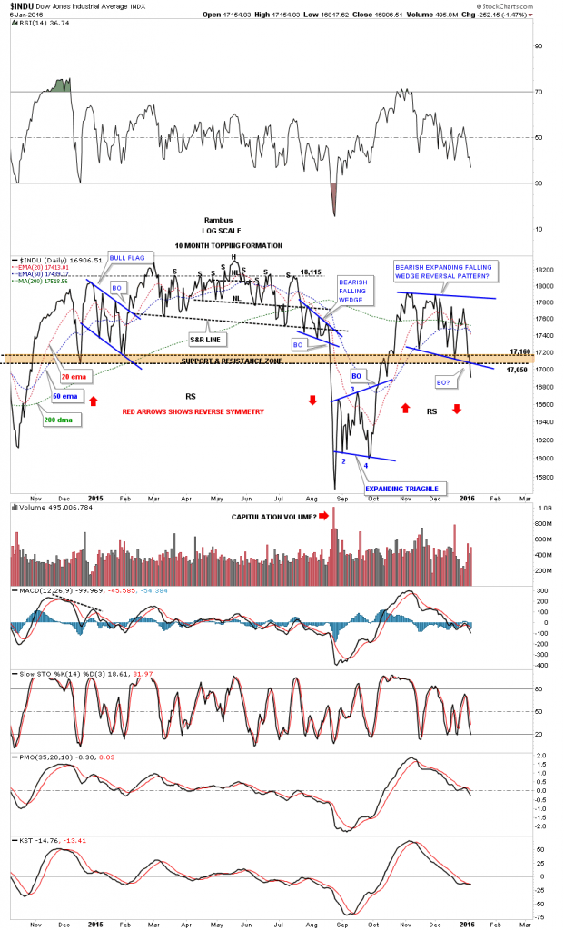
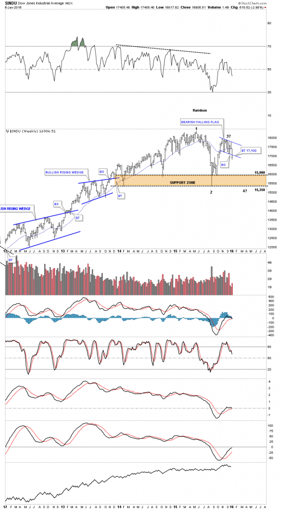
This next chart is a weekly look which now puts the bearish falling flag in perspective. Up until today that flag could have been a bull flag with upside potential. The breakout to the downside is clearly seen now. I also added a brown shaded support and resistance zone which is made from several important lows. I can’t rule out the possibility that the INDU could be building out a big consolidation pattern as one of several scenarios.
The monthly chart below shows what a possible big trading range might look like with the 3rd reversal point in progress to the downside right now.
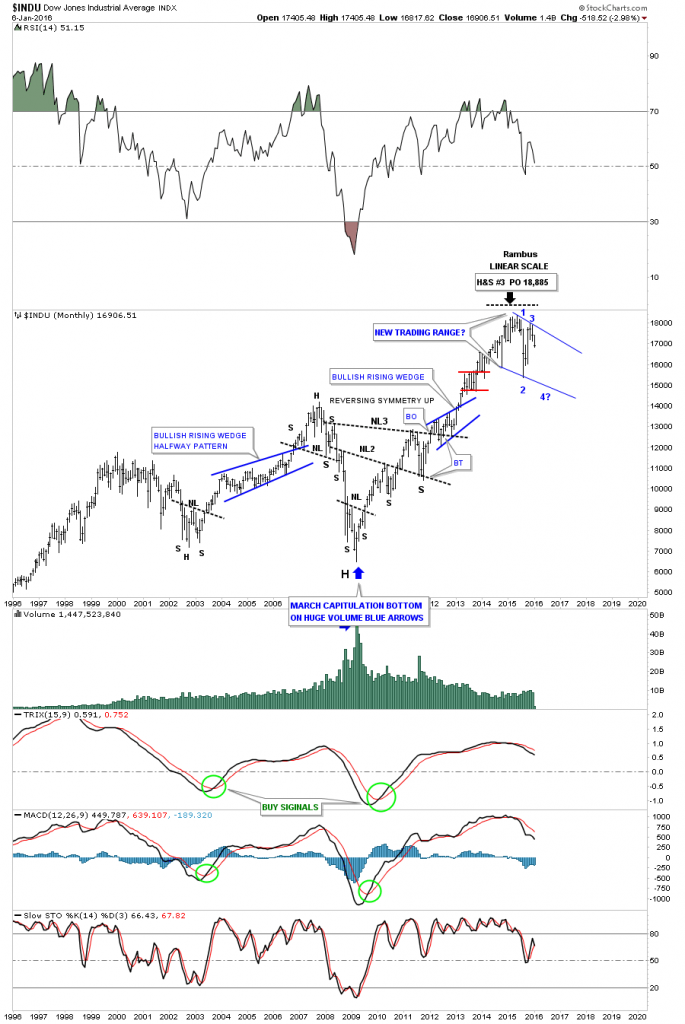
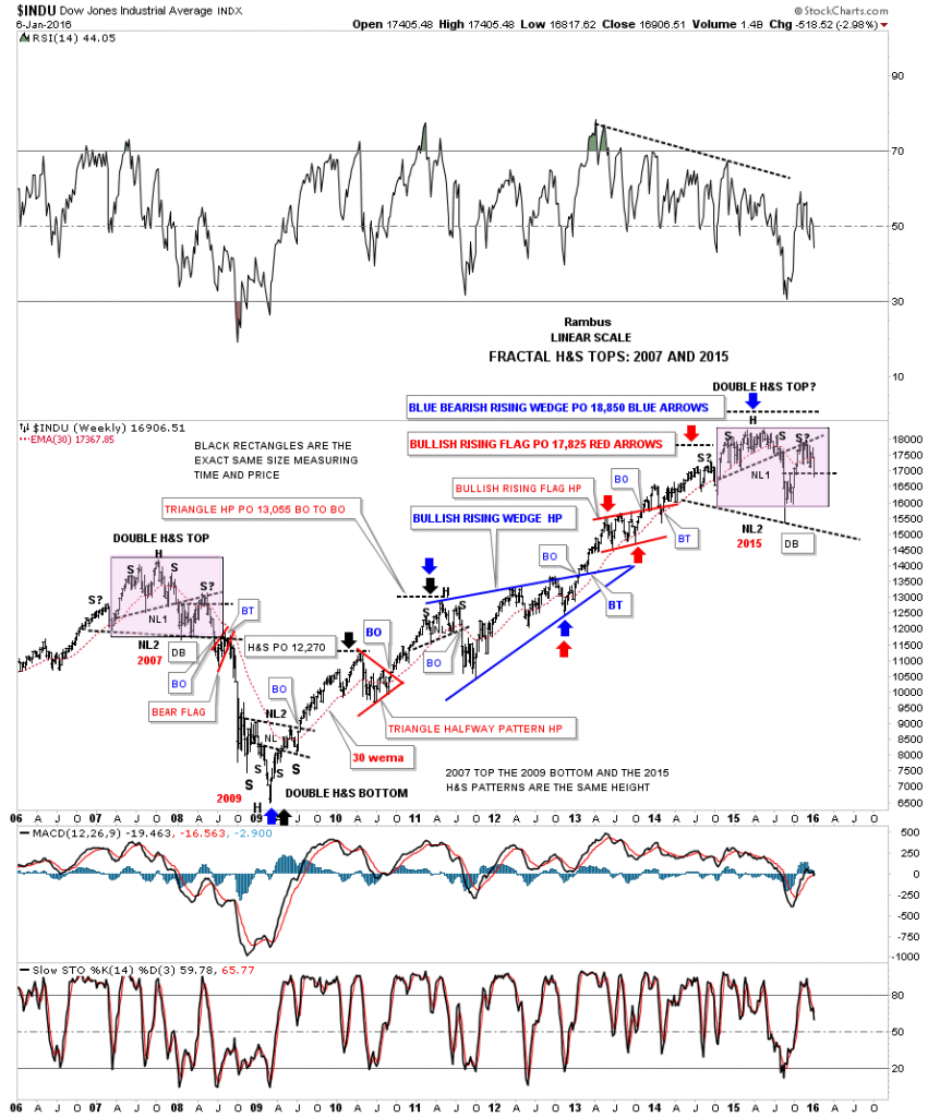
This last chart for the INDU is a weekly fractal chart we’ve looked at a couple of times in the past which compares our current topping pattern to the 2007 topping pattern as shown by the purple rectangles. The last time week looked at this chart the INDU was just starting to trade back up to NL#1 which shows the backtest with the S? on it. With the potential bull flag forming below neckline #1, on the daily chart we looked at earlier, I wasn’t quite convinced that the fractal would keep playing out like it has. If you look at the 2007 fractal top you can see it had a backtest to the underside of neckline #1 after breaking out from a failed double bottom. We have the same situation taking place right now with the INDU’s double bottom failing. If this fractal keeps playing out today’s price action closed basically right on top of the double bottom trendline which would put us in a similar position to the 2007 double bottom trendline.
Note the price action of the 30 week ema during the formation of the 2007 top. Once the INDU broke below the double bottom trendline the decline began in earnest taking out neckline #2. The INDU then formed the red bearish rising flag as the backtest to neckline #2 which took roughly eight weeks to complete before the real fireworks took place to the downside. The INDU never again traded back above the 30 week ema until the inverse H&S bottom formed in 2009. Our current topping pattern for 2015 shows the 30 week ema held resistance this week in a similar fashion to the 2007 top. So here the INDU sits resting right on its double bottom trendline just below its 30 week ema. An interesting juncture for sure.
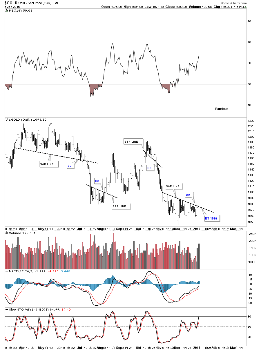
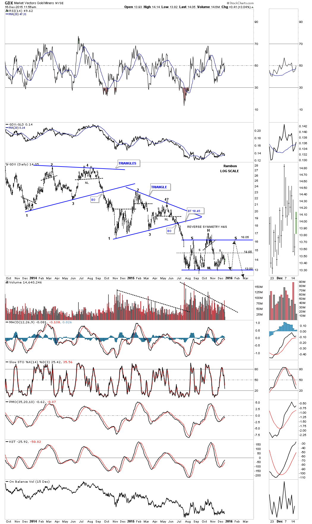
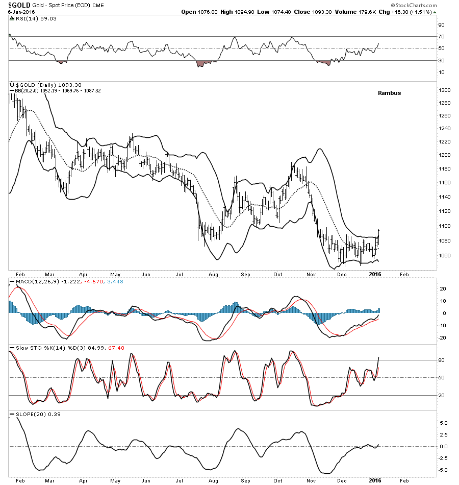
Next lets look at a daily chart for gold which finally showed its hand today. This is just a simple bar chart which shows four support and resistance lines gold made over the last year or so. When you look at the S&R lines just think of the price action as bullish above and bearish below. After flirting with the recent S&R line over the last several days gold finally showed us it was ready to rumble on increasing volume. If we get a backtest to the S&R line it would come in around the 1075 area.
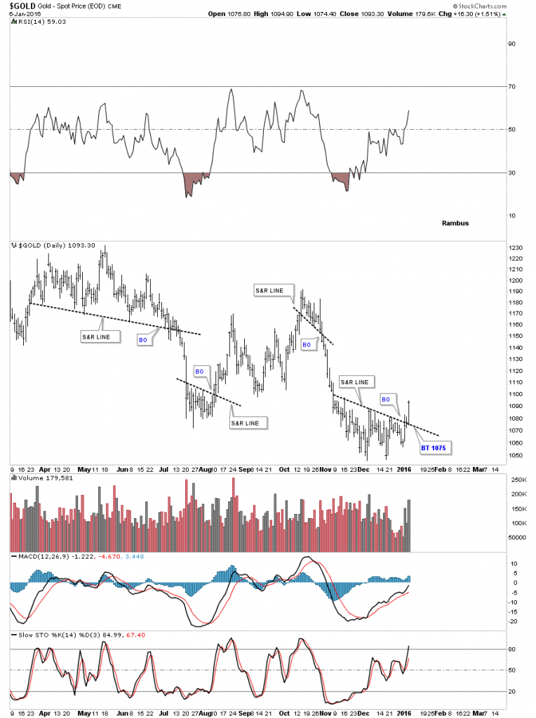
After squeezing pretty close gold closed above the upper BB today which may help in giving us a backtest to the S&R line at 1075.
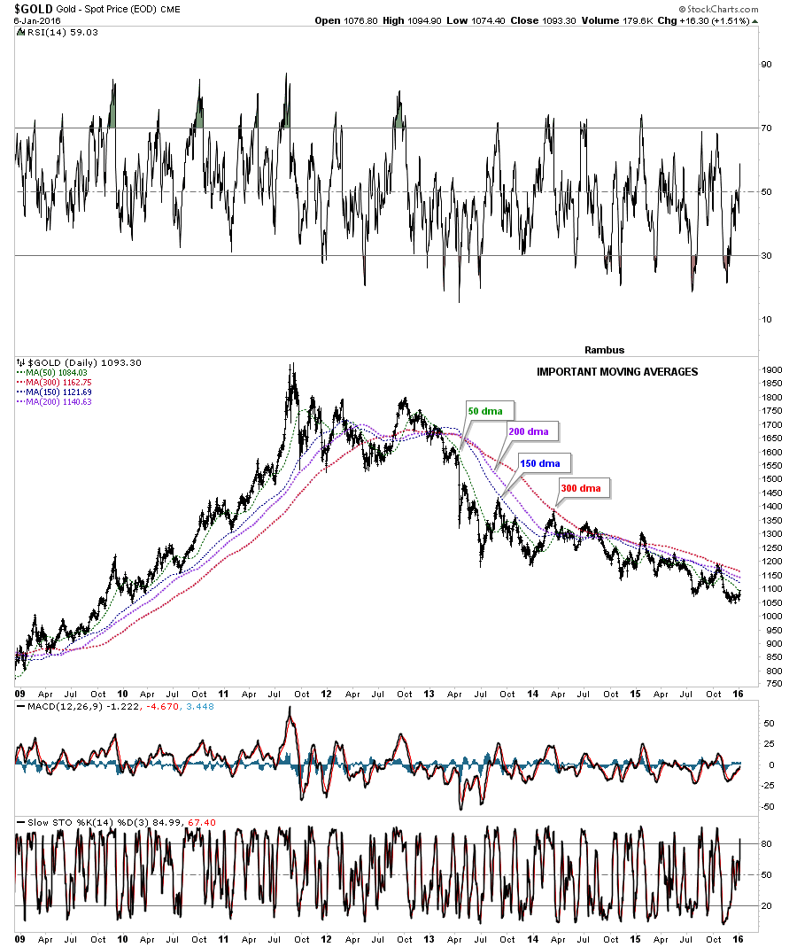
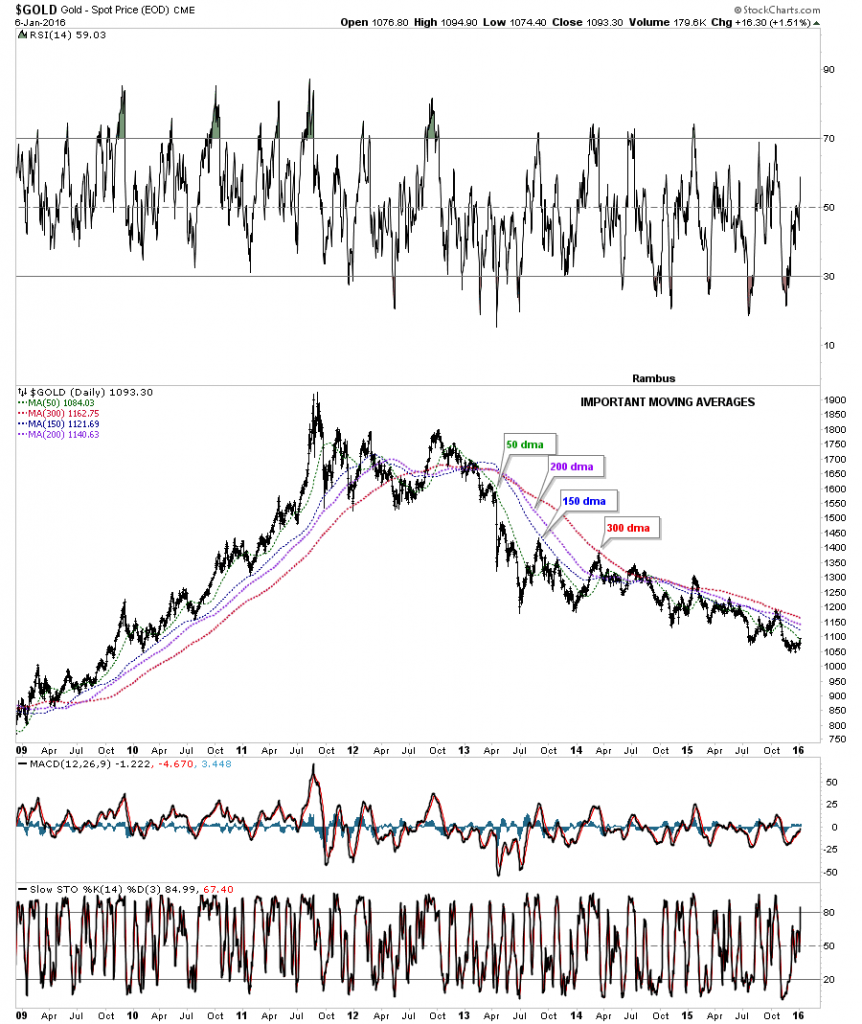
This next long term daily chart for gold shows its most important moving averages. As you can see when they’re properly aligned they do a good job of showing the big trend either up or down. Today gold broke above the lowest moving average the 50 day. The next important moving average is the 150 day which now comes in at 1122 with the 200 day at 1140. The most important moving average is the 300 day which has only been strongly tested twice since the bear market began and is about 70 points higher. Gold will talk to us by the way it interacts with these four moving averages. Is this, THE BOTTOM, only time will tell as its takes time and alot of work to reverse a major trend.
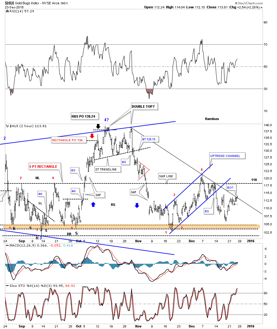
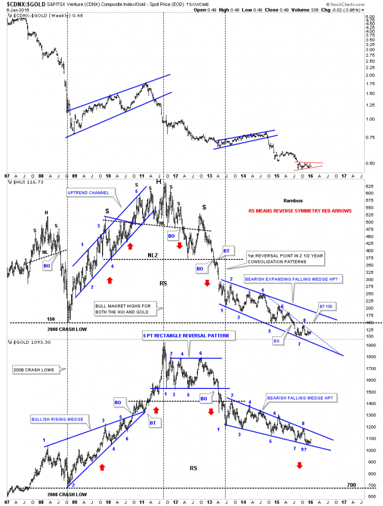
This next chart is a combo chart we’ve looked at several times recently which shows the CDNX on top, the HUI in the middle and gold on the bottom. The last time I showed you this chart I put a 9? at the last reversal point on the gold chart on the bottom. I remember saying, are we going to get a 9th reversal point for gold, when it was touching the bottom rail of the blue falling wedge? We can look at that massive falling wedge two ways. I’ve always thought gold would break the bottom rail to the downside to finish off the bear market in one last capitulation move. If I’m wrong and gold completes its 9th reversal point to the upside and breaks out above the top rail of the falling wedge then we would have a 9 point bullish falling wedge reversal pattern. An odd number of reversal points creates a reversal pattern. A strong move above the 8th reversal point would then setup a pattern of higher highs which is the very first thing we need to see to start an uptrend. As you can see so far gold has been unable to do that since the bear market began in 2011. At some point the lowest tick for the bear market will be made but there is no way to know until we can look back in hindsight and actually see it. Is the low at the 9th reversal point THE LOW for gold’s bear market?
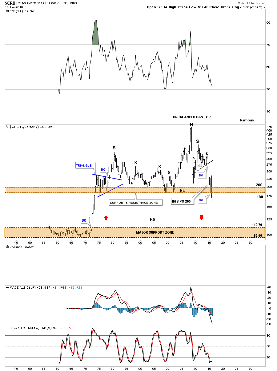
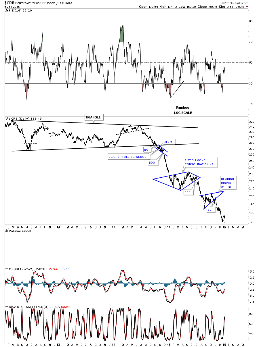
Next lets look at a few commodities charts to see if they are telling us anything. Back in the fall I began writing about another possible inflection point taking place within the commodities complex. This long term daily chart for the CRB index shows the last blue triangle which formed and was backtesting the bottom rail when I suggested another inflection point maybe at hand. Today the CRB index made a new low for its bear market that began in 2011.
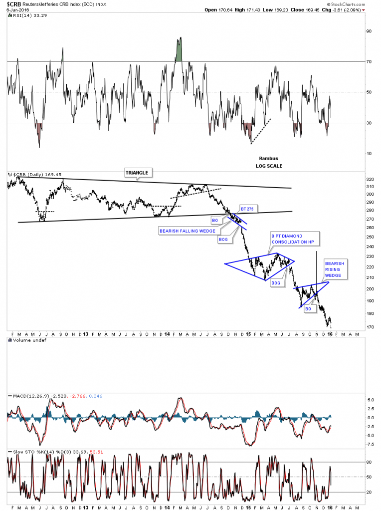
This next chart is the 60 year quarterly chart for the CRB index I showed you when the price action was still trading inside the brown shaded S&R zone. It still boggles the mind to think that the CRB index could reverse symmetry all the way down to the 1970’s major support zone. The very first thing I would like to see on the bullish side is a move back above the brown shaded S&R zone. That would be a good start to reversing this bear market.

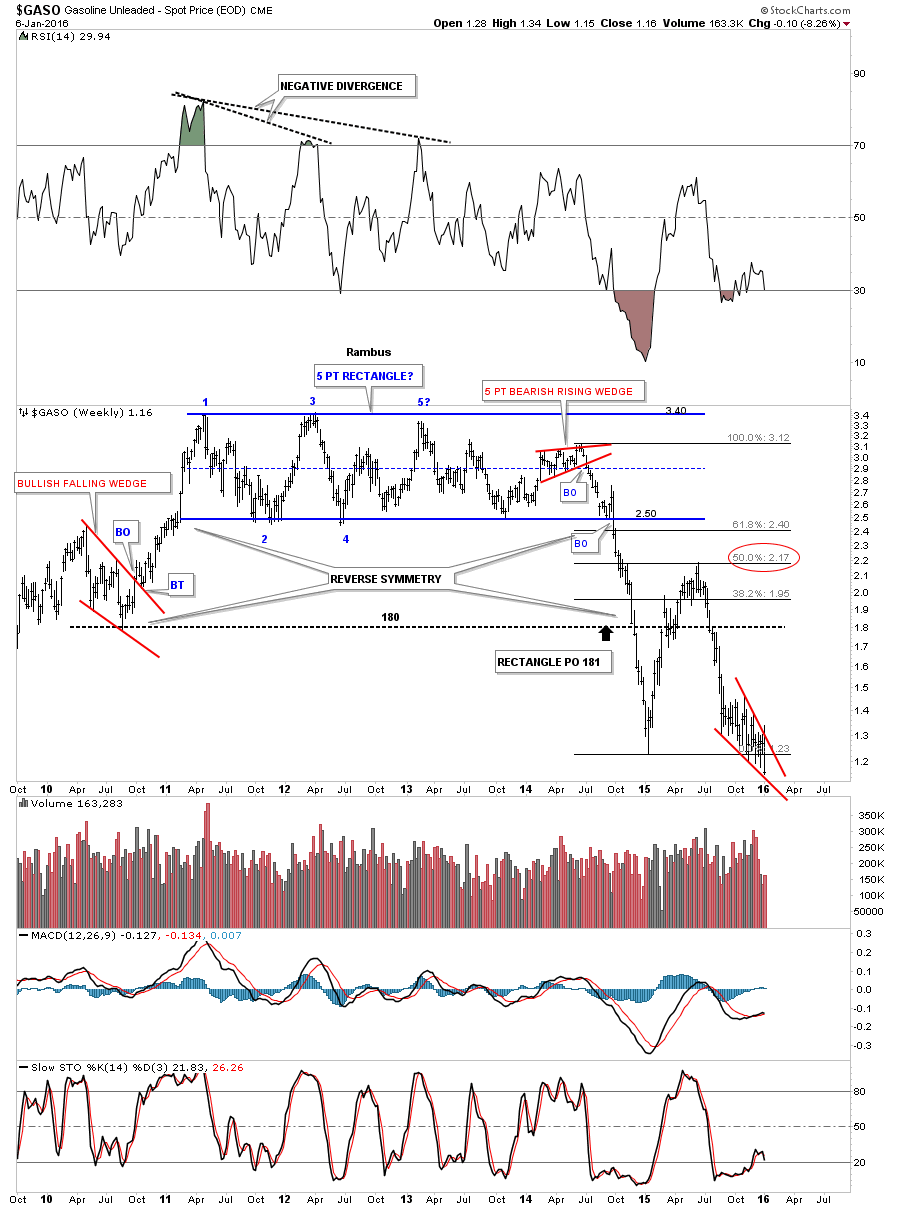
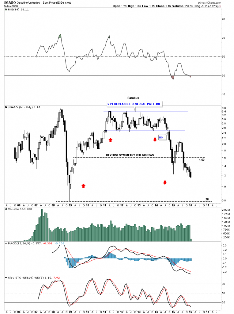
Below is a weekly chart for $GASO, gasoline, which shows the price action sitting on the bottom rail of a falling wedge at new lows for its bear market.

The monthly chart for GASO shows a long string of black candlesticks, all in a row to the downside, which is showing the strength of this impulse move lower.
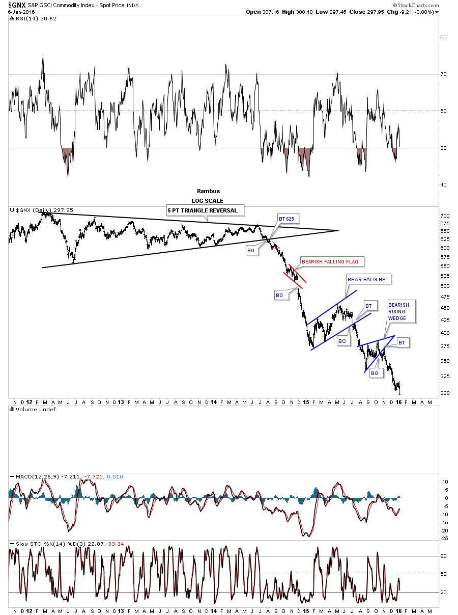
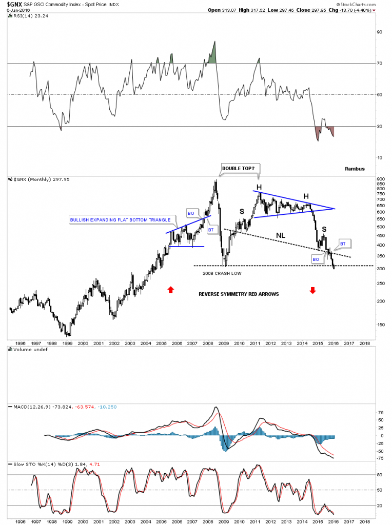
This next commodities index I follow is the $GNX which is making a new low today.

The monthly chart for $GNX shows it’s now cracking the 2008 low with a H&S top in place which is the right side of a possible huge double top.
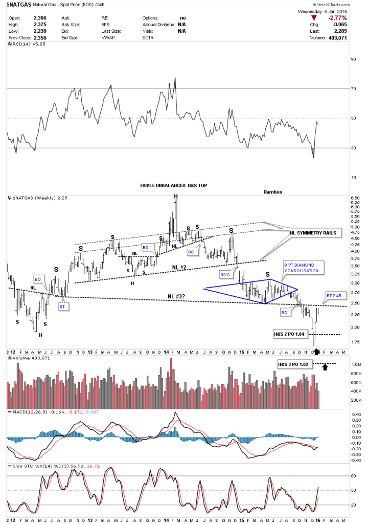
The weekly chart for $NATGAS shows it reached the price objective for H&S #2 and got a big bounce back up to just below neckline #3. So far it has fallen about .10 short of reaching a complete backtest.
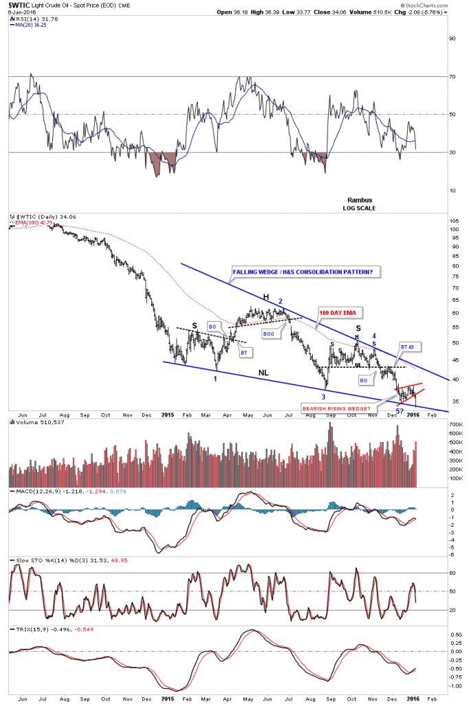
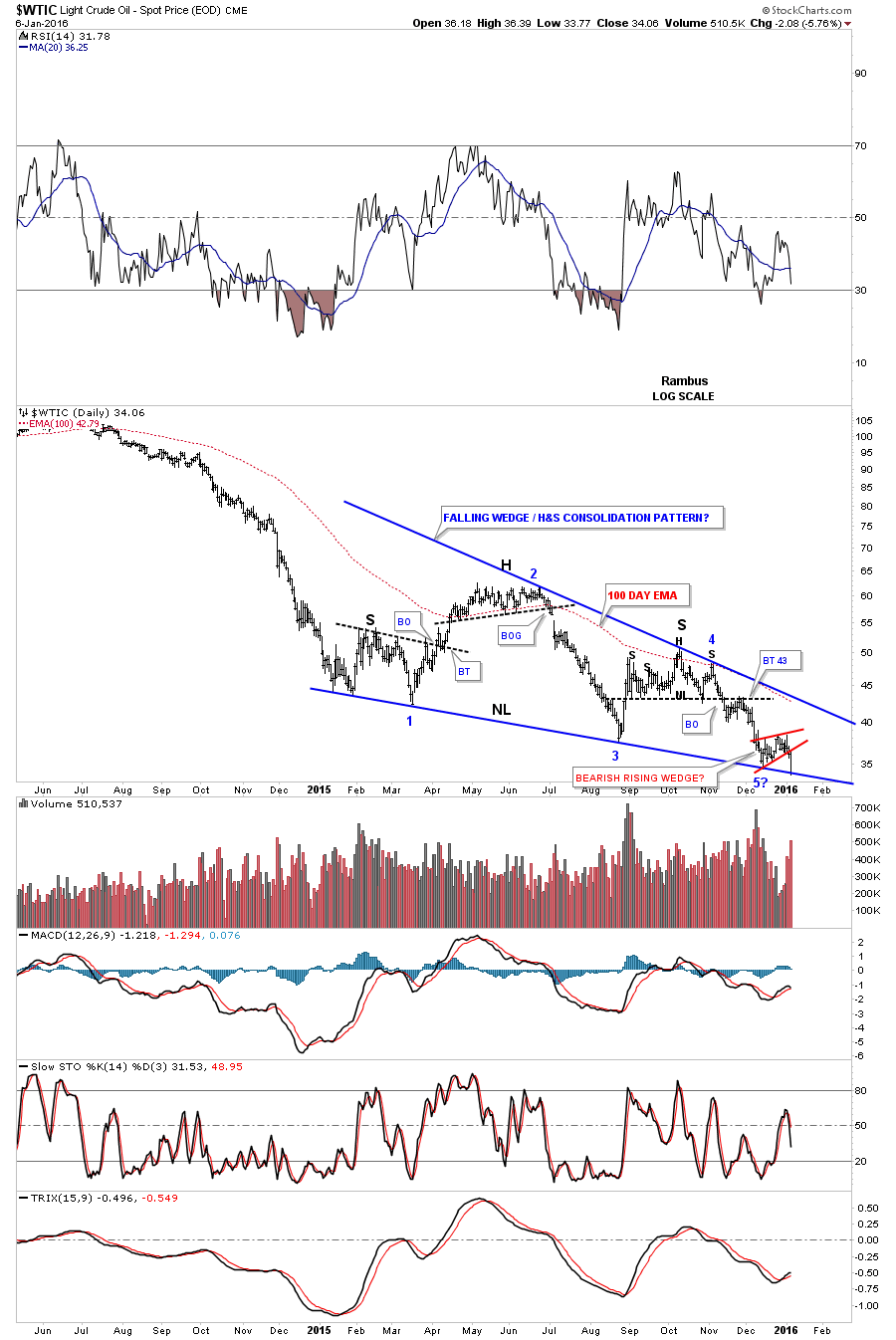
As I’m running out of time this last chart for tonight will be a daily look at oil. We’ve been following this chart way before the price action started to form the combo H&S / falling wedge, which I’m calling a consolidation pattern. We’ve discussed this many times in the past. Whenever you see a smaller consolidation pattern form on top of an important trendline, such as the bottom rail of the blue falling wedge / neckline, that is usually a bearish setup. Today oil broke out of the little red bearish rising wedge and stopped at the bottom blue trendline / neckline. It’s very close to breaking out of the very large falling wedge / H&S neckline.
Word Press is giving me some problems tonight so I’ll post the daily chart for oil when I get things corrected. All the best…Rambus
Got it.