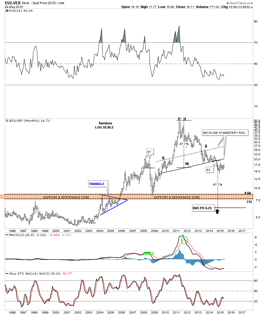
In this Weekend Report I would like to show you an in depth look at some of the more important currencies on the planet to see where we’re at in the big picture and how they may affect the price of gold. In general when a currency (other than the US Dollar) is headed lower the price of gold tends to rise and just the opposite happens when a currency rises . So following the different currencies is important.
With the US dollar being the most important currency we’ll start there.
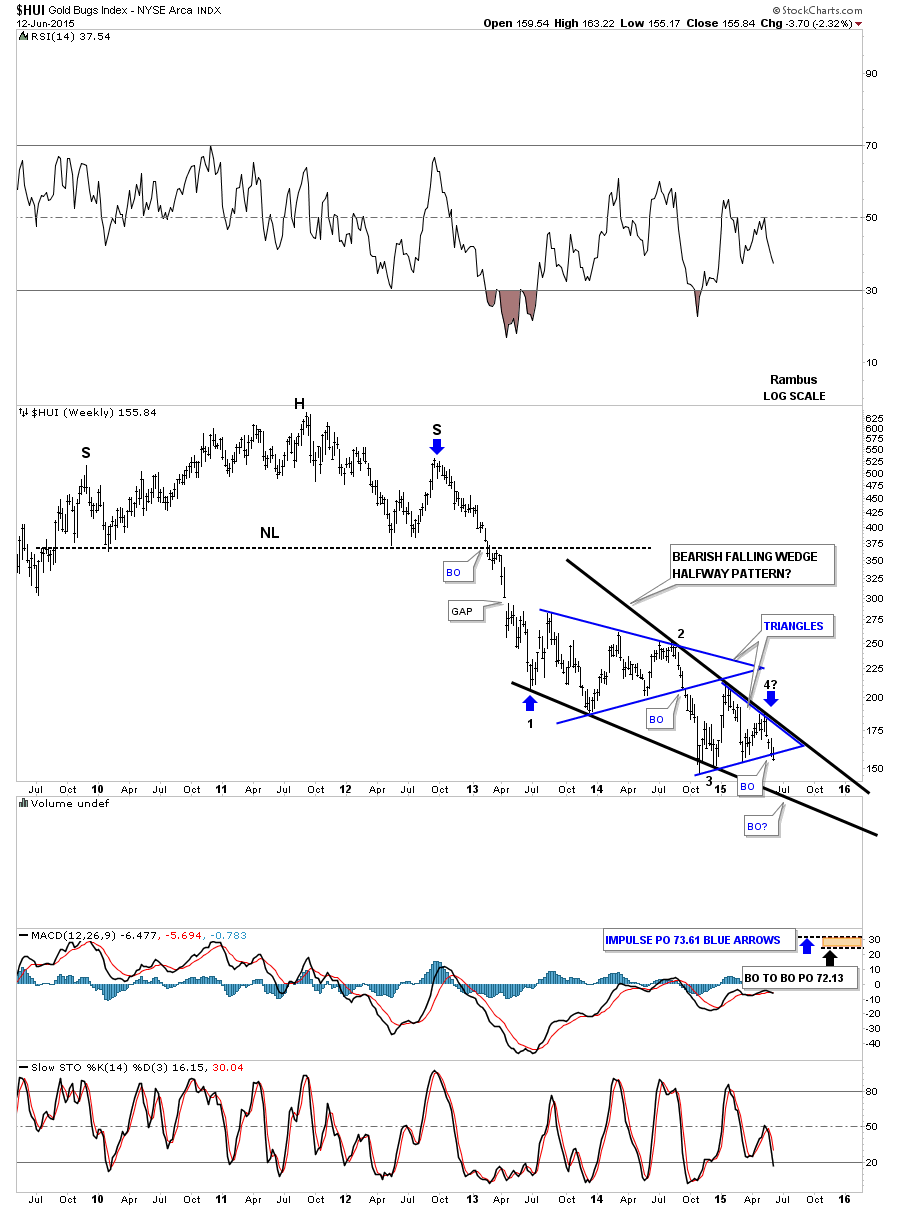
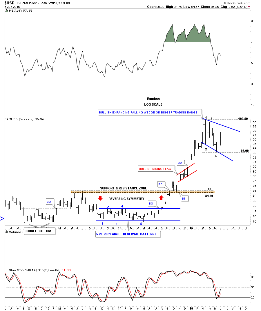
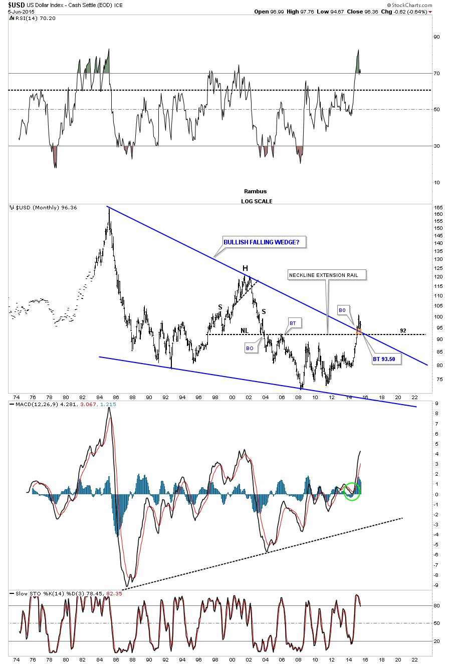
The first weekly chart for the US dollar shows the blue 5 point rectangle, at the bottom of the chart, that launched the US dollar on a near parabolic move higher. The rally finally ran out of gas in March of this year and has been consolidating those gains made over the last year or so. We are at a place where I would like to see a bigger consolidation pattern forming . Bigger than any other consolidation pattern since the last reversal point on the blue 5 point rectangle pattern at the bottom of the chart. As you can see, at the top of the chart, the US dollar has been chopping out an expanding falling wedge since the March high. There have been three completed reversal points so far with the possible 4th one in progress right now.
A break of the top rail would be very constructive in completing the potential blue expanding falling wedge which I would then view as a halfway pattern to the upside. The other scenario would be that many times a chart pattern can morph into a bigger consolidation pattern. In this case reversal point #1 would still be the first reversal point in a bigger consolidation pattern but the most recent low labeled #4 would just be the second reversal point with a third one to form somewhere around the highs and then one more leg down to create the 4th reversal point. The pieces of the puzzle are coming together but we still need to see a few more pieces to complete the picture. The bottom line is that a solid breakout to new highs above the first reversal point would be extremely bullish for the US dollar and not so good for the PM complex and commodities in general.
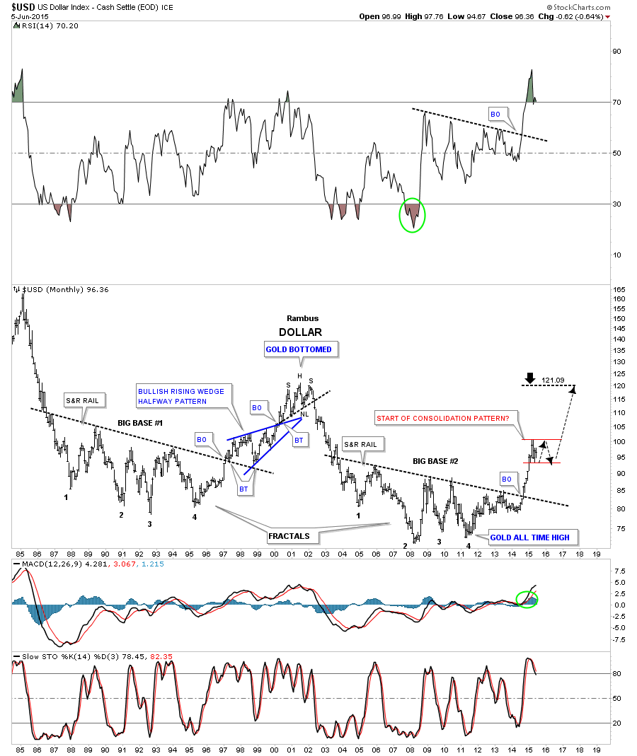
This next long term chart for the US dollar I first showed you when it backtested the top rail of the massive bullish falling wedge as shown by the little brown box. What this implies is that the low, on the weekly chart above, is the low for this correction even if the current pattern morphs into a bigger consolidation pattern. It will still be a consolidation pattern but just a bigger consolidation pattern.
If the blue expand falling wedge fails to breakout and this pattern morphs into a bigger consolidation pattern, the monthly chart below shows you how it may look in the big picture. Regardless of which pattern eventually wins out you can see how this is a perfect area for some type of halfway consolidation pattern to build out. A halfway pattern in this area would show a price objective up to the old highs around the 120 area.
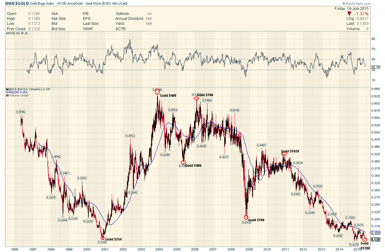
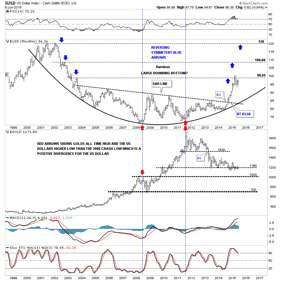
The next chart is a long term monthly combo chart that has the US dollar on top and gold on the bottom. The US dollar shows a huge rounding bottom that is reversing symmetry to the upside as shown by the blue arrows. How it came down is how it’s going back up. As you can see the US dollar is at its first important area of resistance based on the black dashed horizontal line at 98.65 which extends to the high made back in July of 2003. That little congestion area took about 4 months to compete before the price action started to break down again. We’re currently in our fourth month of consolidating the first leg up.
The gold chart at the bottom shows it just chopping around the bottom of its nearly 2 year consolidation pattern. Gold has held up pretty well based on the near vertical rally the dollar had over the last year or so. At this point, if the US dollar does in fact breaks out to new highs for this move, I think it will put enough pressure on gold will finally break below its nearly two year bottom trendline and begin its next impulse move down.
Below is weekly combo chart that has the US dollar on top and gold on the bottom which shows more clarity. The chart on top shows the US dollar has corrected 38% of its big move off of the March low from last year which is another reason why I think we’ve seen the low. The only real question is how long the consolidation phase will last?
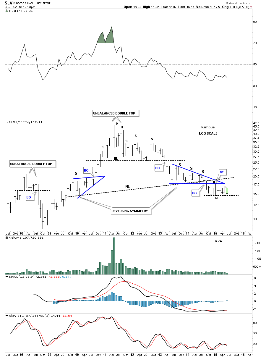
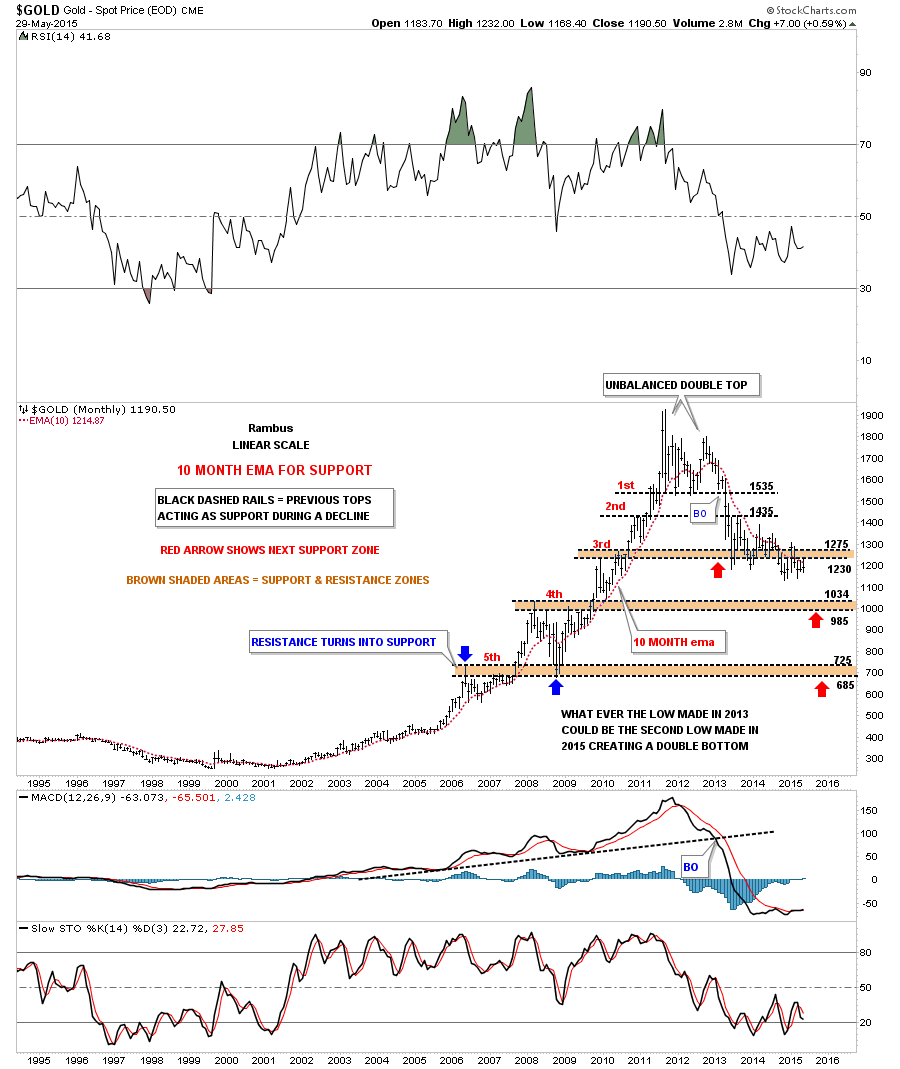
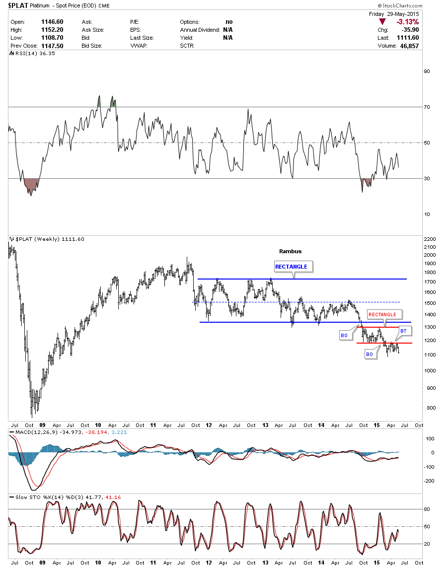
The gold chart on the bottom shows a pretty well defined two year falling wedge. This chart also shows you the brown shaded support and resistance zone, between 1000 and 1035 or so, where anyone who is bearish on gold is looking for the Bear Market to end. However As I’ve shown you in other similar charts for gold, this nearly two year consolidation has a much lower price objective than 1000 . What we may see is a strong bounce off of the brown shaded S&R zone which would then backtest the bottom rail of the two year six point falling wedge and then one last big move down to end the bear market. It’s just speculation at this point but there will most likely be some buyers around the 1000 area that will offer initial support. At any rate things are starting to get interesting.

Next lets look at some long term charts for some of the more important currencies on the planet. Most of these currencies have built out massive topping patterns we looked at when they began their first impulse move down last year.
First the Chartology of the Other “Dollars”
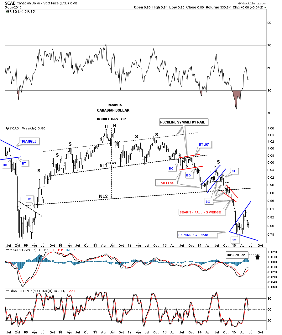
The CAD, Canadian Dollar, built out a massive H&S top which broke down late last year. This chart shows you several good examples of what I’m referring to when I say it’s usually a bullish or bearish setup, in this case bearish, when you see a smaller consolidation pattern form just above, just below, one on top with one below or in some case right on the important trendline. The Canadian Dollar formed a double H&S top and then formed a red bear flag just below Neckline #1 before it moved lower. In regards to Neckline #2 it built out a small blue bear flag above the neckline and then once the neckline was broken to the downside the Canadian Dollar formed a small red bearish falling wedge as the backtest. Like the US dollar the Canadian Dollar is still in the process of building out its current consolidation pattern which so far is taking on the shape of an expanding triangle and is finding some support at the previous recent highs.
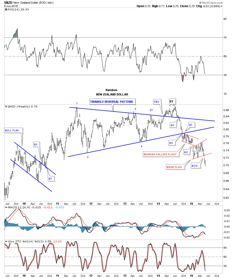
Next lets look at the NZD, New Zealand Dollar , which is one of the weaker currencies out there. This chart broke out of a small red bear flag two weeks ago and looks to be headed lower.
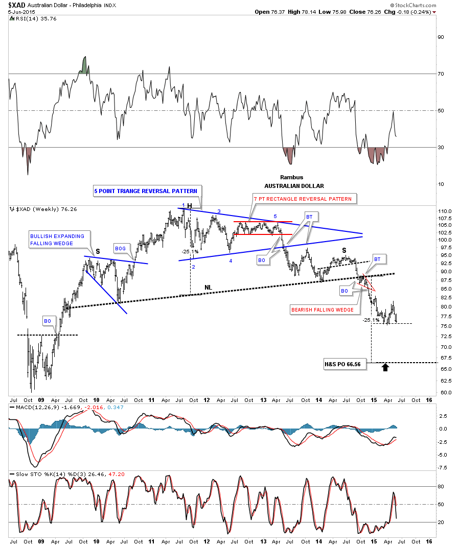
The XAD, Australian Dollar, built out a rather complex massive topping pattern with a blue 5 point triangle several pattern. It then went on to form a smaller right shoulder vs the left shoulder but it’s still a shoulder which created a huge H&S top. It formed the little red bearish falling wedge just below the neckline as the backtest which told me the neckline was hot. As you can see the XAD is sitting right on its low from the first impulse move down. It may give us an early heads up if it starts to break down hard.
Any way you slice them these Other Dollars are getting Smaller versus their big brother .
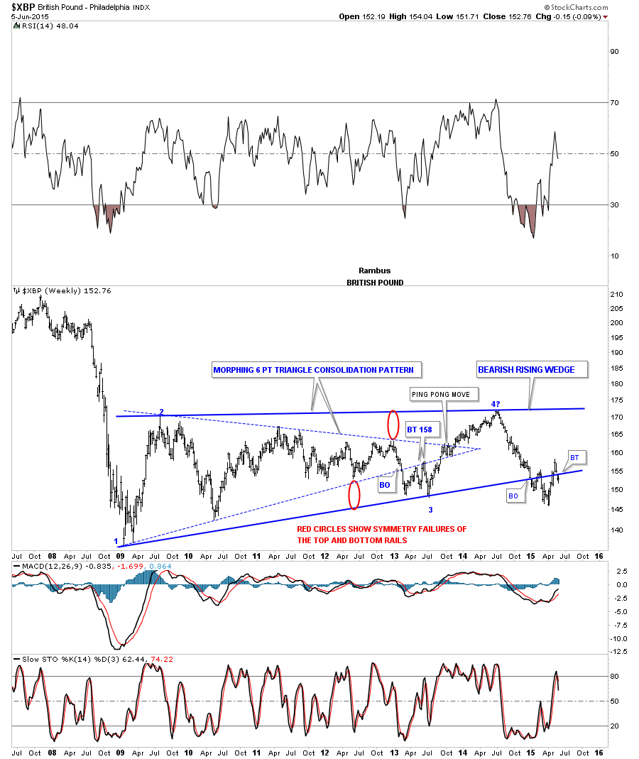
I wonder if anyone remembers this weekly chart for the XBP, British Pound, when it began to morph from the original blue dashed triangle consolidation pattern? When it became apparent that we had a false breakout to the downside I then drew in the bottom red circle which shows the distance of the false breakout. Generally when you see a false breakout like this the top rail will morph about the same distance as the failed breakout. I just took the bottom red circle and moved it up to the last high in the original blue dashed triangle which gave me a place to look for a high to come in play. That new high ended up being the 4th reversal point in a six year bearish rising wedge. The breakout and backtesting process has been a little sloppy but nothing is broken yet in that regards. At this point I would like to see the price action stay below the bottom blue rail and begin its next impulse move down. If you look real close you can see a small gap that was formed about two weeks ago when the XBP traded below the bottom blue rail.
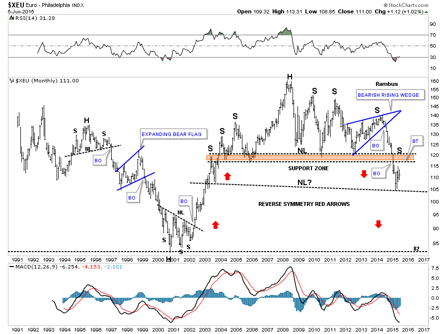
Next lets look at the euro which has the biggest weighting in the US Dollar Index. This first chart shows an inverse bearish expanding rising wedge vs the bullish expanding falling wedge we looked at on the US dollar chart earlier. Like the US dollar, it still hasn’t completed its fourth reversal point to the downside yet , so the chop continues.
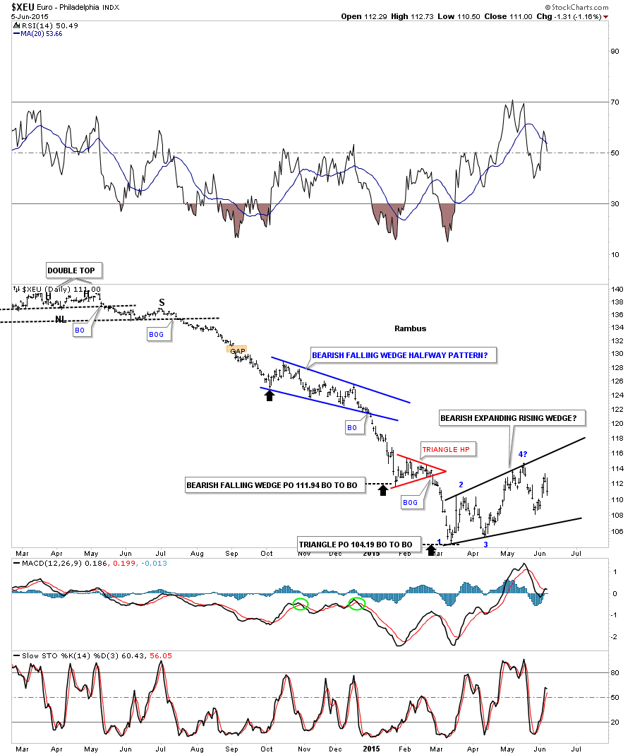
This next chart for the euro shows it built out a very large downtrend channel. The euro found initial support right where you would expect, the bottom rail, where we see an initial pop. The 105 area is a critically important area of support for the euro.
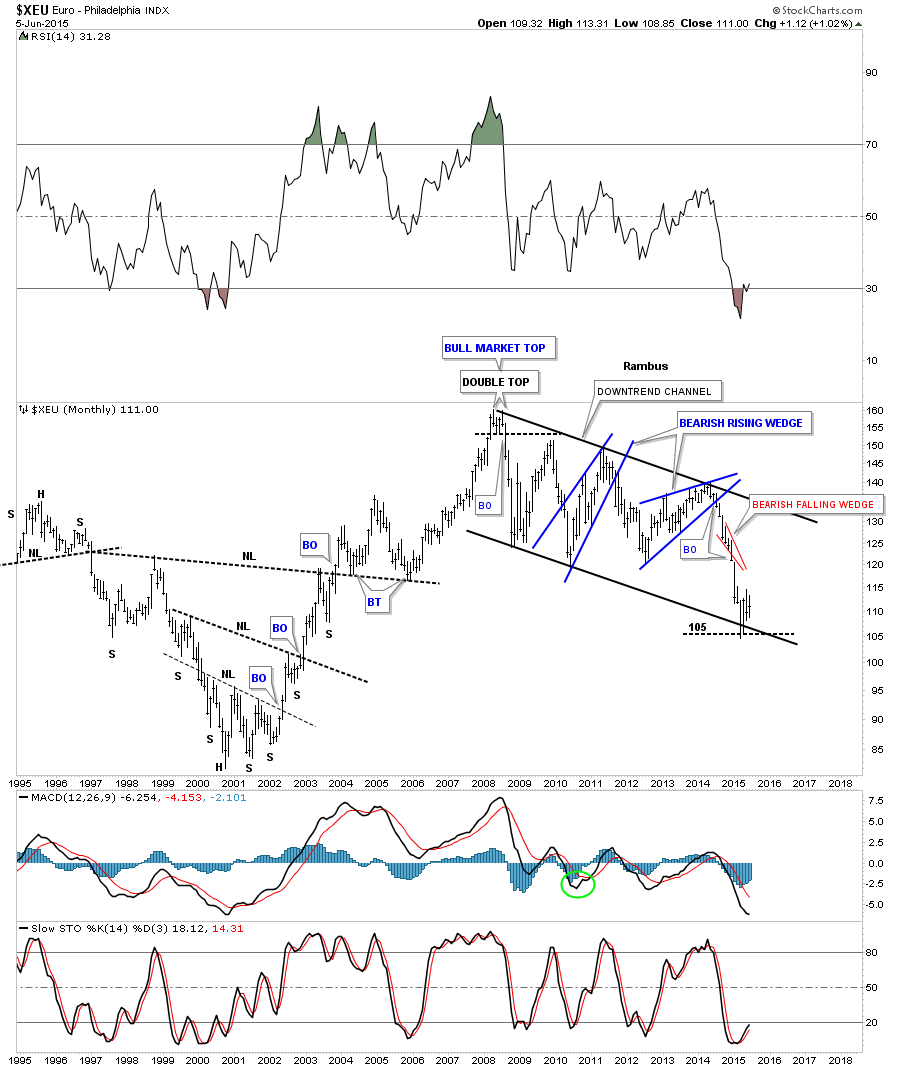
This next long term monthly chart for the euro shows a very large H&S topping pattern which broke below the brown shaded S&R zone. That was a big deal as the odds are very high now that it will reverse its role and act as resistance on any rally attempt. I showed you on the long term chart for the US dollar the big rounding bottom which was testing initial resistance at 98.65 as it was reversing symmetry back up. This monthly chart for the euro shows the exact same thing as it’s finding support at the same relative spot. I left the S&R rail horizontal on the US dollar chart but on the euro chart I drew in a potential neckline based on the reverse symmetry taking place right now. This little counter trend rally maybe forming a small right shoulder similar to the one on the left hand side of the chart. Anyway you slice it that is a massive topping pattern on the euro.
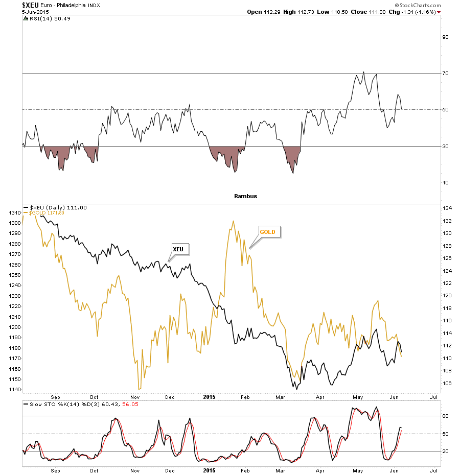
This next chart for the euro I overlaid gold on top of it to see if there is any correlation between the two. As you can see sometimes there is and other times not so much. I remember during the first part of this year was very frustrating when I would look at this chart as the euro wasn’t really going anywhere but gold had a strong rally. Since the first part of May the two have been moving fairly close to each other with gold taking the lead lower.
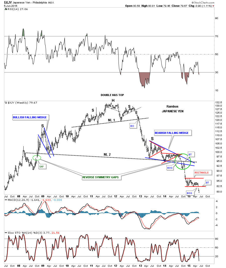
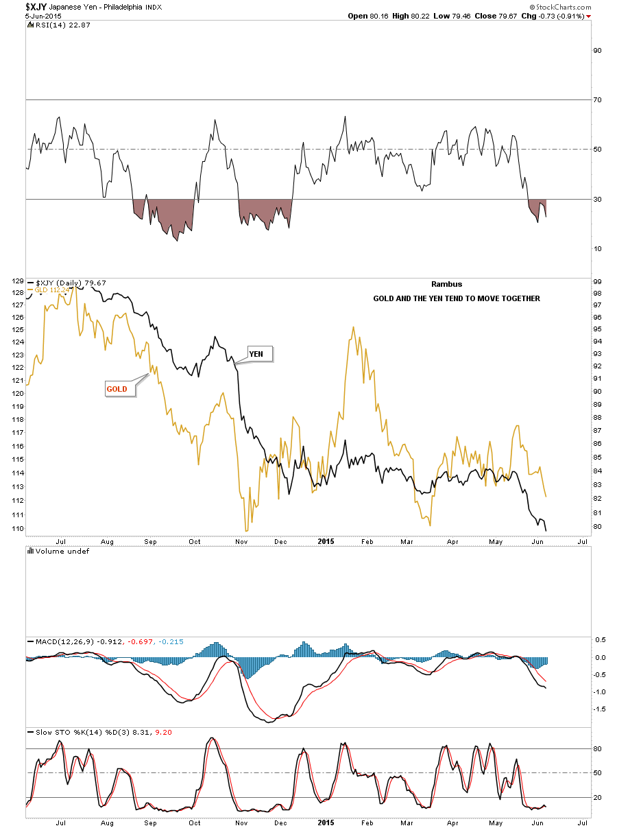
Now lets look at the XJY, Japanese Yen, which shows it built out a massive double H&S top we’ve been following since the breakout from the smaller H&S top. If you recall the right shoulder was formed by the creation of the blue bearish falling wedge. There was a breakout gap of neckline #2 which I showed was a reverse symmetry gap where one had formed when the Yen was in its bull market, green circles. The Yen maybe giving us the biggest clue that the consolidation phase, that started at the all important November low for the PM complex also, maybe coming to an end. As you can see the Yen broke out of the small red rectangle, with a breakout gap, two weeks ago. This is a very big deal IHMO.
Below is a daily chart where I overlaid gold on top of the yen. Gold in US dollars actually has a stronger correlation to the Yen than to the euro. Again, you can see where gold was much stronger than the yen during the first part of this year which was very frustrating at the time as you know the correlation is generally pretty good. Since May of this year the correlation is back as both are moving lower at the same time.
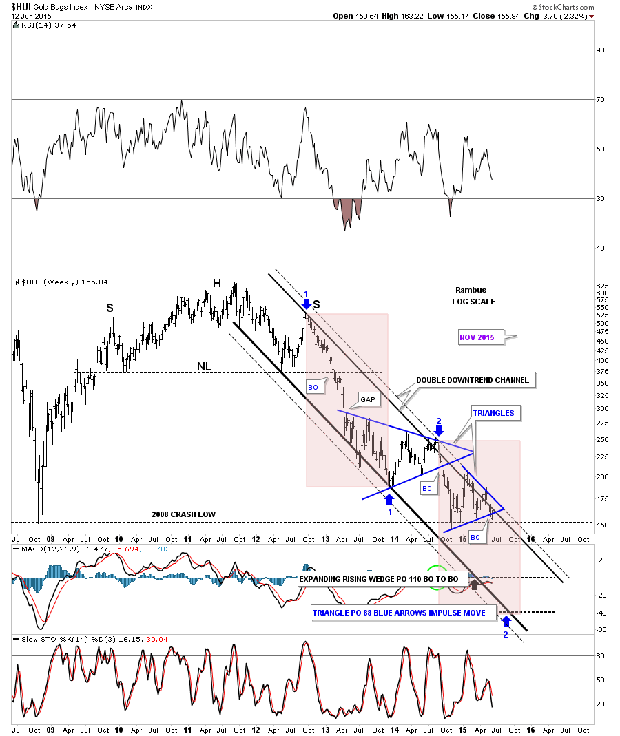
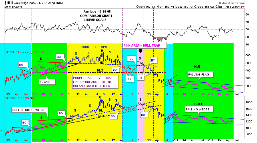
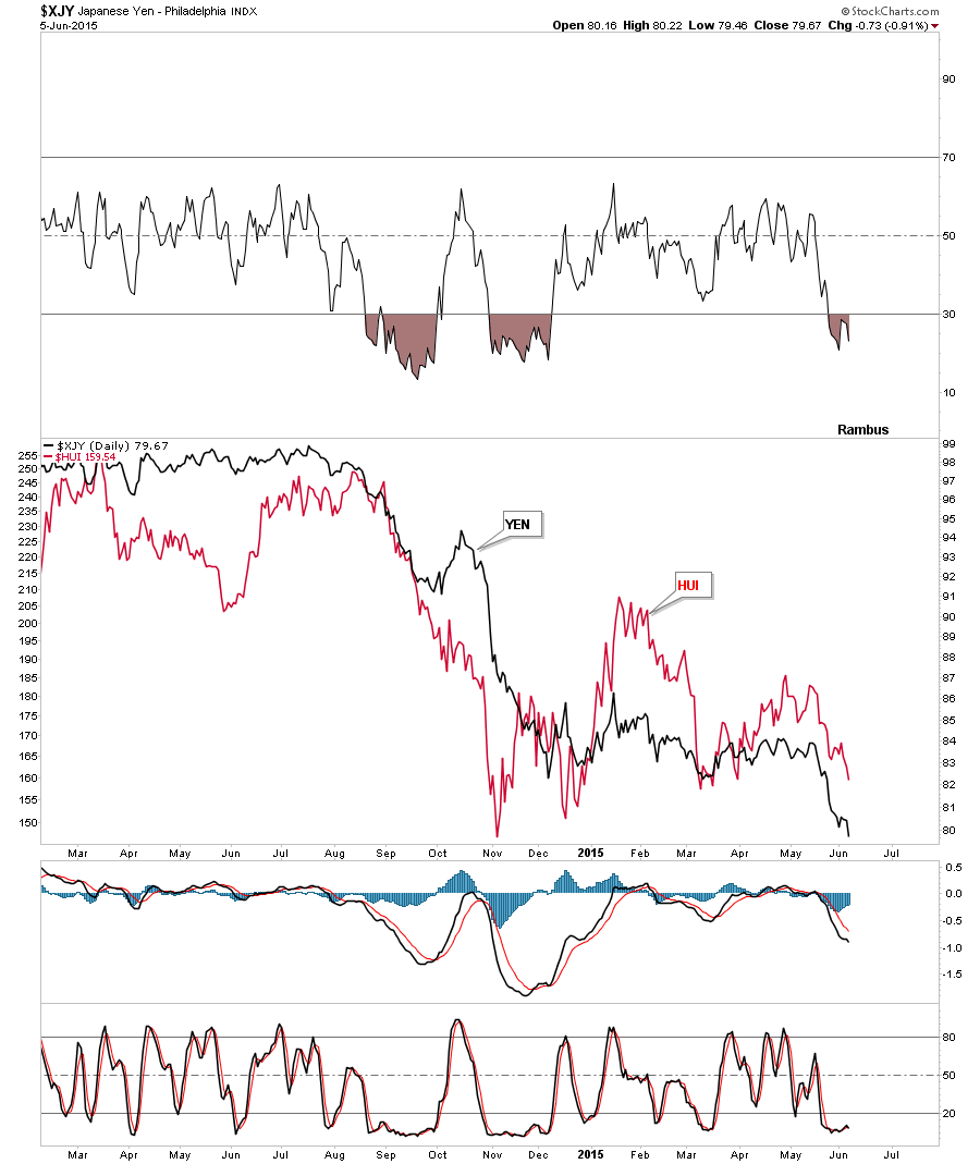
This next chart I overlaid the HUI on top of the Yen to see the correlation. It’s never perfect but there are times when they move pretty much in lock step to each other as shown since March.
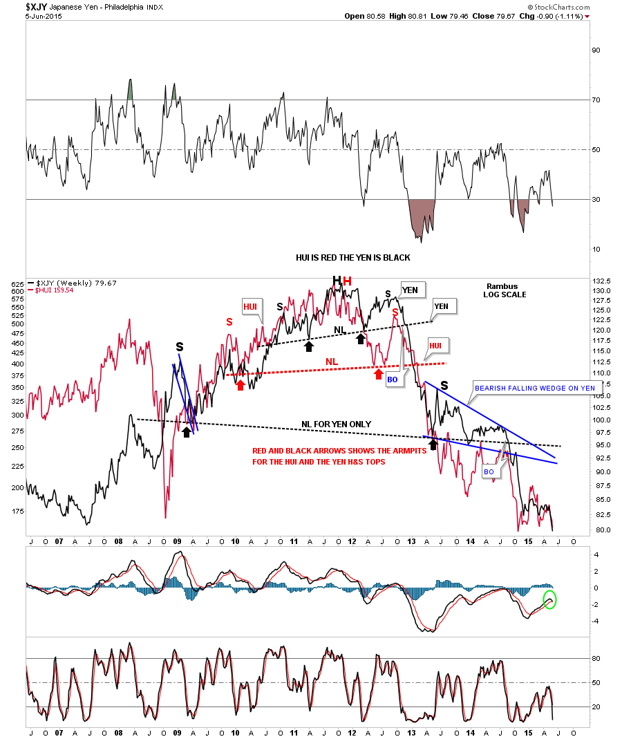
This next long term weekly chart shows the correlation between the Yen and the HUI going back over nine years. This chart looks a little sloppy but it does show the correlation between the two over a long period of time. The HUI in red shows its big H&S top while the yen in black shows its double H&S top. The red arrows shows the armpits for the HUI and the black arrows shows the armpits for the Yen. Looking at the bottom right hand side of the chart you can see the correlation has been pretty good since that all important November low from last year.
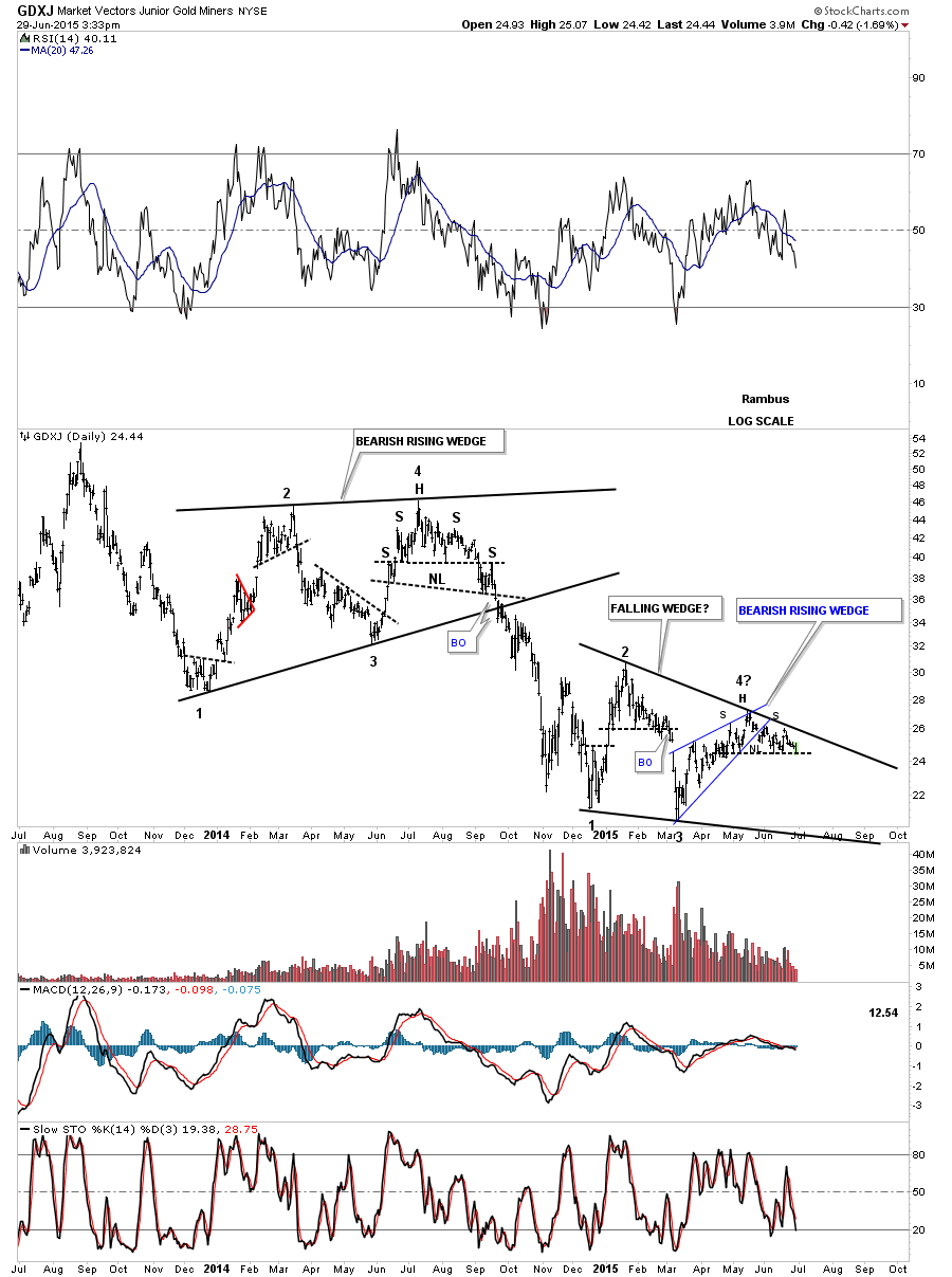
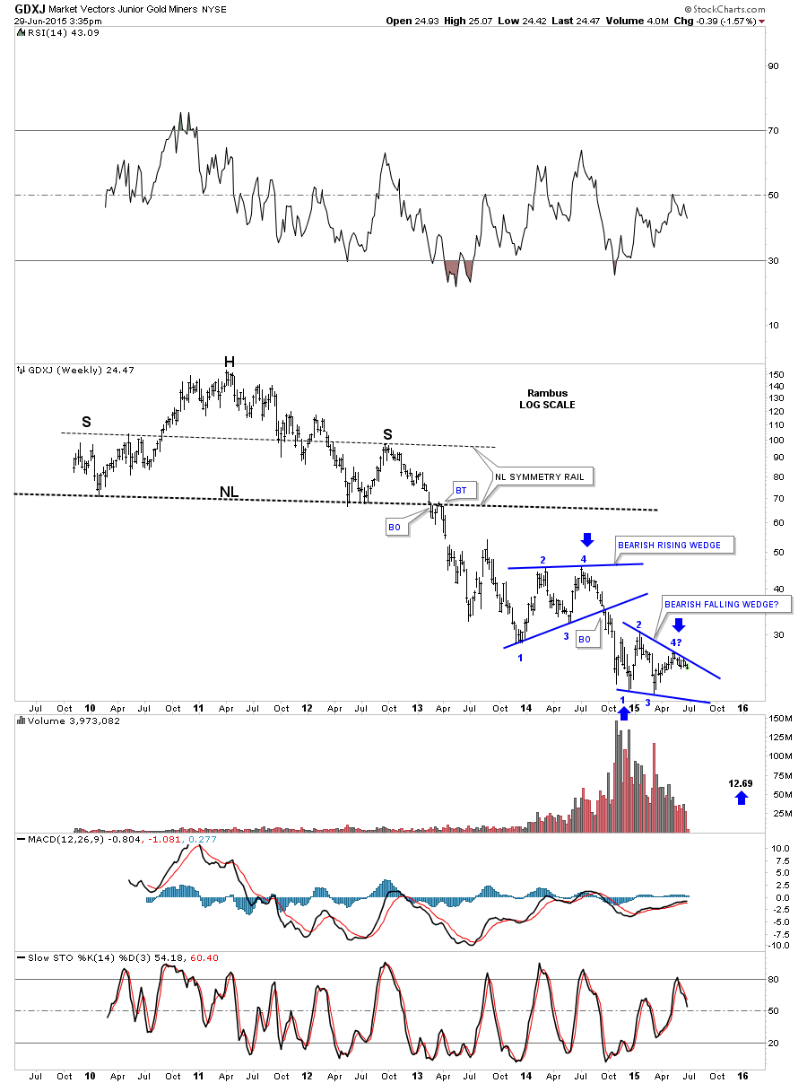
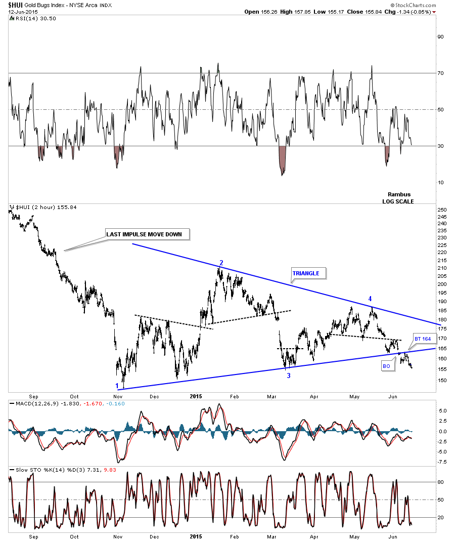
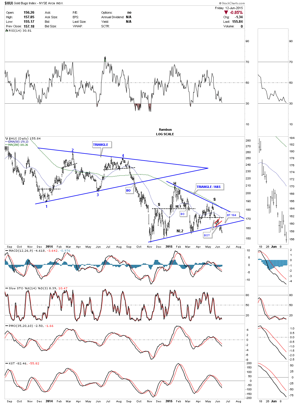
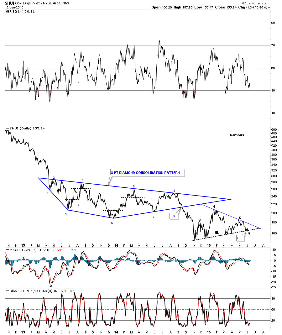
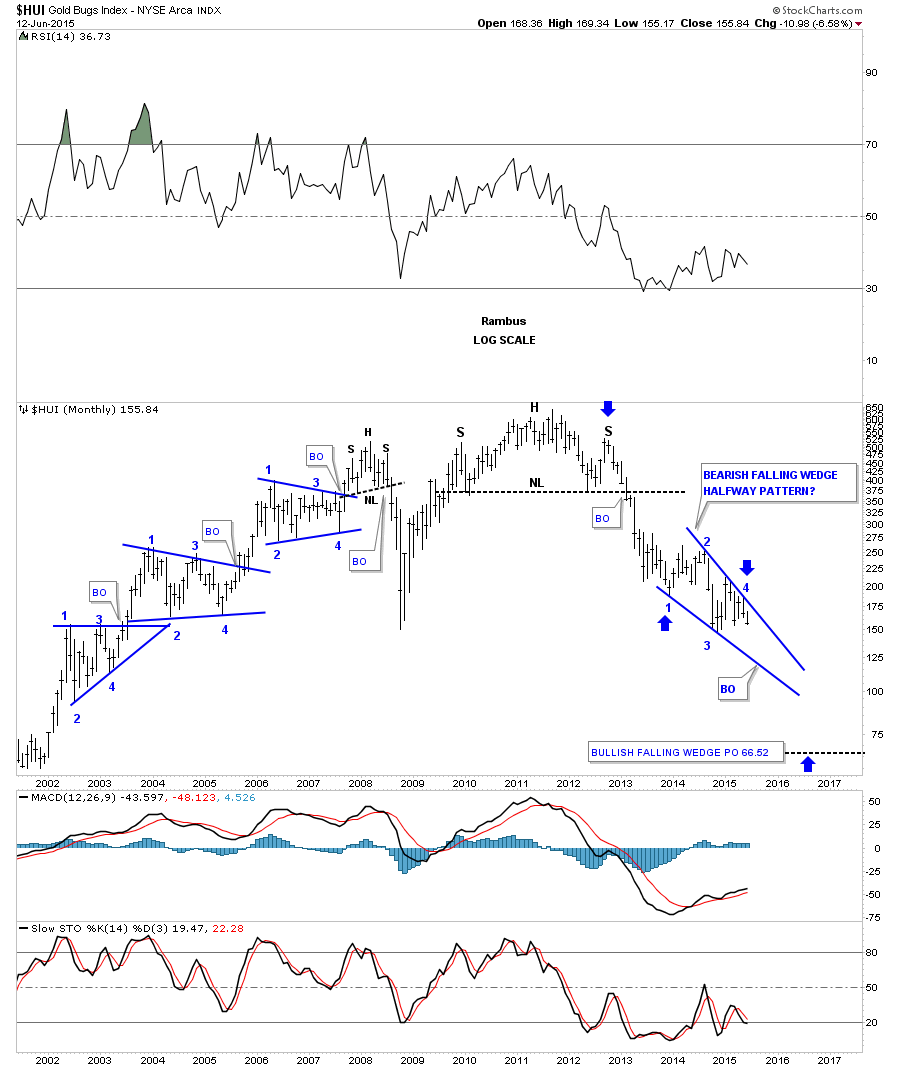
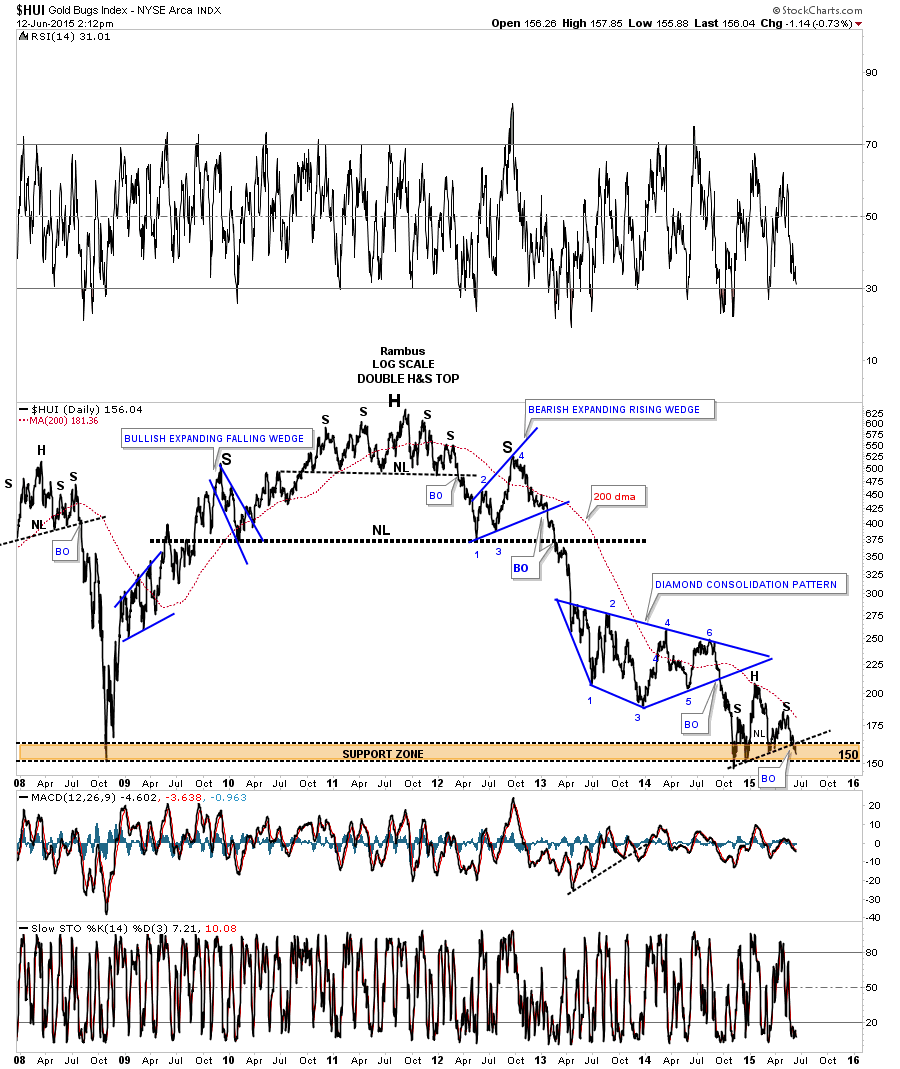
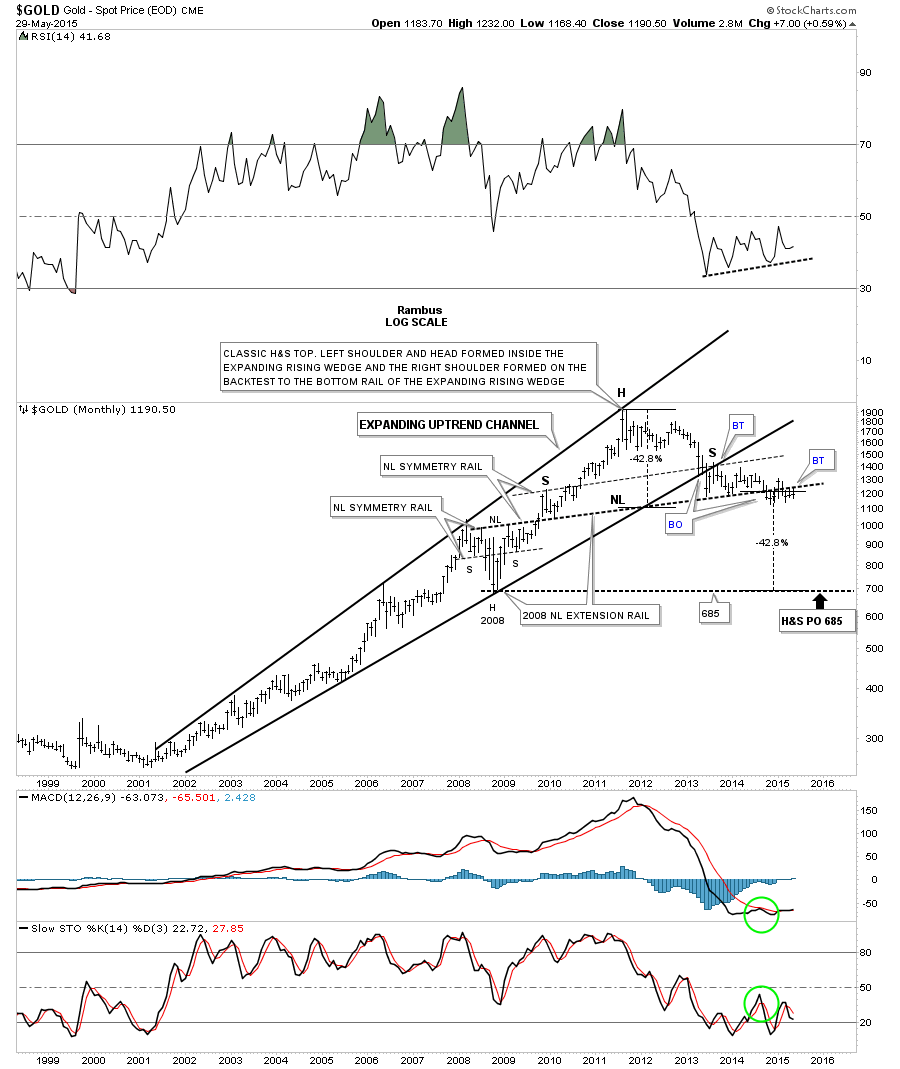
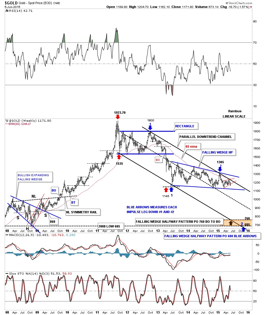
With one week of June under its belt this long term monthly chart shows gold down over 18 points so far but the month is young yet.
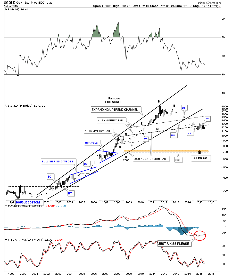
Lets look at one last chart I’ve been trying to show you on a weekly basis so you can follow along on how gold is behaving on the long term linear scale chart. This week gold finally cracked the bottom rail of the little red rising wedge which is a step in the right direction if you are a Bear .
Looking at all the different currency charts above the NDZ and the Yen are showing most weakness right now with the Australian dollar sitting on support. If the PM complex continues to follow the Yen lower then it looks like they should breakout to the downside fairly soon. I wish we could tell the markets what to do but all we can do is follow their Chartology and hope we’re picking up the right signals .
. All the best…Rambus