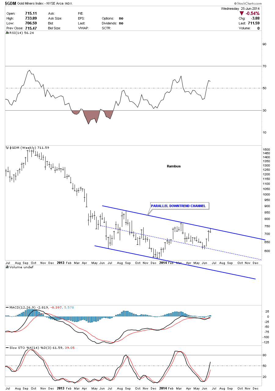
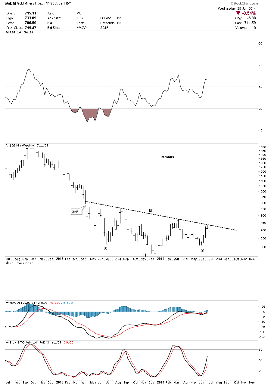
In this Weekend Report I would like to show you an in-depth look at two important precious metals stock indexes, the GDM and GDXJ. The reason I want to show you these two PM stock indexes is because they correspond with the 3 X leveraged etf’s, GDM for NUGT and the GDXJ for JUNG that we are currently trading. Last week seemed like the end of the world to a lot of the gold bugs as the PM complex had a decent sell off causing much pain for those holding on the long side. If you’ve been in the markets for any length of time you know there usually no gain without some pain. It just goes with the territory. We’ll look at the very short term to the long term charts, looking for clues that may shed some light on the future direction for the precious metals complex, at least for the short to intermediate term horizons. Lets start with the 2 hour look at GDM that is showing a some what unconventional consolidation pattern, a six point Diamond. Normally when an area of congestion is taking place and there are no obvious consolidation patterns forming I begin to look at the more obscured patterns such as a Diamond or a Roof pattern. When a Diamond is forming there is usually a big decline in the middle of the pattern that generally expands on the left side and contacts on the right side. As you can see on the 2 hour chart below reversal points #1 and #2 are start the expansion. Reversal points #3 and #4 show the longest point in the Diamond with reversal points #5 and #6 contracting like a triangle. The price action actually broke above the top trendline on the right side of the chart late in the day on Friday. You can see the indicators on the right side of the chart are all in bullish configuration in this 2 hour chart. 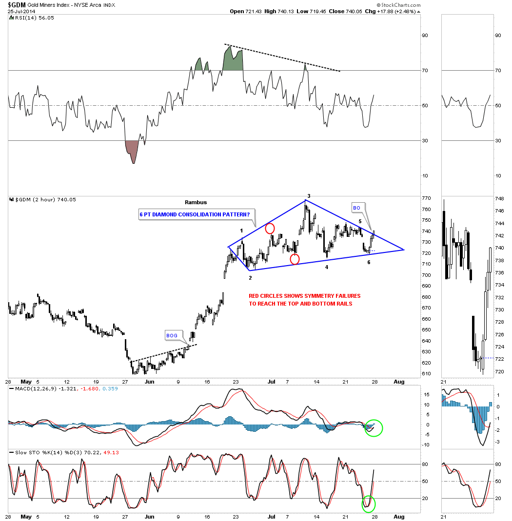 The daily chart puts our little Diamond in perspective in the bigger picture. This chart starts at the December 2013 low and it also shows a higher low made last month in June. This is the start of an uptrend. In order to create an uptrend we’ll need to see GDM take out the March highs creating the first higher high. Right now I’m viewing our Diamond as a halfway pattern that is forming off the June low similar to the little red triangle that formed during the December to March impulse move as measured by the blue arrows. I’ve put two possible price objectives based on the two different measuring techniques I use. Both measurements are very close to each other at 860 for the breakout to breakout method and 865 for the impulse method. One last note on this daily chart for GDM. You may have noticed there was a negative divergence on the RSI when the high was put in on the Diamond several weeks ago. This started the actual correction. Now notice the positive divergence on the RSI. In strong impulse move one likes to see the RSI stay above the 40 area during a correction. So far the RSI has held above 50 which positive.
 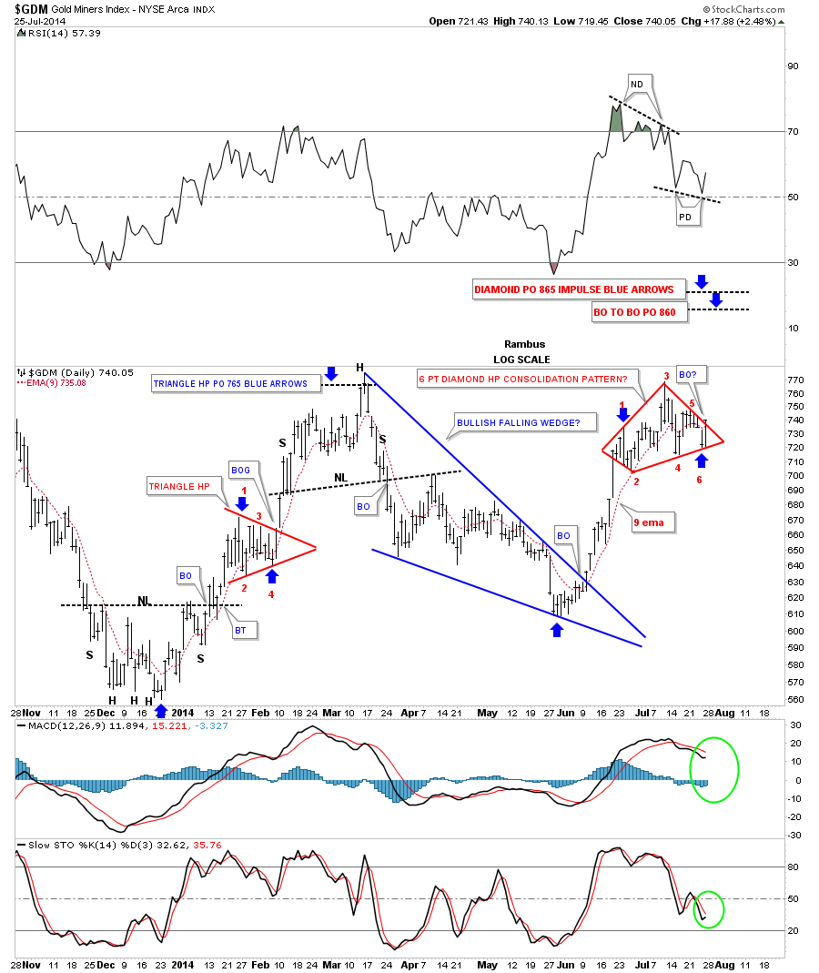 The weekly chart for GDM shows our inverse H&S bottom that has been in backtest mode for three weeks now after breaking above the neckline. These backtests can sometimes be painful but they are a necessary evil which helps you confirm the breakout. As you can see GDM has been trading above the neckline for three weeks now helping to confirm the breakout is for real. The neckline is now our line in the sand, below is bearish and above is bullish.
 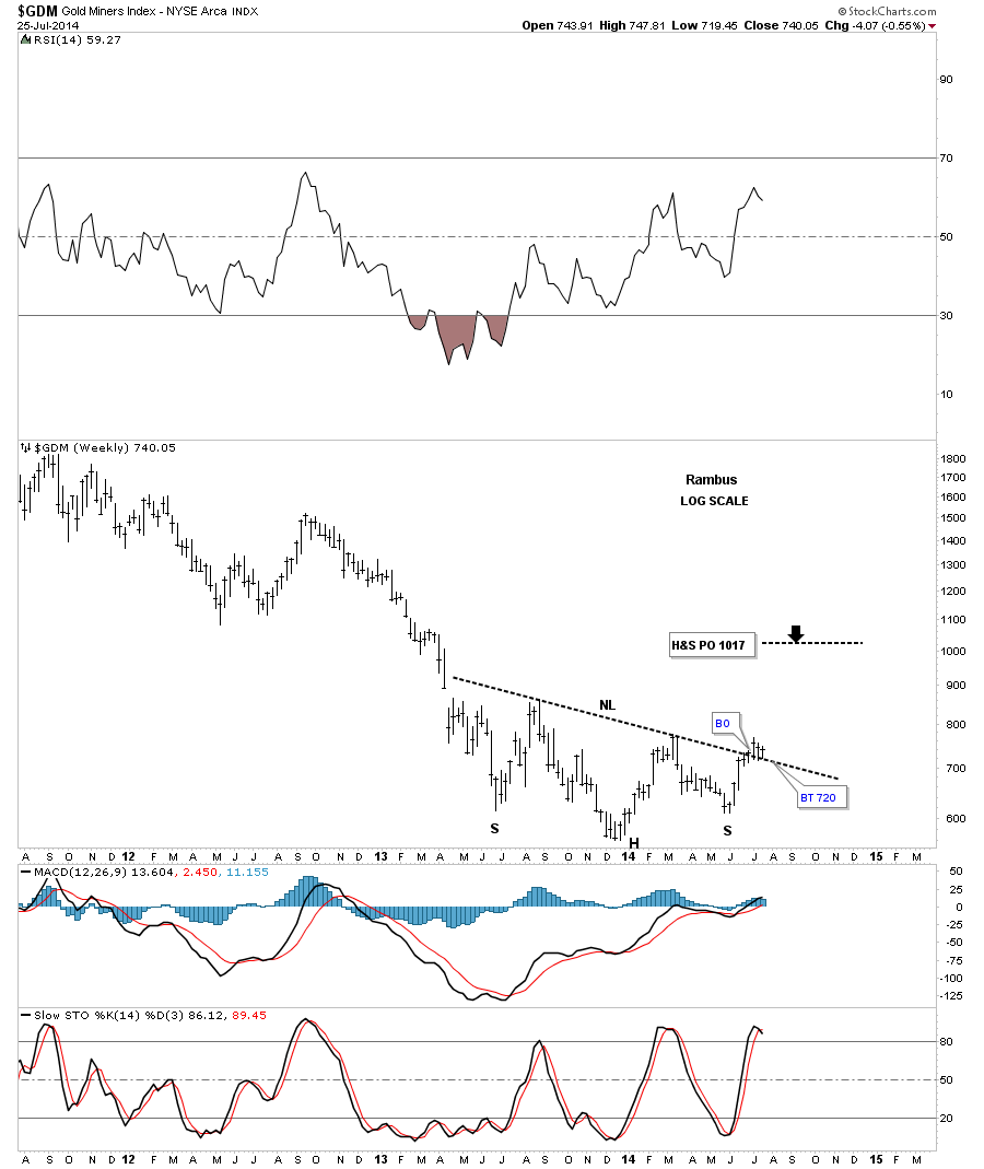 Now for the monthly chart that shows the entire bull market along with the massive H&S top that has led to our current low. When you look at this long term chart notice how each important top and bottom were accompanied by a H&S pattern. Even the 2008 crash low had an inverse H&S bottom but the bounce was too steep to show up on this monthly chart. If our current inverse H&S bottom plays out it will have a price objective up to the 1017 area which is getting close to the most important resistance point on the chart. The brown shaded area shows the price objective of our inverse H&S bottom and the neckline for that massive H&S top which will act as resistance on the initial hit. If the PM complex is actually embarking on the next leg up to new highs I would expect GDM to form some kind of consolidation pattern just below the big H&S top neckline before the price moves higher. On the other hand the old neckline may be too much resistance to overcome and the GDM retreats back down to the precious low or lower. The bottom line is that this inverse H&S bottom is telling us that GDM should have an intermediate term rally that should take the price back up toward the old neckline. From that point we’ll have to see how it interacts with the neckline and take it from there. Note the positive indicator on the sidebar.
 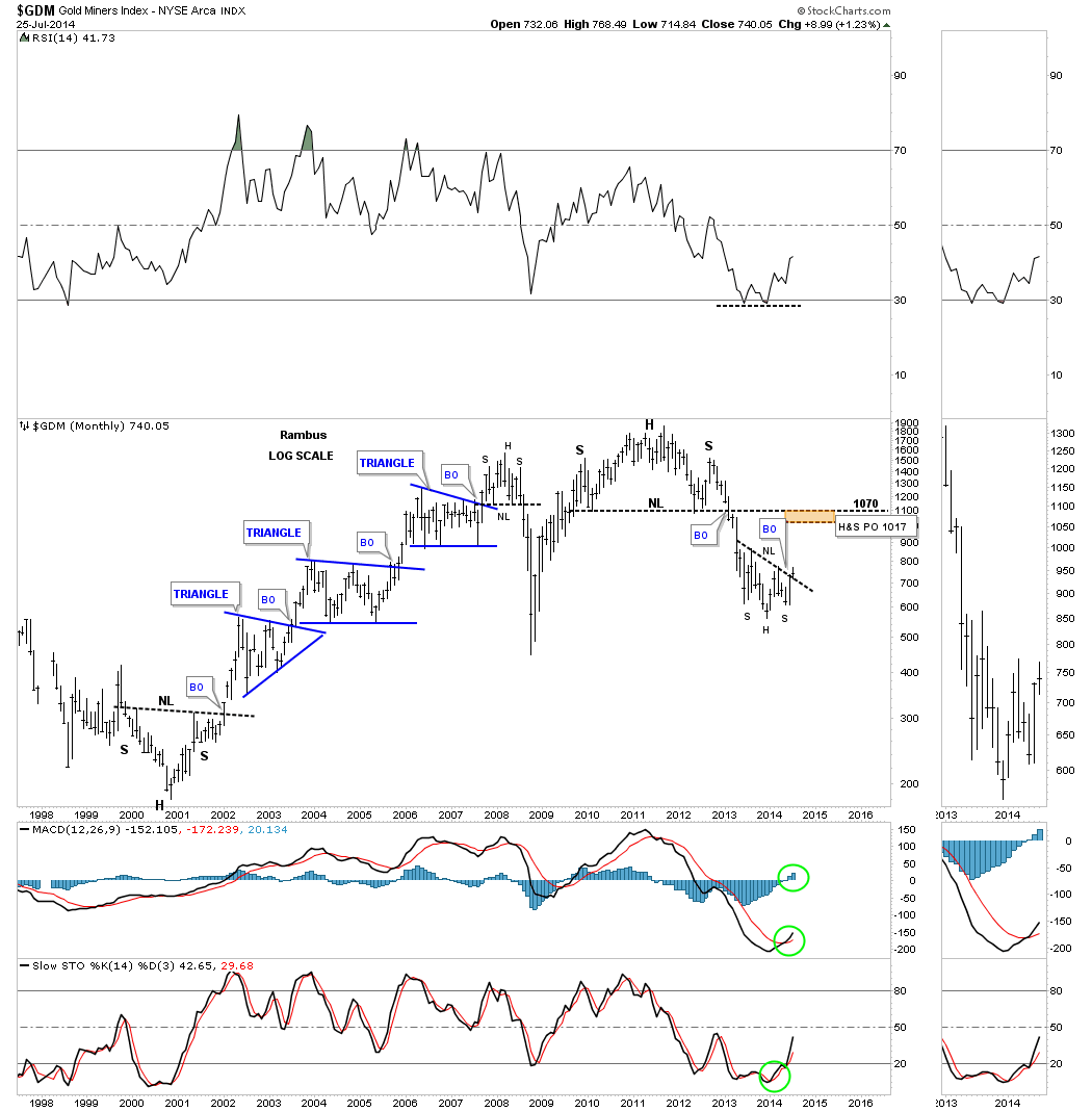 Now that we’ve looked at the big cap PM stocks lets take a look at the GDXJ that will show us how the small caps are doing. As you know the small caps have been leading this rally which is a positive as it shows speculative money is finding its way into the more riskier PM stocks. It looks like GDXJ has formed a blue falling wedge which didn’t really show itself until late in the day on Friday. We need to see it breakout above the top rail to really put the falling wedge into the bullish category. You can see an A B C correction within the blue falling wedge that just missed the bottom target by a hair. It’s possible we get another reversal back down to the bottom rail before this pattern is complete. As long as the price action stays within the confines of the falling wedge it should remain bullish.
 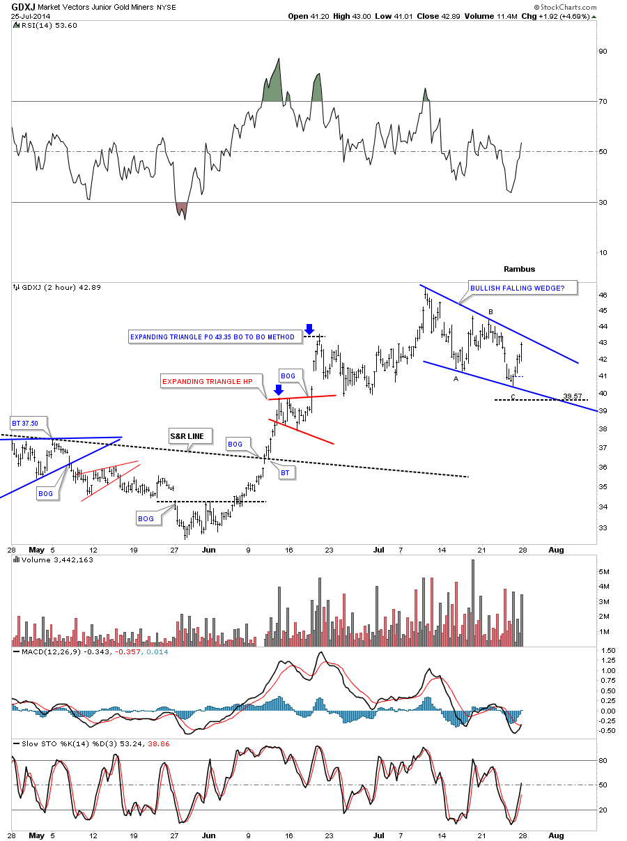 This is the first time I’ve shown you this daily chart for the GDXJ as I was waiting to see if the second backtest would hold support. First, notice the unbalanced H&S bottom that has a much bigger left shoulder than the right. Sometimes this happens in fast moving conditions. Note the nice breakout gap and two quick backtest to the neckline before GDXJ moved higher. What I really like about this setup is how the blue falling wedge has formed on top of the neckline. I’ve shown you many times in the past, when you have a very important trendline, many times you will see a small consolidation pattern form just below, right on top or just above that support and resistance line. As you can see the GDXJ actually put in a slightly higher high before it began to correct. Again, we have an important line in the sand, above the neckline is bullish and below is bearish.
 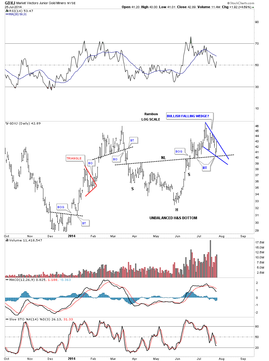 The weekly chart for GDXJ shows the slanted inverse H&S bottom that broke out about three weeks ago. Last week we seen another weekly bar backtesting the neckline which to the untrained eye can seem like the end of the world if you don’t have a game play to follow. As I showed you in last weeks, Weekend Report, that another backtest to the neckline was very possible and I gave you specific price targets to watch for. So far the backtesting to the necklines has been textbook. I’ve put a red circle around the breakout and backtest that took place when the massive H&S top neckline finally gave way and the bear market really got underway. What’s so interesting about the current inverse H&S bottom for the GDXJ is it has a price objective up to the neckline of its major H&S top around the 65 area. It’s one step at a time. If this inverse H&S bottom plays out according to the Chartology I’ve laid out for you we should see a the old neckline act as resistance on the initial hit. From that point we’ll have to see what takes place and go from there.
 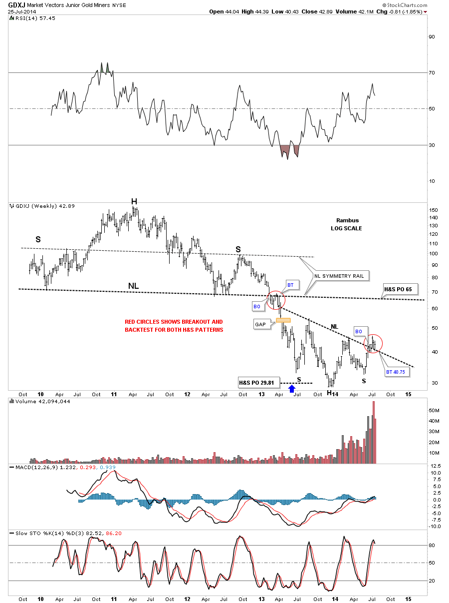 The monthly chart for the GDXJ shows the total history for this PM small cap index. You can see all the indicators are positive along with a positive divergence on the RSI indicator at the top of the chart. The GDXJ is really coming into its own as volume continues to grow exponentially.
 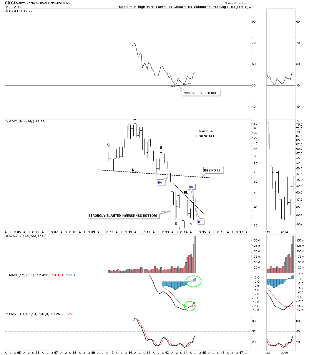 These two very important PM stock indexes gives us a good feel for the precious metals complex as a whole. We have some really good lines in the sand to exit our positions if things don’t work out as expected. There are no absolutes in the markets so we have to go with the odds, and right now from a Chartolgy perspective, the odds are favoring a move higher in the intermediate term. So watch the necklines for major support and take it from there. All the best…Rambus
Category Archives: public
Weekend Report…An In-Depth Look at The Chartology of Gold
In this Weekend Report I would like to take an in depth look at gold as there could be some important developments taking place that didn’t show up until this weeks volatile swings. Keep in mind a week ago this particular pattern didn’t exist as there was no evidence in place to even speculate on what what I’m seeing right now. As you know things can change very fast in the markets especially when the volatility increases as we seen this week. One always has to keep an open mind and look at what the markets are giving us to work with.
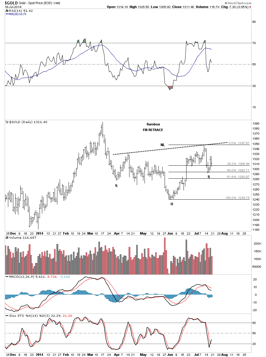
With that said lets start by looking at daily line chart for gold that shows, after this weeks wild price swings, we maybe seeing a right shoulder being formed. What’s so important about the location of this possible H&S bottom is that it’s forming above the December inverse H&S bottom, which if our current H&S bottom plays out, it will give us a higher low and a higher high creating an uptrend. There is a technique I use, which I’ve shown you before, where I will extend the neckline to the right side of the chart far beyond the actual breakout. There is an old expression that a neckline never dies it just slowly fades away. Many times you will see an old neckline act as support long after you think it’s no longer relative. Here you can see how it has been working so far creating the bottom of the left shoulder, followed by a sharp break to form the head and then the rally back above the neckline extension rail which held support last week. As you can see the possible right shoulder is still in the early stage of development. I would really like to see some more work on the right shoulder but no closing price below the 1290 area. Just think of that neckline extension rail as a support and resistance line, below is bearish and above is bullish. If this possible H&S bottom plays out it will have a price objective up to around the 1450 area which would then give is a higher high vs the high made last August.
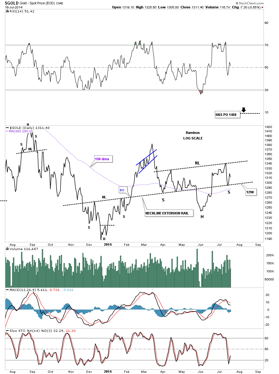
Lets look at the same time frame using a bar chart with what I think are the most important moving averages for gold, the 50 dma, the 150 dma and the 300 dma. During last weeks volatility the 50 dma and the 150 dma held their ground while the 300 dma finally held its ground at the low last Friday. So we have three important averages holding support at the bottom of the right shoulder so far. One big down day can change all that but for right now we have to give the benefit of a doubt that they will hold until proven otherwise.
Along with the moving averages gold is also showing a fib 50% retrace that comes in also at the bottom of the right shoulder.
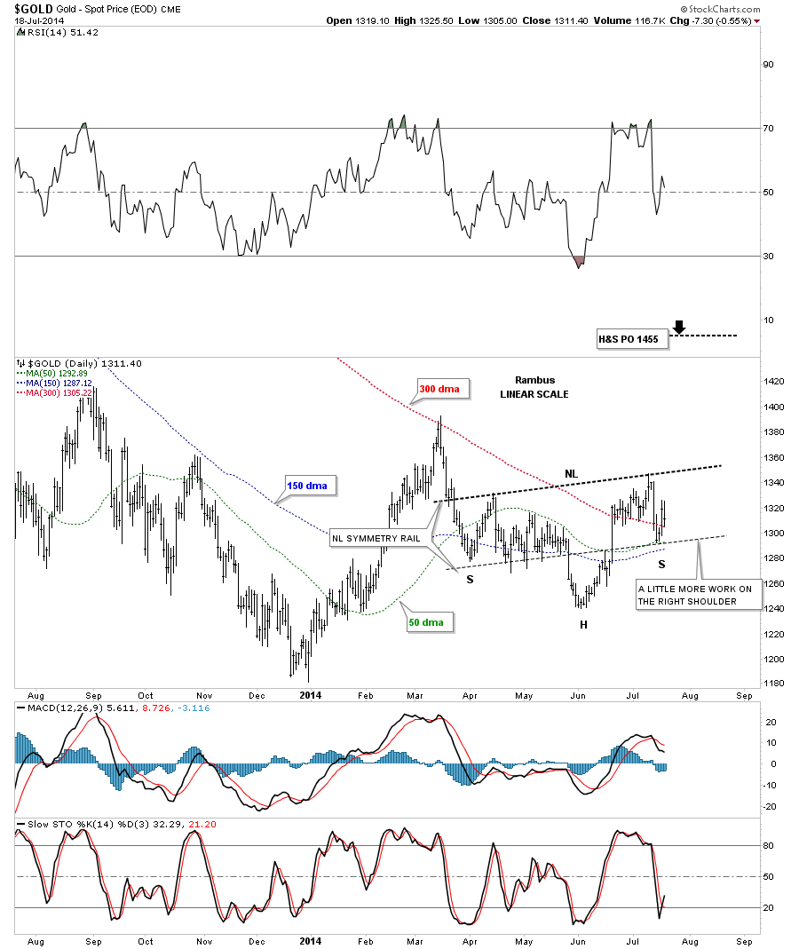
This next chart for gold is a long term daily look that shows our one year plus trading range which is hard to put a name on what type of pattern it will ultimately be. Most have been calling it a triangle which is still inconclusive as we don’t have four completed reversal points in place yet. For a long time everyone was calling it a double bottom which isn’t the case now. If the June low had made it all the way down to the bottom, at the December low, that would have completed the fourth reversal point and we could then call this one year trading range a triangle. We still wouldn’t know if it was a consolidation pattern to the downside or a reversal triangle to the upside until we seen how the price action interacted with the bottom blue rail. If the price action broke through the bottom rail this one year trading range would be a consolidation pattern to the downside. If the price action bounces off the bottom rail and rallied up to breakout above the top blue rail it would then have five reversal points and we could call the triangle a reversal pattern.
This is where it gets interesting. The December inverse H&S bottom and our current H&S bottom are exactly the same size if you measure from the bottom of the head to the right shoulder armpit. If our current H&S plays out the price action will have to break above the top rail of the possible blue triangle. As I showed you earlier the price objective for our current H&S bottom comes in around the 1450 area which is slightly higher than the previous high made back in August of 2013. If that were to occur we would then have a horizontal trading range which would look more like a rectangle than a triangle. The fourth reversal point is always the hardest to locate in real time. It’s easy in hindsight.
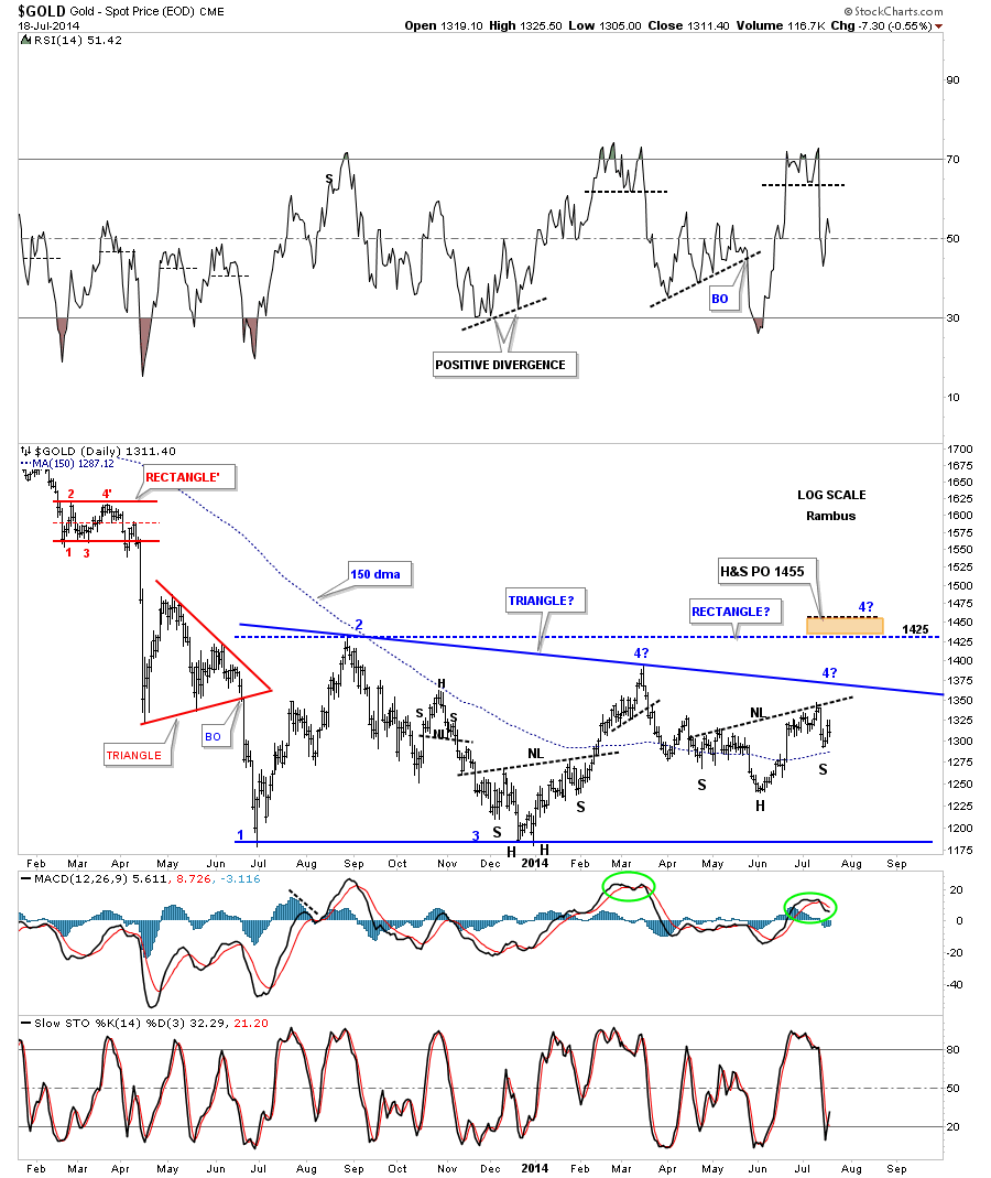
I have never shown you this long term daily chart for gold as it’s not as pretty as I would like it to be. I can tell you that chartists are having a hard time trying to put a name on this one year plus trading range for gold as it doesn’t have all the characteristics in place to actually call it something yet.
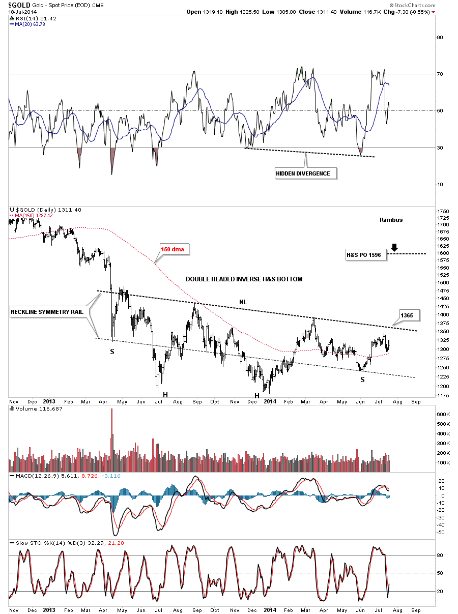
As you know I’ve been labeling some of the precious metals stock indexes as having an inverse H&S bottom in place. As I showed you on the chart above it’s hard to put a name on this one year trading range so far. Many times the precious metals stock indexes and the precious metals will form very similar chart patterns and generally breakout about the same time. If we use our imagination I can see a double headed inverse H&S bottom that has been forming over the last year or so. There is some nice symmetry taking place where I added the neckline symmetry rail, where you take the neckline and move it down to the bottom of the left shoulder. It then projects to a possible bottom for the right shoulder if things progress that far, which they have. As you can see the June low hit the neckline symmetry rail dead on the money. Right now it looks like the neckline resistance will come in around the 1365 area which gold will have to overcome to enter into the next move higher. One step at a time.
I would like to make one last comment on this daily chart for gold that is showing a big divergence with the RSI and the bottom of the right shoulder. As you can see, the RSI at the top of the chart, bottomed at the December low along with gold. They both rallied up to the March highs where they both started to decline. The RSI declined and took out the December low while gold’s decline was very modest and made a much higher low than the December low, which so far is the bottom of the right shoulder. This is a big divergence to say the least. Time will tell how this plays out but gold will have a head start vs the RSI if it decides it wants to put on a decent rally phase.
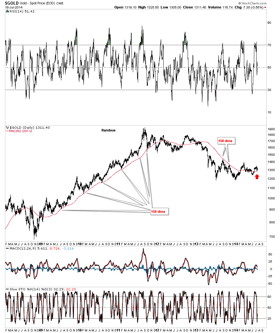
Lets look at a few more charts for gold, in no particular order, that shows the longer term look at the bull market and some of the interesting chart patterns and moving averages that have played a key role during gold’s 14 year run. The 150 dma worked magic during gold’s bull run off the 2008 crash low. It also reversed its role to resistance several times during this bear market. Right now gold is trading back above the 150 dma which comes in at 1287 and is slowly starting to rise.
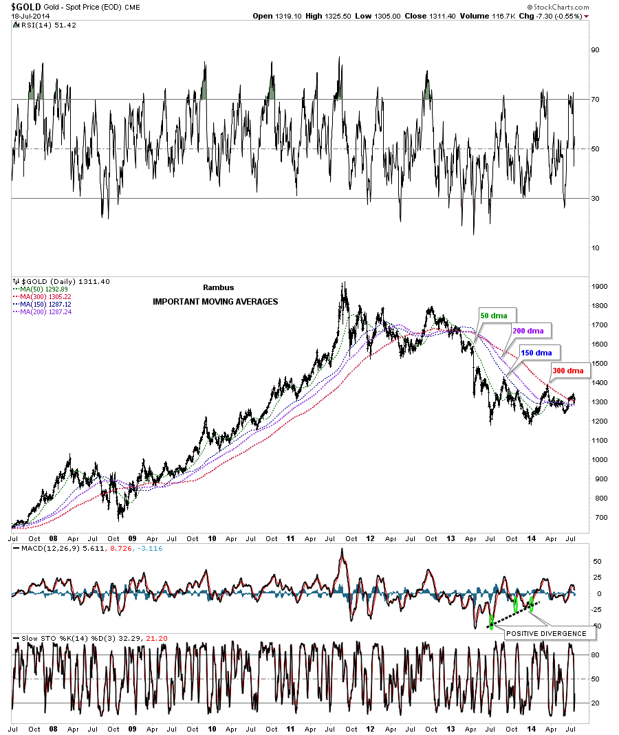
Below is another daily chart that shows the important moving averages and what a true bull run will look like. Once a correction is over and the rally phase gets going these moving averages will start to aline themselves as shown by the rally off of the 2008 crash low to the top in 2011. You can see they also went into alinement during part of this bear phase gold has been in since 2011. What we see happening now is they are starting to squeeze together very tightly while gold is trading above all four moving averages. This is first time this has happened since late 2012.
This next chart for gold is a long term monthly look that shows the 10 month ema and how good of a job it has done during gold’s 14 year run showing both support and resistance. The only time it really failed on the upside is when gold had the 2008 crash and the top in 2011. You can see it has reversed its role to the downside and has held resistance since the second peak, top red arrow. Gold did manage to spike above it for a short time several months back but it couldn’t hold. Then last month gold actually closed above it ever so slightly, and as of today gold is trading about a dollar higher with two weeks to go yet for July.
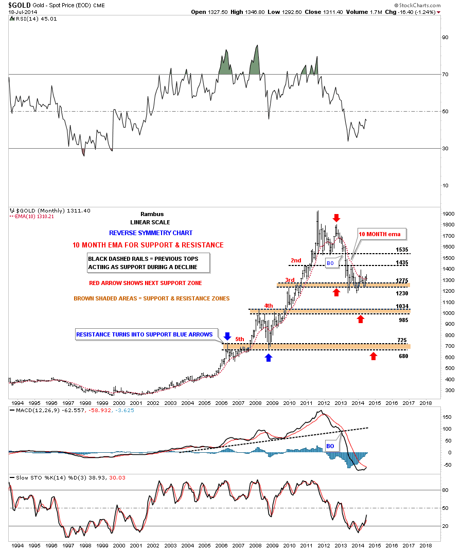
This next monthly chart for gold shows the bigger chart patterns that have formed during gold’s 14 year run. On the first chart in the post I showed you a small neckline extension rail that is helping to add support to the bottoms of the left and right shoulders. In this very long term monthly chart I’ve extended the neckline, that was part of the complex consolidation pattern, that was made back in 2008. It was made up of three different chart patterns with a H&S bottom being one of them. I drew in the neckline extension well over a year ago wondering how the price action was going to react to it. So far the neckline extension rail has reversed its role and has been acting as support for the last year and a half. I can’t tell you how important that neckline extension rail is because if it gets broken to the downside that’s when we get the flush to new lows. This chart also shows that when gold is in an impulse move up you will see a string of white candles form and just the opposite when gold is in an impulse move down, you will see a string of back candles. When you see a mix of black and white candles you know your in a trading range.
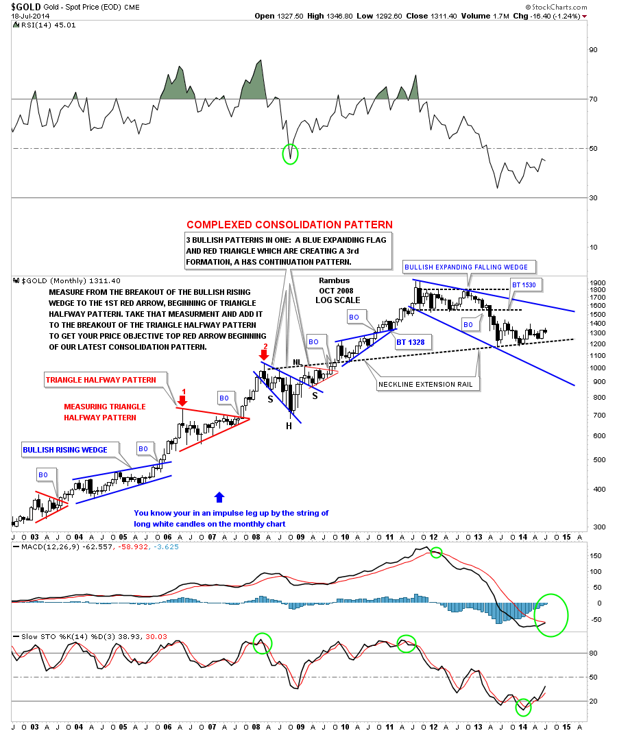
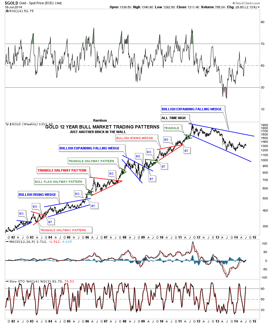
I would like to show you one last long term monthly chart for gold that has all the chart patterns that I’ve followed through the years. I call this chart, JUST ANOTHER BRICK IN THE WALL, because it has to be one of the most beautiful bull markets in recorded history. I’ve said this before and I’ll say it again, they will look back at this gold bull market in the future and study it like we study the 1929 crash. From a Chartology perspective this is as good as it gets when you see one consolidation pattern form on top of the next, each one higher than the last. There are several bullish rising wedges that generally show up in strong bull markets. There was also a bullish expanded falling wedge that was one of the consolidation patterns made in 2008. As you can see the last chart pattern at the top of the chart is now three years in the making and is by far the biggest and longest running trading ranges for this bull market. It to is an expanding falling wedge. Is it going to be just another brick in the wall and lead gold to new all time highs or have we seen the end of gold’s bull market. Stay tuned as we follow the price action to where ever it leads us. All the best…Rambus
PS: We’ll look at silver in depth in the Wednesday Report.
Very Late Friday Night Charts…Palladium ..The Leader of the PM Pack
Sometimes there just aren’t enough hours in the day to get everything done one wants to do.
Today I would like to look at Palladium as it has been the leader in the precious metals complex. When Palladium starts an impulse move up it usually wastes little time and rallies very strongly. Below is a weekly chart that shows the latest triangle consolidation with the breakout and the impulse move that has been in progress since the first of the year. Note the two parabolic moves with the first one starting at the 2008 low and ending at the first reversal point on the red 6 point triangle consolidation halfway pattern. After the red triangle finished building out, the second impulse move began that also went parabolic leaving the red triangle as a halfway pattern as measured by the blue arrows. It wouldn’t surprise me if the big blue triangle that Palladium just broke out of at the first of the year doesn’t workout as a halfway pattern starting at the 2008 crash low with the top at 850 being the first impulse move up.
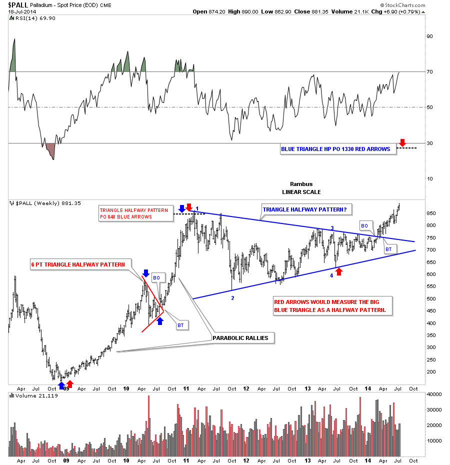
Below is a monthly chart for PALL that puts our blue triangle in perspective within the big picture. The all time high was made way back in 2000 along with the tech bubble and then crashed like just about everything else. PALL is now taking out the previous highs made back in 2010 and 2011 which is showing incredible strength when you compare where gold and silver are relative to their 2011 highs. At some point I expect PALL to start forming a possible halfway pattern after it move a little higher which we will then be able to fine tune a possible price objective. All the best…Rambus

Wednesday Report…The Million DOLLAR Question…
Tonight I would like to take a look at the US dollar as its been showing a little strength lately. Over the last month or two I’ve been showing some commodities indexes that have been very weak which I think has to do with the strengthening US dollar. The move up in the US dollar hasn’t been that big yet but it could be in the beginning stages of a rally phase that could send this index higher. How high is anyone’s guess but any strength will have an impact on the commodities sector and possibly the precious metals complex. It has been awhile since we looked at the US dollar so lets take a look under the hood and see what we can make of the reserve currency.
The first chart I would like to show you is a long term daily chart we were watching very closely back in May of this year. At the time it looked like the US dollar was building out a massive H&S top formation. As you can see the neckline was broken to the downside but quickly reversed direction and rallied back up above the neckline. At the time I said that was probably a very bullish development. When you get a false breakout like that and the price action reverses quickly that is generally a sign of exhaustion. So far that has been the case.
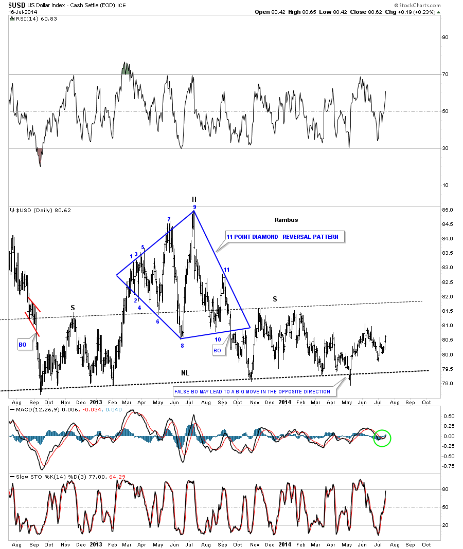
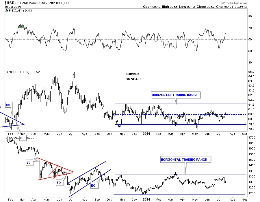
The daily dollar chart is really quite boring for the short term as there aren’t any good chart patterns to be seen at this time. The longer term daily chart does show a big horizontal trading range going all the way back to November of 2013 which corresponds with a similar sideways trading range for gold. It’s not perfect but you can see the inverse movements between the US dollar and Gold. If you look at the last month of trading for both the US dollar and gold, on the combo chart below, it’s very clear that they are moving in the opposite direction.
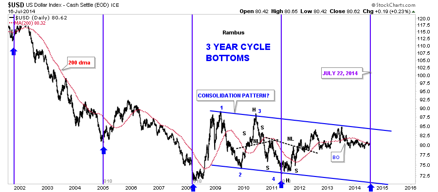
This next chart for the US dollar I’ve been following for many years that shows a three year cycle low that comes in like clock work. It’s hard to believe that the next three year cycle low comes in on July 22 of this year. Please notice the three year cycle low in 2008 and 2011 which coincides pretty close to important tops in the PM sector and commodities. Are we going to experience the same thing again three years later from the 2011 cycle bottom? Also the US dollar is now trading above its 200 dma. It’s something I’m keeping a very close eye on.
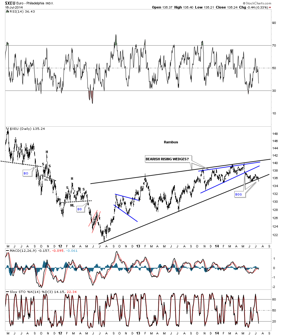
If we’re going to look at the US dollar we need to take a close look at the XEU as the euro is the biggest component in a basket of stocks for the dollar. Unlike the daily chart for the US dollar, that doesn’t have a decent short term daily pattern in play, the euro does. Today it looks like the euro broke out of a H&S top with a small gap. This could be an important top that has just formed as I’ll show you in a bit as to why.
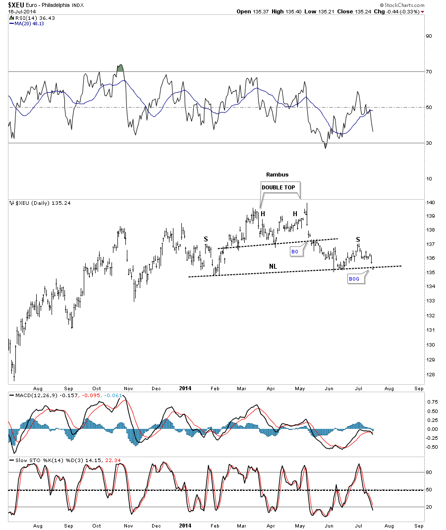
Below is a very long term chart for the euro that shows two bearish rising wedges, one inside the other. Notice the last bar on this chart. It’s the same small gap that accompanied our little H&S top on the chart above. Now you can see why this is such a big deal. If the euro starts to drop precipitously it will have a positive affect on the US dollar which will have a negative impact on the commodities complex.
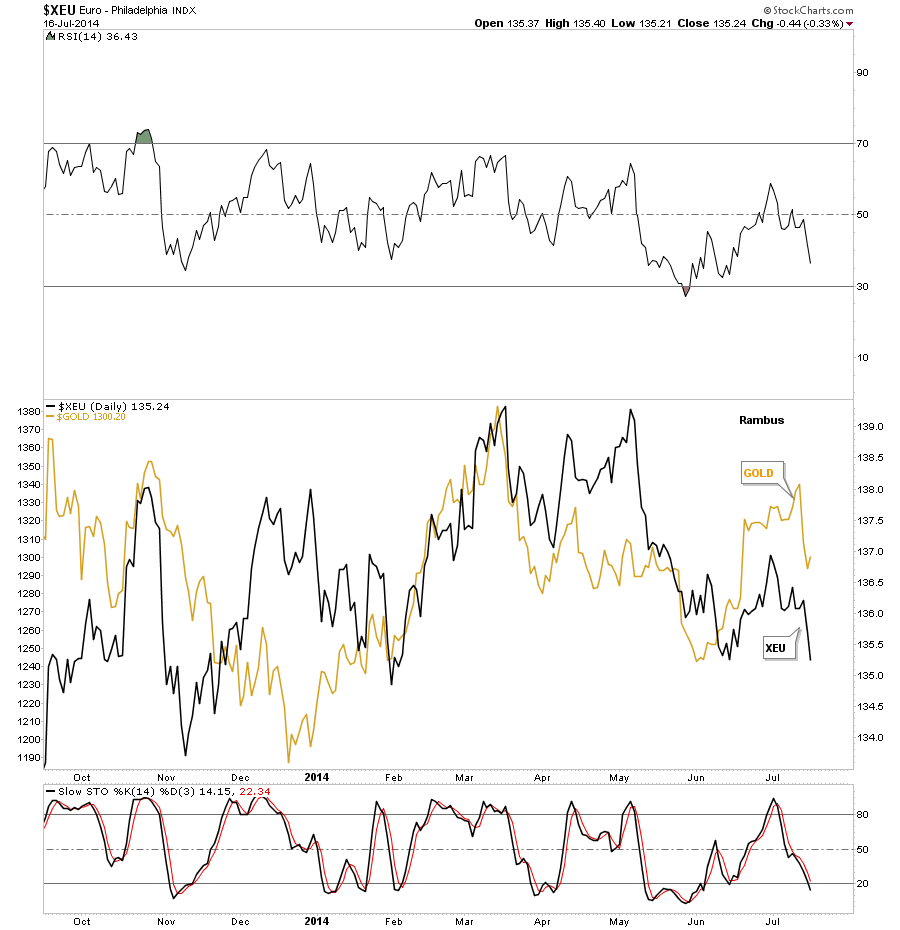
This next chart I’ve overlaid the euro on top of gold so you can see the similar correlation. Again it’s not perfect by any means but it does give you a sense that when the euro is strong or weak so is gold. You can do the same thing with the other important currencies and get a similar result. Again something I’m keeping a close eye one.
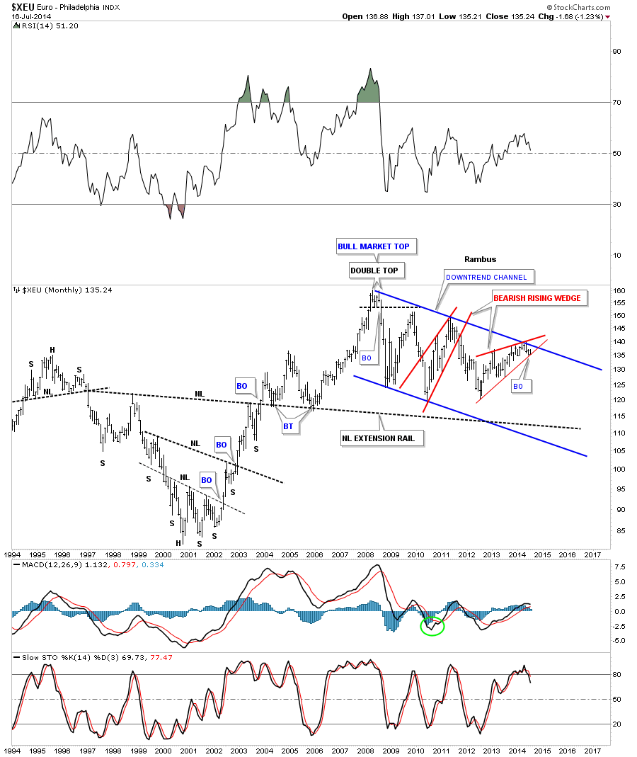
This last chart is a very long term monthly look that shows you just how precarious the situation is with the euro. I showed you a bearish rising wedge earlier in this post for the euro that just broke the bottom trendline today with a gap. This is the same bearish rising wedge only on the monthly look. You can”t see the gap on this chart but the daily chart does show it’s now breaking the bottom trendline. This could be a very big deal.
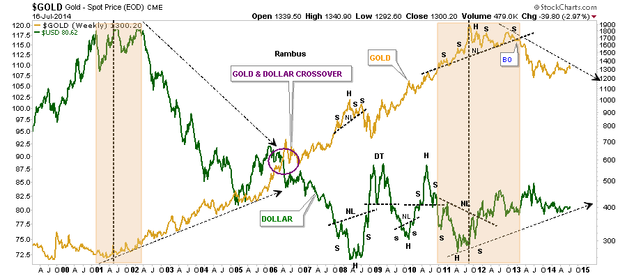
Below is a very long term chart in which I’ve overlaid gold on top of the US dollar. This chart clearly shows you the inverse correlation over the long haul. It doesn’t feel like it but the inverse correlation has been pretty good since the commodities complex topped out in 2011 along with the US dollar bottoming about the same time.
Below is the CCI commodities index we’ve been following that has been showing weakness since the first of the year or so.
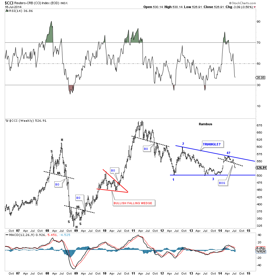
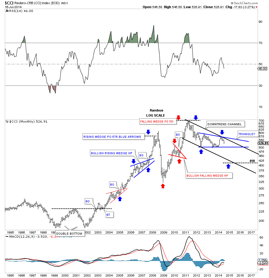
CCI monthly look.
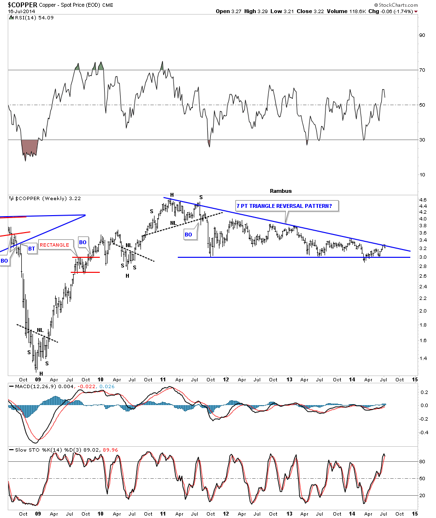
Lets take a quick look at copper as it’s one of the more important commodities to help give us direction. As you can see it has been building out a massive triangle pattern that started to form way back in 2011 when the commodities complex topped out. As you can see it’s testing the top rail which would be the 7th reversal point if it holds which would make this triangle a reversal pattern to the downside. On the other hand if it breaks out through the top rail that would be very bullish for the different economies of the world.
The US dollar is at a critical juncture right here and now. Based on the XEU, which is just starting to break down, this would imply that the US dollar will show strength in the coming months. The weakness in the commodities complex has already shown up which is suggesting deflation is more pronounced than inflation at this moment. There are areas of strength in the commodities, such as the industrial metals, which have been doing pretty good, but other areas like the agricultural side of the commodities complex is doing very poorly. How will the precious metals complex fair is the million dollar question. Will they buck the trend and move to the beat of their own drummer? Looking back in hindsight we will know the answer to that question. Right now we have to be ever so vigilant looking for clues that may help us understand the answer to that million dollar question. All the best…Rambus
Wednesday Report…Precious Metals Miners The Beginning of the End !
I think today’s price action marks a very important confirmation point in the precious metals stock indexes, at least for the intermediate to longer term outlook. Finally, after a year of chopping around in small up and down moves, we are starting to get some confirmation that this one year trading range is indeed a reversal pattern and not a consolidation pattern. When a big patterns like this ends is when you get the big impulse moves which is where you make the real money.
As you have found out trading ranges can be very frustrating to trade especially when there is no real horizontal support and resistance rails. The inverse H&S bottom was hard to trade because there were many smaller moves within the one year trading range. There were also several patterns that failed to mature which also made it difficult to know if we were forming a consolidation pattern or reversal pattern. It always looks easy in hindsight but when you are living through one of these very large trading ranges it’s a totally different ballgame. Patterns can morph and grow larger than what one might have first anticipated on the front end. The name of the game is to protect ones capital and is one reason why we were in and out trying to catch part of the small moves inside the big one year trading range. Sometimes you win and sometimes you lose but preservation of capital will guarantee that you will be able to play the next impulse move when it finally arrives. We did that.
For those members that were with Rambus Chartology back in December of 2012 know what its like to ride an impulse move. It’s a totally different ball game vs consolidation trading. We did very little trading during that huge impulse move down holding on for dear life every time there was a counter trend rally. It would have been easy to sell out during those short term counter trend moves but we held on and captured the lions share of that big impulse move down. Now after a year of going nowhere it looks like we are on the cusp of another important impulse move, this time higher, which gives us many more options to trade with vs just going short.
If this is truly the beginning of a new impulse move higher the toughest thing you will face is the urge to sell out and take a small profit. I know folks are already looking for the exits because they have decent profit but one of the biggest lesson I’ve learned through the years is not to try and trade an impulse move. You will get your small profit but you will find it nearly impossible to get back in at a lower price than where you exited your initial position. It’s the nature of the impulse move to take as few investors for the ride as possible until you arrive at the end of the move.
The first chart I would like to show is the the Gold:XAU ratio chart that we’ve been following for years now. It still amazes me how far out of whack this ratio got. Just when you thought it couldn’t go any higher it did. Below is a weekly line chart that is finally showing us that the end is at hand and the XAU is now going to outperform gold, probably in a big way, revision back to the means. I’m using a line chart because it often times gives you an earlier confirmation than a bar chart. As you can see this ratio just broke the neckline of a one plus year H&S top that is now reversing the uptrend that has been in place since October of 2009. This is a big deal folks and it shouldn’t be taken lightly. This nearly five year uptrend, where gold has outperformed the XAU, is coming to an end. The precious metals stocks are now the place to be.
Below is a long term weekly chart for the HUI that shows the major uptrend channel beginning back in late 2000. This chart shows you what I mean when I talk about an impulse move. Note all the consolidation patterns that formed in the bull market from late 2000 to the 2008 H&S top. Each impulse move started with the last reversal point in each consolidation pattern. You can clearly see the different characteristics from the price action when the HUI was forming a consolidation pattern vs the price action, impulse move, when the consolidation pattern finished building out. The move between each consolidation pattern is an impulse move. That is where the big money is made. What generally happens is, if you caught part of the impulse move up and had a decent profit, you probably gave most of it back during the next consolidation pattern. Sound familiar.
 .I have a lot of work to do tonight so I’m going to end it right here. Today was a very positive day for the precious metals stocks. If we are right then the beginning of the end is at hand. All the best…Rambus
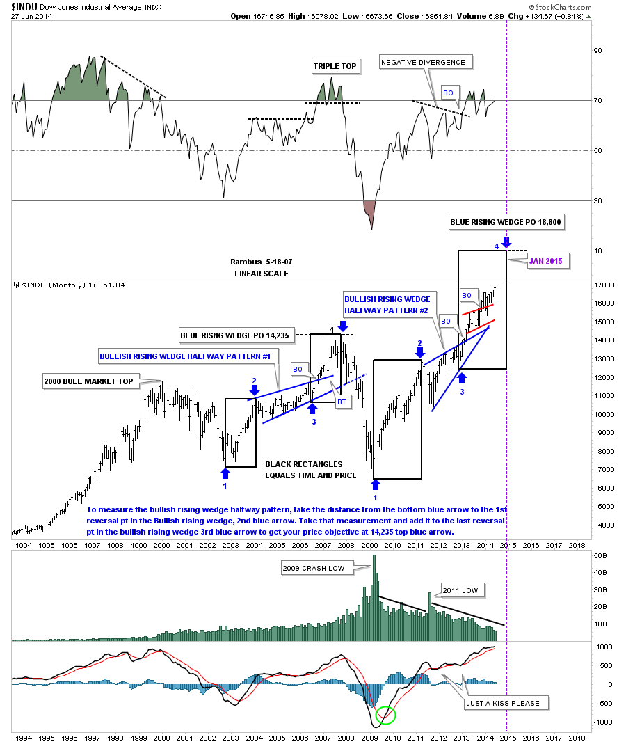
Weekend Report…US Stock Markets Can’t Get No Respect ..BUT…
In this Weekend Report I’d like to show you some charts on the different US stock markets and some of the stronger sectors within the US markets. It seems like no one believes this rally taking place in the US stock markets and many stock markets abroad. The mantra is we have to have a correction because markets can’t keep going up like this , which is true , but the stock markets will let us know when it’s time for a correction. Right now most of the charts are looking positive with no sign of a top in place yet. This could all change next week but right now things are looking much more bullish than bearish.
Lets start with the Dow Jones daily chart that shows us the price action has been chopping around in a 270 point trading range for the better part of June. We still don’t know if this pattern is going to be a rectangle consolidation pattern that will let the price action breakout to the upside or if it will be a double top reversing the uptrend. More time is need to see what the Dow wants to do.
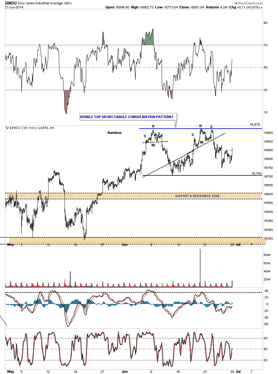
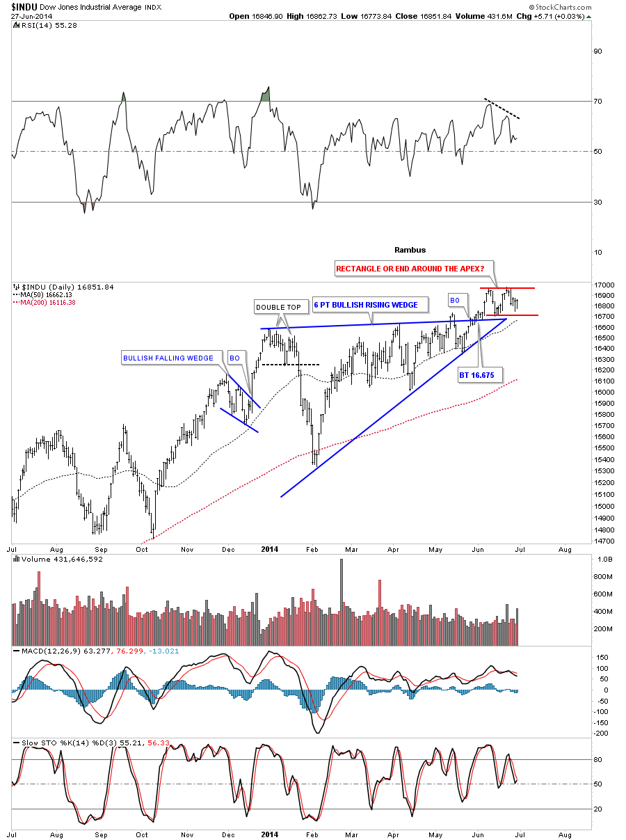
Now lets put our little June trading range in perspective by looking at a daily chart to see how it fits into the bigger picture. What this daily chart shows us is that the Dow has been actually consolidating since the fist of the year. The possible little rectangle has formed as the backtest to the top blue rail of the rising wedge. What we don’t want to see is an end around the apex move as that would change everything in the short to probably intermediate term. So from my perspective a six month correction is enough time for the Dow to have another impulse move higher before it’s time for the next consolidation phase to begin as long as the apex isn’t violated. The trend is your friend.
Now lets look a long term weekly chart that shows our latest consolidation pattern, at the top of the chart, as just another in a string of consolidation patterns that have formed since the low in 2011. As you can see the Dow is in backtest mode right now that needs to hold so the next leg up can begin. As you can see the Dow has been flirting with new highs for the last four weeks now.
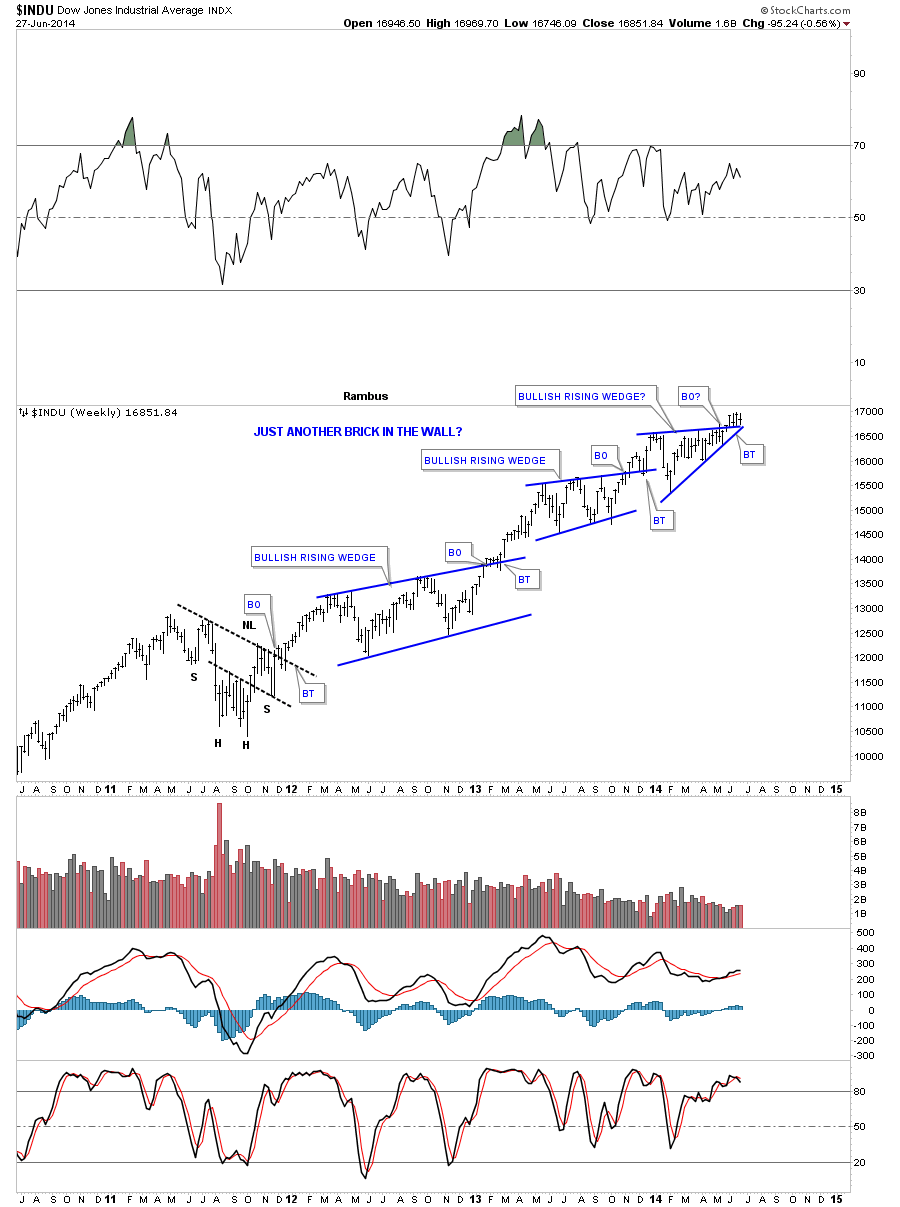
This last very long term monthly chart for the Dow shows how I’ve been following the price action for many years how. What is interesting about this chart is the blue bullish rising wedge that formed back in the rally phase from the 2002 low to the 2007 top. It formed exactly in the middle of that nearly five year cyclical bull market in both time and price as shown by the blue arrows and black rectangles. Now fast forward to the 2009 crash low and the rally phase that has ensued since. Some of our long term members may remember this chart when I posted it when the price action broke out of the blue bullish rising wedge. We got about three months of rally before the Dow started to form another rising pattern the little red rising bull flag. If you look at the price action from the 2009 crash low this monthly chart shows a rally that doesn’t want to quit. When I see chart patterns slopping up into an uptrend that tells me we are in a very strong market. Just the opposite in a down market when the consolidation patterns slope to the downside in the same direction of the downtrend. Until something changes this behavior we have to go with the trend, which is up until proven other wise.
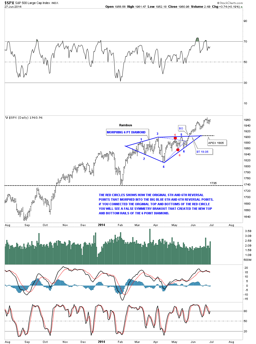
Back in May I showed you this morphing six point Diamond consolidation pattern on the SPX which so far has been working beautifully. Note how much stronger the SPX chart is compared to the Dow chart above. While the Dow has been building out a sideways trading range the SPX has been making a series of higher highs and higher lows since it broke out of its consolidation pattern. It’s showing relative strength to the Dow.
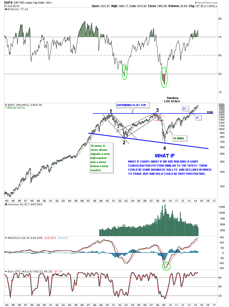
This next very long term monthly chart for the SPX I built many years ago. You can read what I wrote when we were still trading inside the massive flat top triangle consolidation pattern. At the time I didn’t know when the SPX would breakout or if it would ever breakout but as you can see it did in fact breakout and hasn’t looked back since. June produced another new all time high regardless of all the reasons why it shouldn’t.
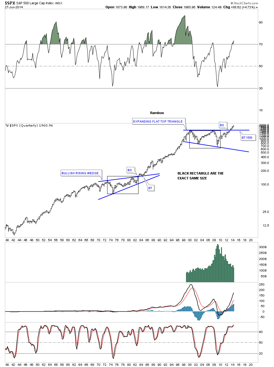
This last chart for the SPX shows you 74 years worth of trading. The reason I’m showing you this chart is so you can see how big the 13 year blue flat top triangle is relative to anything built in the last 74 years. Big consolidation patterns creates big moves.
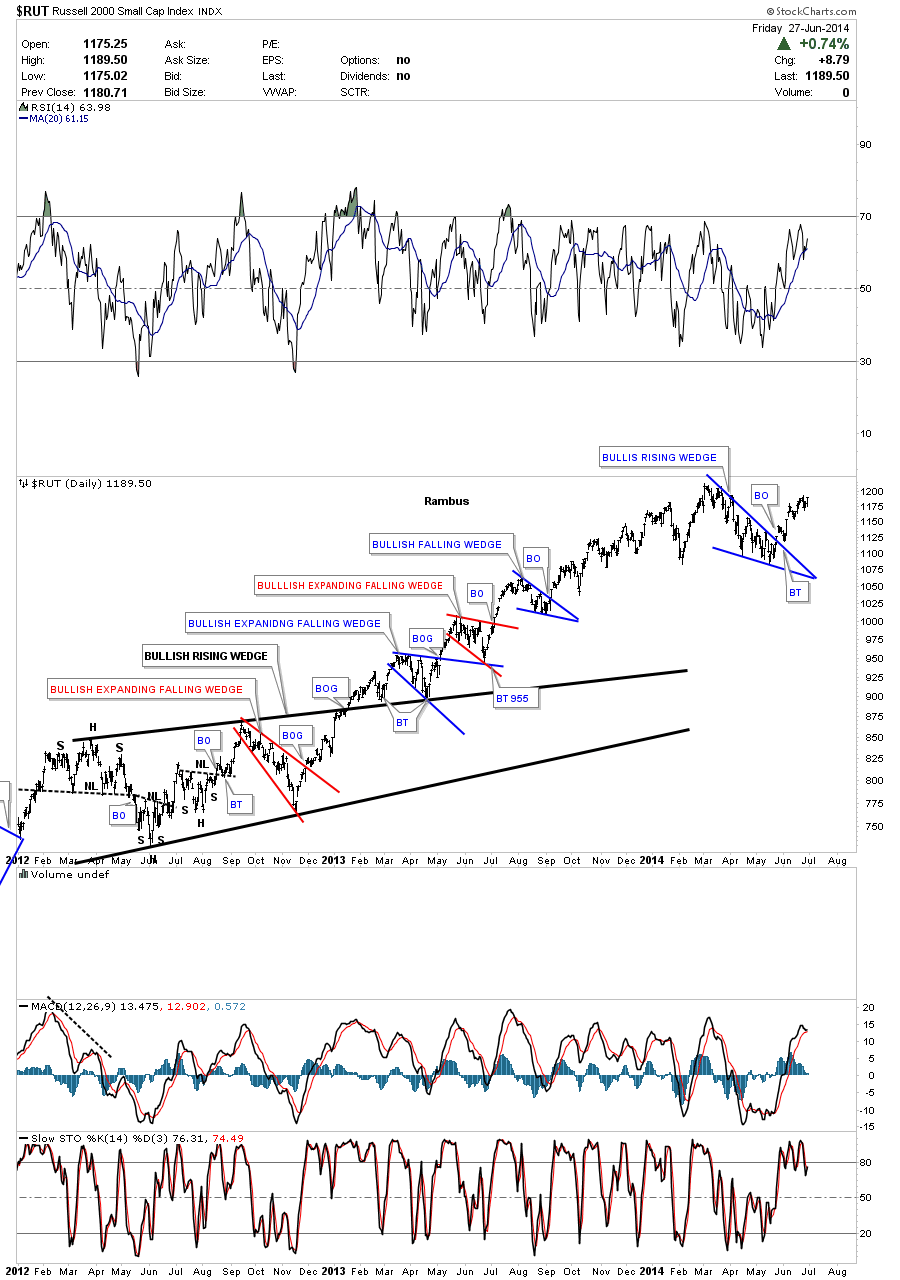
Lets take a quick look at the RUT that shows its correction since the first of the year was the blue bullish falling wedge. As you can see it just looks like another consolidation pattern in a long string of consolidation that have developed since the 2009 crash low. I would like to see the RUT take out the previous high to confirm the new move higher.
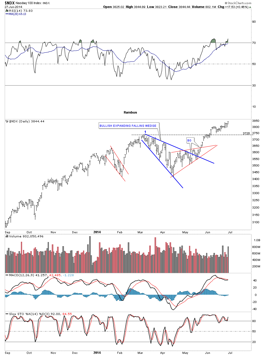
The NDX has been gaining back its strength since it had its correction this year that took on the form of the blue bullish expanding falling wedge. The NDX made a new multi year high last Friday that shows you strength not weakness. It still has some more work to do to breakout into new all time highs but it is getting there.
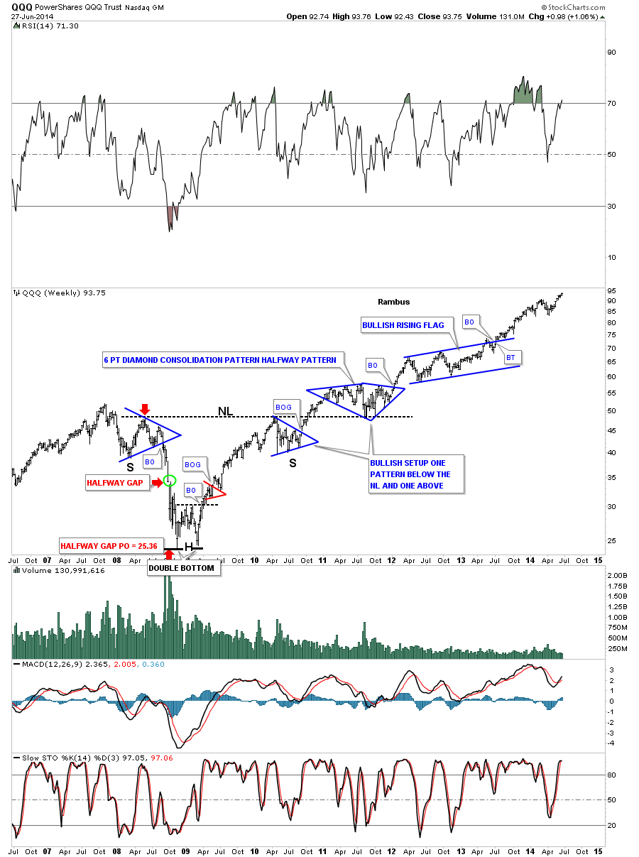
Lets look at the long term monthly chart for the QQQ which is the etf for the NDX 100 biggest tech stocks. This chart shows some beautiful Chartology starting with its massive three year inverse H&S bottom with the head portion being the 2009 crash low. Note the bullish setup that occurred at the neckline where there was one consolidation pattern that formed below the neckline and then one that formed on top of the neckline. After breaking out from the blue bullish rising flag the price action as been rising steadily creating a new multi year high last week. From a Chartology perspective it’s hard to find anything bearish with this chart.
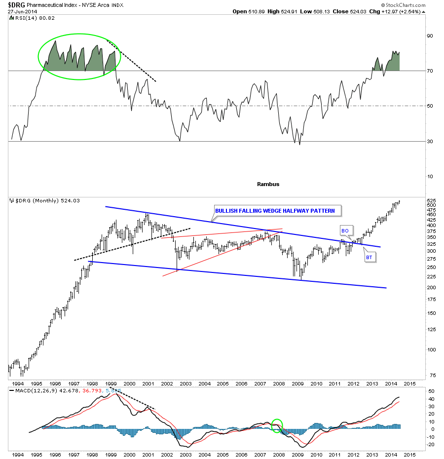
Lets now look at several areas of the stock markets that have been doing exceptionally well. The fist sector I would like to show you is the DRG sector which is making new time highs. After breaking out from its massive blue bullish falling wedge it has been a straight shot to the upside. Whenever you see a nice neat consolidation pattern like this many times how a rally looked coming into the consolidation will look very similar when the price action leaves the consolidation pattern. Note how similar the move was leading into the bullish falling wedge and how similar the rally is since DRG broke out.
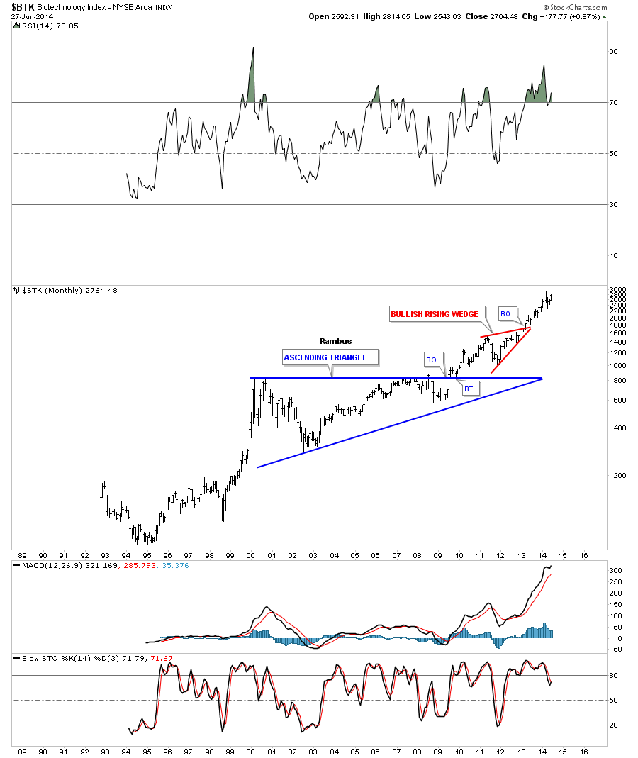
The BTK has been the strongest and the first sector to breakout and begin its new bull market back in early 2010. While most stock markets and different sectors really crashed in 2009 you can see it is hardly visible on the long term monthly chart. This is why it has been the leader during our current bull market.
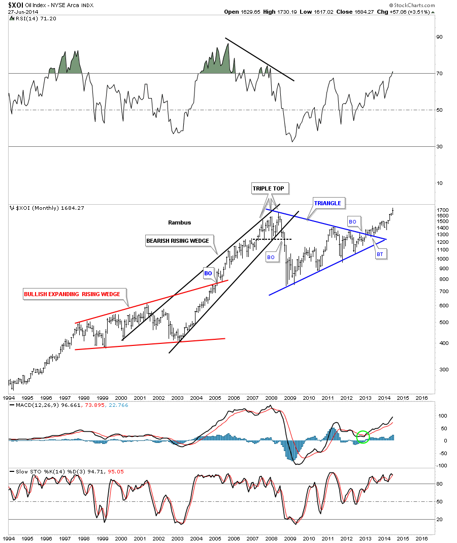
I had been watching the XOI build out that beautiful blue symmetrical triangle for literally years. As you can see it kept bouncing within the confines of the blue triangle with each reversal getting smaller and smaller. It was one of those big patterns that was hard to believe when it first broke out because of all the time and reversal points it took to finally complete the consolidation pattern. Now with the beauty of hindsight we can see the price action is starting to accelerate to the upside just as we should expect. As you can see it made a new all time high this month.
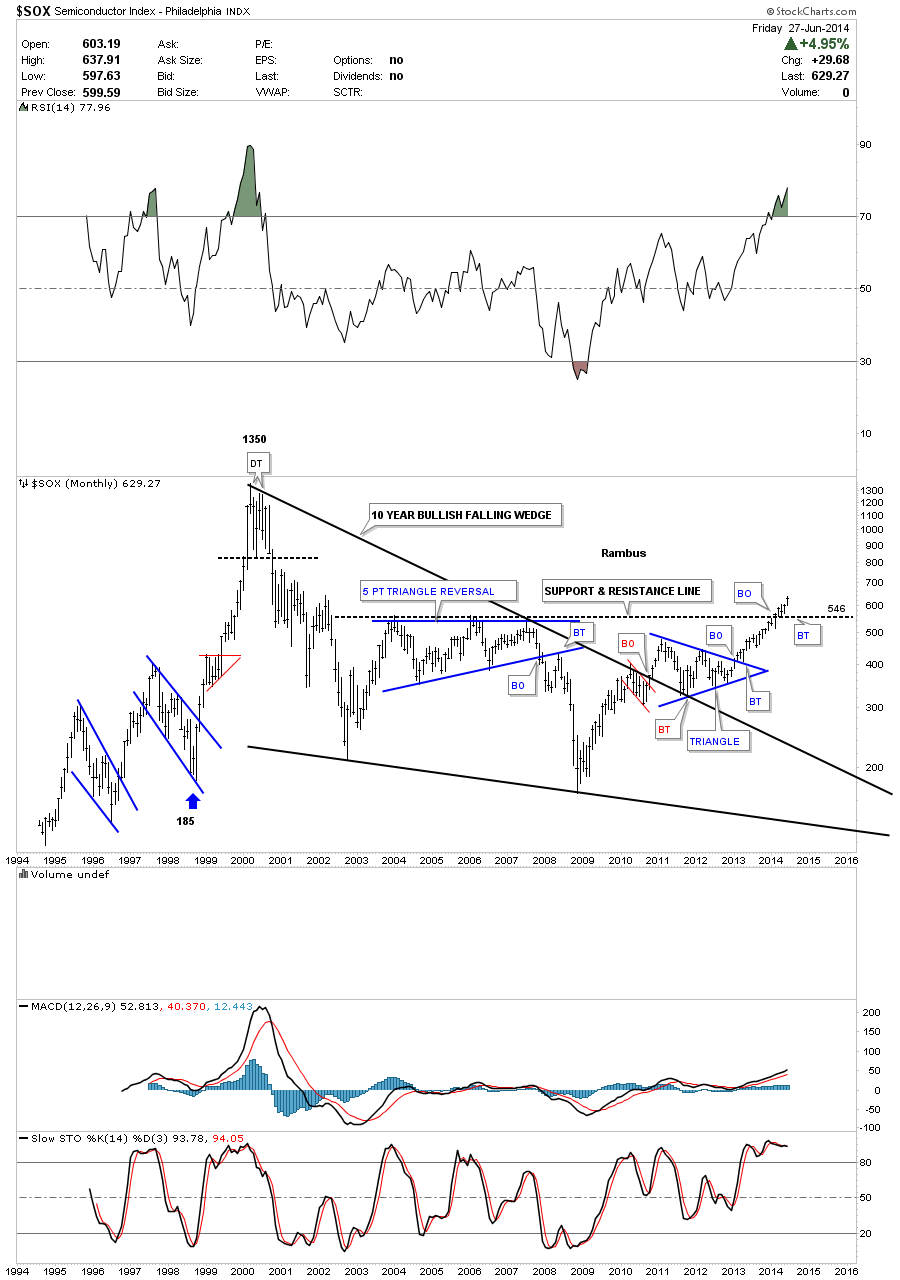
This last sector I would like to show you is the SOX which is not close to making new all time highs but it has just recently broken above horizontal resistance at 546. As with all the other sectors I showed, which all had massive consolidation patterns, the SOX also has its own 10 year bullish falling wedge. When you look at this chart it shows a good example of how markets work from a Chartology perspective on any time scale. There is an impulse move followed by a consolidation period followed by another impulse move. Rinse and Repeat until eventually the major move is finished and then what may look like another consolidation will actually be a reversal pattern. Then the same thing happens when the markets goes down.
When I look at these massive consolidation patterns that have broken out, some years ago already, it’s hard for me to see a new secular bear market forming. Many have been claiming this rally off the 2009 crash low was nothing more than just a counter trend rally in the secular bear market. When you have stock markets and different sectors in the stock markets making new all time highs its hard to call it a top or bear market. Tops take time to form and with many stock markets making new all times highs it would still take a long time to build out a major top. I’m just going to follow the price action and see where it takes me regardless of why the markets are not supposed to go higher.
There are many individual stocks in these strong sectors that one can find using a little Chartology. If you put in a little time and effort you will be surprised what you will come up with. It’s called doing your homework. You know what sectors are strong right now so those are the areas to focus your attention on.
All the best…Rambus
Wednesday Report…A Cold Hard Look at The Big Cap Precious Metals Charts
In tonight’s report I would like to take a good hard unbiased look at some of the big cap precious metals stocks that have been in rally mode since the first of June. This rally has been pretty impressive so far but is it the real thing? Last night I showed you some charts on the GDM going from the 60 minute short term look to a year and a half look that showed the two big patterns we have in place right now, the falling flag and the inverse H&S bottom. Tonight I would like to follow up with some big cap PM stocks, on the 60 minute chart and the bigger long term chart charts, that have their own respective year long trading ranges.
First lets look at the 60 minute chart of the GDM that I showed you last night that had a H&S top forming. Today GDM did some more work on the right shoulder that is making the H&S top a little more symmetrical now. Keep this H&S top in your mind when we look at some of the other big cap PM stocks in a bit.
Below is the 2 year weekly chart that shows the blue parallel downtrend channel that we’ve been following for some time now. These are the two chart patterns I’m going to show you tonight, the little H&S top on the 60 minute charts and this year long blue trading range on the longer term big cap PM charts. The combination of where these little H&S tops lie in regards to the top rail of these big one year trading ranges maybe be giving us a big clue that we are just at the top of this one year trading range that may continue for who knows how much longer. I do know everyone is super bullish right now on the precious metals complex so maybe now might be a good time to go against the crowd. After we look at some of the more important big cap precious stocks you can make up your own mind.
First lets look at biggest of the big cap PM stocks ABX. This 2 hour chart shows a potential H&S top that has yet to break below the neckline. Keep in mind where this potential H&S top resides on the longer term chart following this short term look.
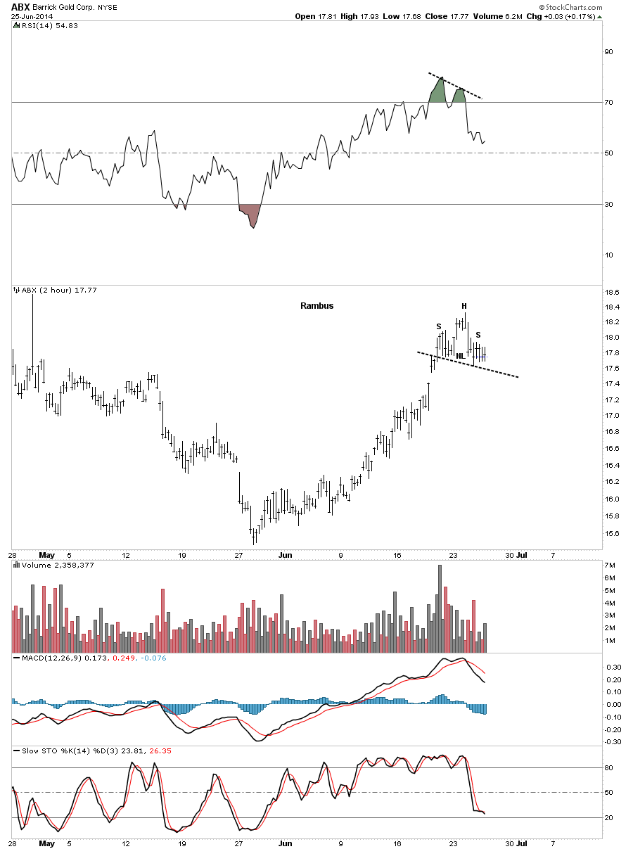
Below is the daily chart for ABX that shows our little H&S top has formed just below the bottom rail of the big blue bearish rising wedge as a backtest so far.
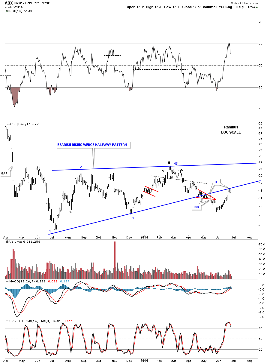
Now the weekly chart that shows our little H&S top forming at the bottom rail of the bearish rising wedge as the backtest. You can see how critical this area is right here on the biggest PM stock there is.

Lets now look at the star performer for this rally off the June low, RGLD.
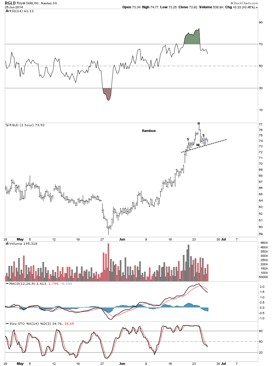
Below is a daily look at RGLD that shows it’s big one year trading range is a rising wedge formation. You can’t really see the small H&S top but it’s there just below the top rail at reversal point #4.
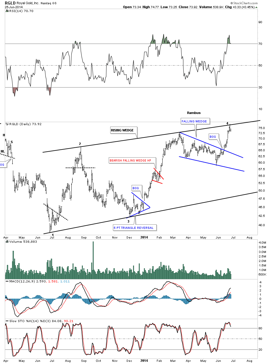
Below is a weekly chart that shows the rising wedge with our little H&S top forming just below the top blue rail at reversal point #4.
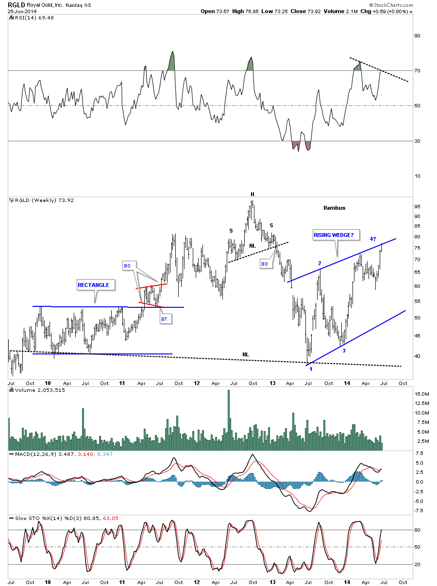
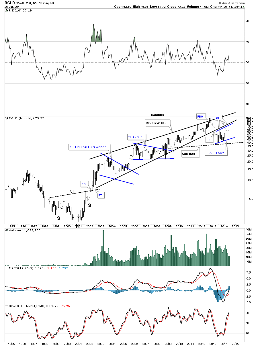
I have to show you the monthly chart for RGLD as it ties all the time frames together. As you can see this is the third backtest to the bottom rail of the long term black rising wedge. How critical is this backtest?
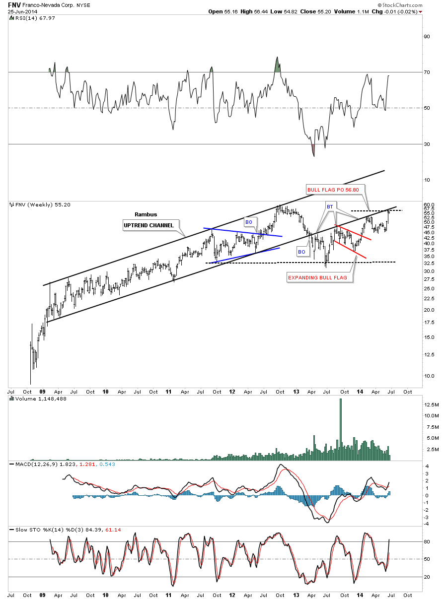
FNV has been another high flyer during this June rally.
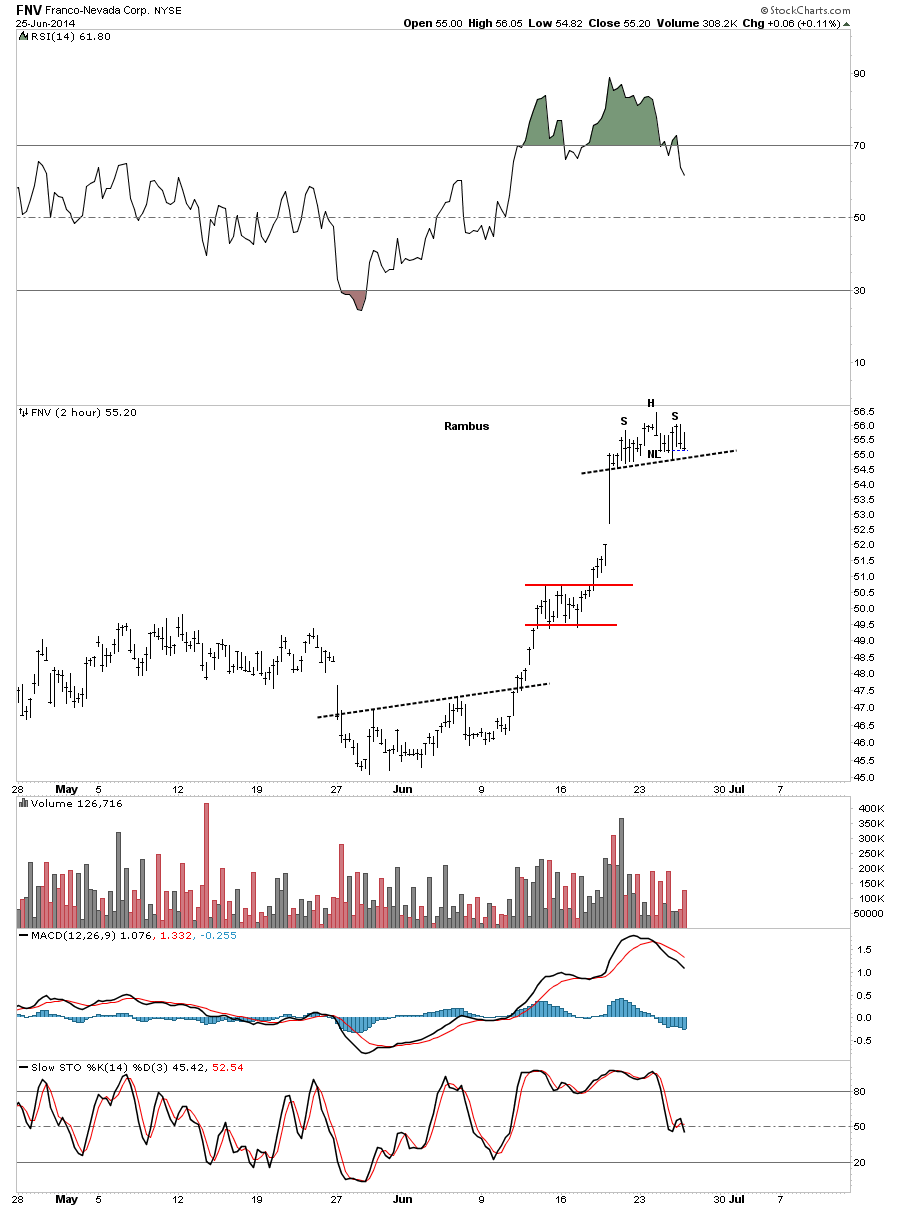
The weekly chart of FNV looks a lot like RGLD that shows a very long term black uptrend channel and now another backtest from the underside making it the fourth now.
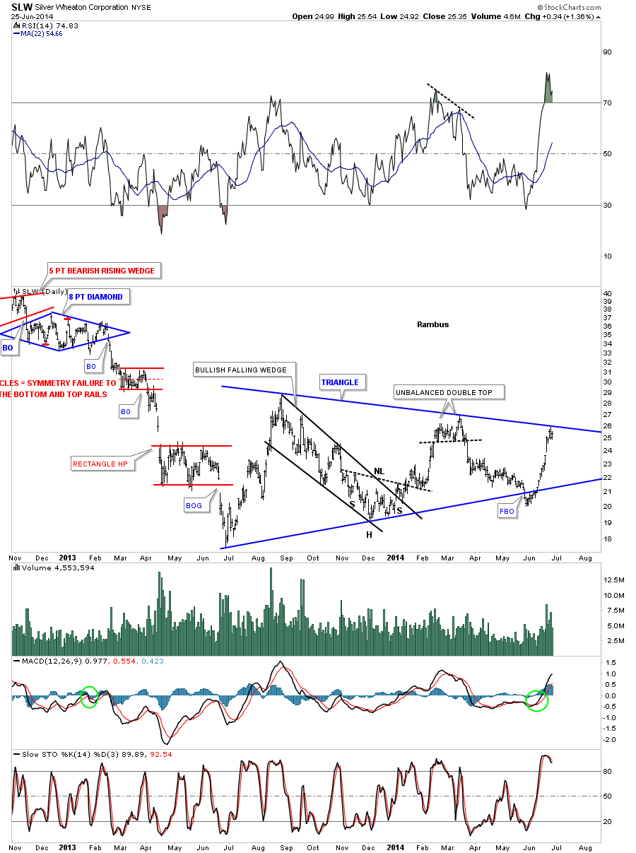
SLW has been another star performer during the June rally.
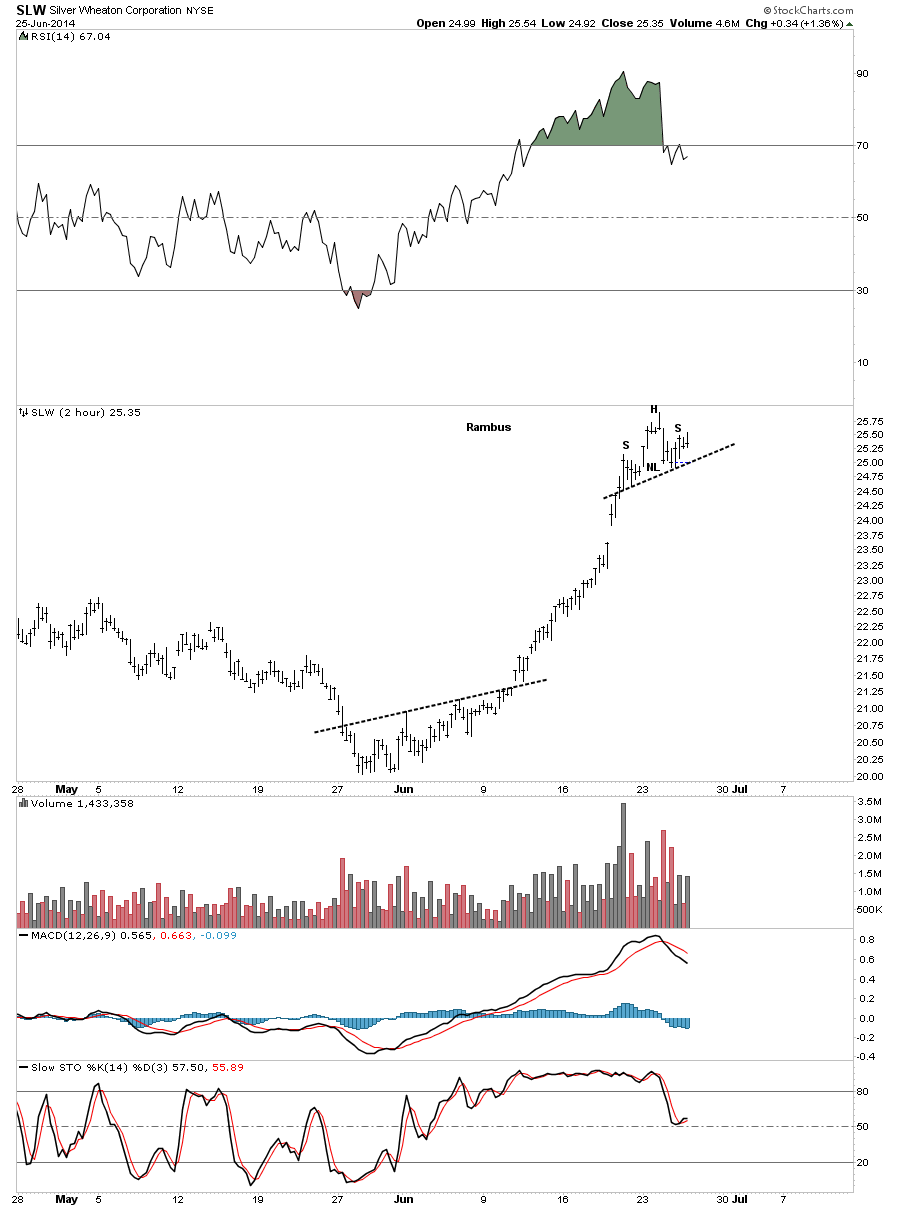
SLW’s trading range has been a triangle formation. As you can see it had a false breakout of the bottom rail and then reversed direction and rallied all the way backup to the top blue rail.
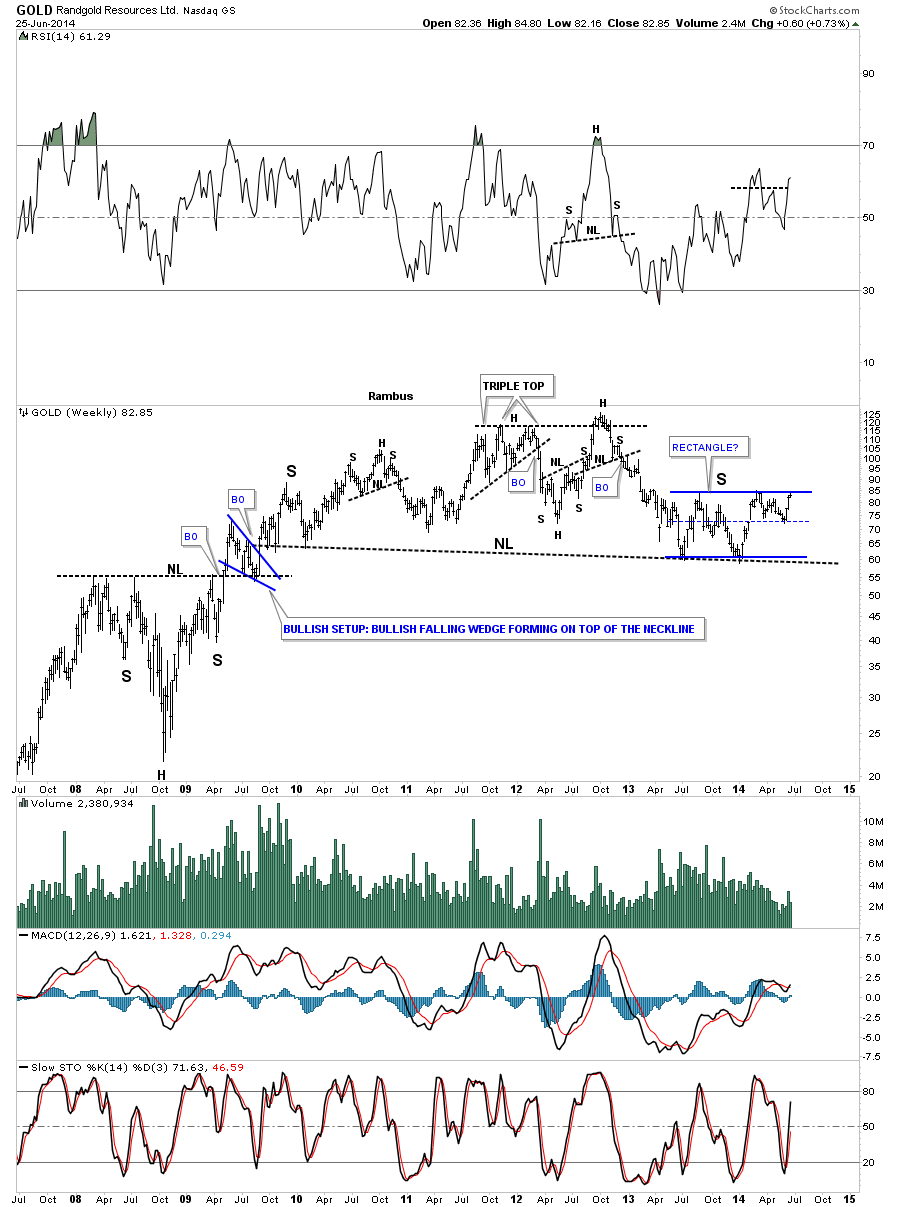
Below is the 2 hour chart for Randgold.

Below is the daily chart that shows Randgold’s expanding triangle and our little H&S top at reversal point #4.
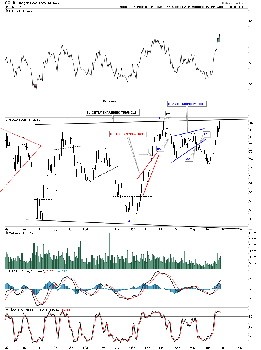
Randgold long term look.
Lets look at one more big cap PM stock GG and its 2 hour bar chart.
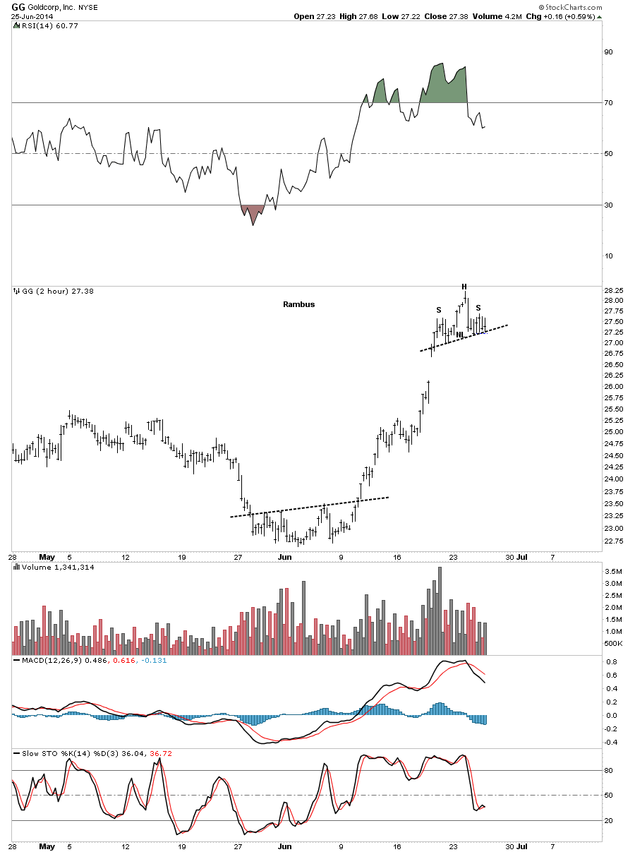
Below is a daily chart for GG that shows its black falling flag as its one year trading range.
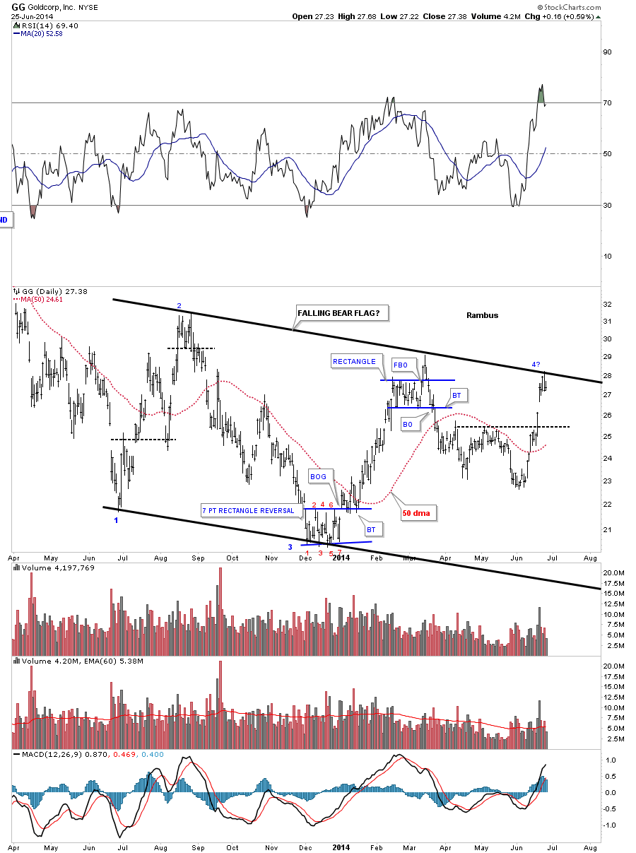
The weekly chart really puts the blue falling flag in perspective.
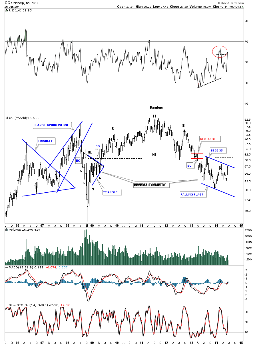
This last chart for GG shows its entire history going all the way back to 1994. You can see its classic bull market that ended with that massive H&S top.
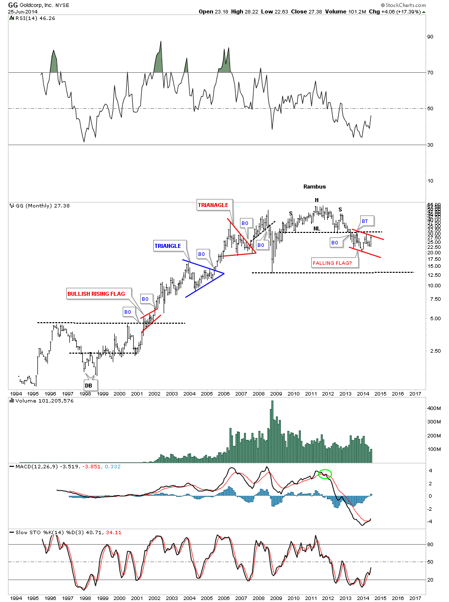
This is where we stand tonight in regards to the big cap precious metals stocks. Keep in mind those little H&S tops, on the two hour charts, weren’t there two days ago. They started to show their self yesterday with some follow up work on the right shoulder today. They still haven’t broken down yet so they are still incomplete patterns. What I showed you tonight, on the bigger one year trading ranges, is the top rails are still hot and to be respected even though there were many different one year congestion zones. Nobody knows with 100% certain how things will evolve from here but there is a lot of evidence that this June rally could just be another reaction within the one year trading ranges exhibited by most of the PM stocks. We need to be prepared for whatever the markets throw our way. If these small H&S tops start to breakdown then we will need to act accordingly. The first thing will be to exit the Junior Portfolio stocks. The big cap precious metals stocks are truly at an inflection point right here and now in which we can take advantage of with just a little more information. Keep and open mind and lets see what kind of hand the markets deals us. All the best…Rambus
PS: Just so you know I’m not bias. Here is the possible inverse H&S bottom everyone and there brother is now seeing. May the best pattern win…
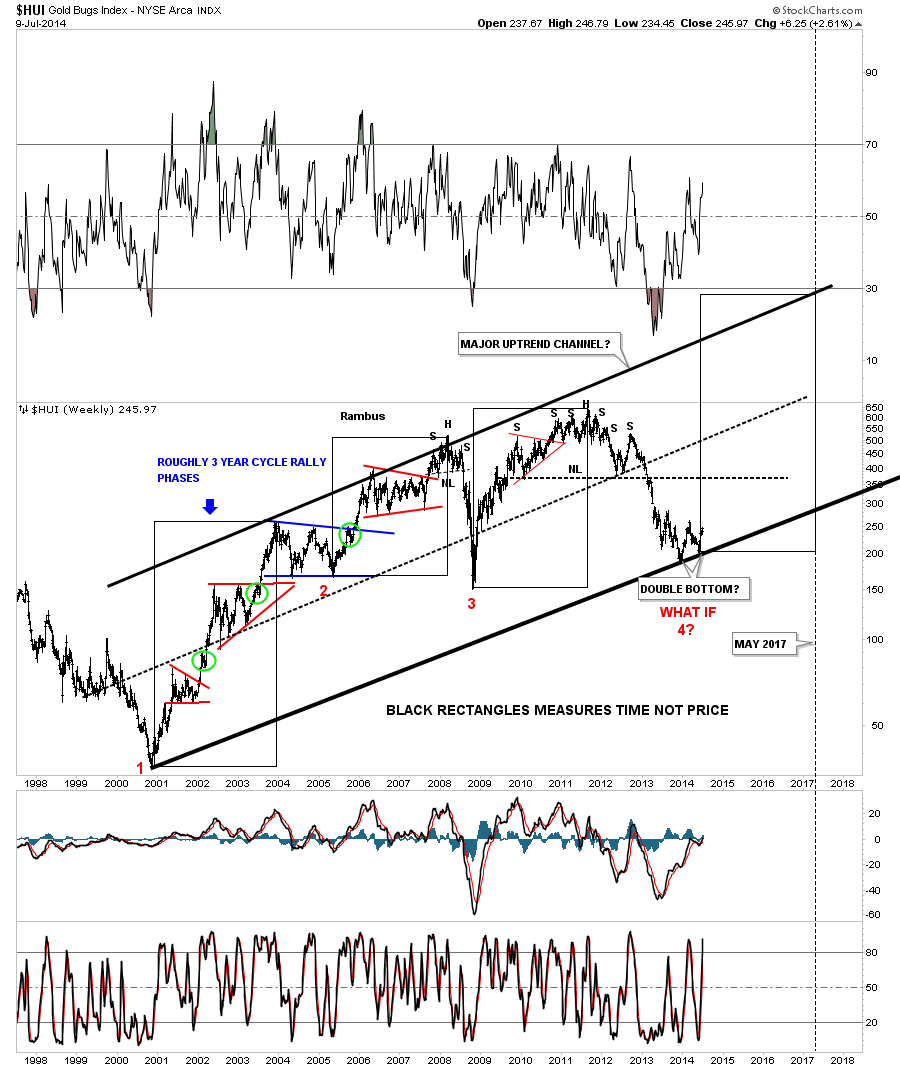
Weekend Report…The HUI..What If ?
What a difference two weeks can make in the precious metals markets. Going from a confirmed downtrend to an uptrend, at least on the short term basis, was rather swift and didn’t leave much time for one to reverse direction to get back in sync with the new uptrend. At this time the rally is still in its infancy as there is more work to do but there are some positive things taking place, over the last two weeks, that could show us a major turning point maybe taking place in the precious metals sector. As always it’s one step at a time with each step confirming or not confirming the price action. In this Weekend Report I would like to look at the HUI to see how things have changed over the last two weeks. With that being said the first thing we need to see is a higher low to even consider an uptrend is taking place. Below is a daily line chart that I showed you a month or so ago that shows the big long black dashed support and resistance rail, possible neckline, that defines the positive or negative trend for the HUI. Below is negative and above is positive. At the time I showed you this chart there was no right shoulder in place as the price action was declining after hitting that big S&R rail. As of right now you can see the June low is higher than the December 2013 low which is the first sign of a possible new uptrend taking place. I’ve added some smaller black dashed horizontal lines that shows how the support and resistance lines have been working . The HUI has now rallied back up to the 236 area where it’s finding some very short term resistance. The perfect breakout scenario would be to see the HUI rally above the last horizontal resistance line at 236, hit the big S&R rail or neckline, back off to the 236 area and make a run above the big S&R rail which I would then consider to be the completion of a one year inverse H&S bottom.The potential neckline is now at the 250 area which is the most important number to watch for a breakout and confirmation of the bottom and a new uptrend is underway. There is a very bullish setup with the RSI indicator at the top of the chart that shows us a hidden bullish divergence. Note how the RSI made a lower low in June vs the December low while the HUI made a higher low in June vs the December low. This is a very positive sign for the HUI. 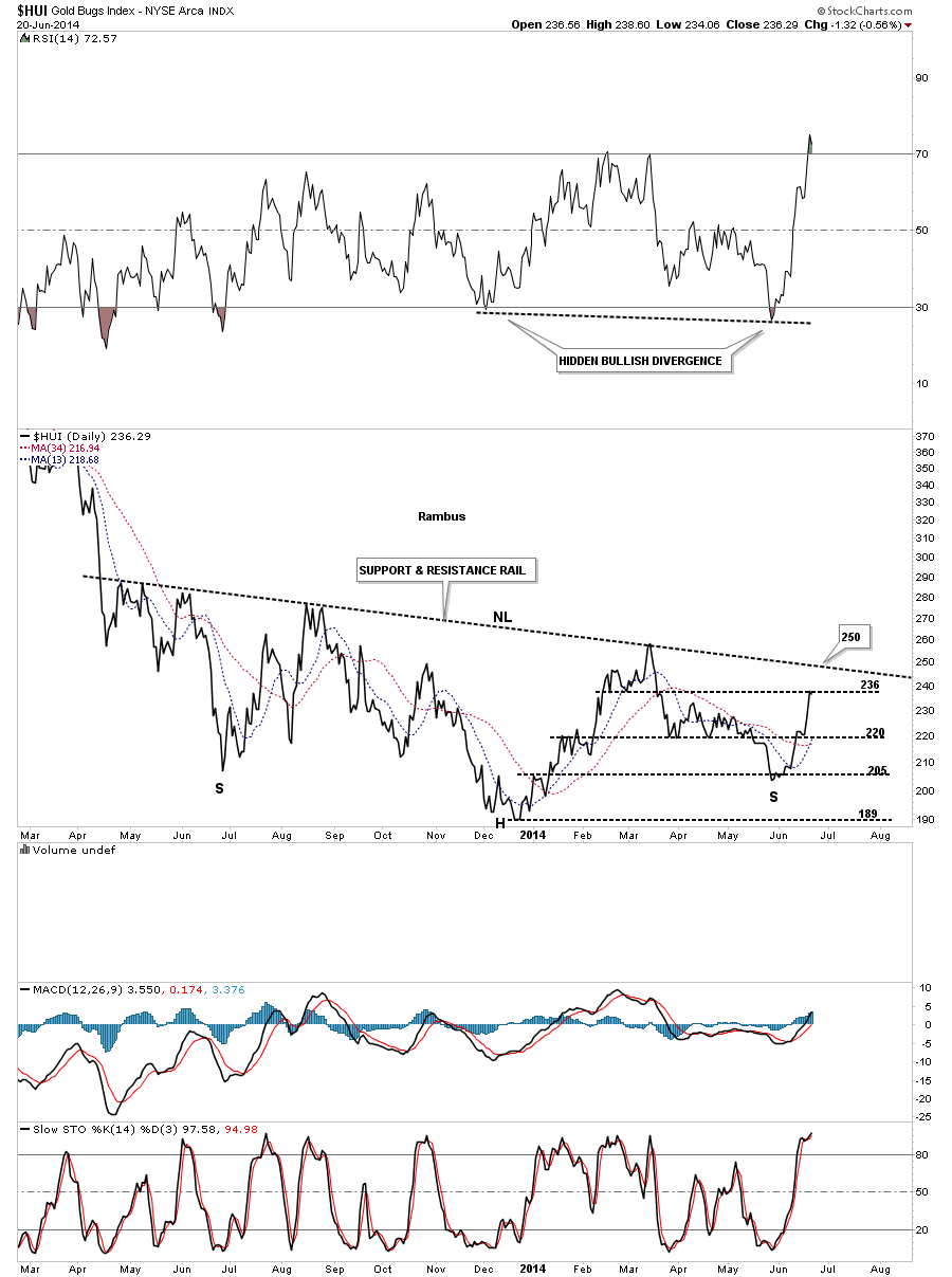 Next I would like to show you another very important support and resistance line, on the long term weekly chart, that showed the initial H&S top several years ago right after we opened our doors at Rambus Chartology. The top neckline #1 shows the support and resistance rail starting all the way back in 2009 and didn’t end until the HUI finally broke below it for good in November of 2012. The red arrows shows how it acted as resistance and the green arrows shows how it reversed its role to support once it was broken to the upside. Note the breakout from the upper neckline #1 that looked like the smaller H&S was complete and the new bear market was beginning. If you’ve been in the markets for any length of time you know there can be false breakouts for even the best looking patterns. As you can see the price action fell down to create a double bottom that looked like it was going to negate the upper H&S top. The purple arrows shows the price broke above neckline #1 but quickly burned out and reversed and declined back below neckline #1. This is how the markets talk to you. Once the price action traded back below neckline #1 is when we went short as the HUI was trading back below the support and resistance rail which ended up creating a bull trap. The rest is history from that bull trap just above the S&R line. From that point is where the bear market really started to accelerate to the downside. Now lets fast forward to our recent bottom. You can see how the red arrows have been holding resistance for over a year now. What has developed over the last two weeks is the low last June and our current low this June are at the same low with the December low being the low for this bear market so far creating the possible inverse H&S bottom. I’ve labeled the December low as a bear trap because that’s what its been so far. As I’ve pointed out many times in the past that when you get a false breakout its usually the final washout phase before the price action reverses its trend and moves strongly in the opposite direction leaving many behind that failed to see what took place.
 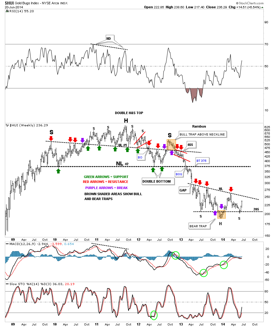 This next chart for the HUI is a shorter term daily look that shows you just how fast the HUI went from a bearish setup to a bullish setup in just two weeks time. First lets focus in on the blue falling wedge that had a breakout accompanied by a breakout gap that looked very promising. At the time I had a parallel downtrend channel that was made by taking the the top black rail of the now bullish falling wedge and adding it to the late March low. Also notice the brown shaded support and resistance zone that had been working very well defining when the HUI was positive or negative. Once the HUI broke below the bottom blue rail of the falling wedge and the brown shaded support and resistance zone it looked very promising that the price action was headed back down to the the December low. After the initial breakout the price action chopped around for a little over a week consolidating the drop out of the blue falling wedge. Nothing looked abnormal at that point. The first real sign that something was amiss with the downtrend is when the HUI gapped above both the blue rail of the falling wedge and the top rail of the black falling wedge. That was a major red flag for me as that wasn’t supposed to happen and when something that isn’t supposed to happen, happens, one needs to take a good hard look at the new situation with a open mind which is exactly what I did. Note how the second days price action, after the breakout from both falling wedges, rallied all the way through the brown shaded support and resistance zone which should have been strong resistance. As you can see on day number three of the breakout the HUI traded at the top of the brown shaded support zone which now had reversed its role to what had been resistance to now support over the next four days. The 50 dma also came in at the top of the brown shaded support and resistance zone to offer its own support. That’s all I need to see to then go long NUGT on June 13th along with USLV. As with any discipline in the markets, whether it be Elliot Wave, cycles or whatever one needs to have confirmation of a trend change before you invest your hard earned capital.
 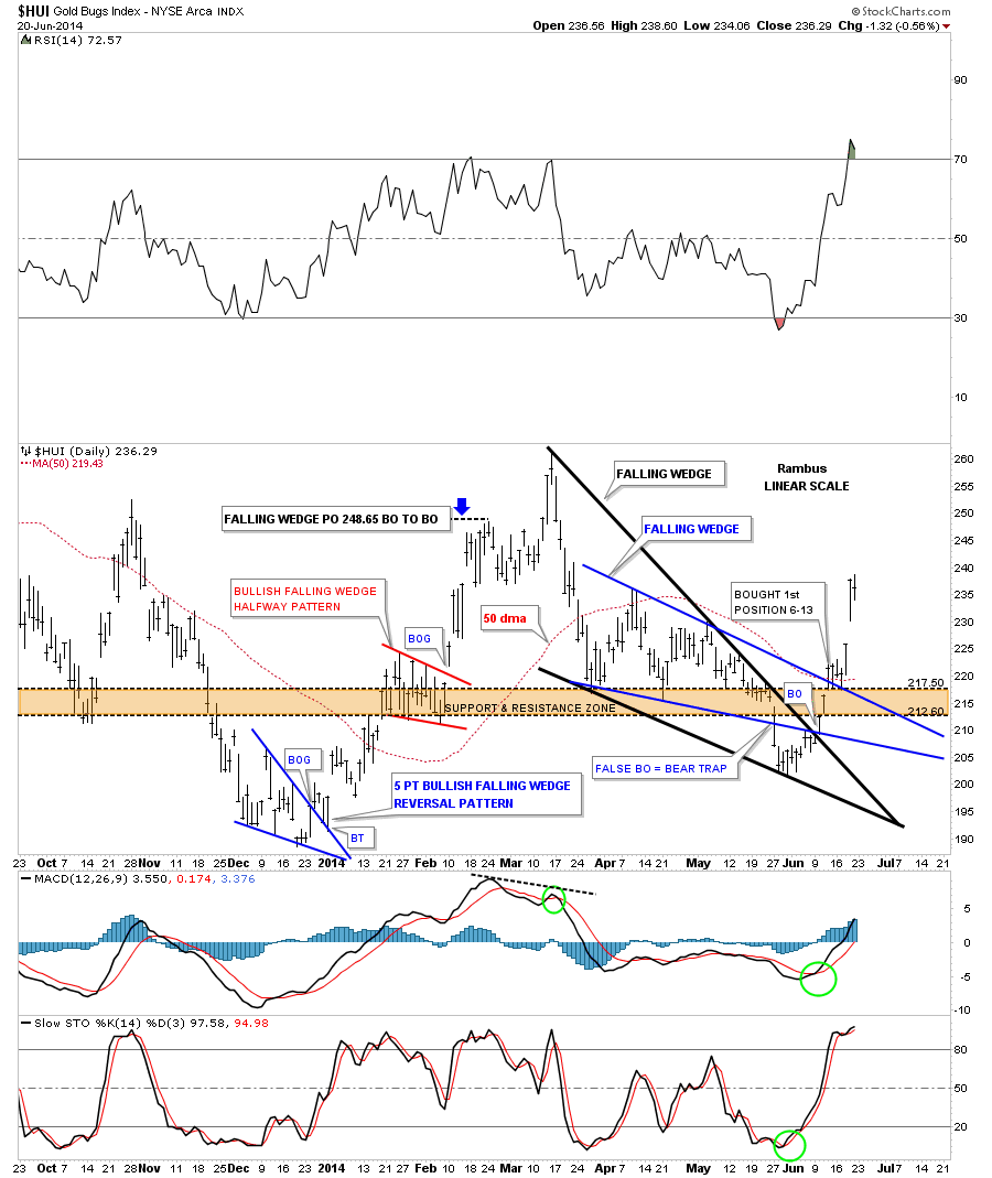 Next I would like to show you the complete history for the HUI that shows all the consolidation patterns and impulse moves during its secular bull market. I have said this many times in the past , the precious metals and precious metals stocks create some of the best looking chart patterns of any sector out there. Note the beautiful blue triangle consolidation patterns that formed during the HUI’s bull market years up until the 2008 crash. The red arrows shows where the actual impulse moves began at the last reversal point in each consolidation patterns. Note the beautiful H&S top in 2008 that led to the first real correction for the HUI. Next you can see the massive H&S top that has led to our current low. What I find potentially very bullish is where our current and potential inverse H&S is forming. Since the December low last year, which is the head portion of the inverse H&S bottom, the bottom rail of the major uptrend channel has just made its second low which is a higher low , the June 2014 low on the bottom rail. This one year inverse H&S bottom is forming exactly where one would want to see a reversal pattern like this form. Note the RSI at the top of the chart that is showing a very large bullish hidden divergence. It’s also showing a series of higher highs and higher lows. When looking at the indicators on the sidebar you can see the price action on the blue histogram has just moved above the zero line and the MACD has just had a positive cross. The slow Stoch has just crossed and in now above 20.
 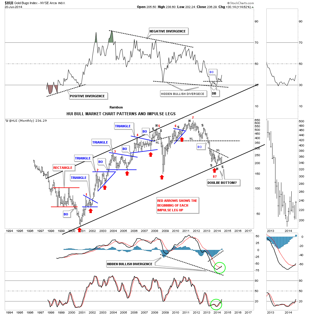 Below is just a simple weekly candlestick chart for the HUI that shows the inverse H&S bottom that has been developing for one year now. There are a lot of ways to use candlesticks but I like to use the back and white candles to show me when a stock is in an impulse move. When there is a strong impulse move down you will see a string of back candles and when a stock is in a strong impulse move up you will see a string of white candles on the weekly and especially the monthly charts. This week marks the third week in a row now that we’ve seen a white candlestick. One last note on this chart. As you can see the June low in 2013 and our current June low happened at the same price with the head portion, of this potential inverse H&S bottom, being the bear market low made in December of last year. There has been a 6 month time cycle in the PM complex that has been around since the beginning of the bull market. Sometimes it gets out of whack a bit but I always look for the June and December months for changes in a trend.
 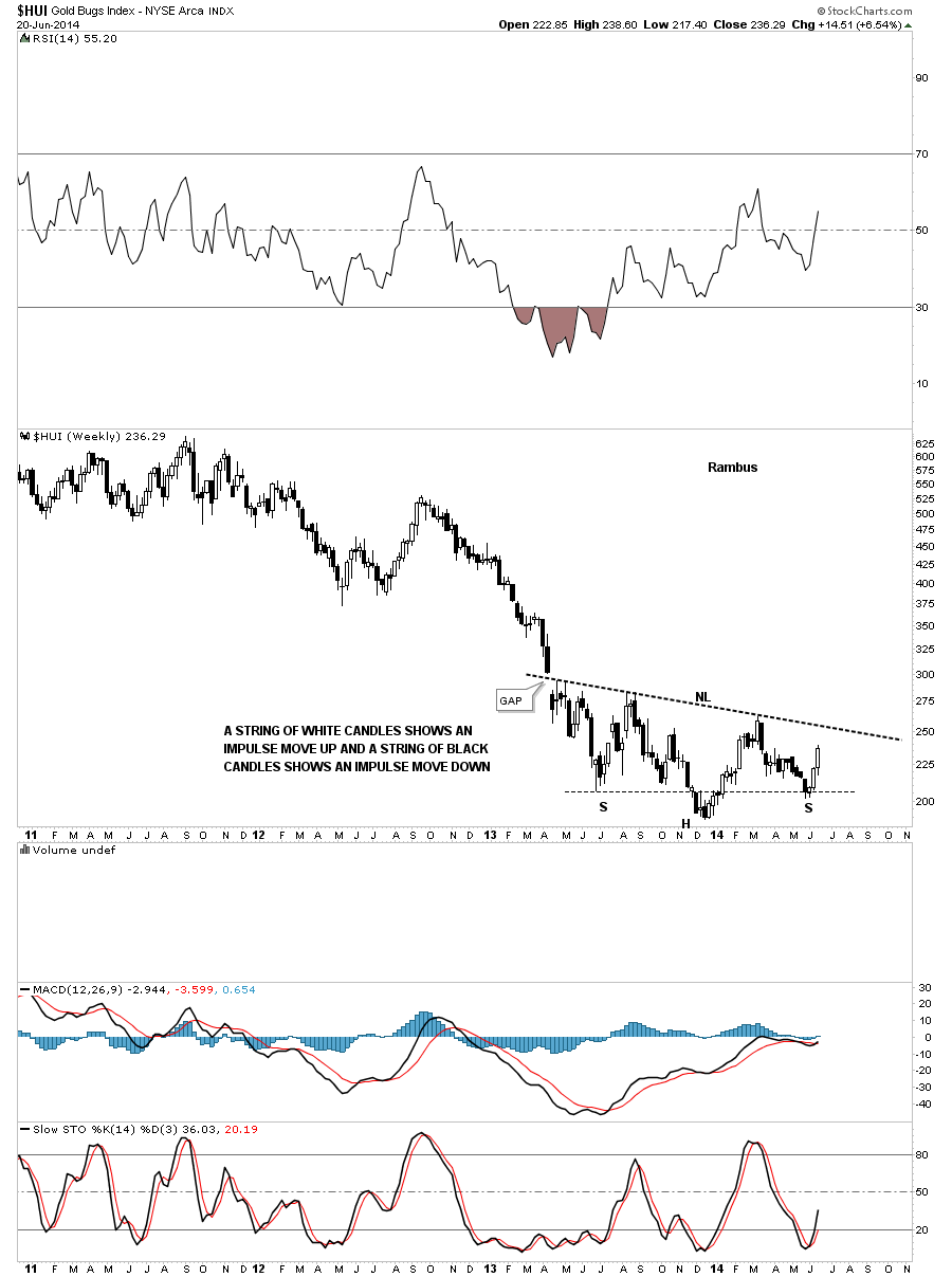 This last chart for the HUI is a long term weekly look that shows a roughly three year time cycle. If the HUI is truly embarking on the next big three year rally cycle then we’re going to see some very strong rallies followed by periods of consolidation that will make it hard to ride the bull. We may not pick the absolute high or low, no body does, but with Chartology on our side we will be able to look for different chart patterns for clues on what to expect next. I’ve moved the black three year rectangle to the right just a tad so you can see our June low. I have just one simple question to ask as you look at this chart below.
What if this is THE BOTTOM? 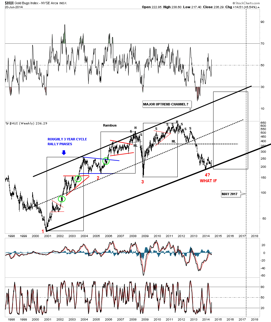
All the best…Rambus
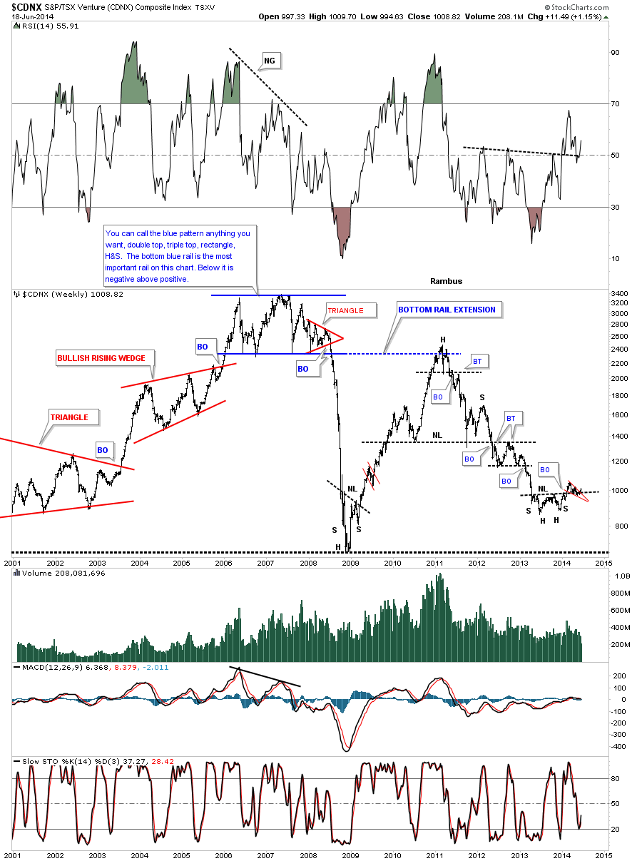
Wednesday Report…The Wild and Whacky History of the CDNX
As you know the juniors have been leading the way higher since this move higher began. I would like to show you the CDNX which was our proxy for the small cap PM stocks before all the new etf’s came out. This is a real good gauge on how the small cap universe is doing, in general, as there are small cap oil and gas stocks in there as well.
Presently the CDNX ( a Canadian Listed Index) has been relegated to the back pages and is watched by very few analysts anymore , but I believe it has an incredible story to tell and is still a very important clue as to the whole Precious Metals Complex
If this index is doing well that means there is some risk capital at work which is good for the entire markets. This is similar to the Russel 2000 small cap index for the stock markets. One always likes to see money flowing into these little guys as it shows overall strength.
This first chart for the CDNX shows a blue bullish falling wedge similar to the big cap PM stock indexes I’ve been showing you.
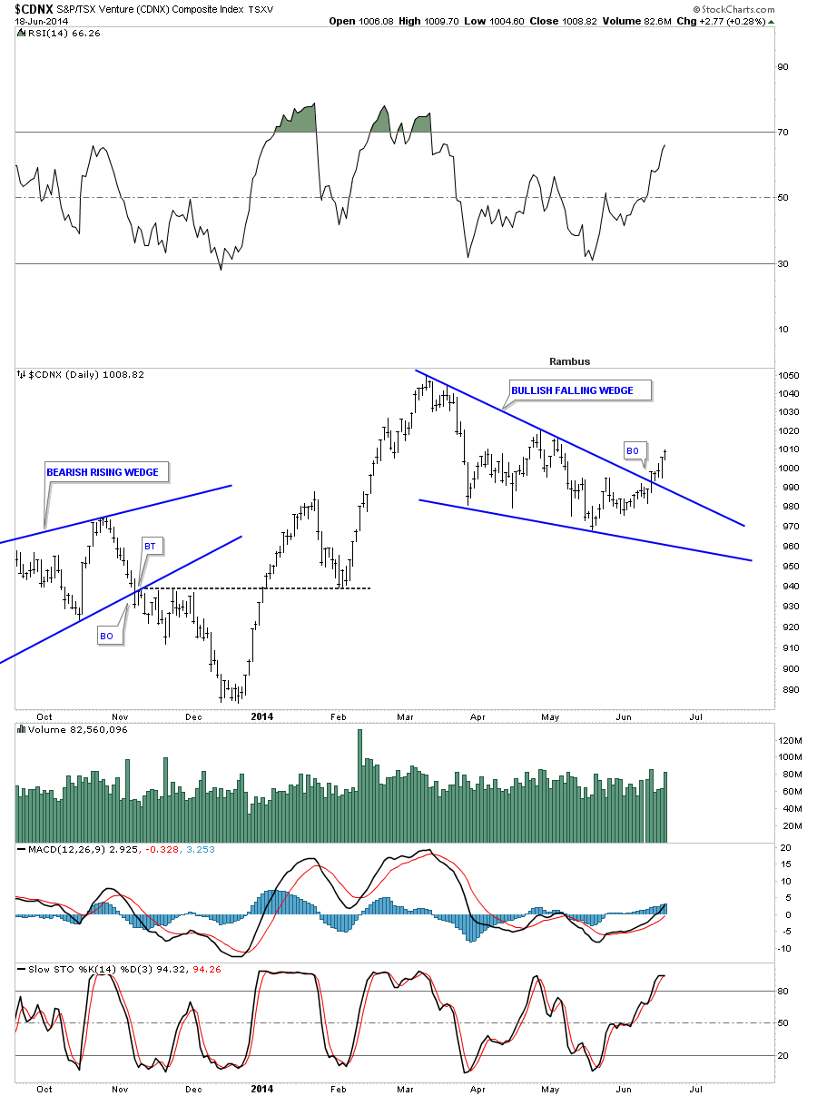
This next chart shows the inverse H&S bottom that I showed you earlier in the year when we tried our hand on the long side back in January and February of this year. As you can see it broke out above the neckline which was a good indication that the juniors were bottoming. After a brief rise the price action fell back to the neckline. It looked like the neckline may fail as there were so many different backtests taking place since the middle of March. It now looks like the neckline has held its ground as the price action is starting to rise. The bullish setup is that we have the blue falling wedge forming right on top of the neckline. As I have stated many times in the past when you have a smaller chart pattern form just below, just above or right on an important trendline that is a very big clue that the trendline is hot and to be respected.
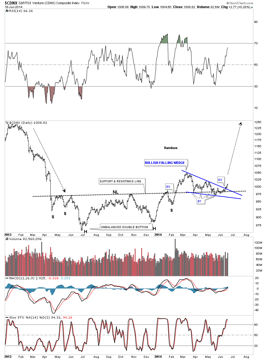
I would now like to put our inverse H&S bottom in perspective by looking at a weekly chart for the CDNX. You can see how critical the neckline is to reversing the major downtrend that began in 2011. This is a perfect location to see an inverse H&S bottom form, at the end of a major move down. What I would really like to see happen next is see the CDNX takeout the high on the little red falling wedge for more confirmation the trend has indeed reversed and is turning up.
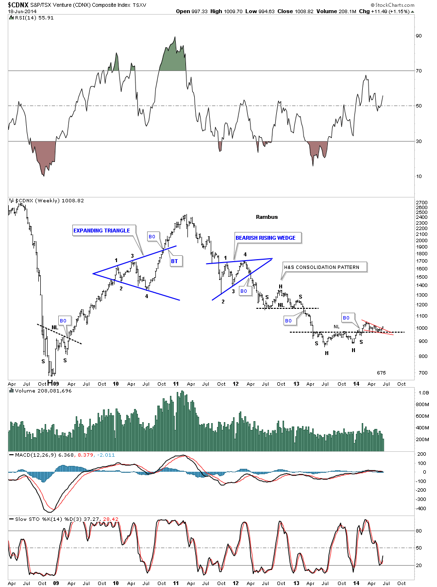
There is another reversal pattern in play that I showed you 6 months ago when the CDNX broke out from the big blue falling wedge. Six months is a long time and a lot of things can happen that one can lose track of. This is one reason why I keep literally 1000’s of charts that I may not update very often but they can give me perspective when there is a possible trend change. Again what I would like to see now is for the CDNX to make a higher high to help confirm the breakout of the bullish falling wedge.
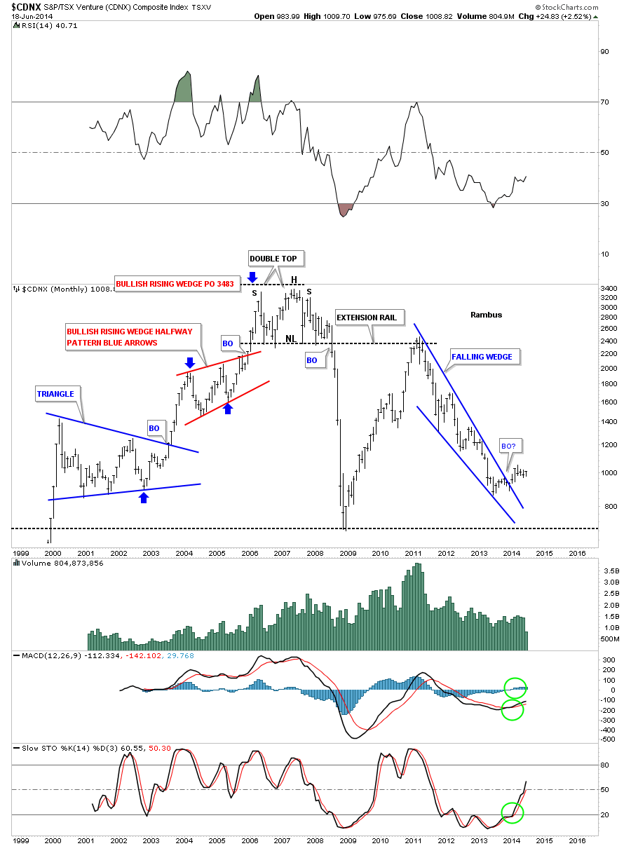
I would like to show you one last chart for the CDNX that helped me determine the top for the precious metals stocks in 2008. At the top of the chart in 2007 and 2008 you can read what I wrote back then as the chart pattern didn’t show what direction a breakout would go. The little red triangle that formed on the bottom rail of that big horizontal trading range was a very big clue that the price action would eventually breakdown even though the bigger blue trading range hadn’t yet. I had no idea of what was to come. As you can see once that blue trading range broke down it was all over for those that didn’t get out in time. The drop was so vertical that most PM investors were in shock and awe. Keep in mind those investors in the PM bull market hadn’t seen anything like what was about to happen before. There was a certain cockiness back then that nothing like this could ever happen to the precious metals stocks. I’ve learned the hard way many years ago that one never becomes cocky no matter how right you think your are. The markets can make a fool out of you before you even know you’re a fool !
. I have a lot more work to do tonight as these four different portfolios are really keeping me busy. ,Especially the Junior Miner Portfolio which is potentially very exciting . I just wanted to show you this possible turning point in the CDNX that may have a far reaching affect for the rest of the precious metals complex. All the best…Rambus