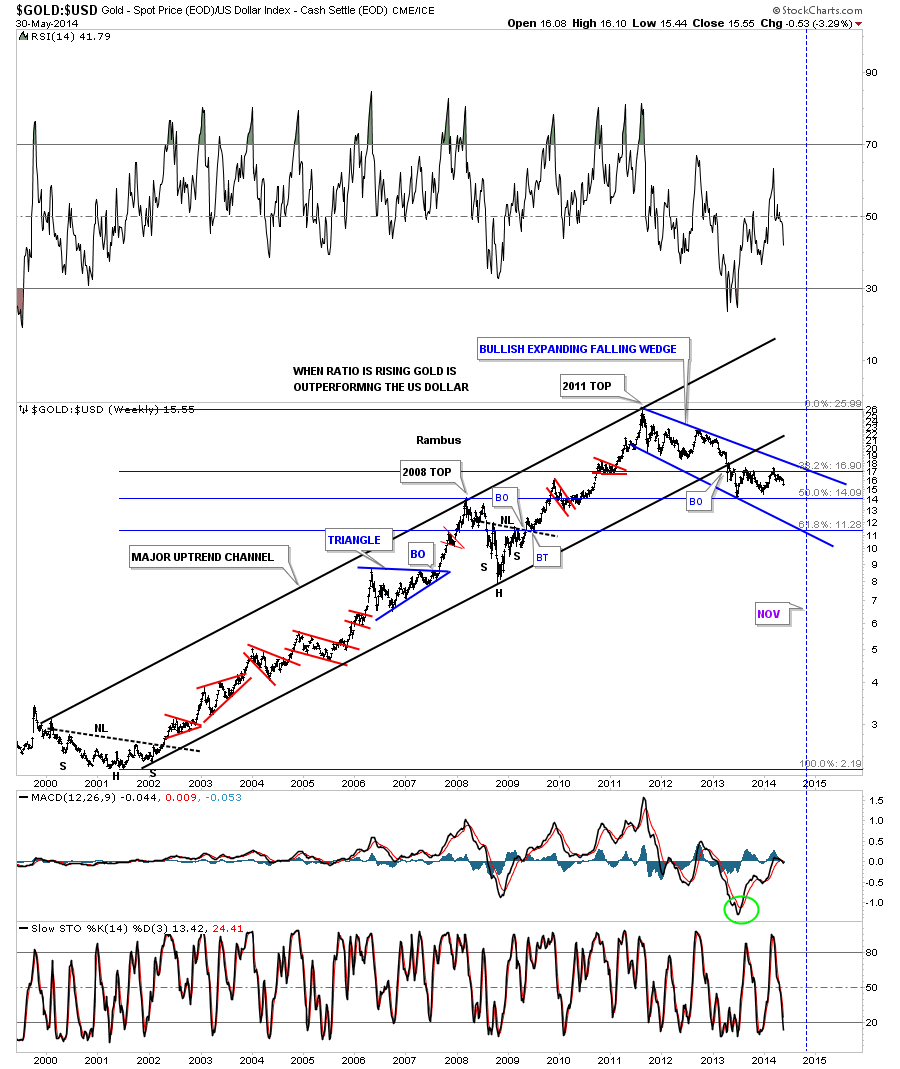
In this Weekend Report I would like to look at some charts for the precious metals complex and some stock markets that have been moving opposite to each other since the PM sector topped out in 2011. Has this Divergence run its course , or not ?
PRECIOUS METALS
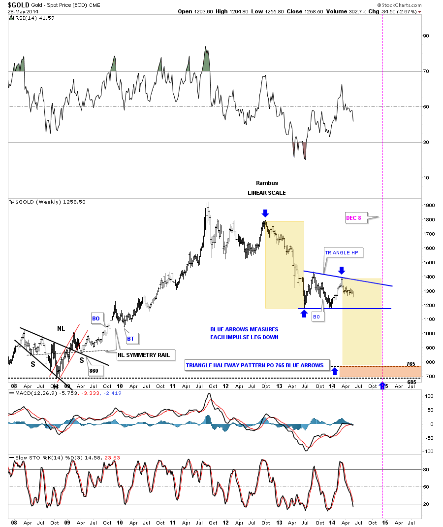
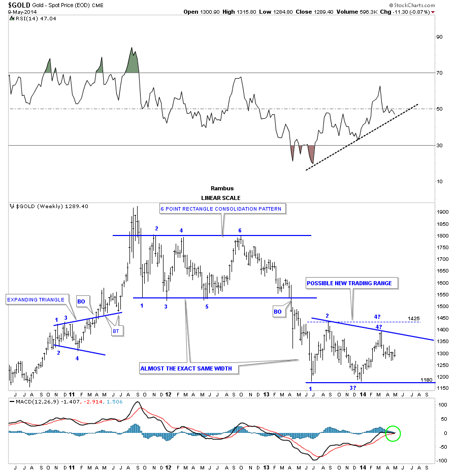
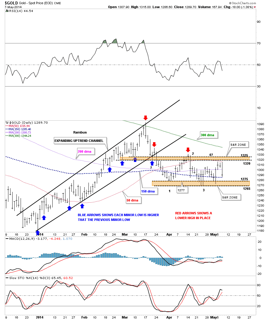
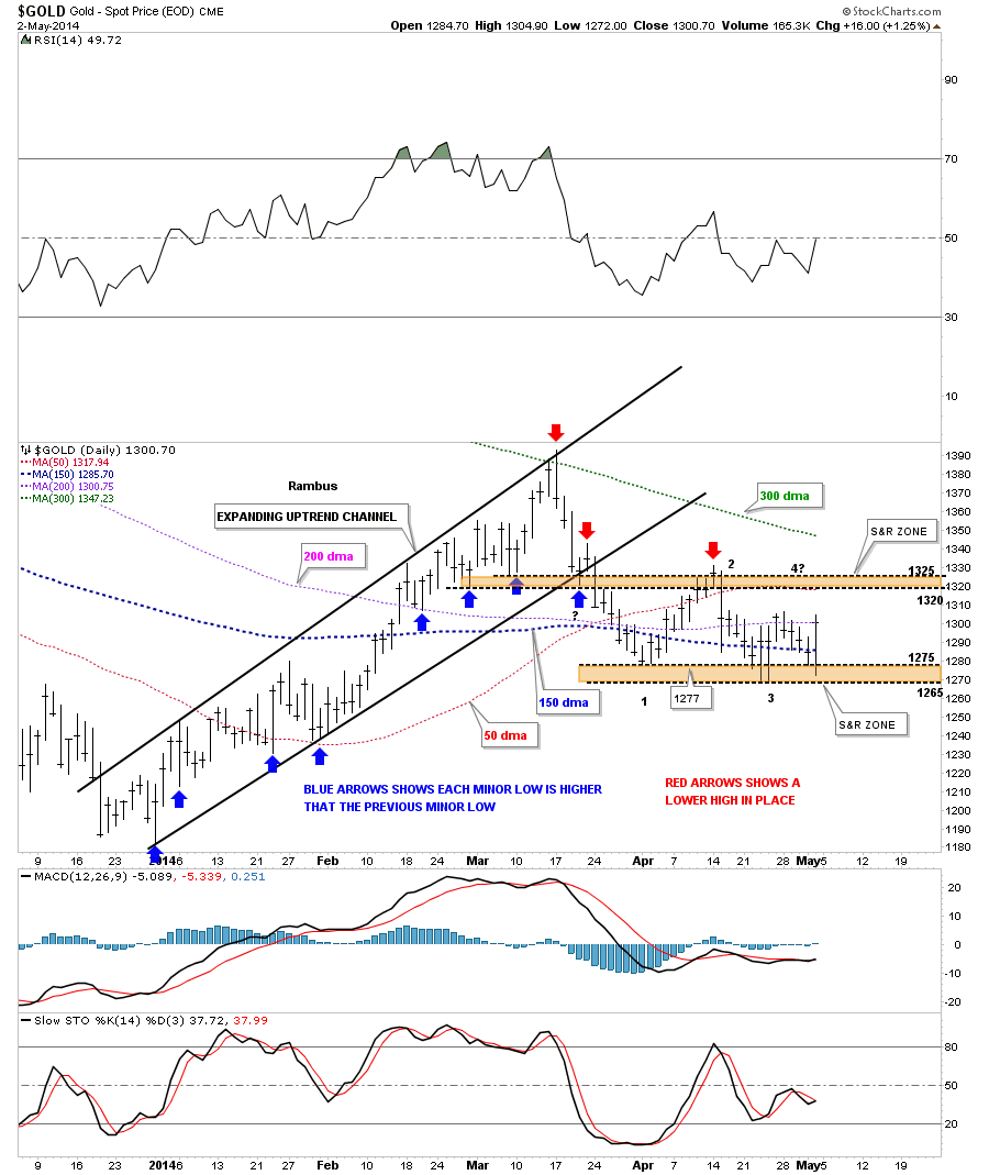
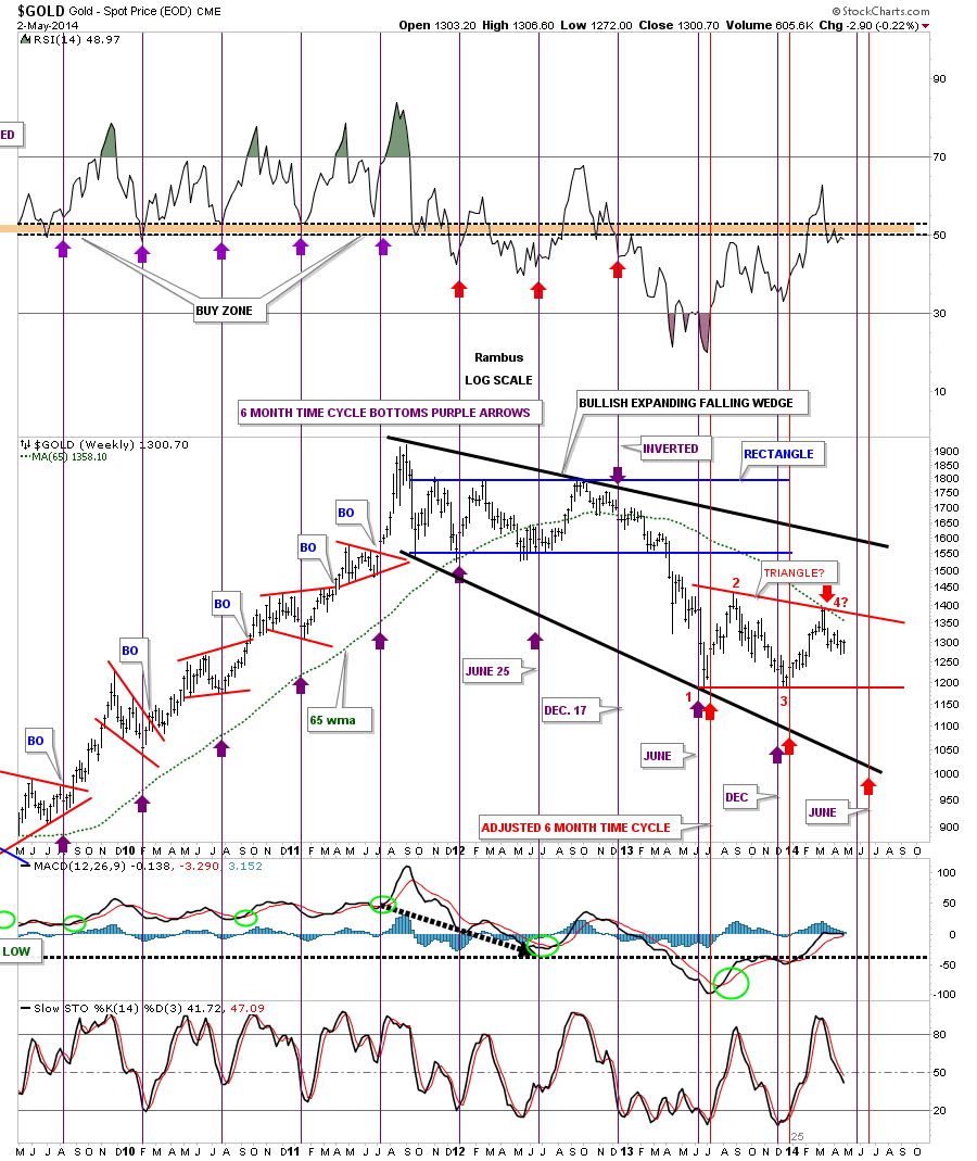
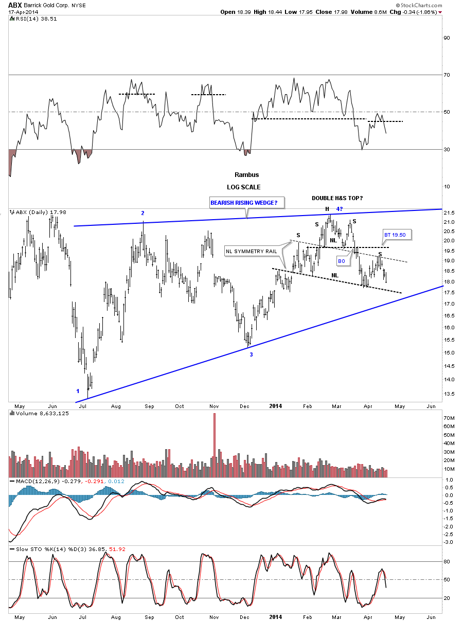
First lets look at a daily chart for gold that shows the bearish blue falling wedge that broke down about two weeks ago. Right now it’s in the process of backtesting the bottom rail around the 1265 area, I also drew in a thin black dashed horizontal line under all the previous lows at 1280, which should also act as resistance if the bottom rail of the falling wedge gets strongly backtested. The all important 150 moving average comes in today at 1279.65. As you can see from the March high gold has been making lower lows and lower highs for the most part which constitutes a downtrend.
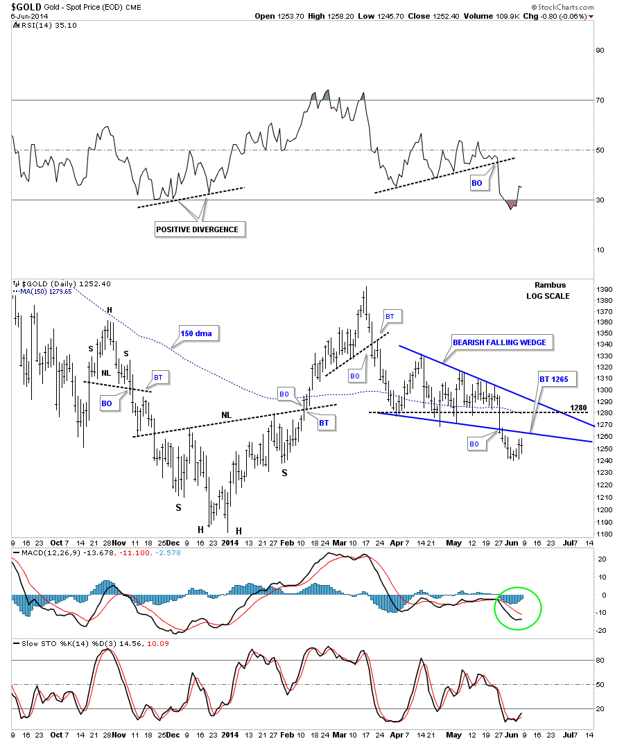
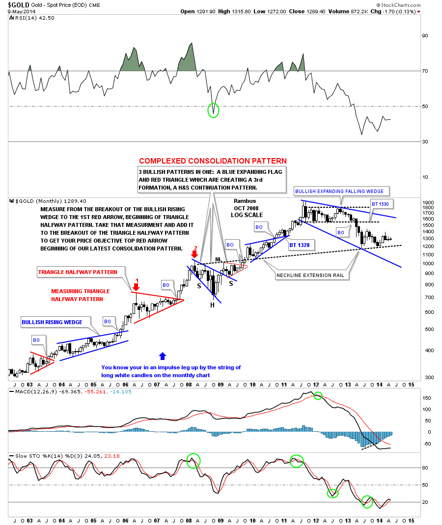
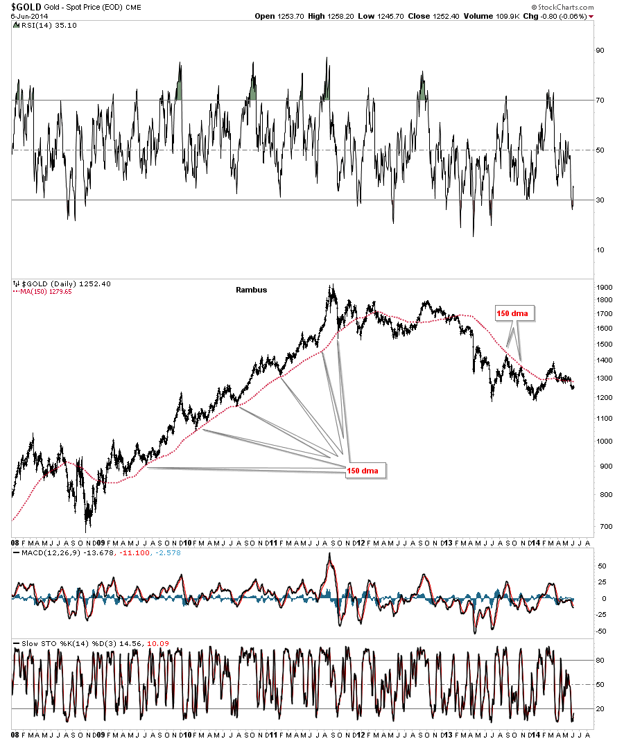
The chart below shows how effective the 150 dma was during the bull market years as support and now it seems to be reversing its role to resistance. As you can see there was a little aberration at the March high this year but gold has since fell below the 150 dma again.
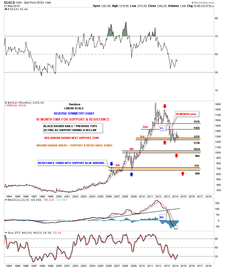
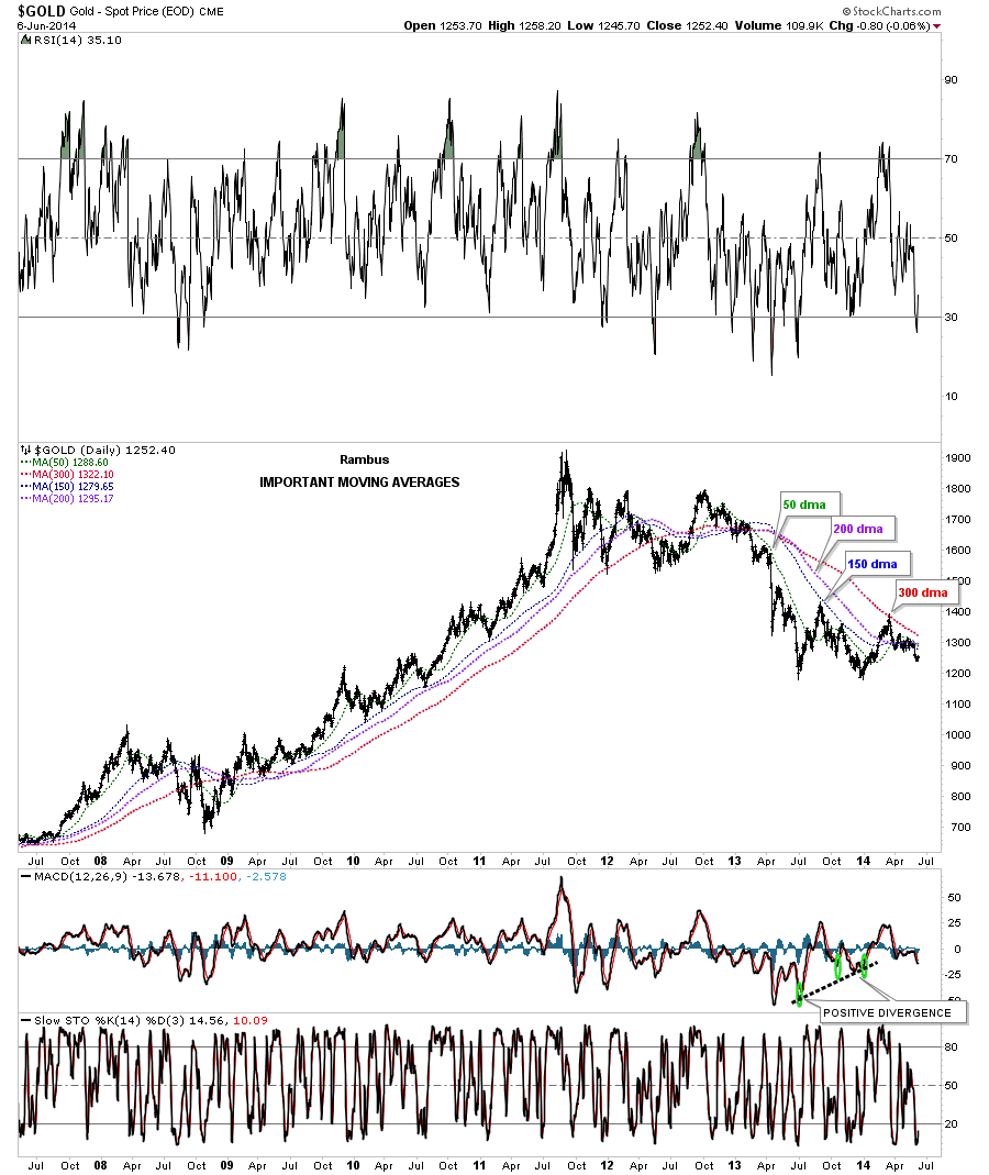
This next chart for gold shows all the important moving averages that shows how nicely they all align once a major move starts progressing. Once the correction ended in 2008 it took several months for all the moving averages to turn up, but once they did they showed you what a bull market looks like. At the bull market top you can see how they started to fail and began to role over. During the first real impulse move down they all lined up in order until the June low last year. As this consolidation period has progressed they have been moving sideways as you would expect. The main thing right now is the price action in gold is trading below all the important moving averages. The 300 dma is the most critical one of watch for the long term move in gold. That one I don’t want to see violated during the bear market.
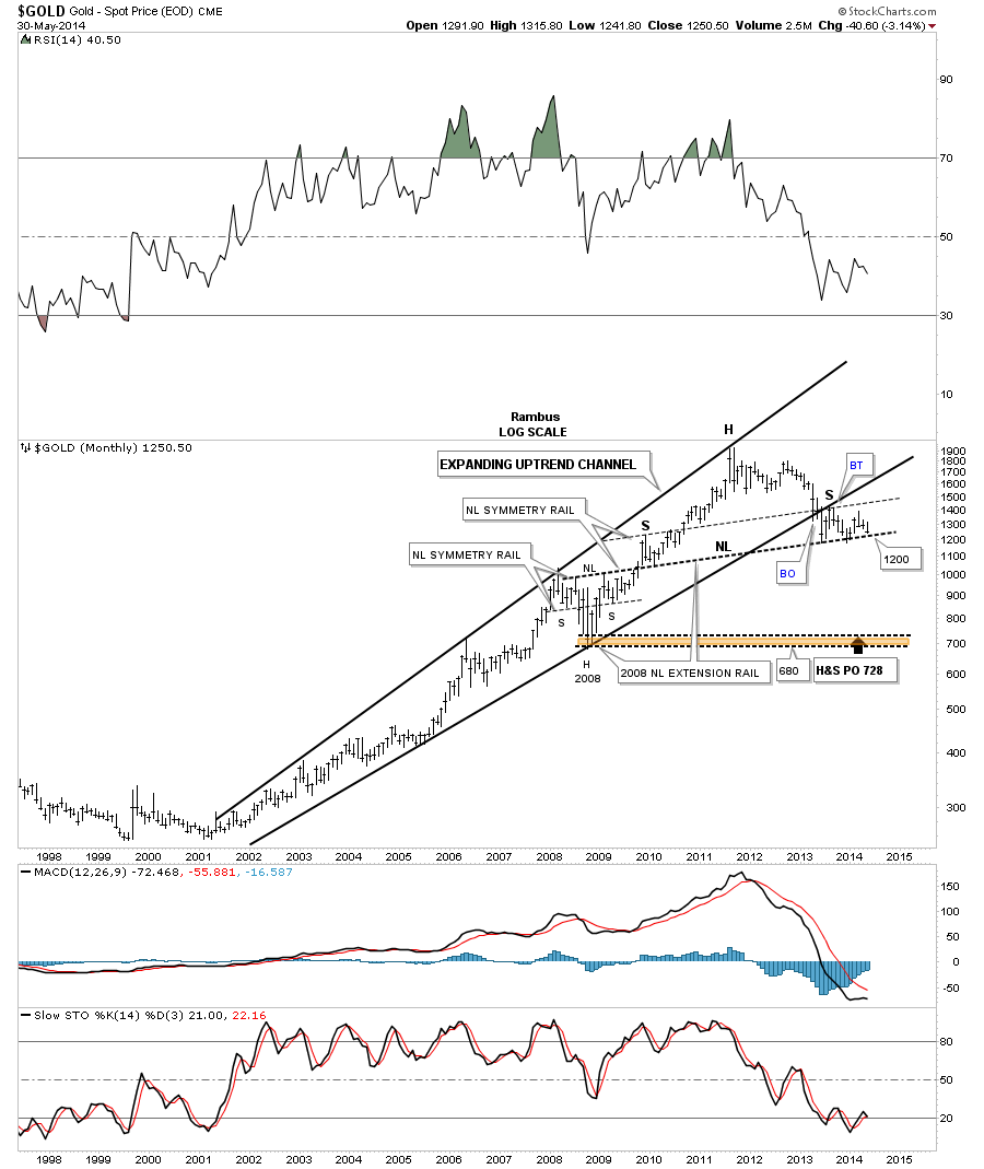
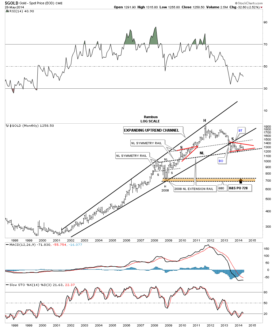
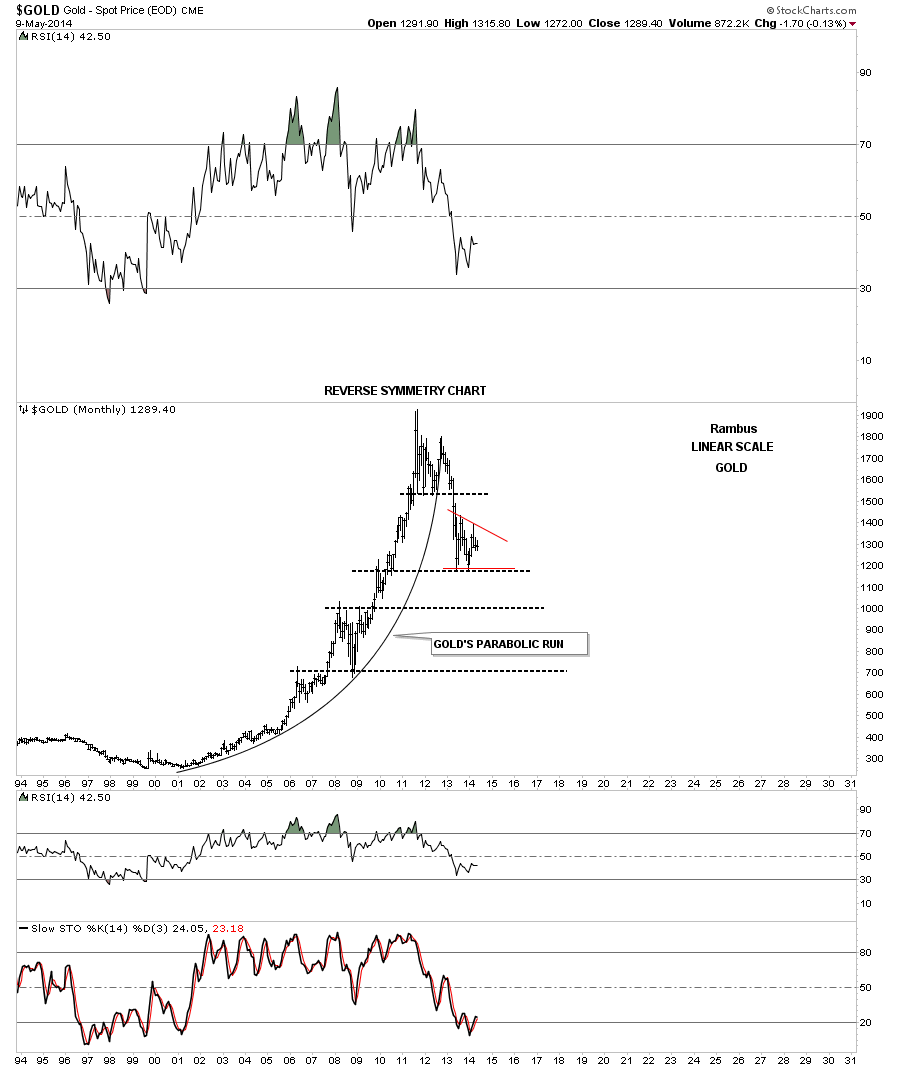
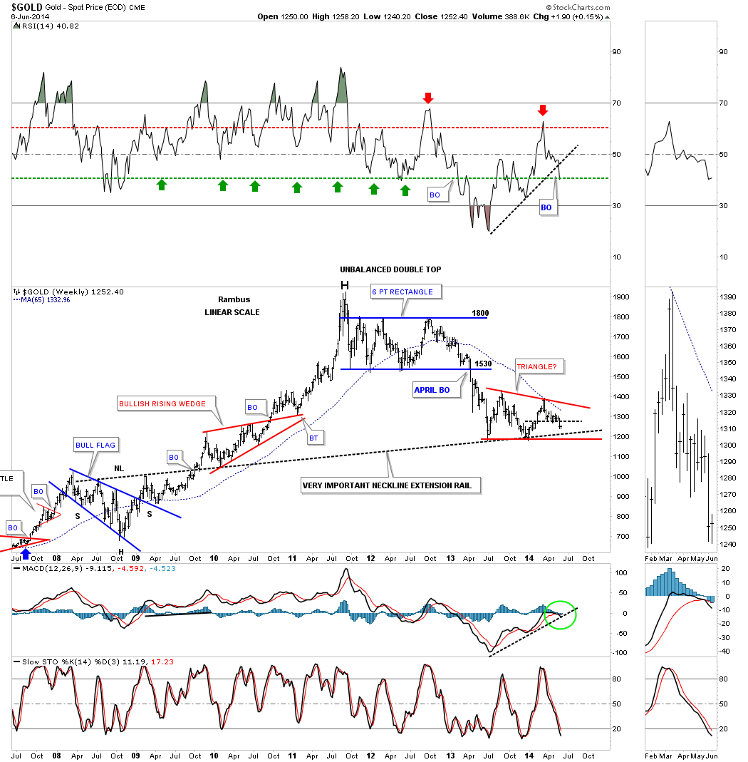
Lets look at one more chart for gold before we move on . This is a long term weekly chart that shows the red triangle consolidation pattern that has been forming since the first low made late June of last year. Keep in mind we are still building out a consolidation pattern and the next impulse move down won’t start until the bottom rail of the red triangle is broken to the downside. If you look at the indicators on the side bar you can see the blue histogram is now below the zero line and the MACD has just recently crossed to the downside. The slow stochastic is still moving lower. On the RSI indicator at the top of the chart you can see it broke below the black dashed trendline. In a strong move up you like to see the RSI stay above the 40 area or so, green arrows and in a bear market you look for the 60 area for signs of a reversal, red arrows.
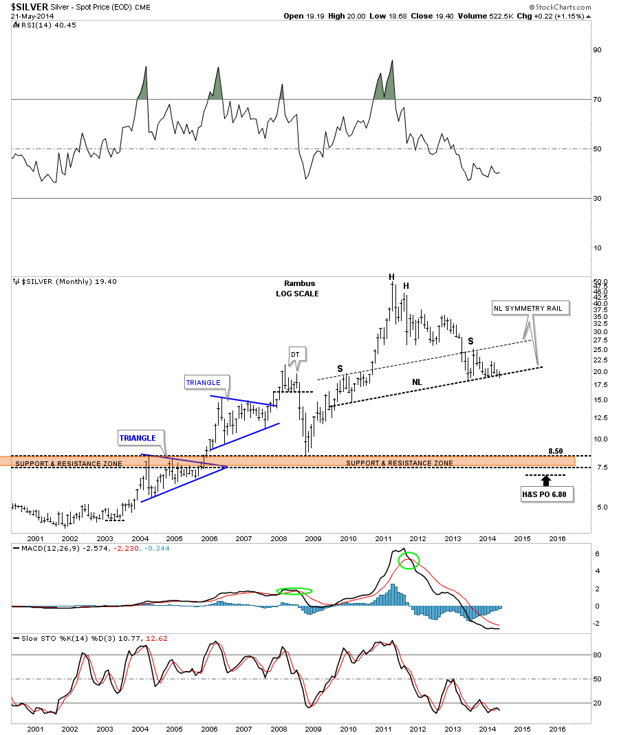
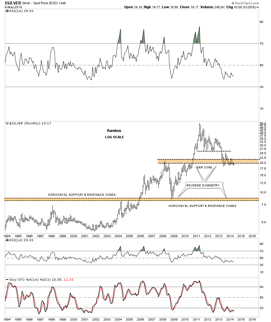
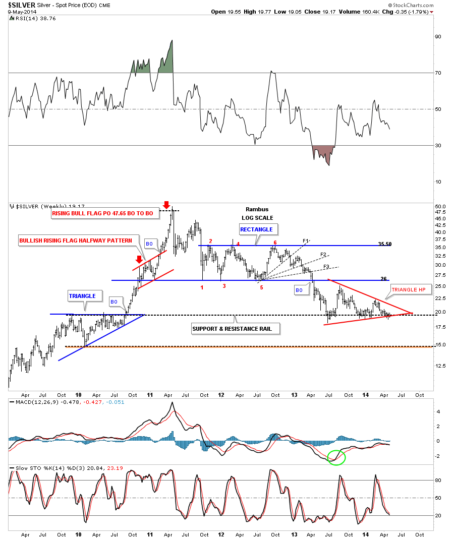
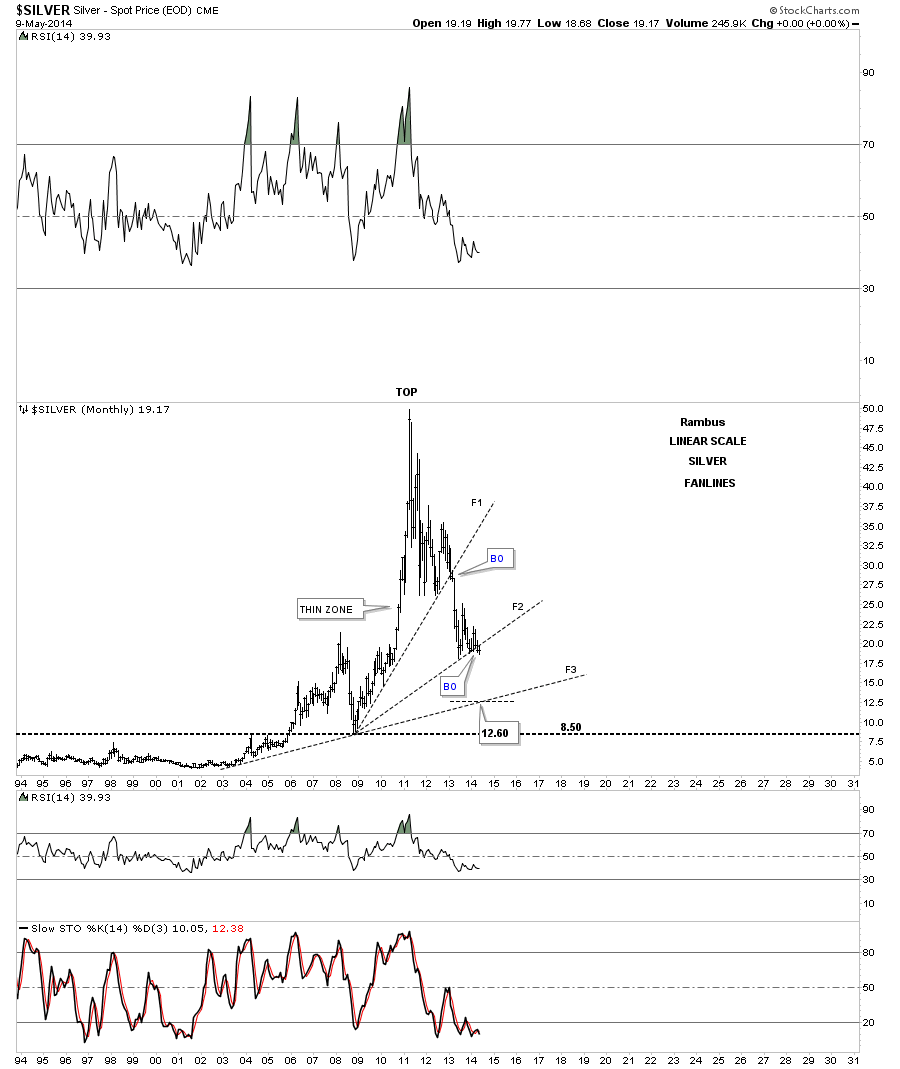
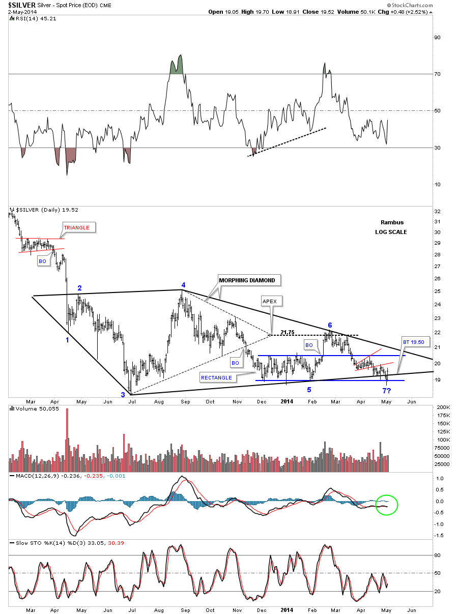
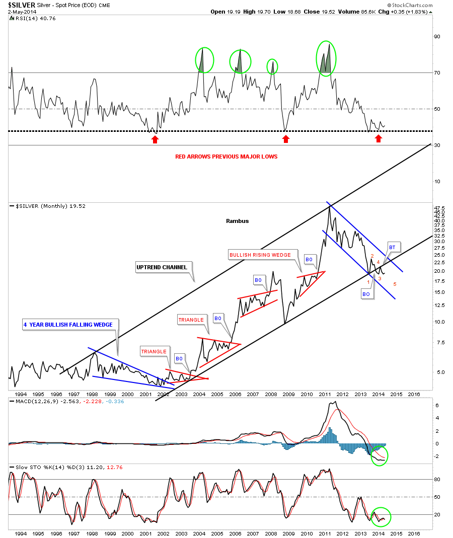
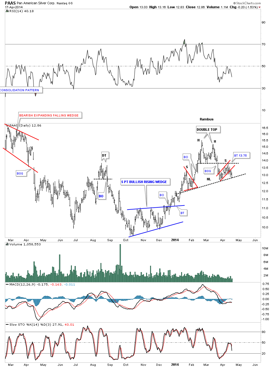
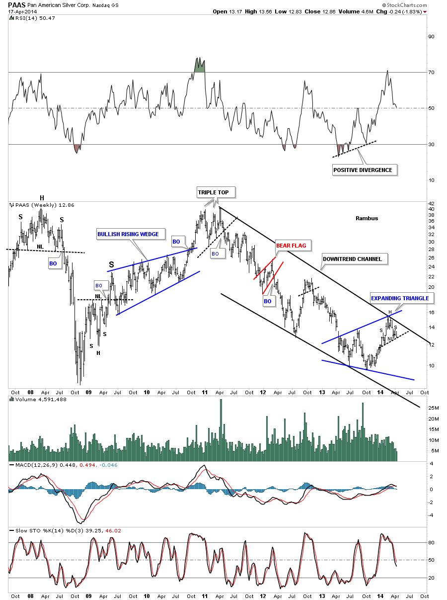
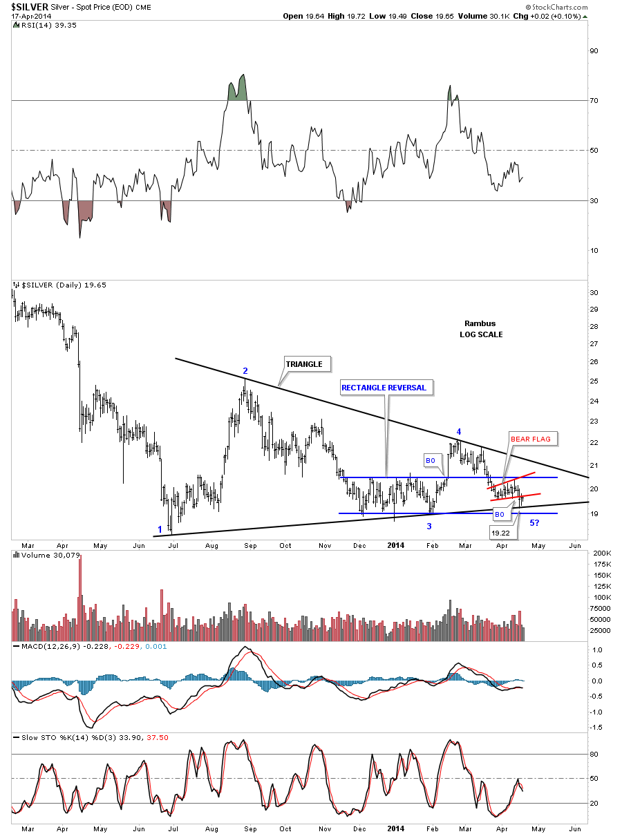
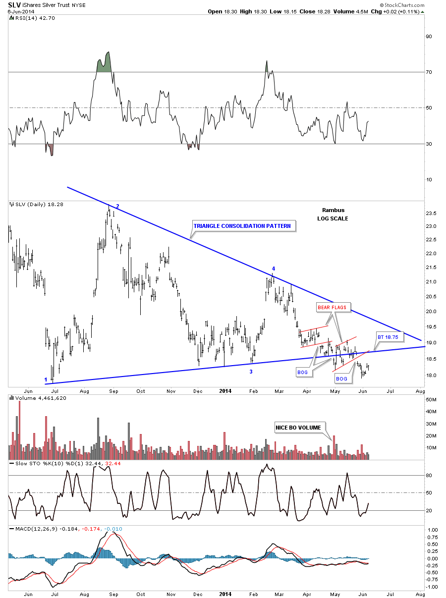
Lets now look at silver that shows the big Diamond – Triangle pattern that has been forming for over a year already. It looks like a breakout took place about two weeks ago and a backtest is now taking place. The bottom rail of the one year triangle is a little inconclusive as there are so many ways one can draw that important trendline. For right now, on this spot silver chart, this is how I’ve drawn in the bottom rail. Normally I would like to see where a possible breakout gap may have been made but on the silver spot chart there is no gap.

If we turn our attention to the SLV we can see two gaps that were made over the bottom blue rail of the big triangle that maybe showing us exactly where the bottom rail should be placed. If the bottom rail is correctly place on SLV we could expect a backtest to come in around the 18.75 area. It’s an ugly breakout for sure but since the 4th reversal point in the big blue triangle, SLV has made lower highs and lower lows all the way down to our most recent low which is a downtrend and the direction you want to trade. If you think playing the short side for silver has been hard think how hard it is for the bulls that keep trying to buy the bottoms since the 4th reversal point on the blue triangle made in February of this year. If you love pain go for it.
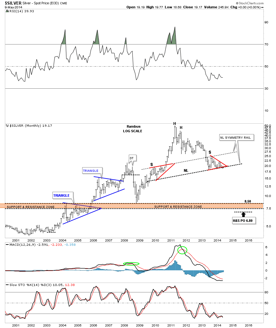
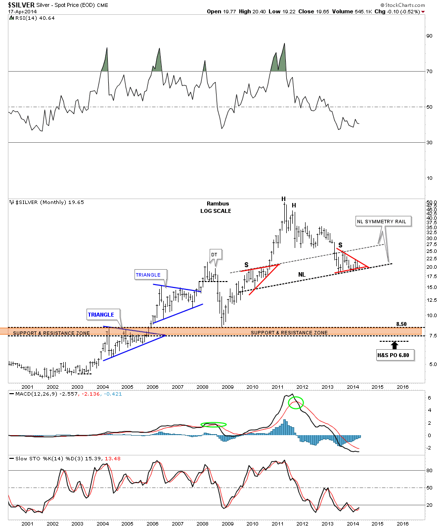
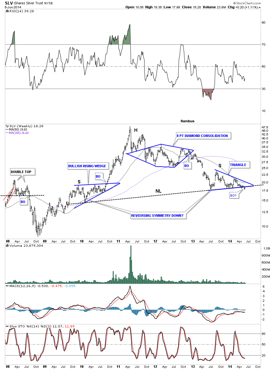
This long term weekly look for SLV shows the potential breakout of the blue triangle, chart above, and the big neckline. SLV has now traded two weeks below both important trendlines which is a plus. The longer the price action stays below both trendlines the better. I know how hard it is to maintain your emotions, especially during a potentially big breakout. You get the breakout and it looks like the impulse move is beginning then you get a backtest and you begin to question the validity of your decision. I’ve been showing you this potential setup for several months now when SLV was much higher. The main thing to understand is nothing is broken yet even if we get a complete backtest. Nothing is 100% guaranteed in the markets so you have to go with the odds until something tells you differently. It can be very hard to do that as the markets can be an emotional roller coaster.
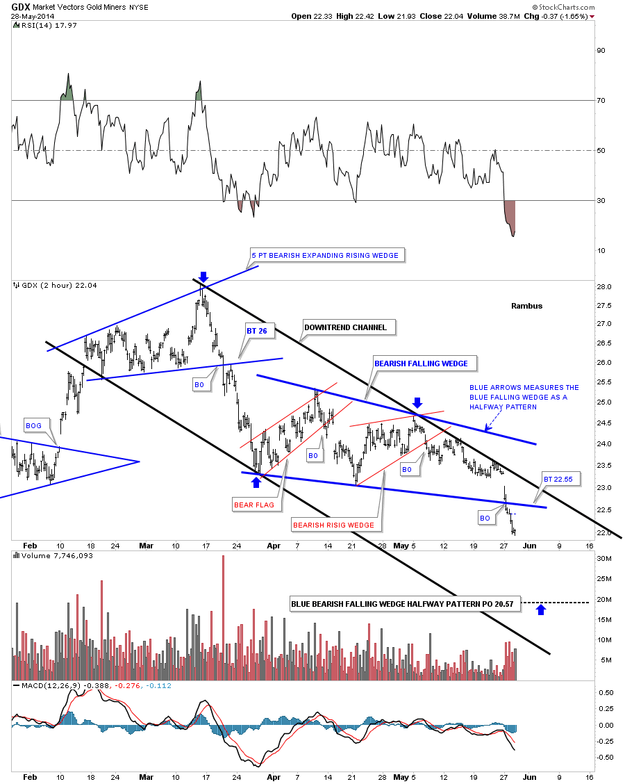
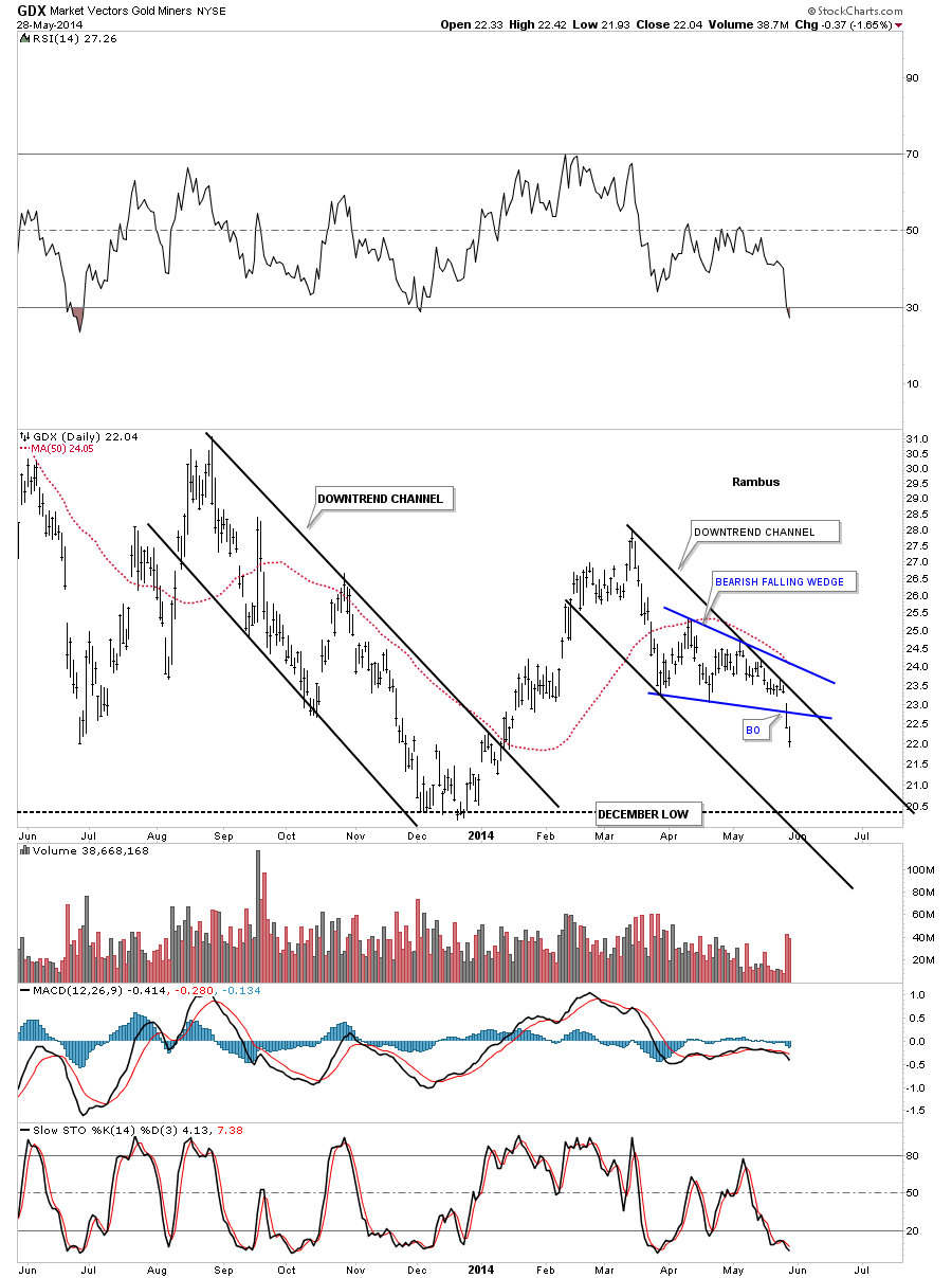
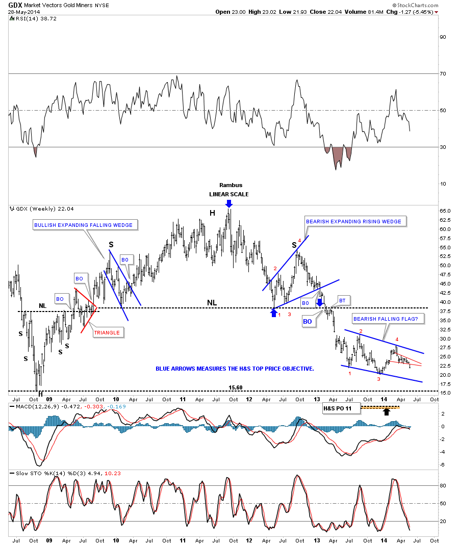
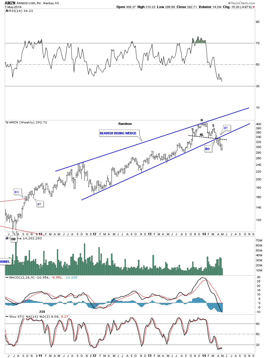
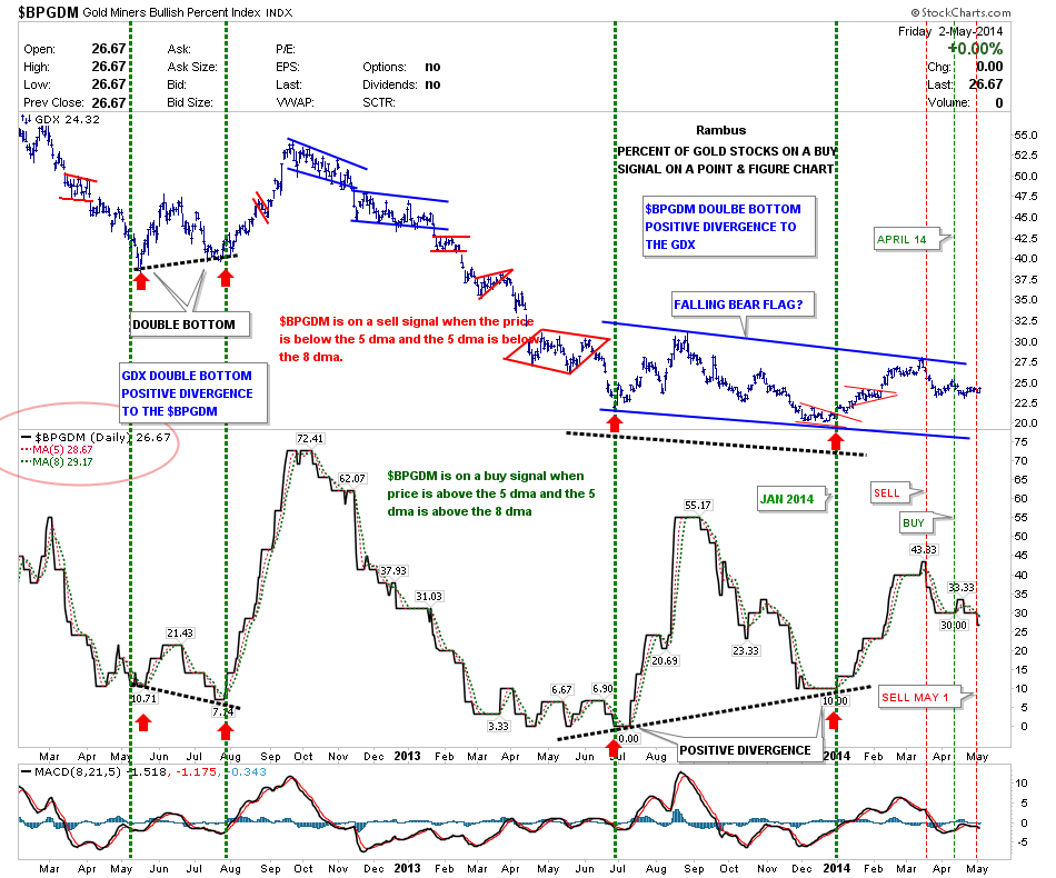
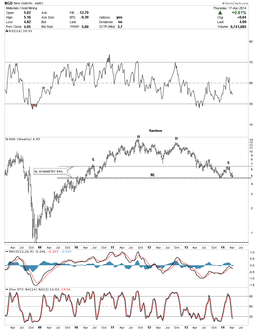
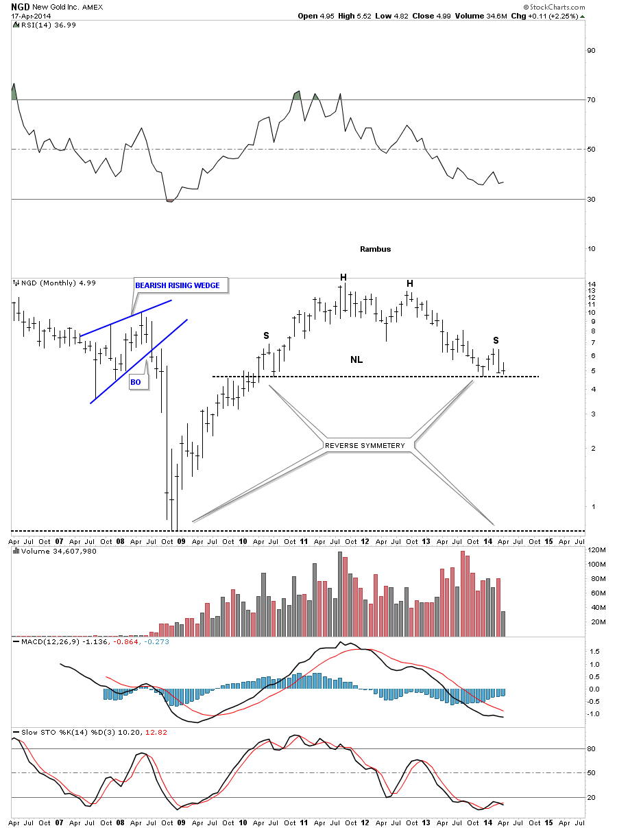
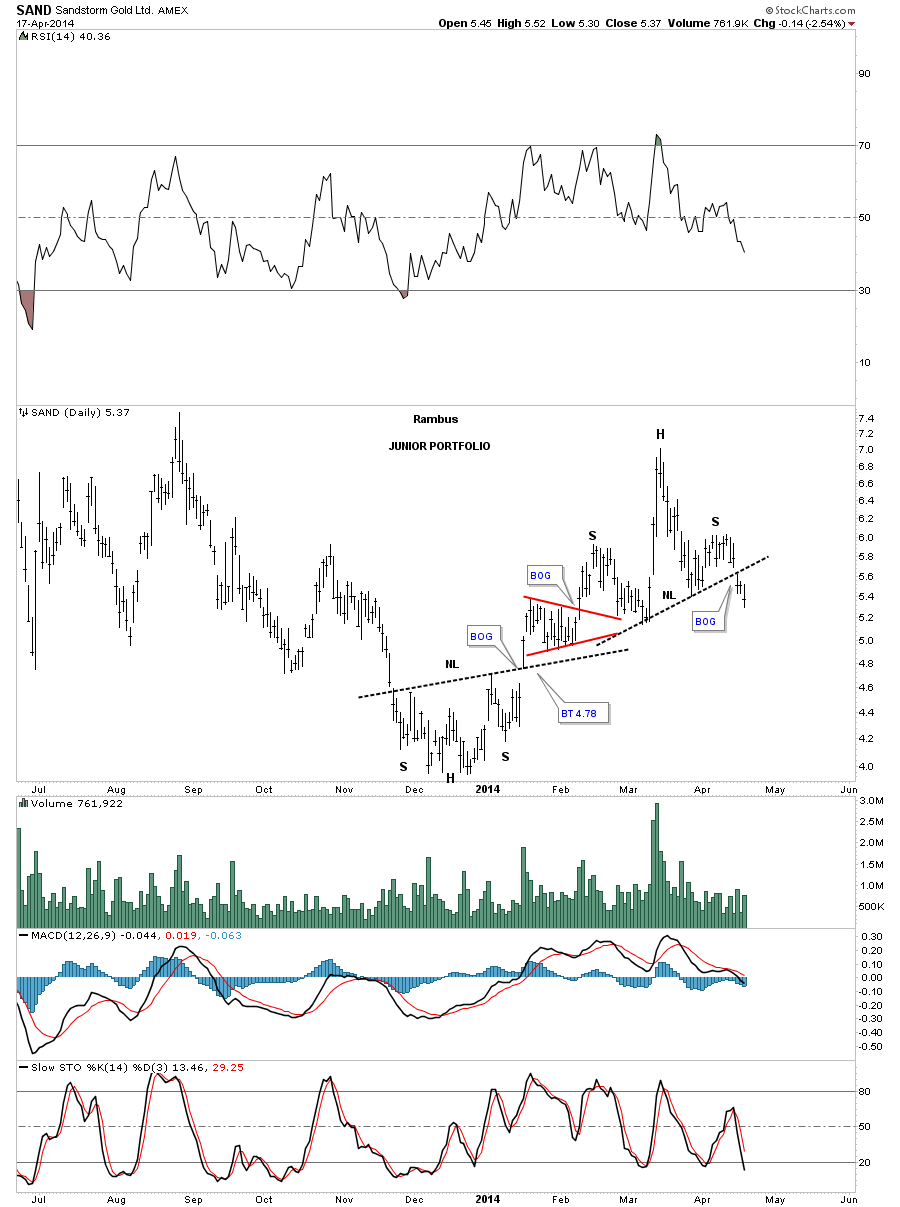
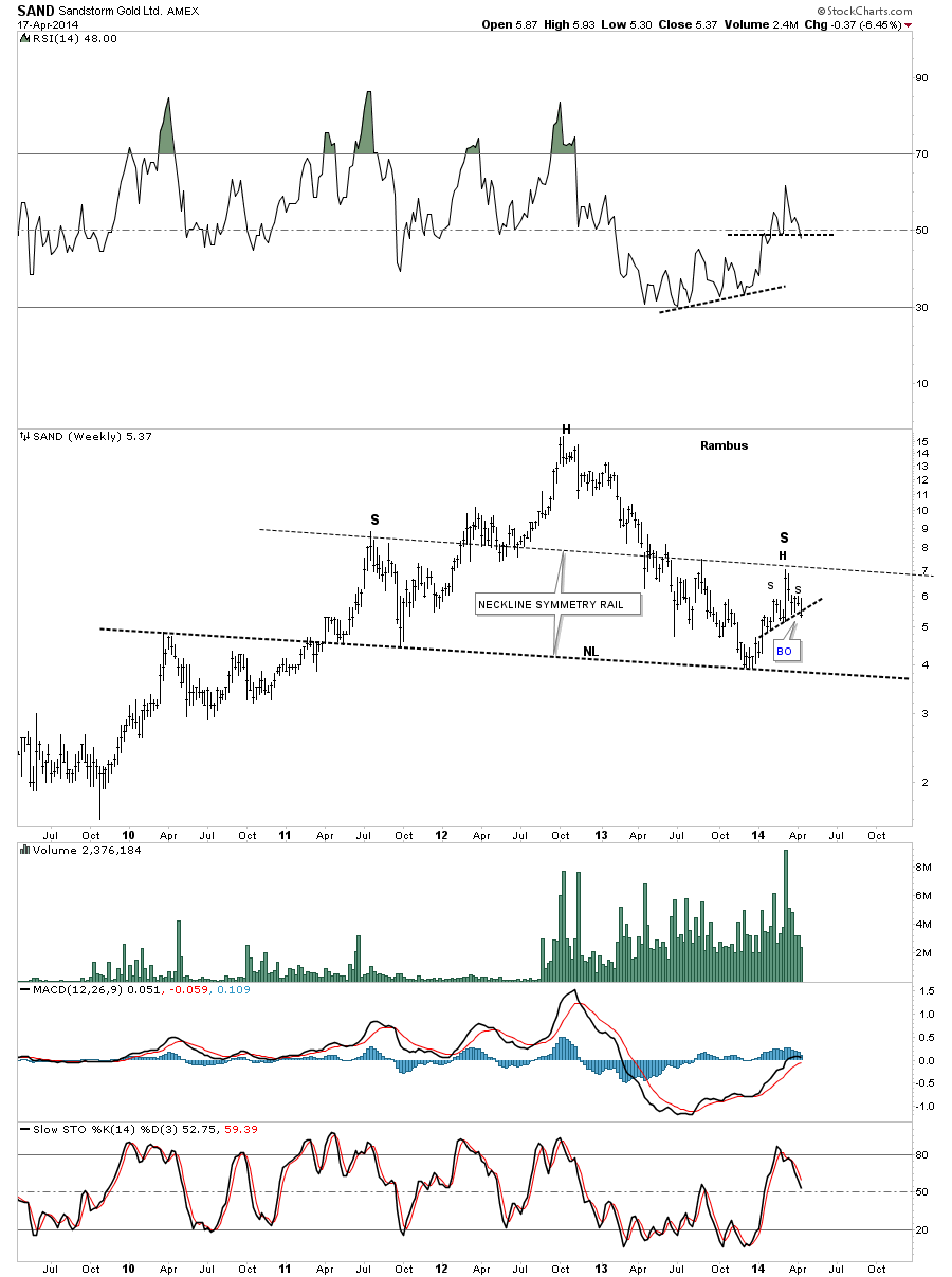
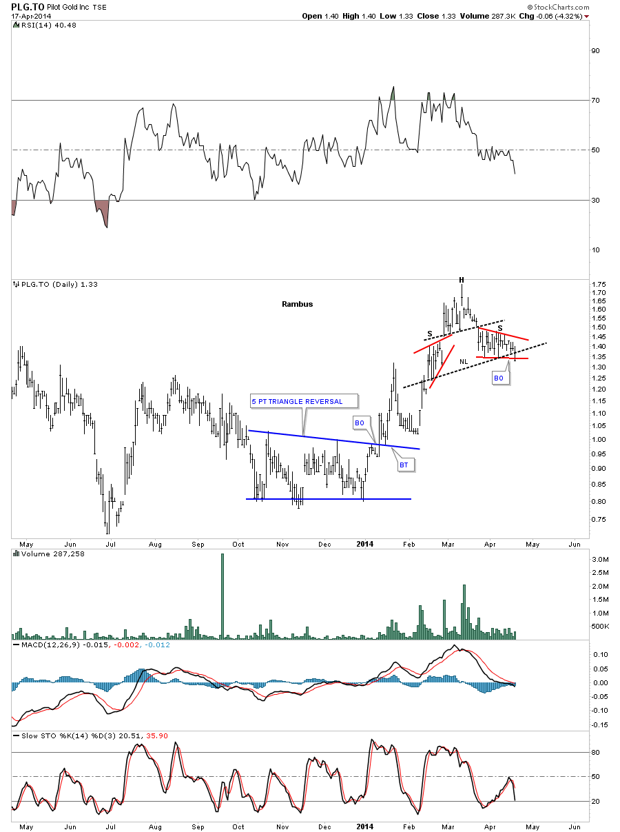
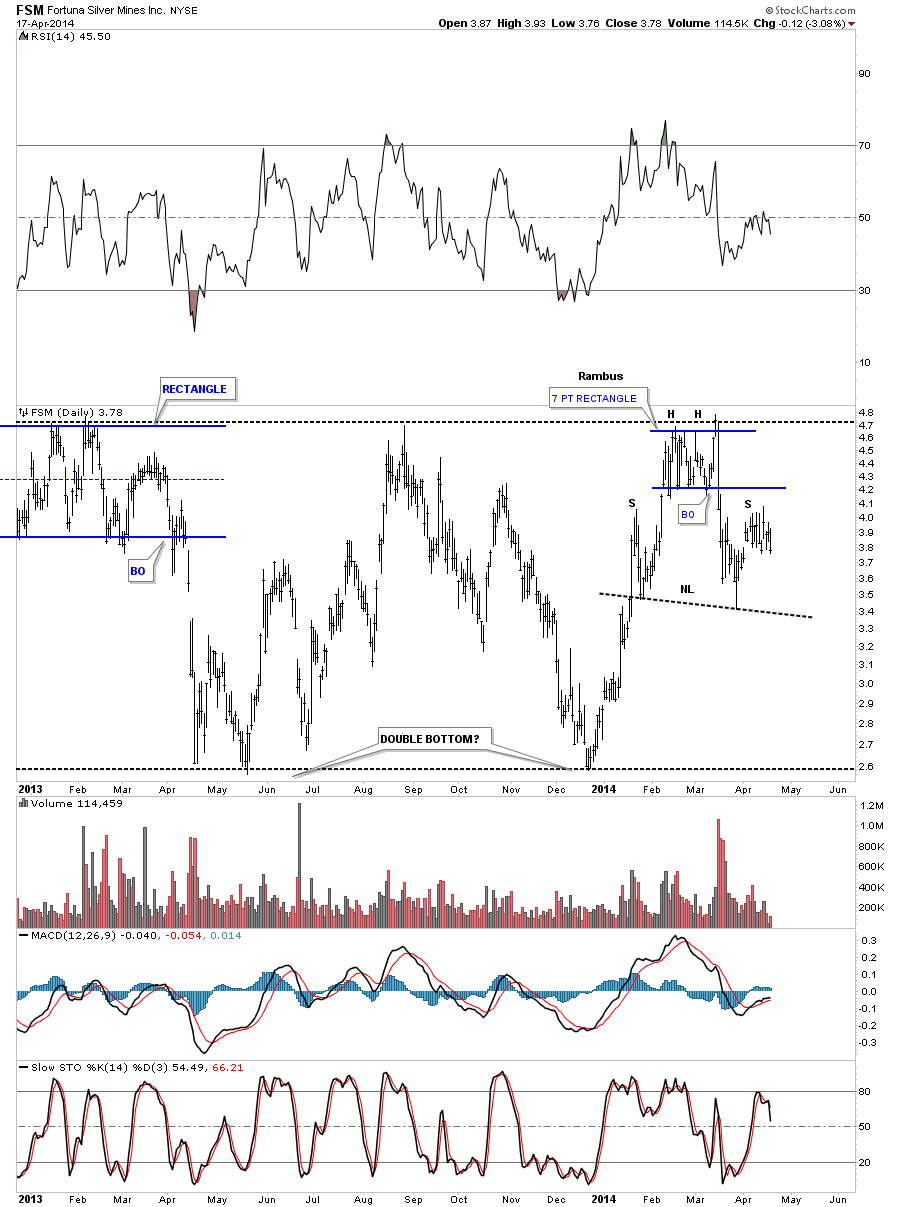
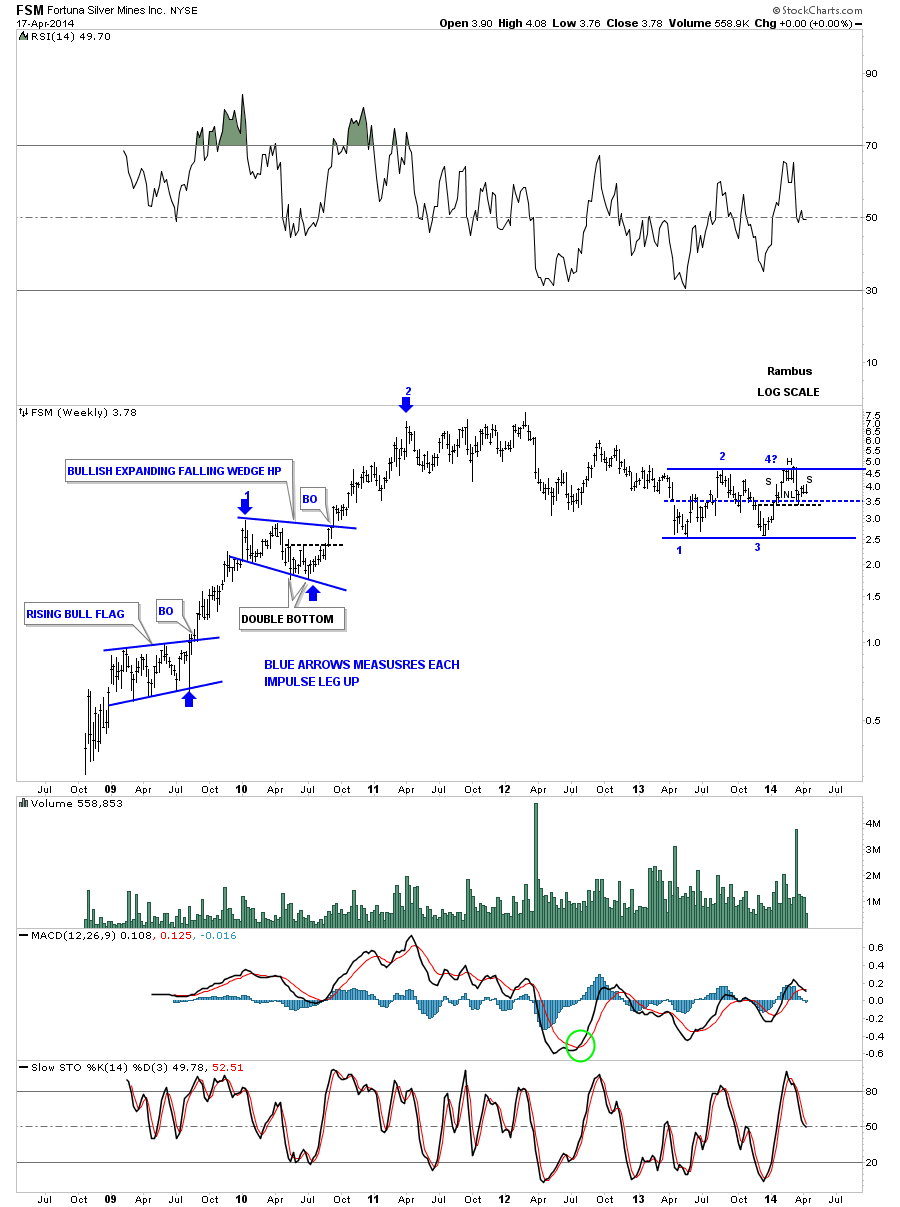
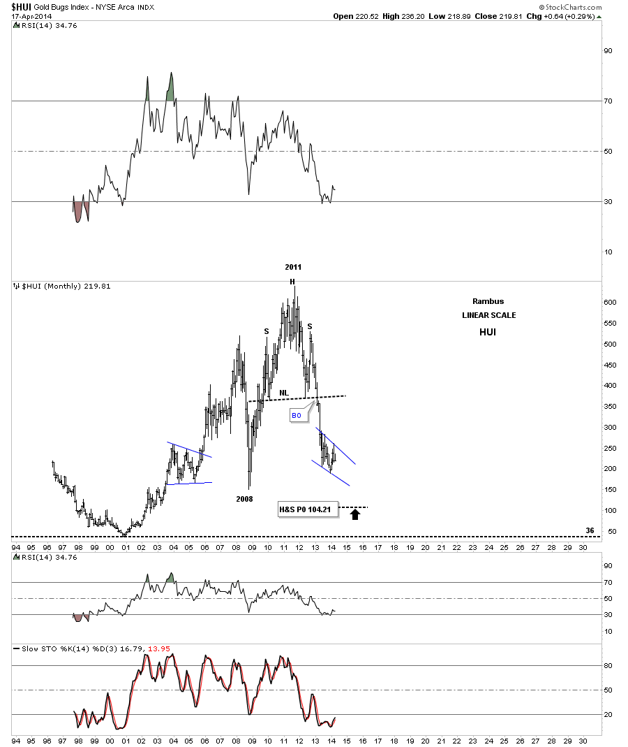
The precious metals stock indexes topped out in March of this year and have been in a downtrend ever since creating lower highs and lower lows the whole time. There are three red small consolidation patterns that make up the blue bearish falling wedge within the March high downtrend channel. The little brown shaded box shows where I would expect the backtest to run out of gas at the 213 area which is less that five points away. Again, this is how the market tests your endurance by these counter trend rallies that look like the next move higher is just beginning. When you look at the downtrend channel since the March high place your self in the bull camp and try to find the best trade possible keeping in mind no body picks the exact bottom and top. Then look to the left side of the chart when the HUI was in rally mode from the December low to the March high. You can see how much easier it was to be long instead of being short. The trend is your friend until it isn’t.
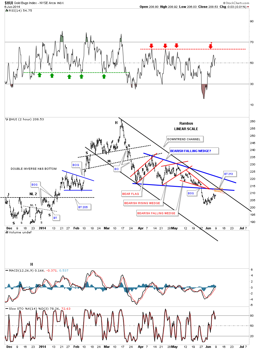
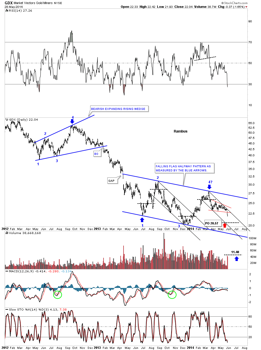
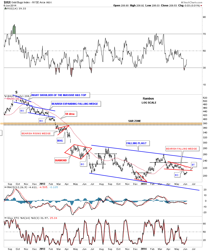
This next chart for the HUI is a long term daily chart that shows the big blue falling flag that began forming in late June of last year. The little red falling wedge is the blue falling wedge on the chart above. So far nothing is broken as we await the possible complete backtest to the red falling wedge around the 213 area.
GENERAL STOCK MARKETS
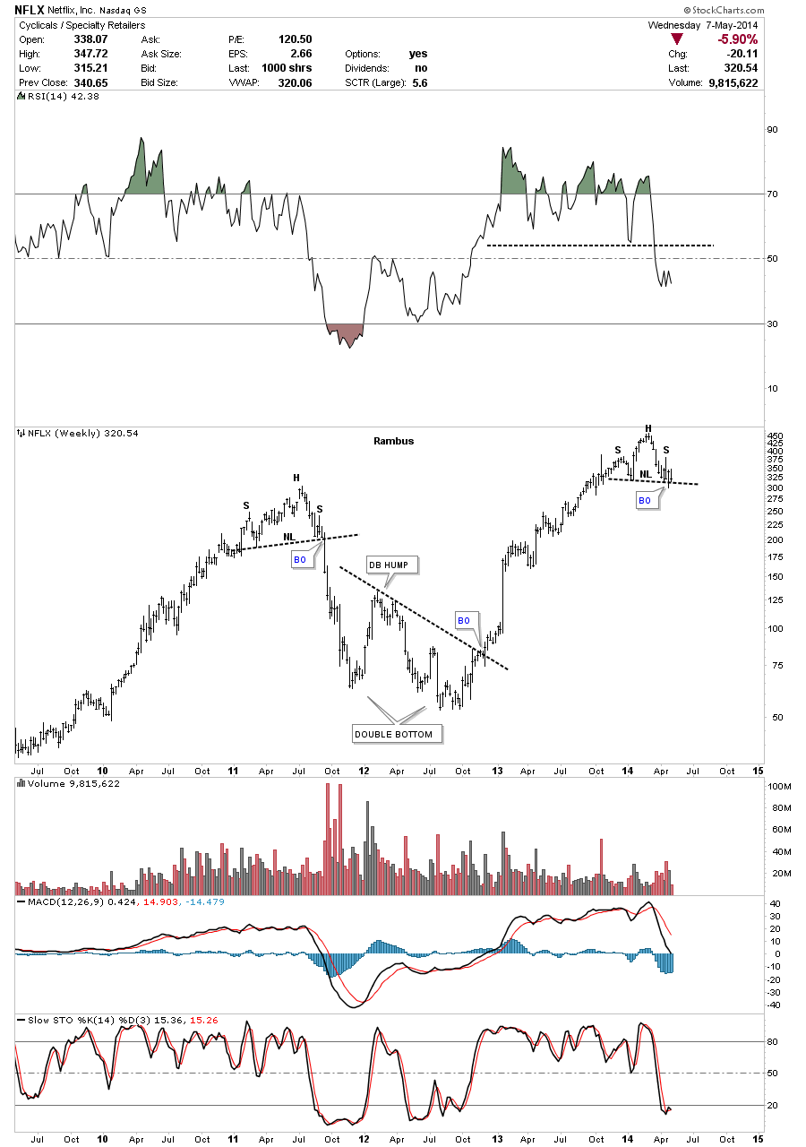
I’ve been getting a lot of requests to show some charts for the stock markets as it looks like a lot of folks are giving up in the precious metals complex being long or short. This is what a big long consolidation pattern can do to you so I’ve started following the stock markets now for those that want to follow along.
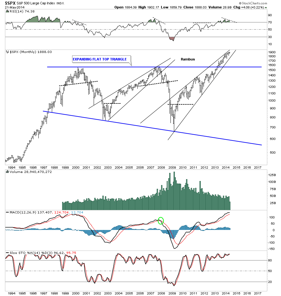
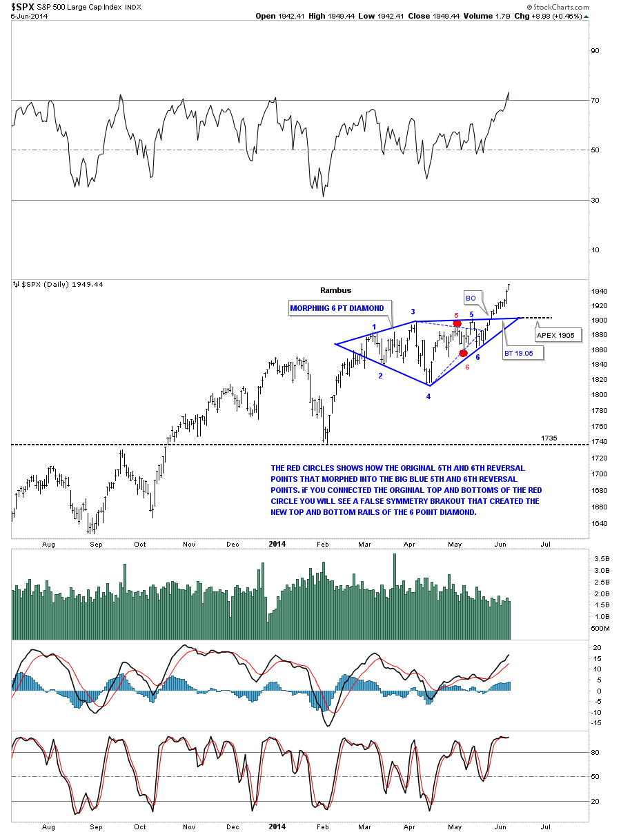
Lets start with a daily chart for the SPX that shows the morphing Diamond pattern I showed you a week or two ago. You can see the original Diamond, blue dashed trendlines, had a false breakout of the top rail and then turned right around and fell back into the Diamond only to have a similar false breakout of the bottom rail. Technically this kind of stuff is challenging but if you are aware of how a pattern can morph, as I have shown you many times in the past, you can use this information to your advantage. Note the clean breakout and no backtest. Unless we get a backtest to the 1905 area the SPX is on its way higher and it’s not waiting around for you to make up your mind whether you want to get on board or not.
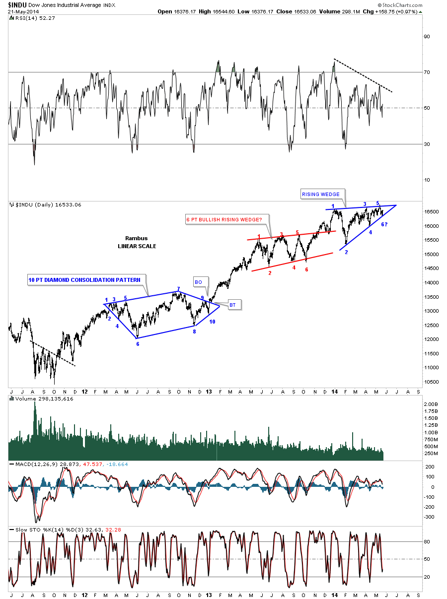
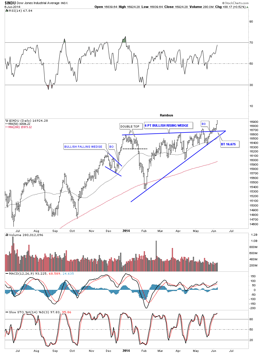
The INDU has formed a 6 point bullish rising wedge that had a false breakout with one last move to the bottom rail and then the breakout to the upside. Here you can see the Dow had a nice backtest before it moved higher.
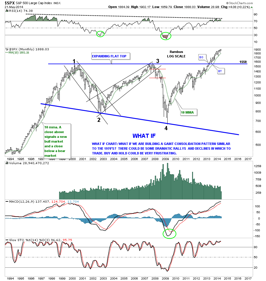
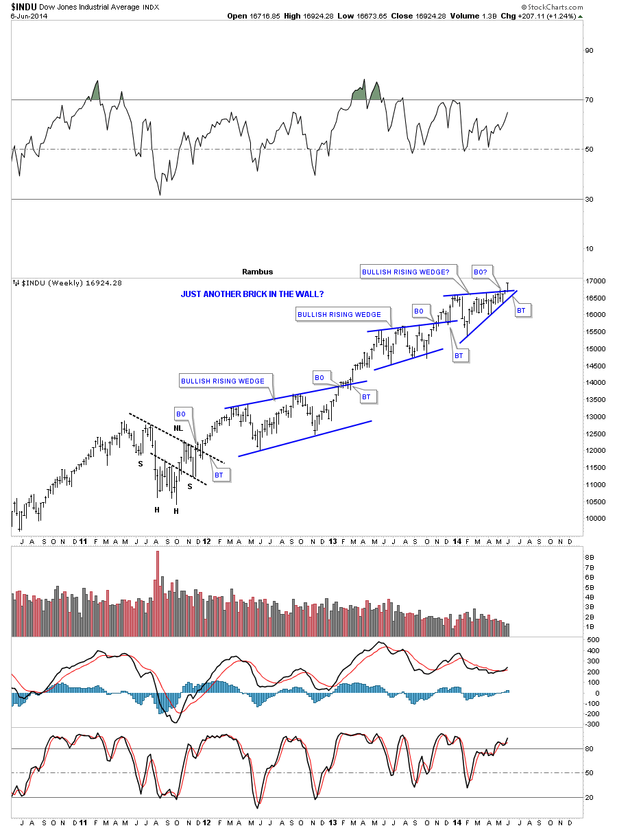
I have a chart for gold that shows all the consolidation patterns that formed during its bull market that I call, Just Another Brick in the Wall. I have now put that title on the weekly Dow chart that shows one consolidation pattern forming on to of the next. This chart just goes back to the 2011 bottom.
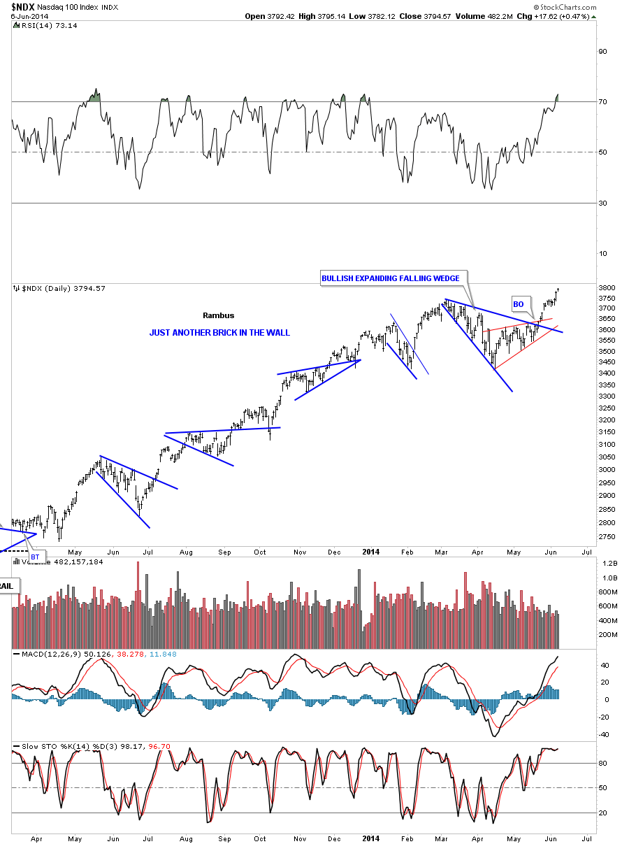
The NDX just another brick in the wall.
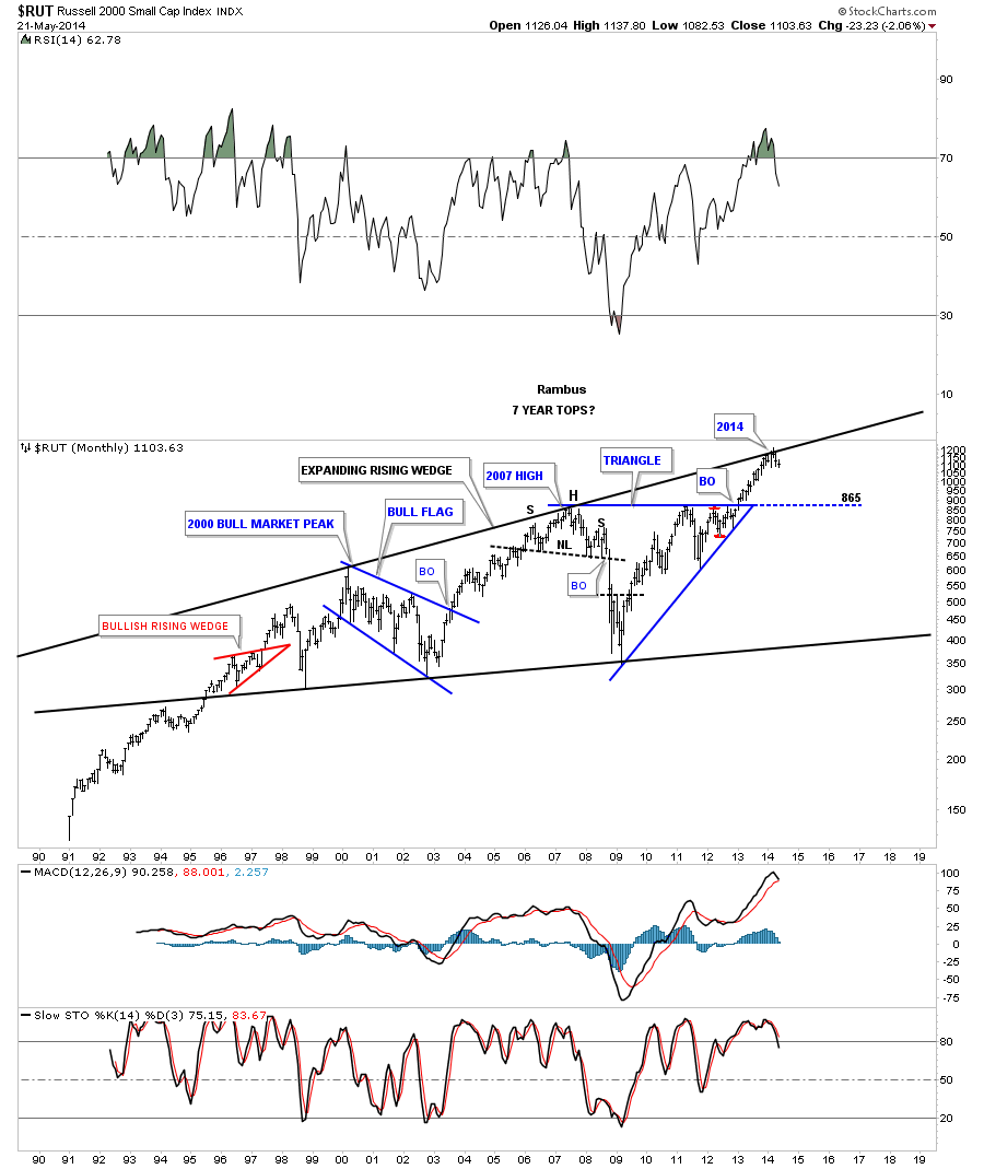
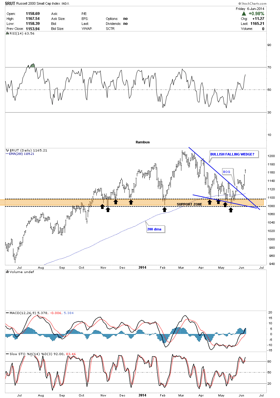
The RUT probably had the biggest correction since the first of the year but it looks like it wants to play catchup now.
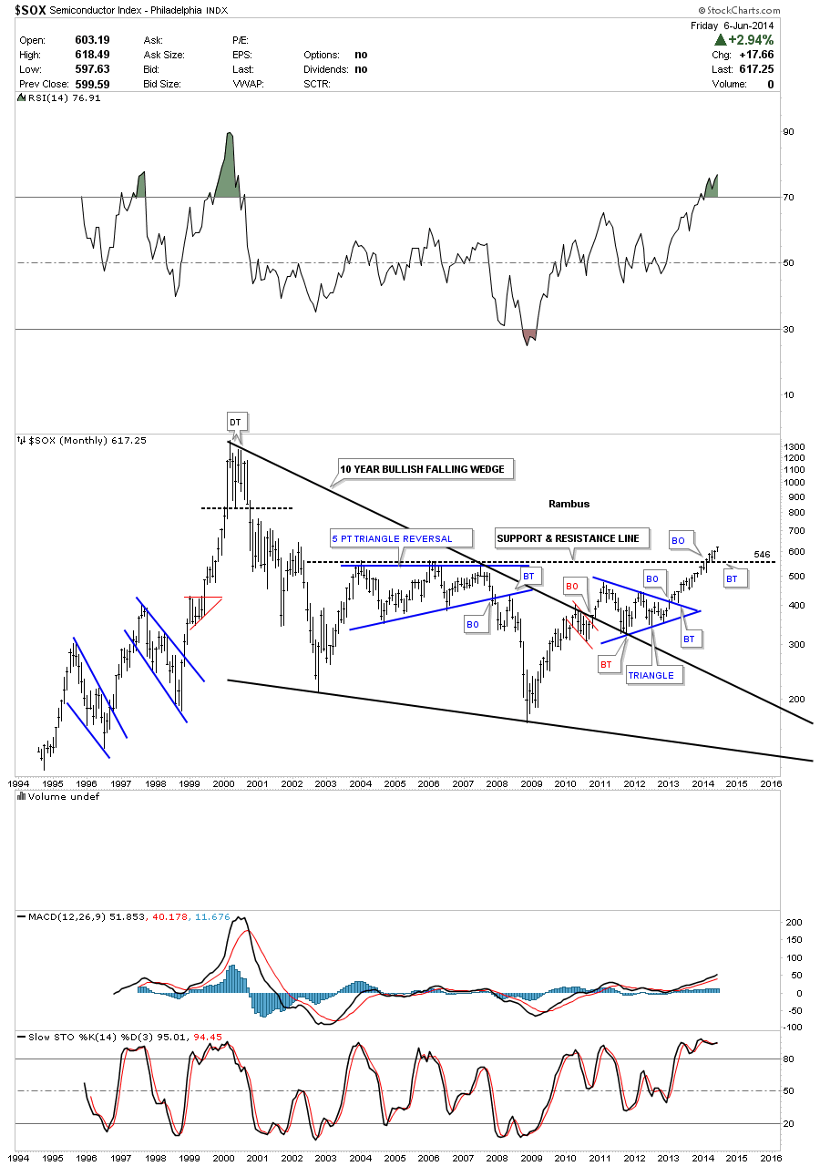
There is one area that looks pretty good right now even though it has had a good rally. The SOX , semiconductor index, broke out of a beautiful symmetrical triangle a couple of weeks ago and hasn’t looked back.
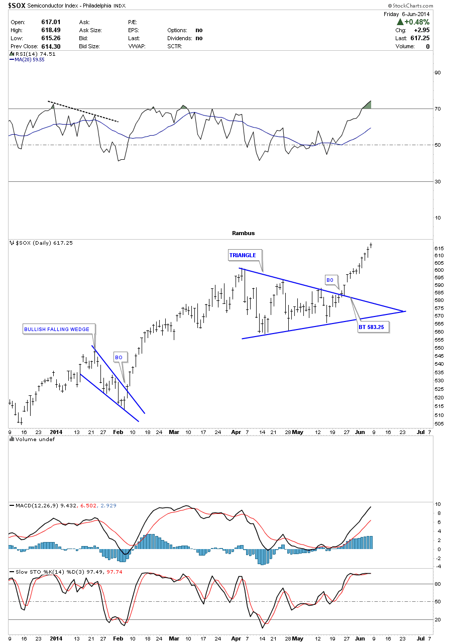
I would now like to show you the monthly chart for the SOX that is incredibly bullish looking. Keep in mind this chart goes back to the bubble phase back in 2000. For those of you that have never experienced what a true parabolic move looks and feels like put your self at the blue arrow at the 185 area and try to imagine what it would have felt like to go on that ride. I can tell from first hand experience it was pretty incredible. Once the bubble phase ended it was time for the SOX to correct all the excess from that parabolic rise. It took a 10 year giant falling wedge to complete the correction. Note how the top rail of the big 10 year falling wedge reversed its role form resistance to support several times. This chart shows Chartology at its best. It just doesn’t get any prettier. Note the little red bull flag that formed just below the top rail before it was broken to the upside. That little red bull flag gave the SOX the energy it need to finally break that huge top rail of the falling wedge. Note the blue triangle that formed as a backtest to the top rail. Now I would like to focus your attention to the black dashed horizontal line at the top of the chart, support and resistance line. That little blue triangle I showed you on the first chart above for the SOX formed right on top of that S&R line. That S&R line should now act as support on any backtest. I plan to post more long term charts that got their start from the 2000 parabolic peak that have been consolidating those gains over the last 14 years. I think these charts are telling us we are in a huge bull market that many don’t want to believe is possible. The 14 years of bear market, huge multi year consolidation patterns mentality, makes it hard to believe the bull market that started at the 2009 crash low has any strength left in which it can rise to new highs. The reality is some of the stock market indexes are indeed making new all times highs along with some European stock market indexes regardless of all the reason they shouldn’t be.
All the best…Rambus