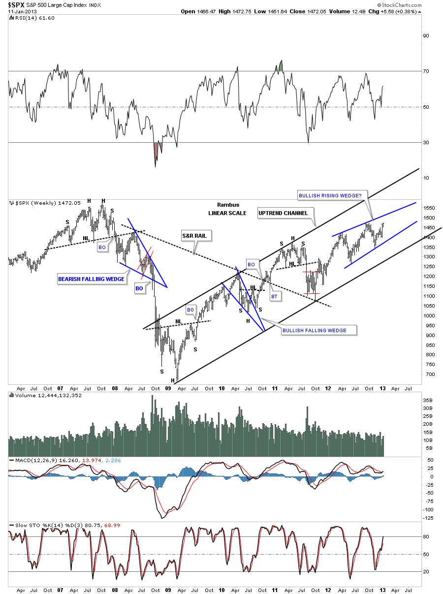
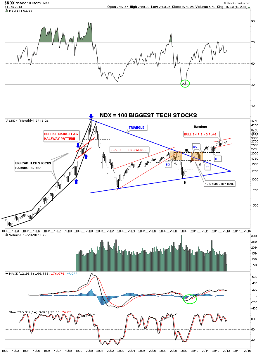
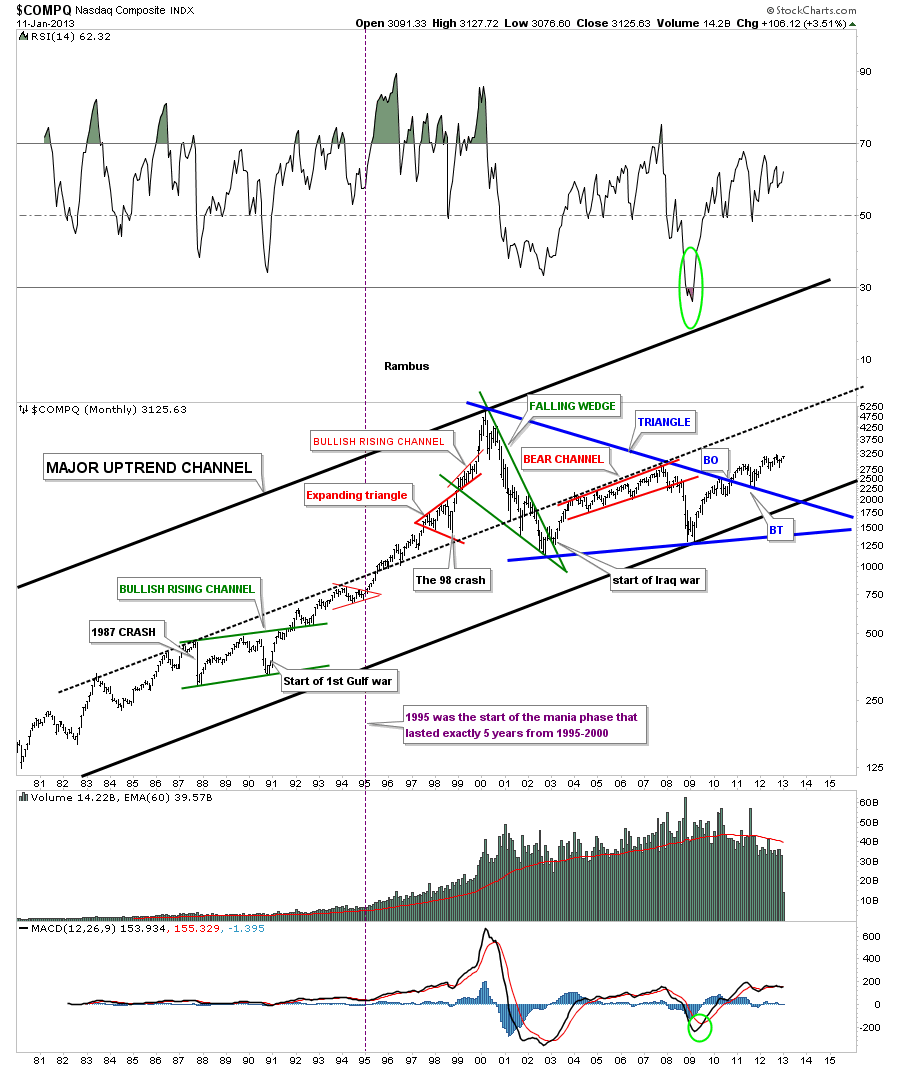
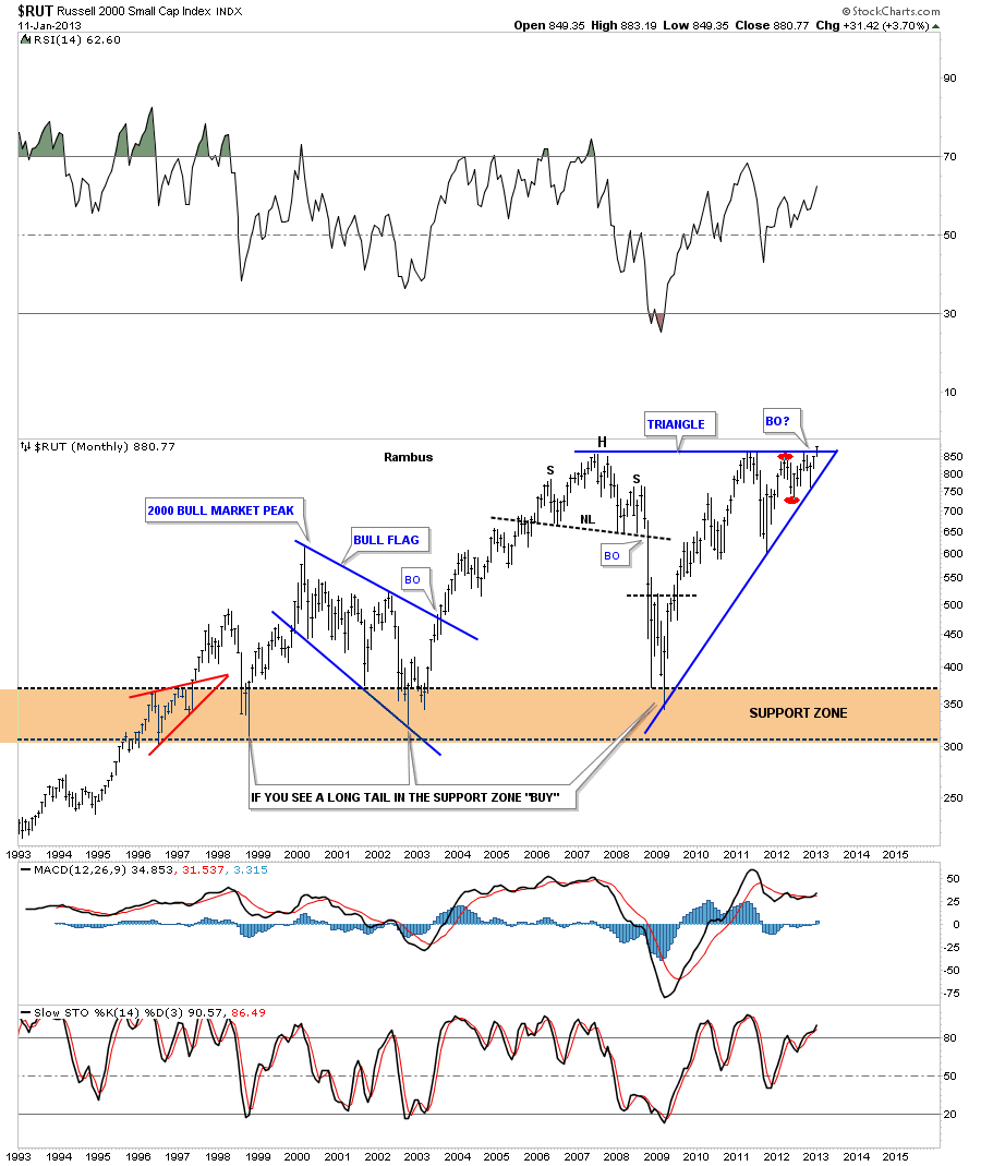
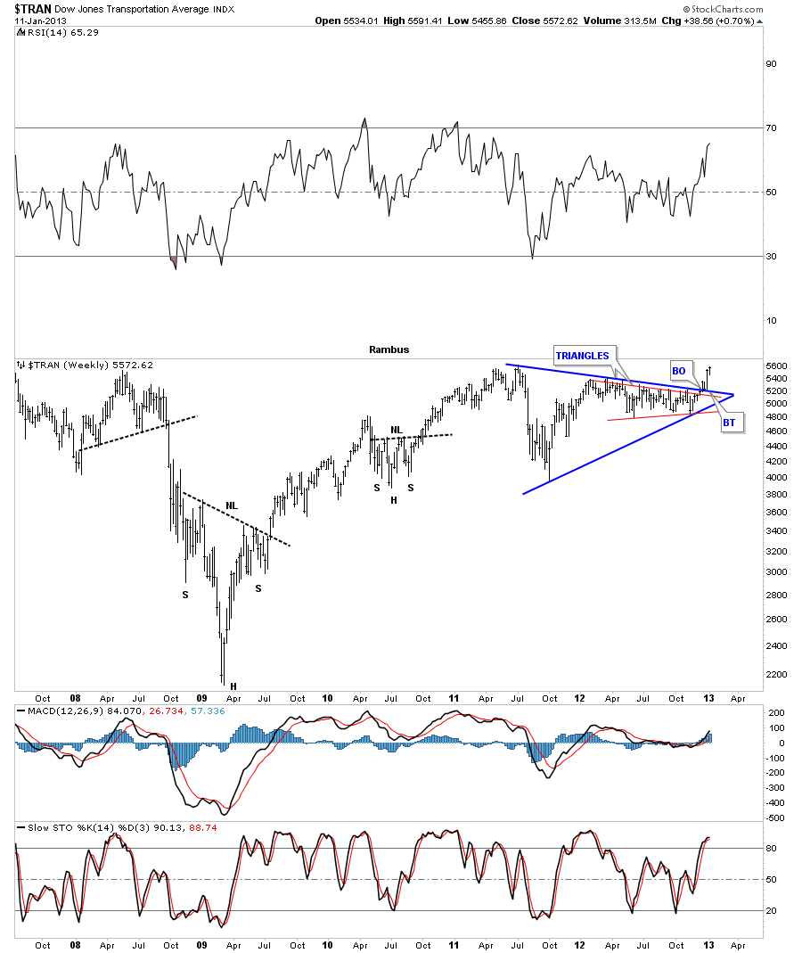
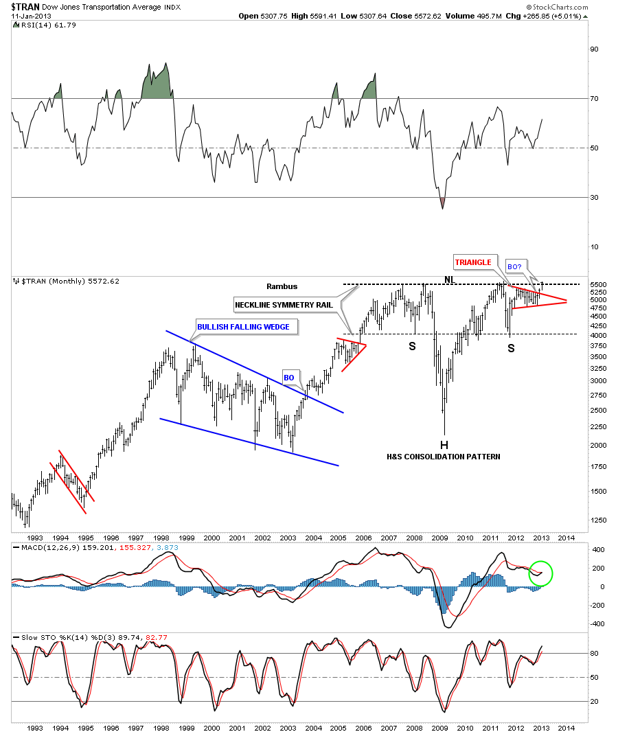
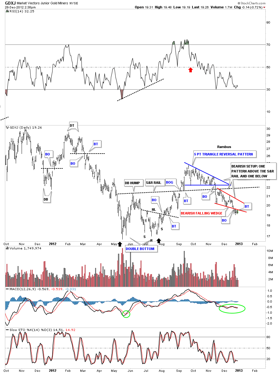
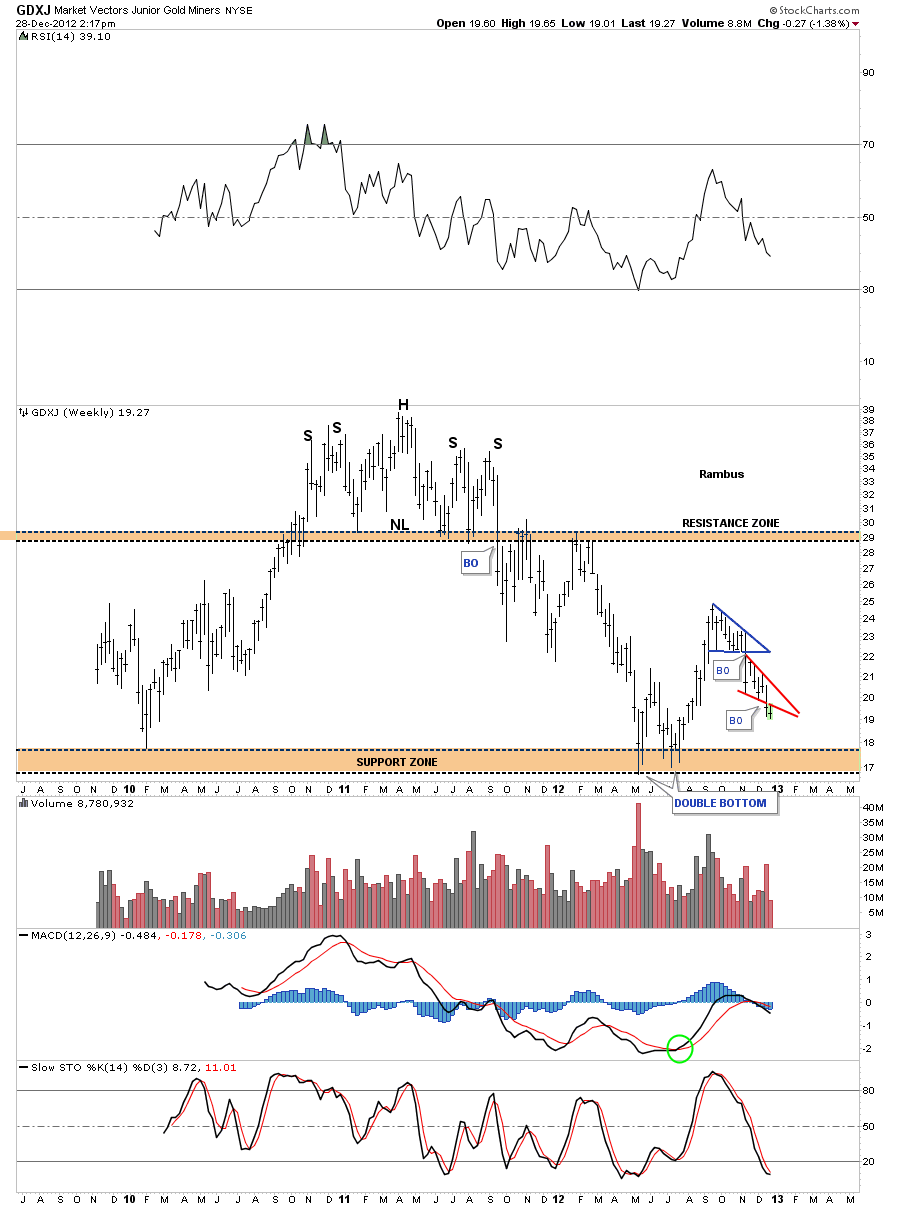
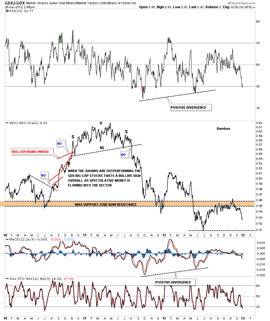
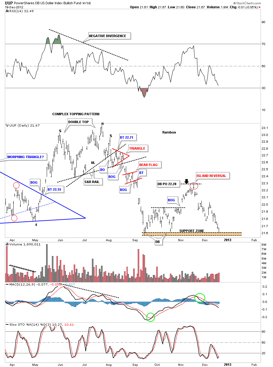
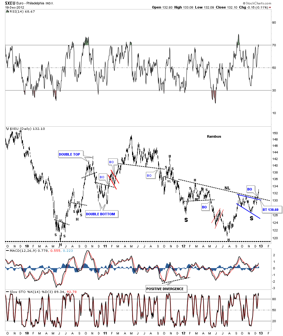
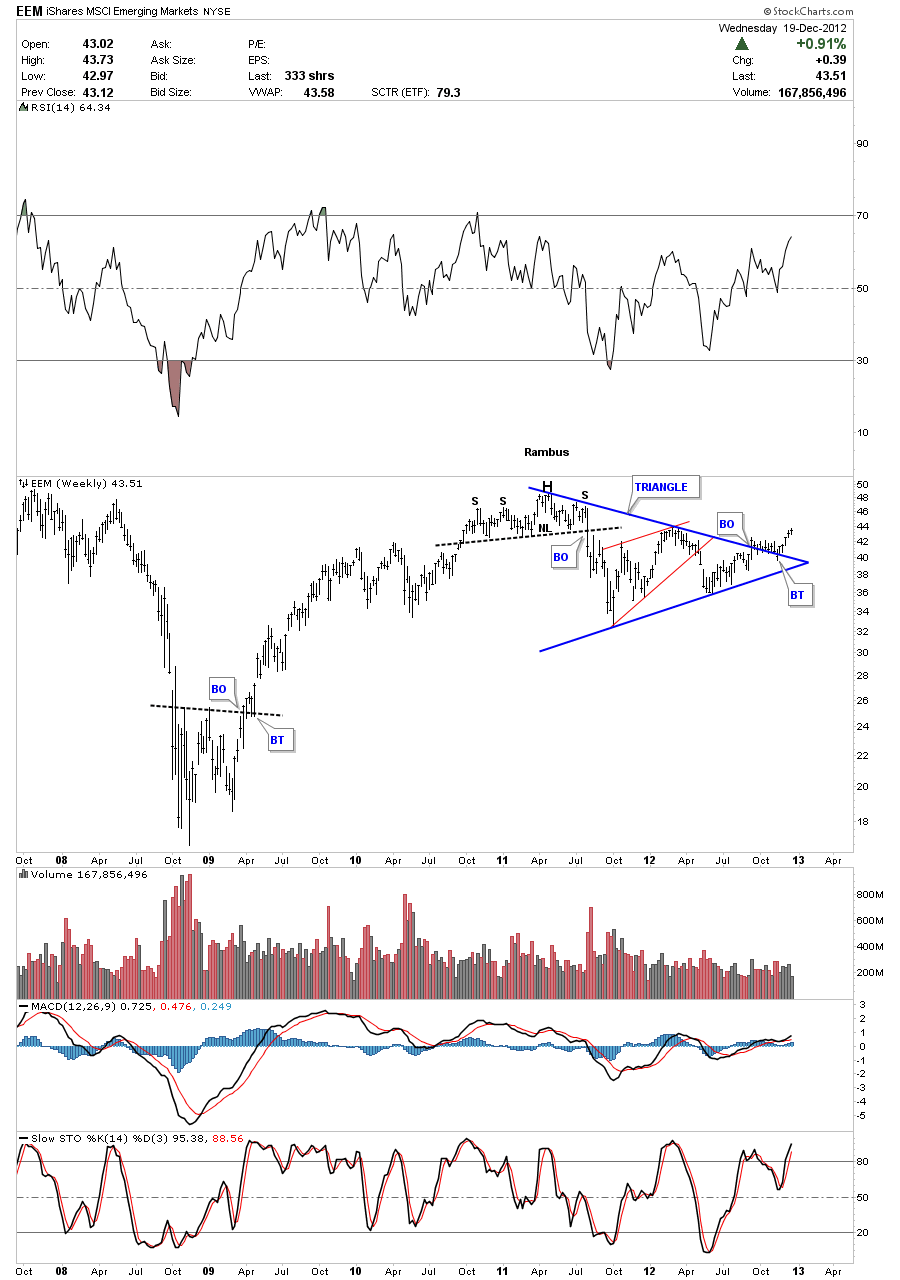
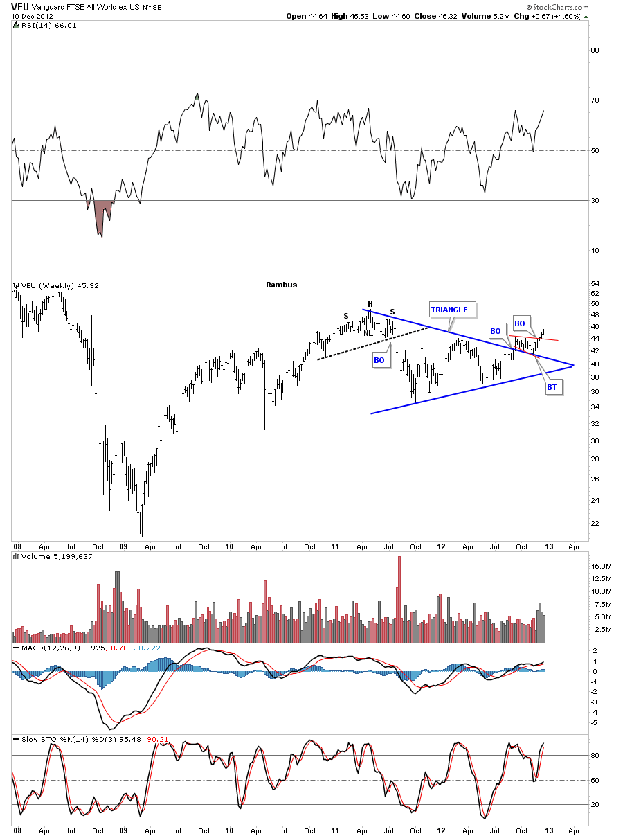
In the Weekend Report we looked at some of the US stock markets to see if they may have a chance to move higher over the intermediate to longer term.There were several charts such as the Russel 2000 and the Transportation Average that are now just starting to breakout to new all time highs. In this Wednesday Report I want show you some charts, from some of the sub sectors of the US economy, to see if they maybe signaling a green light for the US stock markets.
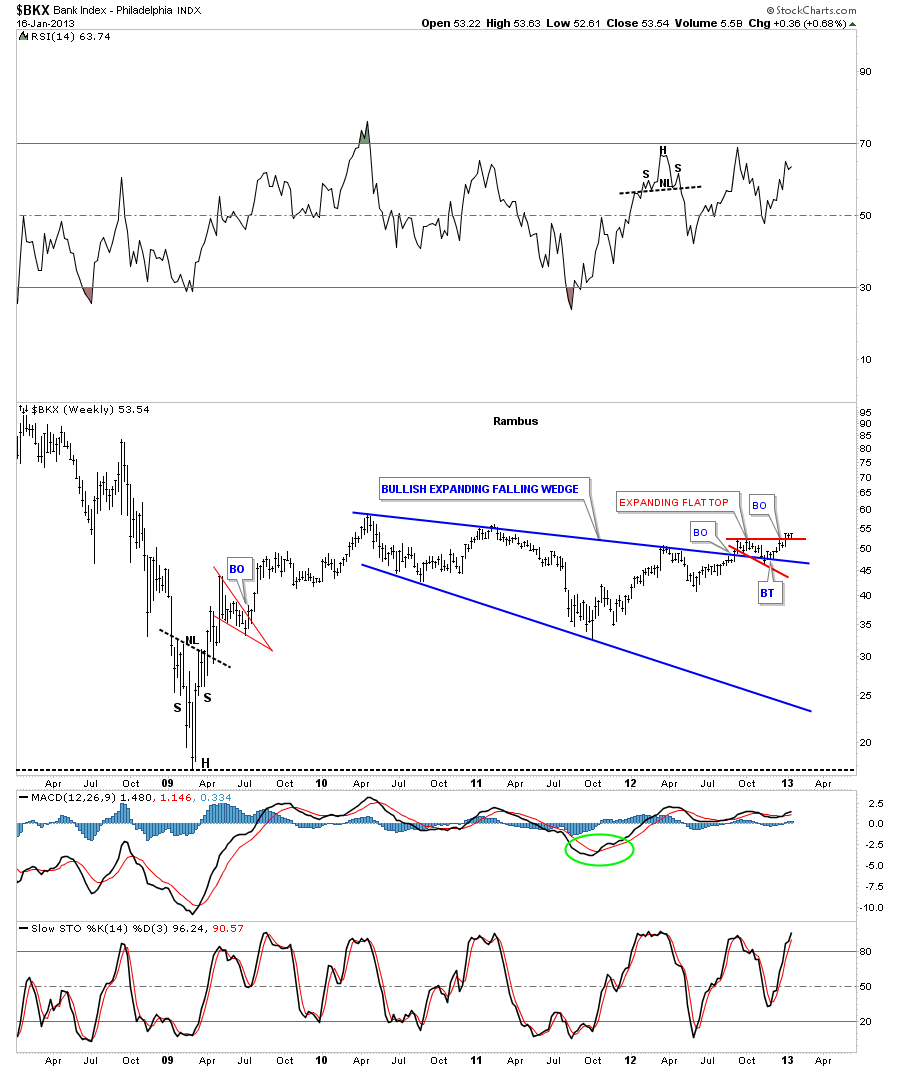
The first and most important index we need to look at is the Banking index, BXK. How the banks are doing is an important clue to the viability of the economy going forward. If the banks are doing well that is generally a good reflection of an improving economy regardless of what we may read to the contrary. So lets take a look at the $BKX and see what it looks like from the weekly perspective.
Below is a five year chart that shows the 2008 crash and the rally off that historical low. Its built out a very large three year bullish expanding falling wedge pattern that broke out through the top blue rail last fall. Since the breakout it has formed a small red expanding flat top that has broken out three weeks ago and is now backtesting the top red rail. So far this is a bullish development.
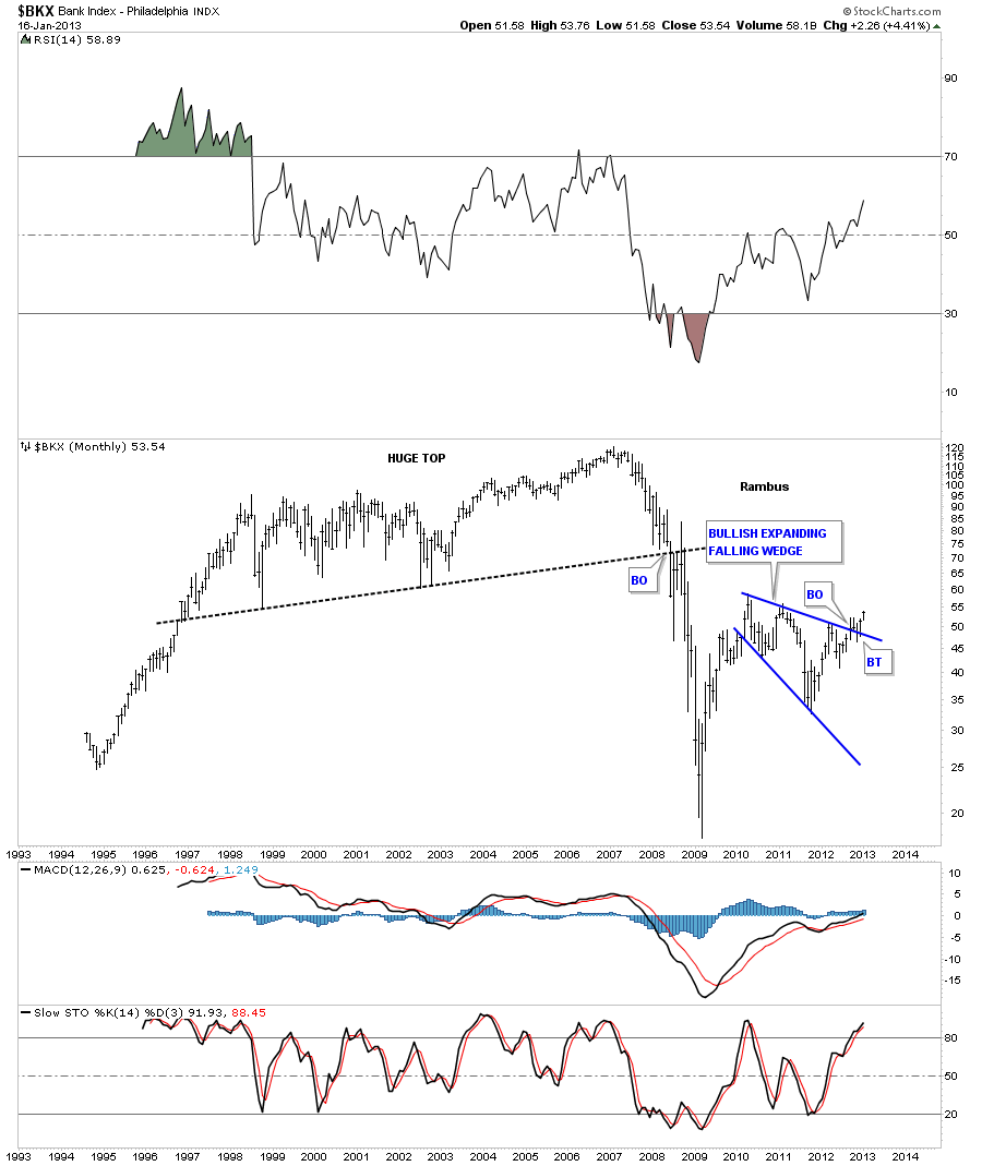
The monthly chart shows the very large topping pattern that took about 12 years to complete that led to the big crash. This chart shows you how our bullish expanding falling wedge plays into our new uptrend. I view this pattern as a halfway pattern with a price objective back up in the vicinity of the old all time highs.
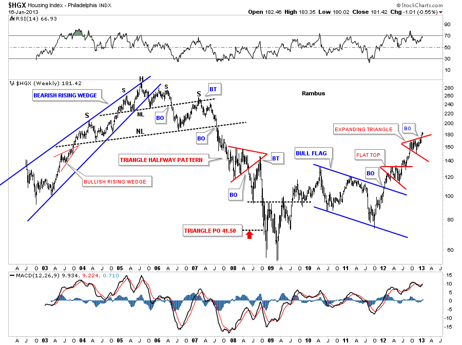
If the US is going to have a decent recovery the $HGX, Housing Index will need to participate. The chartology of this index shows there was alot of time to watch the huge topping patterns build out over the 2004 to 2007 time frame. The first clue that the HGX maybe running into trouble was the big blue bearish rising wedge pattern that formed back in 2003 to 2005. Alot of times when a wedge breaks out the backtest will form a shoulder. In this case the backtest formed the smaller right shoulder before it broke down to form a bigger H&S topping pattern at the second lower neckline. To watch this huge topping pattern form was like watching paint dry. All the pieces of the puzzle were there but it took along time to finally play out to the downside. When it did finally let go it wasted little time in declining in earnest. When you look on the right side of the chart you can see the bull market that began at the 2009 lows. One consolidation pattern sitting on top of the lower one. Regardless of what you read this is an uptrend in a bull market.
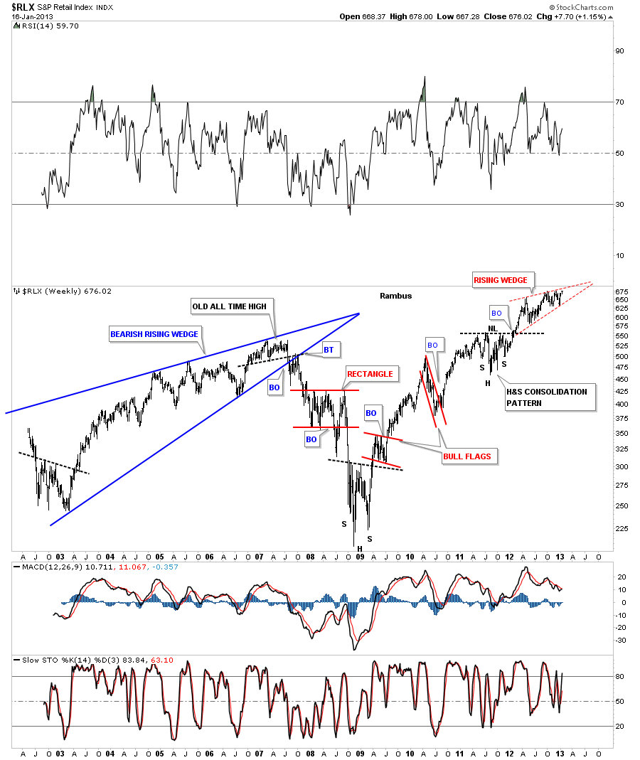
Another important area we need to look at is the $RLX, Retail sector. Again if the US economy is going to grow and show some strength it will need the US consumer spending their hard earned money. Actually this sector has been one of the strongest areas of the economy. As you can see on the chart below this index moved to new all time highs back in 2011 and hasn’t looked back.
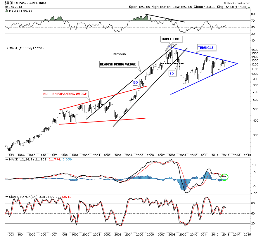
Next if the economy is going to start growing it will have a direct impact on oil use. The XOI, oil index has been forming a 6 point blue triangle consolidation pattern for four years now. The price action is sitting just below the top blue rail and if it breaks out through to the top side it strongly suggest that the rally will be long term in nature and not just a flash in the pan type move. As the economy goes so does oil.
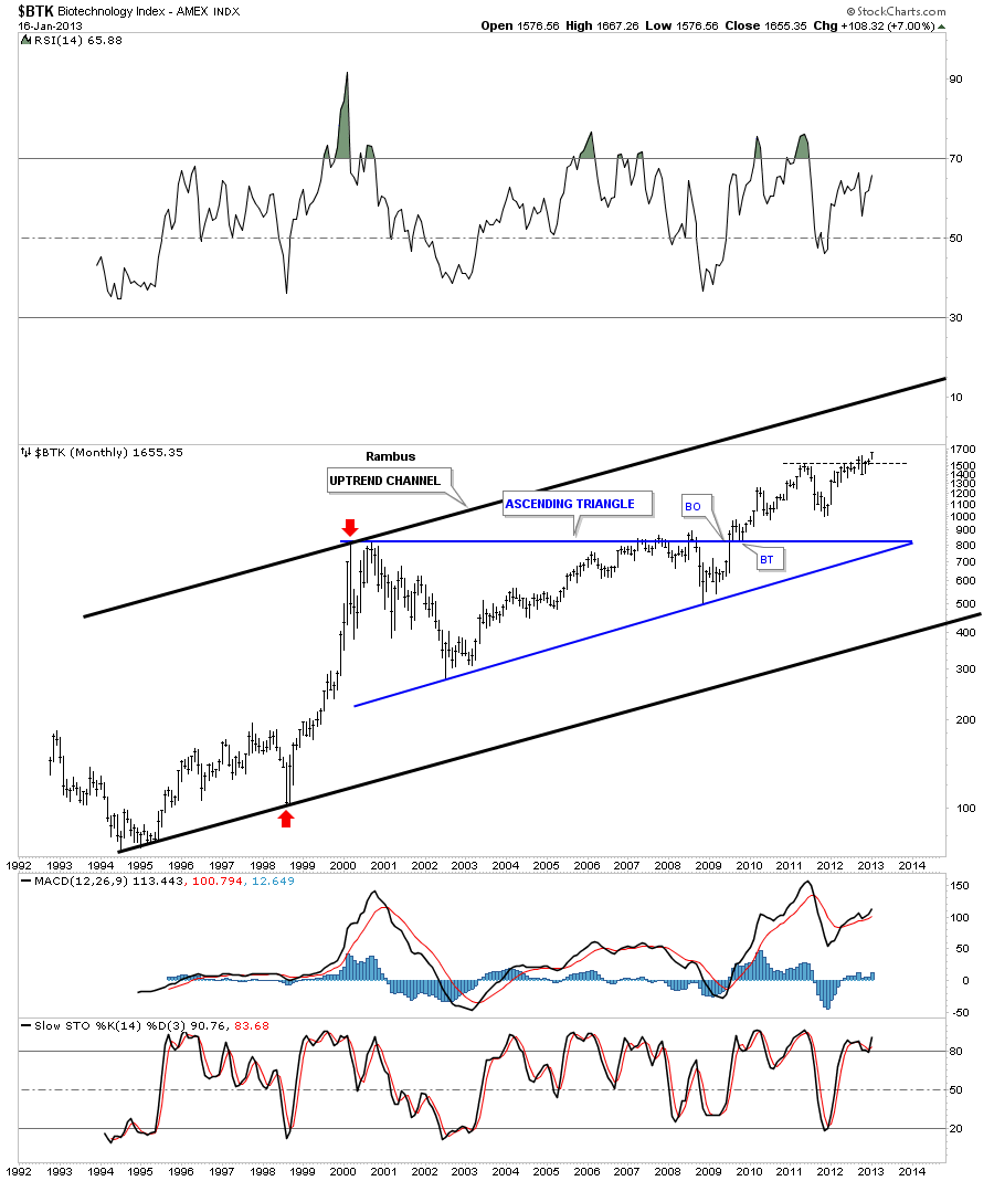
Lets look at one more sector that I think can be a driving force leading the US economy higher. If you traded the bull market in the 90’s you will know this sector was one of the hottest place to make some serious money. The sector I’m referring to is the $BTK, biotechnology index. The red arrows on the chart below shows you the bull move it made back at the end the mania phase in 1999 – 2000. It then went on to make a 10 year ascending blue triangle consolidation pattern. What I like about this sector is, while the rest of the stock markets are testing there all time highs, this sector broke out about four years ago and has been in rally mode ever since. Also the technology that this sector will produce in the years ahead will be mind boggling. This is where the future lies IMHO and the US will be the leader. It has the potential to create many new jobs in industries that are barley visible right now.
With the charts I showed you in the Weekend Report, on the US stock markets, and these charts tonight showing different important sub sectors of the US economy, its hard not to have a positive basis. I know full well this report won’t be viewed well by alot of staunch bears out there that are looking for the world to come to an end any day now. Maybe it will and maybe it won’t but until it does I have to go with what the charts are saying and they are saying be positive right now and don’t get carried away with all the negative hype. Stay strong and keep an open mind. All the best…Rambus
………………….
EDITOR’S NOTE :
Rambus Chartology is Primarily a Goldbug TA Site where you can watch Rambus follow the markets on a daily basis and learn a great deal of Hands on Chartology from Rambus Tutorials and Question and Answers .
Most Members are Staunch Goldbugs who have seen Rambus in action from the 2007 to 2008 period at www.goldtent.org and now Here at Rambus Chartology since early 2012 .
www.rambus1.com
To review his Work and incredible calls from the 2007-2008 period click on the top right sidebar in the “Wizard of Rambus” ….”What If ?! ”
To Follow Rambus Unique Unbiased Chart Work and participate in a Chartology Form with questions and answers, and learn the Art and Science and Mindset of a Pro Trader you may Join us by subscribing at
www.rambus1.com
We have many subscribers from all over the world who are glad they did as they enjoy the many daily updates and commentaries provided at this exciting new site.
As you will see Rambus (Dave from The Ozark Mtns in Arkansas) has prepared us for this difficult period by being one of the only ones to see and warn about the incredibly debilitating PM smackdown as early as Jan 2 2012 …click on the” HUI Diamond in the Rough” Post in the “Wizard of Rambus” top right
More Recently Rambus called a Bottom in HUI in this post…and has had subscribers on board for a Powerful Run to the Upside
rambus1.com/?p=5651
Followed again by his timely bearish call in this SLV Update which has had us on the sidelines and or short
rambus1.com/?p=8876
BUT
What is he seeing Now ?
You will find Rambus to be a calm humble down home country tutor with an incredible repitoir of all the TA based protocols tempered with his own one of a kind style…simply put…He wants to keep his subscribers on the right side of these crazy volitile and downright dangerous markets
See you at the Rambus Chartology