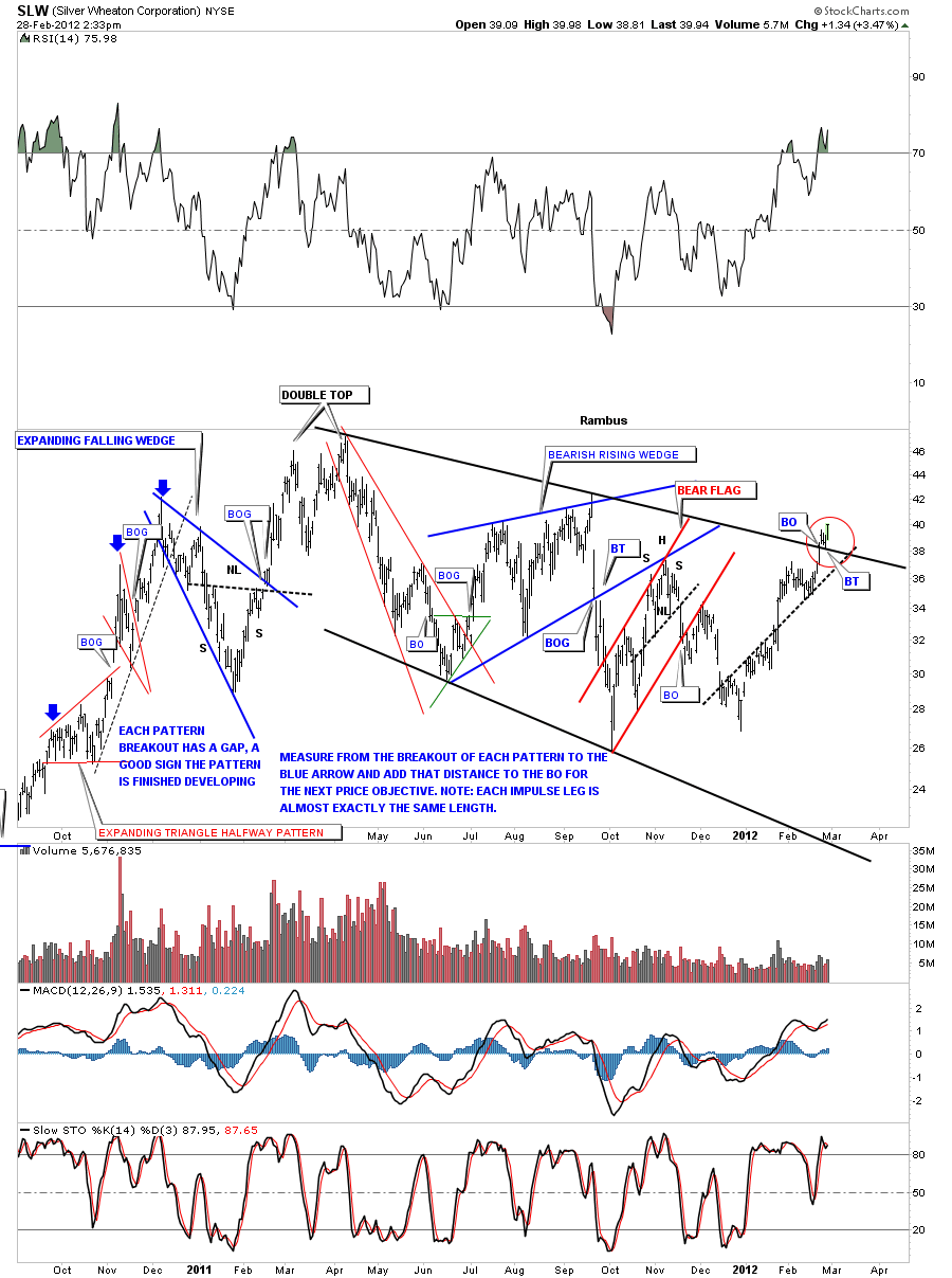
In this weekend report I want to take a good hard look at silver and its many different chart patterns. Silver has an inverse H&S bottom, and expanding triangle, bull flag, and the beginnings of an impulse leg higher. I also want to show what silver looks like from some etf’s like AGQ, DBS and USLV that could give us an early heads up as to the direction and price objective over the next several months or so.
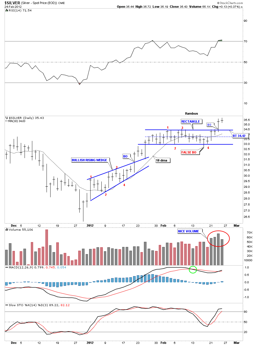
The first chart I want to show is a 3 month look that shows the rally off the December bottom. The first little consolidation pattern was a bullish rising wedge that lasted about 13 days before it broke out to the upside. From that little consolidation pattern we rallied up to about 34.50 where we began the next consolidation pattern, a rectangle. The volume really kicked in over the last four days as silver took out the top rail of the rectangle. This is what we want to see in an impulse leg up, one little consolidation pattern after another. The top of the rectangle at 34.50 or so should hold support if we get a backtest.

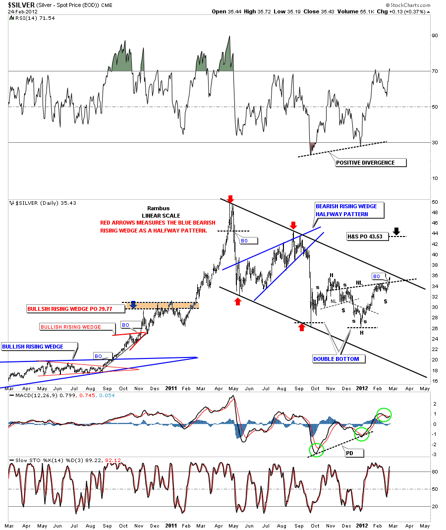
The next chart of silver shows a nice inverse H&S bottom formation. The inverse H&S pattern is coming where you would expect to see some kind of reversal pattern, at the end of a downtrend channel. Note the price objective is around 43.53 where the next high comes in. This H&S will produce enough energy to break the big black downtrend rail that will reverse the trend from down to up.

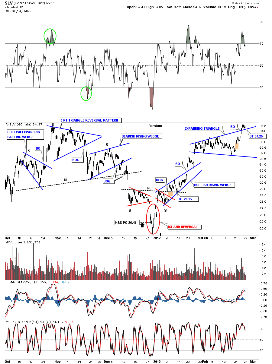
Next lets look at the SLV 60 minute chart that is showing an expanding triangle. The low last Friday was 34.22 which touched the top rail. This is an important test taking place right here. A successful test right here will send SLV up on it’s next leg higher.

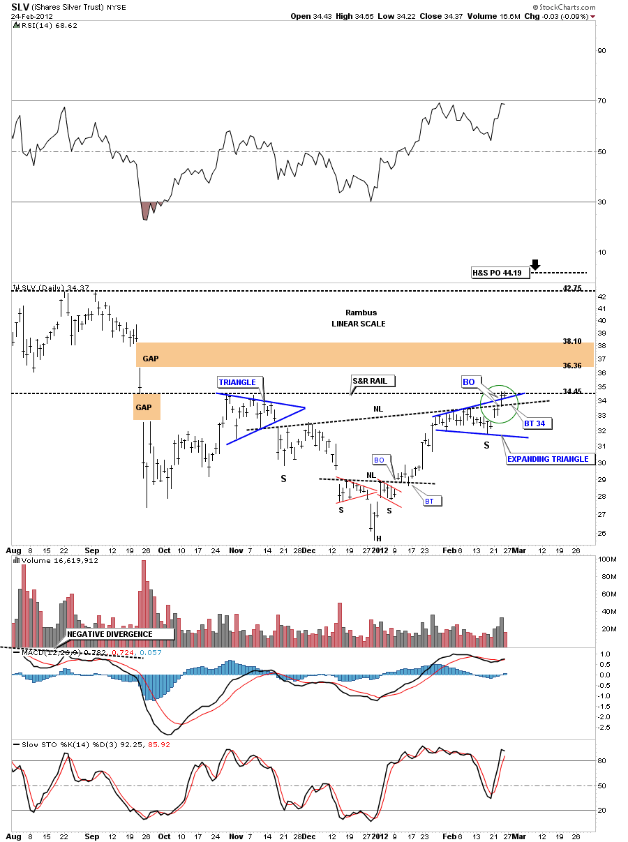
Lets look at our expanding triangle on the daily chart and see how it fits into the bigger picture. First notice how small the last bar is from last Fridays trading and where the low was, right on the top rail of the expanding triangle. So the top rail held support which is what we wanted to see. You can also see we are testing resistance from the previous high to the left side of the chart. The green circle shows the breakout from the ncekline and the expanding triangle with that nice breakout gap last Thursday. Our next price objective, once we clear the horizontal resistance rail at 34.45, will be all the way up to the next high at 42.50 and the H&S price objective at 44.19. It will be interesting to see how we interact with the big gap just above.

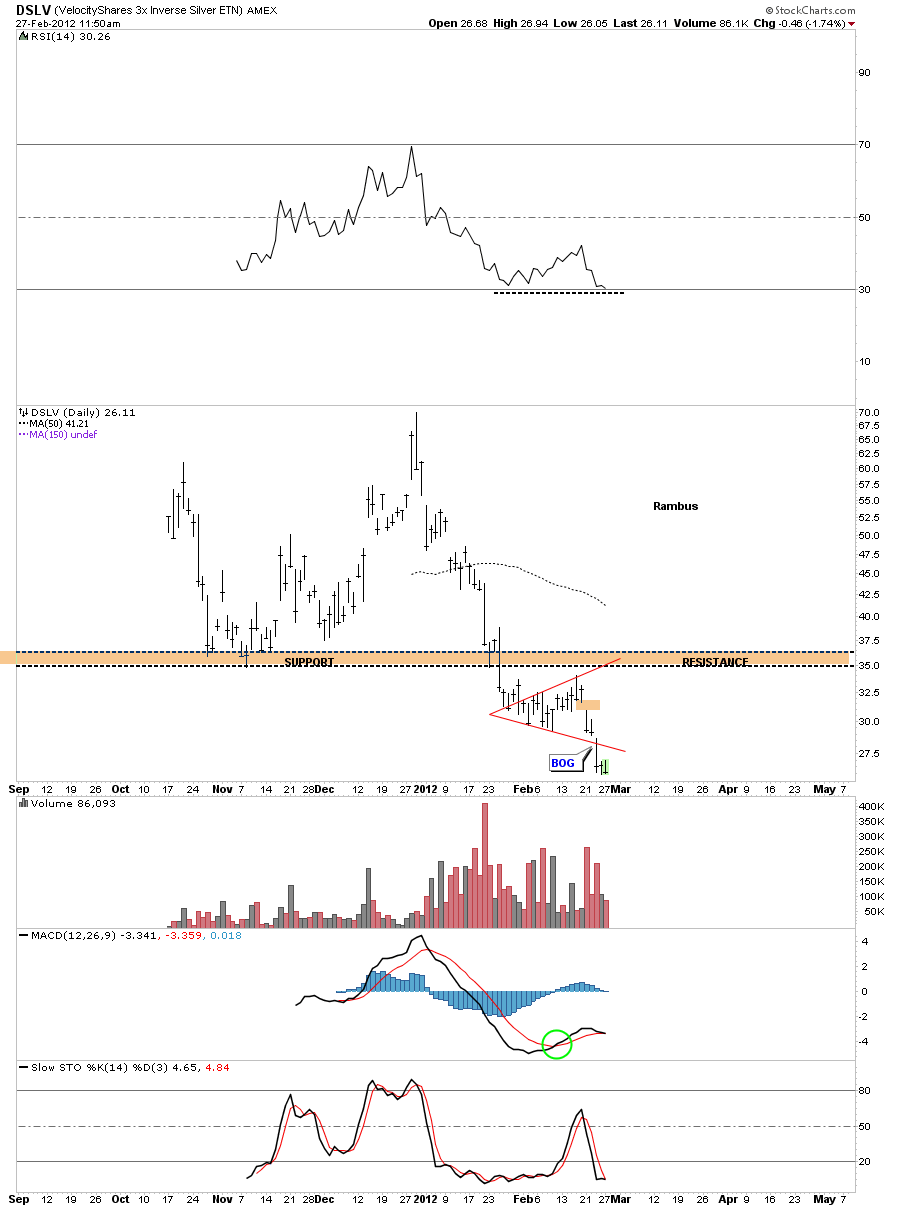
Lets take a look at another example of the expanding triangle. The DSLV is an etf that is short silver so we should see the same pattern only at the lows instead of the highs. Just like SLV breaking above it’s top rail, the DSLV gaped below it’s bottom rail 2 days ago adding more evidence to the validity of the expanding triangle.

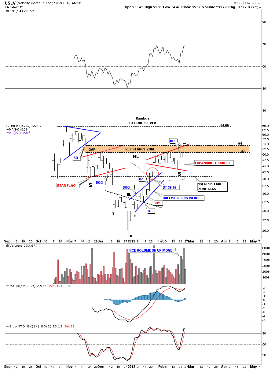
Lets take one more look at the expanding triangle from another etf and one of my favorites the USLV. Again notice the small bar that formed last Friday on the top rail of the expanding triangle. The top rail of the expanding triangle is the reason we took our position in USLV last Friday. Its still possible that we test the horizontal neckline at 51 or so but no guarantee. I would rather have a position alittle higher just in case USLV doesn’t backtest the neckline. I don’t want to be left holding the bag as silver is looking very powerful in here especially this etf.

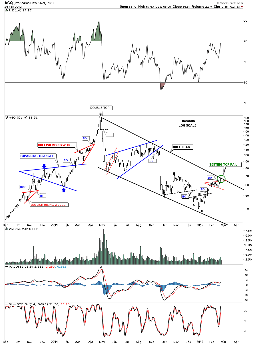
There are several other etf’s one can trade silver with. One of the more popular ones is AGQ. One of the main reasons I watch several etf’s is because one may lead by a small margin that might give an early heads up for the rest. If you noticed Silver itself is still a little ways below its downtrend channel off the 50 dollar high made last year. As you can see AGQ is testing the top rail of it’s downtrend line the last couple of days. Note the little red expanding triangle just below the downtrend rail. I always like to see a small consolidation pattern form just below an important trendline as it will give energy to the move to finally breakout.

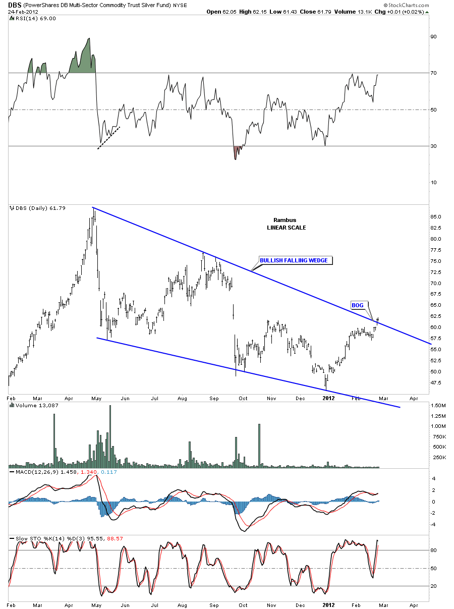
Lets look at one more etf for silver and that is DBS. This etf is showing a bullish falling wedge that is already showing a breakout. Note the little gap just below the top blue rail. The only thing that is lacking is the volume. I would like to see the volume start to really pick up as DBS goes higher.

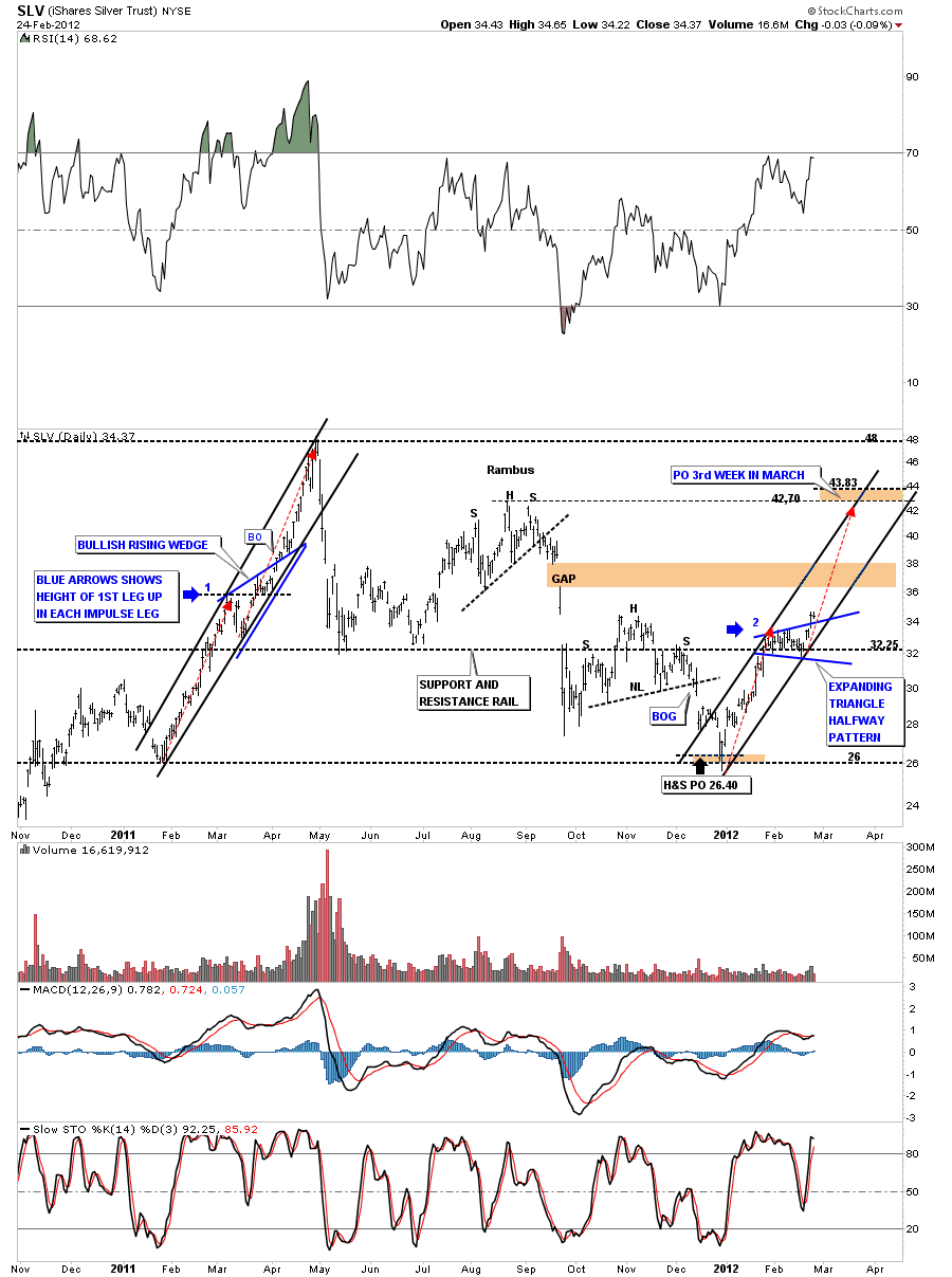
Now lets take a look at a possible new impulse leg up that might be at a half way point with the expanding triangle as a halfway pattern. Notice the 2011 impulse leg up where there was a bullish rising wedge that formed roughly at the halfway mark. We are at a point in our new uptrend where we want to see some consolidation pattern form and the expanding triangle fits the bill rather nicely. As you can see if the expanding triangle is the halfway pattern the next leg up will look very similar to the first one up just below the expanding triangle. This second leg up should get us up to the previous high 42.70 by the 3rd week in march which isn’t that far away.

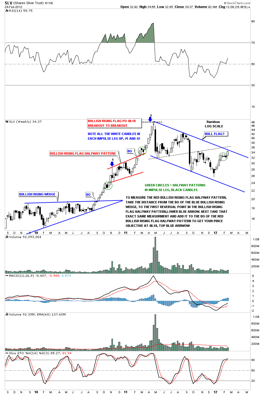
This next chart shows you how an impulse leg up looks using candlesticks. Below is a weekly chart that shows the near parabolic run that silver had back in 2010 and 2011. That big impulse leg was divided into two equal parts with a red bullish rising flag as a halfway pattern separating the two legs. Notice how each impulse leg had nearly all white candles until it was time for a small consolidation pattern to form. That is where you will see a couple of black candles as silver took a breather, green circles. Notice our current impulse leg up on the right side of the chart with all the white candles and then the consolidation area with a couple of black candles which would be the expanding triangle.

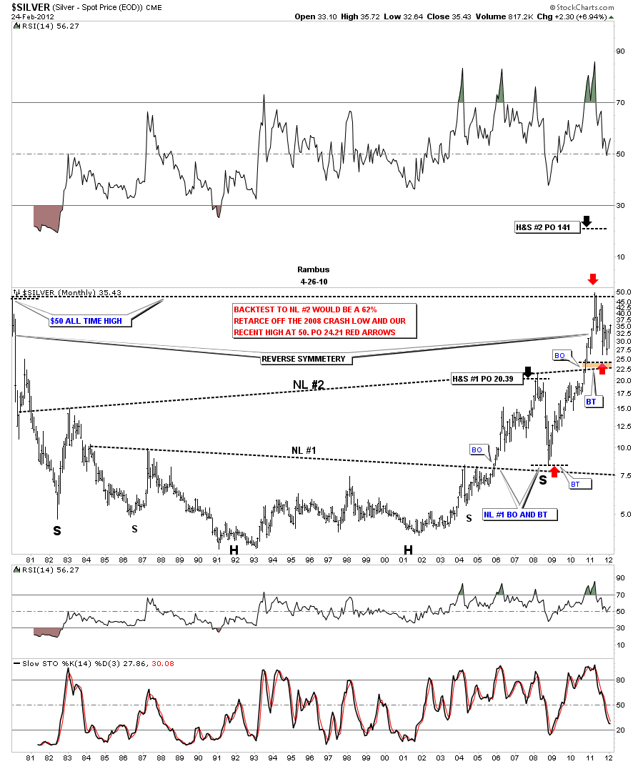
With this next chart I want to show the big 30 year time frame and the two H&S bottoms that have formed over that time. The lower H&S neckline #1 worked as the backtest to the 2008 crash low at roughly 8 dollars. That was one heck of a rally off that backtest. Now look at the second H&S base and the backtest to 26. I had originally thought we would backtest all the way down to the brown area which would have been the 22.50 area. It looks like 26 is going to be the backtest as we have hit 26 three times already, red arrow.

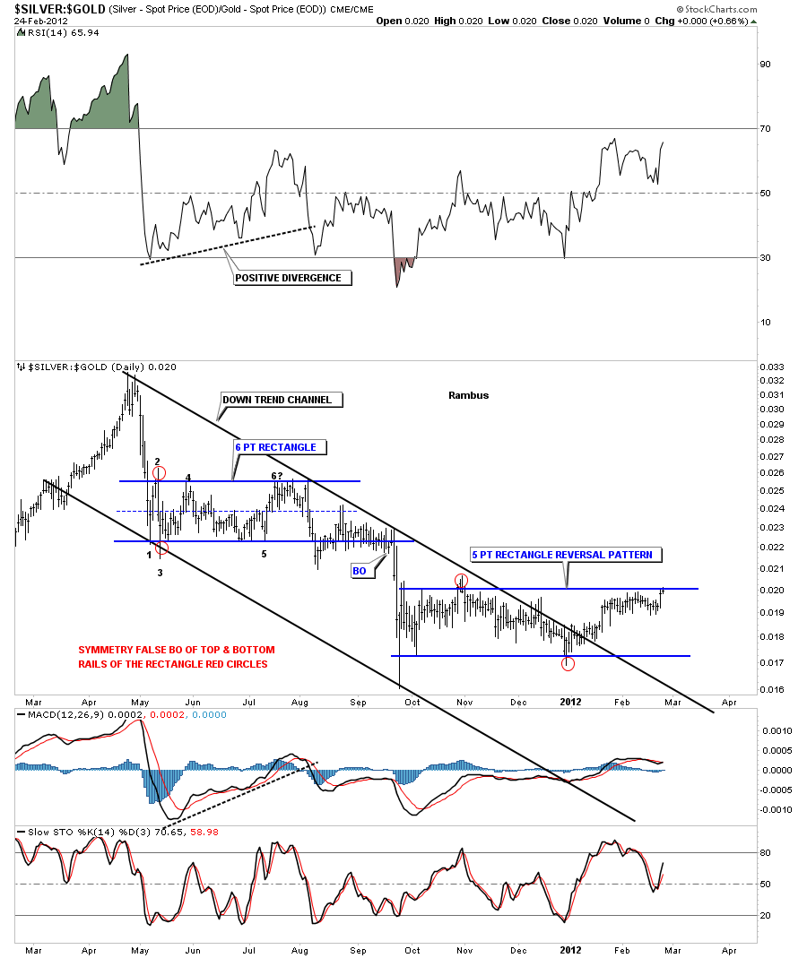
The next chart I want to show is a ratio chart comparing silver to gold. Since silver topped last April it has been in a downtrend channel compared to gold. The down trend channel was broken to the upside at the end of 2012 and has since carved out a horizontal trading range that is a 5 point rectangle. If silver can breakout above the top blue rail of the rectangle that would mean the rectangle is a 5 point reversal pattern. This would be very bullish for silver as it would be outperforming gold going forward.

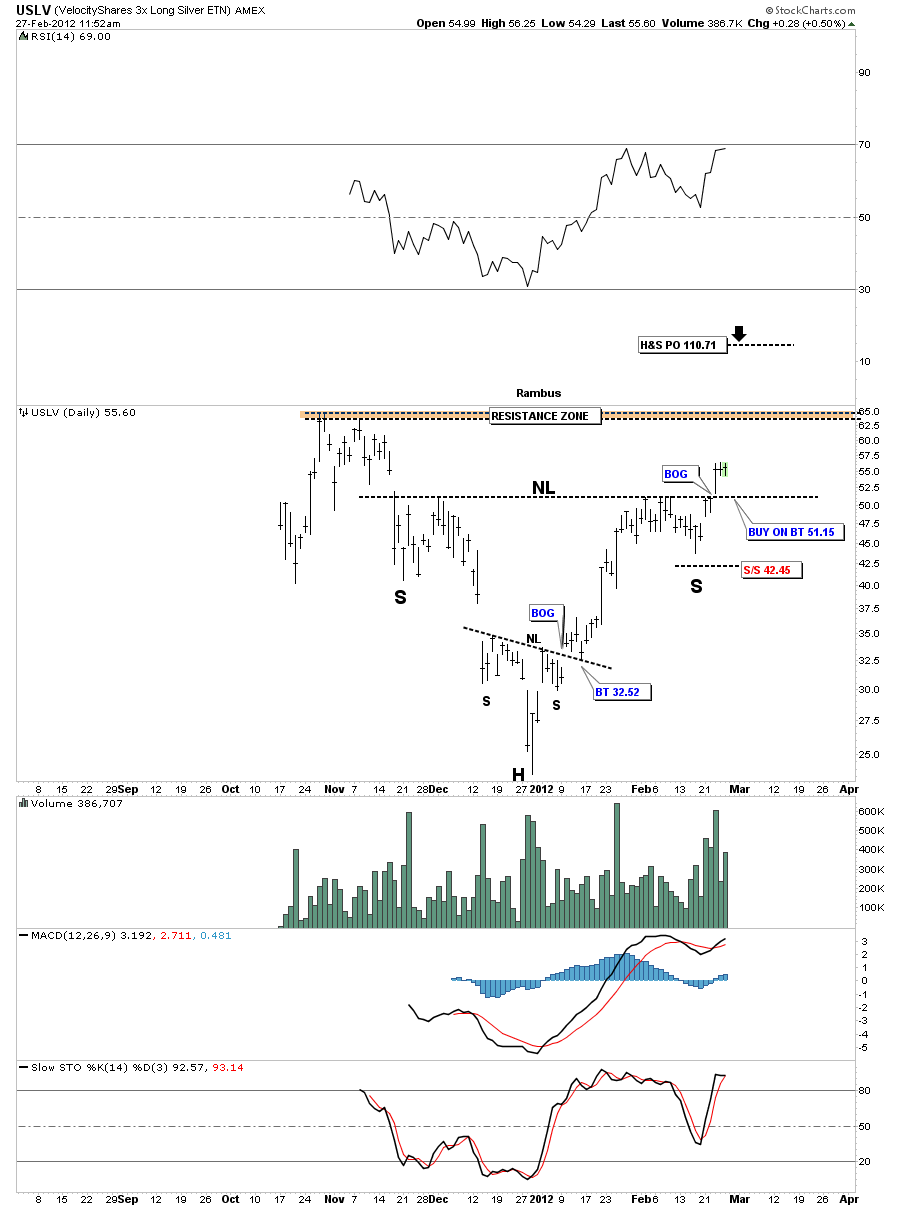
One last chart to put the frosting on cake as far as silver goes and the potential of the 3 X USLV etf to really shine. I showed this chart last Friday where the neckline was broken last Thursday to the upside. That’s one big H&S that has a price objective to over 100. We may or may not get a backtest to the neckline at 51.15 so I’m not taking any chances on missing this potential big move by taking my position last Friday. A few points won’t be a big deal in the bigger picture. So if this analysis is close to being right silver is getting ready for another big move higher in the coming days.
All the best …Rambus
