DOW update

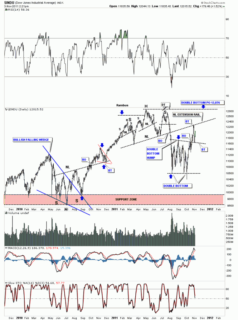
Tuesday of this week, when everything was down hard, stock markets and precious metals stocks, I showed the daily chart for the Dow Jones andĀ  where I thought the backtestĀ  would most likely take place. You can see on the chart below the Dow did come all the way back down to it’s breakout point at around the 11,600 area. So we can now give more credence to the double bottom being valid. That black dashed rail that marks the double bottom hump and the breakout point is now your line in the sand. Above the rail positive below negative. Note where our latest backtest started from, the most obvious place on the chart, the old neckline from the H&S top. You can see why support and resistance shows up at certain spots on a chart. So now we bounce between the big neckline and the top of the double bottom hump until one side wins out. An old stock market adage: The markets like to “climb a wall of worry”. If there isn’t enough to worry about with all the bad news you hear and read and see on TV, I think we have a substantial wall to climb and so far its doing a good job. The Dow has gained almost 2000 points in about a month and everyone is still debating when the end of the world is going to be.

Dow Jones daily breakout and backtest.

Bullish expanding falling wedge

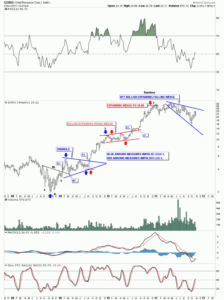
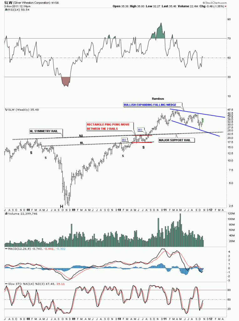
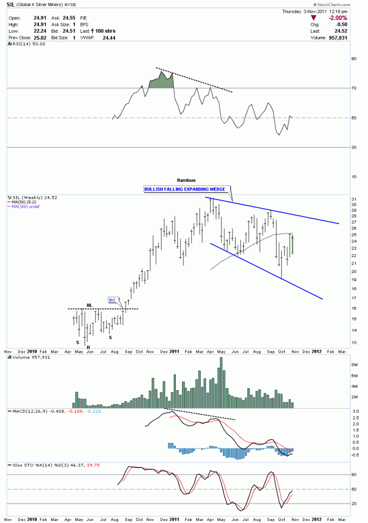
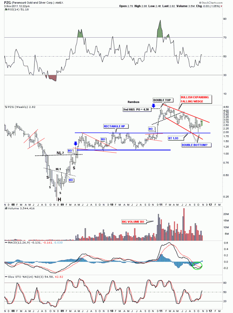
I want to do a little followup on a pattern that I posted yesterday on the weekly stock pick, GORO. I showed a bullish expanding falling wedge as it’s most recent consolidation pattern. I know many of you are thinking, “I want some of what Rambus is smoking”. Where does he come up with some of these off the wall chart patterns? This bullish expanding falling wedge pattern seems to start off as some kind of H&S pattern where the head and the top of the right shoulder form the top rail. The bottom rail is formed from the right shoulder crotch, at the neckline, and the last reversal point is made from the low that is achieved from the breakout of the neckline. The common thread for this pattern is that the price objective of the H&S falls short making the last low higher than if the H&S reached it’s full price potential. These patterns are showing up on the weekly look that is less cluttered than the daily. A consolidation pattern shows the fight taking place between the bulls and the bears and the fight can take on many different patterns.The main thing to keep in mind is there has to be at least 4 reversal points within the top and bottom boundaries to qualify as a consolidation pattern. Sometimes the boundaries of the consolidation pattern slope up, sometimes horizontal, some slope down and in this case they expand. So lets look at some of these patterns in real time and see if this is just an isolated incident on GORO. First we’ll look at the GORO weekly chart from last night as a template.

GORO weekly bullish expanding falling wedge.

SLW weekly very similar setup to GORO.

SIL weekly look.

PZG weekly look.

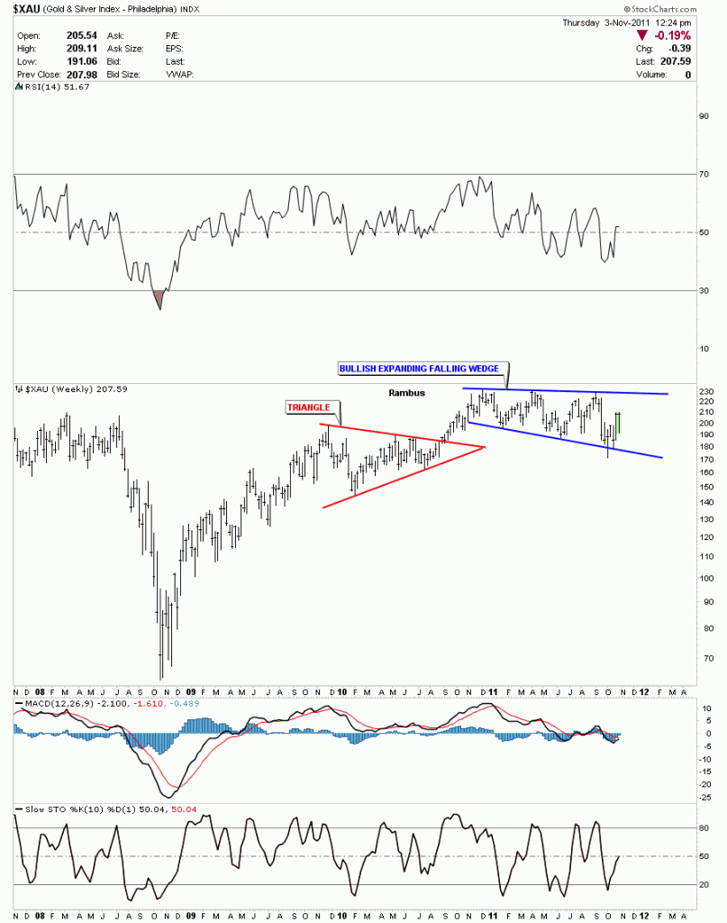
I could show many more bullish expanding falling wedges but I think you can see they are a fairly common consolidation pattern during our latest one year correction. During the next big correction the prevalent consolidation pattern might be a triangle or rectangle or whatever pattern the bulls and the bears create during their fight for superiority. The reason there are so many bullish expanding falling wedges has to do with one of the precious metals stock indexes, the XAU.

XAU weekly 6 point bullish expanding falling wedge.


GORO chart of the week

This weeks “Chart Of The Week” was requested by a long time poster at the tent and friend aurum. He picked up some shares of GORO yesterday when everything was in the backtest mode, which is generally a good low risk entry point into ones favorite stock. As always we’ll start out with the 60 minute chart and work our way out to the long term monthly look.

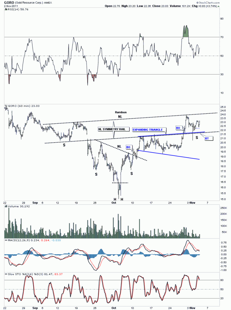
The 60 minute look shows GORO building out a nice basing pattern consisting of several H&S patterns and one expanding triangle. In order to launch a bull move a stocks has to have time to create a nice base which will be able to sustain a big move higher. I’ve added a neckline symmetry rail that sometimes gives you a clue on where to look for a possible bottom for the right shoulder. It doesn’t work all the time but it does give you something to shoot for.

GORO 60 minute multiple H&S base.
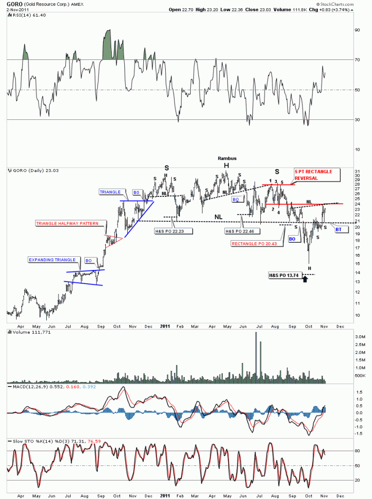
The daily look may seem a bit busy because there is alot to look at. I have run out of annotations to label anymore of the interesting things on the chart. Notice the left side of the chart when GORO was in its impulse move higher back in the 2nd half of 2010. One consolidation pattern was formed on top of the next creating a very exciting leg up. The little red triangle was a halfway pattern that measured to the top of the bigger blue triangle just above. The impulse leg ended in late 2010 where the stock began it;s long awaited correction. The sideways move created 2 H&S tops and one 5 point rectangle reversal pattern These three patterns created a much bigger H&S top that broke down toward the end of September along with most PM stocks. The big H&S price objective fell just shy of it’s objective. The long tail that was made at the low suggested very strongly that the move down was probably over. You can see how the big neckline has worked as support and resistance giving validity to the pattern. Yesterday’s sharp move lower found support right on the neckline where the stock has had a nice bounce. There is another chart pattern that’s hard to see on the daily look but stands out on the less crowed weekly look.

GORO daily H&S
The weekly look really put GORO’s bull market into perspective. After bottoming out in 2008 with alot of other precious metals stocks, it started the base building process that built out a very nice H&S base in which to launch it’s bull market run. What I find fascinating about it’s bull market run is that each of the impulse legs up are almost exactly the same length. If you have a fib tool or can draw a box, just measure the first 2 blue arrows, one at the bottom of the chart and the next at the top of the first triangle consolidation pattern. Take that measurement and add it to the last reversal point in each consolidation pattern, where the blue or red arrows are. The markets never cease to amaze me. Next we’ll look at our most recent pattern which is a 6 point bullish falling expanding wedge. These patterns are more common when one starts to look for them. At any rate a breakout above the top rail should launch the next leg of it’s bull market along with many other precious metals stocks.

GORO weekly look.
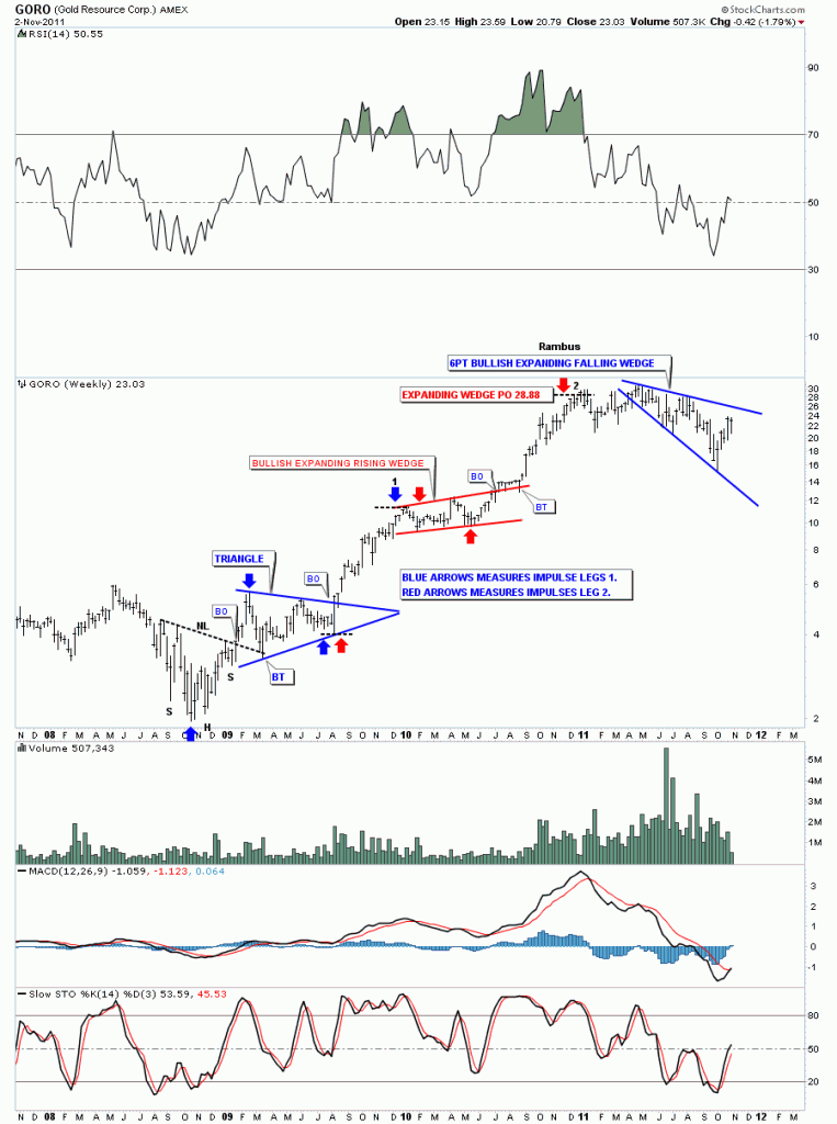
Bottom line with GORO is that it looks like it’s in the process of finishing up another consolidation pattern once it breaks through the top rail of the 6 point expanding falling wedge. As GORO doesn’t have alot more history we’ll stop here as the weekly look shows you everything you need to see. All the best aurum……Rambus

Gold – 2 ratio charts

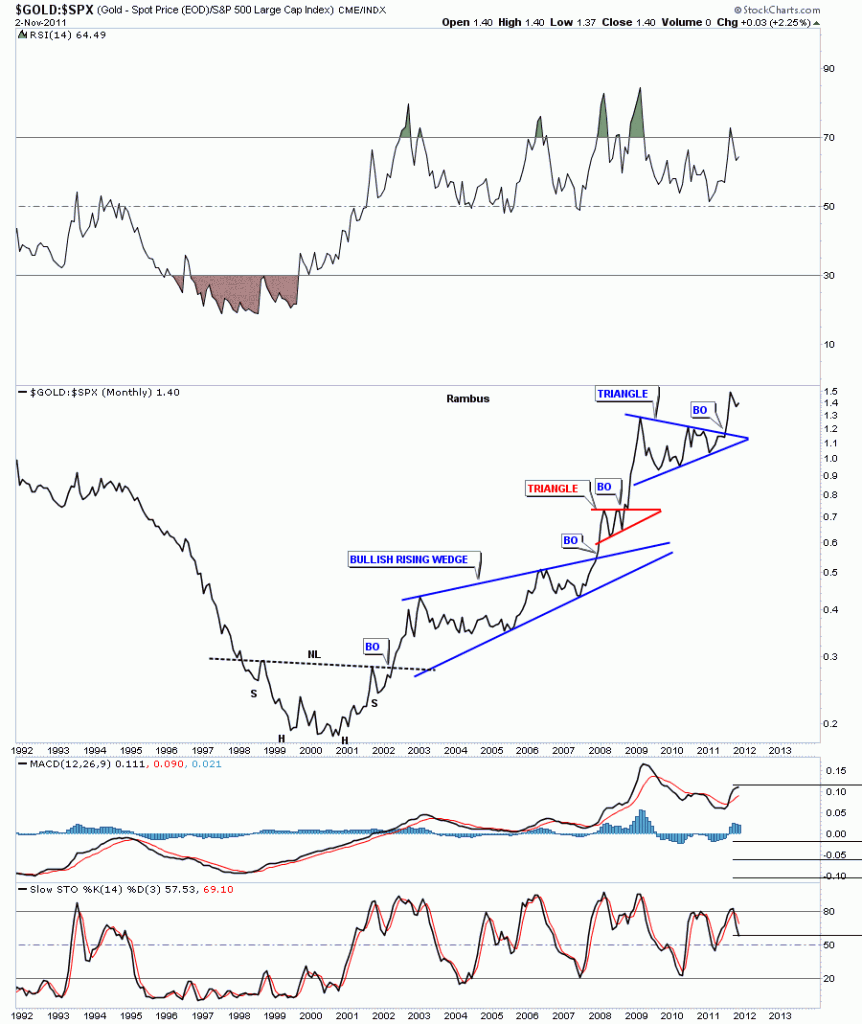
Today I want to look at a couple of ratio charts concerning gold. Ratio charts are a good tool to see how one item is preforming against the other and where is the best place to invest one’s capital. We are going to look at the very long term monthly charts of the Gold to SPX and Gold to CCI to see if gold has really been a good investment compared to the stock markets and commodities. First we’ll look at the Gold to SPX and see how gold has fared compared to the 500 biggest cap stocks in America. If gold is out preforming the SPX the chart below will have an upward bias showing gold’s relative strength. When looking at the left side of the chart below, gold was probably one of the worse investments during the stock markets raging bull market that ended in 2000 about the same time the bear market for gold was ending. Notice the almost 4 year H&S bottom for gold at the bottom of the chart. It took four years to reverse the downtrend that had basically been in place since gold’s bull market top at 850 in January of 1980. There can be no denying, by looking at the Gold to SPX chart, that gold has vastly outperformed the biggest 500 companies in America.

Gold to SPX monthly ratio chart showing gold’s relative performance to the SPX.

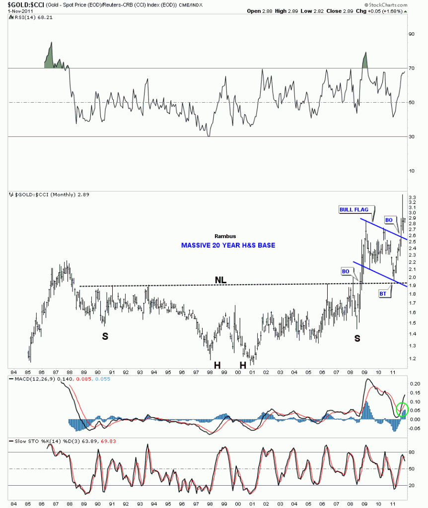
Next, lets look at how gold has fared against a basket of commodities using the CCI commodities index. By looking at the chart below you can see how gold gradually outperformed the CCI since its bear market low from 1998 to 2001 bottom which also created a double bottom which intern is the head of a massive 20 H&S bottom. Gold showed modest relative strength to commodities, in general, until the 2008 stock market and precious metals crash. That crash helped forge the right shoulder and was the percourser to gold’s rally that would go vertical compared to most commodities. It was a massive rally that took out the 20 year neckline and showed gold was finally in charge. After such a big rally gold needed a rest. The resting period for gold to the CCI took the form of a bullish flag pattern that found support right where one would expect to find it, right on the 20 year neckline. Perfect TA. Three months ago this ratio broke out of the flag formation and is now ready to begin outperforming commodities. So the chart below shows how gold is getting ready to outperforming commodities, in general, and is still the place to be invested compared to the stock markets and most commodities.

Gold to the CCI index monthly look.


INVERSE ETF’S

Sometimes looking at an inverse etf can give you alittle boost of confidence when the chips are down. I follow DUST which is a 2 x gold miners bear etf. Last week we broke the neckline of a beautiful H&S top pattern. Today’s action took DUST all the way up to the neckline for it’s backtest while the HUI and other PM indexes were backtesting their neckline from the topside. If the precious metals indexes can hold onto their rebound, into the close, there should be a nice long tail on the daily bar.

DUST daily H&S backtest to the neckline.

Backtest holding

This morning’s hard down move stopped right where it should have on the HUI and other indexes. This is what I call “THE SHAKEOUT MOVE”. All weak hands had plenty of time to unload their shares and feel better about themselves for getting out. As an investor think back to this mornings action and your mental state at the time. The easy thing to do was to relieve the pain that you were most likely feeling. We are just playing a game of psychological warfare. Buying the pain is alot harder to do in reality and in real time and visa versa at the top.

What you want to do now is look for the leaders that came charging back off their lows this morning. These stocks will likely be leading the next charge higher.

DOW critical backtest

The Dow Jones is also doing an important backtest today along with the precious metals complex. I’ve labeled the our most recent correction as a double bottom. Once we broke thru the top rail last week we headed straight for the old neckline that marked the top and led to the correction we are now in. On the chart below you can see how the old neckline came into play and stopped last weeks rally dead in its tracks. This was the most obvious spot for our backtest to begin from. This weeks action has taken us all the way back down to the breakout point where we are in the process of backtesting as we speak.

INDU daily backtest.

HUI 60 minute backtest

Just like gold and silver the HUI is also backtesting an important support rail, the neckline of a 5 week inverse H&S that formed on the bottom rail of the much bigger one year expanding triangle. These backtests never feel good when you watch them in real time. Always feels like the end of the world but in actuality the backtest represents a very low risk entry point. You have a line in the sand where you can enter a sell/stop if the backtest fails. So watch the neckline very close in here and act accordingly.

HUI 60 minute H&S backtest to the neckline.

Below is a daily line chart of the HUI. The 500 area has been a good place to buy precious metals stocks for the last year. I labeled our last bottom as a possible double bottom. As you can see today’s action has taken us down to the double bottom hump. What we want to see on this daily line chart is for today’s close to be real close to where it is right now or higher. If this is truly a double bottom then the double bottom hump will hold support.

HUI double bottom hump support.

GLD critical backtest

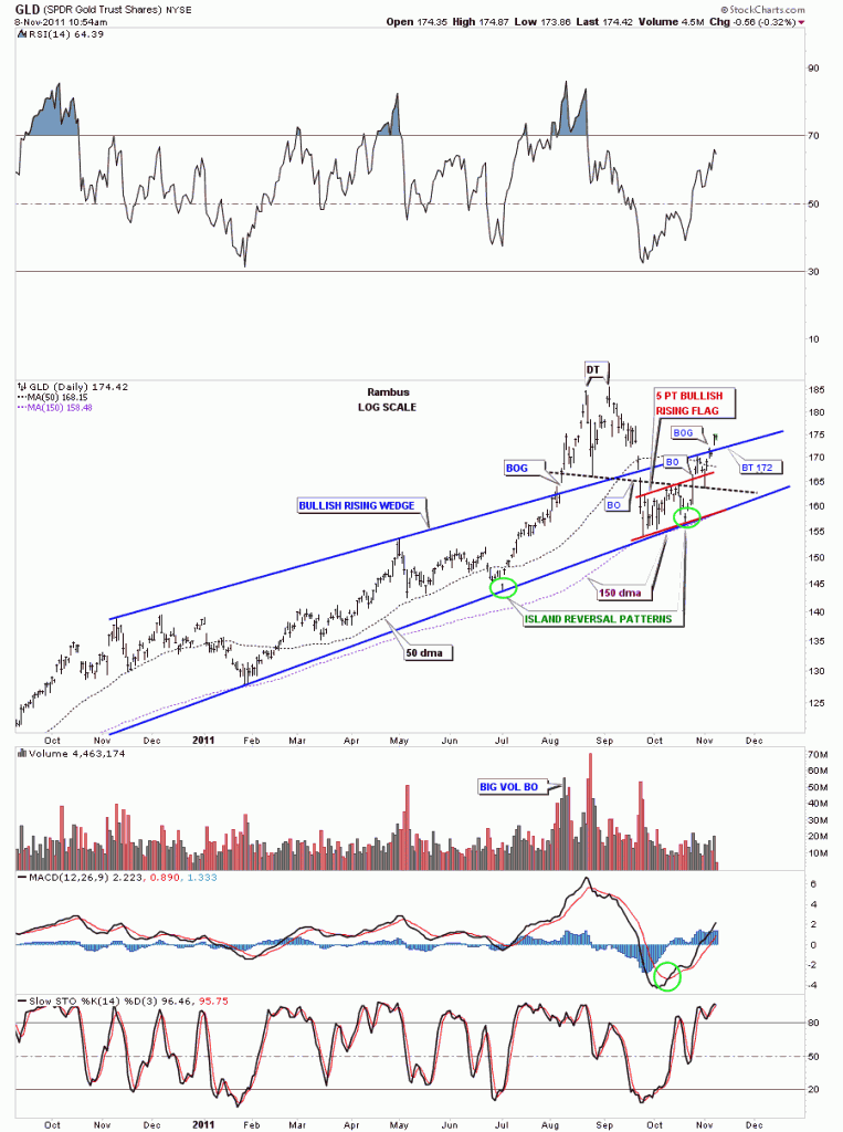
GLD is backtesting the top rail of it’s 5 point bullish rising flag. Just like SLV, the backtest is in progress at this moment. We penetrated the top rail to the downside but GLD is now back above the all important line in the sand. This is a most critical time for GLD. Stay tuned.

GLD 60 minute backtest.