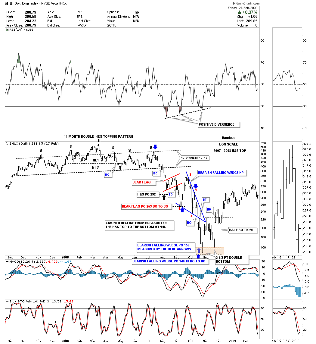
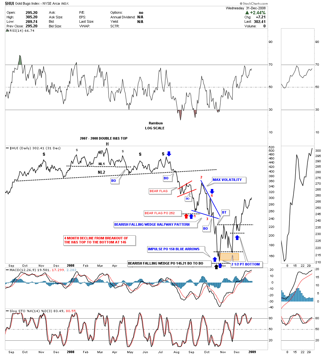
Back at the 2008 crash low in the HUI there was a reversal pattern, that is pretty rare, which helped confirm that very important low. If you ever wondered what the 2007 – 2008 top looked like and the decline that followed to the 2008 crash low this daily chart for the HUI paints the Chartology I posted at the tent, in real time, as the impulse move to the downside took place.
The 2007 – 2008 H&S top was actually a double H&S top which ended the first 8 years of the bull market that began in 2000. Even though that is a beautiful H&S top no one wanted to believe it could be possible when I first began to post the possibility of what the implications were. At the time I viewed the H&S top as a normal H&S reversal pattern but I had no idea it would lead to the crash it did. Even during the crash of that magnitude the Chartology was about as good as it can get.
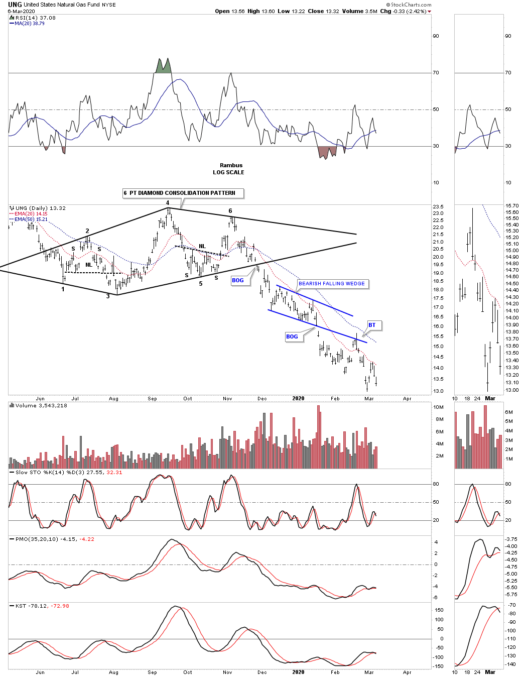
As you can see the first consolidation pattern that formed after the breakout below the neckline was the little red bear flag that has a price objective down to 253. At that 253 low began the real volatile move with the first countertrend rally up to red reversal point #2. Next came the next decline down to red reversal point #3 which still didn’t show the ultimate chart pattern that was forming. Then we got the next reversal point up to red #4 that began to show a possible 4 point bearish falling wedge halfway pattern to the downside. Confirmation that the blue bearish falling wedge was valid was during the breakout and backtesting process which was perfect. The 2 measuring techniques I use showed the impulse price objective down to the 159 area as shown by the blue arrows. The 2nd method I call the breakout to breakout method that had a price objective down to the 146 area. The brown shaded area at the bottom of the chart shows the 2 price objectives.

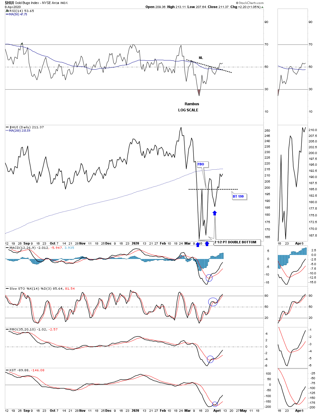
I’m going to use the same chart as the one above so I can show you what is possibly forming right now on the HUI. At the bottom of the chart, at the brown shaded area, you can see where I labeled the chart pattern as a 2 1/2 point double bottom. As I mentioned at the beginning of this post the 2 1/2 point double bottom is fairly rare. The pattern starts out as a normal looking double bottom reversal pattern. Sometimes the price action will rally up to the double bottom trendline where the stock fails to breakout and then declines once more only to stall out about halfway down to the double bottom low. From that low the price action takes off to the upside and doesn’t look back. Other times the stock will actually breakout above the double bottom trendline for a few days and then declines once more below the double top trendline. Again the price action will stall out at roughly the halfway point to the double bottom low and then reverses strongly to the upside.
Below is the same daily chart as the one above but this chart is a line chart which can take out some of the noise a bar chart can make.
Now I would like to show you a daily line chart for the HUI which has been building out a possible 2 1/2 point double bottom since the middle of March. Here you can see a failed breakout above the double bottom trendline and the decline which took the price action down toward the center of the height of the double bottom. This 2 1/2 point double bottom didn’t become visible until the beginning of this week when the HUI broke out above the double bottom trendline for the second time.
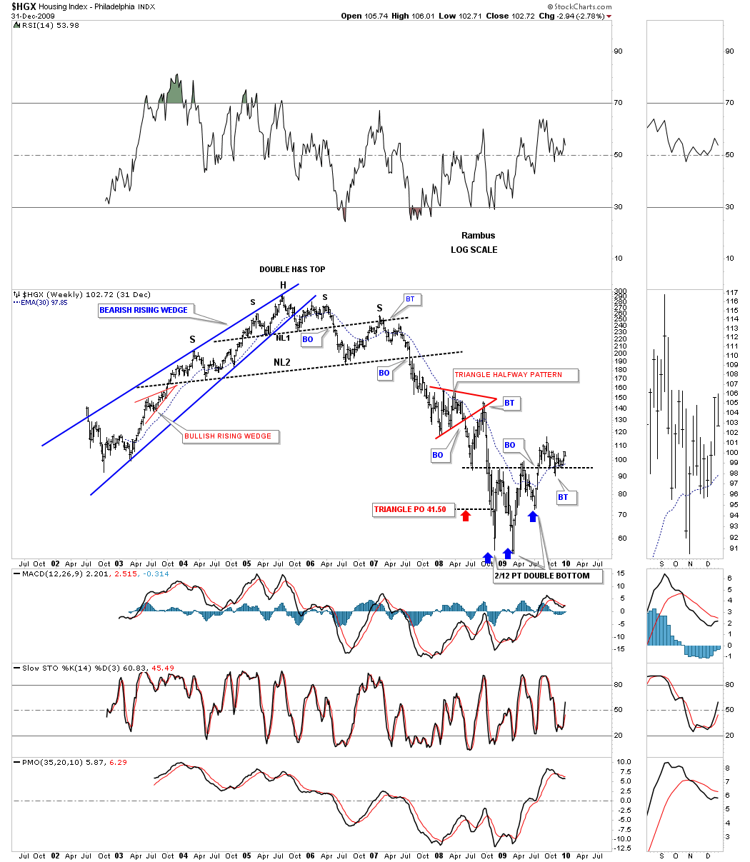
This next chart shows you a good example of a 2 1/2 point double bottom on this long term weekly chart for the $HGX, housing index. This 2 1/2 point double bottom formed at the 2008 – 2009 crash low as shown by the blue arrows.
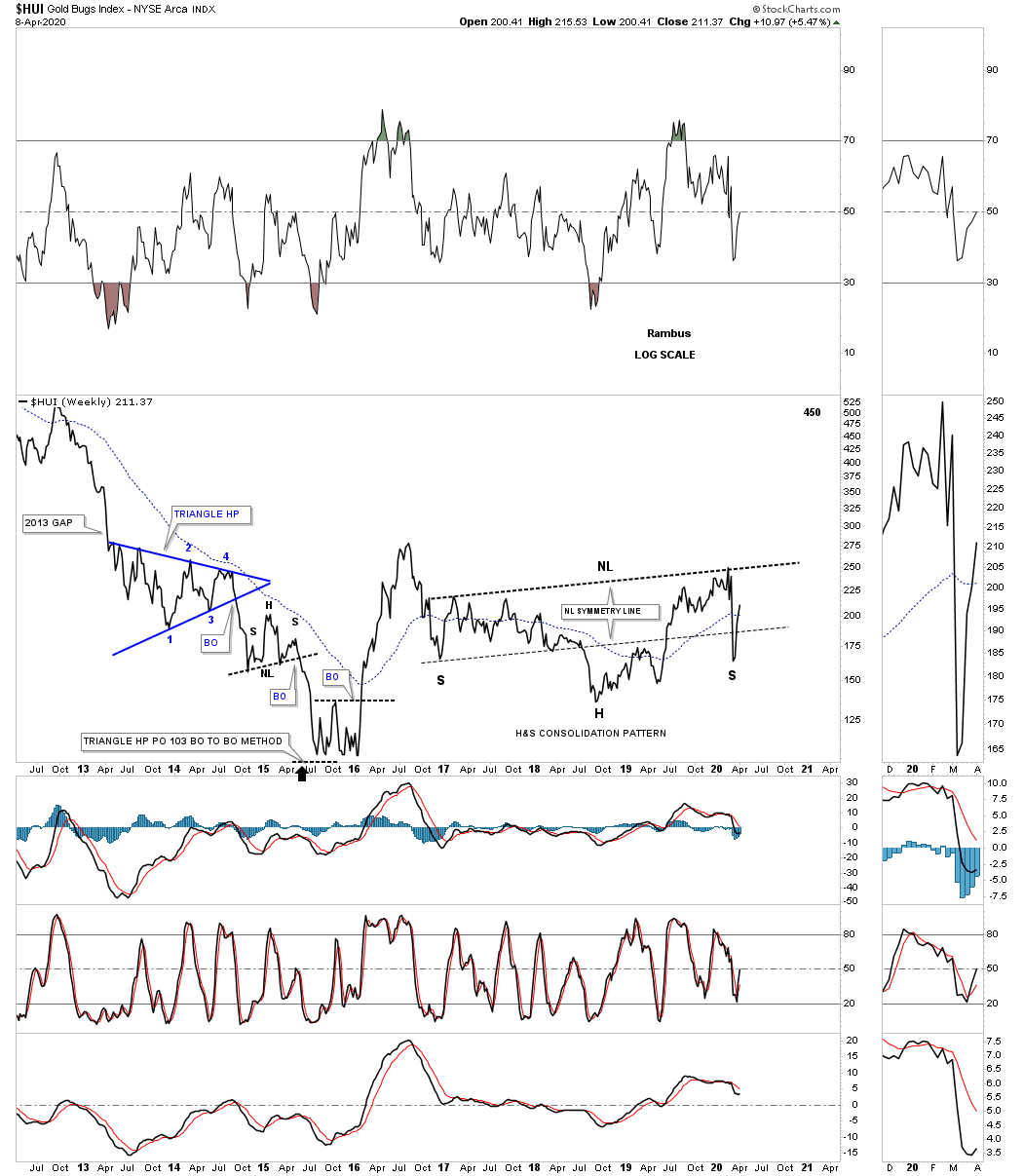
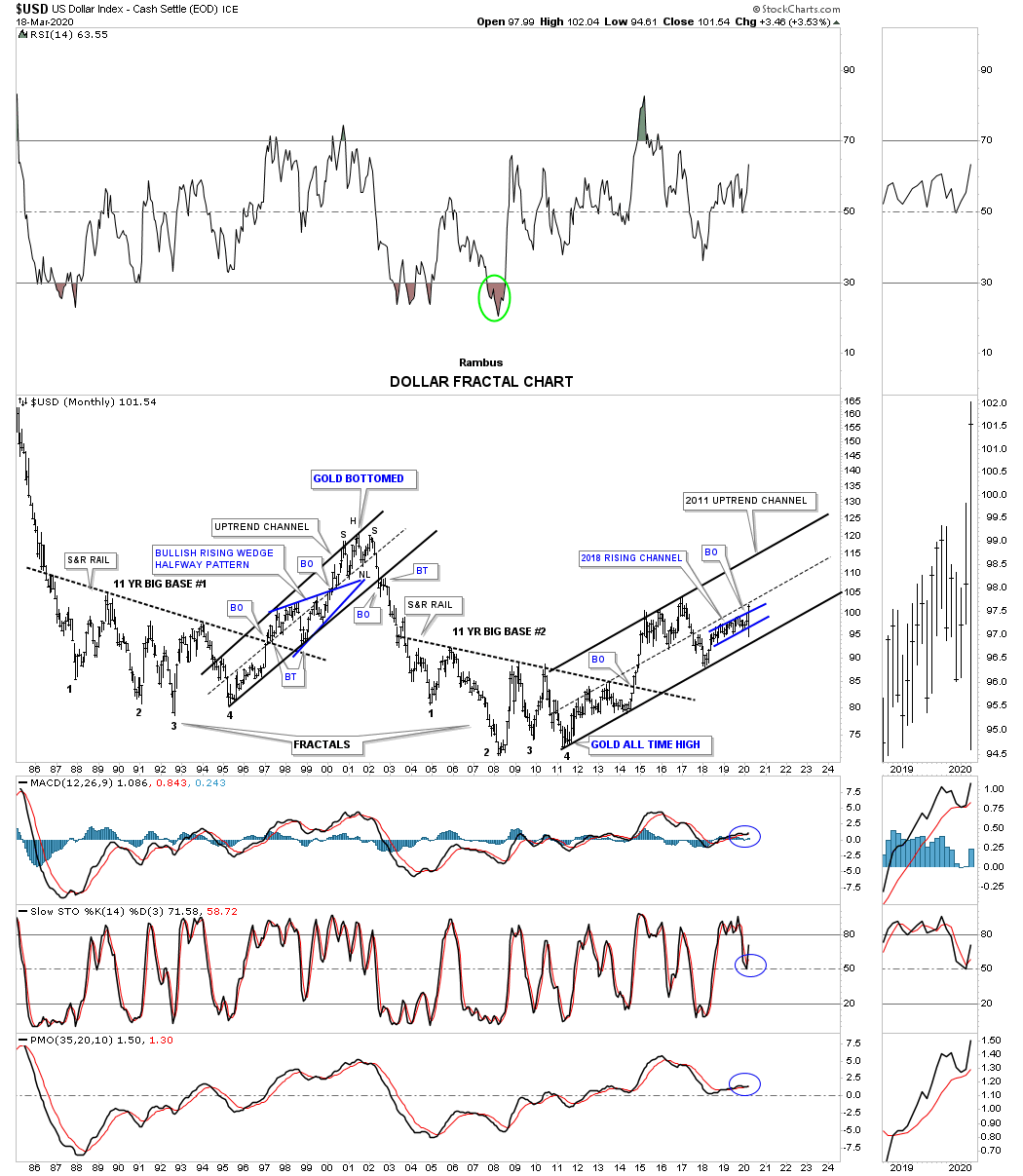
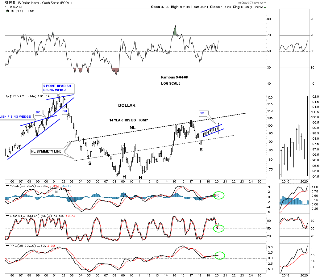
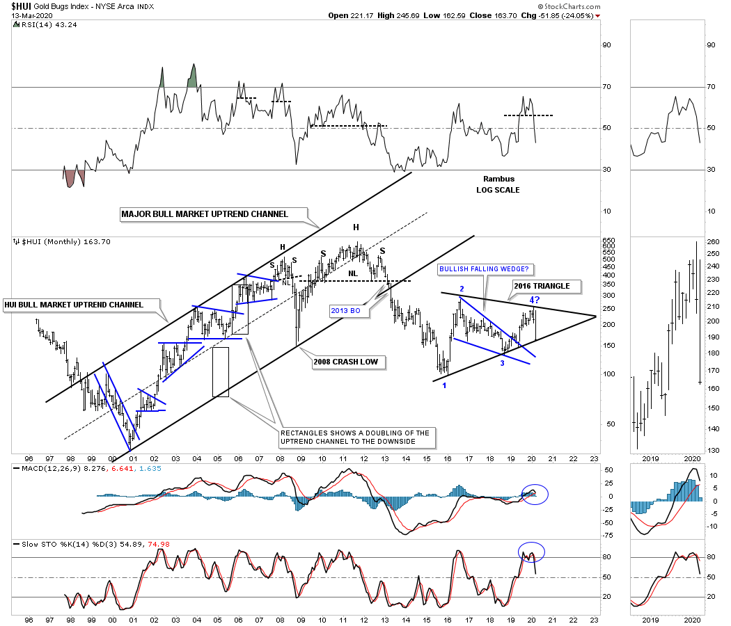
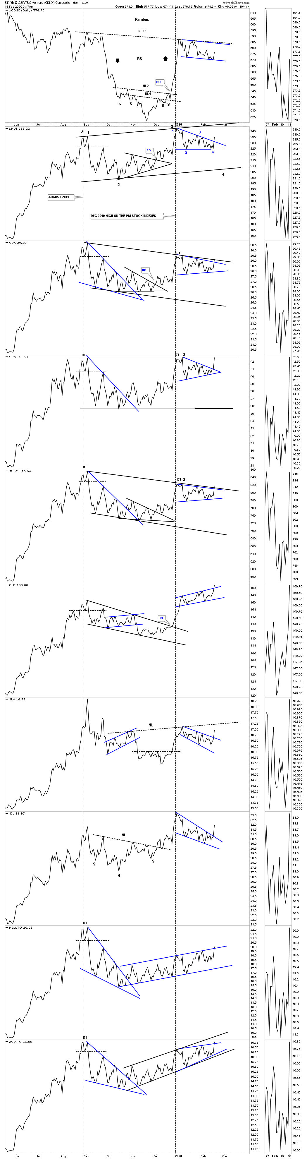
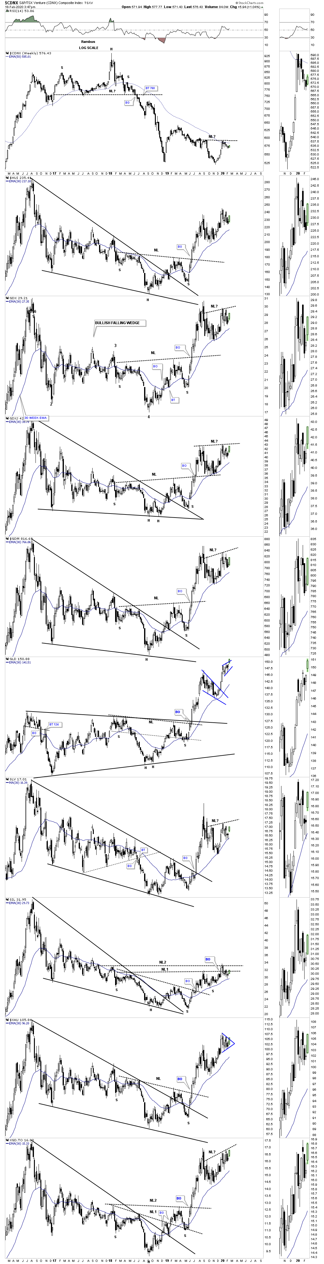
This next chart is the long term history chart for the HUI which shows all of its chart patterns since its inception back in 1995. What I want to focus on are all red arrows. On the left side of the chart each red arrow shows you the beginning of each impulse leg up. If one is lucky enough to spot a reversal pattern at the last reversal point in each consolidation pattern you can see how many more points you can capture vs buy on the breakout point in each consolidation pattern. It’s the impulse moves that I live for which is where the real money is made. Those impulse moves can last from 8 to 14 months before they become exhausted and need to start consolidating those gains.
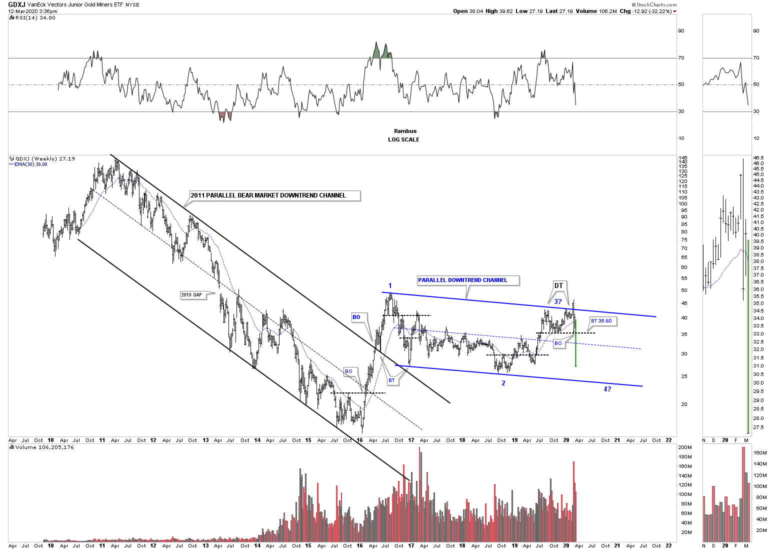
The 2016 black triangle needs to have an odd number of reversal points because the triangle is forming below the 2011 H&S top. After nearly 4 years of chopping around in the 2016 triangle the breakout point is getting very close. As you can see I’ve added the red arrow to the recent low at the 5th reversal point hoping to get a jump on the impulse move that will follow once the breakout occurs. Keep in mind the trading action is going to be completely different than what we’ve been used to over the last four years.
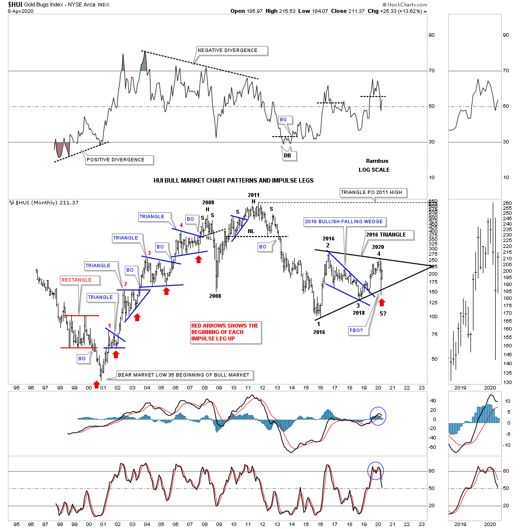
This last chart for tonight is one I haven’t posted before. In big trading ranges there can be multiple chart patterns that can form and the bigger the trading range the more chart patterns you can find if you can keep an open mind. This weekly line chart for the HUI shows a big H&S consolidation pattern which is also about four years in the making. It is a H&S consolidation pattern because its forming above the 2016 low.
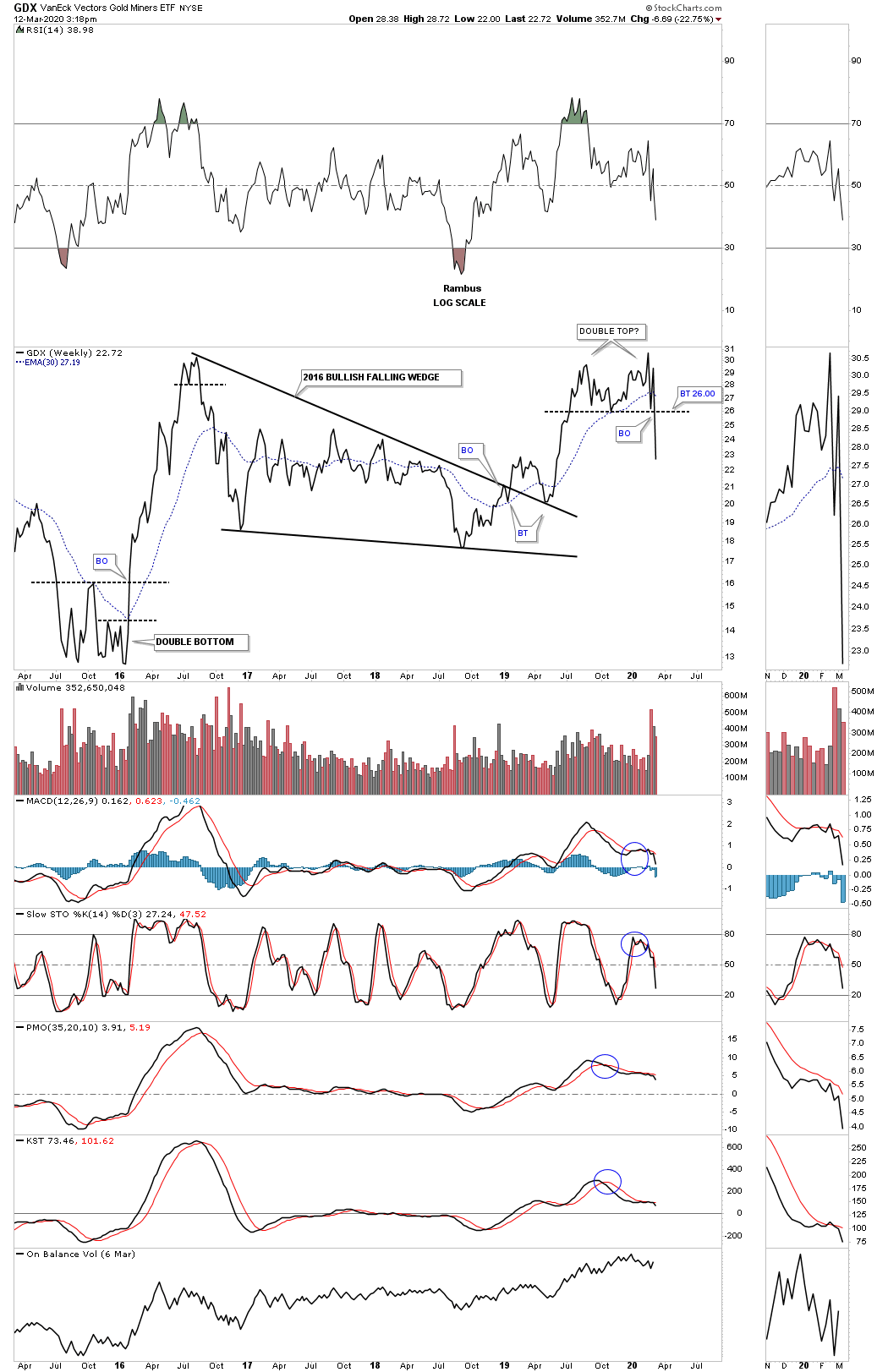
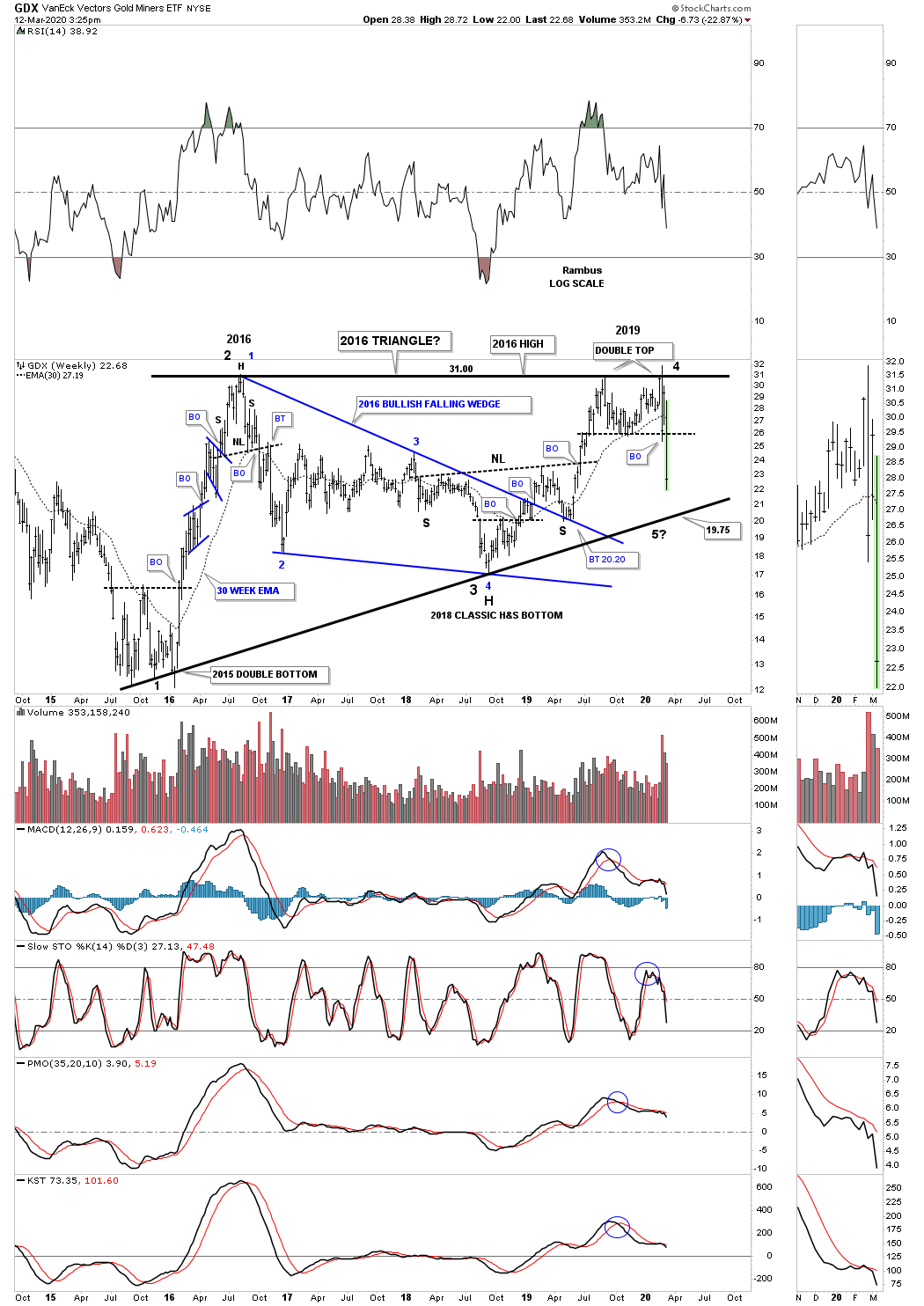
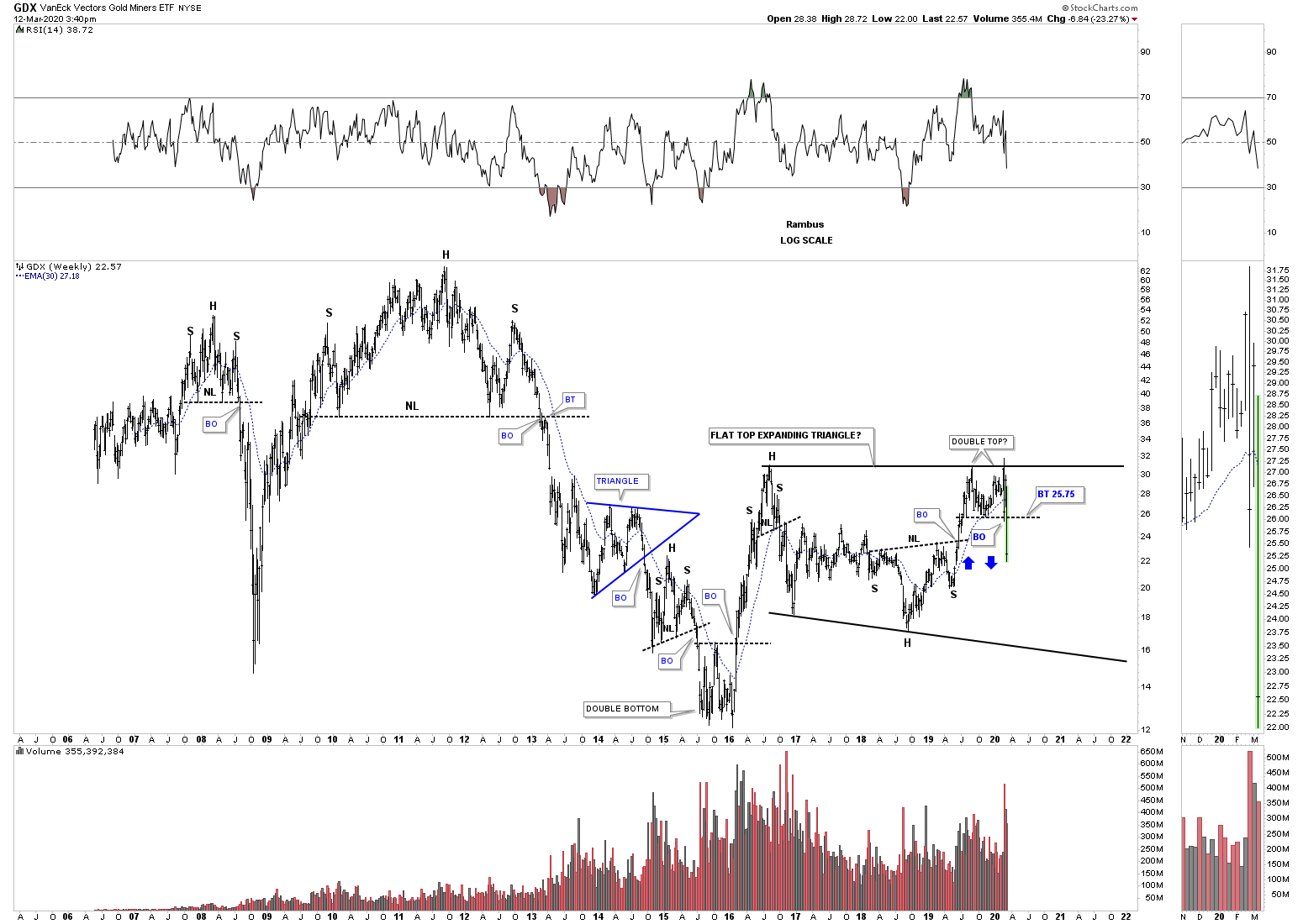
The bottom line is that the PM complex appears to be in the final stages of building out a reversal pattern to reverse the 2011 bear market. Big trading ranges lead to big moves. Stay safe and all the the best…Rambus