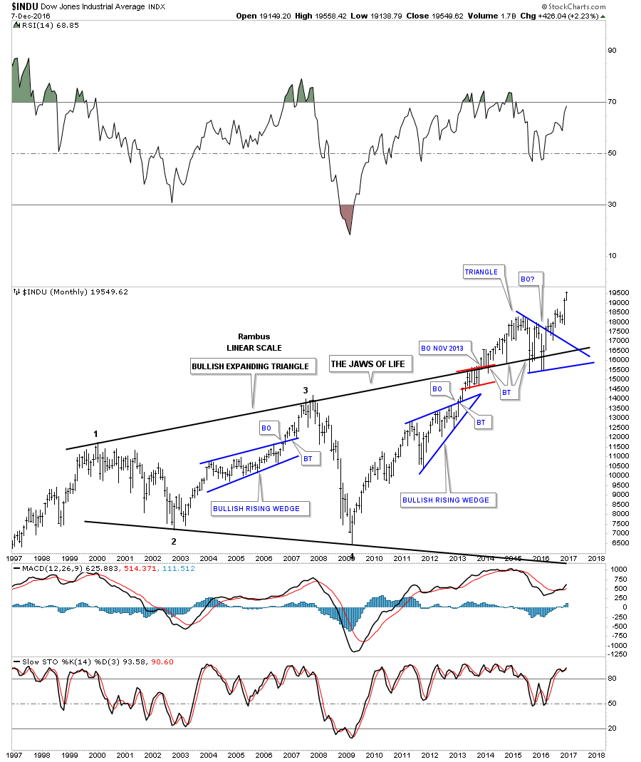
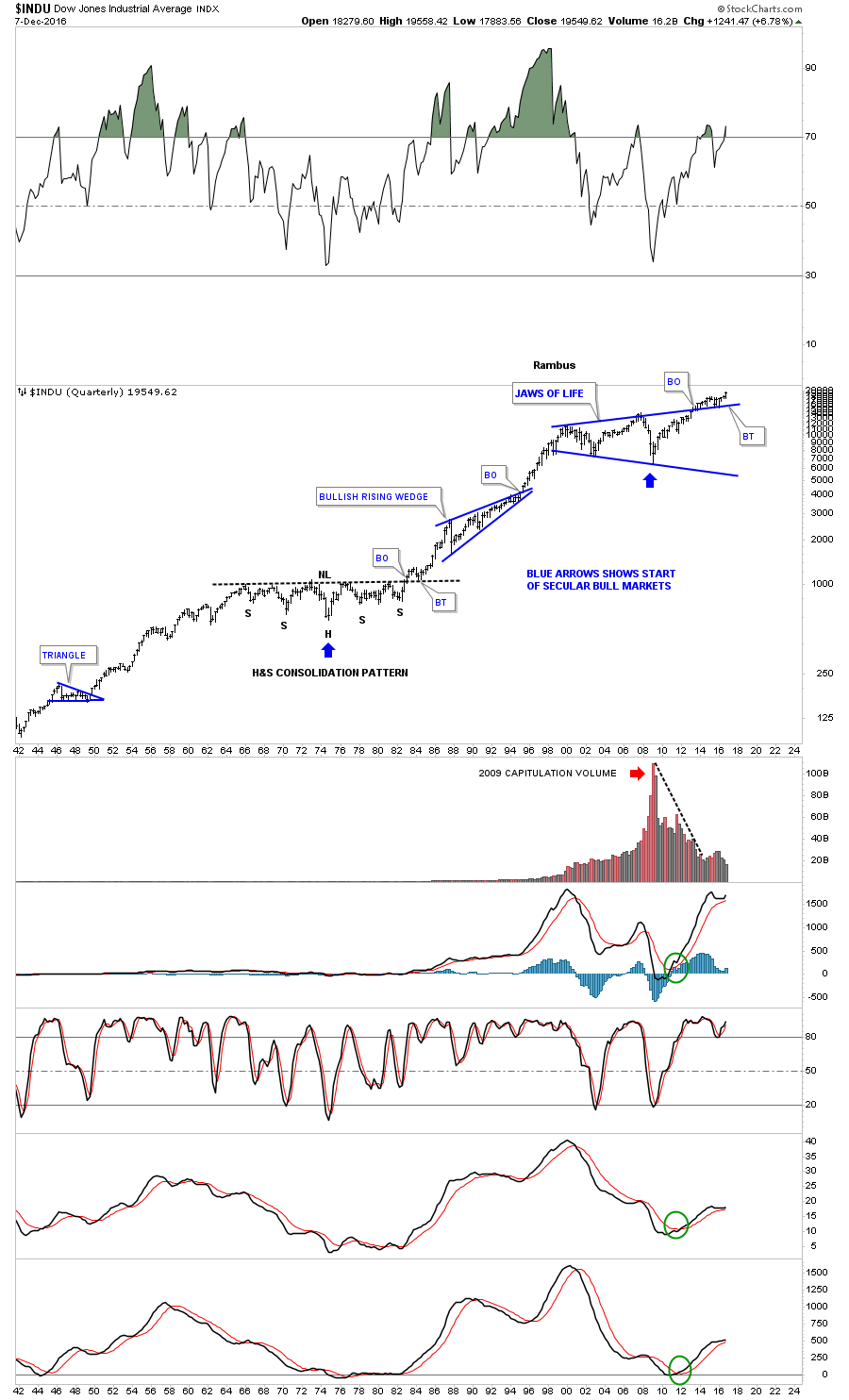
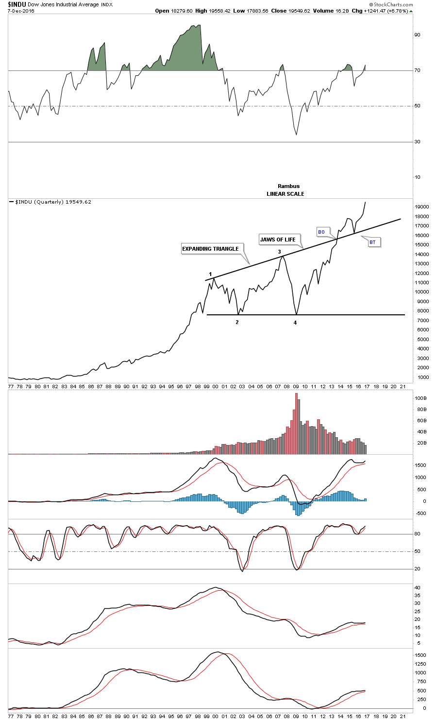
Buckle Up ,Pour yourself your favorite beverage , and take some time . This Report will be an in depth Chartology analysis of the current situation in this ever interesting and often exasperating market we are participating in. Oh and don’t forget to open your mind. Lets begin.
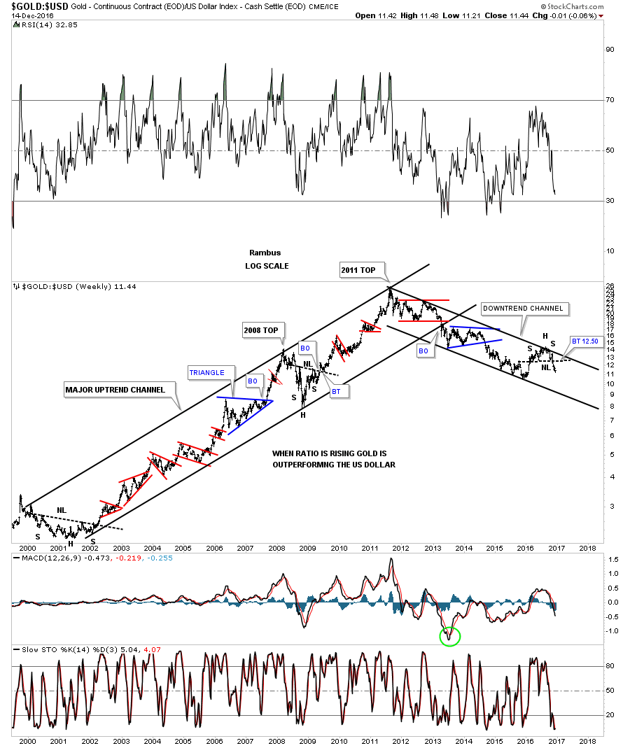
I would like to start the Weekend Report by looking at a combo chart which has the US dollar on top and gold on the bottom, which shows you a better version of the positive divergence the US dollar had vs gold in 2011. First note the red arrows on the US dollar and gold back in 2008 when gold was making a high, and the US dollar was making a low, which is what you would expect. Now look at the two red arrows in 2011 whch shows the all time high for gold and a higher low for the US dollar vs the 2008 low. Gold rallied almost 1200 points to its 2011 bull market high, but the US dollar made a higher low. If they were on an equal footing the US dollar should have traded much lower when gold was making its all time high. That’s how I viewed the positive divergence for the US dollar vs gold.
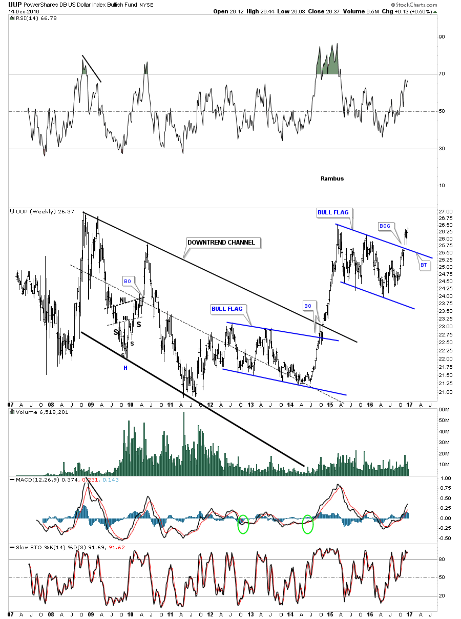
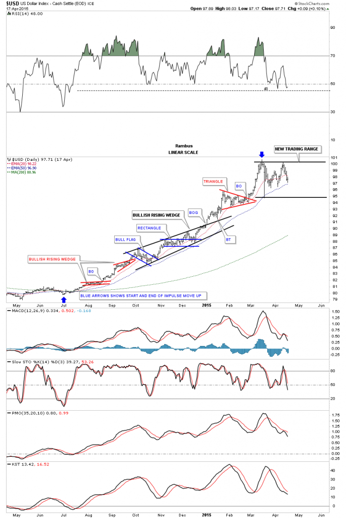
The blue arrows on the US dollar chart on top shows how I was, and still am looking for reverse symmetry to the upside based on how the dollar came down when it started its bear market in 2000.
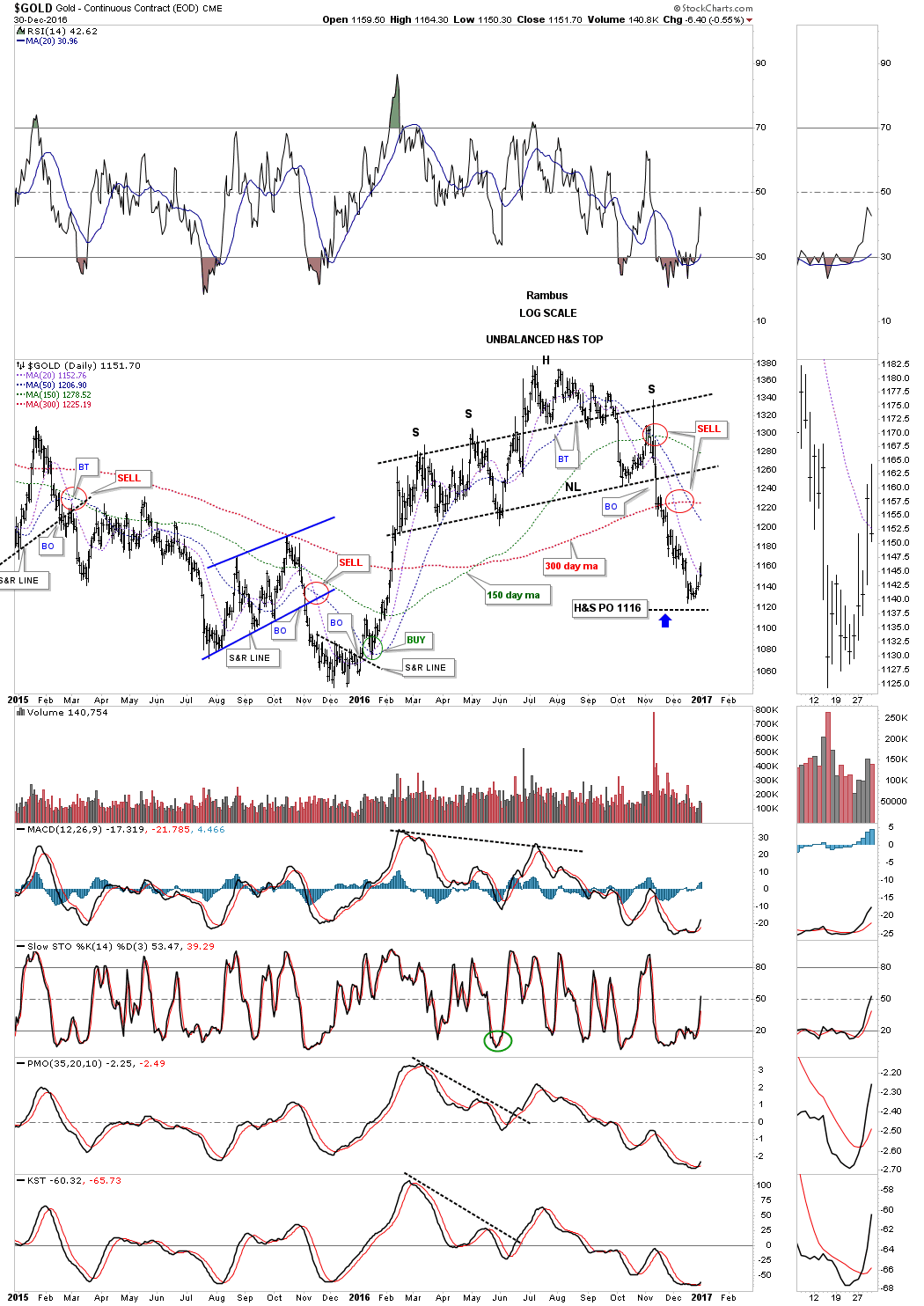
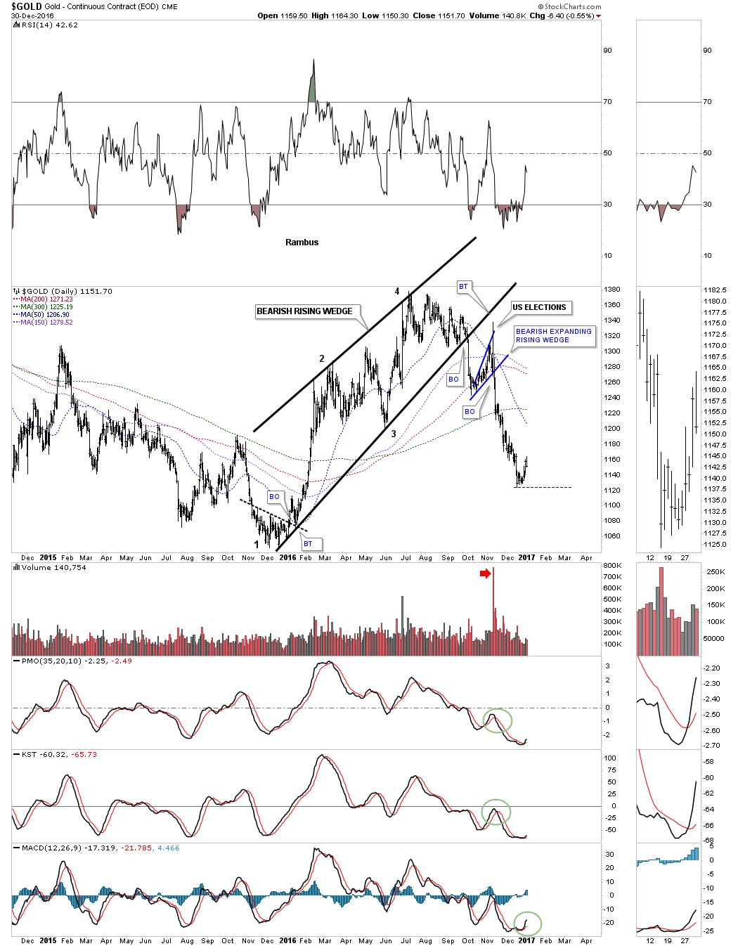
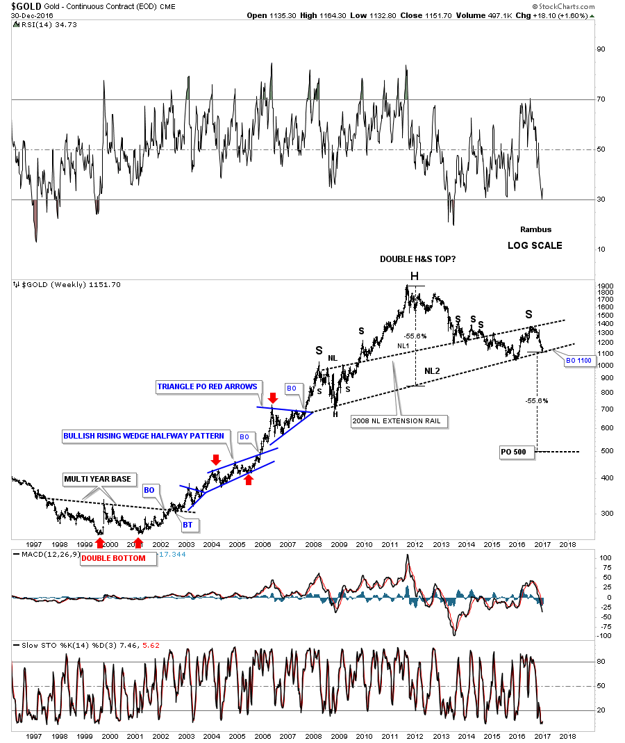
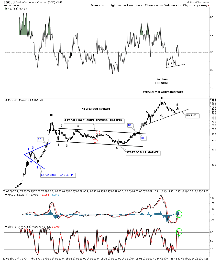
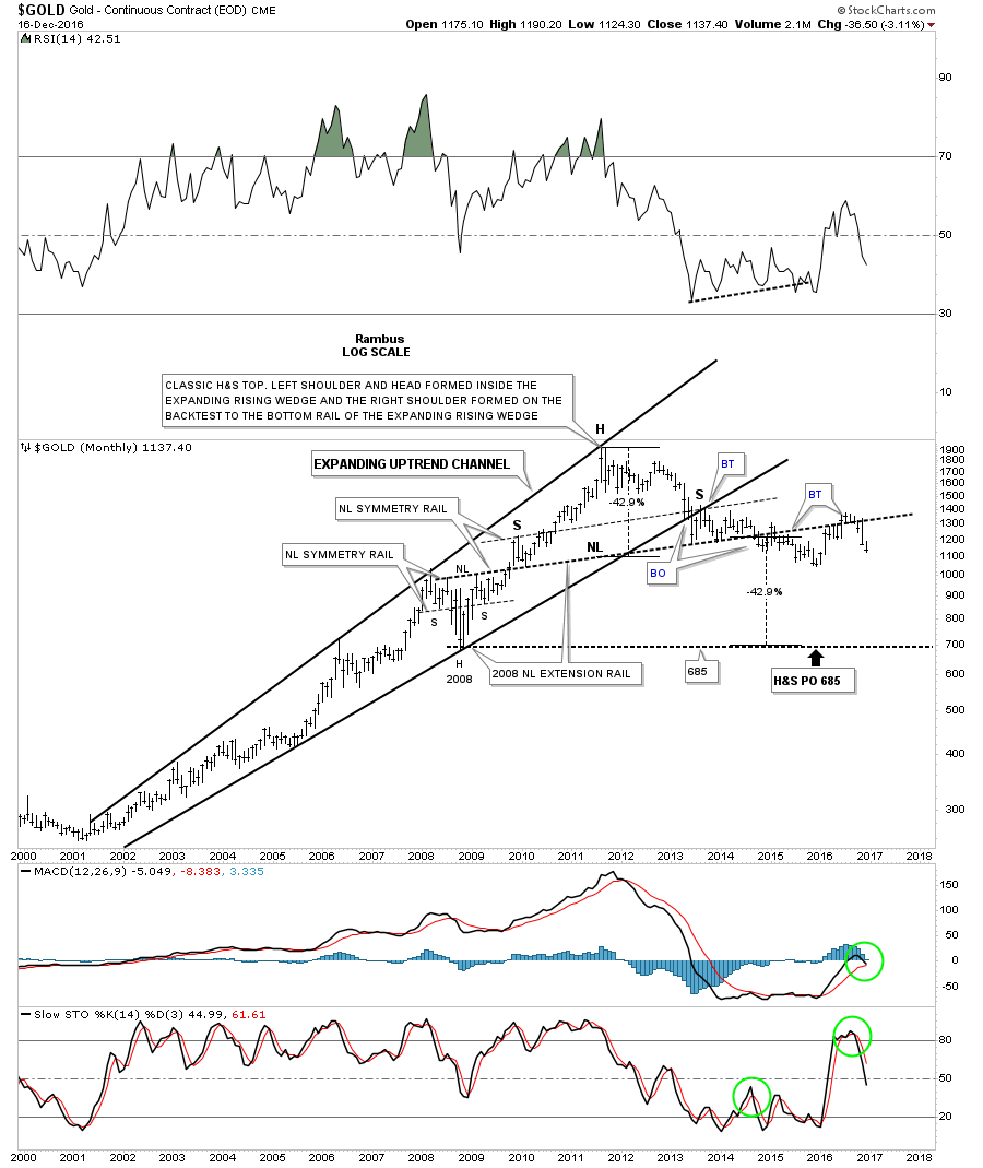
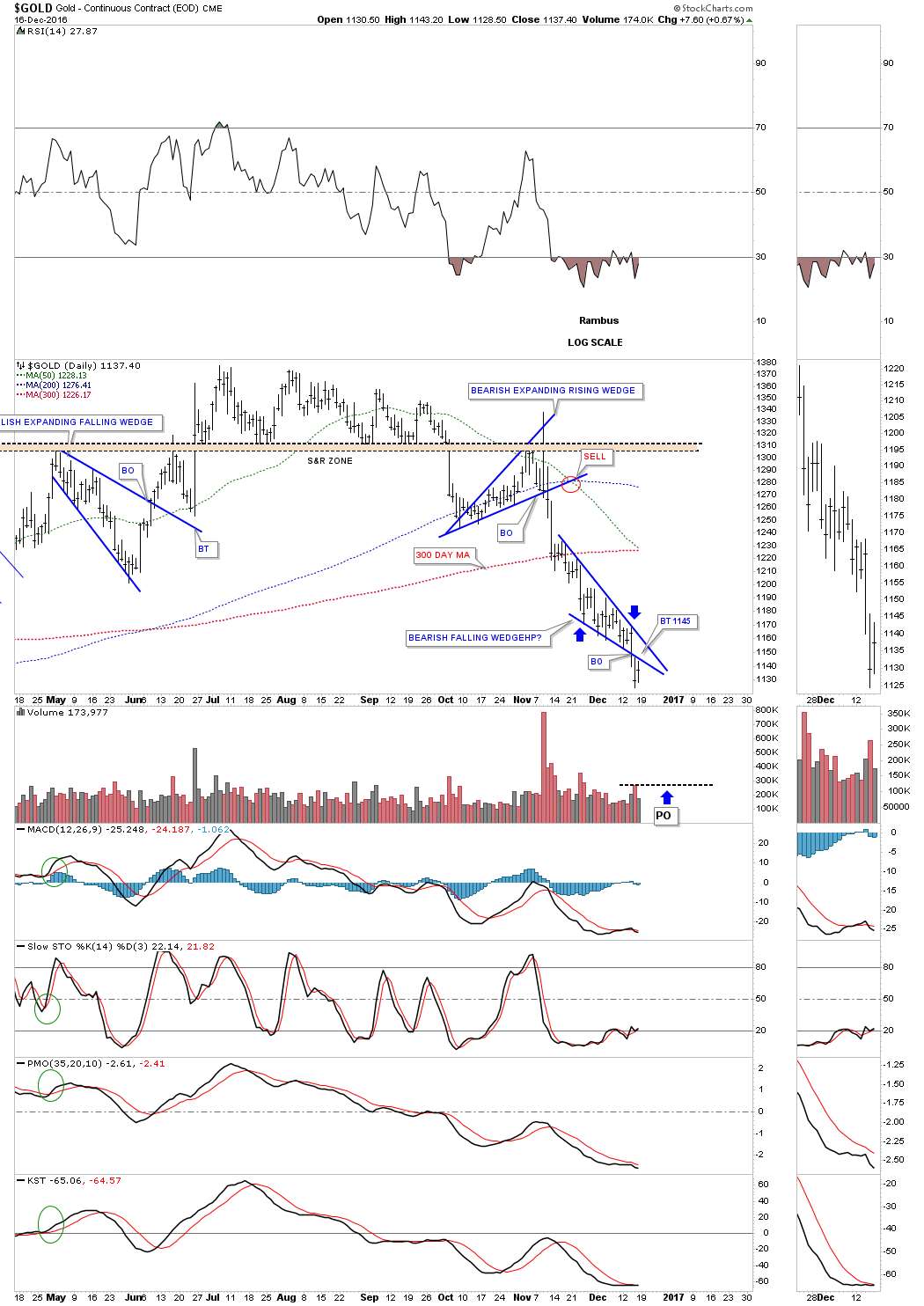
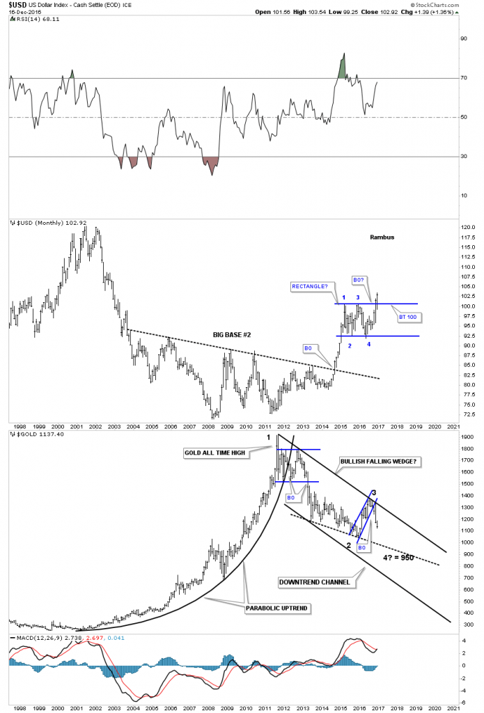
The two heavy black dashed horizontal lines on the gold chart at the bottom are still original from when I built this chart. I have adjusted the downtrend channel, and what was the falling wedge, I’m now annotating it as a bearish expanding falling wedge. During the construction of the original three year falling wedge I always labeled it as a bearish falling wedge and thought it would eventually breakout to the downside until last year at this time.
You can see the original falling wedge when you look at the mid dashed line of the downtrend channel, and the bottom rail of the blue expanding falling wedge. There is no doubt that the S&R line at 1040 did indeed hold support after being tested several times from above. That rally took the price action up to the top rail of the downtrend channel and the top rail of the blue expanding falling wedge, which looks obvious now. It was that H&S top on gold we’ve been following since the US elections, which was the frosting on the cake in showing a reversal pattern at that critical juncture.
One last note on this combo chart. As you can see the US dollar is breaking out to new highs, while gold has failed to take out the 1040 area. What I’ll be watching very carefully as the US dollar continues to make new highs, is that we should see gold take out the 1040 low for more confirmation, gold is still in its 2011 bear market.

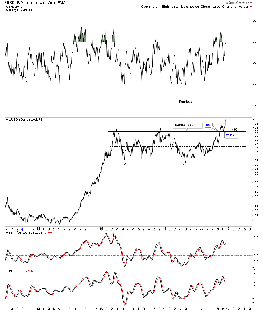
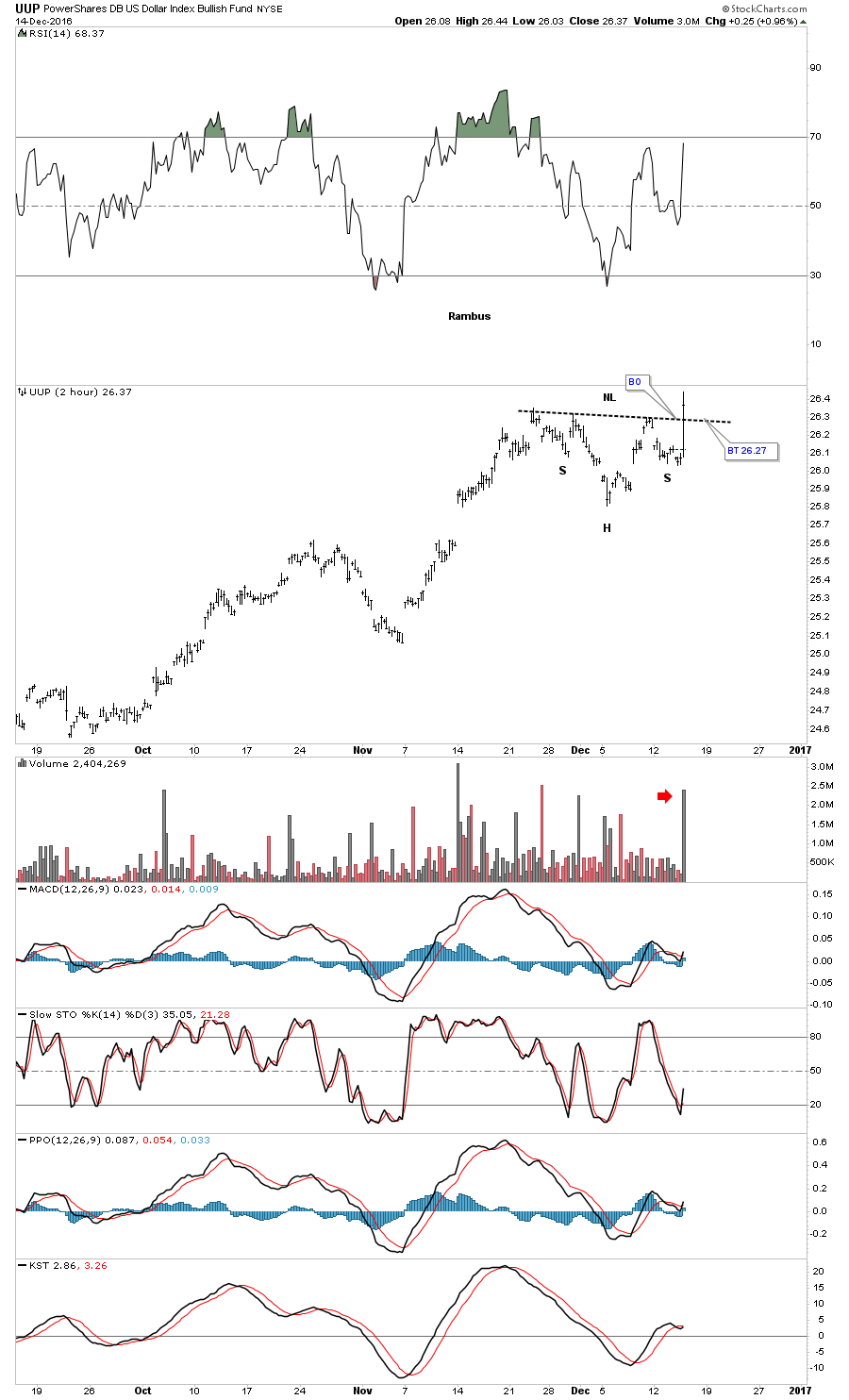
This next chart for the US dollar is a daily line chart which shows the rectangle with four completed reversal points with a breakout and backtest to the top rail. To negate the breakout we would have to see the dollar trade below the top rail on a daily closing basis, until then the breakout is valid.
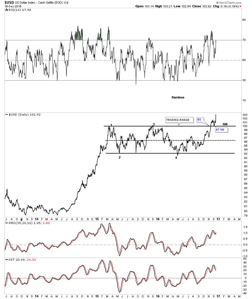
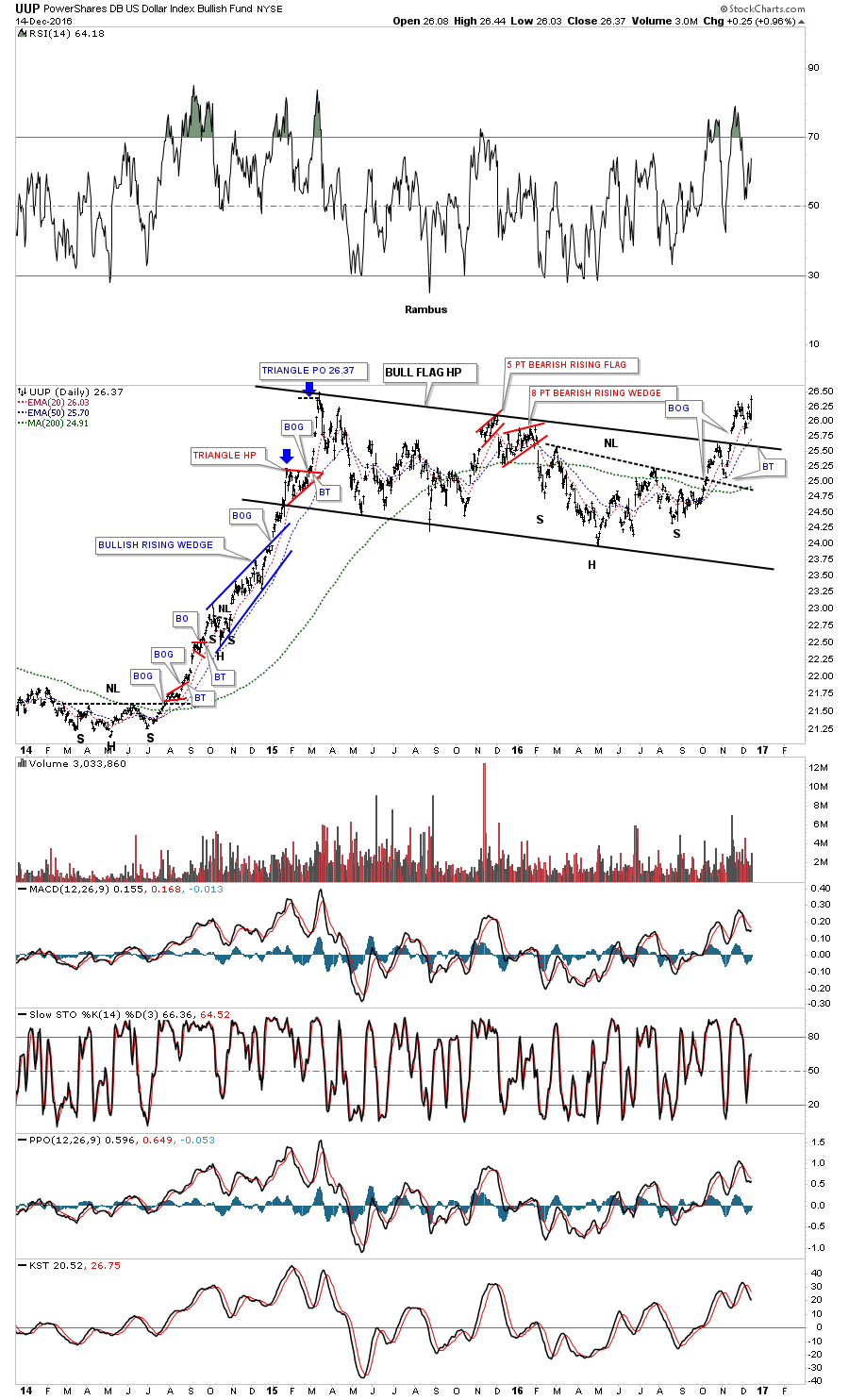
This next chart focuses on the impulse move up in the US dollar that began in mid 2014. I ended the time for this chart to April of this year so you could see the big impulse move up more clearly. This chart shows you exactly what a strong impulse move looks like by forming one consolidation pattern on top of the next. Note the beautiful black bullish rising wedge which formed in the middle of that big impulse move, that was made up of two smaller consolidation patterns. There was a breakout gap above the top rail with a nice clean backtest which confirmed the black rising wedge was a bullish rising wedge. There is a strong possibility that we may see something similar to this impulse leg up in our current leg up.
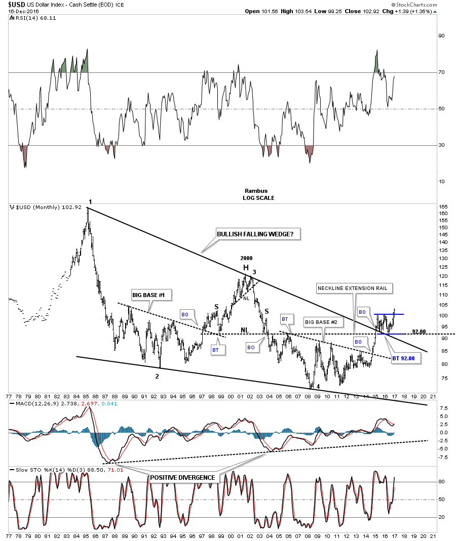
This next chart for the US dollar is a forty year look we’ve been following for a very long time which shows the massive bullish falling wedge. Note how the blue rectangle has formed as the backtest to the top rail of the bullish falling wedge, and the neckline extension rail that formed that massive 2000 H&S top. What actually led to the breakout from that 40 year bullish rising wedge was when big base #2 finally matured and broke out. What is hard to even imagine right now is that the price objective of that 40 year bullish falling wedge is to where it began to build out, which is all the way up to 160 back in 1985. It will take many years for the US dollar to reach that price objective, and what will it mean for everything that is affected by the US dollar.

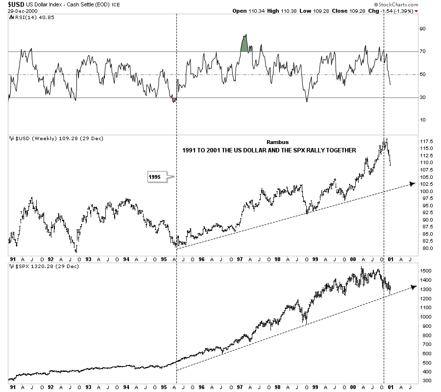
This next chart is a combo chart which has the US dollar on top and the SPX on the bottom. This chart shows how the US dollar and the SPX rose together during the last five years of the bull market that ended in 2000. Not so much on the SPX, but on many other index charts I always viewed the rally from 1995 to the 2000 top as the runaway or acceleration move into the bull market top, which is how most bull markets end.
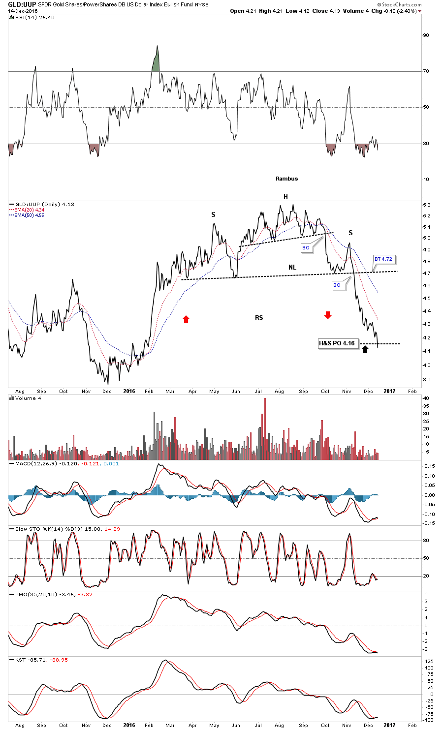
Below is another combo chart which has the US dollar on top and gold on the bottom. I built out this combo chart right after the US elections as something dramatically had changed. The US dollar still hadn’t broken out yet and gold was still trading at the top rail of its downtrend channel, but in just six weeks or so you can see how things have really changed for these two.
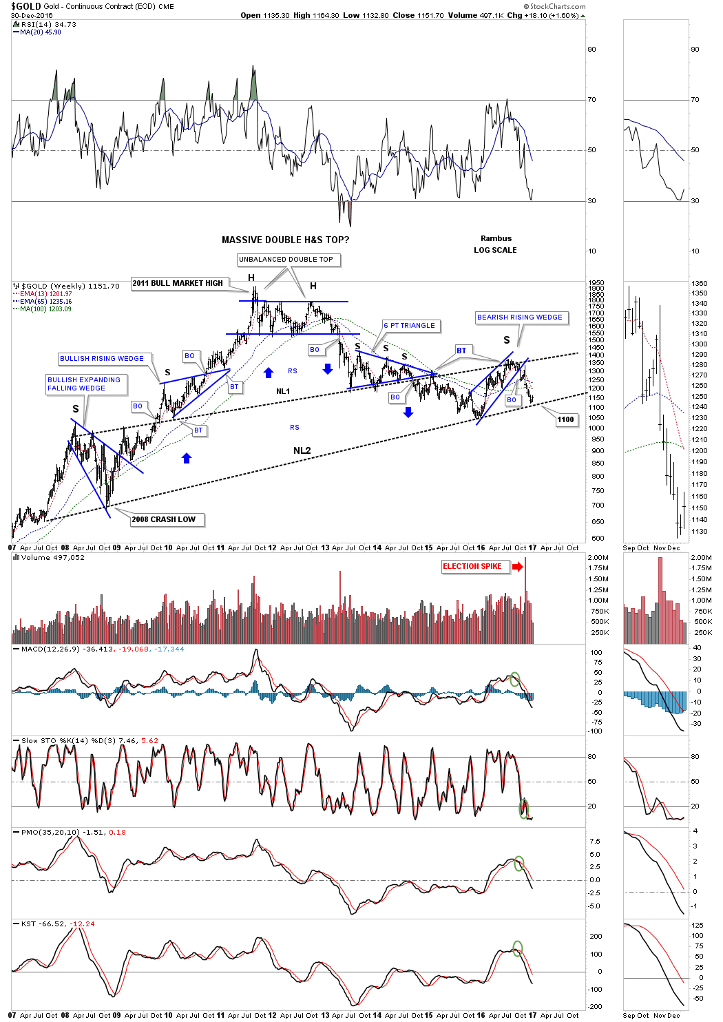
This next chart is the gold to US dollar ratio chart whch shows that H&S top forming right at the 2016 high just below the top rail of the downtrend channel. That is the same area on the gold chart above, which is reversal point #3, top of the blue bearish rising wedge.

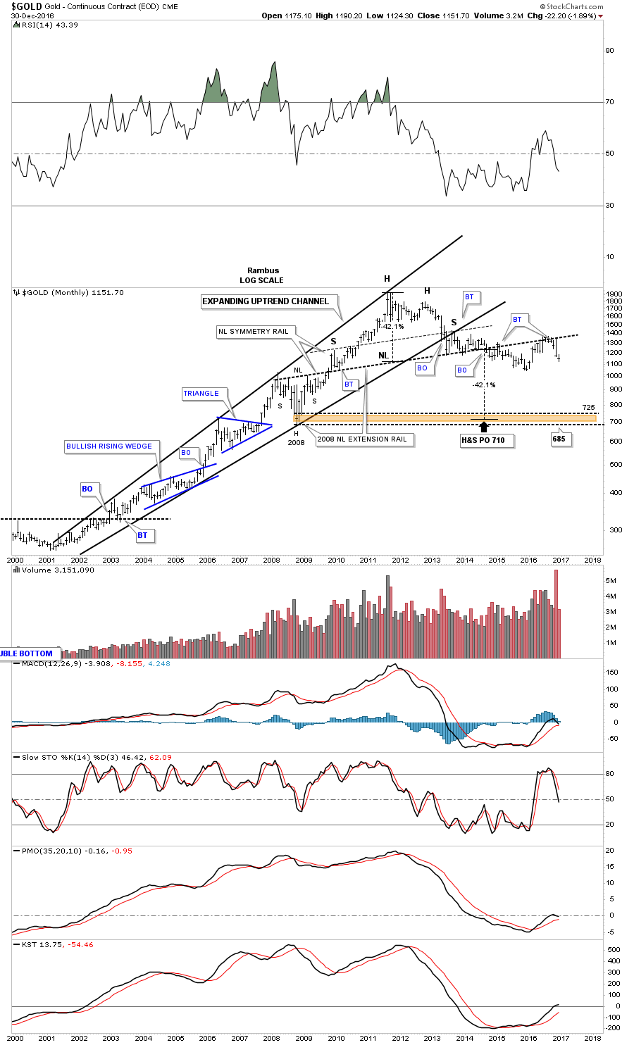
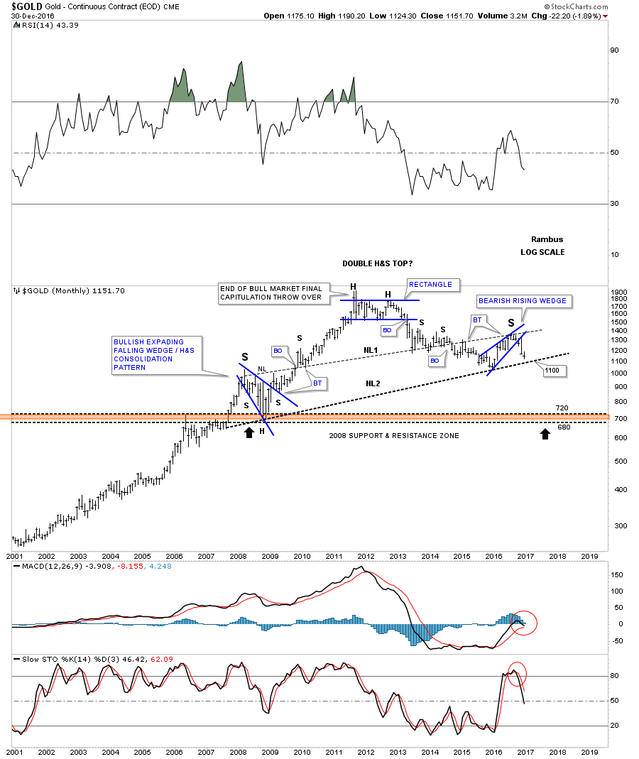
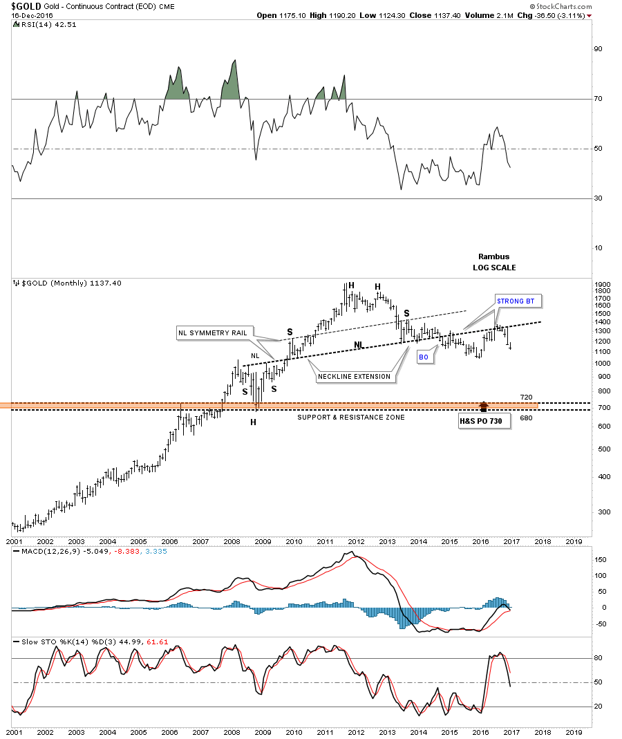
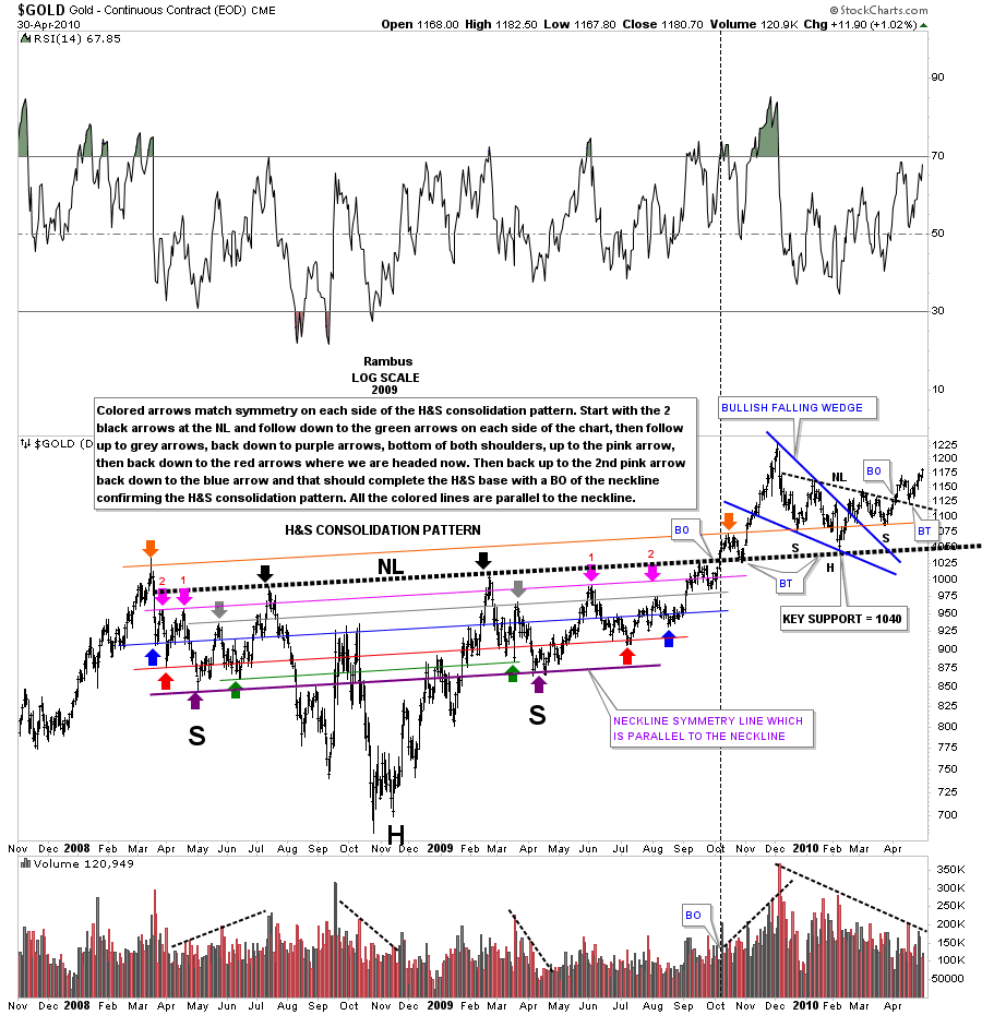
Next I’m going to bring out some old charts we haven’t looked at since the bear market years. This first chart is a daily chart for gold that shows one of the most symmetrical H&S consolidation patterns I’ve ever built out. I won’t get into the details as it’s explained in the annotation box. What is most important about this chart, other than its symmetry, is the heavy dashed black neckline. That neckline played a key role several years later as some of the longer term members may remember. After the top was finally put in at the 1920 area I was looking for a big correction, or even a bear market to begin building out. There is an old saying in Chartology, that an important trendline never dies it just slowly fades away, which I’ll show you in a bit.
Here is the long term monthly chart for gold I first built out in 2013 right after gold bounced off the neckline symmetry line which is taken from the chart above, and extended out in time to the right. There is some really nice Chartology on this chart starting with the neckline symmetry line which showed us the high for the right shoulder which is taken from the massive 2008 neckline extension line. What also happened at the right shoulder high in 2013 was the classic backtest to the underside of the bottom rail of the the expanding bull market uptrend channel.
Gold chopped around on top of the neckline extension line for close to a year creating the right shoulder before it finally broke to the downside in 2014 completing the right shoulder. There was a fairly strong backtest from below to the 2008 neckline extension line, but gold quickly broke below the neckline again, and began to decline in earnest right into last years December low.
I have to admit that I didn’t really think gold was starting a brand new bull market but I had no choice but to go with the rally. I was firmly in the bear camp but when the HUI and other PM stock indexes were showing bottoming patterns there was the possibility that maybe the PM complex had bottomed and was beginning a new bull market. Note the second backtest to the neckline, which occurred this past August. Again, it was a fairly strong backtest, but that is the place where the H&S top and the diamond reversal pattern formed, which is another big clue the second backtest would be successful. That price objective has been on this chart since the middle of 2014 which is down to the 685 area which also coincides with the 2008 crash low. More confirmation that gold is headed to its H&S price objective down at the 685 area will be when we see it trade below its previous low at 1040 or so.
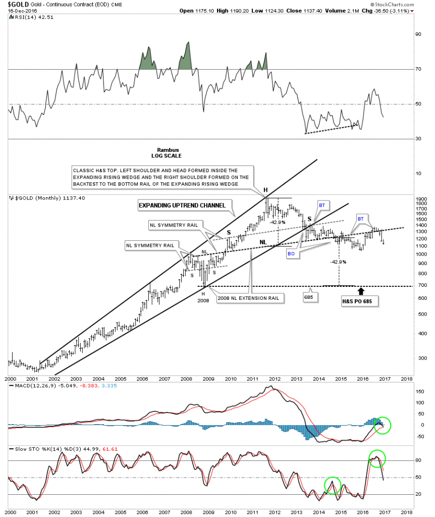
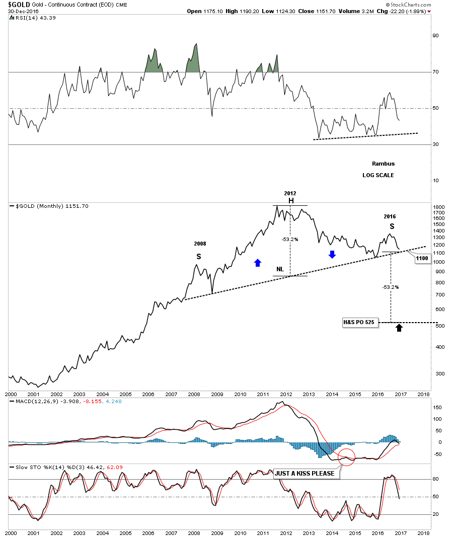
Below is just a simple uncluttered look at the massive H&S top.

This next chart is one we haven’t looked at in a very long time, which is the fanline chart for gold going all the way back to the beginning of the bull market in 2000. The rule of thumb for fanlines is that once they are broken to the downside you generally will have a backtest to the underside before prices break lower again. The other rule of thumb for the fanline pattern is that once the third fanline gives way the pattern is complete. Note the backtest to the underside of fanline #2, which you can see on this long term monthly chart, which is the H&S and diamond reversal patterns on the daily chart that formed that backtest.
As you can see fanline #3 is just starting to break down so don’t be surprised if we see a backtest to the underside at some point in time. If we do then it will represent a very low risk entry point to go short with a close above the fanline as your exit point.

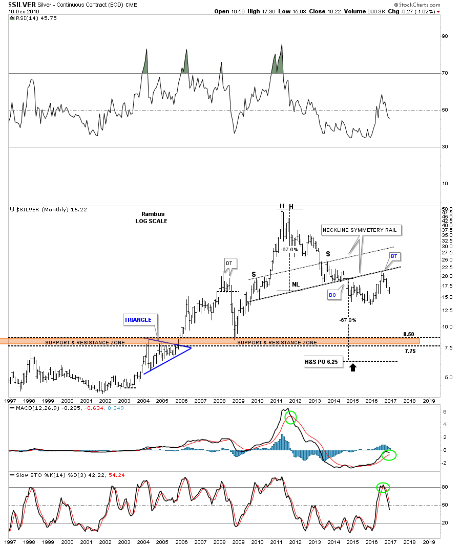
If gold is building out a massive H&S top then we should see something similar with silver. Again here is an old chart I pulled out from the past that is still relevant. Just like gold, silver to has built out a massive H&S top that shows some nice symmetry using the neckline symmetry line to find the high for the right shoulder. Actually, silver had a cleaner backtest to the underside of the massive neckline this summer than gold.
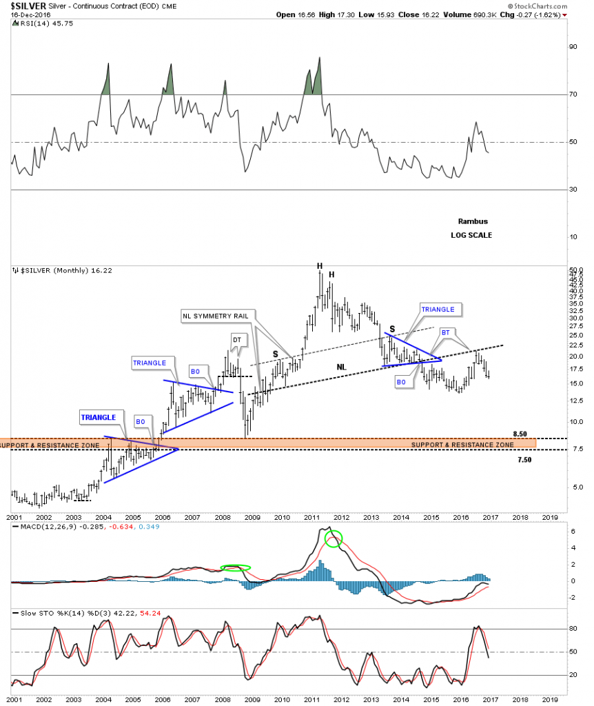
Below is a 20 year monthly chart for silver which shows the massive H&S top and the price objective down to the 6.25 area. The first real area of support should come in around the brown shaded support and resistance zone. Keep in mind the neckline and neckline symmetry rail were put on this chart back in 2014. I should have been paying closer attention, but with everything at major inflection points it’s hard to keep track of everything to the letter. The main thing is that this next impulse leg down is really just getting started. A break below the 2015 low will be more confirmation the downtrend continues.
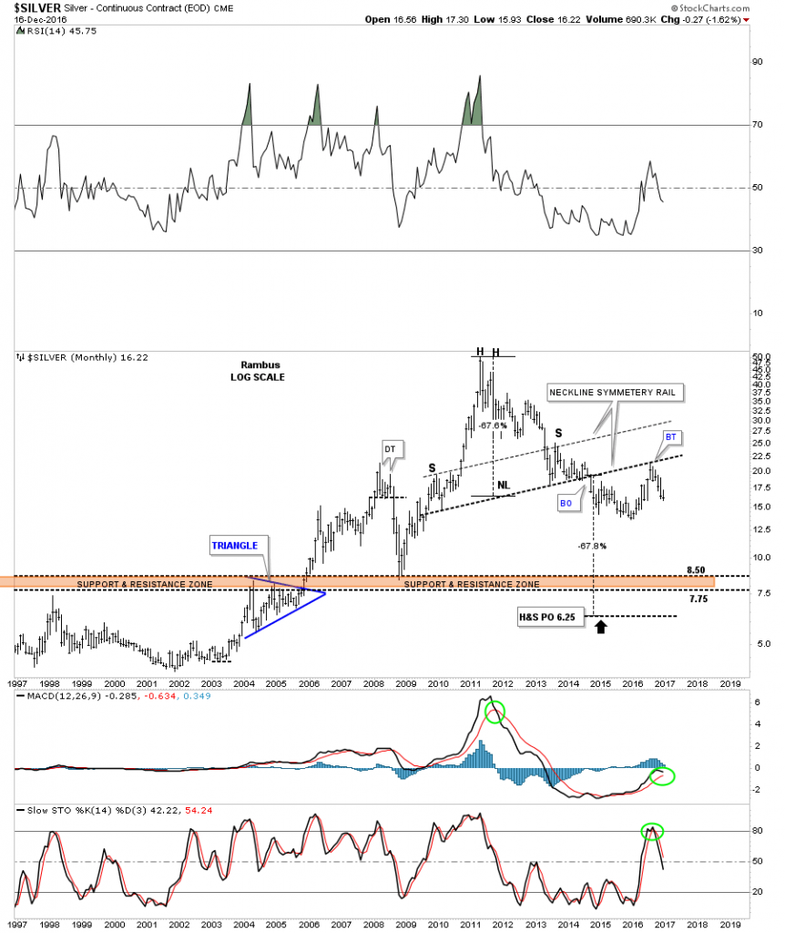
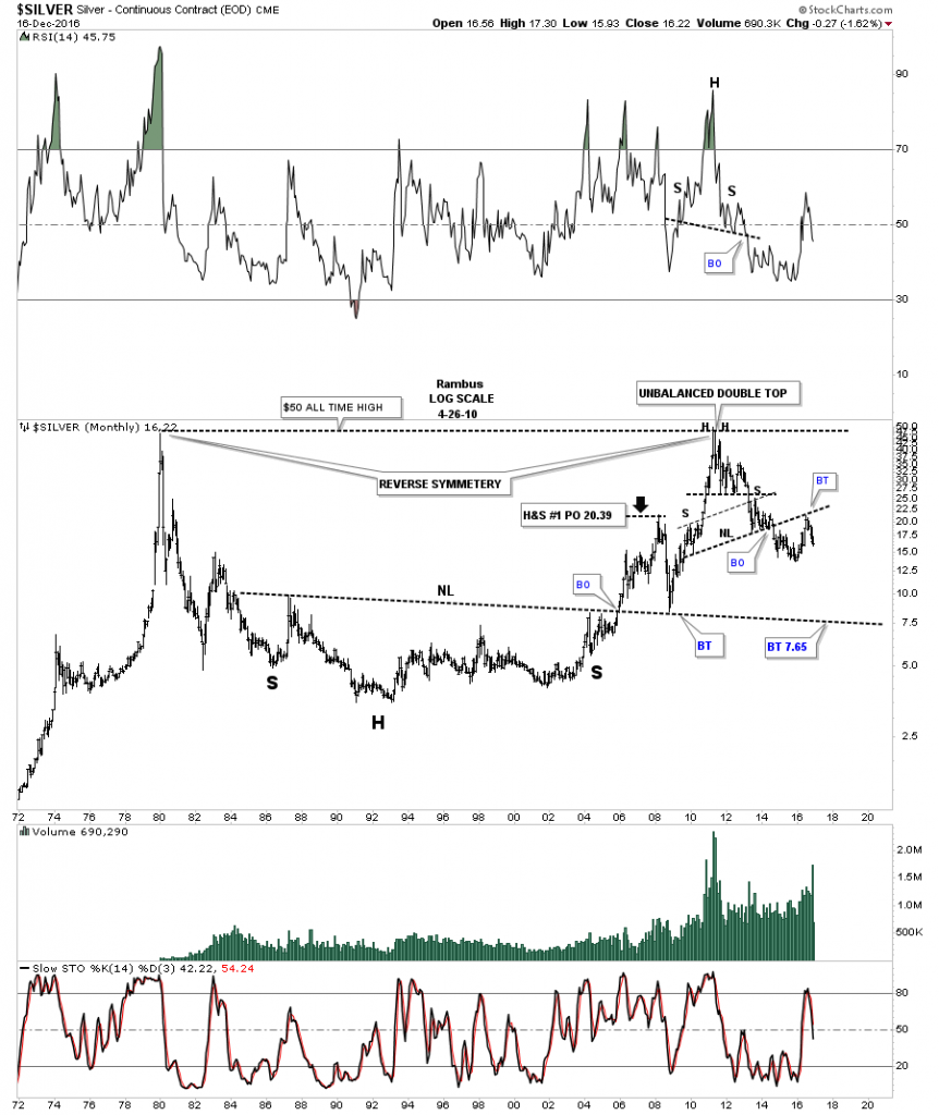
This last chart for silver is a 45 year monthly chart which shows the massive inverse H&S bottom that led to silver’s bull market all the way up to its 1980 high at $50. You can see the clean breakout and backtest to the neckline from our current H&S top, as shown on the charts above. I extended the neckline out in time to the right hand side of the chart which would be the first real logical area of support at the 7.65 area.
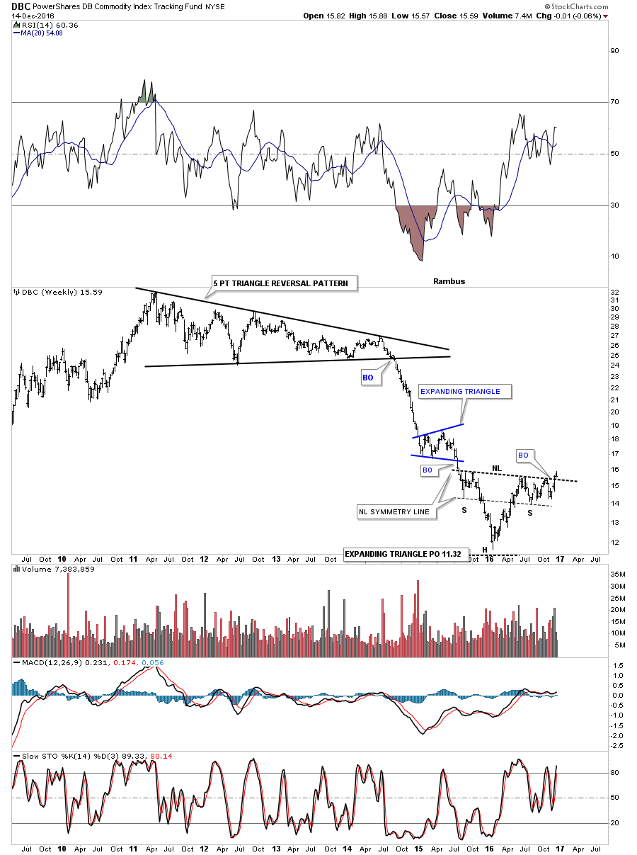
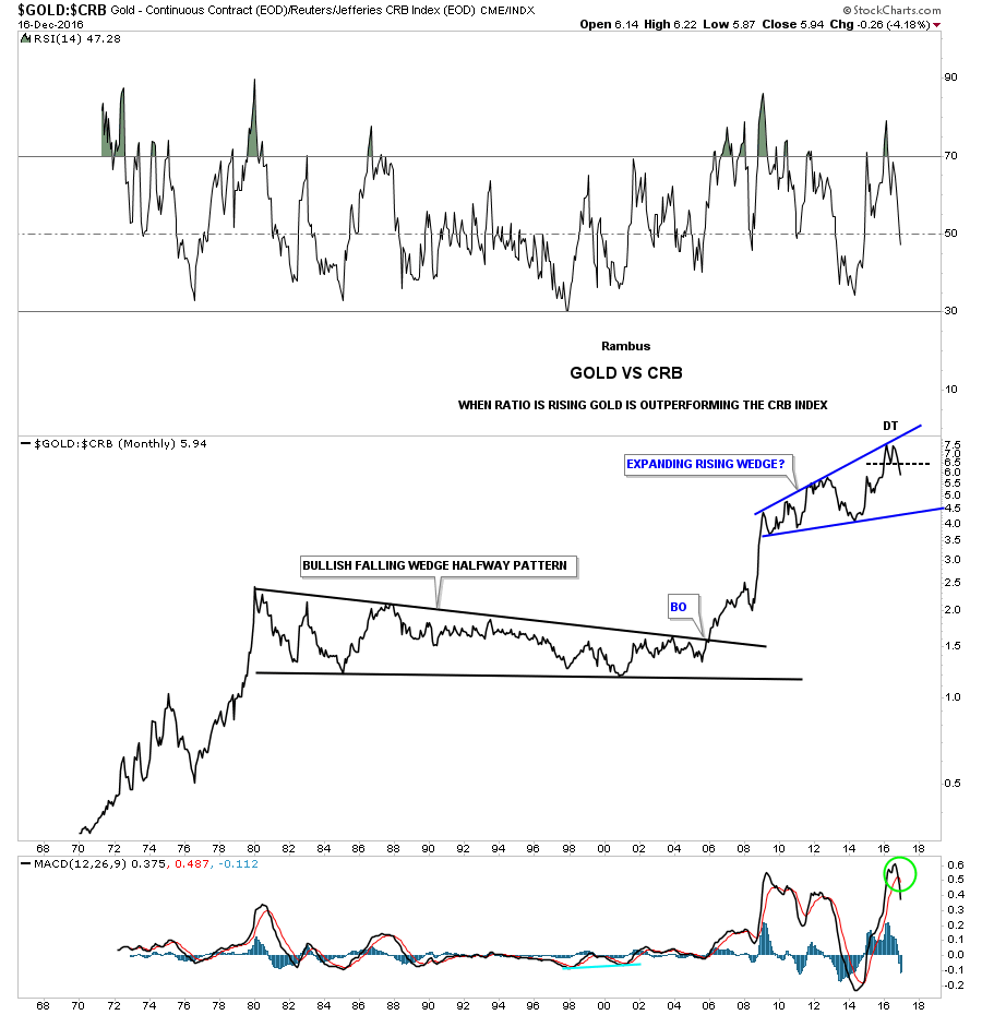
Next lets look at some ratio charts to see what they may be telling us. This first ratio chart compares gold to the CRB index. The last time we looked at this chart it was just breaking down from the five point triangle reversal pattern. This chart suggests gold is going to under perform commodities for awhile.

Below is a 50 year monthly line chart for the gold to CRB index which is showing the ratio has put in a double top at the very top of the five year blue expanding rising wedge. It looks like this ratio won’t find support until it hits the bottom rail around the 4.50 area. Keep in mind this is a very long term chart.
I know some folks think that very large consolidation patterns don’t work, or are useless. This fifty year chart shows a 25 year bullish falling wedge as a halfway pattern to the upside. Also note how gold has been outperforming the CRB index since the last low in the bullish falling wedge. It might be time to see the CRB index really start to outperform gold now, for an extended period of time.
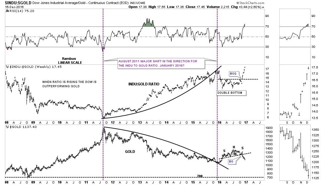
This next chart is a ratio combo chart which has the INDU to gold ratio on top, and gold on the bottom. Since the US election the ratio chart on top has broken out and made a new high for this move. Gold on the bottom chart shows that H&S top which has been showing up in so many different areas in the PM complex. Since the low in 2011 on both the ratio chart and gold, the INDU has been outperforming gold in a pretty big way.
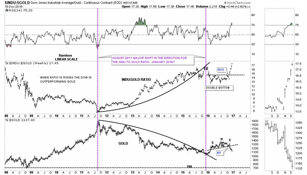
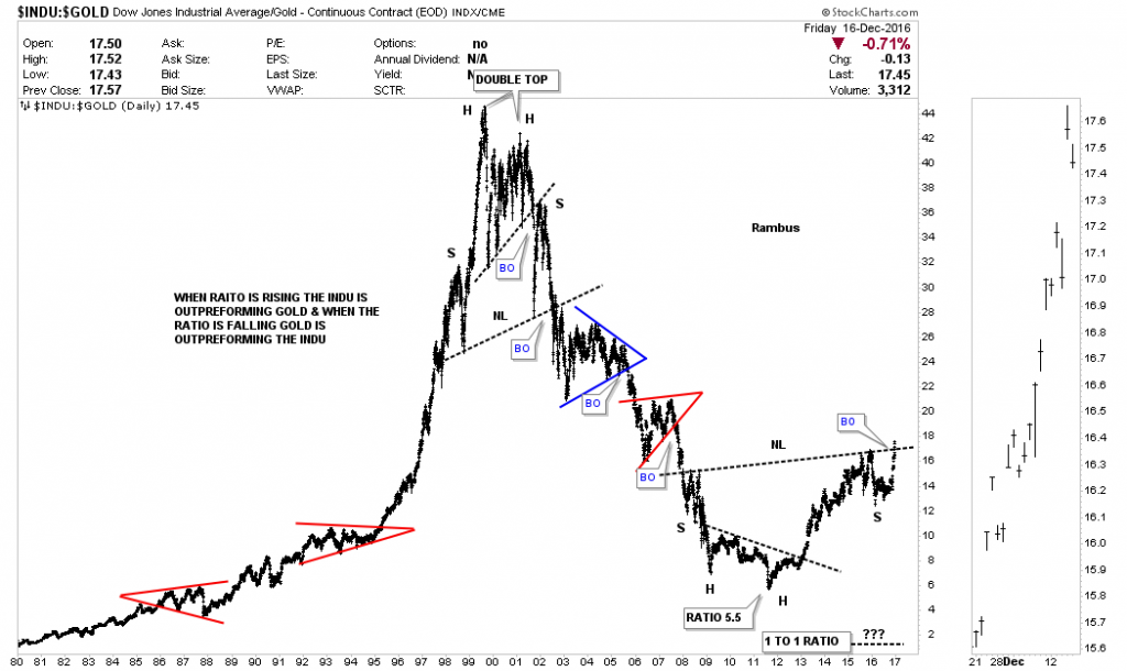
Below is a 35 year ratio chart that compares gold to the INDU. This ratio is just now breaking out from a large H&S bottom. Note how once the big trend gets established it can run for many years. In the 1990’s the INDU was the place to be. From 2000 to 2011 gold was the place to be invested. Many thought this ratio would drop all the way down to 1 to 1, like it did in 1980 when gold was at 850 and so was the INDU. As you can see the ratio only made it down to 5.5 this cycle.
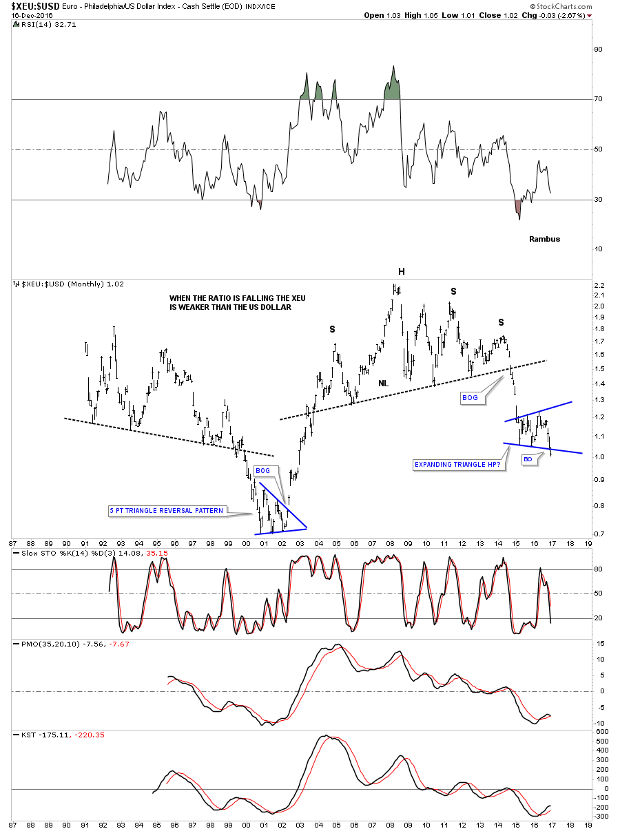
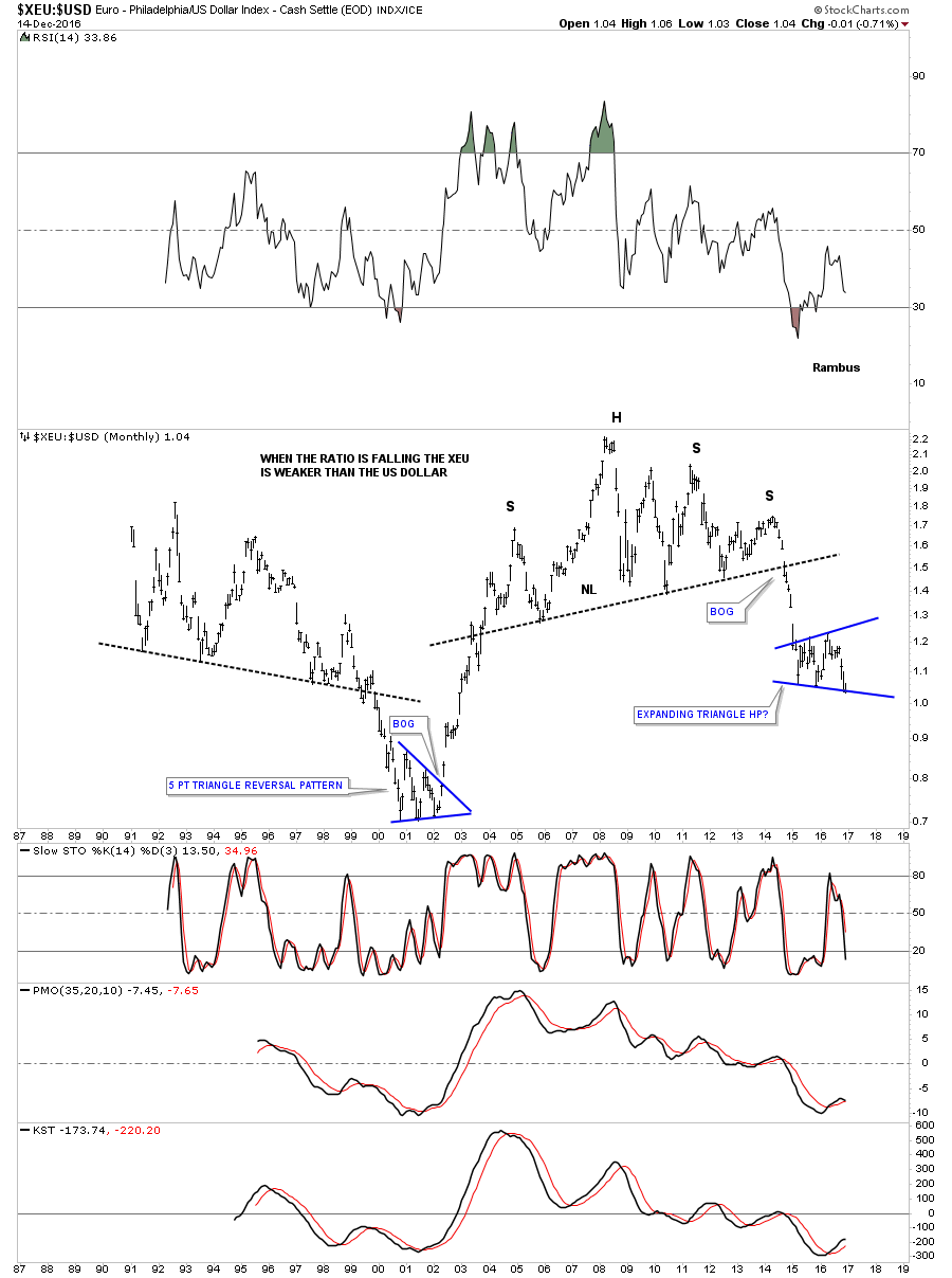
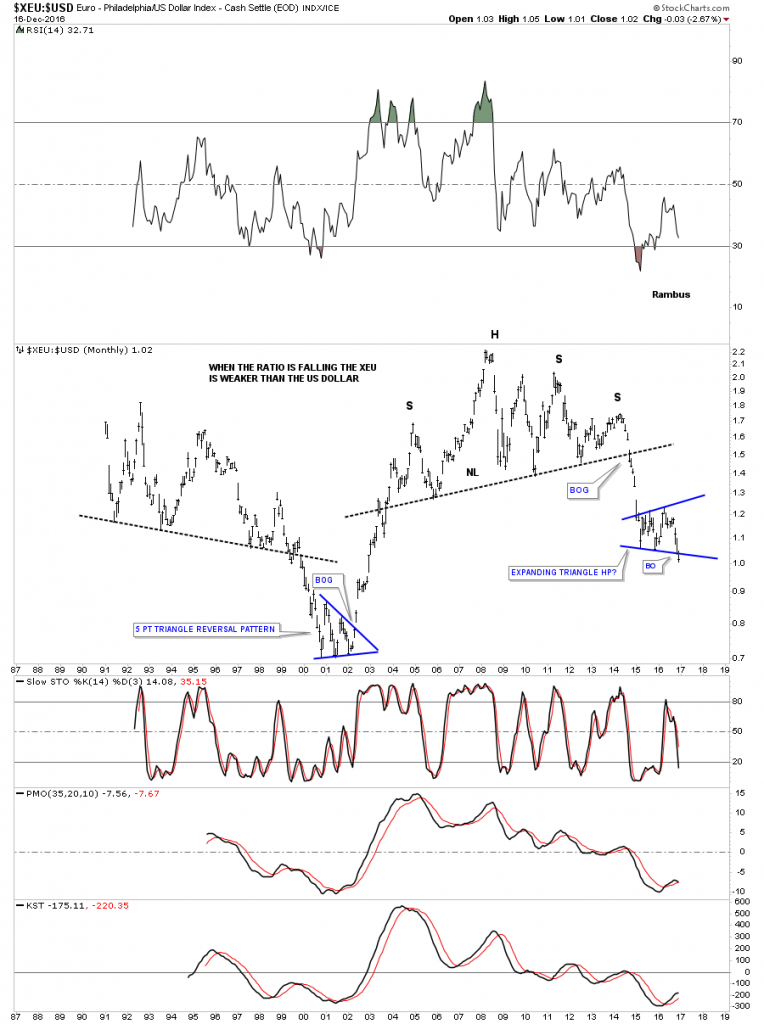
Earlier this week we looked at this long term ratio chart which compares the XEU to the US dollar. The last time we looked the ratio was sitting right on the bottom rail of the blue expanding triangle, but as you can see it is now trading below that very important bottom rail. As this is a monthly chart I would like to see the ratio trading below the bottom rail by months end.
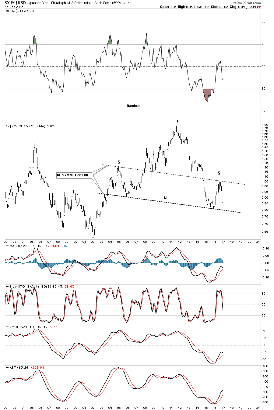
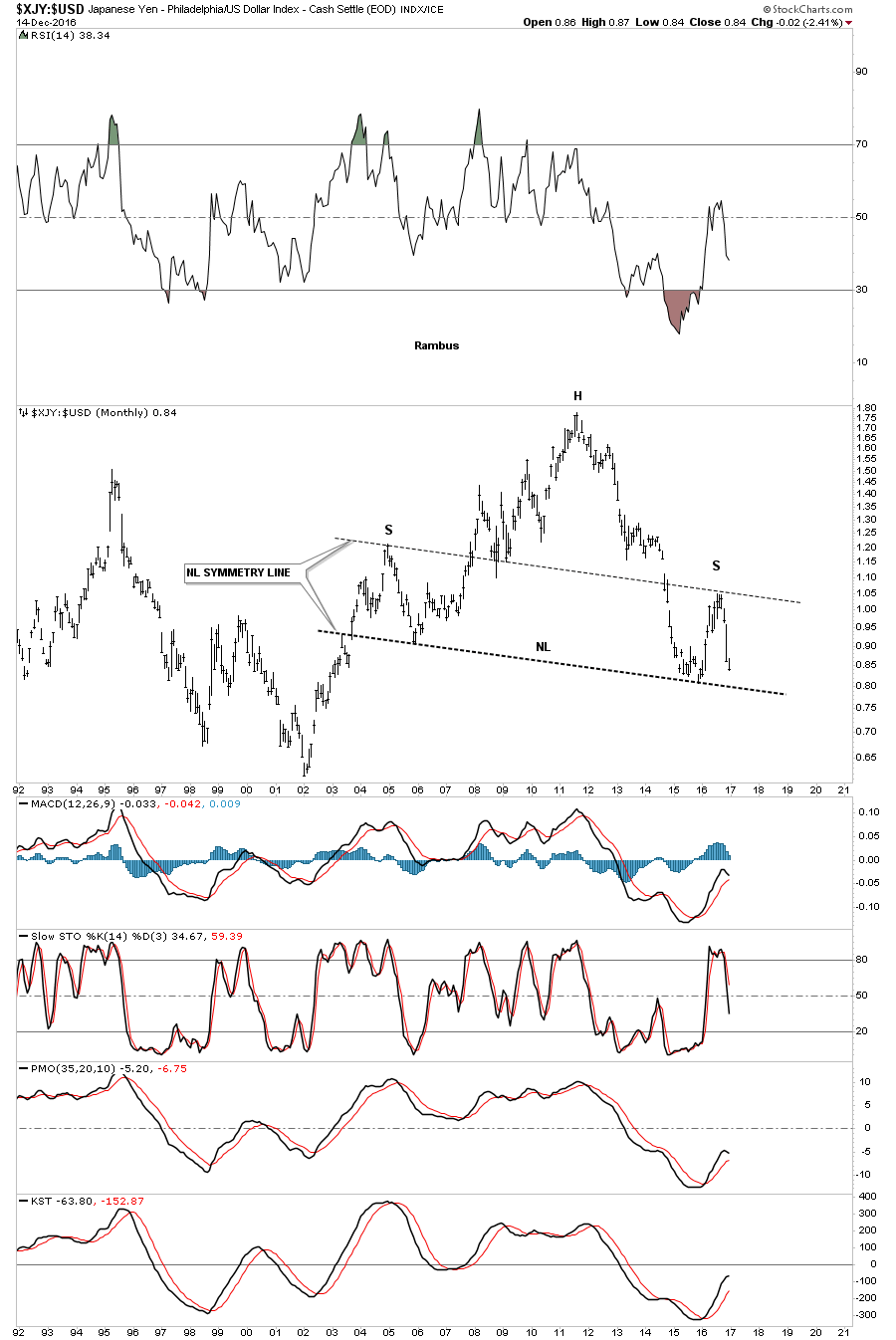
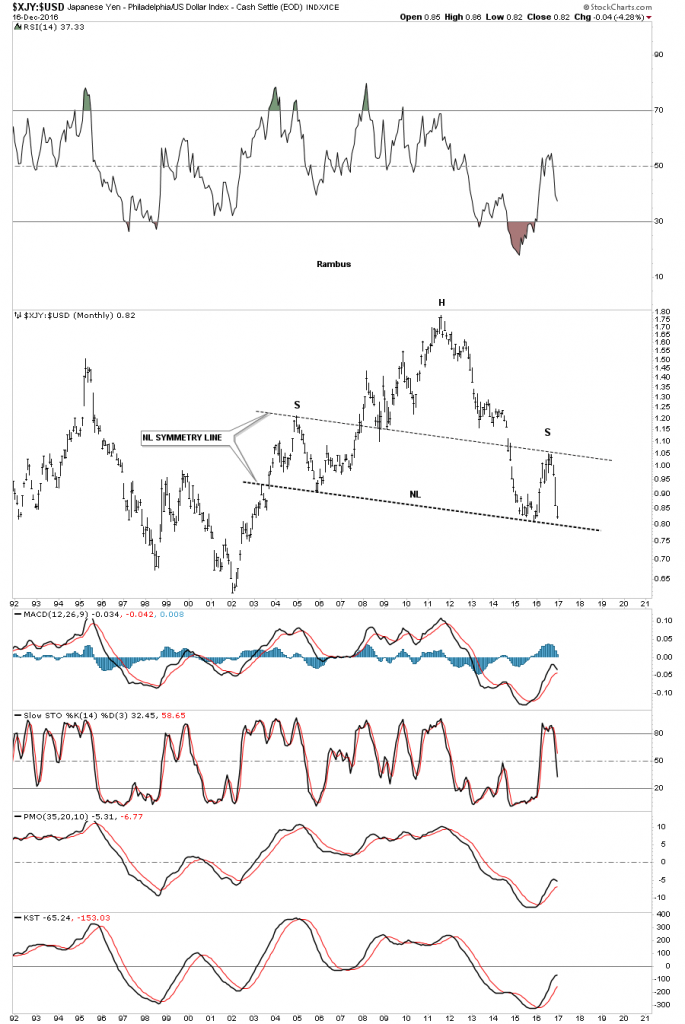
The XJY to the US dollar ratio chart is showing the price action fast approaching its massive neckline.
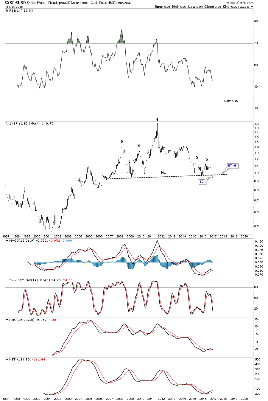
Also earlier this week we looked at the XSF to the US dollar trading right on its massive neckline, which now shows the price action working its way lower. Is it just a coincidence that these currency pairs are all testing their major long term necklines while the US dollar breaking out of an important consolidation pattern?

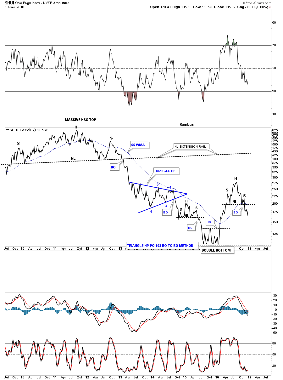
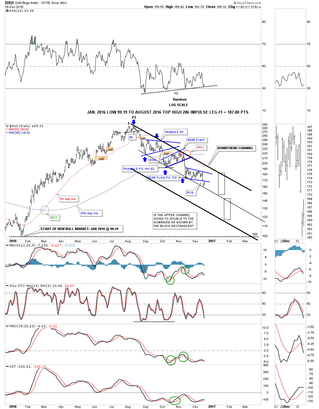
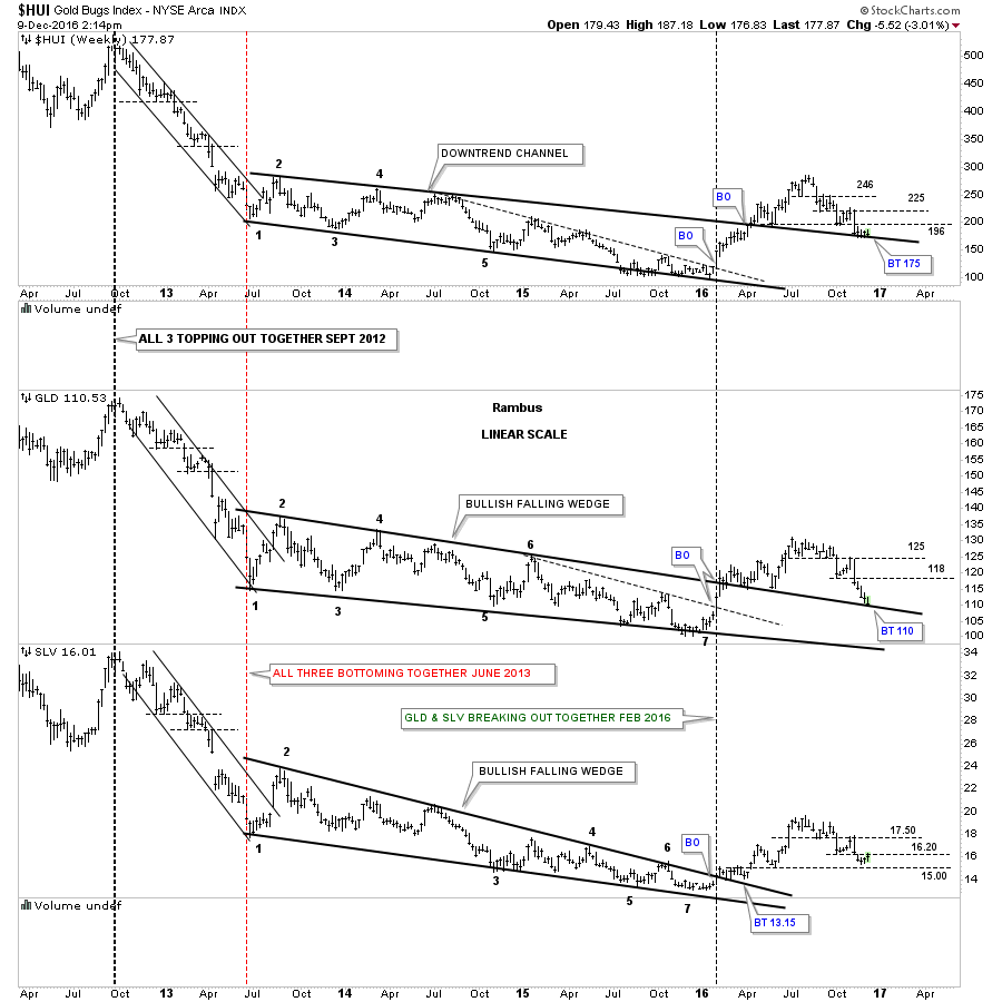
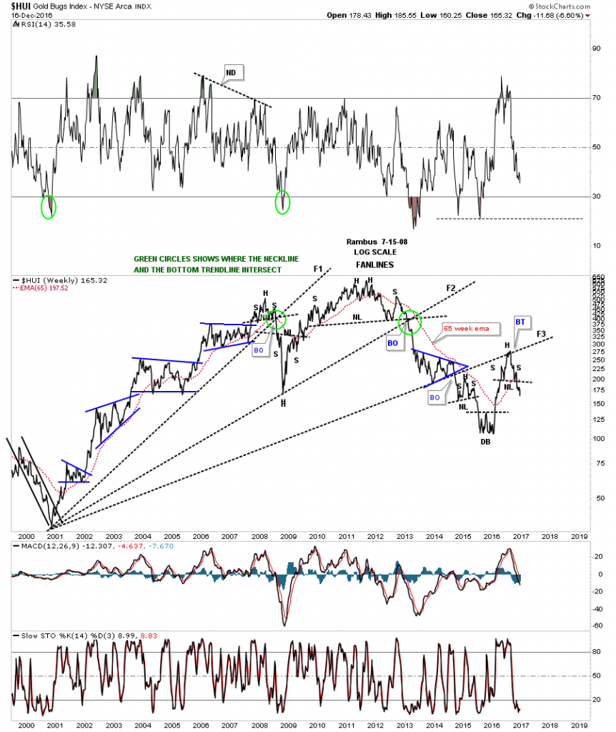
I would like to finish up by looking at some charts for the HUI starting with this long term weekly fanline chart which goes back to the 2000 low. You can see there were H&S tops that built out just above fanline #1 and #2 which suggested the fanlines would would give way.
Fanline #3 is interesting as it built out the blue triangle consolidation pattern which gave the HUI the energy it needed to break the fanline. Shortly after the breakout from fanline #3 the HUI built out a small H&S top just below it, which suggested the fanline pattern was complete, and the decline would ensue. The HUI did indeed decline all the way down to the January low this year where it put in a double bottom. The rally out of the January low was very impressive and it looked like a brand new bull market was just beginning, which most believe is the case today.
There is one really big issue the HUI has to overcome and that is to trade above fanline #3 to confirm the bull market is real, and this wasn’t just a bear market rally. As you can see the price action hit fanline #3 for the second time back in August of this year and built out a second H&S top just below it. Keep in mind that H&S top is a reversal pattern that is reversing the bull run out of the January low. The double bottom at the January low was a reversal pattern that reversed that last leg down in the bear market.
Below is just a simple weekly line chart for the HUI which shows the massive H&S top which reversed the secular bull market and the two smaller H&S top we looked at on the fanline chart above.

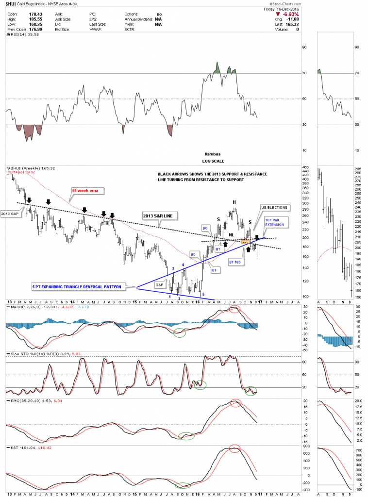
Some of you may remember when I posted this weekly chart for the HUI shortly after it broke back down below the all important 2013 support and resistance line. The black arrows shows how it held resistance for several years and then was finally broken to the upside during this years rally. Shortly after the S&R line was broken to the upside earlier this year it had a clean backtest and all seemed right with the world regarding the HUI and the precious metals stocks in general. The little brown shaded area shows where I thought we would see good support come in just like the last time. We did get a little support but the rally wasn’t very strong and built out the right shoulder for the H&S top.
I mentioned several weeks or so ago, when the 2013 S&R line gave way and the HUI was trading below it, that we could now see a backtest to the underside because it’s a support and resistance line, above is bullish and below is bearish. As you can see it held resistance for the last six weeks and now the HUI is starting to fall away. The HUI also failed to trade above the top rail of the blue expanding triangle bottom reversal pattern extension line.
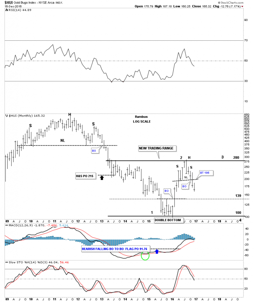
This next chart is a long term monthly look at the HUI which again shows its massive H&S top and the bear market that followed. This chart shows why it’s important to recognize reversal patterns as soon as they become clear. Note the double bottom which looked like it was the bear market low because it’s a reversal pattern and the price action did indeed reverse back to the upside. Now however you can see the H&S top that built out and is now reversing the uptrend to a downtrend. What this is doing is creating a very large trading range between 100 on the bottom and 285 at the top. There is no law that says the HUI has to trade all the way down to 100. If the price action makes a higher low that the January low a triangle could develop, but that’s getting to far ahead of ourselves.
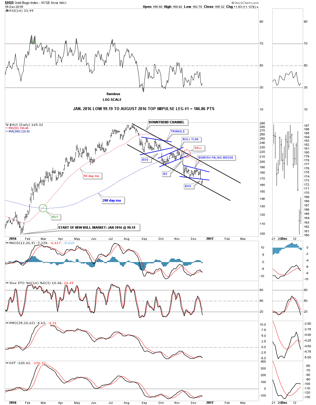
These last couple of charts for the HUI are daily charts which I think have a possibility of playing. If you’ve been following the HUI you will know it has put in a series of three small consolidation pattern since topping out in August of this year. These three consolidation patterns have built out a fairly parallel downtrend channel as shown on the chart below.
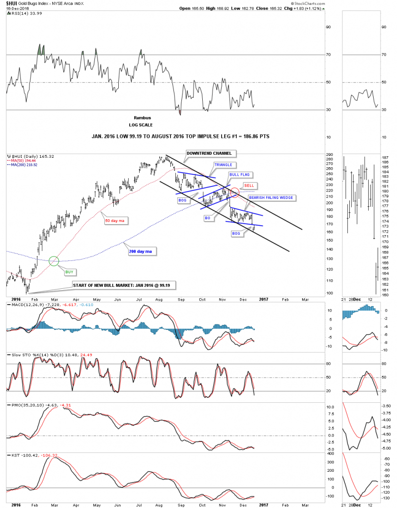
In fast moving conditions, which I think the PM complex is in right now to the downside, there are a couple of things that can happen. In the case for the HUI I think if the bottom rail of the current downtrend channel is broken to the downside we will see a doubling of the upper channel as shown by the black rectangle measuring sticks. The current bottom rail of the downtrend channel would be the mid dashed line on this chart below, which shows what a doubling of the upper channel would look like. To set this possible scenario in play would be to see the HUI break below the dashed midline in a fairly convincing fashion.

Again if the PM complex is in a strong impulse move down this last chart for tonight shows a possible bearish falling wedge on gold. We should get our answer to this question in the next few days.
What I tried to do tonight is paint a picture of the long term status for the PM complex based on chart patterns, currencies pairs, ratio charts and combo charts, coming from many different areas. What all these charts above are strongly suggesting to me is that the rally out of the January low, made this year, was a bear market rally and not the start of a new bull market for the precious metals complex. I know this is a hard pill to swallow but until the bulls can start showing some strength, the bears seem to be in charge. Keeping ones trading capital safe is more important than anything else when it comes to the markets. There will be many more trades if one has the capital to take advantage of the situation when the time comes. This trade in the PM complex started out very good this year, and a good time was had by all. Knowing when to leave the party can be a totally different scenario.
I have to go back down to Little Rock today so I’ll be out of the office on Monday. All the best…Rambus