I’m going to use the GDX as a proxy for the rest of the PM stock indexes. I can now say with a fair amount of confidence that the first consolidation phase is taking place. Lets start with just a simple daily chart for the GDX which is showing a small unbalanced double top with the right high being higher than the left high. Five days ago the price action gapped below the double top trendline and last Friday the GDX backtested the double top trendline from below. The price objective for the unbalanced double top is down to the 24.50 area.
This is how the beginning phase of a consolidation pattern begins to build out. In fairly large consolidation patterns there is generally a small reversal pattern that forms at the reversal points within whatever consolidation pattern ends up building out. This small double top is likely to be the the start of the first reversal point down. The double top price objective down to the 24.50 area would be a minimum decline we should expect before the GDX finds support and begins the next rally back up to the top of the new trading range around the the 32 area. If a triangle is forming then the price action won’t make all the way back up to the top before the bears take over again.This would be labeled as the start of reversal point #3. Then one more move back down to the bottom of the trading range where ever reversal point #2 is located where we should see the fourth reversal point begin to form.
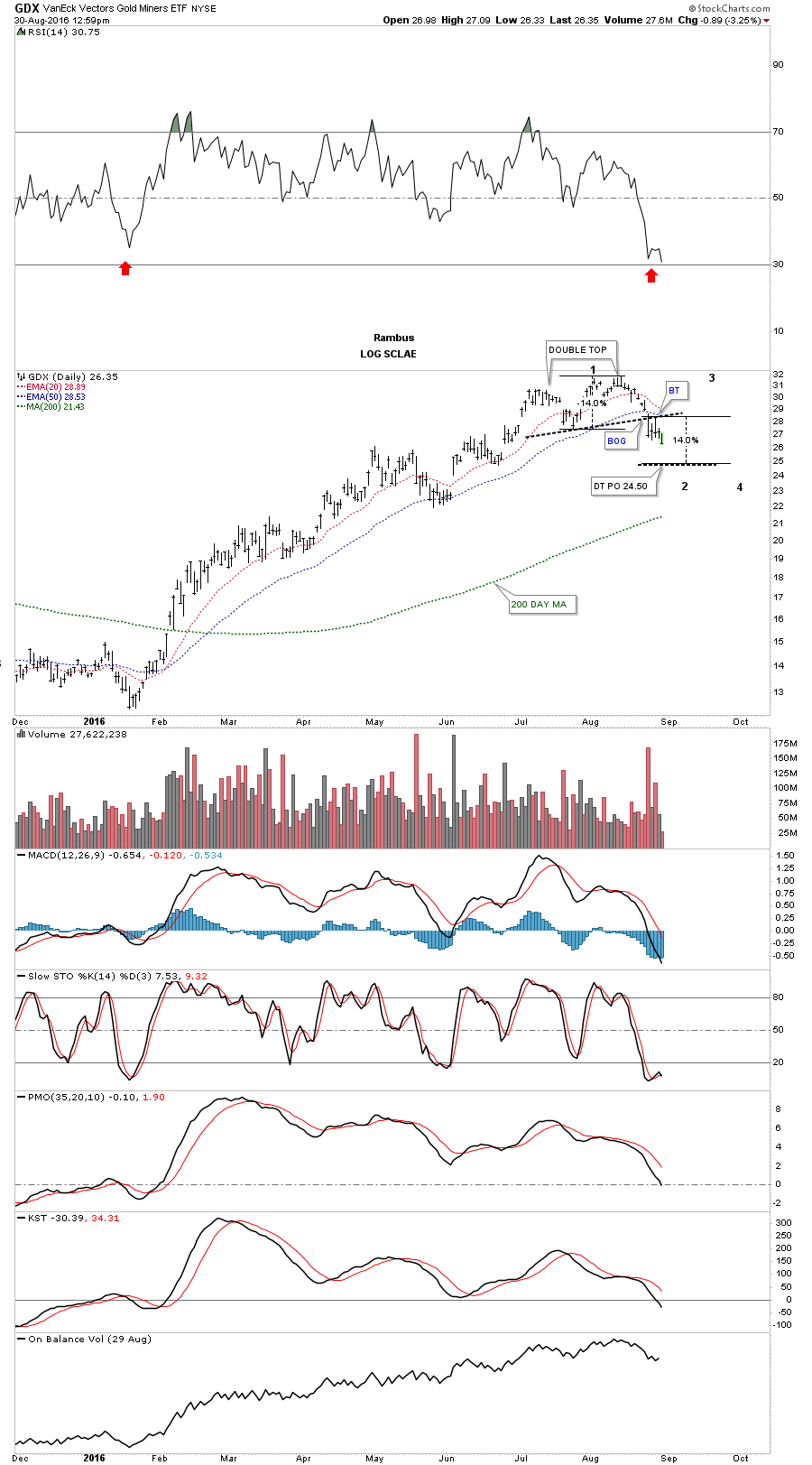
This next daily chart for the GDX is a longer term look which shows the previous small blue consolidation patterns that formed the first impulse move up. What we have to work with right now is the completed small double top and its price objective down to the 24.50 area. It’s possible the GDX could go lower than the double top price objective before the price action reverses back up. The 24.50 area would be the minimum price objective to start the second reversal point back up to the top of the new trading range. Also there is still no way to know what type of consolidation pattern may build out but whatever the pattern, it will have a minimum of four reversal points.
Also whatever consolidation pattern builds out will be much bigger than any of the smaller consolation patterns that formed during the first impulse move up. Something else to keep in mind if you’re feeling beaten down for not selling at the exact high. Once this consolidation pattern is finished building out it will most likely be a halfway pattern to the upside. A rally similar to the first impulse move up in time and price will take the GDX to the next level higher where we should see another consolidation pattern form.
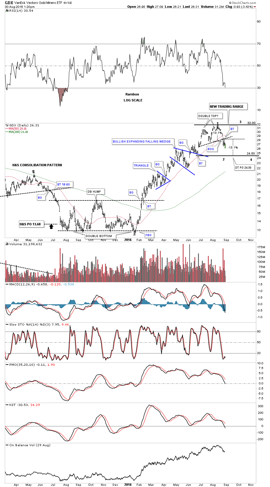
This next daily chart for the GDX shows the fib retracements. The double top and the 38% retrace of the first impulse move up would be around the 24.50 area. A 50% retrace would be down to the 22.00 area.

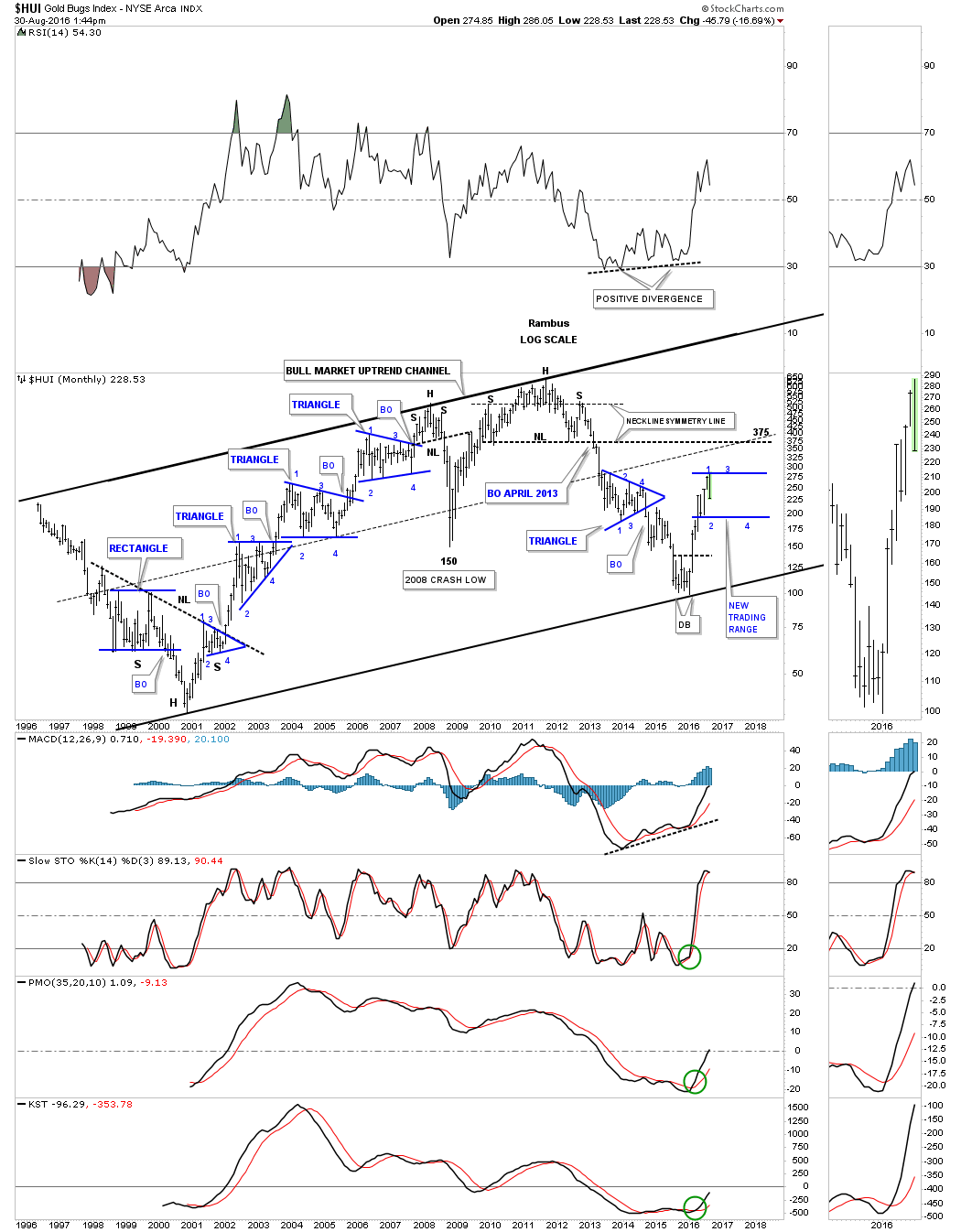
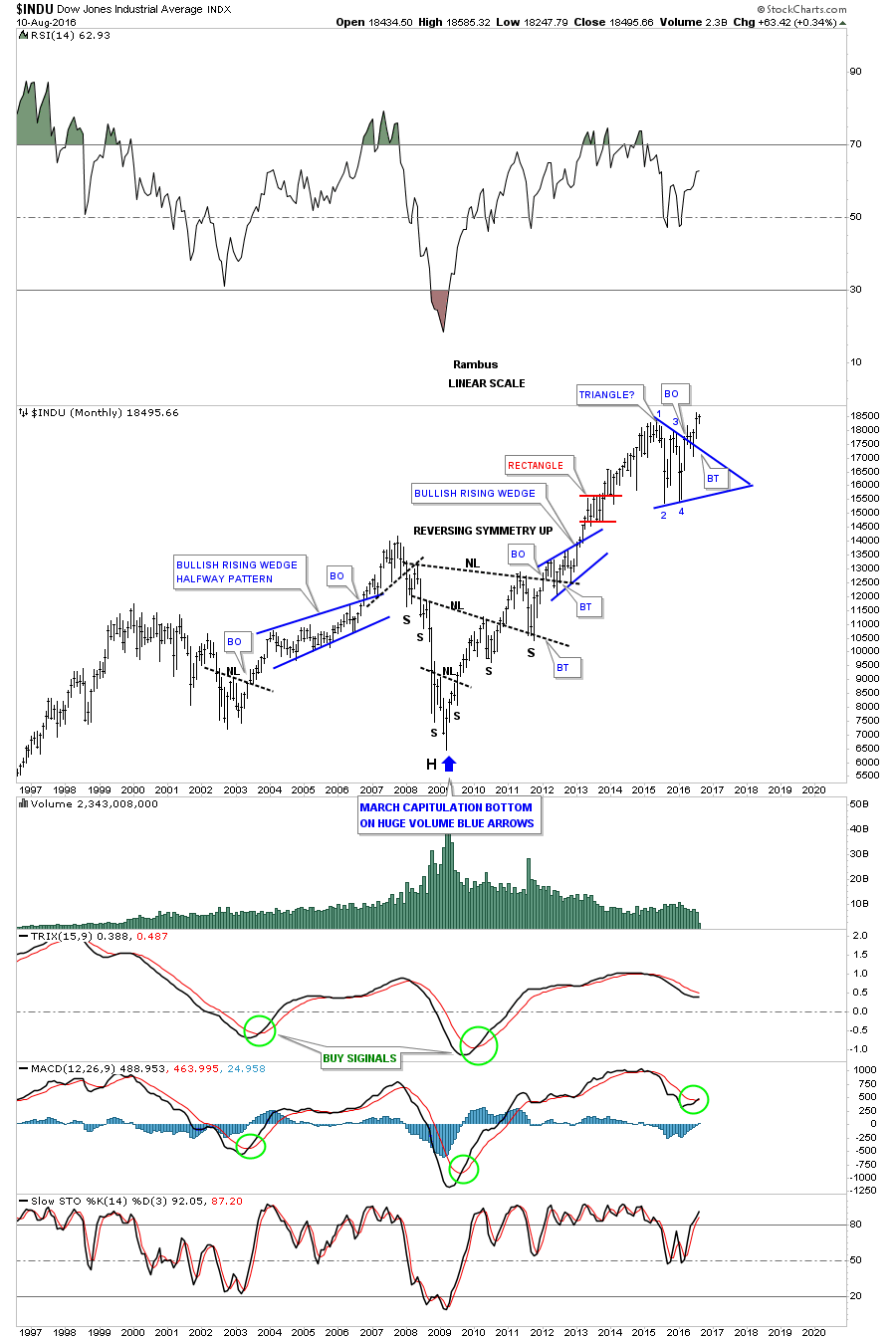
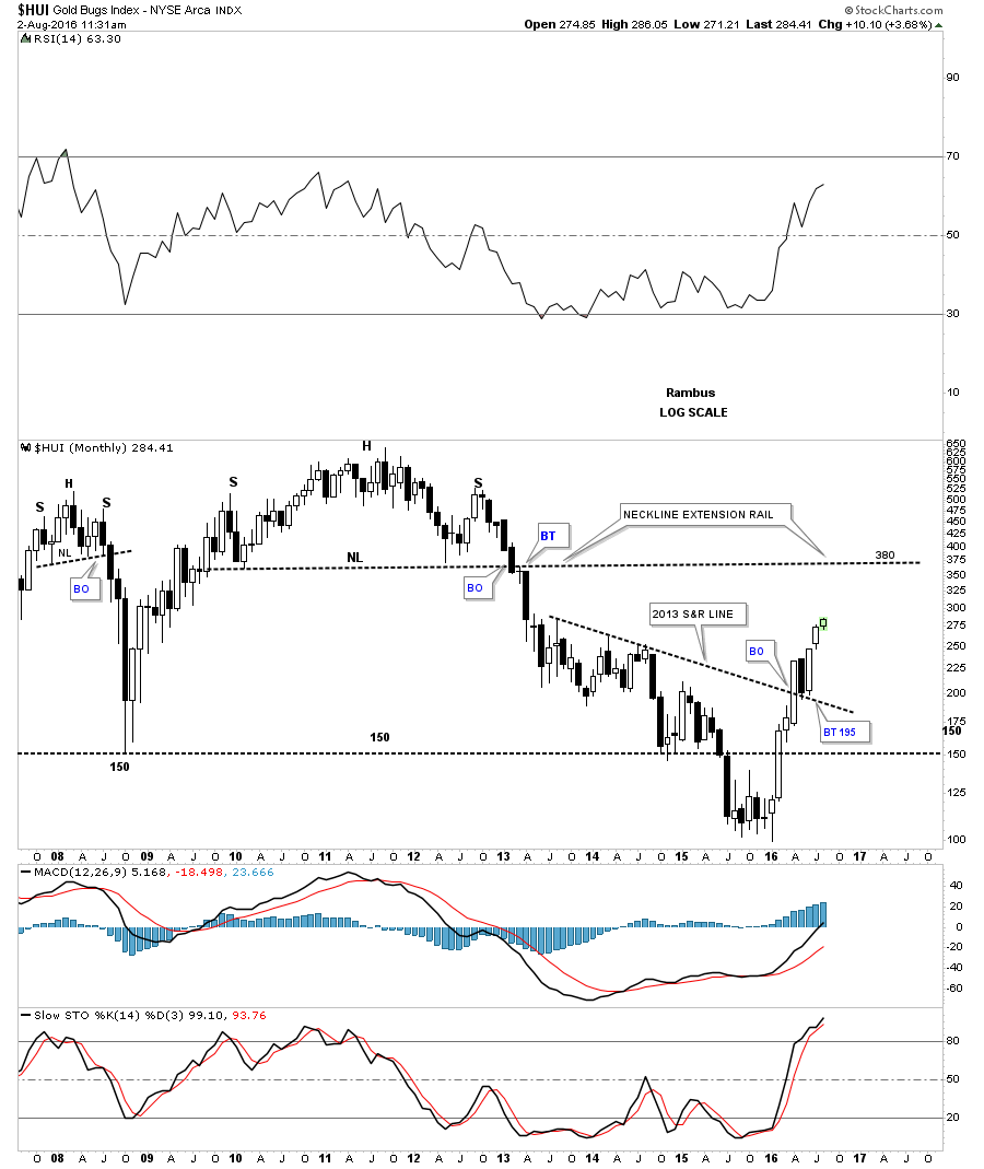
Below is a long term monthly chart for the HUI I posted recently which shows all the consolidation patterns that formed during the bull market years and how our possible consolidation pattern may look. Normally, but not always, the first reversal point down can produce the strongest move within a consolidation pattern. As the consolidation pattern builds out the swings can become less volatile as the bulls and the bears get tired of beating on each other and volume usually tappers off. Once we can establish the reversal point #2 low, there is a good chance that that low will mark the low of the consolidation pattern especially in a bull market. Establishing the first two reversal points in a consolidation pattern can then open up the door for a couple of short term swing trades within the consolidation pattern which will still have to form the 3rd and 4th reversal points. If you plan on shorting within the consolidation zone don’t get greedy as the reversals back up are just as strong the reversals down.