Wednesday Report…Precious Metals Bull Update

Tonight I would like to update some of the precious metals stock indexes as they have been basically consolidating for the last couple of months. This has been healthy for this sector which has been on fire since the middle of January of this year.

The first chart for tonight is one of the laggards but you couldn’t tell it by looking at the daily chart. The $CDNX, which is a Canadian small cap index, is made up of  many precious metal and oil stocks. We’ve been following this one since it broke above the S&R line back in February. In March it built out its first consolidation pattern for its new bull market which was the blue expanding rising wedge. The blue arrows measures the first impulse move up. After the initial price objective was hit in early May the $CDNX built out another bullish consolidation pattern which was the bullish rising wedge. The price objective for the blue bullish rising wedge is shown by the red arrows. On Monday of this week there was a fairly strong backtest to the top rail but today’s price action has now cleared the top rail again after forming the red bull flag as the backtest. It’s always a good sign when you see a consolidation pattern sloping in the direction of the main trend.

cdnx day 1

The monthly chart shows just how low this index was when it finally bottomed out in January. While most of the other precious metals stock indexes have already traded well above their 2008 crash lows the CDNX is just now breaking above that important S&R line. There is a good chance we may see some reverse symmetry to the upside as shown by the red arrows. The decline out of the red expanding rising wedge was straight down with no consolidation patterns. Now it should be much easier for the CDNX to reverse symmetry back up over that same area.

cdnx monthly

This next chart is a monthly chart at the $GDM which shows the bull market years and the consolidation patterns it made. At some point we’ll see some type of consolidation pattern form that will take months to build out but for now the impulse move up remains in place. When that massive H&S top finished building out I called this chart, the reverse symmetry chart, as the rally out of the 2008 crash low was so steep. It’s not a perfect correlation but it gives you a feel on how the move may play out.

There is one other bit of interesting information on this chart as shown by the black rectangles. The inverse H&S bottom in 2000 is the same height as the 2011 H&S top. I put the same black rectangle on our 2016 bottom for comparison.  Unlike the 2000 and 2011 rectangles our 2016 rectangle has run much further. The other two formed their right shoulders which took over six months while our current rally hasn’t begun to correct yet.

GDM MONTHLY

The $XGD.TO has been one of the strongest of the many different PM stock indexes since the January low. It will most likely be the first one of the major PM indexes to test the neckline from that massive H&S top. This will be a good study in how it interacts with that very important trendline.

xgd.to monthly

This next chart is a monthly look at gold and shows the rally to the bull market peak at 1920, out of the 2008 crash low. From that September high in 2011 gold has formed a series of lower lows and lower highs until five months ago. Note how the top rail of the bullish falling wedge has reversed its role to what had been resistance to now support. Also gold has made a new monthly high this month which is something it hasn’t been able to do since the 2011 high. The 10 month ema has also helped out in the support department during the backtesting phase.

GOLD MONTHLY

I built out this next 20 year monthly chart right after the top was put in at 1920. I was looking for some reverse symmetry to the downside and built out the brown shaded support and resistance zones. The reverse symmetry down didn’t work out as well as I had hoped on the front end but the brown shaded S&R zone labeled #4, prove to be the bottom of the bear market. When gold was testing the 4th S&R zone I was looking for one last capitulation move down to the 5th S&R zone to complete the bear market. As you can see that didn’t happen. Now with gold making a higher high and a higher low, with the breakout from the blue falling wedge and support on the 10 month ema, gold found its bear market low at the fourth S&R zone.

gold s&r zones

I call this next chart for gold, Just Another Brick in the Wall, as it shows every consolidation pattern that was made during the bull market years. I know this doesn’t sit well with a lot of gold bugs, but when I look at all the beautiful consolidation patterns that formed during the bull market it looks like the work of a free market and not manipulation. If this market was manipulated we wouldn’t see such nice symmetrical chart patterns.

That was one magnificent looking rally out of the 2000 low, one consolidation pattern forming on top of the next. Note the breakouts and backetsts when each consolidation pattern finished building out. They’re hard to see but there are little green triangles that formed at the halfway point in each impulse move up. Note how similar our current breakout and backtest has been vs those during the bull market. Not every consolidation pattern had a backtest but the majority did. Is our current black expanding falling wedge a bigger clone to the one that was made at the 2008 crash low?

gold clone

This next monthly chart shows just the bigger consolidation patterns that were made during the bull market years. Note how each consolidation pattern formed at roughly the halfway point in each impulse move up. It may not feel like it but gold is up over 100 points with one day of trading to go for this month of June. From a Chartology perspective this is a pretty as it gets.

gold major major

This next chart is a ratio chart which compares the INDU:GOLD going all the way back to 1980. When this ratio is rising the INDU is outperforming gold and when it’s falling gold is outperforming the INDU. This chart shows a good example of the old expression, The Trend is Your Friend. During the bull market in the stock markets that began in 1980 or so, that was the place to be invested as the ratio was rising. Then in 2000 the bull market in the stock markets came to an end and a new bull market in gold began. Again, from the 2000 high the place to be invested was the gold complex until 2011.

As you can see the INDU outperformed gold starting at the 2011 low when the ratio was a 5.5 or so meaning, it took five ounces of gold to buy one share of the INDU. The rally out of the 2011 low looks like it maybe running out of gas it the H&S top plays out to the downside. If that happens will the ratio make it all the way down to the infamous 1:1 ratio where the INDU and GOLD are the same price? That has happened several times in the past with the last one being in 1980 when the INDU and GOLD were price around the 850 area. If we see the 1:1 ratio come to fruition down the road, it may signal a shift out of the PM complex. Just another piece of the puzzle to keep an eye on.

gold frution

Lets switch gears and look at a monthly chart for silver which also shows some nice Chartolgoy. Silver topped out in April of 2011 a full five months ahead of gold. The bear market consisted of two consolidation patterns and one reversal pattern at the bottom of the chart. This chart should also give you some perspective of where silver is in its bull market.

silver monthly

I have time for just one more chart for tonight which will be the long term monthly look at the $XAU which goes back 20 years. Because this index is made up of both gold and silver stocks it actually made a new all time low in January of this year. That low didn’t last very long as the XAU built out a 5 point bullish falling wedge reversal pattern.

I have many more charts to show you but they’ll have to wait for this weekend. I hope these few charts show you the difference between a bull market and a bear market and how the trend is your friend until it isn’t. These trends can last a very long time before they exhaust themselves.Remember the first real correction will come at some point . It won’t be the end of the new bull market but it may feel like it.

All the best…Rambus

xau monthly

GLD Update…

GLD is currently testing the top rail of its blue expanding flat bottom triangle completing the sixth reversal point. This consolidation pattern, that has been forming on the top rail of the seven point bullish falling wedge, is now in its fifth month. Once the price action can break the gravitational pull from that big three year falling wedge the next impulse move higher should begin in earnest.

gld 222

HUI & GLD Combo Chart…Can you Stand some Pain ?

It’s been awhile since we last looked at this combo chart which has the HUI on top and GLD on the bottom. I’ve labeled the most important trendline on this chart, the 2013 S&R LINE. That most important S&R line separates the bear market from the bull market. The black dashed vertical line on the left side of the chart shows where they both made a big gap down to start the three year S&R lines.The right side of the chart shows where the HUI and GLD broke back above that three year S&R line with GLD doing it in February and the HUI two months later in April of this year.

Think of the 2013 massive S&R line as your line in the sand. Knowing there is such an important line in the sand should make it much easier for you to ride out the chopping action that is inevitable. There is always pain in the markets because nothing ever goes straight up or down for that matter. That is one thing each and every investor has to deal with in their own way. This is my game play for the PM stocks I own and I expect some pain along the way.

HUI COMBO

This next chart is a combo chart which shows the three H&S bottoms for the HUI, GLD and SLV. Last weeks price action was very positive as it confirmed for me the necklines are properly placed by the way these three were tested again, for the second time, building out their right shoulders. We now know where support lies on the combo chart above and we now know where resistance is to be found on the chart below. Knowing where you’re at, at any given time, is important to know as it will easy some of the psychological baggage that affects everyone trading the markets.

HUI GLD SLV COMBO

HUI Update…Surprise

Surprises in a new bull market come to the upside. Below is the daily chart we’ve been following for the HUI which shows the top rail of the blue expanding falling wedge being broken to the downside yesterday. We are still not of the woods just yet as we need to see the HUI take out the previous highs but this is a positive development.

HUI UPDATE...

The combo chart shows all three testing the underside of their respective necklines. To breakout above their necklines that would create a higher high which is what we want to see.

combo chart pm complex

Below is a daily line chart for GDX which shows the backtest held on a daily closing basis. So far so good.

gdx line

The daily chart for the GDXJ shows an expanding flat top triangle. I could have connected the top rail to reversal points one and three which would have given me an up sloping top rail. The reason I didn’t do that is because of where the breakout gap occurred and how the backtest to the horizontal top rail fits the pattern better. It’s always important to tweak your charts when you have new information to work with.

gdxj day

The CDNX has been leading the US precious metals stock indexes even though it’s not entirely made of small cap PM stocks. One thing I like about his index is that it’s showing speculative money flowing into the markets in general. When money is flowing into the small caps, investors are looking for a bigger bang for their buck which is positive overall.

cdnx day

The monthly chart for the CDNX shows it has finally broken back above the 2008 crash low which is a big deal.

cdnx monthly


HUI Update…To trade or Not to Trade

Lets review some charts for the HUI and see where we’re at in the short to longer term horizons. Below is the 2 hour chart we’ve been following which shows the three brown shaded horizontal support and resistance zones. The HUI made an attempt to breakout above the top S&R zone but failed to follow through. The next area of possible support should come in at the previous S&R zone between 208 – 210 which is also the bottom rail of the possible uptrend channel. The lowest S&R zone between 182 – 187 is the most important area for long term support.

HUI 2 HOUR

This next chart is a daily look which shows the top rail of the small expanding falling wedge giving way today which is not what I wanted to see on the very short term chart. This failure opens up the door for another reversal point to the downside to begin. Below the current price action are three possible areas of support, the 20 and 50 day ema’s with the 38% fib retrace at 183 or so.

HUI FAILING EXPANDING

This second daily chart for the HUI shows where I laid out a possible bigger trading range with the top at 235 and the low around the 190 area. This last rally up to the 235 area completed the second reversal point with the possible 3rd one to the downside beginning. When I laid out this possible scenario I said we had to see one more decline to complete a consolidation pattern of some kind. The fourth reversal point is always the hardest to spot in real time because it doesn’t show its self until after the fact.

hui trading range

Below is another daily chart we looked at recently which shows the potential bullish set up with the rally off the January low being the flag pole and the flag which is currently in the developing phase right now.

hui flag pole

Lets look a few longer term charts to put everything in perspective. This first weekly chart shows the rally out of the January low this year and the blue trading range that is developing between 190 and 235. From a long term view this looks like a good place for the HUI to catch its breath and consolidate the massive first impulse leg up.

HUI WEEKLY TRADING RANGE

This next weekly chart for the HUI shows that important S&R line which I labeled the 2013 S&R line, as it held on the last backtest from above so we know it’s hot. The 20 week ema is also moving up to the 2013 S&R line and should help with support.

hui 2013 s&r line

Next I would like to show you a couple of combo charts which has the HUI on top, Gld in the middle and SLV on the bottom. This first combo chart we’ve been following for a very long time which shows the big three year falling trading ranges finally breaking out to the topside this year. This chart gives you a sense of how close all three are trading to the top of their recent move up.

hui combo falling wedges

This next combo chart shows how all three may very well be forming a very large inverse H&S bottom. All three have been testing their respective necklines from below  for several months now. The black vertical line shows where they all began to build out their possible H&S bottoms.

hui combo invese h&s bottom

Below is the long term monthly chart for the HUI for perspective. It looks very possible that the HUI may be building out a consolidation pattern between roughly 190  and 235 or so. For those that want to try and trade this consolidation area have some decent lines in the sand in which to place your sell/stop. If you short up here you can use the top of the range at 235 or so to place your sell/stop. You can then take profits at the bottom of the trading range and reverse to the long side just under the 200 area. The main thing is not to get greedy at the bottom. There are no grantees it will play out exactly like this but the trading range looks like it’s still developing which is a good thing in the bigger picture.

This is also a good place to decide if you want to take a few chips off the table up here, as the HUI is only about 12 points or so from its first impulse move high. This has to be a personal choice on how you want to play this new bull market. Probably for most folks it would be wise to hold on for dear life but for some of you, trading these trading ranges may be the way to go. For the time being I’m going hold on to my positions and let the trading range develop further as I know there will be some pain to come. This is my personal choice.

hui long term montly

Gold Stocks: Be Prepared

There are two patterns I’m watching very closely in here on the HUI which will be a proxy for the rest of the PM stock indexes. This first chart is daily chart which shows the three small consolidation patterns that have formed since the January low. The top pattern basically completed its fourth reversal point today which is an expanding falling wedge. One of two things will most likely happen tomorrow. If this is the correct consolidation pattern then we will most likely see a breakout gap above the top rail which should lead to the next impulse move up. The second scenario would be to see the top rail hold resistance and a move down to the bottom rail of the expanding falling wedge where the 38% retrace would come into play around the 183 area. This pattern is complete except for the breakout.

hui day 1

Below is another daily chart we’ve been following which shows a possible bigger consolidation area forming with the second reversal point coming into play at the top of the trading range. If and that is a big if, if the top of the trading range does hold resistance then we’ll need to see one more decline toward the bottom of the trading range to complete the 3rd reversal point, which would then setup the all important area to begin the fourth reversal point back up to the top of the trading range to complete whatever consolidation pattern develops. We won’t know what pattern we have until we have the four reversal points in place. As bullish as this sector seems right now it’s hard to imagine that big gap getting filled but it’s a possibility. There are no laws though that says the gap has to get filled, it’s just that most of the time they do get filled at some point.

hui day 2 sideways trading range

This next daily chart for the HUI would be the most bullish pattern we could ask for. The initial rally that began at the January low to the April high could be called a flag pole. Whatever consolidation pattern we get starting from the April high would be called the flag. The blue trendlines shows the two most likely patterns that may form the flag. I’ve also added a horizontal dashed line at the top and bottom of the trading range that would show a rectangle. So there is a possible triangle, falling flag or rectangle that could form the flag. The most important thing to watch right now is what happens up here at the top of the trading range.The blue arrows would measure the halfway point from where ever the last reversal point takes place in the bull flag. The higher the last reversal point the higher the price objective.

If the HUI gaps up big tomorrow morning then the first chart we looked at, the expanding falling wedge, will most likely be the next consolidation pattern that leads the next impulse move up. The bottom line is to be prepared for either scenarios.

hui flag pole

I’ve been watching the $CDNX for clues also, which may have given us a big one today. I wanted to wait for the end of the day to see if the price action held above the top rail of its small blue rising wedge. It did and closed at the high for the day. The blue bullish rising wedge would equate to the first pattern we looked at on the HUI which was the falling expand wedge.The blue arrows measures the first impulse move up that was separated by the bullish expanding rising wedge as the halfway pattern. The red arrows measures the second impulse move up if the blue bullish rising wedge works out as a halfway pattern. The rally would probably last four to five weeks before the price objectives are reached. Again have your favorite PM stocks ready to go in case this scenario plays out.

cdnx day buy

Weekend Report…Never a Dull Moment in the Precious Metals Markets

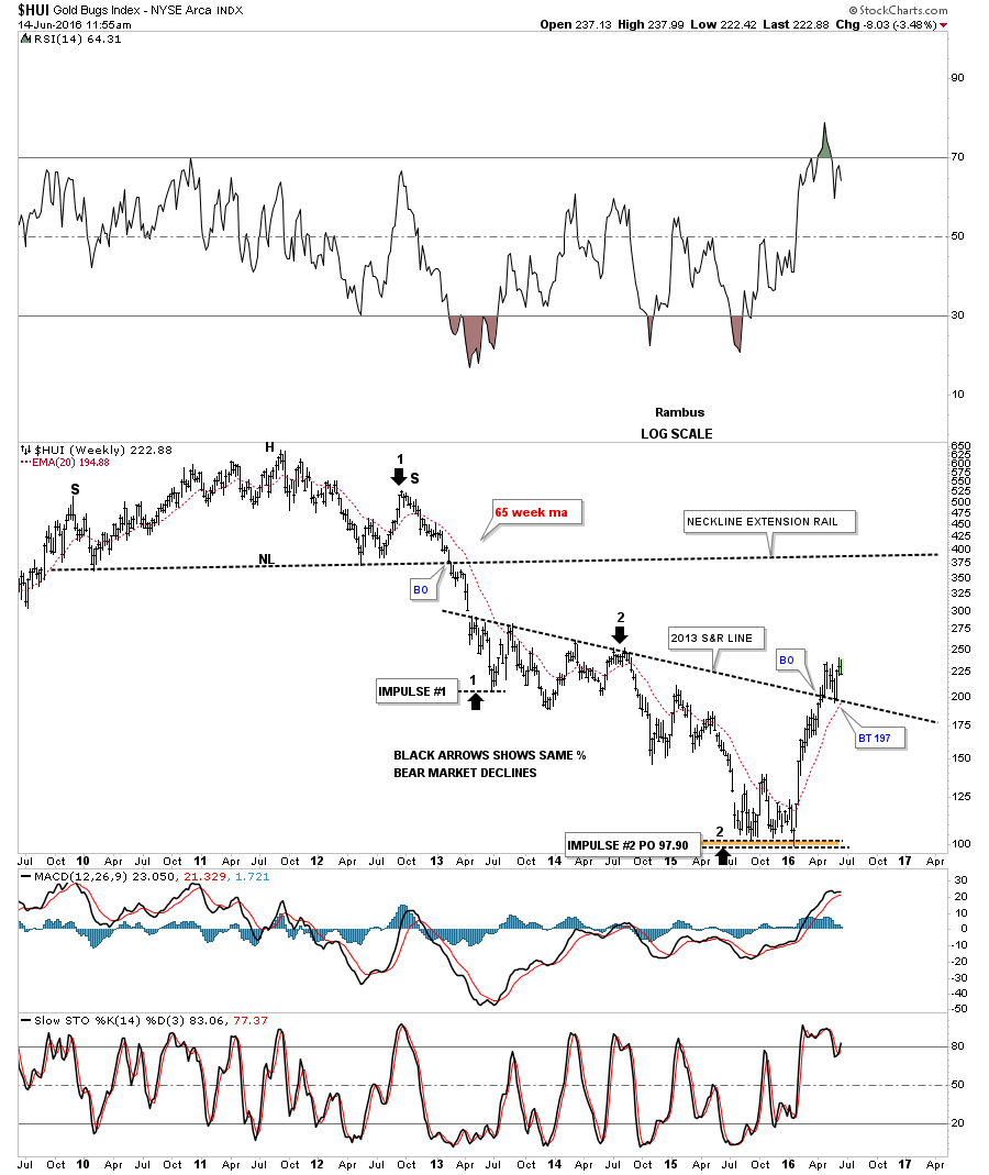
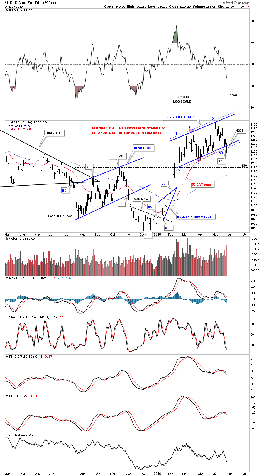
Lets get right into the charts tonight as last weeks price action showed a possible inflection point in the US dollar, precious metals complex and the stock market indices which I pointed out in the Wednesday Report I did last Tuesday. While the US dollar was strongly testing the bottom of its 14 month trading range gold had been consolidating in an almost four month rising flag formation. These two were at critical support areas on their daily charts which suggested one support area was going to hold while the other would most likely give way. As it turned out gold was the one breaking support while the US dollar, with a false breakout through the bottom of its big trading range, reversed direction and rallied strongly telling us the false breakout was indeed a bear trap.

I know some of you are wondering, how could I change my mind so fast. Inflection points are just that which is a place on a chart where the price action can break either way signaling a continuation of the prior move or a reversal. Up until the inflection point  shows its hand the prevailing trend has to be respected which was up on gold and down for the US dollar. Once an inflection point shows its hand I’ve learned not to fight it and go with the new trend regardless of how bullish or bearish I might have been. The charts are always right but It’s the interpretation of the charts which can be hard to understand sometimes so when they change I have to change as well.

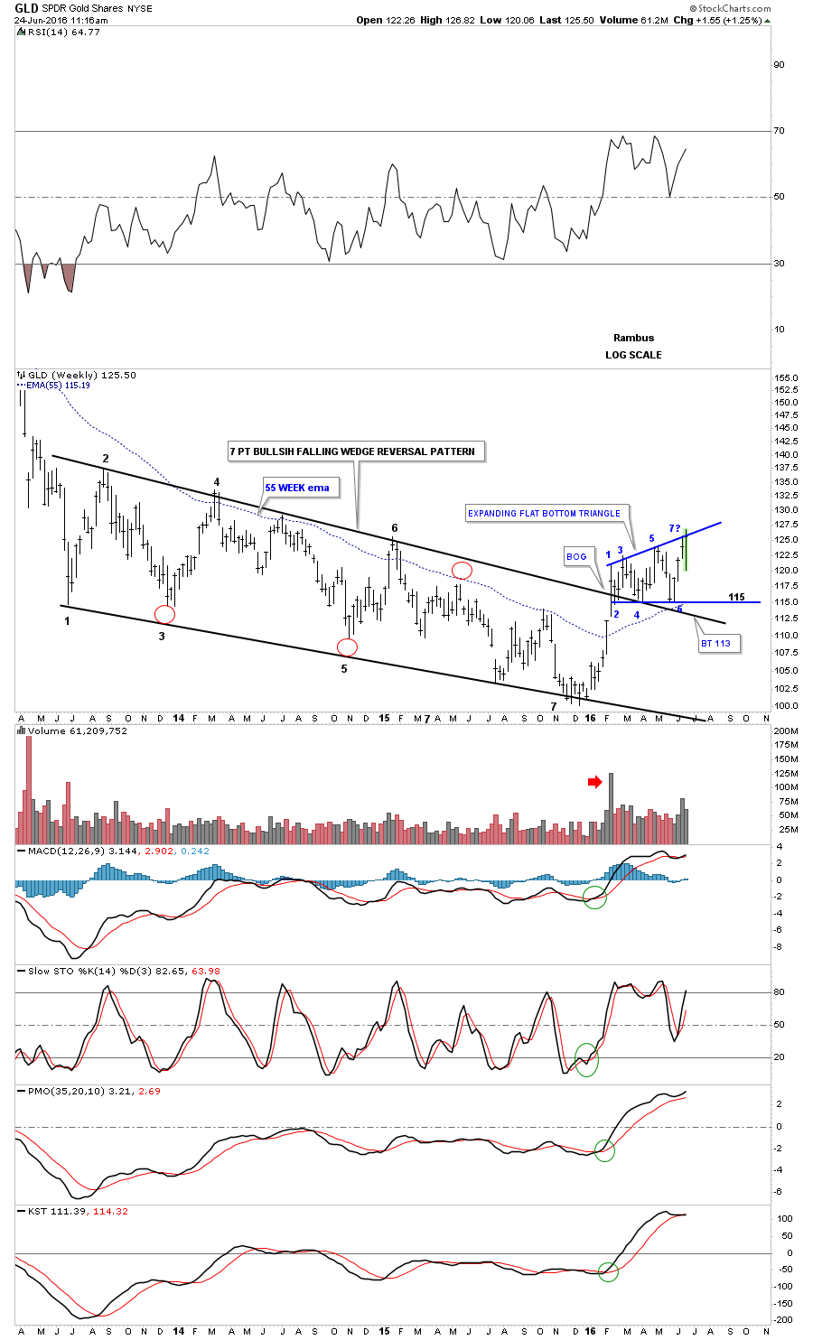
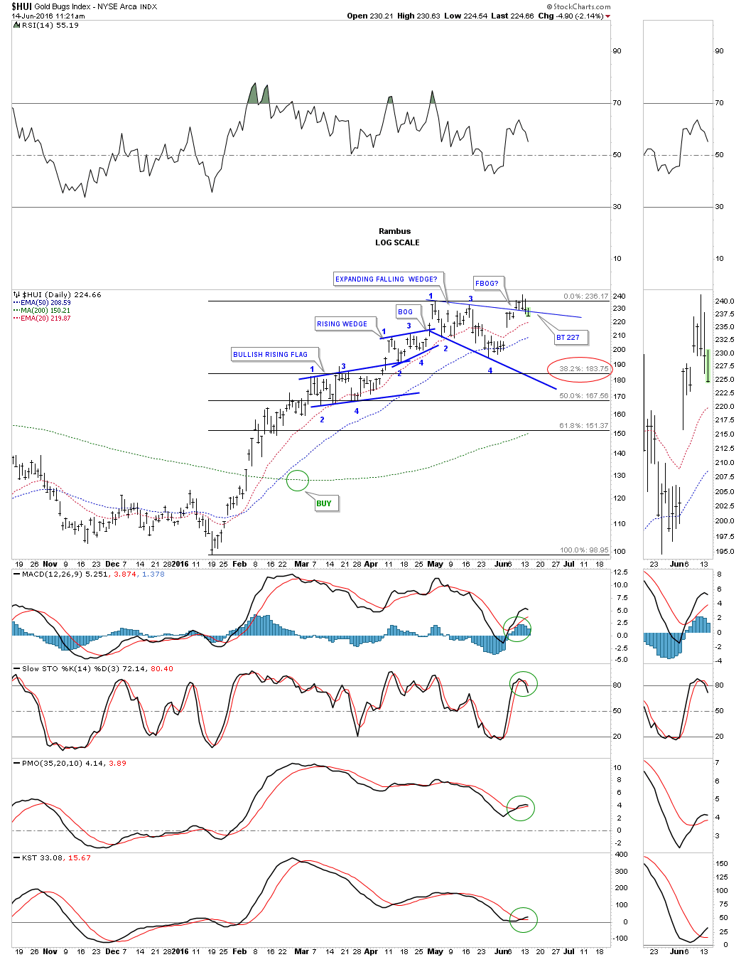
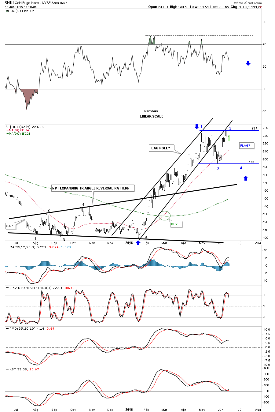
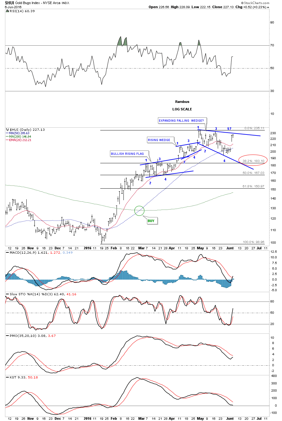
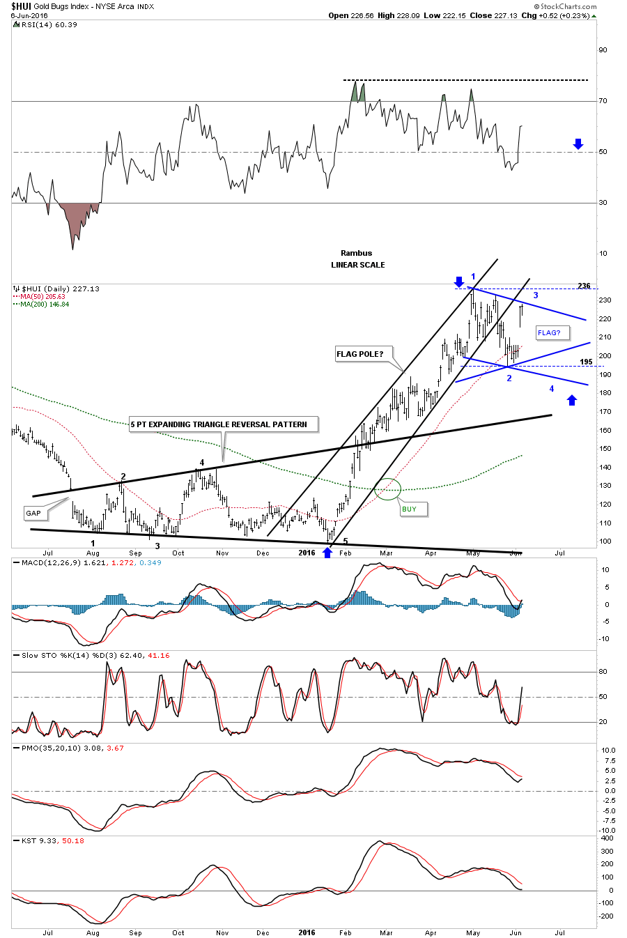
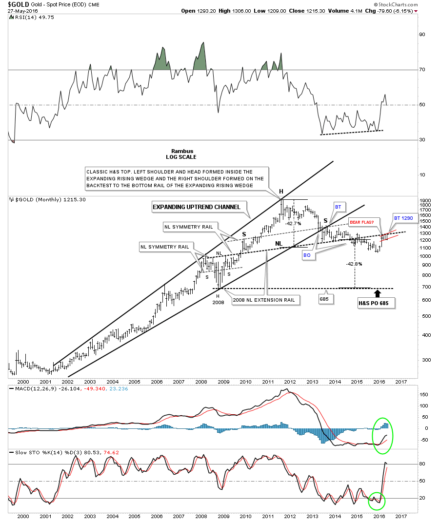
Lets start with the daily chart for gold which I’ve been showing has been building out a rising flag formation over the last four months or so. The rising flag was actually pretty symmetrical except of the small false breakouts of the top and bottom trendlines. The last time we looked at this chart I pointed out that it had completed five reversal points so far which makes it a reversal pattern to the downside. I also said that a possible sixth reversal point could form at the bottom trendline which would then put the rising flag back into the consolidation pattern camp if it could rally back up to the top rail.

A rising flag or wedge, that slopes in the same direction as the current trend, can be one of the most powerful formation in Chartology. Looking at gold’s rising flag you can see each reversal point made a higher high and higher low which is bullish. I can almost guarantee that most folks seen something different than a rising flag formation as the possible consolidation pattern or even a reversal pattern for that matter. How the price action interacts with an important trendline is very important to understand as it lets you know if the trendline is hot and to be respected.

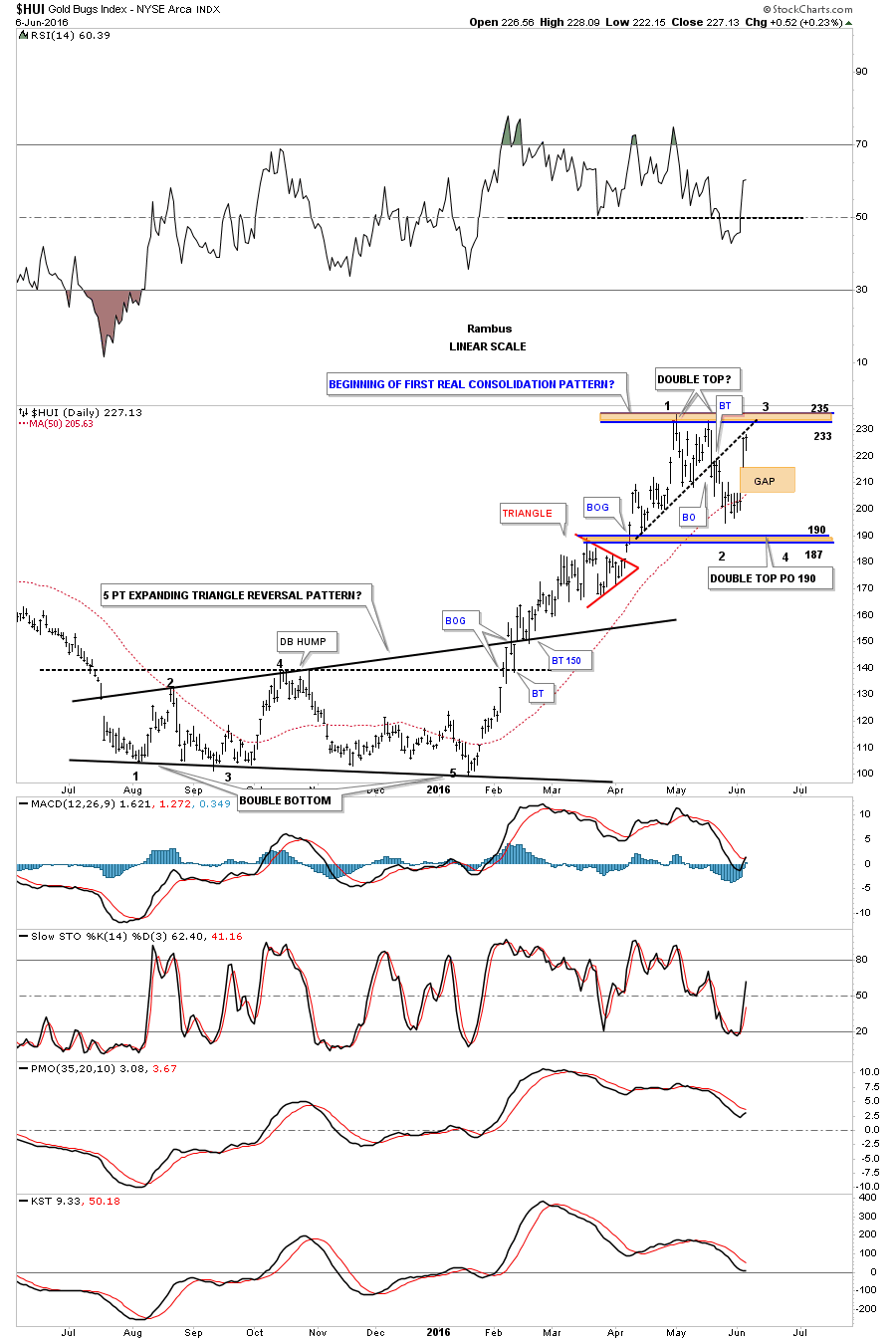
I’ve added a red circle around the breakout area through the bottom rail of the five point, now I can call it, a bearish rising flag. Note the last touch of the bottom trendline just before the breakout which shows gold got a small one day bounce which told me the bottom trendline was properly placed. That one day pop then led to the drop and breakout which occurred four trading days ago, last Tuesday with a big long daily bar. Up until that point the rising flag was still in play as a possible consolidation pattern. The breakout through the bottom rail now confirms a the rising flag as reversal pattern that has five reversal points. A backtest to the underside of the rising flag would take place around the 1250 area if we get one. Also one more important point to make on this daily chart is that gold closed below the 50 day ema which had been doing a great job of holding support during this strong move up in gold. As you can see it’s now starting to roll over to the downside. The next area of possible support will be the previous high at the 1190 area.

gold day rising flag

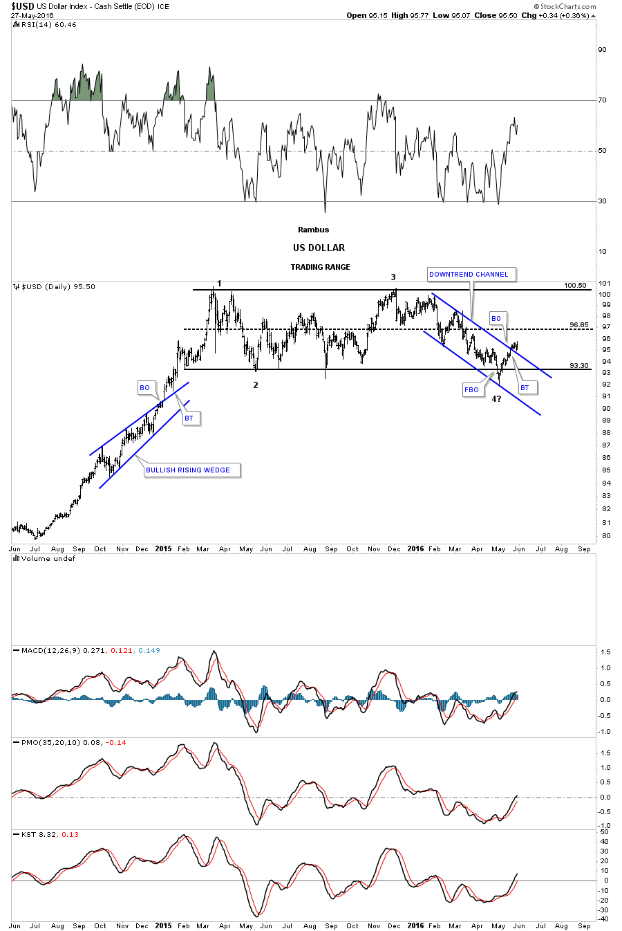
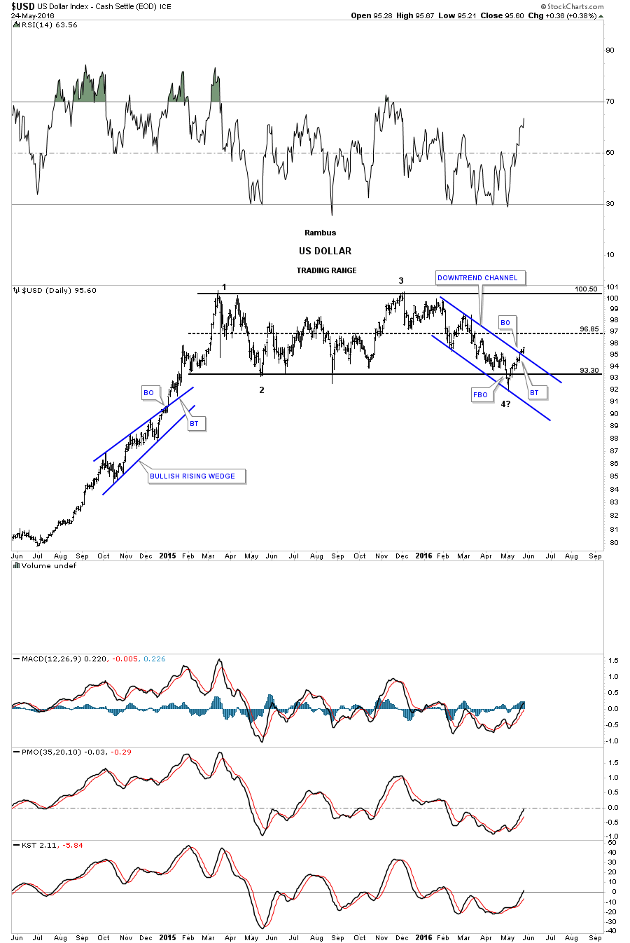
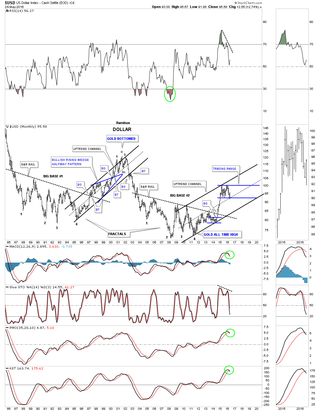
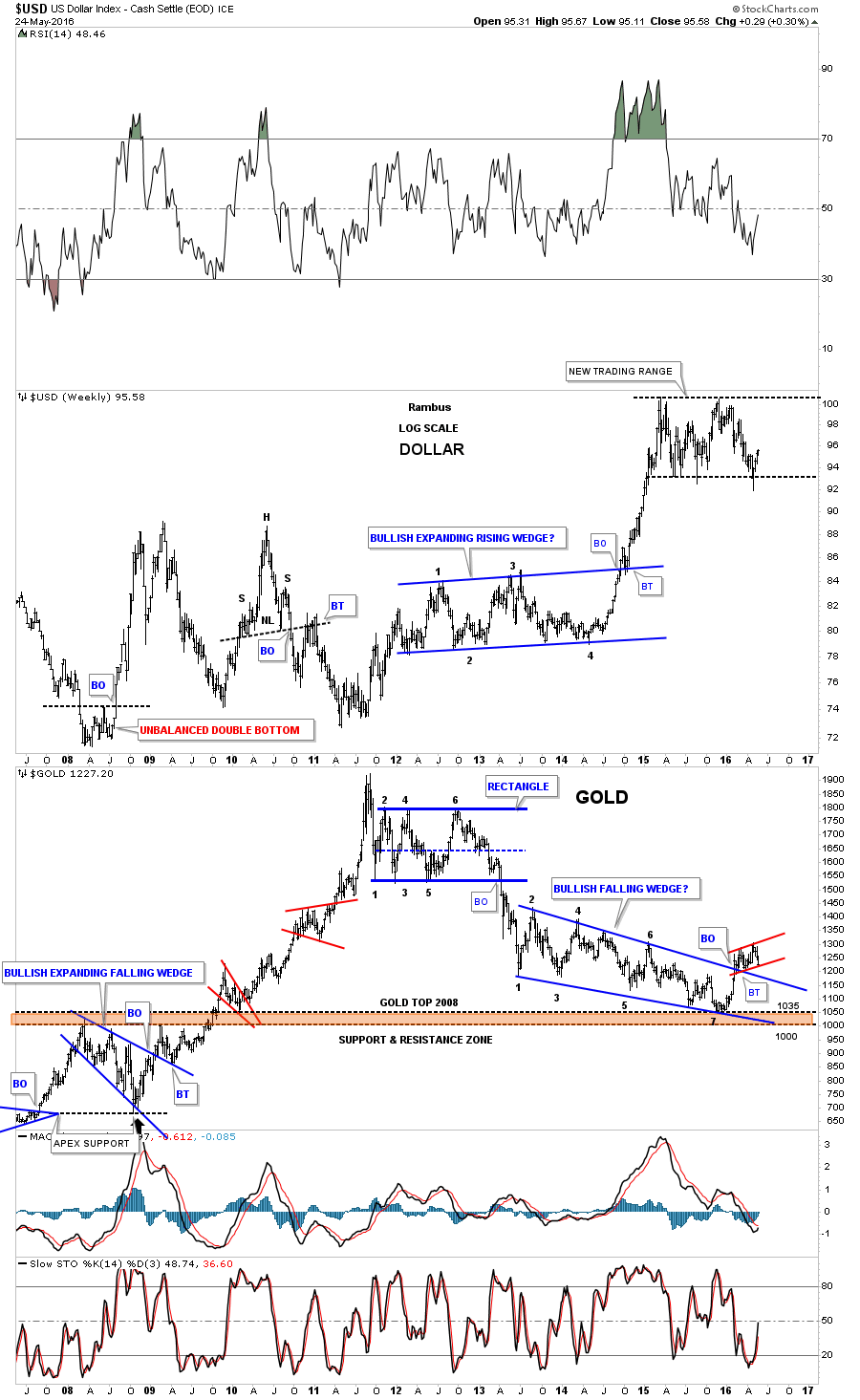
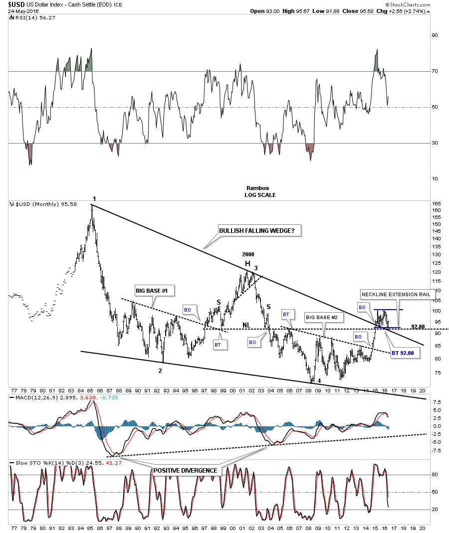
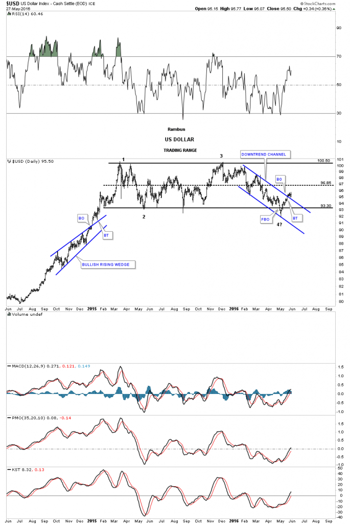
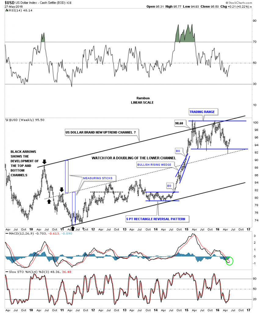
Now lets look at the daily chart for the US dollar we’ve been following which shows it had a false breakout through the bottom rail of its 14 month trading range only to close back above the bottom rail negating the breakout. The US dollar has continued to rally and broke out above its next area of resistance, the top rail of the blue downtrend channel. What is important to note here is that the US dollar hasn’t completed its fourth reversal point yet. It’s on its way but until the top rail is hit around the 100 area we can’t  confirm the 14 month trading range is in fact a rectangle consolidation pattern. This daily chart for the US dollar is another reason I decided to go to cash in the precious metals complex. Note the blue bullish rising wedge which formed roughly at the halfway point of the big impulse move up that started in the middle of 2014. That’s a similar pattern to what I had hoped gold would complete.

us dollar day one

As we know, how the US dollar generally behaves, has a direct impact on the precious metals complex and how other currencies trade has direct impact on the US dollar. Lets look at several of the more important currencies of the world and see what has been developing on their respective charts starting with the $XEU.

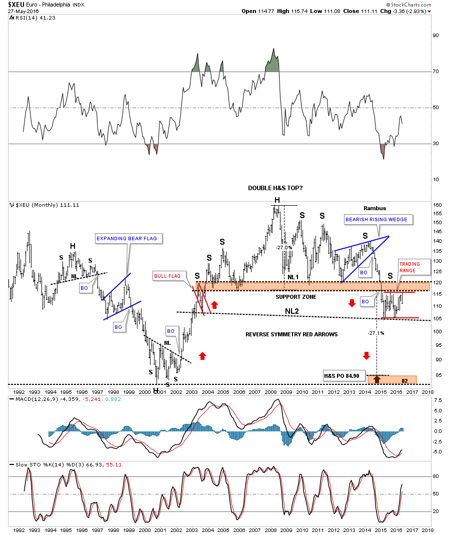
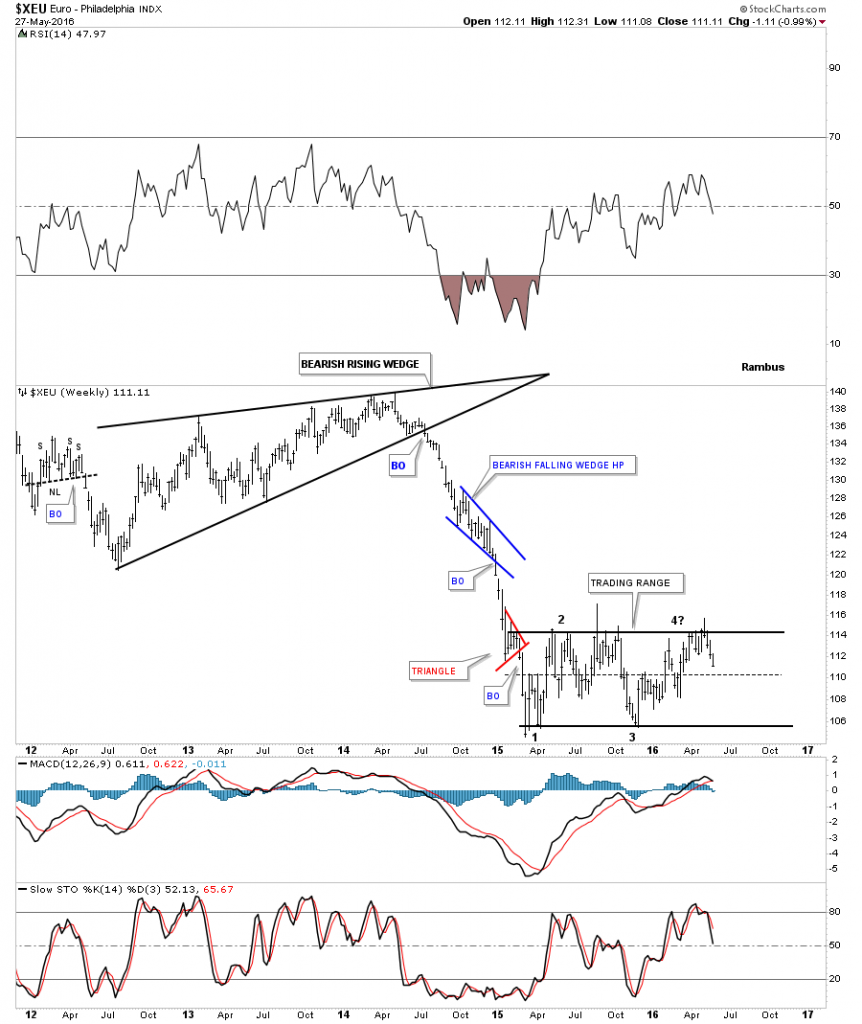
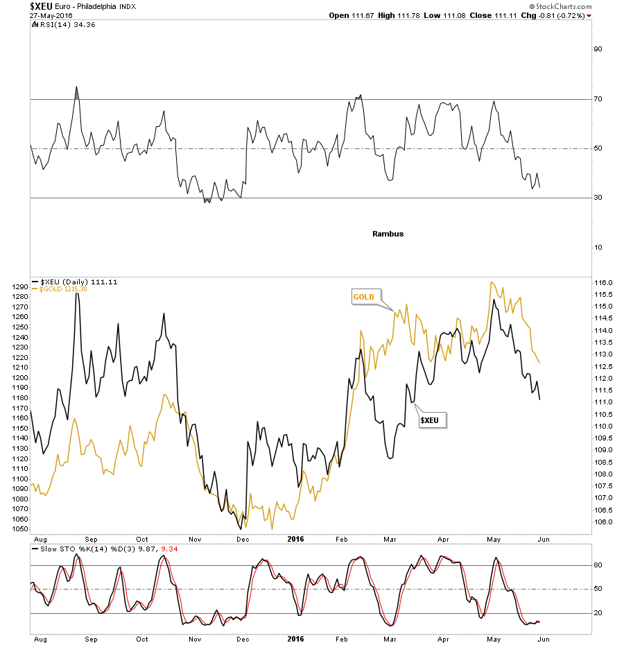
As the XEU has the biggest weighting in the US dollar index it will have the closest look to the greenback of any other currency. If the US dollar is building out a consolidation pattern the XEU will generally have an inverse looking pattern. The weekly chart below shows the XEU building out a sideways trading range similar but inversely to the US dollar. Like the US dollar, it’s working on its all important fourth reversal point to the downside which won’t become complete until the bottom trendline is hit.

xeu weely 1

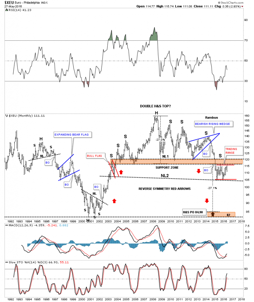
Next I would like to show you several long term monthly chart for the XEU, we’ve been following for several years, which shows two different bearish setups. This first monthly chart shows the massive double H&S top with a ping pong move taking place between neckline #1 and neckine #2 which is building out the 14 month trading range. Since the red trading range is forming in a downtrend, the odds favors the breakout will be to the downside.  The upper H&S top has a price objective down to the 84.90 area which is close to it previous major low which formed the inverse H&S bottom back in 2001.

xeu monthly 1

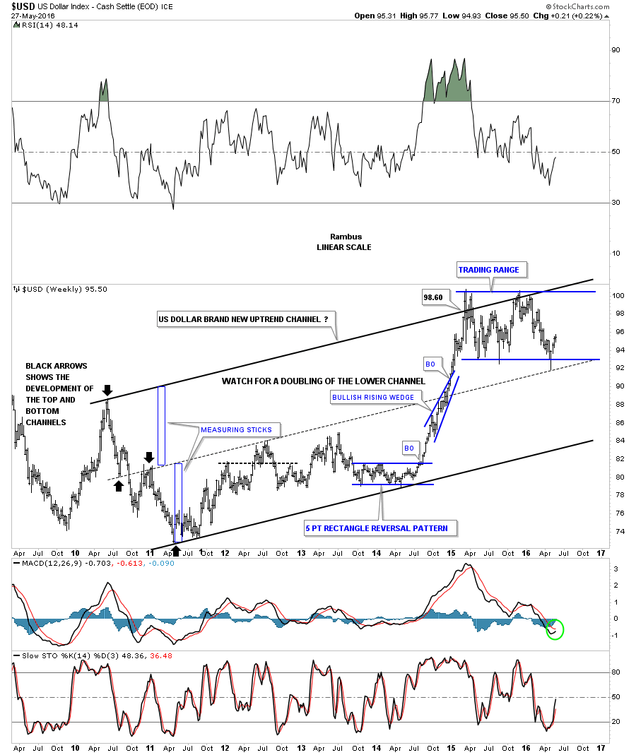
This next long term monthly chart for the XEU shows a different look but with bearish implications if the blue horizontal trading range gives way to the downside. As you can see the XEU topped out in late 2008 and has been trading in a well defined downtrend channel. If the blue trading range is going to be a halfway pattern to the downside then the current bottom rail of the downtrend channel will give way and many times a lower channel will develop of equal size to the upper channel as shown by the black rectangles labeled measuring sticks.

xeu monthly2

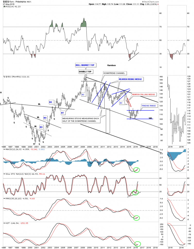
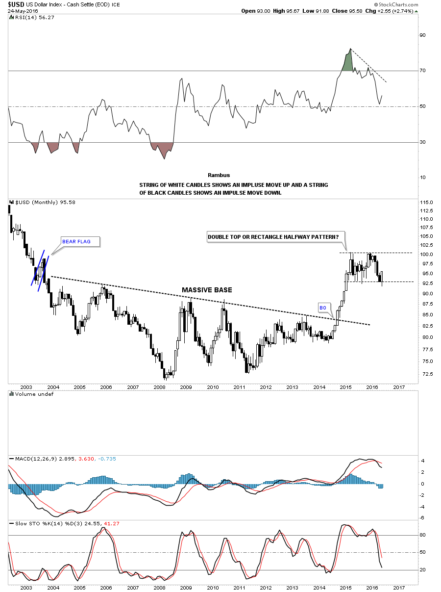
Below is an example of how a doubling of a channel can take place. Most probably won’t remember this chart for the US dollar but I showed how the lower channel may double in size when the US dollar was building out the blue bullish rising wedge right on the top rail of what was the lower uptrend channel at the time. With the blue bullish rising wedge forming where it was it became clear to me that if the rising wedge broke out to the topside there was a good chance the bottom channel would double as shown by the blue rectangle measuring sticks. The price objective for the top rail of the upper trend channel was 98.60. An interesting side note. Notice how the top rail of the original uptrend channel, blue dashed trendline, held support for the US dollar at its most recent low.

us dollar weekly double channel morph

This last chart for the XEU is a daily line chart in which I overlaid gold on top of the XEU. It’s not a perfect correlation as sometimes they can invert but on the whole if the XEU is declining or rallying so is gold. If the trading range on the XEU does indeed break down there is a good chance that gold may follow. No guarantees though just probabilities.

xeu gold overlaid

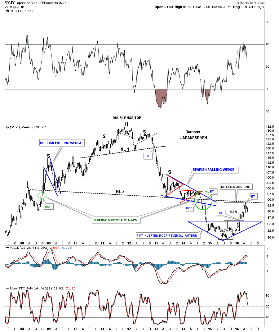
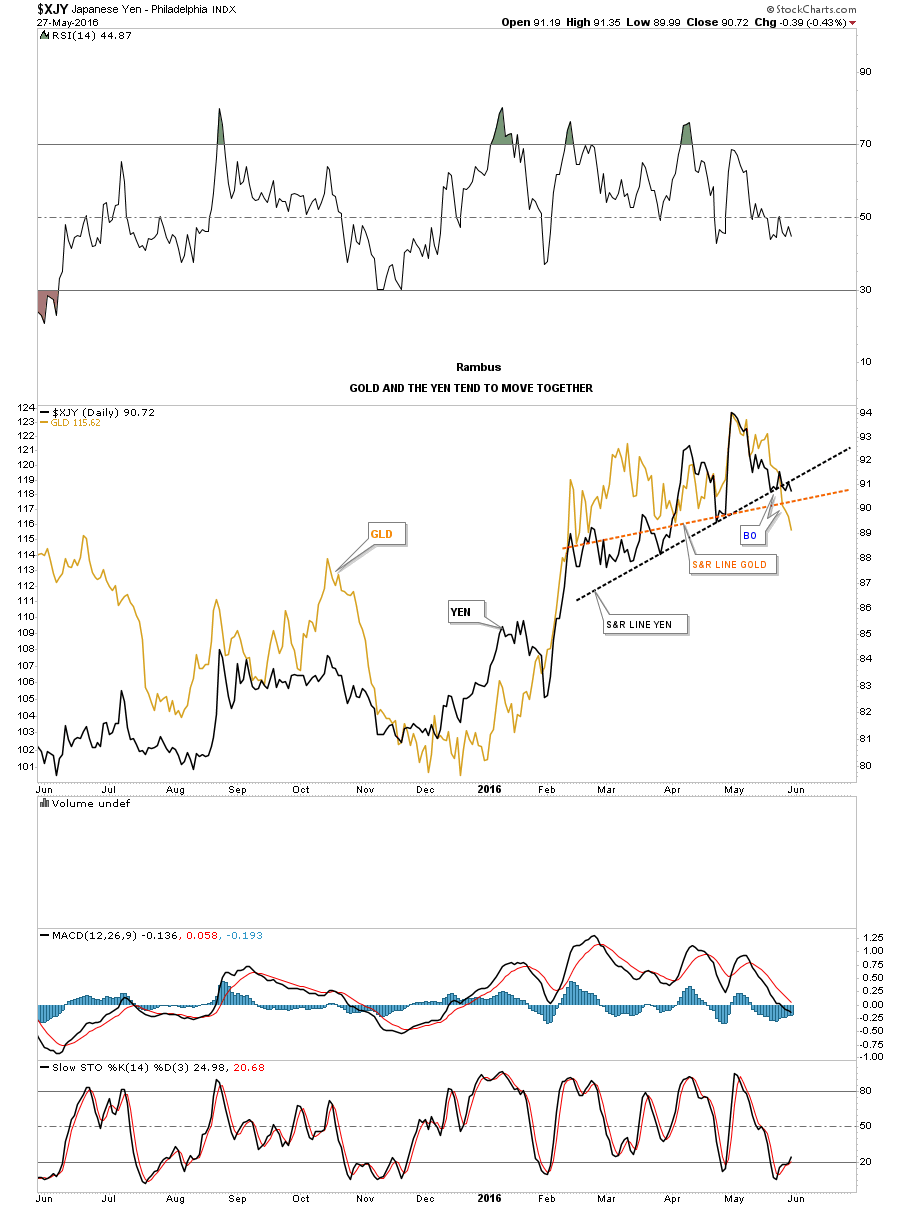
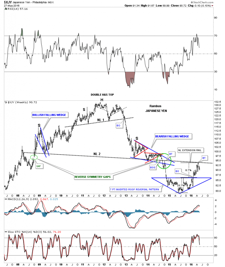
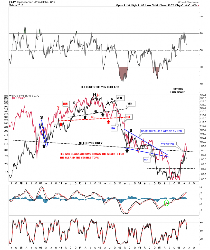
Another very important currency that can affect gold is the $XJY, Japaneses Yen. Below is another very long term weekly chart for the XJY we’ve been following for years now which shows the massive H&S top which reversed its bull market. Again, some of the longer term members may remember when the yen was interacting with the big neckline after forming the second red triangle which was building an even bigger bearish falling wedge. The two green circles shows what I called at the time, reverse symmetry gaps, one on the way up and one on the way down. The one on the way down was the breakout gap below the massive H&S top neckline.

Late last year and earlier this year the yen formed what I called a seven point inverted roof reversal pattern. Measuring the width of the inverted roof pattern gave me a percentage move at a minimum of 8.7% from the breakout point. As you can see the price objective came right in line with the big neckline which is labeled as the NECKLINE EXTENSION RAIL. So far the neckline has done its job of holding resistance which is an important line in the sand. If the yen can trade back above the big neckline that would be a bullish development but until that point is reached the neckline is resistance.

xjy massive h&s top

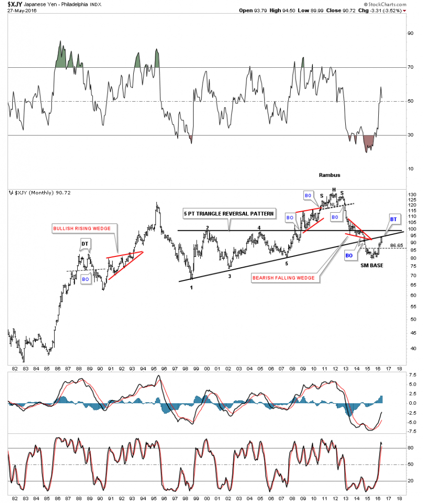
This next chart for the yen is a 35 year monthly look which has some nice Chartology on it. The main feature on this long term chart is the ten year five point triangle reversal pattern. Since the triangle formed below the previous high it had to have an odd number of reversal points to reverse the downtrend at the time. Over that long term time span the yen built out two red bullish rising wedges and one red bearish falling wedge. The very top of that bull market was marked by the multi year H&S top. Note the backtest to the bottom rail of the five point triangle reversal pattern that occurred last month.

yen monthly long term 5 point

Below is a daily line chart in which I overlaid gold on top of the $XJY. Again, it’s not a perfect correlation but close enough that one needs to pay attention. I’ve added two support and resistance lines. The brown one shows gold breaking below its S&R line and the black one which shows the $XJY breaking below its S&R line.

yen and gold overlaid

This next chart is a long term weekly chart in which I overlaid the $XJY on top of the HUI so you can see how these two tend to preform together. This chart looks a little busy but the HUI is in red and the XJY is in black and shows how they both built out massive H&S tops to reverse their bull markets back in 2011.

hui and yed overlaid

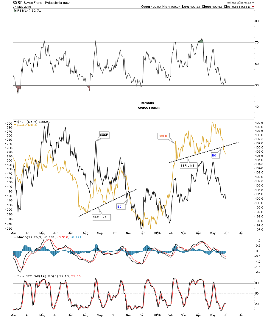
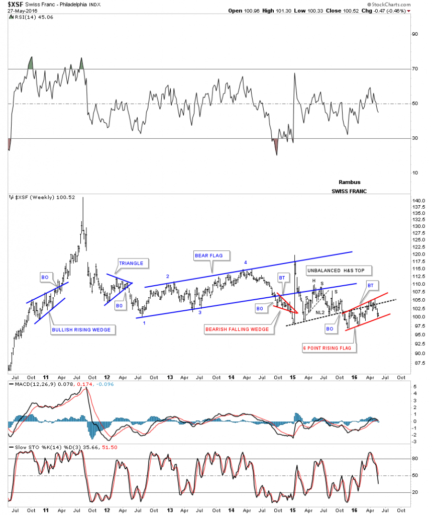
This next currency I would like to show you is the $XSF, Swiss Franc, which has been doing a laborious backtest to the neckline and has formed a red six point rising flag. A break below the bottom rail will complete the consolidation pattern and will usher in the next move lower if the breakout takes place.

XSF WEEKLY

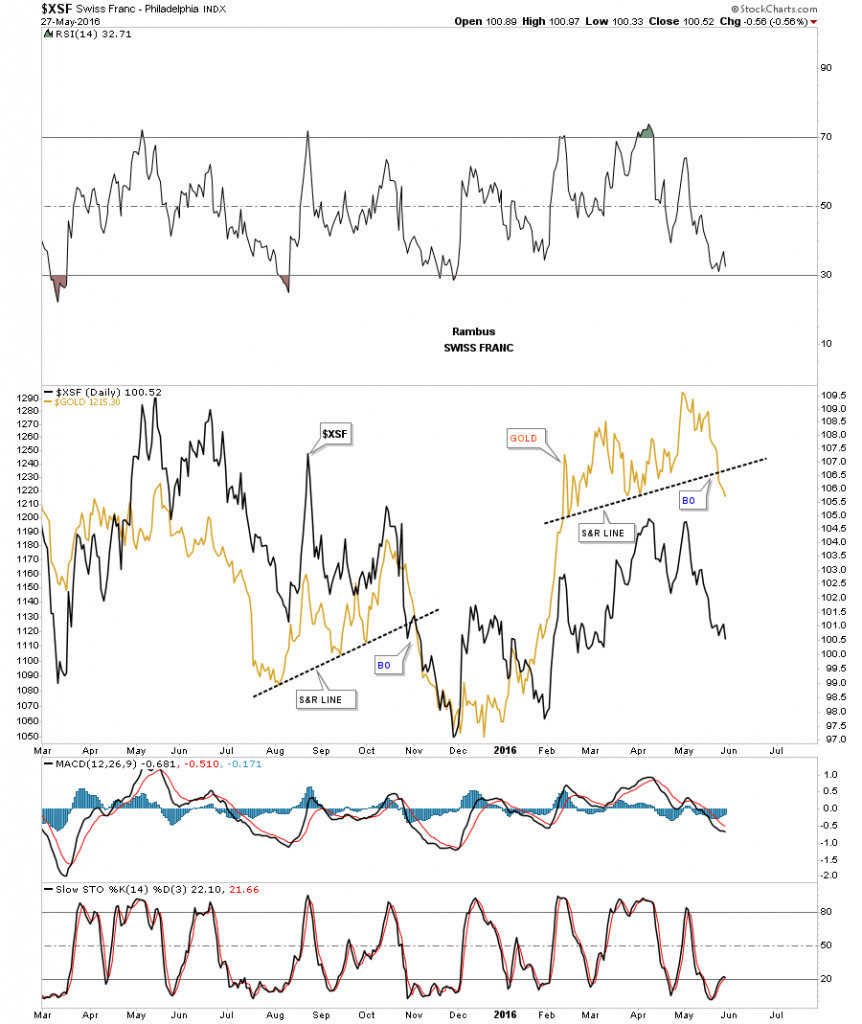
Below is a daily line chart in which I overlaid gold on top of the Swiss Franc which shows a similar correlation to the other currencies we looked at. What got my attention last week was when gold, on the daily line chart, broke below its support and resistance line while the XSF declined in a similar fashion.

xsf gold overlaid on day

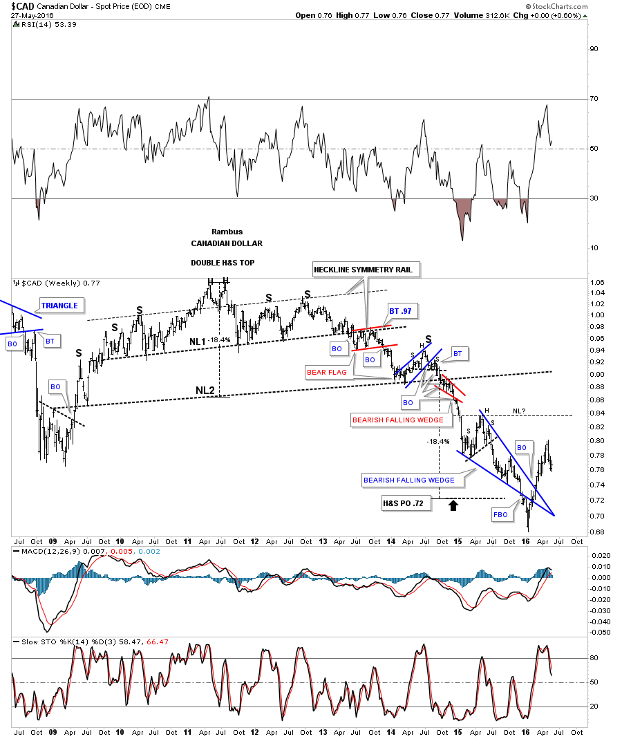
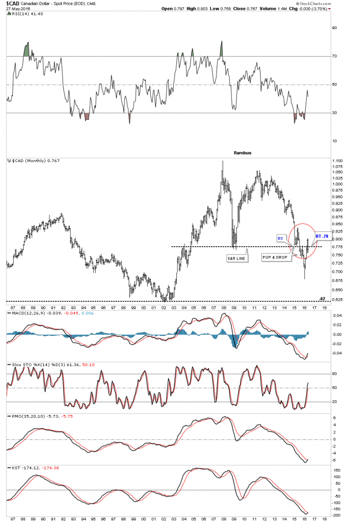
The weekly chart for the CAD, Canadian Dollar, shows its massive H&S top which reached its price objective down at the .72 area. The CAD threw me a curve ball as it initially broke below the bottom rail of its blue bearish falling wedge only to reverse direction with a strong rally. Since the price objective has been hit it’s now time to see what develops as far as a reversal pattern or another consolidation pattern.

cad massive h&s top

The Canadian Dollar has been one of the stronger currencies since the January low. Initially it bounced off the multi year support and resistance line as the pop and then the drop through that very important trendline with a clean backtest about four months later. It then, what looked like the start of its next impulse move down, failed to deliver. The CAD bottomed about the same time as gold in January of this year and had a very strong rally that took the price action back above that mulit year S&R line which looked like it was failing. As you can see the CAD is now trading back below that very important horizontal S&R line which is negating the previous months move. Again we have a very important line in the sand to keep a close eye on.

cad monthly

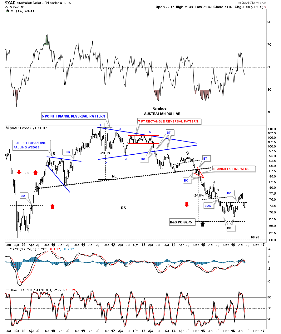
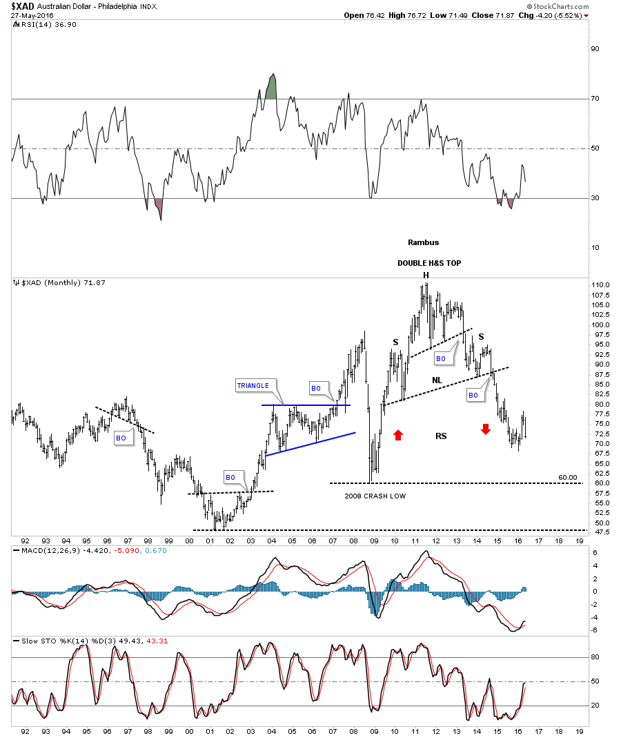
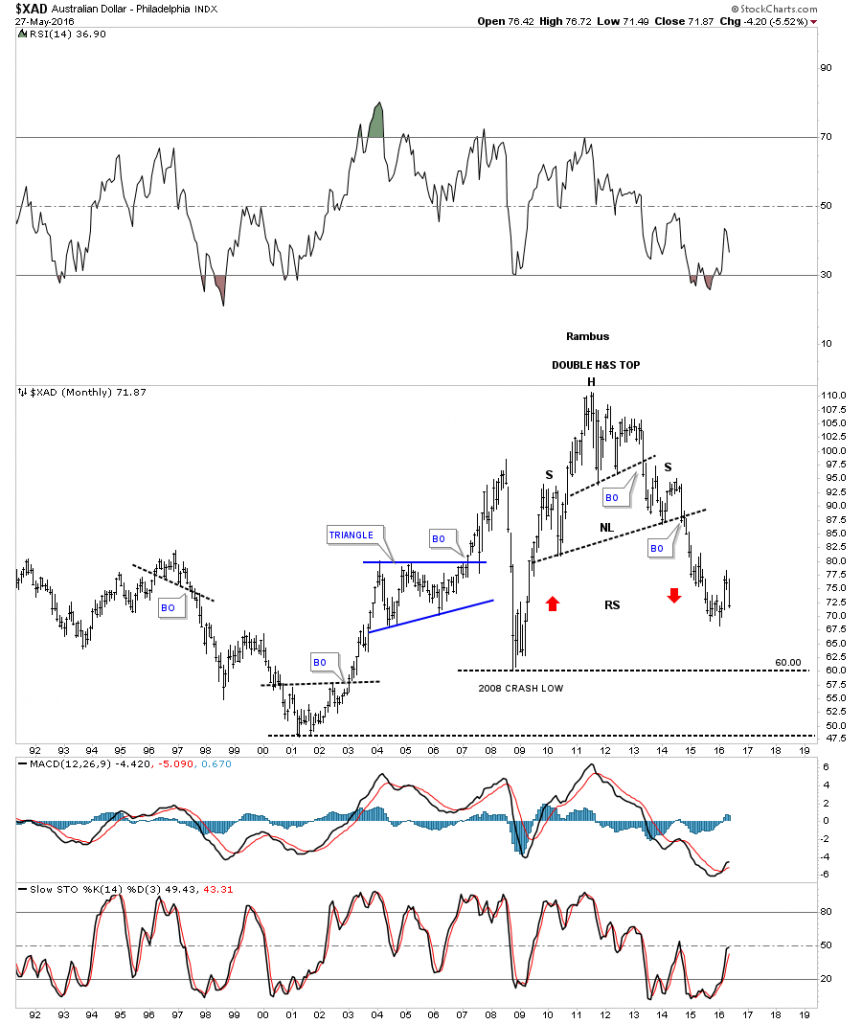
The long term look for the $XAD, Australian Dollar, shows it too completed its massive H&S top price objective down to the 66.75 area. It then formed what looked like a double bottom and broke out above the double bottom trendline only to decline once more below that small but important line in the sand. So now we wait and watch to see what develops.

xad weekly

The very long term monthly chart for the XAD shows its massive H&S top and a series of lower highs and lower lows.

xad monthly

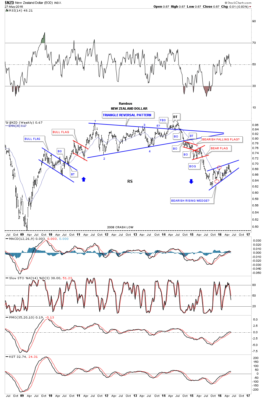
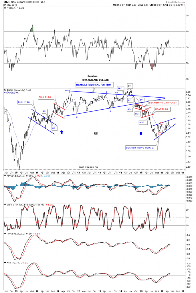
Lets look at one last currency which is the $NZD, New Zealand Dollar. This long term weekly chart shows it has been building out a blue rising wedge and if broken to the downside will create a bearish rising wedge which may bring the 2008 crash low back into the picture.

NZD WEEKLY

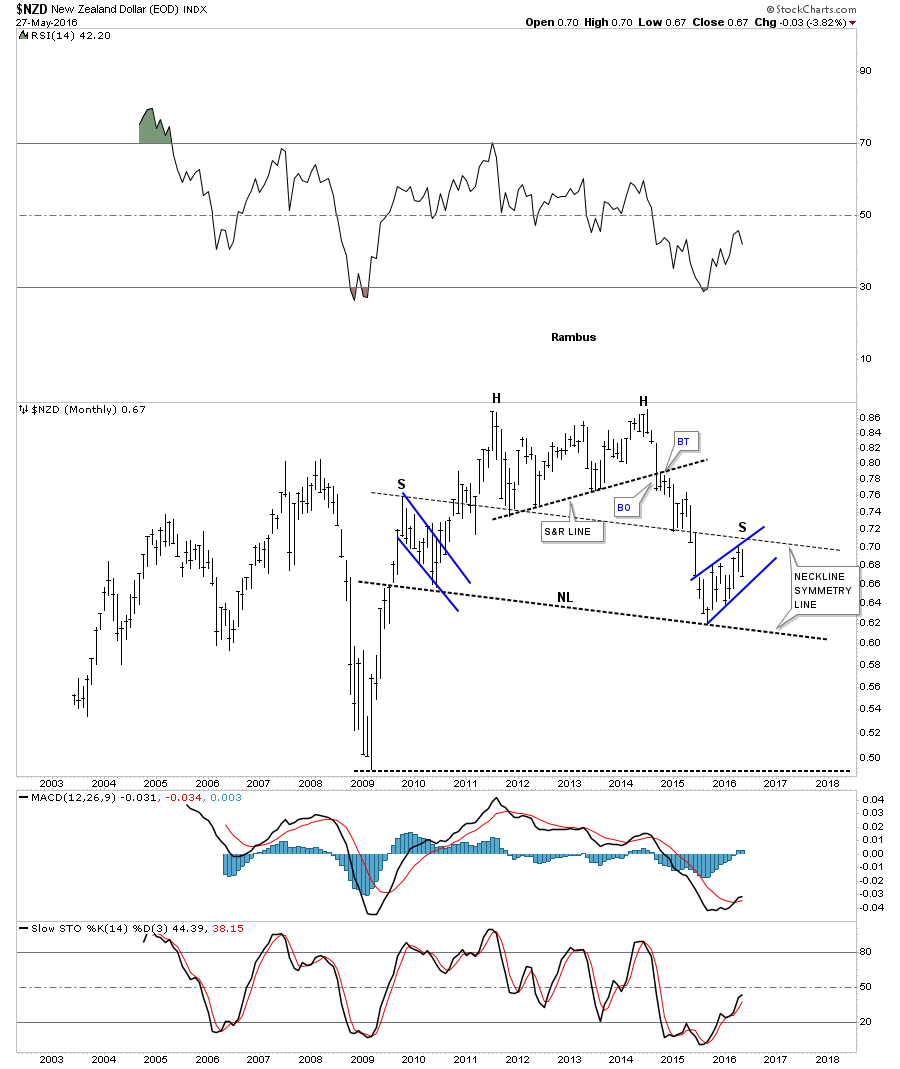
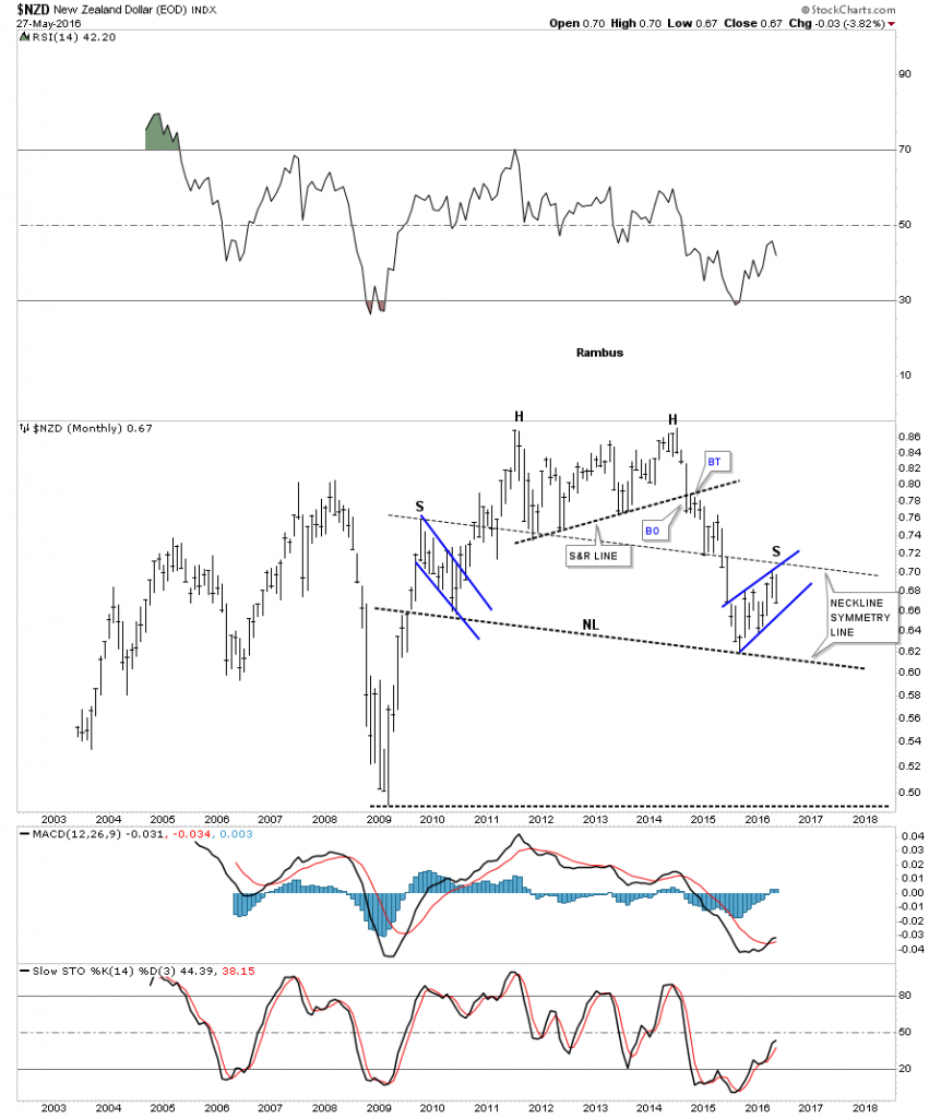
The monthly chart for the NZD shows some nice symmetry taking place which is forming a possible big H&S top. The head is a double top with the left shoulder forming a bull flag while the right shoulder may be forming a bearish rising wedge. Note how the neckline symmetry line came pretty close to showing us the height of the right shoulder. As this is a monthly chart there is still a lot of work to be done yet but the basic H&S top is beginning to show itself. One to keep a close eye on.

NZD MONTHLY

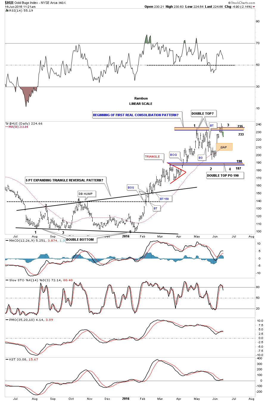
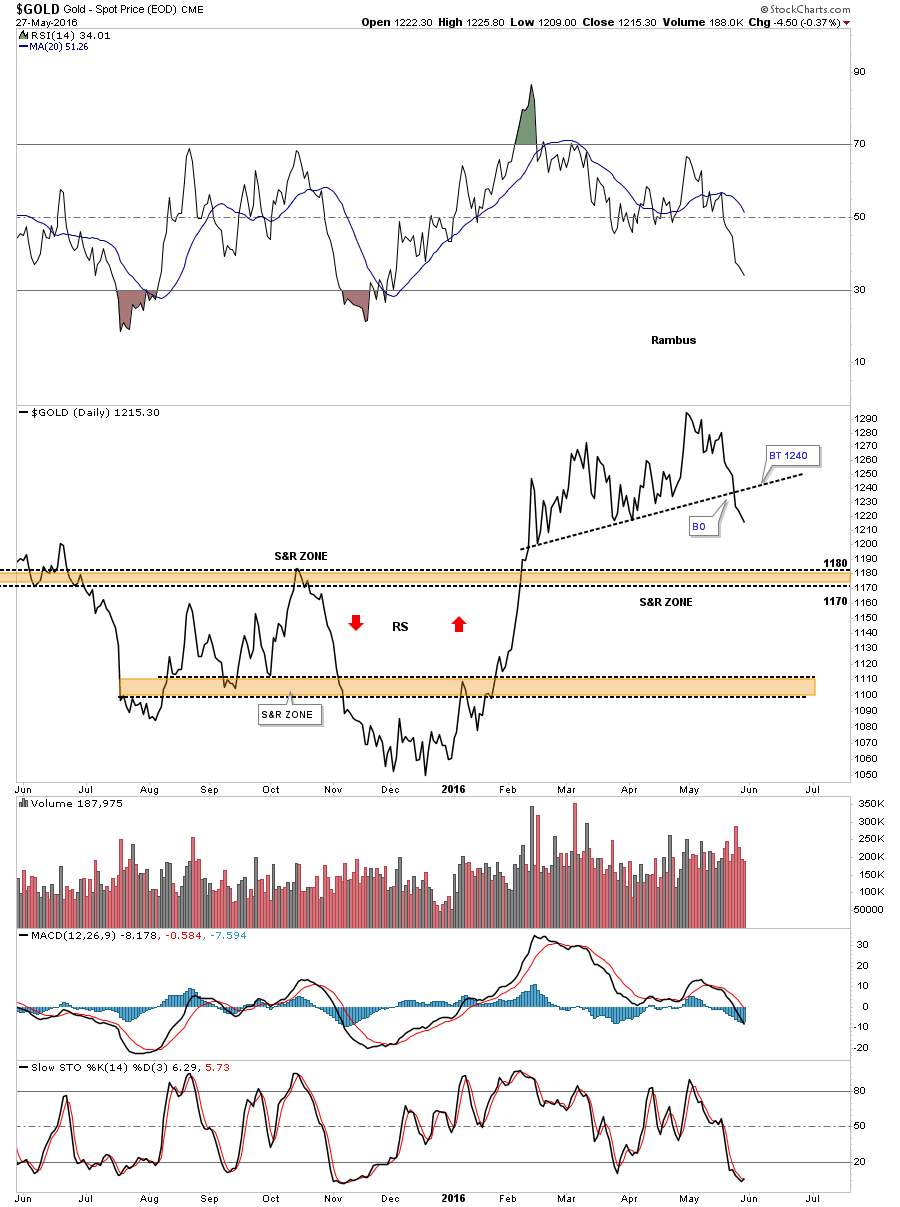
The first chart I posted tonight was a daily bar chart for gold which showed it breaking down form the five point bearish rising flag formation. Below is a daily line chart which shows a clearer picture of the bottom of the four month trading range. Until gold broke below that bottom rail it was still all systems go. Now we have a broken S&R line in place which is not what you want to see happen in a strong move up. The S&R line is now our line in the sand, below is bearish and above is bullish. It’s possible we could see a bigger consolidation pattern start building out once we see what happens at the brown shaded support and resistance zone between 1170 and 1180. If that area gives way we’ll have a bigger correction on our hands to deal with.

GOLD DAILY LINE CHART

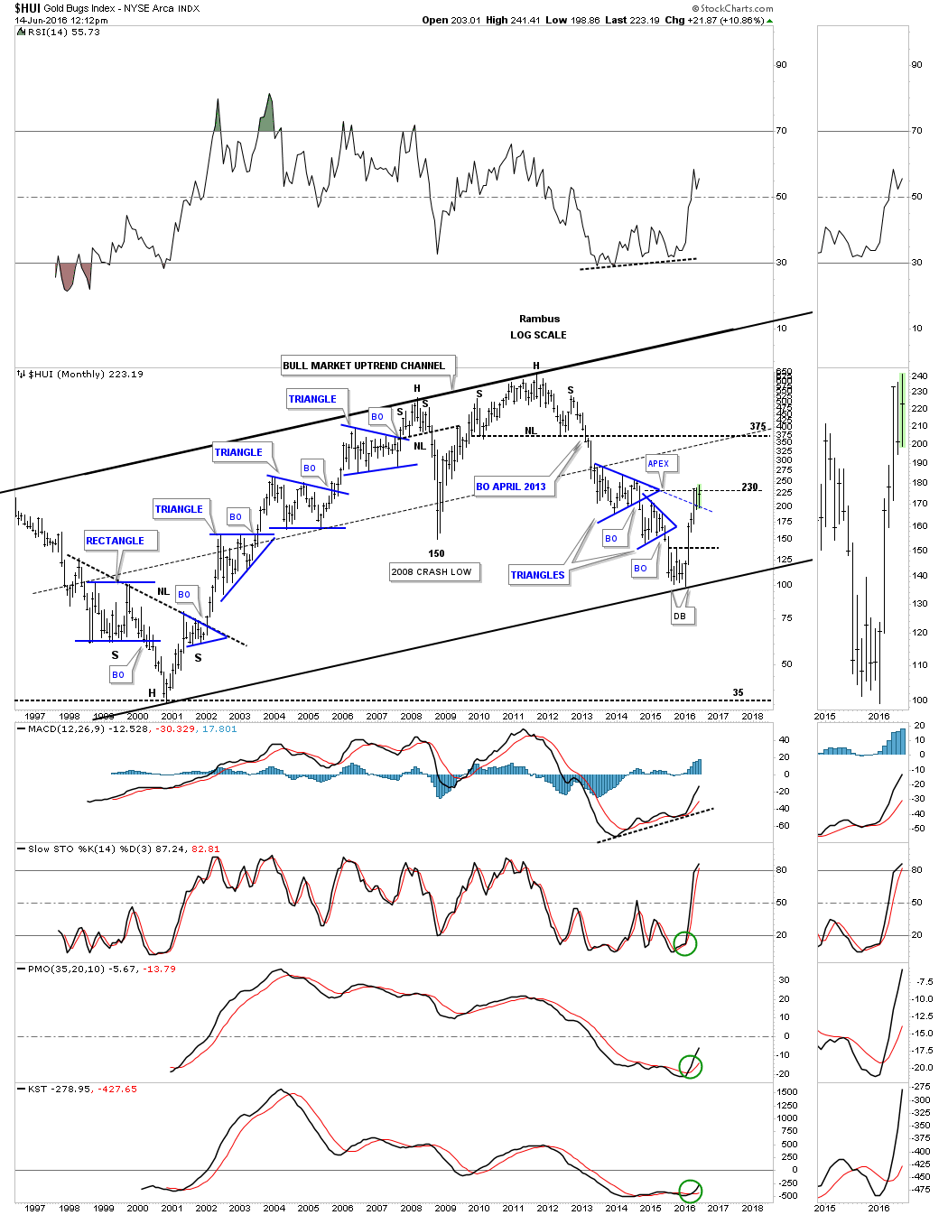
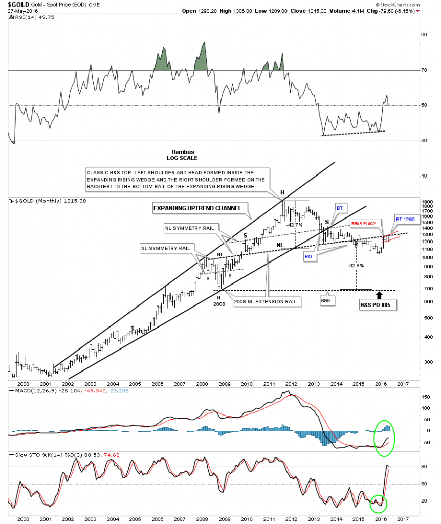
It’s been about six months since I last posted this long term monthly chart for gold which we followed since I first built it back in 2013. This chart is based on the H&S consolidation pattern neckline which formed at the 2008 crash low. After the major top was put in in 2011 I extended the neckline to the far right hand side of the chart labeled, neckline extension rail. Even tho I’ve been bullish on the PM complex since February of this year, this chart always caught my attention when I would go through all my gold charts. As hard as gold tried it couldn’t break out above the neckline extension rail and ended up forming the five point bearish rising flag instead on the daily chart. Is gold throwing us a massive curve ball completing the second back test to the massive H&S neckline? Is the capitulation move I was looking for finally going to take place? I’ve shown the price objective down to the 685 area as measured by the potential H&S top. Again we have a very clear line in the sand at the 1300 area, below is bearish and above is bullish.

With the way many of the more important currencies of the world are trading I can’t rule out a strong move down for the PM complex. It’s the charts that are speaking and not my opinion because if it was up to me I would much rather see a bull market to trade than a bear market. We have our lines in the sand which should keep us on the right side of the PM complex going forward. When the lines change so do I. There are still some important trendlines that have been offering support that I’ll be watching very closely for more clues. Have a great Memorial Day and all the best…Rambus

aaaaa

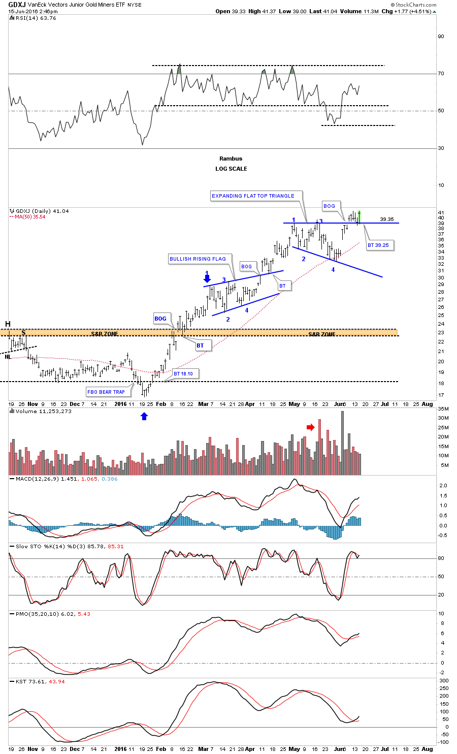
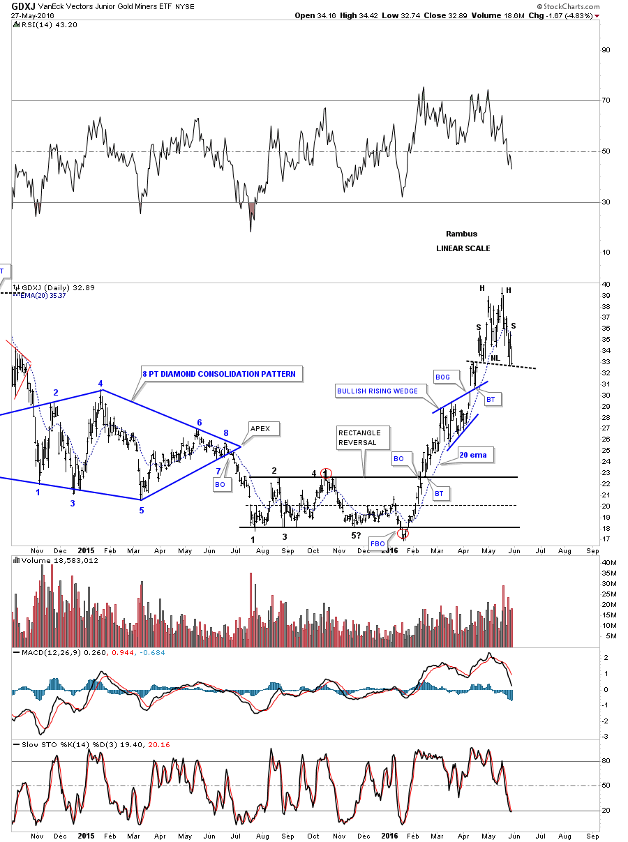
PS: Below is a daily chart for the GDXJ which shows it closed right on its possible neckline last Friday after putting in a small double top.

GDXJ DAY


Wednesday Report…US Dollar , Back From the Grave ?

We’ll be leaving for home sometime tomorrow afternoon so I won’t be able to do a Wednesday Report. By the movements in the markets, today is actually a better day to do a Wednesday Report.

There are several times a year when the markets gives you an important inflection point.  Today I believe we just witnessed one in regards to the PM complex, the US dollar and the stock markets. Even though the US dollar didn’t have an extremely big up day it did show its hand by breaking out of a downtrend channel while the PM complex had a tougher day breaking down from a small topping pattern we looked at earlier today. Also the stock markets had a very good day to the upside with some completing small double bottoms or falling wedges.

As the US dollar is the key driver going forward lets take a look some charts which are showing it has likely bottomed and is reversing back up. Below is a daily chart which shows the one plus year trading range. We’ve discussed in the past that a false breakout, of an important trendline, can lead to a big move in the opposite direction. Remember the false breakout the HUI and other precious metals stocks had back in January of this year that led to this massive rally we’ve enjoyed up until today? I believe we are seeing the same thing taking place on the US dollar right now. One has to respect the breakout but when the price action trades back above the breakout point the breakout in negated.

This daily chart also shows another reason why I believe the US dollar has bottomed. It just recently broke out above the top rail of its blue downtrend channel and looks like it had a short and sweet backtest. As I explained earlier today on the possible consolidation pattern that maybe forming on the HUI, there has to be four completed reversal points, at a minimum, before we can conclude we have a consolidation pattern. As you can see on the US dollar chart below it has completed three reversal points so far with the possible fourth reversal point just beginning. The fourth reversal point won’t be complete until the price action reaches the top of the trading range, around the 100 area.

us dollar day 1

This next chart puts the one plus year trading range for the US dollar in perspective. There were nine white candlesticks that formed the massive impulse move up when the US dollar finally broke out above the massive bases. We still have a few more days to trade  for the month of May but it looks like the US dollar will most likely form a white candlestick. In and of itself it’s not a big deal when a consolidation pattern is still building out but it is something to keep an eye on. Also when looking at this chart from 35,000 feet, with the big base in place and the current trading range building out, we have to respect the potential outcome when all is said and done. The potential outcome could still be a double top if the price action begins to fail fairly soon but when I look at the massive base it looks like a  consolidation pattern seems like the probable outcome. Keep in mind we could see several more reversal points build out before the possible consolidation pattern is completed.

US DOLLAR HLAFWAY PATTERN

Below is a 35 year chart for the US dollar showing the two fractal bases labeled BIG BASE #1 and BIG BASE #2. Back in the mid to late 1990’s the US dollar built out a big blue bullish rising wedge as a halfway pattern that took roughly three years to complete. That major uptrend finished off with a H&S top which was the beginning of the bull market in the precious metals complex. As you can see our current uptrend channel is less steep than the 1990’s which could take several more years to build out. The big question for me is how well will the PM complex do during this consolidation phase in the US dollar? We will most likely get our answer if or when the US dollar trades back up to the top of its trading range. In the meantime as the US dollar consolidates so should the PM complex as both are reversing direction right now.

us dollar big base 2

This next chart is a weekly combo chart with the US dollar on top and gold on the bottom. As the US dollar has been consolidating sideways gold put in a nice low right on top of the 2008 highs at the 1035 area, brown shaded support and resistance zone. You can see gold’s red rising flag that we’ve been following on the daily chart that has formed above the top rail of the multi year falling wedge. Both the US dollar and gold are at critical inflection points right now.

gold us dollar combo

Below is the daily chart for gold we’ve been following which shows the rising flag that had created five reversal points. The breakout below the bottom rail is the main reason I exited half of the mining shares today. Gold still had a chance to bounce off of the bottom rail to start the possible sixth reversal point to the upside but that was not the case. With five reversal points in place gold now has a five point reversal pattern which is a bearish rising flag. Gold also closed below the 50 day ema for the first time since this impulse move up began.The next possible area of support may show up at the previous high at the 1190 area. The bottom line is we now have a reversal pattern in place which has to be respected regardless of what we may think. With the way the US dollar is looking now, there is a good chance I will exit the reaming shares tomorrow now that the dust has settled and we can see more clearly now.

I’m going to post this part of the Wednesday Report now and will do another post after while on what the stock markets are saying. I know most don’t want to trade the stock markets but while the PM complex is consolidating the stock markets may offer us a good trading opportunity for the time being.

gold day 5 pont bear flag

PS: So many charts to look at tonight I forgot to post this long term chart for the US dollar I haven’t posted in quite awhile. The US dollar is finding support on the top rail of the 30 year bullish falling wedge and the neckline extension rail taken from the previous H&S top. It’s hard to argue with what this chart is suggesting.

us dollar aaaaaaaaaaaa


HUI Update…

Below is the two hour chart for the HUI which shows the horizontal S&R zone around the 210 area which is being strongly tested this morning. If you look real close you can see a gap below the S&R zone this morning which I didn’t want to see. This is the first time since the bull market began in mid January that the price action is close to trading below a previous low.  The next area of critical support is the 182 to the 187 area.

HUI 2 HOUR

This next chart is a daily look at the HUI which shows two completed consolidation patterns with the third one testing the critical bottom rail of the flag formation. Today’s price action is trading below the 20 day ema with the 50 day simple moving average coming in at the 200 area. I’ve also added the fib retracements which shows the 38% retrace at 183 or so which is the second area of support on the 2 hour chart above.

HUI DAY 1

So far, since this bull market began in mid January of this year, we have yet to see a real consolidation pattern develop of importance form.. This daily chart below shows you where I would expect a consolidation pattern to form  based on the current information we have. In the bigger picture this would be a healthy development and not hurt the bull market in anyway.

In bigger consolidation patterns you will normally see some type of reversal pattern form at the reversal points. Sometimes they are hard to spot in real time but in hindsight they will usually show up pretty clearly. On the daily chart below  I’ve added the possible new trading range or consolidation area with what now looks like a small double top with a breakout and backtest completed. The double top measures out to the 190 area which would be an area to look for  the second reversal point to show up. Based on the lower brown shaded S&R zone, on the two hour chart above, and the fib 38% retrace down to the 183 area, should offer some solid support. For the time being I’m going to call the top in the possible new trading range or consolidation area at 235 and the bottom at 180 or so. What type of consolidation pattern that may build out is still not known yet as the HUI has just started to consolidate the first impulse move up. The consolidation pattern could be a triangle, rectangle, flag or wedge.

Bigger trading ranges like this can be traded if one doesn’t get too greedy. We should see some type of reversal pattern develop at the lower boundaries of the trading range between 180 and 190 or so.

hui trading range

Below is the daily line chart we’ve been following which shows the current S&R line being strongly tested today at the 205 area. If this area gives way then the lower S&R line at the 182 area comes into play which is also the 38% fib retrace of the bull market.

hui 38 % retrace

The weekly chart below shows the three year S&R line going back to April of 2013 which comes into play at the 205 area.

For the time being I’m going to hang on and see what happens if this possible first consolidation pattern begins to build out between 180 and 235. It will be somewhat painful but that is the nature of a consolidation pattern, to inflict as much pain as possible before the next impulse leg up can begin. Some of you who have some decent profits may want to take a few chips off the table and see if you can reenter at a lower price. Normally though it seems like one always pays a higher price up to get back in again.

If this is really the beginning of a bigger consolidation pattern the volatility will be very strong in both directions until the pattern is complete. Also keep in mind in a trading range we’ll have to see a minimum of four reversal points so even if we see a reversal down at the 180 area we’ll have to see another rally followed by one more decline to complete the minimum requirements of a consolidation or continuation pattern.

hui weekly