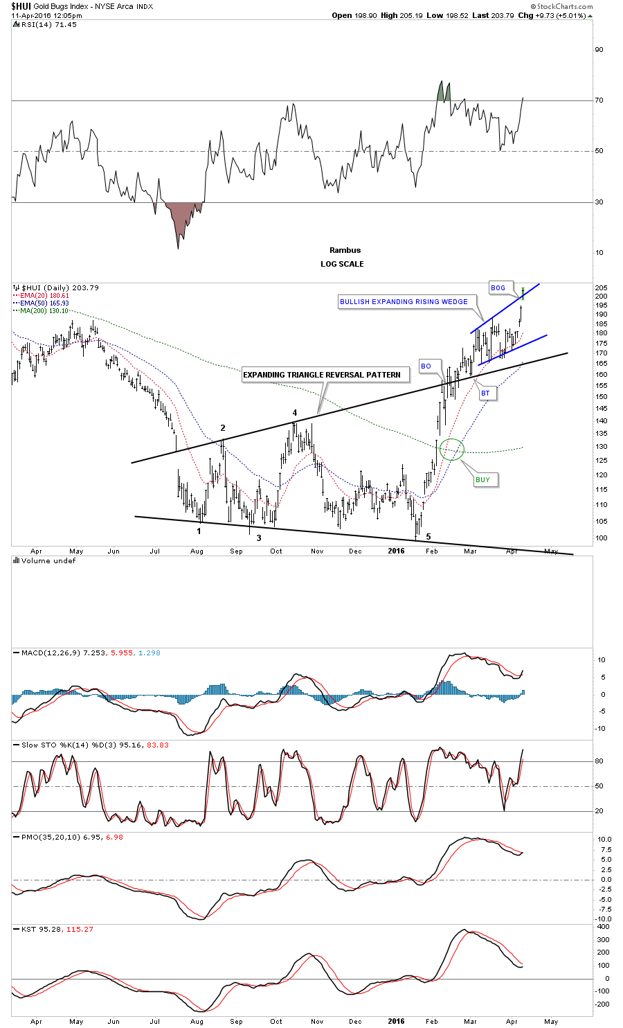
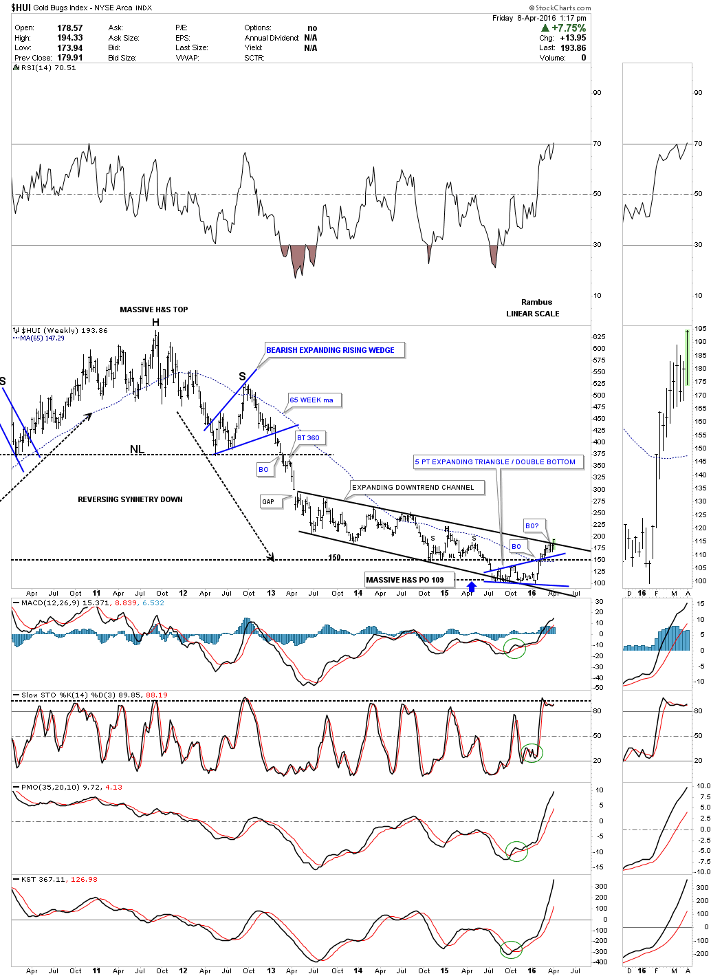
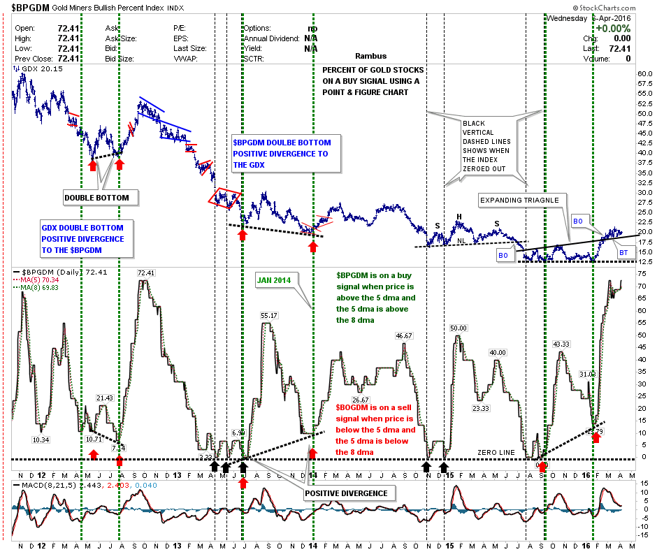
In mid January of this year it looked as if another leg down was in store for the precious metals complex. Most of the precious metals stock indexes broke down to a new bear market low which I was expecting, as I was looking for that one last capitulation move to shake out the last of the bulls. There was a pretty symmetrical H&S consolidation pattern that had developed at the lows going back to August of last year. The setup looked perfect for one last move down to end the bear market but that didn’t happen. Instead we got a two day shakeout below the previous low which ended exactly three months ago today.
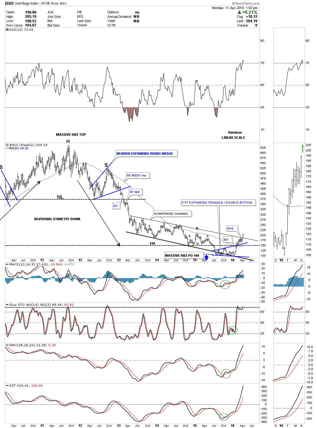
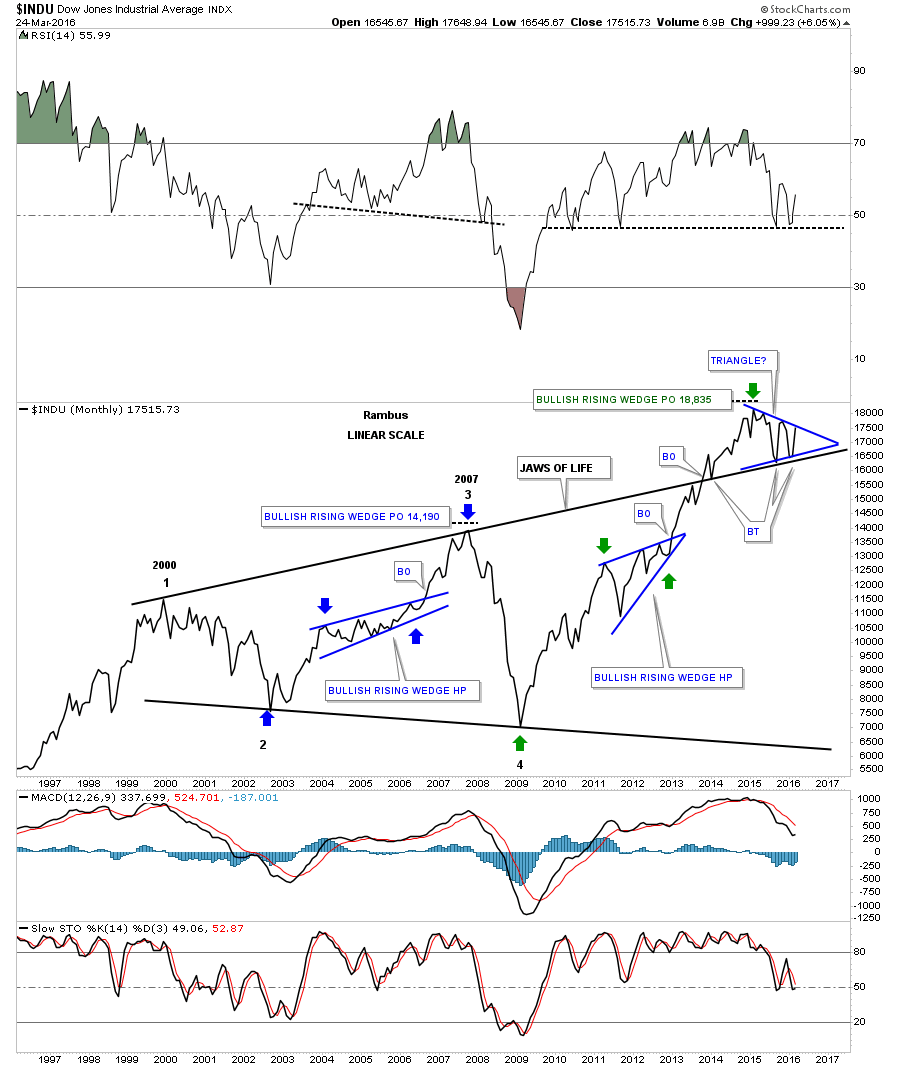
I have been one of the biggest bears since the HUI put in its right shoulder high in 2012 which was the beginning of the bear market.The actual high was made in 2011 but the first real strong impulse move down started from the right shoulder high. Three and a half years or so was a long time to be bearish on this once thriving sector but when I seen the failed breakout to the downside in January of this year that caught my attention. There is an old expression in the markets that says if you see a false breakout from a well defined pattern, the chances are very good that it was a failed breakout and the price action will move rapidly in the opposite direction, leaving everyone who was on the wrong side of the trade in the DUST.
This is exactly what happened in the precious metals sector. After just two days below the neckline on the HUI for instance, the move back up has been breathtaking to say the least. Both the bulls and the bears were confused as to what just happened. How could sentiment change so quickly from the bottom falling out, to a rip roaring bull market just like that. That’s how many moves end. The bear market was so long and brutal that everyone who wanted to sell finally had their chance. With no sellers left the bulls took charge and a brand new impulse move up began.
We’re now at a critical point where both the bulls and the bears don’t know what to do. The bears keep hoping that they were right and the bear market isn’t really over yet and new lows will be on the horizon. The bulls on the other hand are waiting for a good correction in which to buy their favorite PM stocks in this new bull market but the precious metals stocks just keep going higher without any significant declines. Damned if you do and damned if you don’t.
Lets look at some charts so I can show you what I was looking at in regards to such a major shift in sentiment. These first charts will be what I call a ratio combo chart. The top chart will have a ratio which compares one item to the other, which shows how it’s doing compared to the item on the bottom chart. It’s a little bit like inner market analysis, but is easy to see and understand. How a ratio chart develops can have huge consequences for the underling stock or market.
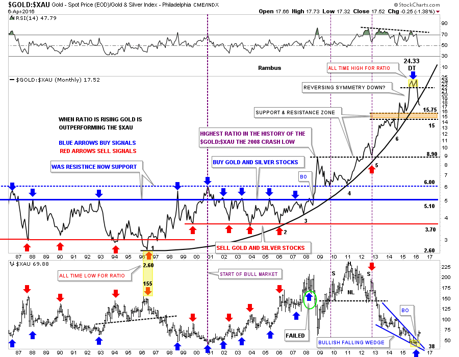
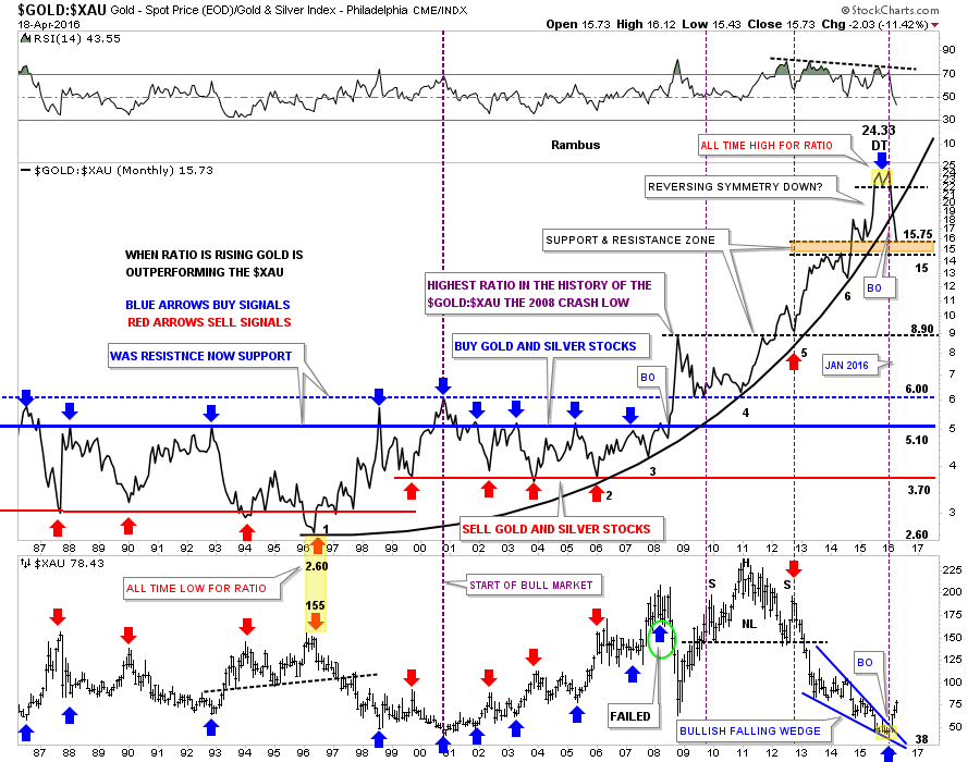
This first ratio combo chart compares gold to the XAU on top with the XAU on the bottom. The ratio chart on top tells the story of how undervalued the XAU index is to the price of gold. It’s mind blowing when you understand how beaten up the precious metals stocks have been vs gold. For many years the blue horizontal line at 5.10 or so was a good place to buy your favorite precious metals stocks, and when the ratio dipped down to the red horizontal line around the 3.70 area it was time to exit those favorite PM stocks.
Looking back to the 1996 time frame you can see the ratio chart on top put in its all time low at 2.60 while the XAU was putting in another important high up to that point in history. From that important low in 1996 the ratio chart on top embarked on a twenty year parabolic rise in which gold would outperform the XAU, even with the bull market the XAU had in the 2000’s.
The first real sign that the XAU or the precious metals stocks were in trouble with gold was during the famous 2008 crash which spiked the ratio up to new all time highs. At the time it looked like it might just be an aberration and the ratio would fall back into its normal trading range between 3.70 and 5.10. If you look at point #4 on the parabolic arc the old ceiling now became support for the ratio meaning gold was outperforming the XAU. There is no way anyone could have predicted how far out of wack this ratio would become. The parabolic arc just kept getting steeper and steeper until it finally put in a double top reversal pattern in January of this year. That was my cue to reverse from a staunch bear to now a staunch bull on the precious metals stocks.
Many times when a parabolic trend ends either up or down the move in the opposite direction can be quicker than the actual parabolic move itself. So far the move down from that double top on the ratio chart has been vertical in nature. Now take a look at the XAU monthly chart on the bottom. As the ratio has been moving down the XAU has been in a strong rally since the middle of January of this year. The XAU broke out from the five point blue bullish falling wedge reversal pattern while the ratio chart on top has broken below the parabolic arc. What this combo chart strongly suggests to me is that it’s now time for the precious metals stocks to outperform gold and in a big way, a revision back to the means.
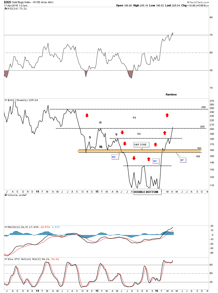
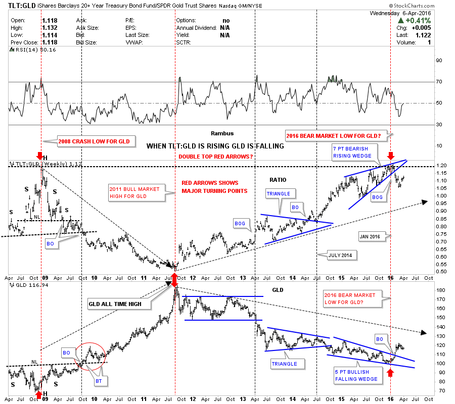
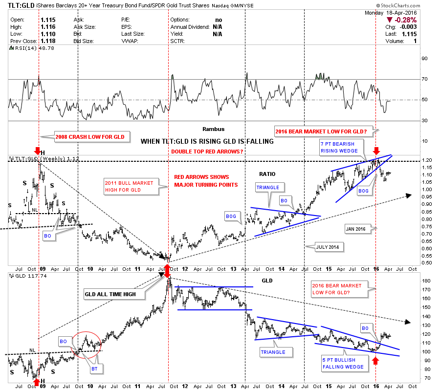
Below is another ratio combo chart which did an excellent job of calling the low for the bear market in the PM complex. This chart has the TLT:GLD ratio chart on top and GLD on the bottom. On the left hand side of the charts you can see how the ratio chart topped out during the crash in 2008 while GLD bottomed out with each forming a H&S pattern. Then when GLD topped out in 2011 the ratio chart bottomed out calling for a bear market in GLD. Now fast forward to January of this year 2016. Up until January of this year, the blue rising wedge could have broken out in either direction which I was leaning toward an upside breakout as that would have signaled the capitulation move for the PM sector. After the seventh reversal point in the blue rising wedge the ratio broke to the downside signaling the bear market was over. Instead of being a consolidation pattern the blue seven point rising wedge ended up being a reversal pattern. Mid January of 2016 comes into play again as an important low for the PM complex.
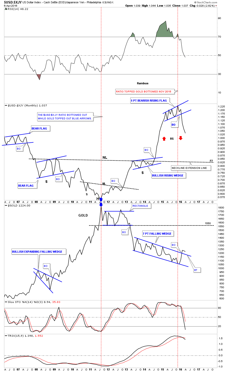
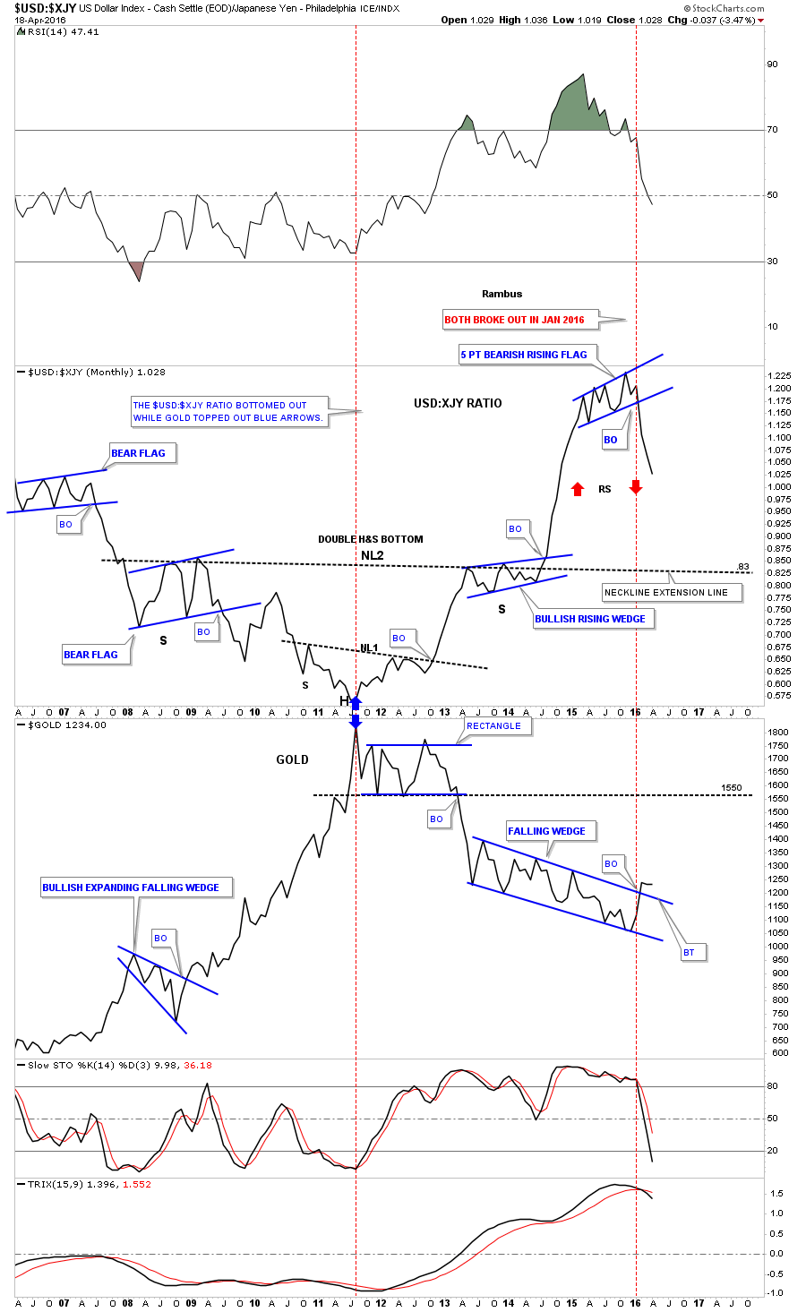
This next ratio combo chart compares the US dollar to the Japaneses Yen on top and Gold on the bottom. Normally when the US dollar is outperforming the Yen gold declines in general. Note where the two blue arrows meet in 2011. They meet at gold’s 2011 bull market peak and the ratios bottom. The ratio chart built out a double inverse H&S bottom while gold built out a rectangle consolidation pattern. From the 2011 high for gold, and the bottom for the ratio they both moved in the opposite direction. The ratio chart on top and gold on the bottom actually made their reversal high in November of last year but they both broke out of their reversal patterns in January of this year. Again January 2016 comes into play You can see the ratio built out a blue five point bearish rising flag reversal pattern while gold built out a very large seven point falling wedge.
There is one more important point to make on the ratio chart which will most likely affect gold as well. Note the near vertical move up the ratio made when it broke out of above neckline #2. It was a vertical move which didn’t have time to form any consolidation patterns along the way. Many times when you see a near vertical move like this the decline will be just as strong because there were no consolidation patterns built on the way up to offer any support on the way down. I call this Reverse Symmetry as shown by the red arrows. As you can see the decline out of the blue 5 point bearish rising flag has been just as steep as the rally leading up into the bearish rising flag, reverse symmetry. The first area of real support for the ratio chart will be .83 which is the neckline extension rail taken from neckline #2 which many times will hold initial support.
What is interesting about these three ratio combo charts is that they are all suggesting a strong move up for the precious metals complex that maybe larger and quicker than move folks can believe. We won’t know 100% until we can look back in hindsight and see what actually took place, but so far the beginning of the rally, especially the precious metals stocks, has been very strong since the mid January low. If you’re a bull where do you get on and if you’re a bear where do you get off? Questions I’m sure are being asked right now from many of the precious metals complex investors.
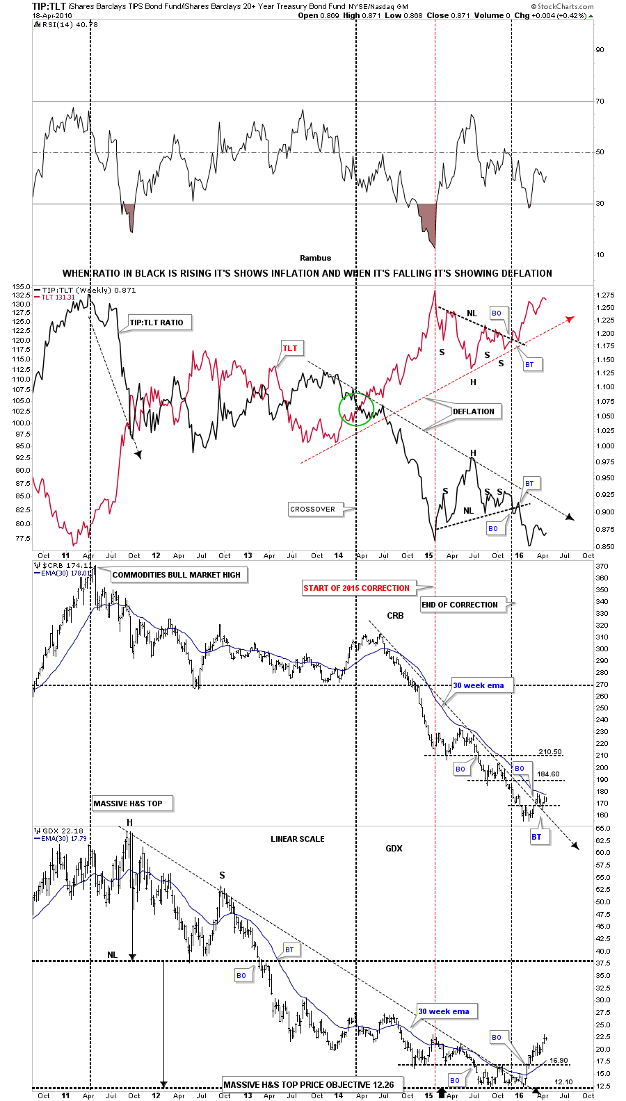
Lets look at one last ratio combo chart which has the TIP:TLT ratio chart on top with the CRB and the GDX indexes on the bottom. When the ratio chart in black is rising there is some general inflation and when it’s falling we generally see deflation. It’s not a perfect tool but it shows us a general picture of what is actually taking place. As you can see the ratio chart in black topped out in 2011 along with most commodities and the precious metals complex. We’ve been in a general state of deflation since the 2011 ratio high and still are to this day. What would get my attention that maybe some inflation may be coming into the markets would be if I seen the ratio in black starting to rise above the downtrend arrow with the TLT itself declining below its uptrend arrow. At this point there is nothing to get excited about on the inflation front unless the ratio chart builds out a possible double bottom in this area, and the TLT builds out a possible double top.
Now lets look at the CRB index and the GDX precious metals stock index at the bottom of the chart. The CRB index has barely budged off of its bottom but it has formed a higher high and has broken above its two year downtrend arrow with the 30 week ema just above the current price.
The GDX is showing a much stronger bottom in place as it has broken above its double bottom trendline at 16.90, the top rail of its five year downtrend line, and is trading well above its 30 week ema. This tells us the precious metals stocks are leading the rest of the commodities complex higher at least to this point in time. There is one more bit of interesting chart action on the GDX at the very bottom. If you look to the left hand side of the chart you can see that massive H&S top that formed back in 2011 on this linear scale chart. You only get one guess on the price objective for that massive H&S top. The measured move for that H&S top is down to 12.26 which is almost dead on the money of the actual low. Just take your fib tool and measure down from the top of the head to the neckline and then move your fib tool down to the neckline and see what you get.
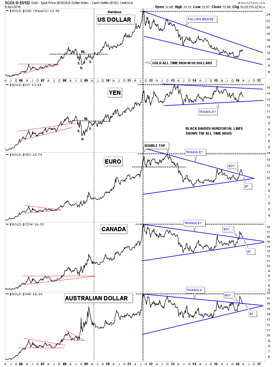
This next combo chart shows how gold is performing in some of the more important currencies of the world. The two resource based currencies the Canadian Dollar and the Australian Dollar show a big triangle consolidation pattern that has broken out and and is being backtested presently. Note how the Australian Dollar is the closest to making new all time highs vs the other currencies vs gold while the US dollar is the furthest away from making a new all time high.

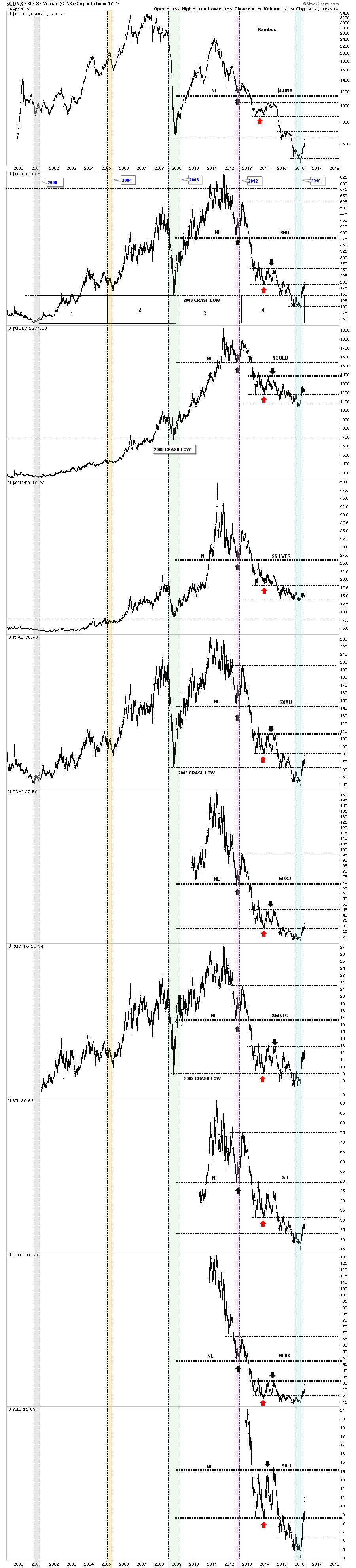
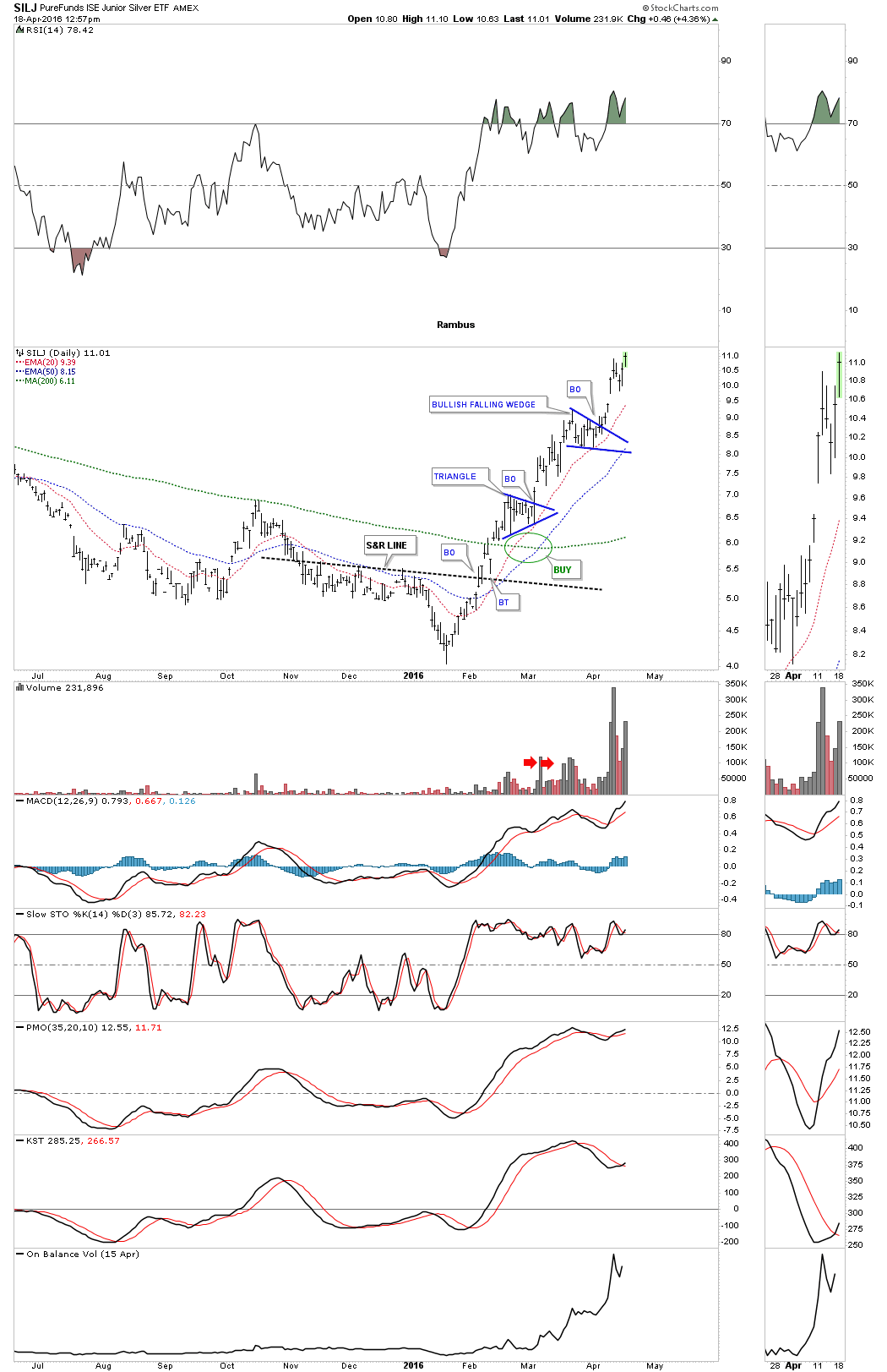
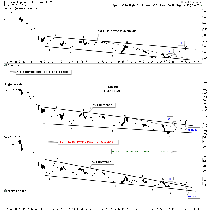
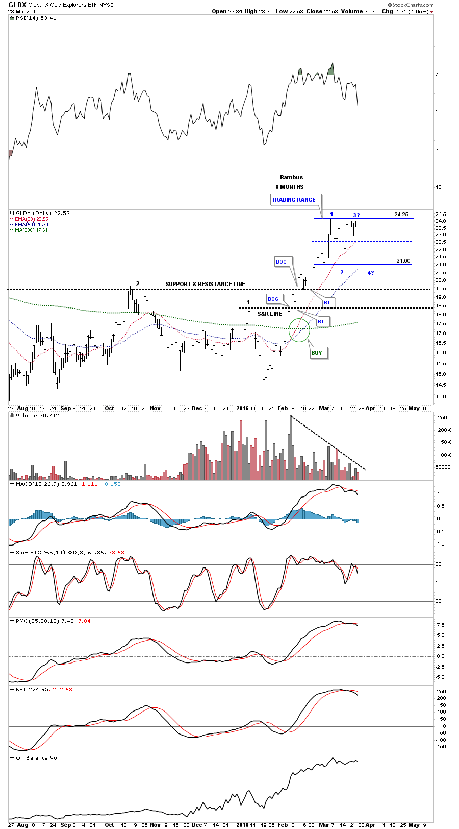
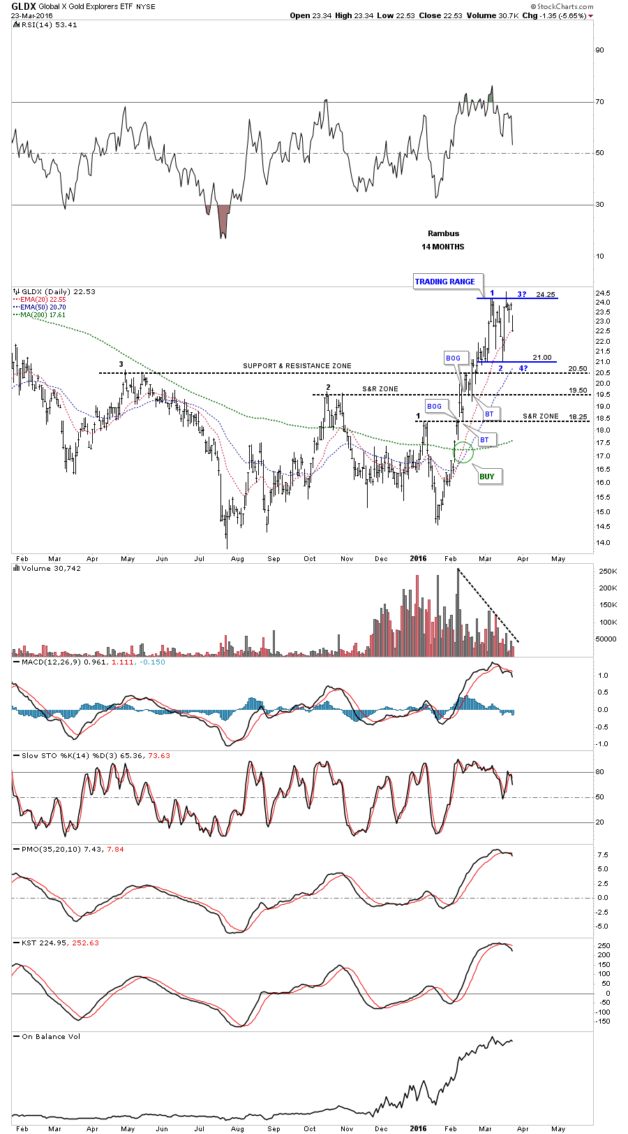
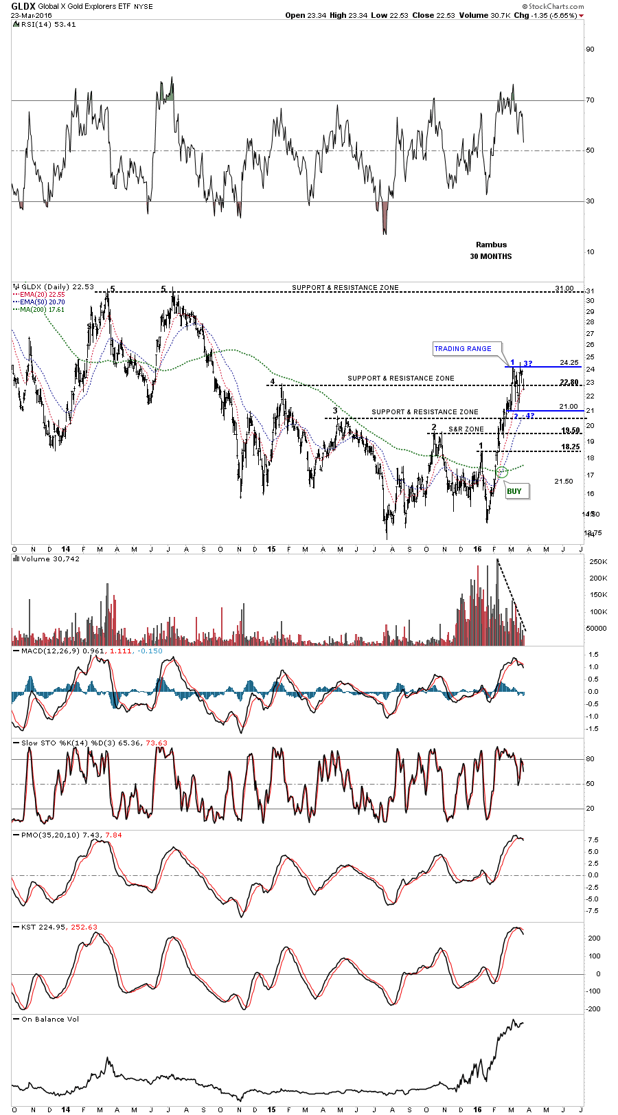
This last chart for tonight I call the Precious Metals Combo 10 chart. This combo chart has all of the most important precious metals stock indexes along with gold and silver. I use this chart to see what PM indexes are performing the best so far in this new bull market. The red arrows shows the 2014 consolidation patterns lows and the black arrows shows the 2014 consolidation patterns highs.The blue shaded vertical area shows the January 2016 lows. When you scroll down through all these charts you can see which ones are leading the pack using the red arrows for a reference point. Up until today the XGD.TO, big cap PM miners, was the first PM index to reach the top of the 2014 consolidation pattern as shown by the black arrow. Today though shows the GLDX, junior gold explores, making up ground fast as it too closed at the top of the 2014 consolidation pattern. Note the move of the small cap junior silver miners which is the last chart on the bottom. The SILJ still has a ways to go yet to reach the black arrow, but they’re putting on a show for all those folks that care to take a look. Silver is still the weakest but it’s trying to make a move up. Even the old $CDNX small cap Canadian index has finally joined the party and is getting a decent move to the upside.
The other different shaded vertical areas shows what I consider to be important lows. It just so happens that the lows are roughly four years apart, as shown by the black rectangles on the HUI chart. They’re not exact by any measure, but they do show up at interesting junctures on these indexes.
Back in 2008 when the PM sector finally bottomed it was an important low as that’s where the buyers stepped up to the plate. In 2015 most of the PM stock indexes broke below that very important bottom which made one stand up and take notice. And then in January of 2016 a rally started, which would take those PM indexes back above that important 2008 crash low. That was a very big deal for me, which suggests we seen a bear trap which few got out alive. Now just three months later many of the PM stock indexes are trading back up to their 2014 consolidation pattern highs, which is a multi year high in some cases. There are no guarantees when it comes to trading the market, only probabilities which we need to get on our side in order to be successful. All the best…Rambus