Catherine asking Rambus: I never heard the word Chartology before until I found your website. Can you tell us what it means?
Chartology is a new word coined by our computer guy, Todd. The word Chartology has two meanings. Chart, means the study of chart patterns and ology is the study of the psychology of investors who make up these chart patterns. It’s the thousands of investors, all acting in concert, bulls and bears alike, that create the many different chart patterns we look for on a chart.
Human nature and the sum total of all trading activity tends to repeat over and over again throughout time. Once you learn to read a chart you will be able to see the battles that take place between the bulls and the bears on any given time frame from minute charts to long term monthly charts. This will give you an edge in deciding if you want to take a trade or not. So basically we’re charting the psychology of thousands of investors interested in a particular stock or market.
Ask question on the US Dollar.
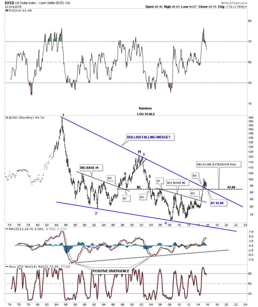
That’s a great question Catherine. Lets take an indepth look at the US dollar starting with a very long term monthly chart which goes back about 40 years or so. This chart shows how the US dollar made its all time highs way back in the mid 1980’s around the 160 area. The US dollar then made a lower high in 2000 which corresponded with the bottom in the precious metals complex. From the 2000 high the dollar fell for eight years until it finally found a bottom in 2008 at 71.33 which was its all time low. The two blue down slopping trendlines captures the investors psychology, bulls and bears, during each major swing within the blue falling wedge during the last thirty years.That is a massively large blue falling wedge which should give the US dollar plenty of energy to move much higher.
One last thing before we move on. Note the breakout above the top rail of the blue falling wedge that occurred last year. The top rail of that blue falling wedge held resistance for thirty years. That breakout last year is incredibly important. When a trendline gets broken it will reverse its role, in this case it was resistance for 30 years, it should now act as support during any backtest. As you can see the price action has found support on the top rail, consolidating its gains since the breakout. There was also a H&S top that formed in the late 1990’s and early 2000’s which led to the all time low. Many times you can extend the neckline out in time and look for support, in this case at the 92 level. So there are two main areas of support for the US dollar where the top rail of the blue falling wedge and the neckline intersect at 92 or so. Until 92 gets broken to the downside I have to remain bullish on the US dollar.
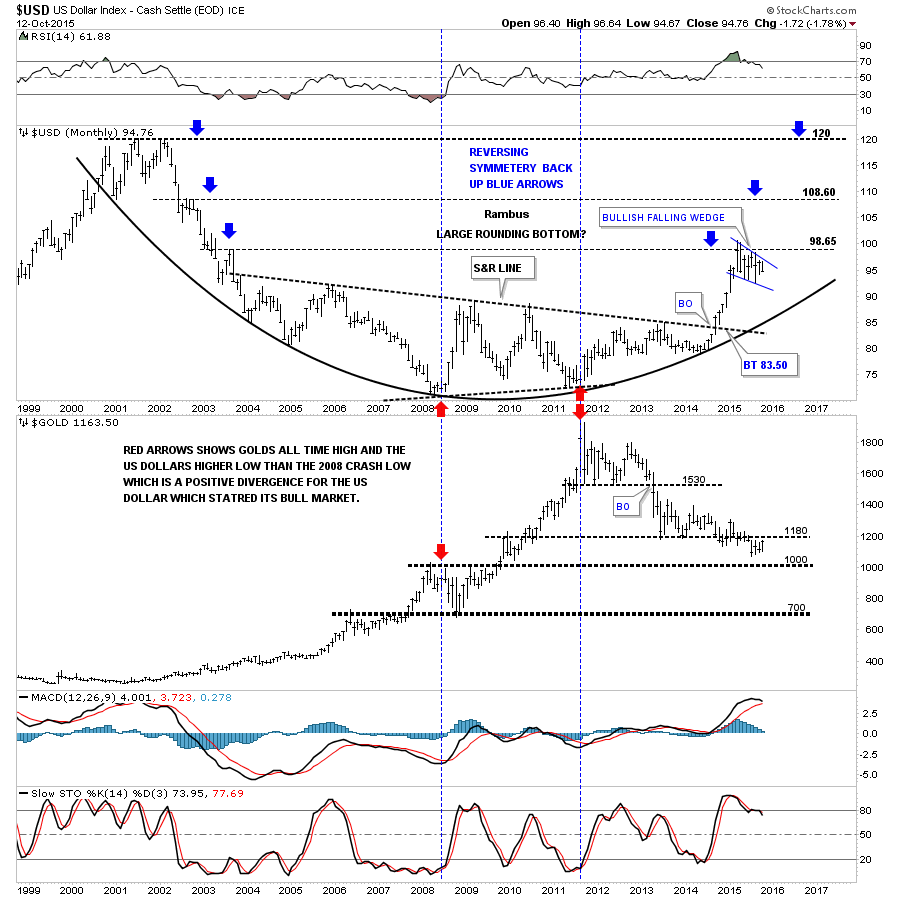
This next 15 year monthly chart for the US dollar shows a nice big rounding bottom or base which is needed to launch a big move in any stock or index. The blue arrows on each side of the chart shows how the price action is reversing symmetry back up. Many times a stock will go up inversely to the way it came down. The pause at 98.65 was to be expected as that’s where a previous top in 2003 formed. Once this correction ends I will be looking for a move up to the next area of resistance at the 109 area.
Also notice that this is a combo chart which has gold below the US dollar. This combo chart gave me my first real clue that gold was topping out and the US dollar was bottoming. Everything was pretty normal going into 2008 as gold was topping and the US dollar was bottoming, red arrows on the left side of the chart. What happened over the next ensuing three years was way out of character for this pair that usually ran opposite to each other, not always but in general. Note the red arrows on the right side of the chart which shows the US dollar making a higher low vs the 2008 low while gold ran over a thousand points higher into its all time high in September of 2011 at 1920. This was a massive positive divergence for the US dollar, which we can see now looking back in hindsight. From the low in 2011 for the US dollar and the high for gold they have been moving opposite to each other again for the most part, with gold not to far off of its low and the US dollar not to far off of its high.
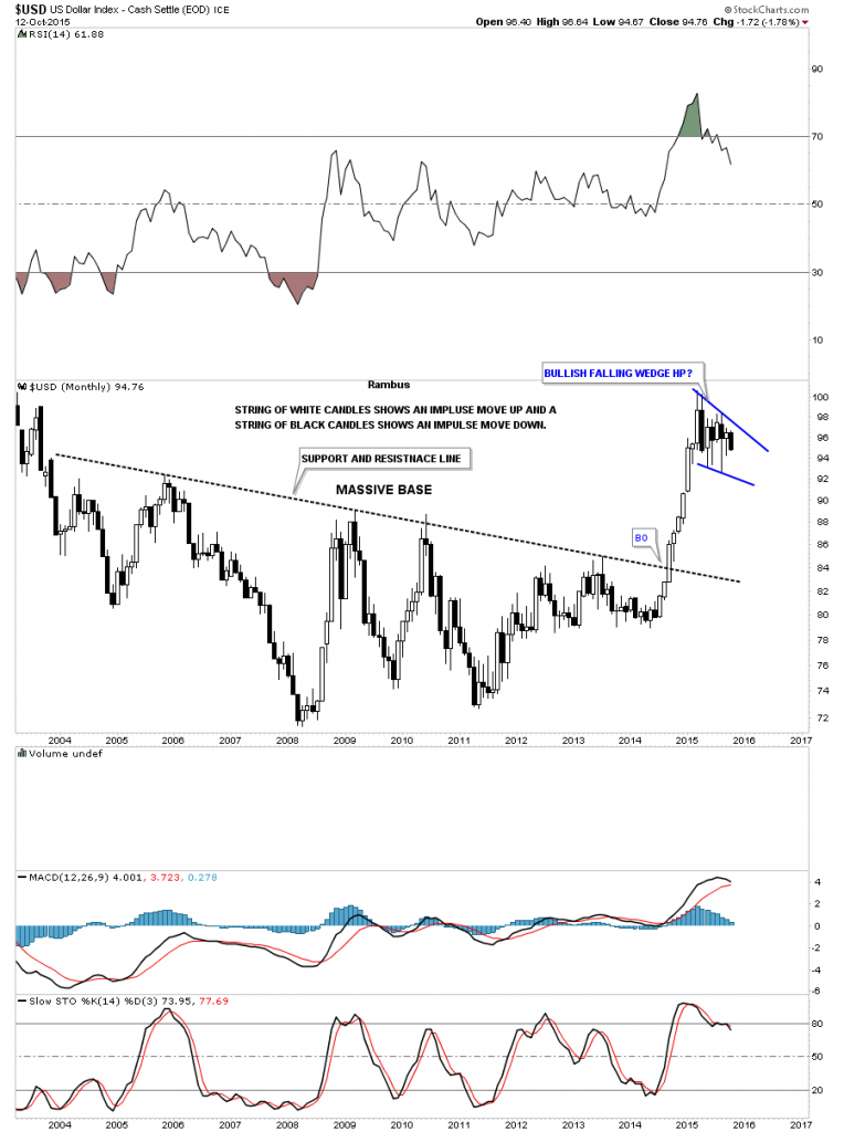
This next ten year monthly candlestick chart for the US dollar shows the massive base which launched the first impulse move up. When you see a string of white candlesticks all in a row, you know you’re in a strong impulse move up. It’s just the opposite in a strong move down where you’ll see a string of black candlesticks all in a row. Note the ten year chopping action during the formation of the big base which basically went sideways. Compare that price action to the near vertical move the nine white candlesticks made once the breakout occurred. This is called an impulse move.
Once a stock has a big impulse move like that it eventually needs to rest before it can move higher. This is what the dollar has been doing since it topped out. With the near vertical move out of the big base many times a stock will consolidate that move forming a much smaller consolidation pattern which will show up as a halfway pattern. What this means is that when this particular consolidation pattern finishes building out we should see an equally strong impulse move higher, which will leave the blue falling wedge in the middle of two strong impulse moves. How much longer this blue consolidation pattern will last before it breaks out is unknown yet. What we do know is that when the dollar is ready to move we will see a very strong rally according to this principle .
Lets work our way back to the beginning of the big impulse move up by looking at a daily chart for the US dollar. The big rally the US dollar had started with a five point blue rectangle reversal pattern at the bottom of the chart. In case you’re wondering, BO means breakout and BT means backtest. In a strong impulse move it’s not uncommon to see up to three small, in this case red , consolidation patterns form the impulse leg. At the top of the chart you can see the blue falling wedge that has been building out since March of this year. This is where patience comes in while waiting for the dollar to finish consolidating the move from roughly 79 to 100. Usually during a correction, like the dollar has been experiencing since the top , a stock can correct up to 38%, 50% or as much as 62% of that impulse move. These percentages are Fibonacci numbers. If you recall I showed you where 92 should be strong support on the first monthly chart we looked at above. So far the US dollar has corrected 38% of that big move at 92.47, red arrow.
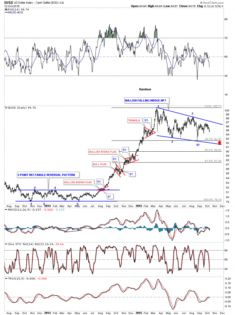
From a Chartology perspective this is how I see the US dollar. Long term it’s still bullish with the short term trend being neutral consolidating the big rally. It now becomes a waiting game.
Catherine: Ask me about gold.
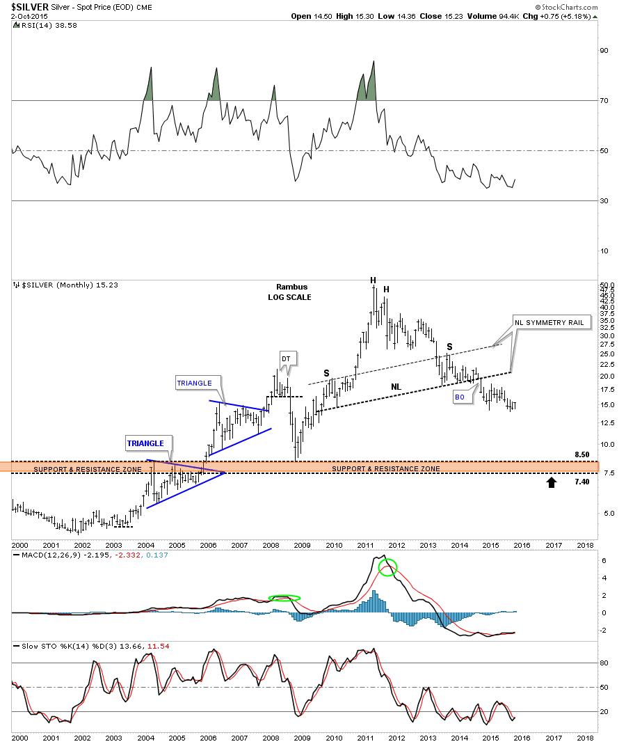
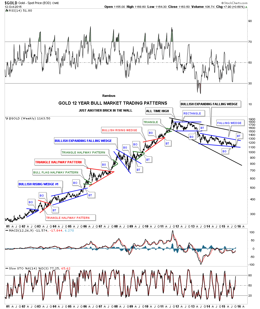
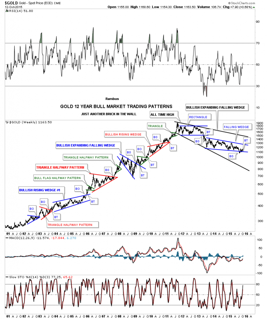
As I mentioned earlier I didn’t even become aware of the gold bull market until the spring of 2002. Up until that point I didn’t know a junior from a major. It was all new to me. I’m so glad I found the bull market in gold when I did because the bull market was a thing of beauty. From a Chartology perspective it just doesn’t get any prettier. I have told my members several times that they will study gold’s bull market in the future just like we study the 1929 stock market crash.
Most folks don’t know I was really bullish on gold and the whole precious metals complex up until the top in 2011 when the bull market ended. Since we got Rambus Chartology up and going there has been very little to be bullish about so most think I’m a long time bear but that would be so far from the truth.
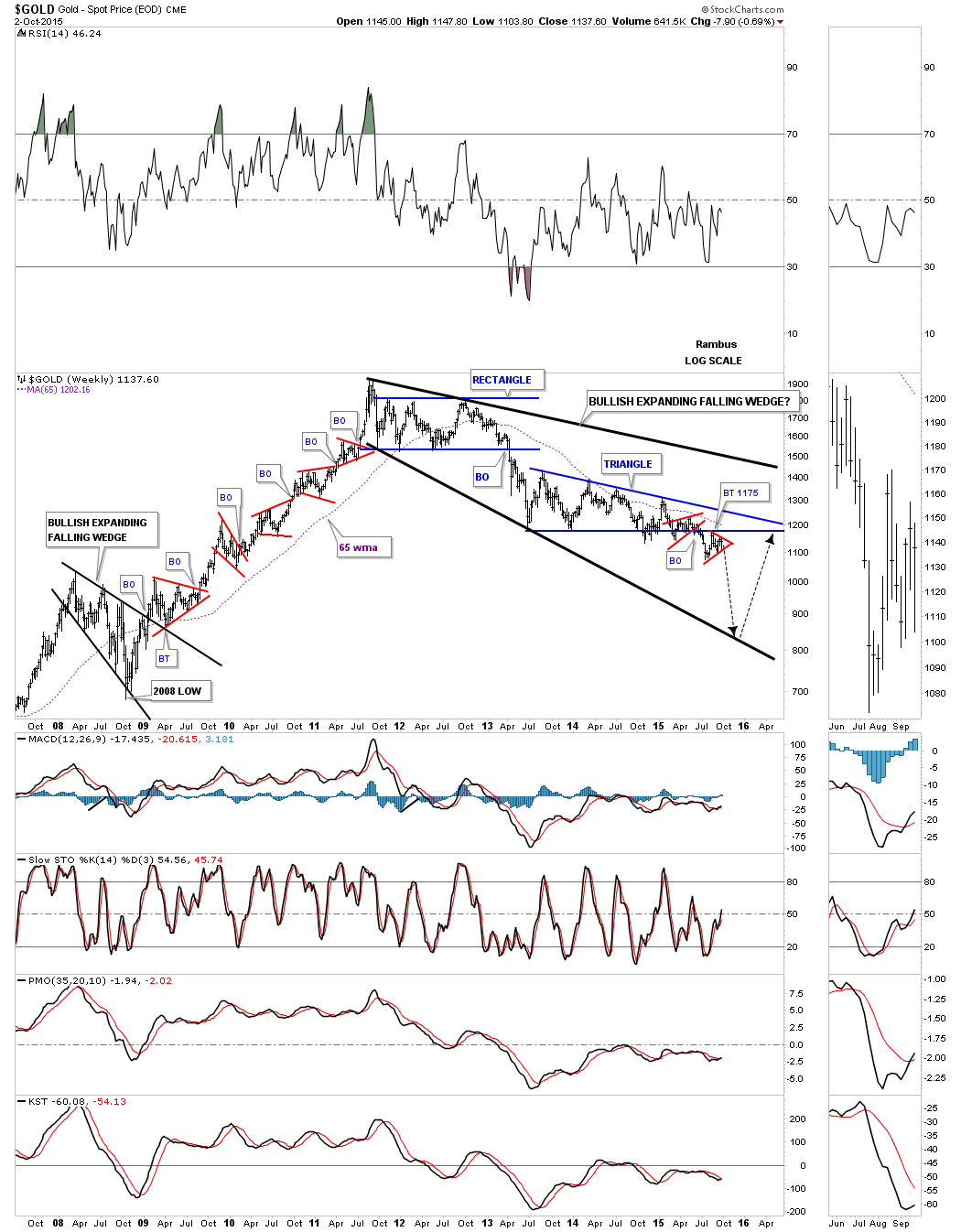
The long term weekly chart below shows the most beautiful bull market I’ve ever had the pleasure to trade. This chart will give you an understanding of what Chartology is all about. I call this chart, ” Just Another Brick in the Wall.” You will notice after each consolidation pattern there was an impulse move up, which led to the next consolidation pattern which led to the next impulse move up, so on and so forth all the way up to the bull market top in September of 2011. If you look real close you can see some small green triangles that formed as a halfway pattern between each impulse leg, similar to what I showed you with the US dollar’s blue falling wedge. It’s the same principal.
Note how the character of gold changed once the bull market topped out in 2011. Instead of making higher highs and higher lows gold has been making lower highs and lower lows which tells us gold is in a bear market.
The first consolidation pattern to form during this ongoing bear market was a six point rectangle consolidation pattern that broke down in April of 2013. I can still remember all the gold bugs calling that impulse move down manipulation. From a Chartology perspective that was exactly what I wanted to see. It makes me cringe to hear that word as you couldn’t have such beautiful chart patterns if gold was manipulated. All those chart patterns were formed by millions of investors each individually adding their own two cents worth to each chart pattern.
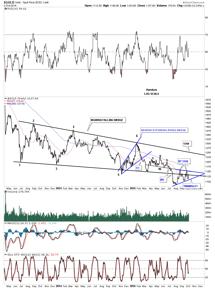
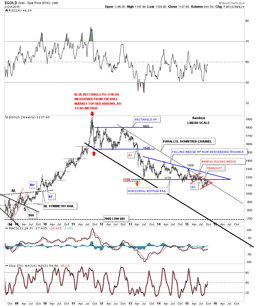
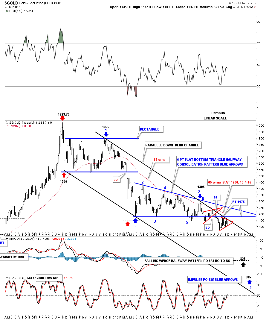
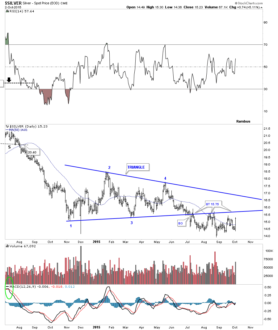
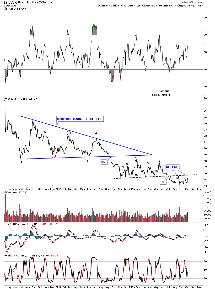
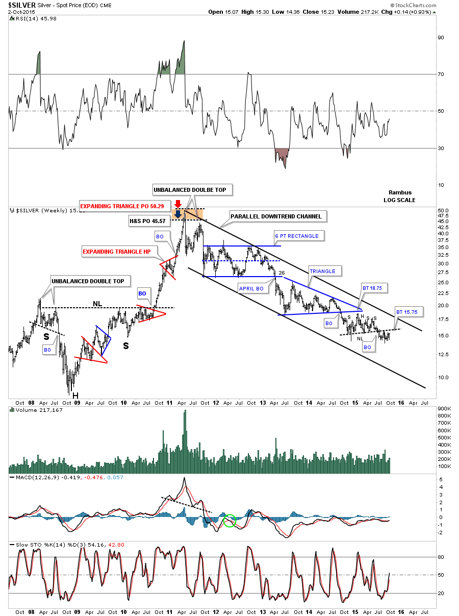
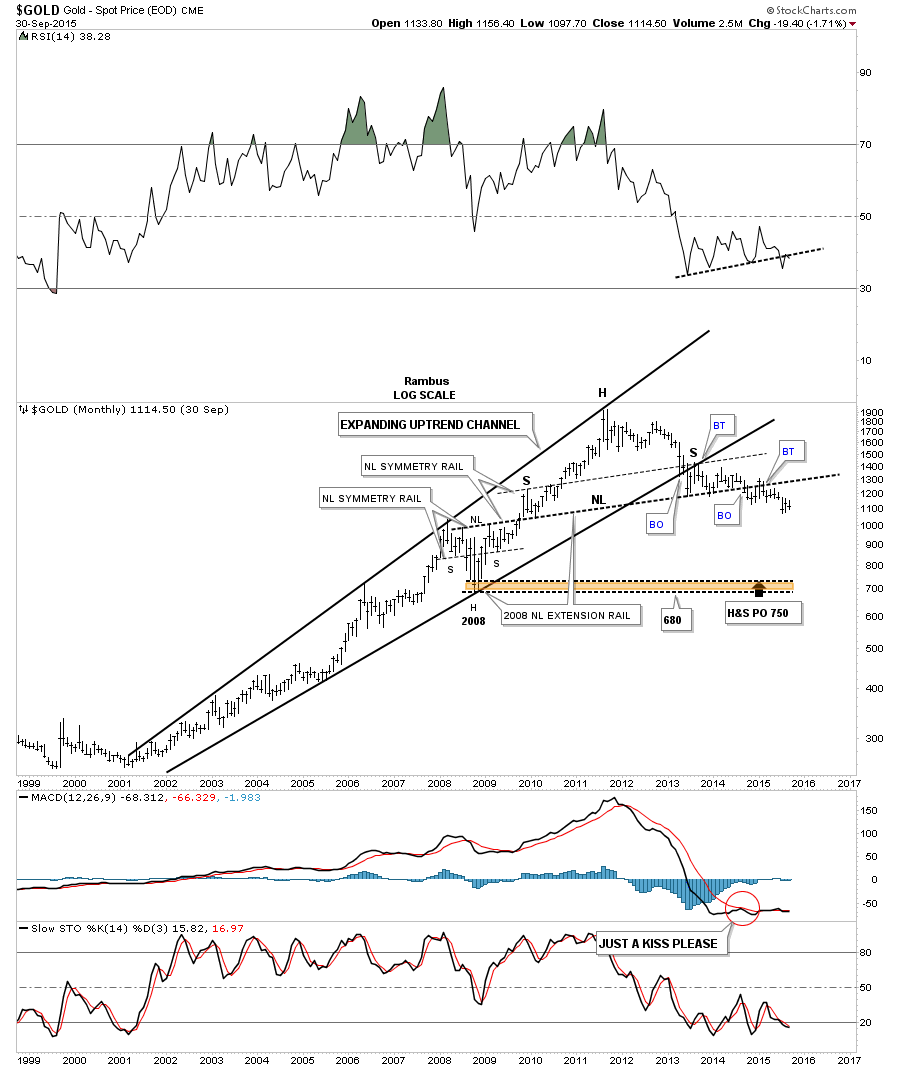
Since gold has been in a bear market since 2011, our latest chart pattern that has formed is the two plus years blue falling wedge, which I consider to be a halfway pattern to the downside when all is said and done. Just look at the left side of the chart during the bull market years when each consolidation pattern broke out to the upside. Now look how our current bear market is unfolding just opposite to the bull market. This is how markets work.
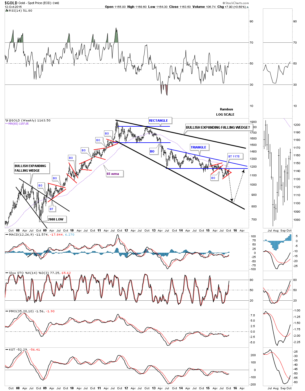
On a bullish note. Gold could be forming the last consolidation pattern within this bear market. If the blue falling wedge breaks out to the downside, which I expect it will, this next impulse move down may very well complete the bear market. As you can see I’ve labeled this four year bear market as a possible bullish expanding falling wedge. You can compare this possible bullish expanding falling wedge to the same pattern that formed during the 2008 crash low for gold, same pattern just on a bigger time frame. Even though I’m bearish for the short to intermediate term, I can still see the bull market continuing when the top black rail of the potential bullish falling wedge gets broken to the upside.
This next chart for gold is a weekly look that brings the potential bullish expanding falling wedge into focus. I did take some liberties with the bottom blue rail and instead of having it slope down as shown in the weekly chart above I’ve made it horizontal. The reason I did that was because of the two small red consolidation patterns. Sometimes you will get a bearish setup, in this case, when you see a small consolidation pattern form just above, just below or one on top and one below and important trendline. Here you can see we have one above and one that looks like it maybe completing as we speak, just below the bottom trendline.
You can see how the bottom blue rail has held support for over two years. Once gold broke below that botttom blue trendline everyone who bought gold since the bull market peak in 2011 is now underwater. This is the psychology part of Chartology. Everyone is now trapped from above the horizontal blue trendline and they will be looking for a place to break even or take a loss just to end their pain. This is the essence of how support and resistance works. The black arrows shows how this bear market might end. It won’t be pretty but important bottoms never are.

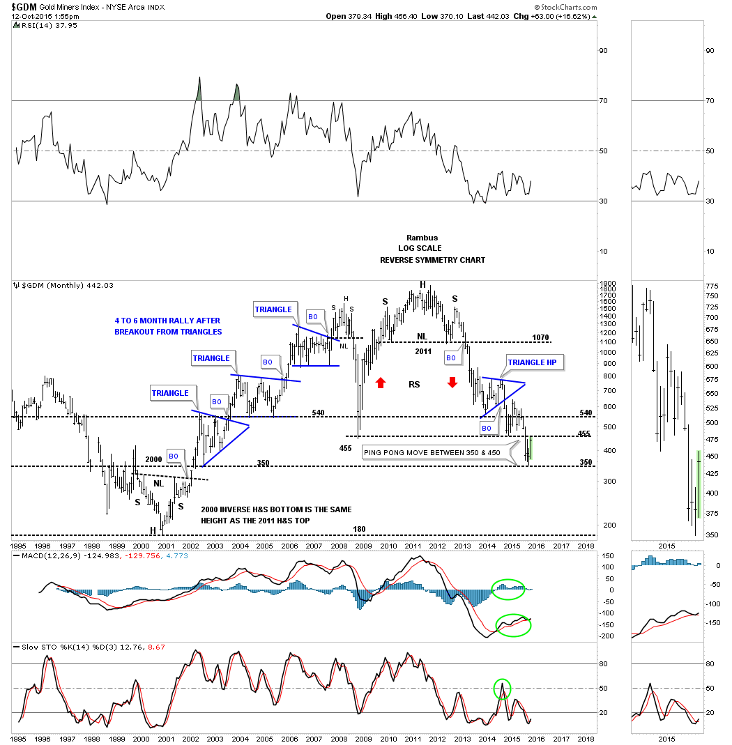
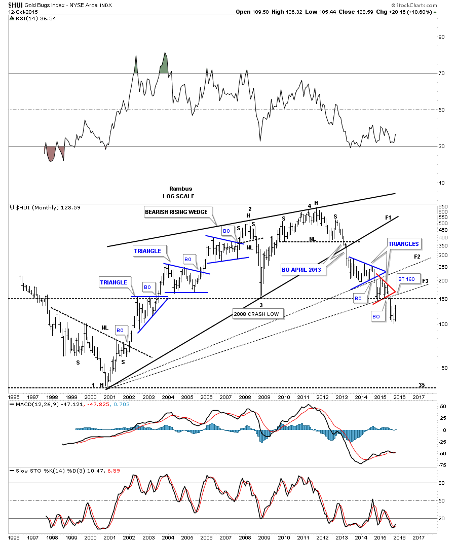
Lets take a quick look at the HUI ( The most widely watched Precious Metals Stock Index which contains the largest miners) since its inception back in 1996 , which shows many different chart patterns. The HUI built out a big inverse H&S bottom in 2000 which launched its bull market. It built out three blue triangle consolidation patterns during the main part of its bull market. That part of the bull market ended with the small H&S top that formed in 2007.It was a relatively small pattern and the bull was so powerful so I took alot of flack for that call. After the 2008 crash low was in place , the HUI rallied back up to make a slightly higher high vs the 2007 H&S top. Note how symmetrical the H&S top was that ended the HUI’s bull market. That’s one of the prettiest H&S tops you’ll find anywhere but few recognized it at the time. The whole bull market ended up being a massive 13 year bearish rising wedge. The neckline and the bottom rail of the bearish rising wedge broke down around the same time which really put the last nail in the coffin for the gold promoters.

Catherine: Ask me about the SPX
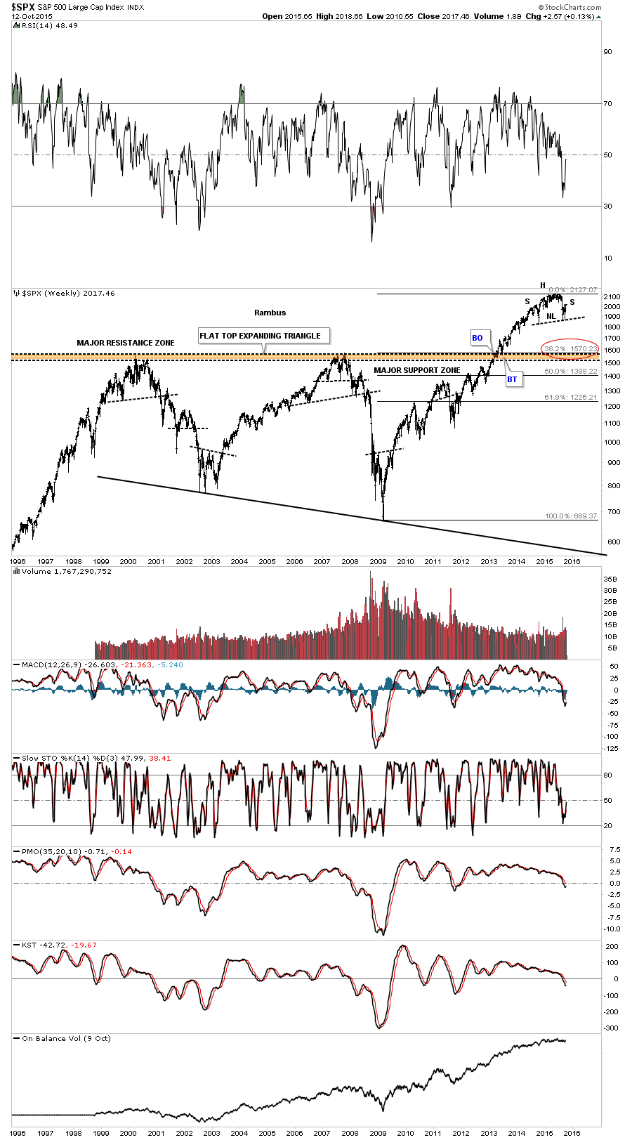
As you know the stock markets took a pretty decent hit back in August of this year which did some technical damage on the short to intermediate term scale. The big question on everyone’s mind is this the start of a brand new bear market? As always lets start by looking at the long term charts for the SPX and work our way back to the shorter term charts so we can put this latest move in perspective.
Lets start with just a very simple monthly chart for the SPX which shows the parallel uptrend channel that began forming in 2009. So far there haven’t been any violations of the bottom trendline. The move down in August came close to breaking below the October low from last year but support held. This chart shows you what a bull market looks like with higher highs and higher lows forming for over six years now.
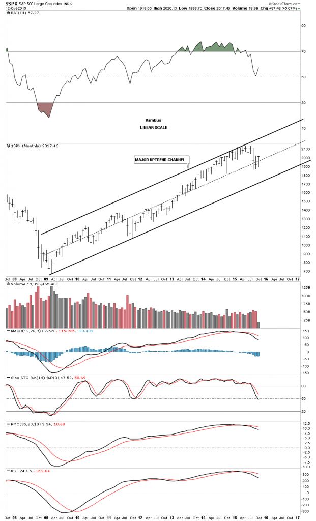
This next very long term monthly chart for the SPX shows the 13 year flat top expanding triangle consolidation which the SPX broke out of in early 2013. This is a massively large consolidation pattern which strongly suggests our current bull market has much further to run. I know it’s hard to believe from a fundamental point of view but the SPX has been climbing a wall of worry since the 2009 crash. Every time there is a small correction the bears come out of hibernation. At some point they may be correct if the top rail of the expanding flat top triangle at 1550 gets broken to the downside but until then the bull lives.
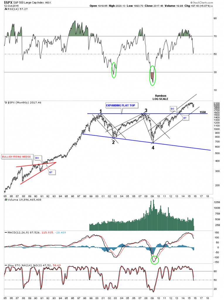
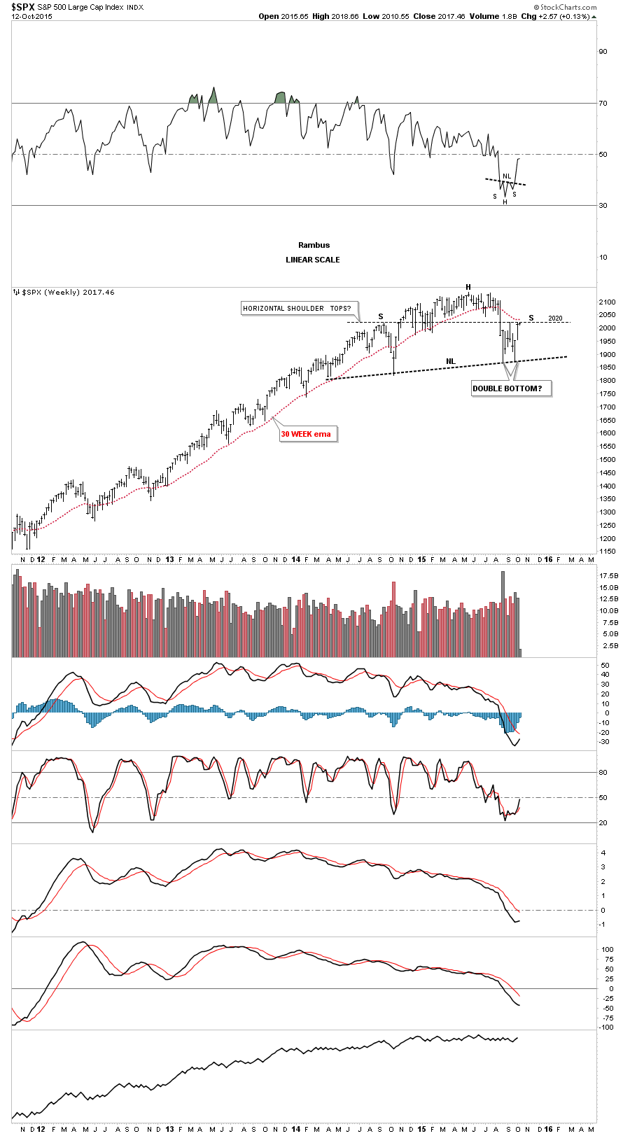
If I was bearish on the SPX I would be looking at this weekly chart which shows the multi year flat top expanding triangle. One could make the case for a H&S top with the neckline forming on the October low from last year and the August low from this year. If a H&S top were to play out I would still be looking for major support to come in on top of the brown shaded support and resistance zone at 1550 to 1570 which would also be a 38% retrace of the entire bull market. The H&S top looks obvious but when you look at a shorter term chart you can see a possible double bottom forming.
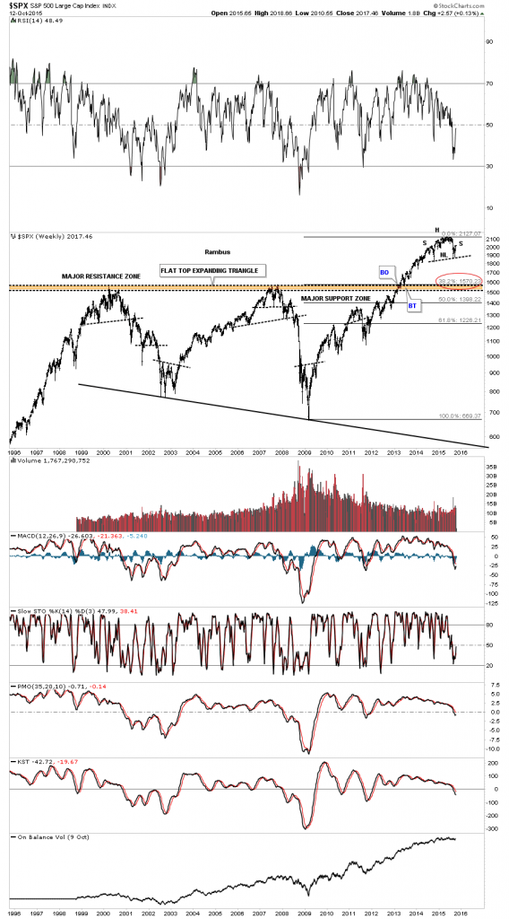
This next weekly chart shows the two possible scenarios with one being bearish and the other being bullish. Again when you look at this chart the H&S top seems very obvious. On the other hand I’ve labeled our recent lows as a possible double bottom. As you can see the SPX is right at a critical inflection point where the price action is either going to breakout above 2020 signaling the double bottom is in play or the 2020 area is going to hold resistance and the top for the right shoulder will be in place. We will now know in 20 20 hindsight .

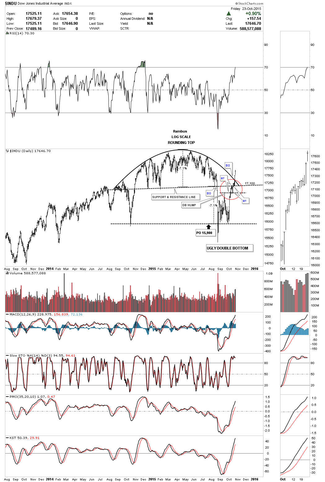
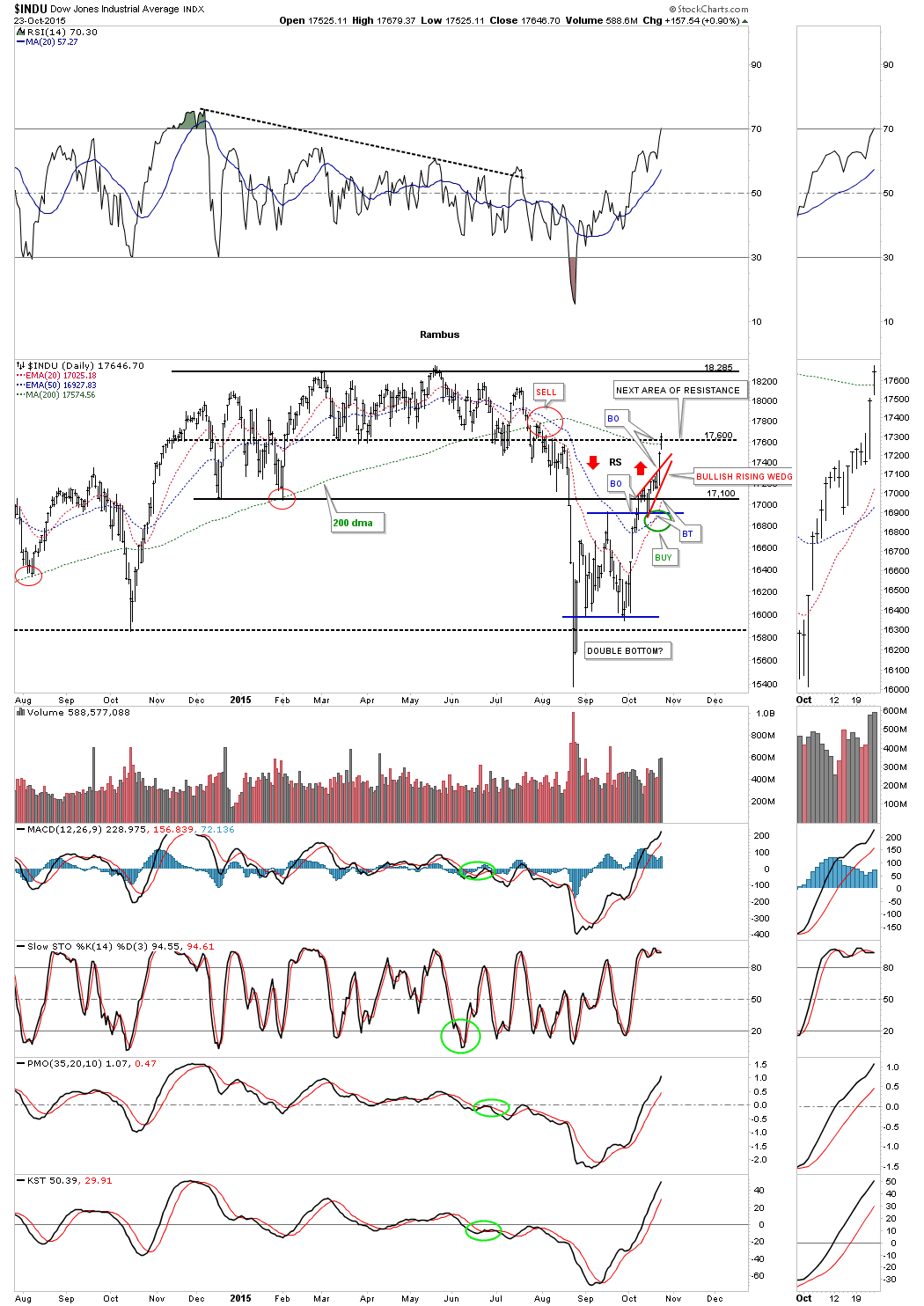
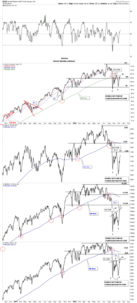
Next I would like to change it up a bit and look at a daily line chart that has the QQQ’s, $RUT, $INDU and the $SPX on it which covers the big US stock markets. Looking at these charts from this perspective you can see the potential double bottoms that maybe forming. The INDU and the SPX have already broken above their double bottom hump with the QQQ testing its potential double bottom hump and its 200 day moving average. To be sure there is still a lot of work to be done before these charts really become bullish, like trading above their respective 200 day moving averages, but a bottom has to start forming somewhere if the bull market is going to continue.
The numbers on these charts represents the reversal points if we see a consolidation pattern form to the downside. There has to be a minimum of four reversal points in a consolidation pattern to be valid. At this point they have all completed three reversal points. A break below their lows would complete a consolidation pattern and would be bearish.
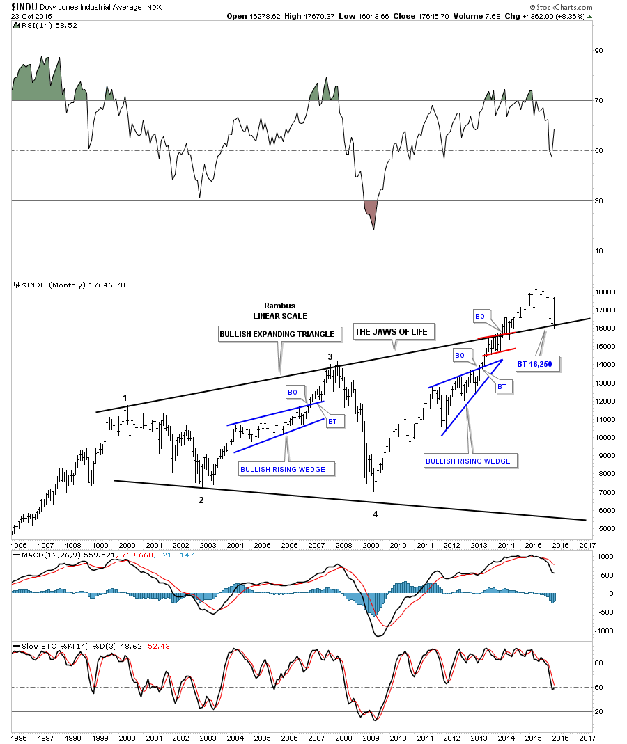
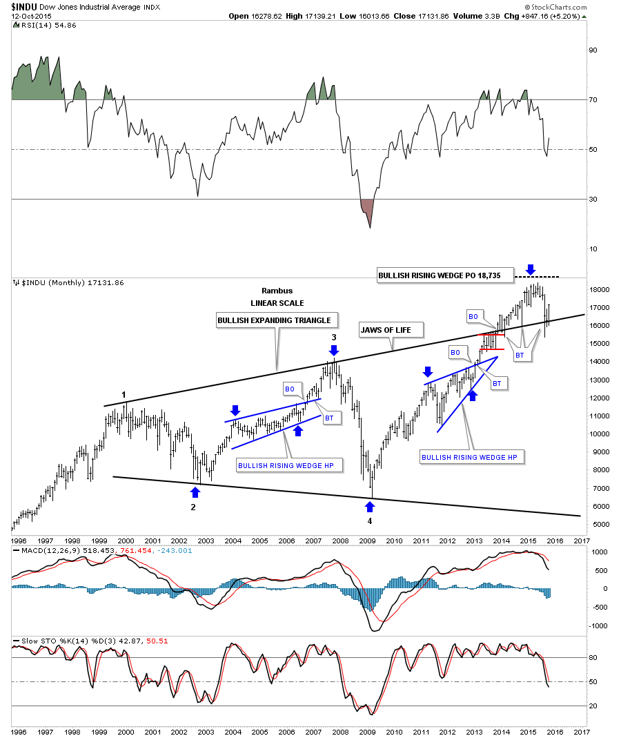
This long term monthly chart for the DOW shows you the main reason I remain a long term bull for the US stock markets. I’ve been showing this chart since the day it broke out above the top rail of the bullish expanding triangle. Many are calling this pattern the Jaws of Death. I on the other hand am calling it the Jaws of Life. For close to two years now that all important top rail has held support even though it has been strongly backtested from above in August.

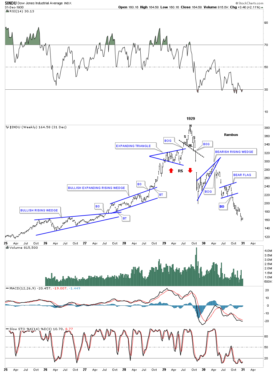
I know many folks that don’t understand charting are turned off by it because of one reason or another. Investor psychology has been around since the beginning of time and they experienced the same emotions as we do today which creates these various chart patterns. Even with all the technical advancements over time the same chart patterns still show up even after a hundred years or so.
To show you what I mean I have built a chart that takes in the bull market in the INDU (Dow) which began in 1925 or so. I have shown my members many examples of bullish rising chart patterns, such as wedges, flags or expanding rising wedges, that tend to show up in strong moves. As you can see on this weekly chart for the INDU it built out a bullish rising wedge which broke out to the topside followed by a backtest to the top rail in July of 1927. The INDU then began forming another very bullish pattern , a bullish expanding rising wedge. It to had a breakout through the top rail and had a nice clean backtest before the impulse move began. As you can see the trend is starting to go parabolic. That mania phase formed one last consolidation pattern before the top was put in and that was the blue expanding triangle. Expanding triangles tell you investors are becoming confused and uncertain as each swing within the expanding triangle is getting bigger and bigger. This particular expanding triangle had six reversal points in it and broke to the upside with a breakout gap.
Few knew it at the time but the INDU’s days were numbered. Note the beautiful little H&S formation that formed the top in 1929 which reversed that parabolic bull run. The neckline was broken to the downside with a big breakout gap. When a parabolic move ends it wastes little time in chopping around and usually the price action will go down faster than it went up which was the case back in 1929. After the INDU lost almost half of its value it rallied back up closing the big gap and created a bearish rising wedge which is a very common pattern. The price action gapped out of the bearish rising wedge with a breakout gap and declined close to the October 1929 low where it created a beautiful little bear flag.
If one just knew a little basic Chartology back in 1929 they could have saved themselves from disaster. You don’t have to be a rocket scientist to be able to find many of the different chart patterns. You just have to develop your skill through trial and error .This is what we teach our members to do at Rambus Chartology.
http://rambus1.com/
It has been a very rewarding experience for me to watch many members at our forum learn and grow in their trading , to the point where they are making consistent gains in their portfolio using the principles we teach . We have a contest at the Forum and many members trading the contest have made 100% plus plus gains using 3X leveraged ETFs .
There are no absolutes when it comes to the stock markets. All you can do is get the odds in your favor.

Thank you Catherine for having me on your show. I have been a fan of your work for many years and it is a great experience to connect with you and your community .
Regards
Dave