Before we look at some weekend charts I just want to second Sir Fullgoldcrown’s Friday night post at the forum. We created Rambus Chartology so we could have a community of like minded investors who want to learn as well as share what they have experienced in their own investment world. We are all equals when it comes to the investment world which can humble even the most experienced traders on the planet. That’s the nature of the game we’re playing. Sharing ideas in which everyone can benefit from is the corner stone of Rambus Chartology. I know we have a lot of lurkers at the forum and if you have any good ideas you would like to share with the rest of the members please feel free to post what you have without fear of ridicule or embarrassment. As Sir Fully likes to say, “It’s all for one and one for all.”
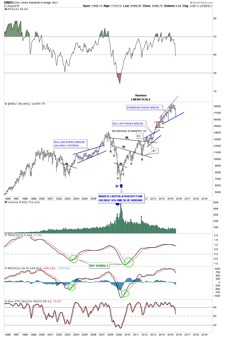
Last week was a week that doesn’t come around very often in the stock markets. After chopping sideways for all of 2015 it now looks like we’re finally getting an intermediate term move down as some important support zones have given way. Until this past week it was still uncertain whether this horizontal trading range was going to be a consolidation pattern or a reversal pattern. Thursday and Friday’s price action confirms for me that we have a 5 point bearish flat bottom expanding triangle reversal pattern in play now. The bottom blue rail of the expanding flat bottom triangle, which gave way on Thursday at 17,100, finally broke critical support. That bottom trendline will now become resistance on any backtest. The next big question will be whether we’ll see a backtest to 17,100 before we go lower? I’ll try to answer that question a little later.
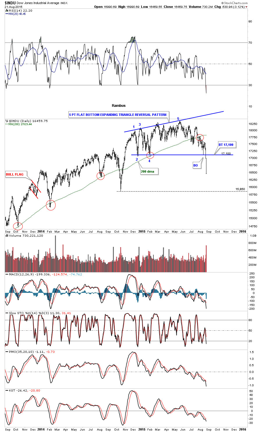
Next lets look at a four year weekly chart for the INDU which shows the smaller red 5 point bearish expanding flat bottom triangle as part of a much bigger blue expanding rising wedge. As you can see the DOW closed right on the bottom rail last Friday which is showing us it’s hot. A break of the bottom blue rail of the expanding rising wedge at 16,460 will give us an even bigger topping pattern.
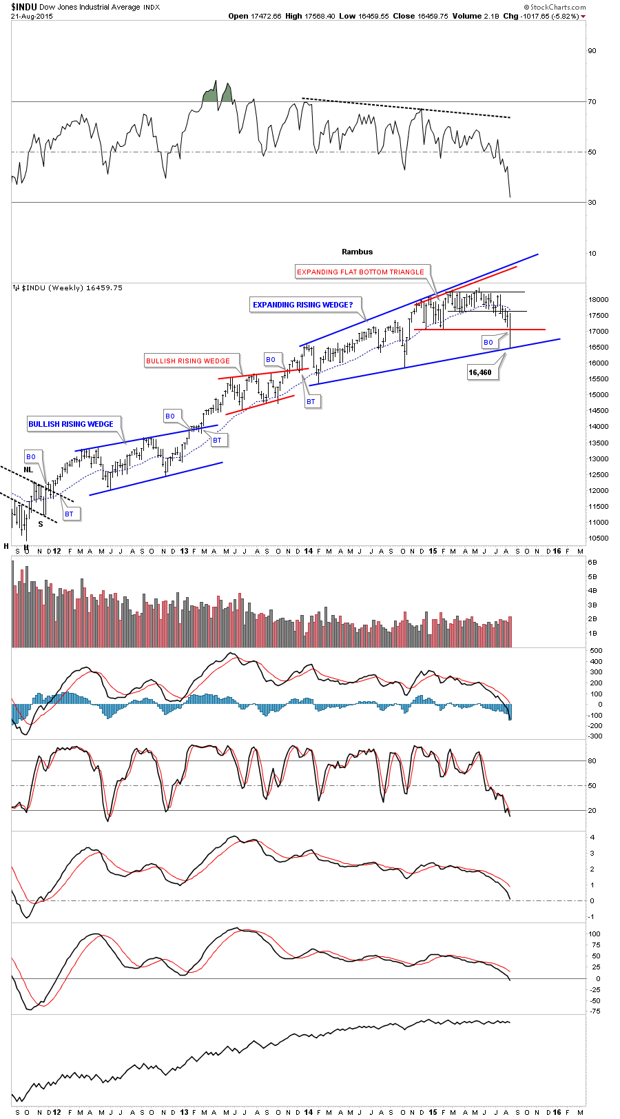
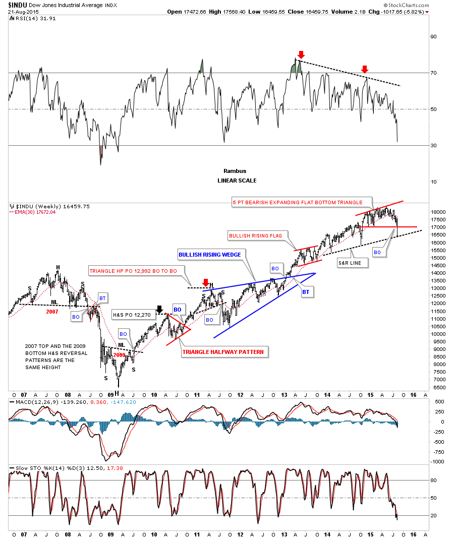
This next very long term weekly chart for the INDU goes all the way back to the 2007 H&S top which reversed the bull market at that time. That strong decline ended with an inverse H&S bottom which was the exact same height as the 2007 H&S top and led to our 6 1/2 year bull market rally. On this weekly chart I’m showing the bottom rail of the expanding rising wedge as a black dashed support and resistance line. That line is now the most important line on that chart. It will be interesting to see how the price action interacts with it.
This last chart for the INDU is a 30 year monthly chart which shows how the blue expanding rising wedge fits into the big picture at the top of the chart. Keep in mind this pattern won’t be complete until the bottom rail is broken to the downside. That will be the confirmation we’ll need to see that says this stage of the bull market is now over.
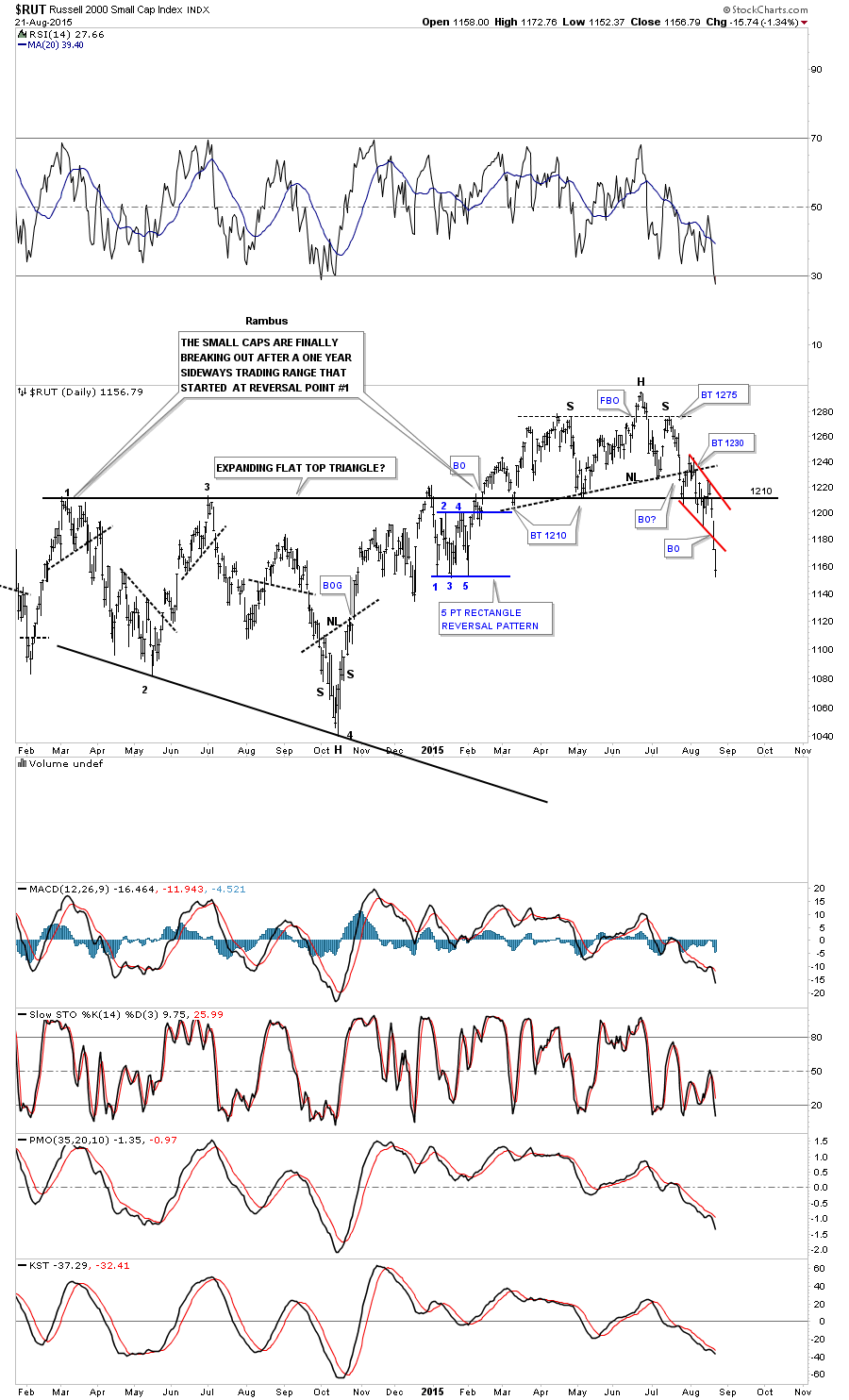
Now I would like to show you a few charts that may shed some light on whether we’re going to see some follow through to the downside or if we’ll get a backtest to the 17,100 area before the INDU moves lower. Below is a daily chart for the $RUT which is now showing a double H&S top, not a very pretty one but the pieces of the puzzle are there. Notice the blue bearish falling wedge that formed right on neckline #2. As I’ve stated countless times in the past when we see a smaller consolidation pattern form right on top, below, above and below or right on an important trendline, it’s usually a pretty good indication that the pattern is valid and the breakout will occur. Also I have shown you many times in the past when we see a small consolidation pattern slope in the same direction of the trend, in this case down, we usually see a pretty strong move. This looks like the case with the $RUT.
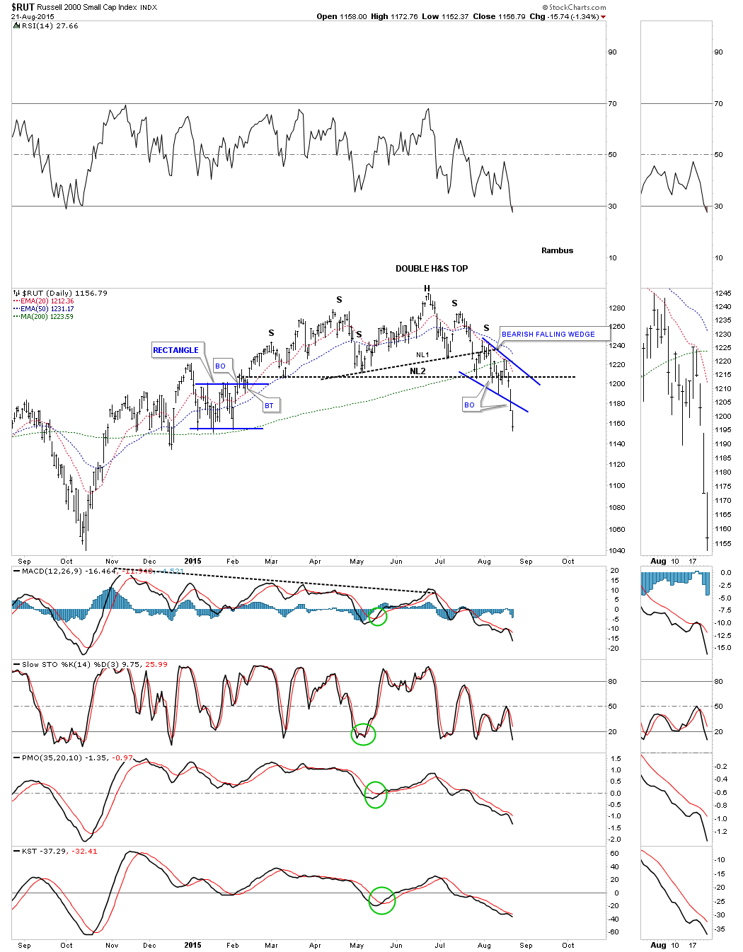
The long term daily chart for the RUT shows the damage that has occurred when the price action broke below the one year top black rail of the expanding flat top triangle. As you can see it held support on three separate occasions but now with the H&S top and the red bearish falling wedge in place significant damage has been done to the original flat top triangle. The red bearish falling wedge is strongly suggesting that we’ll see lower price dead ahead before we get a counter trend rally.
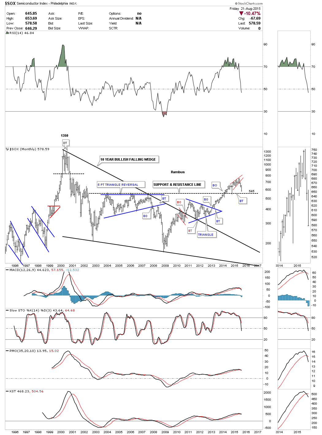
The daily chart for the $SOX shows it broke down from a bearish falling flag and still has a little ways to go yet before it reaches its price objective shown at the bottom of the chart.
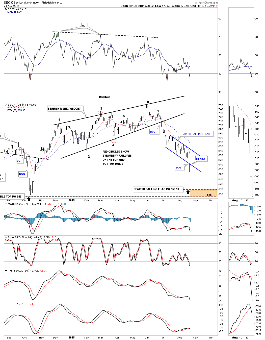
The monthly chart for the SOX shows why the 545 area may offer some decent support in the short term or even the long term. We just have to see what happens when the SOX gets there.
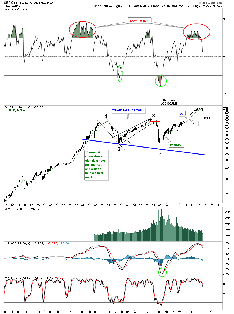
The daily chart for the SPX shows it has broken down from a blue 5 point bearish falling flag at the end of its almost nine month parallel 5 point bearish rising flag formation. We can now call it a bearish rising flag formation because the price action has broken below the bottom rail confirming the reversal pattern for us. The failure of the price action to reach the top rail, which would have been reversal point #6, now tells us the bulls were weak. It’s hindsight now but it still helps confirm the bearish price action from last week. Clues, it’s all about getting clues.
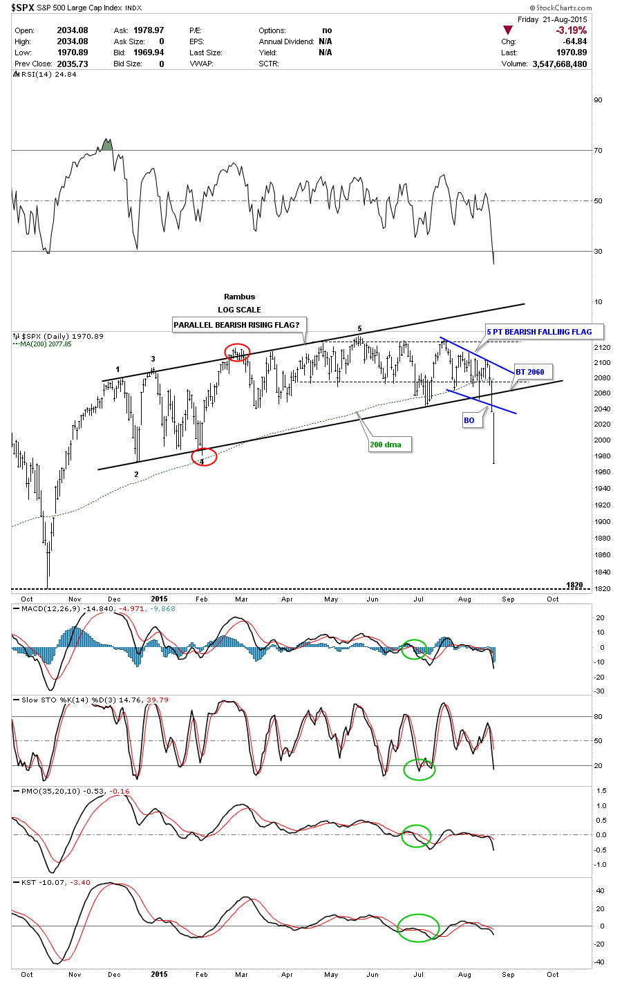
If this decline takes off to the downside the monthly chart for the SPX shows the previous highs made back in 2000 and 2007 should offer some strong support at 1550 or so.
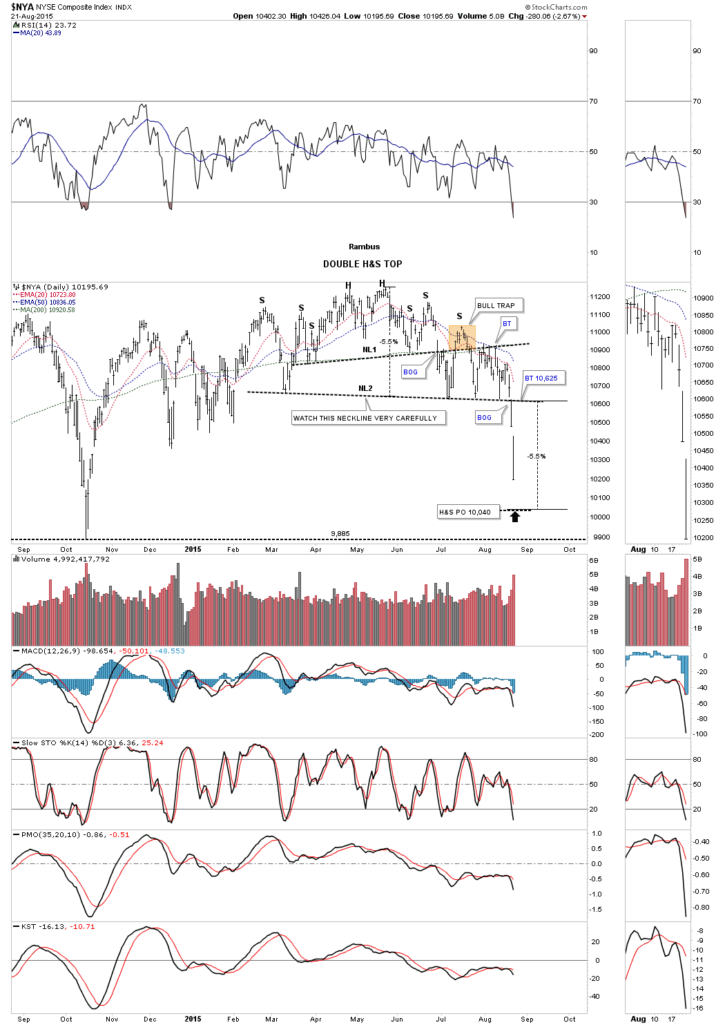
I’ve been showing you this daily chart for the $NYA for awhile now which finally gapped below the neckline this past week after testing it on four separate occasions.
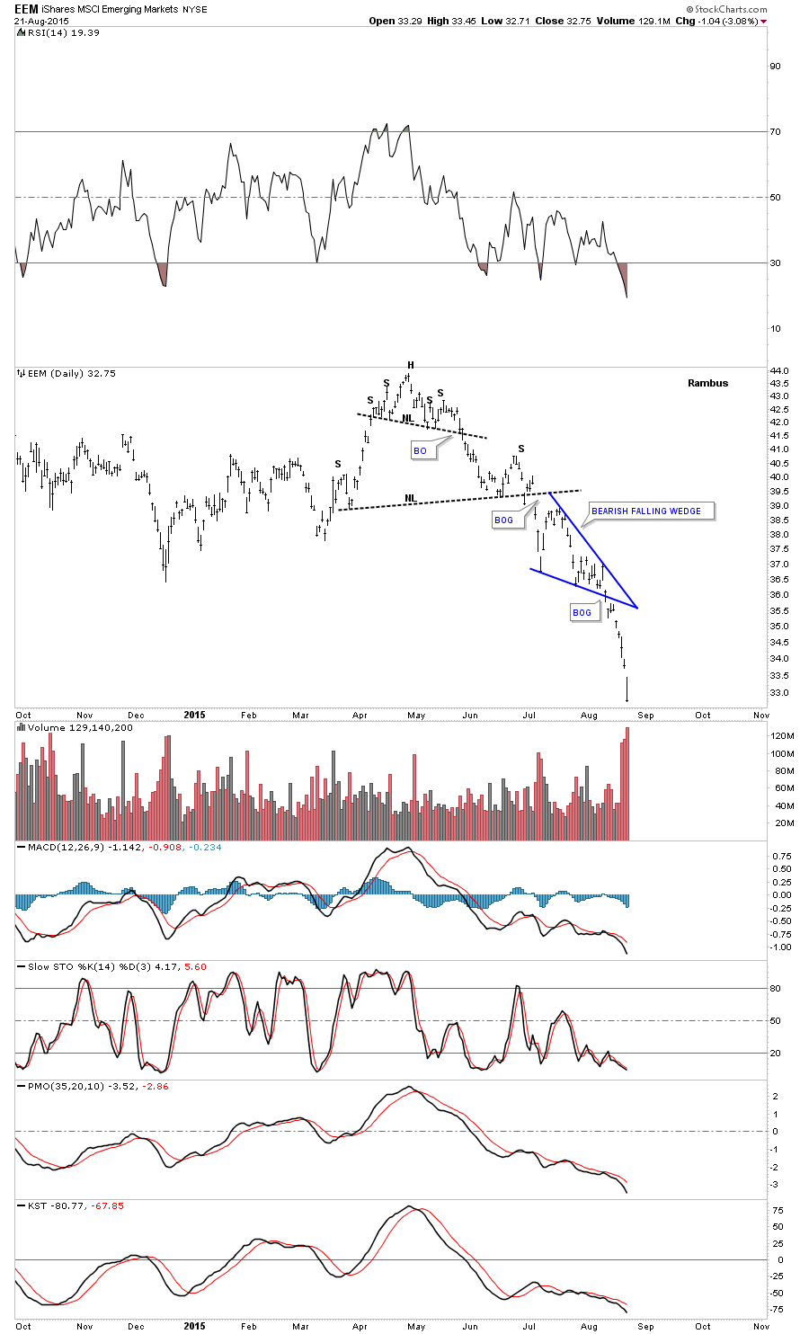
The daily chart for the EEM, emerging markets, broke below the bottom rail of its own bearish falling wedge a week before the US markets.
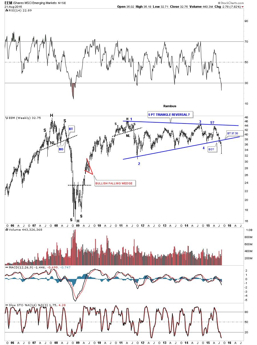
The weekly chart for the EEM shows it’s now just breaking out of a blue 5 point triangle reversal pattern. The only question is will we see a backtest to the bottom rail?
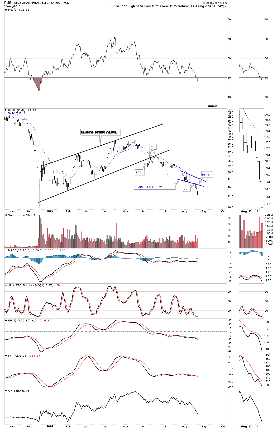
The daily chart for the RUSL, 3 X long the Russian stock market etf, broke below the bottom rail of a blue bearish falling wedge just three days ago which suggest there is more to go on the downside.
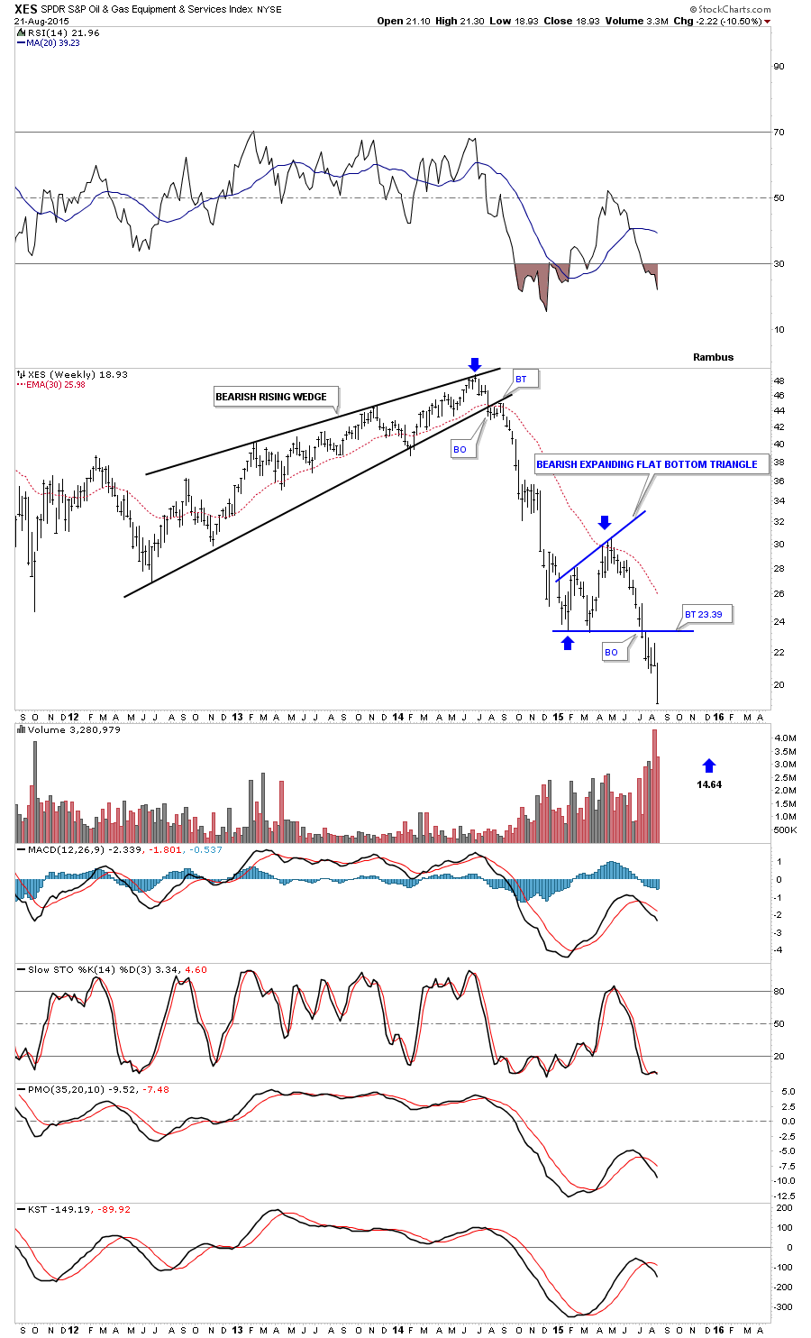
Lets look at one last bearish falling flag which has formed just below the bottom rail of a much bigger black bearish expanding flat bottom triangle consolidation pattern on the $XES. This area has been leading the energy sector lower.
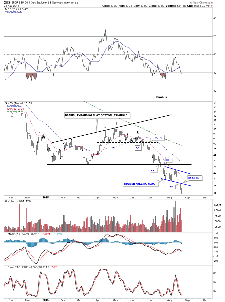
The weekly chart for the $XES shows the bearish expanding flat bottom triangle which I’m looking at as a halfway pattern to the downside that is separating the first leg down out of the bearish rising wedge and our current impulse move down out of the expanding flat bottom triangle.
There are never any guarantees when it comes to the markets but I’m seeing several small bearish falling wedges and flags that usually lets us know that we’re in a strong move. Time will tell.
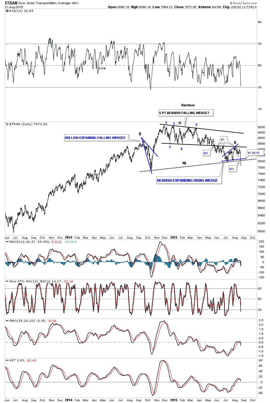
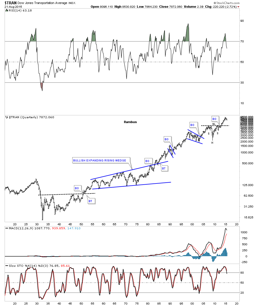
There is another sector in the markets that maybe showing confirmation of a strong move lower. The Transportation Average was one of the strongest sectors when the markets bottomed in 2009. The daily chart below shows it completed a H&S top last week when it broke below the neckline on Friday. The head is a 5 point bearish falling wedge with a blue bullish expanding falling wedge as the left shoulder and our most recent blue bearish expanding rising wedge as the right shoulder. A backtest would come in around the 8015 area.
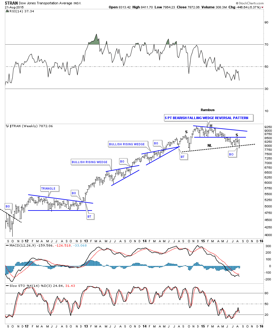
The weekly chart for the Transportation Average shows you just how strong its bull market was by the formation of the two bullish rising wedge which is just the opposite of what I just showed you on the charts above with the smaller bearish falling wedges and flags. You can see the price action is just now breaking below the neckline.
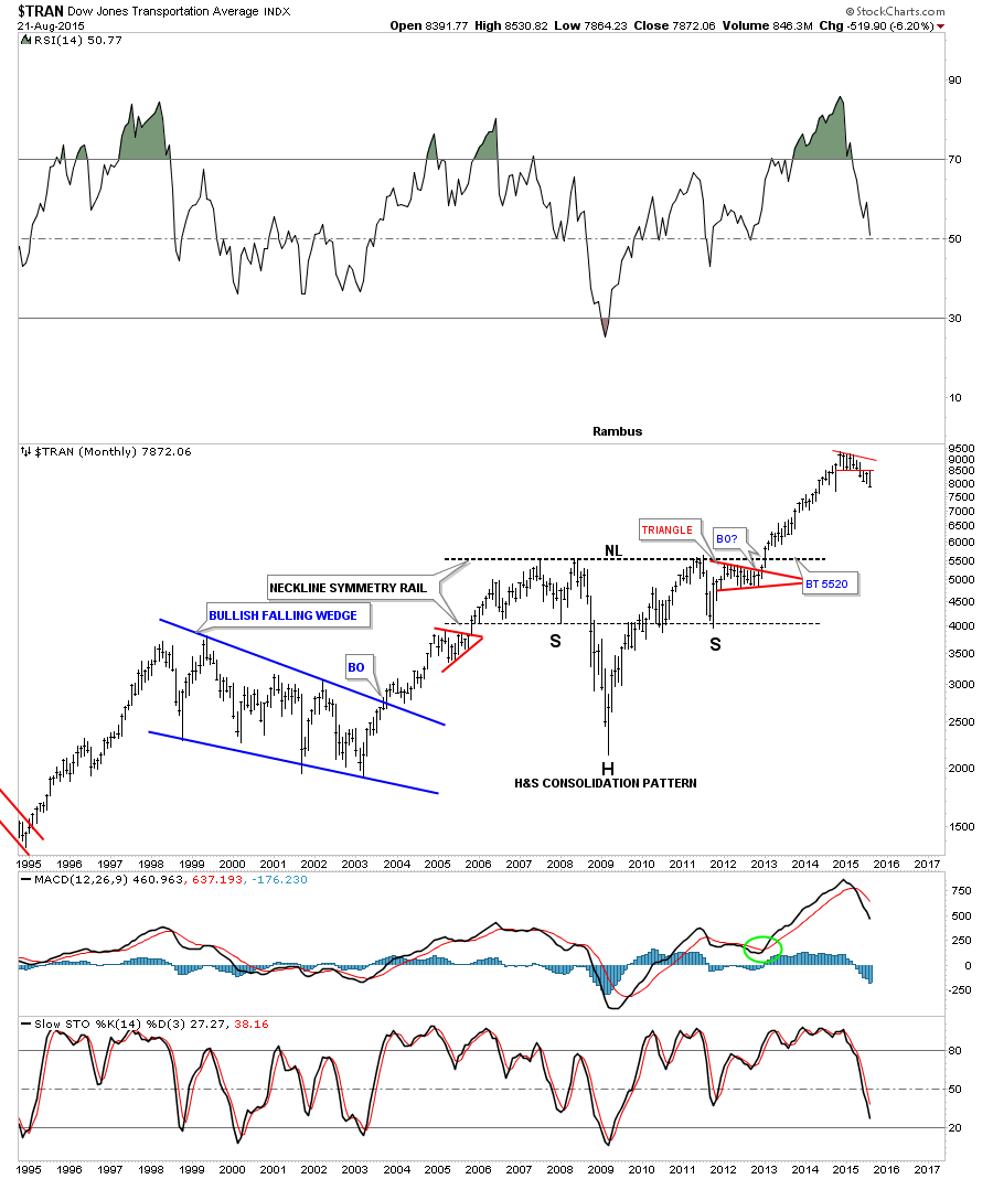
The monthly chart for the Transportation Average shows the reason I had been so bullish on this sector for such a long time. This monthly chart below shows you one of the most beautiful H&S consolidation patterns I’ve ever seen. I’ve seen some pretty good ones but this one is right up there with the best of them.
The long term quarterly chart for the Transportation Average goes back about 100 years showing the really big patterns that have formed through the years. You can see the H&S consolidation pattern at the top of the chart. If this index ever declines down to the neckline it would probably be a very good clue that the correction or bear market or whatever it is we’re facing maybe over and a new bull market may begin.
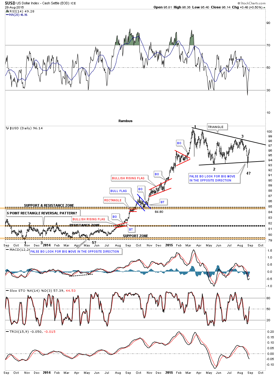
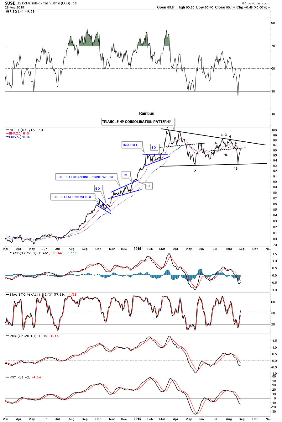
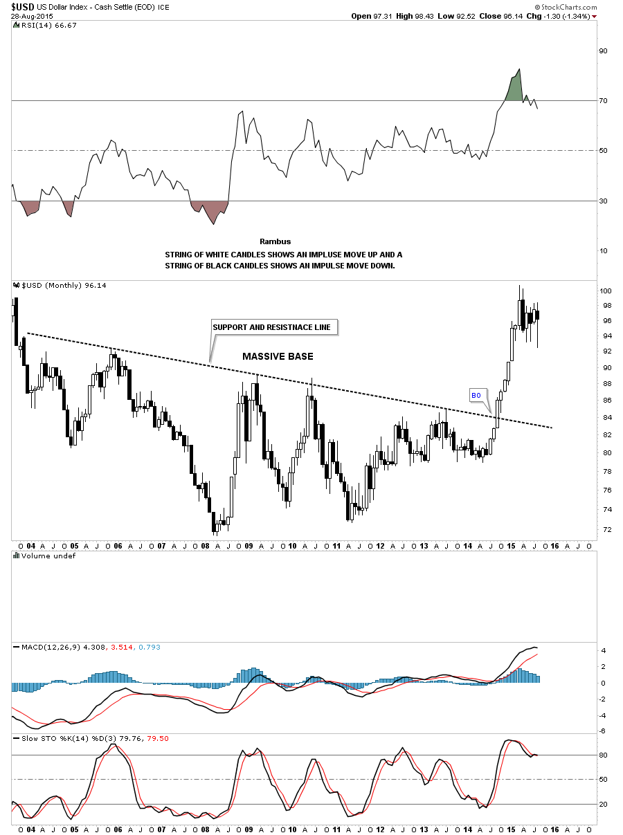
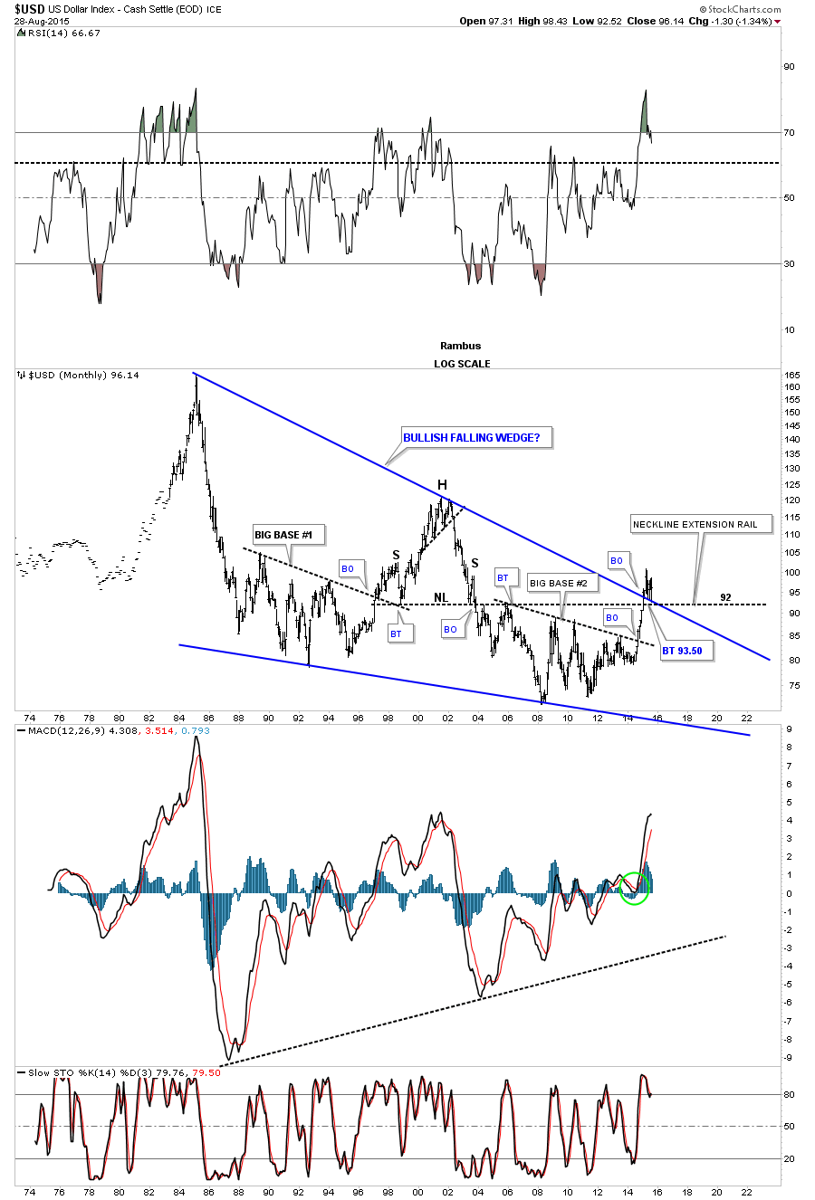
Lets turn our attention to the US dollar as a lot of folks are becoming bearish which maybe the case in the very short term. I first showed you this long term monthly chart when the price action broke above the top rail of the massive bullish falling wedge. So far all the US dollar is doing is taking a well deserved rest after breaking through the top rail. As you can see it has had one backtest to the top rail so far and it might have another one where support should come in between 92 and 93.50 or so. Nothing is broken on this chart which shows a very bullish picture for the US dollar.
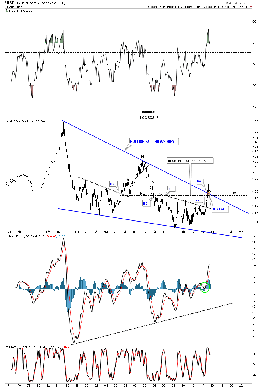
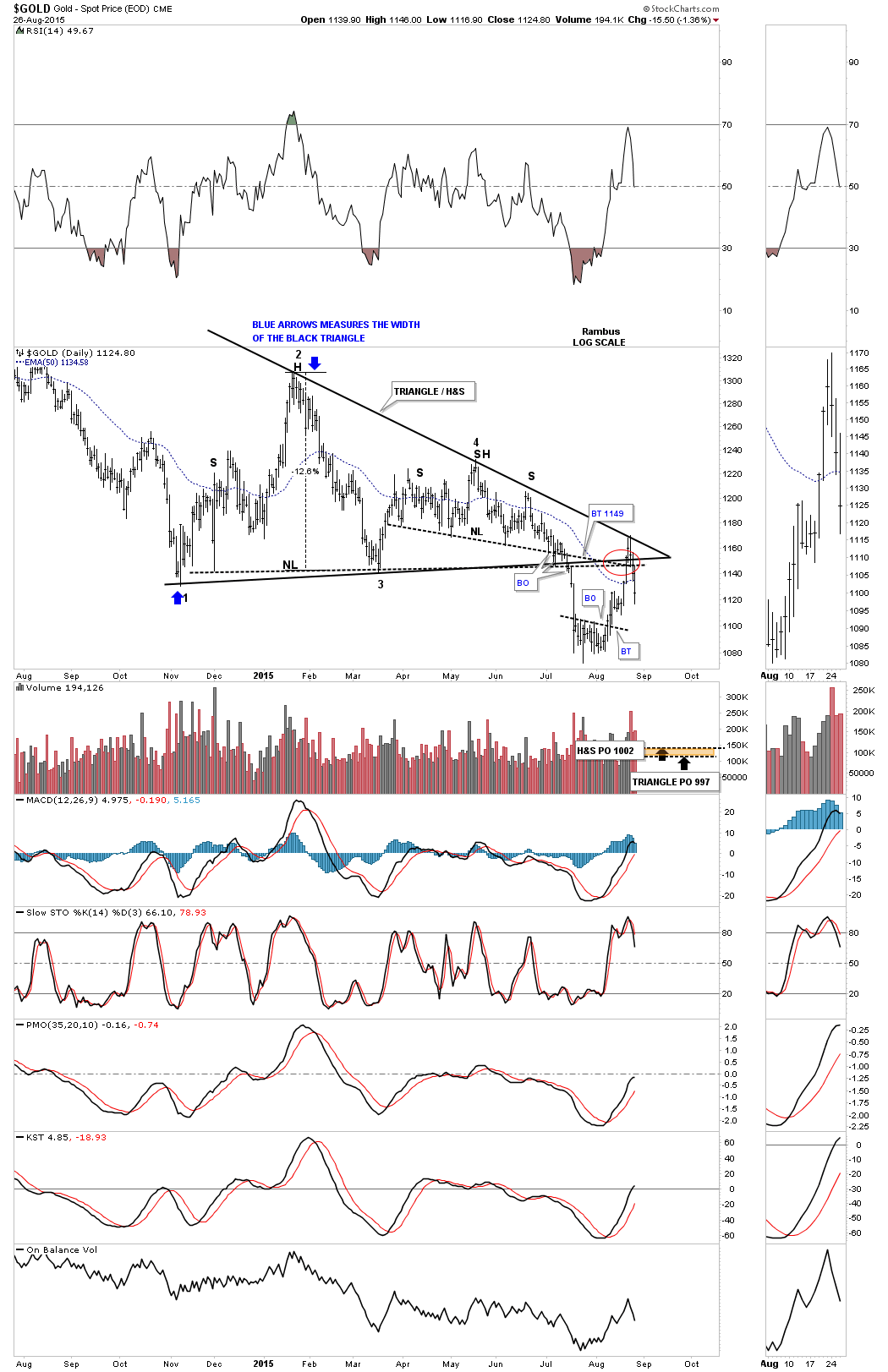
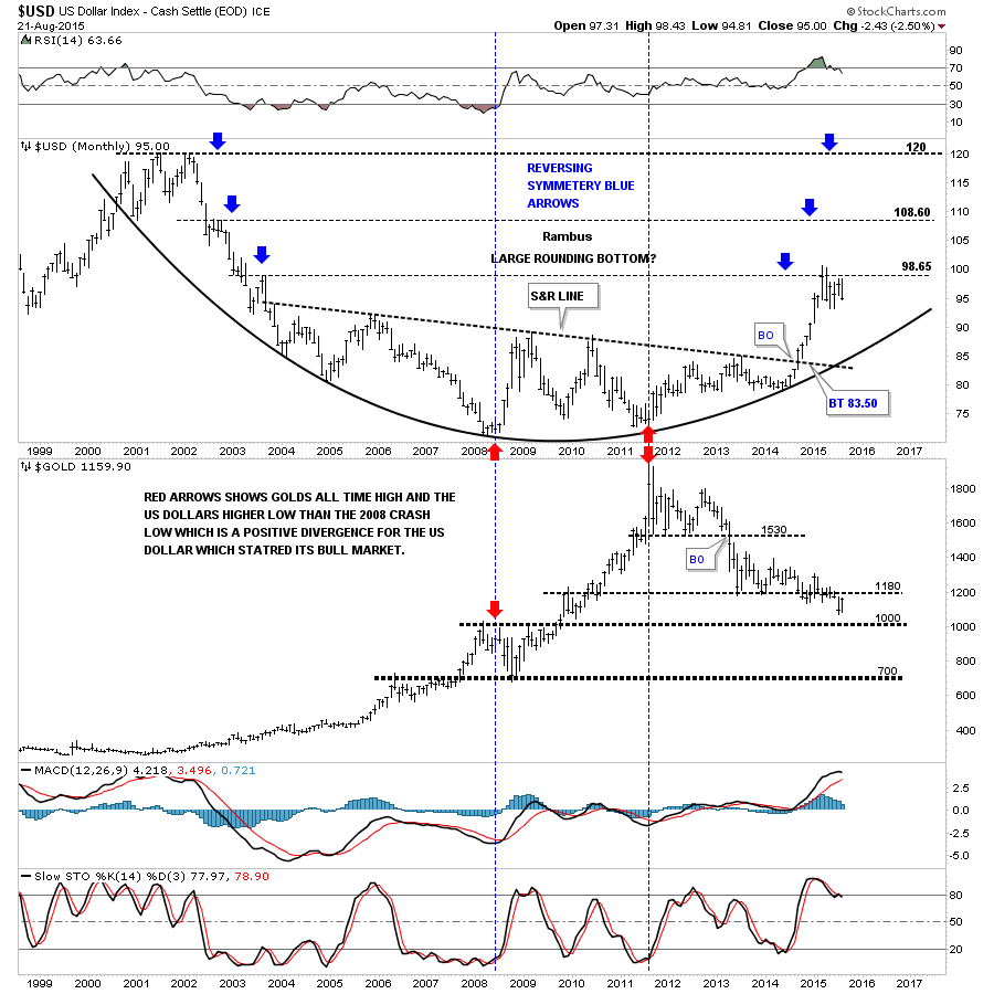
Below is a monthly combo chart for the US dollar and gold which shows the US dollar reversing symmetry back up as shown by the blue arrows and gold possibly running into resistance at the 1180 area. Once this consolidation period ends for the US dollar I expect it to rally up to the next blue arrow which comes in around the 108.60 area and then a time out to consolidate its gains. Remember a big base equals a big move which the US dollar has.
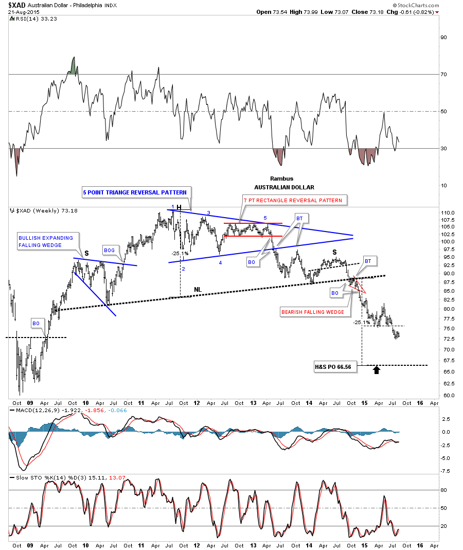
Lets take a look at some of the other most important currencies of the world and see what their long term charts look like because the big picture tells the truth. The $XAD, Australian Dollar, shows it still has a ways to go yet before it reaches in massive H&S tops price objective at a minimum.
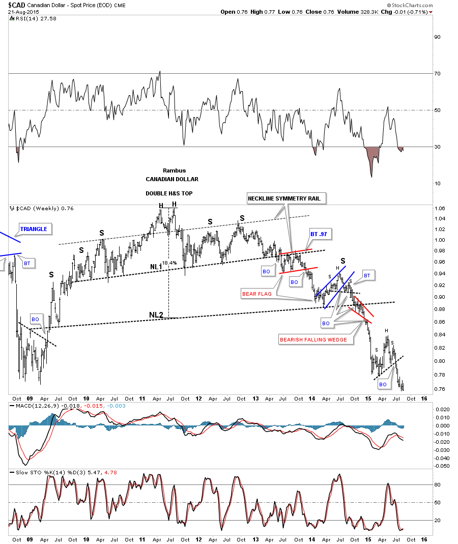
The weekly chart for the $CAD, Canadian Dollar, shows a double H&S top and has recently broken out of a small H&S consolidation pattern.
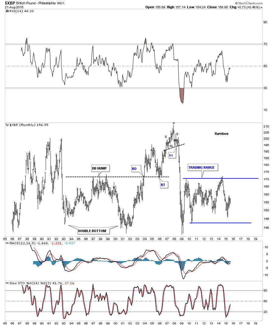
The monthly chart for the $XBP, British Pound, shows it has been trading sideways since it crashed in 2008.
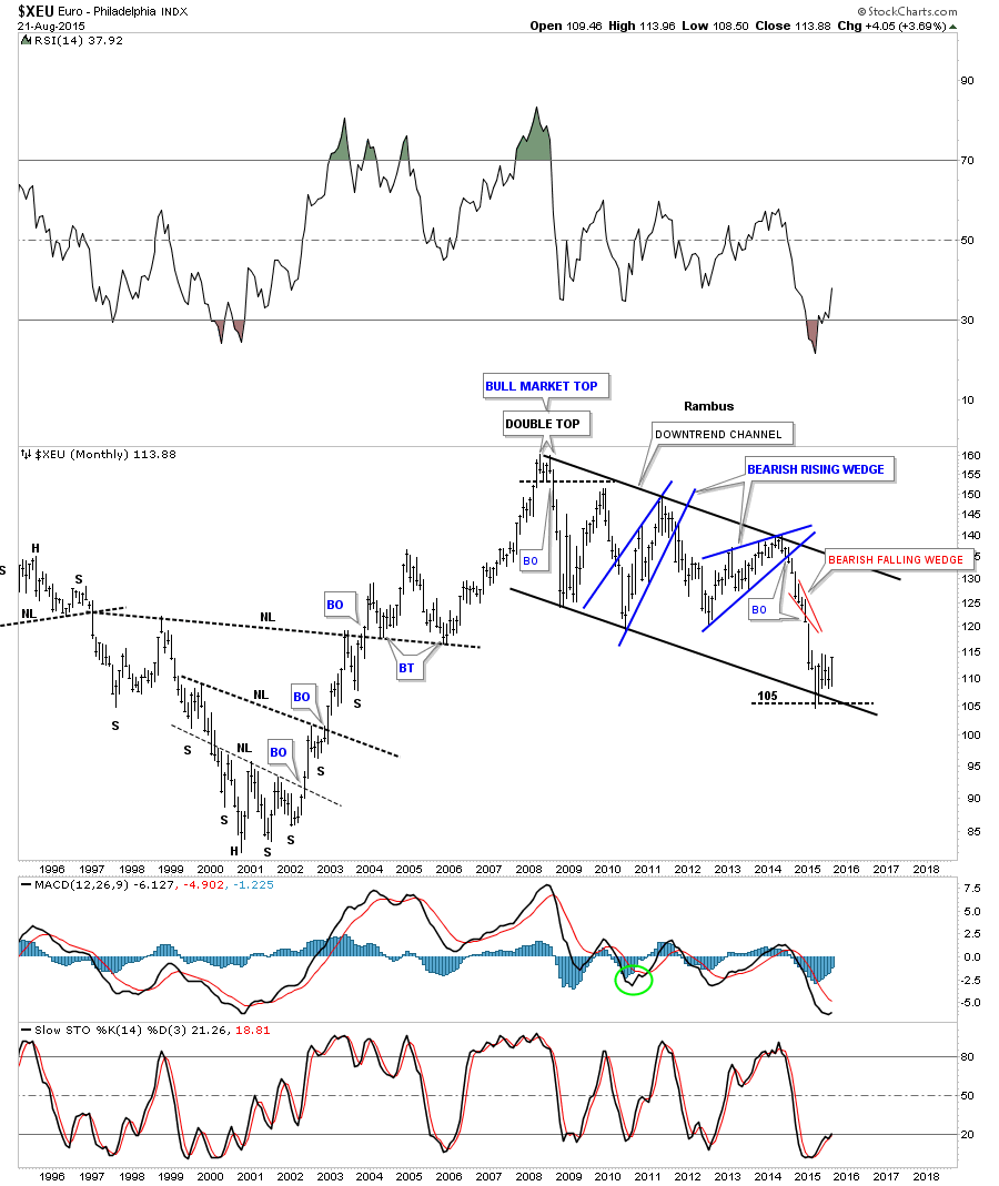
There are two separate chart patterns that we can look at in regards to the long term, $XEU, Euro. The first chart is the massive downtrend channel that began to form when the $XEU topped out in 2008. We’ve been watching this one for a very long time, well before it broke out from the blue bearish rising wedge. It did find support at the bottom rail of the downtrend channel and has gotten a bounce. Is it just a dead cat bounce or something more?
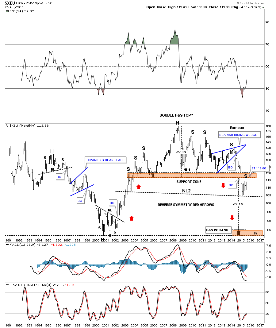
This second long term monthly chart for the $XEU is my preferred look which is showing a double H&S top. After putting in neckline #2 the euro has been in rally mode and it’s reversing back up to the brown shaded support and resistance zone which comes in at the 116.60 area which would be the high for the lower right shoulder for the neckline #2 H&S top. If the double H&S top plays out it will have a price objective down to the low made back in 2000 – 2001.
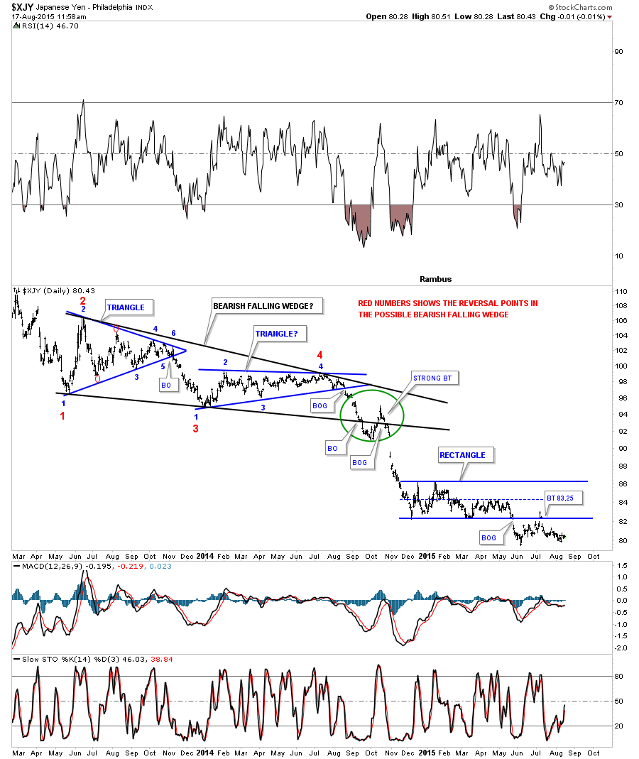
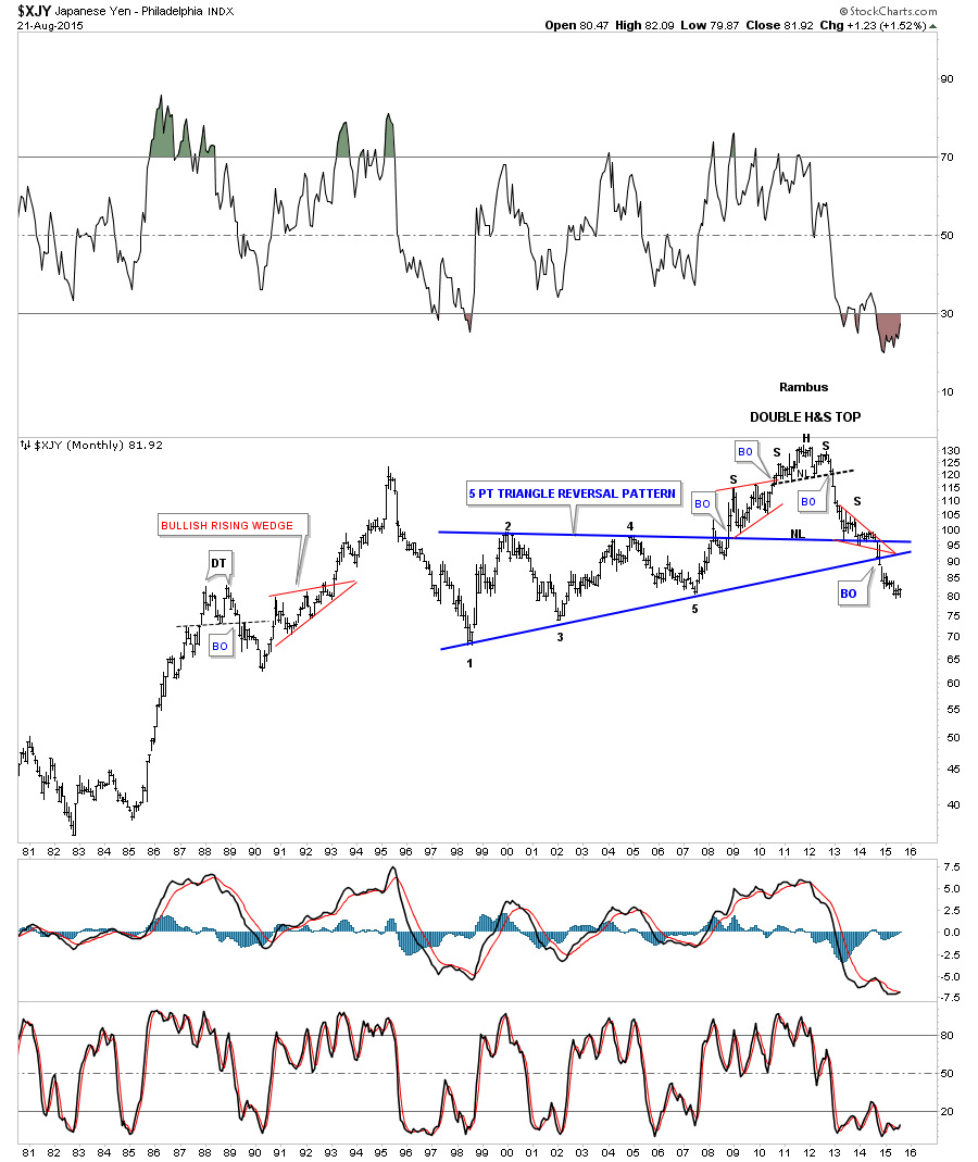
The 25 year chart for the $XJY, Japanese Yen, shows it has completed a double H&S top and has broken below the apex of its ten year triangle reversal pattern that launched the rally to its ultimate top in 2011 that shows a small H&S top that reversed the bull market.
From a short term perspective it looks like the Stock markets still have a ways to go down before we see a short covering rally. The many bearish falling wedges and flags tells us this is a strong move down right now. Be prepared tho for some high volatility as the bulls and the bears fight it for control of the trend. I promise I’ll have more on the precious metals complex this week but this move in the stock markets supersedes everything else right now. Big breakout moves don’t happen very often and when they do its nice to play the impulse leg until something changes. Again we should have a very interesting week ahead. All the best…Rambus