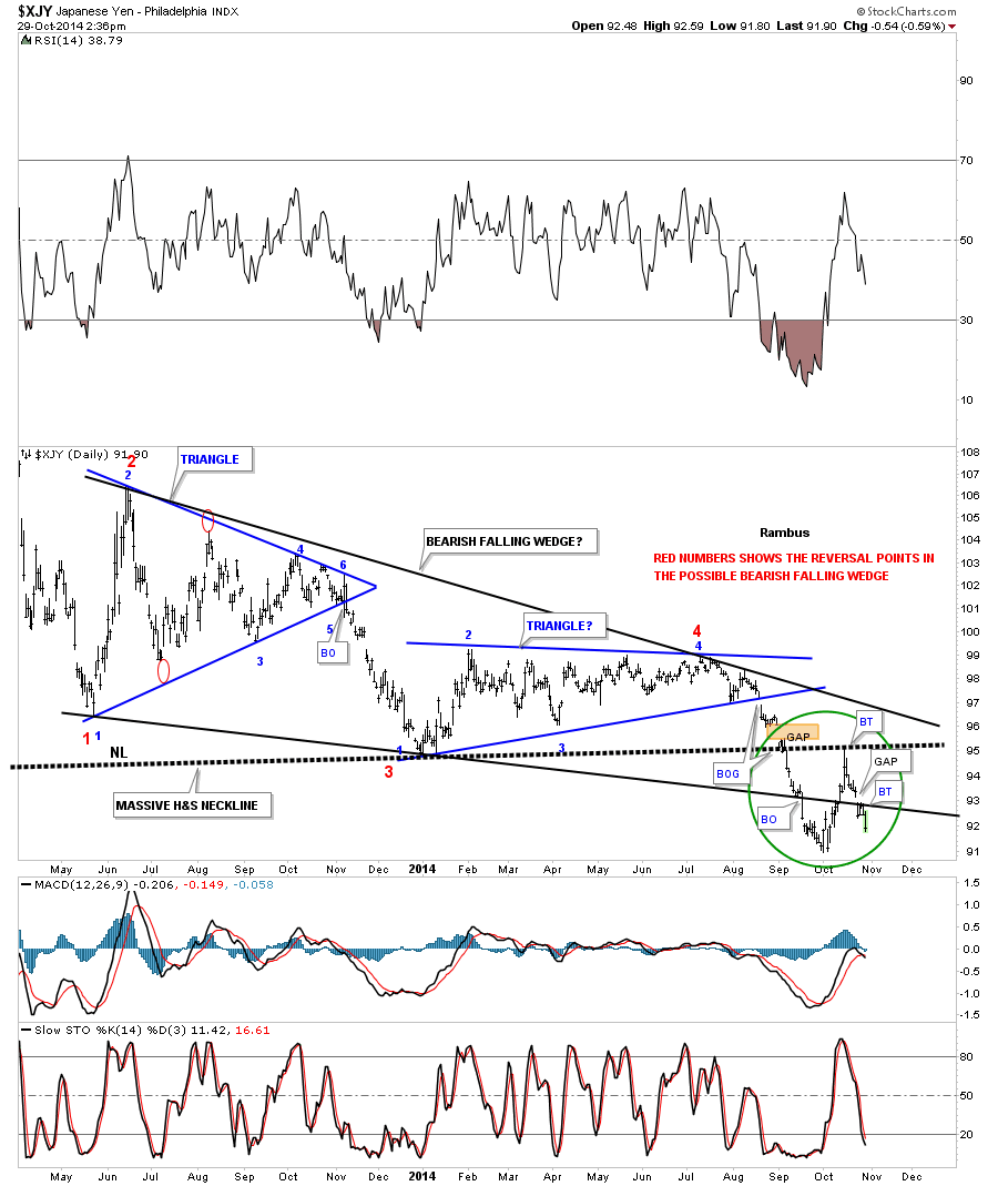
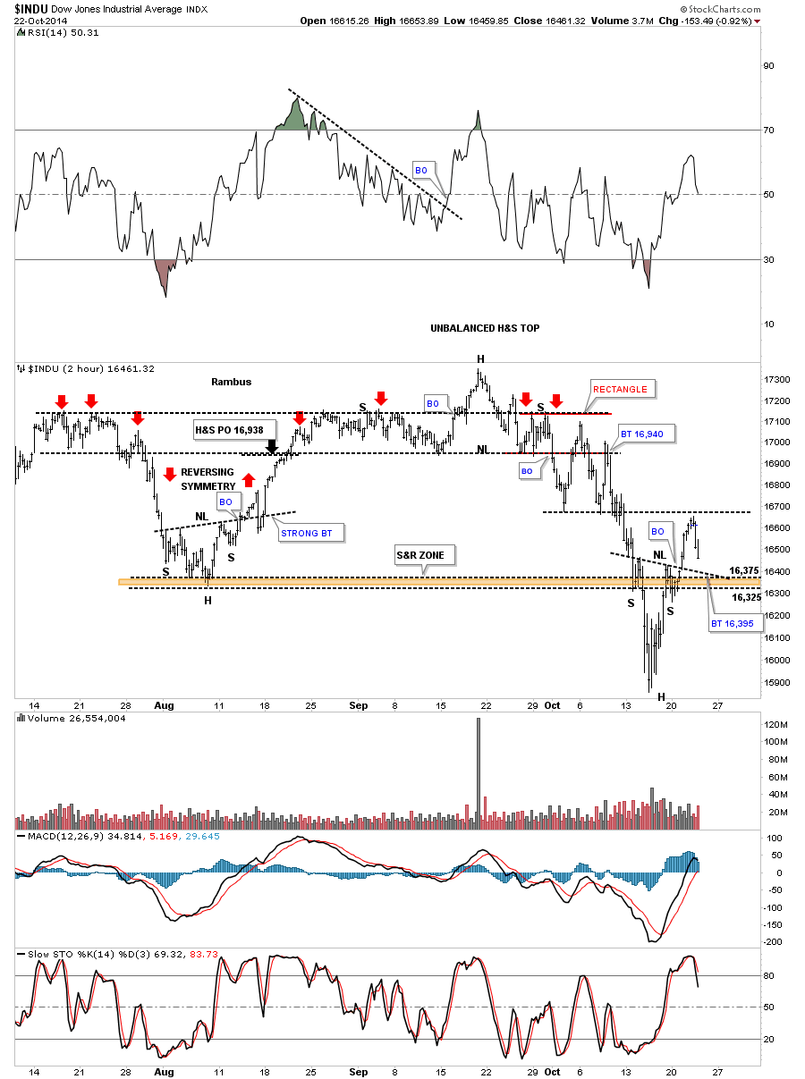
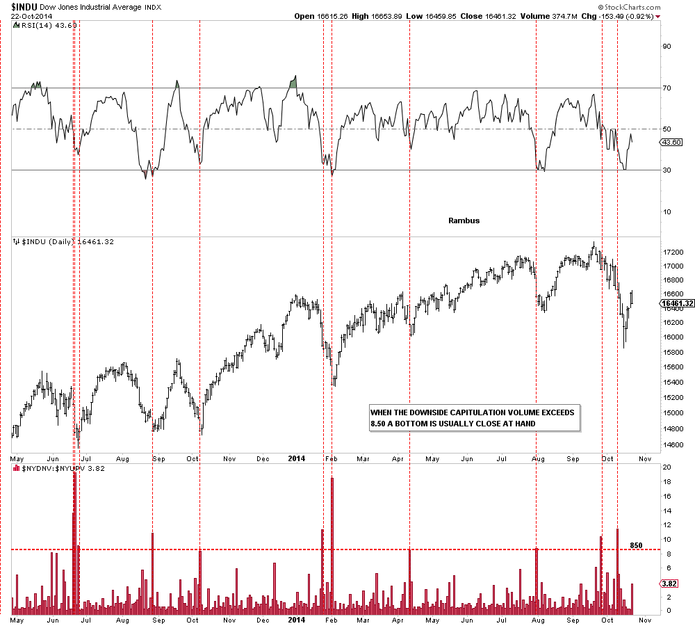
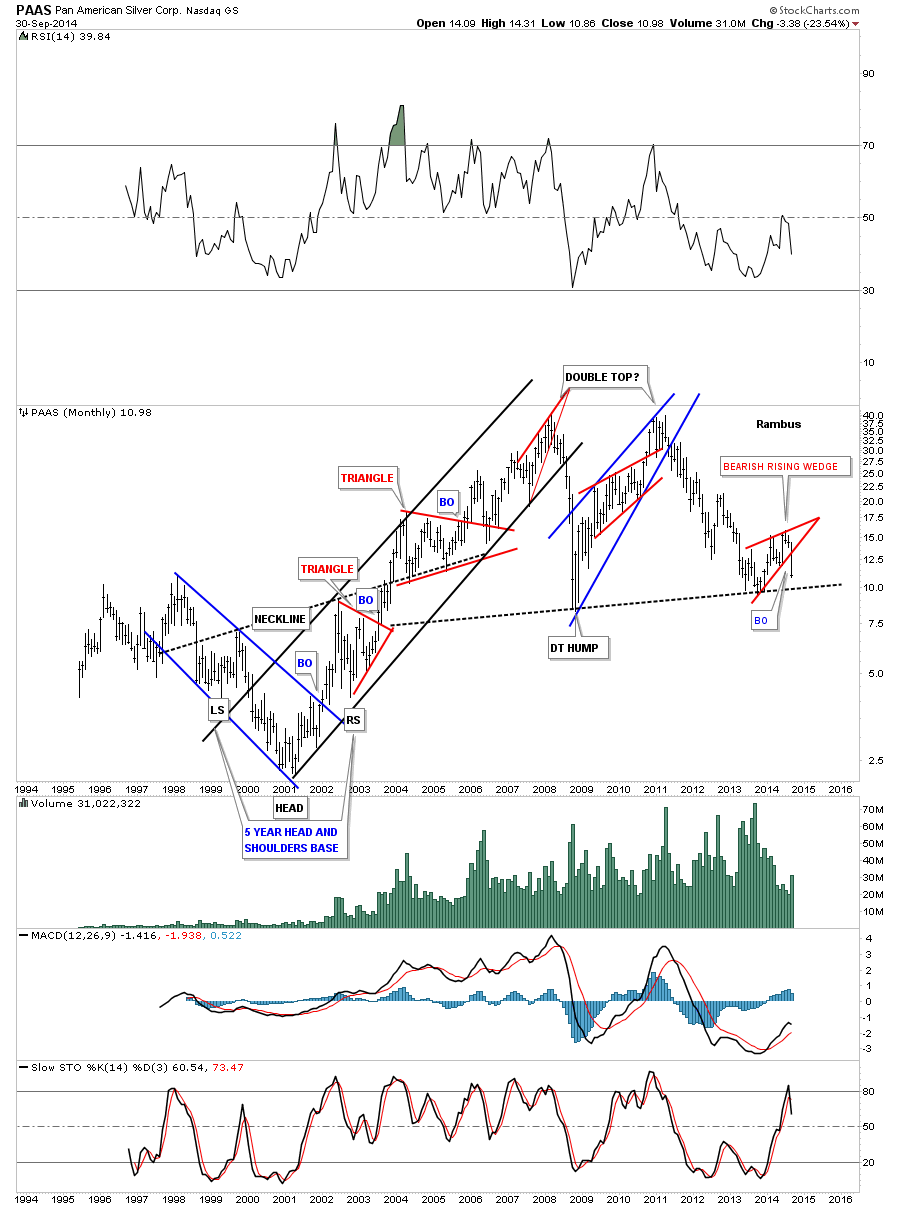
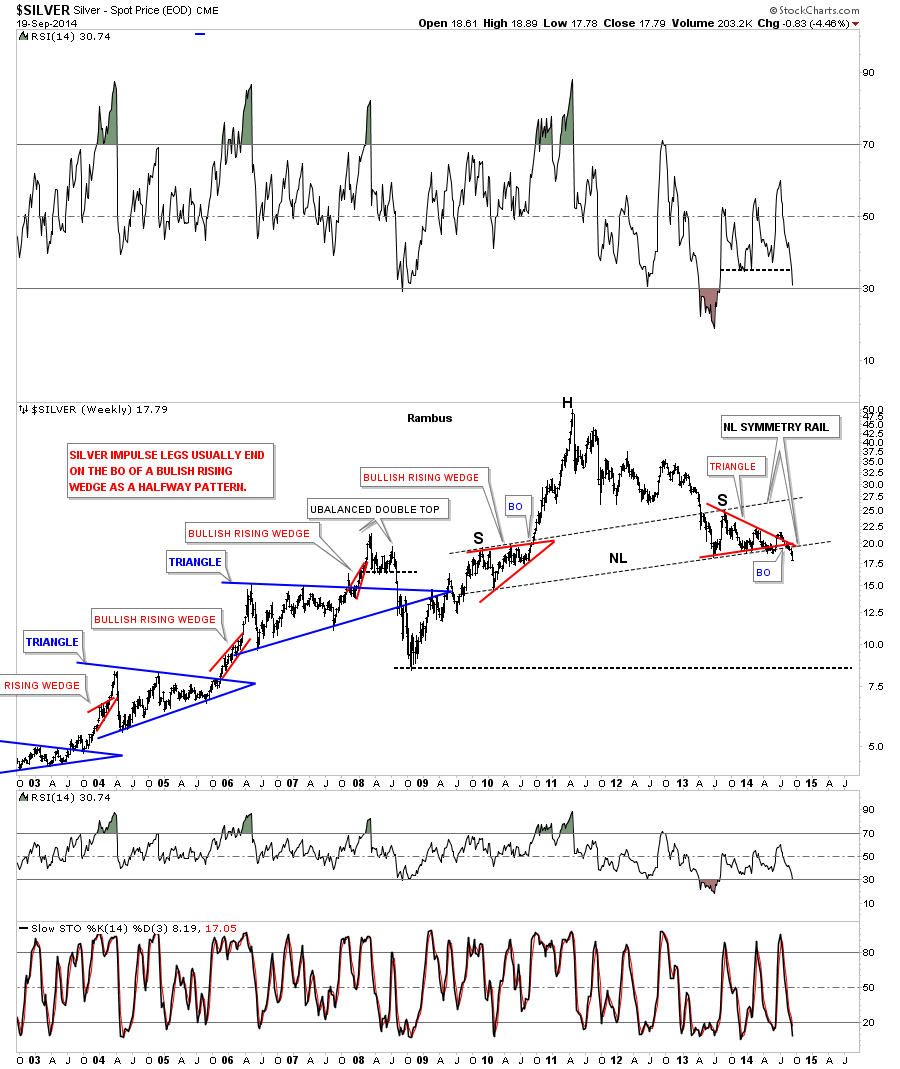
In this Weekend Report I want to show you what I think is the most important chart on the planet right now. I know many of you won’t agree with this statement because there are a lot of important charts out there that are talking to us right now. This just my opinion based on the most recent price action that this chart exhibited on the recent plunge in the month of October. The chart I’m referring to this the long term monthly chart for the Dow Jones Industrial Average.
Before we get to the present charts I would like to show you a Weekend Report from January 2013 . The signs that a new Bull market in US Stocks was beginning were there , almost 2 years ago . Even I am surprised how this has evolved exactly as described .
http://rambus1.com/?p=9469
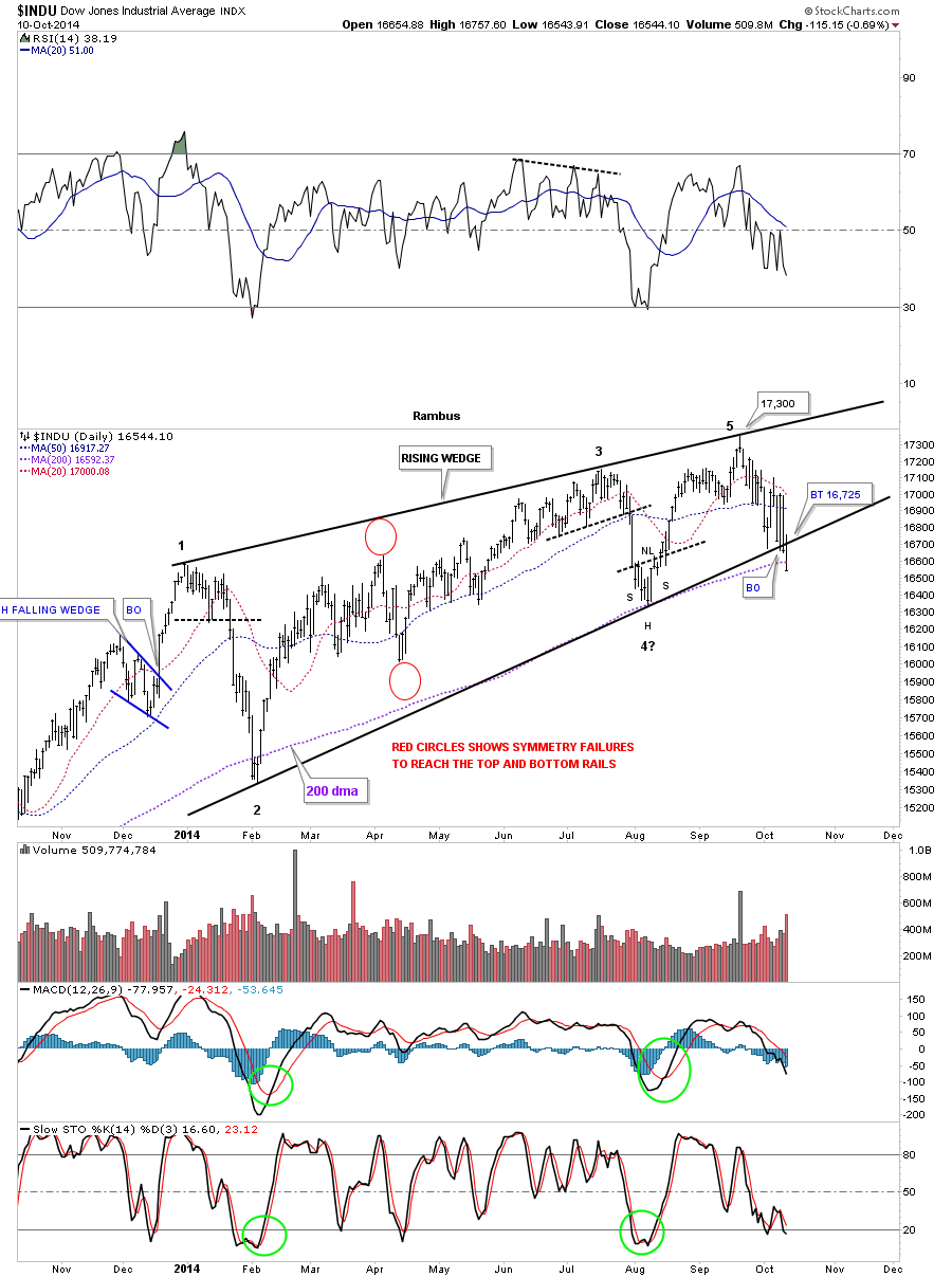
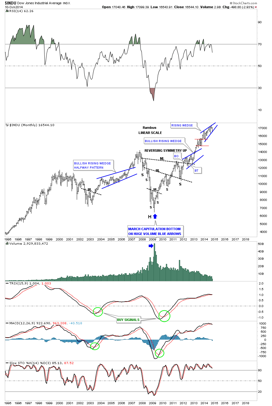
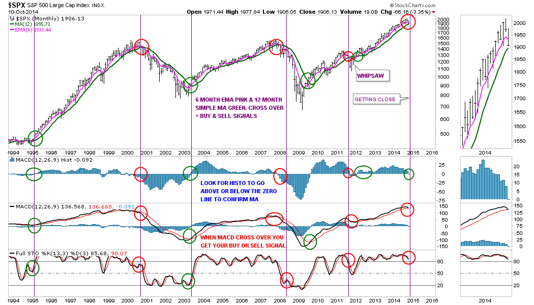
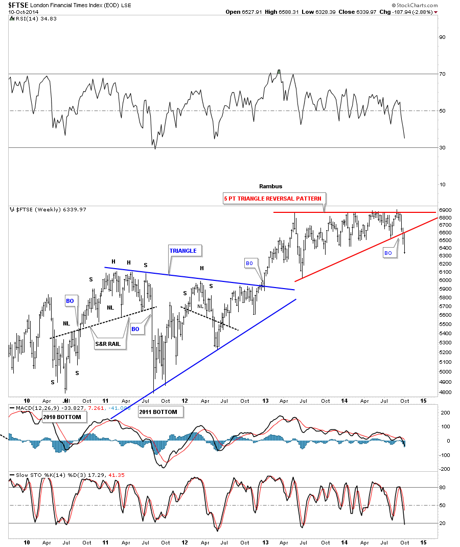
Before we look at the Dow Jones I would like to give you just a simple quick explanation of how Chartology works. Every trendline you put on a chart either acts as support or resistance. For example during a rally phase the bulls are in control and move price higher. At some point the bulls run out of gas and need to consolidate their gains before the stock can make an other advance. The recent high is where you start the trendline which is resistance. Next the reaction takes the stock down far enough where the bears run out of gas and the bull take over again and begin to move the stock back up. This is the beginning of the support line. The next move up can stall out just above, right on or even below the first reversal point high which gives you a the high to place your top trendline which is acting as resistance now. The same goes for the next reaction to the downside where the stock will find support just above, right on or just below the previous low. This is how a consolidation pattern begins to form. The upper and lower trendlines shows you the fight between the bulls and the bears which in a bull market the bulls will when the battle at least 2/3 to 3/4 of the time.
Once the battle is resolved in the bulls favor the top rail, for whatever chart pattern developed, will then reverse its role from what had been resistance to now support. The reason this happens in bull markets is because the bulls are the dominant force in play, Just the opposite in bear markets. Those that bought their stock before or during the consolidation process are still making a profit so there is no reason to sell when the new consolidation pattern breaks out to the upside. A lot of times you will see a backtest to the top rail, which had been resistance turned into support, which gives you confirmation the top rail is hot and to be respected. The bears are weak at that point and can’t drive the price down any lower so the dominate uptrend resumes again. This is just a very short and simple explanation of how support and resistance works which is the basis for Chartology.
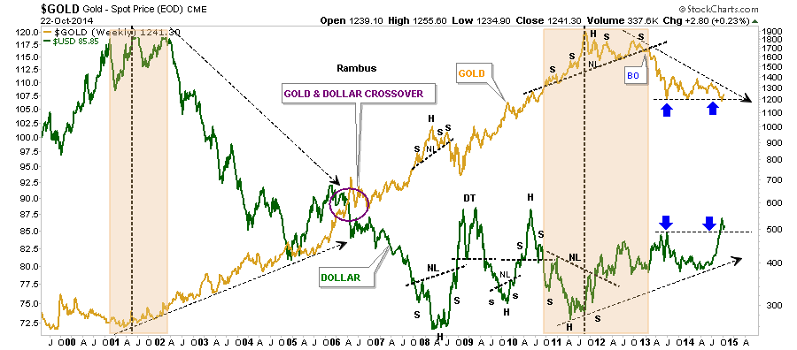
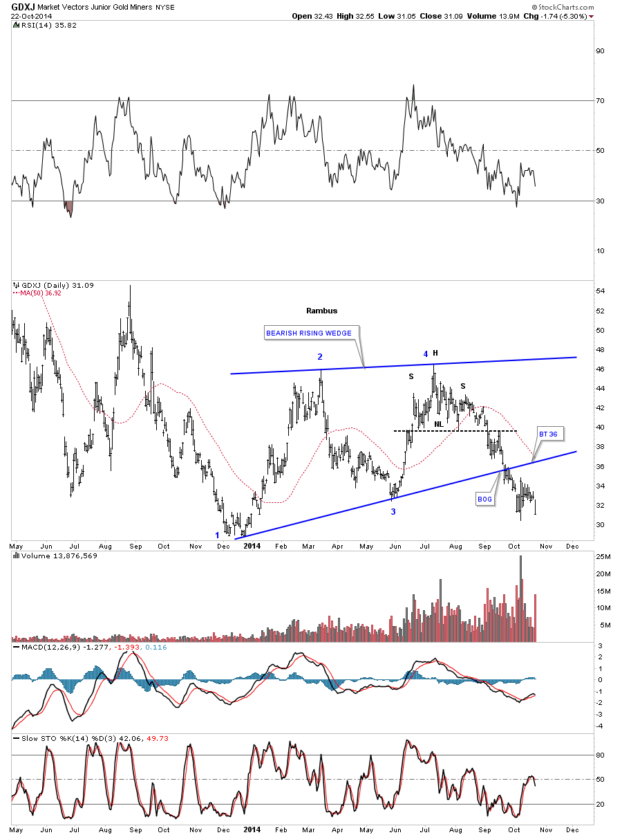
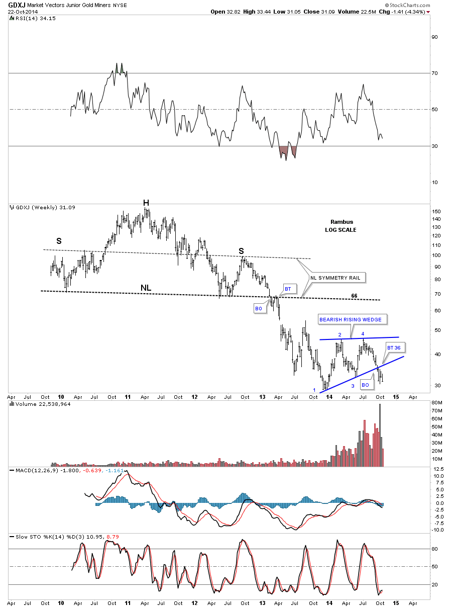
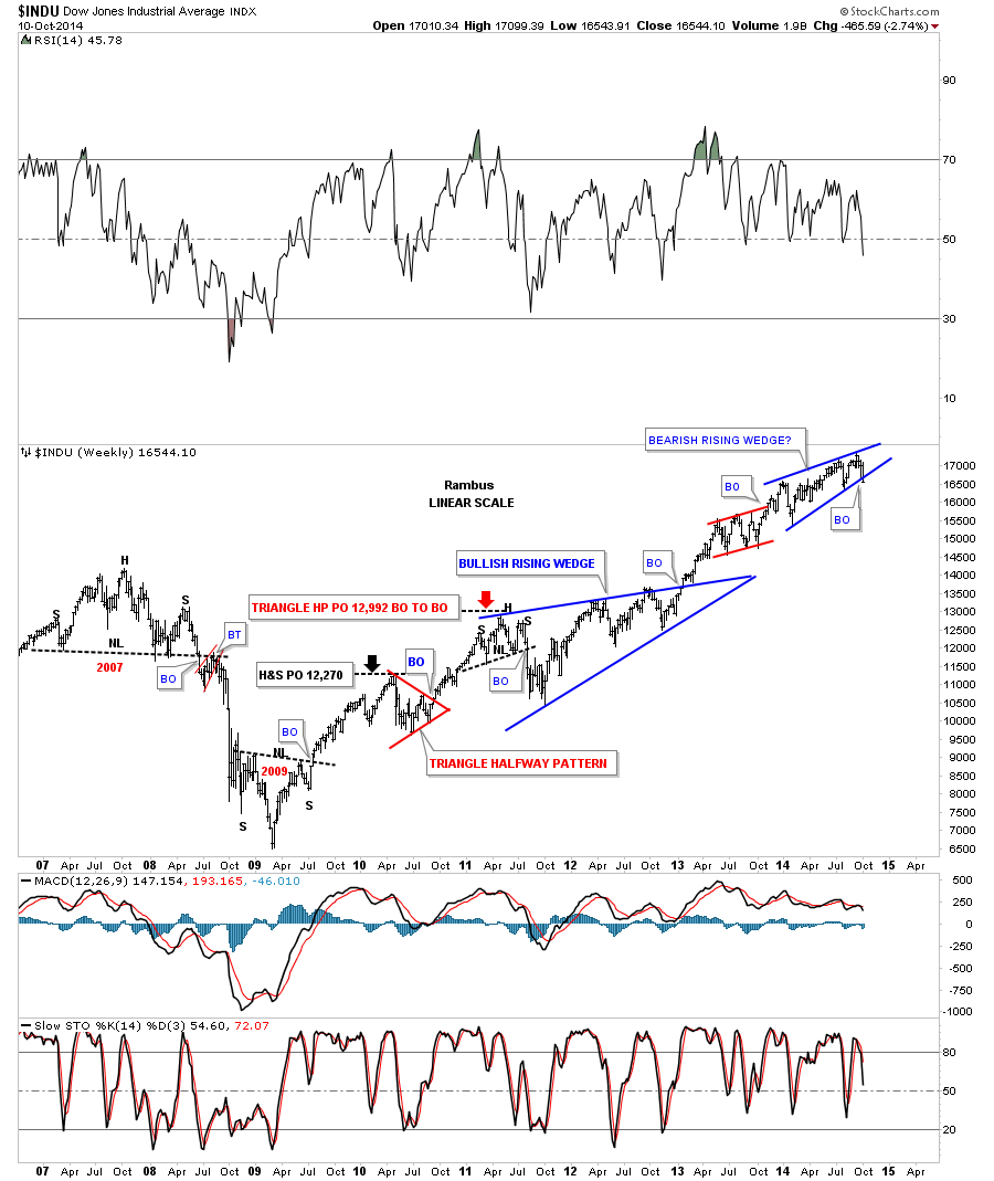
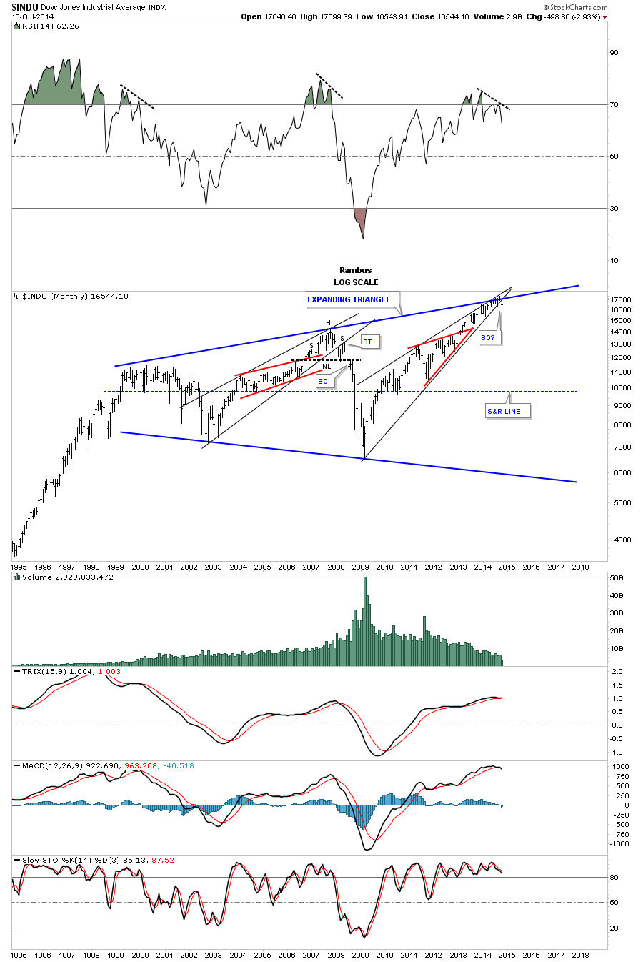
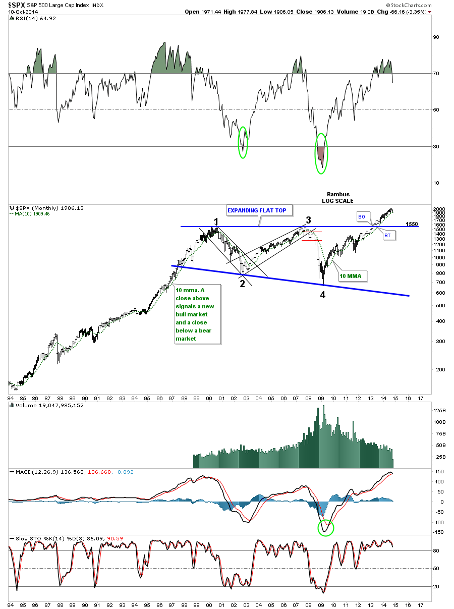
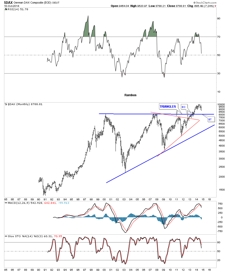
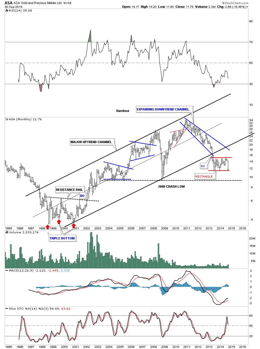
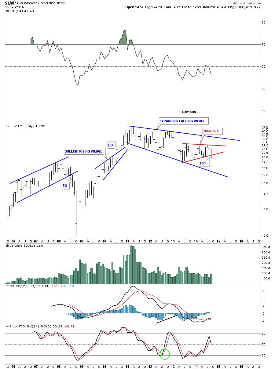
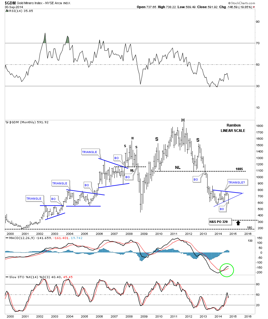
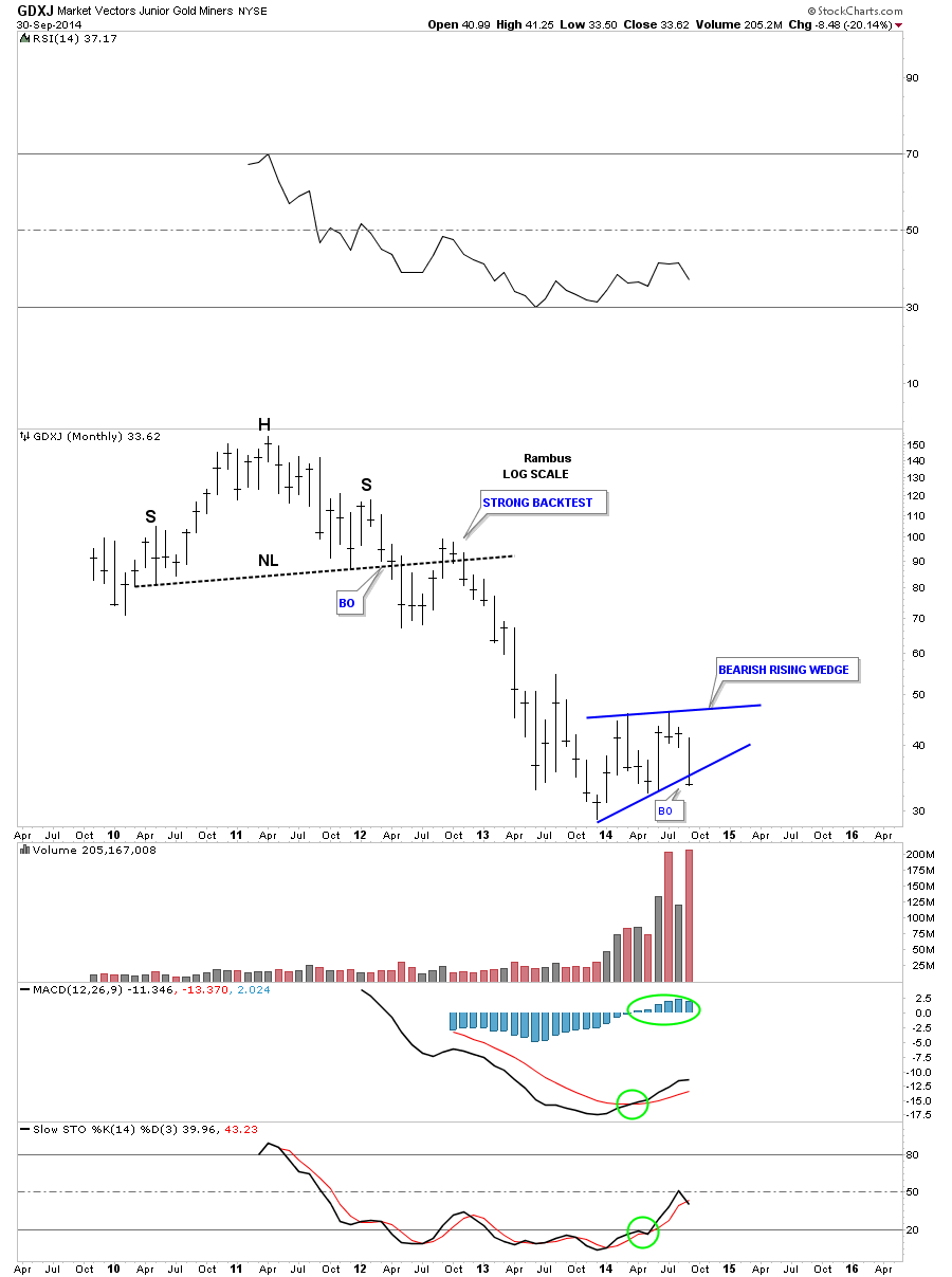
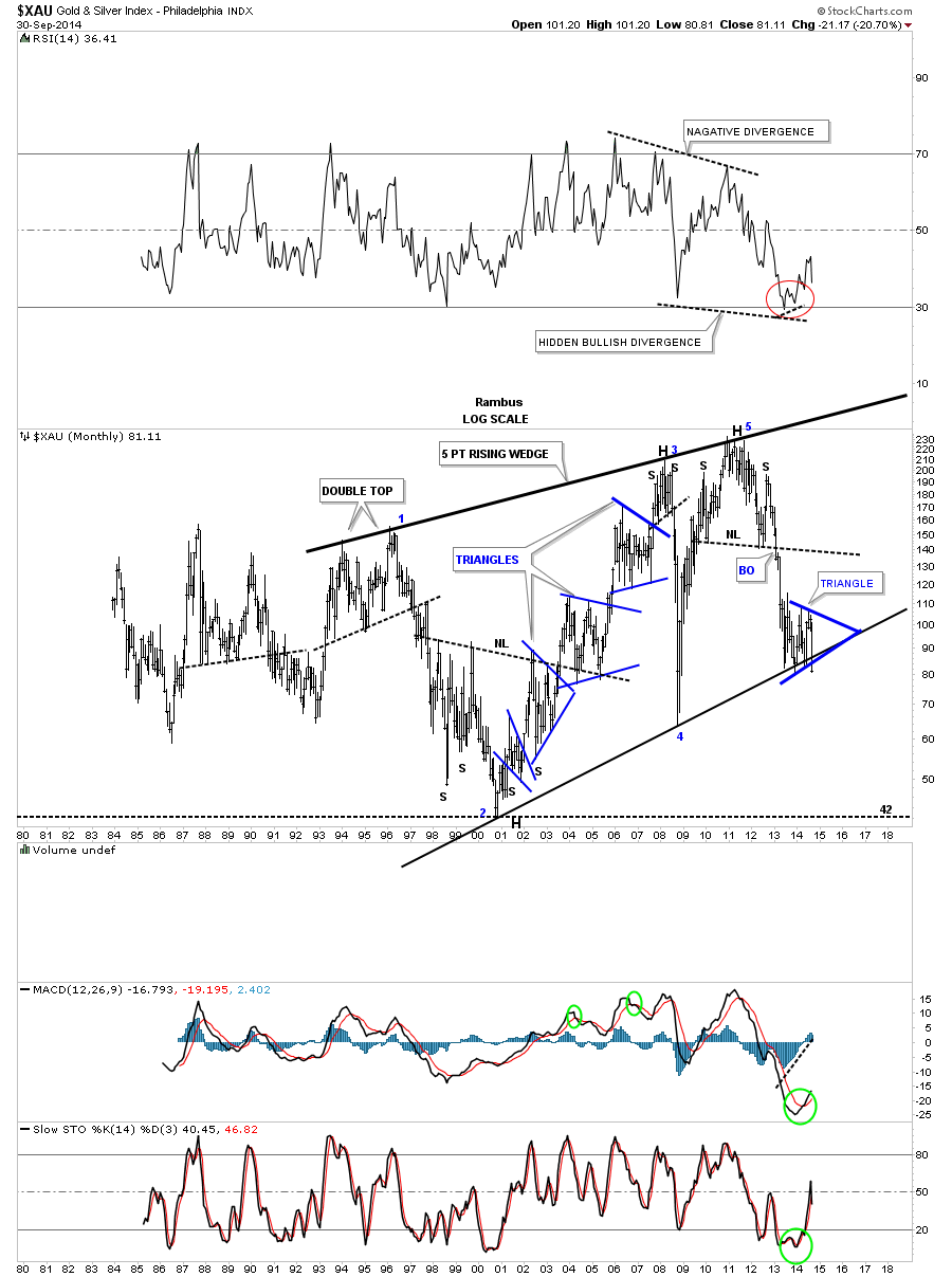
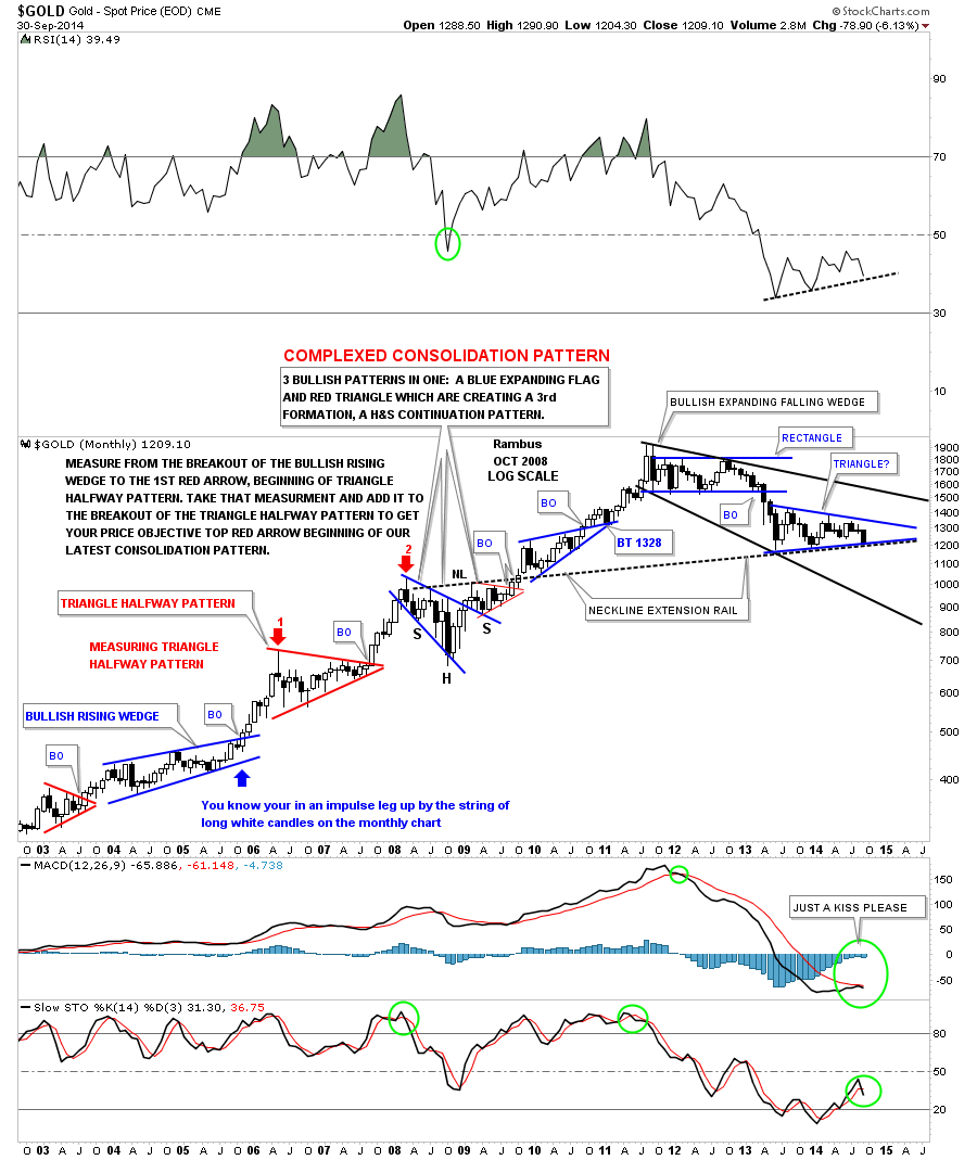
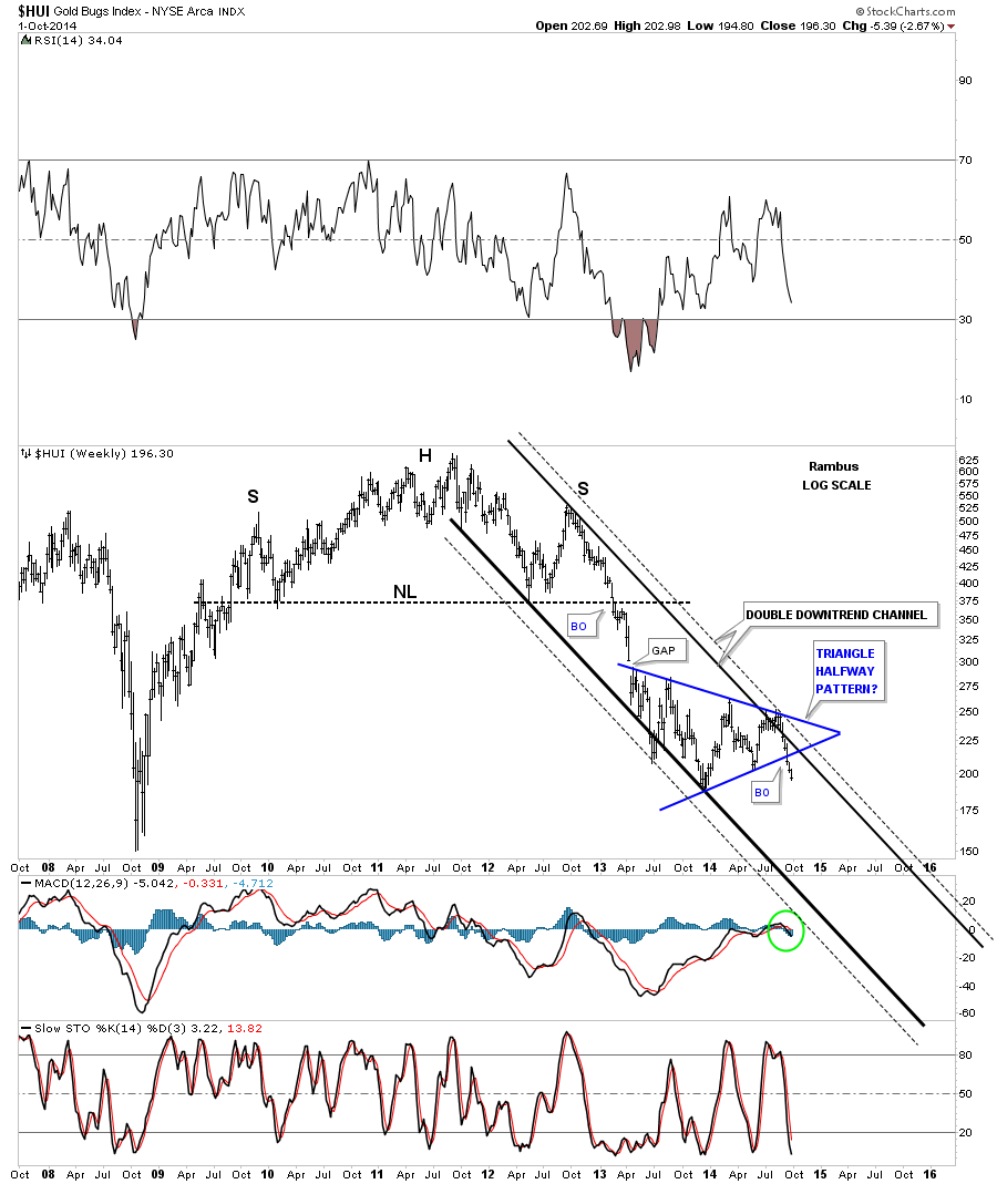
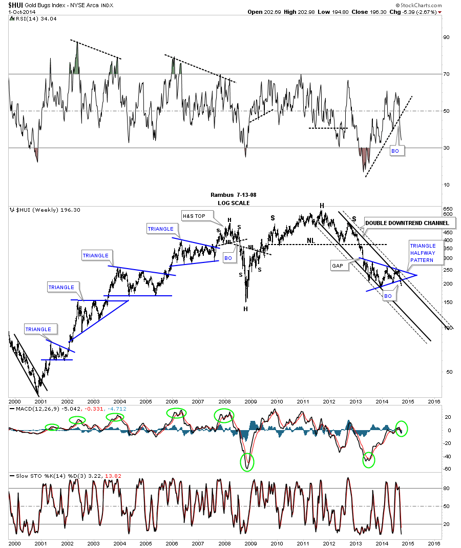
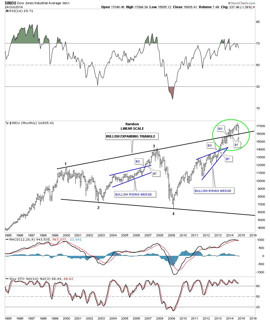
The basic principal is, resistance turns into support when it’s broken to the upside and visa versa to the downside, I would like to show you the most important chart on the planet right now IMHO. This very long term monthly chart for the Dow Jones has gotten a lot of play lately as a very bearish pattern which technically is an expanding triangle or as some call it The Jaws of Death.
This next statement will be hard for most folks to understand but I believe the Dow Jones, along with many other stock market indexes and individual stock, have been consolidating in one giant consolation pattern, that got their first reversal point all the way back at the bull market high in 2000. The second reversal point came at the 2002 low followed by reversal point #3 that formed a higher high against the 2000 bull market peak. Then came the crash low in 2009 that looked like the end of the world as we knew. How could the stock market ever recover from such a beating? That important low has scared most investors for life and they will never be able to look at the stock market in a positive light again. That’s what crashes do to your psyche.
Below is a monthly chart, in linear scale, that shows the expanding triangle or as some refer to it as the Jaws of Death. I’ve put a green circle around the area I want to discuss in detail so you can see the principal I showed you earlier in this post on how a trendline can reversal its role, in this case, from resistance to now support. First notice the price action, which was six month of trading, just below the top rail of the expanding triangle. The bulls tried as hard as they could but couldn’t move the price action above that all important top resistance rail that goes all the way back to the 2000 high. Then on the seventh month the bulls were able to crack that strong resistance rail to the upside ever so slightly, but it was beginning to give way. For almost one year now the top rail of the expanding triangle has held SUPPORT with one strong backtest four months after the breakout but quickly reversed direction to close back above the top rail of the expanding triangle. This is where the rubber meets the road as they say. Notice the very last bar on the right hand side of the chart that shows the inter month decline that has everyone worked up about the new bear market that is now beginning and will lead to the next stock market crash. My take on the October decline is that it was nothing more than the backtest to the top rail of the expanding triangle. This whole process of breaking out from the expanding triangle and the backtesting process, from the topside, has taken roughly a year and a half to complete at this time. If we see the Dow Jones make a new all time high that will be the confirmation I’ll be looking for that the secular bull market is still in play and indeed is just getting started, regardless of all the reasons the stock market has to go down. The reason I call this chart the most important chart in the world right now is because of it’s implications for the rest of the US markets.
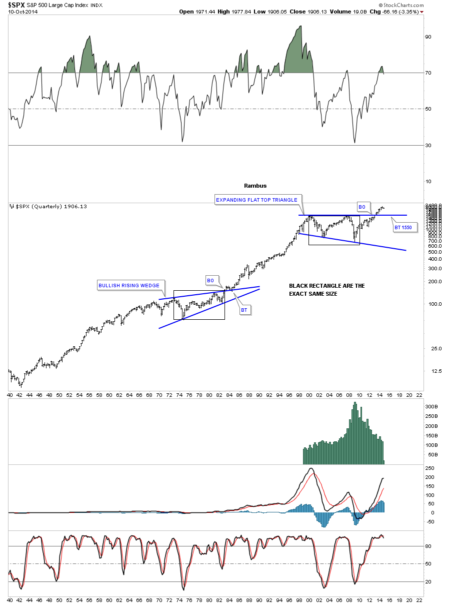
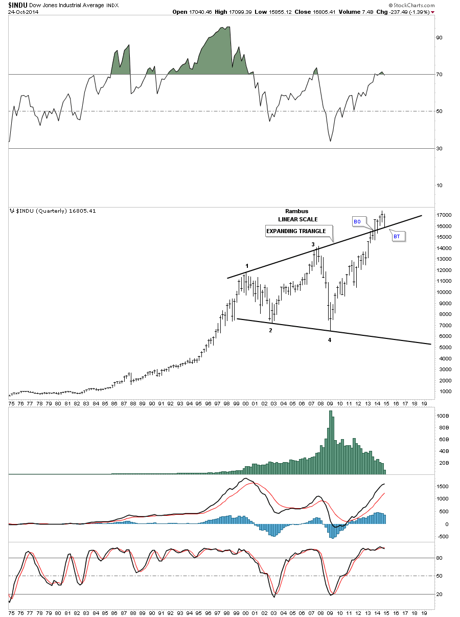
Below is a quarterly chart for the Dow Jones that shows the expanding triangle with the breakout and backtest in place.
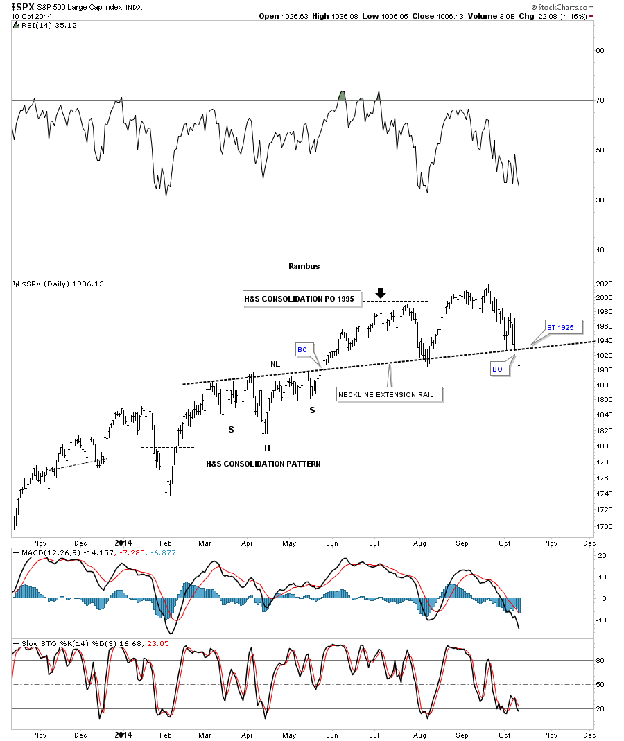
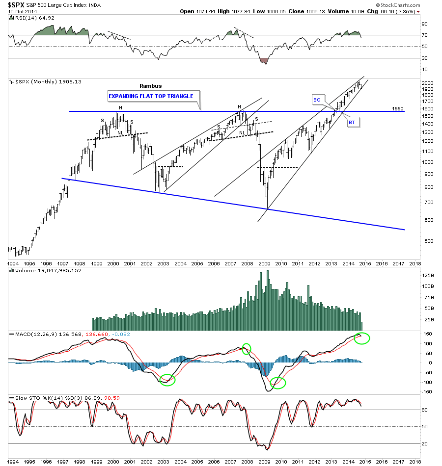
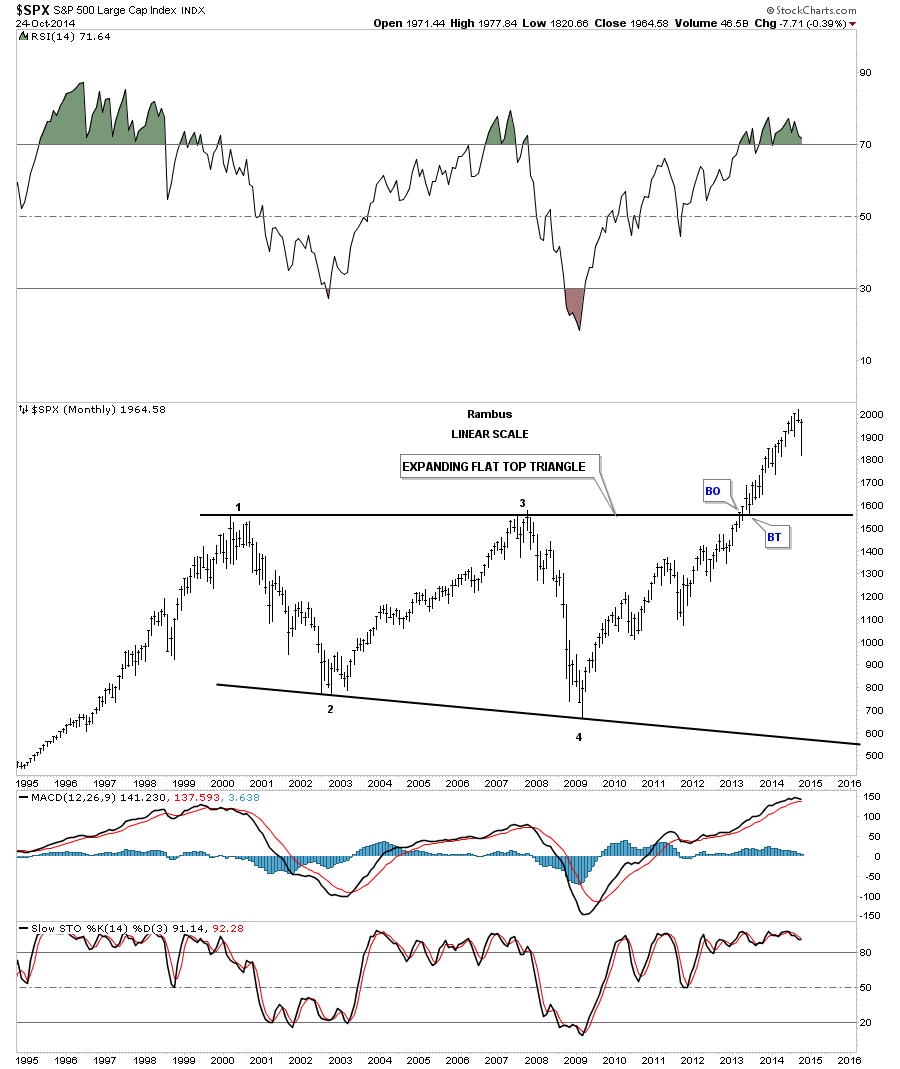
The long term linear scale chart for the SPX shows it has been much stronger than the Dow Jones as it wasted little time in its breakout and backtesting process of its expanding flat top triangle consolidation pattern.
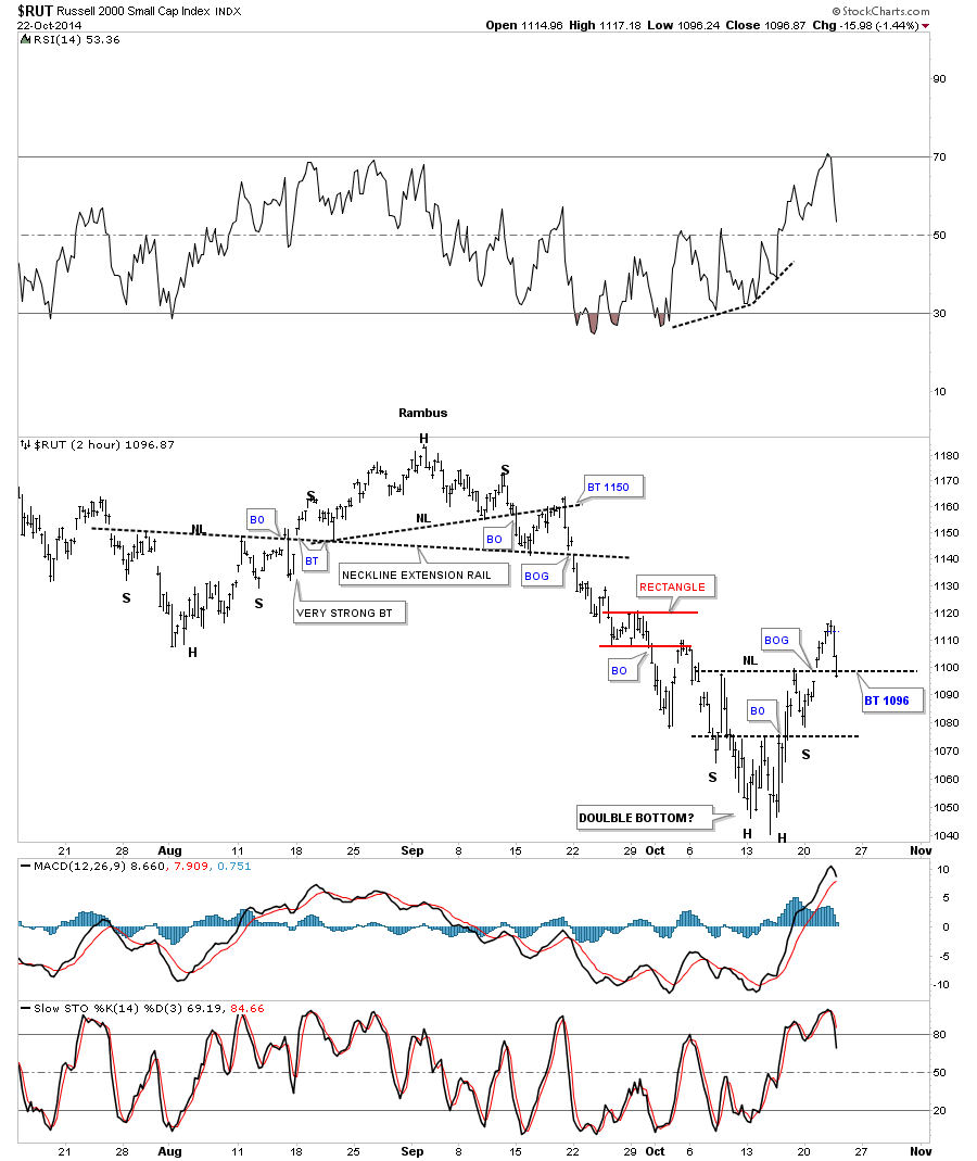
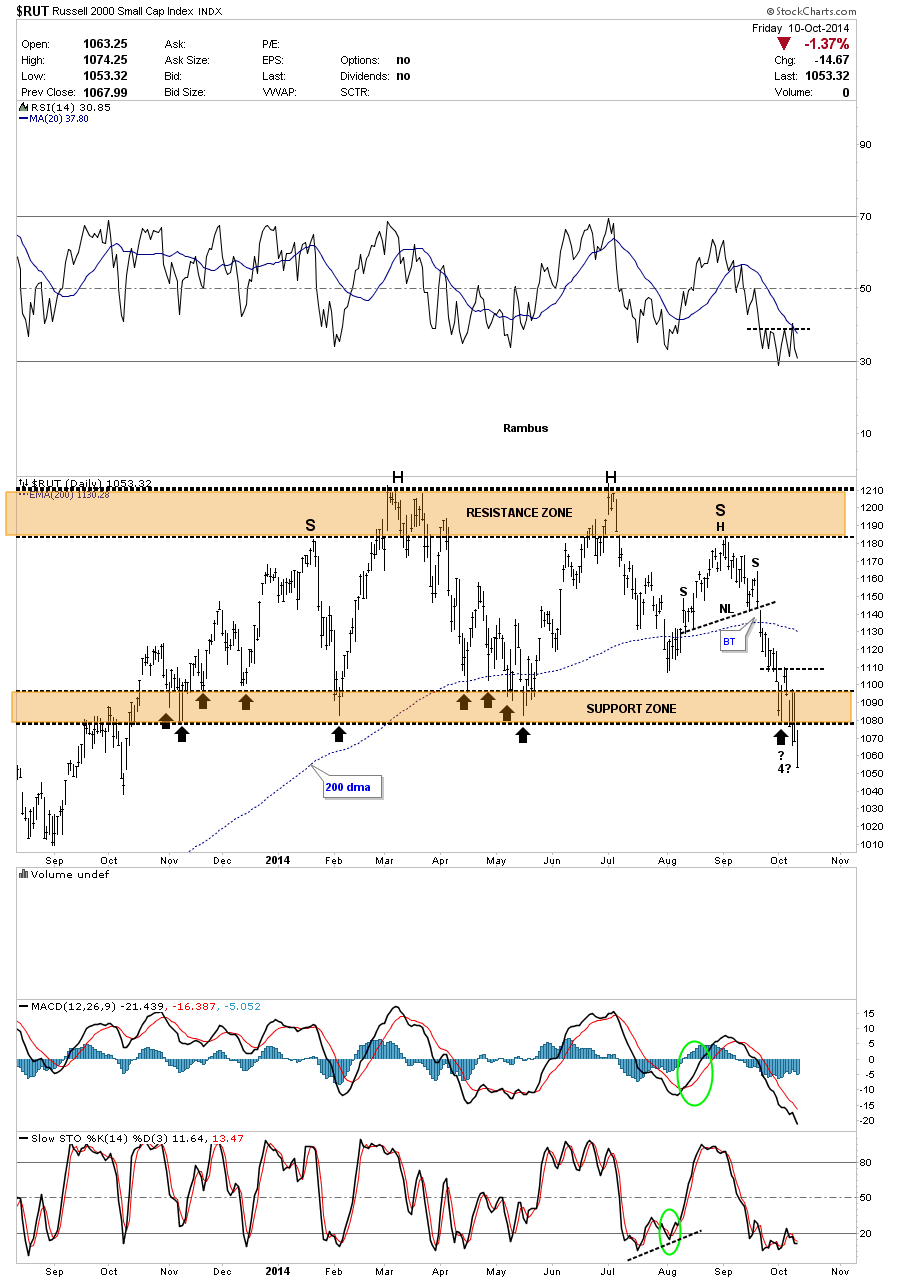
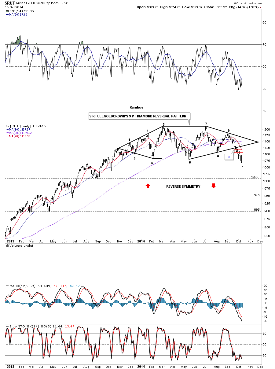
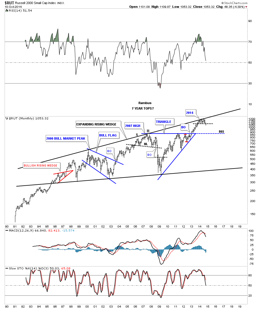
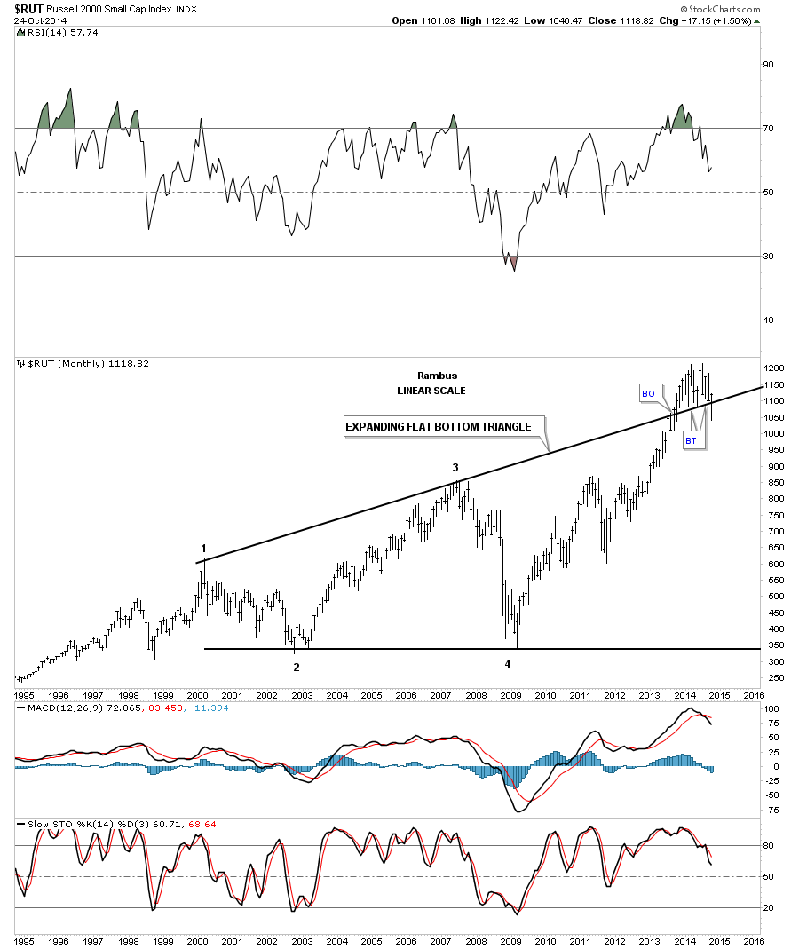
Using the 2000 starting point for all these big consolidation patterns the RUT has broken out of an expanding flat bottom triangle pattern. You can see the last bar on the right hand side of the chart that shows our current month of October as having a strong backtest to the top rail. What is encouraging about this chart from a bullish perspective is the price action is now trading back above the top rail of the expanding flat bottom triangle. Another positive development would be if the RUT can close above the previous months closing price which it is doing right now with one more week of trading left for this month. Again any move to new all time highs would be confirmation that the breakout and backtesting process if finished and we can get on with the rally that lies ahead.
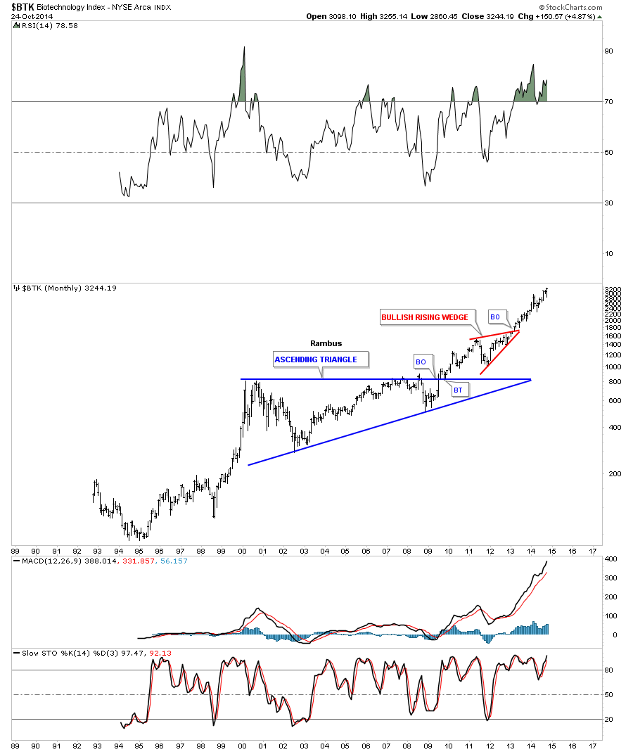
Next I would like to show you some very large consolidation patterns similar to the ones I’ve shown you on the charts above that have already broken out and have been in their new bull market for several years in some instances. Lets start with the strongest sector in the markets which is the BTK (Biotech Sector). You can see its nine year blue triangle consolidation pattern that started to form in 2000 and broke out in 2009 and is hitting new all time highs at this moment. Note the breakout and backtest of the top blue rail of the triangle consolidation pattern before the rally to new highs began. This is exactly the same process I showed you on the long term monthly charts above.
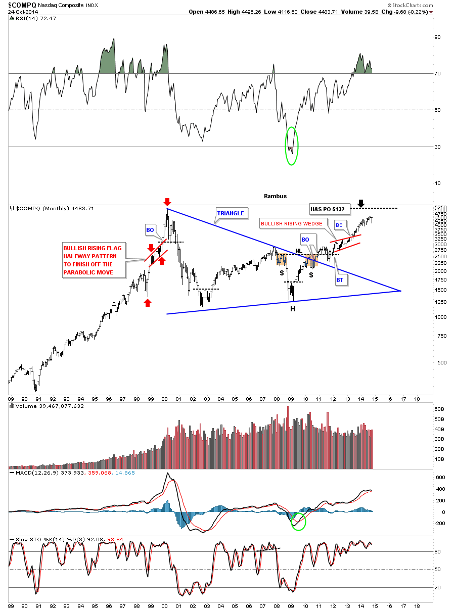
Next is a long term chart for the COMPQ that started to from its blue triangle in 2000 and broke out in late 2009. When you look at the short term charts this last decline in October looks like a disaster but when you look at the monthly chart you can see a new all time high isn’t that far above our most recent price action. As this is a monthly chart I would like to see the COMPQ close the month on the higher end of its last bar which would leave a long tail.
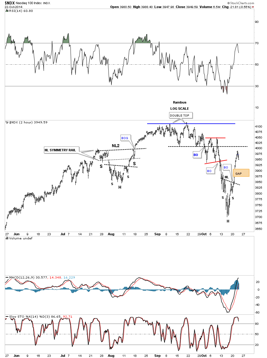
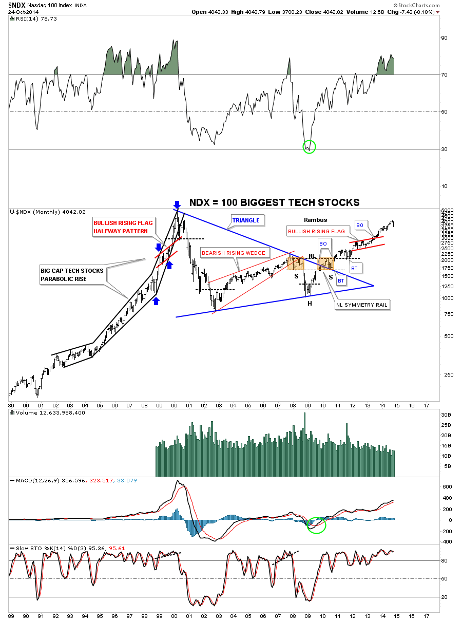
This next chart shows the NDX 100 which represents the 100 biggest tech stocks that shows some beautiful Chartology. There was the beautiful multi year blue triangle consolidation pattern which formed a H&S bottom toward the apex. There are two important break outs and backtests on this chart. The first one is when the price action broke out above the blue rail of the triangle consolidation. As you can see the backtest created the right shoulder of the H&S bottom which had a breakout and a backtest to the neckline before price took off to form the red bullish rising wedge. Note the parabolic rise in the mid to late 1990’s bull market that ended in 2000 after building out a beautiful red bullish rising flag halfway pattern to show where to look for the top, blue arrows.
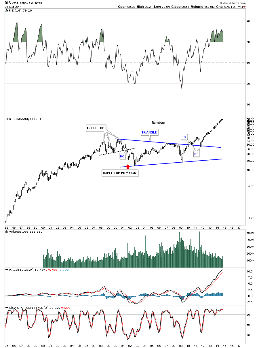
DIS (Disney) shows you another fine example of a big triangle consolidation pattern that broke out in 2010 with two backtests to the top rail and hasn’t looked back since.
Below is a different and shorter term look for CAT that shows its been building out a 6 point blue triangle for close to 3 1/2 years now. Note where the last bar on this chart found support this month. 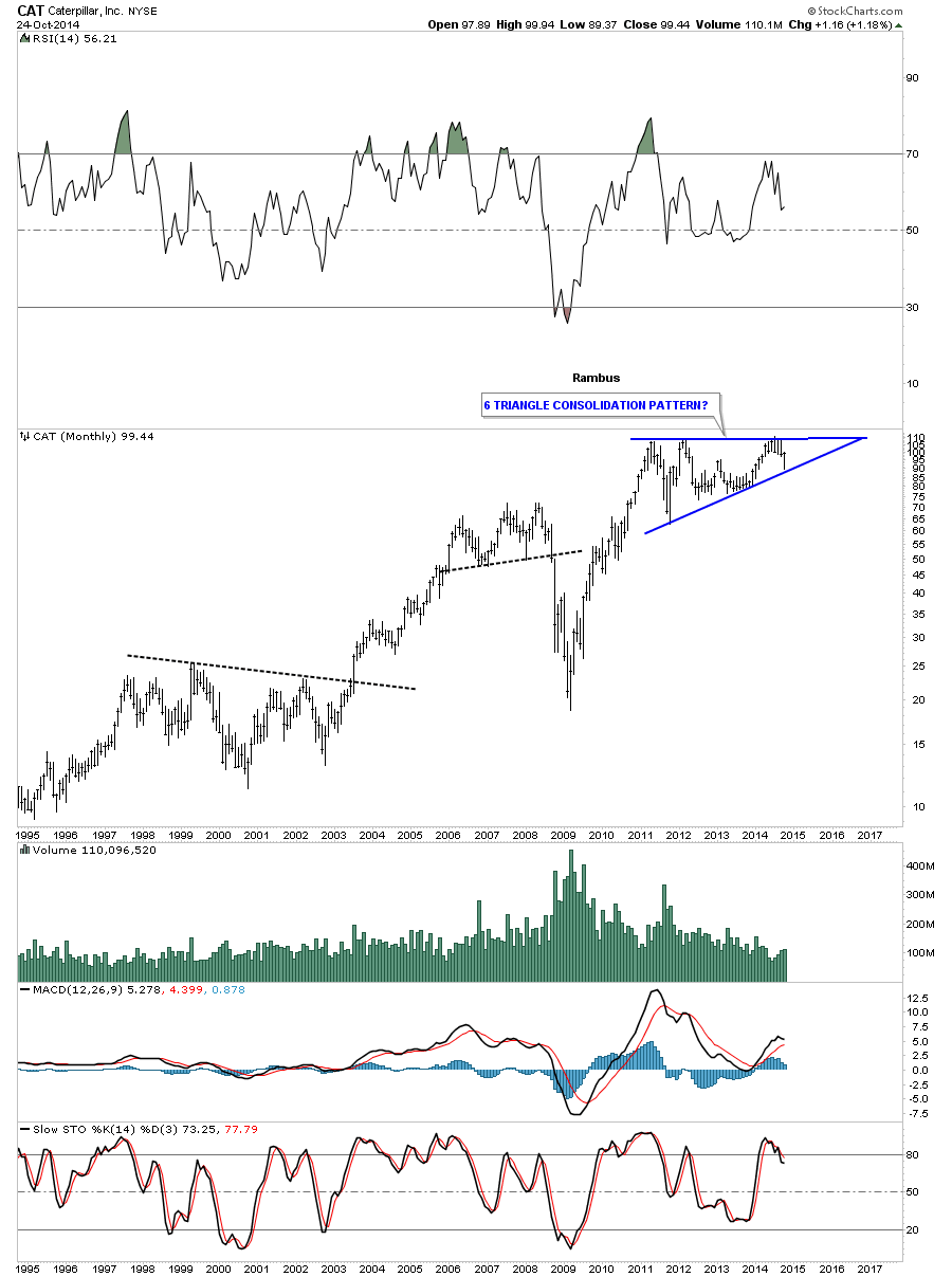
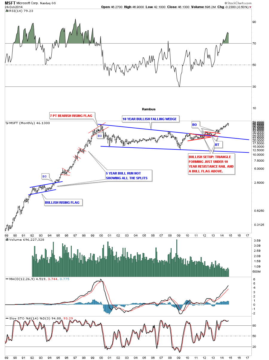
MSFT broke out of its massive blue bullish falling wedge after 10 years or so of consolidating the rise that began in the late 1980’s to the 2000 top. This chart shows the bullish breakout that has one red consolidation pattern below the top rail of the blue falling wedge and one red consolidation that formed on top of the falling wedge which I have shown many times signals a bullish setup as you can see.
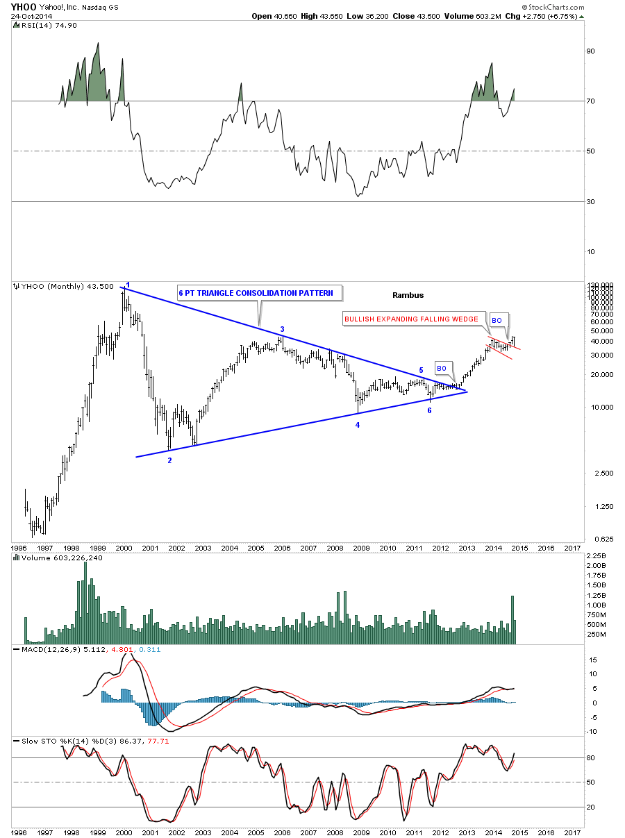
Lets look at one last huge blue triangle consolidation pattern that YHOO broke out of last year after spending nearly 13 years working off the excesses from the bubble phase of the bull market that topped out in 2000. As you can see it just broke out of the red bullish expanding falling wedge and did the backtest this month which is the reason I bought this stock for the Model Portfolio.
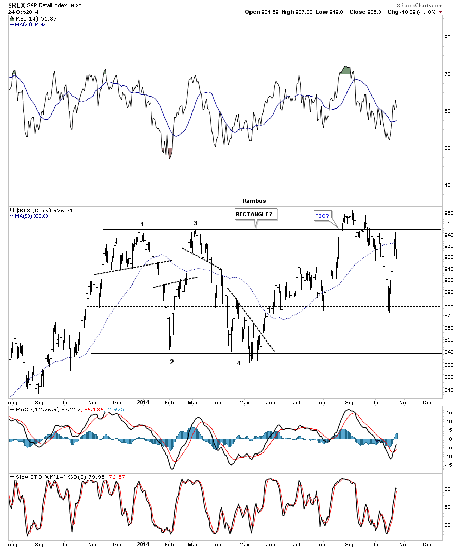
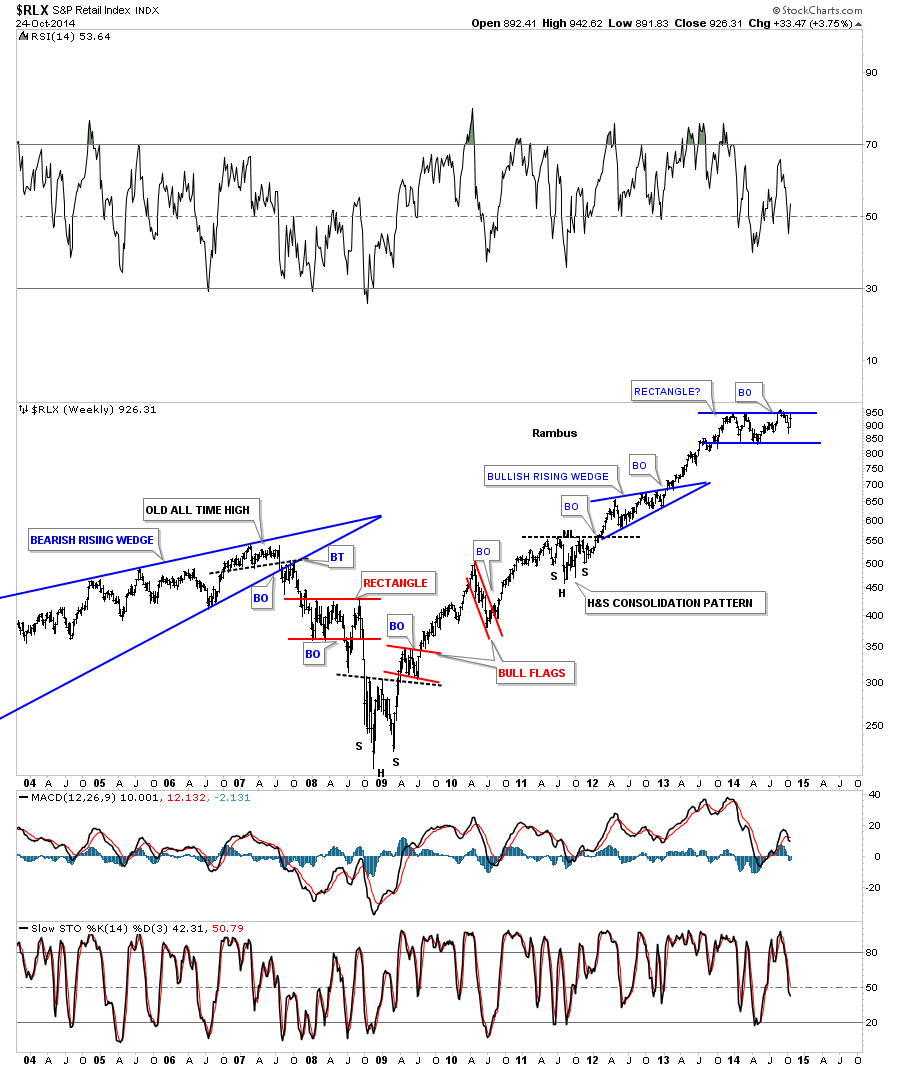
Next I would like to show you two sectors that need to be monitored very closely as they look like they’re going to breakout to the upside. The first sector is the RLX, retail sector that has been forming an almost one year rectangle consolidation pattern that is getting close to breaking out to the upside. First the daily chart gives you a close up view of the rectangle consolidation pattern that had a false breakout recently. It’s not uncommon for the last move out of a rectangle to have a false breakout with one last move down that can find support toward the center of the rectangle. We’ll see confirmation when the RLX makes new all time highs above the recent high.
The weekly chart really puts the possible rectangle in perspective. From a Chartology perspective it looks like the blue rectangle consolidation pattern is going to be just another brick in the wall that will lead this sector to new all time highs once all the work is done with the breakout and backtesting process. There are etfs for this index that can be played. Also for those that just like to buy individual stocks you can do a little homework in this sector and find which stocks have the best setup from a Chartology perspective.
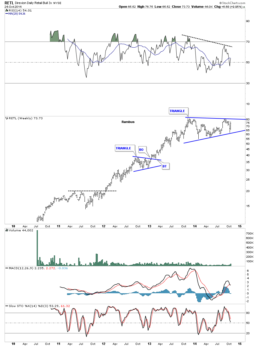
Below is a 3 X long etf for the retail sector that is showing a nice triangle consolidation pattern. The volume is very light on this eft which may grow over time like our Kamikaze stocks have.
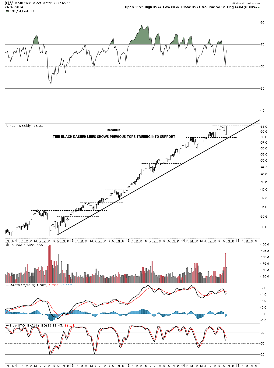
The last chart for tonight shows the RLV, health care sector, getting real close to making new all times highs. Again this is an area that one needs to investigate if they’re more interested in stocks instead of playing the etfs.
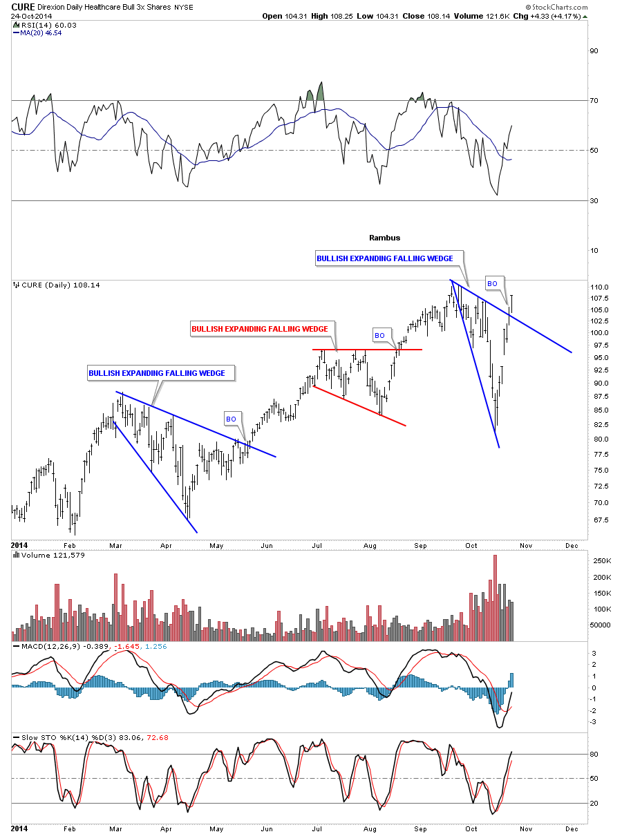
I have been watching this 3 X long etf for this sector which just broke out above the top rail of a bullish expand falling wedge on Friday.
The bottom line is the stock markets may not have the crash that many are looking for at this time. That’s not to say we can’t correct some of the recent move from the October low to the high made on Friday. The markets will confirm for us the bull is back once we see the Dow Jones break to new all time highs. With all these new etfs out there now I prefer to trade them for the most part vs individual stocks. There were so many times in the past when I would get the direction right in the markets only to have some of the individual stocks failing to follow along. Picking a stock now days is like adding another degree of difficulty where you have to be right on the trend then you have to be right on your stock selections. To each his own .
All the best…Rambus
Editors Note:
Rambus has recently added a General Market Leveraged Portfolio where he trades the 3X ETFs on selected market sectors .
www.rambus1.com