Before we get into the charts I have seen several questions on what type of trader is Rambus. There are basically three types of traders. The short term, the long term and the intermediate term. I’m an intermediate trader that looks for the impulse move when a consolidation, top or bottom is confirmed. It’s those moves where you can make the most money in the shortest period of time.
The markets are either building out at top, bottom or consolidation pattern at any given time. This is where it’s much harder to make profitable trades because they are in chopping mode with no real trend, just short term moves going nowhere. It’s when these tops, bottoms or consolidation patterns are completed is when you get your impulse move and a trend to follow. Being in an impulse move is much easier psychologically because the chopping action has finally ended. On the other hand, during an impulse move, you will run into small consolidation patterns that form along the way that many think is the end of the move but in most cases it’s just a pause that refreshes.
What frustrates most investors is the waiting game when the markets are building out these tops, bottoms and consolidation patterns. They want action now. These patterns can be traded but you have to be very nimble and quick so most traders get eaten alive. Sometimes it’s easy to see that you are in a clearly defined consolidation pattern for instance and know exactly where the breakout will occur. Then, there are the more complex consolidation patterns that morph many times before it becomes clear what kind of pattern it’s forming. We have been in one such pattern since the June low in regards to the precious metals complex. It has morphed at least three times so far and it still isn’t giving us a clear cut signal that it’s finished.
We have attempted several trades within our current congestion area and have been lucky enough to come out with a small profit. We were setup though for an impulse move that failed to materialize so we had to abort these trades with a small gain. My goal is to be mostly setup for the impulse move before they begin. This means taking some position while still in the congestion zone. Sometimes you win and sometimes you lose but if you can keep your loses to a minimum, during these chopping phases, and can recognize when the real impulse move begins, that is what the intermediate term trader looks for. What we experienced from December of 2012 to August of 2013, shorting the precious metals complex, is a prime example of what I’m trying to accomplish right now. We just haven’t gotten confirmation the congestion area is finished building out which could be a consolidation pattern to the downside or a reversal pattern.
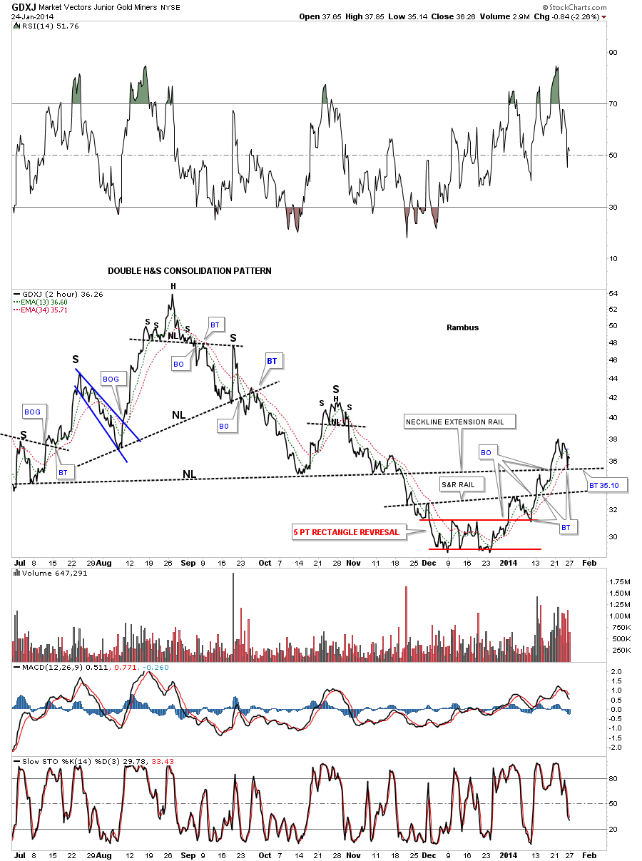
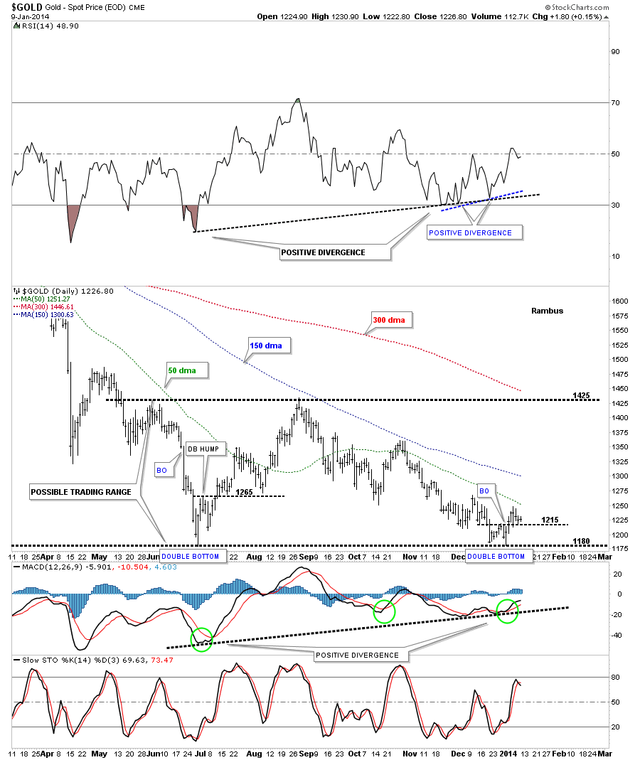
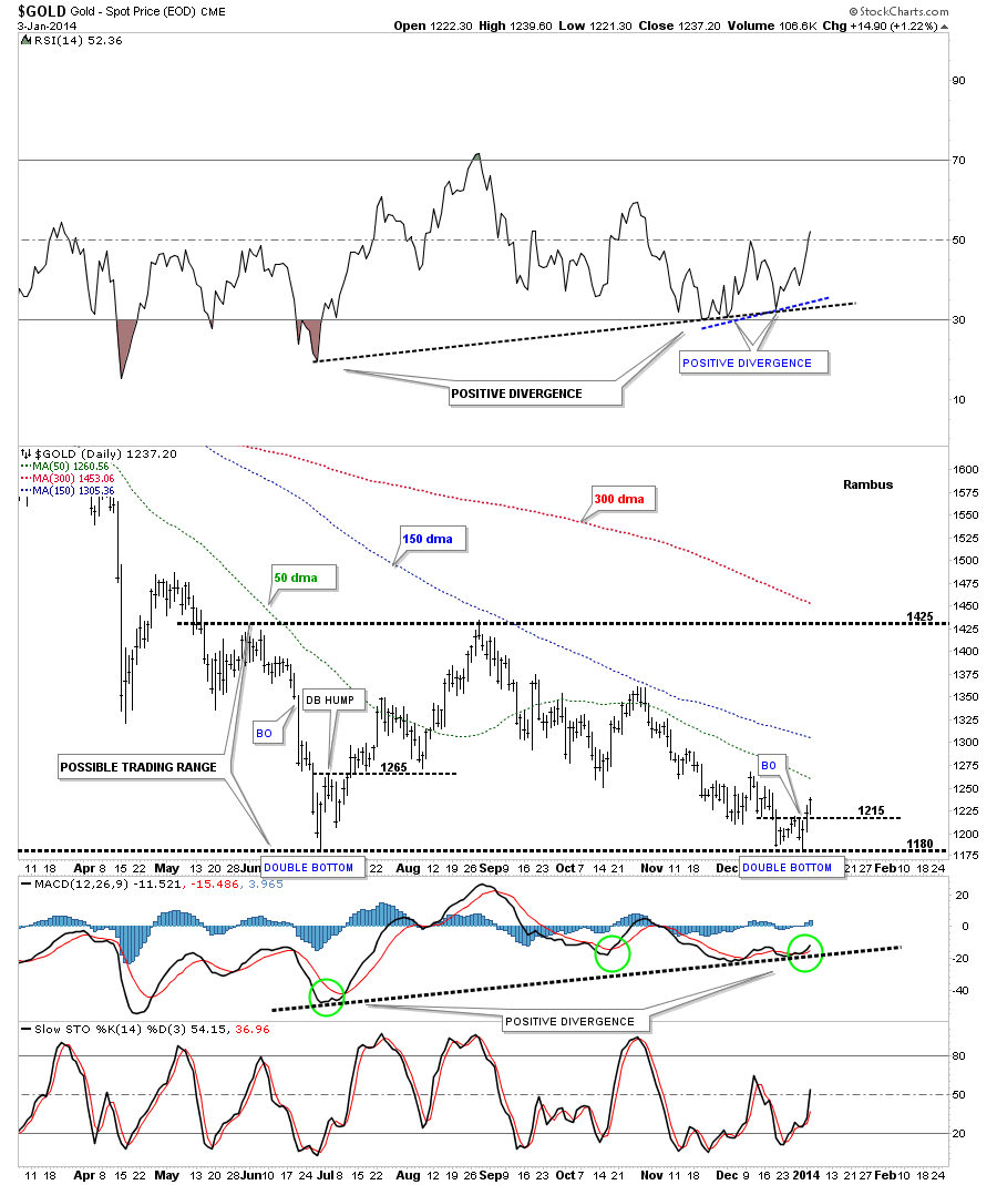
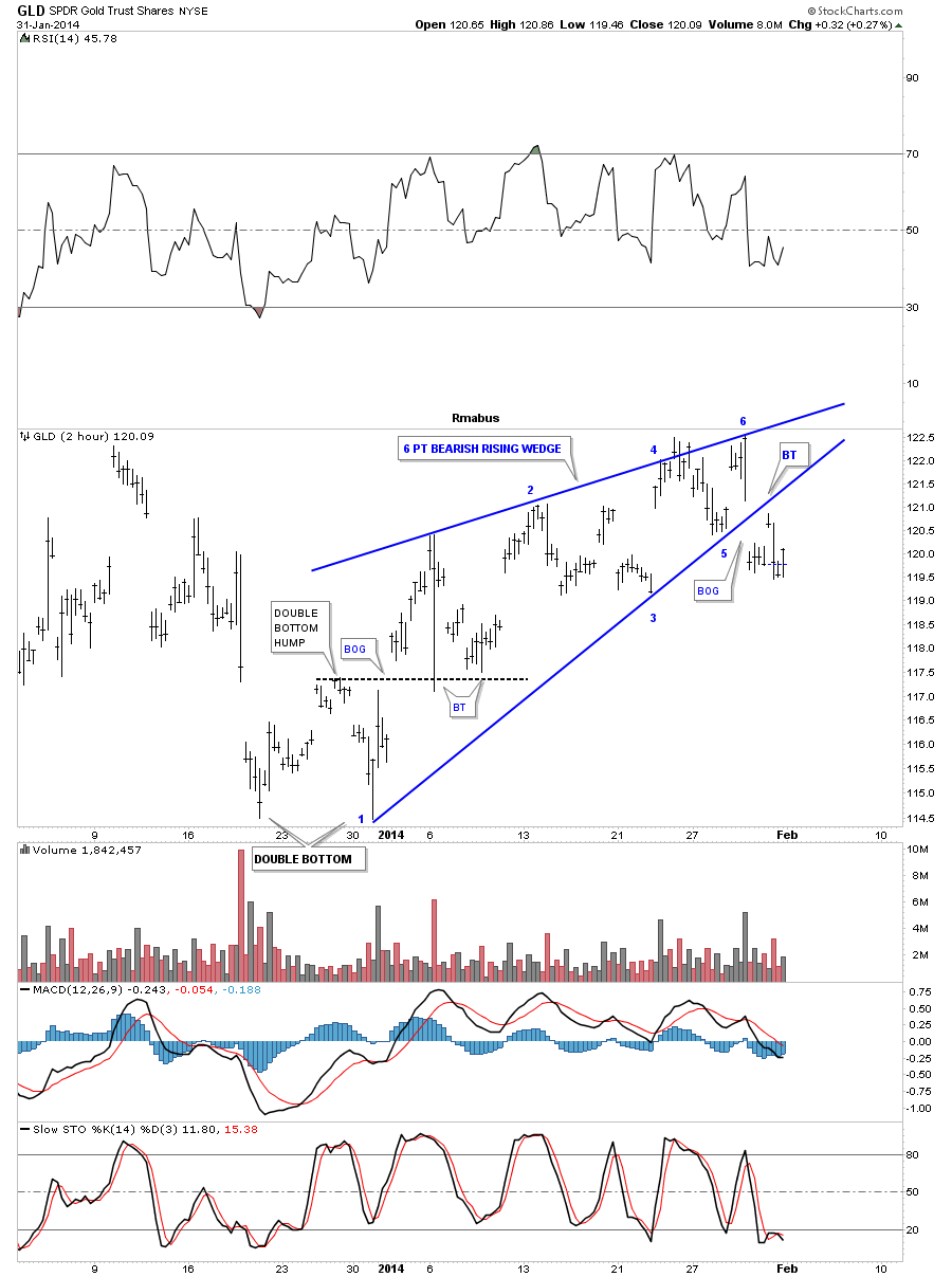
Lets take a close look at GLD from the short term to the long term to see if we can find any clues as to where we are in terms of a top, bottom, or consolidation pattern. It’s very important that you look at all time frames to get a feel of where you are in the big picture especially if your an intermediate term trader. Below is a two hour, two month chart that shows us a six point bearish rising wedge that broke down late last week. If you recall I became somewhat positive on the PM sector when I seen the double bottom that started the building process of the rising wedge. As you can see the double bottom worked out beautifully as the breakout above the double bottom hump was accompanied by an nice gap. Next we got our confirmation when the price action did a double backtest to the double bottom hump. All systems were go at that time. I had no idea of what was to come next only that GLD had put in a nice little double bottom reversal pattern to the upside. When you hear me talk about following the price action that is exactly what I mean. In hindsight now we can see the result of that little double bottom that took the price for GLD from 114 to 122 or so.
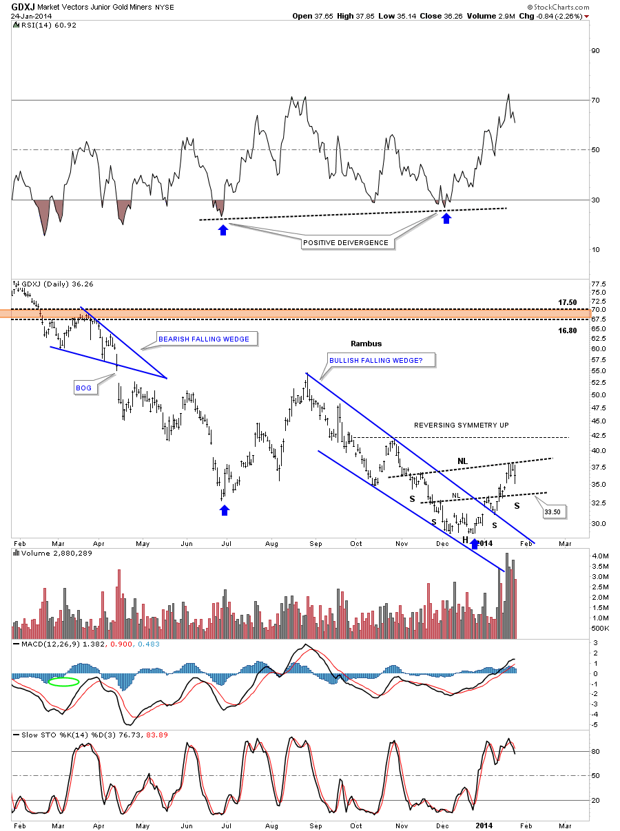
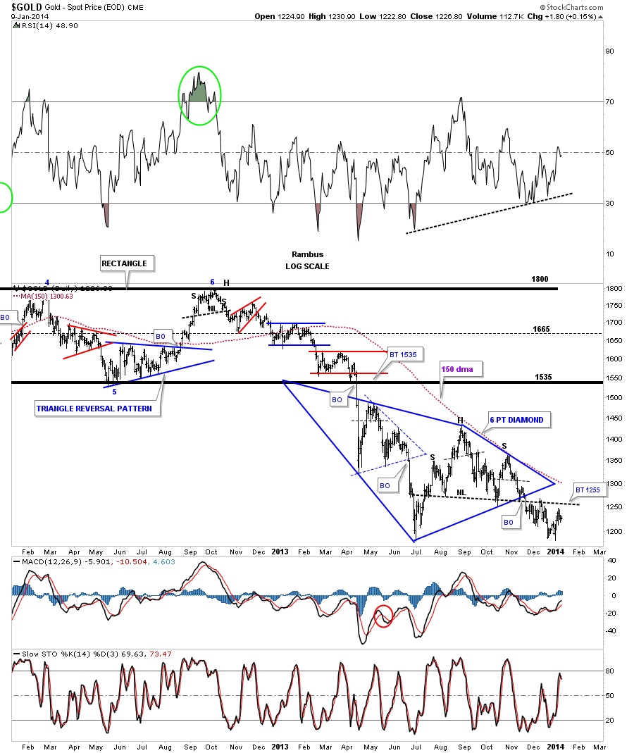
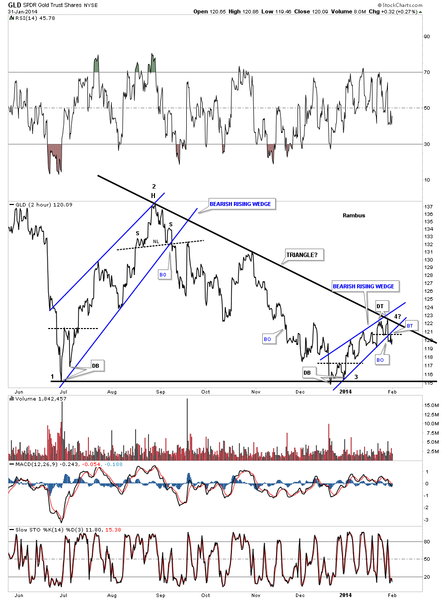
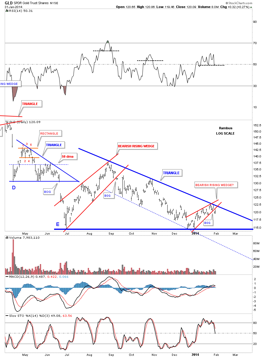
Next I would like to put our little blue rising wedge into perspective by looking at a 2 hour line chart for GLD but this time it goes back about nine months or so that shows how it’s just part of a possible bigger pattern. Starting at the June low on the far left hand side of the chart you can see there was another small double bottom that was the start of that blue bearish rising wedge. If you recall we went long back then and caught some of that move in the blue raising wedge. I remember looking for a slightly higher price objective as I was using a parallel channel. When the price action failed to reach the top rail and broke below the bottom rail I knew the trade was over and we exited the trade with a small profit. What we have developing right now is a possible triangle formation. We have completed 3 reversal points with the possible 4th starting last week. The fourth reversal point won’t be completed until it touches the bottom rail plus the last reversal point is always the hardest to spot in real time because you won’t know until you can look back in hindsight and say, ” yup that was the last reversal point.” If the price action breaks above the top black rail of the possible triangle formation that would be a very bullish development and we would have to exit our short positions. As you can see there is a very fine line between being a bull or a bear when you look at the top rail of the black triangle. It is also the lowest risk entry point, which we took, because of that line in the sand.
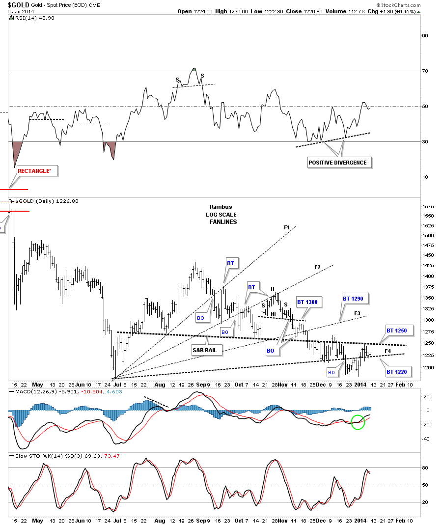
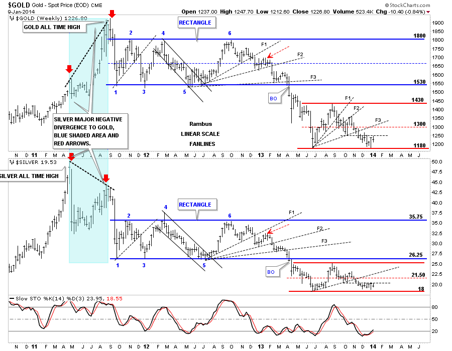
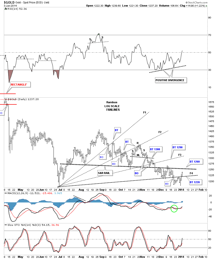
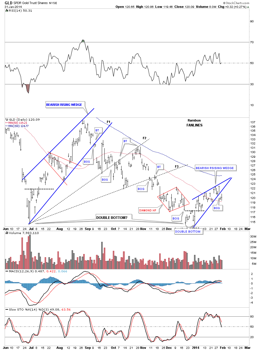
Lets look at a daily chart for GLD which shows our 2 blue bearish rising wedge, three fanlines and a possible double bottom. The further you go back in time the bigger the picture is you have to work with. The fanlines did a good job of keeping the downtrend in check between the two blue rising wedges. We have to keep an open mind as the June low and the December low were made at the same low on the chart. We can’t leave any stone unturned when it comes to looking for clues that may help us make the right decisions.
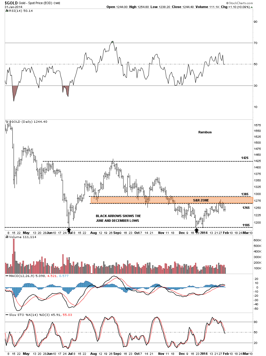
This next chart shows why the GLD is stalling up here in this general area. Note the brown shaded support and resistance zone that is working as resistance right now. Again if the GLD can trade above that brown shaded support and resistance zone it will be talking to us. Right now it’s up to the bulls to prove their case.
Next I would like to show you our possible blue triangle again in the short term and then using the same chart going back in time so you can see what I’m referring to when I talk about being in an impulse move where, in this case the impulse move is down, and the smaller consolidation patterns that form along the way in a true impulse move. Keep in mind I built these patterns in real time as the impulse move worked its way lower. The first chart is the short term look.
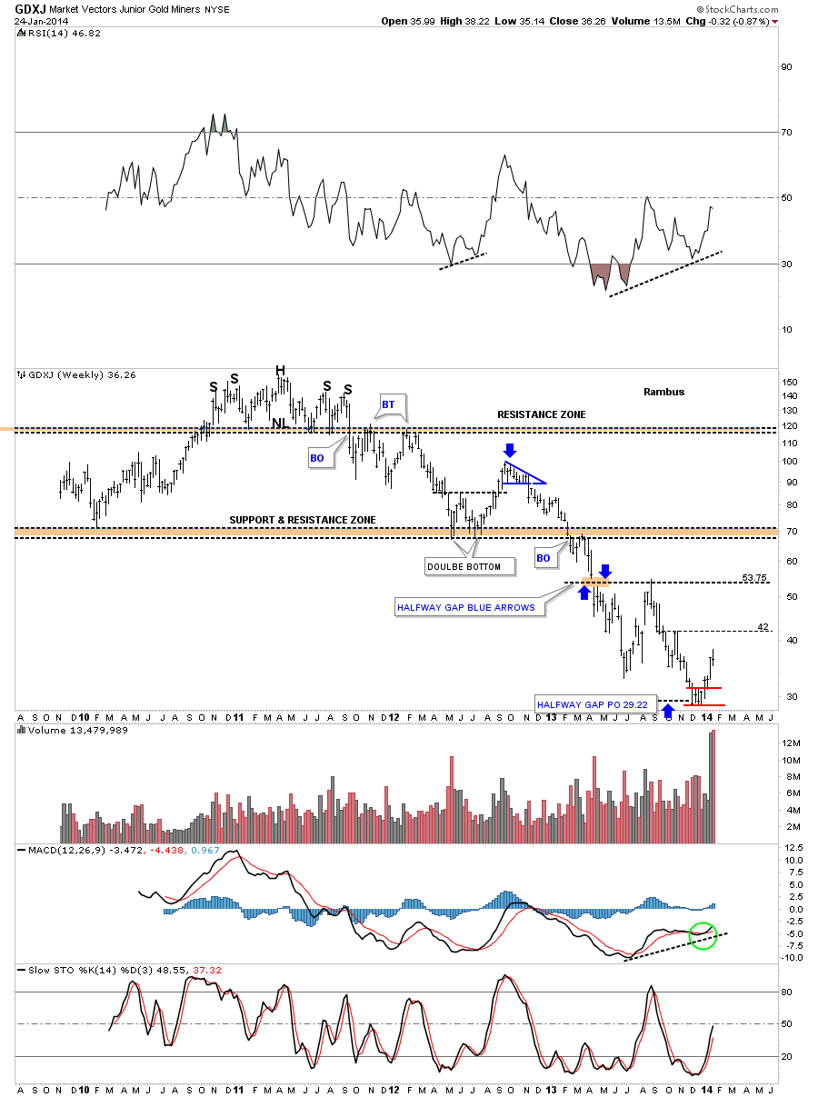
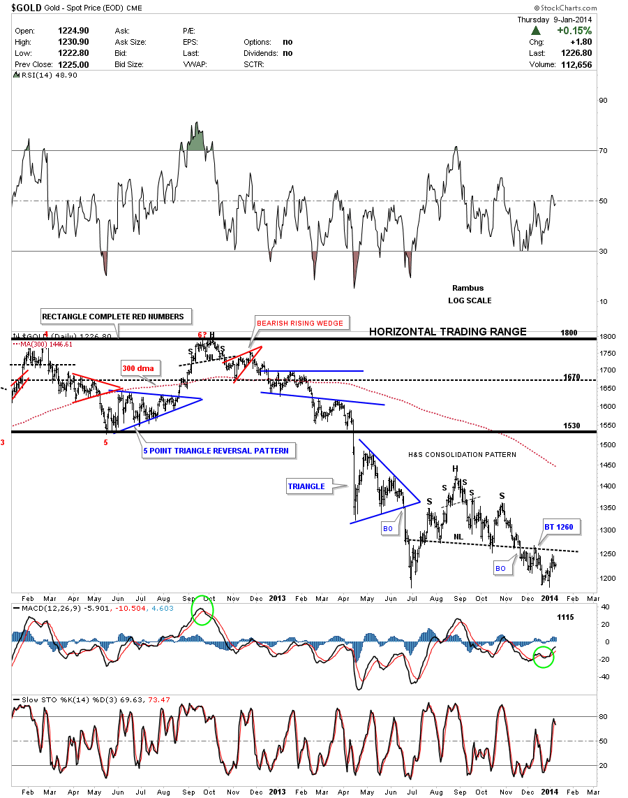
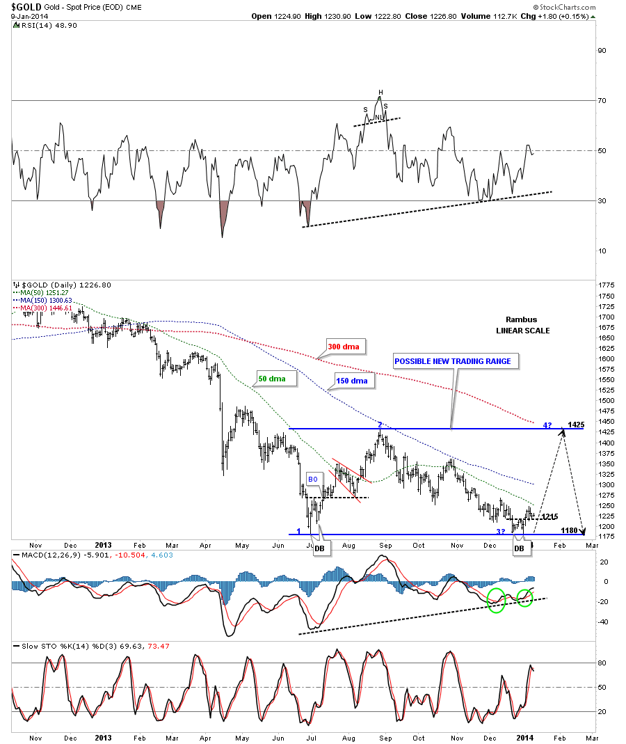
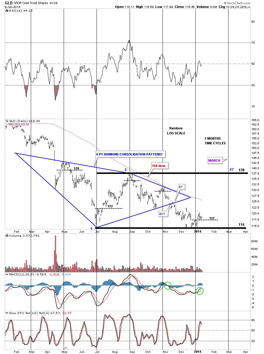
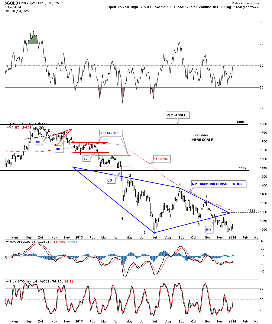
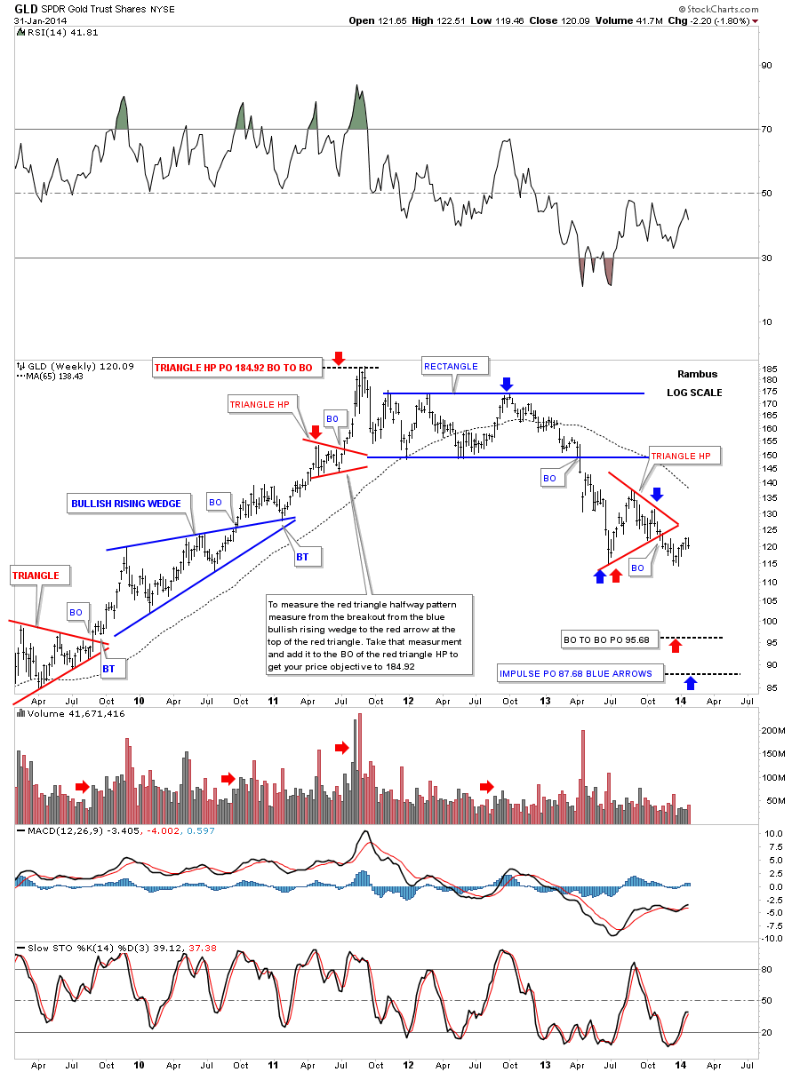
This next chart is the exact same chart I’ve been using for many years. All the old chart patterns and annotations are still where I left them as the GLD has moved on in time. The first thing I would like you to note is how much smaller the consolidation patterns are vs our current and possible blue triangle consolidation pattern. Those small consolidation patterns formed during the impulse move down. In this case there were about four that were made before GLD hit the bottom and built the first pattern inside our big blue triangle, the red bearish rising wedge. Many times after you have an impulse move a consolidation pattern will form that is much bigger than any of the smaller consolidation patterns that formed during the impulse move as this chart clearly shows. These bigger consolidation pattern will often be a halfway pattern that separates the first impulse move down from the second one which hasn’t happened yet for GLD. If the GLD breaks below the bottom rail that could very well signal the next impulse leg down is underway and and the big blue triangle will most likely show up halfway between the two impulse legs when we look back in hindsight.
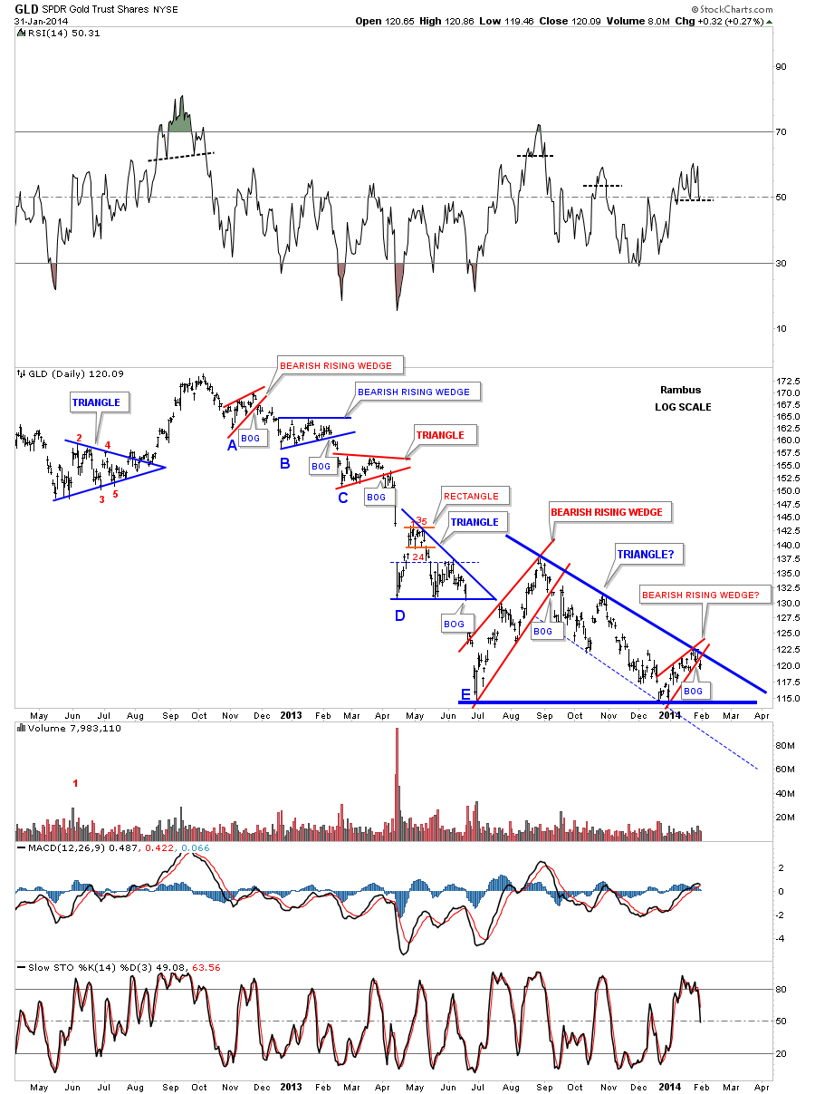
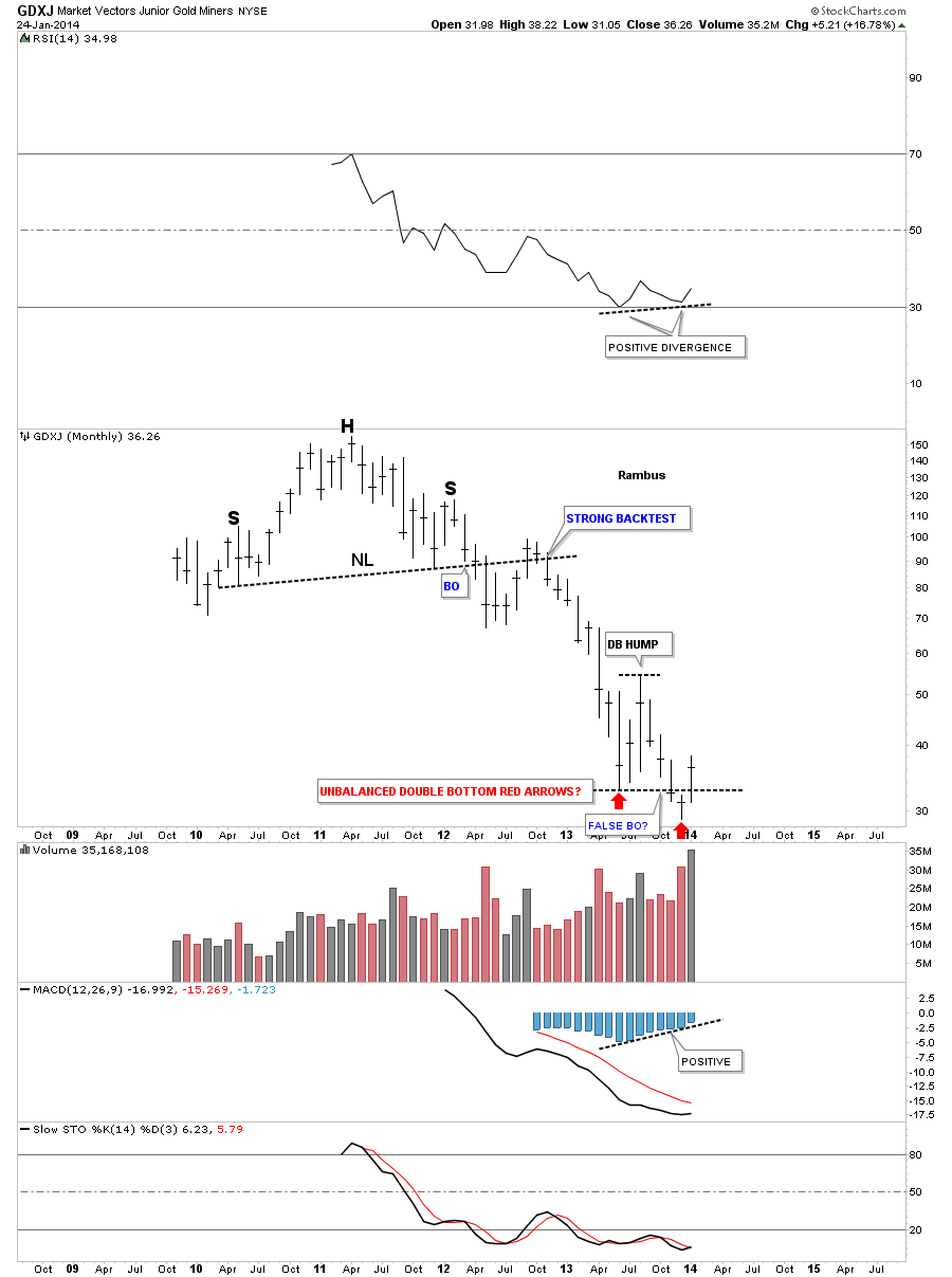
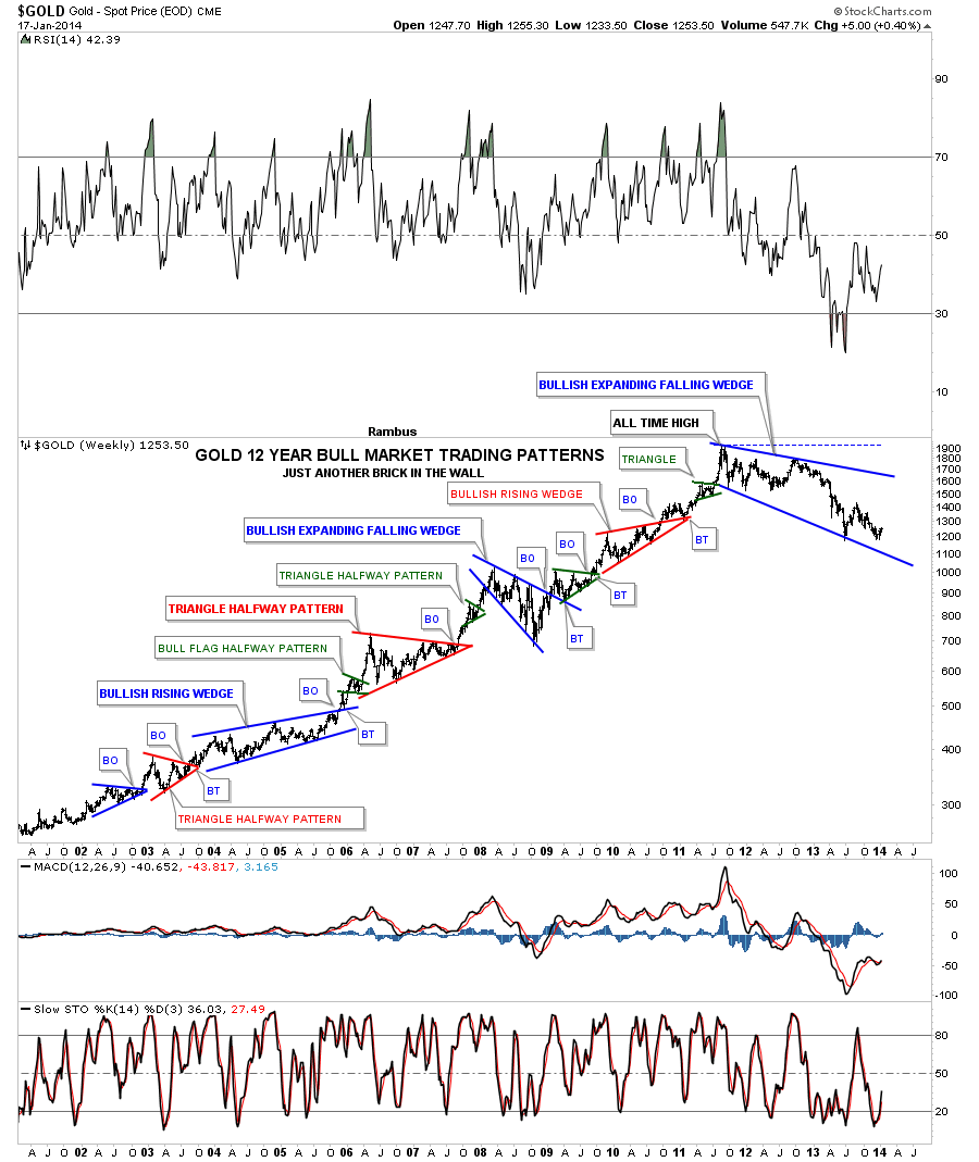
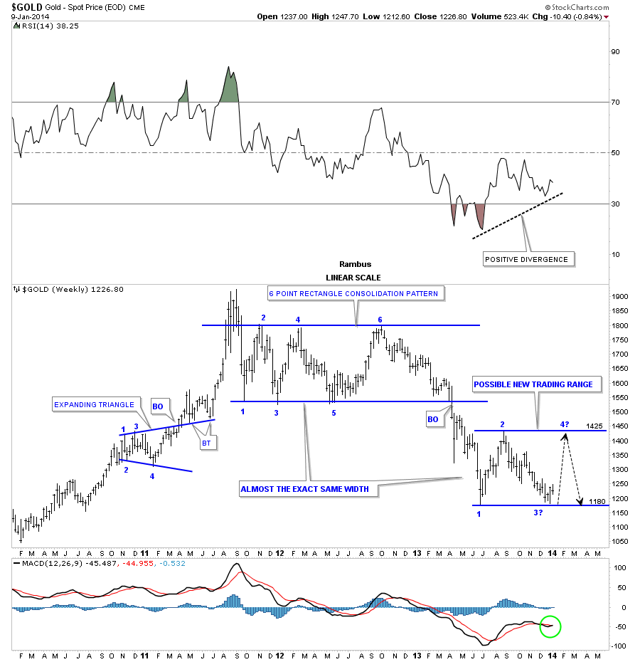
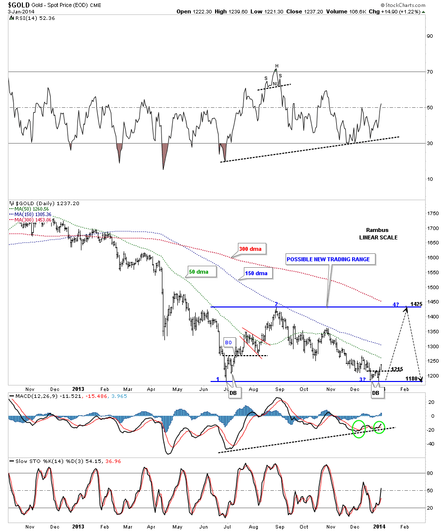
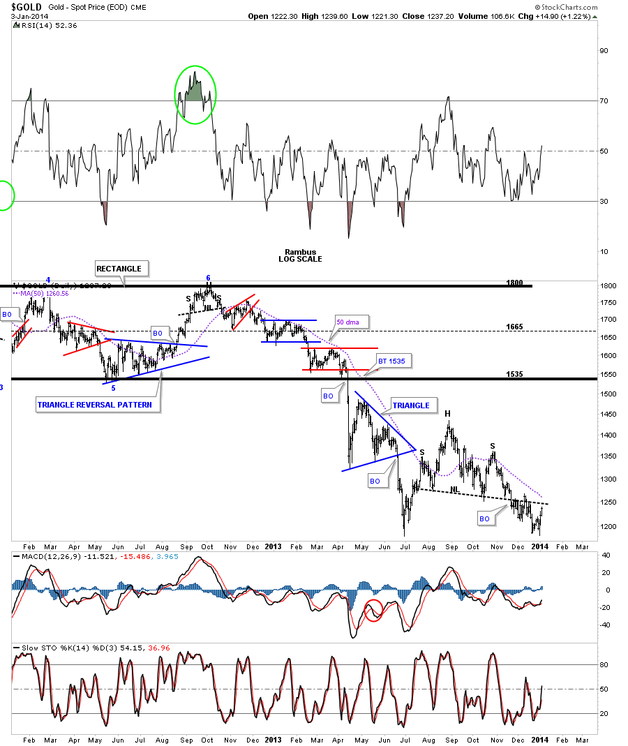
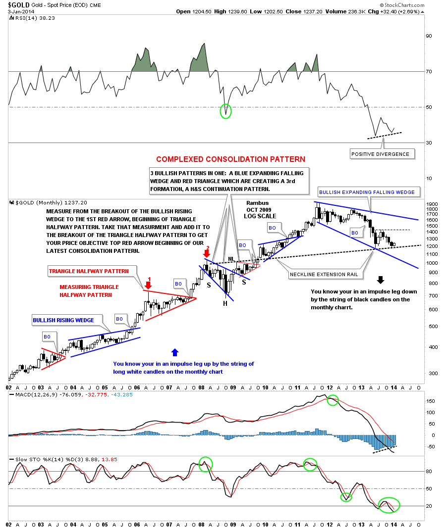
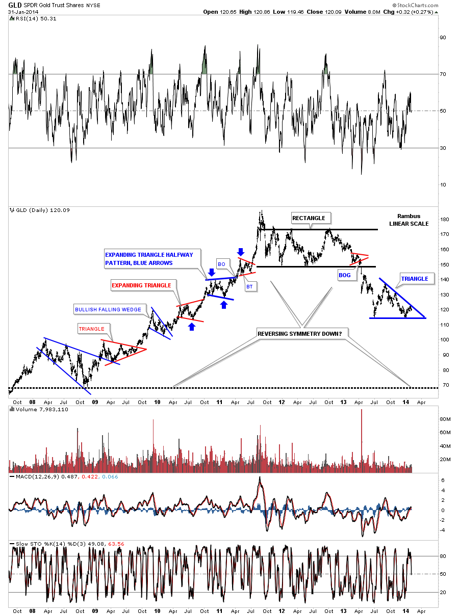
This next chart for the GLD goes back over six years and shows you the really big impulse move up off of the 2008 crash low. Just as I showed you on the short term daily chart above, all the smaller consolidation patterns formed in golds impulse move down, just the opposite happened when gold was moving higher off the 2008 low. Here you can see when each of the consolidation patterns completed, a strong move up occurred. GLD did this all the way up to its all time high where you can see the finial thrust higher was nearly vertical after breaking out from the last little red triangle. Then the chopping action started which eventually turned out to be a topping pattern. No one knew with any certainty if that chopping action was going to be just another consolidation pattern to the upside or a topping pattern which would change the character of the whole bull market. I was lucky enough to get out of Dodge and wait for awhile to see what might happen especially after that near vertical move which I know can be the end of something that was very good. After the small top formed and GLD had its hard break down it then went on to form a 22 month six point beautiful rectangle consolidation pattern to the downside. That confirmed for me that the GLD was truly in a bear market. Now we have a possible triangle formation that could very well be a halfway pattern for the second leg down. The only problem we have right now is the blue triangle hasn’t completed its fourth reversal point yet. Until that happens we have to respect the fact that anything can happen. We can lean toward the bearish camp because of the downtrend GLD has been in. If you look at every short term top that GLD has made since it broke down from the last reversal point inside the black rectangle you will see every top is lower than the previous top. That’s a downtrend period.
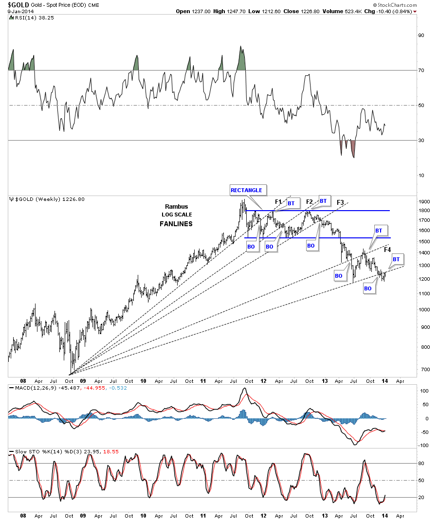
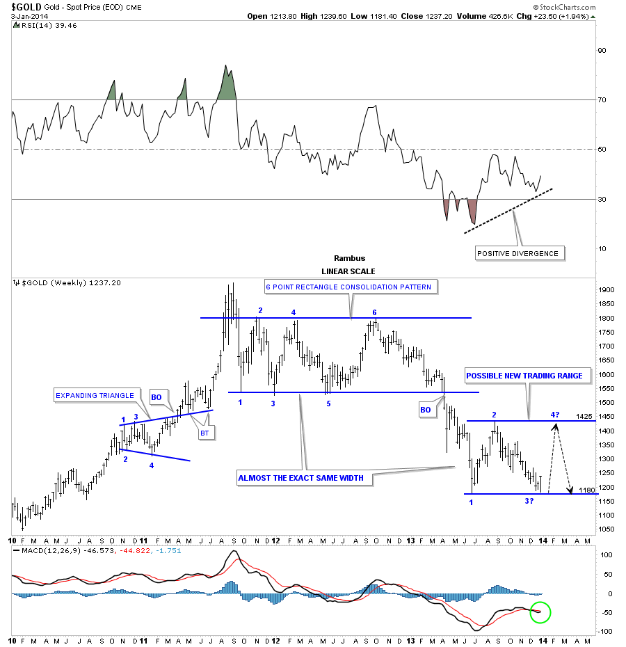
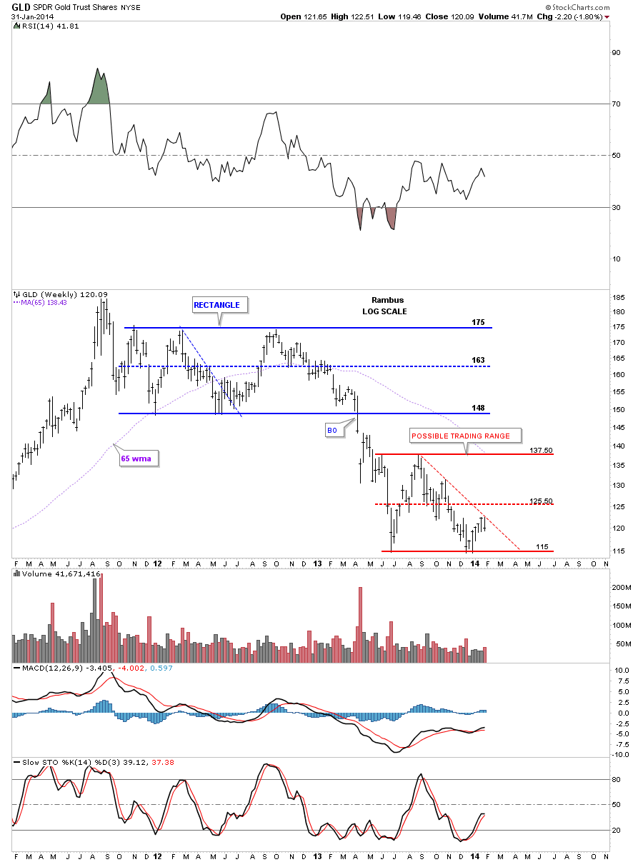
Lets take a quick look at the weekly chart for GLD that I’ve shown you several times in the past that shows a possible sideways trading range that maybe in play. I’ve shown you how important that top rail is on our blue triangle and this weekly chart shows you why. The red dashed down slopping line is the top rail of our possible blue triangle. If GLD can breakout above the red down slopping line then there is a good chance that it will make up to the previous high around the 137.50 area. Whatever it decides to do we’ll be ready for it. It just has to show us its true intentions which right now are still suspect.
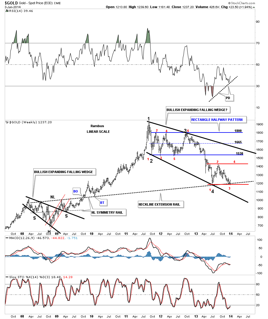
Believe it or not there is still another triangle I can make a case for that I’ve been following since it broke down about 12 weeks ago. What I’ve been looking for is for GLD to put in a lower closing low on the weekly chart. This week we came pretty close to doing that. I believe when we see that, that will tell us the backtest is finally finished and the next impulse move down will be ready to begin. I’ve put two different price objective on this weekly chart if this red triangle turns out to be the halfway pattern.
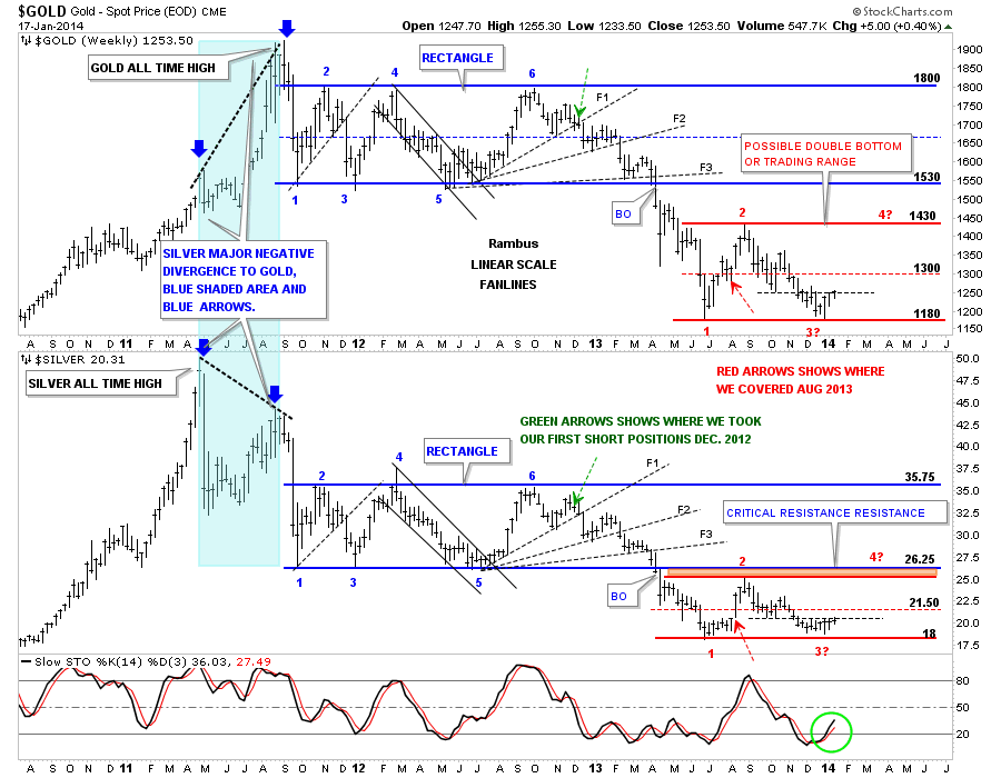
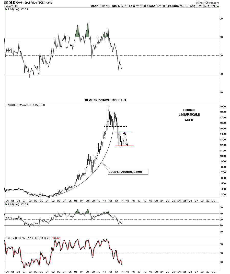
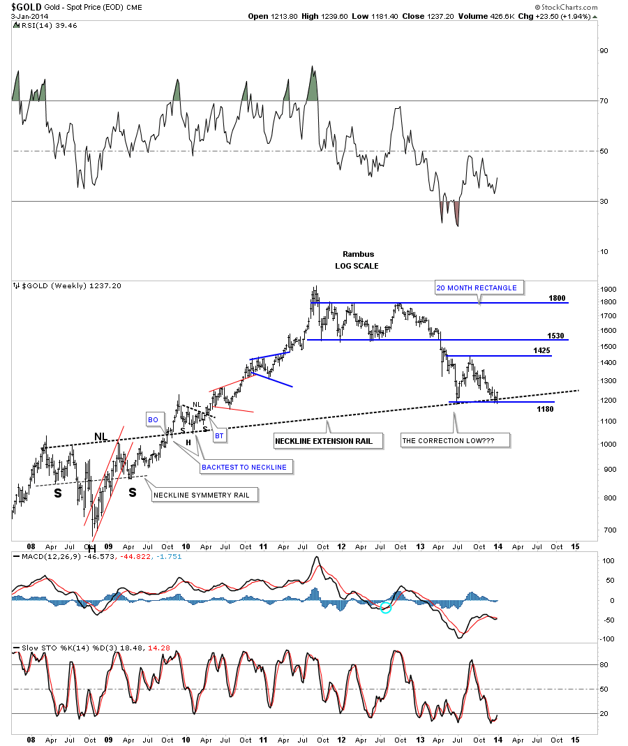
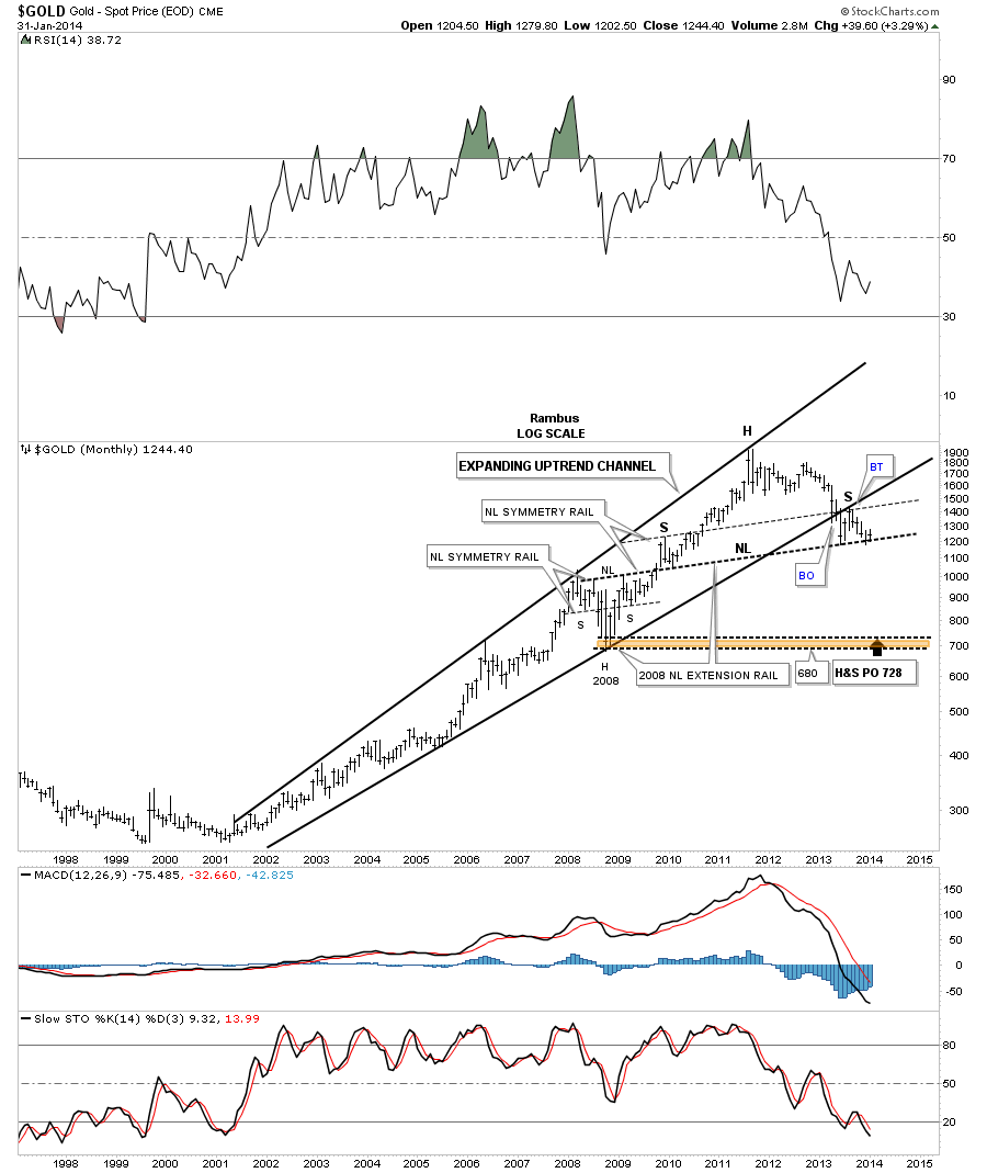
This last chart for gold is one we’ve been following for sometime now that shows a possible very large H&S top pattern. So far we have no confirmation as the price action is trading right on the neckline. If gold ever does take out that neckline we’ll be the first to know that a really big drop is forthcoming as that possible H&S top has a price objective down to the 700 area. The symmetry is definitely there with the neckline symmetry rail showing us the high for the left and right shoulders just as it did when gold put in its H&S consolidation pattern back in 2008.
So far we have a lot of nice looking charts but we have no confirmation that the next impulse leg is starting yet. All we can do is take some small bites from the short side as that’s the main direction of the PM complex right now. It could change tomorrow and if does we’ll change with it.
Before I end this Weekend Report I want to show you just a couple of charts for the SPX, using it as a proxy for the rest of the stock markets, which we may trade based on its current setup. The first chart is a 2 hour chart that shows us a possible unbalanced H&S top in place. The right shoulder is quite a bit smaller than the left but in fast moving markets the right shoulder can be much smaller. You can see the price action really bouncing between the top and bottom blue rails in a frantic attempt by the bulls and the bears to gain control of the situation. If the neckline is broken to the down side the price objective will be down to the 1700 area.
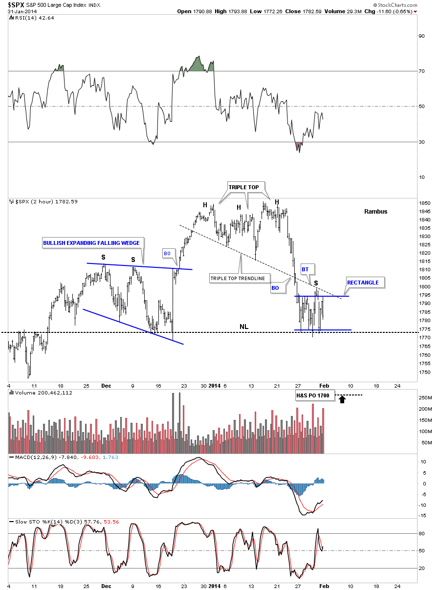
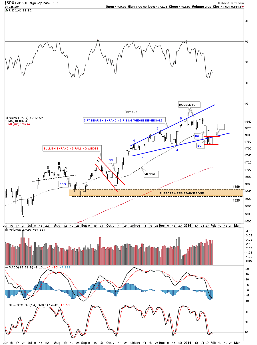
I just want to show you one more chart for the SPX that is a possible 5 point bearish expanding rising wedge. Note the little red rectangle that has been forming just below the bottom blue rail. We also have a double top in place which is a reversal pattern.
Tomorrow I’ll go into more detail on what I’m expecting with the stock markets over the intermediate term time frame based on the SPX. Now its time to get ready for the Super Bowl and relax for a few hours. Enjoy the game. All the best…Rambus