Team Chartology would like to thank each and every member who has found your way to our website and have honoured us
with your support these past 2 years . We are truly humbled by this experience .
………………………
Some of you have been with us from the very beginning in November 2011 .
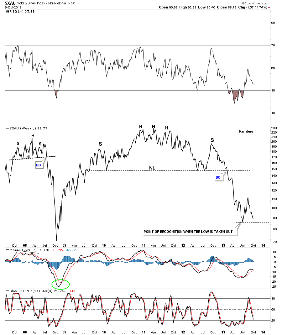
Most of you early Subscribers are from Goldtent , (the best Damn Goldbug Site On the net) where Rambus first posted his charts back in 2007- 2008
Who We Are and How We Happened
http://rambus1.com/?p=12205
2008 Rambus Deja Vu Post
http://rambus1.com/?p=1829
…………………….
Many more of you found us via Precious Metals Information sites such as
Gold-Eagle
Safehaven
Market Oracle
Investing.com
Kitco and
Safehaven
We thank the Owners and Editors of these sites for posting Rambus Public Posts
Example :
Gold-Eagle Rambus Posts
http://www.gold-eagle.com/authors/rambus
…………………………………..
We are also overwhelmed by the notes of appreciation we have received these past 2 years…some of which can bee seen here
Testamonial Testamania
http://rambus1.com/?p=11625
and
Some Stunning Research into Rambus Chartology from a Member
http://rambus1.com/?p=14543
……………………………………………
The Point of this Post is Not to brag or gloat about Rambus’s Successes( Rambus Hates when I do that) because as we all know
In this business we are only as good as our last trade .
The Point of this Post is to Recap where we have come from and where we are going
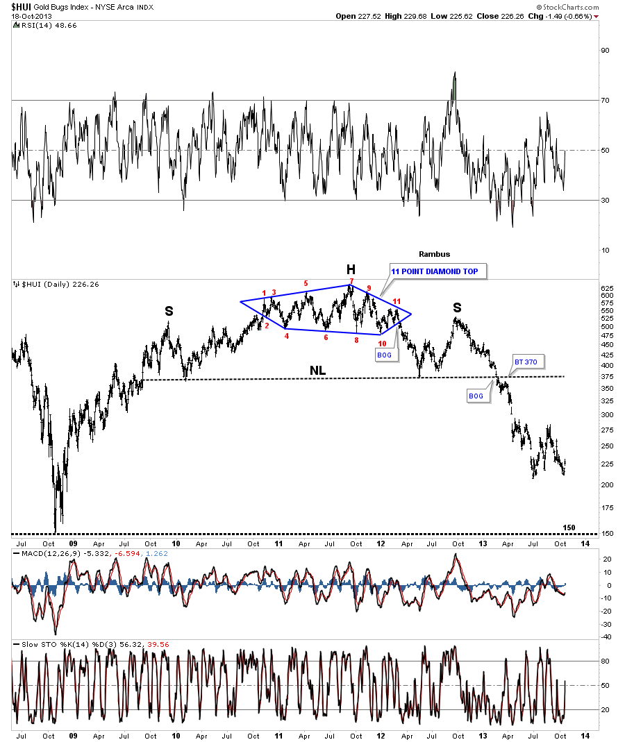
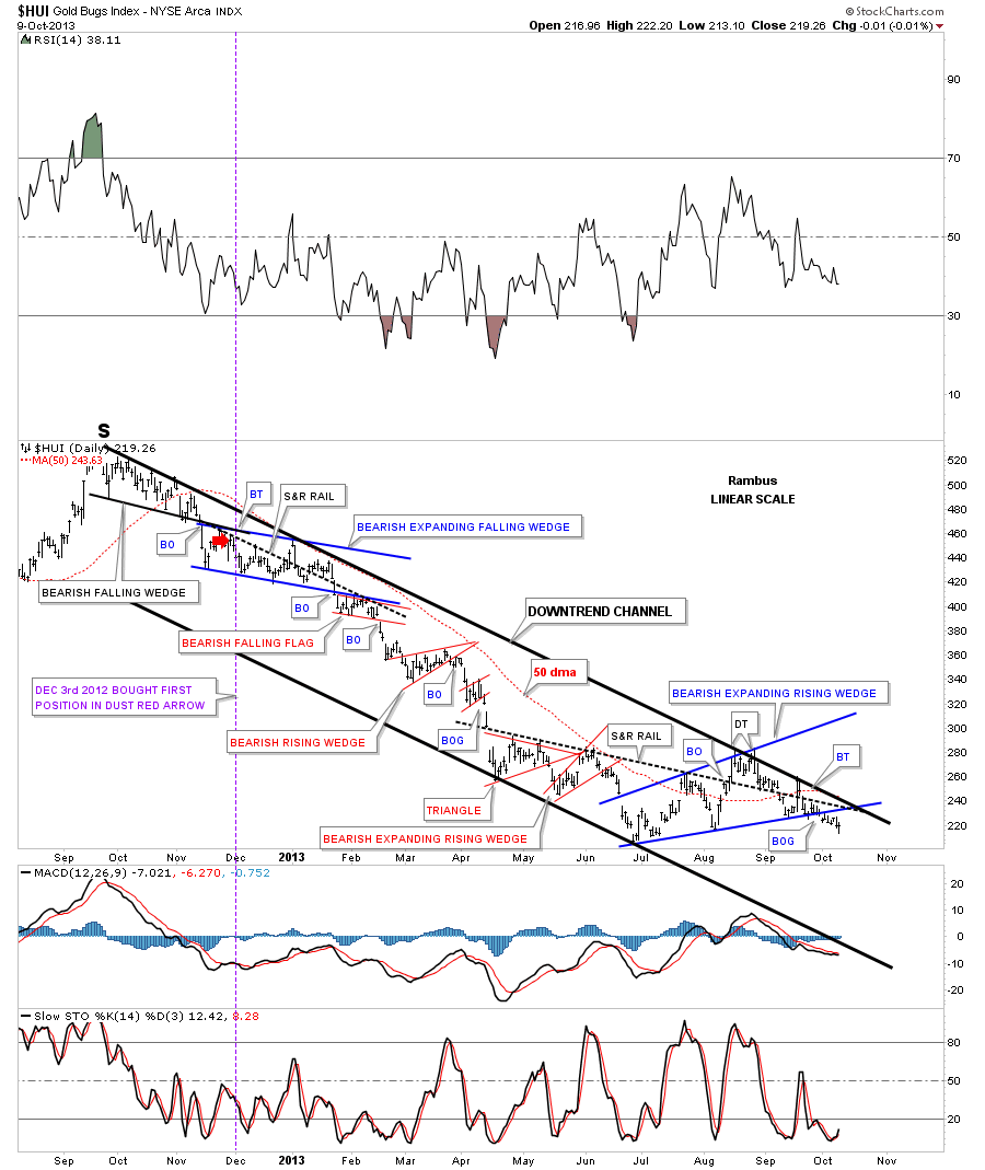
HUI a Diamond in the Rough (Posted January 2 2012 !) …just 2 months after we opened
http://rambus1.com/?p=1874
………………………………………………..
Rambus has 2 Portfolios
Both Started August 1 2012
1… Model Portfolio which was originally intended to contain 20 or so PM Stocks
Rambus has been Bullish for very short periods and has carefully built this portfolio 3 times
only to abandon them shortly after when things did not line up
this portfolio has recently held other General Market Stocks and occasionally shorts as well
Presently it is Up a mere 38% since inception and presently it is all in cash..but if I know Rambus
Not For long
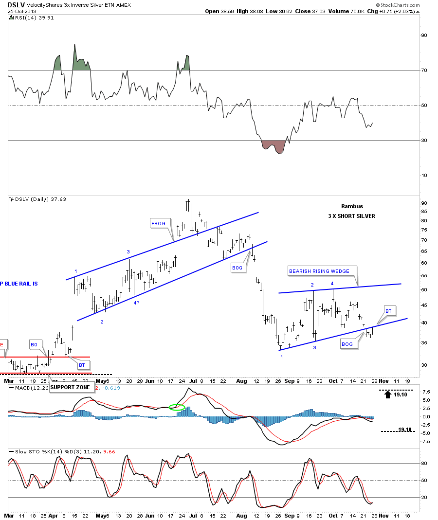
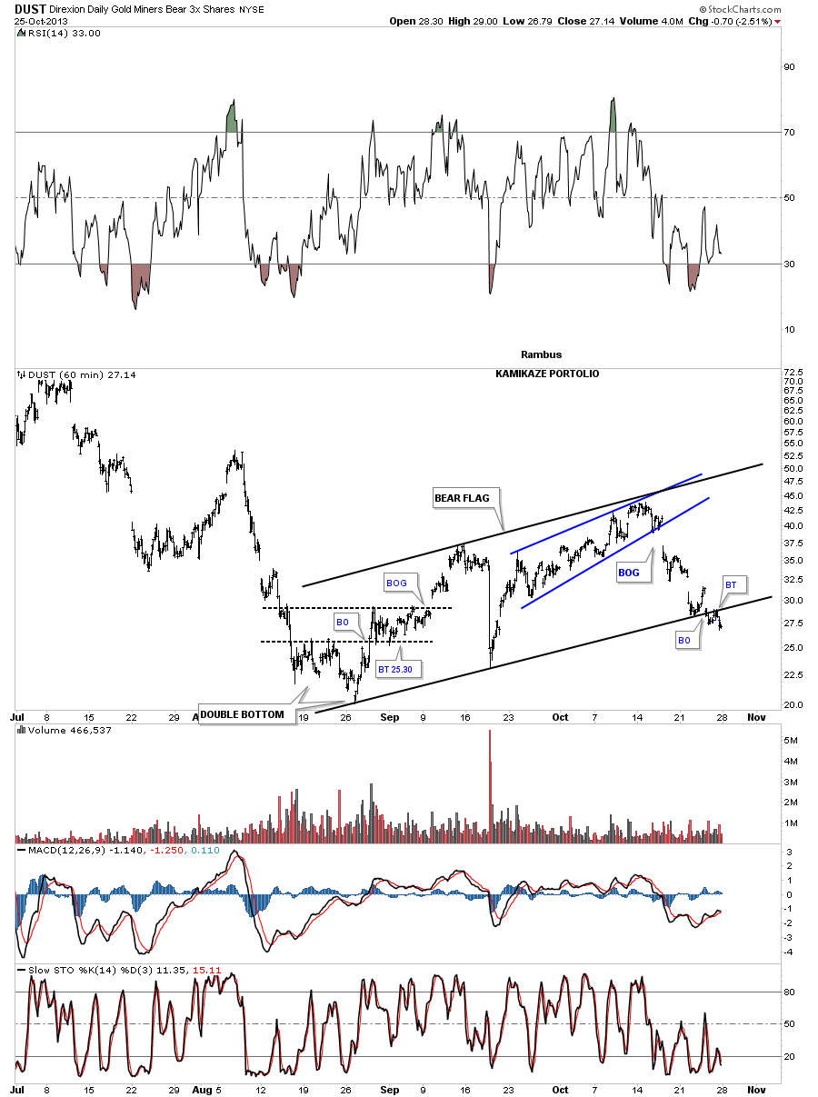
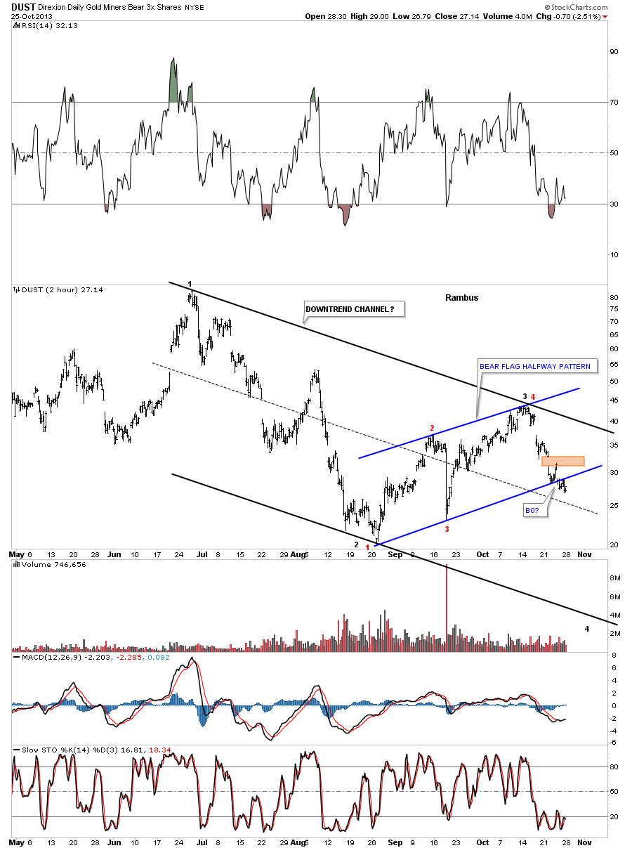
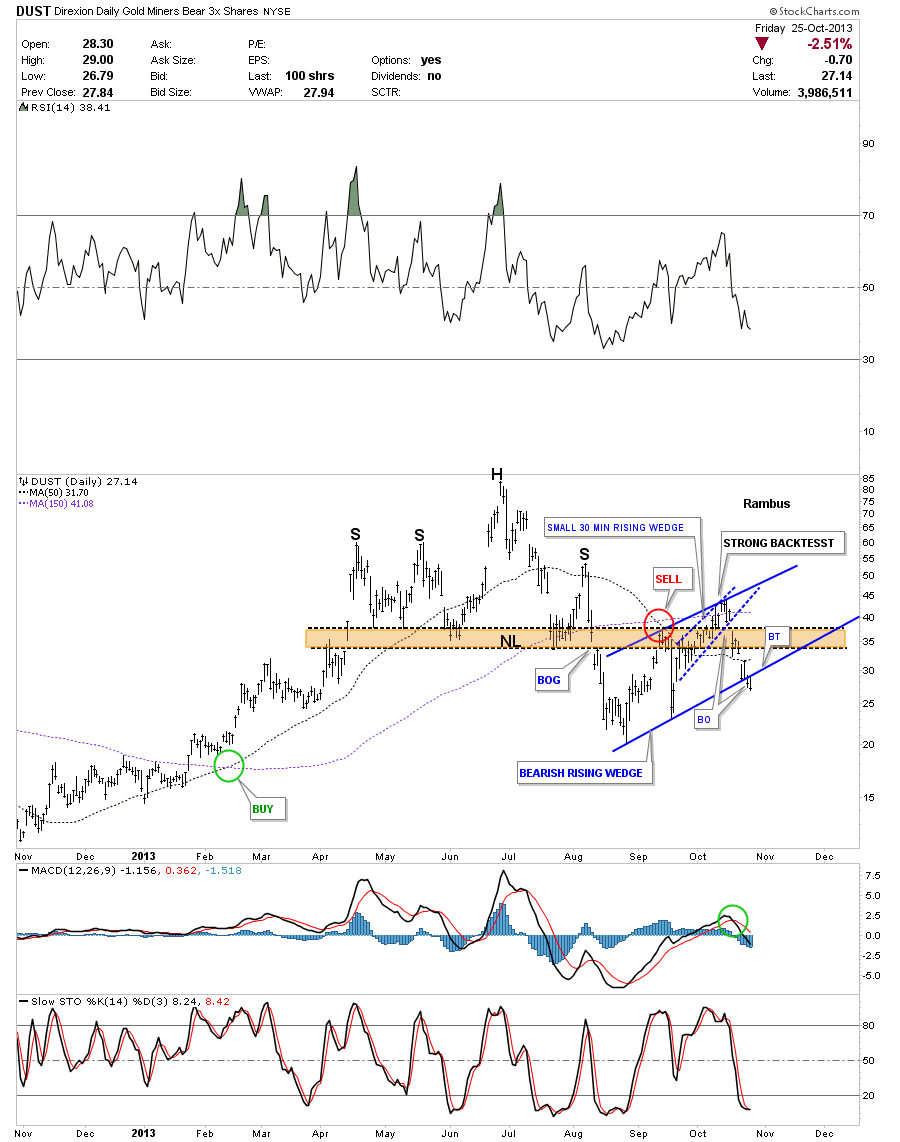
2…the Kamikazi Portfolio which is for Agressive Traders and houses 3 X Precious metals Bull and Bear ETFs
as well as occasional other 3X ETFs in other sectors…This Portfolio is presently Fully Invested
and is presently up 358% from Inception…Yes Rambus has turned $100,000 into $458,000 in 14 months
PORTFOLIO TRACKER
http://rambus1.com/?page_id=6926
………………………………….
Now to the Point :
We have Decided to raise the Price of Subscription from $29.99 a month to $39.99 a month
and from $299 a year to $399 a year
Starting on our Second Anniversary Next Sunday October 20th
BUT
All Present Members are Grandfathered at the Present Rate
You will continue as Rambus Members for as long as we are here for $29.99 a month or $299 a year
until you chose to unsubscribe
Now…Present monthly Members who have been considering yearly can do so this week (until Next Sunday)
at the present $299 Yearly price
After that date there will only be 2 Subscription price options available via paypal
$39.99 and $399
So if you chose to go yearly after the 20th it will be at $399
For those who pay by cheque or monthly invoice
we will still honor you present price but if you chose to go with recurring monthly or yearly payments
please do so this week at the present price
Here is the Sign up Link
http://rambus1.com/?page_id=10112
…………………………………..
Again We wish to thank each and every one of you for Subscribing and Look Forward to more Exciting and interesting and Profit Filled years
Fullgoldcrown ……(for Audept, Mrs Rambus and Rambus)
PS : Questions and Comments can be sent to the Contact link on the top right of the Home Page