I’m presently going over a ton of charts for the model portfolio so I won’t have much time to write a Wednesday Stock Report tonight. I know alot of you folks have some precious metals stocks that you have been following for a long time. If you think they might work in the model portfolio please post them at the forum and I can take a technical look at them. Right now I’m finding the bigger cap PM stocks have better looking charts than the little juniors which is what one would expect at the beginning phase of a bull run. I will probably create another list of just juniors that we’ll be able to switch over to when there turn comes. Right now I’m seeing alot of high level consolidation patterns in the big caps that are running from a year to a year and a half. This is where we want to be right now as they should be the first ones to take off. Then, as the bull move starts to get some legs we should see the little juniors get some attention and that is when we will reduce some exposure from the big caps and start layering in to some of the better looking juniors. As many of you already know the juniors can be tricky to trade. They can take their good ole time until the money starts to find its way to them. That can be very frustrating when you see the bigger cap pm stocks are rallying and your small juniors just sitting there. Hopefully we will be able to take advantage of each sector within the pm stocks to maximize our profits. Let me get back to work so I can find the best of the best to add to our model portfolio….All the best…Rambus
Category Archives: public
NGD.TO Trade Setup
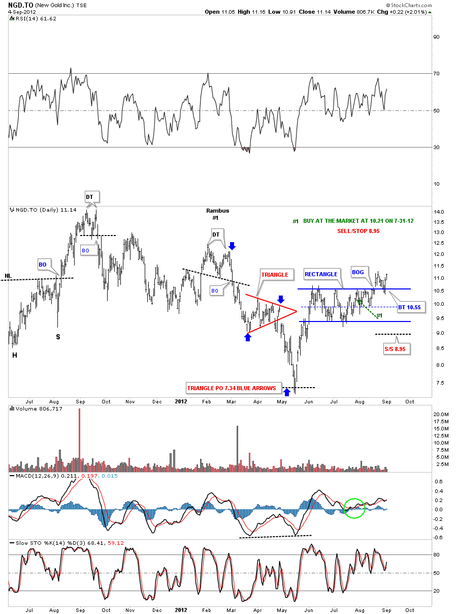
NGD.TO September 4th update. I’ve updated the daily chart for NGD.TO that is showing a very well defined rectangle consolidation now after a months worth of trading.
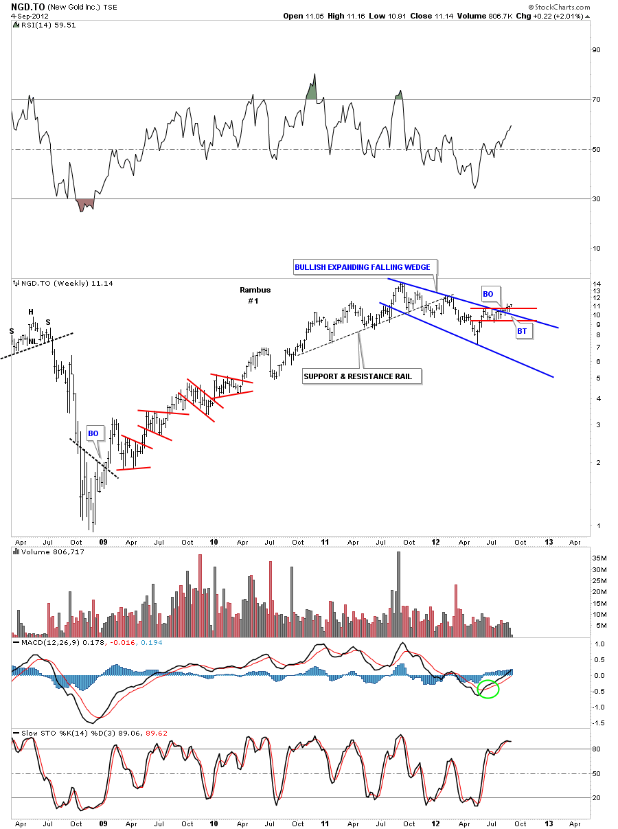
The weekly look shows NGD.TO has just now broken out of two important chart patterns. The red rectangle that I showed you on the daily chart above and a blue bullish expanding falling wedge several weeks ago.
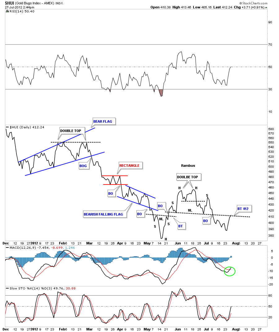
This will be the first stock I will start the model portfolio with. Its been a long time coming but it looks like its time to start dipping our toes in the water. There are several PM stocks that are starting to show some life so I will start to post more PM stocks that we’ll add to the model portfolio as their trade setups become apparent. My goal is to get positioned for an impulse leg that may last anywhere 18 months to 2 years. This will be where the real big money will be made. Get right and sit tight. So far the precious metals complex hasn’t allowed us to do that as gold and silver have been consolidating, gold for 10 months and silver for 15 months, and the precious metals stocks have been totally hammered during the corrections in gold and silver. The HUI, GDX and XAU all look to have a double bottom in place which is a 3 point reversal pattern to the upside. As the double bottom is a reversal pattern it will give us more confidence to take the long side for a change. There is still some serious overhead resistance on the HUI at 465 that will have to be over come to really get the bull market going in the precious metals stocks. For right now as I see a decent trade setup in one of the precious metals stocks I will post it and put it into the model portfolio.
Dow Jones Update
HUI Update
SLV & SLW Update
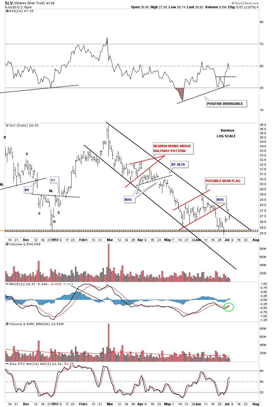
Tuesday SLV had a big gap move above the top rail of the downtrend channel. Today SLV gaped below the same trendline. With today’s move SLV has basically closed the gap from Tuesday. If SLV can trade back above the top rail of the downtrend channel that would be a big positive. Right now we can view the top rail of the downtrend channel as a Support & Resistance rail, Above positive and below negative. There are a couple of positives we can see on the chart below. There is a positive divergence on the RSI indicator at the top of the chart. Also the MACD indicator at the bottom of the chart has just crossed over. So until SLV can trade above the top rail of the downtrend channel we have to be cautious for the time being. I would like nothing more than to see SLV get back above the top rail on some nice volume.
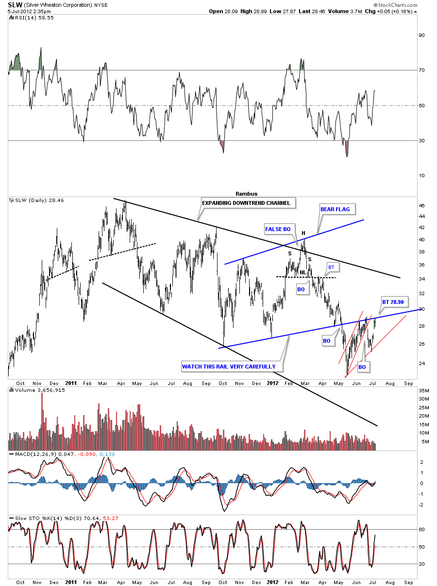
SLW has rallied back up to the blue rail of the bear flag which has acted as a support and resistance. Above positive and below is negative. SLW is a very important stock to follow to gauge the strength or weakness in silver. If SLW can trade above the bottom blue rail of the bear flag it will be talking to us. Like the SLV chart above we are getting close but we just need a good strong up day to get above the overhead resistance.
GLD Update
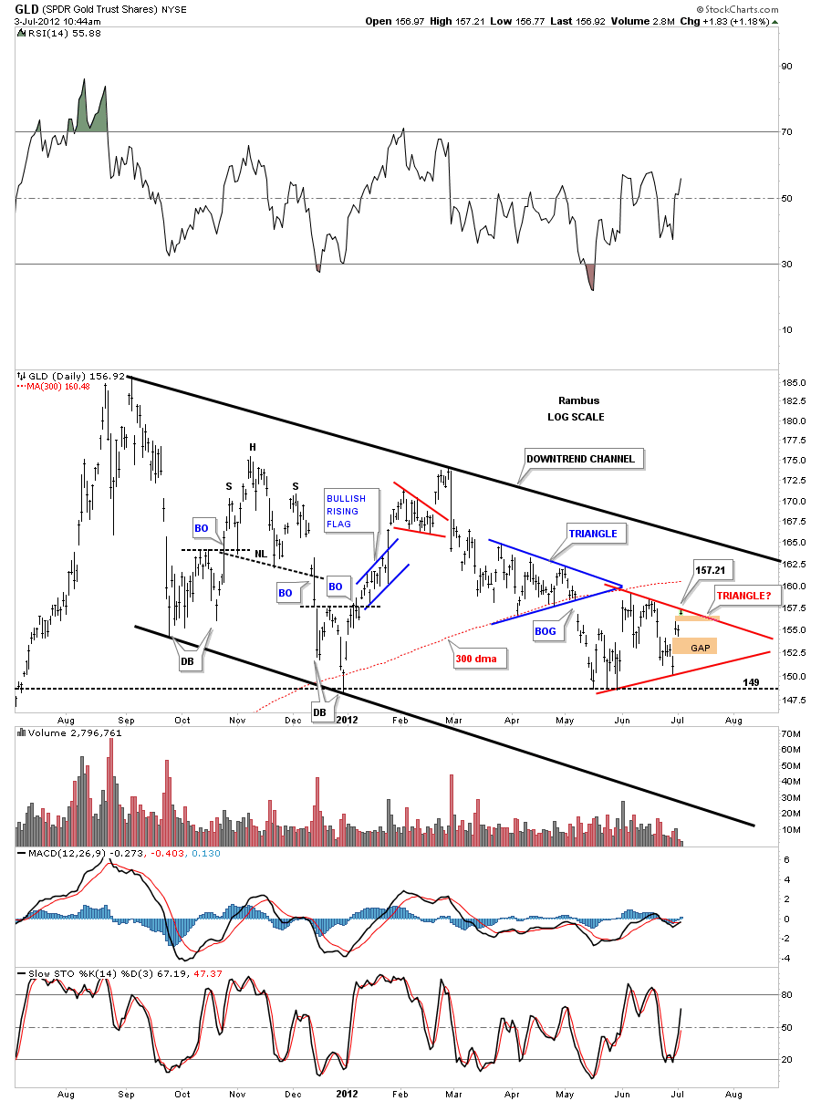
This morning’s gap up took the price up to the top rail of potential triangle consolidation pattern. The high for this morning stopped right at the top rail. You can also see two gaps below today’s price action that may need to get filled at some point. The 300 dma comes in around 160 also. This is the point where the bulls have to show their strength and break through the top rail of the triangle to get the ball rolling to the upside. If they fail right here and prices start to decline and break through the bottom rail of the red triangle the triangle will be a consolidation pattern to the downside. If that is what happens then the horizontal support at 149 will be taken out and that will usher in a move to new lows since the top at 186 for GLD. Today’s high is 157.21 so that is the number we’ll watch very carefully.
GDXJ …A Junior World of Caution…
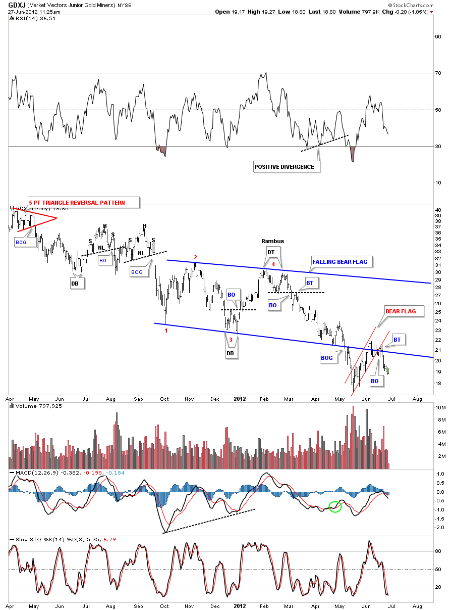
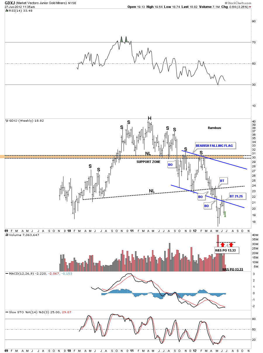
Yesterday I posted a look at SLW and SIL that showed their big bear flags that had broken down and had their backtest to the underside of the bottom rail. Today I want to show the other stock in the trilogy of big bear flags. I posted this chart of the GDXJ at the same time I posted the charts of SLW and SIL a month or so ago.
Lets start with the daily look that shows the big blue falling bear flag. Instead of rising against the trend it is falling with the downtrend which is even more bearish. Note the breakout gap that accompanied the breakout of the bottom blue rail. The backtest took on the shape of a rising channel or bear flag, in red. The backtest was a little strong as you can see on the chart below but it held and now the downtrend is now in progress again.
The weekly chart that I showed you had the bearish falling flag that is just part of the much bigger H&S top pattern. You can see there are two H&S top patterns which is more common than one might think. The top, smaller H&S pattern, is just the head portion of the the much bigger H&S top. Also notice how the brown zone or neckline stopped the advance of the right shoulder.
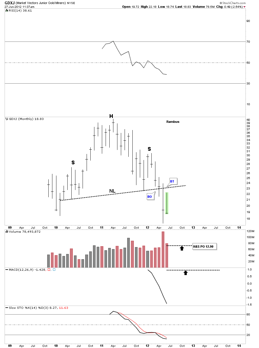
If you are invested in some of the junior precious metals stocks stocks I want you to take a good hard look at this monthly chart of the GDXJ. The only thing that has changed on this chart since the last time I posted it is the last bar on the right side. Folks, that’s a massive H&S top that is in the same league as the ones on the HUI and GDX that I been showing since the first of the year. Very few precious metals investors understand the significance of these massively huge tops that are reversal patterns. They are reversing the uptrend that had been in place since the 2008 crash low. As I said in 2008 and again this year, never ever ignore the implication of these H&S tops. Rambus
Weekend Report…A Comprehensive Look at The Chartology of Silver…
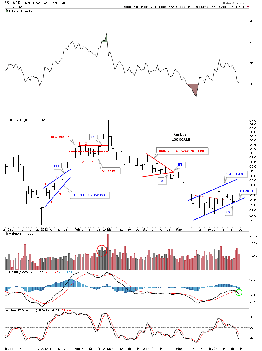
In the Wednesday stock report we took an indepth look at gold to see what the chart patterns were telling us. Tonight I want to look at silver as there is a chart pattern similar to the gold rectangle that no one is seeing at the moment. This pattern is very large and will have a major impact for the silver price going forward. Before we look at the bigger picture I want to bring everyone up to speed on the daily look that shows the chart patterns that have formed since the first of the year.
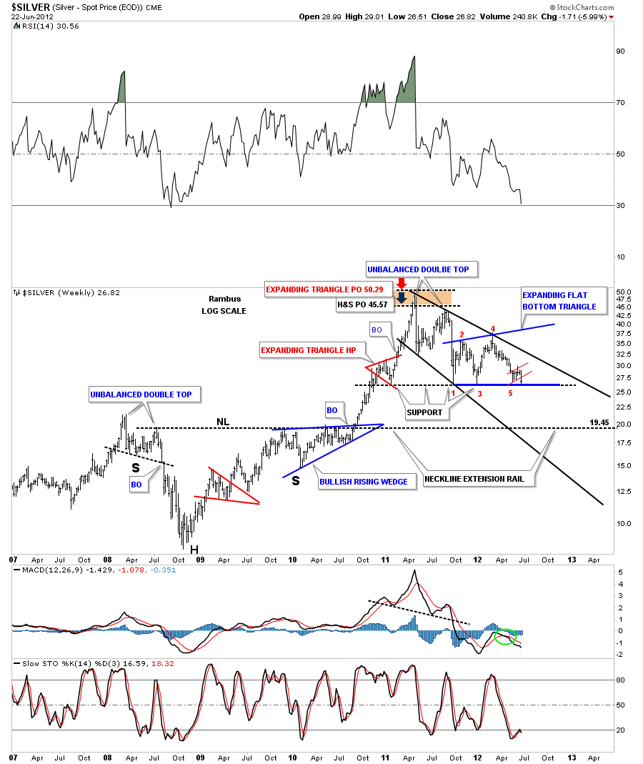
The daily chart shows silver finally breaking down from the blue bear flag that has been forming since the middle of May. If you recall this pattern started out as a 5 point triangle reversal pattern that looked like it would workout to the upside when it had a big breakout gap on nice volume. The next day it gave back all its gains and looked like it was doing a backtest to the top rail of the triangle. I remember at the time, dragging the bottom rail up to the high made the day before. This showed you that silver could have a false breakout and to watch the potential for this pattern to morph into the blue bear flag that we now see as the correct chart pattern. Sometimes when you get a false move to the upside like silver had, and you can detect it early enough, you will get a good move in the opposite direction, in this case back down. The high point on the blue silver bear flag is what I’m talking about.
The thin red dashed line, on the chart above, shows the top rail of the triangle, with the big breakout that failed to materialize, and caught many traders by surprise when prices fell back below the red dashed rail.
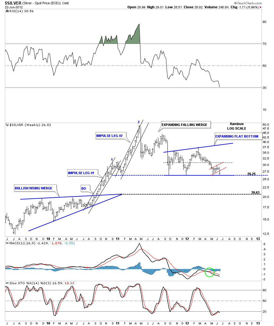
This next chart is a weekly look that shows the blue expanding flat bottom triangle that no one is recognizing yet. You can see the bottom rail of this pattern is part of the big horizontal support zone, at 26, that has been in place since the end of 2010. I can’t stress enough how important the horizontal support rail at 26 is for silver. If silver breaks below, it will reverse it’s role and act as resistance on any rally attempt. You can see our little red bear flag that I showed you on the daily chart above that may be giving us a big clue that the bottom rail at 26 is going to fail. Another clue that the bottom support rail may break to the downside is that flat bottom triangles usually break through the horizontal rail, not always but most of the time.
Lets look at another weekly chart that goes back over five years to put everything into perspective. I’ve also added a downtrend channel that is expanding in nature. I’ve also labeled the reversal point for the expanding flat bottom triangle so you can see it is a completed pattern. You can also see the little red bear flag that has been forming on the bottom blue rail. If the bottom support rail breaks down I’ve extended a neckline extension rail that was made back in 2009 during the formation of that big H&S base that helped launch the huge rally to 50. The neckline extension rail would be the first logical place for silver to find some decent support.
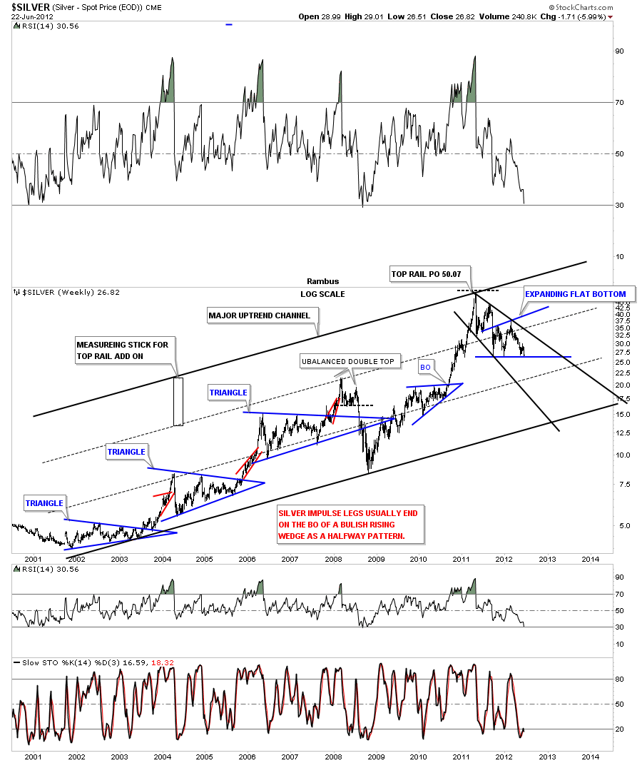
The next chart I would like to show you is the long term look that goes back to the beginning of the bull market for silver. Its been in a very nice uptrend channel. The top rail off the major uptrend channel had to be moved one magnitude higher when silver went on its near parabolic run to 50. This is the same technique I showed you on the gold chart on the Wednesday Stock Report. You can see there is only one touch of the top rail that was put in place by the height of the measuring stick made off the upper black dashed rail. Silver could conceivably trade down to the bottom rail of the major uptrend channel and still be in it’s bull market.
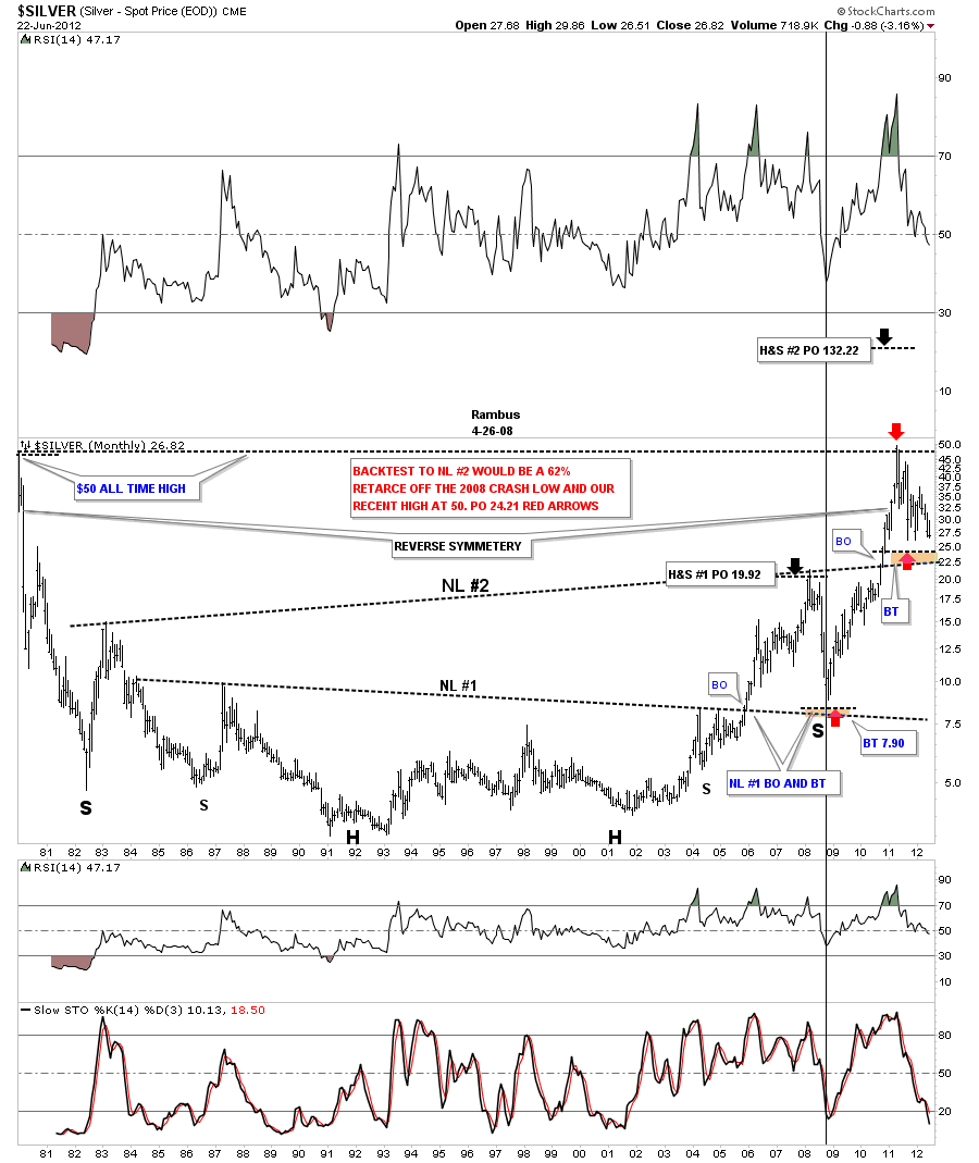
The last chart I would like to show you leans toward the bullish side for silver. This chart goes back 30 years and takes in the top that was made back in 1980 at 50. There are two huge H&S bottoms that were made when silver was in it’s major bear market after the 1980 high. I’ve labeled each neckline on the H&S bases #1 and #2. First lets focus in on H&S #1 and how it fared. It broke the neckline in November of 2005 and reached it’s price objective at 19.92 in March of 2008. That high was made just before the 2008 crash began. As you can see the 2008 crash took the price of silver all the way down to just above 8 which was also the backtest to the neckline.
From that backtest low in 2008 silver started the rally that would take the price all the way back up to the 50 area. Now we need to focus in on neckline #2 that was broken to the upside in November of 2010. On the chart above I’ve labeled where we might see the backtest to neckline #2, brown area around the 22.50. The red arrows shows a 62% retrace of the entire bull market comes in around the 24 area.
Its going to be interesting to watch how things unfold and see if neckline #2 holds support like neckline #1 did. For me, this chart represents the most bullish aspect for silver because if neckline #2 holds, on a backtest, the second H&S base calls for a price objective to 130 or so. Stay tuned as things are really starting to get interesting for both the short term and the long term. All the best…Rambus
EDITOR’S NOTE :
Rambus Chartology is Primarily a Goldbug TA Site where you can watch Rambus follow the markets on a daily basis and learn a great deal of Hands on Chartology from Rambus Tutorials and Question and Answeres .
Most Members are Staunch Goldbugs who have seen Rambus in action from the 2007 to 2008 period at www.goldtent.org and now Here at Rambus Chartology since early 2012 .
To review his Work and incredible calls from the 2007-2008 period click on the top right sidebar in the “Wizard of Rambus” ….”What If !!” Post
To Follow Rambus Unique Unbiased Chart Work and participate in a Chartology Form with questions and answeres and learn the Art and Science and Mindset of a Pro Trader please Join us by subscribing monthly for $29.99 at
www.rambus1.com
We have many subscribers from all over the world who are glad they did as they enjoy the many daily updates and commentaries provided at this exciting new site
As you will see Rambus (Dave) has prepared us for this difficult period by being one of the only ones to see and warn about this incredibly debilitating PM smackdown as early as Jan 2 2012 …click on the” HUI Diamond in the Rough” Post in the “Wizard of Rambus” top right
You will find Rambus to be a calm humble down home country tutor with an incredible repitoir of all the TA based protocols tempered with his own one of a kind style…simply put…He wants to keep his subscribers on the right side of these crazy volitile and downright dangerous markets
See you at the Rambus Chartology
OIL Update
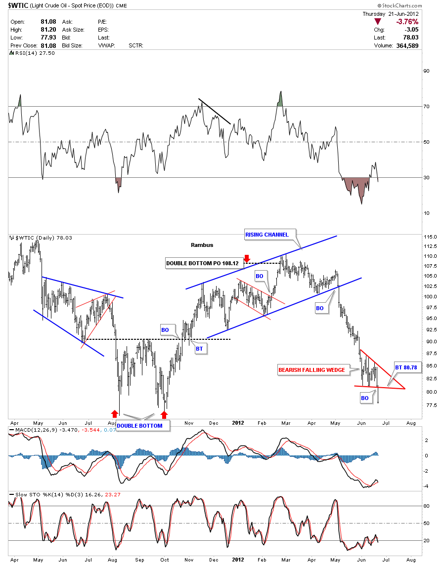
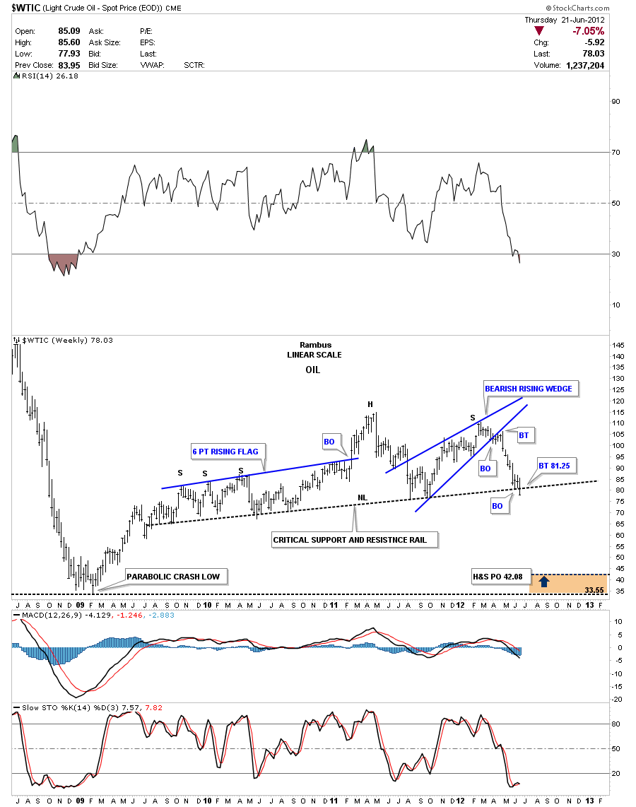
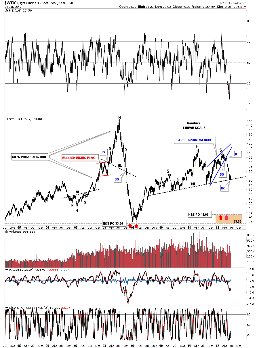
I’ve been showing a potential huge H&S top that has been forming on oil for almost 3 years. Yesterday we had a critical break of the neckline. I first want to show you a daily chart and the bearish falling wedge that broke down yesterday as well. I’ve shown you many instances where a small consolidation pattern, that forms right on an important trendline, will give the bigger pattern the strength it needs to finally confirm the pattern once the last bit of support is gone. Think bear flag on the SLV chart that has formed on the horizontal support rail at 26.. A backtest to the bottom red rail of the bearish falling wedge would come in at 80.78.
Below is a four year weekly chart that shows the huge H&S top pattern. A backtest to the neckline would come in around 81.25.
I want to put this H&S top into perspective by showing you an 8 year weekly look that takes in the parabolic rise to 147 and the crash that followed.
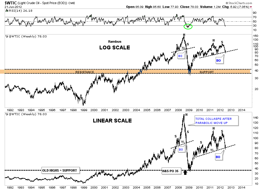
The last chart I want to show you is a 20 year look that shows the old top of the trading range at 35 that kept oil in check until it finally broke through in 2004 that was the very beginnings of the parabolic run to 147. This chart clearly shows that when a parabolic move has run it course the move down can be even faster than the move up. I think this oil chart is giving us a very big clue to the deflation wave that is coming our way.

