Wednesday Stock Report

We have several new subscribers that I would like to thank for joining our website and bring up to speed on some of the big H&S top patterns. I want to show some of the big H&S top patterns that are in different stages of completion. Some are still forming their right shoulders while several more have broken their necklines since the last time I posted them. Its really important to grasp what these big topping pattens are telling us. This correction, for the most part, is still in the early stages in time and price, I will keep it simple and let the charts speak for themselves with limited description.

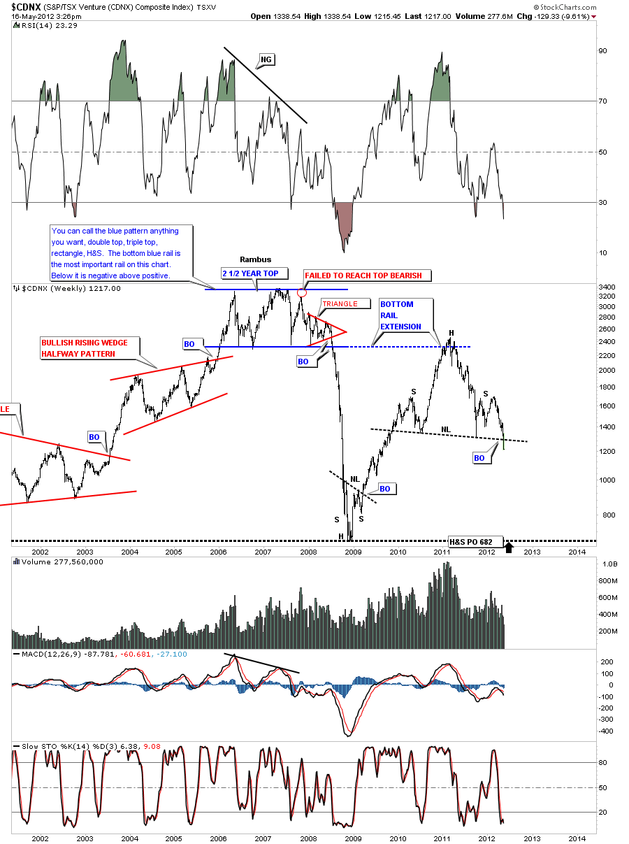
CDNX has now clearly broken the neckline of a big H&S top pattern. PO down to the 2008 crash lows at 682.

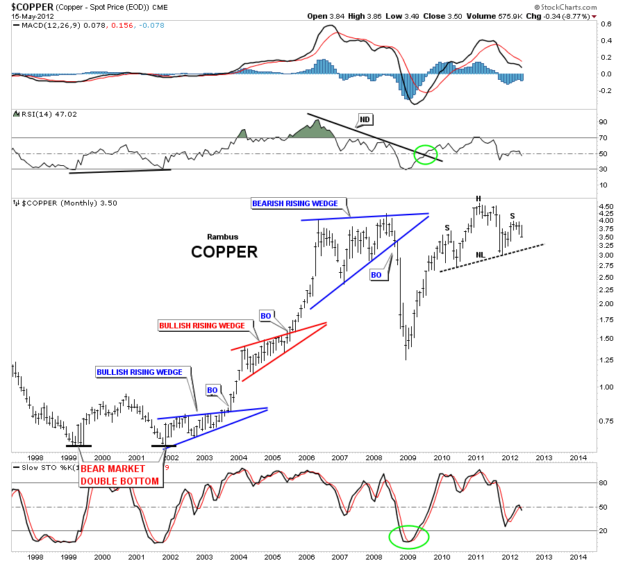
COPPER is still working on it’s right shoulder of a very big H&S top pattern.

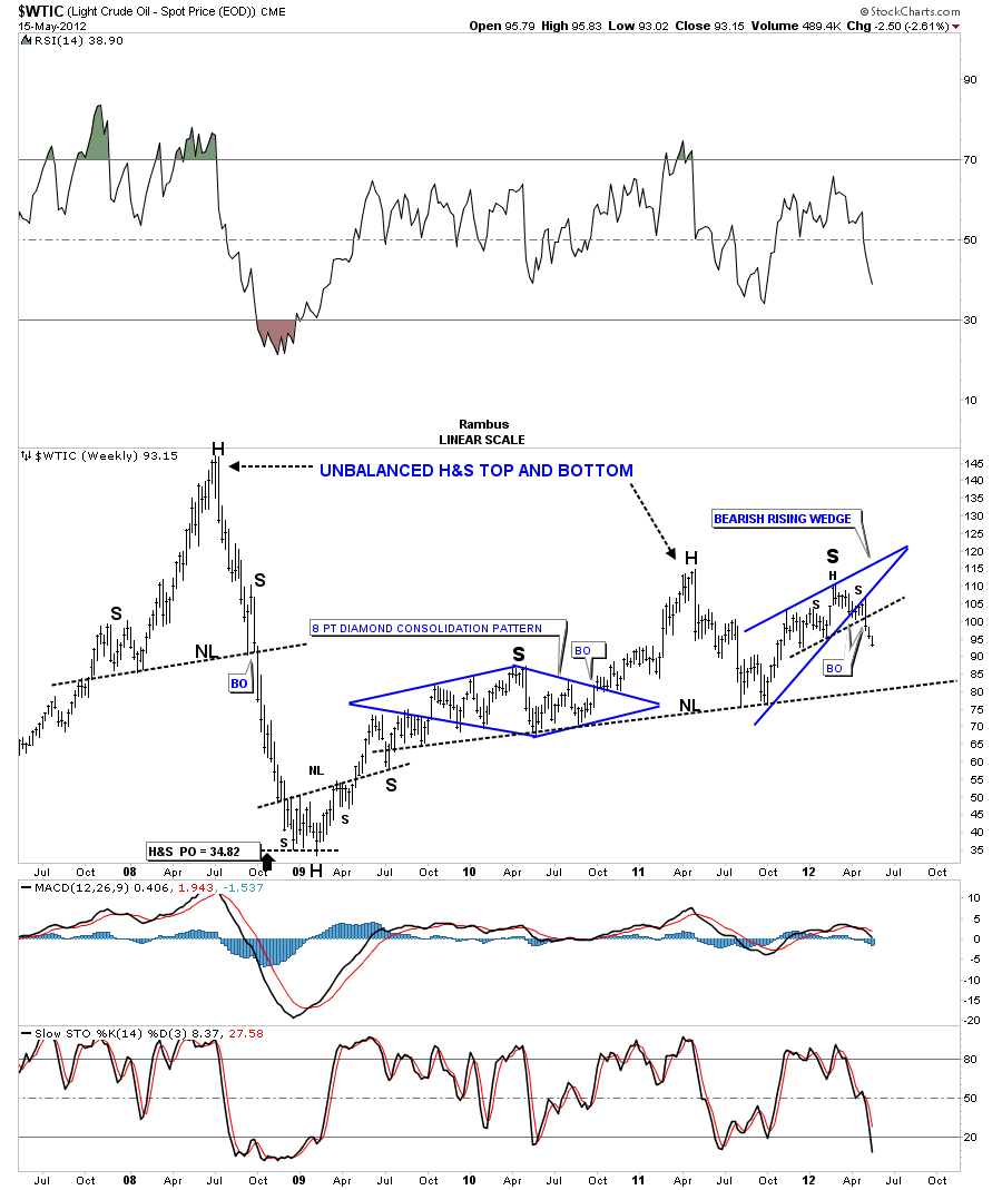
OIL has just broken down from a bearish rising wedge that maybe the right shoulder of a big H&S top.

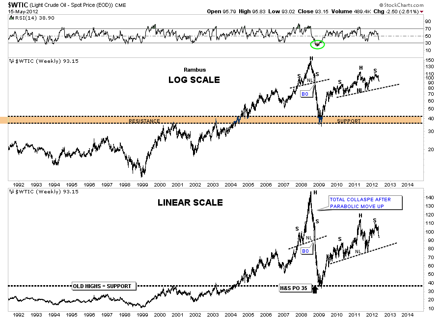
Below is a combo chart for oil in log scale and linear scale that takes in the parabolic move and the crash that followed.

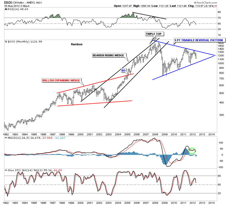
The XOI oil index is working on a 5 point triangle reversal pattern. A break below the bottom rail will confirm the top is in.

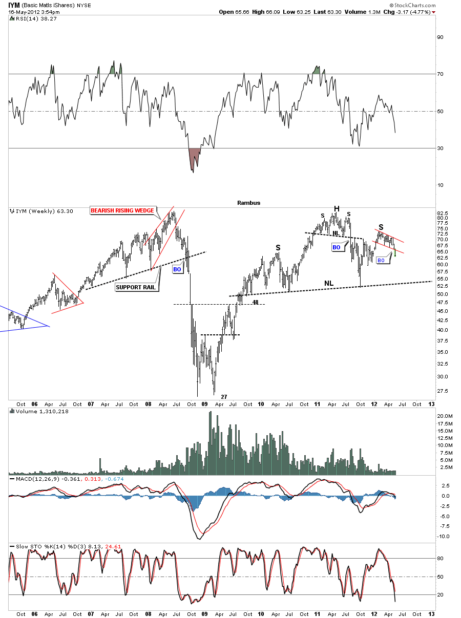
The weekly chart for IYM shows a big H&S top. This week we are breaking below the red 5 point falling flag that is creating the right shoulder. This chart shows why I recommended the inverse etf, SMN  as a buy today.

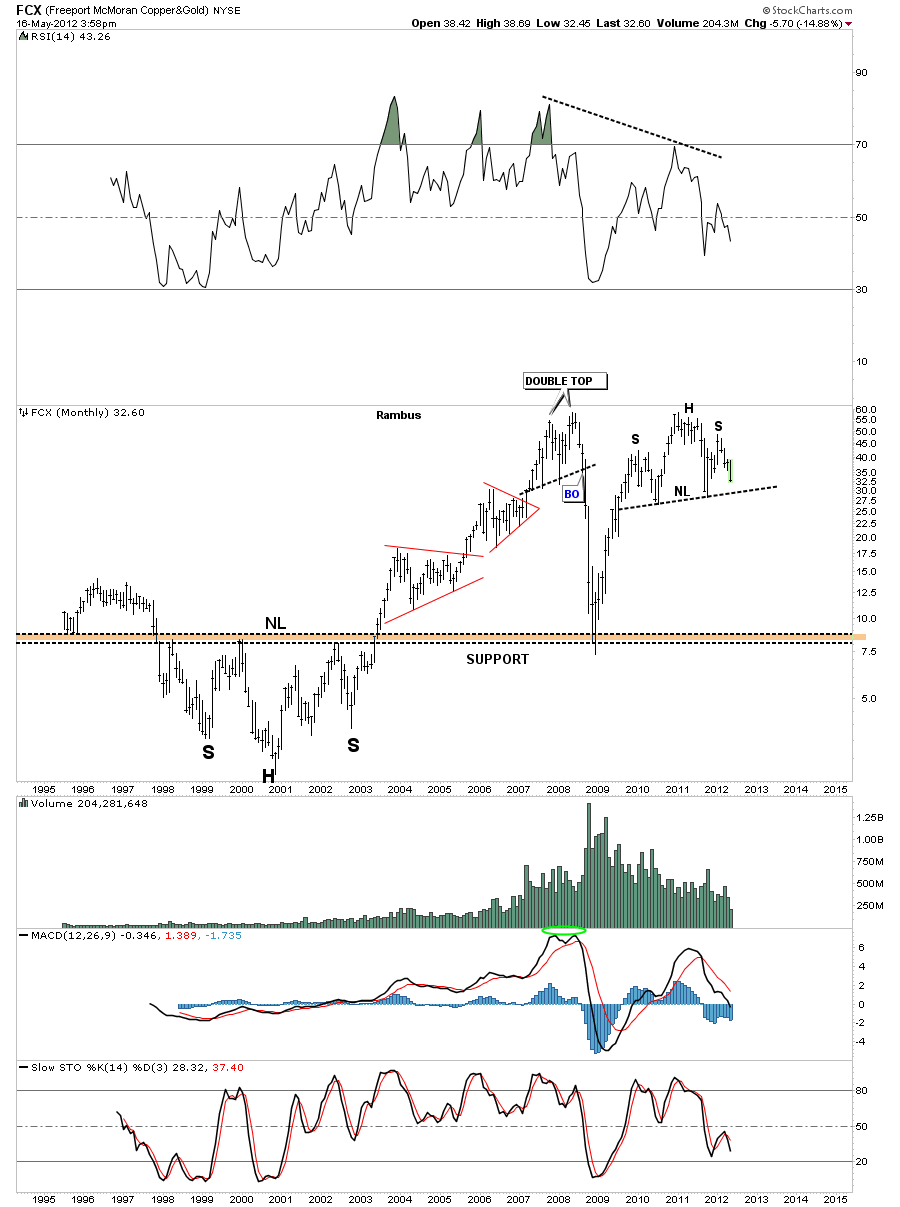
If the basic materials etf’s are showing weakness in here then that should also show up in the miners. FCX is moving closer to it’s neckline but not quite there yet. If that big monthly H&S plays out there is a long ways to go to the downside yet.

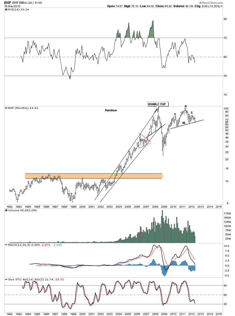
BHP is a big miner that is just slightly ahead of FCX as its testing the neckline right now. Watch for a break of the neckline to get the ball rolling to the downside.

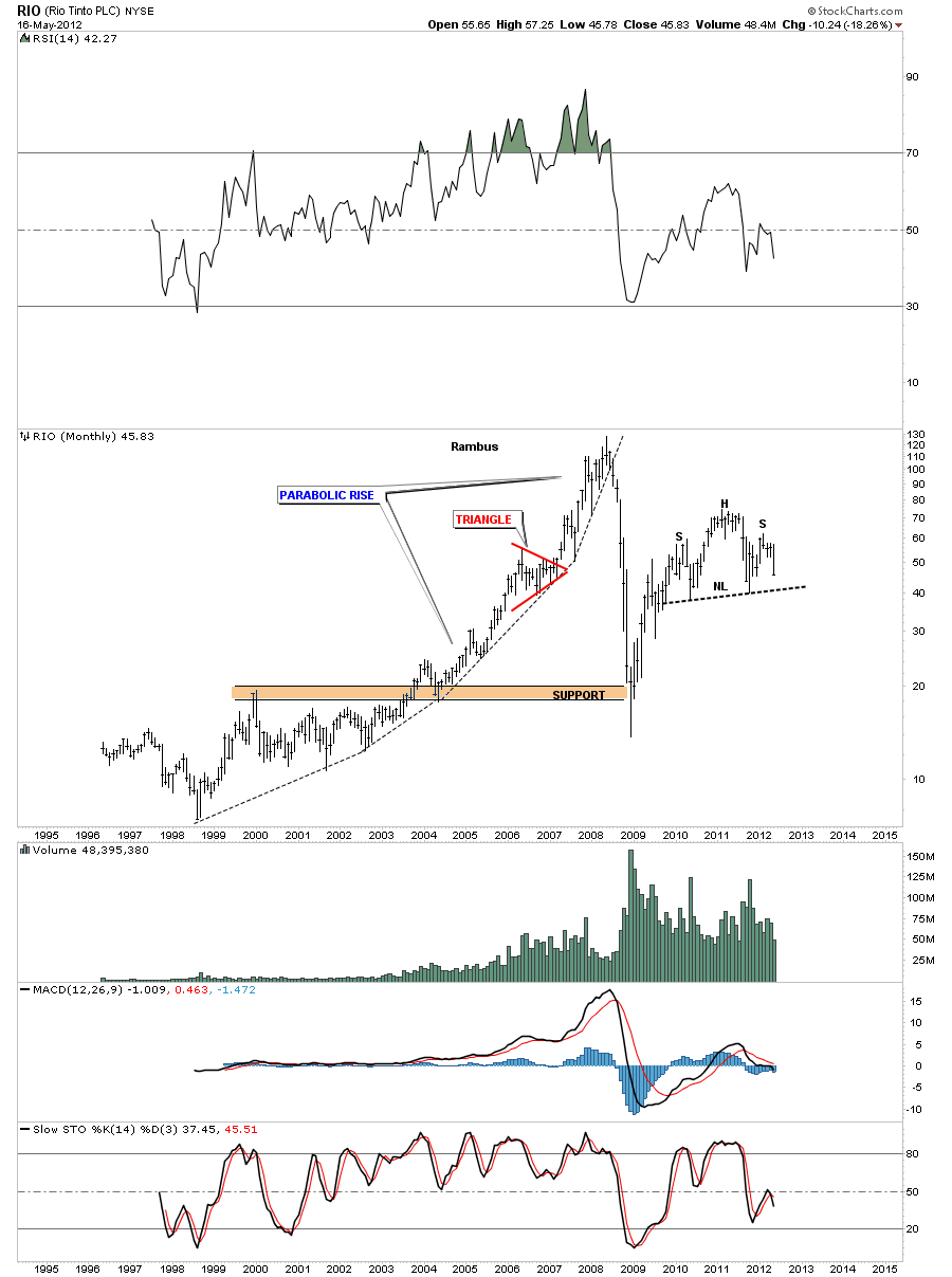
RIO is another big miner that is working on it’s right shoulder. I hope you are starting to see a pattern developing.

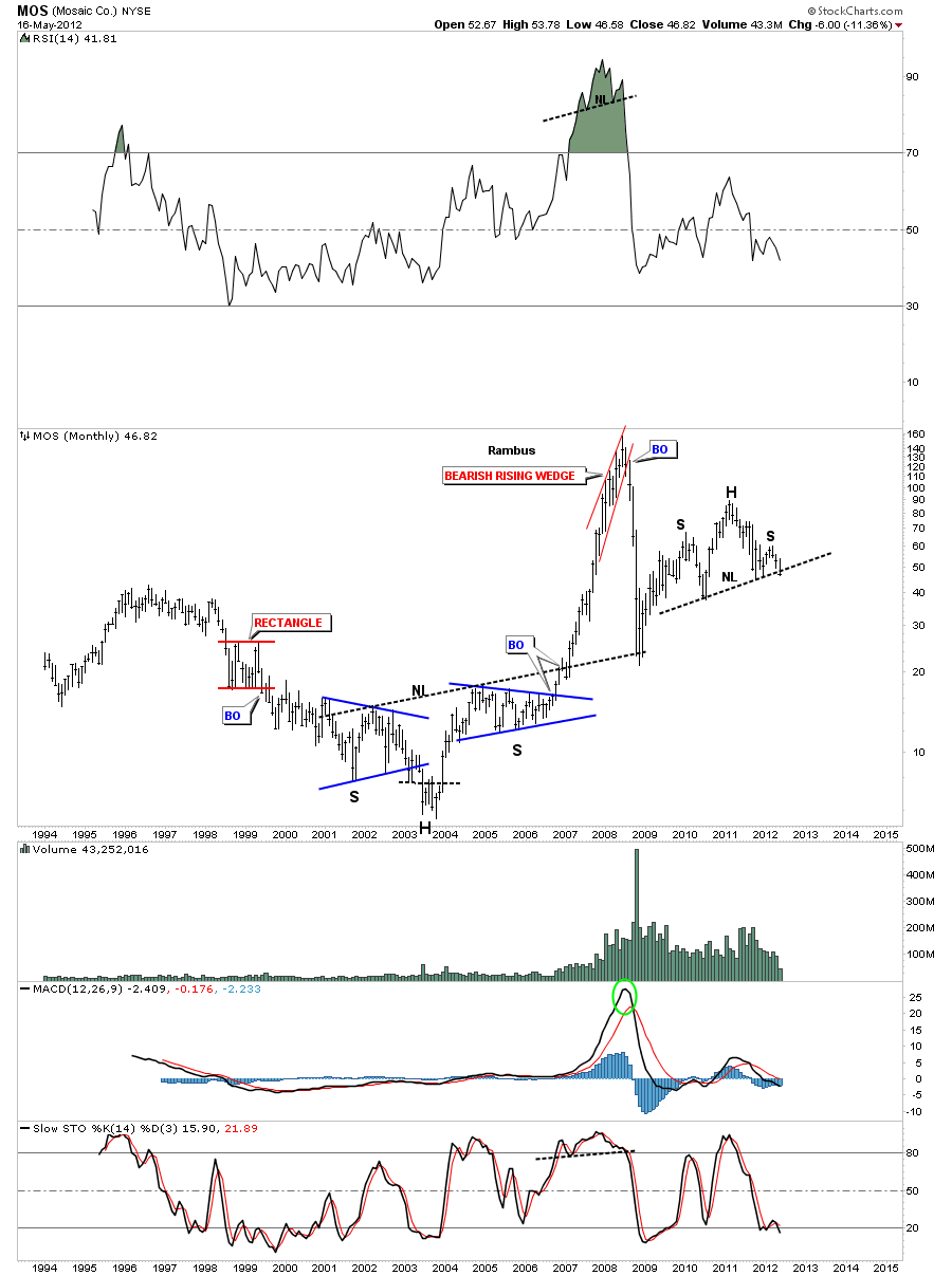
MOS is a basic materials stock that is now cracking the neckline of it’s H&S top pattern.

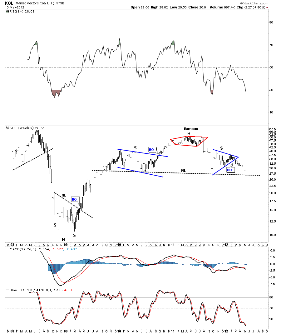
KOL is a coal etf that is trading right on its big neckline. A weak coal price tells me the world economy is in slowdown phase.

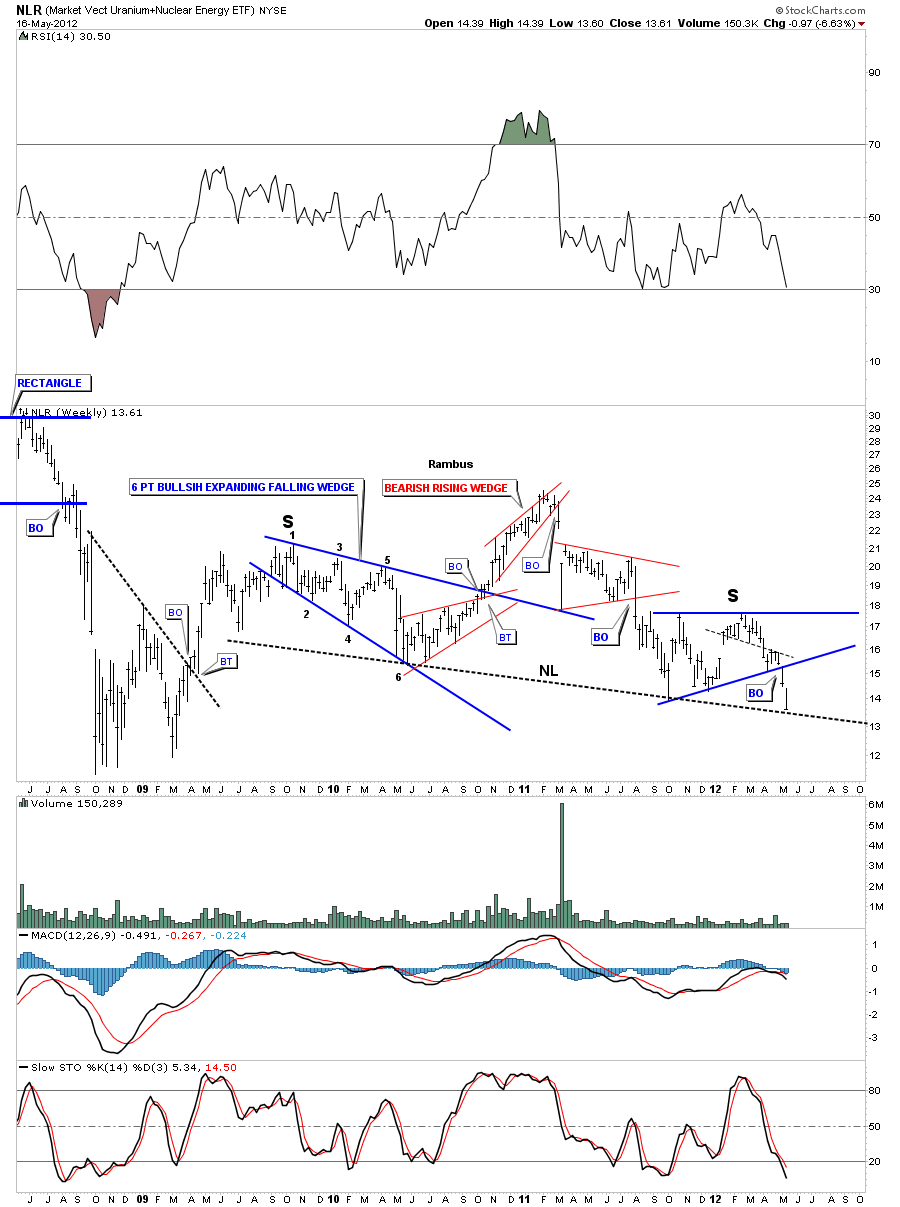
NLR is a Uranium etf that is testing it’s big H&S neckline. This chart is alittle busy but you can see the neckline and both shoulders.

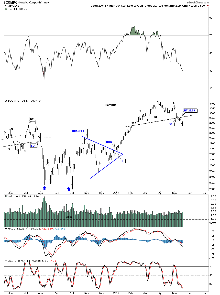
Lets now look at some stock market that are showing H&S top patterns. COMPQ had a nice breakout and backtest and is now in the impulse leg down.

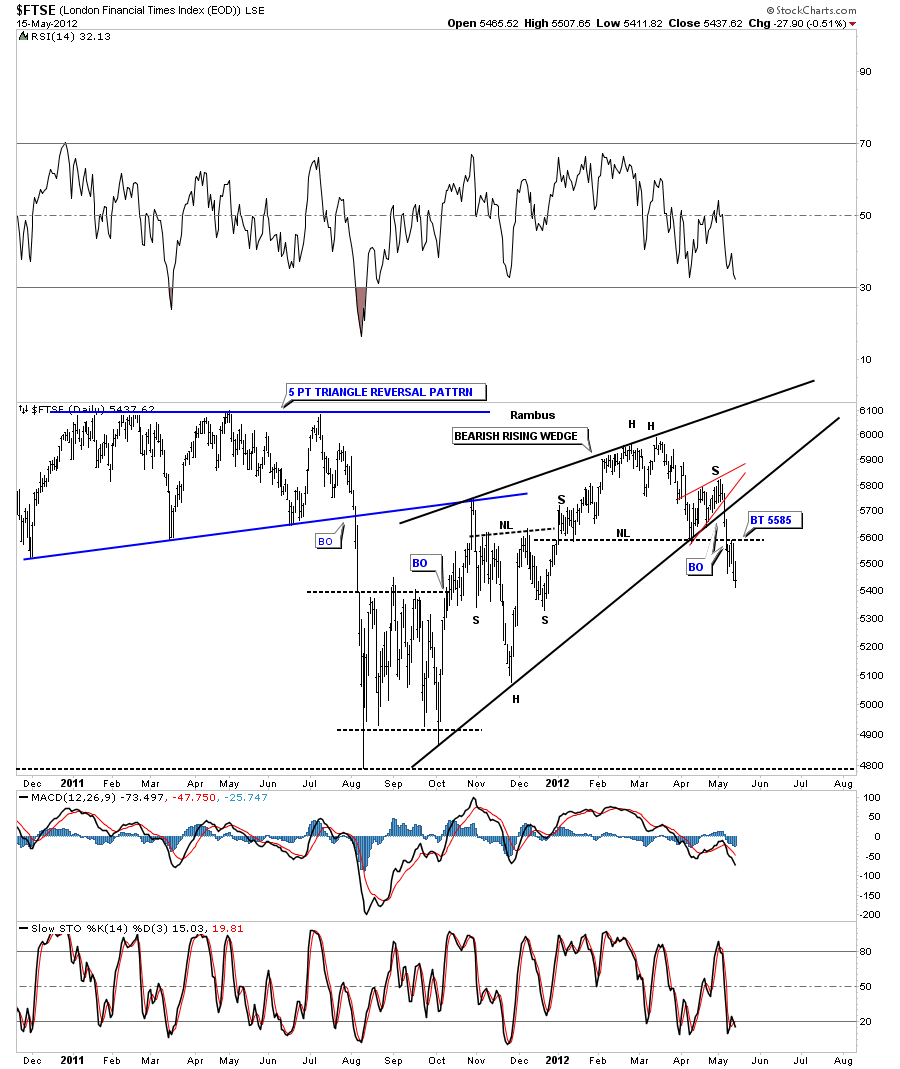
FTSE has broken out from its H&S top with a nice clean backtest.

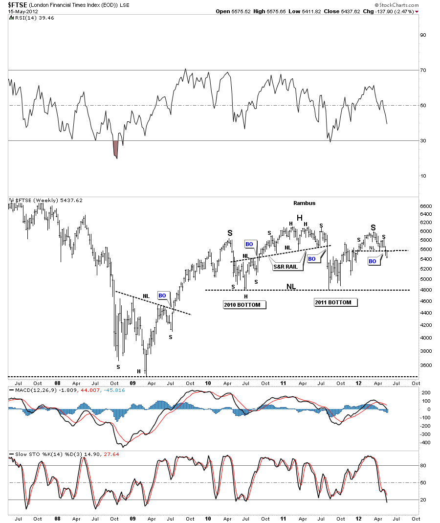
I want to show you another chart of the FTSE that is showing a much bigger H&S top forming. The daily chart above is just the right shoulder of the much bigger H&S top on the chart below.

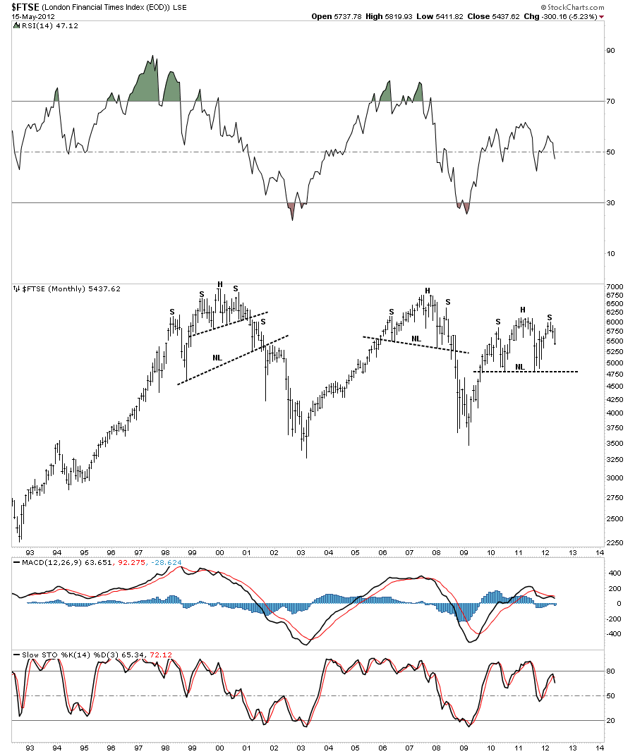
Lets look at the monthly chart of the FTSE as it shows why H&S patterns are so important to recognize. Do you see any similarities to the previous topping patterns?

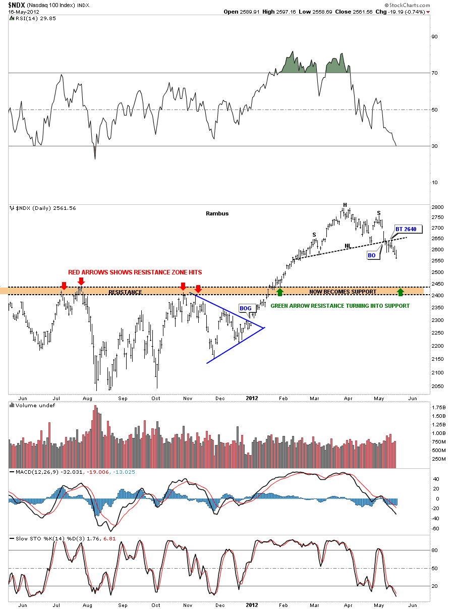
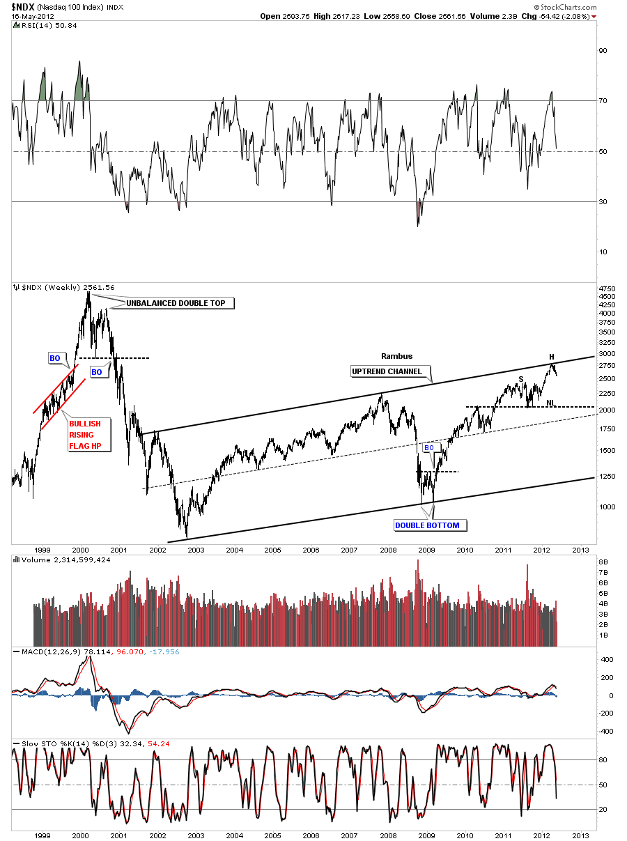
The NDX 100 is made up of the 100 biggest tech stocks. Stocks like Apple, Priceline and GOOG to name just a few.

The weekly look shows why the H&S top is forming where it is. You can see NDX is trading right up at the top rail of the big uptrend channel so a good place to look for a reversal pattern.

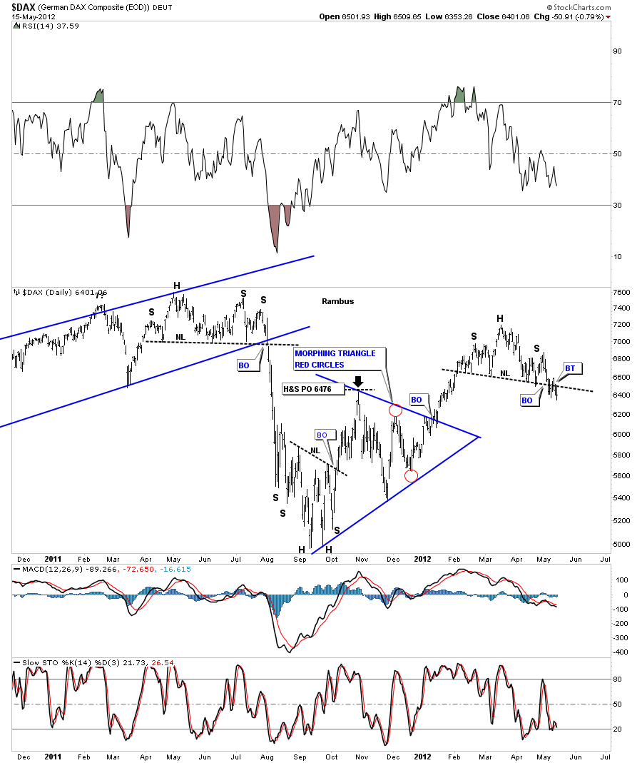
DAX is the German stock market and one of the stronger economies in Europe. As it has already broken it’s neckline and had a backtest this index is ready to start it’s next leg lower.

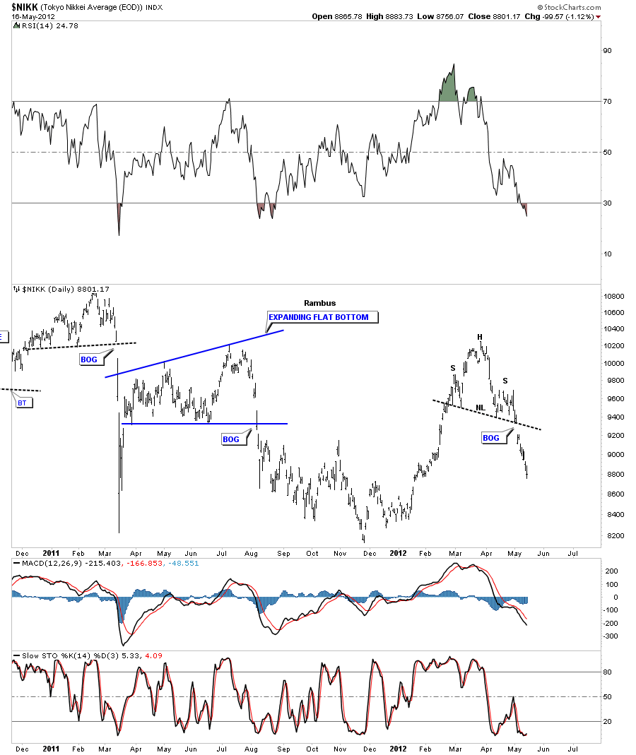
The Japanese stock market, the NIKK, had a big breakout gap when it left it’s H&S pattern. Notice how its reversing symmetry down. How it went up into the H&S top is how it is coming down.

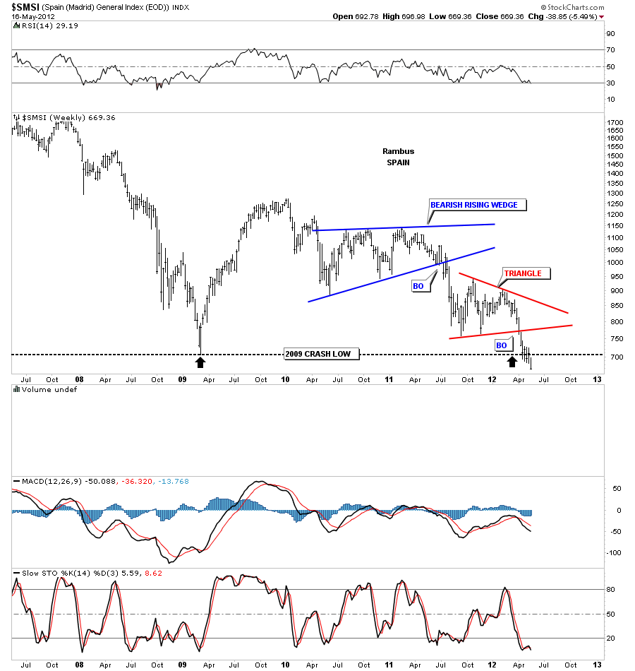
Now to a couple of weaker stock markets. The SMSI is one of the weaker European stock markets as it is now taking out the 2008 crash lows.

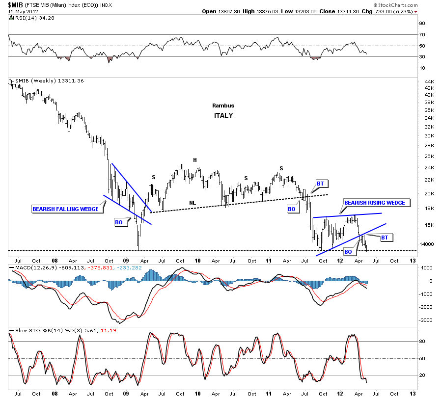
The MIB, Italian stock market, isn’t far behind the Spanish stock markets as it to is testing the 2008 lows.

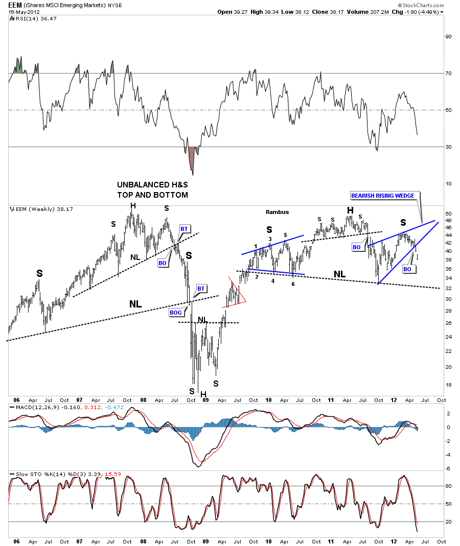
The EEM has broken out of a bearish rising wedge this week that looks like it will be part of the bigger H&S top pattern.

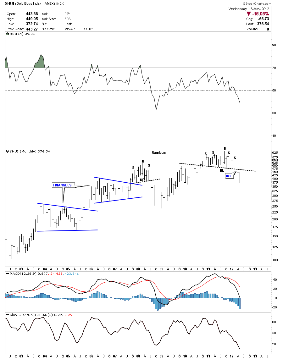
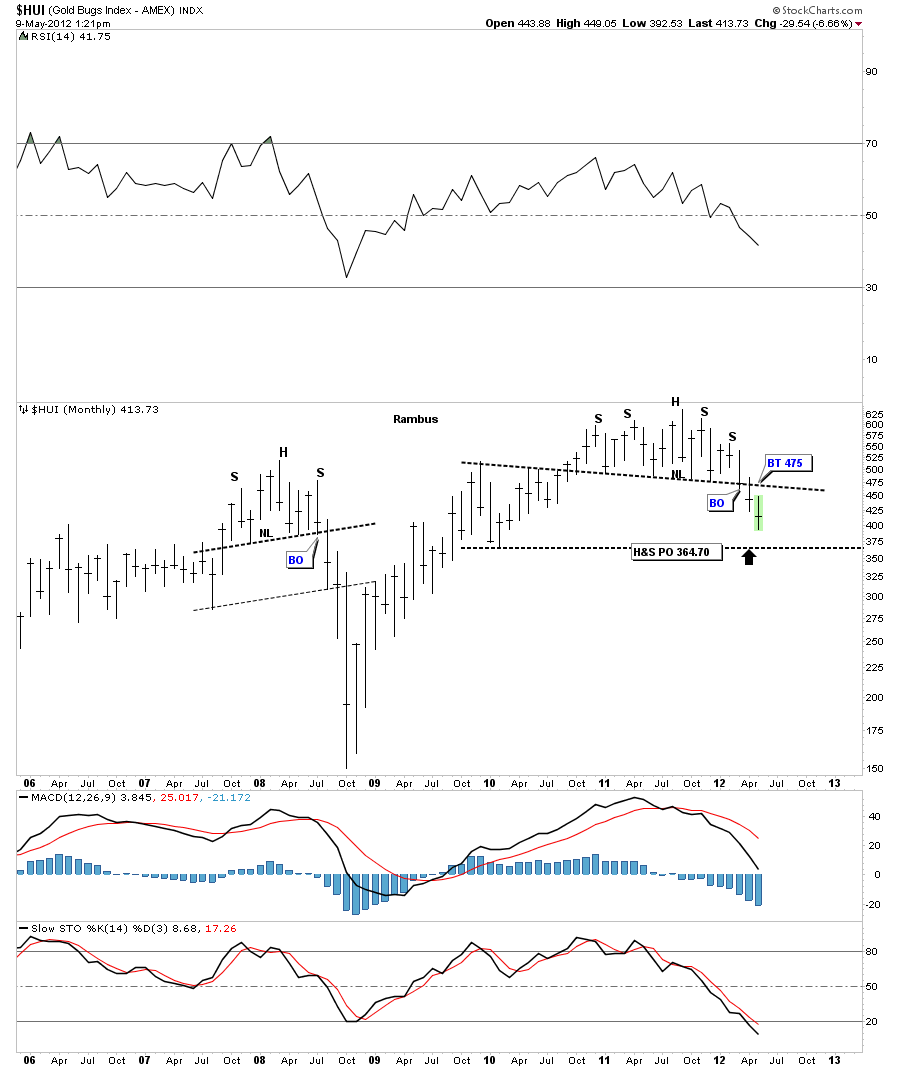
Lets now take a look at some of the precious metals stock indexes as they seem to be leading the charge lower. You can see they have all had big runs lower already. Notice how the monthly look at the HUI has already broken well below it’s big neckline compared to all the charts shown above.

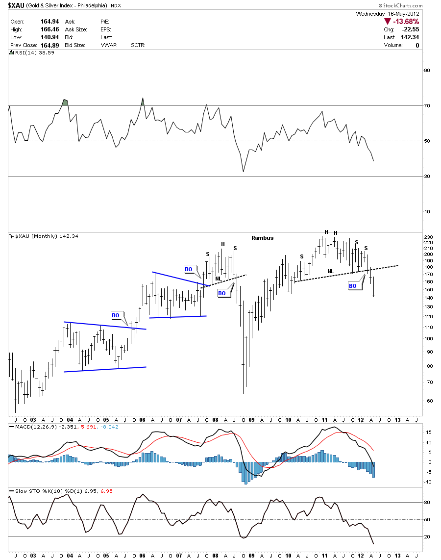
The XAU monthly look.

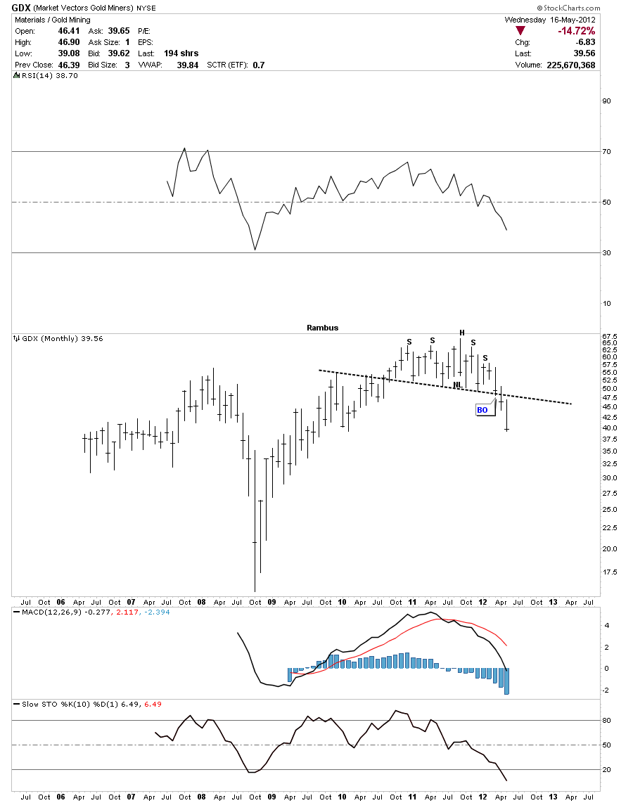
GDX monthly look.

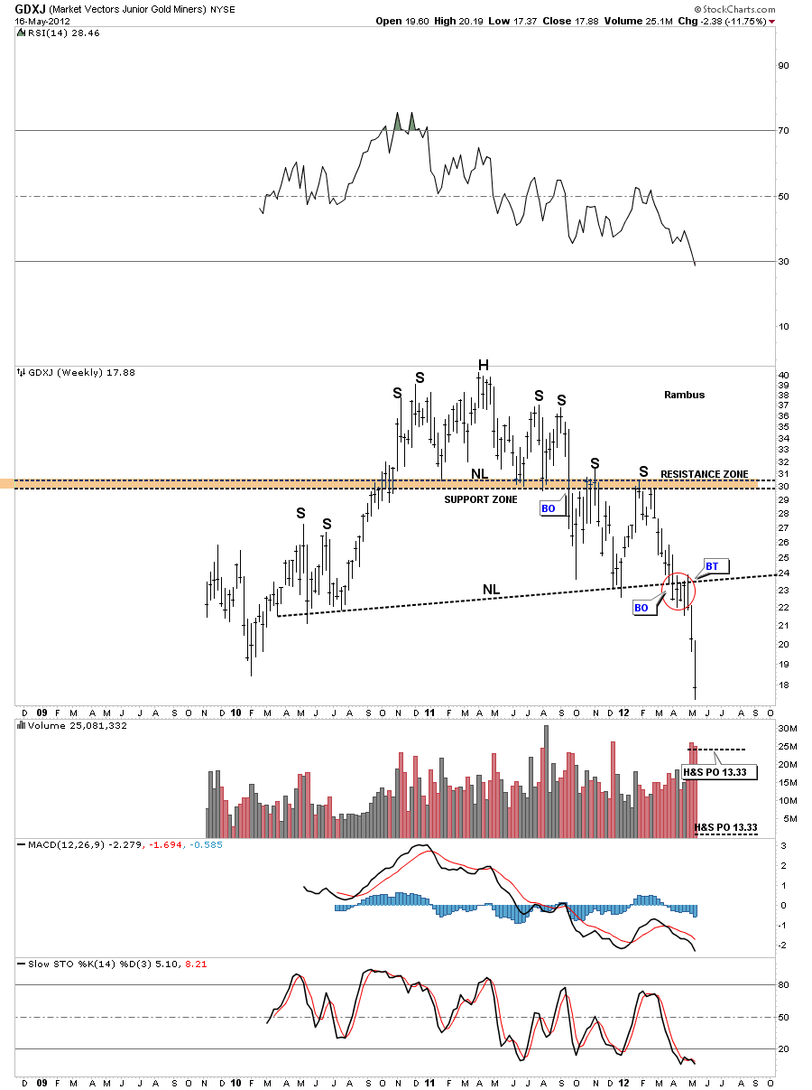
This weekly chart of the GDXJ shows the little juniors on the move to lower prices. I said at the time, when we broke the neckline, that this chart concerned me the most because most PM investors are heavily invested into the junior PM stocks. The selling has been relentless making it almost impossible to sell into any strength as there hasn’t been any to sell into.

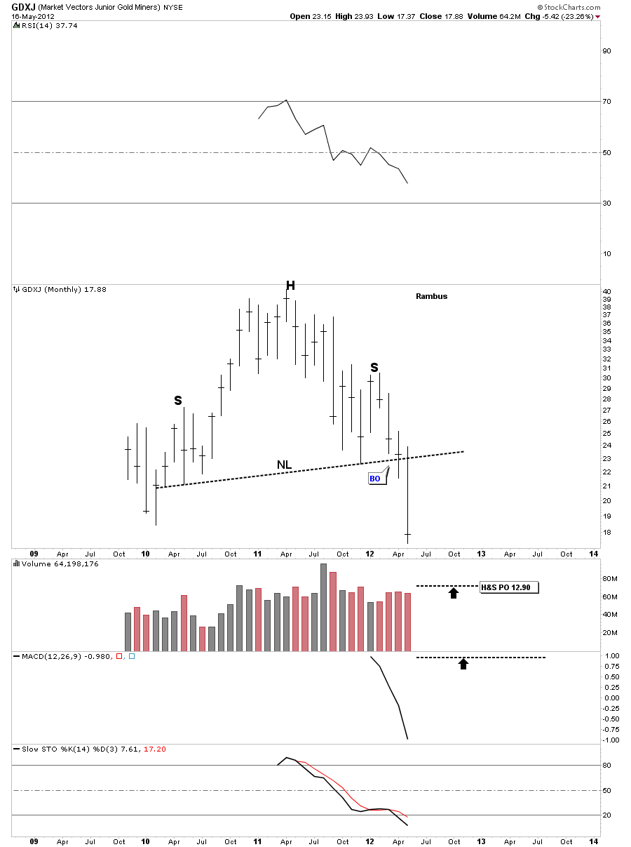
GDXJ monthly look.

These charts should get everyone up to speed now on what I’m seeing going forward. We are still very early yet in this move lower across the board. It looks like everything is going to be affected to some degree.

There is only one way that I want to play this new developing trend and that is to sit tight and ride out any counter trend rallies or short covering rallies that will come our way. I’ve learned along time ago the real big money is made when you can identify a big trend, either up or down, and ride it for all your worth. It will be the hardest thing you will ever do in the markets. Be right and sit tight is easier said than done. When we get a short covering rally you will think the bull is back but the bull won’t be back until all those big H&S top patterns play out to the downside. So I suggest getting your portfolio together using the different trade setups on the sidebar that suits your investment style. All the best…Rambus

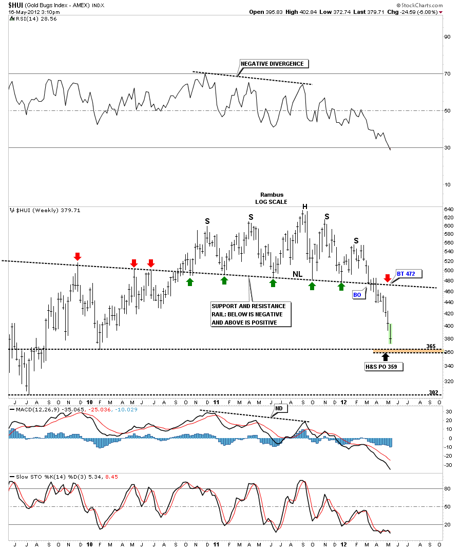
HUI Update

Below is a weekly chart that shows a possible area to expect some kind of bounce or short covering rally. There was a low made back in 2010 at 365 and the H&S minimum price objective at 359. Keep in mind that the 2008 H&S price objective tripled the initial price target.

………………………………………………………..
EDITOR’S NOTE :

Rambus Chartology is Primarily a Goldbug TA Site where you can watch Rambus follow the markets on a daily basis and learn a great deal of Hands on Chartology from Rambus Tutorials and Question and Answeres .
Most Members are Staunch Goldbugs who have seen Rambus in action from the 2007 to 2008 period at www.goldtent.org and now Here at Rambus Chartology since early 2012 .
To review his Work and incredible calls from the 2007-2008 period click on the top right sidebar Deja Vu
To Follow Rambus Unique Unbiased Chart Work and participate in a Chartology Form with questions and answeres and learn the Art and Science and Mindset of a Pro Trader please Join us by subscribing monthly for $29.99 at

www.rambus1.com

We have many subscribers from all over the world who are glad they did as they enjoy the many daily updates and commentaries provided at this exciting new site

As you will see Rambus (Dave) has prepared us for this difficult period by being one of the only ones to see and warn about this incredibly debilitating PM smackdown

You will find Rambus to be a calm humble down home country tutor with an incredible repitoir of all the TA based protocols tempered with his own one of a kind style…simply put…He wants to keep his subscribers on the right side of these crazy volitile and downright dangerous markets

See you at the Rambus Chartology

…………………….

PM Ratio Charts (STUNNING) Story

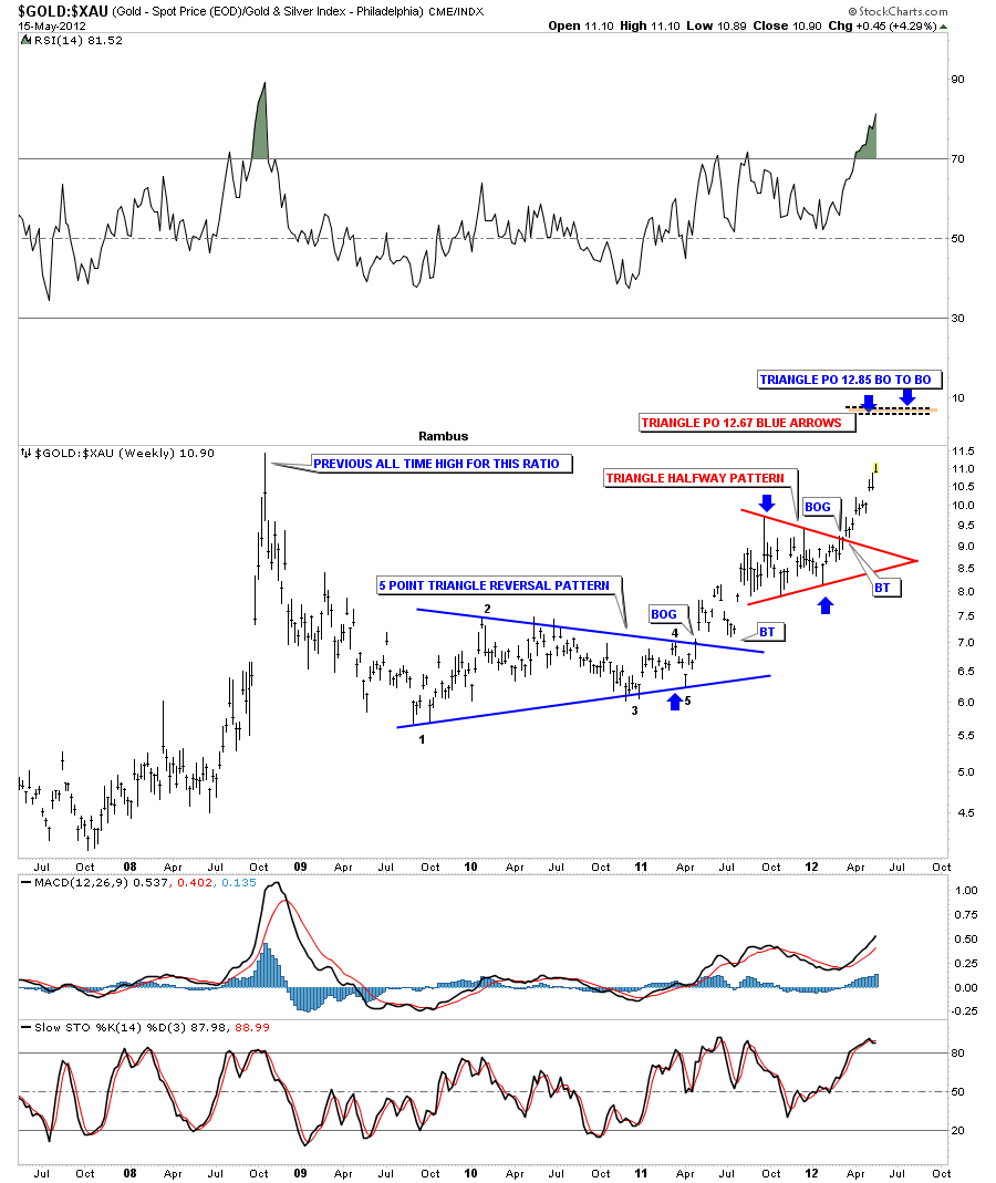
The gold to XAU ratio chart is showing we are approaching the all time high made back in 2008. That was a spike high that reversed almost immediately and signaled the bottom was in for the precious metals stocks. On the chart below you can see we have a different setup as we approach that all time high this time.

As you can see on the chart above the ratio bottomed out with a 5 point triangle reversal pattern to the upside. The ratio then went on to form a red triangle consolidation pattern that broke out to the upside about three months ago. If we view that red triangle as a halfway pattern the price objective comes in around the 12.80 area based on two different measuring techniques I use. So even though this ratio is at an extreme it looks like it wants to go higher IMHO.

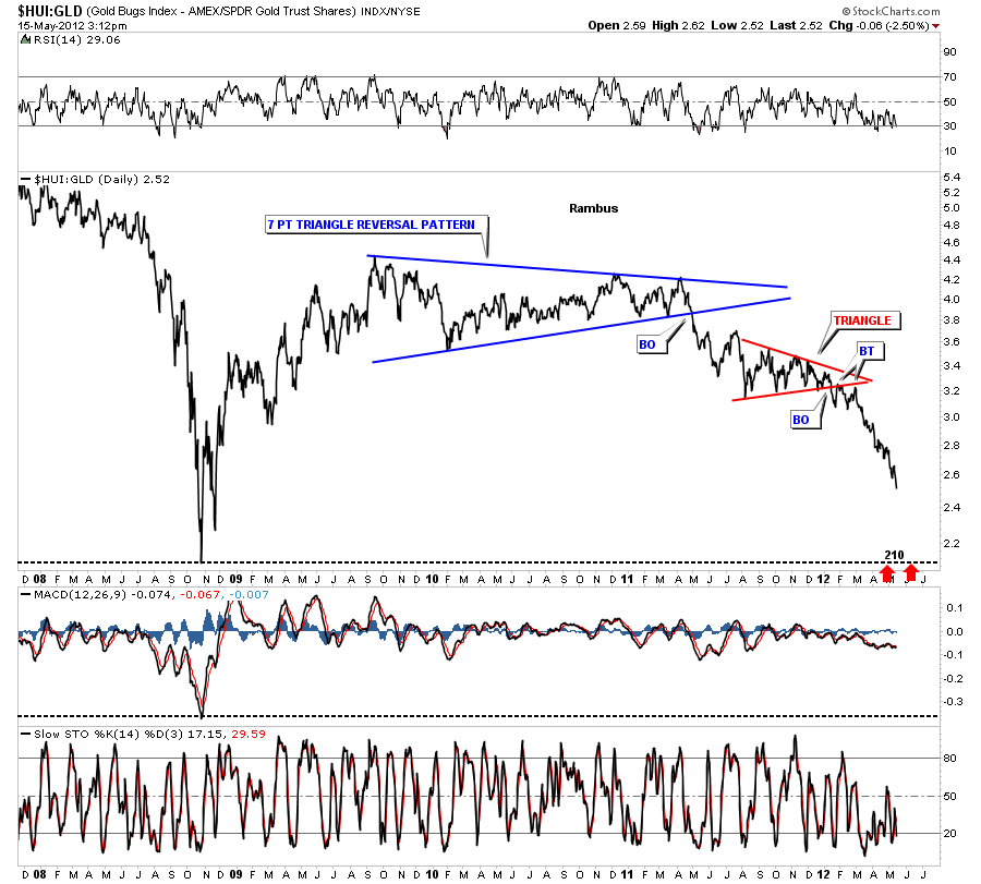
Below is a daily look that shows the HUI:GLD ratio chart  still has a ways to go yet before we test the 2008 crash lows down at 210. I mentioned several months ago that I thought that the PM stocks were accelerating to the downside relative to gold. This has been the case as the chart below shows.

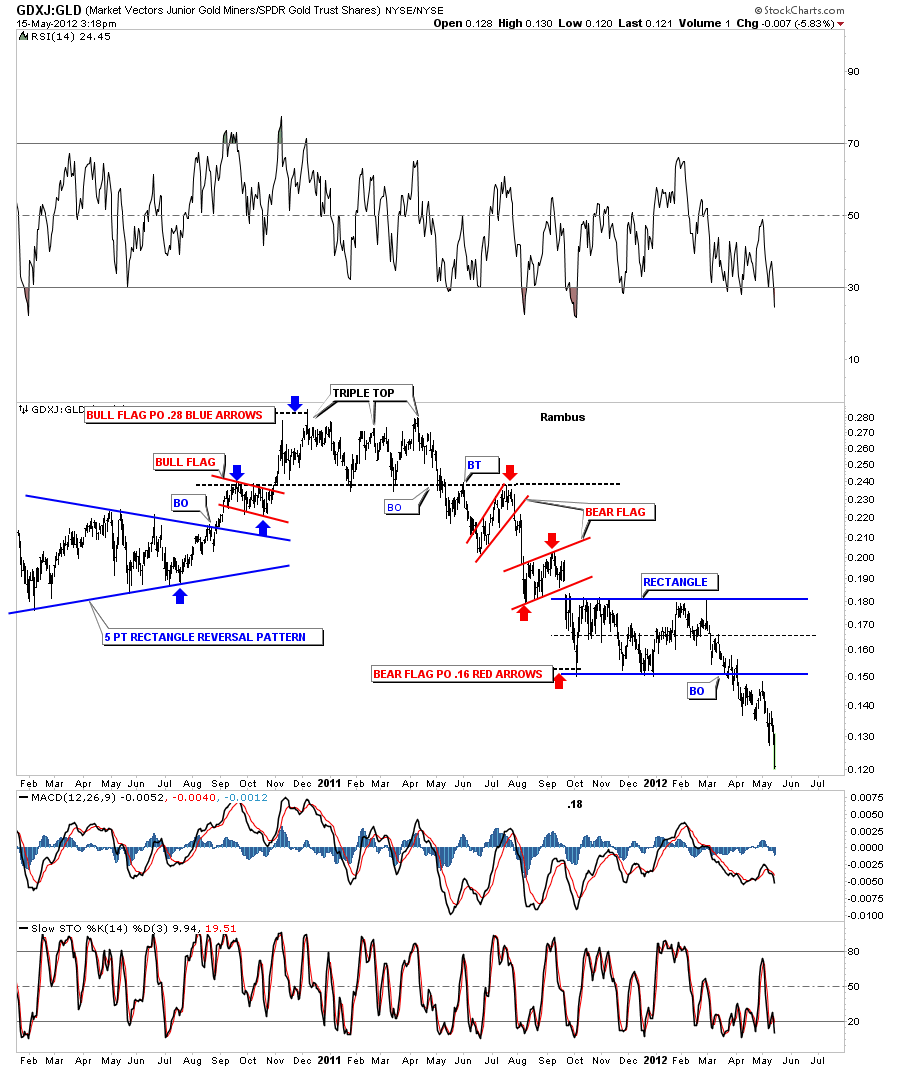
The GDXJ:GLD really shows the little juniors plunging against GLD after completing a rectangle consolidation pattern.

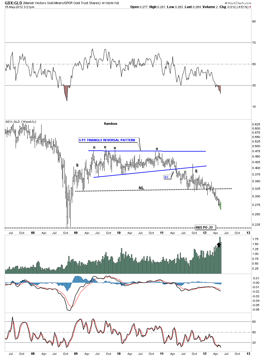
I can make a case for a big H&S top pattern with the weekly GDX:GLD ratio chart that shows there is still some more room to move lower before we reach the crash low of 2008. Although the PM stocks seem to be oversold compared to gold there is still room to move down before we reach the 2008 panic lows. Note the price objective that measures down to the 2008 bottom.


UUP Update

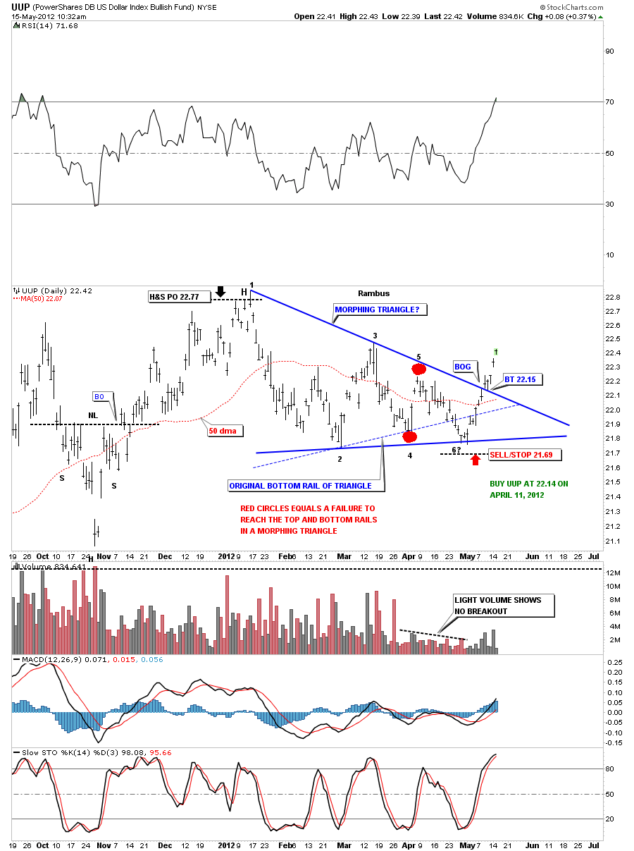
Just a quick update on the morphing triangle that we have discussed previously. As you can see on the chart below it all worked out according to plan. Most Technically Analysis were watching that thin dashed blue bottom rail of the original triangle and when UUP broke below it they turned bearish on the dollar. This was the fake out before the breakout. Once we got back above the  blue dashed rail of the original triangle the top rail came into play that was the next objective to conquer. Note how clean the breakout and backtest was. That was about as pretty as it gets. Now the UUP – Dollar is in rally mode that will put pressure on just about everything else for the time being.

………………………………………………………..
EDITOR’S NOTE :

Rambus Chartology is Primarily a Goldbug TA Site where you can watch Rambus follow the markets on a daily basis and learn a great deal of Hands on Chartology from Rambus Tutorials and Question and Answeres .

Most Members are Staunch Goldbugs who have seen Rambus in action from the 2007 to 2008 period at www.goldtent.org and now Here at Rambus Chartology since early 2012 .

To review his Work and incredible calls from the 2007-2008 period click on the top right sidebar Deja Vu

To Follow Rambus Unique Unbiased Chart Work and participate in a Chartology Form with questions and answeres and learn the Art and Science and Mindset of a Pro Trader please Join us by subscribing monthly for $29.99 at

www.rambus1.com

We have many subscribers from all over the world who are glad they did as they enjoy the many daily updates and commentaries provided at this exciting new site

As you will see Rambus (Dave) has prepared us for this difficult period by being one of the only ones to see and warn about this incredibly debilitating PM smackdown

You will find Rambus to be a calm humble down home country tutor with an incredible repitoir of all the TA based protocols tempered with his own one of a kind style…simply put…He wants to keep his subscribers on the right side of these crazy volitile and downright dangerous markets

See you at the Rambus Chartology

SPX Update

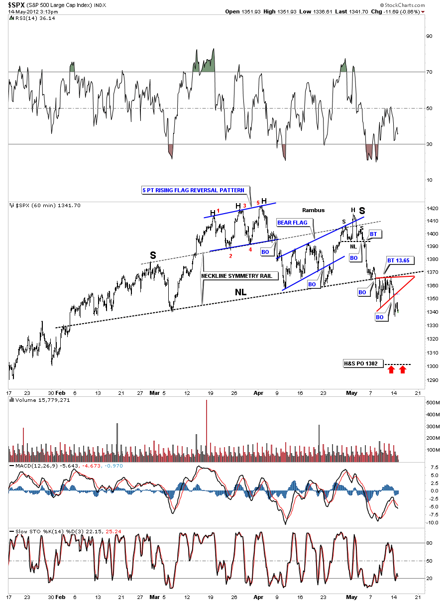
Just a quick update on the 60 minute chart of the SPX. Last Friday I showed the little red triangle that was forming just beneath the neckline. Whenever you get a little consolidation pattern that forms just above, just below or sometimes right on a critical trendline that is usually a bearish setup in our current instance.

EDITOR’S NOTE :

Rambus Chartology is Primarily a Goldbug TA Site where you can watch Rambus follow the markets on a daily basis and learn a great deal of Hands on Chartology from Rambus Tutorials and Question and Answeres .

Most Members are Staunch Goldbugs who have seen Rambus in action from the 2007 to 2008 period at www.goldtent.org and now Here at Rambus Chartology since early 2012 .

To review his Work and incredible calls from the 2007-2008 period click on the top right sidebar Deja Vu

To Follow Rambus Unique Unbiased Chart Work and participate in a Chartology Form with questions and answeres and learn the Art and Science and Mindset of a Pro Trader please Join us by subscribing monthly for $29.99 at

www.rambus1.com

We have many subscribers from all over the world who are glad they did as they enjoy the many daily updates and commentaries provided at this exciting new site

As you will see Rambus (Dave) has prepared us for this difficult period by being one of the only ones to see and warn about this incredibly debilitating PM smackdown

You will find Rambus to be a calm humble down home country tutor with an incredible repitoir of all the TA based protocols tempered with his own one of a kind style…simply put…He wants to keep his subscribers on the right side of these crazy volitile and downright dangerous markets

See you at the Rambus Chartology

SPX Update

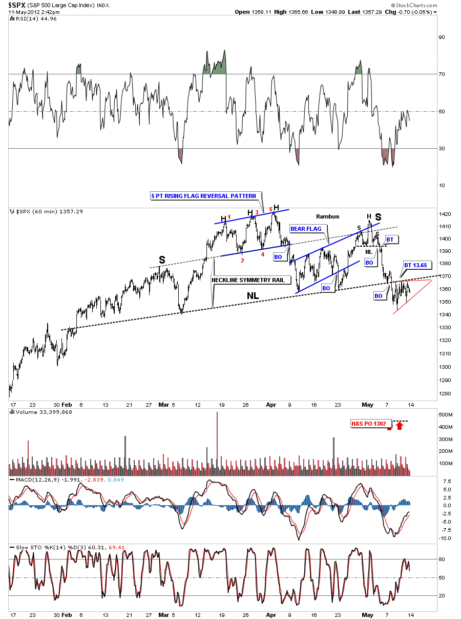
Just a quick update on the SPX 60 minute and daily charts. The 60 minute charts shows the SPX breaking the neckline on Monday and backtesting the rest of this week. You can see a small red triangle forming just below the neckline. This should be a bearish setup. The neckline is holding as resistance while the little triangle consolidation pattern is forming just below. This is low risk setup to buy one of your favorite short etf”s like SDS.

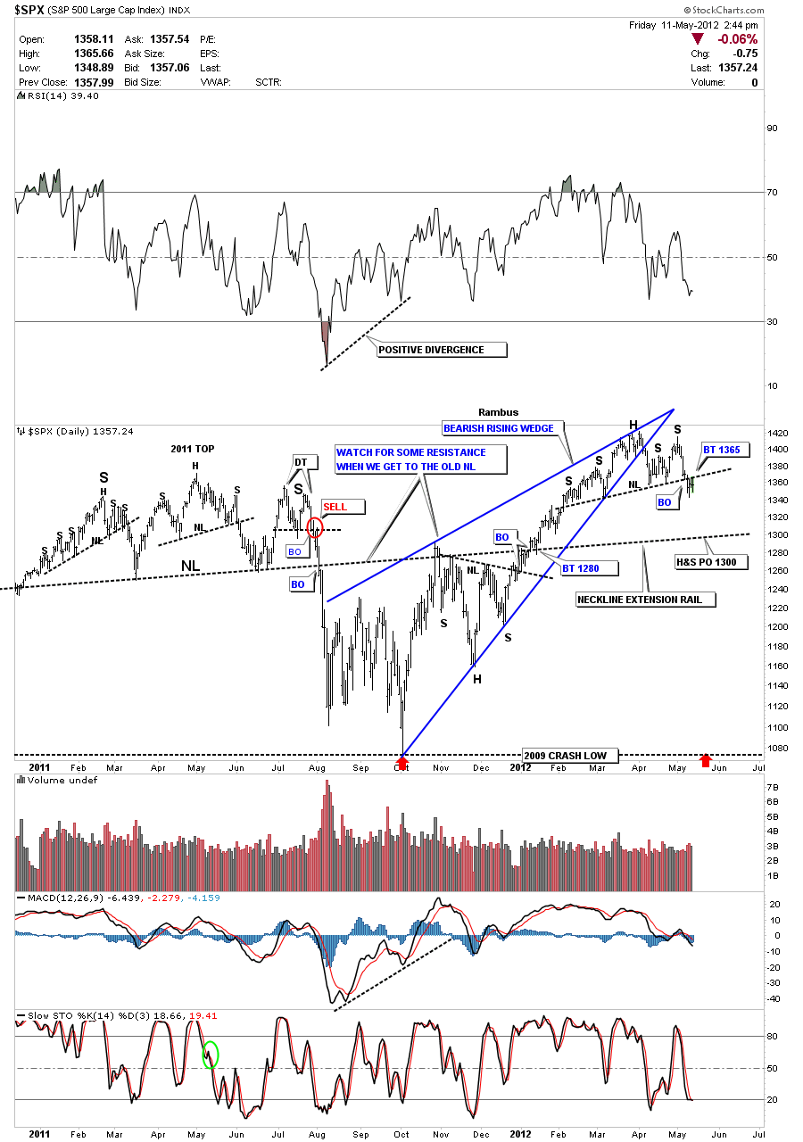
The daily charts shows the nice H&S top pattern in place with the breakout and backtest to the at 1365 neckline.


………………………………………………………..
EDITOR’S NOTE :

Rambus Chartology is Primarily a Goldbug TA Site where you can watch Rambus follow the markets on a daily basis and learn a great deal of Hands on Chartology from Rambus Tutorials and Question and Answeres .

Most Members are Staunch Goldbugs who have seen Rambus in action from the 2007 to 2008 period at www.goldtent.org and now Here at Rambus Chartology since early 2012 .

To review his work and incredible calls from the 2007-2008 period click on the top right sidebar Deja Vu

To Follow Rambus Unique Unbiased Chart Work and participate in a Chartology Form with questions and answeres and learn the Art and Science and Mindset of a Pro Trader please Join us by subscribing monthly for $29.99 at

www.rambus1.com

We have many subscribers from all over the world who are glad they did as they enjoy the many daily updates and commentaries provided at this exciting new site

As you will see Rambus (Dave) has prepared us for this difficult period by being one of the only ones to see and warn about this incredibly debilitating PM smackdown

You will find Rambus to be a calm humble down home country tutor with an incredible repitoir of all the TA based protocols tempered with his own one of a kind style…simply put…He wants to keep his subscribers on the right side of these crazy volitile and downright dangerous markets

See you at the Rambus Chartology

Wednesday Stock Report

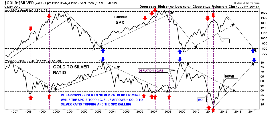
This week Sir rlscott63 is interested in the gold to silver ratio and how it plays into the movement of the stock markets.

First, we’ll start with the gold to silver ratio that can tell a very important story if one interprets the information correctly. The general theme of this ratio is when gold is outperforming silver the stock markets are generally declining and the ratio is rising. Just the opposite happens when the ratio is falling meaning silver is out preforming gold and the ratio trends downward. What it means when the ratio is falling is that silver is outperforming gold signaling to the stock markets that its time to rally as silver is still used as an industrial metal and the demand from a robust economy is putting a higher demand on the white metal vs when the economy is weak. This is why you see the ratio falling during rising stock markets.  I built a chart four or five years ago that shows a very clear picture of how the ratio rises while the stock markets fall and falls when the markets rises. The chart below is a combo chart with the SPX on top and the gold to silver ratio on the bottom. You can see the general principal, I described above, at work on the chart. Notice when the ratio is falling the stock market is rallying and when the ratio is rising the stock markets are falling. Note the 2011 period when the gold to silver ratio plunged below the horizontal support rail at 49 or so. That’s when silver was in it’s near parabolic rise to 50 and was kicking golds butt all over the place. You can see the stock market was rallying hard and was at it’s high while the gold to silver ratio was extremely low at 34 not seen in a very long time. From that extremely low reading of 34 the ratio started to rise and the stock markets had their summer correction finally bottoming out in the fall. Note the steep rally in the gold to silver ratio during the stock market crash in 2008 labeled deflation scare. Even though gold fall hard silver fell much faster as investors were seeking the safety of gold over silver. Gold has been outperforming silver since the low in the stock market last fall and the raito has broken back above the horizontal rail at 49. This is a bit of a divergence as both the stock market and the ratio have been rising together just a tad. So its very interesting right now as the ratio is just about to break above it’s little downtrend rail that will signal a weaker stock market and once we see the SPX break below it’s uptrend rail that should signal the stock markets going back into it’s secular bear market. I’ll be watching this chart very carefully for more clues for a declining stock market and an out performance of gold over silver.


HUI : THE ETERNAL QUESTION

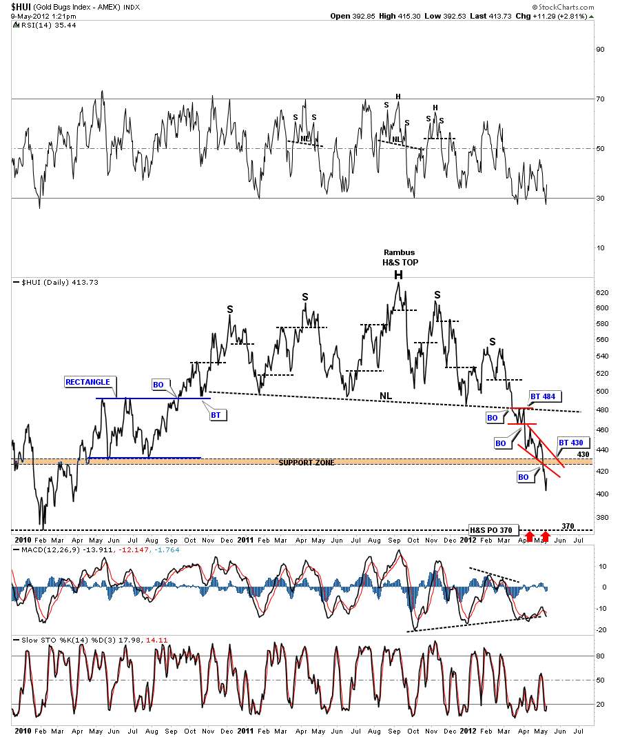
This morning I got an e mail from a subscriber that asked several important question regarding the HUI and the precious metals stocks. First, he wants to know if the big H&S price objective down to the 360 area is still valid?  Yes, the 360 is our real first area of key support as it’s the big H&S price objective, at a minimum. There is also a low made back in February of 2010 that should give us some initial support.

Next he would like to know if we hit the H&S price objective down at the 360 area would it be a good place to accumulate precious metals stocks? First of all this is a huge H&S top that is a reversal pattern, reversing the uptrend made off the 2008 crash lows. This is a massive top formation that is going to take time and lower prices to put in a lasting bottom. The topping pattern is about 18 months or so in the making. We are now only several months into the correction. A rule of thumb is the larger a top, bottom or consolidation pattern is the longer the move will be in time and price. If our current H&S top only took several months to complete we would be in a completely different ball game. I would not be looking for a major reversal like I see happening with our present H&S top. So the answer to your question would be the 360 area may offer us a decent counter trend trade against the big downtrend that is in play right now but not for accumulating precious metals stocks for the long term IMHO. What we are seeing today is a short covering rally that will get everyone excited again.

The last question he asked, which is very important to each individual investor is, should I sell my core holdings? That’s a hard question to answer because each individual investor has a different psychological profile. Some can’t stand the least bit of pain while other investors can ride a correction out and not bat an eyelash. As I’ve mentioned several times I’m not holding any precious metals stocks at this time. This is my preference. Many of you may recall the big bull market in the 90’s that had many analysis saying the Dow would go to 25,000 based on this or that and that a new  paradyme was underway. Its really hard not to get caught up in all the hype when so many are talking the same thing. Nobody knows for sure if this bull market is over for the precious metals complex or that we still have several thousands of dollars to go yet for gold. I can’t prove it because I didn’t trade the gold bull market in the 70’s but I bet the fever was high and most analysis didn’t even come close to selling out at the 850 top because gold was going to 1000 or 1500 or whatever price anybody wanted to put on it. That is how the tech bubbled ended with everyone looking for much higher prices. Very few got out at the top. I was lucky because I could read a chart and seen what was happening but my broker, at the time, rode the whole thing down because buy and hold is the only thing most investors know. So all I can tell you is that we have a major top in place and how low we go is anybodies guess at this time. When I seen the H&S top pattern in 2008, on the HUI, I had no idea of the magnitude of the crash that was to follow. All I knew was we had a H&S top in place and it was reversing the uptrend that had been in place since the beginning of the bull market. We tripled the H&S price objective before the HUI found its bottom. As I said before we are going to get some short covering rallies that will knock your socks off but they will be against the downtrend that is now in place. Holding a core portfolio of PM stocks has to be a personal choice. A choice based on your own knowledge and personal make up. My first rule of thumb is to protect ones hard earned capital. If I sell out too early and the markets go against me I’m not afraid to buy in higher as its better to buy in higher than to be caught in a downdraft that you can’t get out of. I hope I’ve answered your questions.

HUI daily line chart.

HUI monthly with the 2008 H&S top.

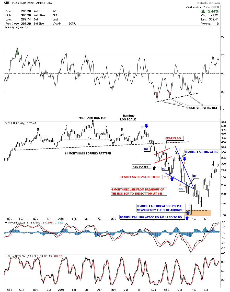
Below is a snap shot of the 2008 H&S top on the HUI. That top took 11 months to complete and four months after the breakout to reach it’s final low at 148. You can see two consolidation patterns that formed on the way down the little red bear flag and the much bigger bearish falling wedge. Once I was able to identify the big blue bearish falling wedge I was then able to put a price target for that move down. Note points one and two on the bearish falling wedge. That counter trend rally was just over 100 pts. Put yourself in that time frame and how would you have reacted at the time. I can tell you from experience its very very hard not to get insecure about your position but knowing the major trend was down made it easier to ride the counter move up. In our current situation we have had a big move down and a counter trend rally or short covering rally can come out of the blue but knowing that the main trend is down should give one confidence to ride the move out.

HUI 2008 H&S top.


………………………………………………………..
EDITOR’S NOTE :

Rambus Chartology is Primarily a Goldbug TA Site where you can watch Rambus follow the markets on a daily basis and learn a great deal of Hands on Chartology from Rambus Tutorials and Question and Answeres .

Most Members are Staunch Goldbugs who have seen Rambus in action from the 2007 to 2008 period at www.goldtent.org and now Here at Rambus Chartology since early 2012 .

To review his Work and incredible calls from the 2007-2008 period click on the top right sidebar Deja Vu

To Follow Rambus Unique Unbiased Chart Work and participate in a Chartology Form with questions and answeres and learn the Art and Science and Mindset of a Pro Trader please Join us by subscribing monthly for $29.99 at

www.rambus1.com

We have many subscribers from all over the world who are glad they did as they enjoy the many daily updates and commentaries provided at this exciting new site

As you will see Rambus (Dave) has prepared us for this difficult period by being one of the only ones to see and warn about this incredibly debilitating PM smackdown

You will find Rambus to be a calm humble down home country tutor with an incredible repitoir of all the TA based protocols tempered with his own one of a kind style…simply put…He wants to keep his subscribers on the right side of these crazy volitile and downright dangerous markets

See you at the Rambus Chartology

…………………….

Attention Rambus Subscribers :

Many of you have good questions you are forwarding to rambus from the “Comments box ” under the posts

Some of these go unnoticed

Please use the “Chartology Forum” linked on the right sidebar

Just log in there with your same user name and password

You are all set as Authors there…much like at Poster’s Paradise at Goldtent

Select “New”…then “Post” at the top and post your questions there …where all can see them and participate…Ranbus checks in there regularily

Its an underused resource

Subscriber RL Scott is posting his work there daily

Please gather at the form and post your chart requests and questions there

See you there

Fully